Modern Calligraphy, it appears, is an actual thing. Whether it is the sort of thing that it sounds like is possibly another matter. Calligraphy (‘beautiful writing’, for all the classical etymology fans out there), can mean anything from zen masterworks to that nineteenth-century business hand which looks like copperplate but was seriously intended for everyday use. So a book featuring just those two words as its title could relate to any point within that wide spectrum – but we were pretty sure it was going to be something which would interest us.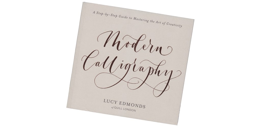 The author is owner of Quill London, a combined design studio and stationery shop. What becomes clear on an introductory perusal is that the definition of calligraphy in use here is very much at the ornamentally decorative end of the scale. Bluntly, if you’re looking for a calligraphic hand which you can practise, perfect, and incorporate into your daily note-taking to the amazement of colleagues this probably isn’t the book you need. But if you’re called on to label floral arrangements, wedding place settings and hipster chocolates, it might be exactly what you want – as long as the style suits you.
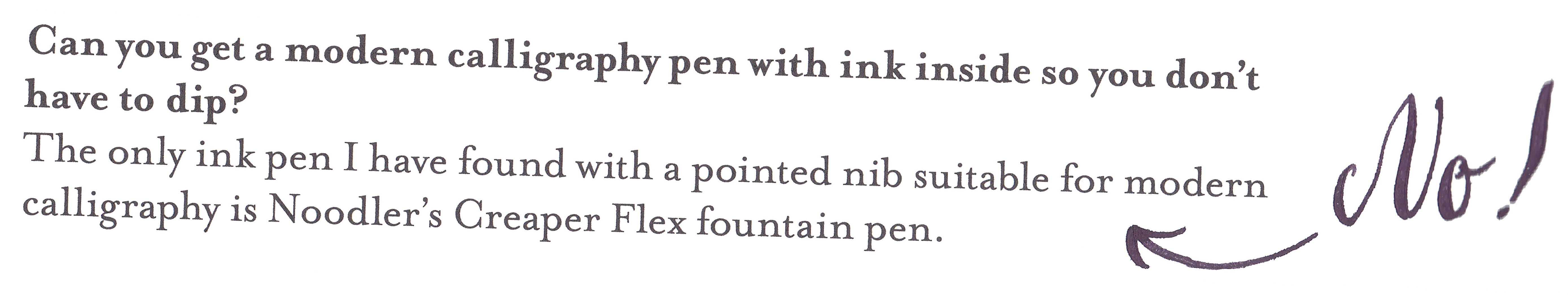
 Lucy refers to letter-forming, not writing, and that’s a useful indicator to the type of art-form expounded here, which perhaps owes as much to sign-writing as traditional pen calligraphy. The advantage of this is that the approach recommended offers lots of scope for variety, from reminding readers that brush pens are a legitimate tool, to actively encouraging us to ‘fake it’ when large features such as drop-capitals are required and a two-inch ginormoflex nib isn’t readily to hand. The disadvantage is that the book’s main dependence upon dip pens overlooks the range of flex nibs available in modern fountain pens – indeed, the text gets this factually wrong by suggesting that the only flex FP is the disposable ‘Nib Creaper’, but this is the only complete howler and we can hopefully help if there’s a reprint.
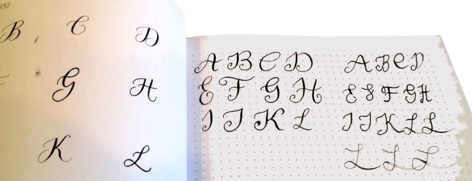
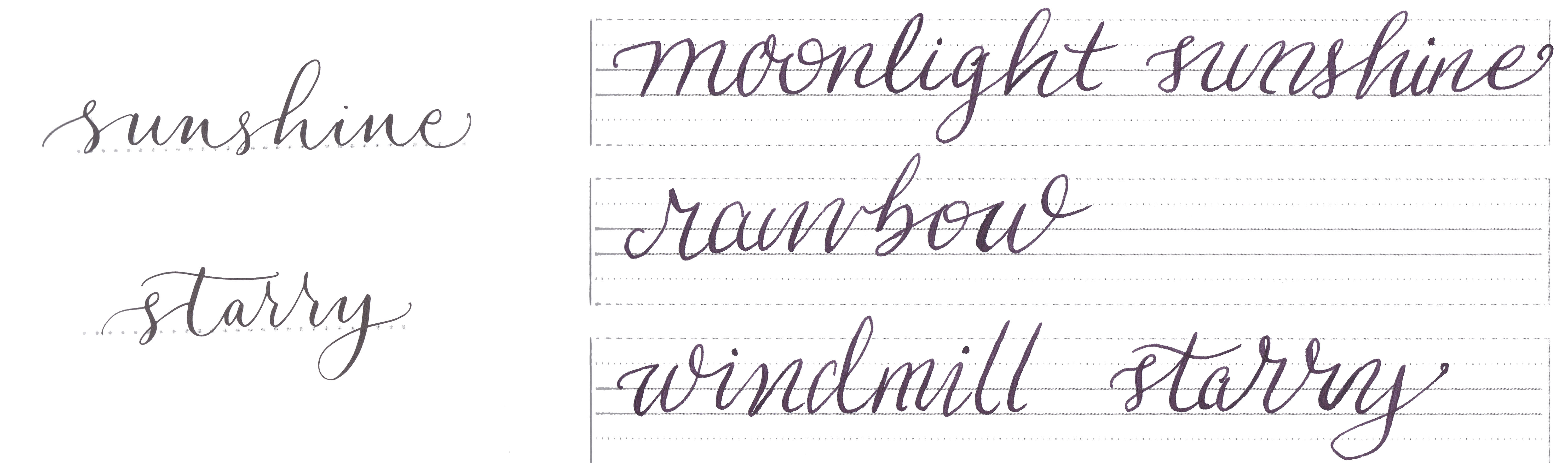
The book features a range of practice exercises and ample space to rehearse your moves. That may not be so comfortable for anyone raised to avoid ever writing in a text-book, and it also means paying full price for a book which is only half composed of actual text, but it also makes it is easy to get started. Importantly, the publishers have wisely chosen to use fountain-pen-friendly paper, so the exercises are accessible and give a quick feel for whether this is a hand which suits you. The verdict from our test panel was it may or may not be quite everyone’s favourite lettering style, but that it is at least fun finding out.
So, we’d perhaps like to see something like this book covering a hand which could be tackled with a flex fountain pen, but that’s for another day. In the meantime this is a good example of how a lot of ideas and experience can be conveyed quickly by a well-designed manual, a great advert for Lucy’s in-house training courses, and a pretty good stocking filler for anyone you know who is more into the eye-catching end result than the rarefied details of ‘serious nibbage’.
This meta-review draws upon brief reviews by:
Thanks to Lucy and her publishers for sending a few review copies our way.