Monthly Archives: April 2017

London Stationery Show report

Your dogged correspondent trekked down to the London Stationery Show for a second year, and as previously there was an embarrassment of riches.  Many of this year’s ‘finds’ are ones we’ll come back to, so here’s a quick report to whet your appetite.

There is no escape from Noris; resistance is futile

Highlights included:

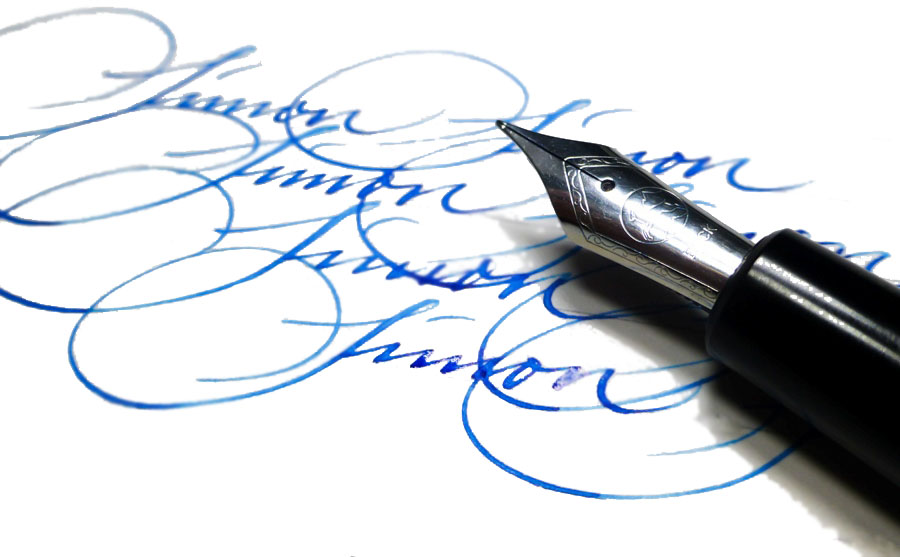
  1. The Manuscript stand, with hands-on calligraphy area and of course the rather splendid new ML1856 – which we’re hoping to review before too long.

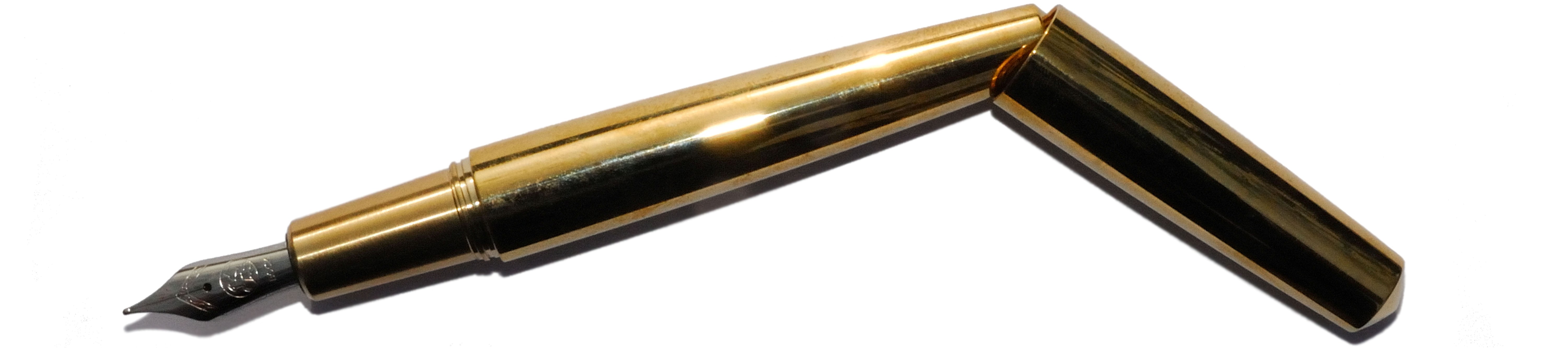
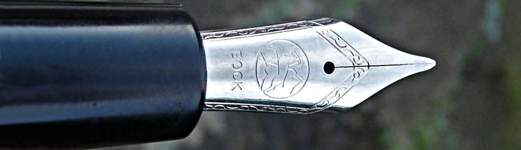
  2. Kaweco – having now seen the brass version of the Special it’s obvious why it immediately sold out, but we’ll be back to review it when we can get our hands on a few.

  3. Meeting Stuart, who now runs the excellent Pocket Notebooks site – a great guy to talk to, and we’ll be reviewing his wares very soon.

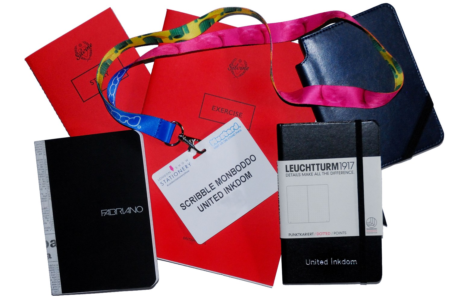
  4. Encountering the revamped Silvine red notebooks; pictures don’t really do them justice.

  5. Playing with the very nice brass pens and pencils from Ystudio.  We’ll get some to review if we can.

  6. Flipping through the new Rhodia Heritage Collection; they really do look the business and we are endeavouring to acquire some to test.

  7. Discovering that Fabriano notebooks are coming back to our high streets soon; good-quality dot grids which you don’t have to go online for sound like they could be very handy.

  8. Meeting the owner of the new bricks-and-mortar shop in lovely Hexham, Penfax.

  9. Admiring the refillable notebooks for people who know that ‘traveller’ has two Ls, from Paper Republic – and yes, we’re aiming to review those too.

  10. Discovering that Sheaffer still make some proper posh pens.  We can’t be so certain of getting some of those to play with, but we’ll see.

  11. Wading through a veritable forest of shiny new Leuchtturm notebooks, with a lot of understandable fuss about how 1917 was, y’know, a whole century ago and everything, and watching their portable embossing machine and old-school Gutenberg lettering rack in progress (see below for more on how to bag the results).

Lowlights included:

  1. Heating which threatened to boil all exhibitors alive, until a merciful cool-down after lunch.

  2. A certain rather well-known manufacturer whose representatives didn’t recognise one of their own pens, got confused about how flex nibs worked and had to be given a brief lecture on model numbers and the difference between push-button converters and piston filling systems.  We shall leave them unidentified to spare their blushes… don’t mess with penthusiasts, people!

Win the notebook

Leuchtturm kindly embossed our name in a silver on a unique United Inkdom A6 notebook, and with only one of them in the whole world we couldn’t possibly divide it between our team so we decide to hand it over to you!  We asked for comments with weird and wonderful ideas about what you’d do with such notebook in your pocket (or indeed in your hand), and the winning answer was, well, world domination.  How could we argue?


Super5 pens and inks

A little bit of history  Last year we made contact (via Matthias) with the remarkable Super5 in Germany, and a select band of bloggers got to grips with their novel range of pens and inks.  It’s such a distinctive collection that just this once we’re reviewing a whole brand, rather than just one product. The range includes fountain pens, rollerballs, and FP-friendly permanent inks – you can see why we couldn’t resist!newandoldSuper5s

How it looks  The Super5 pen, in all its variants, looks a lot like the Kingsley Dex and the Manuscript Master, which is hardly surprising as it shares its basic Helit body with both. Like the Master, it has a nice metal sections too, and the useless but fun screw-off blind cap which could, just about, allow access to the turning knob of a converter if you wanted it to (but you won’t want it to, honestly).  This is a comfortable, appealing shape and there’s a decent range of colour schemes too.  The inks looks like they come in Rohrer&Klingner bottles, because that’s precisely what they are.orangeonblack

How it feels  The pen’s body is a combination of warm plastic and firm but comfortable metal (in the section).  ‘Nothing to complain about there.Super 5 FP

How it fills  Pop in a cartridge, or if you want to make the most of the Super5 ink range, a normal ‘international’ converter.  It’s all very straightforward.Super5 07FP

Crucially, how it writes…  Very well, and quite differently from many other affordable fountain pens.  The round nib has iridium tipping but the italic versions have none – just polished steel.  Of course, that’s just fine if calligraphy is your style. If you really can’t handle fountain pens, which seems unlikely if you’re reading this but let’s roll with it anyway, there’s also a rollerball version which accepts the same cartridges or converters so you can use fountain pen ink.orangeonwhite

Pen! What is it good for?  The italic nibs (0.5mm and 0.7mm respectively) are particularly good for fast semi-calligraphic writing.  They work with the Super5 permanent inks, too, so they’re pretty handy.Atlantic

Ink! What is it good for?  While the names of some of the inks baffled us a bit, we all thought they worked very well in the Super5 pens, flowing impressively well for such a thick ink.  So, it’s good stuff for calligraphy – as long as you give your pen an occasional flush-through afterwards.Australia

VFM  These have to be imported, and they are only procured in relatively small batches, so the pens are inevitably not going to be quite as affordable as the humble Dex – indeed, they’re about twice the price.  That’s still not ridiculous money for pens which work well and can handle some punishment, though.  The ink is a little steeper, but still fair value if a coloured permanent ink is just what you need.

If this isn’t quite your cup of tea, but almost…  The Dex and Manuscript Master are pens worth a look instead.  KWZ are working on some permanent inks which could prove competition in the refill department.Super5 Rollerball

Our overall recommendation  It’s all worth a look – and if you want something no-one else in the office is likely to have, this is a sure-fire bet.

Where to get hold of one  Direct from ‘Papierlabor‘ is the only way.

This meta-review references:

Thanks to Super5 for the generous set of test samples.


Namisu Nova fountain pen meta-review

01 Brass at the castle
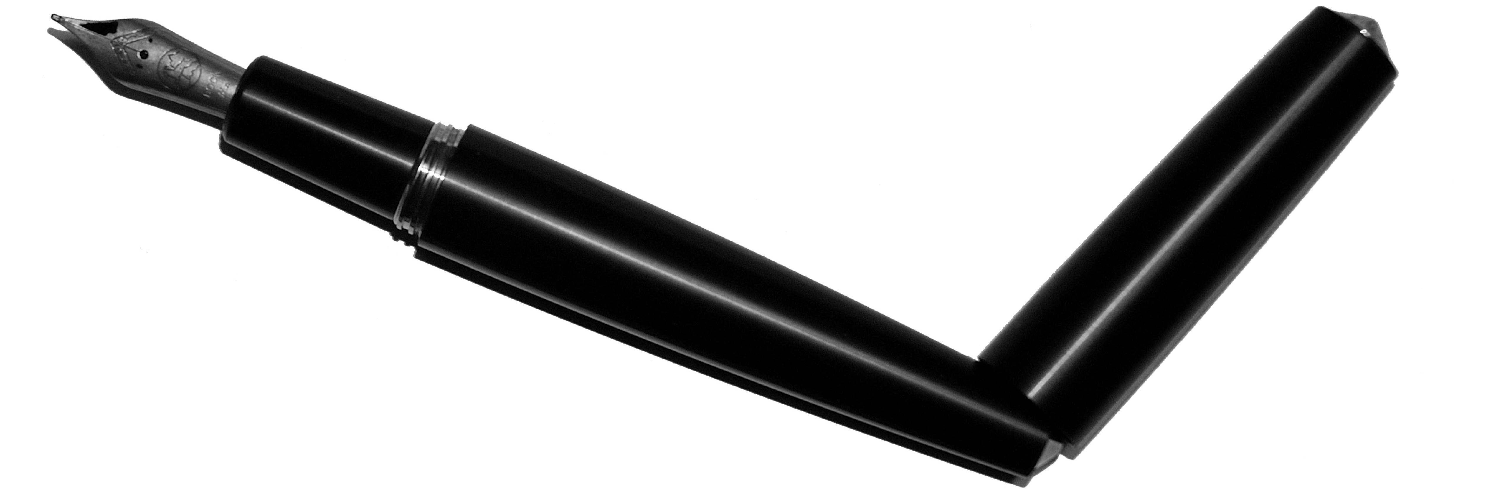
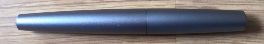
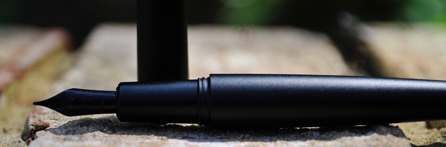
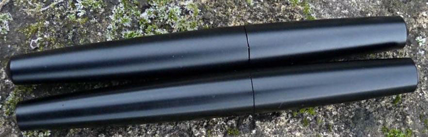
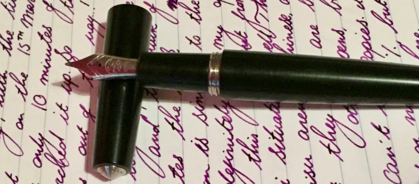
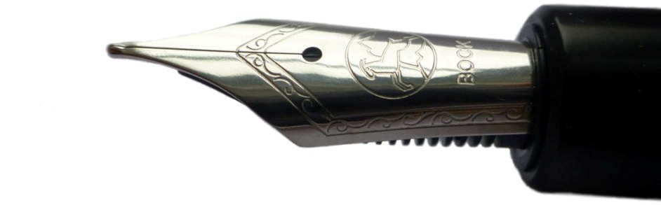
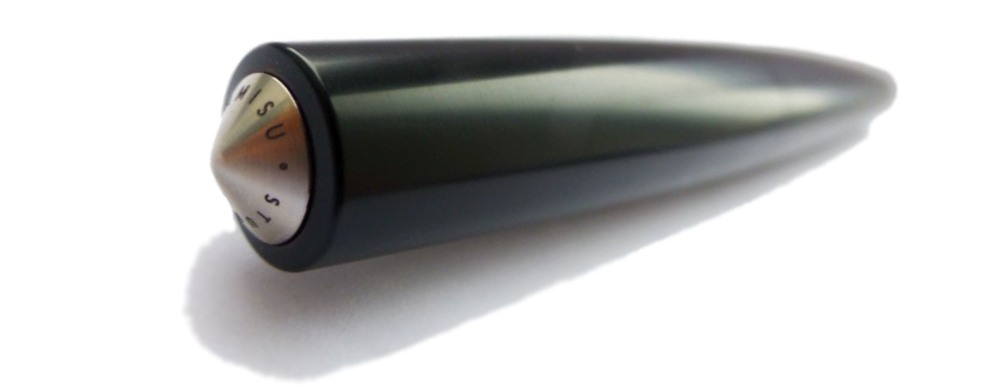
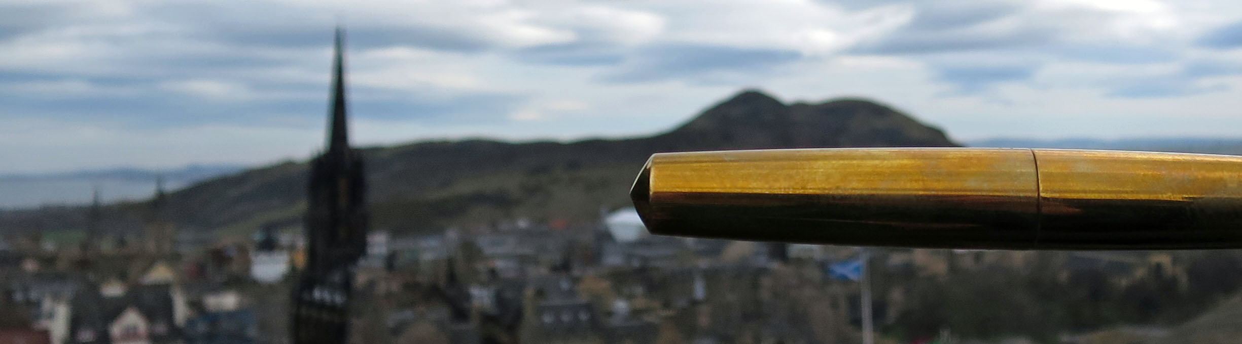
A little bit of history  Glaciers, weathering and tectonic plates were all involved to a greater or lesser extent in separating the Lothian volcanoes from the kingdom of Fife, but ever since the Forth Bridge became the world’s largest project management metaphor, both sides of the firth have been part of an on-and-off industrial heartland.  That engineering heritage was recently sparked in to life in one local business unit by the Kickstarter project which brought Namisu into being, and they’re now producing a couple of models in an increasingly diverse range of materials.  Some of us have been interested since those heady Kickstarter days, but the word is spreading fast…01 Alu goes Forth

How it looks  Like a streamlined version of the Nakaya-esque ‘bullet’ shape, polished-up for use as a prop in 1950s sci-fi B-movies – which is a long way round to saying that it’s minimalist, and we like that.  It looks exceedingly cool, whatever the material it’s cast in. The only catch is that said minimalist tube does rather like to roll off any surface you place it on!ClumsyPenmanship

How it feels  Large but really rather comfortable.  Obviously, the different materials available make a quite a difference; the aluminium version is sturdy and light, the ebonite version is very warm to the touch, and the brass version is satisfyingly heavy – probably too heavy for many writers, but marvellous if you like a weightier pen.02 Laura's Alu

How it smells  This criterion doesn’t feature in every meta-review, but appears here thanks to the ebonite version which Namisu kindly lent several of us to test.  Ebonite is a rather old-school material for a fountain pen, and it’s essentially just very hard rubber. That makes it tactile, light and warm to hold, which are all good things, but for those with sensitive noses there is also the detectable whiff of burnt tyres on a warm summer’s day. Of course, whether that’s a noxious pong or a nostalgic aroma is very much a matter of olfactory taste.03 Scribble's alu

How it fills  Cartridge/converter.  There should be space in there for a longer international cartridge, and Namisu often provide a good Schmitt converter with the Nova too.04 Rob's Back in black

Crucially, how it writes…  This is very much dependent upon whether you go for one of Namisu’s nibs or fit your own. Namisu stocks Bock nibs, usually either the standard steel (occasionally black-coated, as above) or titanium.  The Bock #6 steel nibs are firm but quite pleasant to use, while the titanium option offers a bit of flex – although we had mixed feelings as to how smooth they were on the paper.  The feed and collar unscrew, and any other Bock #6 assembly will screw back in, so if you happen to have spare nibs from the larger Kaweco or Diplomat pens, for example, they’ll be easy to swap.  It’s also possible to buy unbranded Bock replacement nibs from sources such as Beaufort, although the gold option is as pricey as you might expect.  Helpfully, the actual metal is a standard shape, so other #6 nibs, for instance those made by JoWo, can be transplanted into the Bock feed and collar assembly without too much difficulty.08 Ruth's ebonite

Pen! What is it good for?  The aluminium and ebonite versions are both good for longer writing sessions or quick note-taking – as long as you put the cap somewhere safe! The brass version could probably double up as some form of defensive weapon, but we wouldn’t recommend doing that with it.05 Ian's Alu&Ebonite

VFM  At £45 the aluminium version is really very good value for a distinctive British-built fountain pen.  The brass and titanium versions get pricier, but are both still quite competitive for enthusiasts of those metals.  Ebonite nudges the ticket into three figures, which seemed a little steep to us for a pen which only has a basic steel nib, but it’s an unusual material, and while rather expensive this is hardly daylight robbery.  Match a Nova with a really good nib of your choice and you get something truly splendid for the outlay.06 Dan's Ebonite

If this isn’t quite your cup of tea, but almost…  Namisu also make the Orion, a fairly similar shape but one which hasn’t appealed so much to us.  Or, if you like the look of the titanium Nova and want to spend ten times as much, there’s a Nakaya made from the same material.  Hmm.nib again

Our overall recommendation  Go ahead and get one while you can!  The aluminium version is an affordable design classic, and you can always upgrade to other materials later on.  If you covet the brass version, though, move fast; Namisu took some persuading to make it at all and we understand that it is intended as a one-off at the moment (you could prove them wrong, of course).cap end
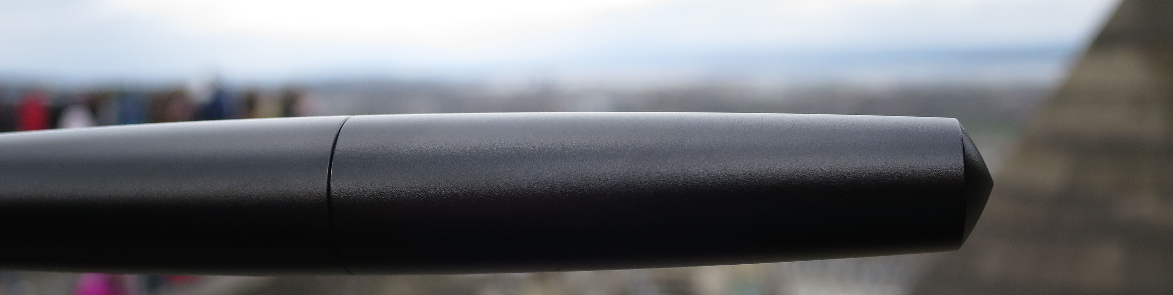
Where to get hold of one  Right now, buying from Namisu directly is the only way. Some purchasers have found that customer service is not always their strong suit, so this is one where ordering carefully and waiting patiently are sensible strategies.10 Scribble's brass

This meta-review references:

Thanks to  Namisu for lending several of us an ebonite Nova to play with.  The rest we bought with our own money!07 Nova-nib