Monthly Archives: May 2017

Kaweco Lilliput fountain pen meta-review

A little bit of history  Are you sitting comfortably? The history here is a quite a long one. When Padraig was kidnapped by pirates and taken to slavery in Ireland – prior to his subsequent visit which, in the long run, elevated him as Saint Patrick – some accounts record that his sister Lupita was carried away with him.  Her life story is obscure indeed, but somehow legends ascribed to or connected with her found their home at the edge of Lough Ennell.  What may have been an isolated area of the now-drained bog at the edge could conceivably been named in shaky Norman French as L’Isle de Lupita, but this too is conjecture; somehow, nevertheless, the name was corrupted to Lilliput.  Many centuries later the Dean of a cathedral – St.Patrick’s Cathedral, as it happens, for in our world all things are connected – was staying by the lake when he looked across and saw tiny figures, diminished by perspective, on the far side of the shore.  According to literary legend, there an idea was born; for that Dean was none other than Jonathan Swift.
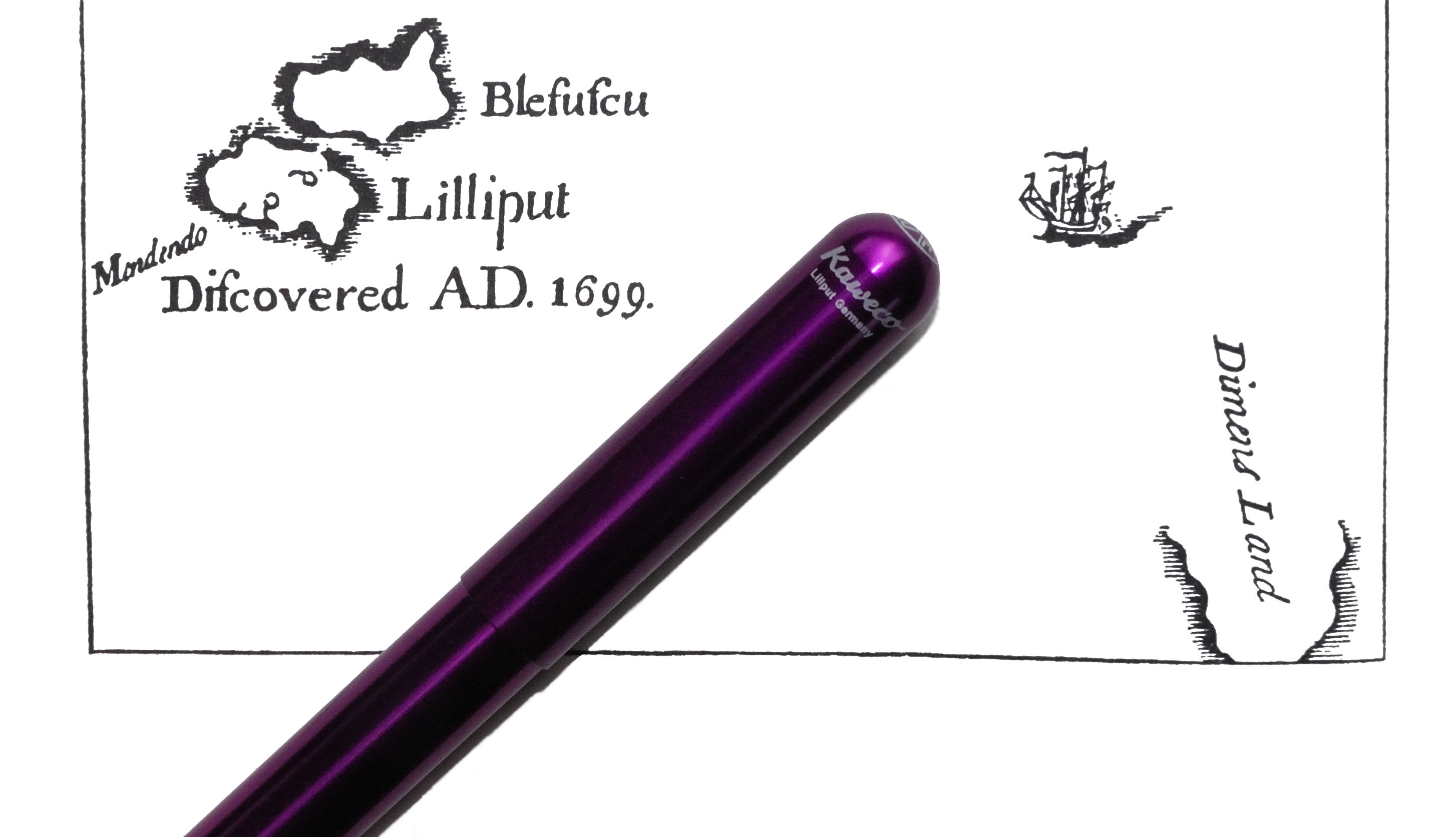
A little bit more history Jonathan Swift was a rapier-sharp satirist in his time (see ‘A Modest Proposal‘ for his critique of the way some governments behave towards the poor), but his best-known work these days is a rather subtler satire on tribal folly, Gulliver’s Travels.  Lemuel Gulliver’s first port of call, of course, is Lilliput, where the people are astonishingly diminutive – around six inches in height, typically.  If the fountain pen had been available at this point, a good century and a half before its invention, the proportionate writing implement for a true Lilliputian would have been about 1cm in length.  In setting out to make an exceptionally minuscule fountain pen it is greatly to the relief of all diligent scribes that Messrs Koch, Weber and Company of Nuremberg, late of Heidelberg, aspired to virtues beyond mere portability…
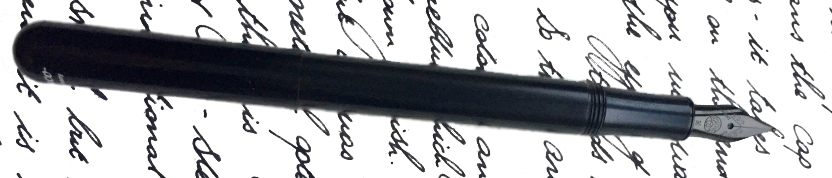
How it looks  Oh alright, it’s still tiny – just not quite as tiny as that! This simple metal tube (well, simple in most versions, at least) is the smallest serious fountain pen currently in production.  It looks small and, at least in basic black, inconspicuous.  Unscrew the cap, screw it onto the back to extend to the pen’s full length, and it looks a bit more like the pen concept we’re all familiar with.  Then different finishes separate the subtle from the unsubtle; the plain black aluminium gives way to flashy pink and purple versions, encounters with flame-throwers turn the stainless steel version into ‘fireblue’, and the rippled finish of the ‘brass wave’ turns a basic pipe into something which looks like it just fell out of a grandfather clock.  There’s a lot of visual variety for such a small pen.  Oddly, a typographical error misses the third ‘L’ in Lilliput from the barrel imprint, but Swift’s own spelling was so haphazard that he probably wouldn’t mind too much.

How it feels  Did we mention this thing is small?  It really feels it!  For most of our reviewers, the Lilliput is ideal for a light, unobtrusive pocket pen which does a good job of taking quick notes. One of our reviewers found it too small to do anything much with, while another actually wrote an entire examination paper with one.  This is certainly a size and shape which divides opinion quite sharply.

How it fills  There is room for a small international cartridge in the barrel, and that’s all. Kaweco’s new small converter does fit into the section, but with little free space in the barrel the piston cannot be safely pulled far enough to get more than about 0.1ml drawn up, so that’s unlikely to be helpful. Thankfully, a wide range of decent tints are available in cartridge form these days, including all ten of Kaweco’s own inks, and refilling an empty cartridge from a bottle with a syringe is fairly straightforward.

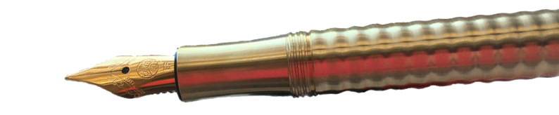
Crucially, how it writes…   As ever, that depends upon the nib you choose.  The Lilliput uses the same nib as most other small-ish Kaweco fountain pens including the Sport, Student, Special and Dia, and the whole nib, feed and collar assembly is a simple screw-fit so you can swap and change to your heart’s content.  The standard steel units are usually pretty good, and if the quality consistency is perhaps not quite as stellar as that achieved by Diplomat and Faber-Castell, the enthusiastic and friendly customer service more than makes up for it; no Kaweco pen owner is left for long without a pen they can use, in our experience. The gold-coloured nibs work similarly well, while the black-painted nibs tend to run a little drier but can be coaxed back into life by refilling with a very wet ink, such as KWZ.  If you really want to go crazy and spend more on a nib than you did on the pen, you can even fit one of the excellent gold nibs – and those are indeed not cheap, but Bock gold is very reliable.

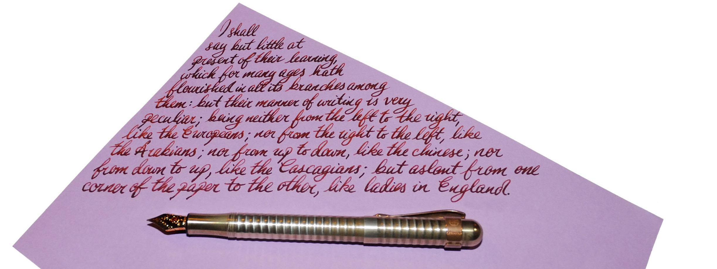
Pen! What is it good for?  For most people, this is a trusty little  stand-by pen to write quick notes with. True eccentrics will write reams with the thing, but it’s a free world and we love the variety!

VFM  This depends upon the finish you go for, and how far it fits your writing style.  The brass wave and ‘fireblue’ versions do take considerable expertise and time to make, and are priced quite reasonably for what they are – but perhaps only represent good value if you are actually going to use them.  The more basic aluminium  versions are incontestably good value as robust but real pocket fountain pens.

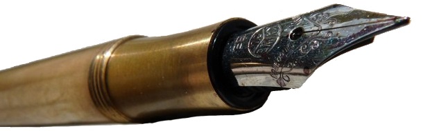
If this isn’t quite your cup of tea, but almost…   Buy a bigger pen.  Seriously, there is very little of comparable size and quality in the current market. There are some tiny vintage pens, which you may find if you’re lucky, and some other cheap and rather less durable pocket pens from a few other manufacturers are still around, but if you want an ultra-small pocket fountain pen which will last the distance this is probably the best option.  If you like the minimalist shape of the Lilliput and just want it scaled-up for comfort in the hand, however, you might consider its larger sibling, the Brobdingnag*.

Our overall recommendation  If you have a need for a pocket pen and are determined to avoid the wretched Ballpoints of Blefuscu, Lilliput is the destination for you.  One contributor to this meta-review’s team is returning their sample as too small for their needs, but probably a good half of our bloggers have a Lilliput tucked into a pocket somewhere.  Pick up a friend’s before you buy, test-drive one at a shop, or purchase one from a dealer you can trust to take it back if it’s just too, errm, Lilliputian for you.

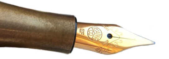
Where to get hold of one  Any number of fountain pen specialist sellers – in fact, nearly all of them – carry the Lilliput. However, the purple, pink and champagne versions are only available from Mostwanted Pens.

This meta-review references:

Thanks to  Kaweco for helping with access to several of the Lilliputs we reviewed – some of which we couldn’t let go of.

*The Brobdingnag is now marketed as the Supra, the original Swiftian soubriquet having proved a little long even for this barrel. ‘Cracking pen, though.

Pocket Notebooks subscription box meta-review

A little bit of history  Pocket Notebooks, as covered in last week’s quick profile piece, specialise in, well, pocket notebooks.  These have been making quite a resurgence in recent years and there’s ample competition.  But which is going to work best with your juiciest fountain pen? Our team set out to investigate…

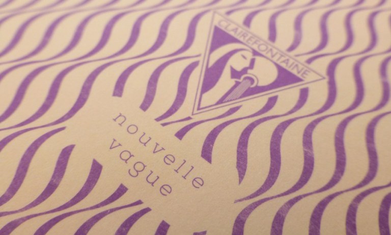
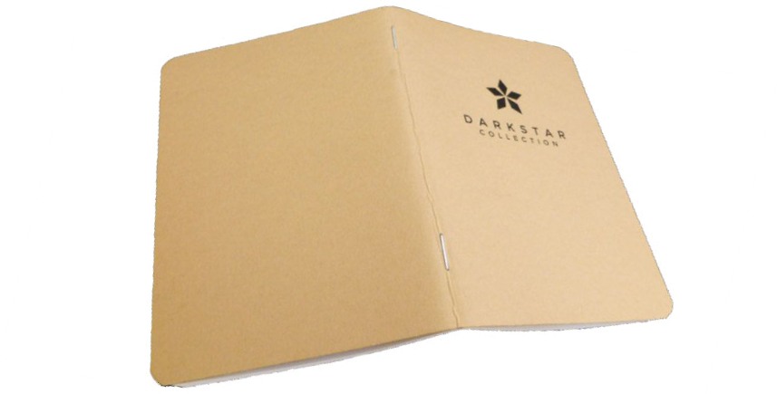
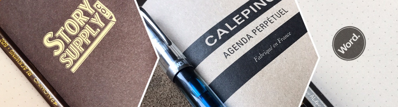
How they look  Apart from the slight variations in size, they do range from the wild to the very subtle in cover artwork. Clairefontaine have gone to town with retro geometry, while right at the other end of the scale Darkstar are understated to the point of nearly anonymous – but not quite! Of course this isn’t so important if you’re planning to put the notebook into a cover for added durability, but it does add to the visual experience of that ‘unboxing’ moment.

How they feel  Stuart was wise to send our reviewers smooth enough paper to handle the rigours of proper nibs, and most of the paper stocks felt pleasant to write on – but this can be quite the opposite experience with the similarly-sized Field Notes, so beware.  Thanks to stitched spines, the Clairefontaine and Silvine offerings felt a bit more robust to use too. Due to an apparent lack of size standardisation (none seem to be quite proper A6) some feel distinctly smaller than others, particularly the Silvine pocket book. But they don’t feel cheap, despite their impressive affordability.

Crucially, how they work with a fountain pen…  On the whole, very well.  The overall winner looks like the Clairefontaine Retro Nova, with the Silvine coming a close second and honourable mentions going to the California notebook using Tomoe River paper and feisty upstart Darkstar. None can quite survive the Clumsy Penman’s atomic-standard Baystate Blue test, but no-one in their right mind uses that ink for everyday writing anyway.  The key point is that these are good enough to write on and let your thoughts wander, without having to resort to a wretched ballpoint (or ‘Biro of Beelzebub’ as it’s known amongst discriminating audiences).

John, our chief paper-pusher for this exercise, reports the following results from individual tests: 

California Journals  These come in two different styles, the Tomoe River paper version and the ‘Backpocket Journal’.  Mateusz, Gillian and John received these to have a look through, and our conclusions were very similar.  Tomoe River is Tomoe River, and there’s little more to be said about it; it’s excellent paper for writing on but does occasionally need a blotter to make sure you’re not smudging with the wetter inks.  On the other hand, the Backpocket Journal could occasionally be used as a blotter, such is the density and absorbency of the paper in question.
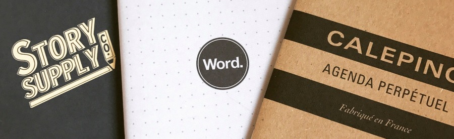
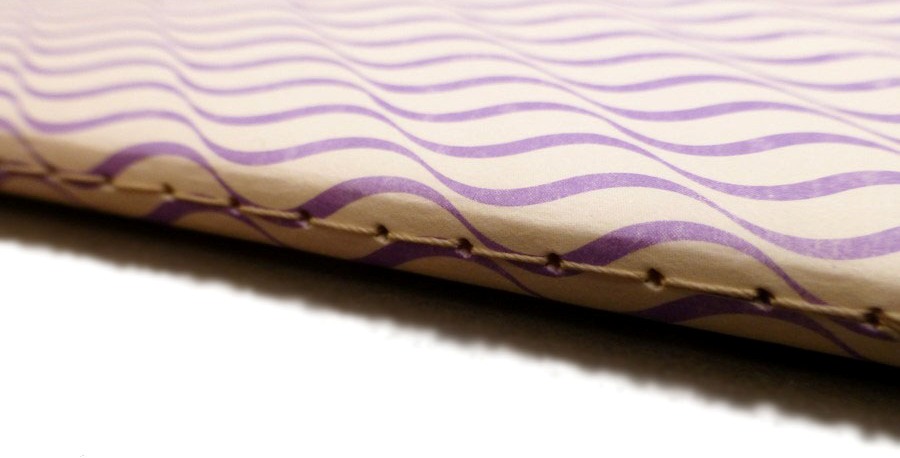
Story Supply notebook  An interesting one this, with the attention to detail that many notebooks just don’t concern themselves with, such as a section in the front for all your details, resilient paper, and a hard wearing cover.  Laura, Mateusz and John all received these to work with, and it has to be said that all were pleased with this Journal, so much so in Laura’s case that marriage may be on the cards… You saw it here first.So what’s so good about it?  It’s got fine lines, which is a must when you write small, but even in broader hands, proves to be a good choice for those who enjoy writing copiously.  It wouldn’t be so good for those who write with stub nibs or italics, but for everyone who uses it as an everyday note book, the lines (0.5 from 0.7 standard) were very popular.  It’s a thirsty notebook (by which we mean that if you leave your pen on it, it may take a drink…), but the paper is excellent quality and writes well, just so long as you remember to keep going rather than taking a break.

Clairefontaine 1951 Retro nova Notebook  Coming from a brand with the history of Clairefontaine, anything new has both the recommendation of past excellence to chivvy it along, but also the weight of ensuring that it passes muster in the face of the old guard.  Laura, Gillian, Mateusz and John all got this one, and while the new stylings were interesting, what you have here is another quality product from Clairefontaine, the paper is what we’ve come to expect, equally the binding and the cover.  It doesn’t distinguish itself from the other notebooks that Clairefontaine produce though, merely adding a spin on the style of an already classic notebook.

Inky fingers Journal  Something of an oddity when compared to the other Journals with its shiny cover, both Gillian and John received one of these and while it’s a reasonable book to write in, it didn’t fire the imagination in the way that the others had done, and the price was not conducive towards considering it essential. That said, it’s an interesting journal and the paper has the feel of being recycled without having the usual associated bleed through that goes with it.  Worth taking a look at, but it wasn’t our favourite of the bunch.

Dark Star Nomad Journal  Aside from having the most epic name of the journals we looked at, the Nomad also had good reactions from Gillian, Mateusz and John, although Mateusz was more circumspect about the quality of the paper.  At 100gsm, the paper is some of the thickest that we looked at in the journals, with all the attendant ease of writing that provides whilst not being absorbent like many thicker papers are.  John uses a Darkstar as an ink journal, so his own proclivities are well known on the matter, but Gillian had similar thoughts too.

Word, Calepino, Moleskine, and Whitelines.  Fewer of our team received these, so the simplest summary is to report that Moleskine was actually not as bad as feared, and refer readers to Laura’s excellent summary (see links below).  It has to be said though, she still wants to marry the Story Supply…

And that brings us to the Pale Horse of this particular meta-review…

Silvine Pocket notebook.  This little journal took many of us by surprise.  From the classic brand of Silvine, the pocket notebook was not only the smallest of the books offered us to take a look at, but also the one that for many of us left the strongest impression.

Gillian, Mateusz and John received one of these, and to be honest none had expected it to be anything all that special.  First contact soon put that assumption to the test.  The Silvine Pocket is a utilitarian notebook, every page perforated, sewn bindings (not just bound in, properly sewn), and a paper that resisted every type of feathering that we tried on it, then came back for more, all the while holding the colours perfectly.  The paper had a slight texture to it, and doesn’t quite compare to papers such as Tomoe (what does…?) when it comes to smoothness, but the textured feel encouraged writing upon it for all those who got it, and it emerged as a surprise success story for all three reviewers.

Pulp! What is it good for?  Well, as the retailer’s own slogan has it “forget the app; there’s a notebook for that”.  Twinned with a decent little fountain pen, these are great for a quick digital-free creative moment when you’re out and about. You probably wouldn’t want to write a whole novel in one, but for a bit of travel diary-writing they’re not bad either.  Plus, they signal your inherent taste and savoir-faire to any of other member of the stationery cognoscenti who you happen to encounter. Generally, a good pocket notebook is going to become a staple (even the stitched variety!).

VFM  Terrific; some of these are sold individually, others in packs of three, but you can certainly get a pocket notebook for pocket money.  The stand-out product from this meta-review, the ‘Retro Nova’, is available at Pocket Notebooks at a substantially lower price than that offered by most of our otherwise favoured stationery retailers.  The equivalent retail value of the subscription box, too, is often rather more than subscribers actually pay, and that’s not to be sneezed at.

If this isn’t quite your cup of tea, but almost…  Then you could do a lot worse than to try the subscription box concept – there’ll be new notebooks coming along on as regular a basis as you like, and one of them will probably suit your style.  Alternatively, if it’s just the size that’s the issue, there are rumours that A5 may be on the cards for similar treatment some time soon.

Our overall recommendation  If you’re a notebook floozy who flits from one paper stock to another with gay abandon, then a hand-selected box set like this can be a great way of working out which one to settle down with eventually.  For those more inclined to the stationery equivalent of the ‘silver ring thing’, read some detailed reviews of potential suitors (like Laura has provided) before taking the plunge.

Where to get hold of a box set like this  www.pocketnotebooks.co.uk

This meta-review references:

Thanks to  Stuart at Pocket Notebooks for getting a great selection of his wares out to our team!


Pocket Notebooks profile

They say you should never meet your heroes – but they’re talking through their hats. While last year’s London Stationery Show introduced us to Tony, the founder of Pocket Notebooks, this year was an opportunity to meet Stuart, who has just staged a friendly takeover.  We’ll be covering some of Pocket Notebooks’ pocket notebooks in more detail next week – but before then, here’s a little bit more about the company itself.

The whole shebang was started by IT people who needed a bit of a ‘digital detox’, hence the rather wonderful brand motto: “Forget the app – there’s a notebook for that”. It gradually grew an online following, selling analogue wares by digital means, and the usefulness of a nicely-crafted old-fashioned notebook in the pocket evidently still has quite a following – possibly even a growing one, as the mobile ‘phone becomes ubiquitous and writing with a proper pen (or pencil) becomes a way of quietly rebelling.  The format includes some real gems, like the retro-styled Clairefontaine below.

Stuart came to Pocket Notebooks in true Victor Kiam fashion; he was a happy customer, and liked the products so much that, when Tony felt it was time to move on to new projects, he bought the company.  Moving operations from the North East down to Hampshire has proved an opportunity to set up a proper stripped-back scaffold-rack hipster warehouse, with a vinyl record player and all retro conveniences – and with all those displacement activities now completed, the company is swinging into business.

Pocket Notebooks is now carrying an impressive range of handy A6 (or thereabouts) notebooks, most of them quite friendly to fountain pens, and our adventurous team of reviewers will be putting some of them to the test next week.  To manage all the demand, Stuart has also employed a capable warehouse manager to sniff out the goodies…

There is a novel twist, too – as well as every-day customer-led retail, Stuart’s developing a neat line in subscription boxes to keep the discriminating scribbler inspired and, occasionally, surprised.  Our very own Laura reviews one of the subscription boxes below, to give you a bit of flavour.

What this brief profile piece can’t really convey is quite what a personal relationship Stuart is building up with customers.  In our experience that’s something only a true fan of the products can provide – there’s just no faking it – and that’s part of what grabs us too. There’s more to come next week on how some of the current product selections fare in the hands of our keen scribblers and scrawlers, but until then, here’s the website itself.


KWZ inks meta-review

A little bit of history  As a still fairly new ink brand, KWZ has received a lot of attention in the last two years as it took the fountain pen world by storm. KWZ is operated by a lovely couple of professionally-trained chemists from Poland, Konrad Żurawski and his wife Agnieszka. That enigmatic name, KWZis simply Konrad’s initials. Konrad’s journey with ink manufacturing started as a hobby few years ago and quickly became his and his wife’s passion. Being a synthetic chemist specialising in polymers and organic chemistry, Konrad decided to experiment (which is not unusual for chemists) with formulae and reactions to create his own unique inks from scratch. Initially, he was mainly interested in making permanent iron gall (‘IG’) inks, which due to specific chemical reactions occurring over time have fascinating properties and behaviour, but he soon extended his laboratory’s range to ‘standard’ dye-based inks too. After many trials and tests Konrad came up with several inks which he and his wife decided to take to the Polish market first, then further afield. Agnieszka tells us that on the first outing to the Polish Pen Show, they were literally cutting-out KWZ Ink bottle labels while they were still on the train. During next few months KWZ inks started to get rave reviews on various fountain pen websites, blogs and social media channels, and with anticipation and demand growing quickly, the KWZ brand was formally registered in 2015. The range grew fast, even as Konrad and Agnieszka continued their scientific careers, and at the time of writing  they have created an impressive range of 62 unique colours including 41 standard dye-based inks and 21 iron gall inks.

How it looks and How it writes  Konrad is a fountain pen user as a well as a chemist, so understands how physical properties like surface tension, appropriate viscosity, flow, etc. are important for a satisfying writing experience. There is nothing worse than beautiful ink which is completely unusable, and when the flow or capillary action is limited one can struggle to write even on the best-quality paper. Konrad goes to great lengths in selecting, testing and applying ingredients and in this respect the KWZ brand has raised the bar for ink manufacturing more widely. 
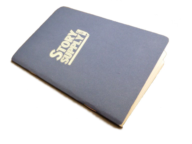
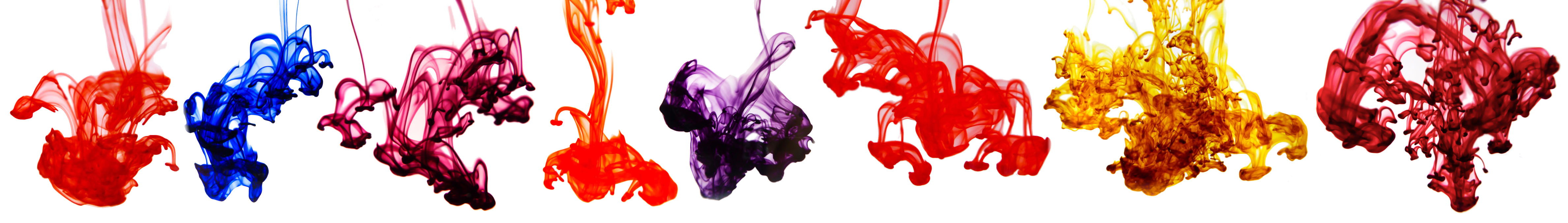
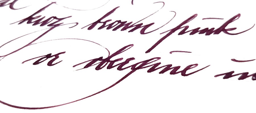
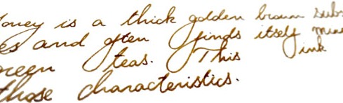
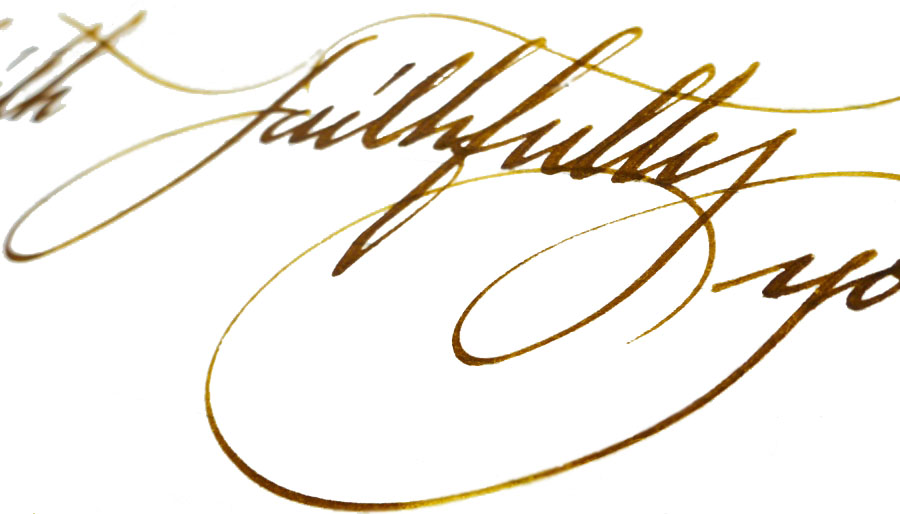
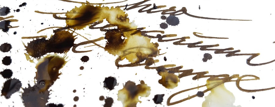
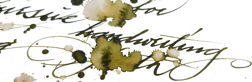
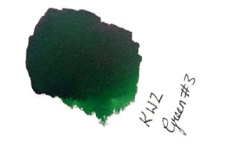
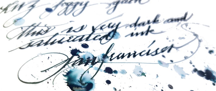
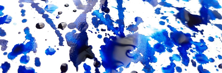
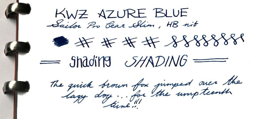
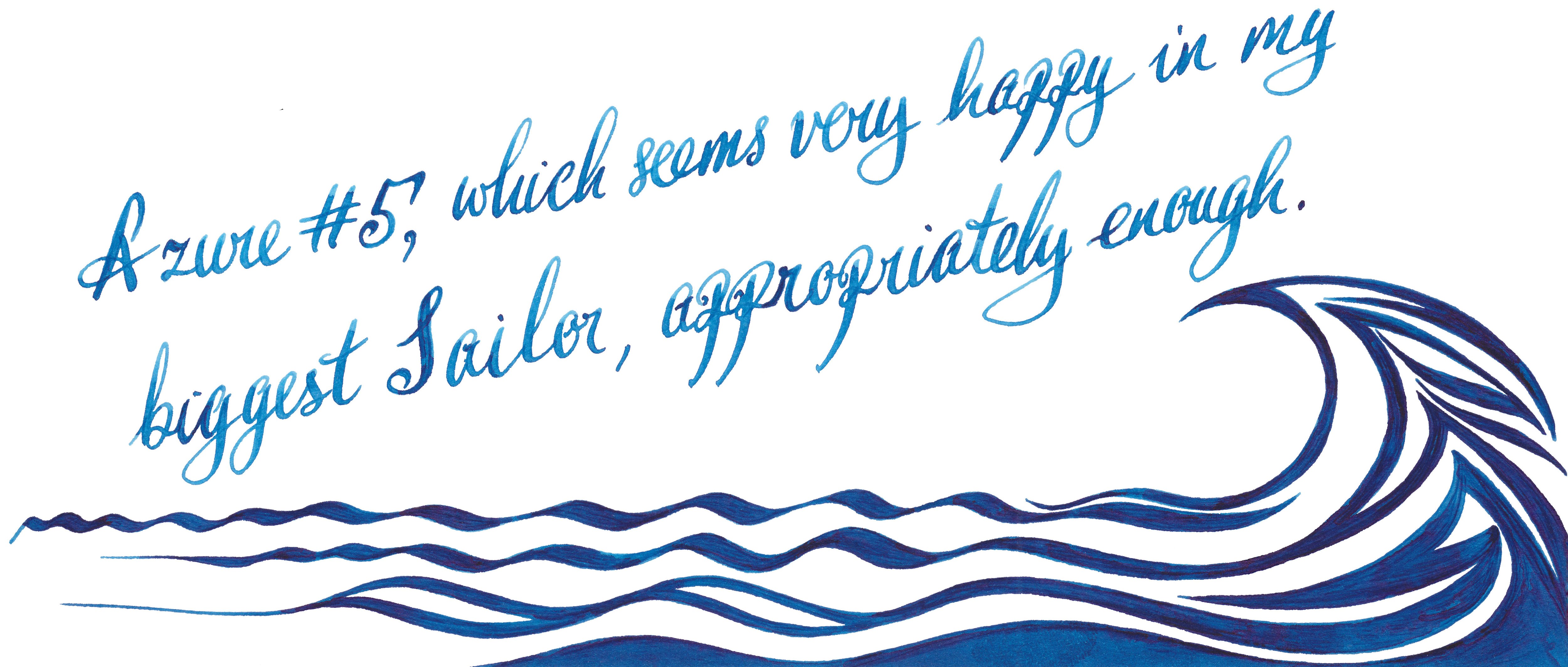
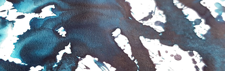
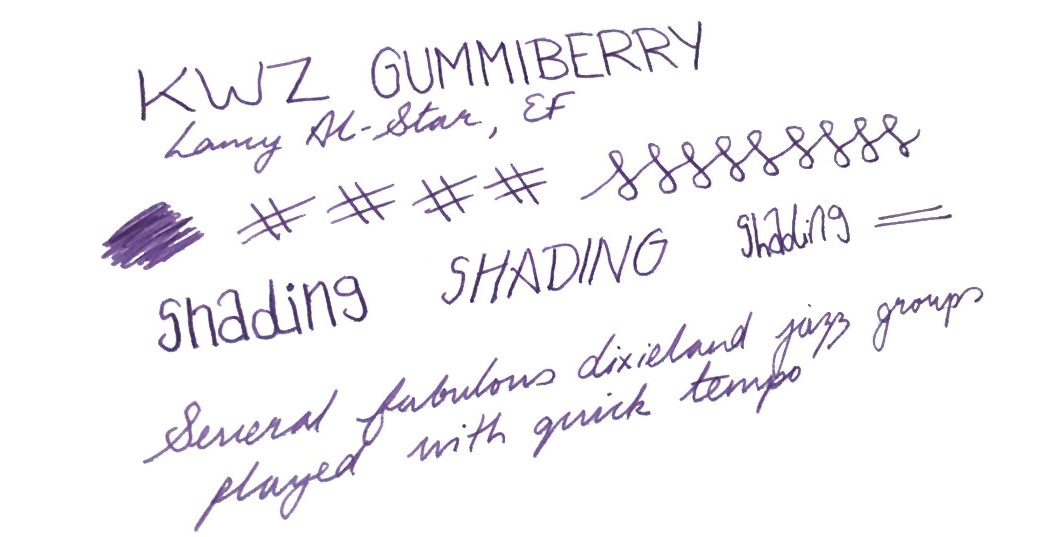
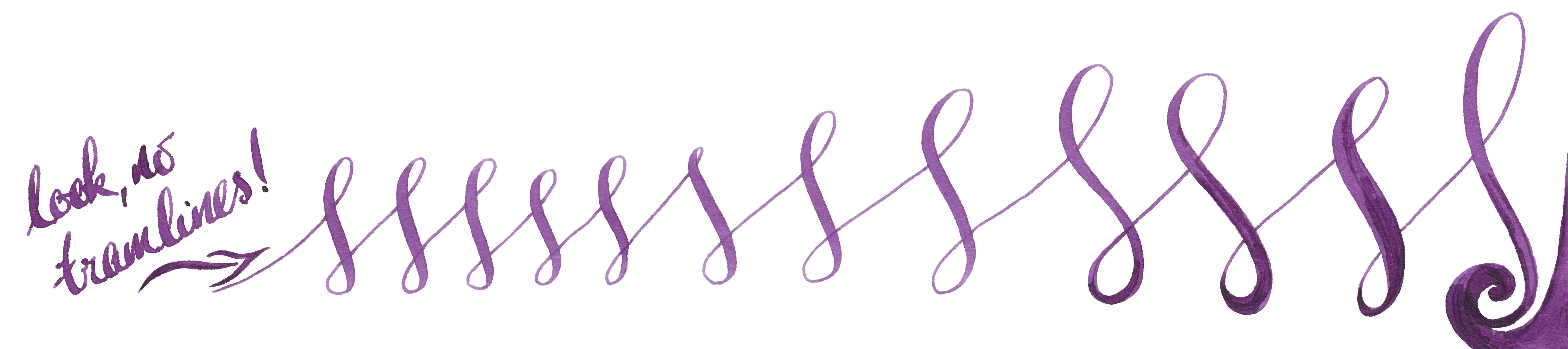
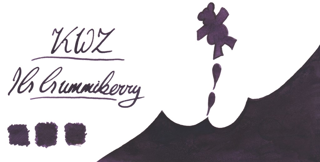
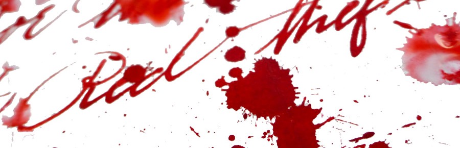
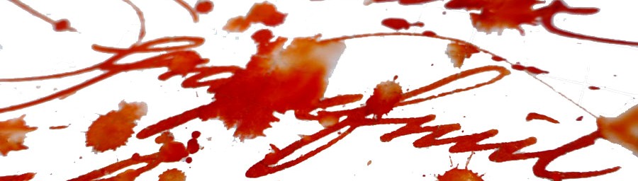
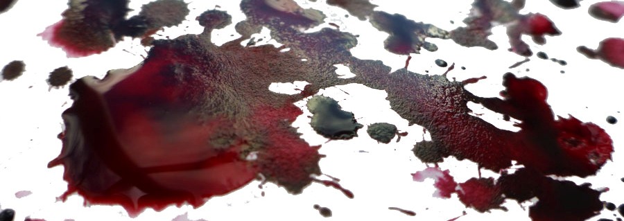
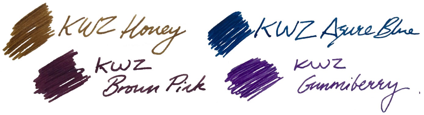
The United Inkdom reviewers all found that aside from the impressively broad colour palette the crucial difference for KWZ ink is its flow properties. Of course writing experience depends on many things like paper, pen, nib, how the feed keeps up with the ink and also one’s writing style itself. People who have very a light touch need ink which flows well to keep up, otherwise pen will skip – but interestingly, heavy-handed writers also require a ‘wet’ ink in order to produce thicker and uniform line. This is especially true for those who use semi-flexible or flexible nibs, which can tend to tramline/railroad if a dry ink is selected. In this respect we found that KWZ inks are some of the best available; the flow is excellent, and in even the most gushing of flex-nib feeds it can keep up.  We found the writing experience very pleasant with all types of pens all we tried the ink in, including those with particularly fine nibs as well as broad and flexible ones. On good-quality paper KWZ inks behave very well, tending not to feather and bleed through. This may not be the case with cheap absorbent alternatives such as photocopy/printer paper, but of course all fountain pen inks struggle on those surfaces. Because KWZ inks are highly saturated some ‘ghosting’ may occur especially on very thin paper, such as that made by Tomoe River. We found that many inks from KWZ we tested gave a decent amount gradual shading, but in some cases shading is very impressive, although in general KWZ inks do not exhibit a sheen. They are fairly wet inks, so drying time is not the strongest feature, but once they do dry completely there is not smudging.

Let’s have a look at some of the particular colours we tested. Obviously we have not tried all the inks KWZ offers, but we picked a few which are good representatives of this broad and diverse palette.

Brown Pink

This is one of the KWZ inks that Mateusz and Laura enjoyed the most. A beautiful combination of red-purple with hint of bright light blue makes this ink quite unique. If you like aubergine, plum or beetroot like colours, this KWZ ink will please you. When it dries on the paper it looks less vibrant and flattened, but with this subtle gradual shading Brown Pink is a ‘must have’ in any ink collection – and its popularity already reflects this.

Grey Plum

Compared to Brown Pink, Grey Plum is darker and more purple. The blend of purple,  dark grey and bright blue gives a very interesting and pleasing result. With wet juicy nibs it looks almost black.

Honey

Honey is probably one of the most popular KWZ inks and for a while it was not easy to obtain it, because it kept selling out. Honey is a warm looking golden-brown ink, which gained its popularity because of the lovely shading it produces. This is particularly pronounced on smooth, good-quality paper, where the greatest colour gradation happens.

Cappuccino

This is a warm-looking brown which also gives nice shading.

El Dorado

El Dorado is an another example of a great shading ink. The colour varies between darker yellow and orange, or a nice blend of caramel and honey, if you prefer.

Orange (IG)

This is very interesting ink. Out of the bottle it looks like a warm orange, but being an iron gall ink it undergoes drastic metamorphosis and quickly becomes a darker brown…pure magic.

Green Gold

If you like military, camouflage colours similar to Diamine Safari, than Green Gold may be for you.  This is a wonderful blend of earthy, almost olive green with yellow.

Menthol Green

This is a blue/green or green/blue ink which verges upon teal – mixed with a little absinthe, perhaps.

Green #3 and Foggy Green

Green#3 may be easily classified as a ‘standard’ green which according to Gillian give some nice shading too.

Foggy Green is rather difficult to describe; a murky, faded dark green with a significant amount of grey. It could be best to use this only in drier pens as it otherwise comes out very dark. This may be an interesting option for those who do not like flashy inks which stand out from the paper.

Azure #3

If you like deep cerulean blue/turquoise inks which remind one of blue lagoons, Azure#3 is absolutely a must. Ruth loves slightly darker brother Azure #4 too.

Azure #5

This is a gorgeous deep blue which offers some pretty shading. This may be a perfect day-to-day ink.  Both Laura and Scribble were delighted how this well-lubricated ink performs with picky Sailor pens.

Turquoise (standard and IG)

Love magic? Iron Gall Turquoise will help you to trick people. This fresh deep turquoise blue ink dries to a wonderfully dark teal.

before…
…and after

However, if you are not so adventurous then the beautiful standard turquoise is a safer option. Moreover, it has been proven that it is happy in flexible nibs, and

Gummiberry

Gummiberry juice gives the ability to bounce at unusual heights. Like the idea? Us too! This is wild and crazy name for such a pretty purple ink. Ruth definitely loves it – no surprises there. John loves it too. The big surprise is that Laura, who is generally is that not much into ‘girly’ colours enjoyed it too. It works very well with Scribble’s Pilot Custom 742 FA. John was also very pleased by flawless performance of his Sailor EF pen. 

There’s an iron gall version of this in development, too:

Thief’s Red and Flame Red

Many of us love red and red orange inks – the more disturbing the better!  Be careful if you decide to work in the office or anywhere public these two.  Thief’s Red is more red-towards-pink:

…while Flame Red is definitely red/orange:

Grapefruit

KWZ Grapefruit is a bold and vibrant orange with light touch of pink – we thought it a very appropriate name.

Maroon

Last but not least is the rich and saturated Maroon, which even gives a hint of sheen, uncommon among KWZ inks. This is a very pretty colour indeed.

How it smells  Well, in general KWZ inks have very a distinctive and recognisable scent which for some is reminiscent of vanilla, whereas for other it reminds them of thyme.  The smell will eventually disappear (at least form the paper).  The characteristic aroma of a KWZ ink comes from the antifungal/anti-mould agent which KWZ uses in the formulation. In contrast to the phenols used as a preservative by some manufacturers, the anti-fungal chemical used in KWZ inks is not toxic. This is great news, but not all of us have been enamoured of the pungent smell, especially during longer writing sessions. Despite some reported problems with staining TWSBI pens (especially the ECO model), it is generally relatively easy to clean pens from KWZ inks, but at the same time is also very difficult to eliminate the smell. Agnieszka and Konrad are certainly aware of this issue and they are continuously working on better, more satisfying formulation. We have been told that since September 2016 all KWZ inks have different component which gives rather sweet and less irritating ‘chemical’ scent compared to how it was before.

Our observation regarding the KWZ ‘perfume’ is in line what we have seen reported and discussed by other users elsewhere; responses are sharply divided between those actually quite like this this smell and those who can barely stand it all. It is worth mentioning that the KWZ inks we were testing came from both ‘old’ and ‘new’ batches respectively, so it is not surprising that our experiences are different. Interestingly, within our team of reviewers Ruth found this smell pleasant, whereas Laura and Gillian have completely opposite experiences, and while Scribble can handle it, his other half will only let him use it outdoors. Our assessment is that as soon as Konrad and Agnieszka standardise the new ‘neutral’ formula, KWZ will become a solid brand for the wider market – but until then, writers may be well-advised to try a sample before committing to a full bottle.

Regarding problems related to the TWSBI ECO line, where several issues with permanent staining were reported, we have been told that the KWZ team has investigated this and have already switched an ingredient which was unfortunately reacting with the polymer used in these pens.

Ink! What is it good for?  This really is a very subjective matter. Because the colour range KWZ offers is so broad, picking the right colour for your needs should not be too difficult. All those who likes classic colours for office/businesses will be satisfied as well as those who are adventurous enough to use more exotic colours.  Again, the only concern is that characteristic smell, which is not to everyone’s taste and may not be appreciated by all around you. Apart from that, this is ink fit for just about any every-day fountain pen purpose.

VFM  KWZ inks are not the cheapest.  In the UK you may get a 60ml bottle of KWZ Ink for around £12-13, depending which retailer you pick. This is almost double what you will spent on 80 ml bottle of standard Diamine ink, so it is not easy to justify on colour grounds alone, but for users of flex nibs or drier feeds the flow properties may make the investment worth it.

Our overall recommendation  Our reviewers all agreed that KWZ Inks are very interesting and even have potential to be market leaders in the future. KWZ inks are generally wet and well lubricating. All the inks we tested flow nicely and gave us a good writing experience, even with pens which normally tend to run dry – and that viscosity helps to maintain a fast flow which is particularly noticeable with more demanding flexible or semi-flexible nibs. Colours are saturated and many exhibit great shading (e.g. Honey). However, if you are sensitive to the rather powerful pong of the current KWZ ink formula, getting cheaper Diamine ink or investing slightly more for Robert Oster’s Signature inks may be a wise alternative.

Where to get hold of some  KWZ inks are not yet as widely available as some other popular brands. However, several specialist online retailers do stock them, and in the UK a wide selection of colours (including Iron Gall inks) is available exclusively from Pure Pens and Bureau Direct.

This meta-review references:

Thanks to  Pure Pens, Bureau Direct and KWZ Ink themselves for providing inks to several of our bloggers previously – and big thanks to Pure Pens for furnishing even more of us with samples specifically for this meta-review exercise.