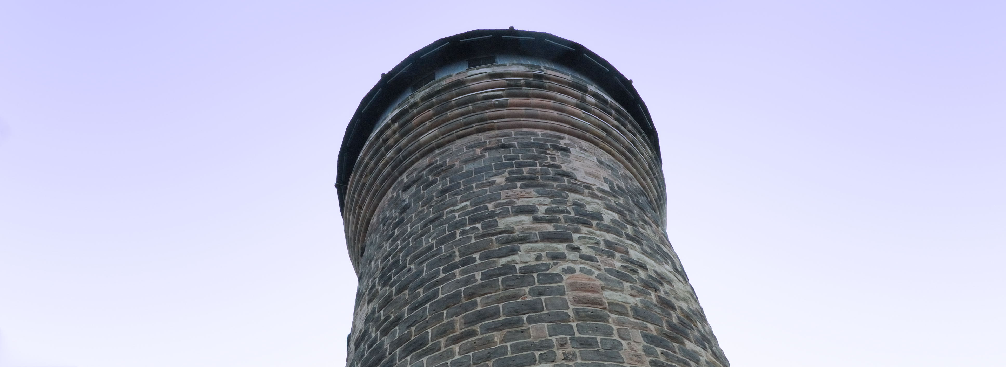
It’s traditional for our meta-reviews to start with a little bit of history, and it’s just as well that this isn’t one of those, as Nuremberg is quite incapable of delivering history in little bits; it provides it in great big monumental slabs. So, let’s get the architectural introductions over with; from the Sinwell Tower, a remarkable medieval survival, you can look at pre-war and post-war photographs of the city landscape then admire the rebuilding job in front of your very own eyes. The one area which nobody was in a much of a hurry to rebuild was the parade-ground used for those 1930s rallies, but thankfully some much more positive uses have been found for that space – and last weekend your dogged United Inkdom correspondent dropped-in on two of them.
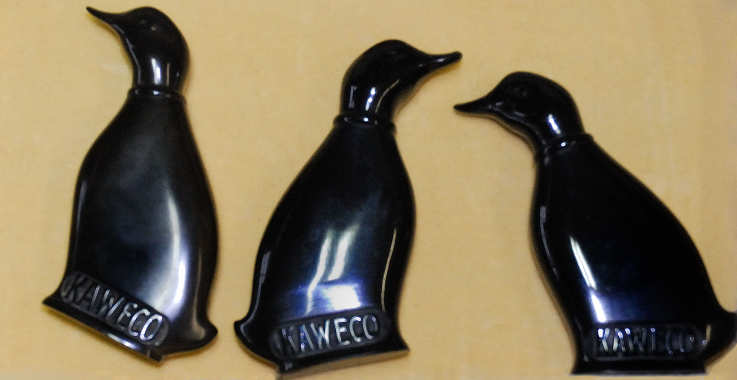
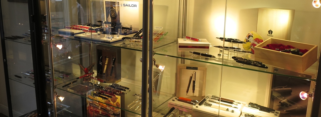
First up, of course, was a visit to Kaweco, who really have their ducks in a row – and we’re not just talking pocket ink flasks there. Michael Gutberlet, head honcho himself, gave a guided tour of facilities at Thomas Mann Strasse and Max Brod Strasse (all the roads are named after liberal German-language literary figures), and this could happily have occupied most fountain pen fans for a whole day. Seeing the assembly and dispatch operations was interesting in itself, but the highlight was inevitably Michael’s own collection of Kaweco antiques, some stretching as far back as the 1880s. The tray below, charting the morphology of the Sport model from 1911 onwards, is a good example of the ‘design DNA’ evolving over a century. The solid silver prototype of the Sport which may follow next was impressively heavy too!
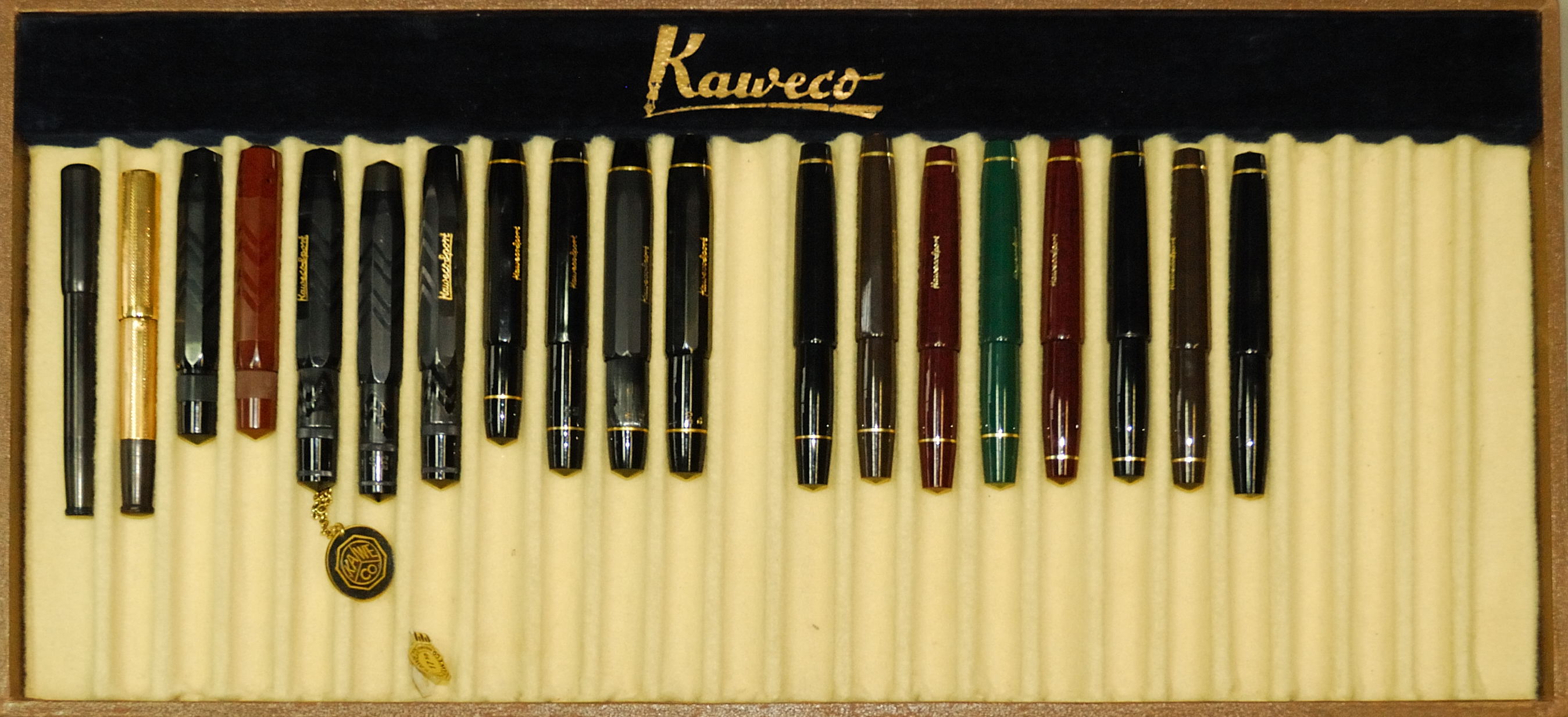
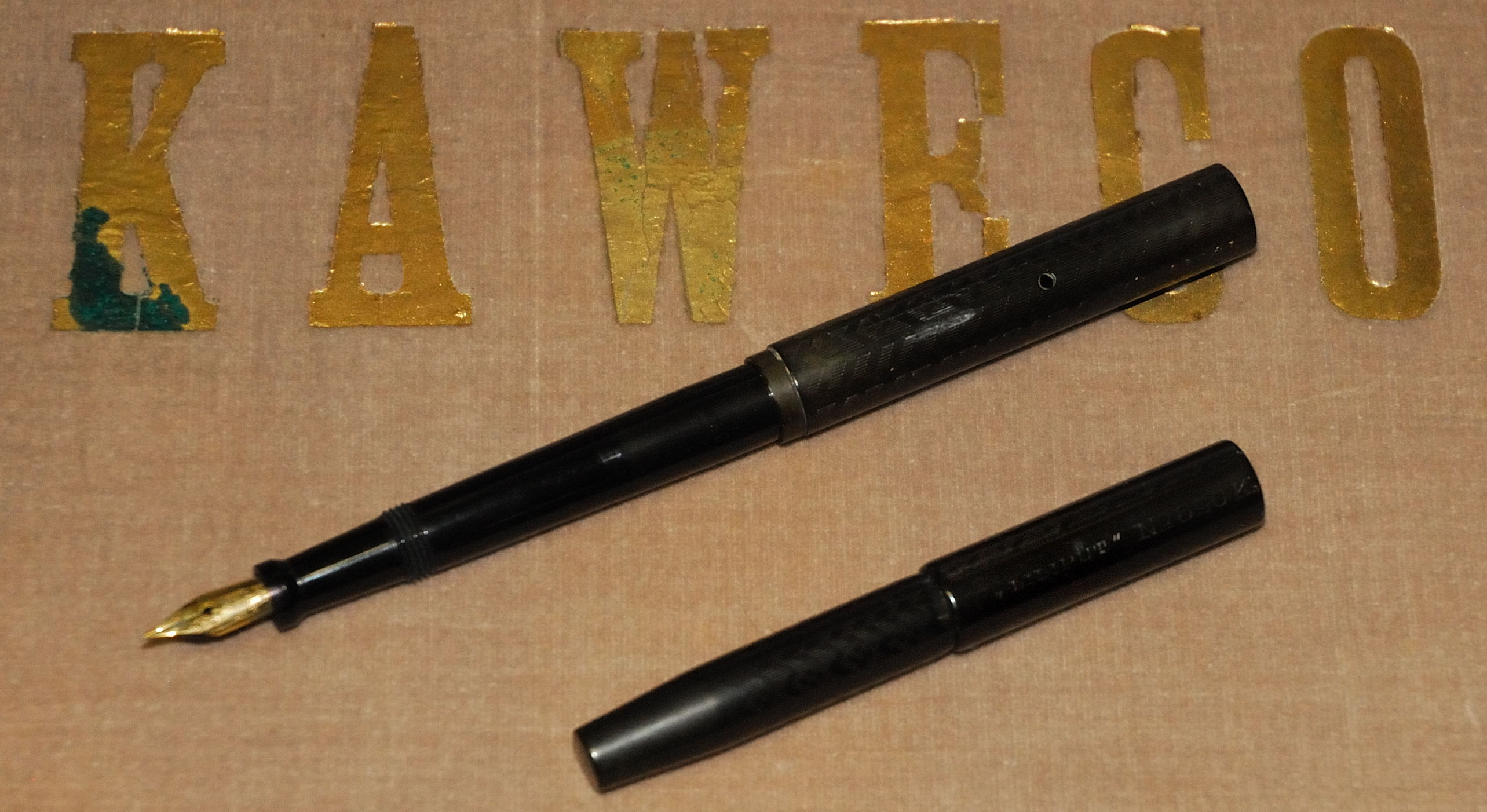
Raiding the pen archive also helped to solve another mystery which had plagued those of us more acquainted with English-language literature, viz why the Lilliput model is missing its second letter L. How the mistake happened is lost to history, but just visible on the original version of this model pictured below is the engraving which shows the spelling as LILIPUT – so retaining the error is at least staying true to tradition.
A short walk north through Hans Fallada Strasse (referring to an author who has only recently been translated into English – a tragic but riveting read) was the Exhibition Centre, our main destination. Also home to Spielwarenmesse, the annual Nuremberg toy fair, for the last few years it has hosted the marvellously-named Insights-X. This is a diverse stationery show rather than just a pen-focused event, but there was going to be plenty to see and, just as importantly, the organisers help to get a few bloggers there too.

Part of the blogger experience is a guided tour (with translator, if needed) of a number of stands for which exhibitors wanted a brief captive audience. For the German and Austrian calligraphers (and one British scribbler) present the relevance of wares varied, with slightly more which was aimed at the children-and-schools market than we quite knew what to do with. But let’s be honest, who can really object to being introduced to parrot knapsacks and flamingo pencils?
Some of the big names were there in force but with displays which left one wondering quite why they had bothered; Faber-Castell had a stand big enough to contain a working café but brought nothing from the ‘Graf’ range, and Pilot showed-up with the usual glut of VPs but no FA nibs (again). However, the guided tour included a chance to visit Online, the inconveniently-named but rather prolific German fountain pen makers. They distributed calligraphy sets to bloggers (there may be a special meta-review of those soon, if all goes according to plan) and even had another purple ink which will feature on a certain obsessive’s blog before too long…
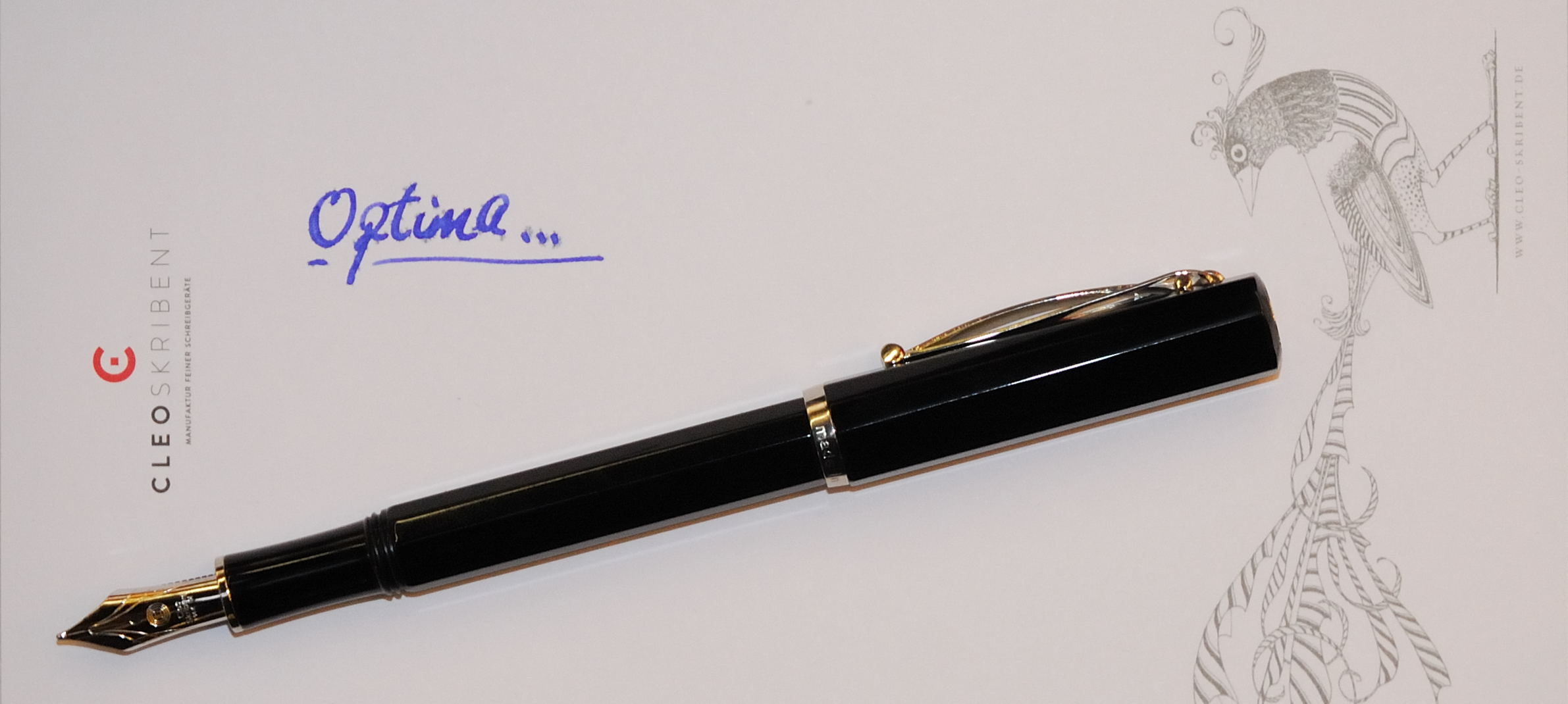
After the guided tour, there was just time to meet up with a few more firms who will interest United Inkdom readers. We made further introductions to the splendid Super 5, got in touch with Turkish pen company Scrikks for the first time (reviews to follow), and got a sneaky early view of Cleo Skribent’s forthcoming Optima model – which will replace its current ebonite piston-filler next year (we will try to cover that here too, if we can get our hands on a sample).
So, there are lots of pens and products which we’ll probably be reviewing over coming months, and you’ll be seeing plenty more blog items and articles flowing as a result of the trip. The other really good thing about this sort of experience, though, is meeting fellow enthusiasts – a real delight, even with a few language challenges to overcome. Stand by for laboured pun… Rather like Nuremberg’s castle, the pen blogging community evidently has a deep well of talent to draw from!
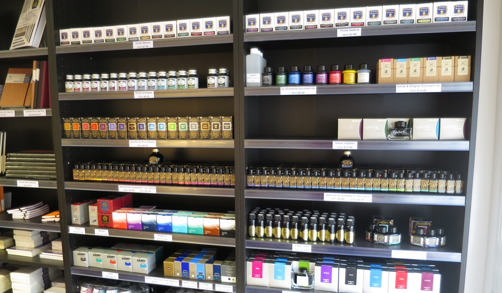
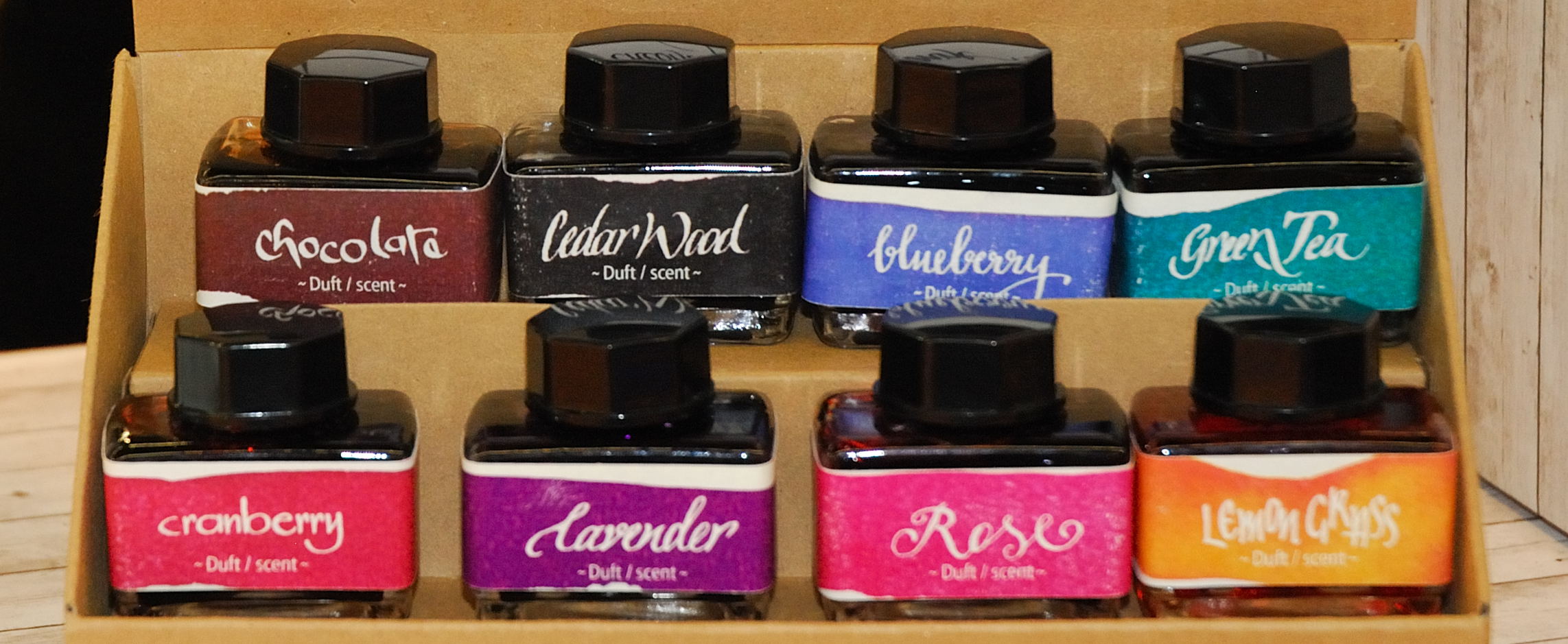
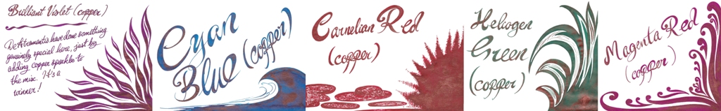
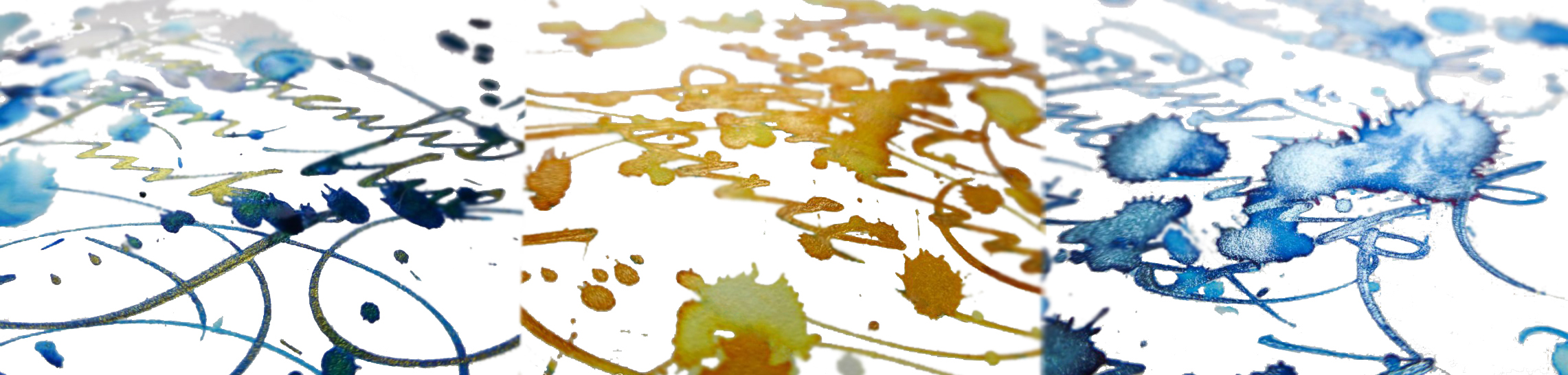
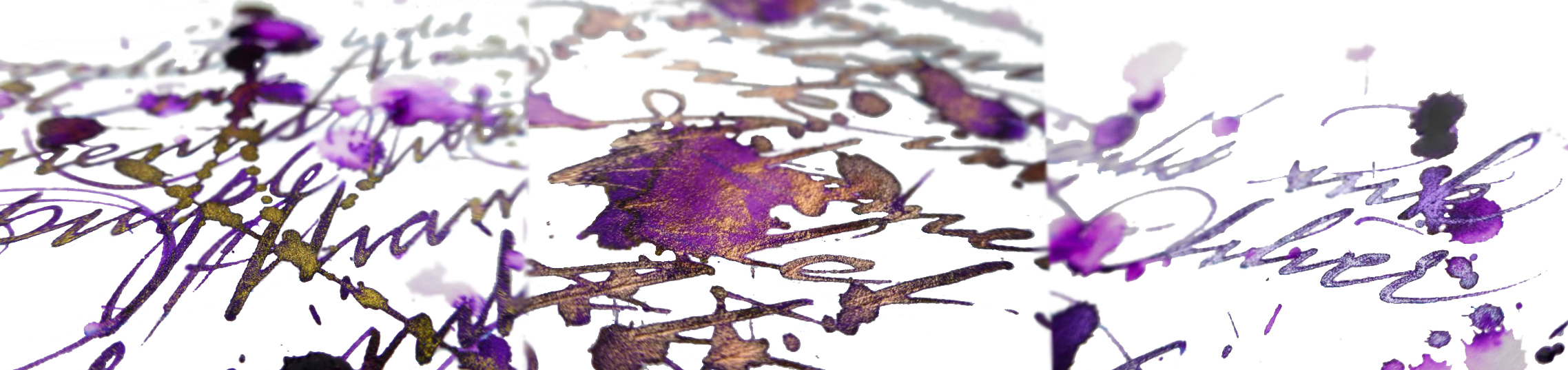 A little bit of history The ancient Romans did all sorts of rum things in barrels; polluting wine with lead to sweeten it, fermenting the pungent rotted-fish sauce garum, and brewing-up the hard-wearing ink atramentum. German ink-makers De Atramentis continue this tradition in their name and some of their production methods (albeit hopefully without the aroma of decomposing marine life), and recently they have got on the sparkly ink bandwagon. Everybody’s doing it these days, it seems – J.Herbin, Diamine and Robert Oster too. So we set out to find out what De Atramentis is bringing to the party…
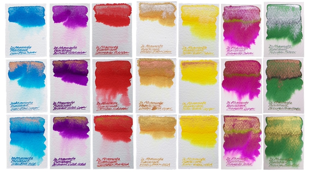 Crucially, how it writes… Much like standard fountain open ink, and De Atramentis certainly make plenty of that. There can be the occasional hold-up due to the high proportion of particulates (the sparkly bits), which eventually silt-up the feed and stem the flow, but this is easily rectified with a thorough clean. With this in mind it’s advisable to stick to fountain pens which can be completely dismantled for a quick scrub, but these inks are otherwise suitable for use with most of the nibbage you own.
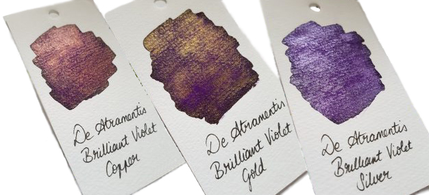
 Thanks to De Atramentis themselves for generously sending us a sparkling set of these inks for testing.