A little bit of history Notebook covers, also often referred to as traveller’s notebooks, have become first a fashion, then an enduring feature of the portable stationery scene. Start Bay notebooks started out as one man working from his home in, naturally enough, Start bay, a scenic cove in Devon, and people like the results so much that the range has grown since then. There is room for a bit of confusion, as Traveller’s Notebook is misspelt as a sub-brand by another manufacturer, while TN is used to denote a particular size of Start Bay notebook – but not the one we’re reviewing today. Just for clarity, this is the A5-size notebook cover, referred to by the makers as the Navigator.
How it looks In many ways this is a fairly simply constructed product, which looks similar to other notebook covers like the Paper Republic alternative we reviewed a few months ago. It’s a sheet of folded leather, with four elastic threads inside the spine to hold notebooks in and one closure band to keep the whole thing together. The range of ‘charms’ which Start Bay also sells are optional, but quite tasteful. Those of us who have had one in use for quite a while find the leather attracts a few minor marks, but they add character – and the cover also comes in a rather nice canvas back should any extra protection be required.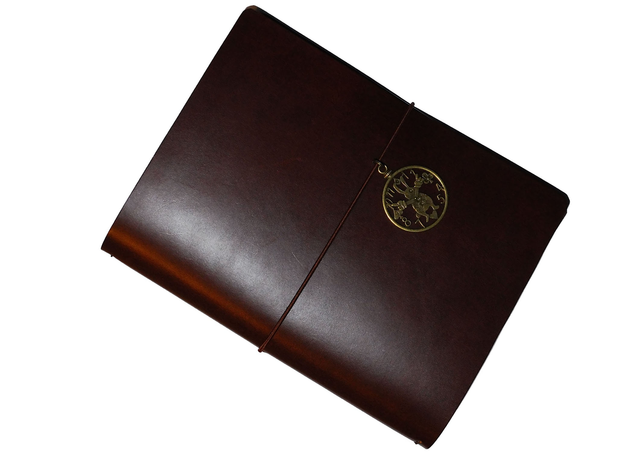 How it feels Supple but solid, essentially; this is a pleasant cover to use and a good platform to write on, while giving the impression that it will take quite a bit of use and abuse if you need it to. Exactly what one wants from such a product, really.
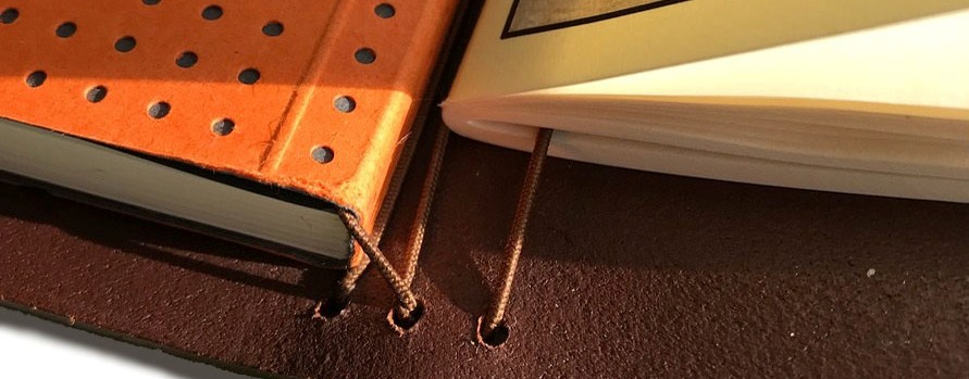
How it fills This is the detail which sets this product head and shoulders above its competitors. Unlike all the other ready-to-buy alternatives which claim to be A5, this one actually is; it’s big enough to accommodate up to four proper A5 notebooks without any of the edges poking out beyond the cover, meaning that your writing is always protected – and you’re not limited to proprietary paper sizes when the time comes to buy a refill. Several other manufacturers fail on this criterion.

Crucially, how it handles fountain pens… Naturally that depends upon what notebooks you choose to put in it! Start Bay sell FP-friendly Clairefontaine notebooks at extremely reasonable prices from their own website, and there’s a range of British alternatives available from Personalised Stationery, to name just one of many sources. You’re unlikely to have much difficulty finding something which both fits this, and which loves your favourite fountain pen.
Bay! What is it good for? Whatever you want to use it for, really. Having room for notebooks of different types means that it’s quite possible to accommodate a dot-grid to-do list book, a diary, a ruled journal and a plain sketch book, for instance. As the name Navigator suggests, it also travels well.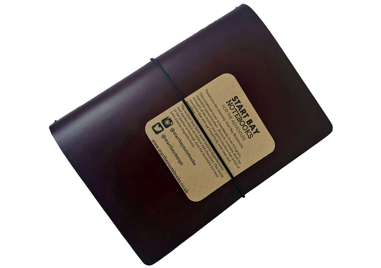
VFM Surprisingly competitive – this is a hand-made, well-thought-through product which you can get for less than £50. That’s pretty impressive, really.
If this isn’t quite your cup of tea, but almost… Start Bay offer a different ‘duo’ arrangement which allows for the fourth noteboook to be a top-hinged A5 pad (like the Rhodia n.16, for instance). They also have some limited-edition finishes, including some splendid-looking paisley patterns and, more recently, a special all-black edition. For those who can wait, a number of readers have pointed-out that there are several specialists who will custom-make a similar notebook cover to order – and we’ll try to review some of those next year.
Our overall recommendation We think this is a well-constructed, useful product which we would have very little hesitation in recommending.
Where to get hold of one Start Bay initially sold through a number of retailers, including many of our favourites, but the operation is increasingly focused on direct sales. Given the high standard of customer support we’ve observed, we think that’s probably a good thing – so if you want one, head straight to Start Bay itself.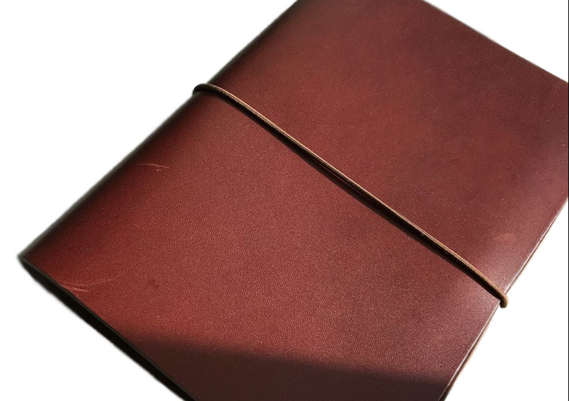
This meta-review references:
- Scribble Monboddo’s hand-written review
- Ian Hedley’s text-and-photos review
- Ruth Hanson’s video review
- Gillian Jack’s text-and-photos review
Thanks to Peter at Start Bay for lending us an A5 notebook cover for this review. Gillian will be hanging on to to it for a little while longer to assess how it fares during longer-term use.
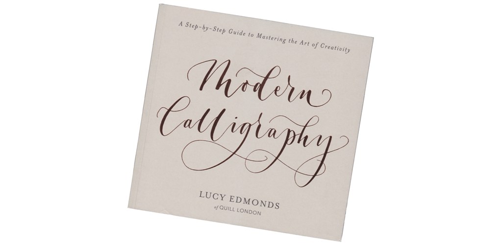 The author is owner of
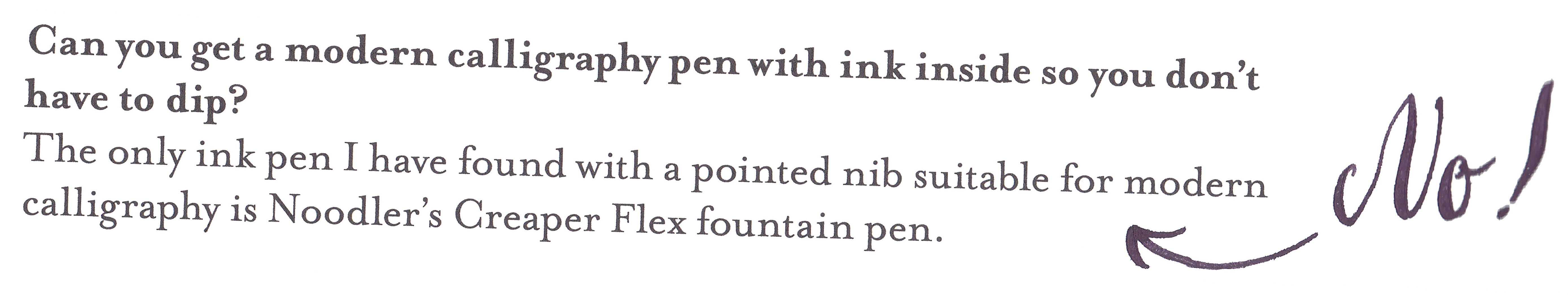
  Lucy refers to letter-forming, not writing, and that’s a useful indicator to the type of art-form expounded here, which perhaps owes as much to sign-writing as traditional pen calligraphy. The advantage of this is that the approach recommended offers lots of scope for variety, from reminding readers that brush pens are a legitimate tool, to actively encouraging us to ‘fake it’ when large features such as drop-capitals are required and a two-inch ginormoflex nib isn’t readily to hand. The disadvantage is that the book’s main dependence upon dip pens overlooks the range of flex nibs available in modern fountain pens – indeed, the text gets this factually wrong by suggesting that the only flex FP is the disposable ‘Nib Creaper’, but this is the only complete howler and we can hopefully help if there’s a reprint.
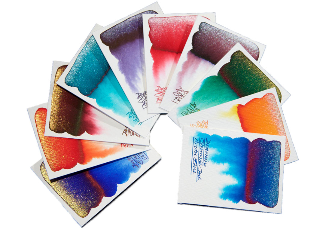
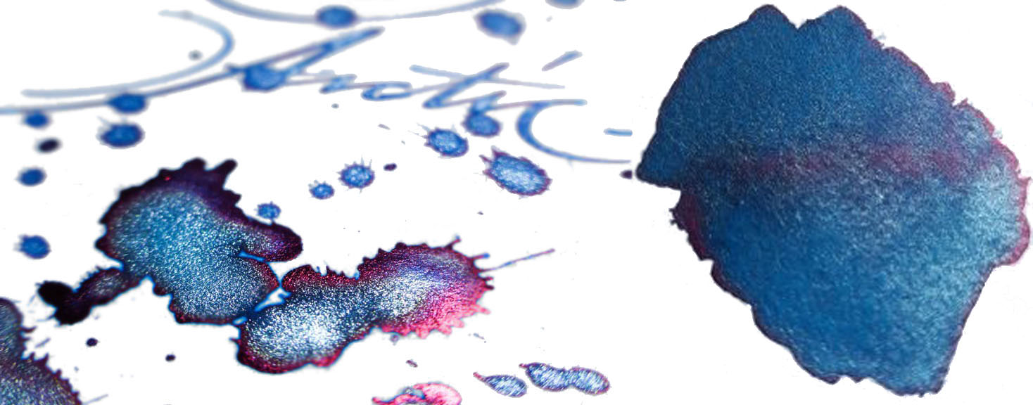
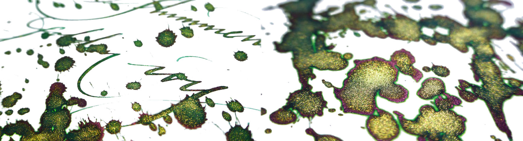
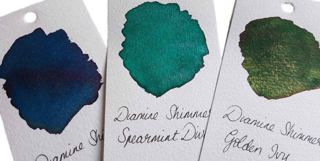
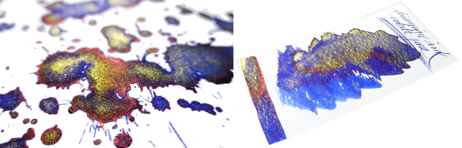
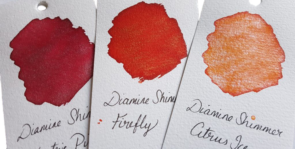
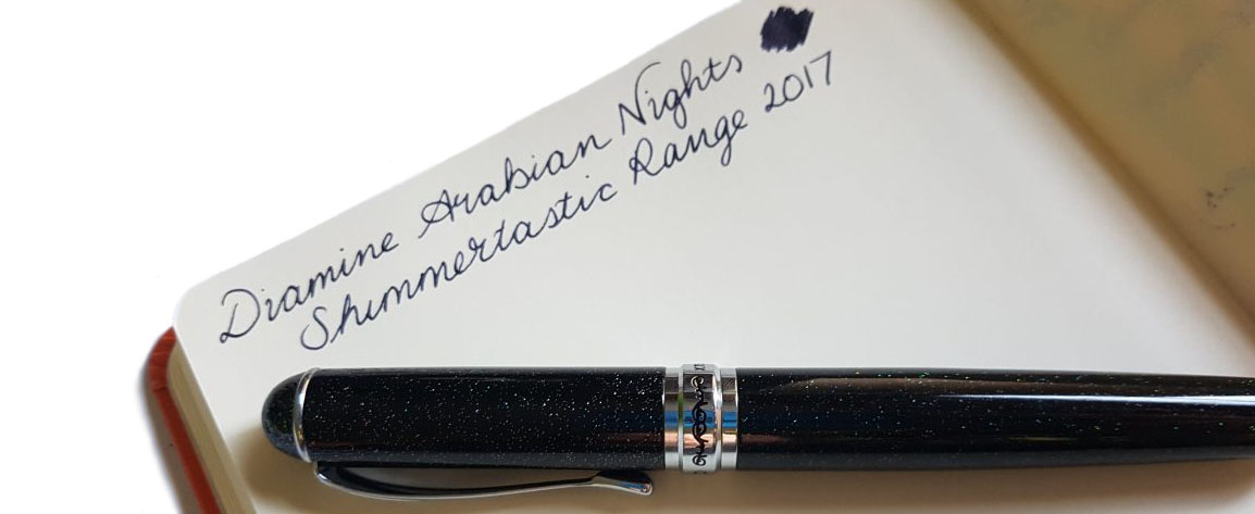
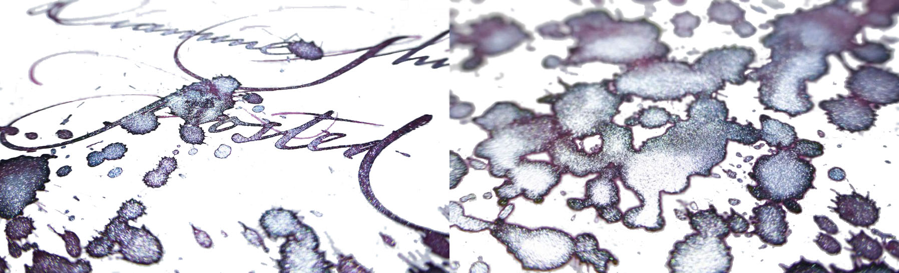
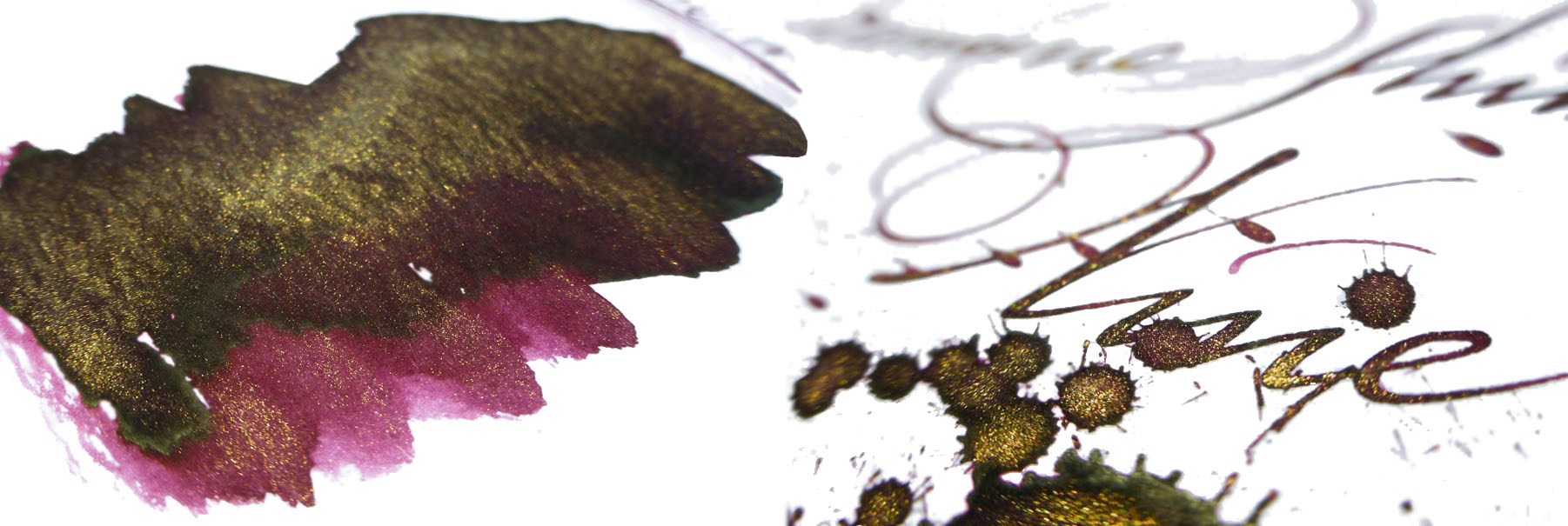
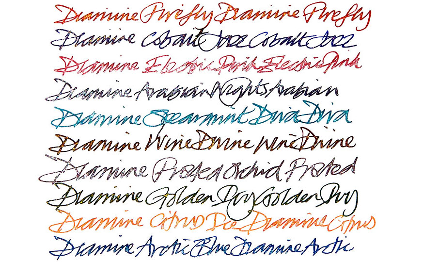
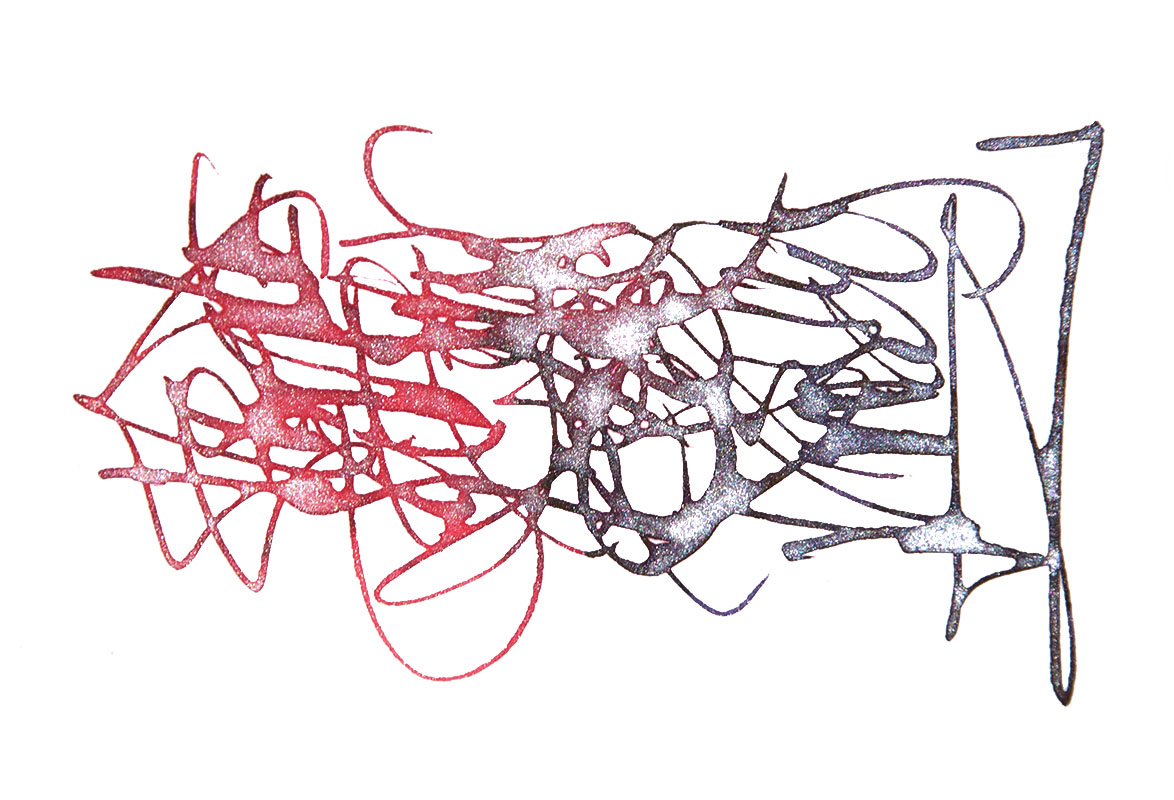
 A little bit of history Diamine were the first manufacturer to produce a range of affordable shimmering inks following J. Herbin’s innovation of introducing tiny sparkling particles to their inks. They launched with a range of 10 different colours, added another 12 later (reviewed
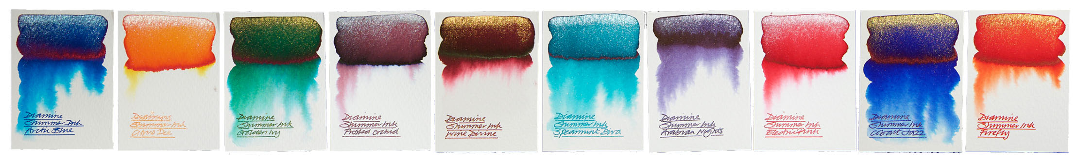


 If this isn’t quite your cup of tea, but almost… J. Herbin make a variety of premium shimmering inks.
 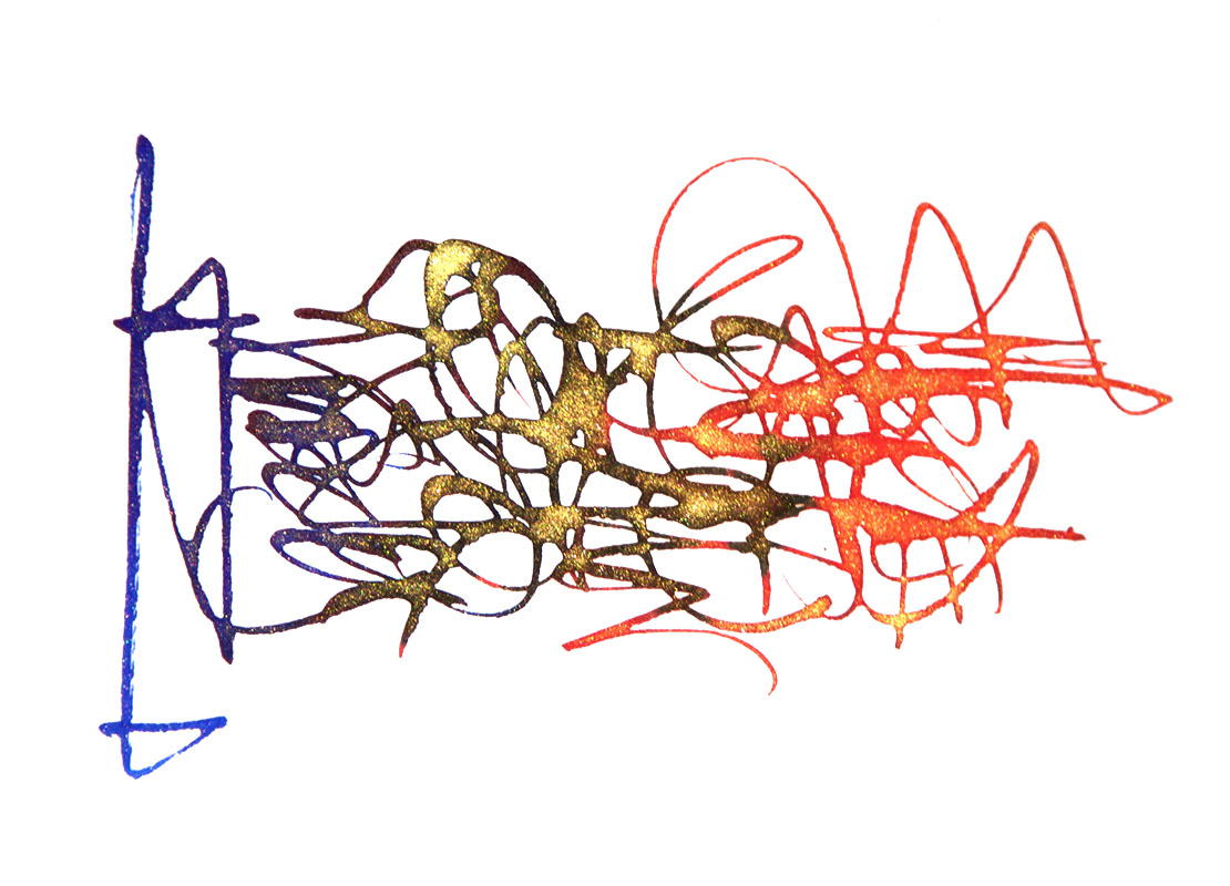 Where to get hold of some The