Here in the United Inkdom, us poms and near neighbours are sometimes lucky enough to receive some bonzer gear to play with – sometimes pens, sometimes paper, and sometimes… sometimes ink!
And here’s the thing about that; a pen will convey the message, the paper will carry the message, but it’s the ink that brings the message to life. So when we get inks to play with, all of us tend to get a bit over-excited.
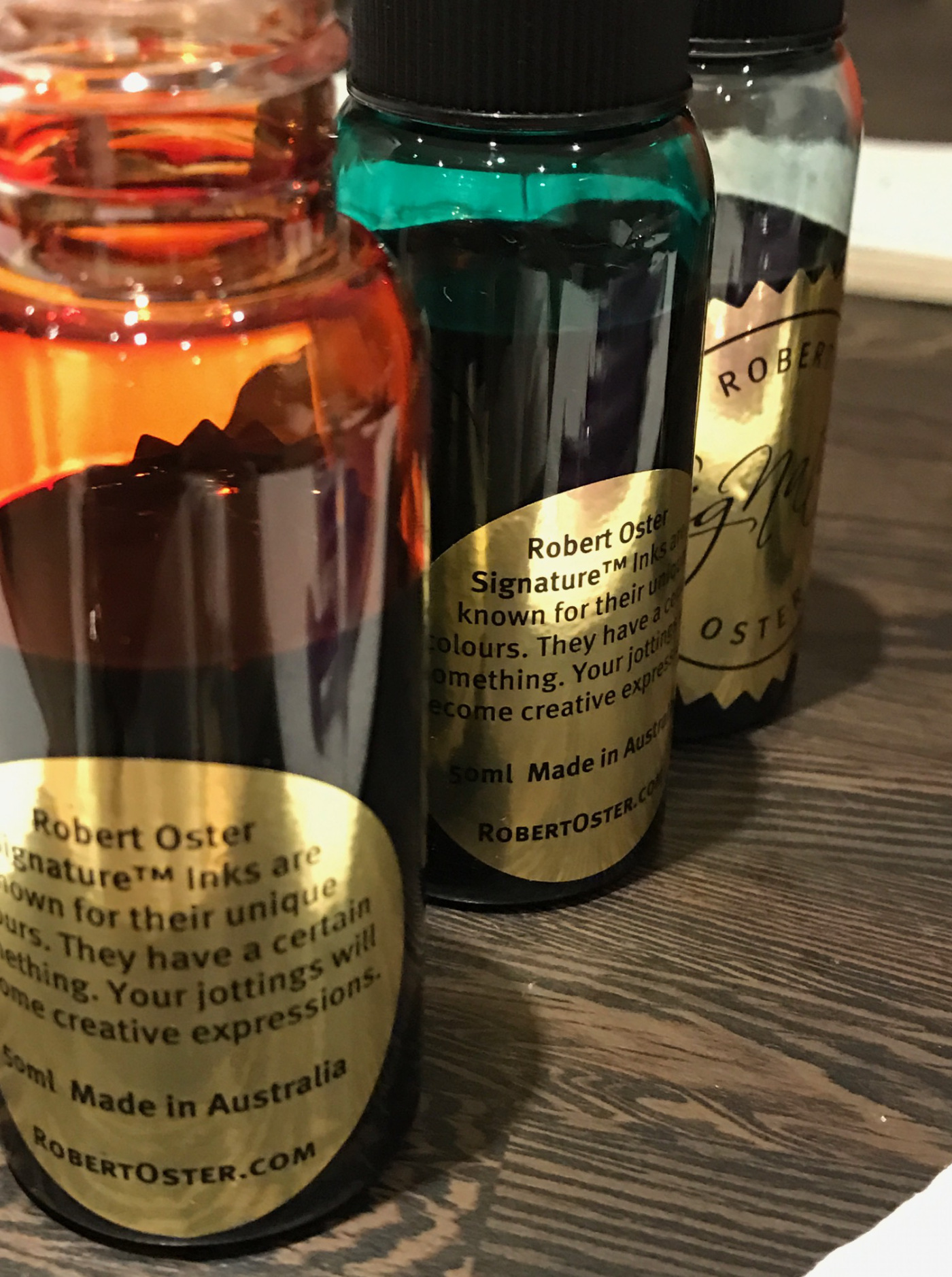
Robert Oster Signature inks are fairly new to Blighty, but an Australian brand that’s quickly developing a strong following over here, and it’s easy to see why.
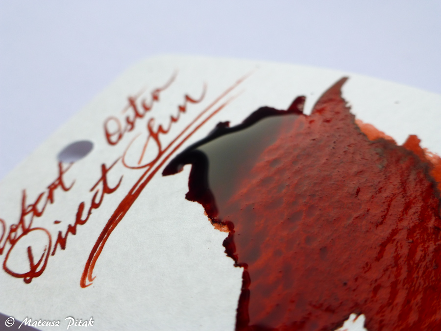
They’re not the fastest drying of inks, averaging between ten and fifteen seconds for full dryness on good paper. As you might expect from an ink that wet the flow on them is superb, coverage on the page is complete, there’s no stutter, even from very fine nibs, but when you have an ink as rich and fulsome as these, you want something a little thicker to enjoy the tones upon the paper.
It’s also rare that all of us agree on the nature and quality of an ink – we’re an eclectic bunch with a wide variety of tastes – but universally, these colours have us inspired. The inks have interesting names which give a nod to the inspiration of the creator, and as you’ll see in the many individual reviews linked below, they don’t disappoint.
But as a little teaser…
Direct Sun
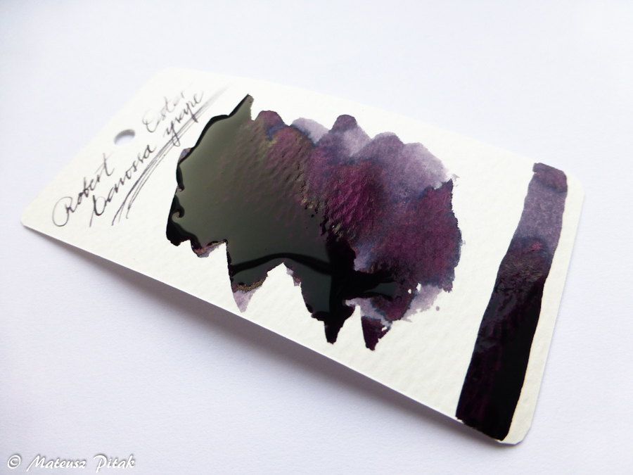
Barossa Grape
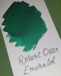
Emerald
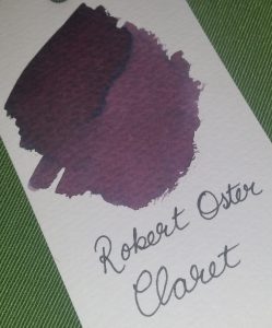
Claret
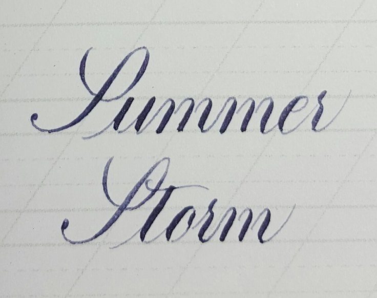
Summer Storm
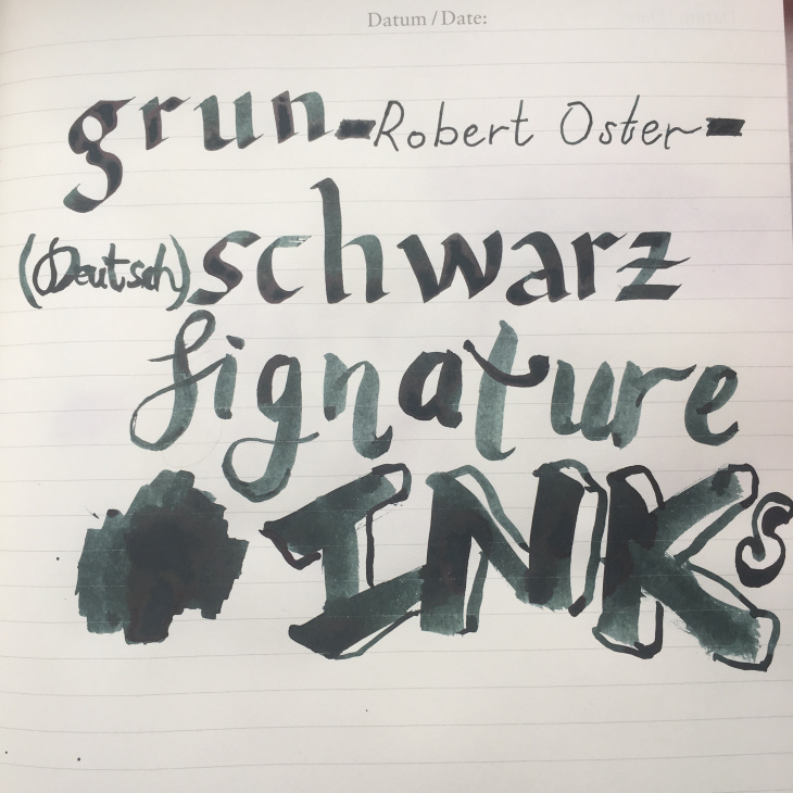
Grün Schwarz
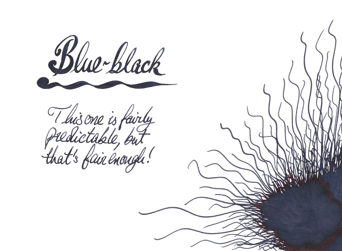
Blue-black
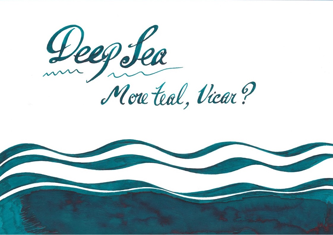
Deep Sea
Blue Sea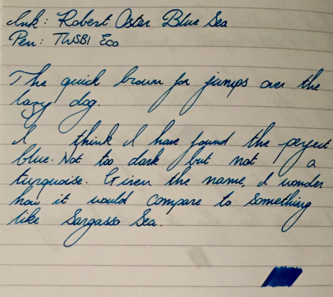
The full range isn’t available in the UK yet, but it will be soon, and we’re both anticipating that (because these really are to die for), and dreading it (because we all have to eat sometime…) in equal measure. They’re not the cheapest of inks, retailing at £14.50 for a single bottle, but with the viscosity of the ink in question, that bottle will last some time. They can be found at iZods, who kindly donated some samples for this review exercise (thanks again Roy), and we gather other suppliers are also coming on-stream as we speak.
So without further ado, we present the combined reviews of United Inkdom for the Robert Oster Signature inks…
Gillian Jack’s review of Claret and Emerald
Daniel Oakey’s maritime meanderings in Blue Sea and Deep Sea
Sarah Goodall’s test of Emerald and Summer Storm
James Lake’s bathe in Direct Sun with a dash of Grün-Schwarz
Scribble’s bejiggering with the whole flamin’ lot
The Clumsy Penman’s barby in Direct Sun with a tinny of Barossa Grape
The Pen and Inkwell’s billabongful of Summer Storm, Blue Black, Blue Denim, Bondi Blue, Fire & Ice, Blue Sea and Deep Sea too.