 A little bit of history Cleo Skribent is the company which kept fountain pen manufacturing going behind the iron curtain, and now make affordable daily drivers like the capable Classic which we tested last year. Their most enthusiastic retailers in the UK, the aptly named Write Here, were determined to persuade us to try one of their more exotic offerings. Well, we didn’t take THAT much persuading…
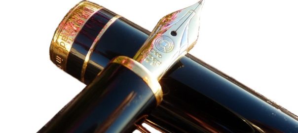
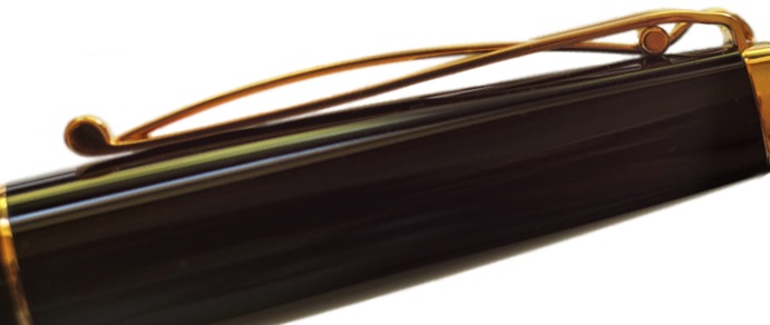
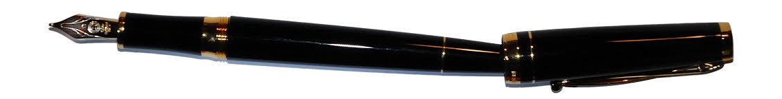
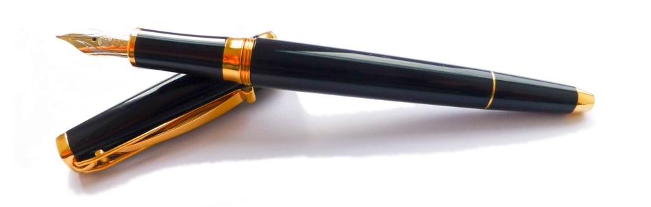
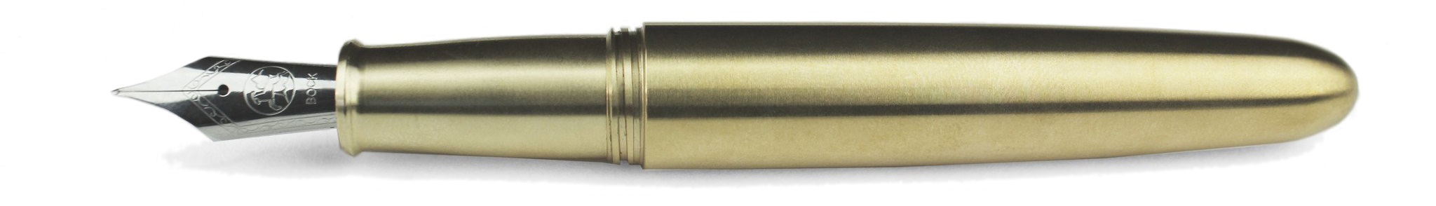
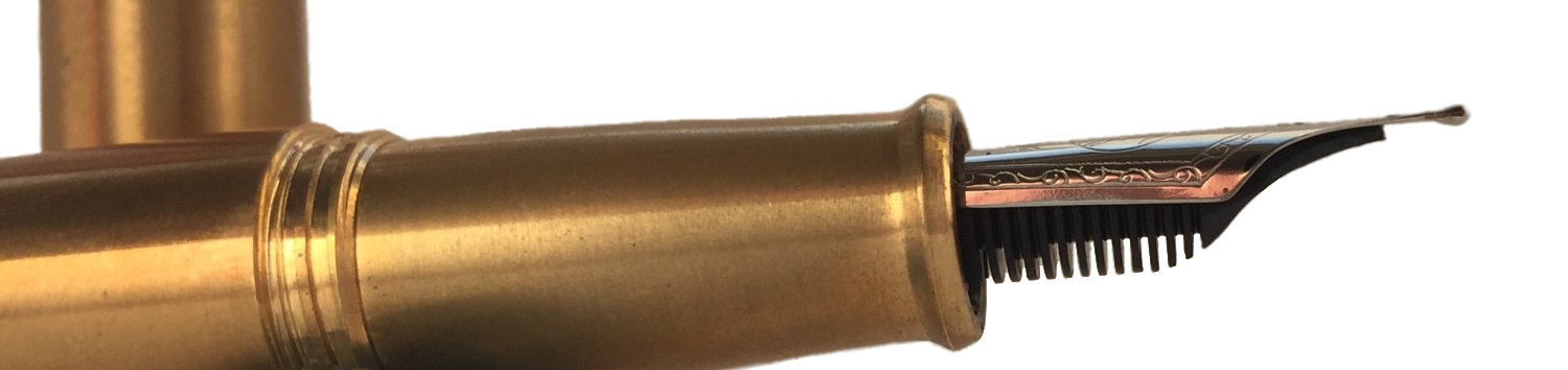
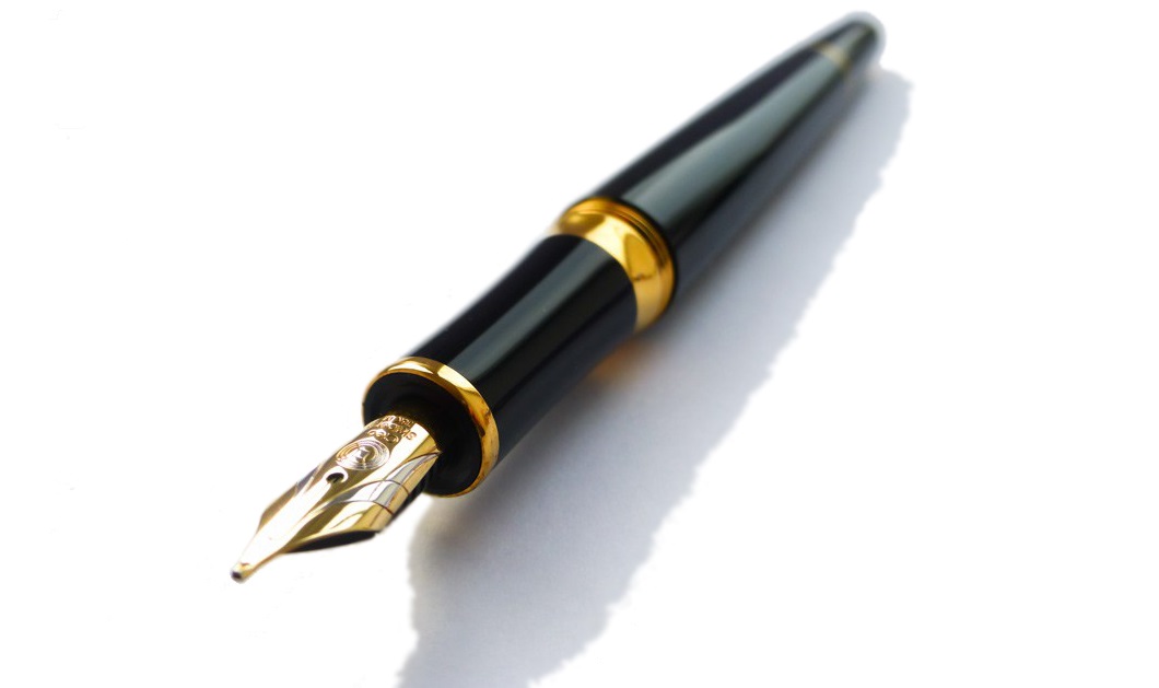 How it looks Quite distinctive, with a tapered barrel which is reminiscent of a desk pen, and that impressively over-engineered clip. The gold finish wasn’t to everyone’s taste, but a chrome trim alternative and a nicely blue version are also available.
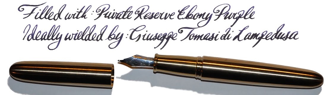
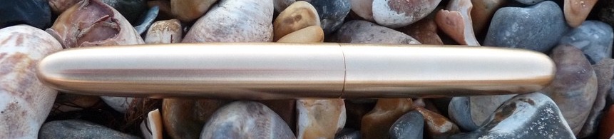
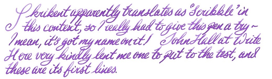
 How it feels Light but well-poised and ready to write. It’s hard to resist the urge to try a few squiggles when you pick this up, even if you have nothing in particular to write – but as Skribent roughly translates as ‘scribble’ that’s perhaps appropriate.
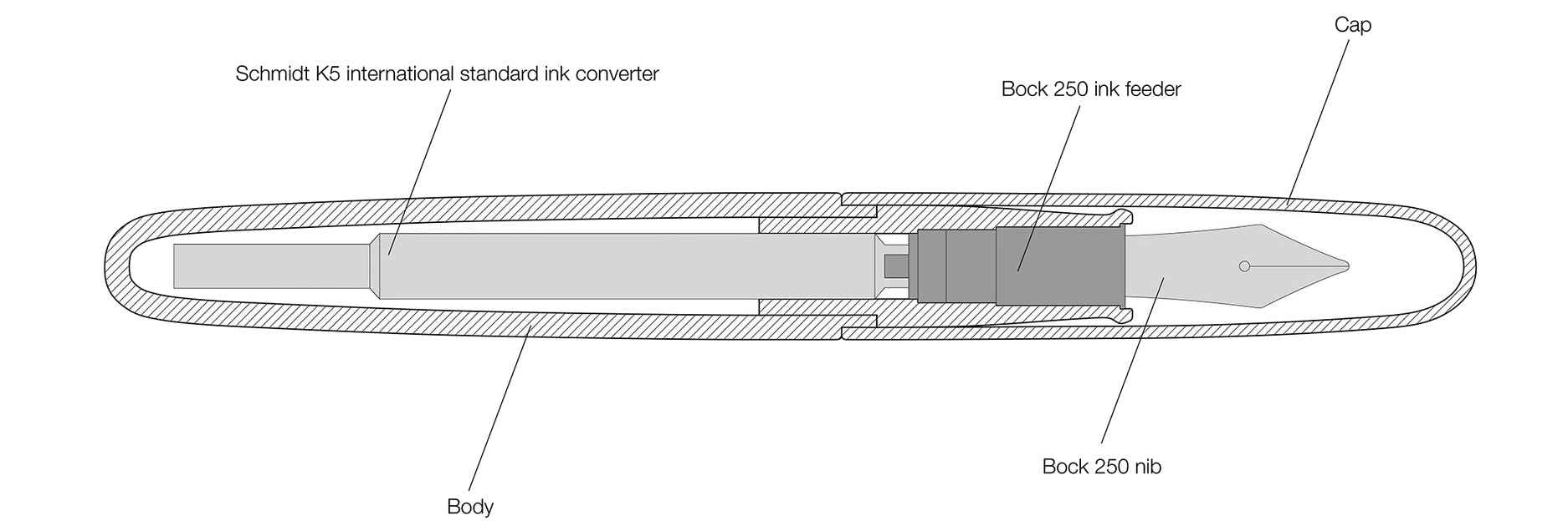
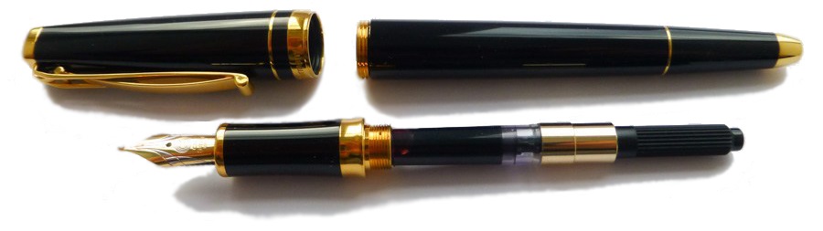 How it fills Somewhat disappointingly, given the piston option of the reasonably priced Classic, the Skribent is a cartridge/converter number. However, the converter does screw in for greater security, which is a smart move.
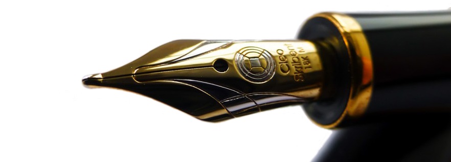
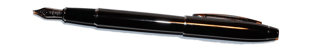
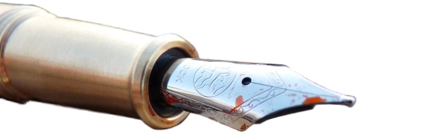
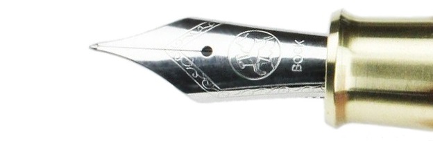
 Crucially, how it writes… Ah, here is where the Skribent changes opinions quite quickly. The looks might not win everyone over, but that nib does! It’s small but perfectly formed, with a gentle bounce usually only encountered on a Japanese ‘soft’ nib, and although it offers only modest line variation it is a real joy to write with.
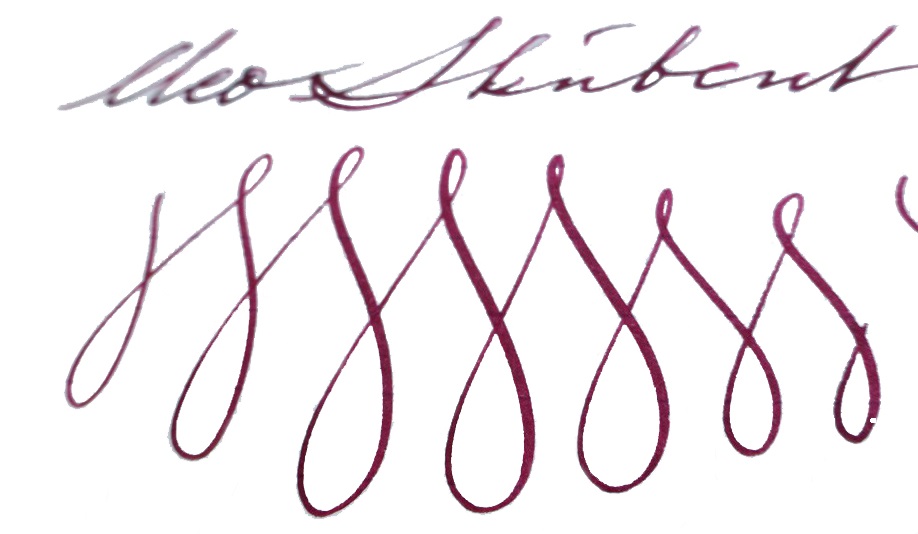 Pen! What is it good for? This is a proper ‘writer’s pen’, this one; it is well-built and could cope with whole reams of text. ‘Just the thing for writing that novel you’ve been meaning to get around to…
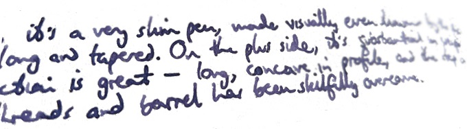
VFM This is the one area where the Skribent struggles a bit, at the moment. It’s a nice pen with a really excellent nib, and deserves a premium price, but £300 is an awful lot of money. For that kind of cash one could buy a piston-filler, with a bigger nib, from a famous name, and it’s hard to escape the sense that Cleo have been a little over-ambitious with the RRP. If this was closer to the £220 mark we’d be recommending it with enthusiasm, though.
 If this isn’t quite your cup of tea, but almost… Cleo makes a wide range of fountain pens, and we do aim to review more of them over the next couple of years. But probably the nearest writing experience to that available from the Skribent would be a Platinum #3776 with an SM nib – if you can find one.
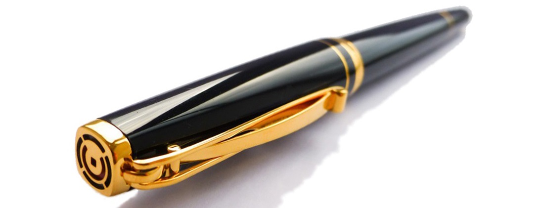 Our overall recommendation If you do have a yearning to write a book long-hand, and you can afford a luxury ‘daily driver’, you could do a lot worse than the Skribent – and you’re sure to fall in love with the nib. We think that Cleo would be wise to reconsider the price positioning, however.
 Where to get hold of one There are few Cleo stockists in the UK so, review samples not withstanding, it does make sense to go straight to a specialist.
 This meta-review references:
- Scribble Monboddo’s immediate and medium-term reviews
- Ian Hedley’s review
- Ant’s review
- The Clumsy Penman’s review
 Thanks to Write Here for lending us the Skribent to play with!
 It’s time for us to announce another give-away here at the United Inkdom Citadel!

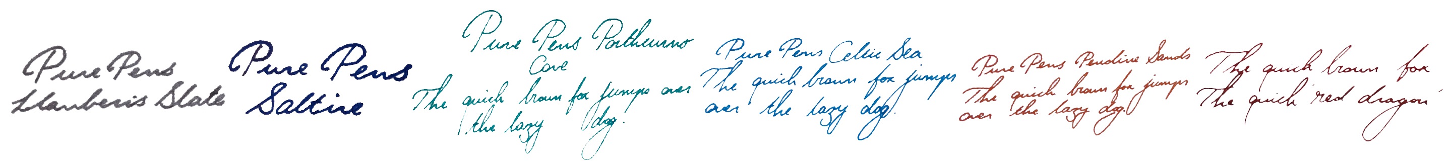
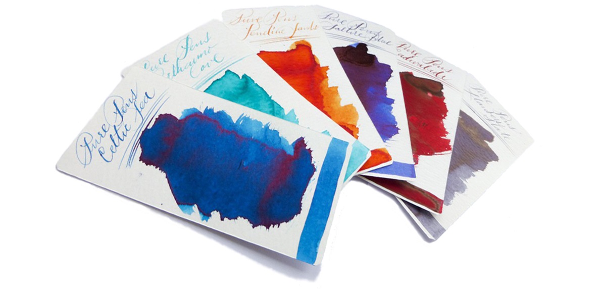
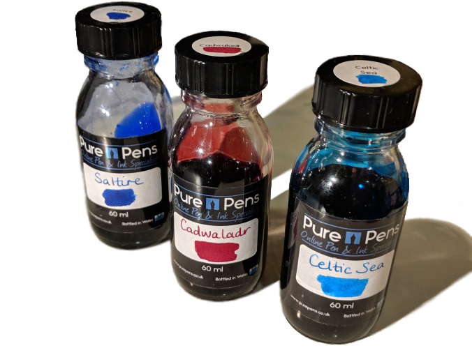
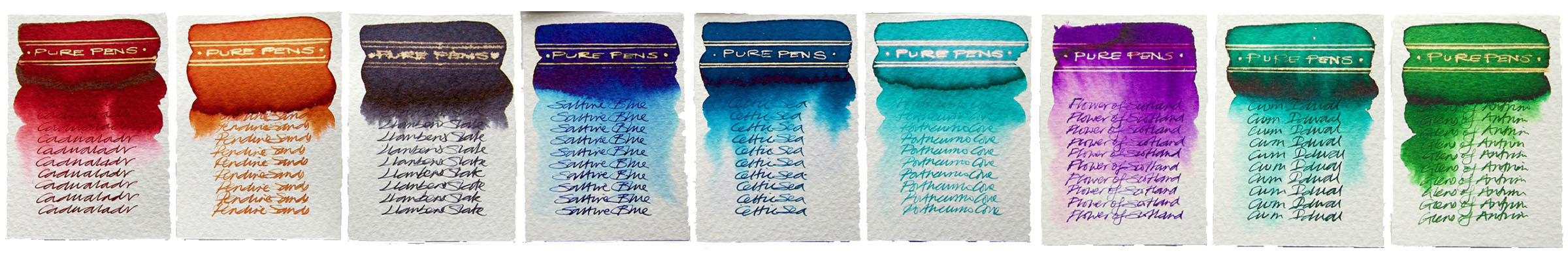
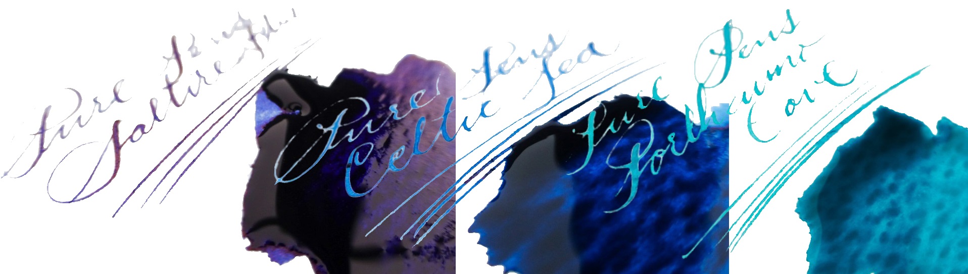
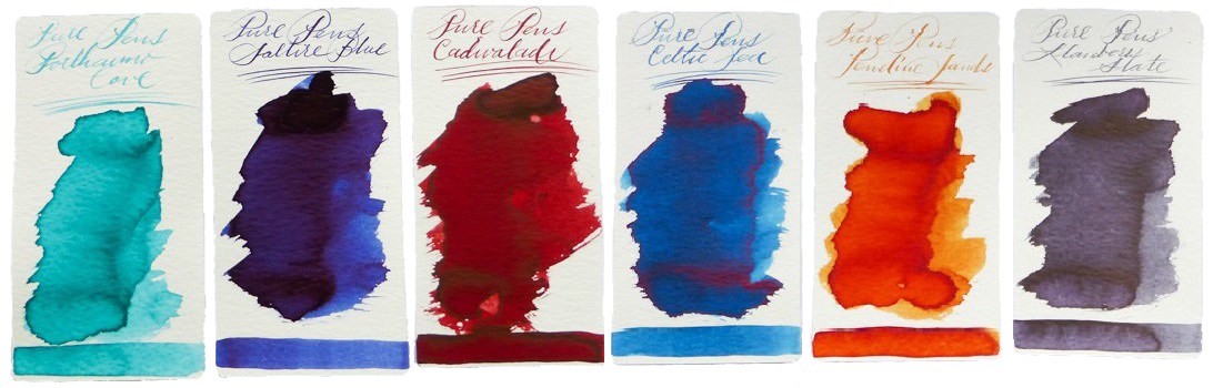
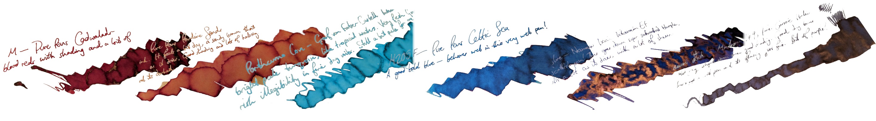
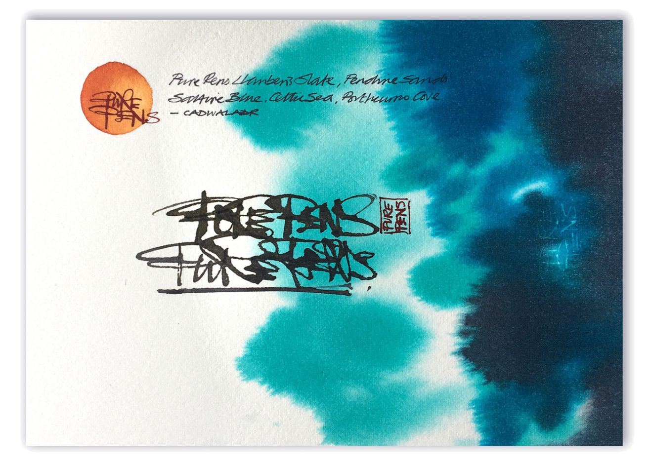 How it looks Cadwaladr is a rich red, with plenty of character.
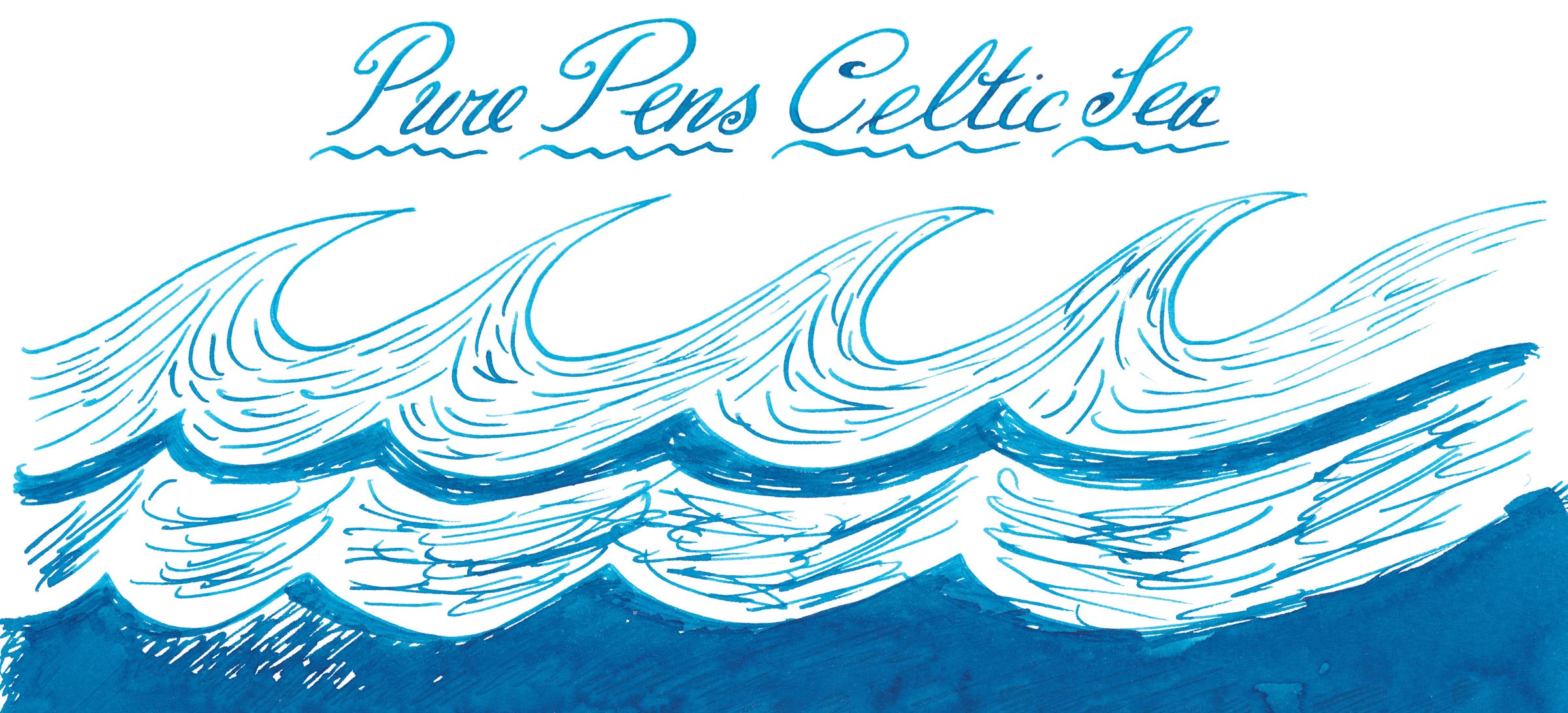
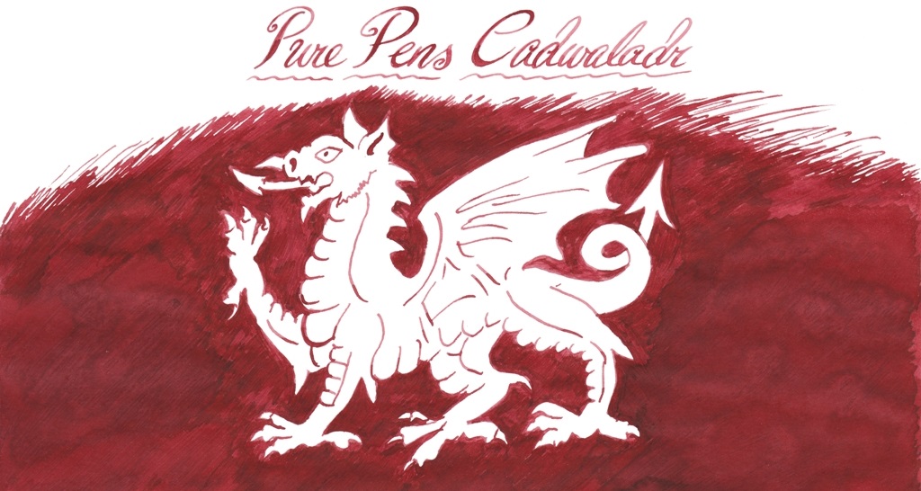 Celtic Sea is a pleasing blue, with lots of maritime presence.