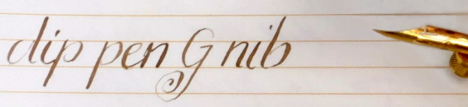
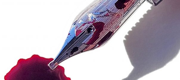
A little bit of history Back in the days of space flight, one of the big problems was getting home safely. Vehicles come in fast, that compresses the thin air below them, and this generates enormous heat. Finding the right shape to survive the experience involved some serious trial-and-error. The Americans tried an inverted cone, which got very hot indeed, while the Soviets tried a spherical design which was, inevitably, tricky to steer. The solution, it turned out, was a bluff body – broad, blunt, fairly flat, with rounded corners. This proved to be so stable and reliable that every space programme currently in operation uses it. Oddly enough, a bluff body is also a promising format for a fountain pen nib; a large contact surface to make a wide mark, and smooth edges to reduce friction. But Bluff would be an awkward name for a nib type, as the letter B is already taken. It’s definitely the opposite of Fine, though, so it appears that Platinum broke out the thesaurus, looked for an antonym to fine, and settled on coarse. So, now we have a C nib. C for confusing, it appears…
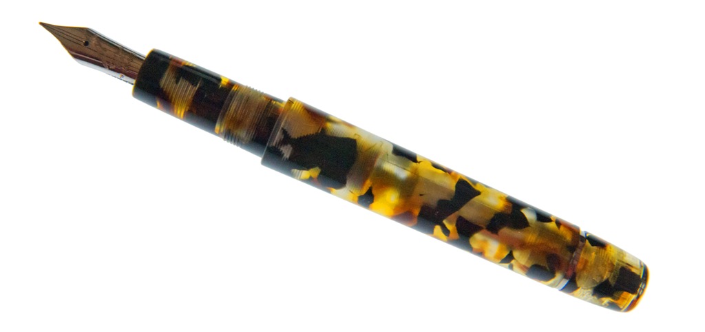
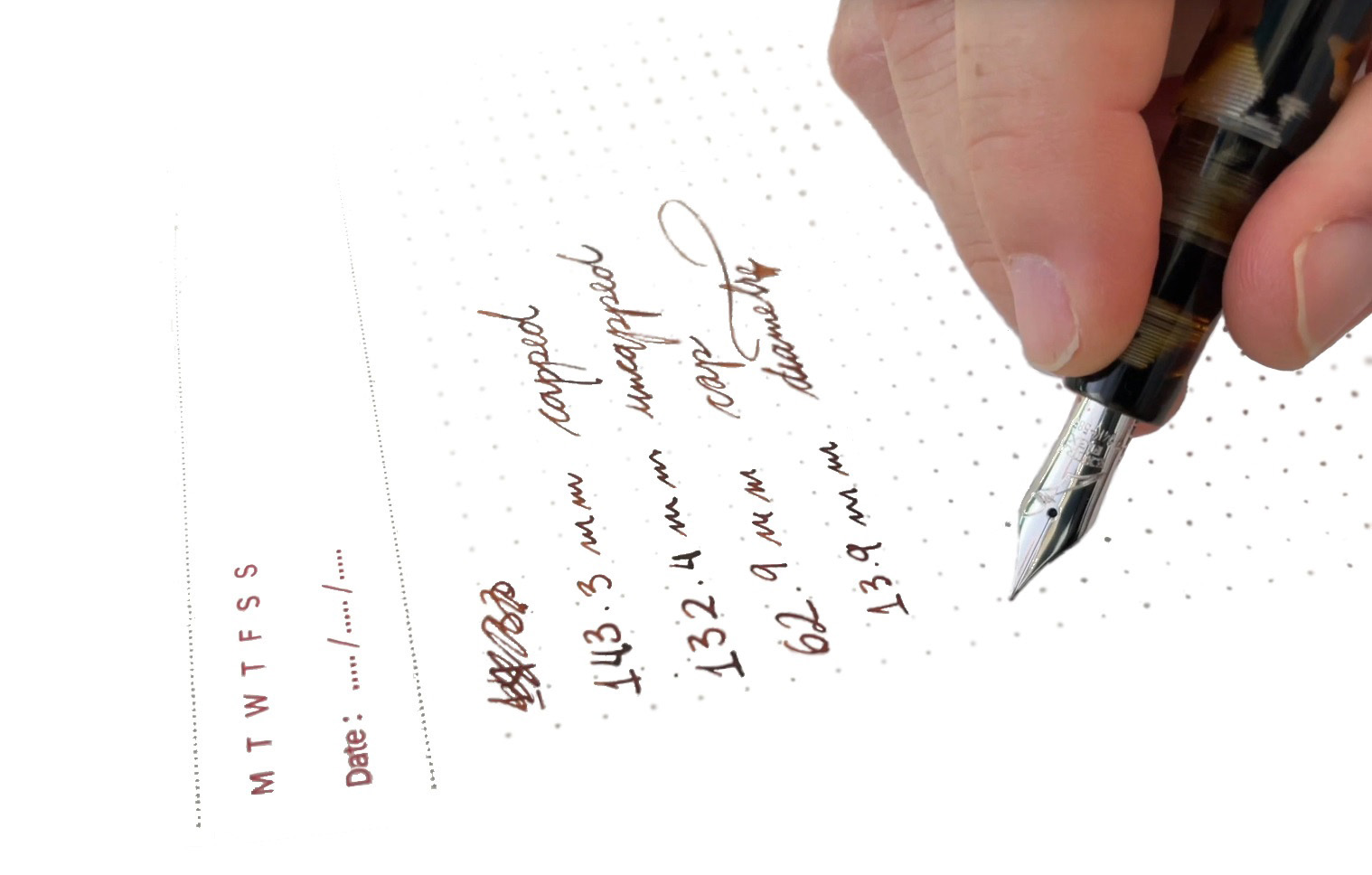
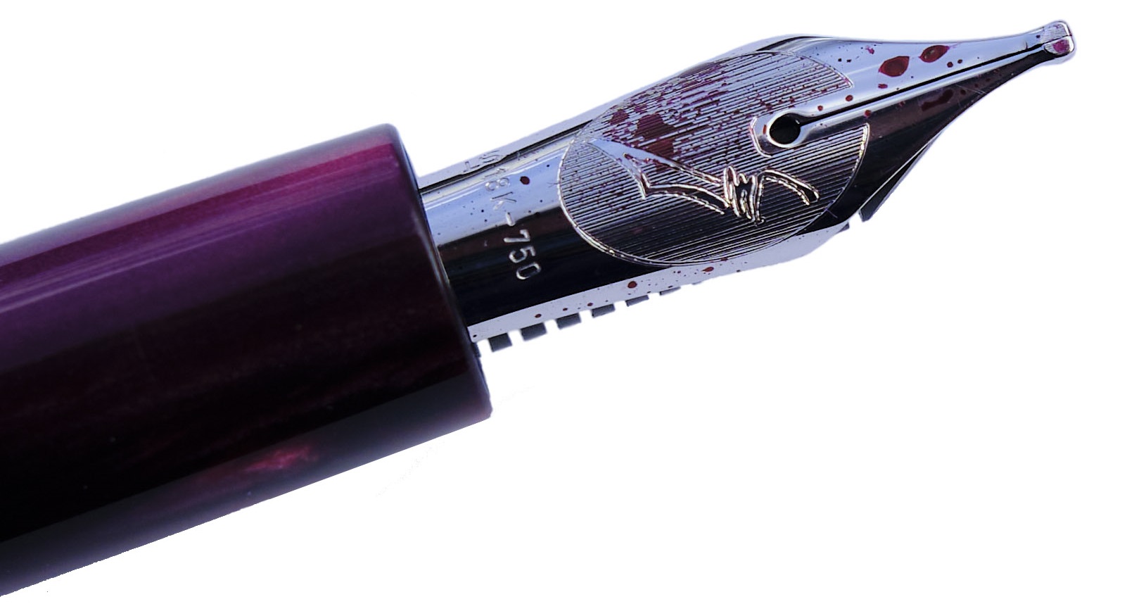
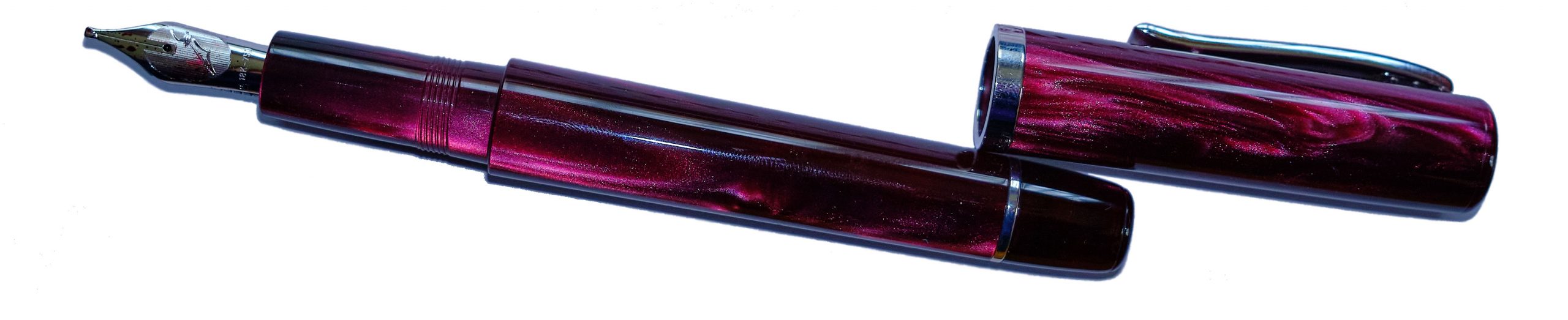
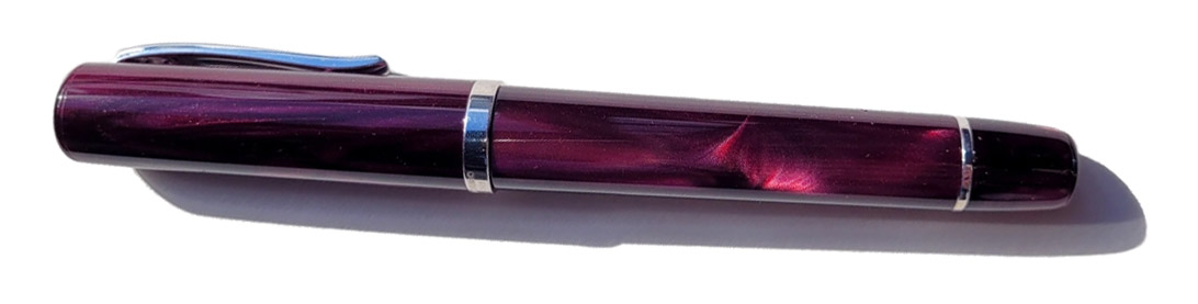
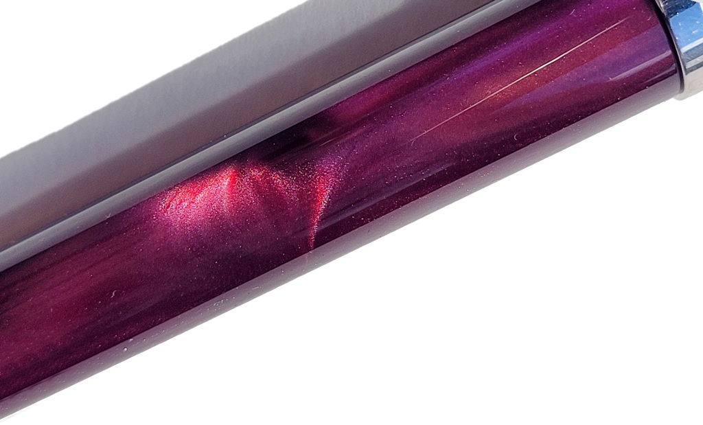
 How it looks Until you pick this up and write with it, the pen looks like a standard #3776 – which is what it is. Our test body has the pleasing red bourgoigne finish, and it looks terrific. But a glance doesn’t quite tell the whole story.
 How it feels This is a light pen and the nib is fairly smooth in use, albeit with the slight ‘toothiness’ common to many Platinum offerings. It’s worth trying in person as we think it’s one of those love-it-or-hate-it propositions.
 How it fills A classic-cartridge/converter system, this, although only Platinum’s own kit will fit. The cartridges aren’t too difficult to find and the converters are some of the more reliable of Japanese pistons.

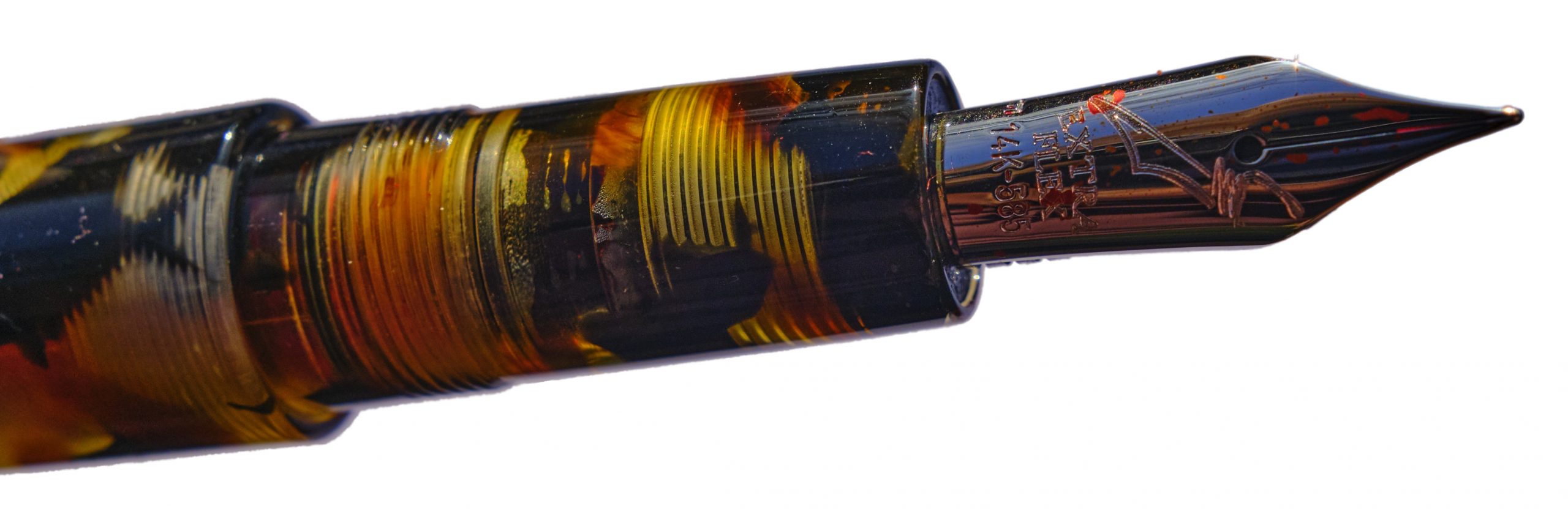
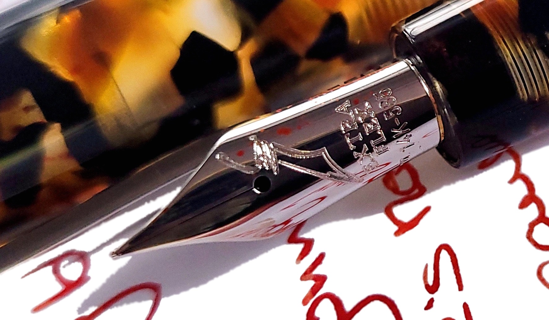
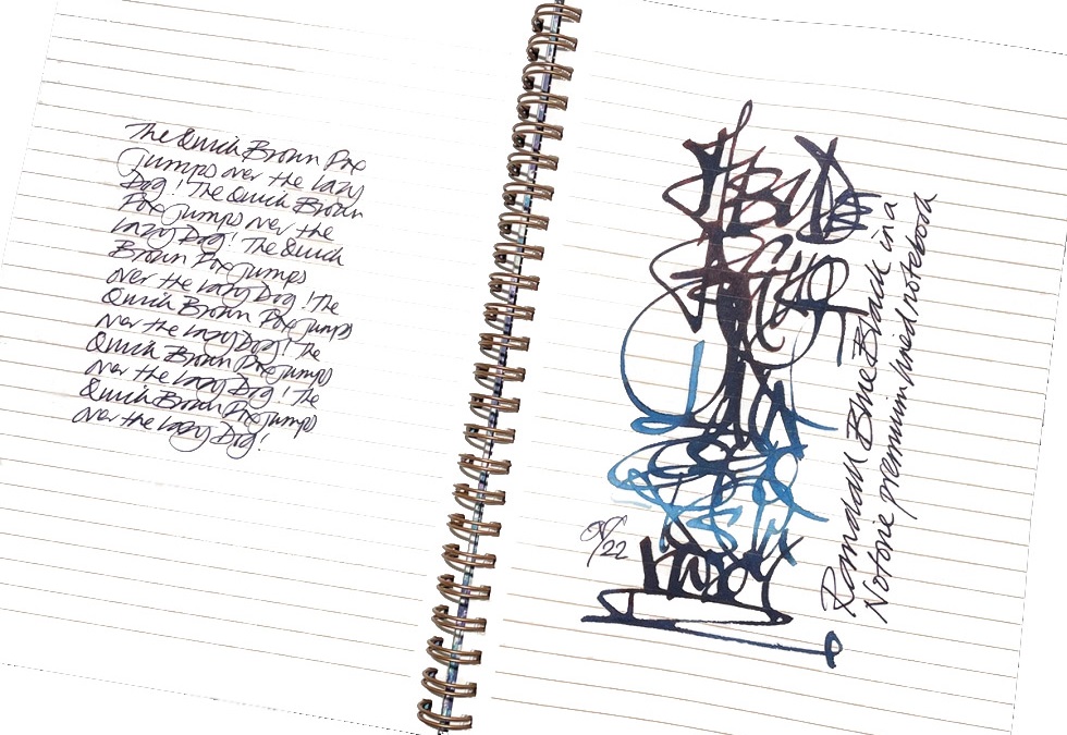
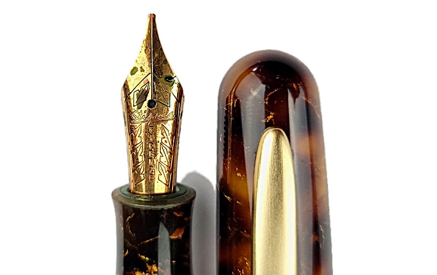
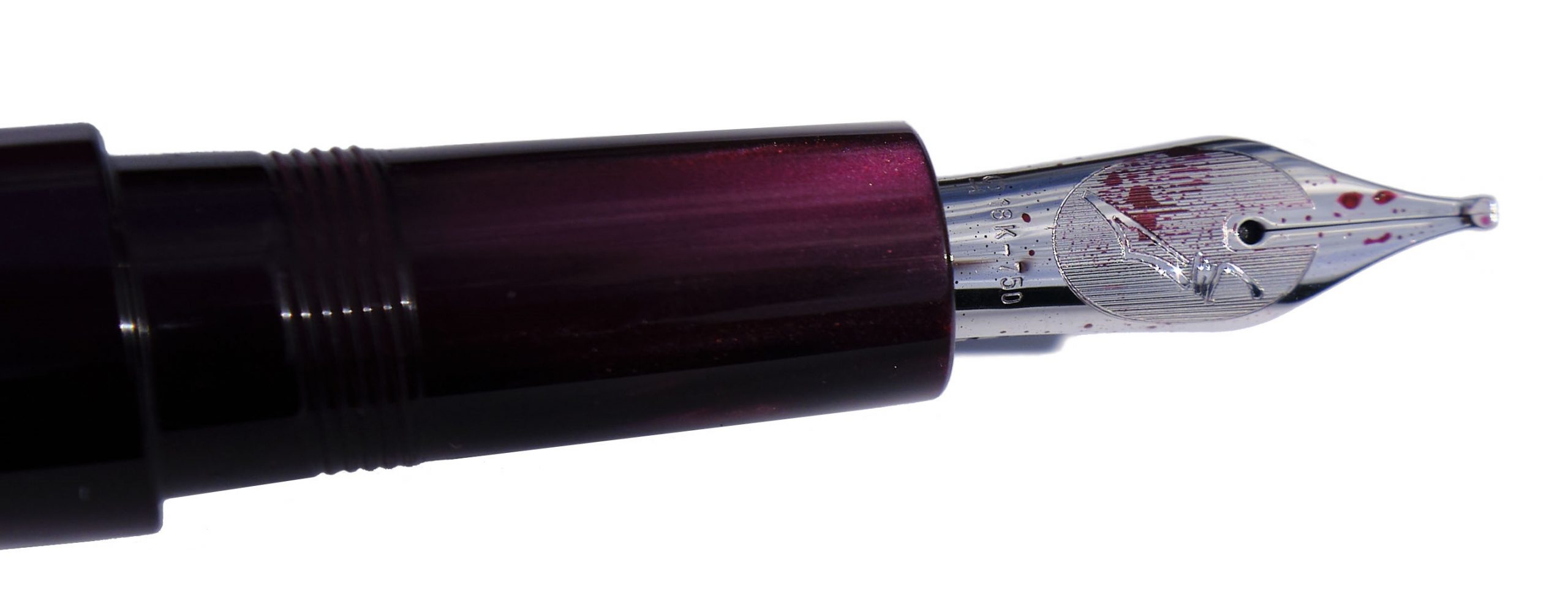
Crucially, how it writes… Fat and flouncy, in short. Imagine the illegitimate offspring of a BB and an Italic, adopted and raised by a Music nib, and you might not be far off. There’s a touch of tooth, but many of us found that it grew on us.
 Pen! What is it good for? Here’s a pen for having fun with, in short. You could probably write distinctive signatures with it if you took it to work, but its greatest joy is writing flamboyant birthday cards and thoroughly jolly notes to friends.
 VFM This is a well-made pen with an unusual ‘niche’ gold nib, so it’s not cheap as chips. But shop around and you ought to be able to find it for less than £200, which is pretty good. We do feel that for that sort of money Platinum ought to include a converter as a standard part of the package, though.
 The only way is ethics We’ve got no complaint to make here; the pen’s made in a place with good labour standards, the packaging isn’t over-the-top and you can buy it from a specialist retailer who’ll back up the purchase with customer support.
 If this isn’t quite your cup of tea, but almost… Platinum’s Music nib is similarly impressive. If you want an alternative Coarse nib, Pilot make one too – but it’s very hard to find in the UK.

Our overall recommendation Coarseness is in the eye of the beholder – or perhaps in the hand. This is such a surprising nib to use that it’s rather difficult to describe at a distance, so it’s worth trying out in person if you can. But if you like it, bag it; this is a great value proposition.

Where to get hold of one The shop which lent us this review sample might not be a bad place to start…
 This meta-review references:
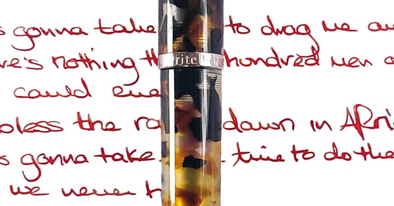
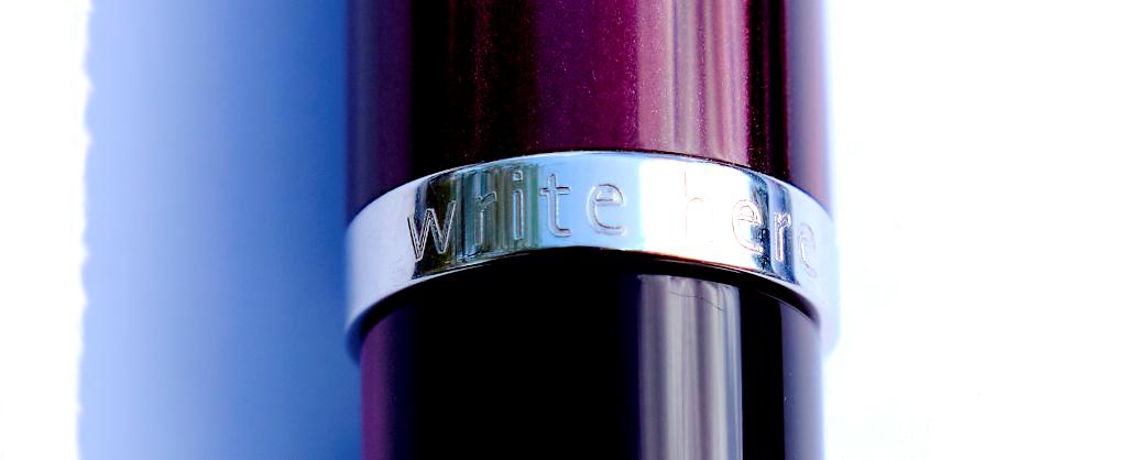
 Thanks to Write Here of Shrewsbury for lending us this unusual pen. One of the team liked it so much that they bought it!
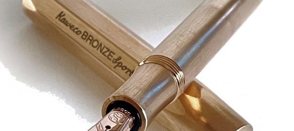
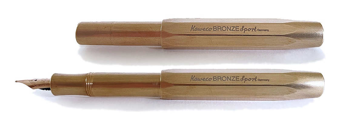 How it looks Like a slightly rosier version of the brass Sport, in short. That doesn’t really do it justice, though. In the modern world there’s not so much bronze to be encountered in every day life so this looks special, unusual, and maybe even a bit other-worldly – or perhaps an object from another time. That Nuremberg Tardis has been busy! Opinion is divided on whether to polish or tarnish, and adherents of either camp regard their opposites as absolute barbarians, so perhaps it is best to observe simply that if you buy one, the choice is yours.
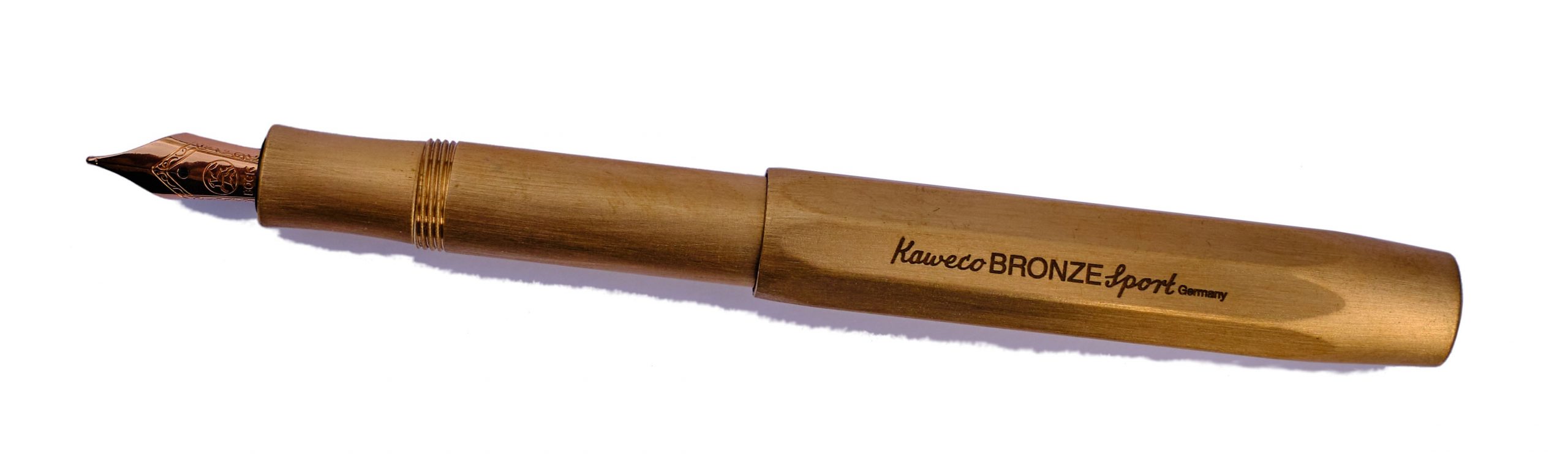 How it fills As with all Sports, syringe-filling a cartridge is the most cost-effective way to get a usable quantity of ink in to the diminutive barrel. It’s not too tricky once you get used to it.
 Pen! What is it good for? As originally intended, it’s a classic pocket pen and does that job mightily well too. But with a bit of work with Brasso, it will look the business on display on your desk too.
 The only way is ethics Made in Germany, with minimal packaging, there are no major worries on this count.
 Our overall recommendation The Sport is a robust workhorse beloved of many of a fountain pen fan. If you like a weighty pen, and the look of bronze appeals, go for it.
 This meta-review references:
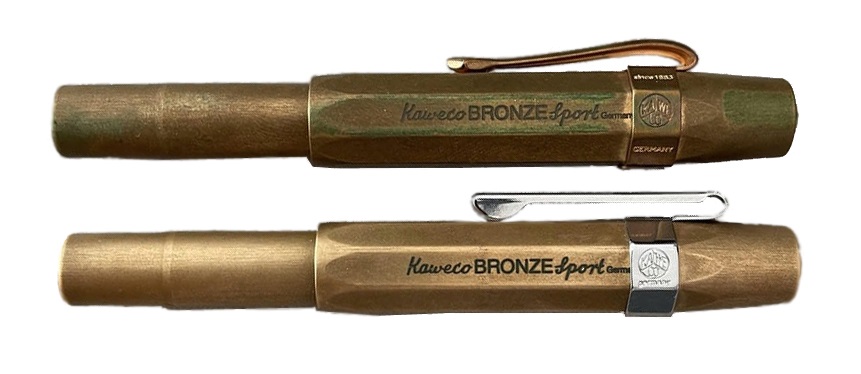
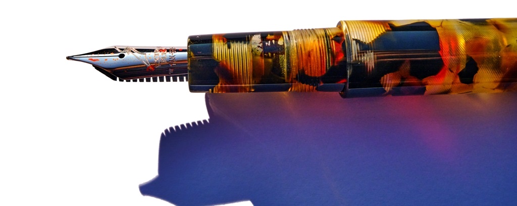
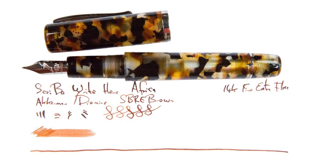
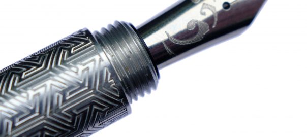
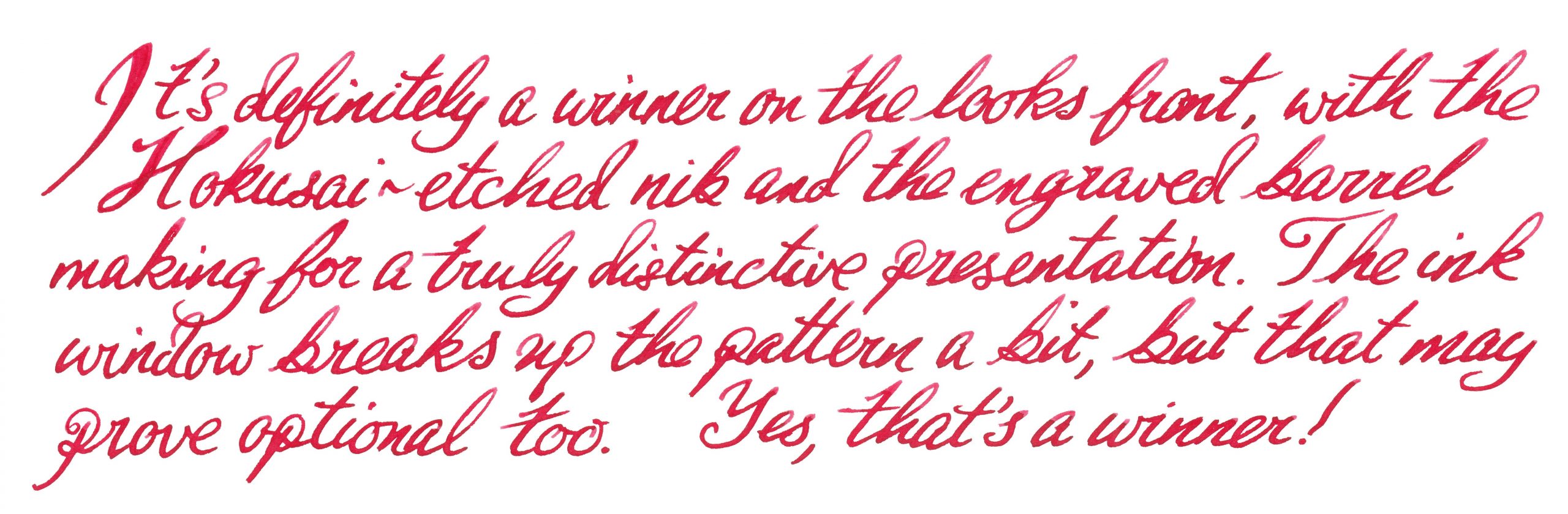
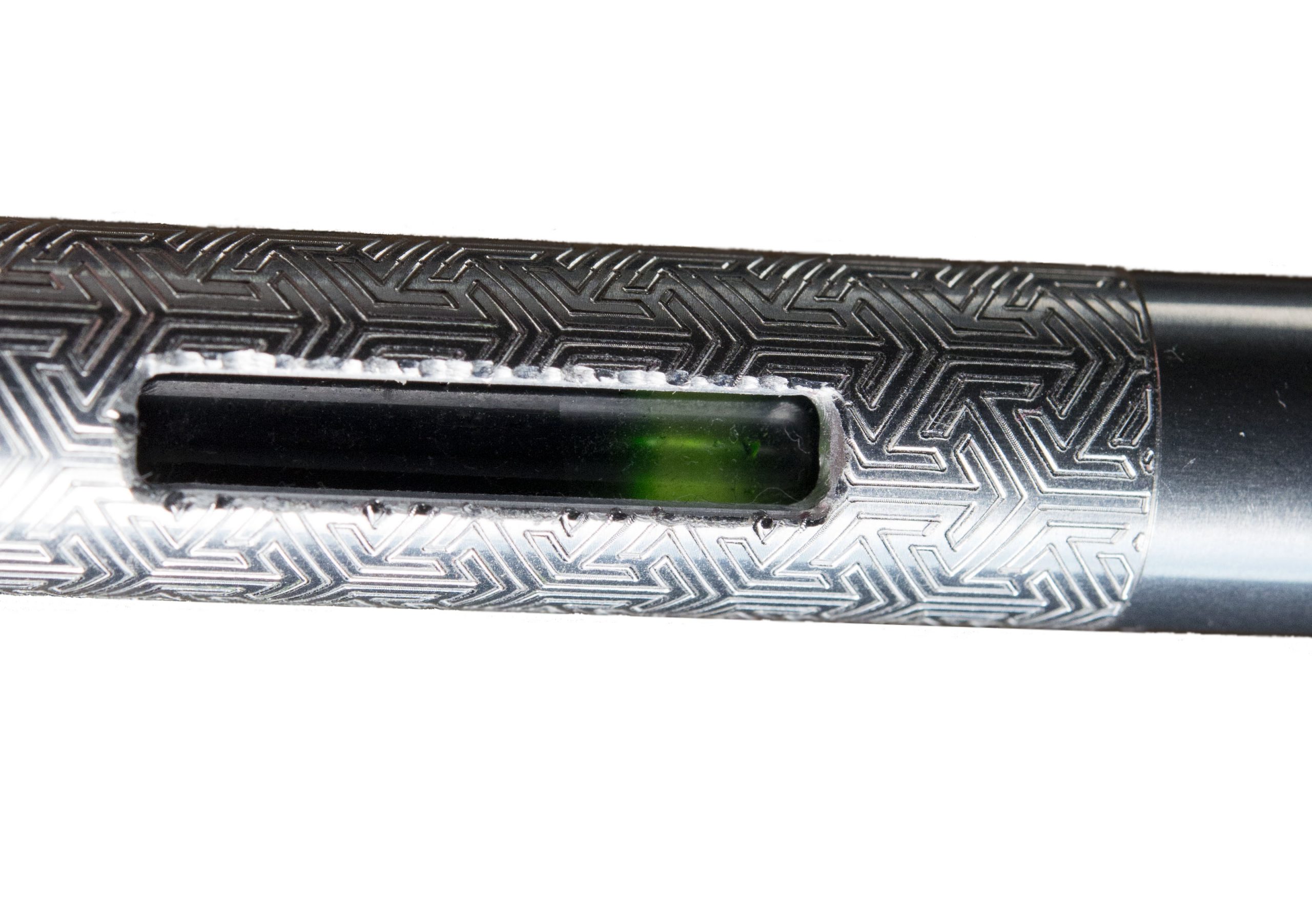
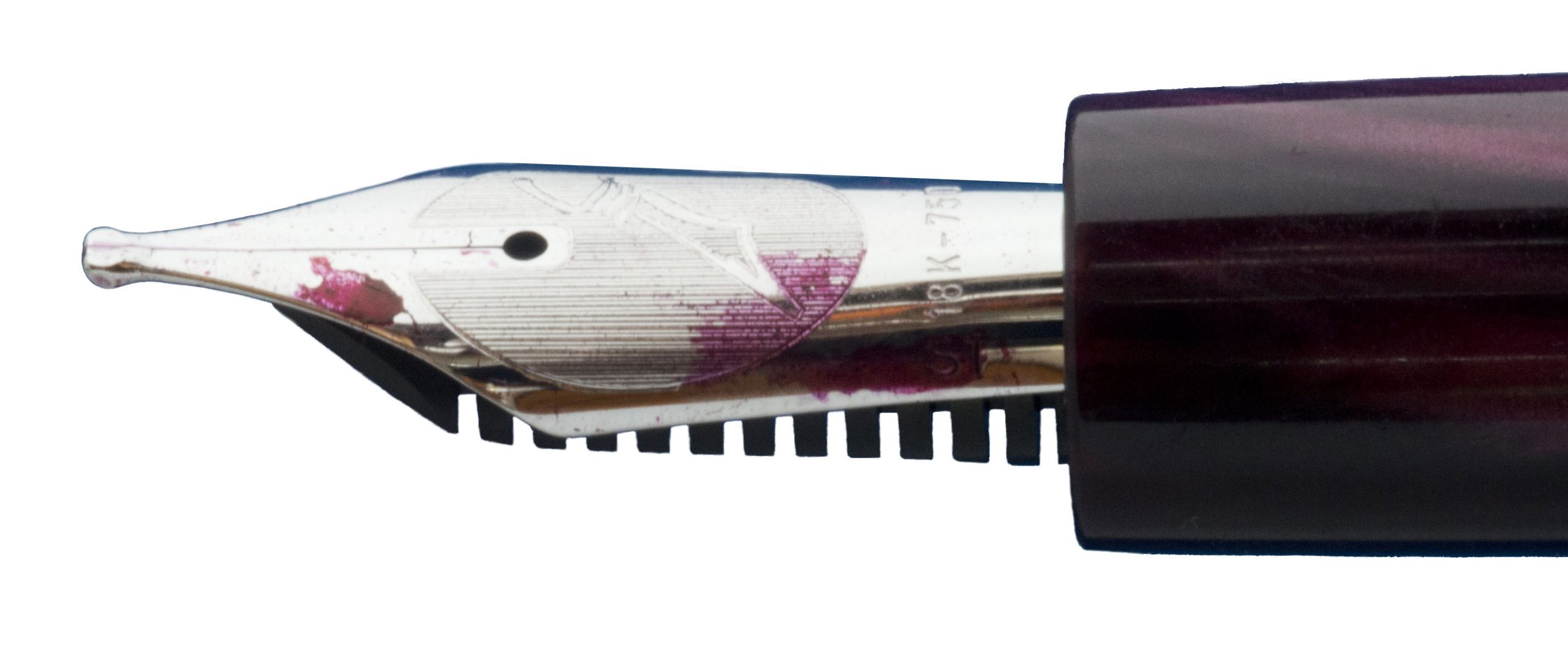
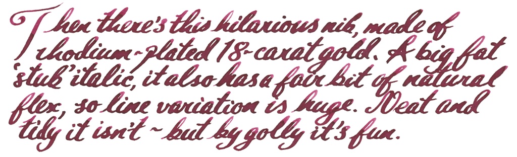
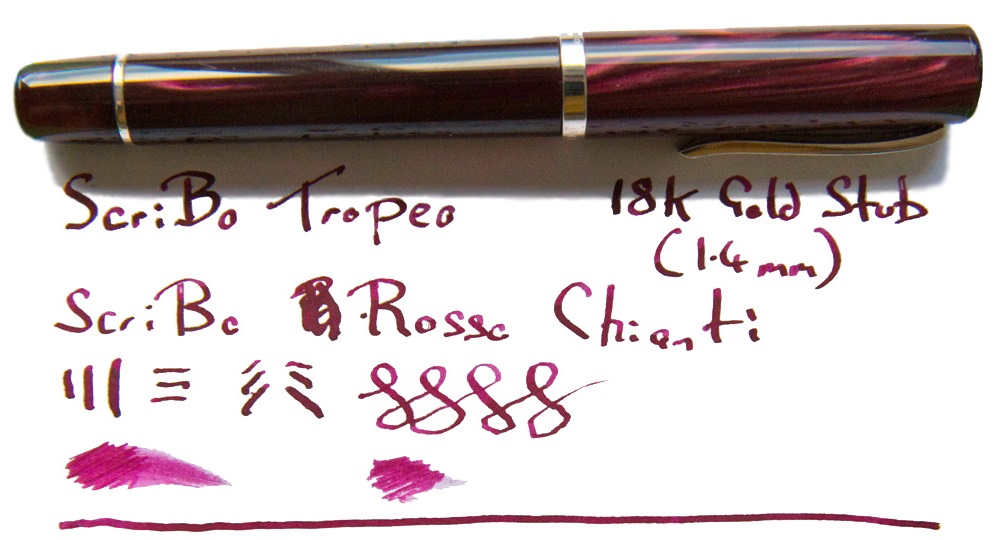
 How it fills This is a piston-filer, as is the norm with most Scribo models (apart from the Piuma), and it fills fairly easily with a decent quantity of ink which, unusually, is visible within the workings. The temptation to fill it with a complementary shade has proved very strong; even Mr Teal didn’t put turquoise in this one, and another contributor bucked the trend with a disturbing absence of purple. If you like orange ink, though, this is the bee’s knees – and looks like them, too.
 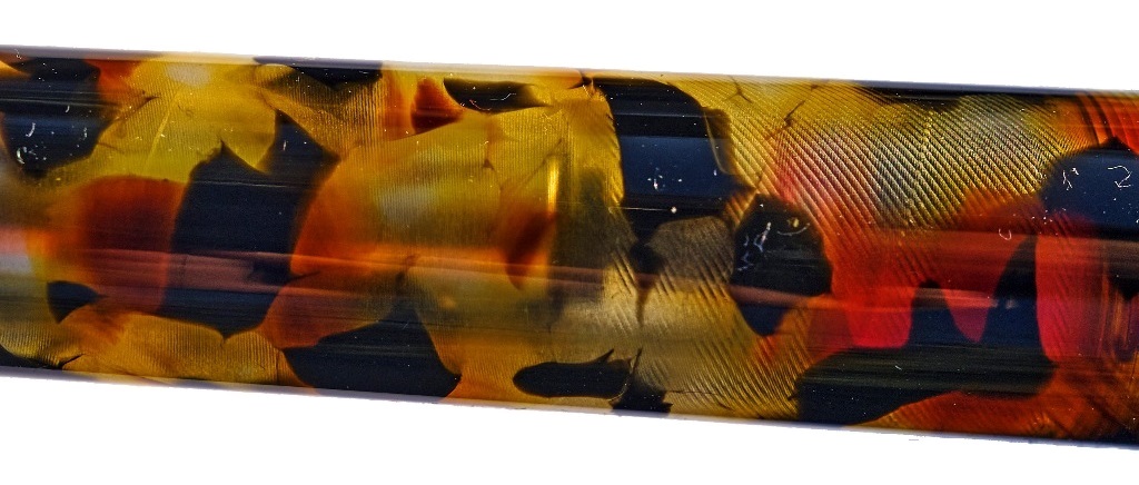 Crucially, how it writes… The Fine Flex nib is a joy, and by general consensus the nearest thing to a vintage wet noodle on the market today – even to the point, shockingly, that some of our reviewers prefer it to the Pilot FA nib. So how it writes is curvaceously, and wet. This is not a pen which scratches and blots on the page so much as one which aesthetically drools all over it.
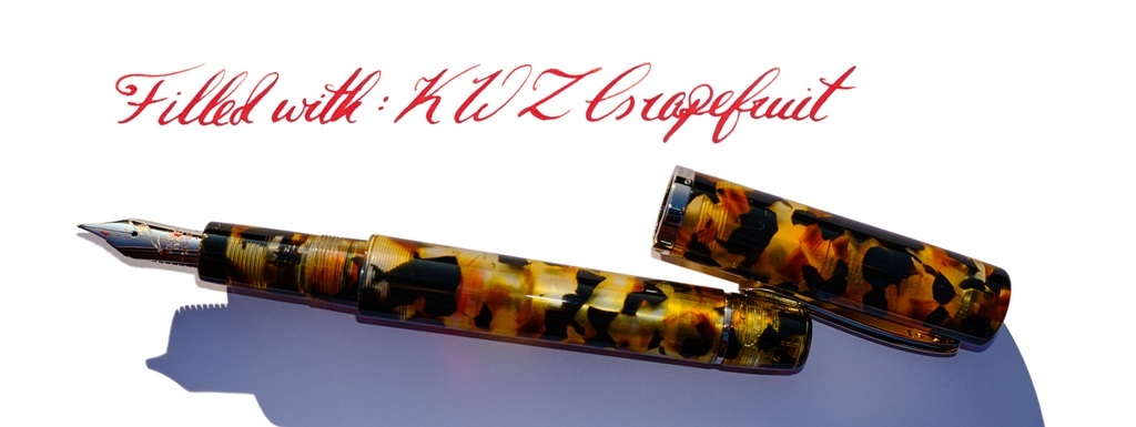
 Where to get hold of one Write Here is the only place you’ll find this, but if you can’t get to Shrewsbury it’s
 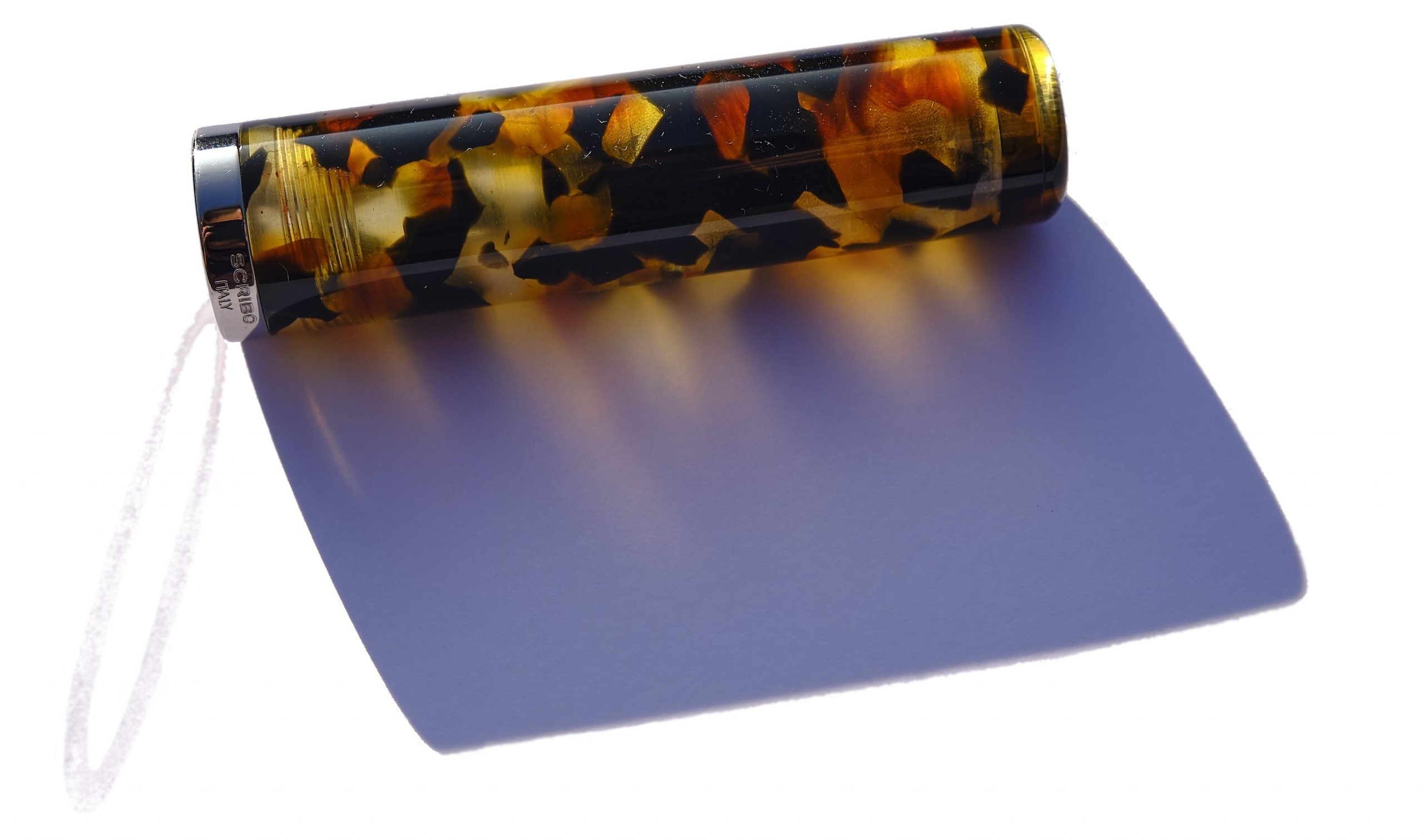 This meta-review references:
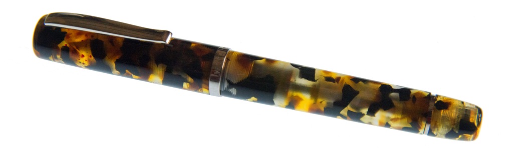
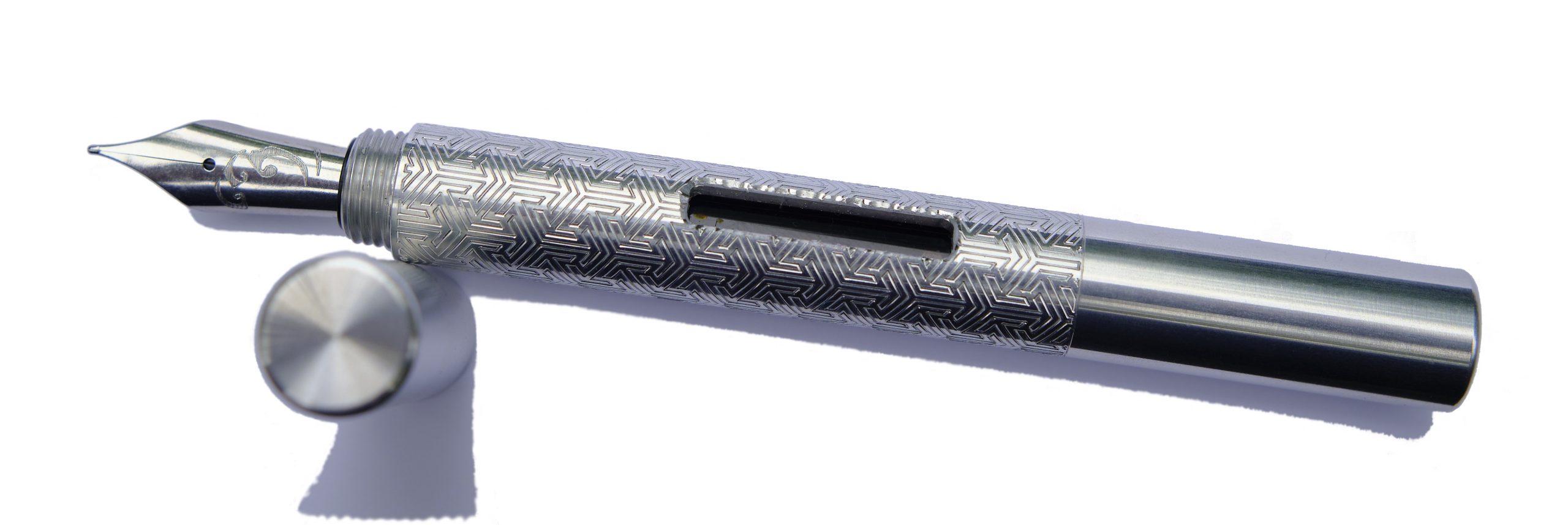
 How it feels Solid, grippy and, thanks to aluminium construction, fairly light. That said, balance is a personal thing and this seems to suit those who particularly like medium-length pens best. Fans of small pocket pens may find it a touch over-long for perfect balance and, conversely, full-size pen afficionados may feel it’s a bit on the short side. Much comes down to personal preference, with this one.
 How it fills This is the converter version of the Kitsune, which tells you most of what you need to know. There’s space for a full size converter, and a blind cap which twists off at the back end to make refilling a touch simpler. The resulting ink capacity is a bit of a step up from the tiny converters which fit small pocket pens, too.
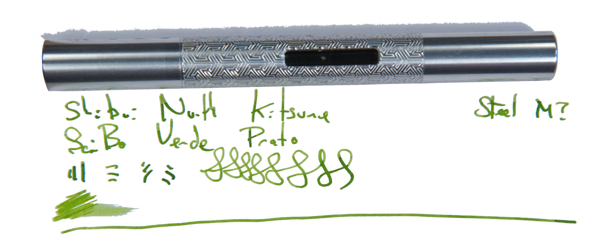
 VFM It took us a little while to test this design, and the exact model is no longer on sale. But the Pocket Fox is similar, with a shorter international cartridge, for around £100 to £110 usually – not bad for a hand-made pen with an interesting finish and Geordie bragging rights.
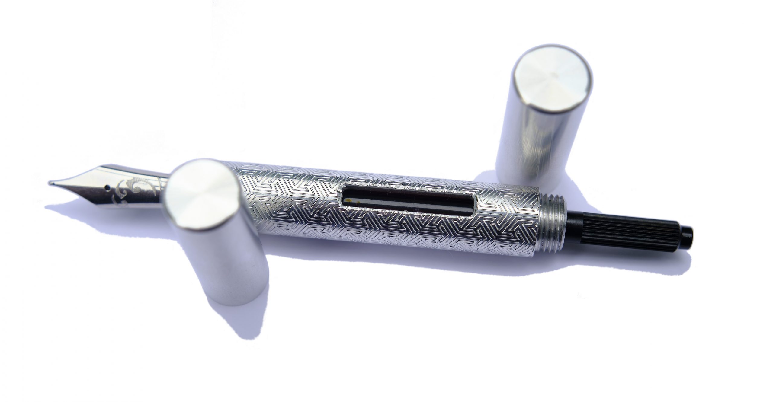 The only way is ethics It’s made by a human being who you can contact and have a chat with first, right here in Blighty, and packaged responsibly. What’s not to like?
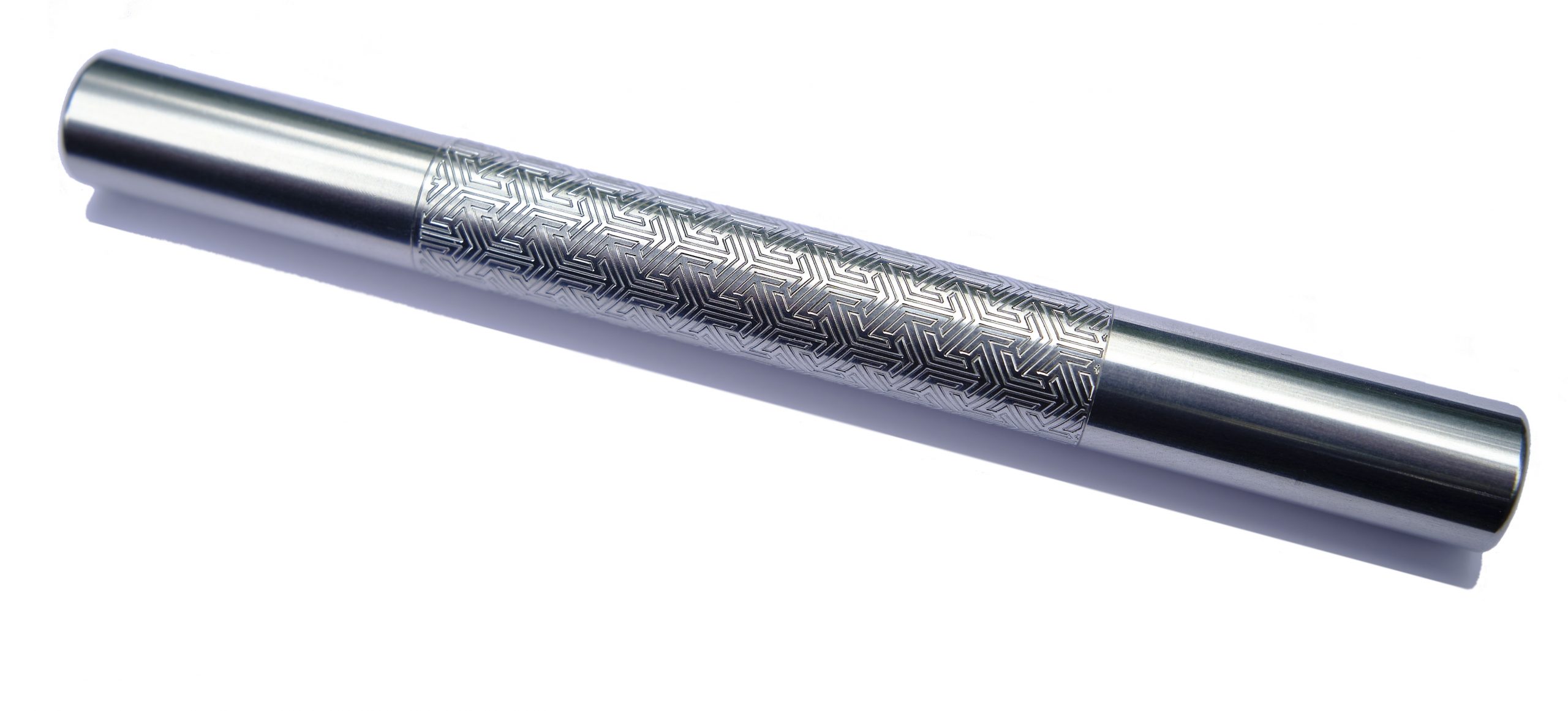 If this isn’t quite your cup of tea, but almost… Go shorter or go longer, in, err, short. The cut-down version is now known as the ‘Pocket Fox’ and looks the business in all sorts of finishes. Fans of longer pens may prefer the gracefully curved Tombo, meanwhile.
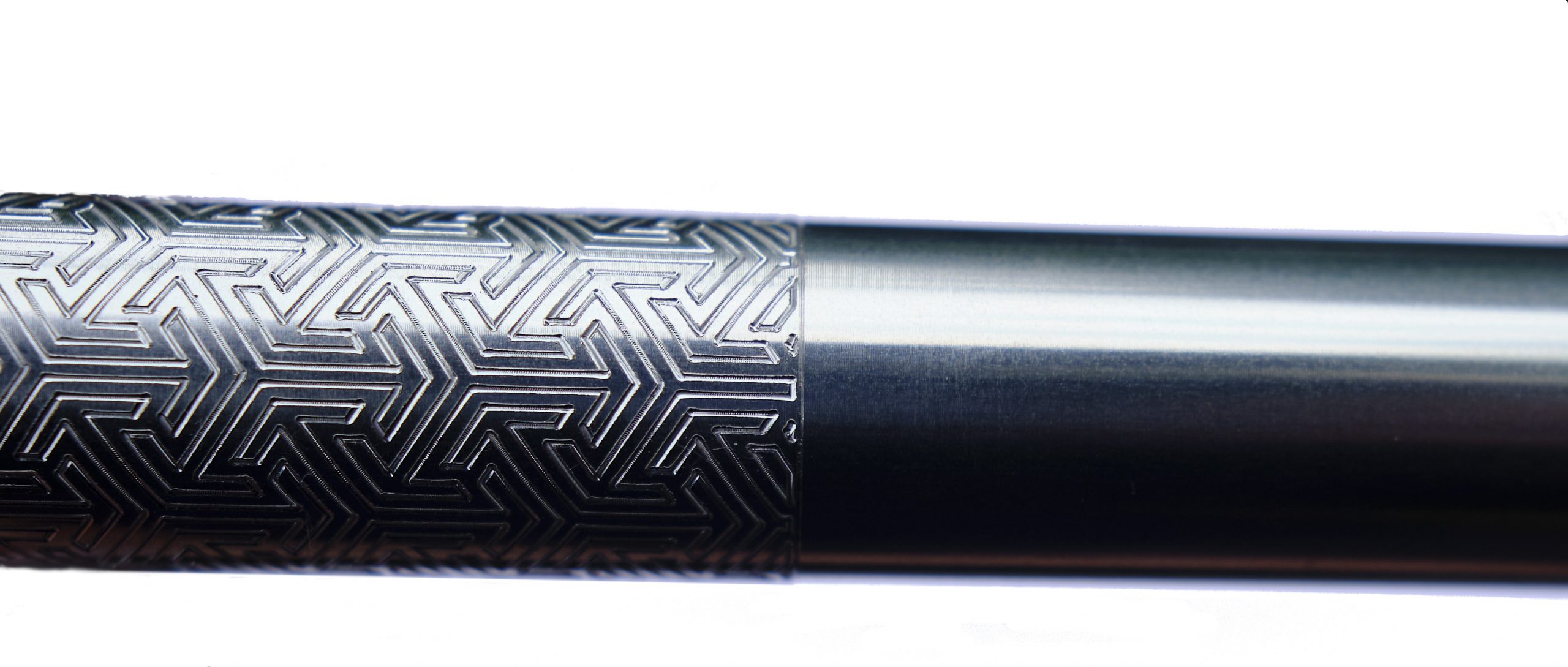 Our overall recommendation Find the right balance for you, then take the plunge.
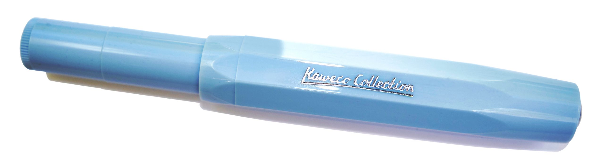
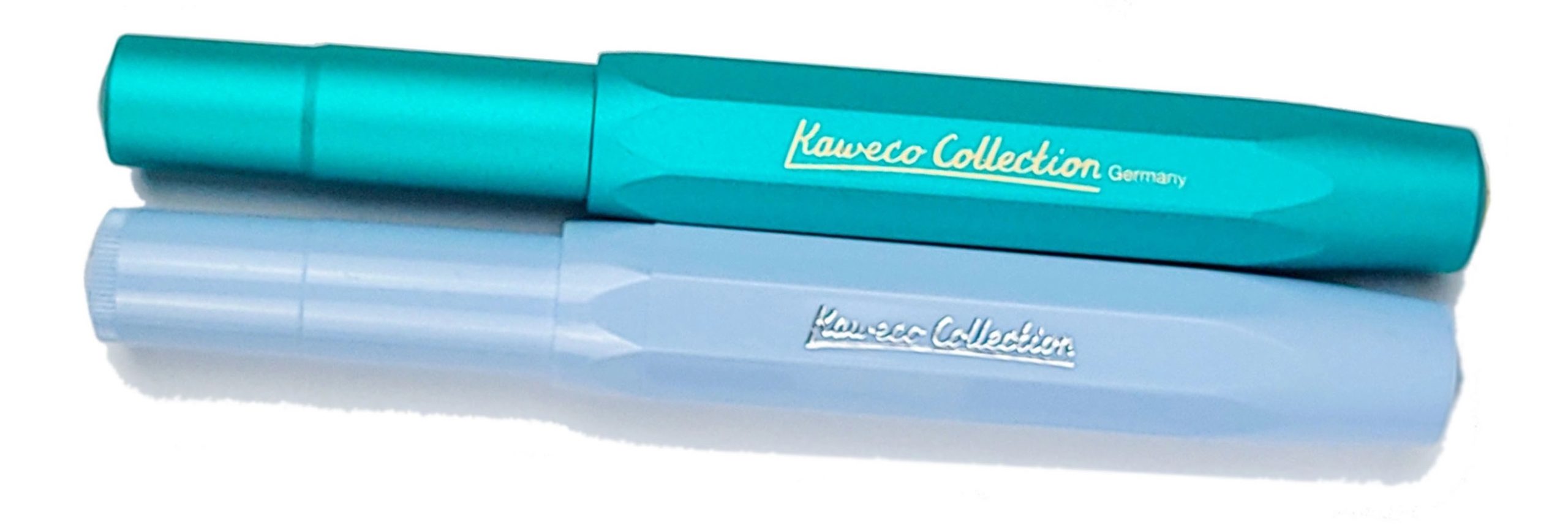 How it looks It looks much like any other Sport but in a pair of rather sophisticated colours, and with ‘Kaweco Collection’ proudly displayed on the side of the barrel. No complaints there; if you’re a Sport fan, you probably want already simply after looking at these pictures – and that’s rather the brand’s plan.
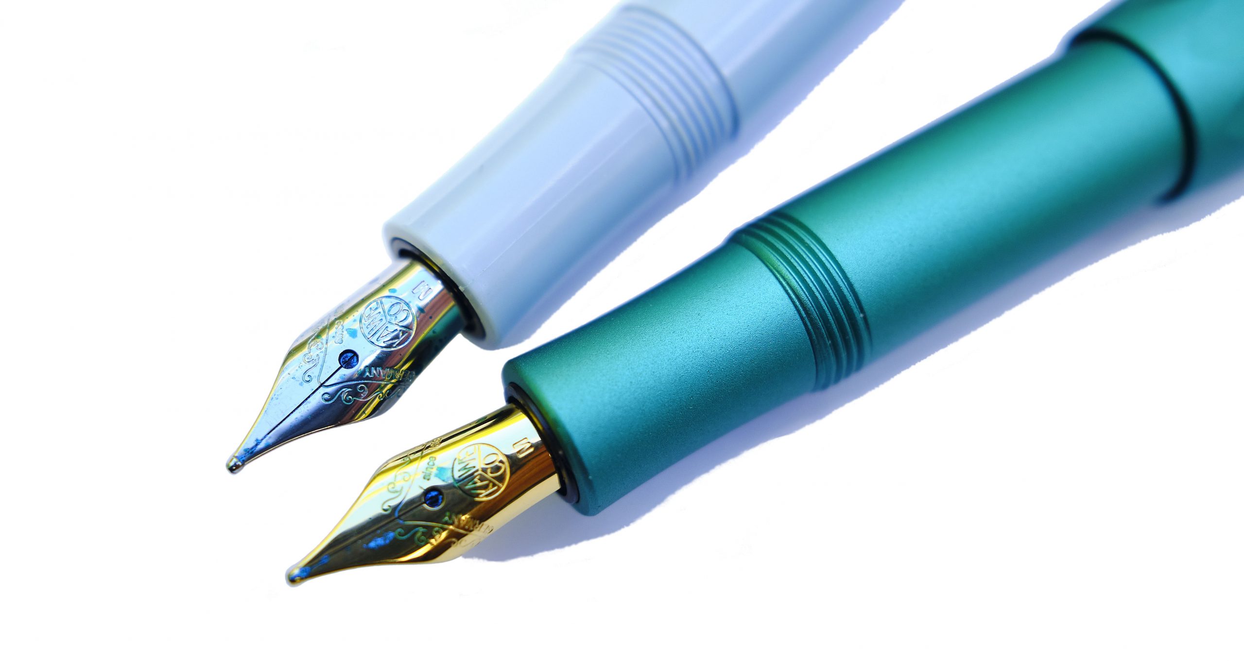 How it feels Small, and light. As usual, the aluminium version feels a touch more robust, but far from heavy. Like you’d expect a Sport to feel, really; the difference is all visual.
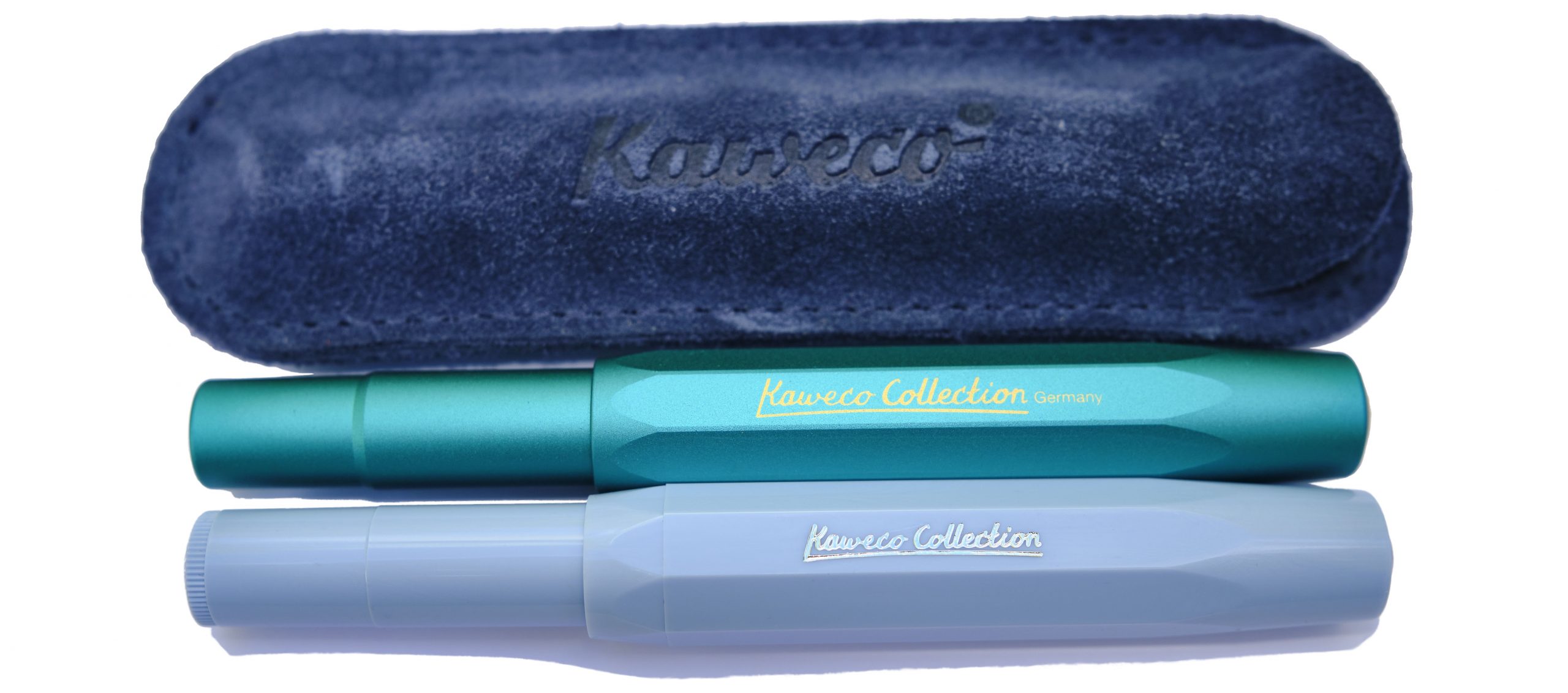 How it fills As ever, syringe-filling a small international cartridge would be our tip. There is a tiny push-rod converter, but the ink runs out so quickly that scope for frustration is considerable.
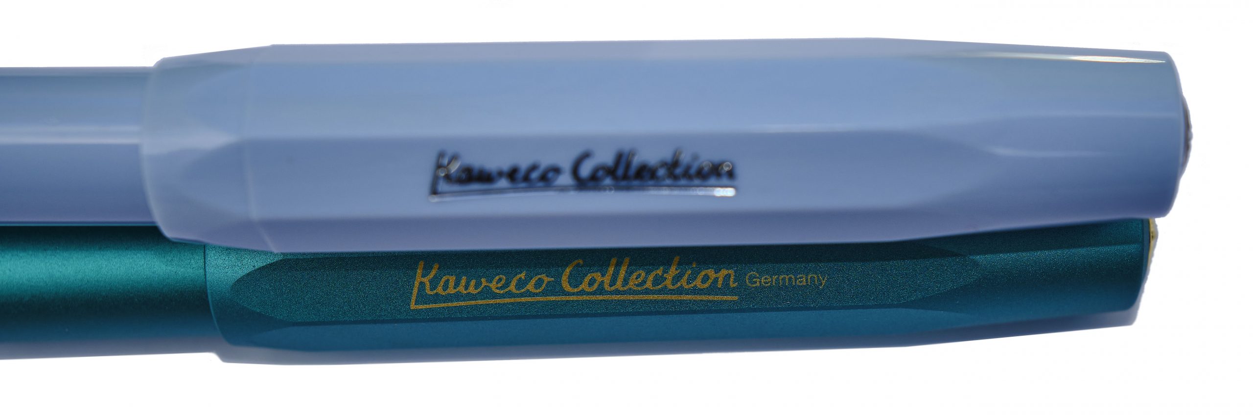 Crucially, how it writes… Generally, pretty well. The quality control on the steel nibs has improved in recent years, and for the pricier aluminium version any Bock 060 nib can be screwed in if you fancy a change. There’s even a gold option, should pushing the boat out that far be on the agenda. We stuck with the standard steel M, probably the most popular option, for this test and the results were encouraging.
 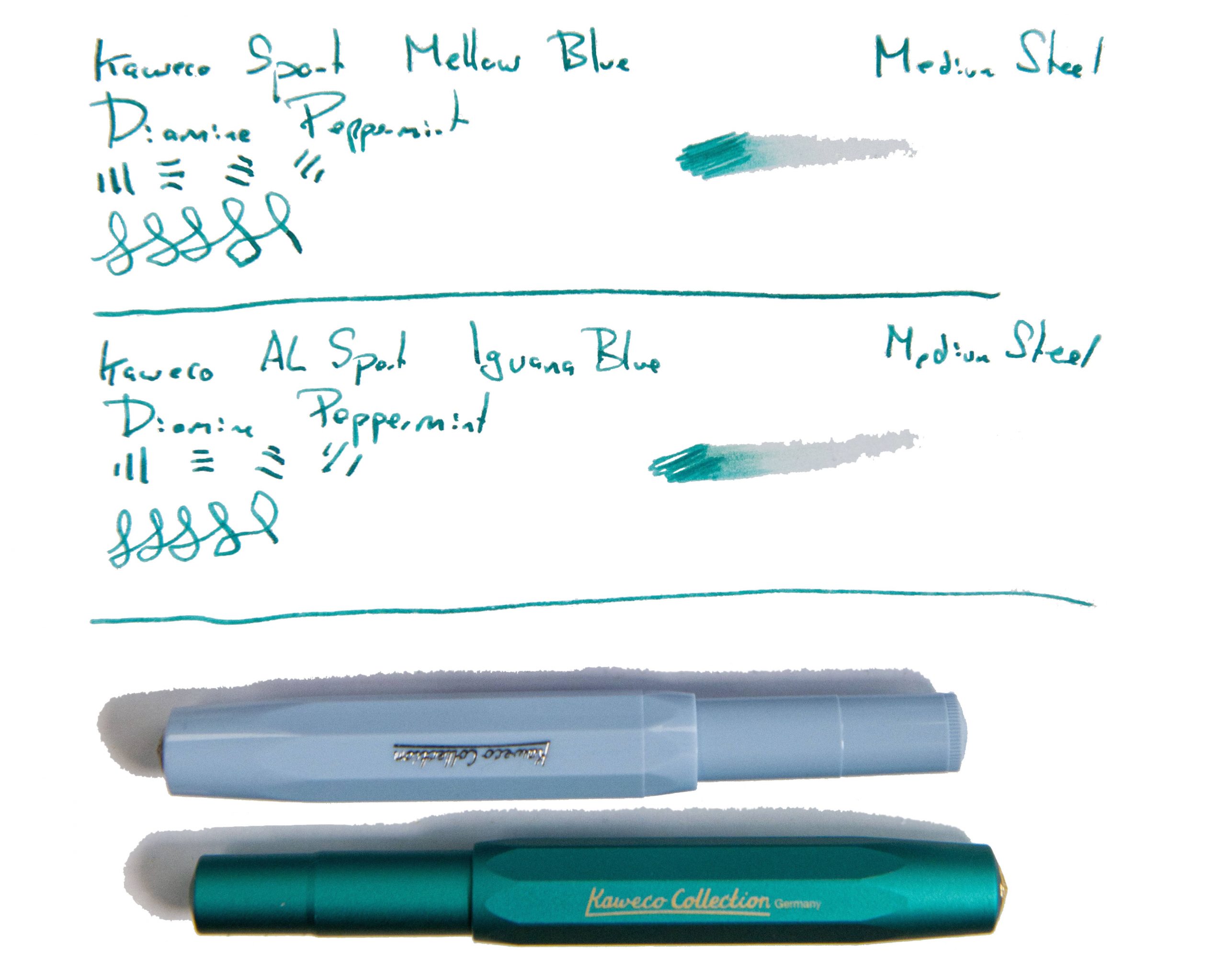 Pen! What is it good for? The Sport’s natural home is in your pocket, of course, but these two specials were also made for showing off, so it’s up to you. Generally we’d suggest these are for leisure use rather than business, but who are we to dictate?
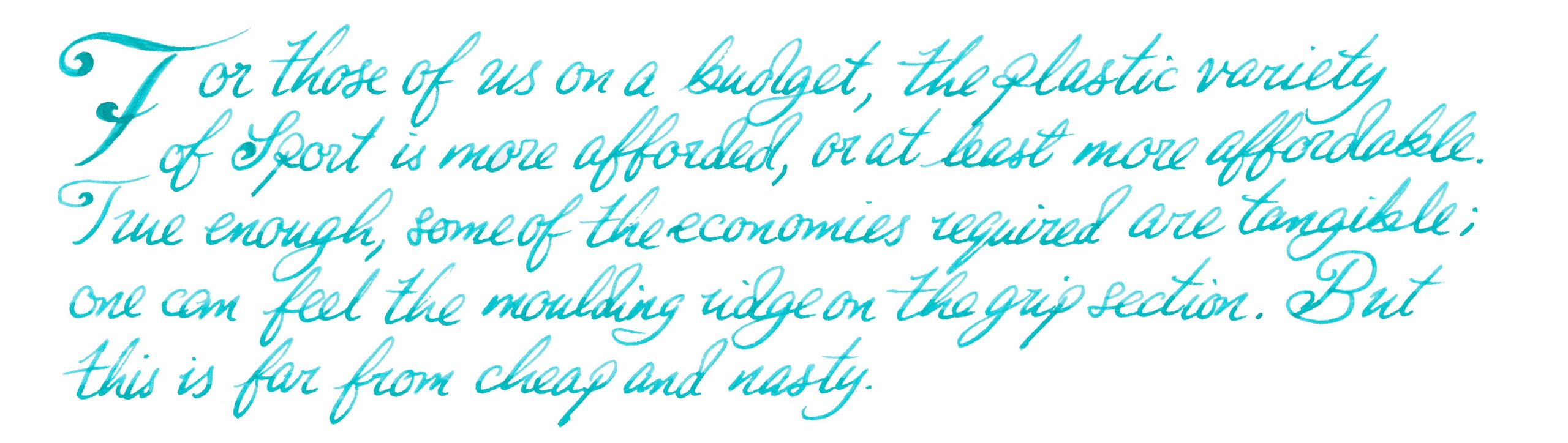 VFM The plastic Mellow Blue will set you back about £25, which is quite fair value, and the swisher aluminium Iguana Blue more like £70 – not crazy money at all, but it makes sense to try an ‘entry level’ Sport to check out whether the format works for you first.
 The only way is ethics These are made in Germany with decent labour conditions, and Kaweco haven’t gone crazy with the packaging, so things look healthy on the ethical front.
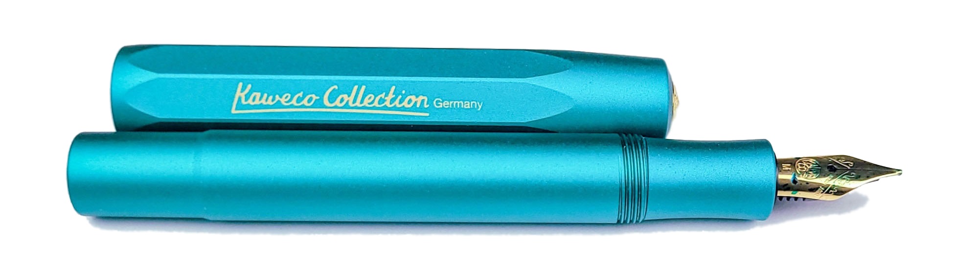
 Our overall recommendation These will sell like the proverbial hot cakes; if either takes your fancy, get it quickly!
 Where to get hold of one All your favourite fountain pen specialists are likely to have these in stock – as long as they last.
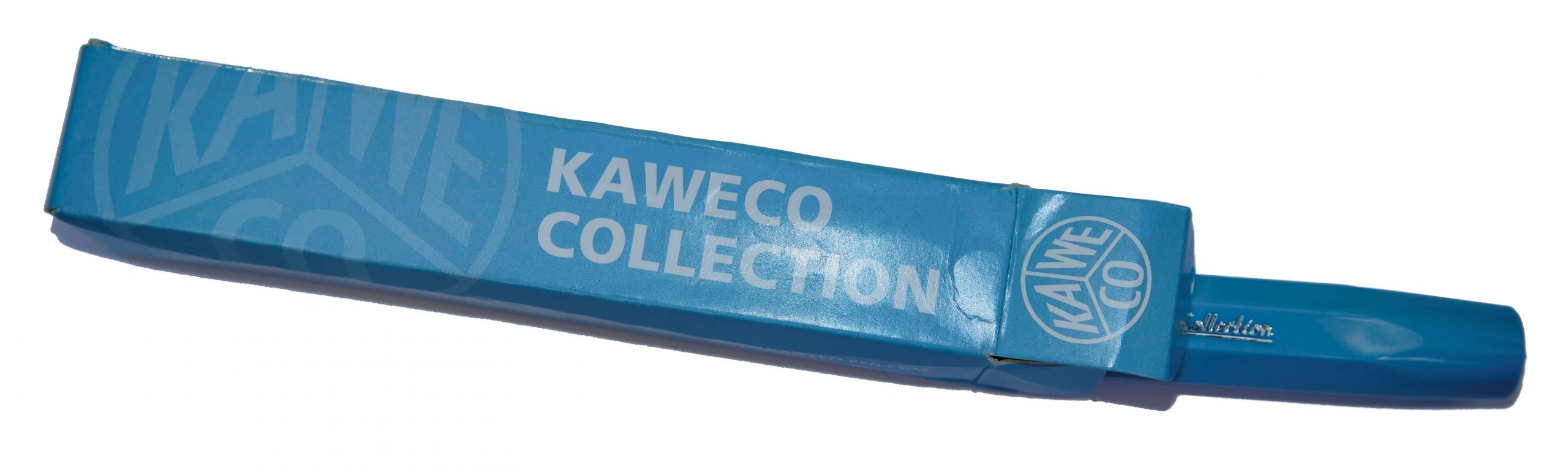 This meta-review references:
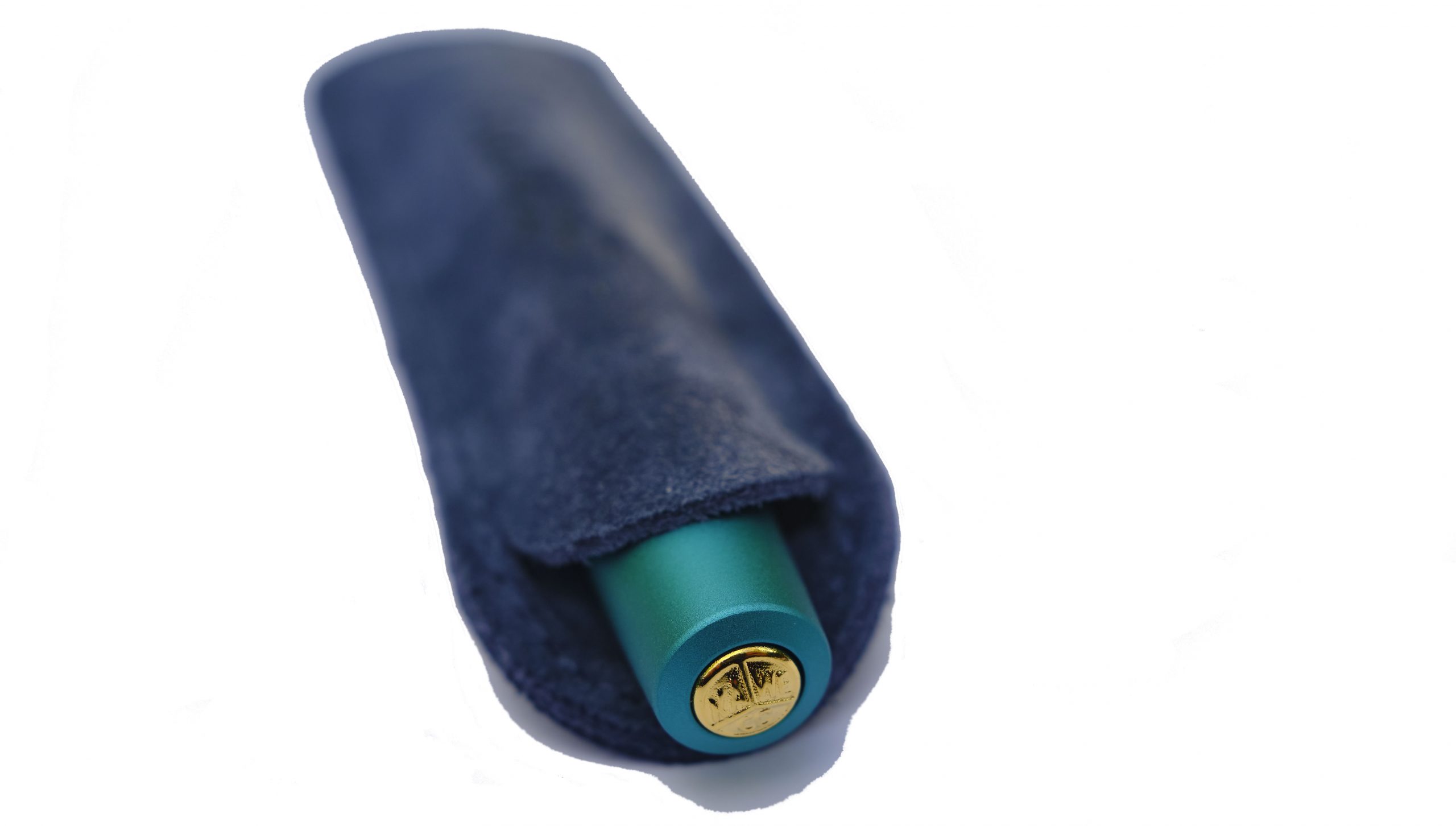
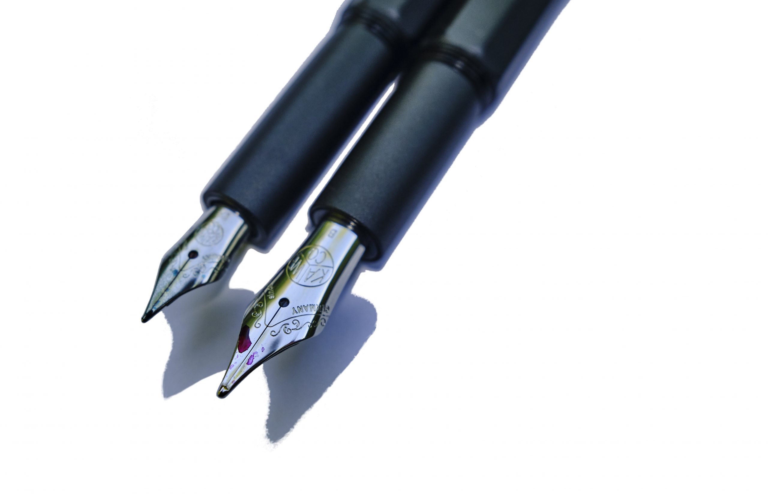
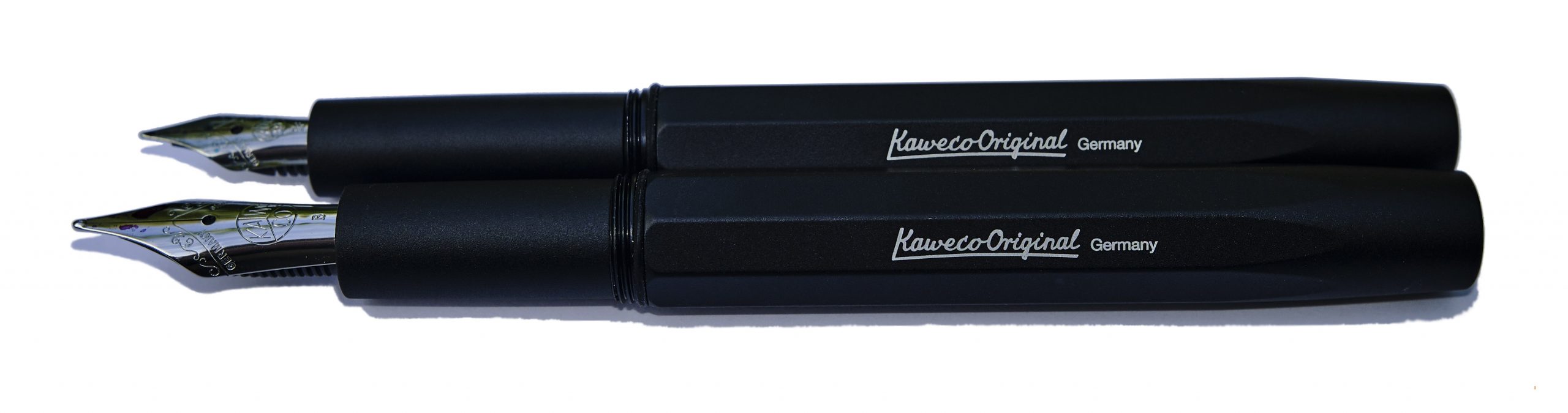 How it looks Actually, they came up with two Originals, with very different nib sizes. The smaller version uses the diminutive short #5 060 Bock nib familiar from the Sport and Lilliput models, which unfortunately looks a little stunted in a long pen like this. The larger Original, though, uses a nice big #6 250 nib which looks in proper proportion – a bit like a scaled-up Sport, keeping the distinctive octagonal profile which is something of a Kaweco calling card.
 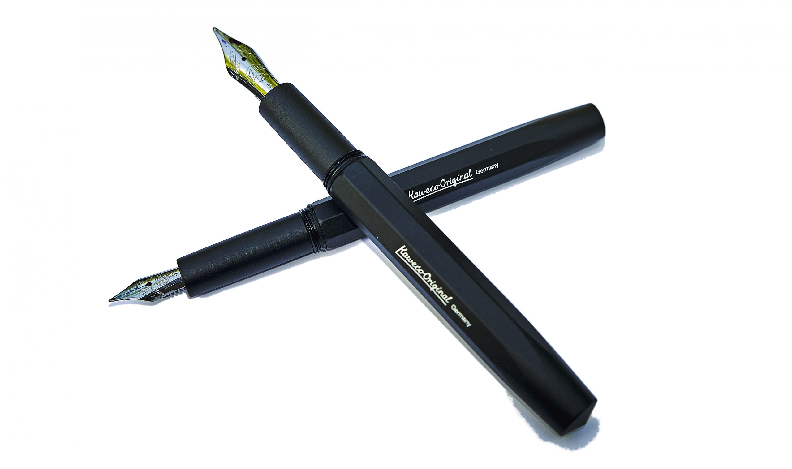 How it feels Both Originals feel solid yet, thanks to aluminium construction, not terribly heavy. On the whole, robust but usable.
 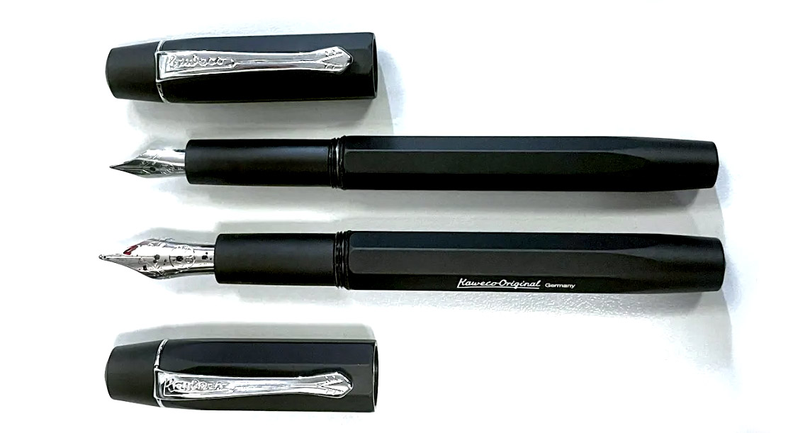 How it fills An obvious advantage over the Sport is that the Originals have room for a full-size converter, and Kaweco have maximised that gain by threading the inside collar of the section to allow for a screw-in converter, helpfully also available from Kaweco in a range of colours. For reasons which remain a mystery, we chose purple for our test units, but retailers might be well advised to provide a converter as standard; it’s a much more ‘premium’ experience filling up with ink from a proper bottle, and being able to prime a feed with a quick twist of the converter can help when inks prove to be a little on the dry side.
 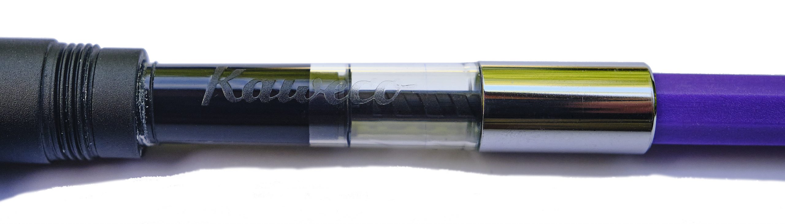 Crucially, how it writes… As ever that depends upon the nib fitted and the ink too, but we had a varied experience with our test units. The tiny 060 had an EF nib which struggled to lay enough ink down really, but as we’d probably elect to upgrade to a more fitting Bock 076 (sadly not yet available in Kaweco branding) anyway, perhaps that’s not the end of the world. The larger 250 had a B tip which surprised several of our reviewers with how well it performed as a ‘daily driver’, so that looks like the winner.
 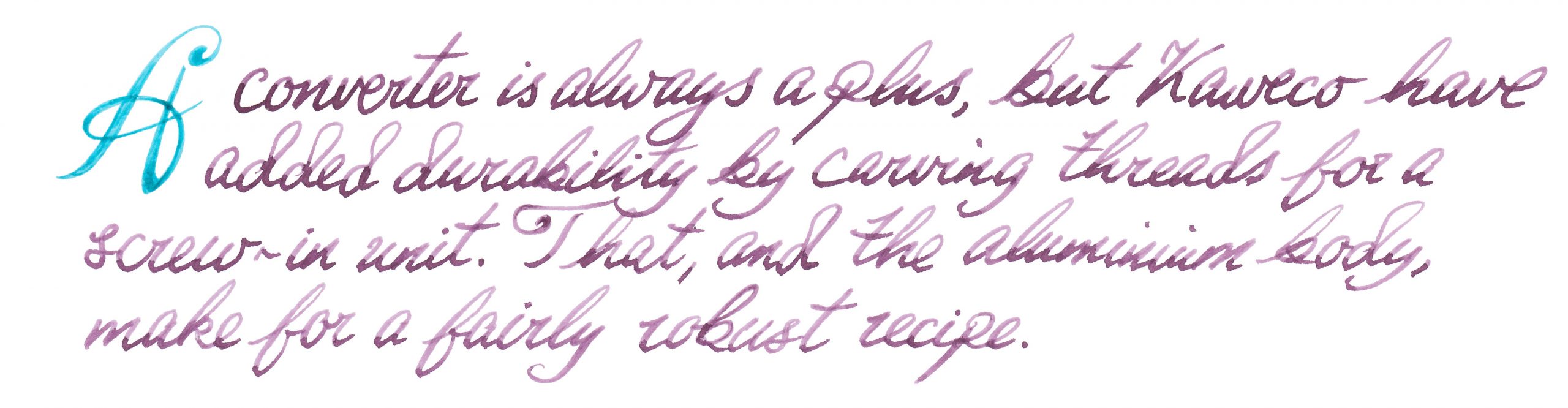 Pen! What is it good for? These might be a bit pricy for a school pen, but they are robust enough to serve as a daily driver for a more grown-up writer.
 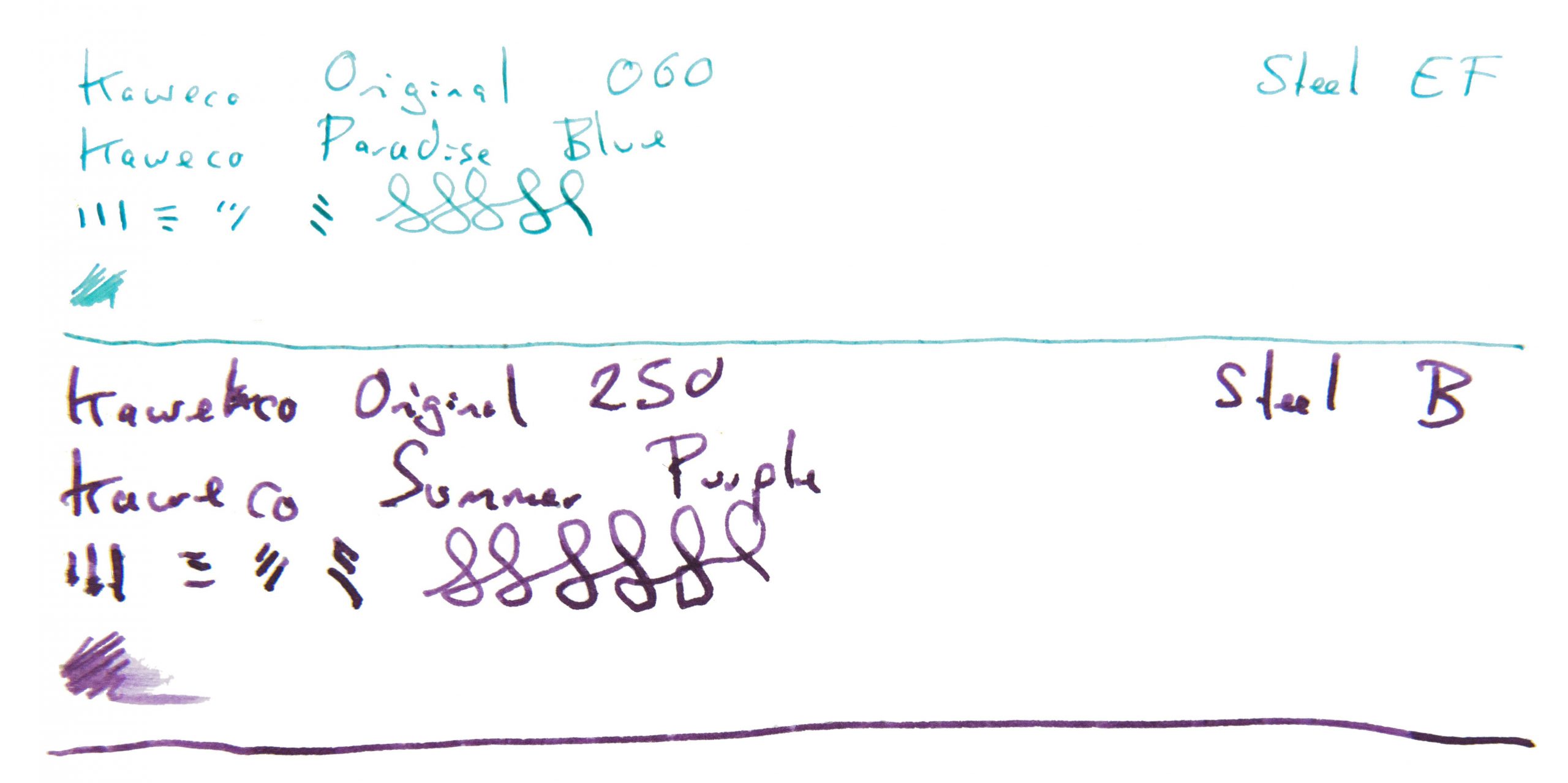 VFM At a ‘street price’ close to £100 for the #6 version these are not cheap, to be honest, so our tip would be to buy from a bricks-and-mortar shop where you can try a number of nibs and get the one which really works for you. It needs to be usable to be worth the money, at this price point.
 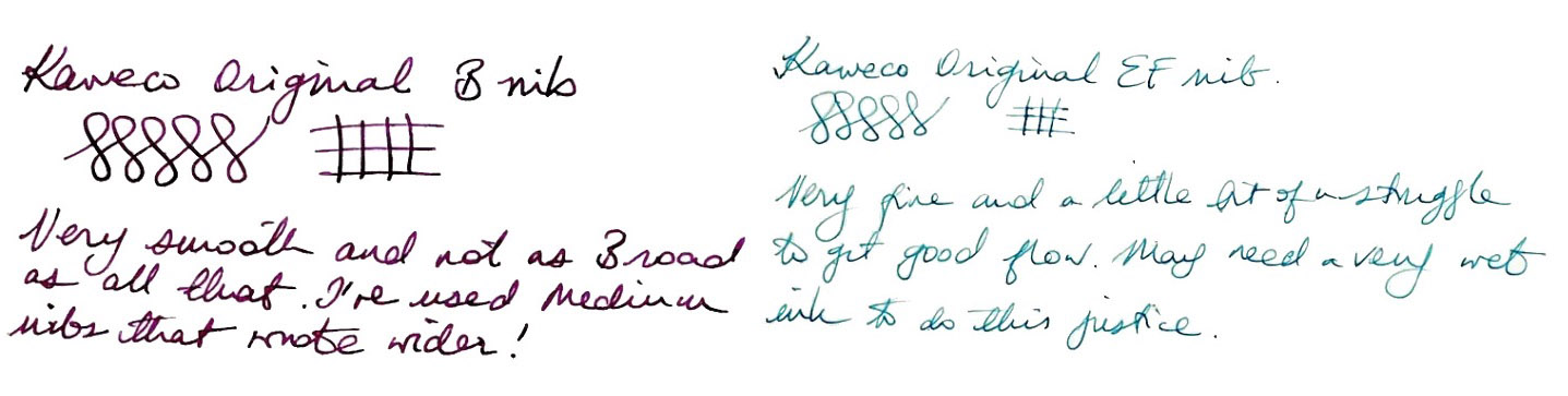 The only way is ethics Made in the EU, and packaged sensibly, there’s little to worry about on this front.
 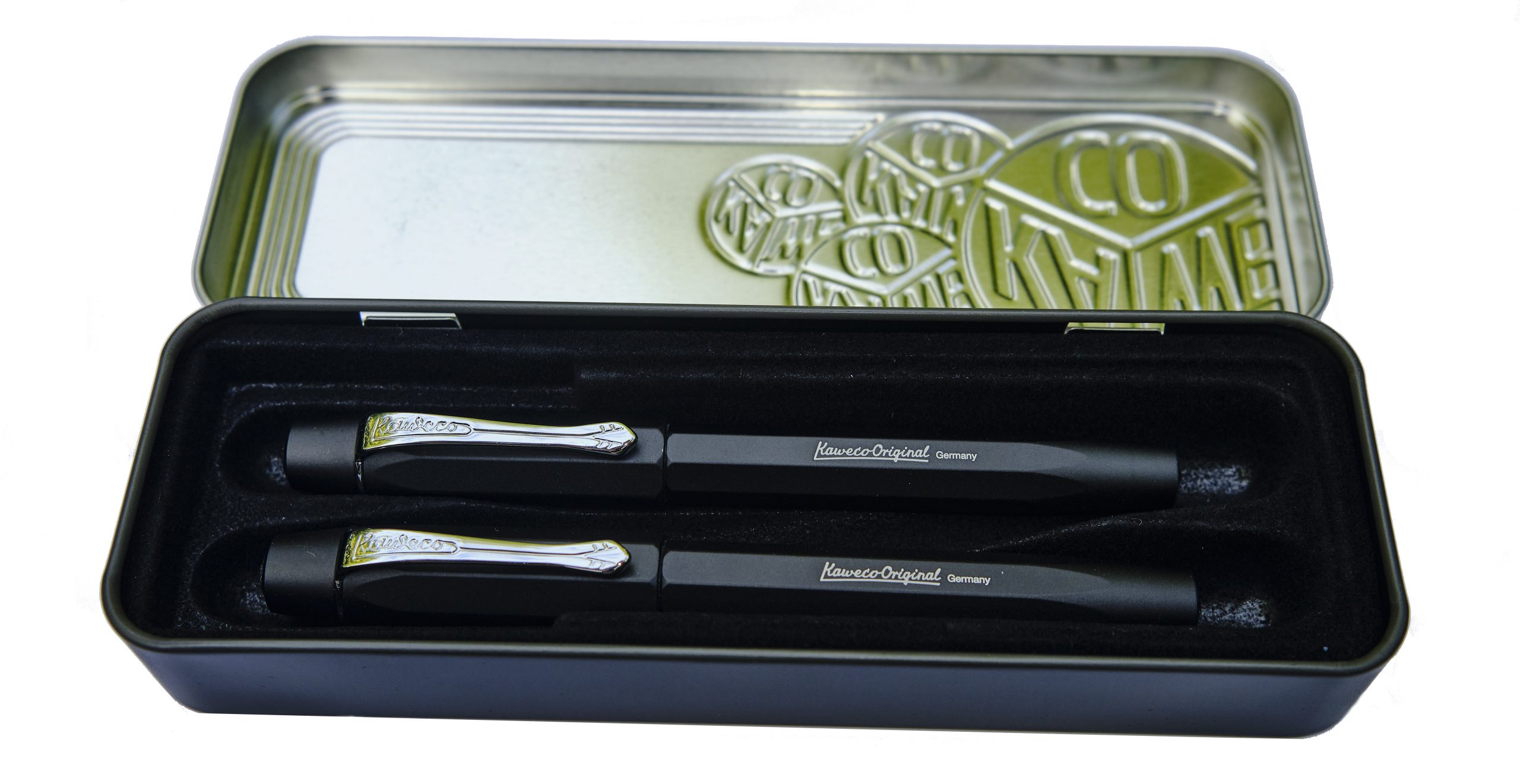 If this isn’t quite your cup of tea, but almost… If the 060 nib just looks a bit short, fitting an after-market 076 will probably help. If you like the 250 version but for some reason just don’t dig a polygonal cross-section, Kaweco’s smoothly cylindrical Supra may be more your thing.
 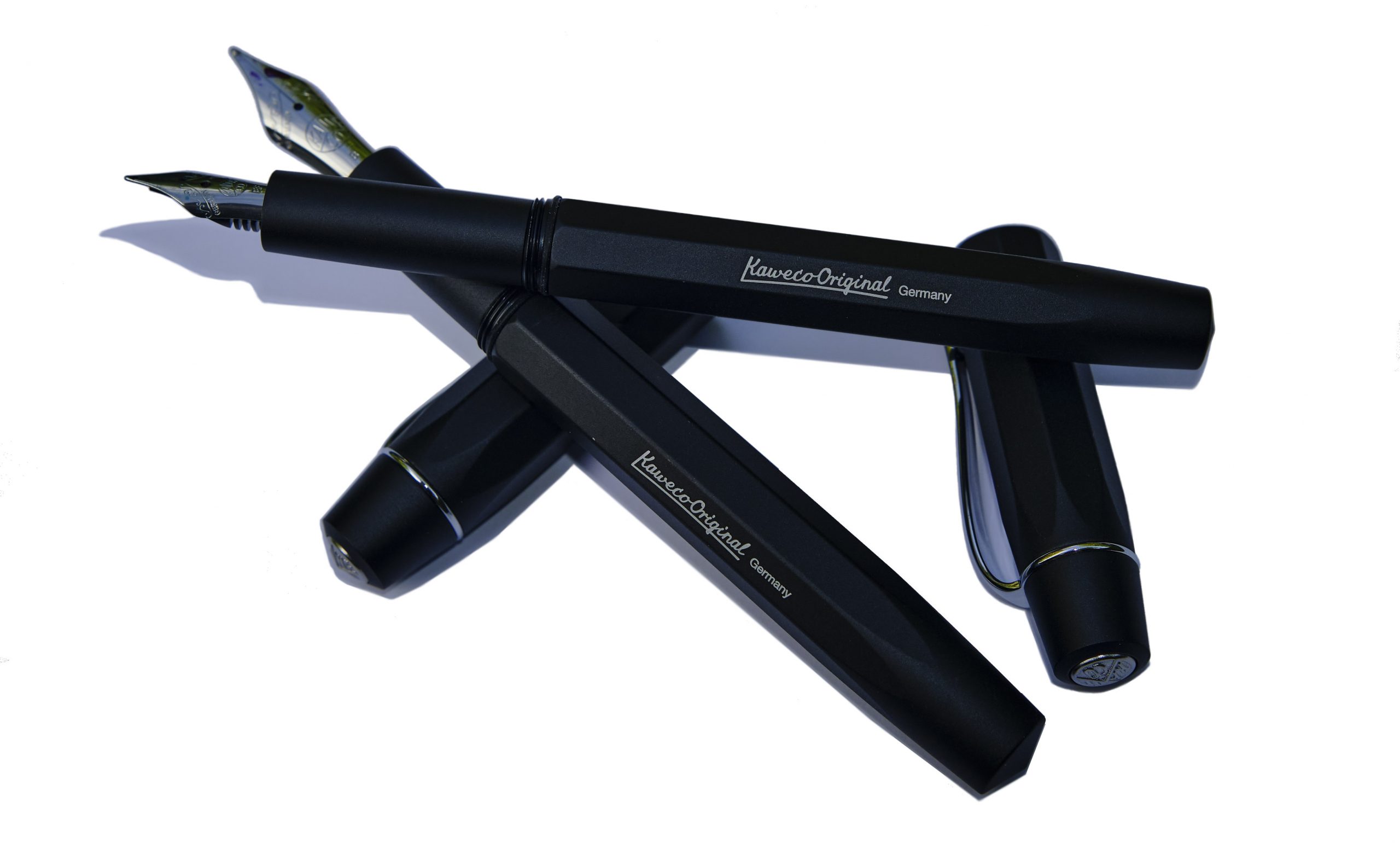 Our overall recommendation For people who enjoy brief scribbles with a Sport but want something similar but a bit larger for extended writing sessions – and that might be rather a lot of us – one of the Originals could well be the answer. But given that the right nib makes a big difference, we’d recommend trying them out in the flesh first.
 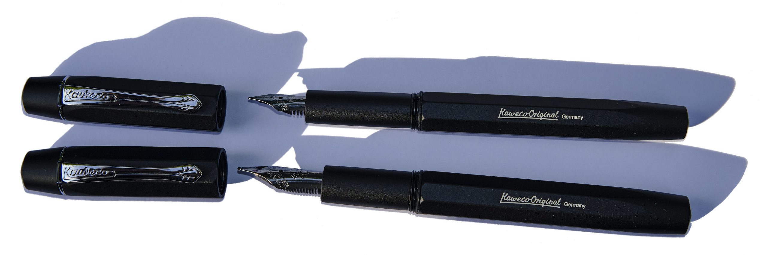 Where to get hold of one It’s a fairly new model at present but most fountain pen shops are likely to consider this soon. Buying in person looks less hassle than online purchasing given the possibility of a bit of nibular trial-and-error.
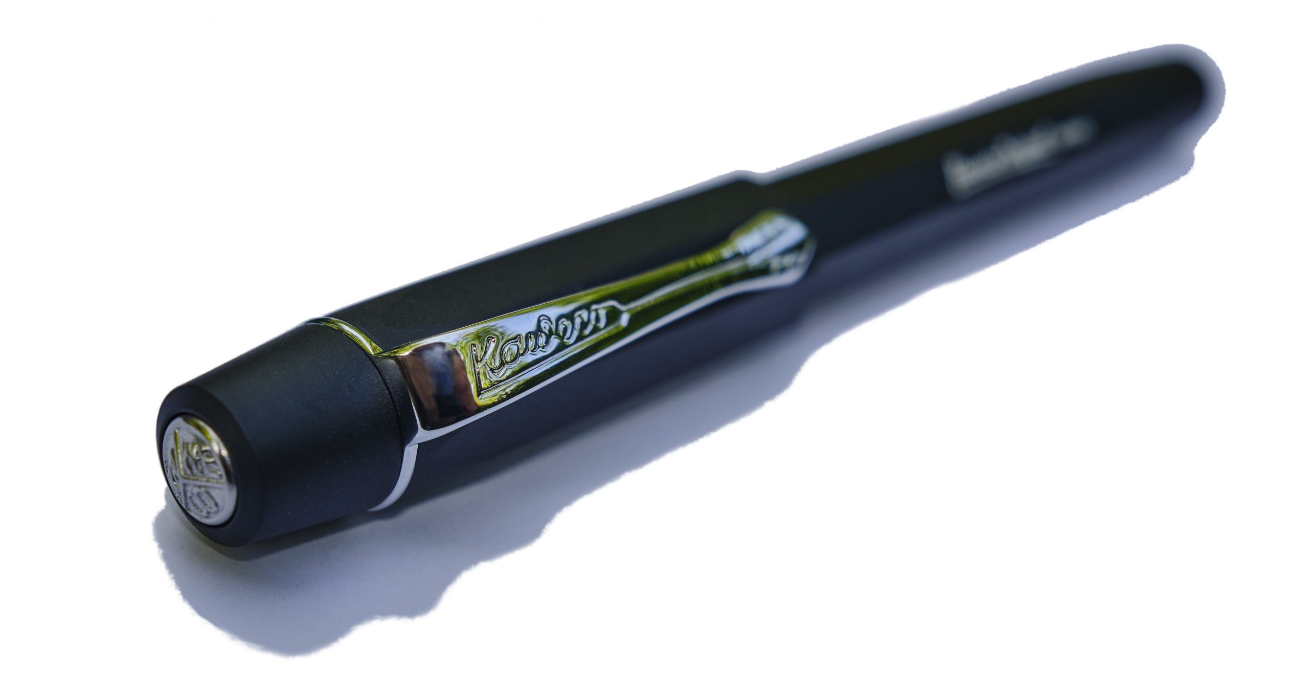
 Thanks to Kaweco for the review samples.
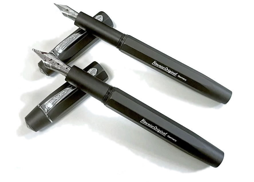
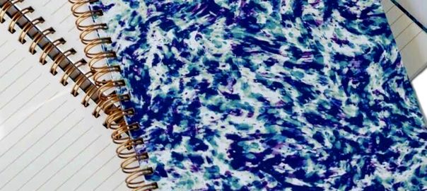
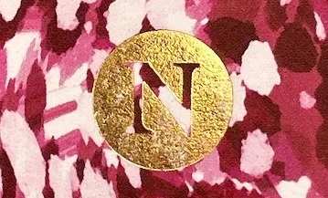

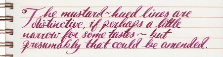
 VFM At £16.99 (including delivery factored in), these aren’t cheap – but then again, they’re hardly ridiculous money either. Certain brands we won’t mention would charge you three times as much for something only half as interesting! Subscribers to Donna’s newsletter tend to get discounts and special editions, too. It’s perhaps a bit too special to take to school, but for many other purposes just posh enough…
 Thanks to Donna for kindly sending samples our way, and telling us (some of) the secrets to the process.
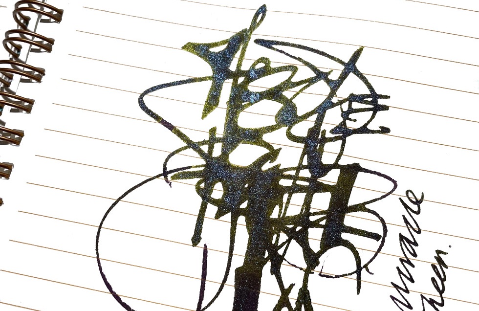
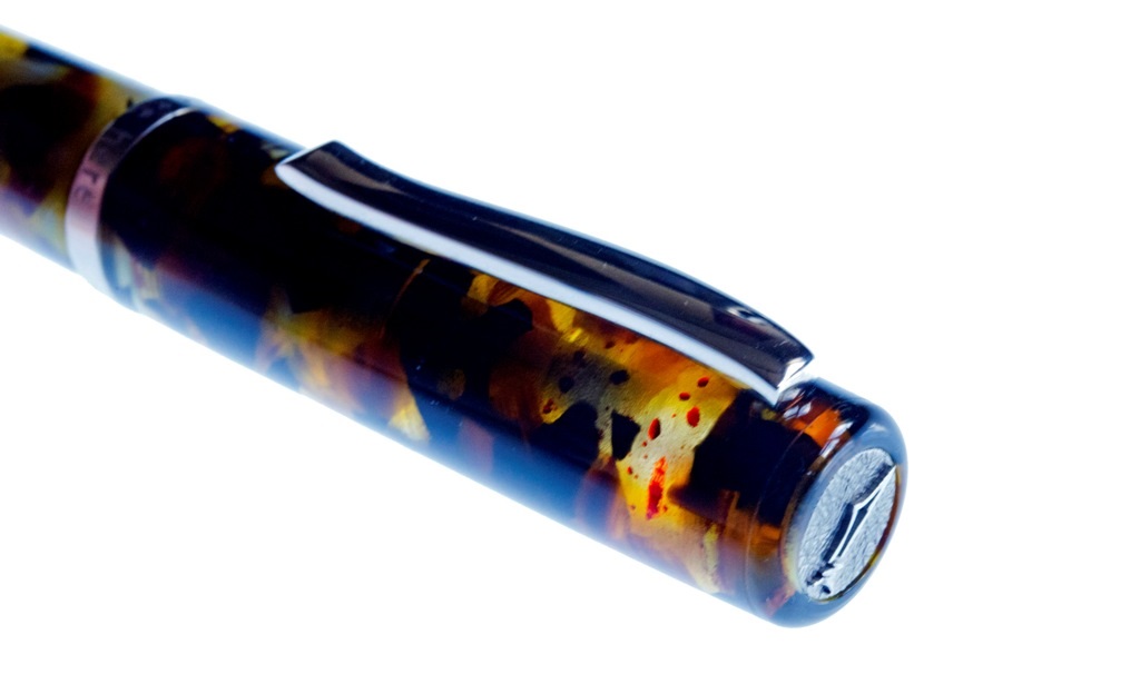
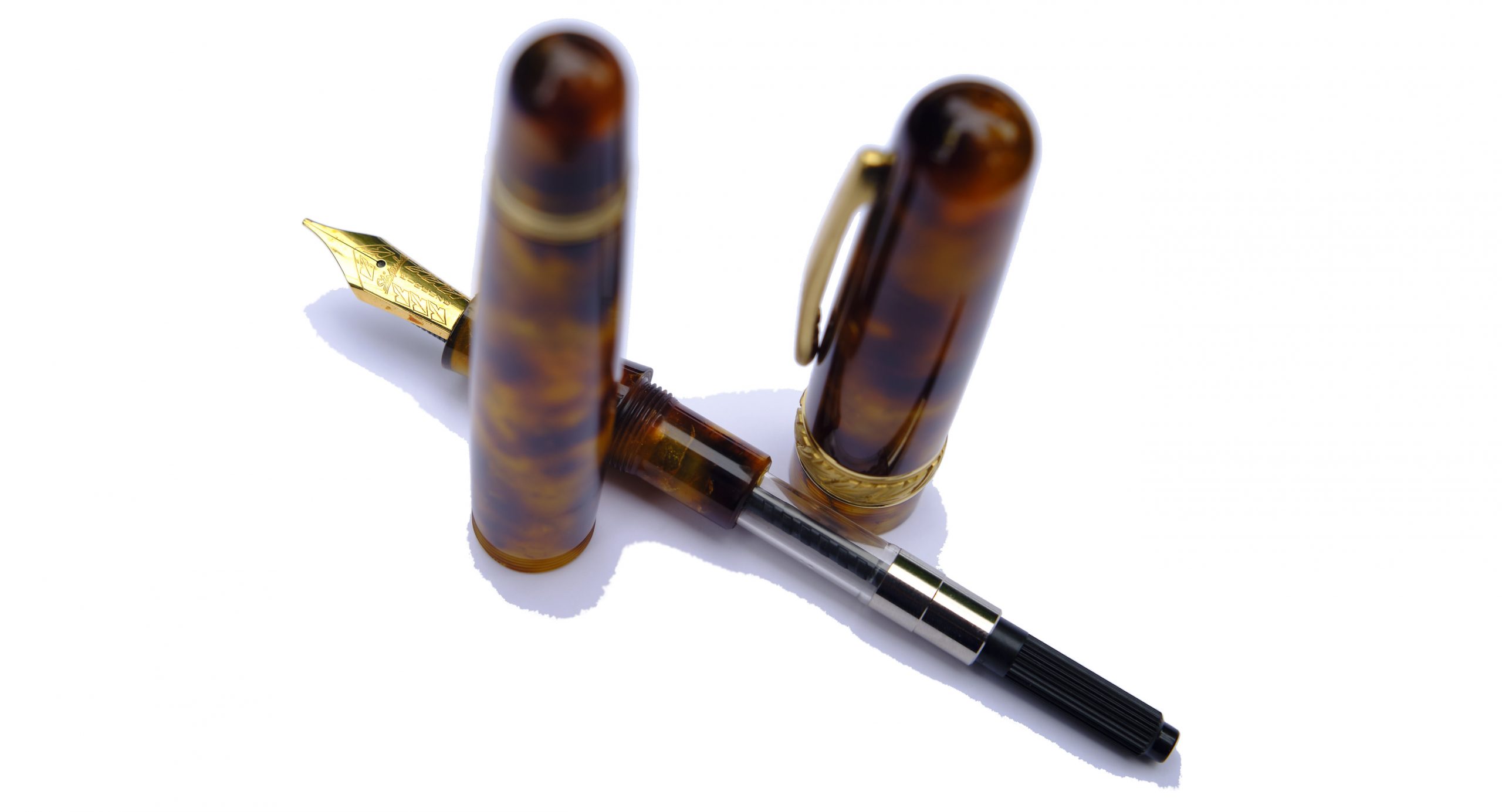
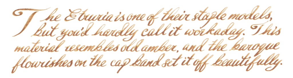
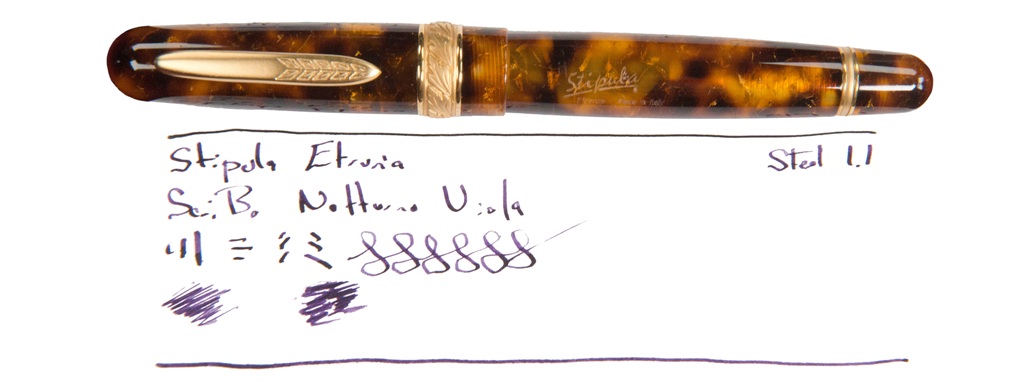
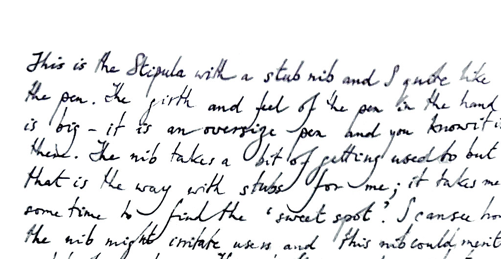
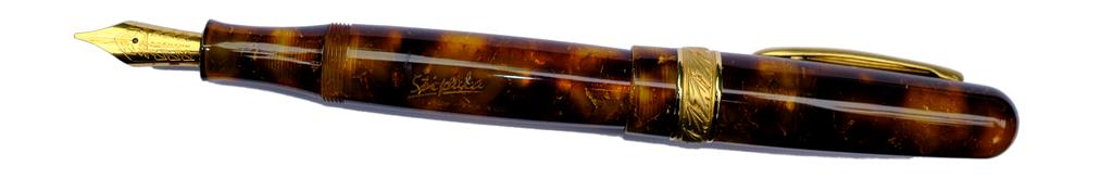
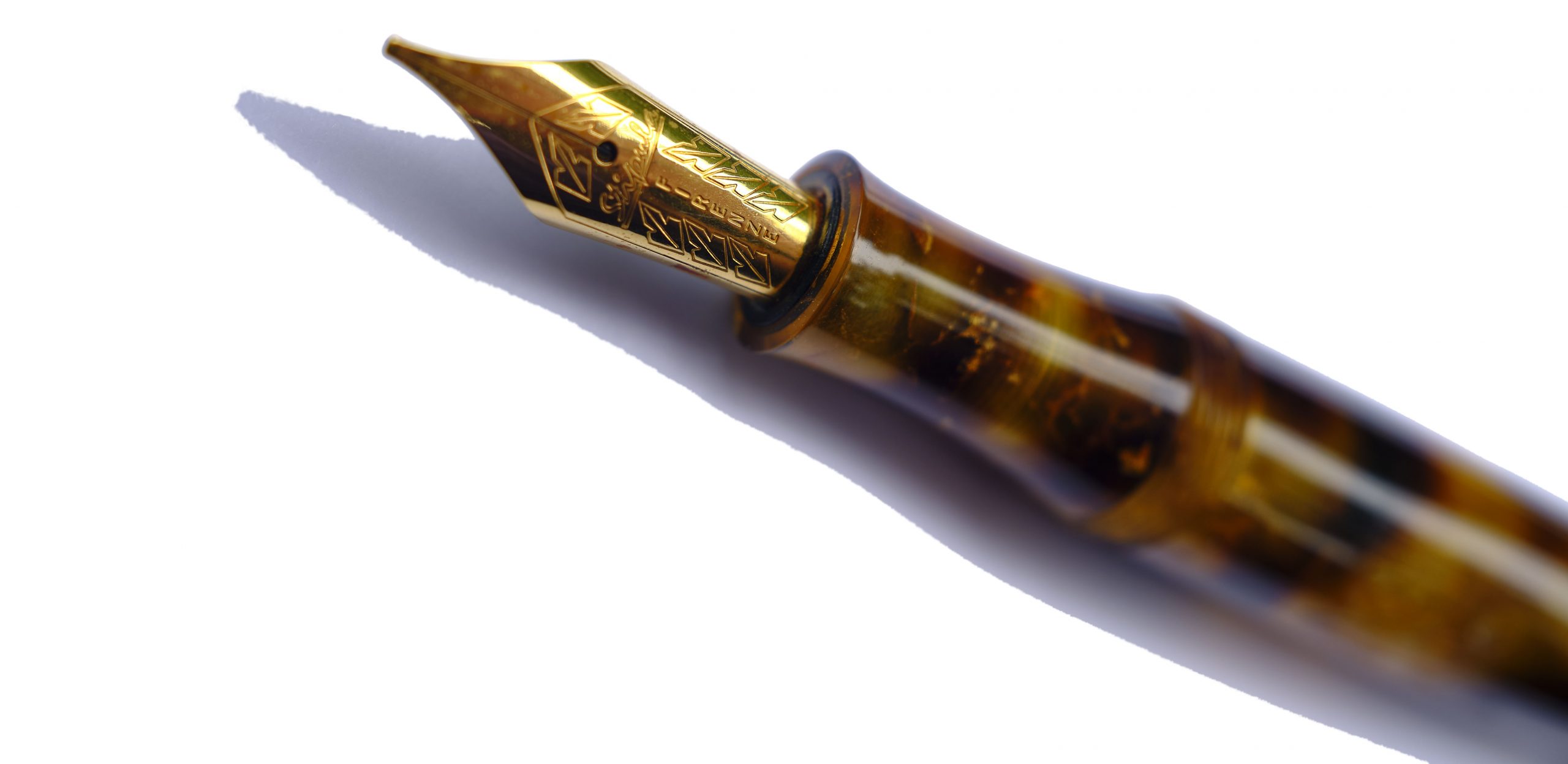
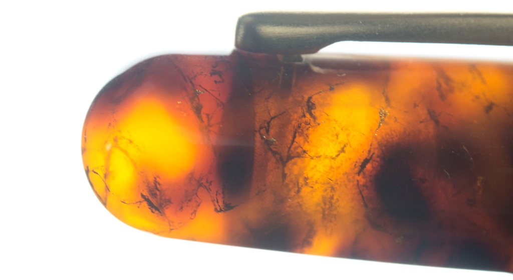
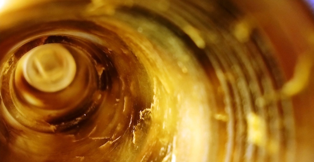
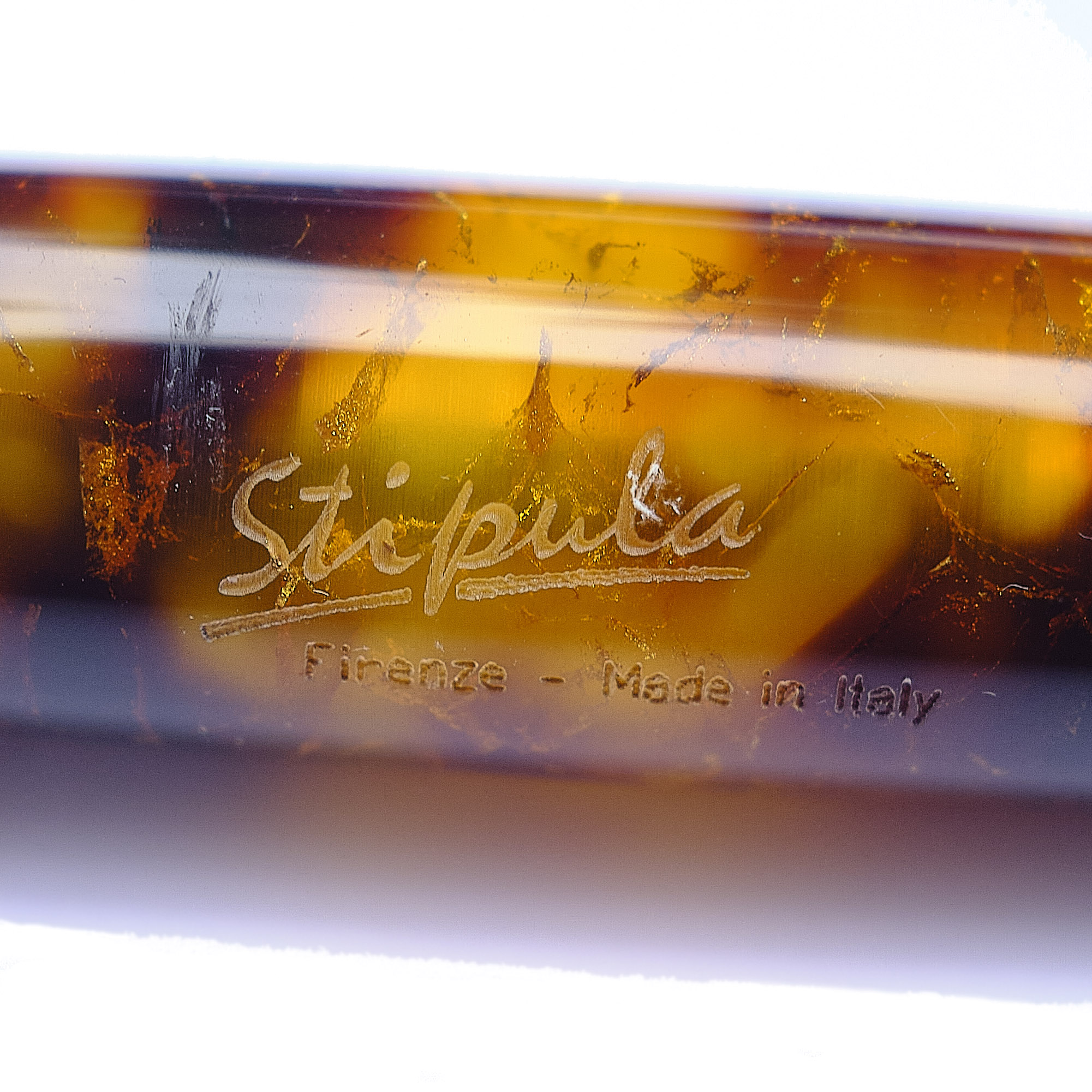 A little bit of history Classics fans know that Latin pops up everywhere, and perhaps even more appropriately so when the brand in question is Italian. Stipulae originally sprung from the same root as ‘stubble’, perhaps denoting thin reeds for writing or perhaps, as Mick suggests, the custom of breaking a twig to indicate consent to all the terms of a contract – the stipulations. The third Renaissance was in love with all those retro references, and nowhere more so than Florence, home to this day to a fountain pen brand called Stipula. But its output is hardly ever seen in Blighty; so we wanted to find what such a pen was like in the flesh.
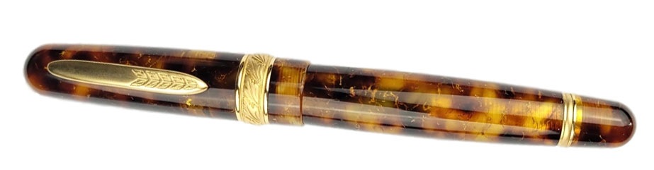
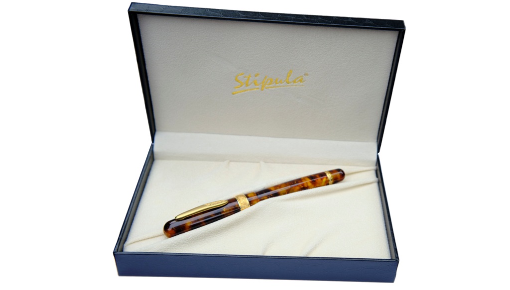
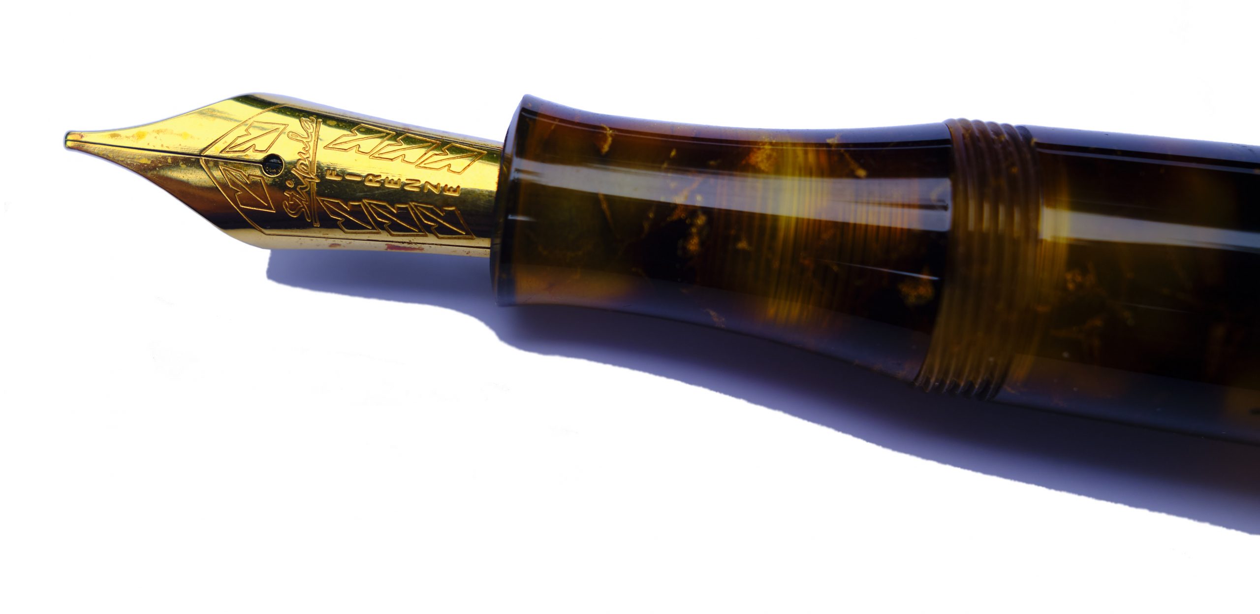 How it feels Girthy but nicely balanced; unless you have a very strong preference for slender pens, this should do you just fine.
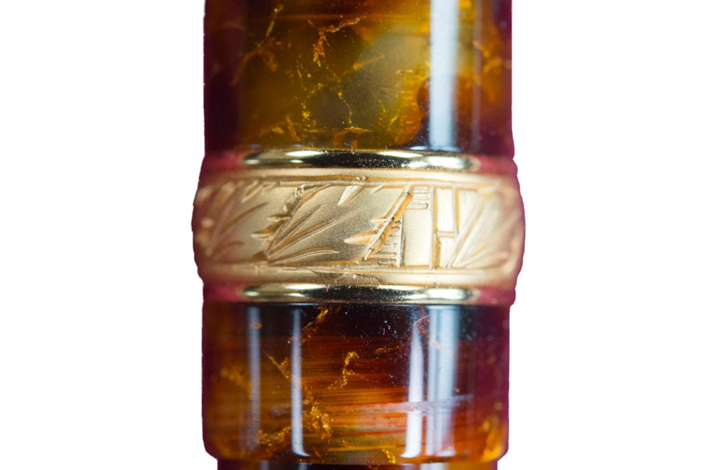
 This meta-review references:
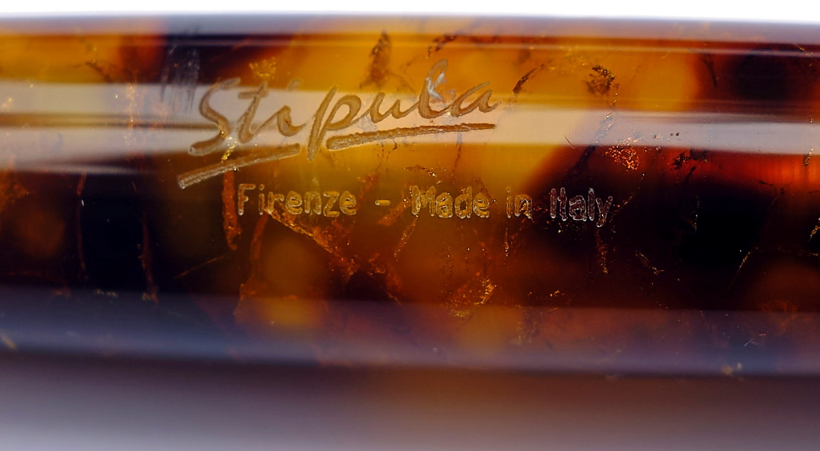
 Thanks to Write Here for sending the Tropea our way.
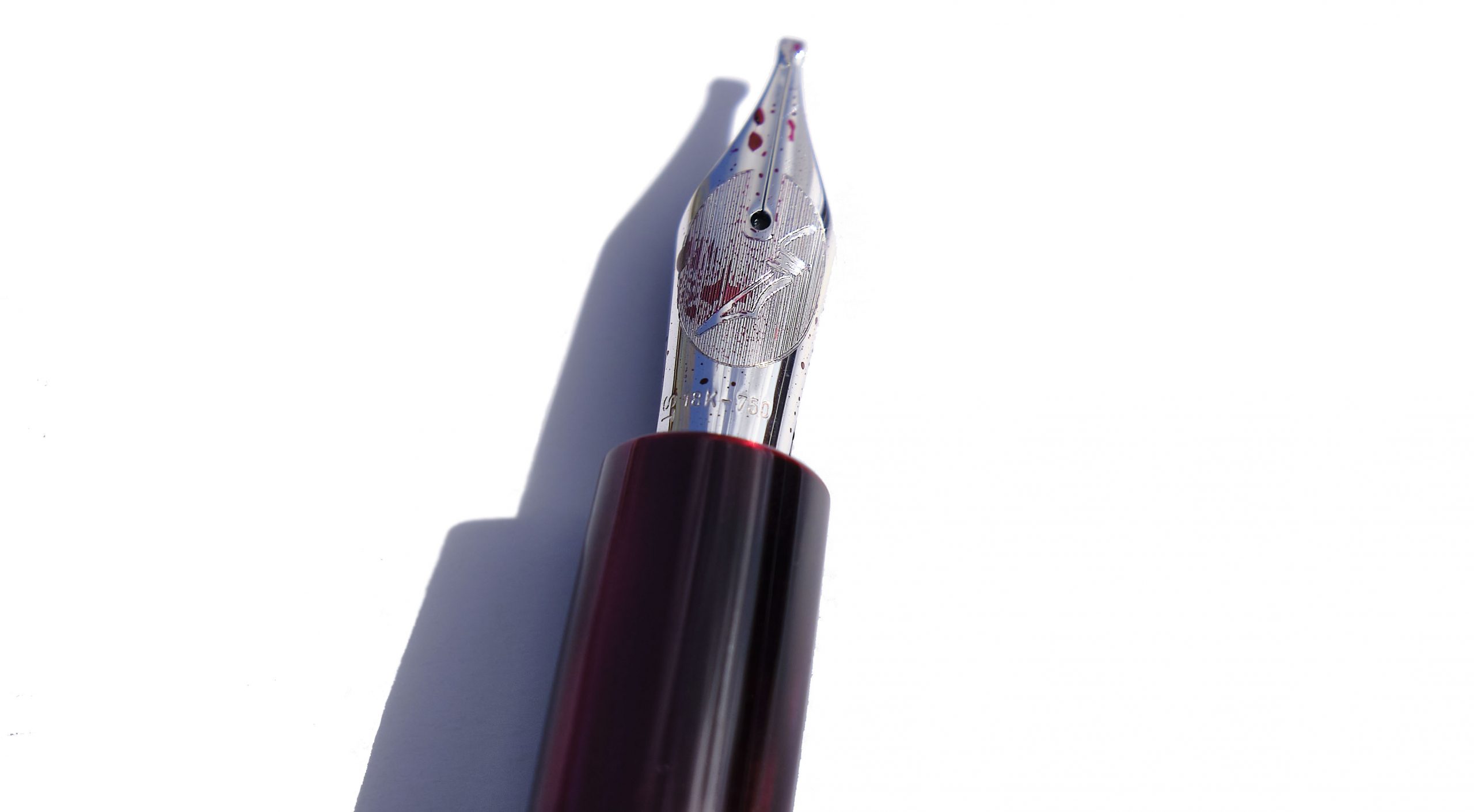
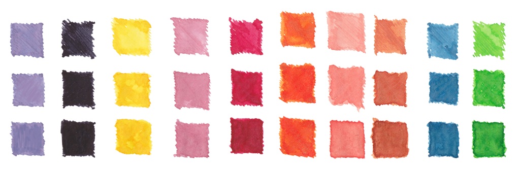
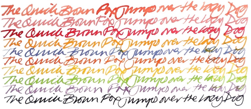
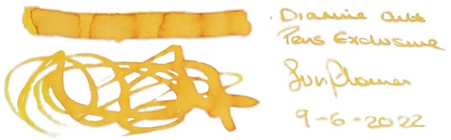
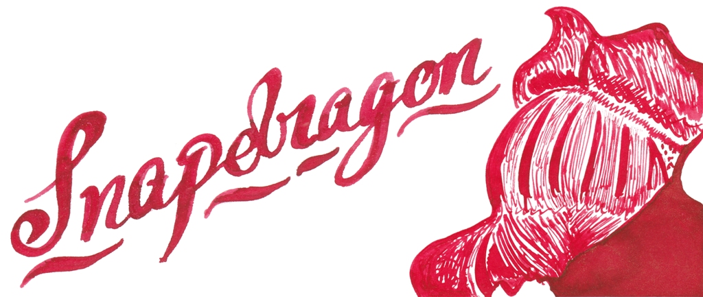
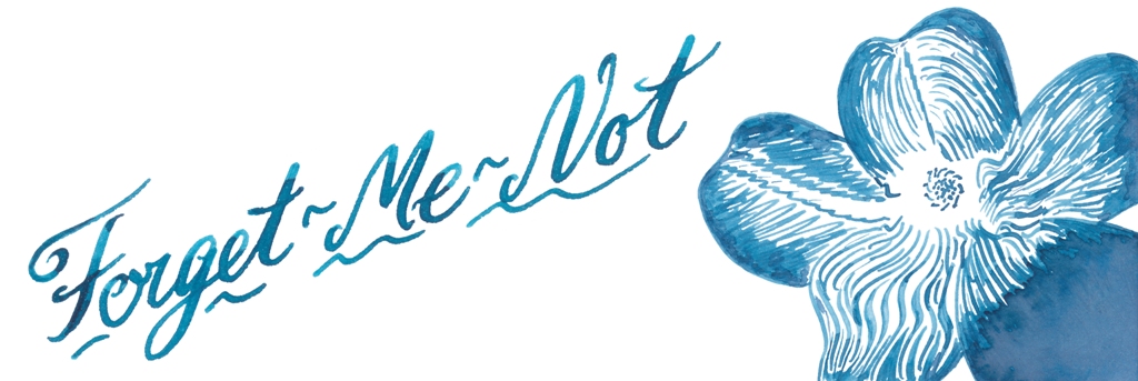
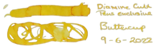
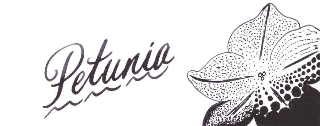
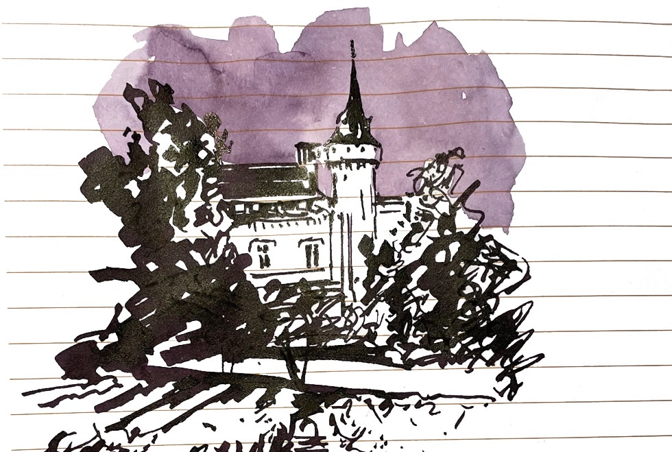
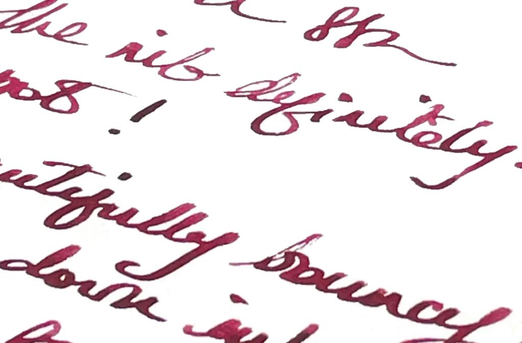
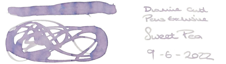
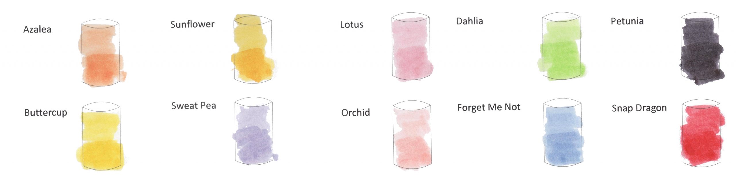
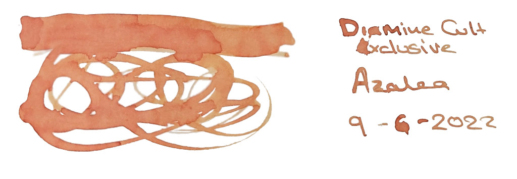
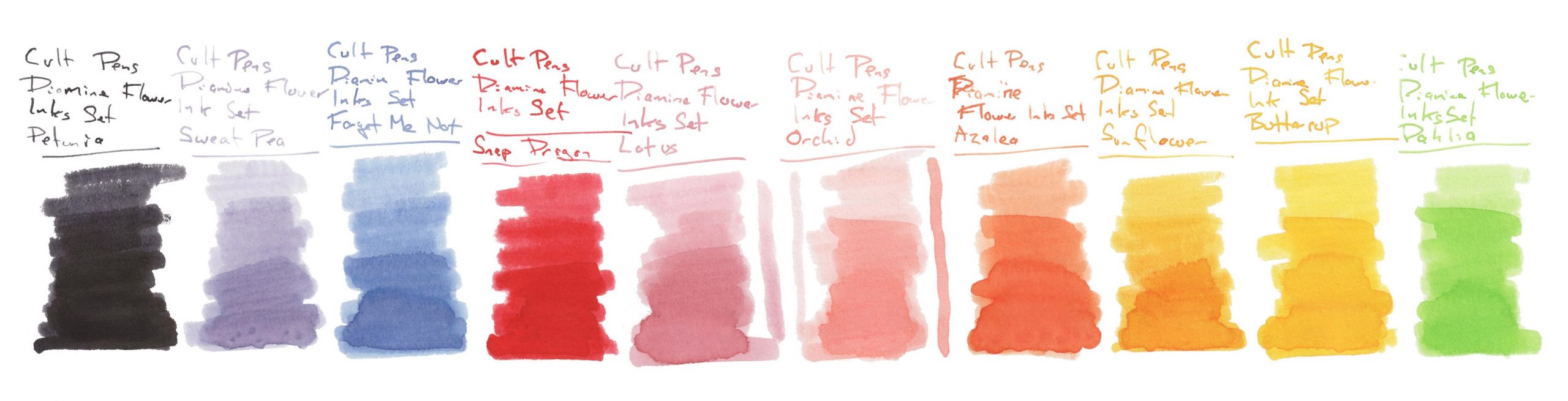 Ink! What is it good for? Drawing, we think; given the pallor of several of these inks they look better suited to illustration than correspondence.
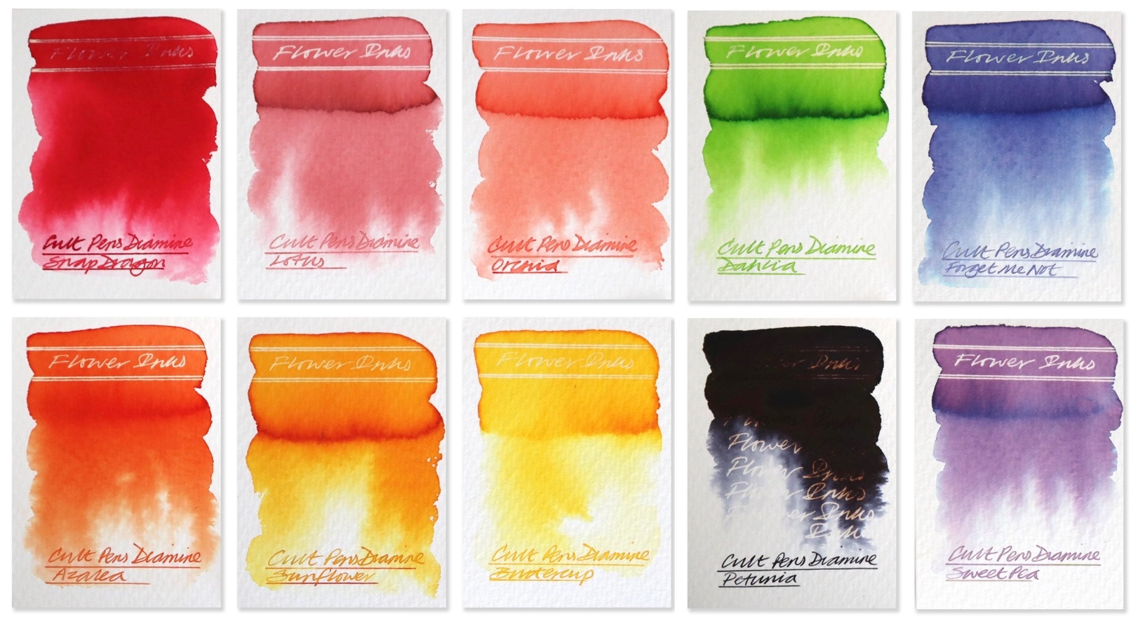
 Where to get hold of some Only from