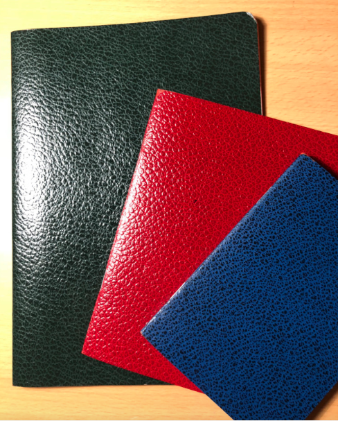
A little bit of history: Choosing Keeping is a shop found in London that can be reached through the Central Line or the many lines that serve London Liverpool Street. They are open Wednesday through to Sunday (which means they’ll be open on the weekend, if you plan on spending a weekend in Central London!). Choosing Keeping sell fountain pens, rollerballs, ballpoints, mechanical pencils, art & office supplies, desk objects and many more. What we have for you today is from their paper offerings: some very beautiful notebooks in three different sizes.
How it looks & feels: Those within the Inkdom were very impressed by the presentation of these notebooks. There’s a very retro look to them, which is further enhanced by the string keeping them together when they were delivered.
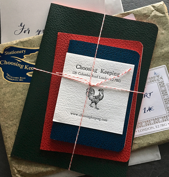
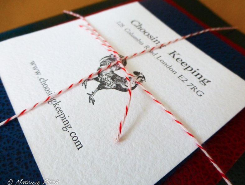
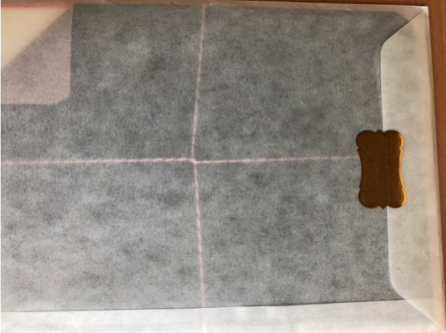
The personal touch and retro look is further enhanced through the envelope that the notebooks are stored in, inside the parcel package.
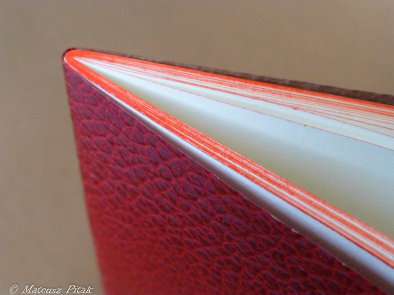
Hand-made in Italy with leather-looking paper, these seriously look the part! The covers do throw you a bit because you expect them to be leather, but they definitely don’t feel it. You can tear them with a bit of force, but it shouldn’t be a problem for normal carry. The covers come in three flavours, depending on the size you want: green (A5), red (11x15cm) and blue (9×13.5cm).
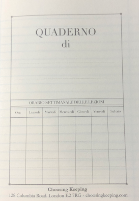
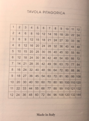
The pages are lined with red edges, which is a bit different. Another thing that is lined is the off-white pages themselves, though you do have the option for plain layouts too. On the inside page you have space for a weekly planner overview and on the final page is a multiplication table. Could be useful? It’s written in Italian as these are Italian-made notebooks – you can still understand the numbers though!
The paper has a bit of tooth and texture, but nothing overly noticeable or anything that would give a bad writing experience.
Crucially, how does it handle fountain pen ink?: Coming in at around 70gsm, we may have been a bit sceptical as to whether the paper would hold up, but it handled fountain pens very well. They even held up to Nick’s tests!
Pulp! What is it good for?: Coming in different sizes, you can use these for different applications. But you have the options, from a pocket notebook to scribble down quick notes up to an A5 size for those more in-depth thoughts. They complement each other quite well as you have the different sizes which will allow you to transfer and expand on thoughts when moving to the larger sizes; it would be quite interesting to view your own thought processes expand in that respect!

VFM, and what else is there on offer if it isn’t quite your cup of tea?: £18 for three notebooks does sound like quite a lot. Especially when you consider that Rhodia A5 notebooks are around the £2 mark. Overall you get 186 pages when considering all three notebooks, which leaves you paying a fraction under 10p per page. Leuchtturm notebooks, with 249 pages, for reference will be 6p per page. Leuchtturm also come with more options, such as colour, options for planning and numbered pages, though the paper quality is often contested. However, you don’t get the same personal touch or feeling when using other notebooks and that is something you definitely get with these. They are also very easy to slip into a bag and don’t take up too much space due to their covers, but remain very stylish and looking the part.
Our overall recommendation: The personality, the way the pages keep up with fountain pens… It’s difficult to give these a miss.
Where to get hold of one: Direct from Choosing Keeping
This meta-review references:
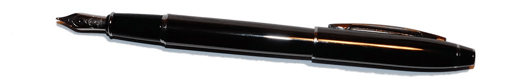
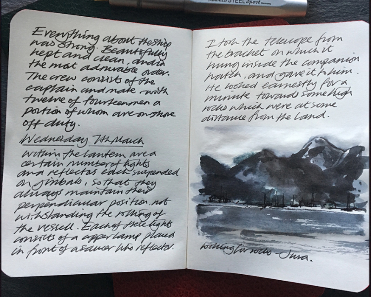
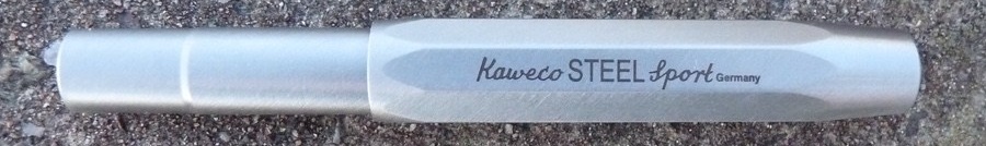
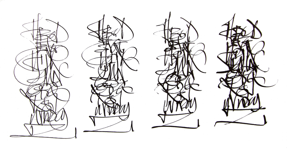
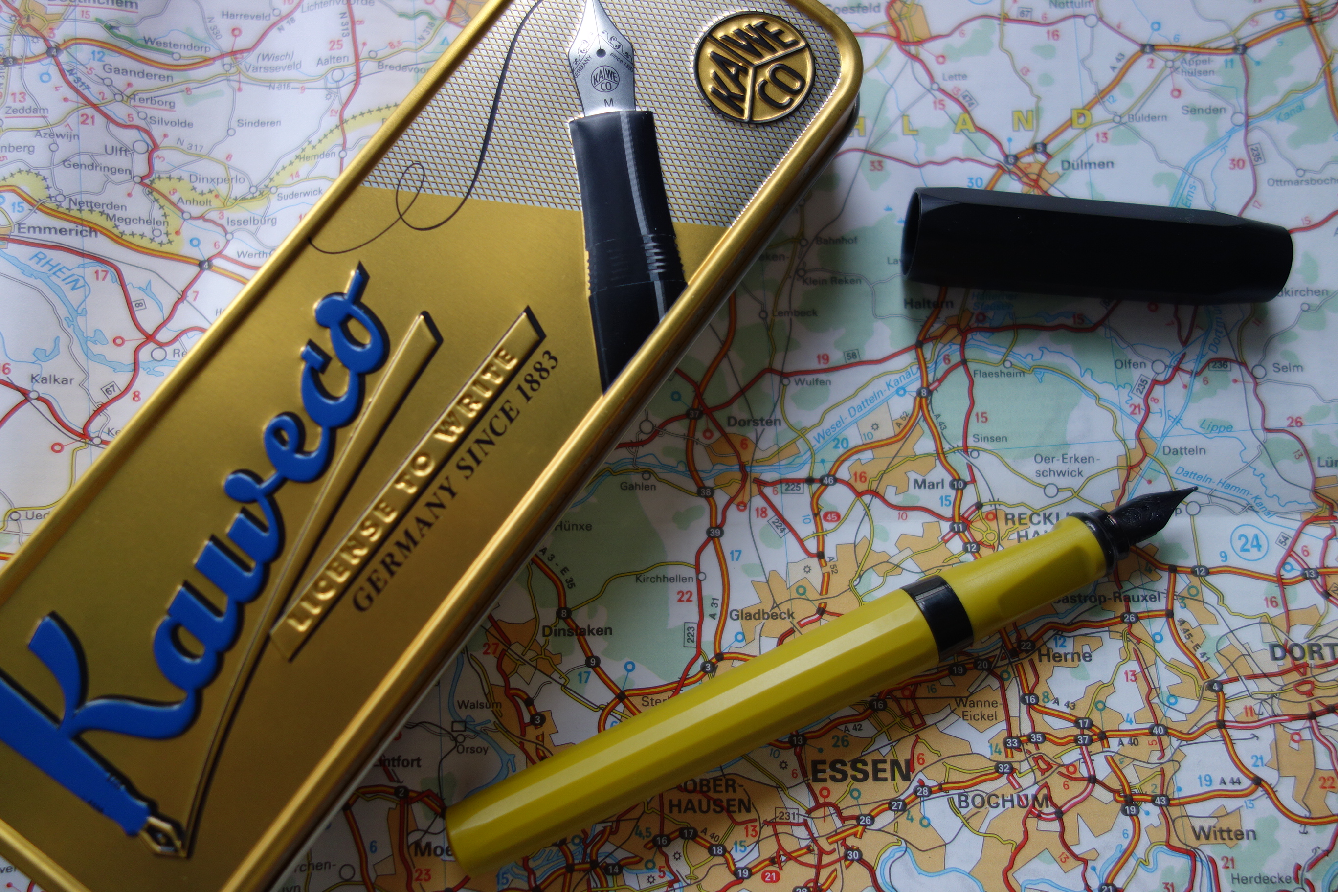
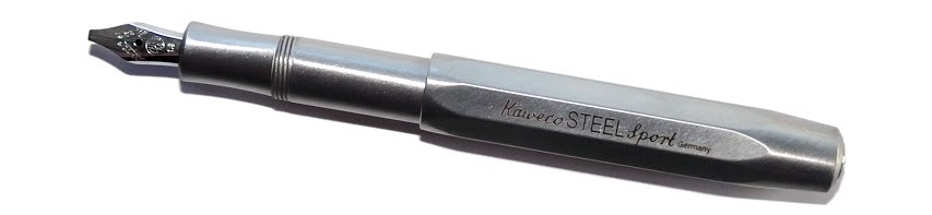 A little bit of history Every serious fountain pen fan has a Kaweco Sport somewhere; small, pocketable – and in their simple plastic form eminently affordable – they are often starter pens, and frequently stay in use as emergency back-up pens even when owners have developed more exotic tastes. For quite a while, though Kaweco has been developing a ‘premium’ line of robust, refined, reassuringly expensive Sports in interesting materials ranging from carbon fibre to industrial metals. The very first United Inkdom meta-review tested the
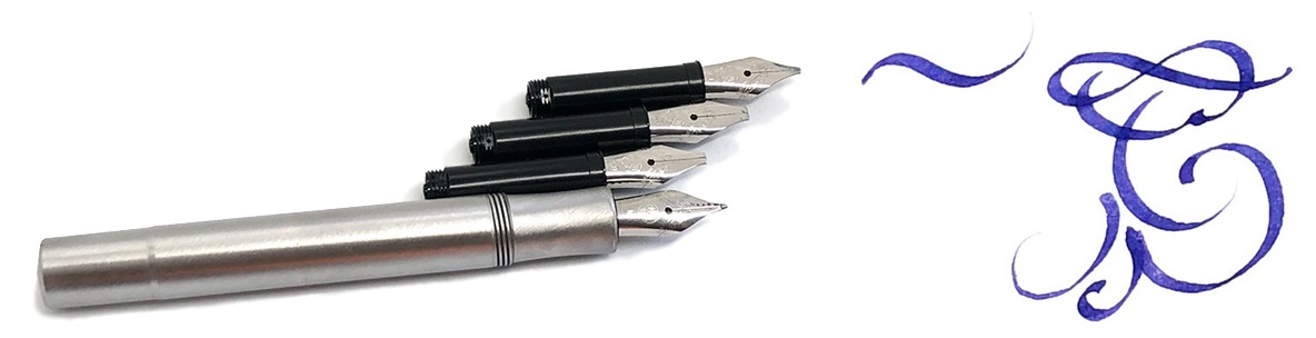

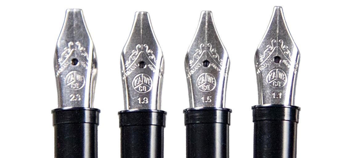
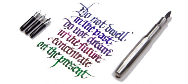
 Crucially, how it writes… As always, that depends on what nib you choose. Like all the more expensive Sport bodies (and indeed most of the Kaweco fountain pen range) this version uses screw-in small#5 Bock assemblies, which are available in a wide range of both round and italic tips. For the round tipped-nibs, many of us find that EF, F and M tend to be safest of the steel options, although any flow or smoothness issues, which can be variable in steel, vanish if you upgrade to gold. For this meta-review, though, we put the Steel Sport in the hands of two professional calligraphers (in Kent and Austria, respectively) who put the italic options through their paces – and found the narrower 1.1mm and 1.5mm nibs worked well even for fast writing, while a little more care was required for the wider tips where the same flow of ink has to stretch further. But as long as you choose the right nib for you and your own writing style, this is a reliable performer.
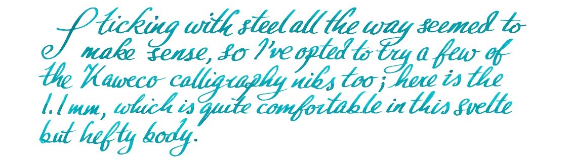 Pen! What is it good for? With a round-tipped nib this is probably the pocket pen par excellence; it looks the business, works well and will probably outlast most owners. Our calligraphers thought it was good for having some fun with italic lettering too, even if not quite the thing for fee-earning studio work (which is not what it is really designed for, to be fair).
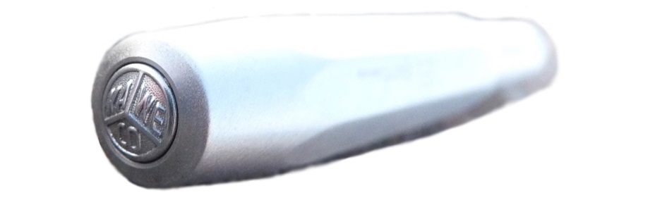
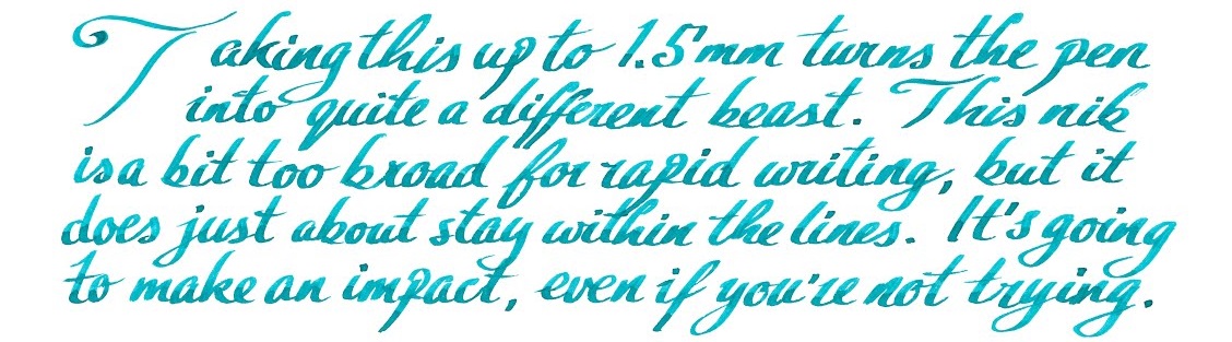 VFM This is not a cheap pen – indeed, apart from the carbon-fibre version this is the most expensive Sport so far. Retailing for either €85 or £84.99 (which says something interesting about current exchange rates), it’s a significant purchase, but still not in luxury price-tag territory in our view. It looks a lot more expensive, though, and it’s tough enough that you would have to try very hard before you damaged it – nothing short of a diamond-tipped angle grinder is going to break this!
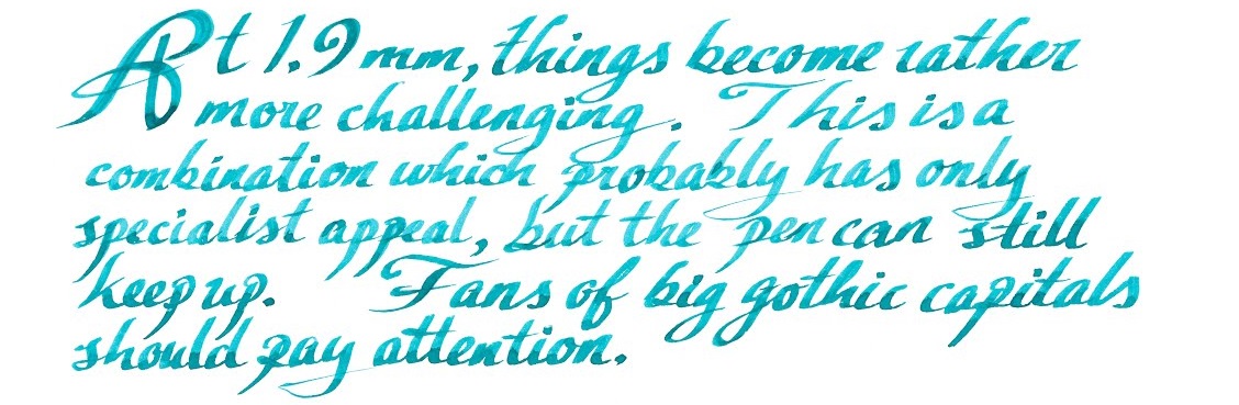 If this isn’t quite your cup of tea, but almost… Then there’s the shinier, lighter and more affordable aluminium version, or the steampunk splendour of the Brass Sport, either of which are sound choices. We have also seen the prototype of the solid silver version – but expect that one to break the £100 barrier, as the materials alone are likely to add around £15 to production costs at current prices.
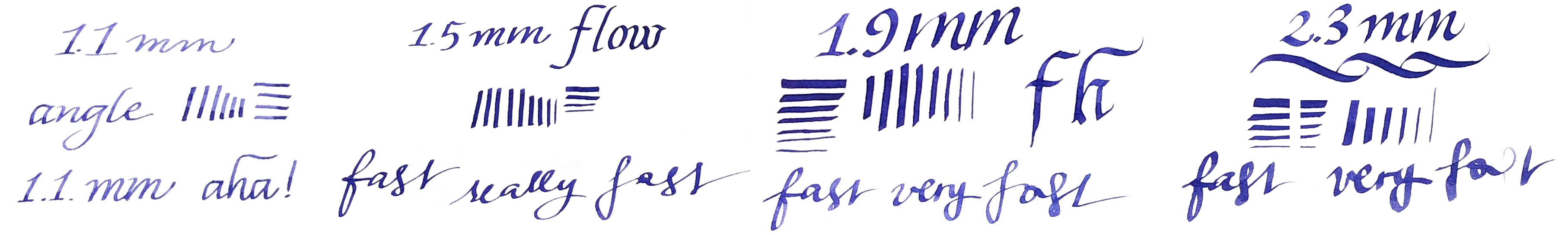
 Where to get hold of one From all the usual sources. Some pens take lots of research to track down, but this shouldn’t be one of them, and it’s currently available from almost all the places you’d expect to look. At the time of publication, The Writing Desk were selling these for £5 less than most other UK retailers, but we don’t expect their stock to last too long!
 This meta-review references:
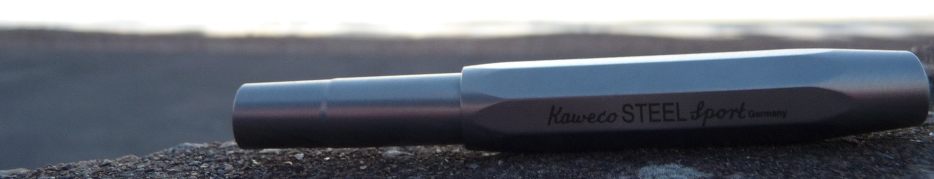
 It’s time for another United Inkdom give-away! You’ve seen these attached to meta-reviews, but we thought it would be fun to run them as a stand-alone exercise every now and then to share some of the gorgeous items that we have been sent to review.
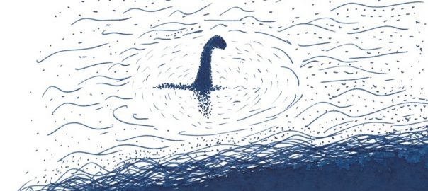
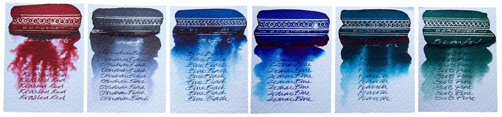
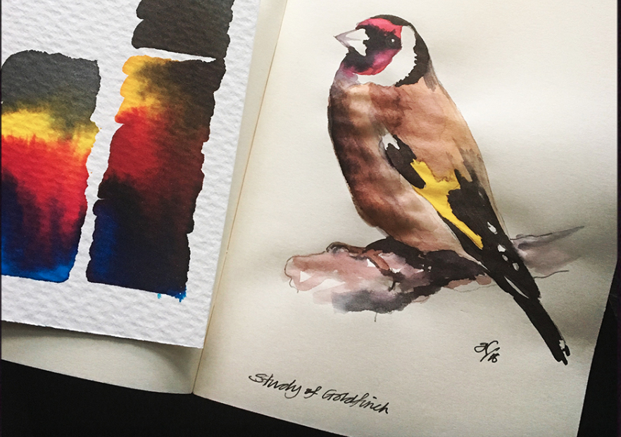
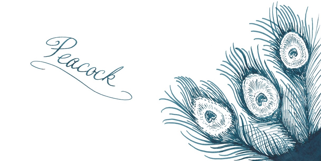
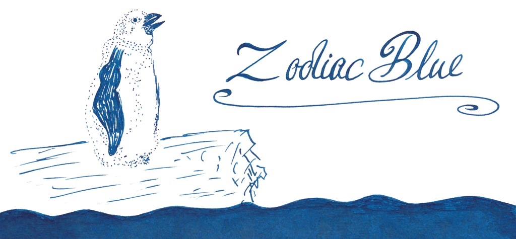
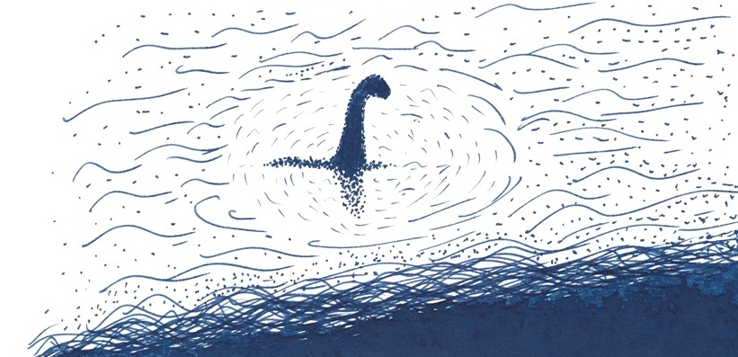
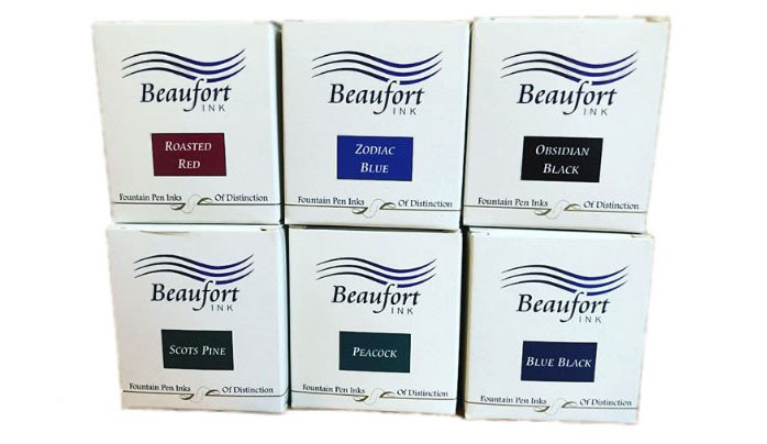
 A little bit of history Some time during the Caledonian Orogeny, around 490–390 million years ago, the Great Glen Fault formed. Wind forward a few aeons and the trench this left cuts a swathe across Scotland, including the very well-known Loch Ness and, just to the south, the rather tautologous Loch Lochy, near which is the home of Beaufort Ink. Despite the name, Beaufort Ink have made their way in the world selling nibs and pen-turning parts rather than ink – until now. Now they’re making up for lost time, and then some!
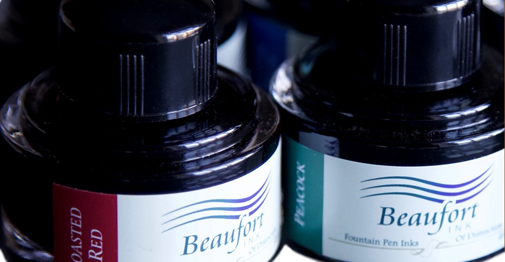
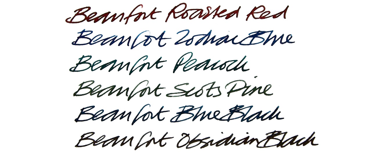
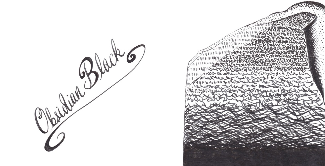
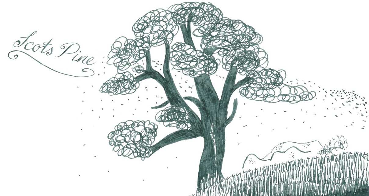

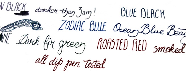
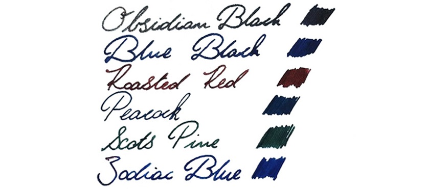
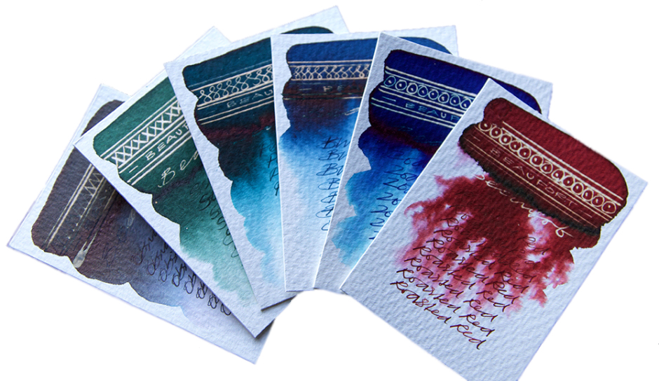
 If this isn’t quite your cup of tea, but almost… Beaufort have indicated that other colours may join the collection if there’s sufficient demand. Unsubtle hints about the urgent need for Purple Heather have already been lodged. The case for Made In Scotland From Girders Orange, meanwhile, awaits a longer label as well as copyright permission!
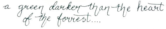
 This meta-review references:
 Thanks to Beaufort Ink for kindly providing samples of the whole range.