A little bit of history When the jurist Lord Monboddo – who we perhaps have to admit was a bit of an eccentric – was in London for one of his yearly visits in 1787, he attended a hearing of the Court of King’s Bench which he, trained in Roman-based law, had relatively little to contribute to. According to legend, the structure started to collapse, plaster rained from the ceiling and everyone rushed from the building, wigs flying, only to realise their esteemed guest had been left behind. Monboddo was entreated to stir himself and asked why he had not already done so; his response was simply that he had assumed this was “an annual ceremony, with which, as an alien, he had nothing to do”.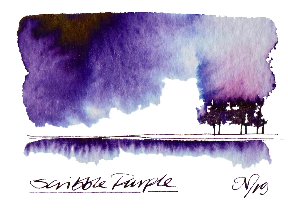
Perhaps he may have had a point; bubbles come, and bubbles go. When the investment bubble of the Darien Gap scheme bankrupted Scotland in the late seventeenth century, it either sought aid from, or was forced to go cap-in-hand to (depending upon your interpretation) England, and the 1707 Act of Union followed. That Union soon fell prey to its own difficulties with the South Sea Bubble, generating debts so massive that they were only finally paid off in 2015, just in time for a new have-cake-and-eat-it bubble to arise in its place the next year. The latter looks likely to put paid to the local market for luxury writing equipment, and indeed those united kingdoms that this site was named in tribute to. But, thanks to a similarly endangered enterprise entitled ‘Fountain Pens UK’ on social media, we can perhaps at least have one last inky hurrah.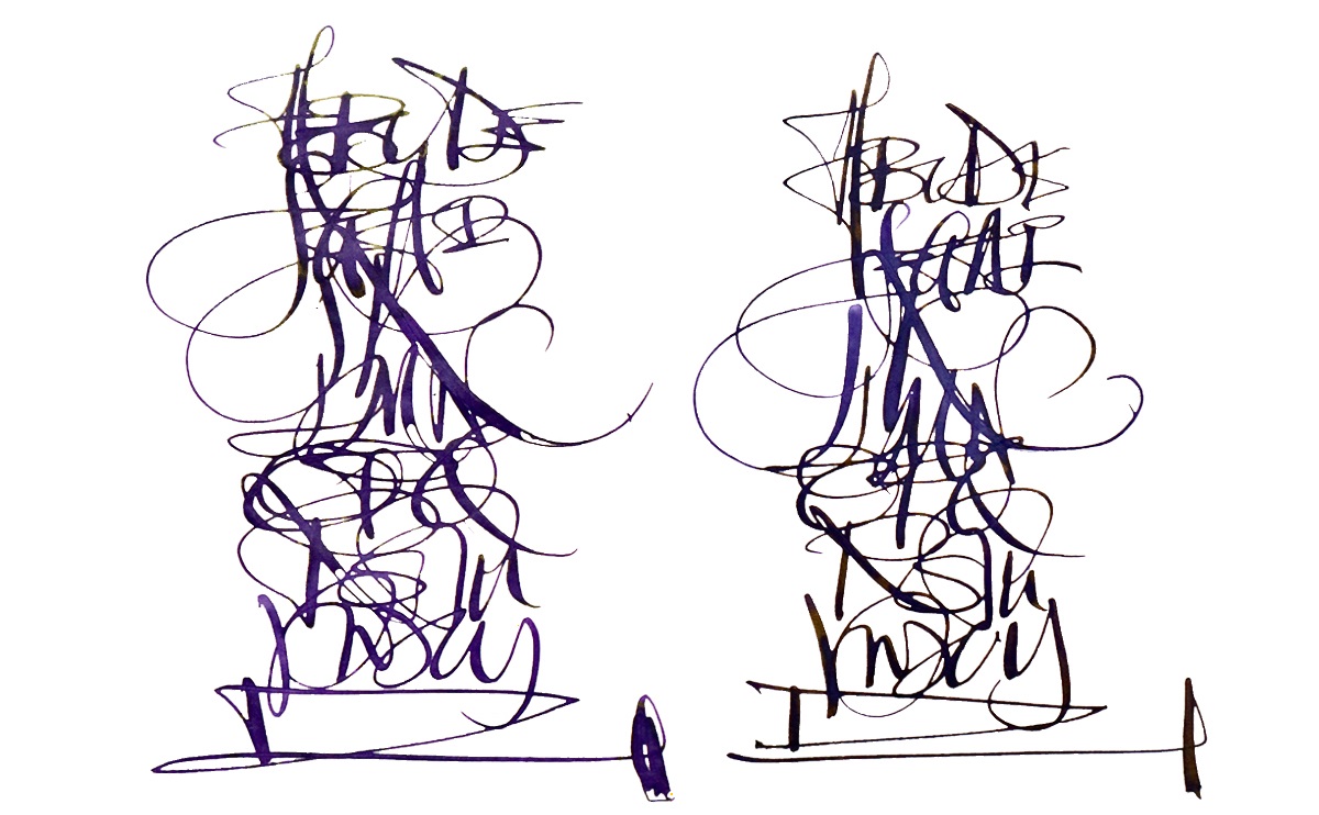
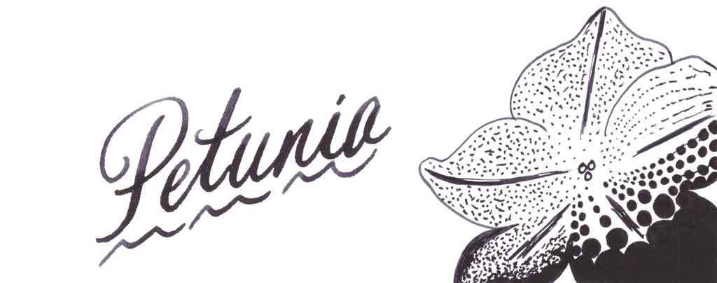
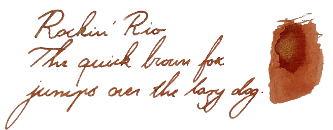
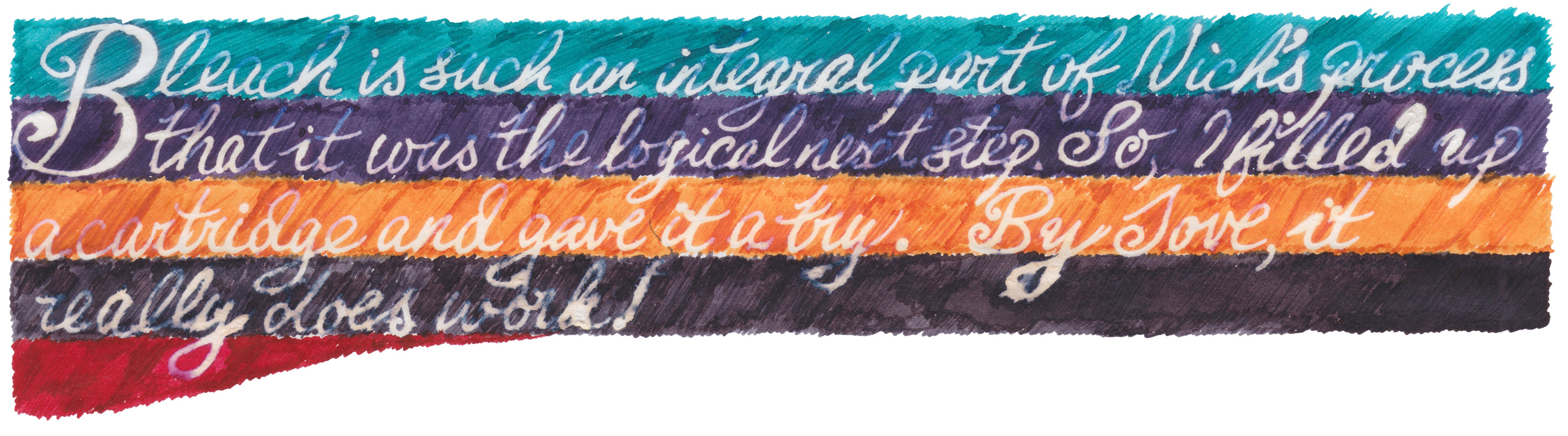
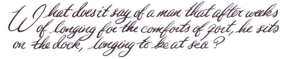
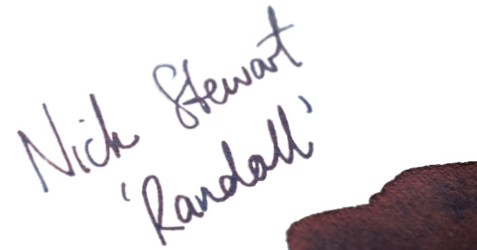
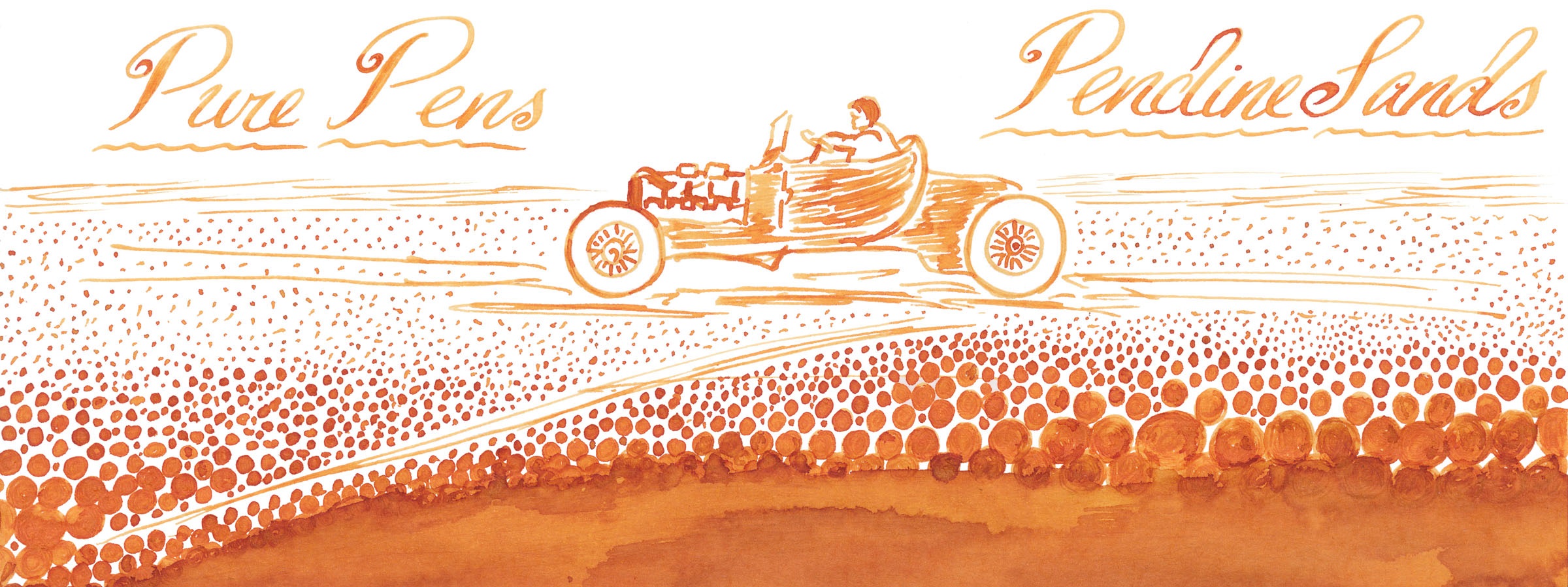
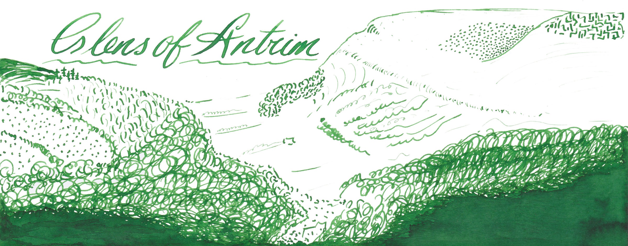
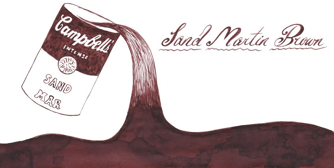
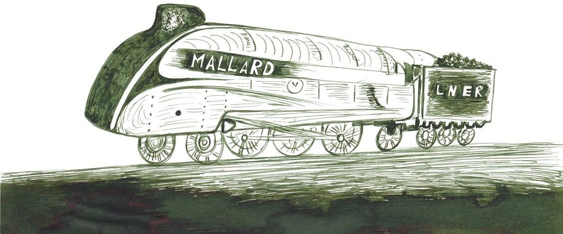
Earlier in 2019, the members of FPUK starting collaborating with Diamine, a brand which has itself been around long enough to have been formally set in a few different countries without actually relocating. The collaboration was fulsome and detailed, with Nick Stewart testing no less than ten prototypes and Scribble then trying the three which made the shortlist. The FPUK group voted on the final formula for production and, in an example of what can happen in properly regulated democracy (perhaps we’d best steer clear of that one here), decided that two should share the winner’s podium. The administrators insisted that one should be named in honour of a certain purple ink enthusiast, and the other as a tribute to his hat, which is somewhat embarrassing for the author of this piece but we’ve got this far using first person plural and it’s too late to come over all gushing now. Lord Monboddo didn’t have a purple hat, because both the millinery style in question and synthesised aniline purple dye came about in the mid nineteenth century, a good fifty years or more after his demise, but the extremely distantly related (probably) Scribble Monboddo does – and is wearing it whilst writing this piece. Pictures or it didn’t happen, eh? 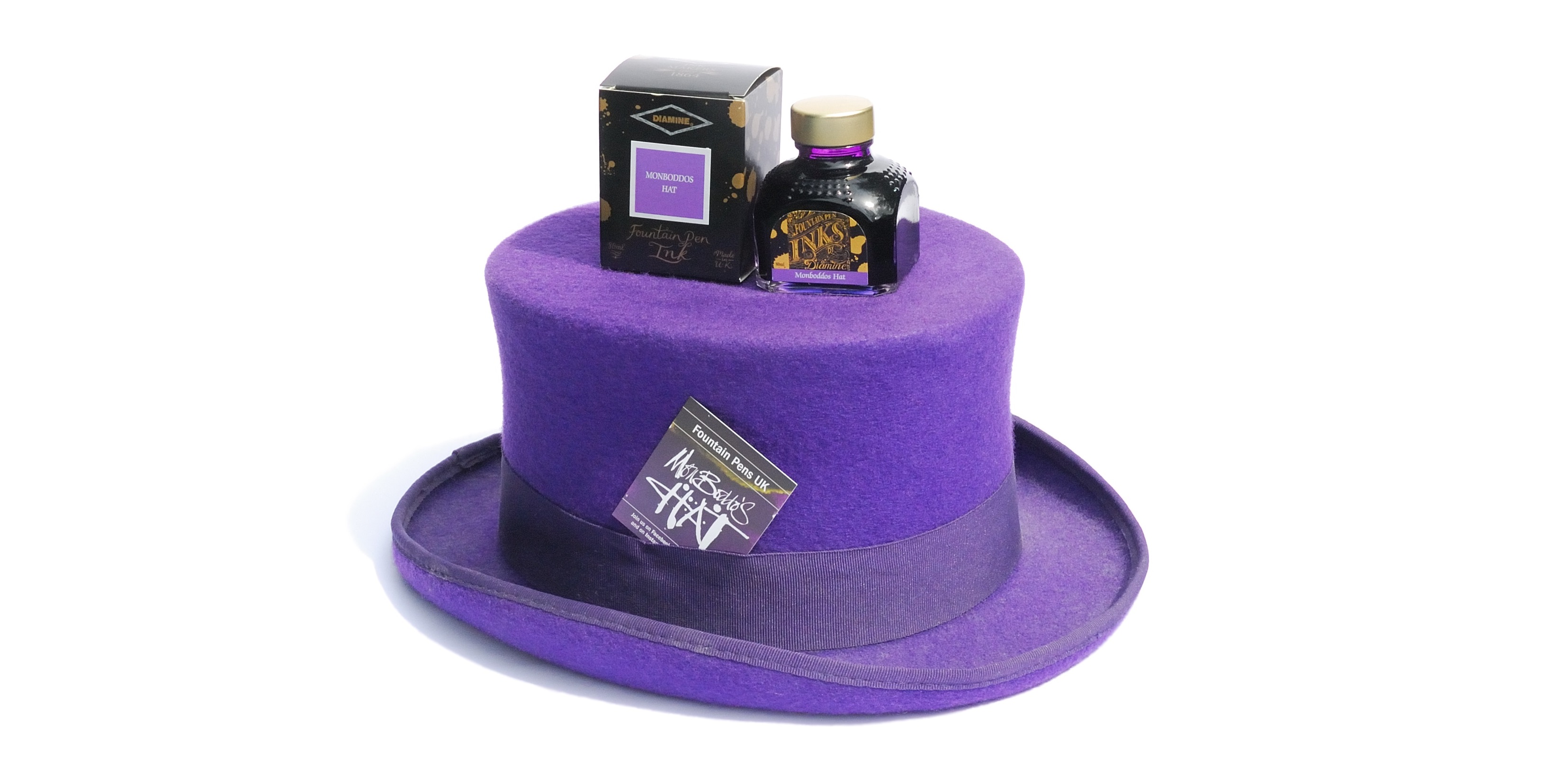
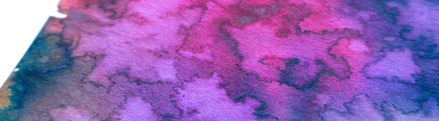
Bubbles come, and bubbles go. Let’s waft this one around for a bit before it pops…
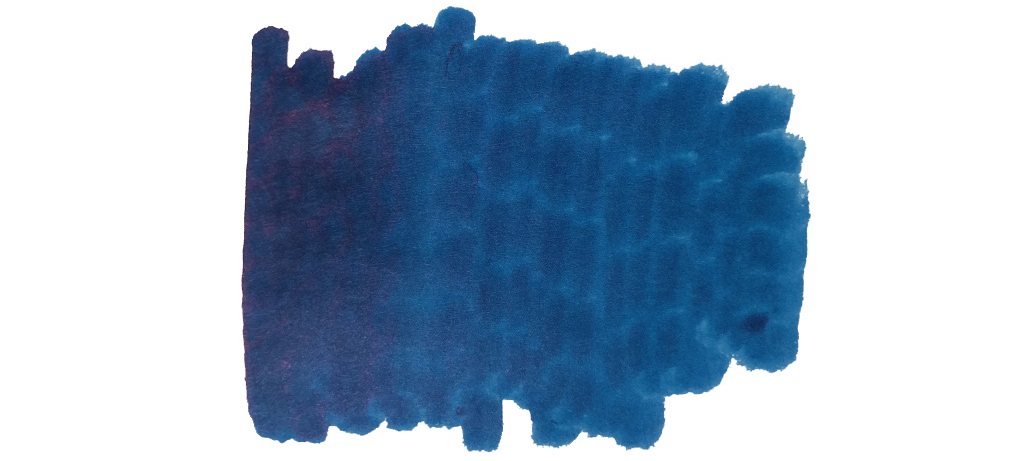
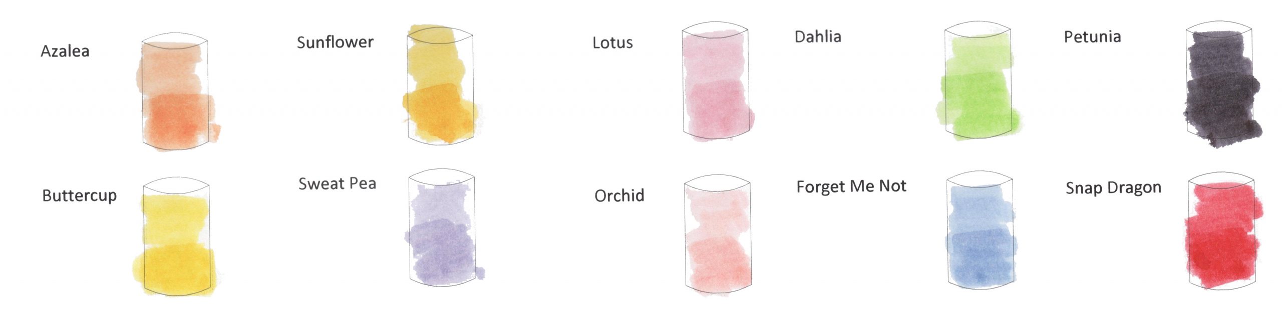
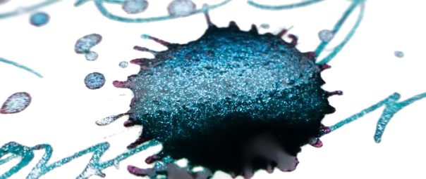
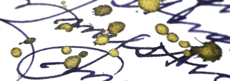
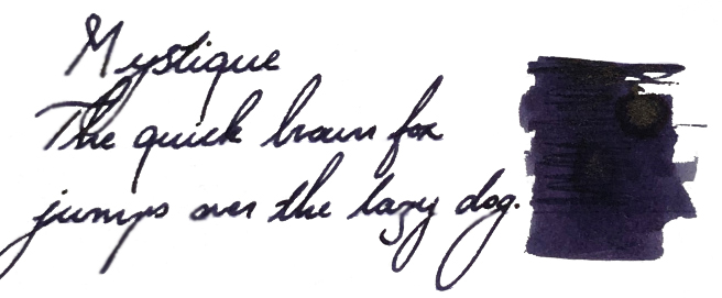
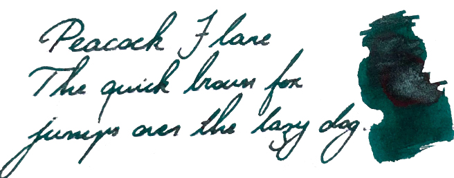
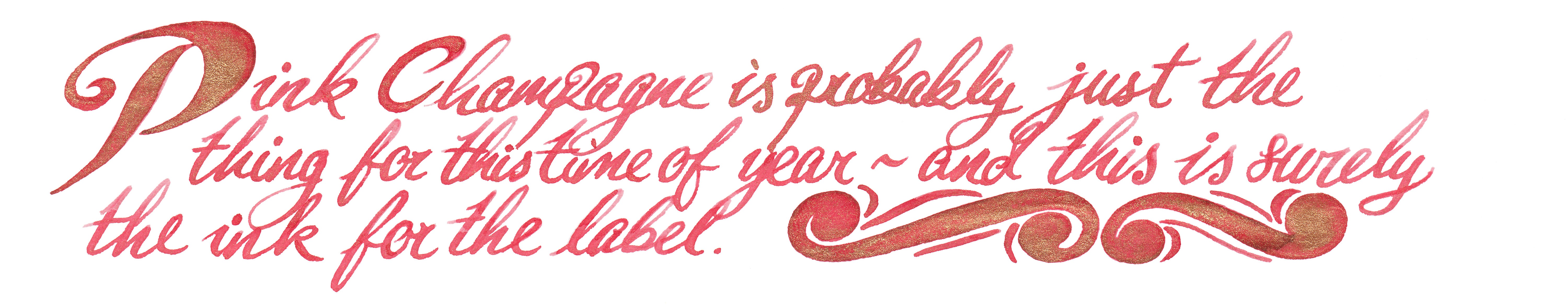
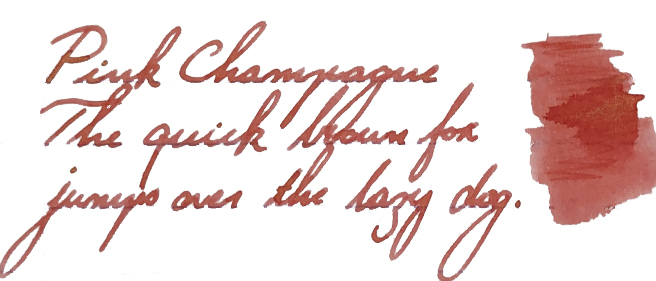
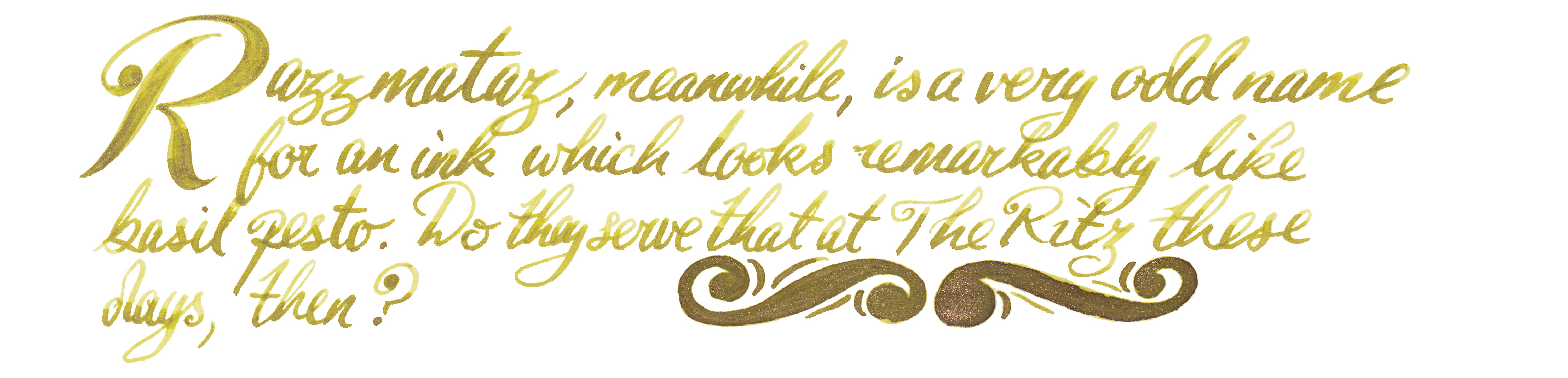
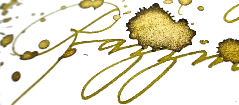
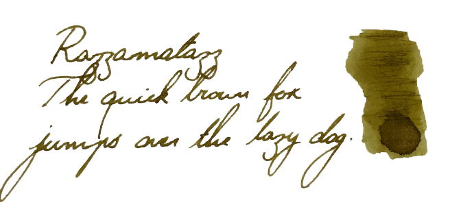
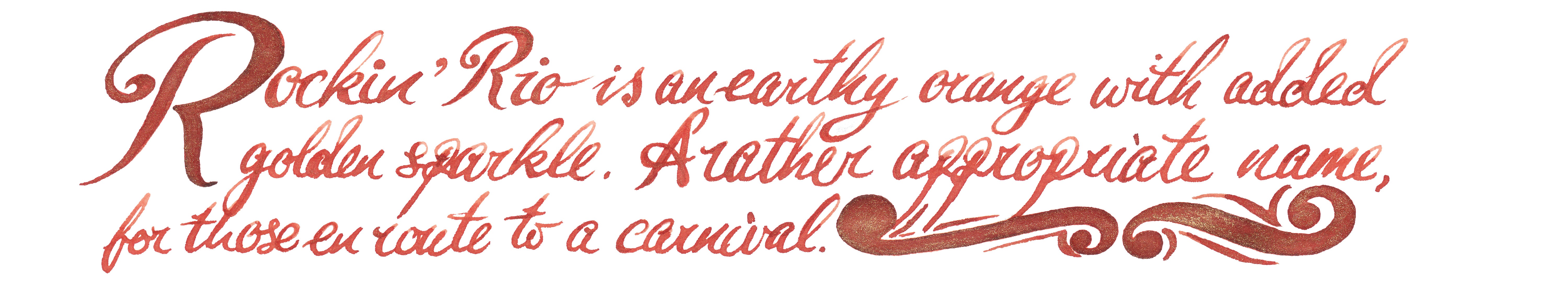
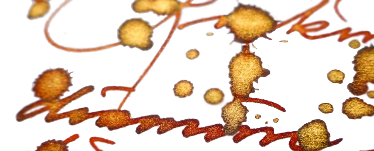
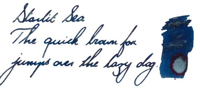
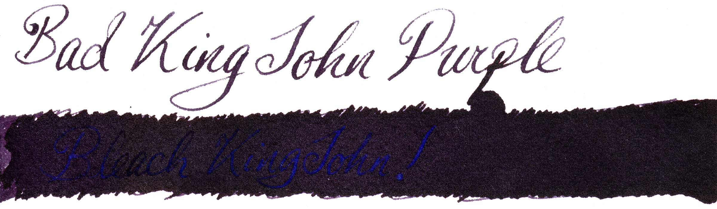
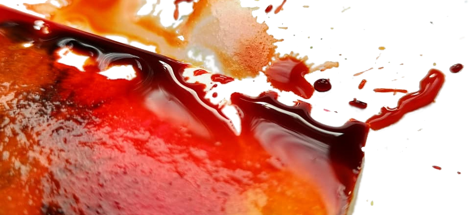
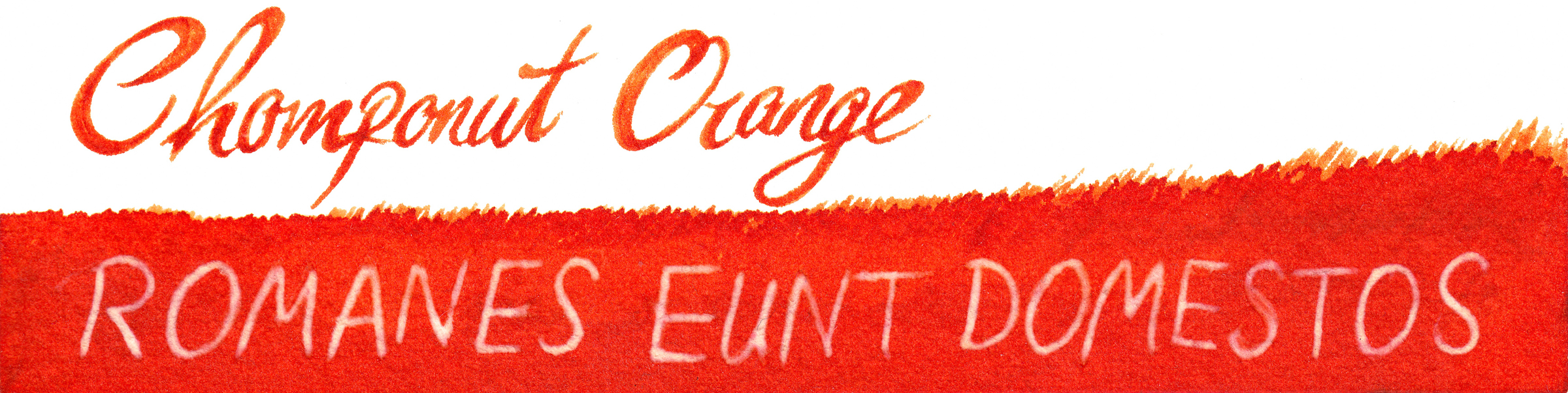
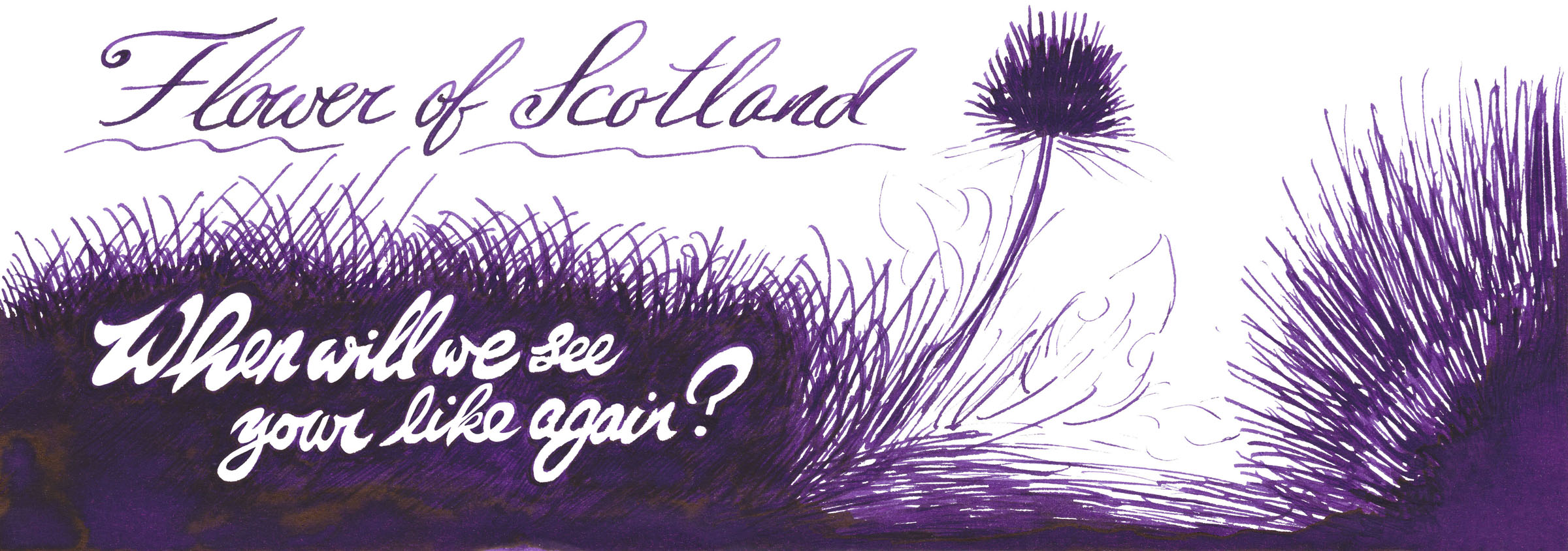
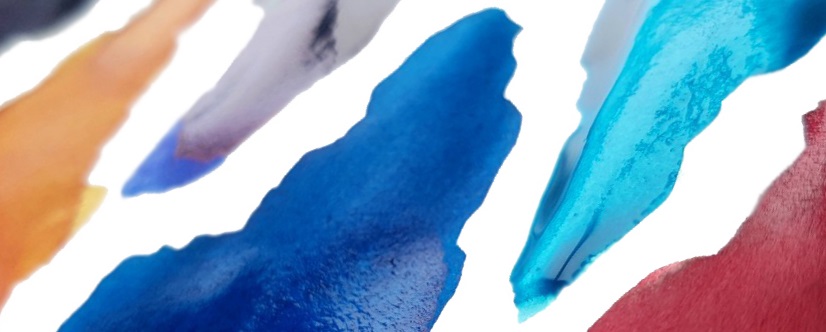
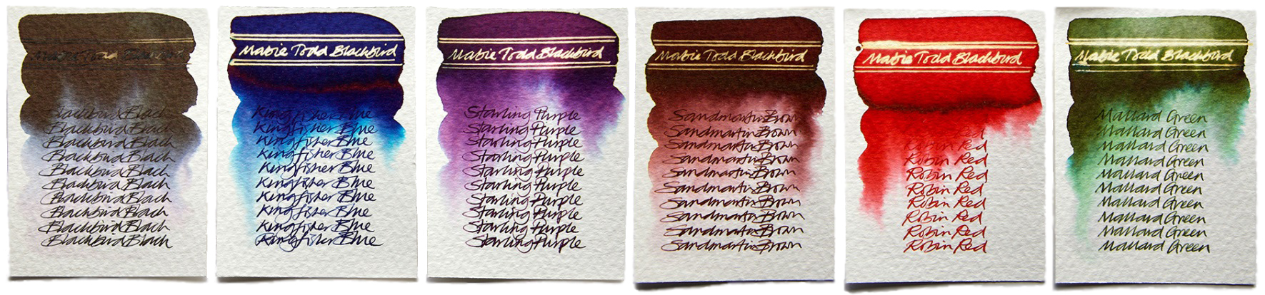
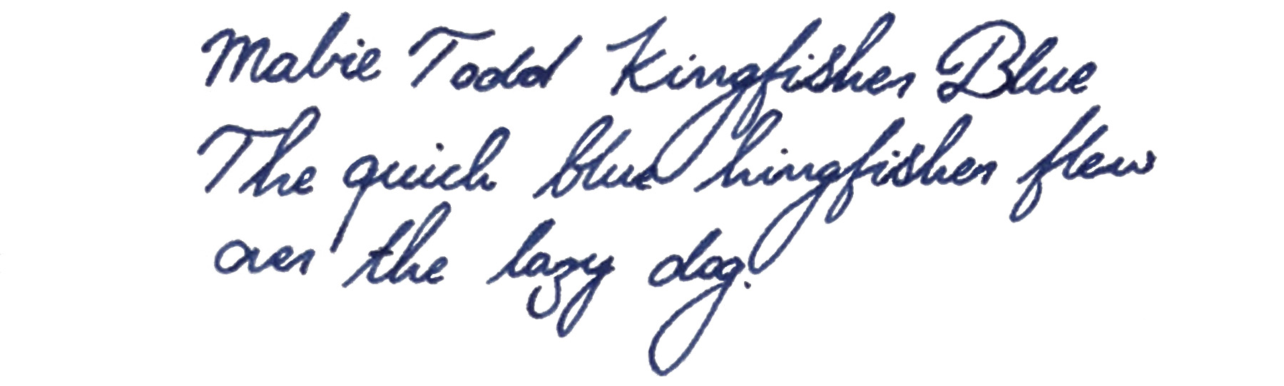
How it looks Purple, astonishingly enough! Scribble Purple, which started life as prototype #765, is a rich, dark purple with, rather unusually, a golden sheen when it is laid on especially thickly. Prototype #768x became Monboddo’s Hat, a brighter pinkish-red (but not wishy-washy) purple with more of a green sheen. 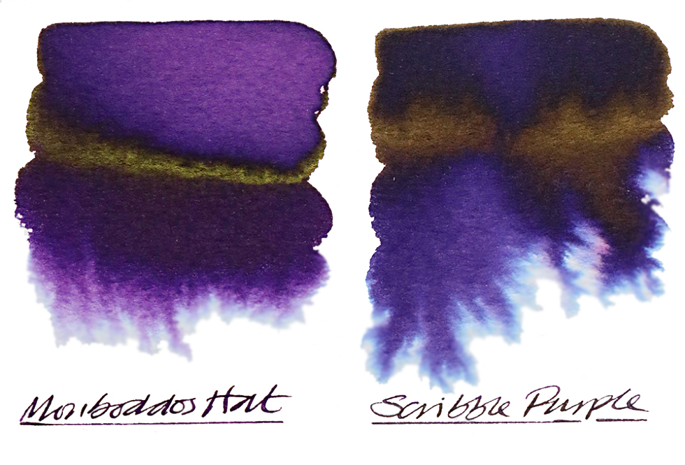
How it smells Nothing to sniff here – move along benodorously now.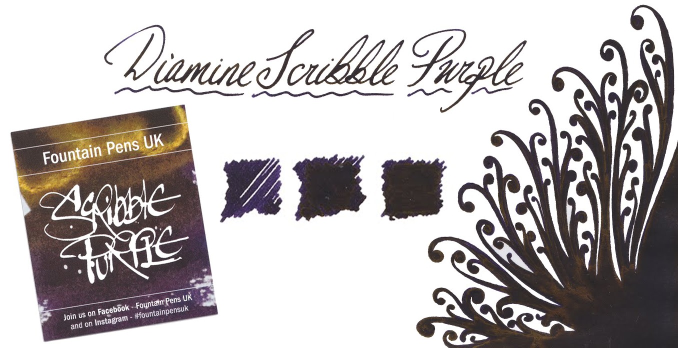
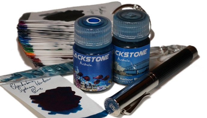
How it travels These inks are available in both of Diamine’s standard carriers, the 30ml plastic Bradgate bottle (incidentally named after the birthplace of Lady Jane Grey, if you fancy another little bit of history) and the 80ml ‘chicken pox’ glass flask. Both are practical conveyances for the ink, and the larger 80ml size also come with collectable cards designed by Nick Stewart himself.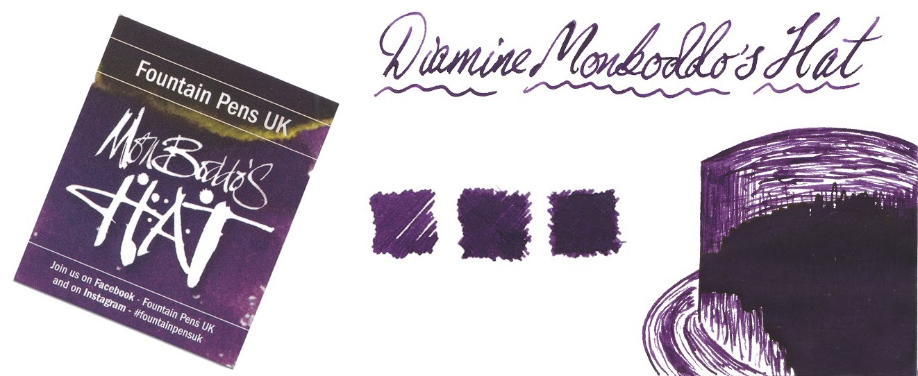
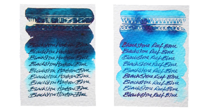
Crucially, how it writes… Now, there are some differences here, which may helpfully justify buying both. Scribble Purple is saturated but nevertheless flows as well as standard fountain pen ink usually does, with no sin to report. Monboddo’s Hat is noticeably drier, so perhaps not so ideal for everyday purposes – but excellent if you have an overly-wet feed to tame, or if you are working on slowly-written calligraphic masterpieces.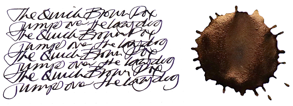
Ink! What is it good for? If you’re lucky enough to find work in the lean years ahead, Scribble Purple is probably an ink which you can take with you; it’s so dark that the uninitiated probably won’t distinguish the difference from boring blue-black from a distance, while cognoscenti will be quietly impressed. Monboddo’s Hat is an ink for creative purposes, as writers of doodle-laden journals and the like are already discovering.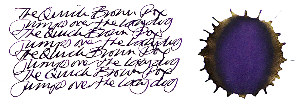
VFM Diamine have a reputation as one of best-value manufacturers of ink anywhere, and these two special editions are no exception. Writers in what is left of Britain once Scotland departs and the borders go up should be able to enjoy access as long as funds allow. Moderate stockpiling may be wise elsewhere, but don’t go overboard – it may look delicious, but you really shouldn’t drink it.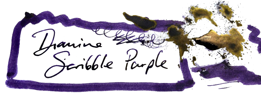
If this isn’t quite your cup of tea, but almost… Then buy the other one!
Our overall recommendation If you want a purple ink which you can use for writing with any fountain pen, without interruptions other than refilling, bag some Scribble Purple. If you enjoy experimenting with calligraphy or have an absolute fire-hose of a vintage pen and wish to, erm, take back control (oh dear) then Monboddo’s Hat is a great choice too.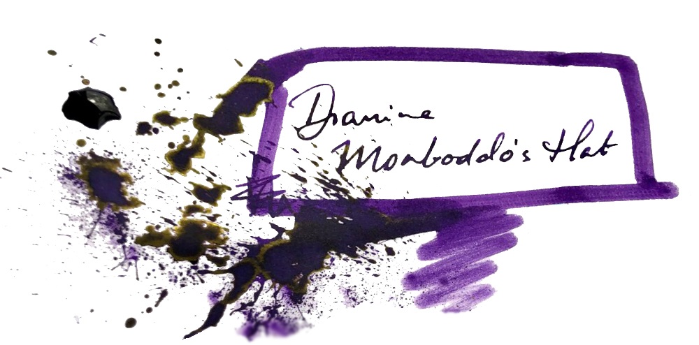
Where to get hold of some All of your favourite fountain pen retailers and etailers sell these inks, which have now made it to the standard Diamine range internationally. It’s also possible to buy from Diamine directly.
This meta-review references:
Thanks to Bernardo and all the members of the FPUK group for the initiative, Diamine for the enthusiastic collaboration – and all our readers and contributors for making the Inkdom, while it lasted, a kinder, gentler and more creative place.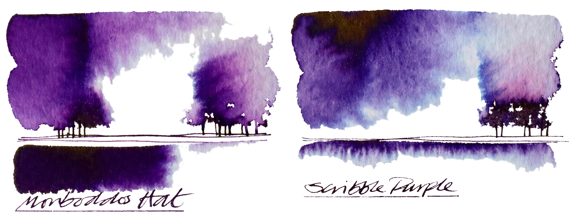
 Ink! What is it good for? Drawing, we think; given the pallor of several of these inks they look better suited to illustration than correspondence.
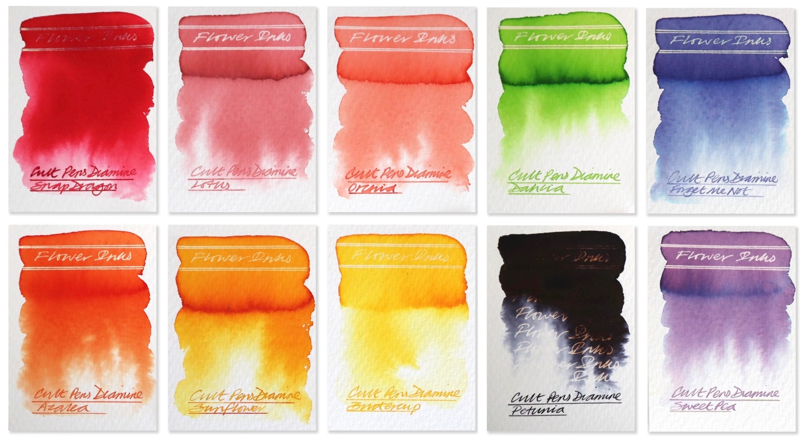
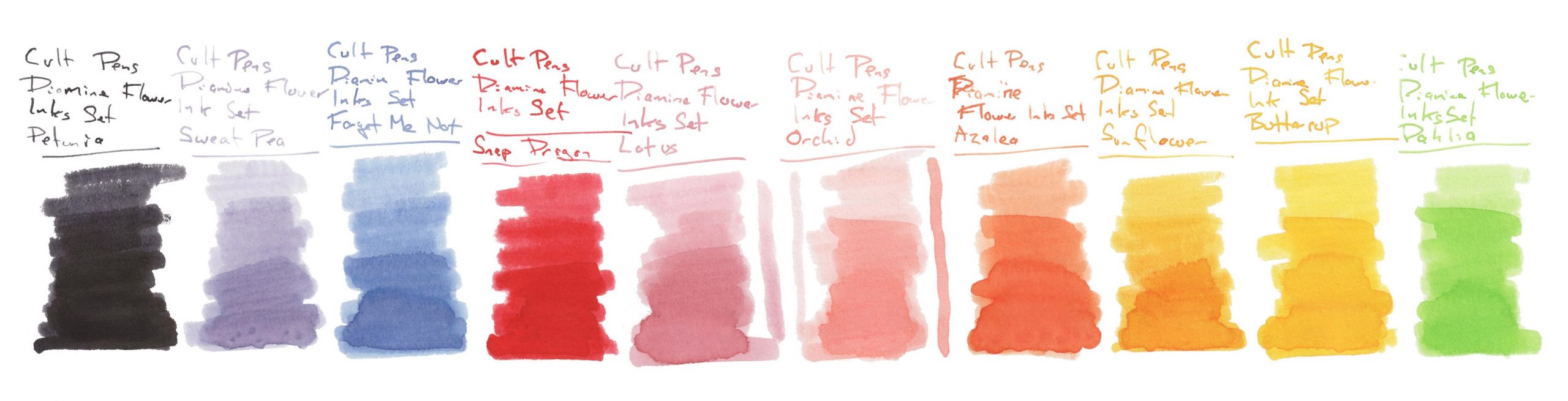
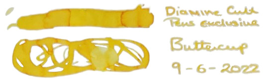
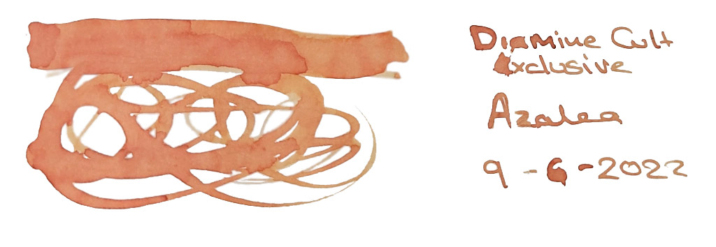 Where to get hold of some Only from Cult Pens
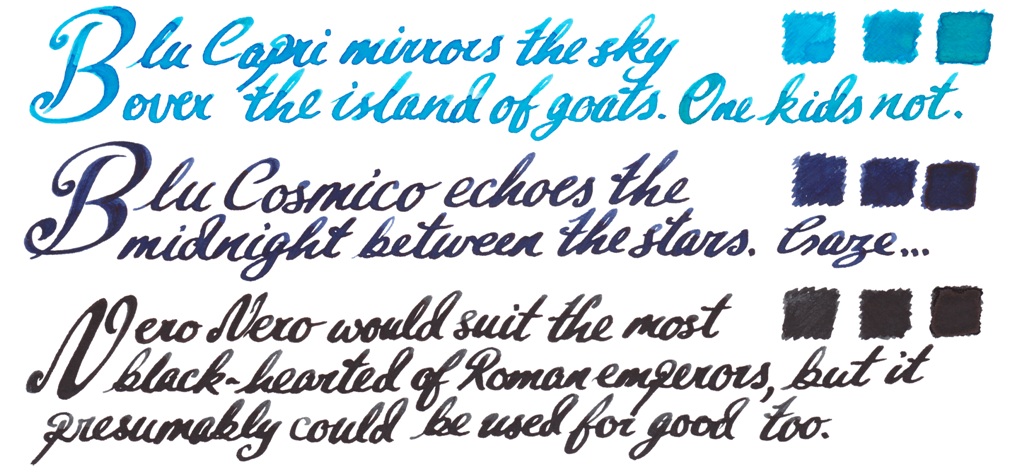
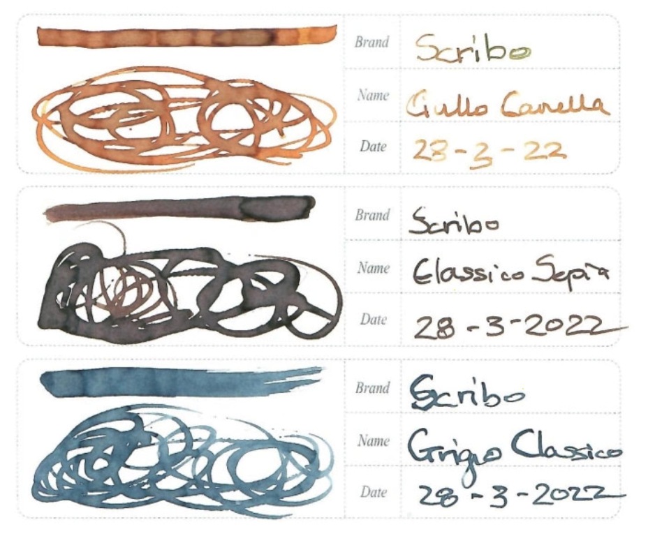
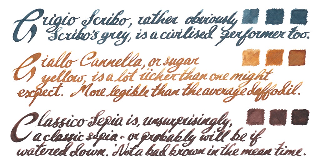
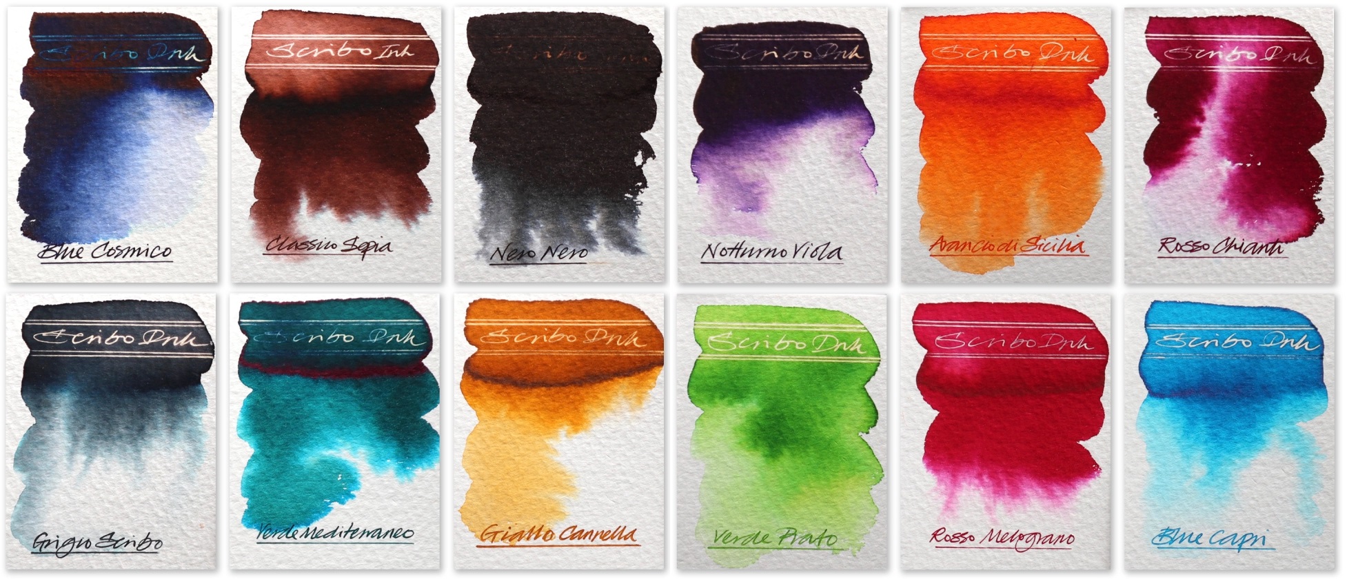
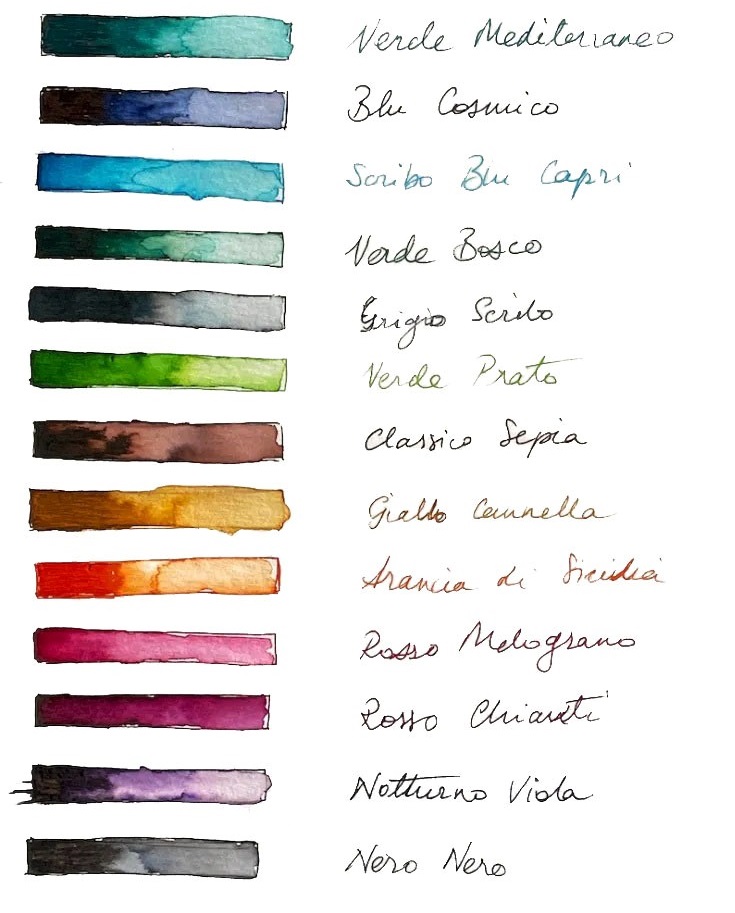
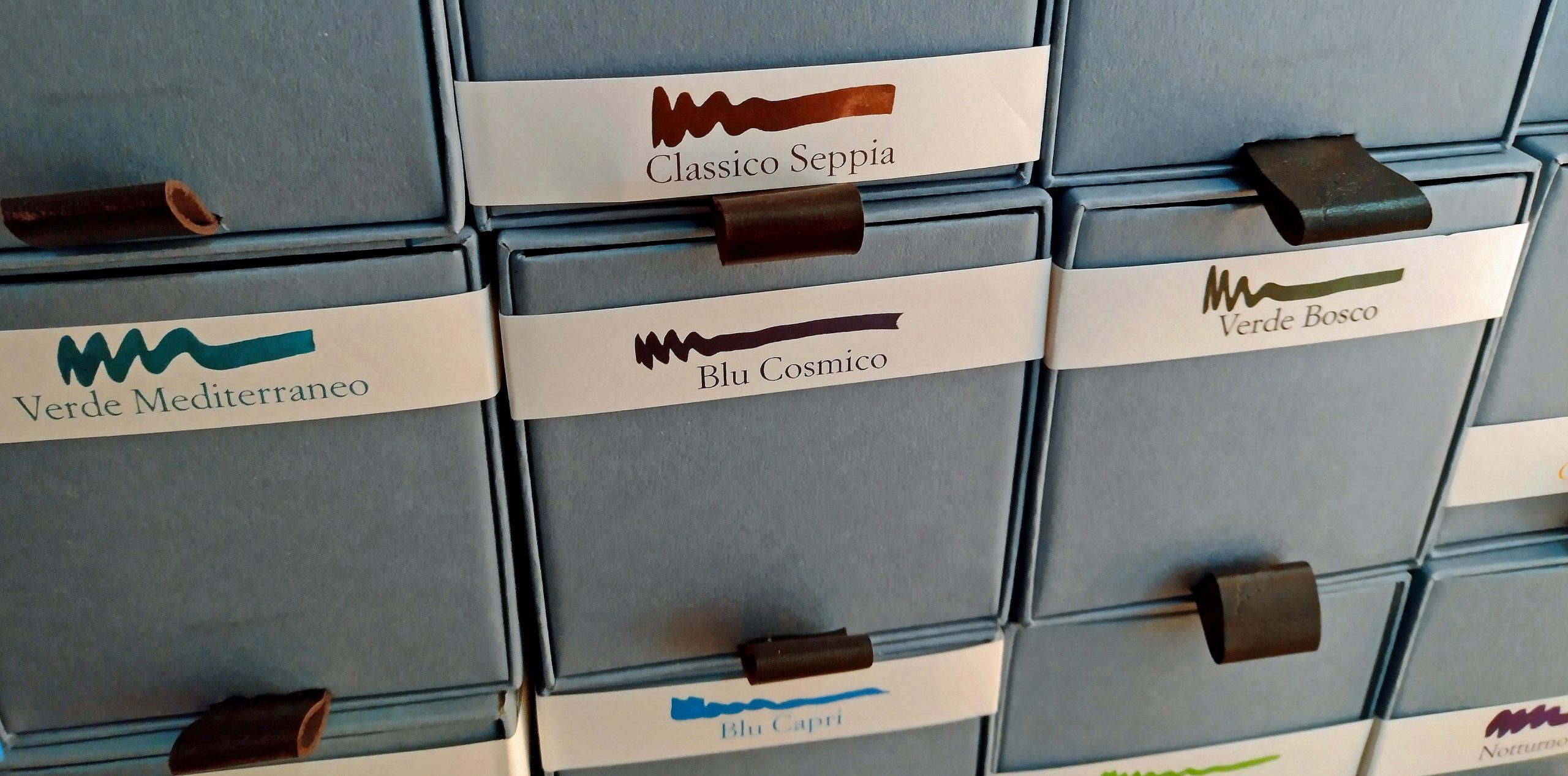
 A little bit of history Much as we all mourn OMAS, ink wasn’t their strong point. Their spiritual heirs, Scribo, have apparently set out to correct that. We put the whole range to the test.
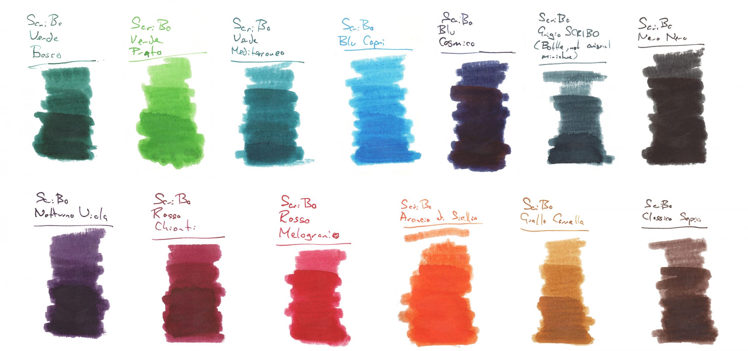
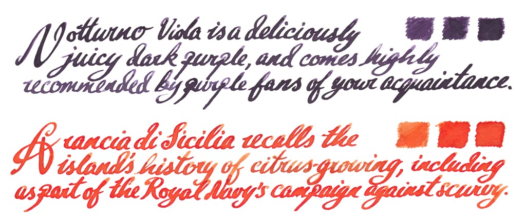
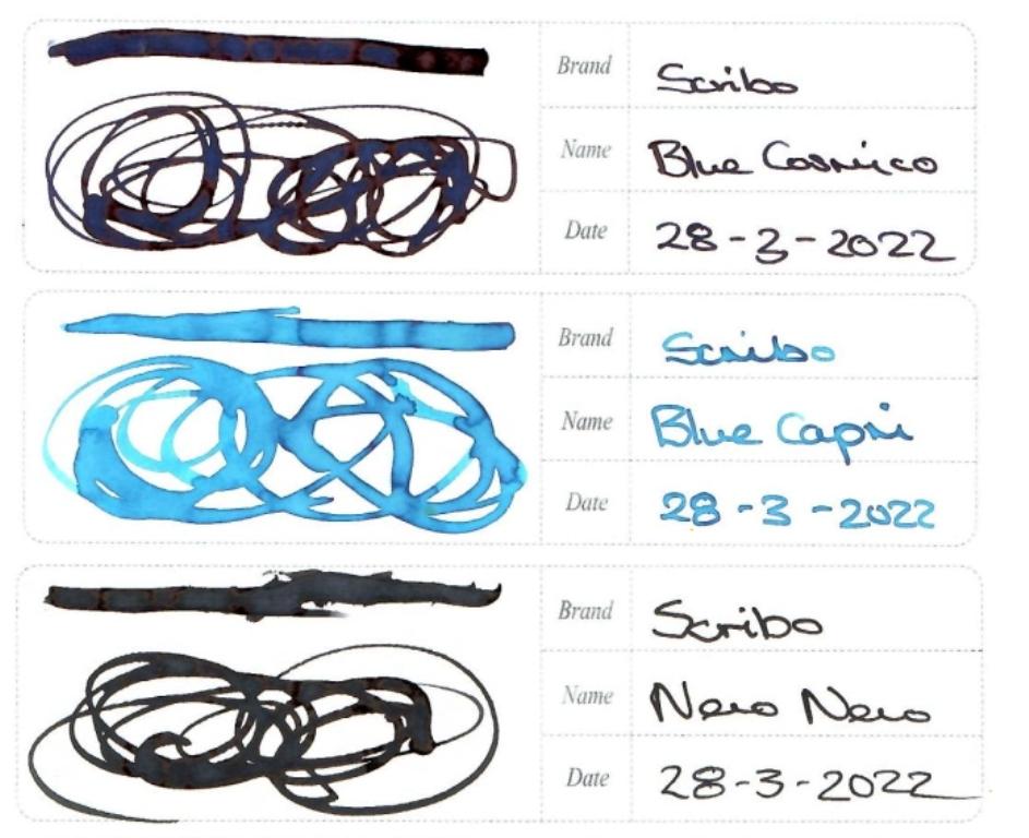
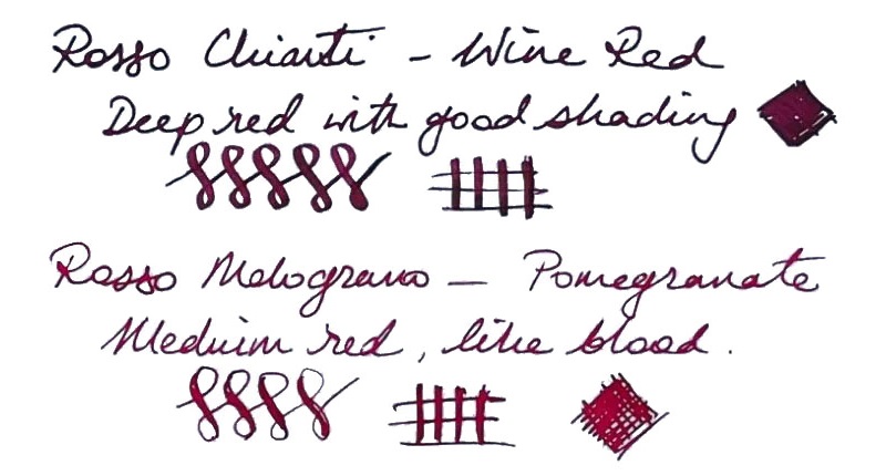
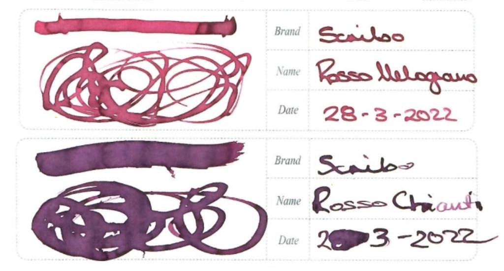
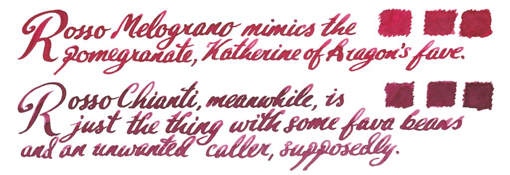
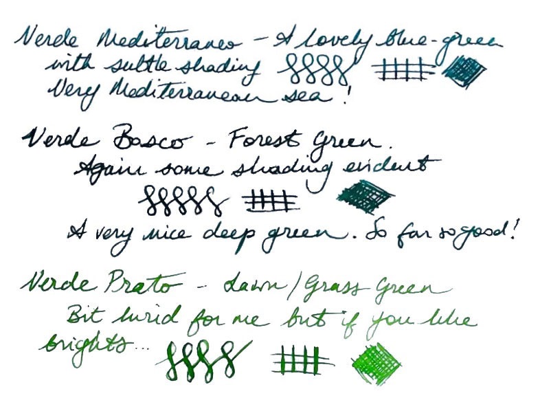
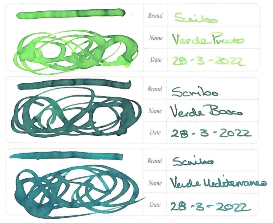
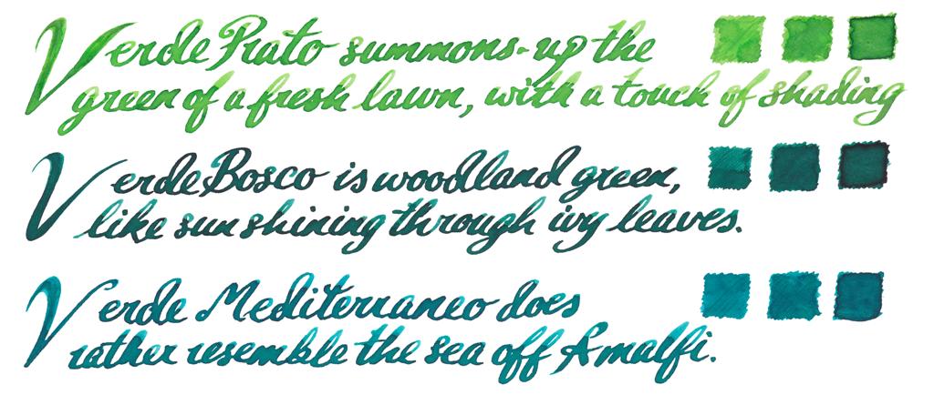
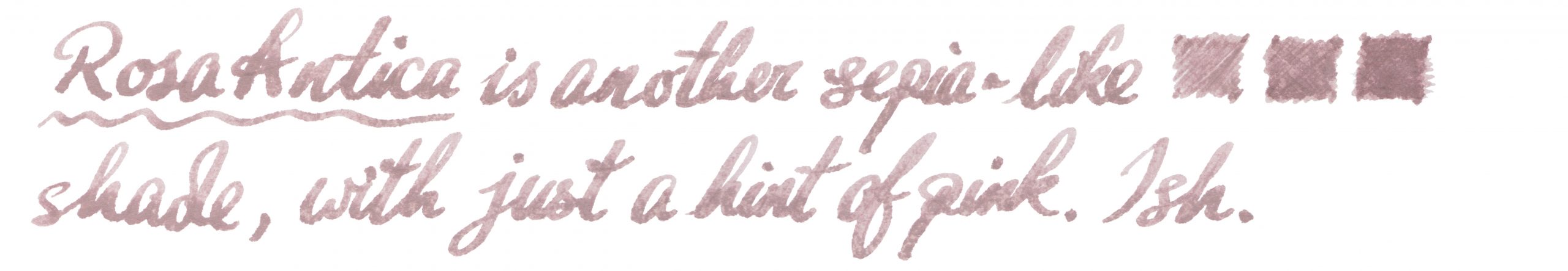
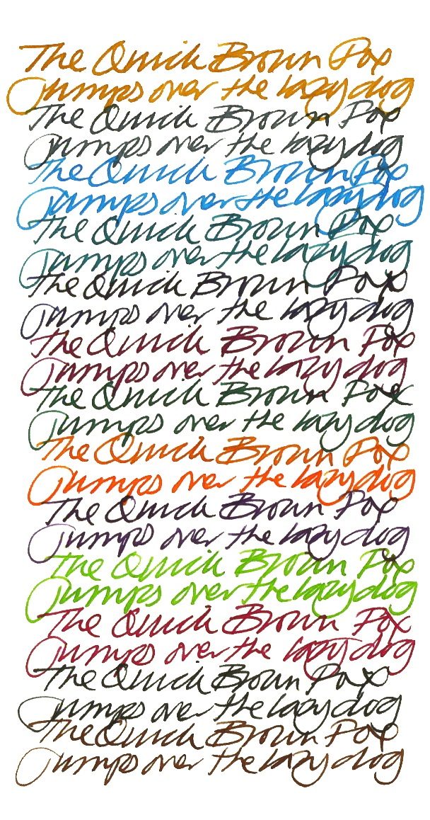 How it looks This is a big range, and the different components deserve detailed attention:
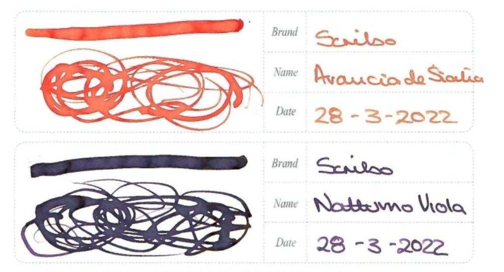
 Thanks to Write Here for the samples
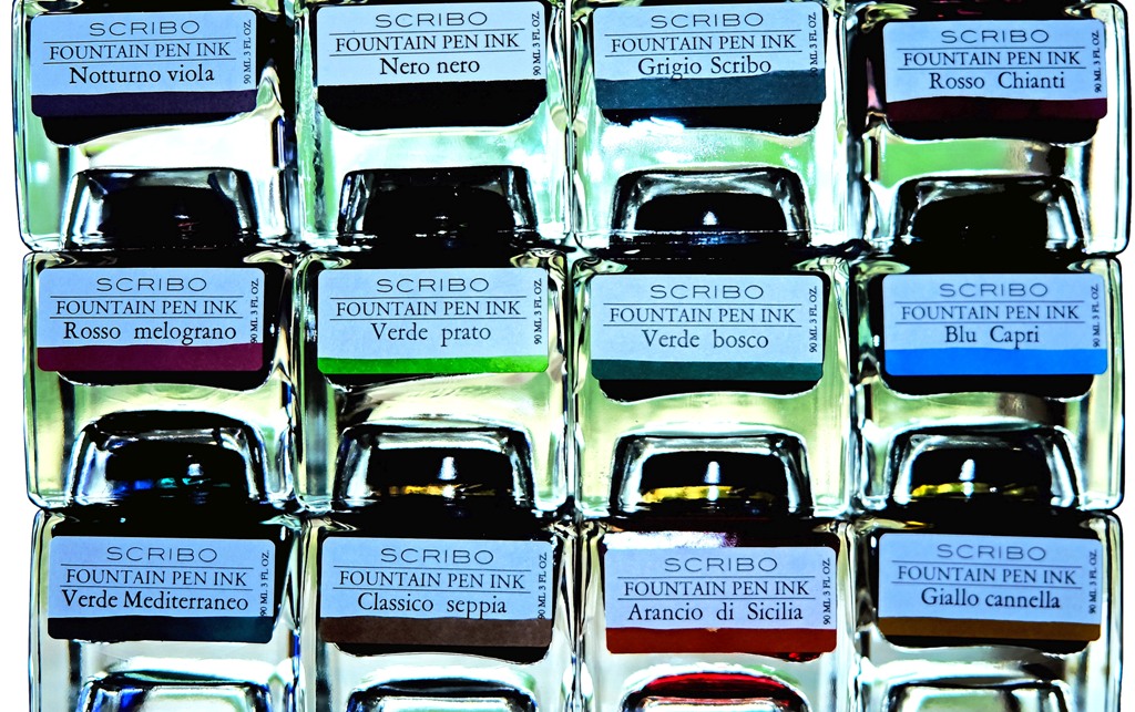
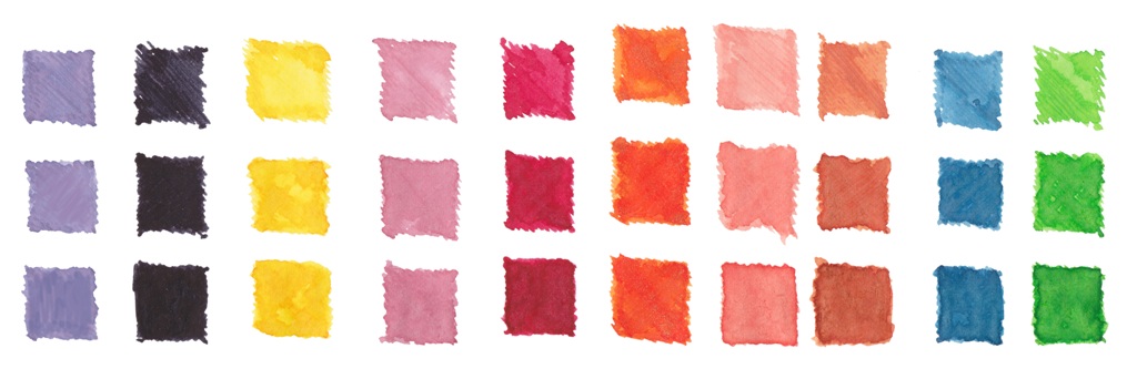
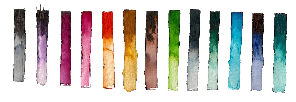
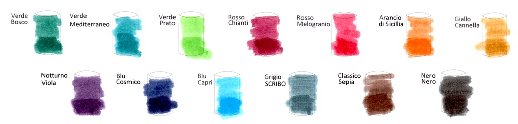
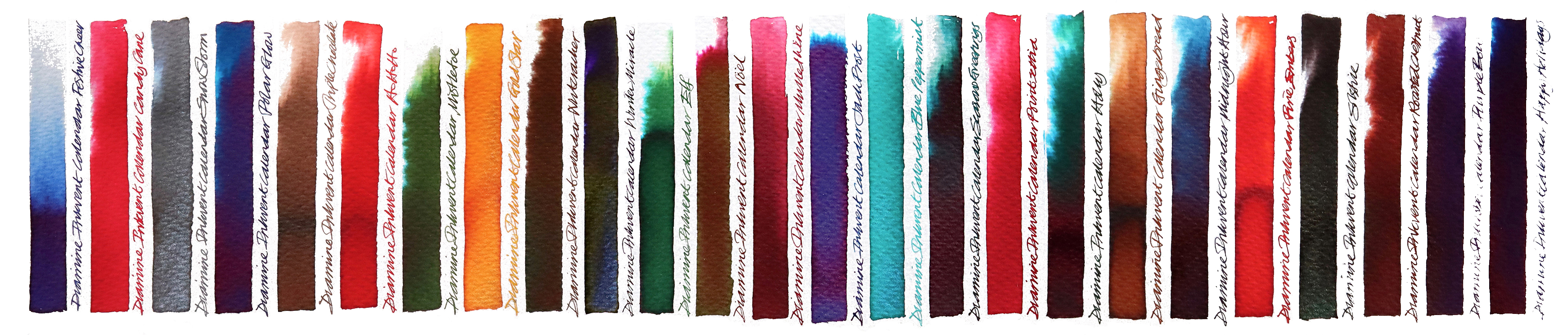
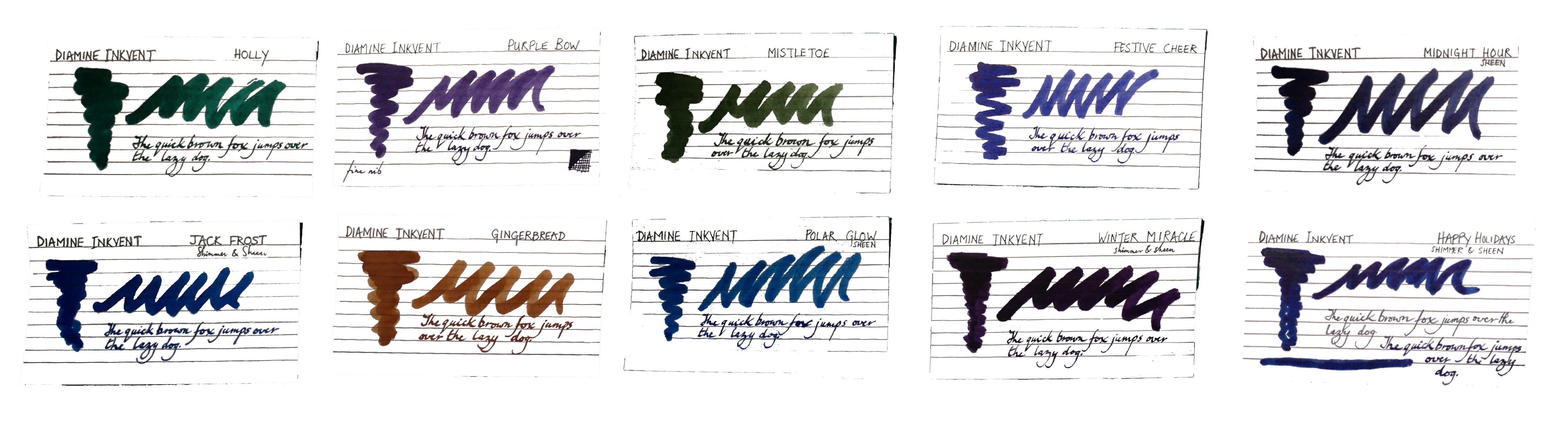
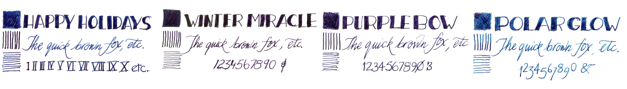
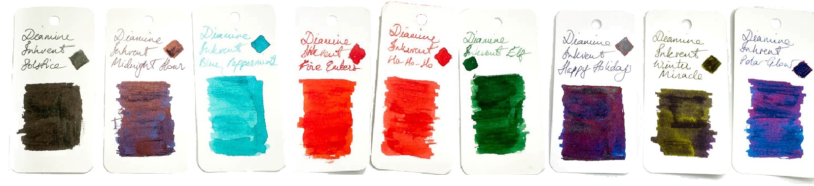
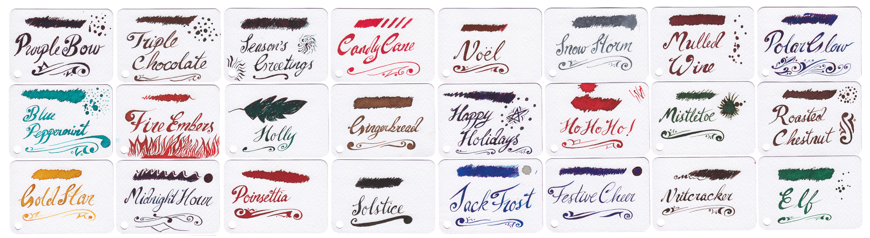
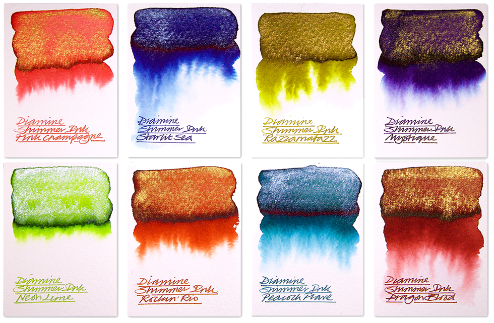
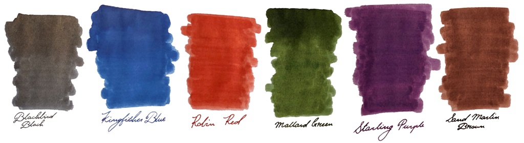
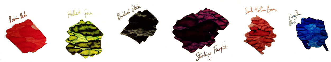
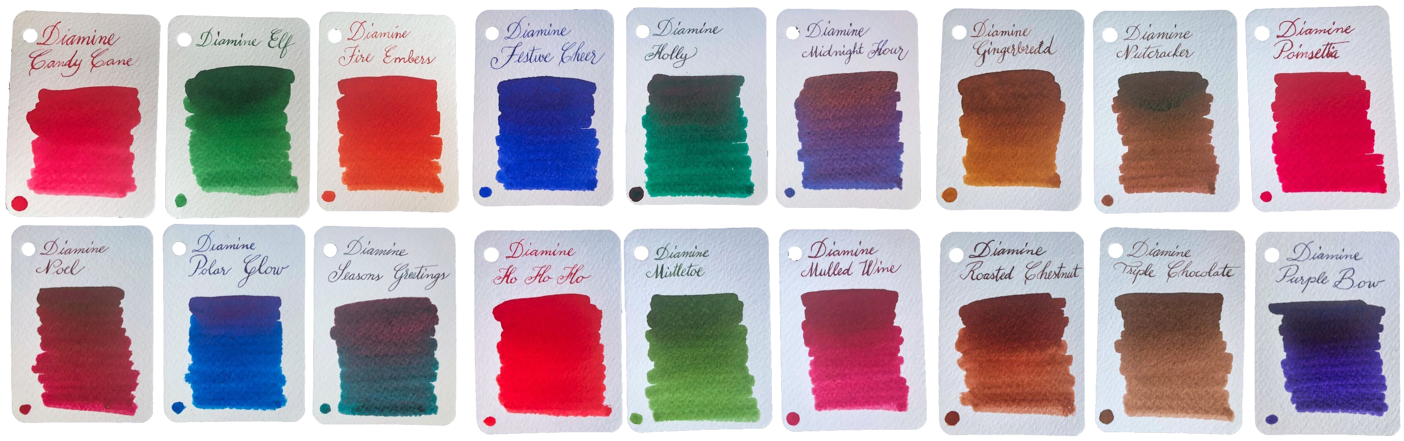 How it looks It looks much like an ordinary advent calendar with something boring like chocolate inside, but that’s just a cunning disguise. There’s a jolly snowman design printed in blue, which might be why the inks are now labelled as ‘Blue Edition’… but that’s probably not what you wanted to know about. The new bottles are amazing four-legged contraptions which look like they could canter away at any moment if you don’t put down that wretched ballpoint and play with a real pen. But perhaps that’s not what you’re after either? Oh – the inks!! Well they look amazing as a range, don’t they? We were a little surprised to find quite so many browns and dark greens, but the whole palette of midwinter hues is here. There are also plenty of traditionally festive reds, some very groovy blues, a gold, a silver, two cracking purples and a terrific turquoise. Unusually for a set released together, some are ‘solid colours’ but many feature sheen, shimmer or both, which is showing off really, but if you can’t do that on special days when can you?
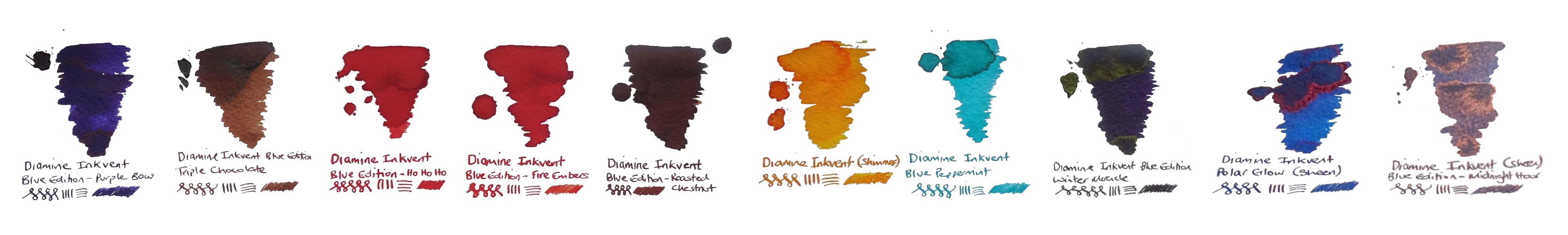
 This meta-review references:
 Thanks to Diamine for inundating us with a postcard from quite near North Wales, actually, and an awful lot of sample pots.
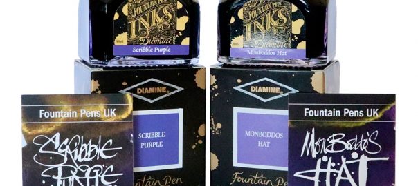
 A little bit of history This is a festive tradition now, so the British ink legends
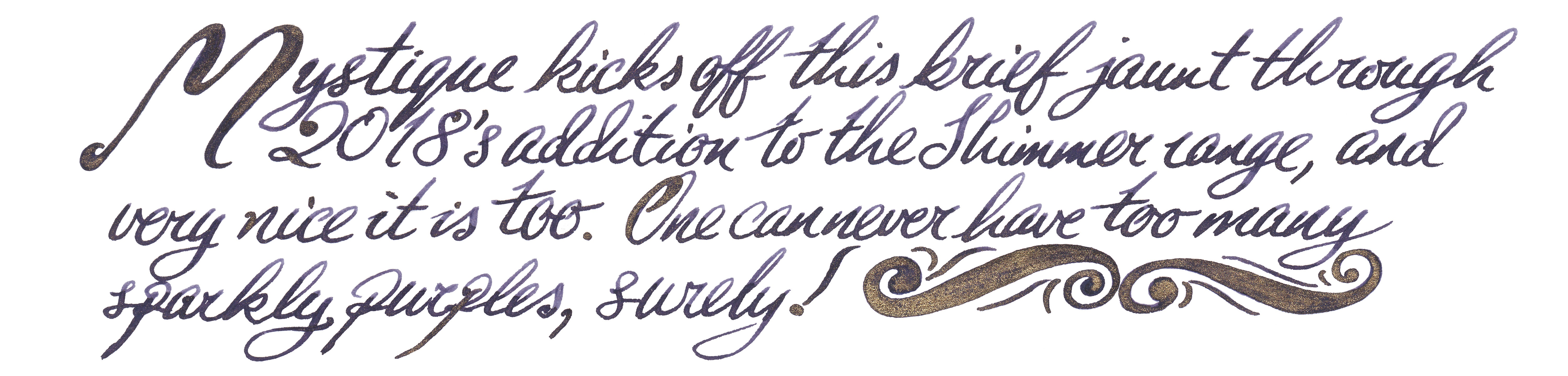

 If this isn’t quite your cup of tea, but almost… If you feel uncomfortable using this type of inks with your fountain pen, you can always try them out with glass pens. It is definitely a safe alternative and the effects are still very good. If you’d prefer to try pearlescent inks from a different manufacturer, then J. Herbin, De Atramentis and more recently Robert Oster all have alternatives worth considering – albeit at significantly higher prices.
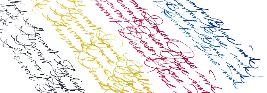
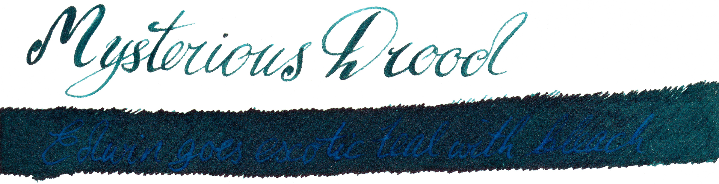
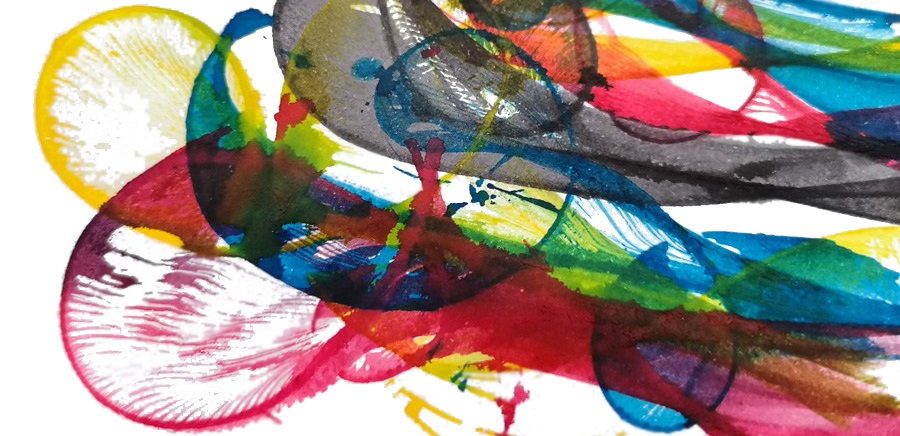
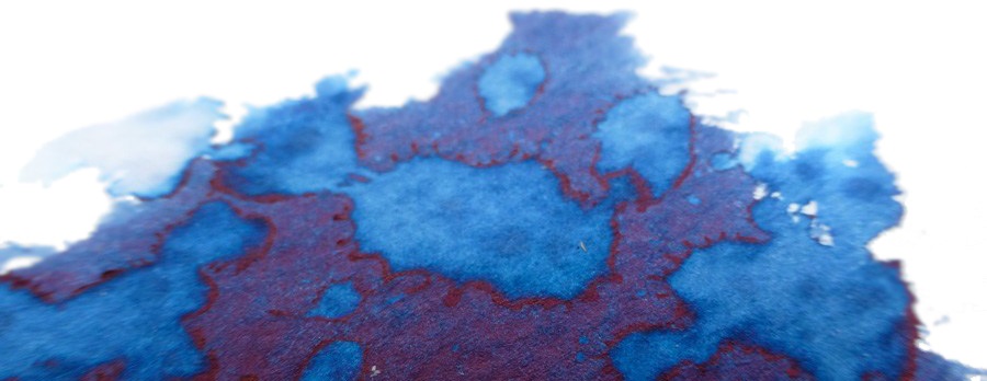
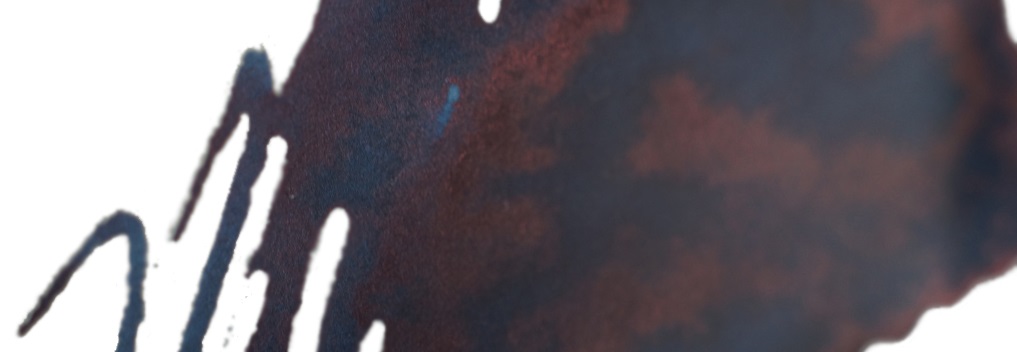
 A little bit of history Nick Stewart is a creative designer, artist, calligrapher and educator from historic Rochester, on the Thames estuary in Kent. Nick also actively contributes to United Inkdom. As an artist he is very passionate about inks, especially their chromatic properties, breaking down all possible hues and tonal ranges present in any ink he works with. He has tested hundreds and hundreds of inks which allowed him to understand how they are made and what factors are affecting specific properties. There is a hint of alchemy in his work, especially when Nick experiments with bleach to test how the destructive process which results can create something new and exciting.
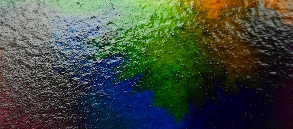
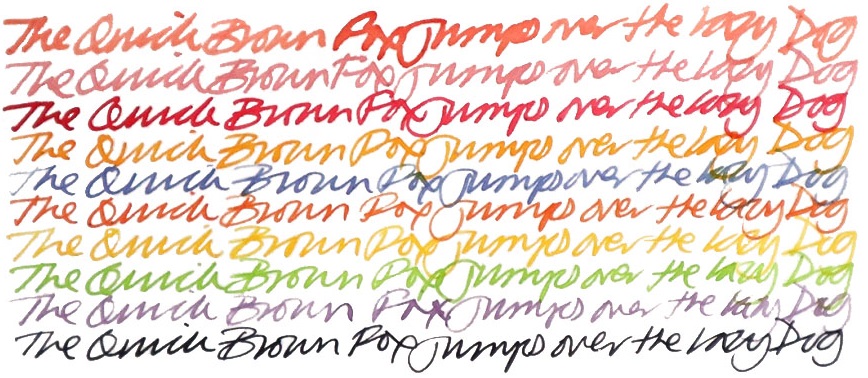
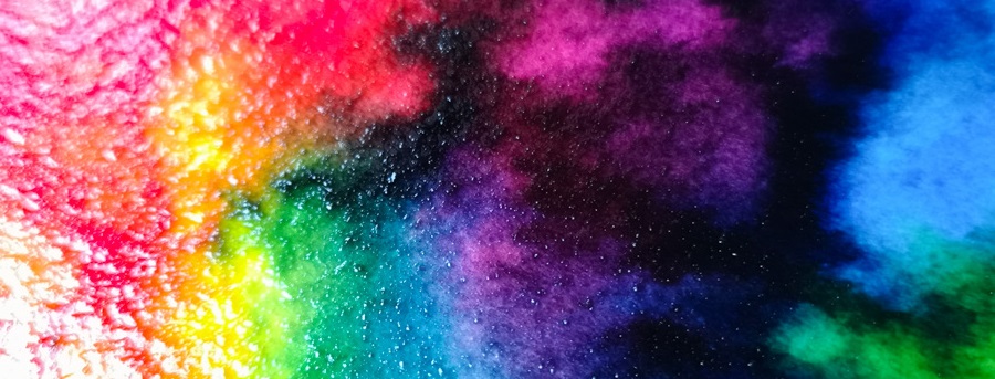
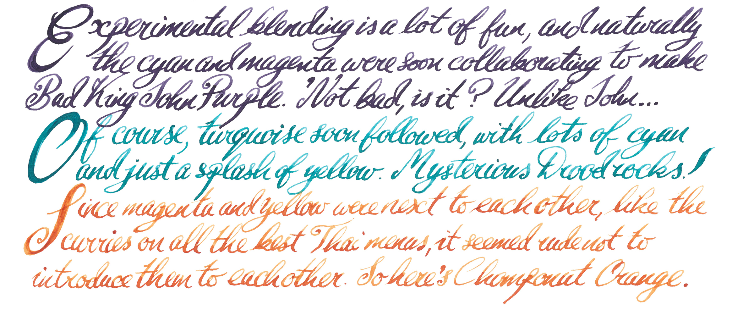
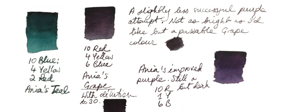
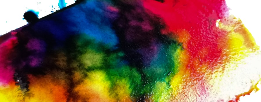
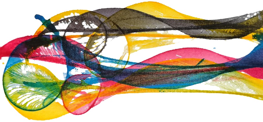
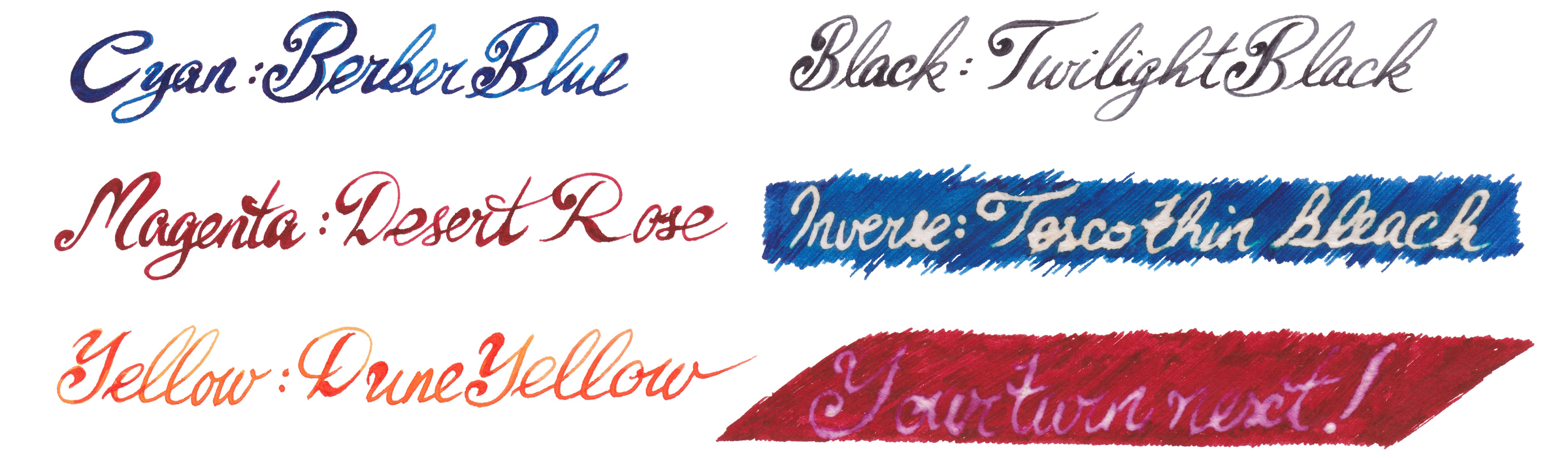
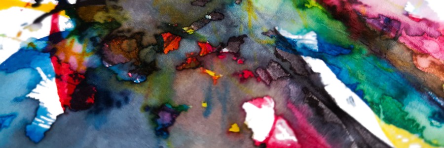
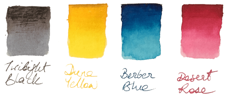 How it looks Nick’s set contains four independent 30ml inks. The intended purpose is to blend them together to obtain new colours, but each ink can be used separately as a stand-alone fountain pen ink. The colours available in the set are: Berber Blue (C), Desert Rose (M), Yellow Dune (Y) and Twilight Black (K). These are not ‘pure’ CMYK colours, and each ink has its own unique characteristics. However, when mixed together they still create a full range of secondary and tertiary colours.
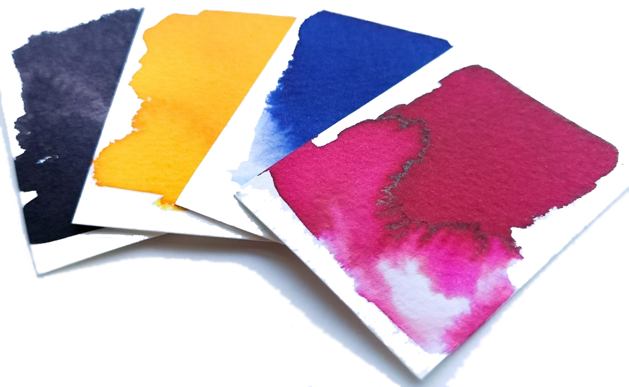

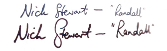
 Thanks to Nick for the samples, and of course Randall for the inspiration
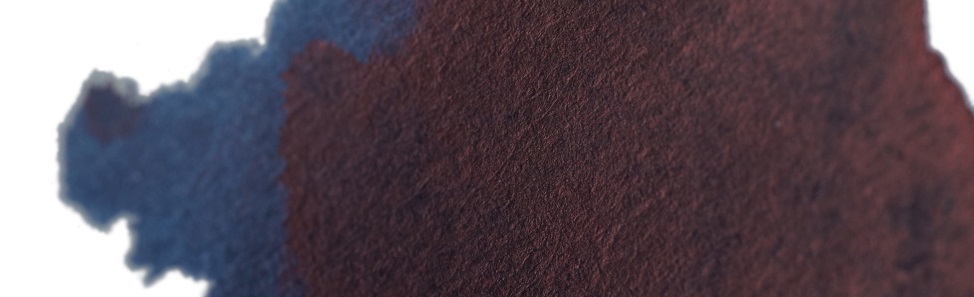
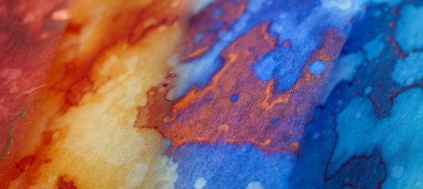
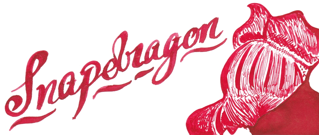
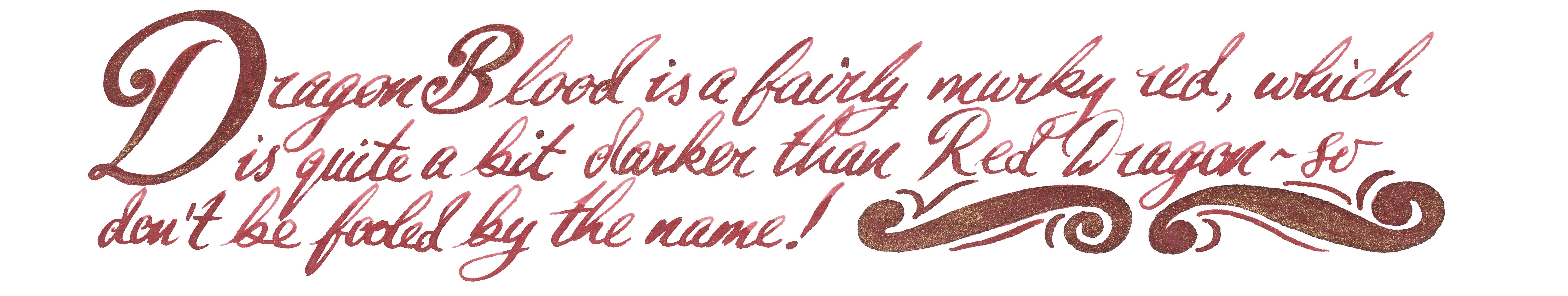
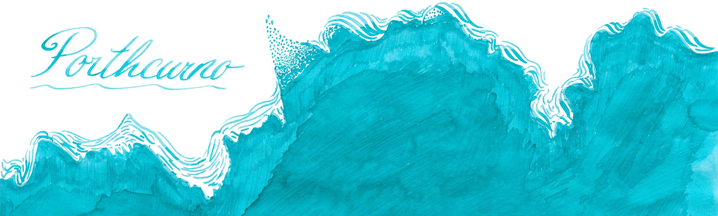
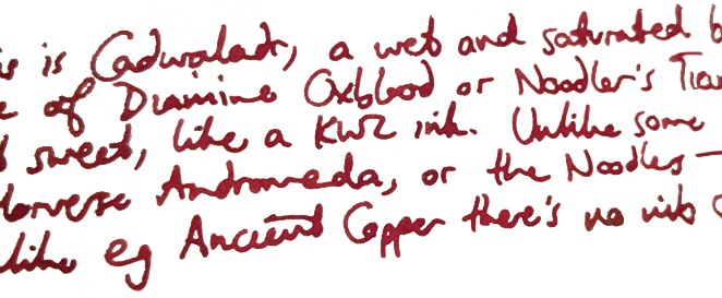
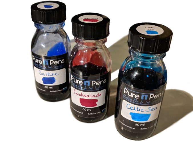
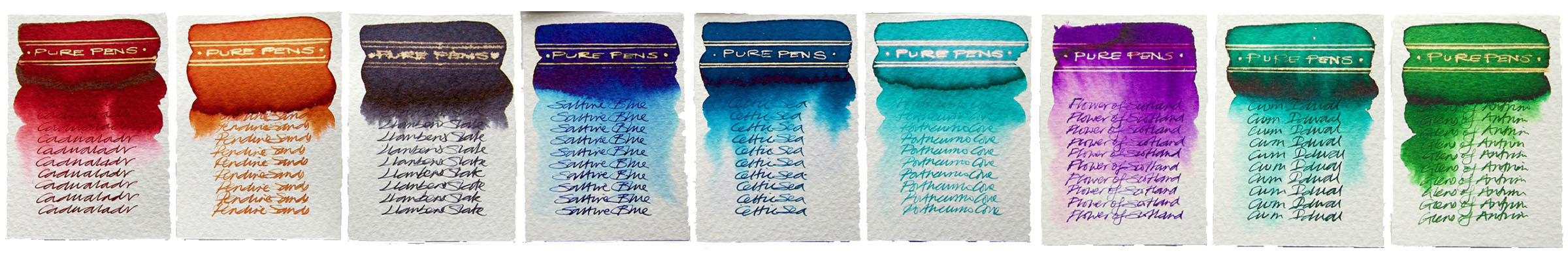
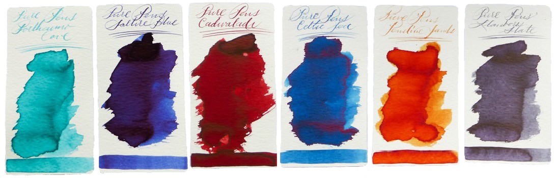
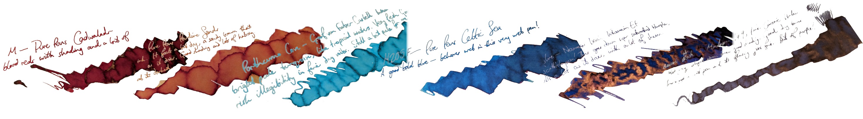
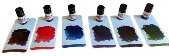
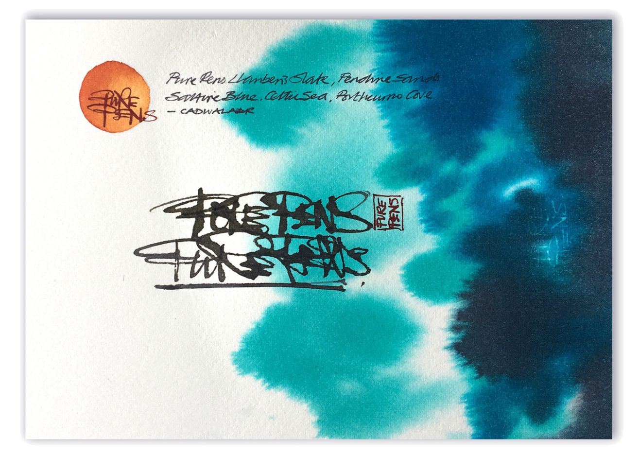 How it looks Cadwaladr is a rich red, with plenty of character.
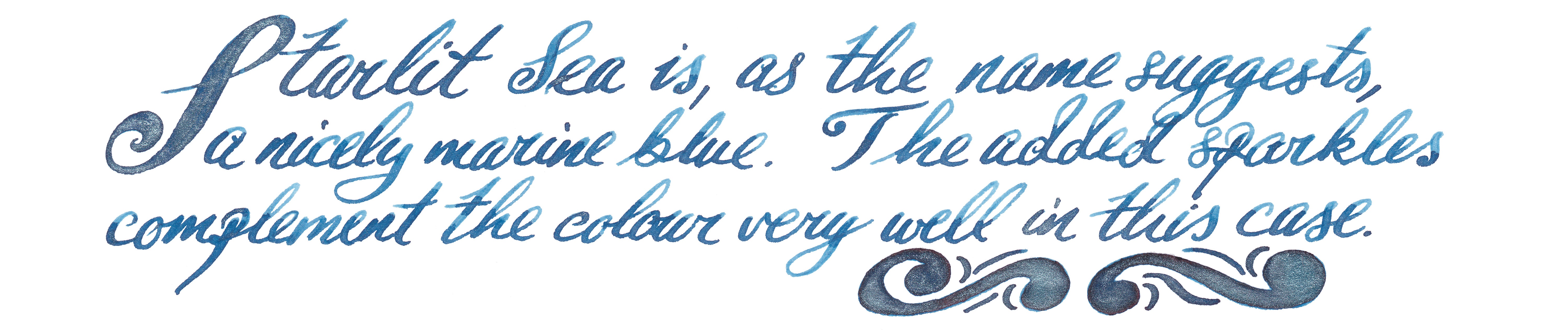
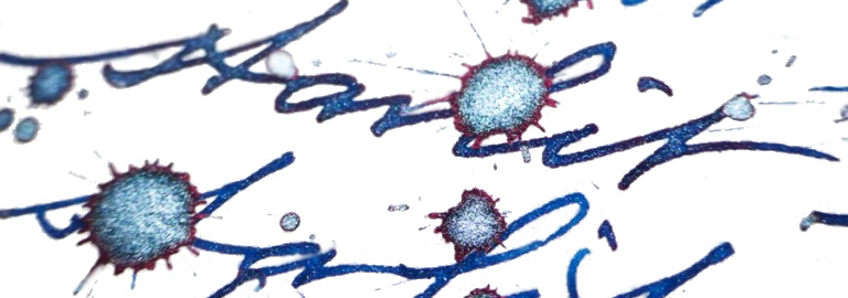
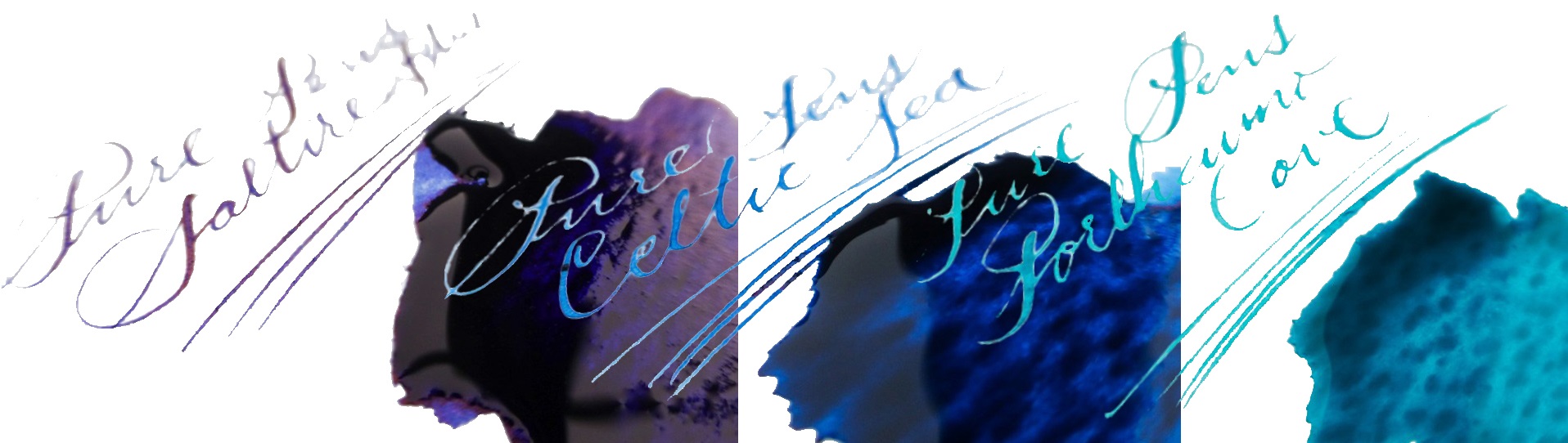
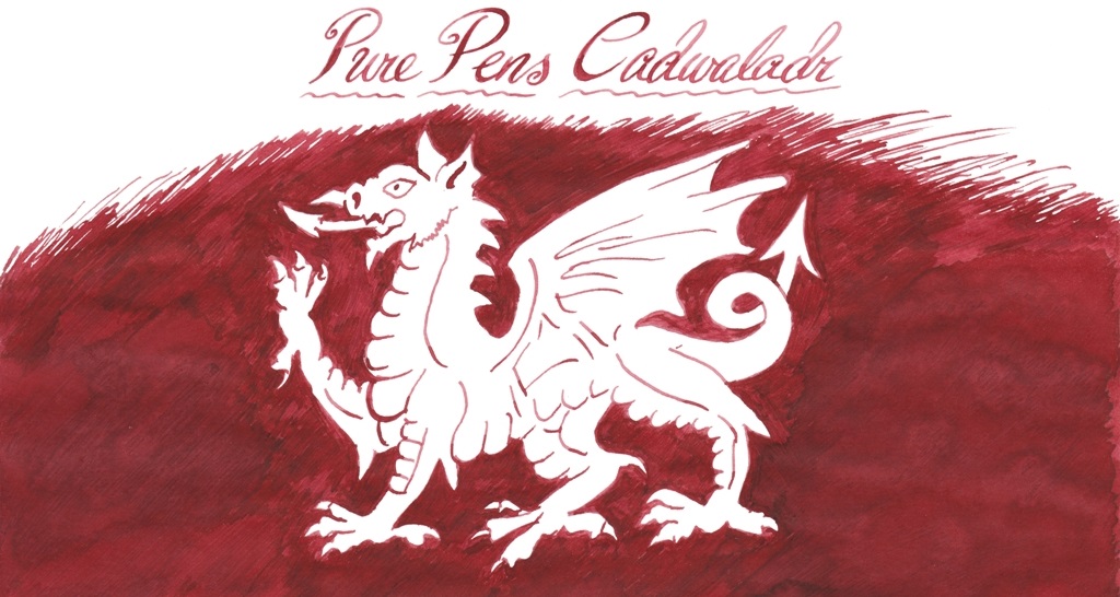 Celtic Sea is a pleasing blue, with lots of maritime presence.
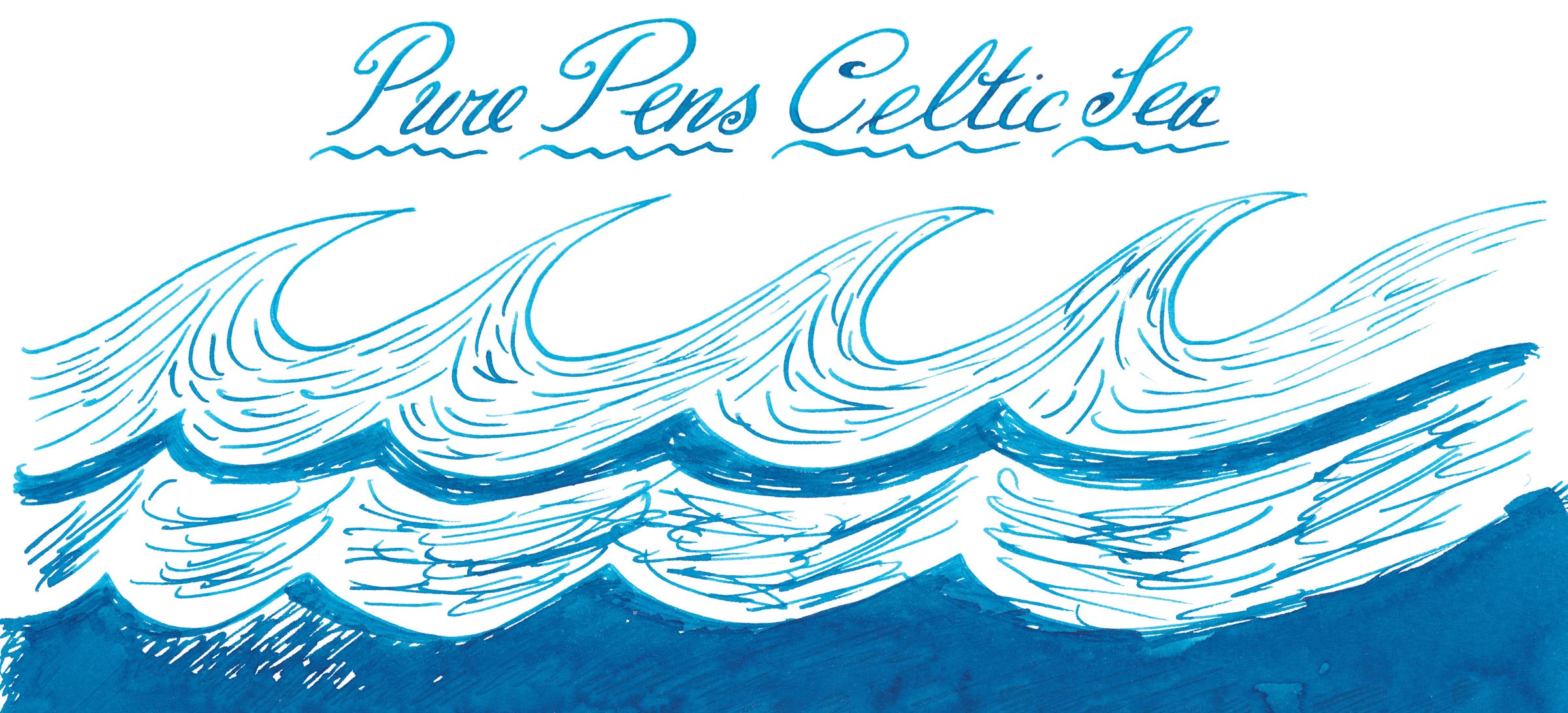
 This meta-review references:
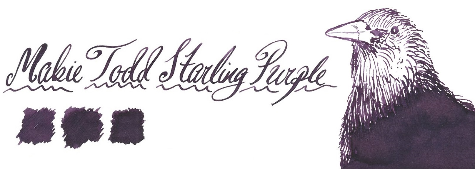
 Ink! What is it good for? It’s multi-purpose ink, this; it would be perfectly nice for writing a diary with, but you could probably get away with taking it to the office too. The plastic bottle is also hardy enough for travelling with, if you want to avoid glassware on the move.