A little bit of history Back in the days of space flight, one of the big problems was getting home safely. Vehicles come in fast, that compresses the thin air below them, and this generates enormous heat. Finding the right shape to survive the experience involved some serious trial-and-error. The Americans tried an inverted cone, which got very hot indeed, while the Soviets tried a spherical design which was, inevitably, tricky to steer. The solution, it turned out, was a bluff body – broad, blunt, fairly flat, with rounded corners. This proved to be so stable and reliable that every space programme currently in operation uses it. Oddly enough, a bluff body is also a promising format for a fountain pen nib; a large contact surface to make a wide mark, and smooth edges to reduce friction. But Bluff would be an awkward name for a nib type, as the letter B is already taken. It’s definitely the opposite of Fine, though, so it appears that Platinum broke out the thesaurus, looked for an antonym to fine, and settled on coarse. So, now we have a C nib. C for confusing, it appears…
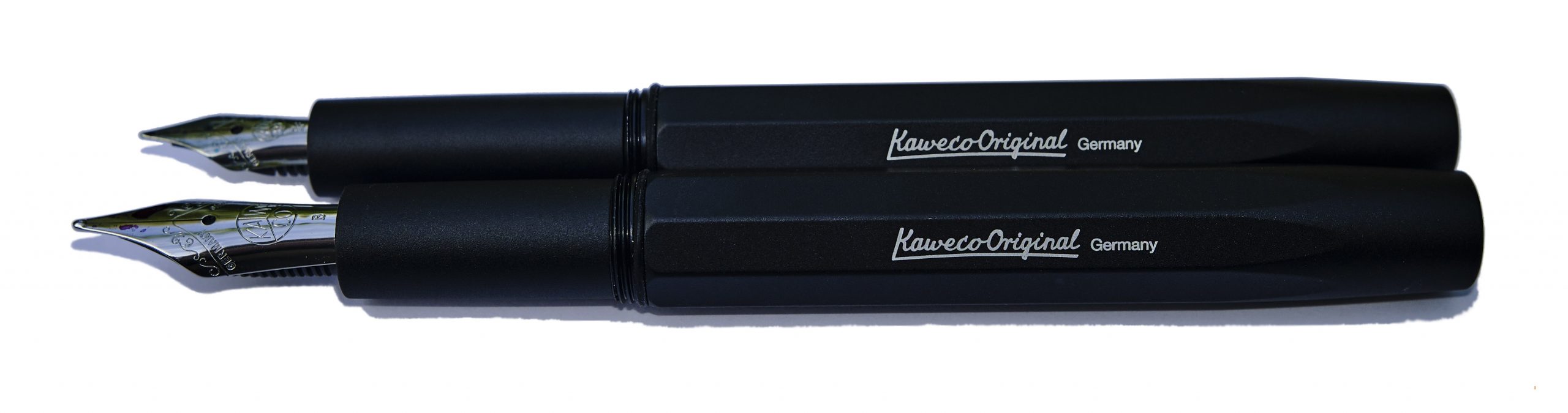
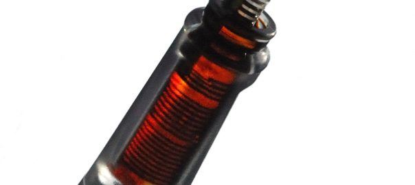
How it looks Until you pick this up and write with it, the pen looks like a standard #3776 – which is what it is. Our test body has the pleasing red bourgoigne finish, and it looks terrific. But a glance doesn’t quite tell the whole story.
How it feels This is a light pen and the nib is fairly smooth in use, albeit with the slight ‘toothiness’ common to many Platinum offerings. It’s worth trying in person as we think it’s one of those love-it-or-hate-it propositions.
How it fills A classic-cartridge/converter system, this, although only Platinum’s own kit will fit. The cartridges aren’t too difficult to find and the converters are some of the more reliable of Japanese pistons.
Crucially, how it writes… Fat and flouncy, in short. Imagine the illegitimate offspring of a BB and an Italic, adopted and raised by a Music nib, and you might not be far off. There’s a touch of tooth, but many of us found that it grew on us.
Pen! What is it good for? Here’s a pen for having fun with, in short. You could probably write distinctive signatures with it if you took it to work, but its greatest joy is writing flamboyant birthday cards and thoroughly jolly notes to friends.
VFM This is a well-made pen with an unusual ‘niche’ gold nib, so it’s not cheap as chips. But shop around and you ought to be able to find it for less than £200, which is pretty good. We do feel that for that sort of money Platinum ought to include a converter as a standard part of the package, though.
The only way is ethics We’ve got no complaint to make here; the pen’s made in a place with good labour standards, the packaging isn’t over-the-top and you can buy it from a specialist retailer who’ll back up the purchase with customer support.
If this isn’t quite your cup of tea, but almost… Platinum’s Music nib is similarly impressive. If you want an alternative Coarse nib, Pilot make one too – but it’s very hard to find in the UK.
Our overall recommendation Coarseness is in the eye of the beholder – or perhaps in the hand. This is such a surprising nib to use that it’s rather difficult to describe at a distance, so it’s worth trying out in person if you can. But if you like it, bag it; this is a great value proposition.
A little bit of history Kaweco was an iconic German pen firm which commenced production in 1883 in Heidelberg, where it remained until closure in 1980. In 1994 the brand was revived by pen enthusiast Michael Gutberlet, and relocated to Nuremburg. Here it has thrived, building on a solid legacy of excellent design and top-quality production standards.
The original Kaweco Dia appeared in 1921 as a traditional small piston-filler equipped with a 14k gold nib. The Kaweco Dia2 shares the look of the original Dia and a no-nonsense functionality. The modern Kaweco Dia2 is produced with computer numerically controlled machine tools and injection moulding of plastic resins and then brought for assembly and finishing at Nuremburg.
How it looks The Dia2 looks like a reborn classic pen, and comes in a plastic sleeve inside an art deco tin box. Nestled in a foam insert, with a small international cartridge, the pen is accompanied by a postage stamp fold-out history of the company and a Kaweco logo sticker to use, or not, as you please.
How it feels The pen can be considered a medium-sized pen by current standards. Sleekly black-bodied, it is a mainly resin model but with aluminium and brass parts that give it a comforting feel of durability and a surprisingly hefty solidity in the hand.
How it fills The pen cap and body finials feature the tricuspid Kaweco logo as well as a knurled band on the cap and end of the body. The latter is reminiscent of the original Dia’s piston filling mechanism. But pistons add cost, so the reborn Dia makes do with the well-tried cartridge/converter set-up.
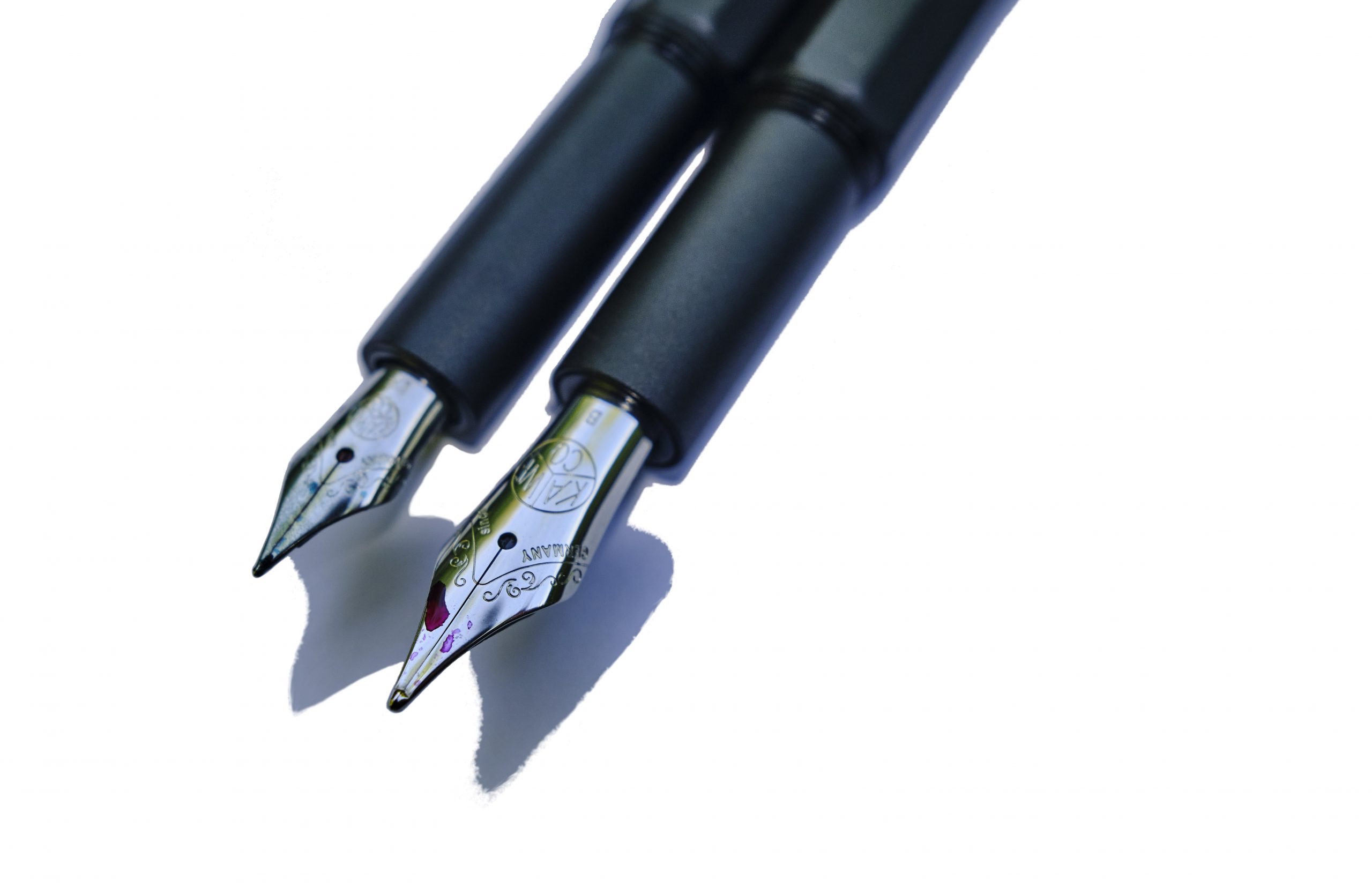
Crucially, how it writes… This depends a little upon what nib you chose to fit. As standard, the Dia comes with the diminutive Bock 060 nib better known from the smaller Sport and Lilliput models. That looks a bit titchy with this full-size body, but thankfully there’s a better-proportioned #5 alternative in the shape of the wider-shouldered 076. An 076 was sourced from Beaufort Ink and, even though it lacked the Kaweco branding, it looked a lot happier. Both nibs delivered the ink well and there’s every sign that this will prove a trustworthy ‘daily driver’.
Pen! What is it good for? This one wants to work in an old-fashioned sort of office, but could handle modern jotting duties just as well.
VFM You can buy the chrome Dia2 for £75 to £90 from UK pen sellers. The gold-plated fixture version comes with a £15 premium on top. A Kaweco converter is about £5. The 076 Bock nib will set you back another £10. Overall, and in a crowded market segment, we think that represents pretty good value for money.
The only way is ethics It’s made in factories with decent labour conditions, as far as we can tell, and the packaging isn’t over the top. Fit a converter and there’s a tiny bit less disposable plastic, too.
If this isn’t quite your cup of tea, but almost… Take a look at the Supra.
Our overall recommendation If you like the look of the old Dia, you’ll be friends with the Dia2.
Where to get hold of one All the usual pen retailers; it may resemble an exotic classic but thankfully this is no rarity.
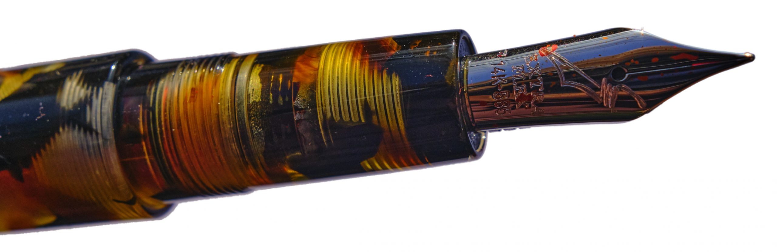
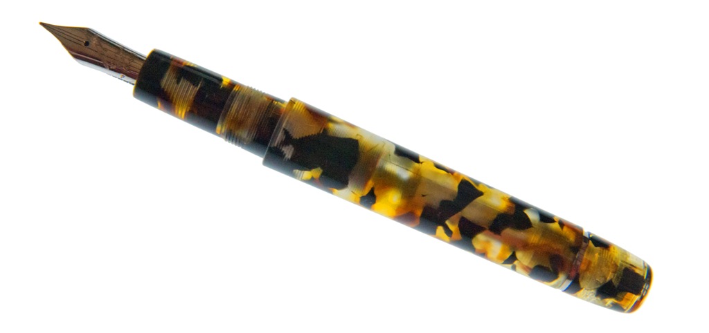
A little bit of history When OMAS collapsed, many a tear was shed – and many a huckster worked hard to purloin the brand. Some have occasionally claimed success in doing so, although it never seems to amounts to much more than a lacklustre product with a familiar logo. But the core values of well-turned pens made from classy materials sporting positively aphrodisiacal nibs live on in Scrittura Bolognese. Write Here, in Shrewsbury, have been commissioning special editions from them for a few years now, and this is the first to feature a translucent barrel so that some of the magic is on view. Inevitably, we all wanted to put it through its paces.
How it looks It looks a lot like a distilled leopard, in short – at which point we should add that this is a vegetarian sort of pen (even if it inspired Dappr to nibble a zebra) and the image really is just that. But our panel were all struck by how much prettier this pen is in the, err, flesh. Even for those of us not given to favour brown pens all that much, it’s won fans wherever it has travelled.
How it feels Light, warm, and springy – the latter being a lot to do with the Extra-Flex nib, about which more in just a moment.
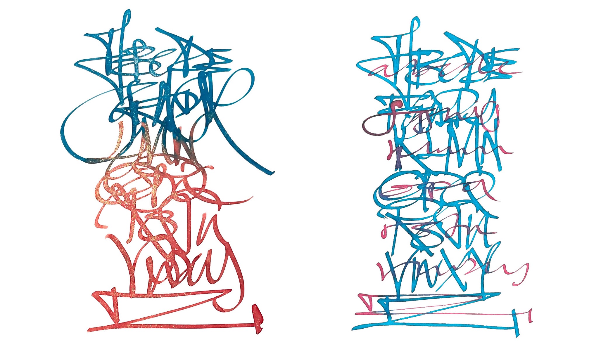
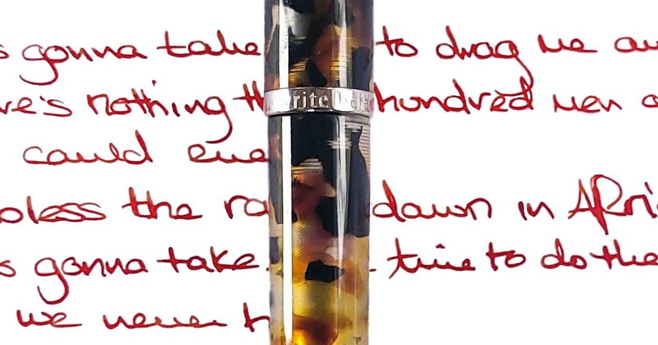
How it fills This is a piston-filer, as is the norm with most Scribo models (apart from the Piuma), and it fills fairly easily with a decent quantity of ink which, unusually, is visible within the workings. The temptation to fill it with a complementary shade has proved very strong; even Mr Teal didn’t put turquoise in this one, and another contributor bucked the trend with a disturbing absence of purple. If you like orange ink, though, this is the bee’s knees – and looks like them, too. Crucially, how it writes… The Fine Flex nib is a joy, and by general consensus the nearest thing to a vintage wet noodle on the market today – even to the point, shockingly, that some of our reviewers prefer it to the Pilot FA nib. So how it writes is curvaceously, and wet. This is not a pen which scratches and blots on the page so much as one which aesthetically drools all over it.
Pen! What is it good for? Unlike the popular Lamy, you won’t want to take this on safari; it’s a lovely, lovely pen, but the elephant in the room is that this is categorically unsuited to the rigours of the Serengeti. The Africa is made of somewhat delicate materials and the nib needs careful handling, so it is strictly one for enjoying in the library at home, possibly with a glass of Amarula in the other hand and Toto on the stereo, although the ambience is optional.
VFM Bologna doesn’t make cheap pens, and this is no exception. Half a grand is a heap of dough for a writing implement and we probably wouldn’t suggest that anyone completely new to proper pens starts here; it helps to have a bit of experience before taking on a nib this flexible, for a start. But if you want something really special, this is arguably a decent bargain given that a certain well-known German brand will charge you twice as much just for the honour of turning a fairly boring black pen a slightly less boring red. If this is the perfect pen for you, it will probably be worth raiding the piggy-bank.
The only way is ethics It’s made in the European Union, so we’re confident about labour practices, and it hasn’t travelled too far to get here either. Subjectively, we very much doubt it will break your heart.
If this isn’t quite your cup of tea, but almost… Realistically, the only nib anything like this comes in a different Scribo. The Write Here special editions change material roughly once a year, so you don’t have to wait too long for something visually different (although, conversely, if you love the Africa you’d better get your skates on). Or, of course, there are other, less cylindrical, Scribo shapes.
Our overall recommendation Try one in the hand if you can, save up for a while if you need to – and whatever you do, don’t Google that Toto video.
Where to get hold of one Write Here is the only place you’ll find this, but if you can’t get to Shrewsbury it’s also available online.
A little bit of history We’ve been tracking the development of Ruth’s Japanese-influenced Tyneside pen project Shibui-North pretty much since its inception, and the results keep tempting us to try things out for ourselves. So when the little Kitsune’s big sibling came along, we had to give it a run!
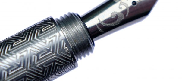
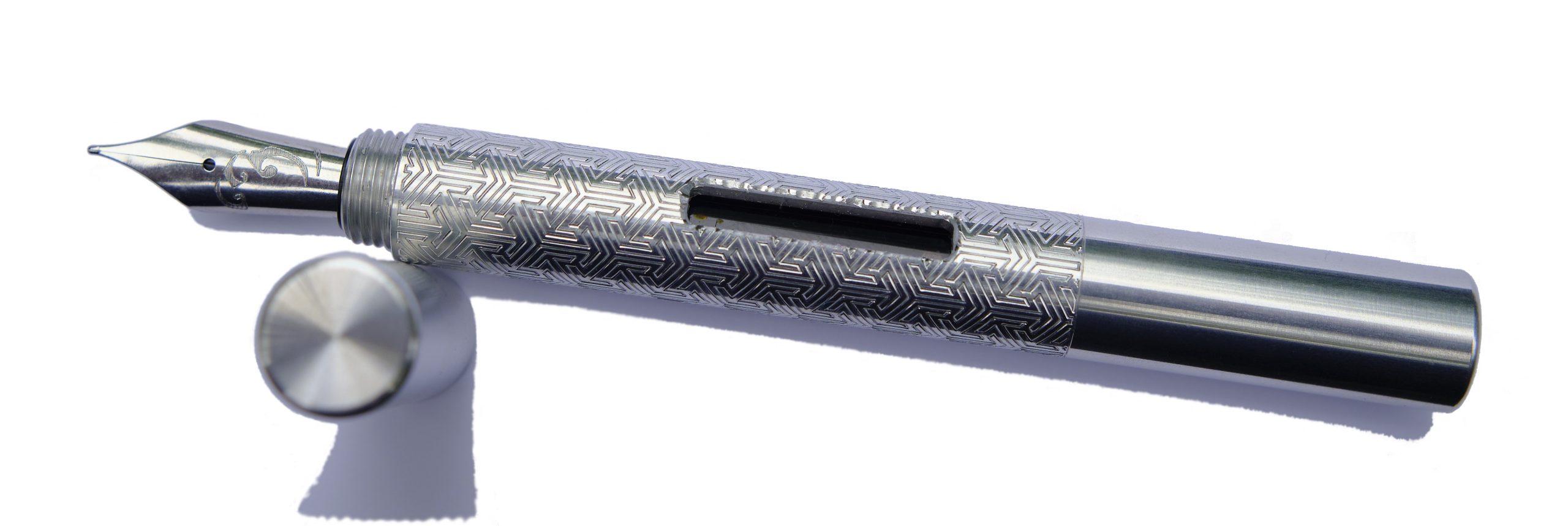
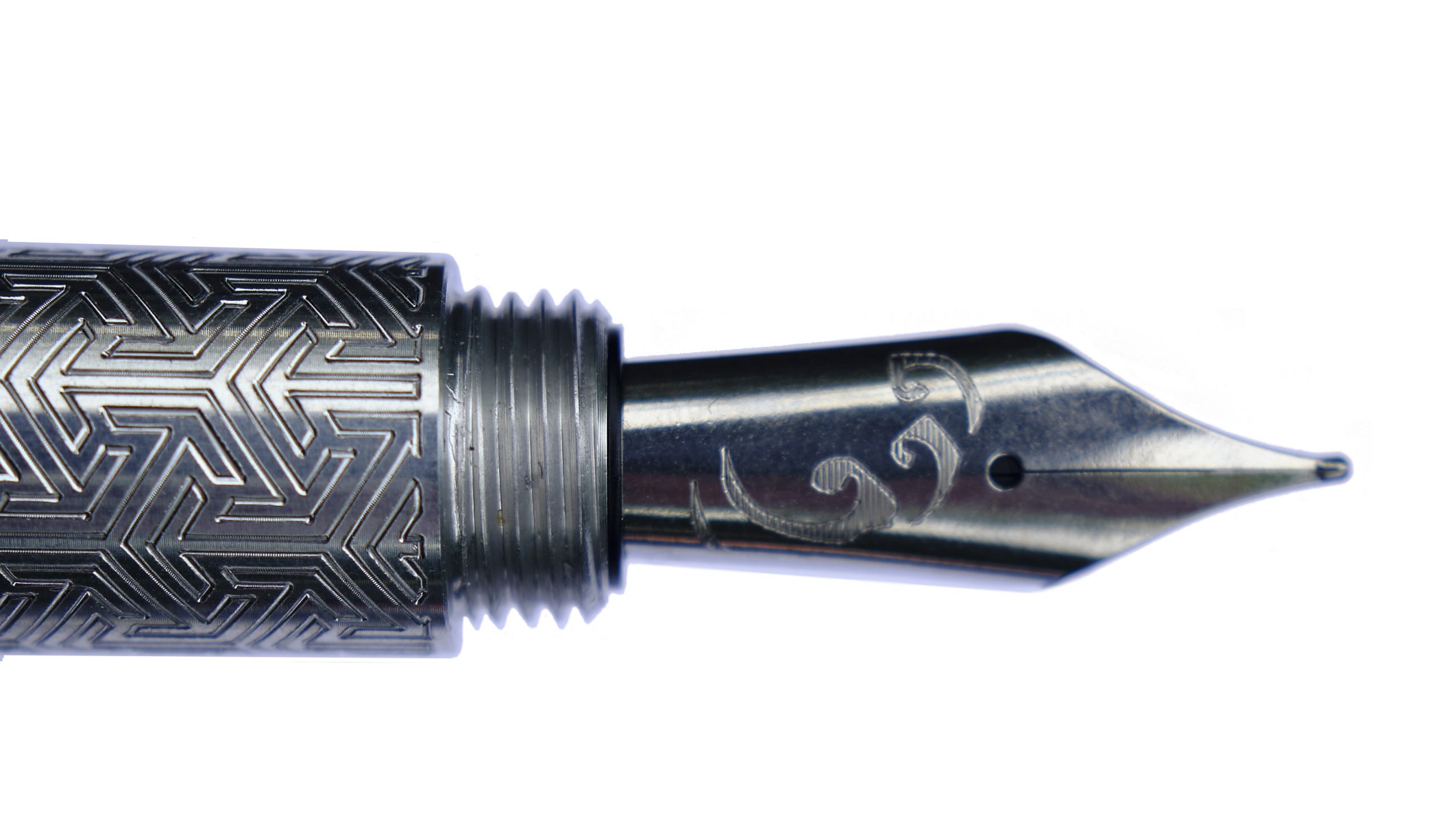
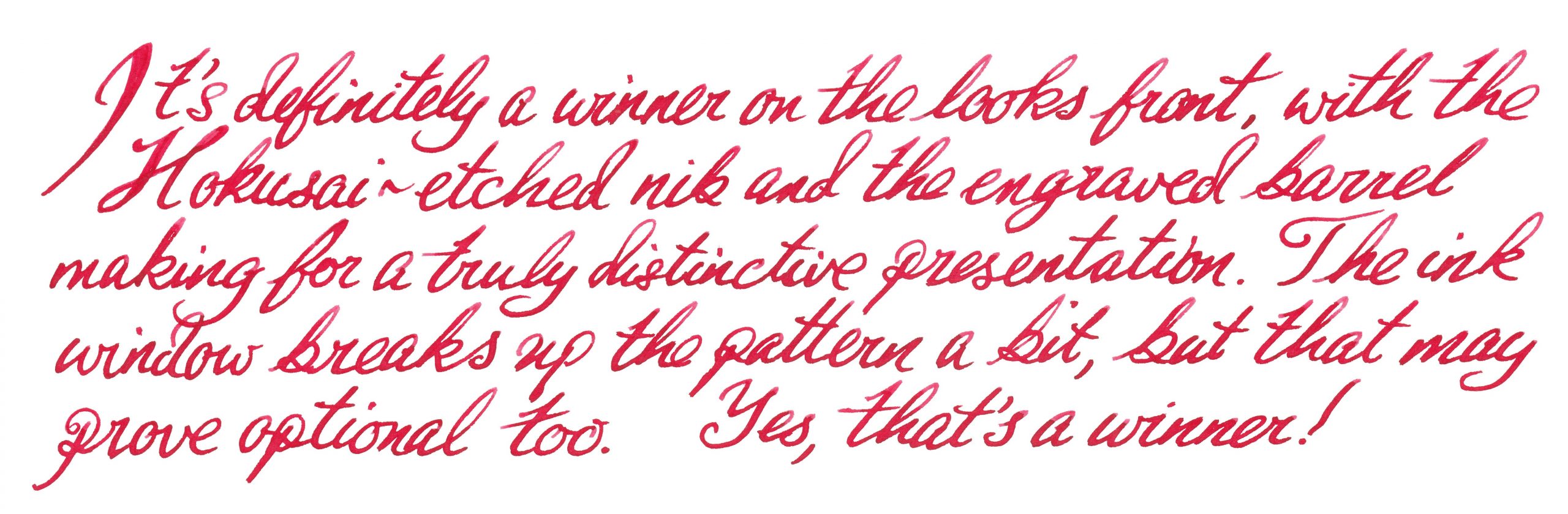
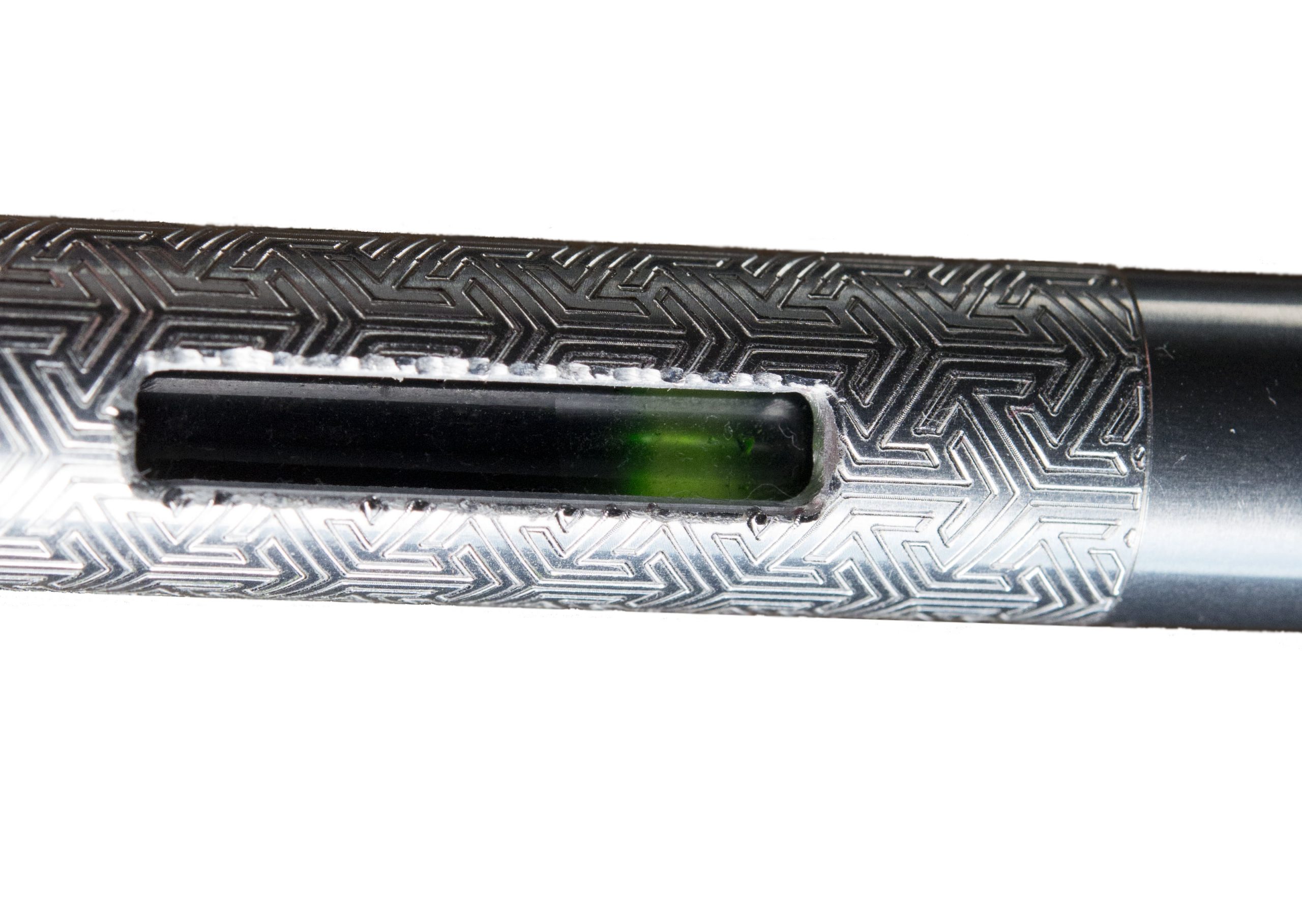
How it looks Like a medium-sized long-ish pocket pen, which is pretty much what it is. Several hallmarks make it stand out, however: the cut-out ink window, the Hokusai wave inscription on the nib and the geometrically etched barrel imprint. Bland and everyday it certainly ain’t.
How it feels Solid, grippy and, thanks to aluminium construction, fairly light. That said, balance is a personal thing and this seems to suit those who particularly like medium-length pens best. Fans of small pocket pens may find it a touch over-long for perfect balance and, conversely, full-size pen afficionados may feel it’s a bit on the short side. Much comes down to personal preference, with this one.
How it fills This is the converter version of the Kitsune, which tells you most of what you need to know. There’s space for a full size converter, and a blind cap which twists off at the back end to make refilling a touch simpler. The resulting ink capacity is a bit of a step up from the tiny converters which fit small pocket pens, too.
Crucially, how it writes… It’s a Bock steel nib, so writes just as expected; fairly smoothly, with reliable flow and the slightest hint of bounce.
Pen! What is it good for? To our minds this is still a pocket pen, albeit for people with relatively large pockets – if only in the literal sense. It could even be an everyday note-taker – although with a robust set of threads undoing that cap does involve a few seconds of rotation in between jottings.
VFM It took us a little while to test this design, and the exact model is no longer on sale. But the Pocket Fox is similar, with a shorter international cartridge, for around £100 to £110 usually – not bad for a hand-made pen with an interesting finish and Geordie bragging rights.
The only way is ethics It’s made by a human being who you can contact and have a chat with first, right here in Blighty, and packaged responsibly. What’s not to like?
If this isn’t quite your cup of tea, but almost… Go shorter or go longer, in, err, short. The cut-down version is now known as the ‘Pocket Fox’ and looks the business in all sorts of finishes. Fans of longer pens may prefer the gracefully curved Tombo, meanwhile.
Our overall recommendation Find the right balance for you, then take the plunge.
Where to get hold of one Direct from Ruth, the maker, either in person at a pen show or via her website.
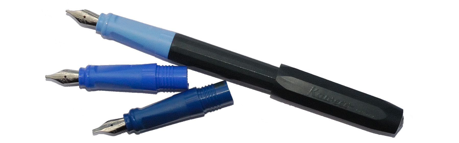
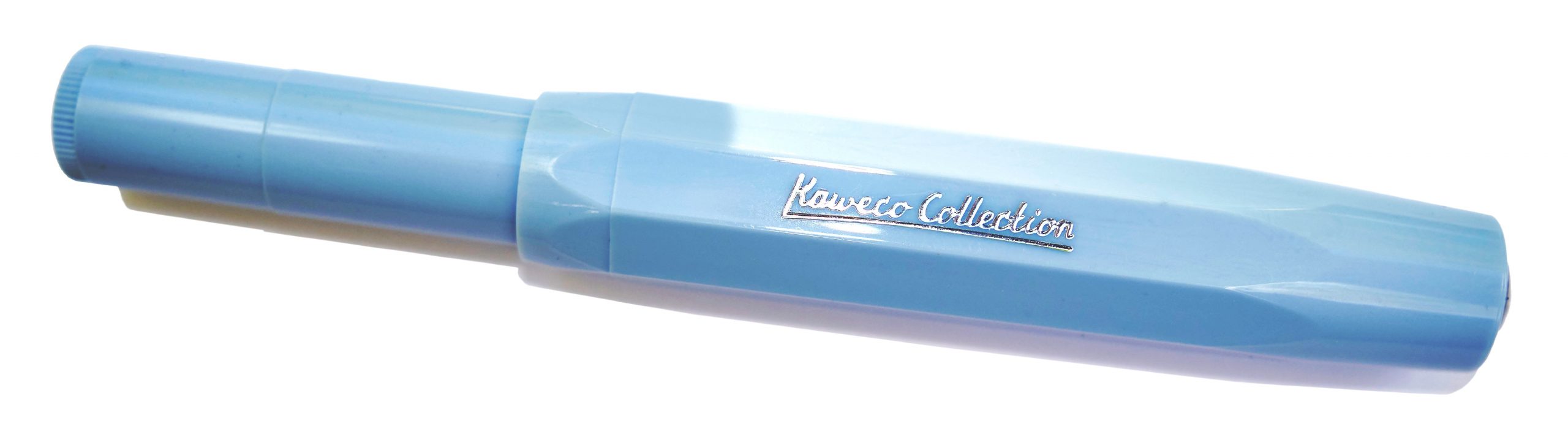
A little bit of history Every fountain pen fan tries a Sport eventually, often fairly on, and for many of us the convenience of the venerable pocket performer reels us in to the point where different flavours start to appeal too – and Kaweco does a fine job of feeding the frenzy, with colour-matched limited editions like this. The Kaweco Collection serves up both an affordable plastic Sport and a posher aluminium version this time, and luckily we got to try both!
How it looks It looks much like any other Sport but in a pair of rather sophisticated colours, and with ‘Kaweco Collection’ proudly displayed on the side of the barrel. No complaints there; if you’re a Sport fan, you probably want already simply after looking at these pictures – and that’s rather the brand’s plan.
How it feels Small, and light. As usual, the aluminium version feels a touch more robust, but far from heavy. Like you’d expect a Sport to feel, really; the difference is all visual.
How it fills As ever, syringe-filling a small international cartridge would be our tip. There is a tiny push-rod converter, but the ink runs out so quickly that scope for frustration is considerable.
Crucially, how it writes… Generally, pretty well. The quality control on the steel nibs has improved in recent years, and for the pricier aluminium version any Bock 060 nib can be screwed in if you fancy a change. There’s even a gold option, should pushing the boat out that far be on the agenda. We stuck with the standard steel M, probably the most popular option, for this test and the results were encouraging.
Pen! What is it good for? The Sport’s natural home is in your pocket, of course, but these two specials were also made for showing off, so it’s up to you. Generally we’d suggest these are for leisure use rather than business, but who are we to dictate?
VFM The plastic Mellow Blue will set you back about £25, which is quite fair value, and the swisher aluminium Iguana Blue more like £70 – not crazy money at all, but it makes sense to try an ‘entry level’ Sport to check out whether the format works for you first.
The only way is ethics These are made in Germany with decent labour conditions, and Kaweco haven’t gone crazy with the packaging, so things look healthy on the ethical front.
If this isn’t quite your cup of tea, but almost… There are plenty of other Sports to try if you prefer a different colour or a heavier metal, for instance. Or, if that modest-sized nib irks you but the octagonal barrel is just your cup of tea, try the larger, #6-nibbed Original.
Our overall recommendation These will sell like the proverbial hot cakes; if either takes your fancy, get it quickly!
Where to get hold of one All your favourite fountain pen specialists are likely to have these in stock – as long as they last.
A little bit of history The Kaweco brand has been going for a long old while, and many of their models hark back to designs of a hundred years ago. But just this once, they have echoed familiar themes whilst coming up with something, well, original. Naturally, we had to put it to the test. How it looks Actually, they came up with two Originals, with very different nib sizes. The smaller version uses the diminutive short #5 060 Bock nib familiar from the Sport and Lilliput models, which unfortunately looks a little stunted in a long pen like this. The larger Original, though, uses a nice big #6 250 nib which looks in proper proportion – a bit like a scaled-up Sport, keeping the distinctive octagonal profile which is something of a Kaweco calling card. How it feels Both Originals feel solid yet, thanks to aluminium construction, not terribly heavy. On the whole, robust but usable. How it fills An obvious advantage over the Sport is that the Originals have room for a full-size converter, and Kaweco have maximised that gain by threading the inside collar of the section to allow for a screw-in converter, helpfully also available from Kaweco in a range of colours. For reasons which remain a mystery, we chose purple for our test units, but retailers might be well advised to provide a converter as standard; it’s a much more ‘premium’ experience filling up with ink from a proper bottle, and being able to prime a feed with a quick twist of the converter can help when inks prove to be a little on the dry side. Crucially, how it writes… As ever that depends upon the nib fitted and the ink too, but we had a varied experience with our test units. The tiny 060 had an EF nib which struggled to lay enough ink down really, but as we’d probably elect to upgrade to a more fitting Bock 076 (sadly not yet available in Kaweco branding) anyway, perhaps that’s not the end of the world. The larger 250 had a B tip which surprised several of our reviewers with how well it performed as a ‘daily driver’, so that looks like the winner. Pen! What is it good for? These might be a bit pricy for a school pen, but they are robust enough to serve as a daily driver for a more grown-up writer. VFM At a ‘street price’ close to £100 for the #6 version these are not cheap, to be honest, so our tip would be to buy from a bricks-and-mortar shop where you can try a number of nibs and get the one which really works for you. It needs to be usable to be worth the money, at this price point. The only way is ethics Made in the EU, and packaged sensibly, there’s little to worry about on this front. If this isn’t quite your cup of tea, but almost… If the 060 nib just looks a bit short, fitting an after-market 076 will probably help. If you like the 250 version but for some reason just don’t dig a polygonal cross-section, Kaweco’s smoothly cylindrical Supra may be more your thing. Our overall recommendation For people who enjoy brief scribbles with a Sport but want something similar but a bit larger for extended writing sessions – and that might be rather a lot of us – one of the Originals could well be the answer. But given that the right nib makes a big difference, we’d recommend trying them out in the flesh first. Where to get hold of one It’s a fairly new model at present but most fountain pen shops are likely to consider this soon. Buying in person looks less hassle than online purchasing given the possibility of a bit of nibular trial-and-error.
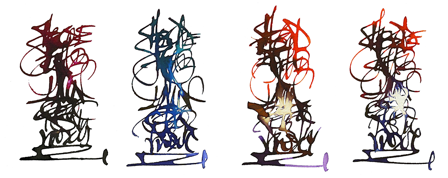
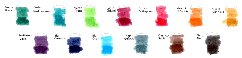
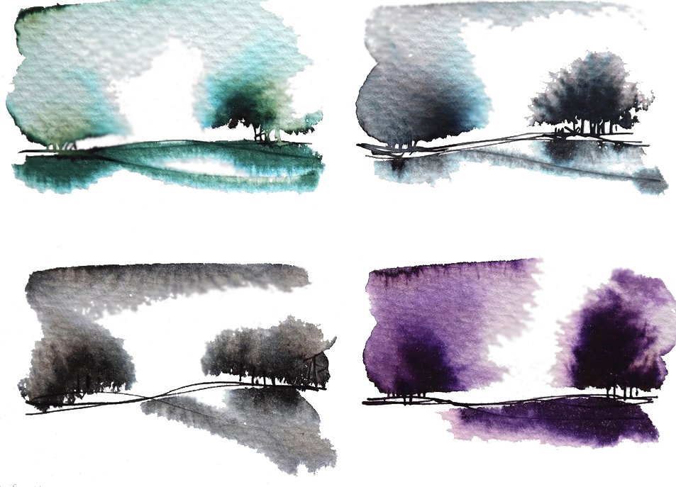
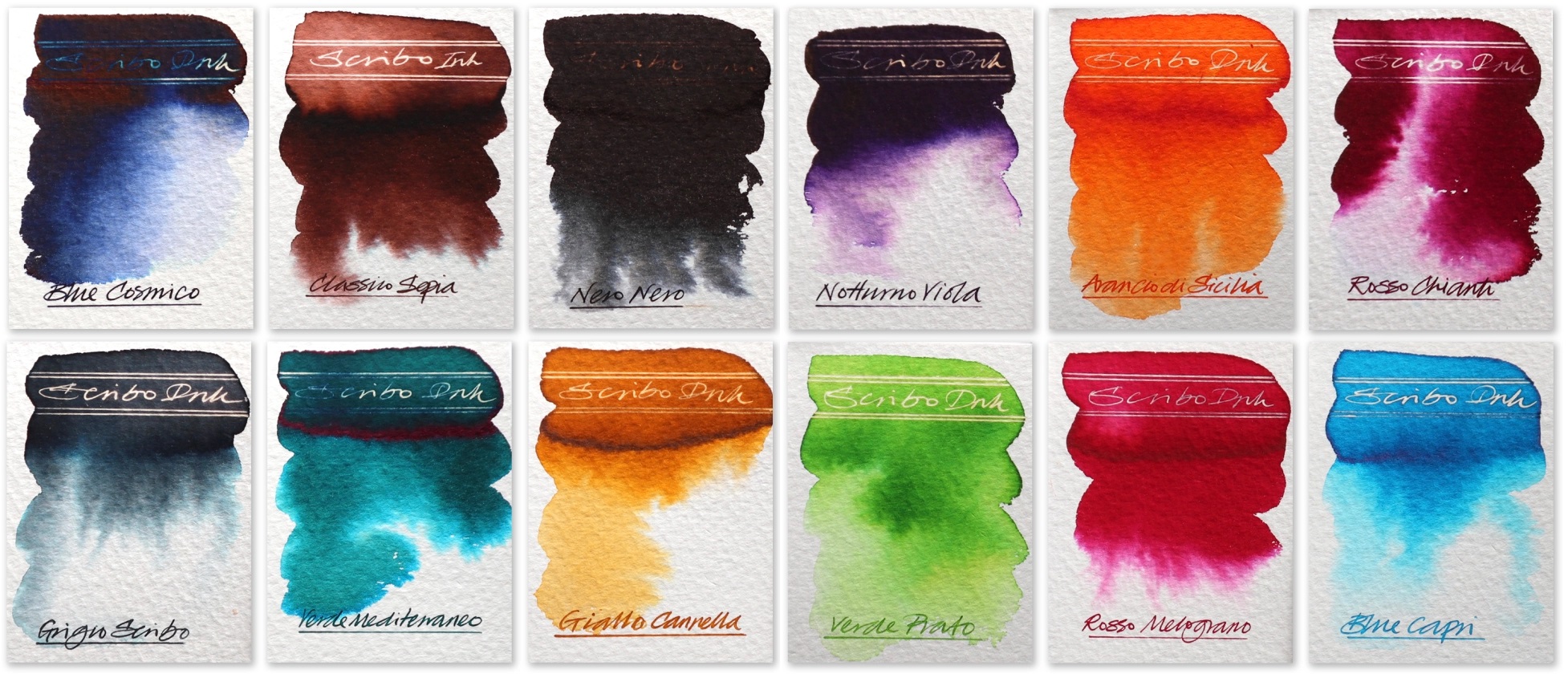
A little bit of history Much as we all mourn OMAS, ink wasn’t their strong point. Their spiritual heirs, Scribo, have apparently set out to correct that. We put the whole range to the test.
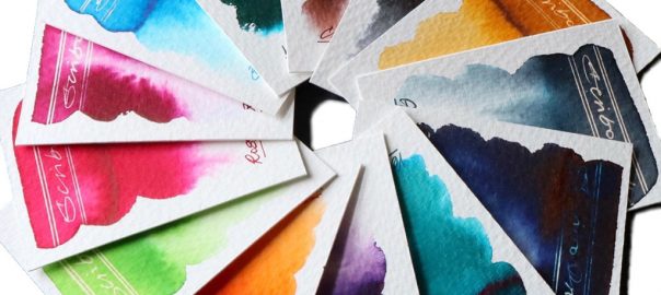
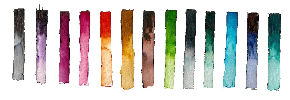
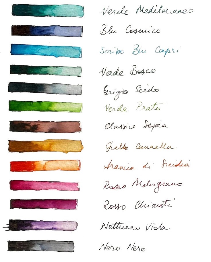
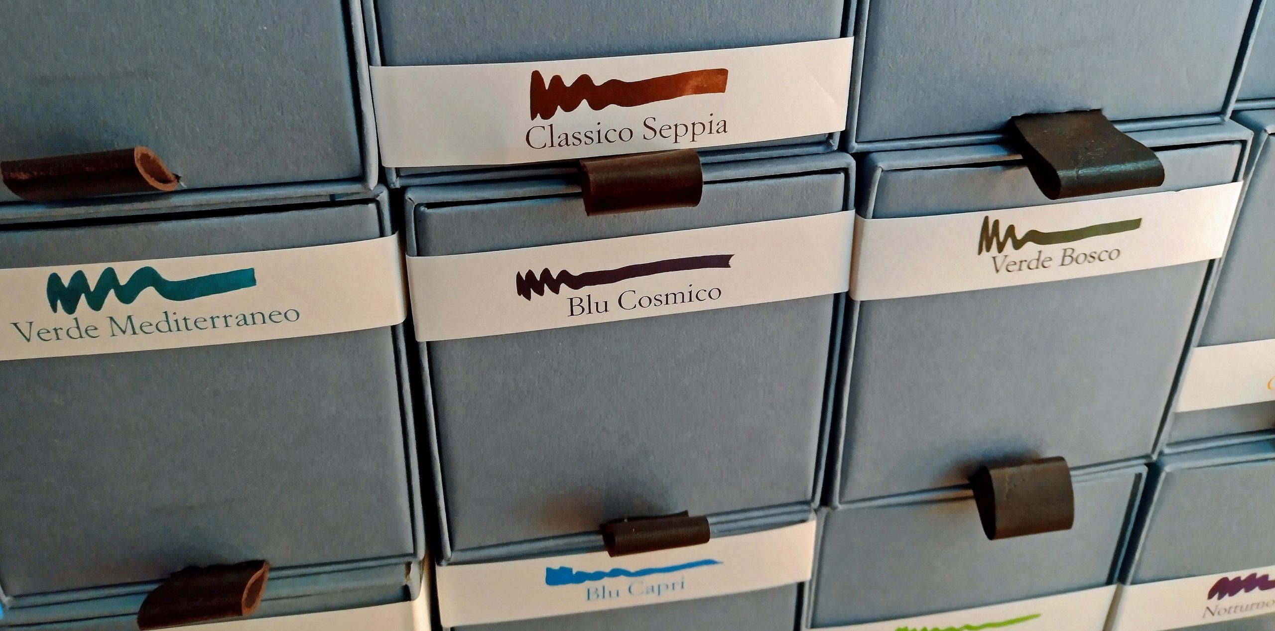
How it arrives Packaging isn’t everything, but my goodness do Scribo make an event of it. The cubic cardboard boxes slide out like drawers to reveal stackable square-based bottles which positively shout “we’re special!” – and so they are.How it looks This is a big range, and the different components deserve detailed attention:
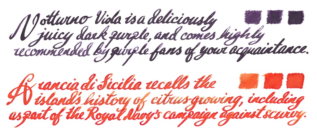
The inktelligentsiaThe orange and purple offerings immediately won many fans, the purple dark enough to take to work and the orange stiff competition for any similar shade. If you have only the pocket money for the one bottle, either would be a good place to start.
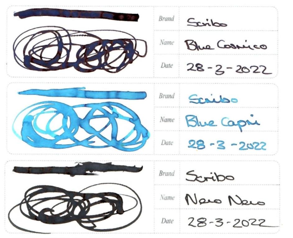
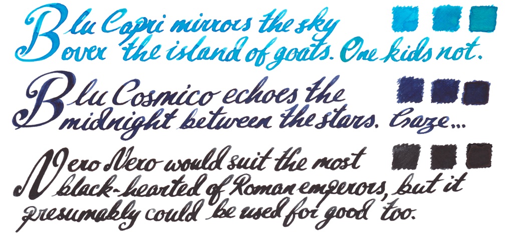
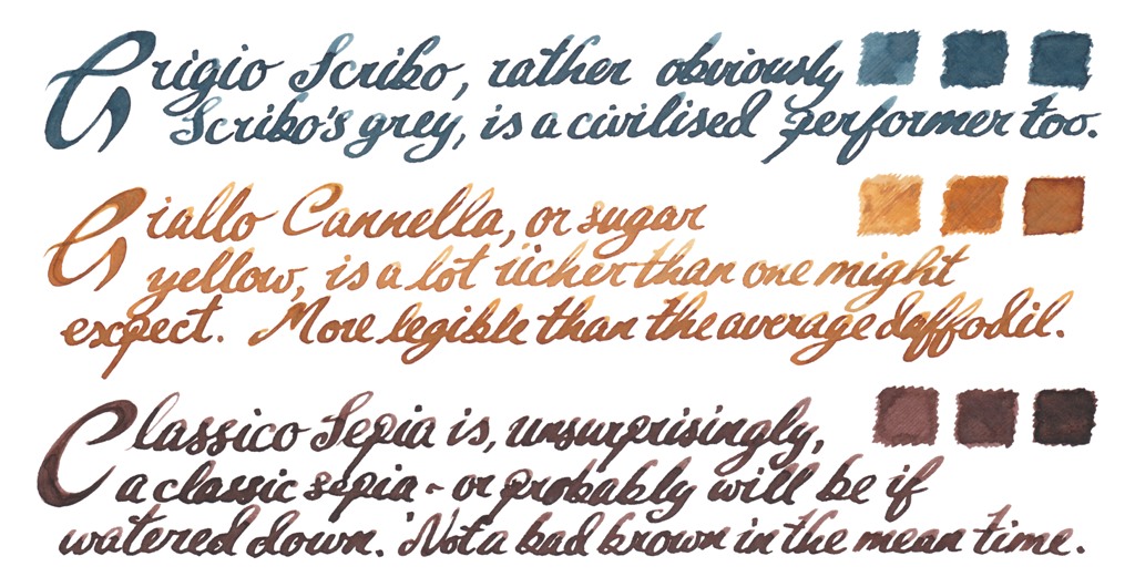
The patricians Some sturdy blues and very black black here, with an empirical link; Capri was the childhood home of Caligula, uncle of Nero.
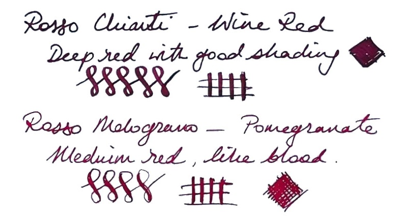
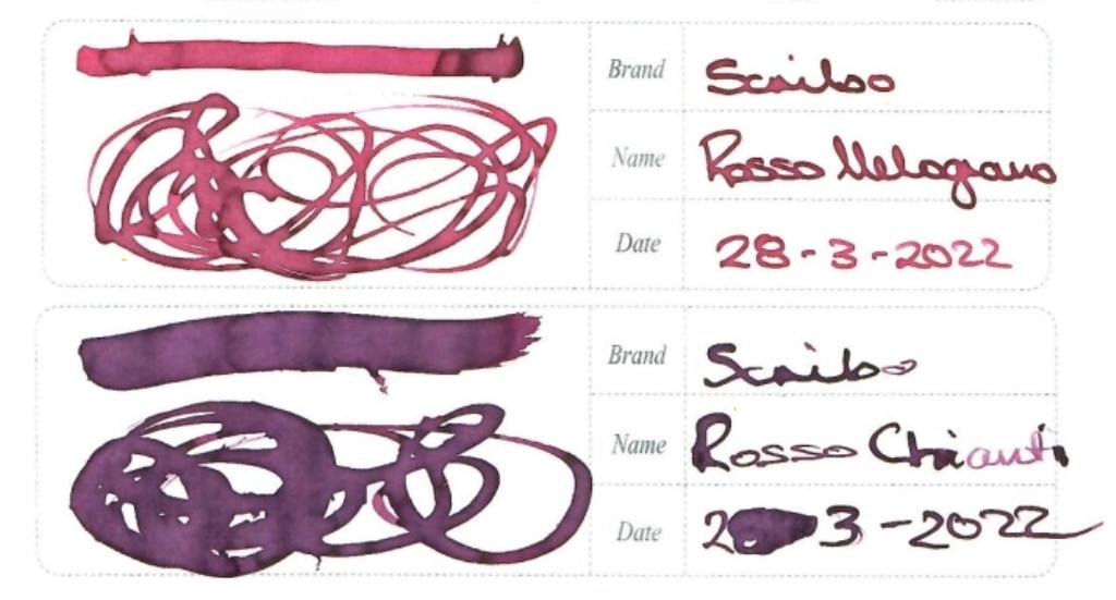
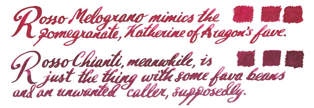
The communards Should you wish to raise the red flag, you can do so with a juicy pomegranate, or, err, with a nice Chianti.
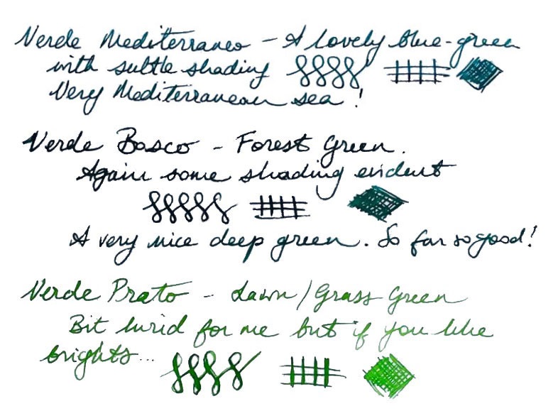
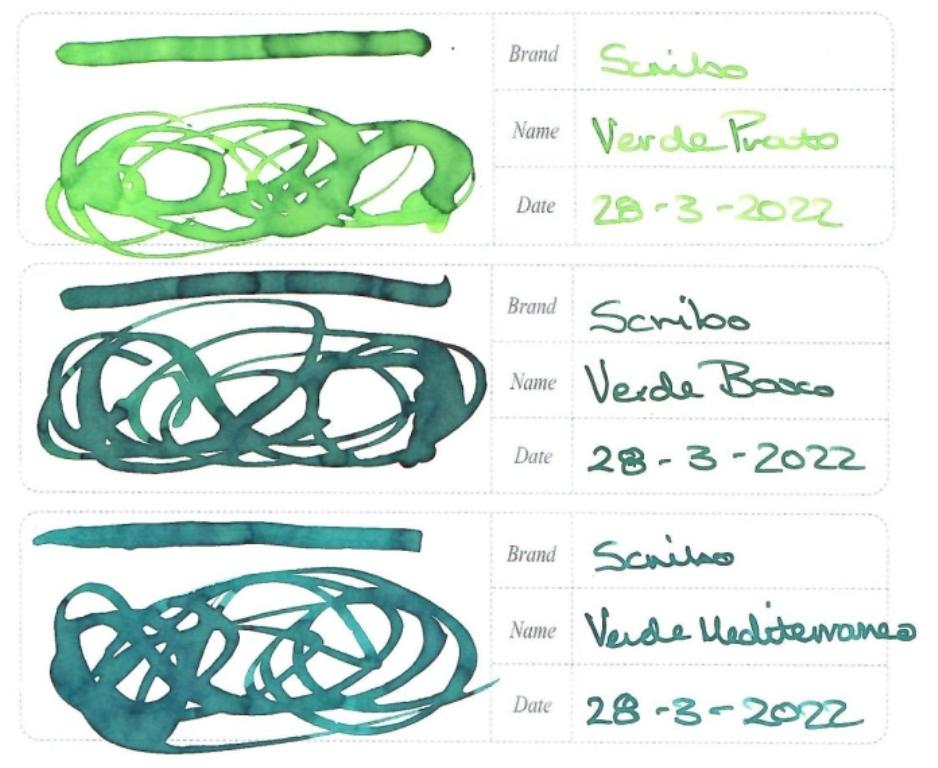
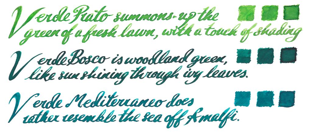
The ecologistsThat’s a lot of green for a modest range, but there’s a shade here for everyone – with a civilised teal probably taking the prize.
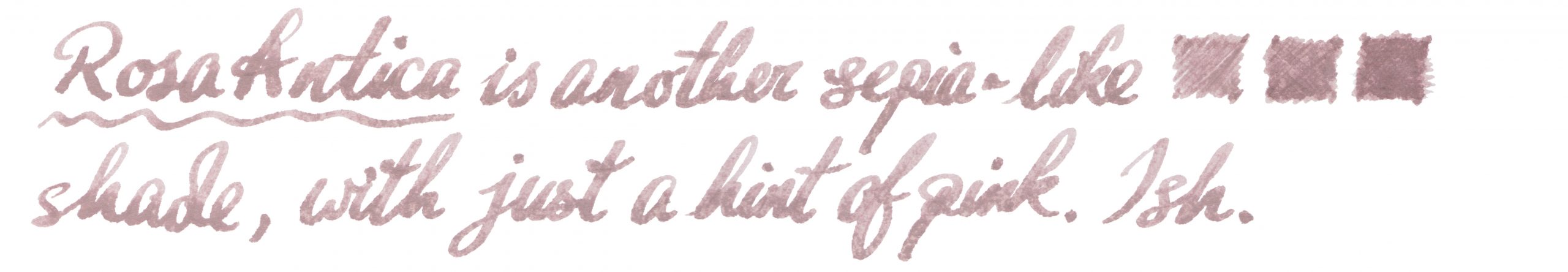
The dullardsIt’s a little harder to get excited about browns and greys, but they do have an audience – and these at least do it with a bit of class.
Crucially, how it writes… Actually, that varies: some were found to be a touch dry for our testing panel. However, as Scribo pens themselves tend to run very wet, it’s a good match for the right nibbage.
Ink! What is it good for? If you work in design or fashion, perhaps you can take one of these inks to the office. For the rest of us, this is probably best for writing a diary, making private notes or correspondence with friends – and none the worse for that, of course.
VFM These aren’t cheap, by any stretch of the imagination, and are priced comparably with Iroshizuku inks. As a result we would hesitate to advise rushing out and buying the whole range, as the outlay would be equivalent to the price of a very good pen. But if you have treated yourself to a nice Scribo pen and want something which complements it, a bottle of your favourite shade might not be too crazy an indulgence.
The only way is ethics The inks are made in the EU (we think) and the packaging is eminently re-usable, so it scores fairly highly on this front.
If this isn’t quite your cup of tea, but almost… You could try some KWZ – although be prepared that a Scribo pen thus equipped may double as a small fire-extinguisher in emergencies. In terms of the colour palette, Italy may have little to compete with this but over in Japan Sailor and Pilot both have ink ranges which cover similar ground, at similarly ‘premium’ prices.
Our overall recommendation Scribo have done their pens justice with some grown-up inks in really impressive packaging, but they do cost accordingly. Our tip would be to choose just the one which which matches your pen.
Where to get hold of some Our samples were donated by Write Here, the only UK stockist we’re aware of thus far. If you happen to be in Bologna, Scribo may also sell direct.
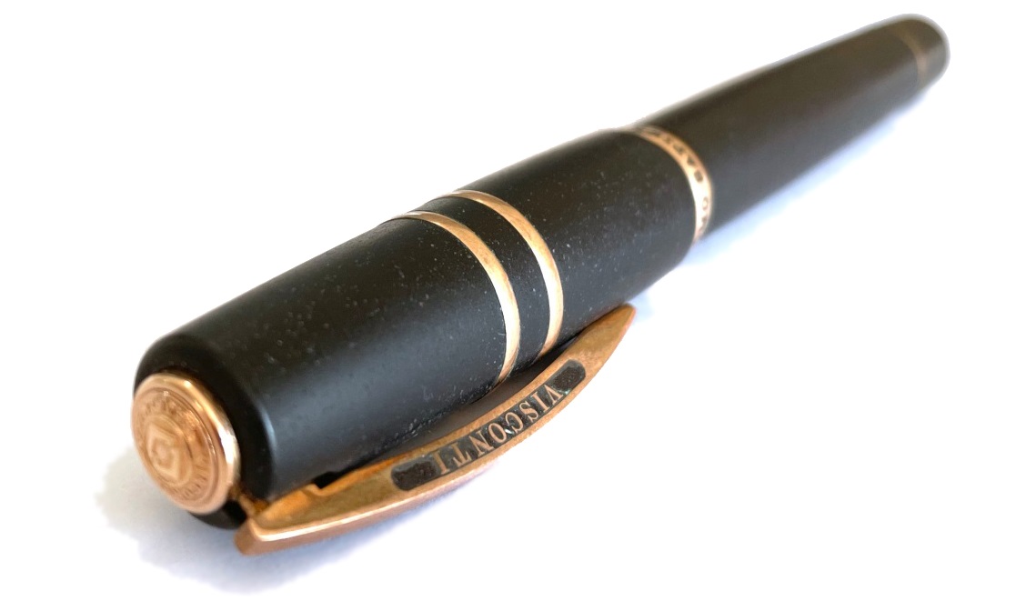
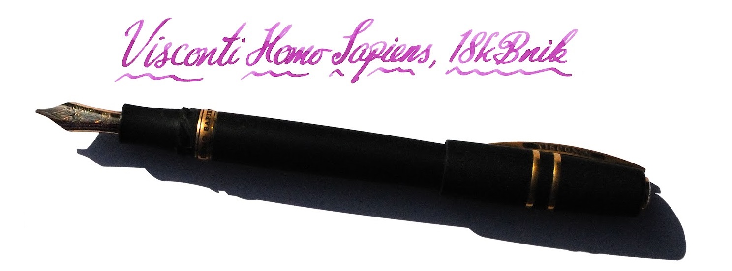
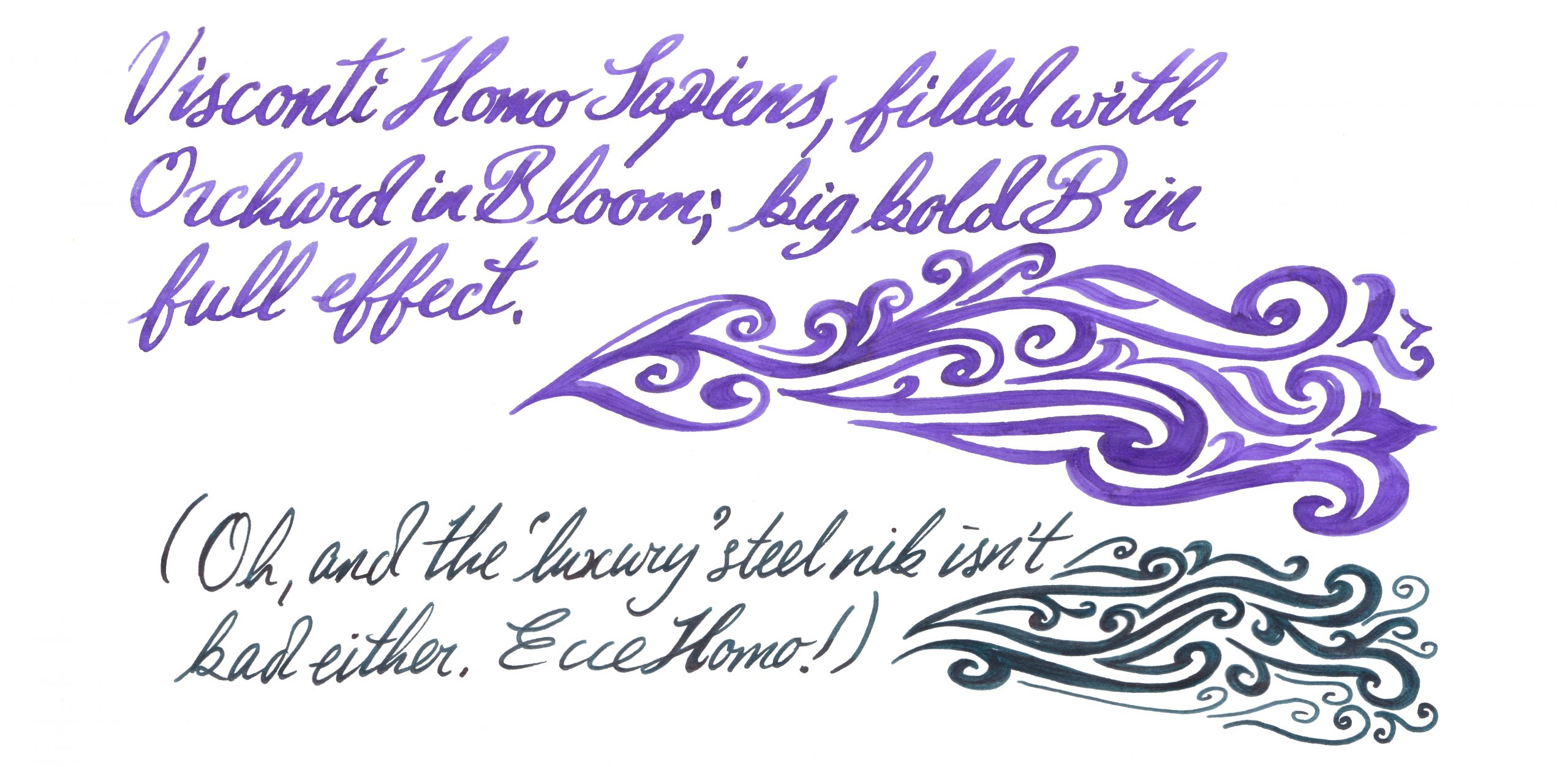
A little bit of history Our species are not the first terrestrial hominids to make art, and therefore conceivably not the first to use a device like a pen for making marks. But we are, in all probability, the first on this planet to invent copperplate, so it’s perhaps not too bold for Visconti to name a pen design after us. Sed – ecce! – inter homi sapientes, de gustibus non est disputandum. We therefore did our best not to argue too much. Quite a mountain of history, actually Back in the 1970s, steady-state Luddites fought against two intellectual movements and lost twice, first to the constant expansion of the universe and then, down here on Earth, to plate tectonics. But our story starts about half a million years ago when the slow-motion collision of the African and Eurasian plates caused the growth and repeated eruptions of a stratovolcano known to successive civilisations as Etna. It’s held a place in myth and legend ever since, including as the prison of the monstrous Typhon, and as the source of much of Sicily’s soil has been ruled over by Greeks, Carthaginians, Romans, the offspring of King Rollo (no, really) and, for a brief but toothsome interval, a revolutionary squashed-fly biscuit. Etna also chucks out plenty of lava, of course, and Visconti gamely set out to make something of it. How it looks The classic Homo Sapiens look is a black basaltic tube with a few metal rings and the signature Visconti bowed clip. If it’s under-stated in its usual dress it can be a lot more exotic as a special edition, and we were lucky enough to get our hands on a curious ‘special’ indeed, the Evolution – which looks like a Klingon tool for signing instantly broken peace treaties. How it feels Sizeable, fairly hefty but not ridiculously heavy, for most of our reviewers. Most is not all, mind; at least one of our panel put the pen on the scales and declared it too weighty to live with. The clever bayonet closure (NB, not present on the Evolution) makes for a comfortable grip, though, and the weight is well-distributed. Visconti makes bold claims about the barrel material being hydroscopic, so that it still has a grip in sweaty hands, and although this is perhaps better tested in the summer it does seem to work quite well in practice. How it fills This is a vacuum-filler, and it sucks in a voluminous gulp of scribbling juice without much effort on the user’s part. There’s no way to use cartridges, of course, but if you’re in the market for a pen this pricey a bottle of decent ink is unlikely to exceed the budget. Crucially, how it writes… Now here hangs a tale. Originally, the Homo Sapiens employed palladium nibs which proved notoriously difficult to tune (and harder still to keep in trim). Our duo exemplifies recent alternatives; a usually well-behaved and slightly bouncy gold nib or, for the Evolution, a tubular steel nib which is firm but smooth. A pleasure on either count, although they are very different beasts. The gold nib on our test pen afforded some hard starts to a couple of reviewers, but not to the degree that made writing impossible – and as it flowed adequately for others ink choice may be a critical factor there. Another vital Homo Sapiens tip, which we wish Visconti would tell people directly, is to undo the blind cap a couple of turns before staring to write; this seems to reduce the risk of drying-up considerably.
Pen! What is it good for? In standard trim it’s probably sober enough for the office – although some of the special editions might frighten the horses! The new gold nibs are lovely to write with, though, so this is also ideal for writing a diary or personal correspondence. It’s for keeps either way, though. VFM These are very good pens, no doubt, but compared to other premium Italian offerings the value proposition is sometimes perhaps a little dicey. The Evolution tipped over into four figures, and that’s hard to justify for a steel-nibbed pen, however artistically assembled. Choose with care. The only way is ethics These are made in Italy and (unless someone gets a really harsh cut of the fee) no-one’s being under-remunerated at this price. If you can afford one, enjoy it with a clear conscience!If this isn’t quite your cup of tea, but almost… There are new special editions of the Homo Sapiens out most years. Bide your time, save up, and pounce as soon as you see one you like. Or, if you want a posh pen from a different part of Italy, Scribo and Pineider may have a competing claim upon your attention. Our overall recommendation Try one in the hand, if you can – but if you love it, that’s your pocket money spent for a while!
Where to get hold of one Your fountain pen emporium of choice; Visconti is widely stocked. This meta-review references:
Thanks to Manuscript, who as welling making great calligraphy kit themselves are also Visconti’s UK distributor – and sent these pens our way to put to the test.
A little bit of history Rob de la Porte at Made for Ink very kindly sent the United Inkdom review team samples of these notebooks just in time for Hallowe’en. Rob is a real craftsman with a well-deserved reputation for producing limited print runs of affordable, good quality, fun-themed, hand-made notebooks that are ideal for journal keepers of all persuasions. These notebooks are no exception – and they include more than a little bit of history themselves.
How they look The notebooks came beautifully packaged, raising expectations that something good and of quality would be within. We weren’t disappointed.
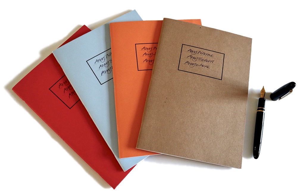
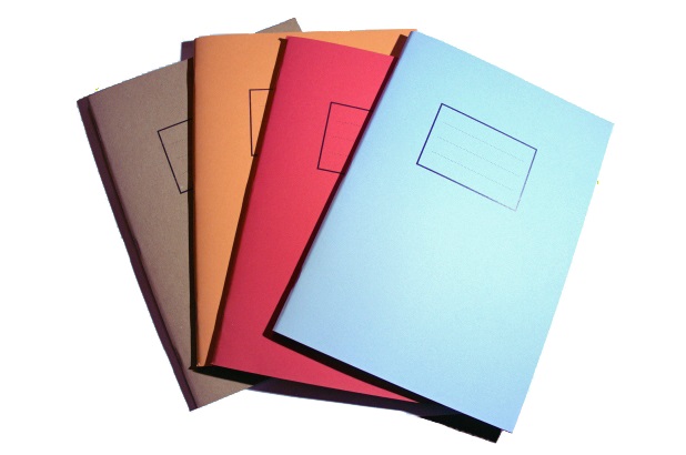
The Exorcise Books initially look quite unprepossessing, like something that you would have used in school, but they are very definitely a league or two up from that and reveal attention to detail and quality that sets them apart. The B5 paper is 100 gsm uncoated extra white in a smooth finish and hails from Scotland, but no mention of that play please, despite the subject matter. The four designs come in red, pale blue, orange and buff covers.
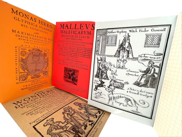
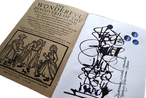
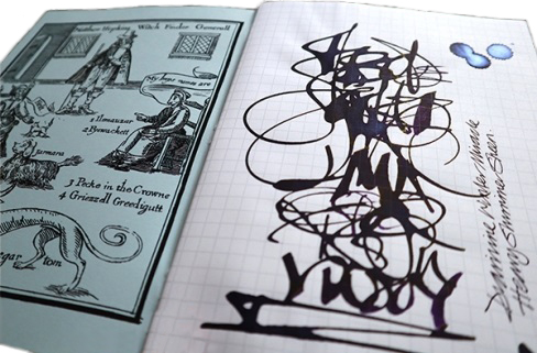
The inside covers back and front distinguish the notebooks, which have a theme which suits the title. The research for the woodcut images (on the flyleaf) and text (on the back cover) was carried out by our very own Scribble Monboddo, who is also a historian on the quiet; they really add to the notebooks.
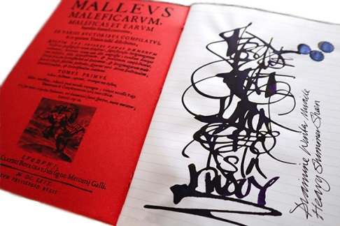
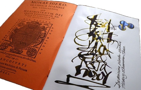
The light blue one we saw featured reproductions of woodcuts of the infamous torturer and murderer of unusual and wise women, Matthew Hopkins. In the red Exorcise Book lurked the 15th century’s malodorous Malleus Maleficarum, a manual for interrogating witches. The orange book featured the strange Elizabethan Doctor Dee, and eruditely swept through the even stranger HP Lovecraft, the mad bad Aleister Crowley, and Joseph Smith of Mormon fame too.
Finally, the inside buff-coloured front cover had a reproduction of a book made by the 11th Duke of Rutland in 1619 recording the lamentable putting to death of two women for witchcraft on 11th March 1618. In the fraught times of the war between the new religion (Protestantism) and the old religions (Catholicism and even older folk beliefs) women were the constant losers and victims. The victimisation of the so-called Belvoir witches is recounted briefly in Scribble’s text, noting that there is a unique ecclesiastical monument to the supposed victims of witchcraft in a local church, but no marker to, or even records of the trial of the poor women themselves. The pithy motto of the final sentence is a worthy axiom for these times and for filling these notebooks; “Remember to write what you see and what you hope for, not what you fear.”
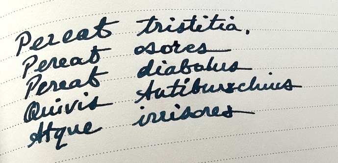
One of our number risked a Latin inscription in her notebook but no incubi seemed to appear; so, no Inkdom reviewers were harmed or alarmed in this meta-review.
How it feels The Exorcise Books consist of 60 pages of beautiful, high-quality 100gsm paper which absorbs fountain pen ink like a strolling minstrel wandering over the page. So nice is the paper that you might be tempted to try water colour on the plain paper, but that won’t end well – charcoal, graphite, or coloured pencils work just fine, though.
One of our number did push the wetness of ink considerably and went full on with Diamine Winter Miracle, a very heavy sheening purple ink with a shimmer, and applied with an automatic pen. It showed through on the 100gsm where the ink puddled, and there was some bleed through but that is to be expected with such a payload of ink. The shimmer and sheen both worked but if it’s just for handwriting then this paper will work very well with a fountain pen.
Another reviewer tried a range of different pen-ink combinations including a Sailor Naginata Togi equipped with Robert Oster Opal Mauve, a Waterman Carene 18k gold Fine nib filled with Rohrer and Klinger Verdegris, a John Garnham JG6 with a titanium fine nib and powered by Diamine Inkvent Midnight Hour. All of these, including the very wet JG6 permutation, were quickly absorbed by the paper. Only a very wet ink showed a bit of, err, ghosting.
How it fills Starting to fill a notebook is often one of those rituals of delay and procrastination for fountain pen users and the quality of the paper in these may compound such deferment misery. But the messages and pithy adages on the inside back covers should surely make you want to fearlessly learn more, read more and reflect and wonder on the power of scribing information on paper. Exorcise any fear and record your thoughts and considerations of what you have read, found out, and want to be known.
Crucially, how it handles ink… These notebooks cope beautifully with fountain pen writing. One reviewer blitzed them with super-saturated pen and ink combinations and did a little bleed-through. Another reviewer reported some ghosting. A third found the Exorcise paper behaved perfectly; no feathering, no bleed and only slight show-through with very wet ink, and inks seemed to show very true to their colours and characteristics with the super-saturated combo of double broad nib and purple blue of the Troublemaker Lam-ang and the subtle shading of the Robert Oster Opal Mauve. Neither the blitz of the former, nor the subtly of the latter were missed out on this paper.
The quality of the paper shows through on every level. We were aided by award-winning microscopist Mike Smith, the secretary of the Leeds Microscopical Society, to examine the paper closer. Mike’s equipment yielded a series of images that he said clearly showed the superior quality of the paper compared to 100gsm standard print paper, a 90 gsm French brushed vellum and a ‘certain’ 68gsm Japanese paper.
Kon-peki ink on Exorcise MfI Notebook Paper at 100X
In brief, the heavier paper from Made for Ink seems to absorb more of the ink in the fibres, and their interstices, across the path it was scribed on the paper and in a more consistent manner.
Pulp! What is it good for? Notebooks and scrapbooks have been the go-to tools for collating and organising information for many hundreds of years. Medieval and Renaissance scribes were typically systematic indexers and bullet-pointers of their commonplace books. These are just as versatile; write Latin, Gaelic or sketch in them and they can cope.
VFM These are high-quality, hand-made products selling at very reasonable prices – no malice there!
The only way is ethics The Exorcise Books are handmade in Rutland from materials made in the UK. Enough said?
If this isn’t quite your cup of tea, but almost… The reviewers unanimously loved these notebooks. They look good, feel of quality and work consistently with a range of ink and nibs. The chances are that you will like them too – but if you really need something in a different size, Made for Ink also stock very good A5 alternatives.
Our overall recommendation The Exorcise Books are made with paper you can trust to handle any pen and ink combination consistently, and they tell a story. They are handmade by an ethical UK-based penthusiast, and they are good value for money too. They get an unequivocal thumbs-up from us.
Where to get hold of one The Exorcise Books retail for £6.95, and can be ordered direct from: https://madefor.ink/
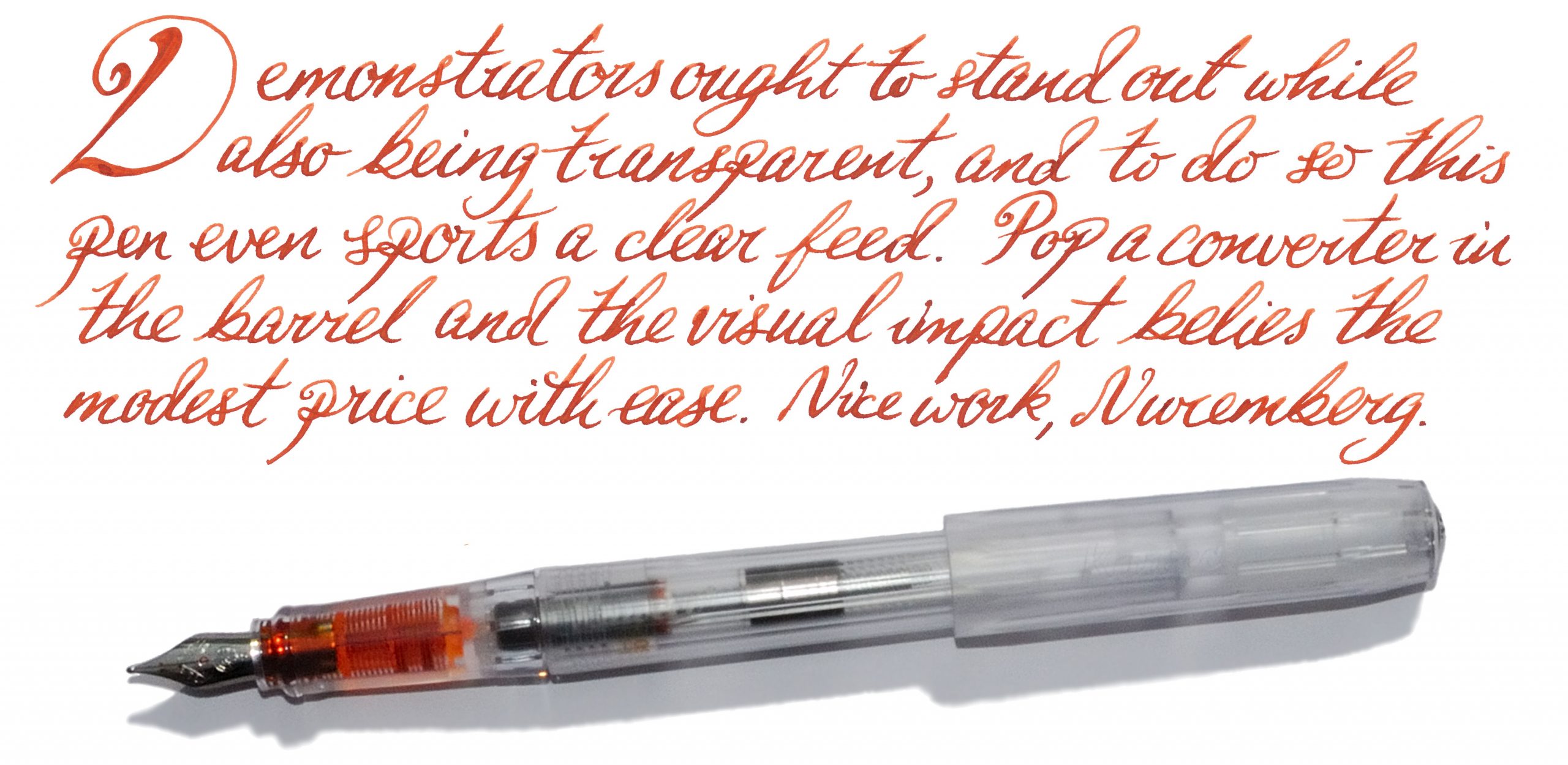
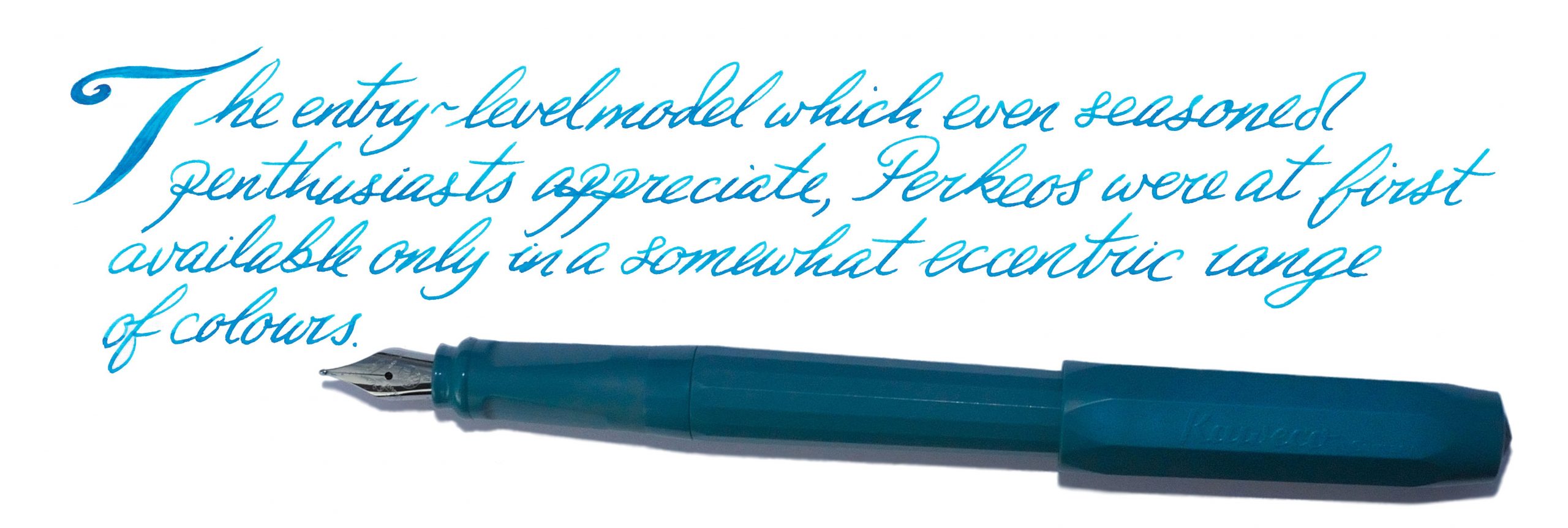
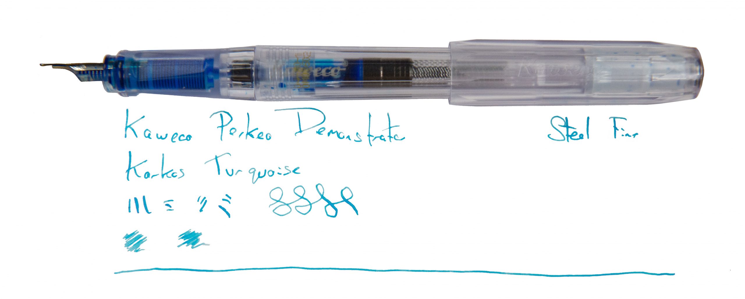
A little bit of history We’ve reviewed the Perkeo before, so the basics have already been covered. To recap briefly; this is a Kaweco’s entry-level offering for those who find the budget version of the Sport a little too diminutive. The model has served well enough in the market for 2021 to bring some interesting new colours and a three-nib calligraphy set to the market.
How it looks Like a Sport cap with a full-sized barrel on the back, essentially. ‘Nout wrong with that! But the new colour-schemes really add something, especially the splendid ‘breezy teal’ and the icily cool demonstrator version with its unusual clear feed.
How it feels Light and comfortable, with the three-sided grip section gently guiding pen posture.How it fills There’s space for a brace of small international cartridges in the barrel, or a full-sized converter, which really looks the business in the demonstrator version.
Crucially, how it writes… These take Kaweco’s rebranded Bock 060, a small #5 nib with plenty of options. The standard M and F nibs write well (and rather better than when the Perkeo was first released, we think), and the range of italic nibs in the calligraphy set impressed our favourite calligrapher, so no complaints there.
Pen! What is it good for? The Perkeo is essentially aimed at the entry-level market, and fits there very well, but plenty of grown-up, seasoned fountain pen fans seem to rather like it too.
VFM Generally retailing at £12 to £15 at the time of writing, this isn’t dirt-cheap but certainly isn’t highly-priced either.
The only way is ethics Kaweco manufactures primarily in Germany so we have no concerns around labour conditions. Some of the packaging is plastic, but it’s not excessive.
If this isn’t quite your cup of tea, but almost… If you like the Kaweco look but want something pocket-sized, of course there’s the trusty Sport – while if you want an entry-level German fountain pen but can’t find a Perkeo, the Pelikano occupies similar territory.
Our overall recommendation If you’re penabling a member of the family who’ll prefer to pick up something which looks cool, you could do a lot worse than the pulchritudinous Perkeo.
Where to get hold of one Almost any fountain pen retailer you choose; these aren’t hard to find at all.

 A little bit of history Back in the days of space flight, one of the big problems was getting home safely. Vehicles come in fast, that compresses the thin air below them, and this generates enormous heat. Finding the right shape to survive the experience involved some serious trial-and-error. The Americans tried an inverted cone, which got very hot indeed, while the Soviets tried a spherical design which was, inevitably, tricky to steer. The solution, it turned out, was a bluff body – broad, blunt, fairly flat, with rounded corners. This proved to be so stable and reliable that every space programme currently in operation uses it. Oddly enough, a bluff body is also a promising format for a fountain pen nib; a large contact surface to make a wide mark, and smooth edges to reduce friction. But Bluff would be an awkward name for a nib type, as the letter B is already taken. It’s definitely the opposite of Fine, though, so it appears that Platinum broke out the thesaurus, looked for an antonym to fine, and settled on coarse. So, now we have a C nib. C for confusing, it appears…
 How it looks Until you pick this up and write with it, the pen looks like a standard #3776 – which is what it is. Our test body has the pleasing red bourgoigne finish, and it looks terrific. But a glance doesn’t quite tell the whole story.
 How it feels This is a light pen and the nib is fairly smooth in use, albeit with the slight ‘toothiness’ common to many Platinum offerings. It’s worth trying in person as we think it’s one of those love-it-or-hate-it propositions.
 How it fills A classic-cartridge/converter system, this, although only Platinum’s own kit will fit. The cartridges aren’t too difficult to find and the converters are some of the more reliable of Japanese pistons.
 Pen! What is it good for? Here’s a pen for having fun with, in short. You could probably write distinctive signatures with it if you took it to work, but its greatest joy is writing flamboyant birthday cards and thoroughly jolly notes to friends.
 VFM This is a well-made pen with an unusual ‘niche’ gold nib, so it’s not cheap as chips. But shop around and you ought to be able to find it for less than £200, which is pretty good. We do feel that for that sort of money Platinum ought to include a converter as a standard part of the package, though.
 The only way is ethics We’ve got no complaint to make here; the pen’s made in a place with good labour standards, the packaging isn’t over-the-top and you can buy it from a specialist retailer who’ll back up the purchase with customer support.
 If this isn’t quite your cup of tea, but almost… Platinum’s Music nib is similarly impressive. If you want an alternative Coarse nib, Pilot make one too – but it’s very hard to find in the UK.

 This meta-review references:
 Thanks to Write Here of Shrewsbury for lending us this unusual pen. One of the team liked it so much that they bought it!
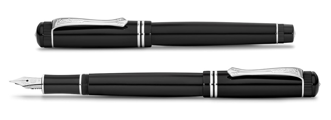 How it looks The Dia2 looks like a reborn classic pen, and comes in a plastic sleeve inside an art deco tin box. Nestled in a foam insert, with a small international cartridge, the pen is accompanied by a postage stamp fold-out history of the company and a Kaweco logo sticker to use, or not, as you please.
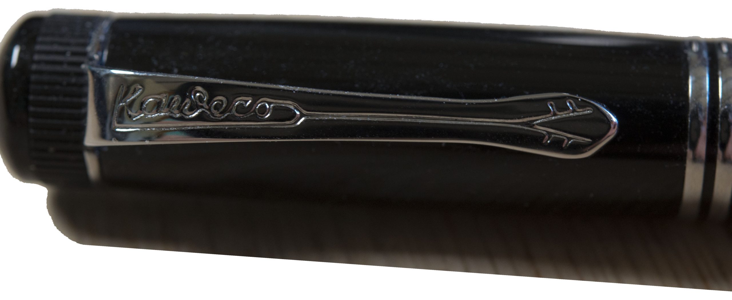 How it feels The pen can be considered a medium-sized pen by current standards. Sleekly black-bodied, it is a mainly resin model but with aluminium and brass parts that give it a comforting feel of durability and a surprisingly hefty solidity in the hand.
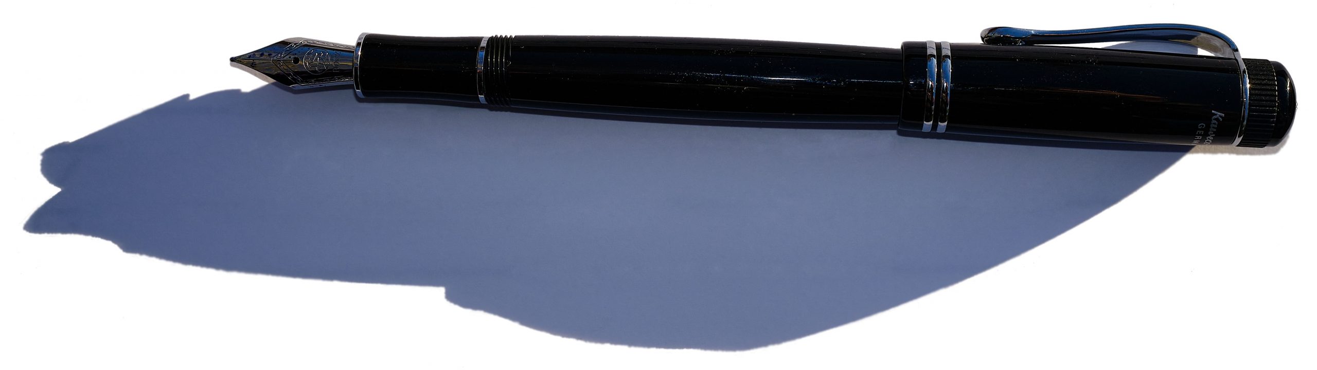 How it fills The pen cap and body finials feature the tricuspid Kaweco logo as well as a knurled band on the cap and end of the body. The latter is reminiscent of the original Dia’s piston filling mechanism. But pistons add cost, so the reborn Dia makes do with the well-tried cartridge/converter set-up.
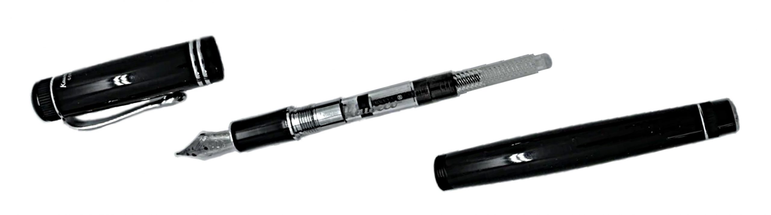 Crucially, how it writes… This depends a little upon what nib you chose to fit. As standard, the Dia comes with the diminutive Bock 060 nib better known from the smaller Sport and Lilliput models. That looks a bit titchy with this full-size body, but thankfully there’s a better-proportioned #5 alternative in the shape of the wider-shouldered 076. An 076 was sourced from Beaufort Ink and, even though it lacked the Kaweco branding, it looked a lot happier. Both nibs delivered the ink well and there’s every sign that this will prove a trustworthy ‘daily driver’.
 Pen! What is it good for? This one wants to work in an old-fashioned sort of office, but could handle modern jotting duties just as well.
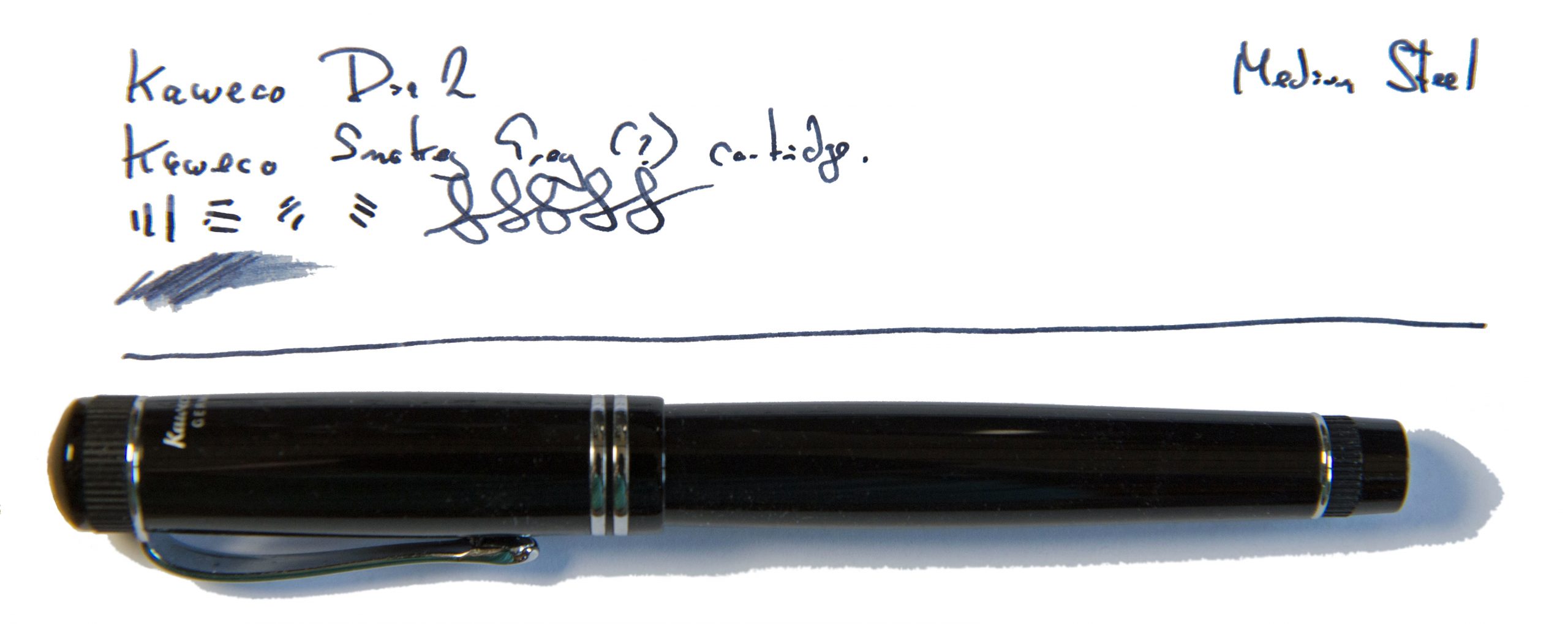 VFM You can buy the chrome Dia2 for £75 to £90 from UK pen sellers. The gold-plated fixture version comes with a £15 premium on top. A Kaweco converter is about £5. The 076 Bock nib will set you back another £10. Overall, and in a crowded market segment, we think that represents pretty good value for money.
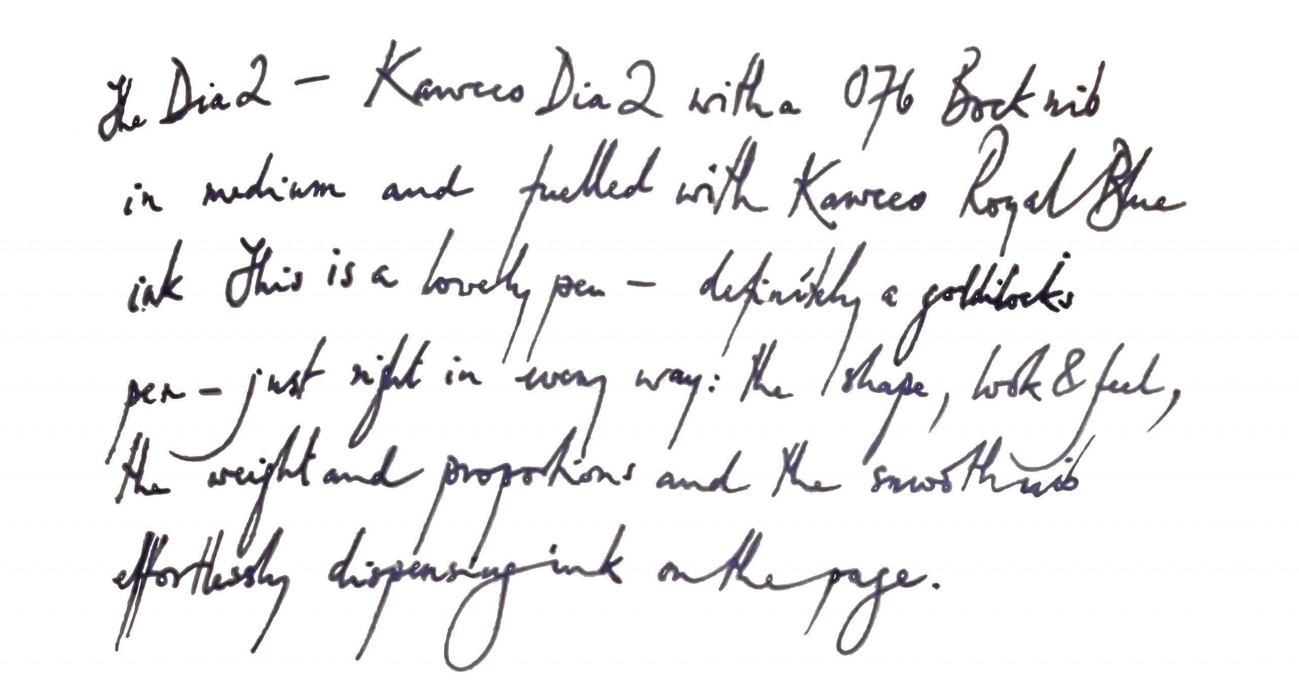 The only way is ethics It’s made in factories with decent labour conditions, as far as we can tell, and the packaging isn’t over the top. Fit a converter and there’s a tiny bit less disposable plastic, too.
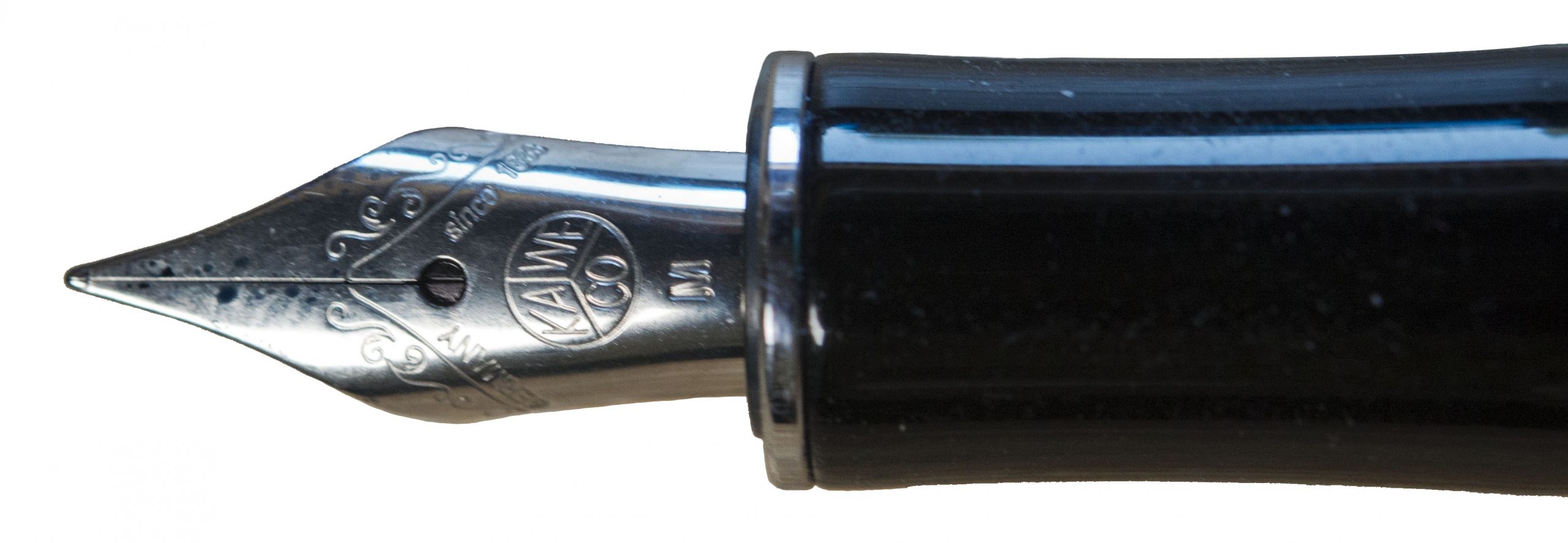 If this isn’t quite your cup of tea, but almost… Take a look at the Supra.
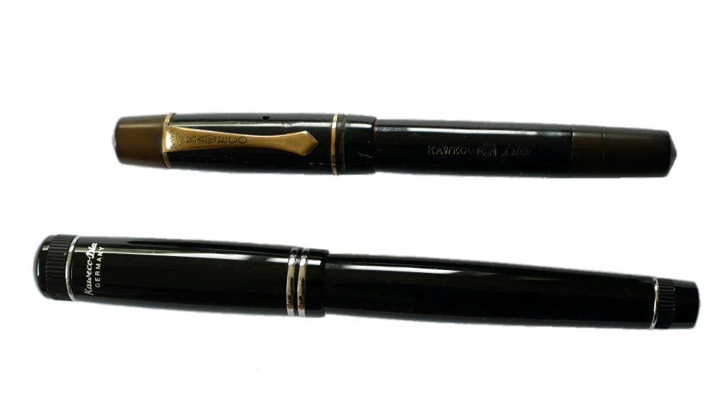 Our overall recommendation If you like the look of the old Dia, you’ll be friends with the Dia2.
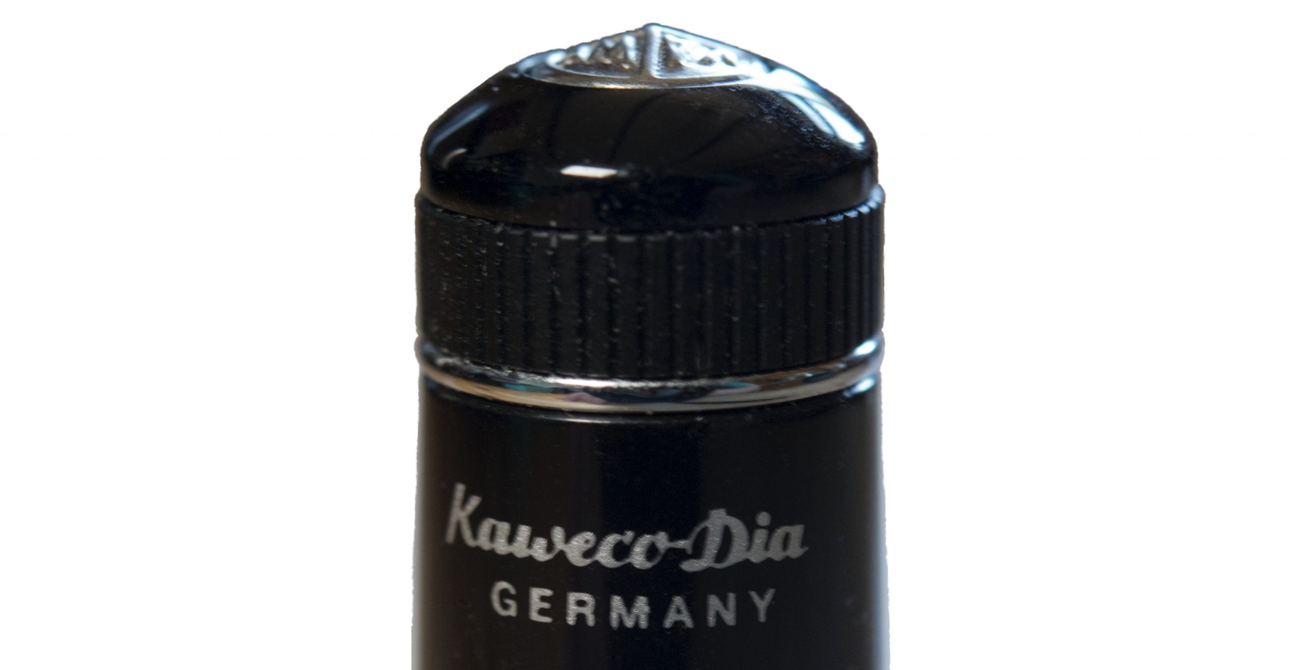 Where to get hold of one All the usual pen retailers; it may resemble an exotic classic but thankfully this is no rarity.
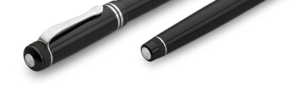 This meta-review references:
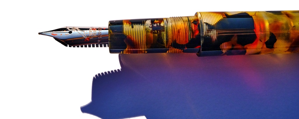
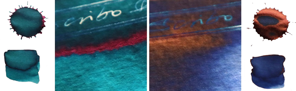
 How it fills This is a piston-filer, as is the norm with most Scribo models (apart from the Piuma), and it fills fairly easily with a decent quantity of ink which, unusually, is visible within the workings. The temptation to fill it with a complementary shade has proved very strong; even Mr Teal didn’t put turquoise in this one, and another contributor bucked the trend with a disturbing absence of purple. If you like orange ink, though, this is the bee’s knees – and looks like them, too.
 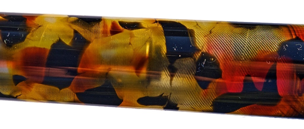 Crucially, how it writes… The Fine Flex nib is a joy, and by general consensus the nearest thing to a vintage wet noodle on the market today – even to the point, shockingly, that some of our reviewers prefer it to the Pilot FA nib. So how it writes is curvaceously, and wet. This is not a pen which scratches and blots on the page so much as one which aesthetically drools all over it.
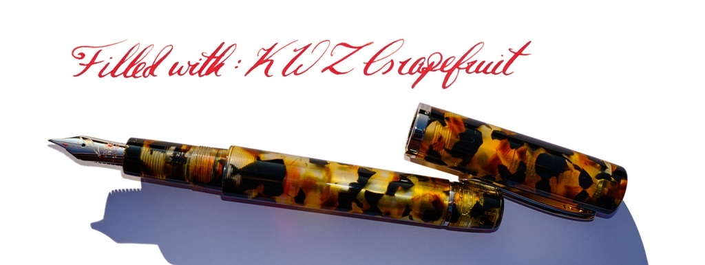
 Where to get hold of one Write Here is the only place you’ll find this, but if you can’t get to Shrewsbury it’s
 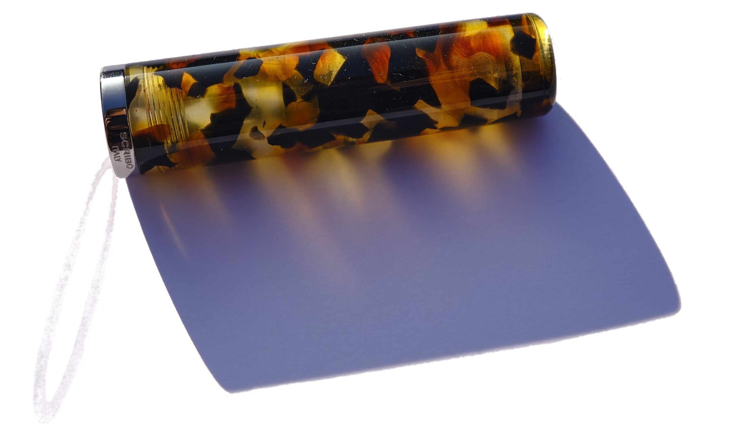 This meta-review references:
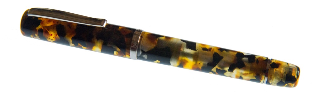
 How it feels Solid, grippy and, thanks to aluminium construction, fairly light. That said, balance is a personal thing and this seems to suit those who particularly like medium-length pens best. Fans of small pocket pens may find it a touch over-long for perfect balance and, conversely, full-size pen afficionados may feel it’s a bit on the short side. Much comes down to personal preference, with this one.
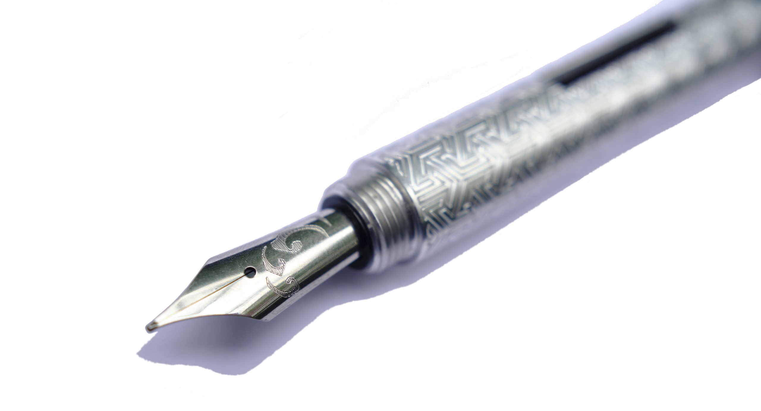 How it fills This is the converter version of the Kitsune, which tells you most of what you need to know. There’s space for a full size converter, and a blind cap which twists off at the back end to make refilling a touch simpler. The resulting ink capacity is a bit of a step up from the tiny converters which fit small pocket pens, too.
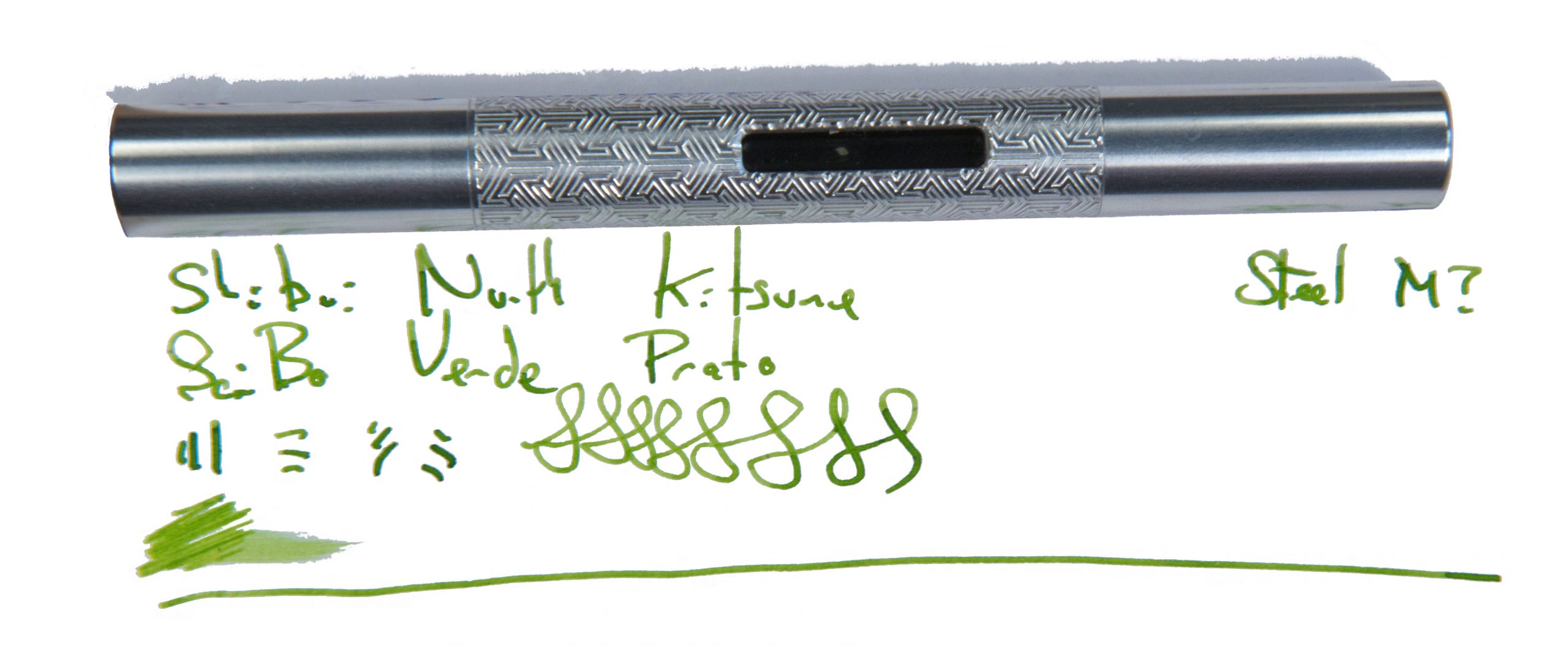
 VFM It took us a little while to test this design, and the exact model is no longer on sale. But the Pocket Fox is similar, with a shorter international cartridge, for around £100 to £110 usually – not bad for a hand-made pen with an interesting finish and Geordie bragging rights.
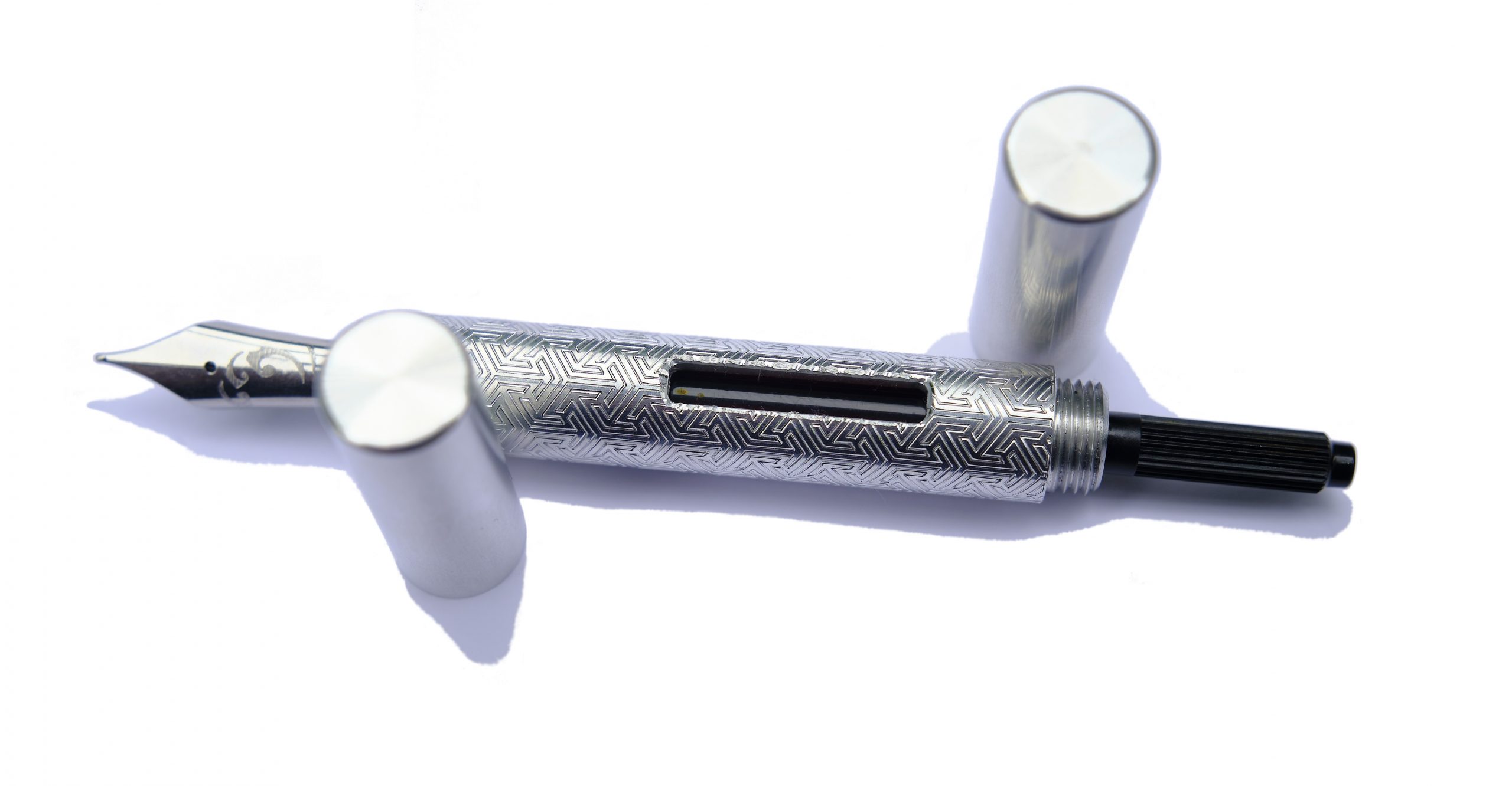 The only way is ethics It’s made by a human being who you can contact and have a chat with first, right here in Blighty, and packaged responsibly. What’s not to like?
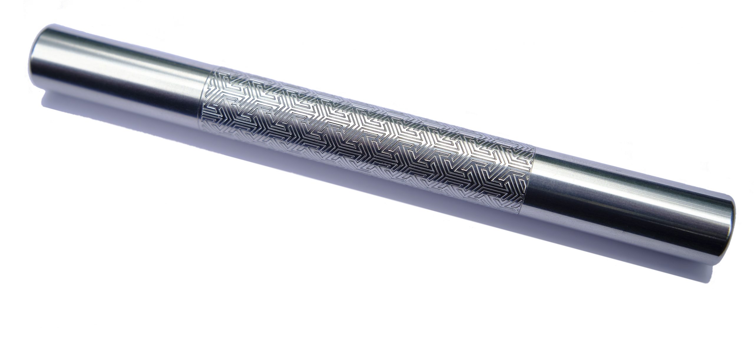 If this isn’t quite your cup of tea, but almost… Go shorter or go longer, in, err, short. The cut-down version is now known as the ‘Pocket Fox’ and looks the business in all sorts of finishes. Fans of longer pens may prefer the gracefully curved Tombo, meanwhile.
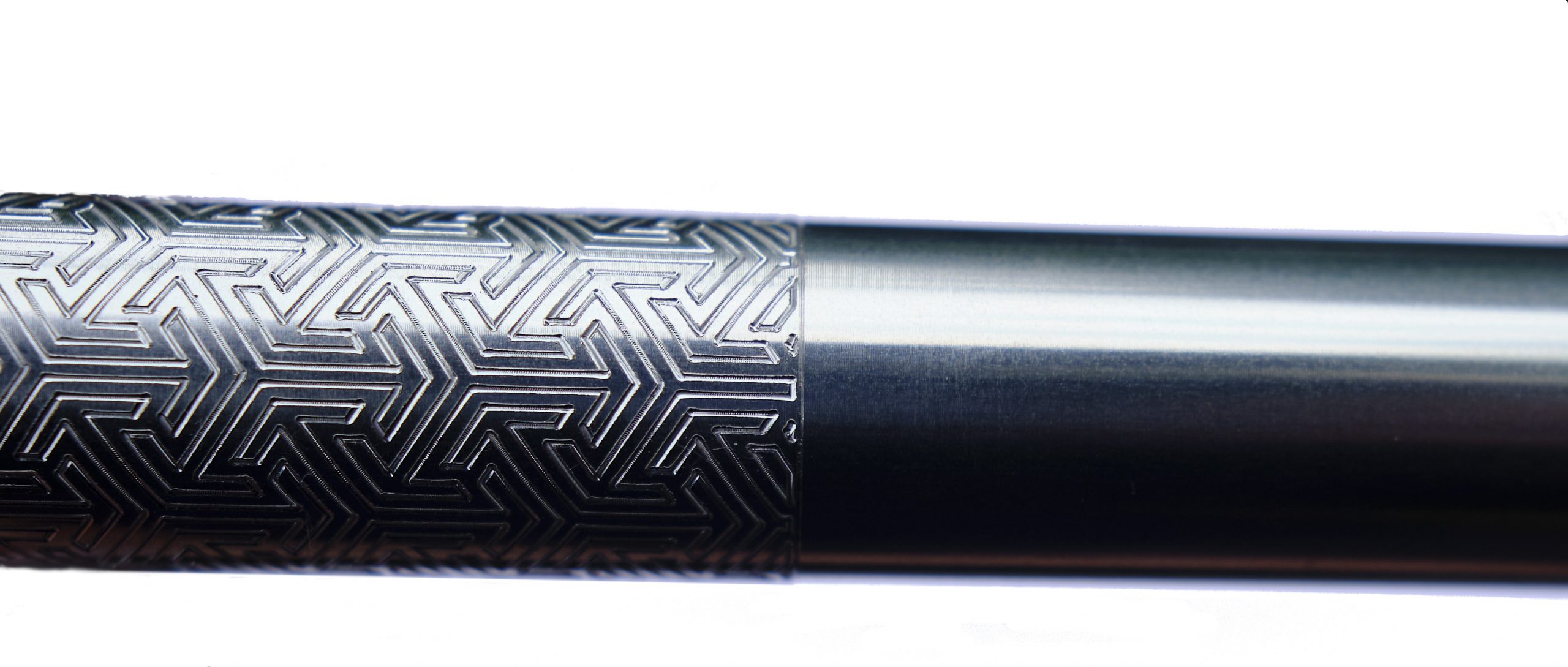 Our overall recommendation Find the right balance for you, then take the plunge.
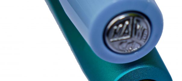
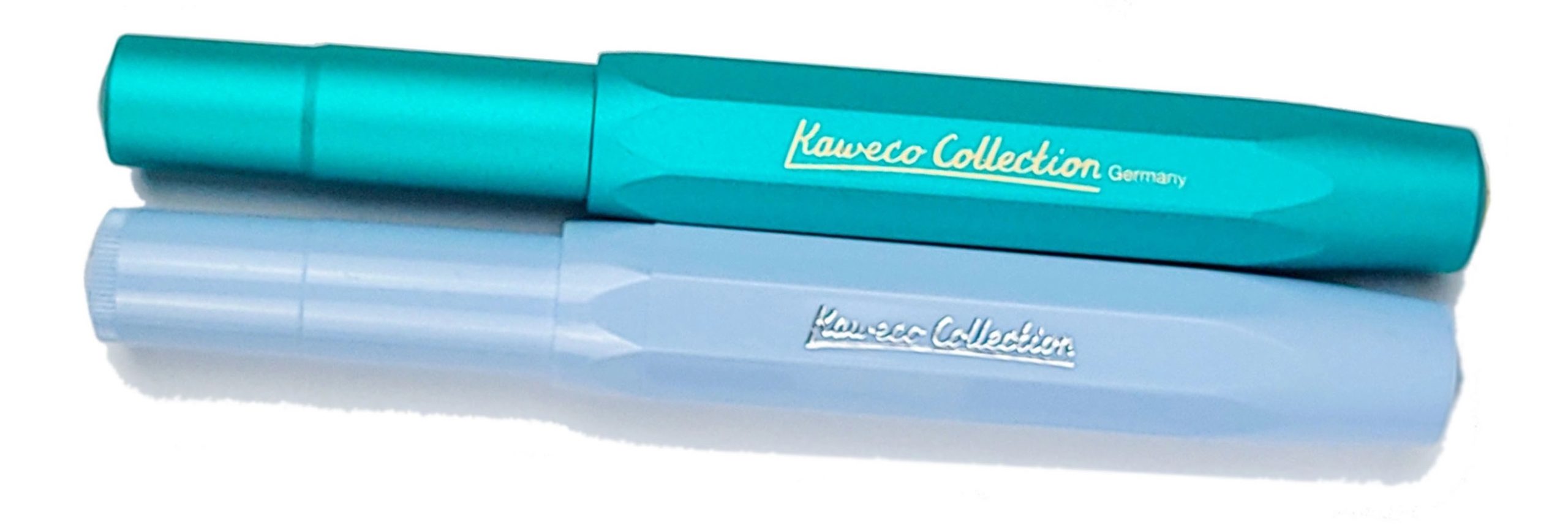 How it looks It looks much like any other Sport but in a pair of rather sophisticated colours, and with ‘Kaweco Collection’ proudly displayed on the side of the barrel. No complaints there; if you’re a Sport fan, you probably want already simply after looking at these pictures – and that’s rather the brand’s plan.
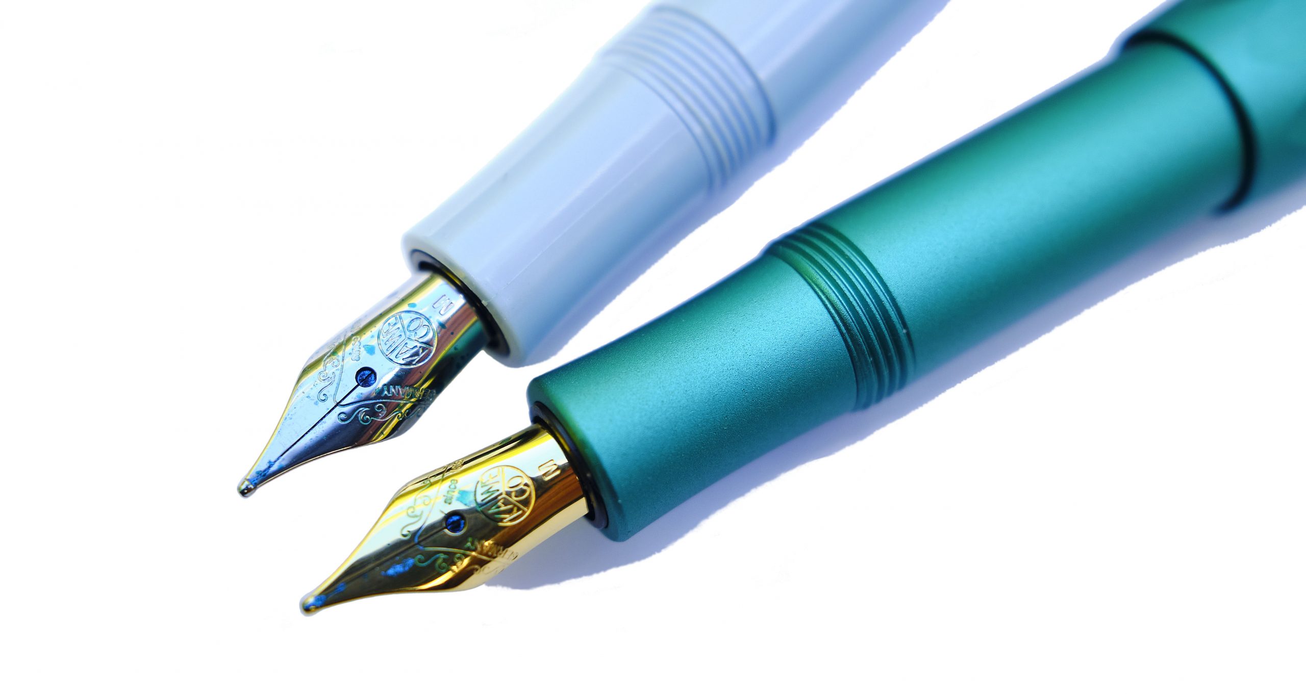 How it feels Small, and light. As usual, the aluminium version feels a touch more robust, but far from heavy. Like you’d expect a Sport to feel, really; the difference is all visual.
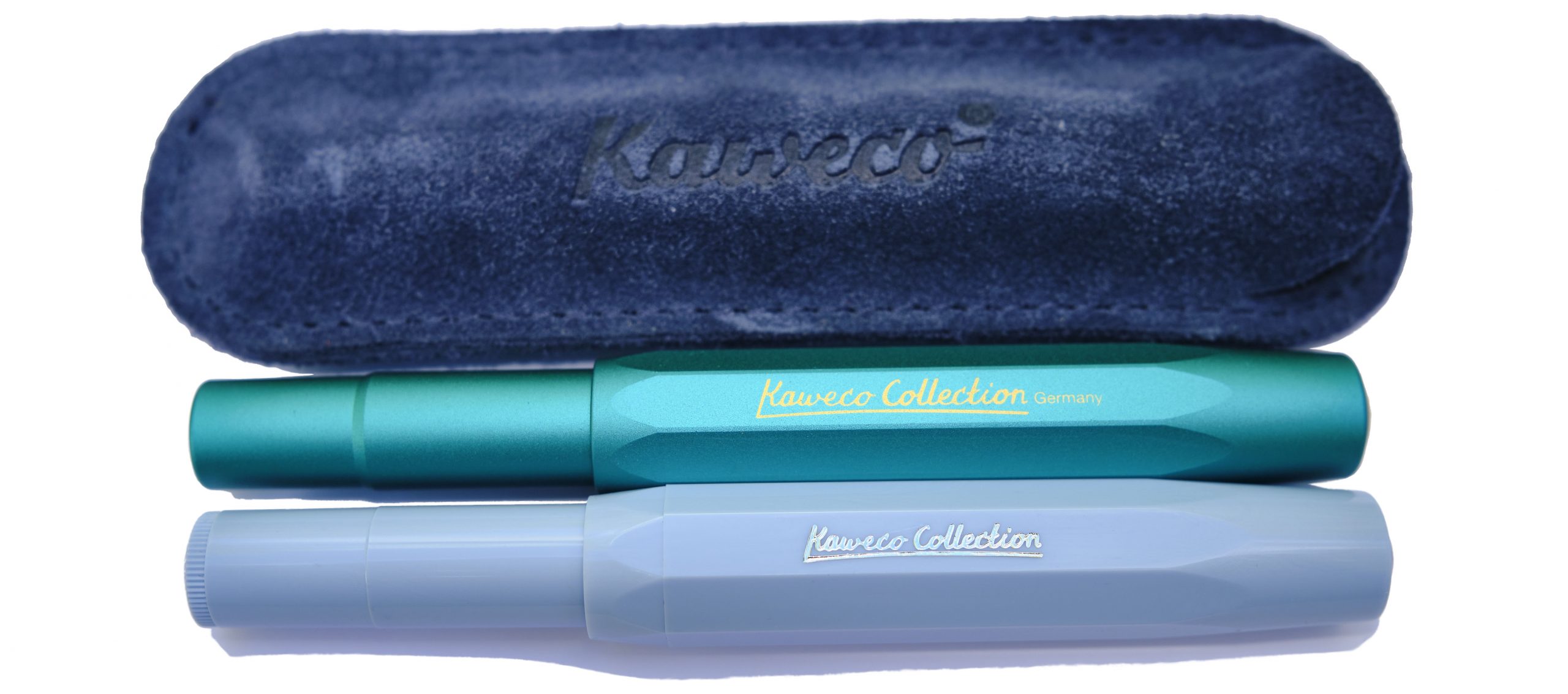 How it fills As ever, syringe-filling a small international cartridge would be our tip. There is a tiny push-rod converter, but the ink runs out so quickly that scope for frustration is considerable.
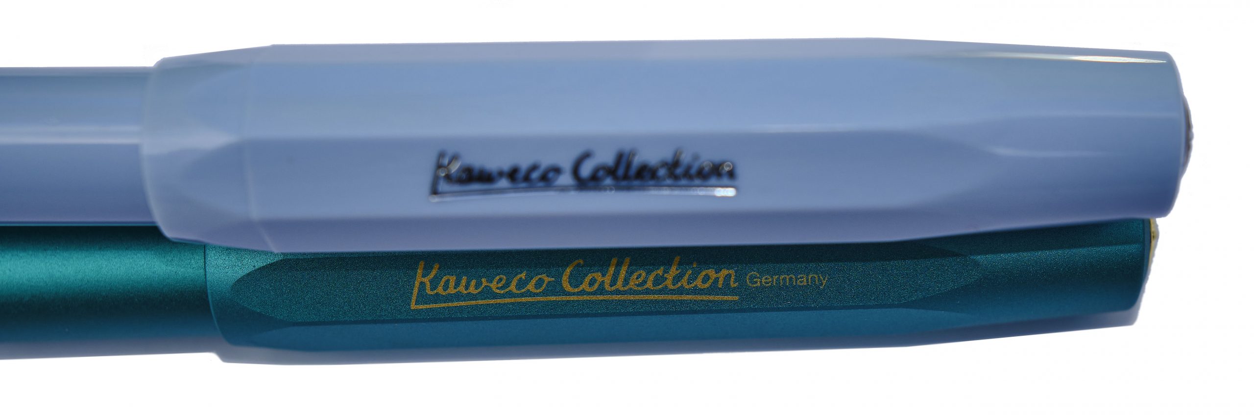 Crucially, how it writes… Generally, pretty well. The quality control on the steel nibs has improved in recent years, and for the pricier aluminium version any Bock 060 nib can be screwed in if you fancy a change. There’s even a gold option, should pushing the boat out that far be on the agenda. We stuck with the standard steel M, probably the most popular option, for this test and the results were encouraging.
 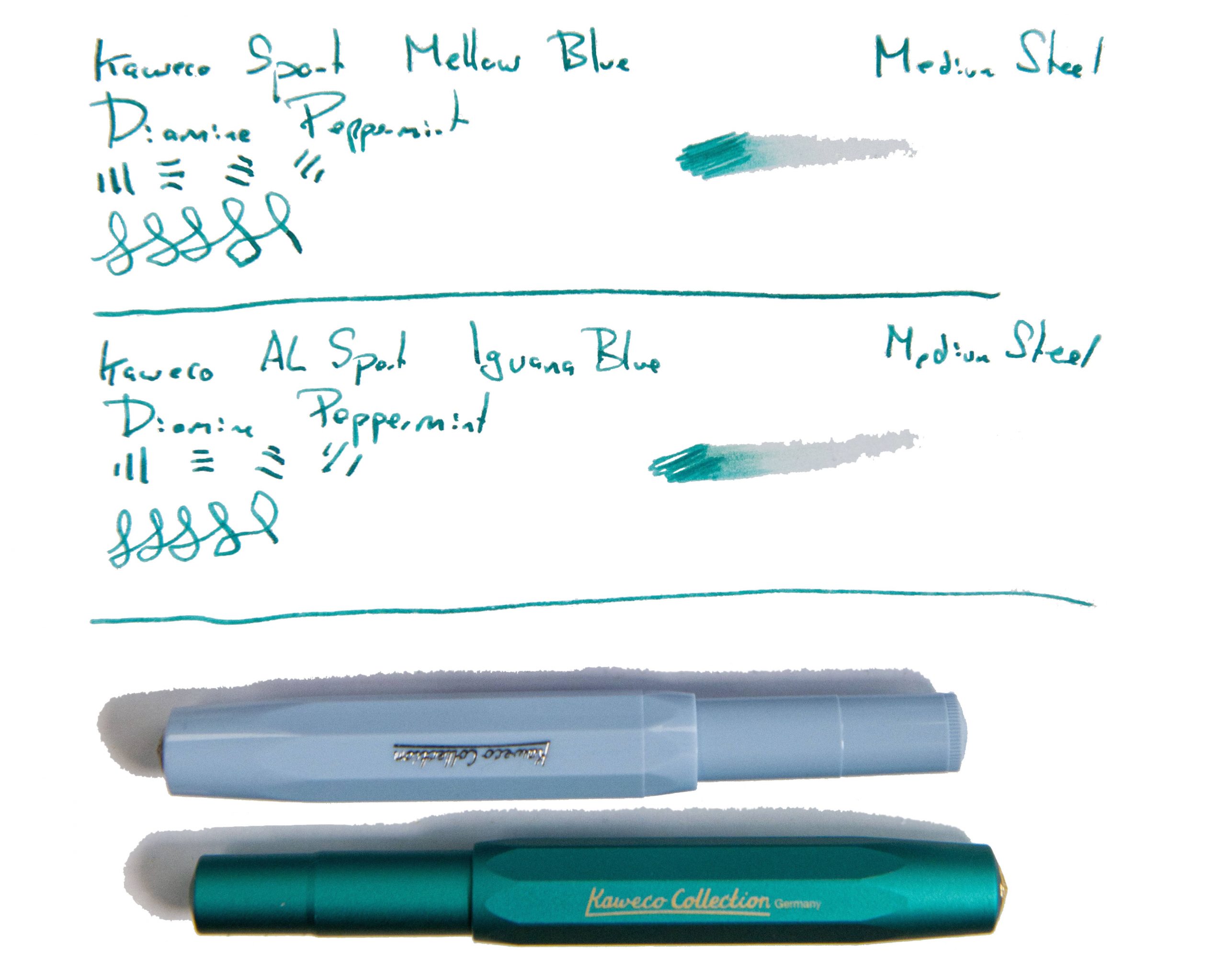 Pen! What is it good for? The Sport’s natural home is in your pocket, of course, but these two specials were also made for showing off, so it’s up to you. Generally we’d suggest these are for leisure use rather than business, but who are we to dictate?
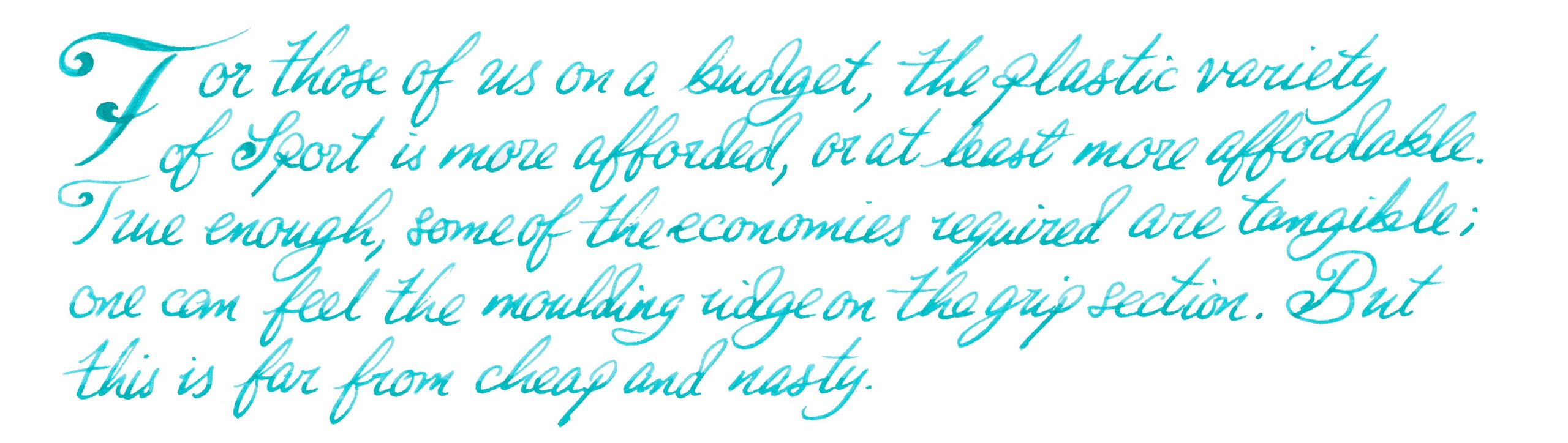 VFM The plastic Mellow Blue will set you back about £25, which is quite fair value, and the swisher aluminium Iguana Blue more like £70 – not crazy money at all, but it makes sense to try an ‘entry level’ Sport to check out whether the format works for you first.
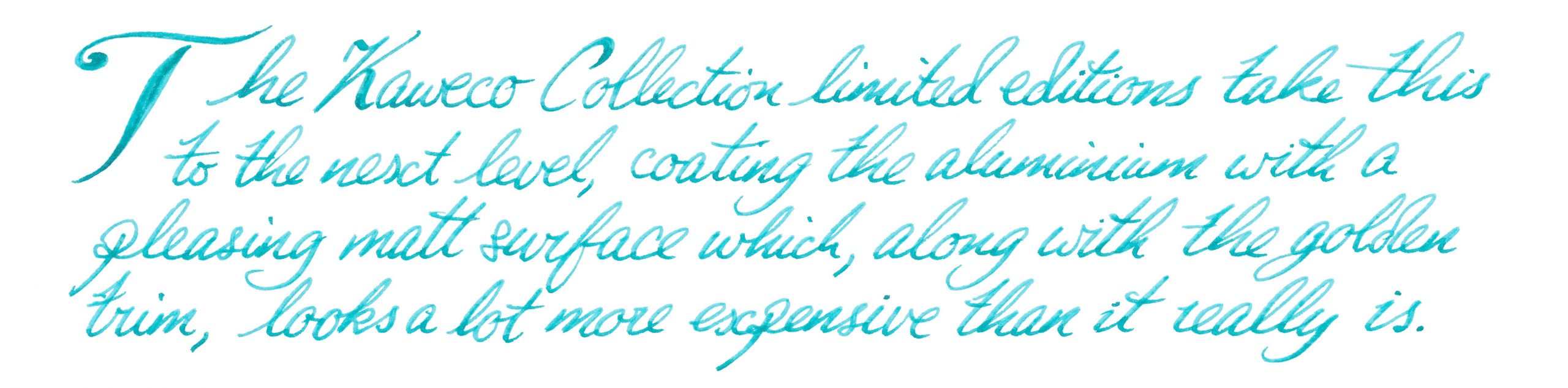 The only way is ethics These are made in Germany with decent labour conditions, and Kaweco haven’t gone crazy with the packaging, so things look healthy on the ethical front.
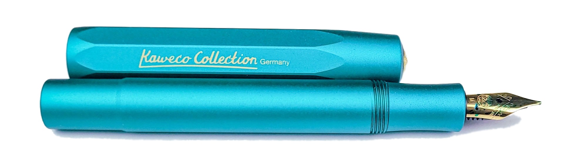
 Our overall recommendation These will sell like the proverbial hot cakes; if either takes your fancy, get it quickly!
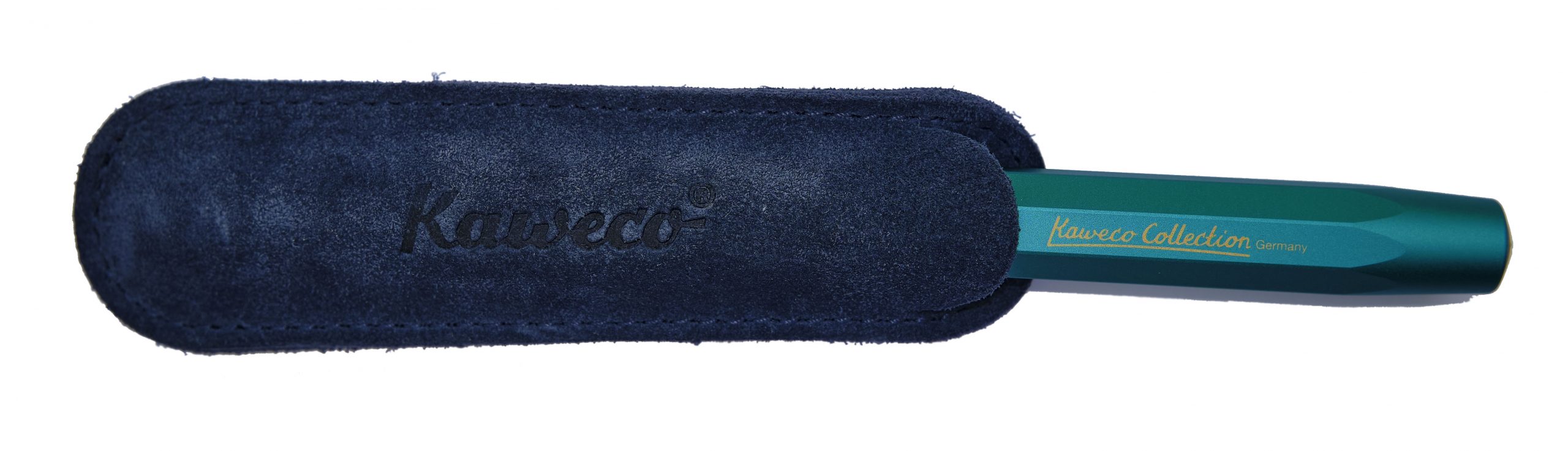 Where to get hold of one All your favourite fountain pen specialists are likely to have these in stock – as long as they last.
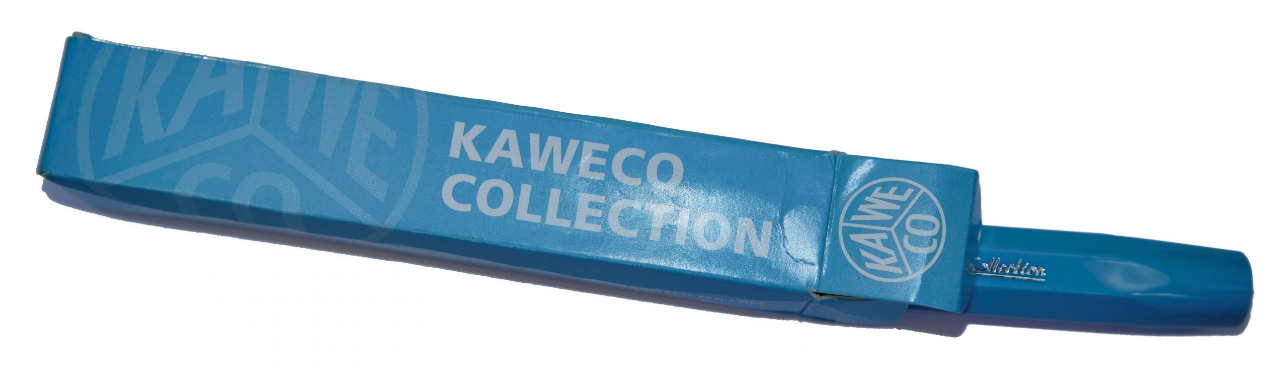 This meta-review references:
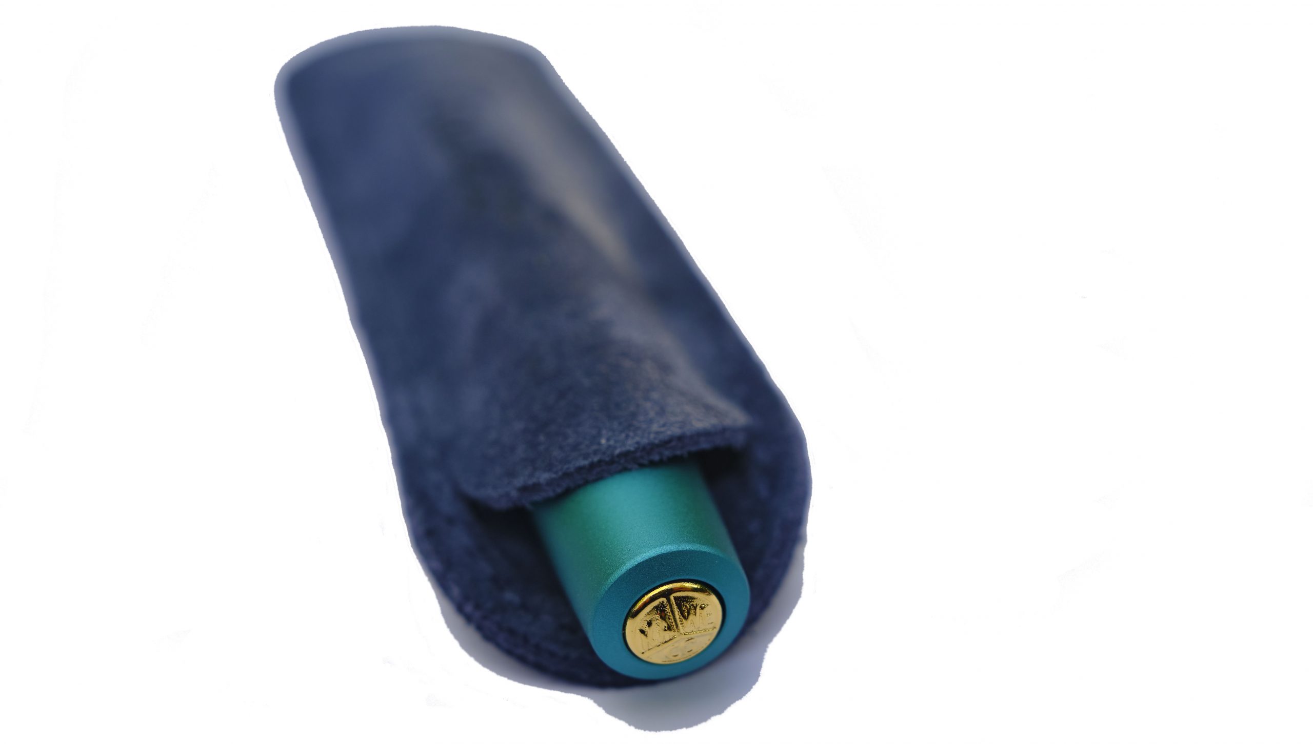
 How it looks Actually, they came up with two Originals, with very different nib sizes. The smaller version uses the diminutive short #5 060 Bock nib familiar from the Sport and Lilliput models, which unfortunately looks a little stunted in a long pen like this. The larger Original, though, uses a nice big #6 250 nib which looks in proper proportion – a bit like a scaled-up Sport, keeping the distinctive octagonal profile which is something of a Kaweco calling card.
 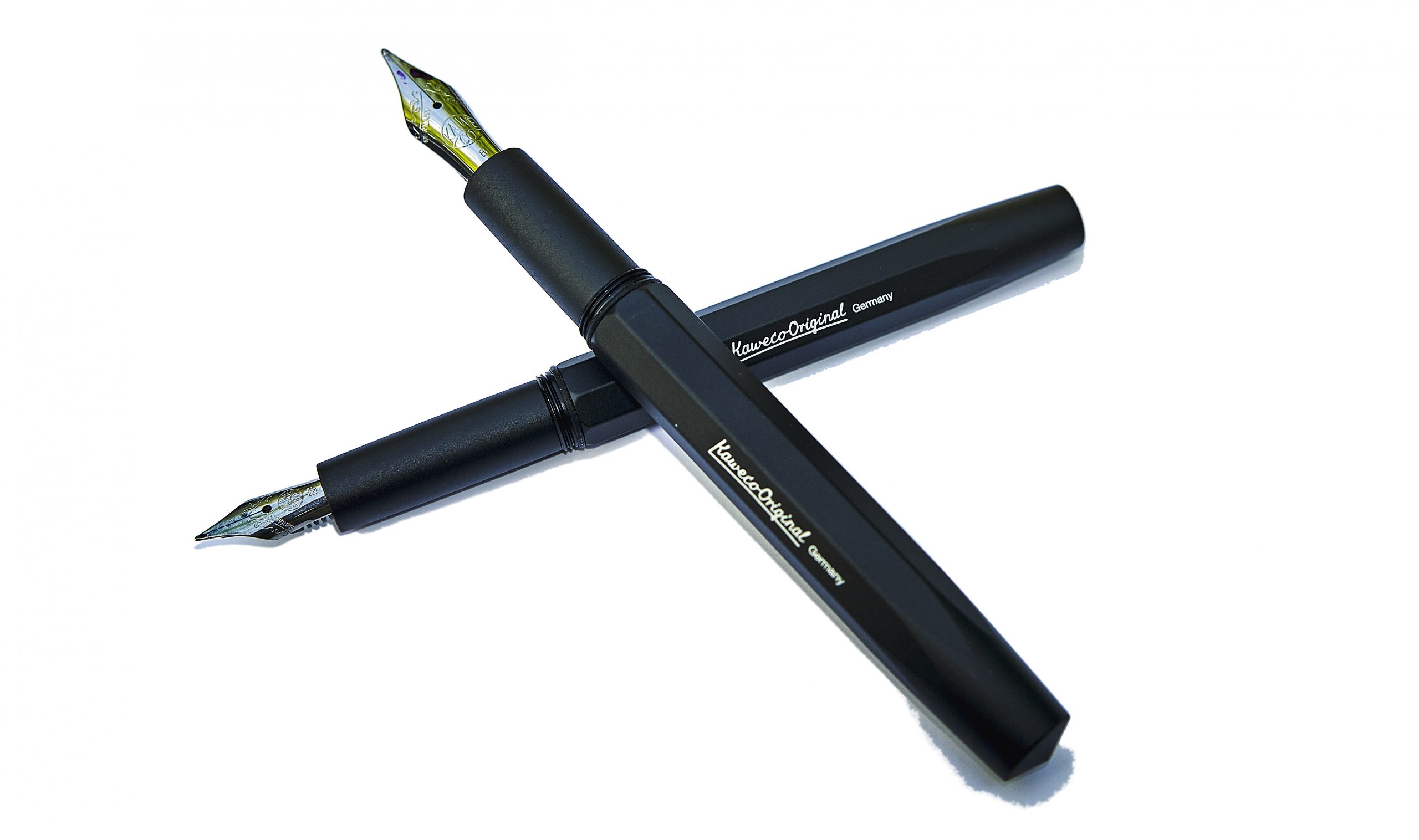 How it feels Both Originals feel solid yet, thanks to aluminium construction, not terribly heavy. On the whole, robust but usable.
 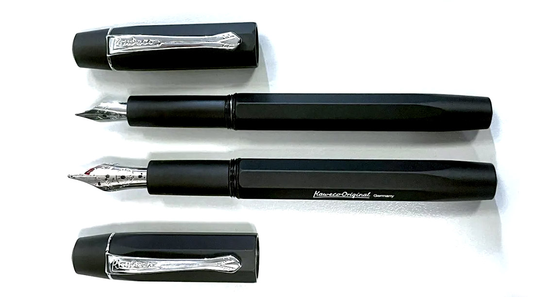 How it fills An obvious advantage over the Sport is that the Originals have room for a full-size converter, and Kaweco have maximised that gain by threading the inside collar of the section to allow for a screw-in converter, helpfully also available from Kaweco in a range of colours. For reasons which remain a mystery, we chose purple for our test units, but retailers might be well advised to provide a converter as standard; it’s a much more ‘premium’ experience filling up with ink from a proper bottle, and being able to prime a feed with a quick twist of the converter can help when inks prove to be a little on the dry side.
 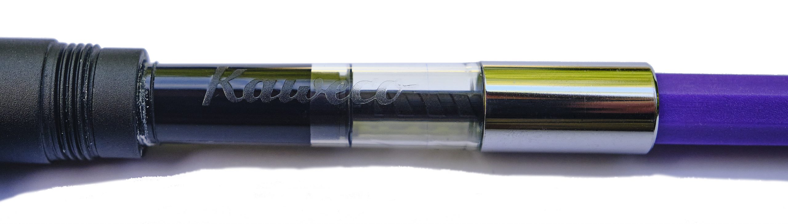 Crucially, how it writes… As ever that depends upon the nib fitted and the ink too, but we had a varied experience with our test units. The tiny 060 had an EF nib which struggled to lay enough ink down really, but as we’d probably elect to upgrade to a more fitting Bock 076 (sadly not yet available in Kaweco branding) anyway, perhaps that’s not the end of the world. The larger 250 had a B tip which surprised several of our reviewers with how well it performed as a ‘daily driver’, so that looks like the winner.
 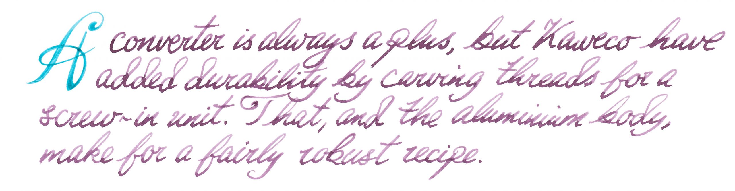 Pen! What is it good for? These might be a bit pricy for a school pen, but they are robust enough to serve as a daily driver for a more grown-up writer.
 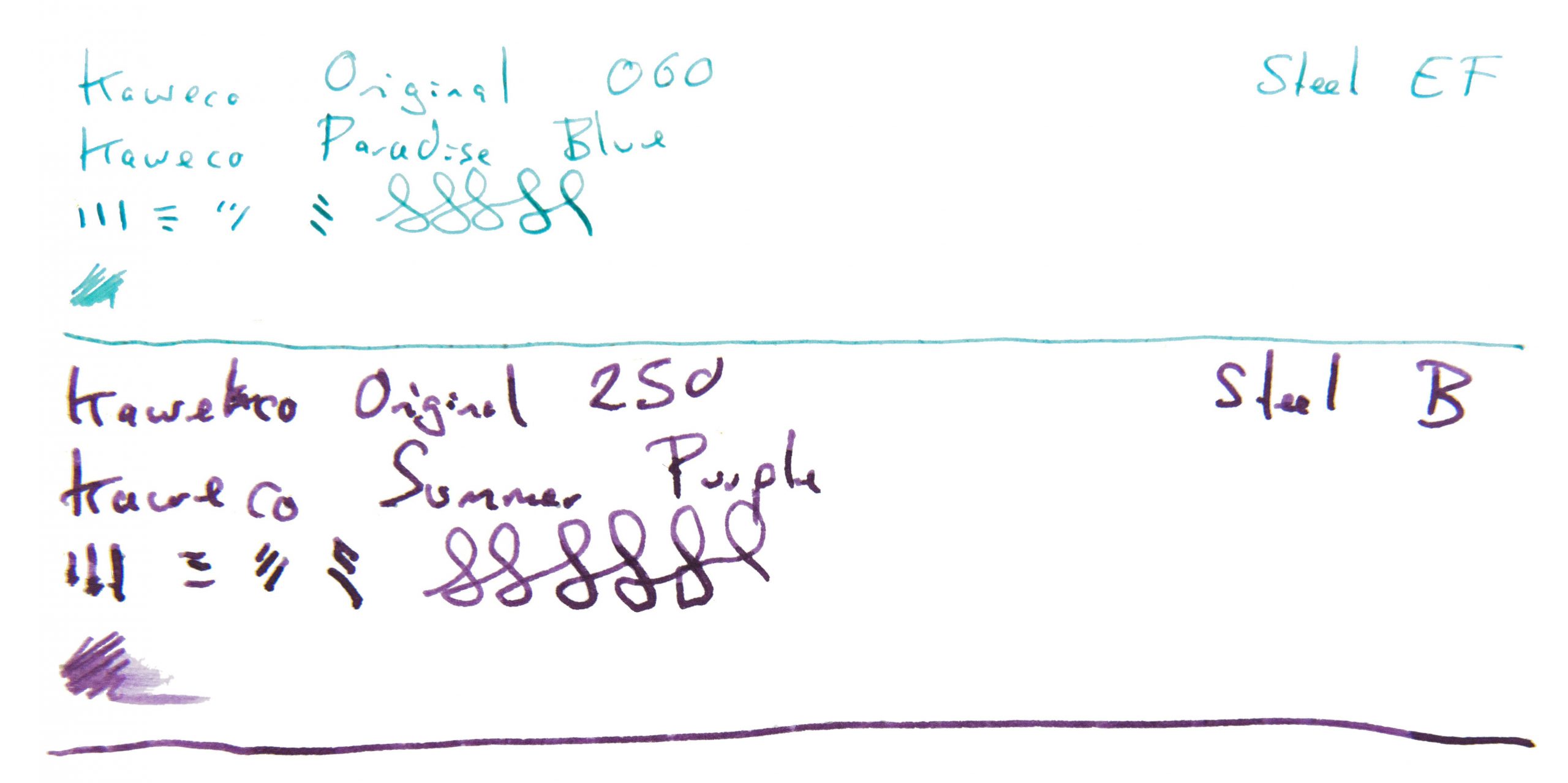 VFM At a ‘street price’ close to £100 for the #6 version these are not cheap, to be honest, so our tip would be to buy from a bricks-and-mortar shop where you can try a number of nibs and get the one which really works for you. It needs to be usable to be worth the money, at this price point.
 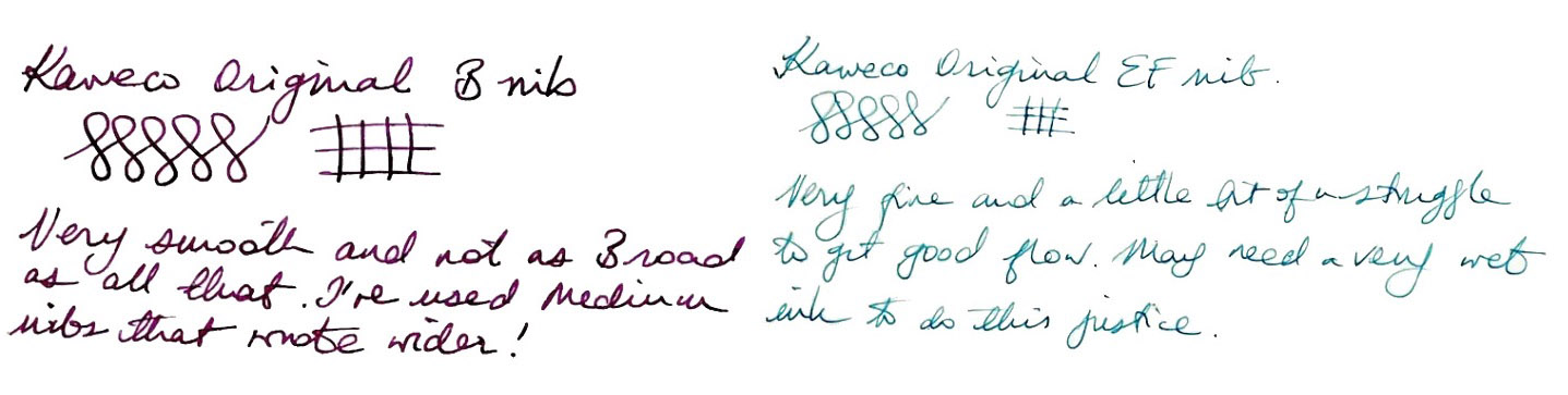 The only way is ethics Made in the EU, and packaged sensibly, there’s little to worry about on this front.
 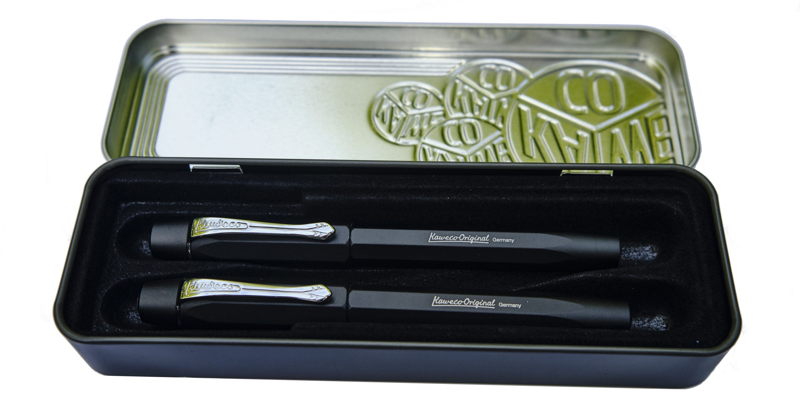 If this isn’t quite your cup of tea, but almost… If the 060 nib just looks a bit short, fitting an after-market 076 will probably help. If you like the 250 version but for some reason just don’t dig a polygonal cross-section, Kaweco’s smoothly cylindrical Supra may be more your thing.
 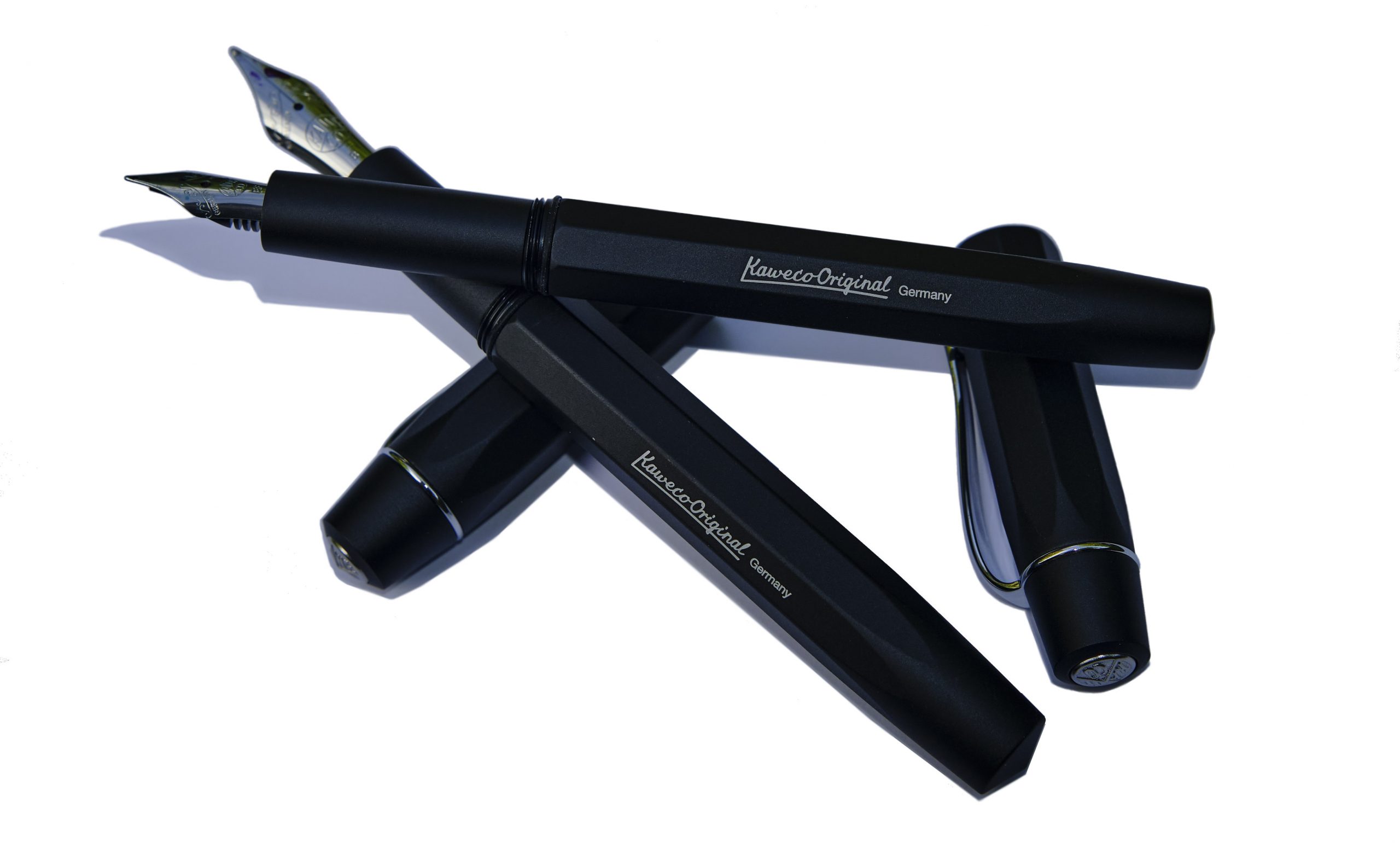 Our overall recommendation For people who enjoy brief scribbles with a Sport but want something similar but a bit larger for extended writing sessions – and that might be rather a lot of us – one of the Originals could well be the answer. But given that the right nib makes a big difference, we’d recommend trying them out in the flesh first.
 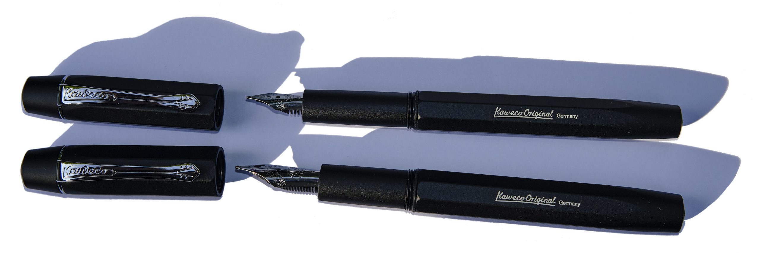 Where to get hold of one It’s a fairly new model at present but most fountain pen shops are likely to consider this soon. Buying in person looks less hassle than online purchasing given the possibility of a bit of nibular trial-and-error.
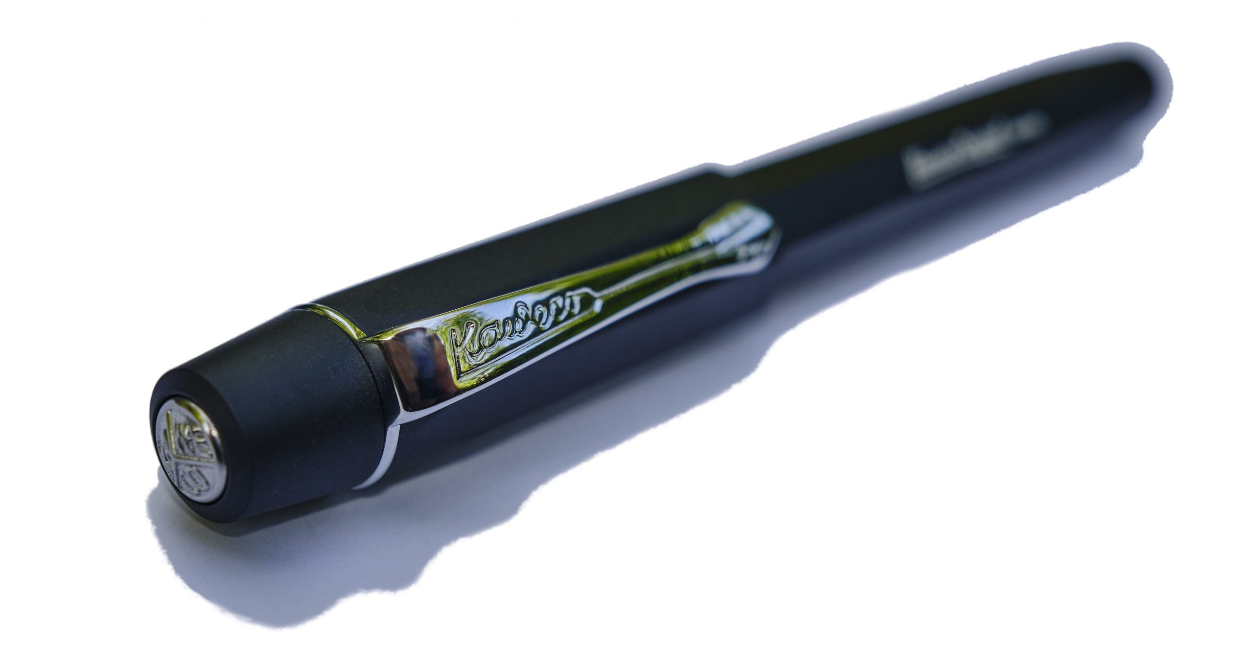
 Thanks to Kaweco for the review samples.
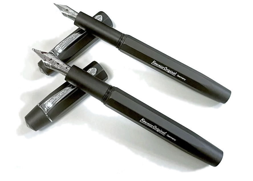
 A little bit of history Much as we all mourn OMAS, ink wasn’t their strong point. Their spiritual heirs, Scribo, have apparently set out to correct that. We put the whole range to the test.
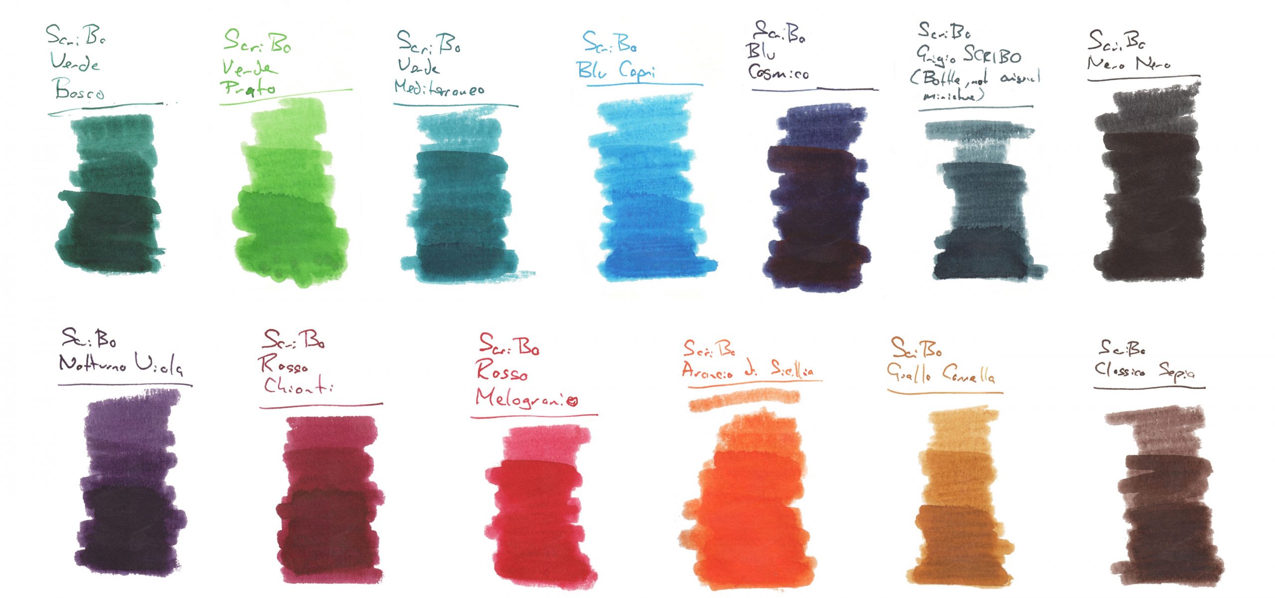
 How it looks This is a big range, and the different components deserve detailed attention:
 Thanks to Write Here for the samples
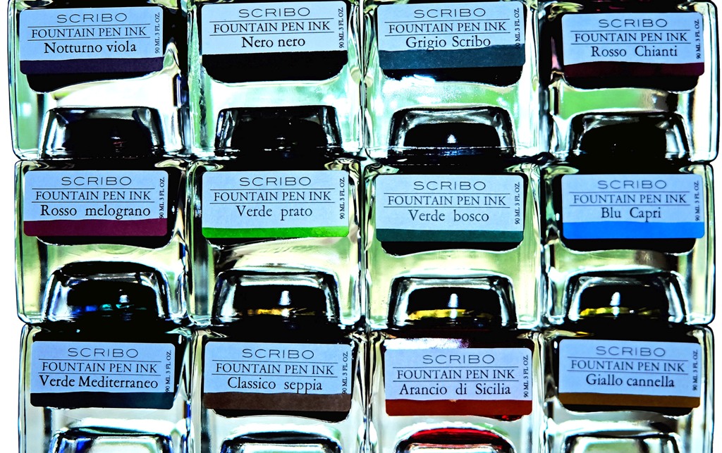
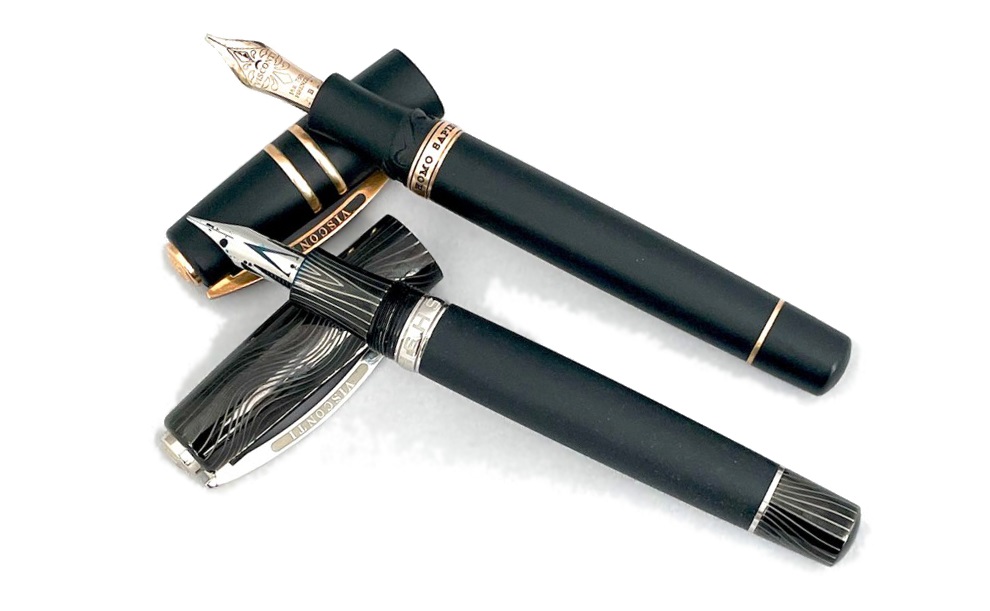
 Quite a mountain of history, actually Back in the 1970s, steady-state Luddites fought against two intellectual movements and lost twice, first to the constant expansion of the universe and then, down here on Earth, to plate tectonics. But our story starts about half a million years ago when the slow-motion collision of the African and Eurasian plates caused the growth and repeated eruptions of a stratovolcano known to successive civilisations as Etna. It’s held a place in myth and legend ever since, including as the prison of the monstrous Typhon, and as the source of much of Sicily’s soil has been ruled over by Greeks, Carthaginians, Romans, the offspring of King Rollo (no, really) and, for a brief but toothsome interval, a revolutionary squashed-fly biscuit. Etna also chucks out plenty of lava, of course, and Visconti gamely set out to make something of it.
 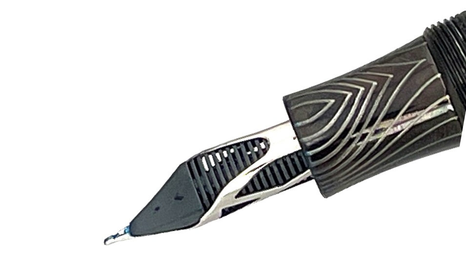 How it looks The classic Homo Sapiens look is a black basaltic tube with a few metal rings and the signature Visconti bowed clip. If it’s under-stated in its usual dress it can be a lot more exotic as a special edition, and we were lucky enough to get our hands on a curious ‘special’ indeed, the Evolution – which looks like a Klingon tool for signing instantly broken peace treaties.
 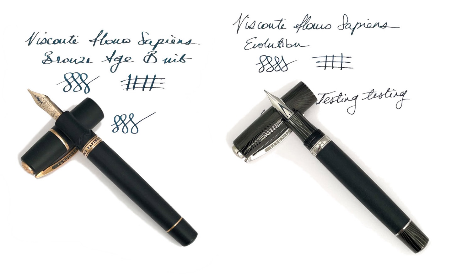 How it feels Sizeable, fairly hefty but not ridiculously heavy, for most of our reviewers. Most is not all, mind; at least one of our panel put the pen on the scales and declared it too weighty to live with. The clever bayonet closure (NB, not present on the Evolution) makes for a comfortable grip, though, and the weight is well-distributed. Visconti makes bold claims about the barrel material being hydroscopic, so that it still has a grip in sweaty hands, and although this is perhaps better tested in the summer it does seem to work quite well in practice.
  How it fills This is a vacuum-filler, and it sucks in a voluminous gulp of scribbling juice without much effort on the user’s part. There’s no way to use cartridges, of course, but if you’re in the market for a pen this pricey a bottle of decent ink is unlikely to exceed the budget.
 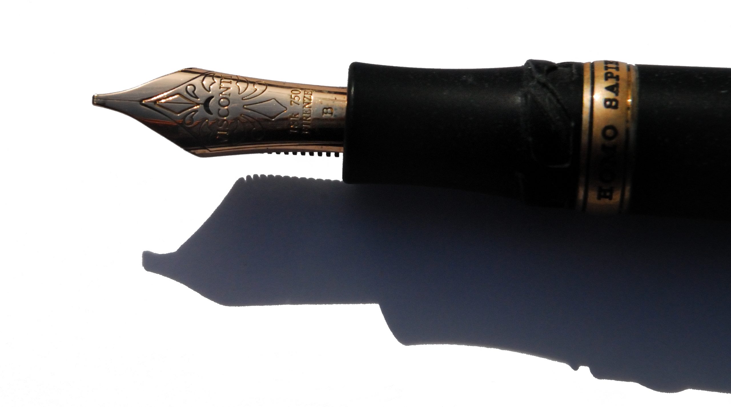 Crucially, how it writes… Now here hangs a tale. Originally, the Homo Sapiens employed palladium nibs which proved notoriously difficult to tune (and harder still to keep in trim). Our duo exemplifies recent alternatives; a usually well-behaved and slightly bouncy gold nib or, for the Evolution, a tubular steel nib which is firm but smooth. A pleasure on either count, although they are very different beasts. The gold nib on our test pen afforded some hard starts to a couple of reviewers, but not to the degree that made writing impossible – and as it flowed adequately for others ink choice may be a critical factor there. Another vital Homo Sapiens tip, which we wish Visconti would tell people directly, is to undo the blind cap a couple of turns before staring to write; this seems to reduce the risk of drying-up considerably.
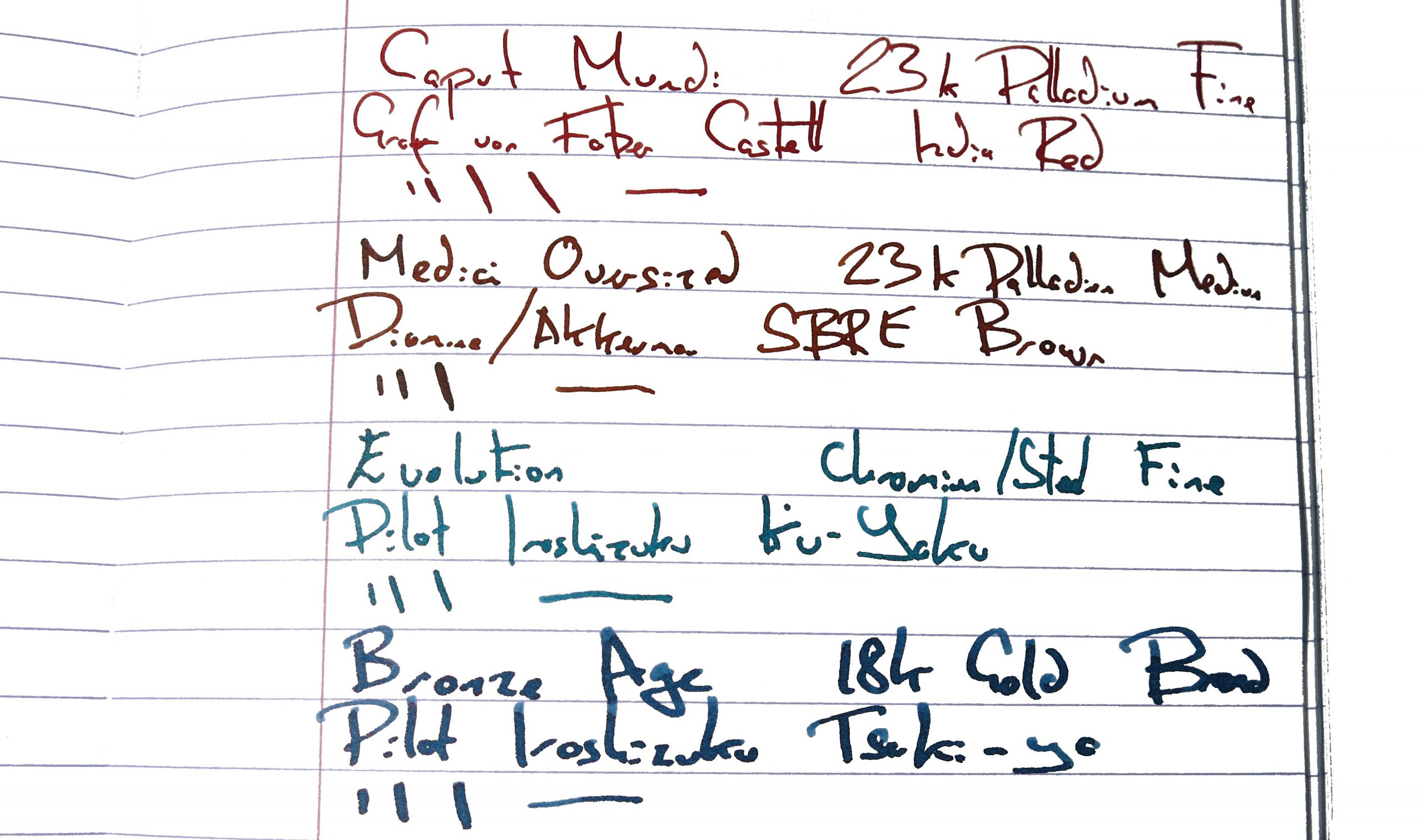
 VFM These are very good pens, no doubt, but compared to other premium Italian offerings the value proposition is sometimes perhaps a little dicey. The Evolution tipped over into four figures, and that’s hard to justify for a steel-nibbed pen, however artistically assembled. Choose with care.
 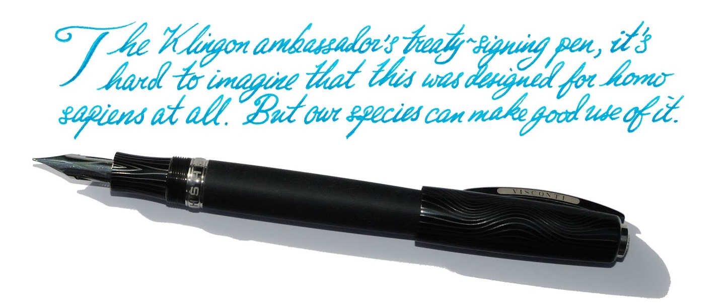 The only way is ethics These are made in Italy and (unless someone gets a really harsh cut of the fee) no-one’s being under-remunerated at this price. If you can afford one, enjoy it with a clear conscience!
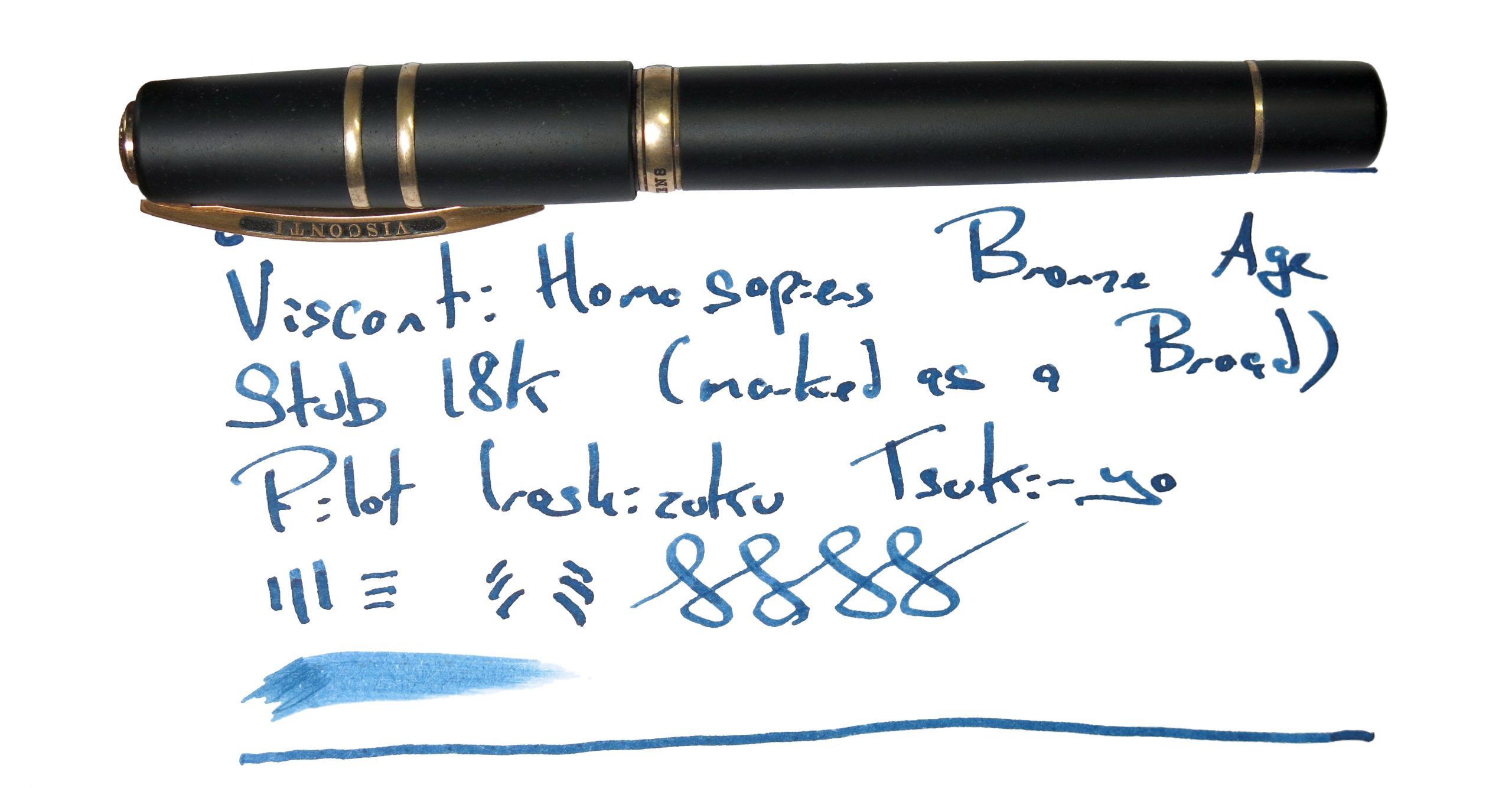 If this isn’t quite your cup of tea, but almost… There are new special editions of the Homo Sapiens out most years. Bide your time, save up, and pounce as soon as you see one you like. Or, if you want a posh pen from a different part of Italy, Scribo and Pineider may have a competing claim upon your attention.
 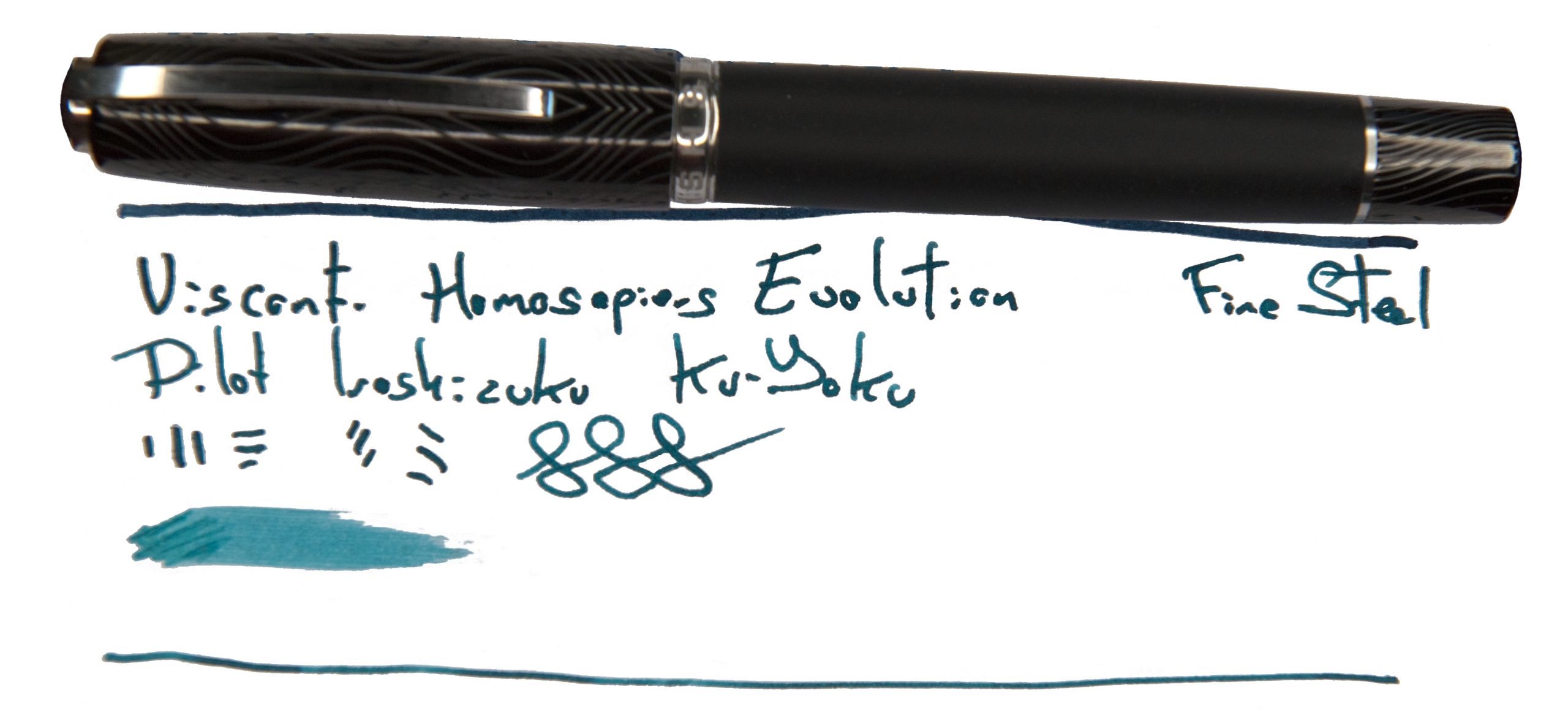 Our overall recommendation Try one in the hand, if you can – but if you love it, that’s your pocket money spent for a while!
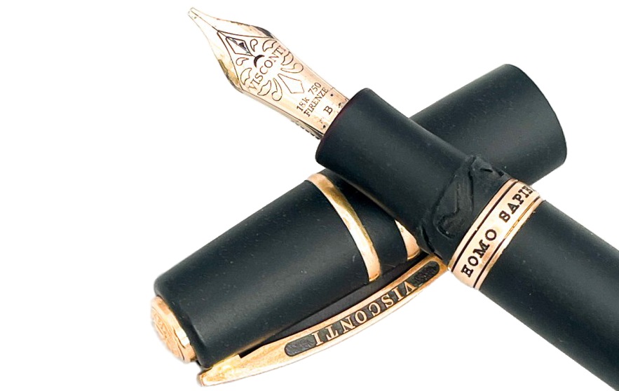
 This meta-review references:

 A little bit of history We’ve reviewed the Perkeo before, so
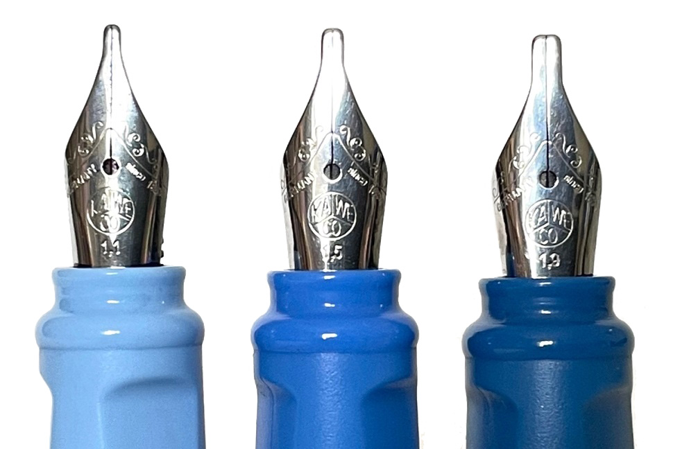
 How it fills There’s space for a brace of small international cartridges in the barrel, or a full-sized converter, which really looks the business in the demonstrator version.