A little bit of history As the twentieth century grew more confident in its own artistic milieu and Art Deco architecture collided with aeronautical design, the blended lines of ‘Streamline Moderne’ emerged. It bore all sorts of results, from Morecambe’s Midland Hotel (where everyday is like Sunday, according to Mr. Morrissey), to the passenger accommodation of The Hindenburg (itself inspiration for the Diplomat Aero), and, of course, the Airstream caravan (as slow as all other caravans but at least nicer to look at). Several decades later, Jake Lazzari of Applied Pens spotted the missing category; fountain pens.
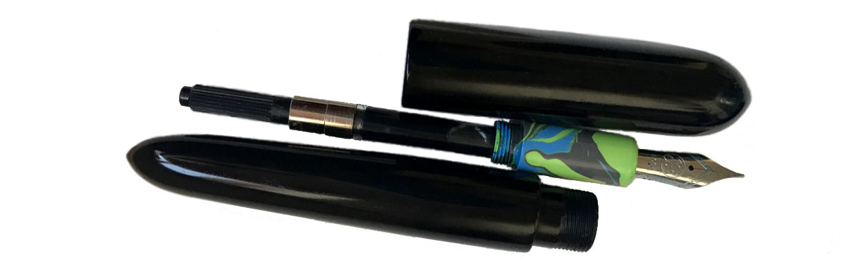
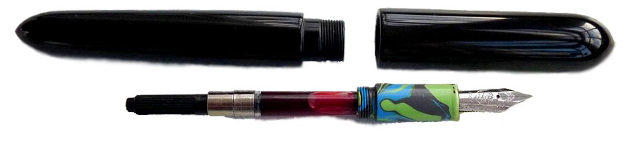
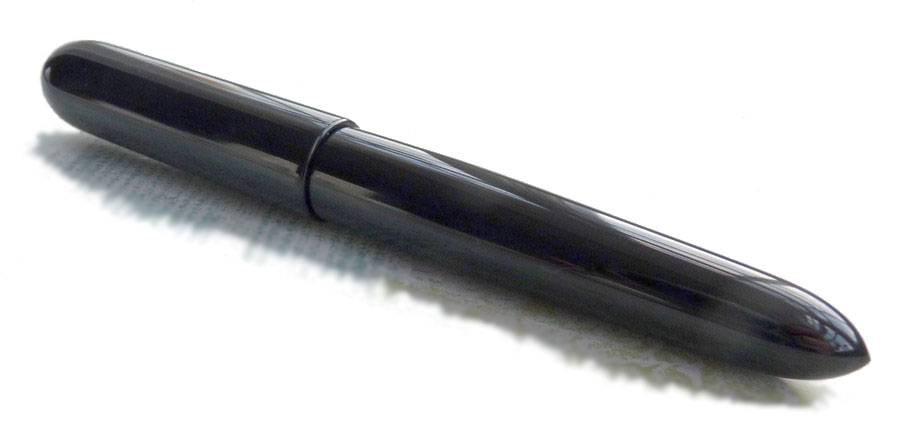 How it looks Like a pocket version of the Schienenzeppelin with a nib inside the engine bay, or a rapidly-extruded Airsteam, or, inevitably an alien mind-probe. It rather defies easy description, frankly, and it’s probably better to let the pictures do the talking on this occasion; suffice it to say that there is nothing else out there quite like it.
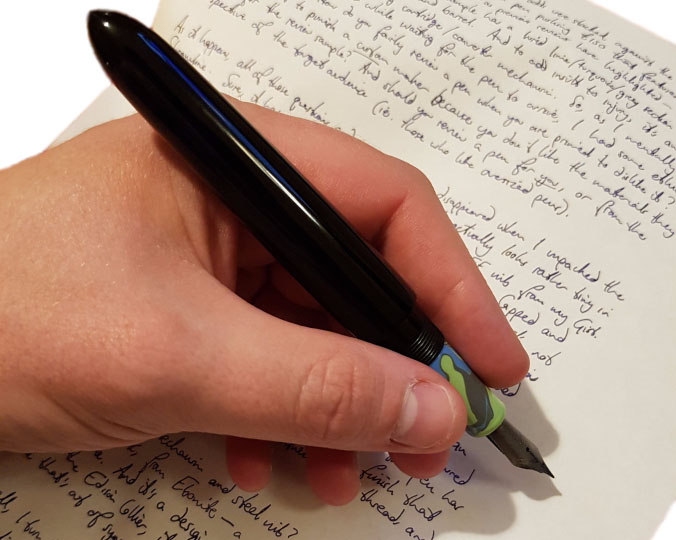
 How it feels It’s big – really extraordinarily big. So much so that you might wonder if your hands are big enough. Three-quarters of our reviewing panel were, however, pleasantly surprised to find that it nevertheless felt about right in the hand, and the lightness of the materials ensures that it’s not as heavy as it looks either. The ebonite makes it warm to the touch immediately, which is also rather pleasant. But it will be just a bit too big for some.
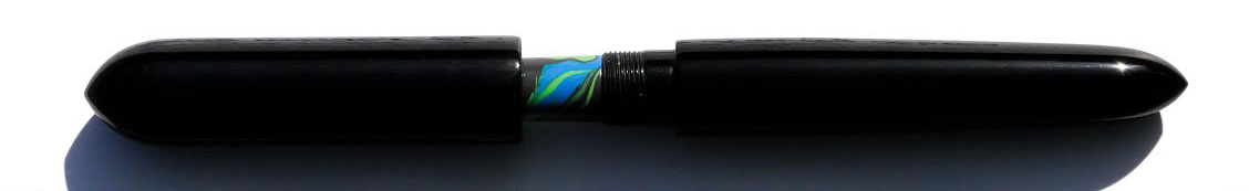
How it fills With a simple Schmidt converter, and that’s perfectly reasonable. The lack of metal inside then barrel and the close threads probably means that eye-dropper conversion is also possible, if you don’t mind a few ink-burps as a result.
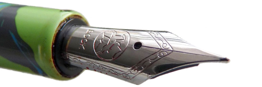
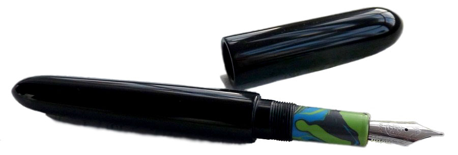 Crucially, how it writes… As ever with hand-made pens, that depends upon the nib you choose to add. Jake uses the Bock #6 steel nib as standard, and although the review unit we sampled had been bashed about a bit, to the detriment of writing performance in this case, Jake does test all nibs before dispatch to customers and will rectify any issues which arise after delivery. The writing position is comfortable and, with a #6 nib of your choice, this should be a very nice long-term scribbler.
Pen! What is it good for? Let’s keep it clean, folks. It’s for writing – really, it is. Most of us would probably keep a pen this extravagantly outré for use at home, but it would certainly look the part signing big contracts… or peace treaties with extraterrestrial civilisations.
 VFM Most versions of the Streamline are available at around the £150 mark, which we think is fair for a hand-made pen with unique design and plenty of customisation options. Installing a nib which is more exotic than the steel standard will naturally add to that, but it’s still a tempting proposition for most of us who reviewed it.
If this isn’t quite your cup of tea, but almost… The acrylic used in the section of this review sample wasn’t quite as popular as the ebonite of the main body, but that’s no real problem as there are copious alternative options – have a look at Jake’s Etsy page (link below) for a few ideas if you need them. If you like the unique design but just can’t handle something quite this huge, Jake does make some smaller pens too. We can’t think of any other pen maker turning out anything remotely comparable, though.
 Our overall recommendation If you like big pens and you cannot lie, then make like Sir Inkalot to the website and order one; we were mightily impressed and several of us have started to muse about our own choice of materials one day. We’d like to see a version with a bigger #8 nib in the future too, but this is a pretty special pen which looks out of this world but is also very nice to wield.
 Where to get hold of one From Jake’s Etsy page, or the outer rings of Saturn, whichever is closer to you.
This meta-review references:
 Thanks to Jake for supplying this extraordinary test sample, and offering one lucky reader the chance to take it home! The competition entailed ideas for favourite Welsh designers, with a very broad brief as to what ‘designer’ means. There were some wonderfully creative responses but the most surprising had to be the humble equals= sign. The prize is winging its way by flying saucer…
It has to be Gofannon; wondrous metalwork and that famous ale….
A bit obvious, but for me it has to be Sir Clough Williams-Ellis – designer of Portmeirion village. If ever there was a man with a nutty idea that took fifty years to build, it is he and what a crazy, stunningly beautiful creation it is.
I love the pen! Maybe having a big pen means that one’s hand doesn’t get so cramped if writing one’s Magnum Opus by hand?
Well designer …. hmmmm – ‘was going to plump for Shirley Bassey because, SHIRLEY BASSEY, but have gone for the man who designed the National Health Service: Aneurin Bevan. HE would have used a big fountain pen, I’m thinking 😀
I want so badly to win this monstrous implement so I can take a photo of it in my wee… LITTLE… HAND.
My favourite Welsh “designer” is Jess Fishlock, midfielder for the Welsh National Team and #1 enemy of my favourite team. (It’s a love/hate relationship, OK?) Her creativity in designing audacious angles for shots and assists is unparalleled.
That is super weird…
I nominate Dylan Thomas’s Hunchback in the Park for designing “a woman figure without fault/Straight as a young elm/Straight and tall from his crooked bones/That she might stand in the night”.
R. K. Penson; I have always had a soft spot in my architectural heart for the Gothic and Italian palazzo building styles and I think a lot of his work was a perfect example of these building styles. Thanks for the great review!
It has to be the equals sign invented in 1557 by Welsh Mathematician Robert Recorde.
“The “=” symbol that is now universally accepted in mathematics for equality was first recorded by Welsh mathematician Robert Recorde in The Whetstone of Witte (1557). The original form of the symbol was much wider than the present form. In his book Recorde explains his design of the “Gemowe lines” (meaning twin lines, from the Latin gemellus).”