A little bit of history Ireland doesn’t have much of a tradition of fountain pen making. That has all changed, changed utterly, as Ben Walsh’s Gravitas has brought a clutch of innovative metal-based designs to the market. They are typified by modern design, attention to detail, interesting material and eye-catching (and smelling) packaging.
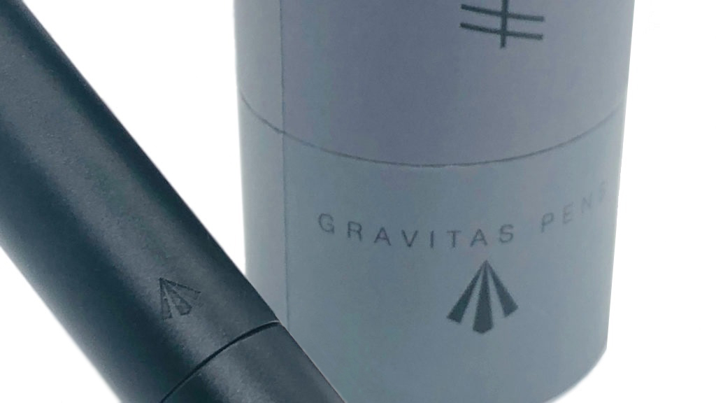
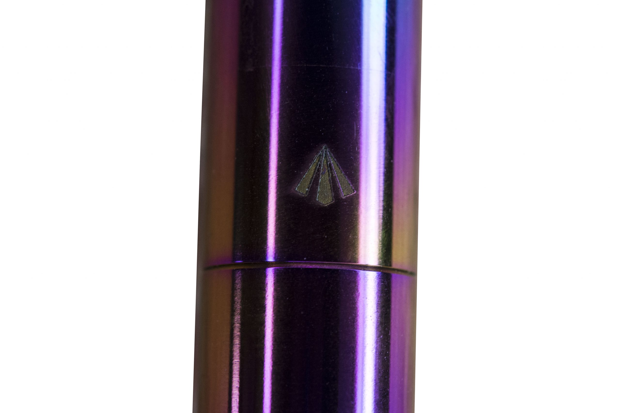
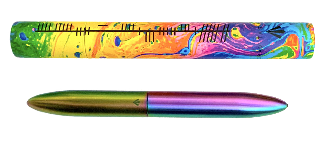
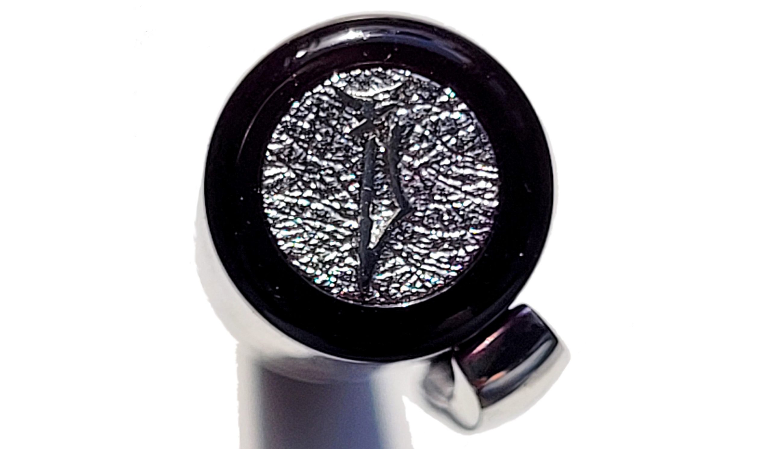
Gravitas’ production base is in the port town of Drogheda, some 50 kilometres north of Dublin, in a region which is home to the 5,000-year-old Neolithic stone-age Newgrange (a UNESCO world heritage site). There’s also a strong Irish cultural dimension with the use of Ogham symbols on the packaging and heraldic escutcheon similar to the ermine of Breton coats of arms or the fleurs de lys from the family crest being branded on the pens and the packaging (although not on the bronze pen). Walsh, by the way, is a Norman family name from Breathnach, the Gaelic for Breton, foreigner or Welshman. The Normans invaded Ireland in the 12th century and fairly quickly became completely Hibernicised. As it happens, the logo is also rather reminiscent of the benchmarks left around these islands by the Ordnance Survey to ascertain how the ground rises or falls by, well, gravity. Choose the influence you prefer, but either way it looks good.
Ben Walsh had previously made pens in concrete before developing some prototype fountain pens as a Kick-starter project. It did not reach its initial target and he opted to execute the project himself. He asked many people in the pen community for their thoughts and feedback, and the results show him to be a good listener. In late 2020 Gravitas pens hit the market with a series of products in different materials and nib widths. Fountain Pen UK Facebook group members were offered a 10% discount and many took the plunge, including quite a few United Inkdom bloggers; a meta-review was inevitable.
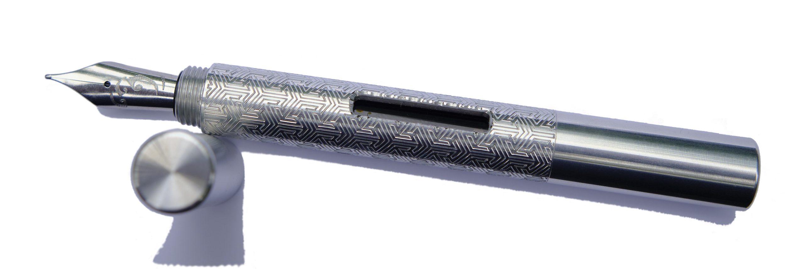
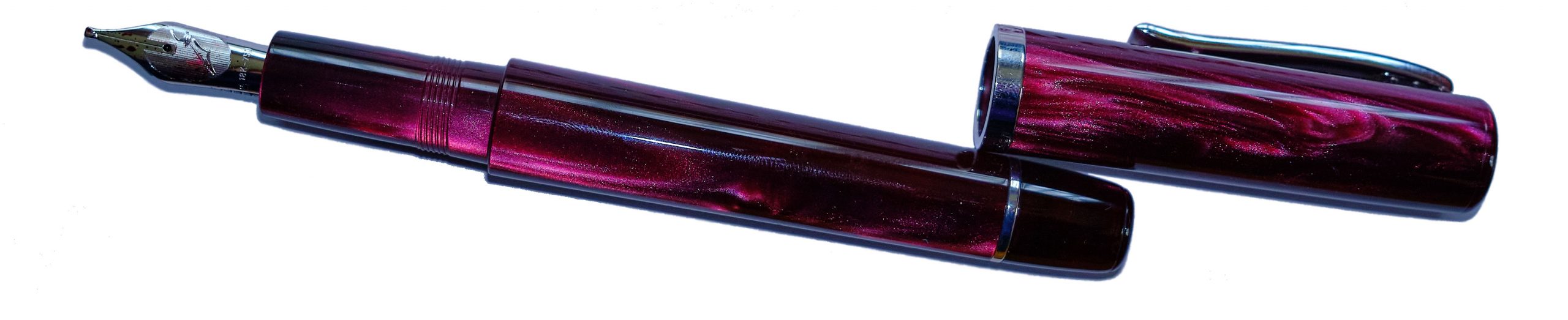
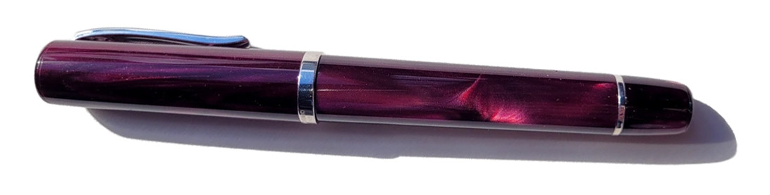
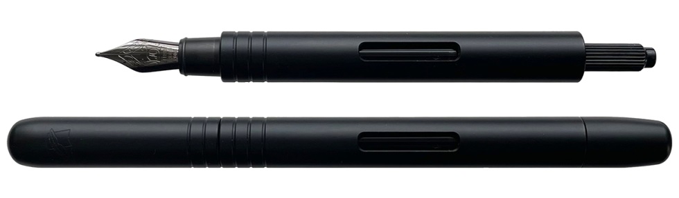
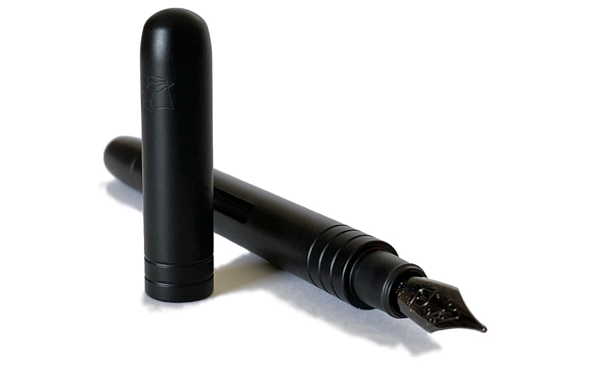
How they look These Gravitas fountain pens are cigar-shaped and made of metal (aluminium, steel and bronze) and come in a variety of finishes. Four models are considered here; a bronze, a stainless steel, a stunning eye-catching rainbow finished Skittles and a beautiful Celtic knotwork pen.
The Gravitas bronze model came well-packed inside a jiffy bag in a cardboard tube. The pen was wrapped in Gravitas-brand grey-black tissue paper and tightly plugged into the tube’s base, which keeps it safe in transit. The tissue paper comes powerfully perfumed, a touch which delights some and appals others, but attention from those now ubiquitous surface wipes removes the worst if that’s not to your taste. The exterior of the tube sports Ogham alphabetic runes translating to: Gravitas Pens and “May your blessings outnumber the shamrocks that grow and trouble avoid you wherever you go”.
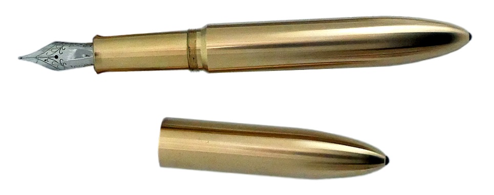
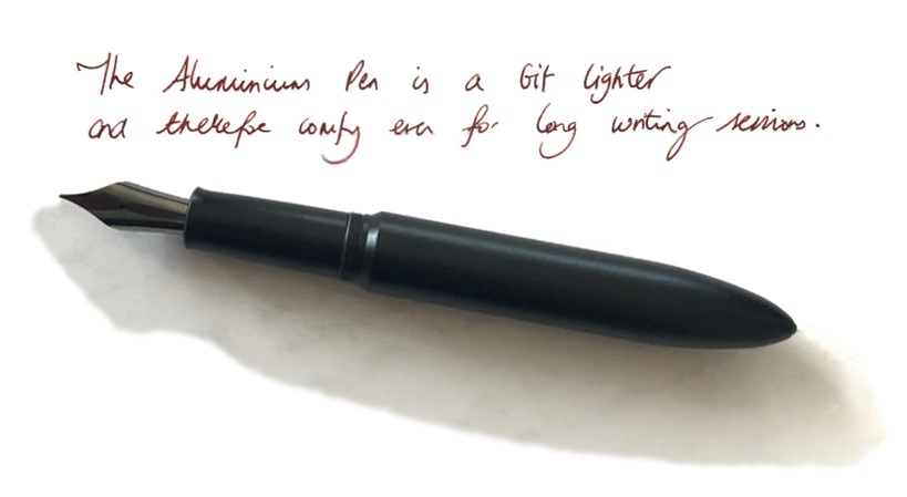
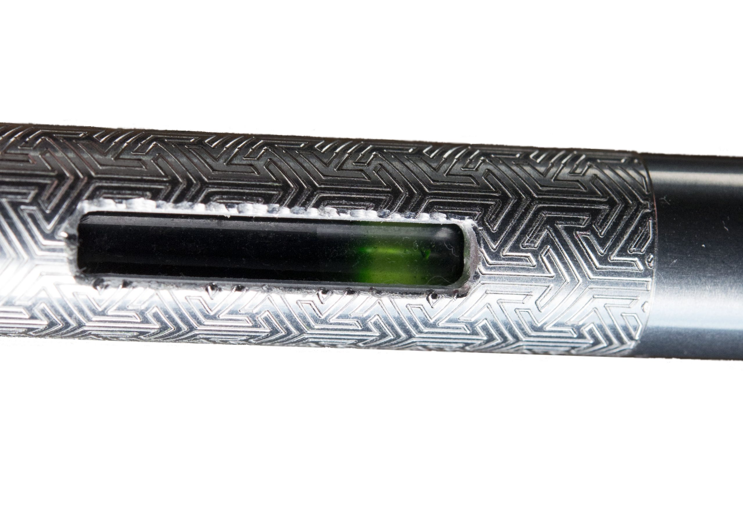
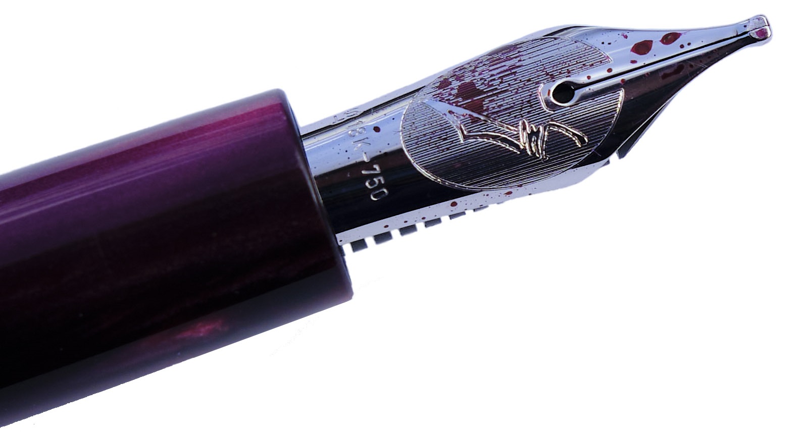
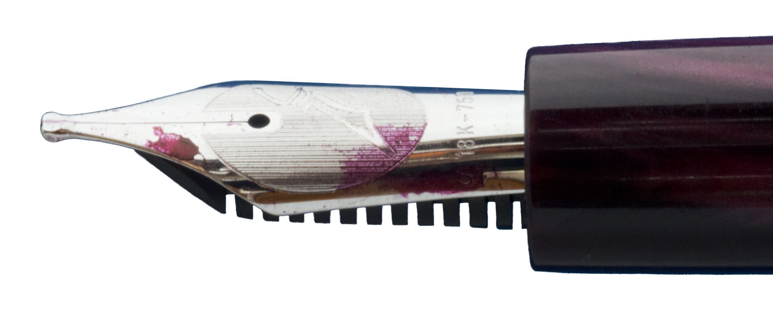
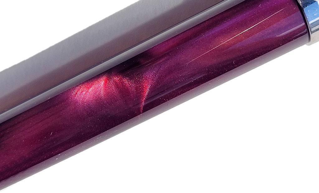
The bronze material is a nickel-free Ampco 18 alloy of aluminium (10.5%), iron (3.5%), and the rest copper, and heat treated to provide a high strength, ductile and unusually tough metal typically used for aircraft parts (gears, bearings, etc). The finials are silicon nitride embedded in cap end and barrel end matching the toughness of the pen body. At 147.5mm long (capped), 15mm width and 97.15g capped (70g uncapped) this is a big, heavy pen, even compared to other metal-bodied fountain pens such as the Kaweco Supra (48g in stainless steel), aluminium-based Diplomat Aero (a substantial 41g), and four and a half times heavier than the ubiquitous Lamy Al-Star yardstick (a lightweight 21.7g).
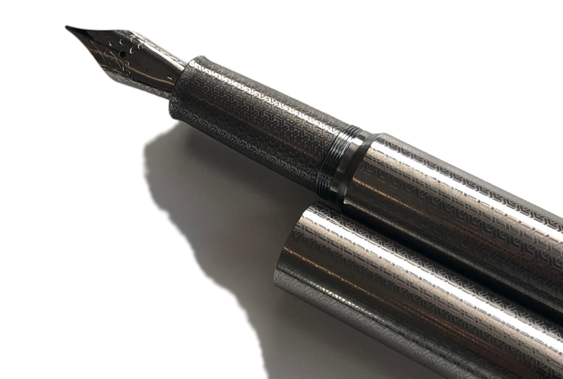
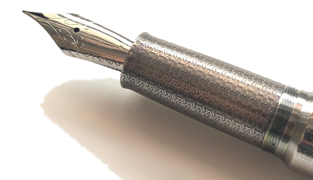
At 74g capped (49g uncapped) the stainless-steel model is lighter than the bronze version but the design and dimensions are identical. The model we reviewed had a distinctive textured finish which extended to the section and which eliminated any of the typical slipperiness that many experience with metal sections.
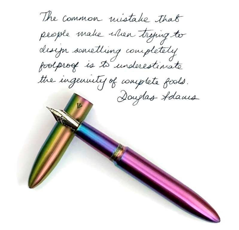
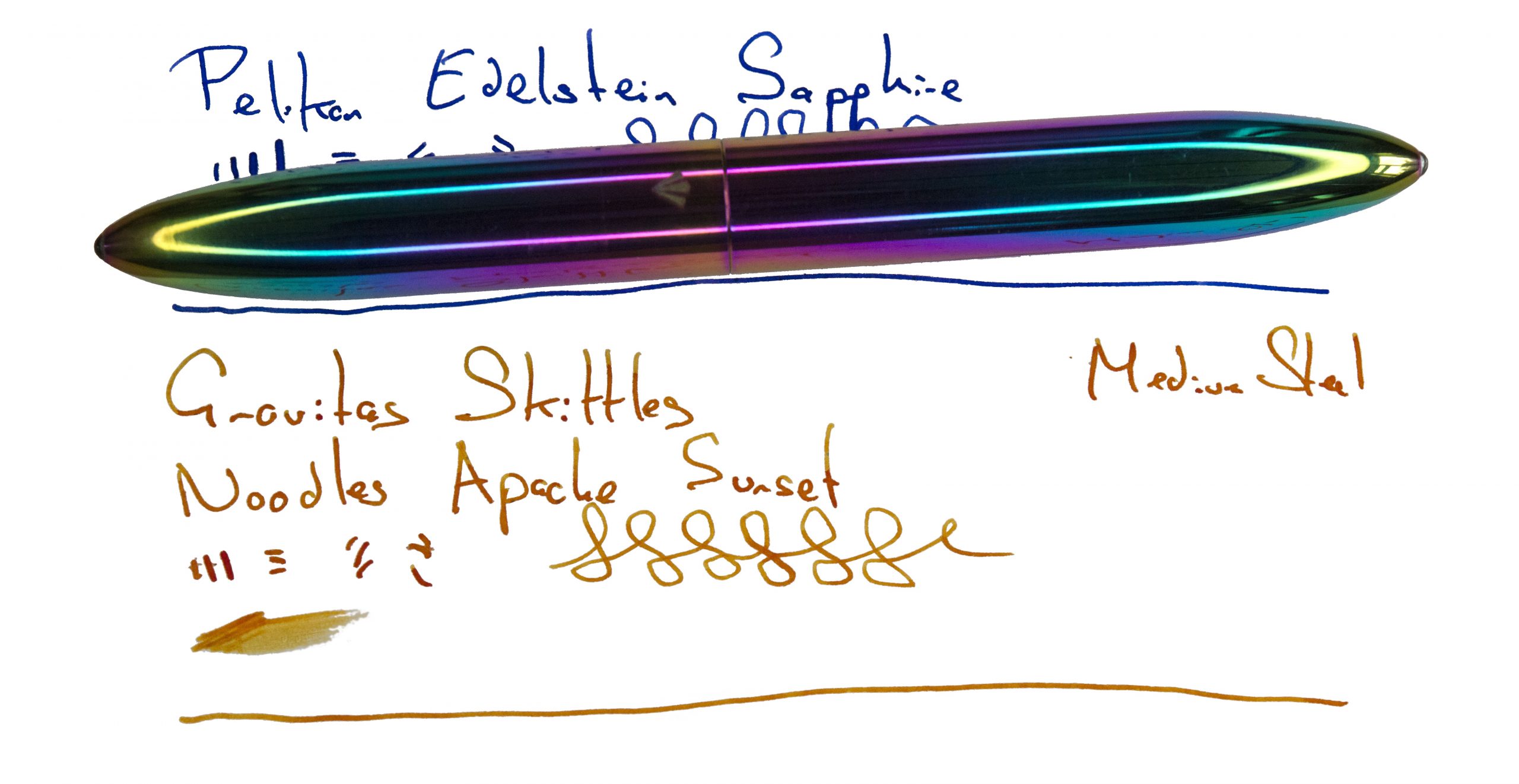
If Ben Walsh impresses as the serious mind behind Gravitas, you can see he has a sense of fun in his design of the Gravitas Skittles fountain pen. It is a stand-out ‘wow’ model which is quite hard to describe without sounding like a complete hippy. There is nothing subtle about it, be it the weight, the size, or the rainbow colours. If Jim Morrison were to grab a fountain pen, it would be this one, and he would quite probably stare into it for hours.
This psychedelia is reflected in the packaging, a very attractive tube, which gives you a sense of the colours of the pen even before you open it. Ben’s sense of fun carries through in the packaging because he infused it with a violet scent which persists for months after the pen is opened. The pen is made from 304 stainless steel with a precision machine finish, lightly brushed with a titanium nitride rainbow physical vapor deposition (PVD) coating, also known as thin-film coating. The attention to detail is seen in the continuation of the PVD coating inside the pen cap and body. This hefty pen is 74g capped and 49g uncapped but again feels comfortable in the hand. It is available in matt or polished finishes.
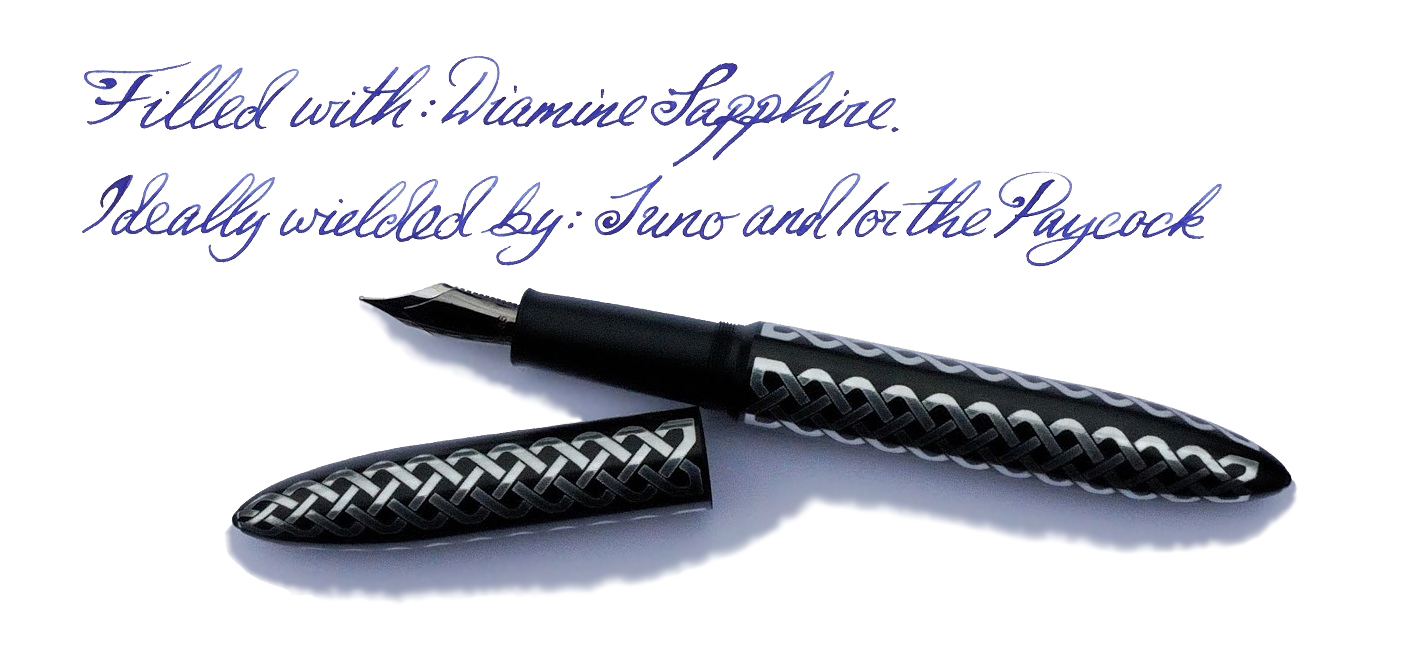
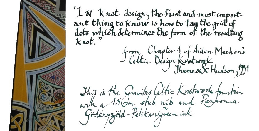
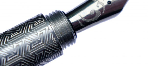
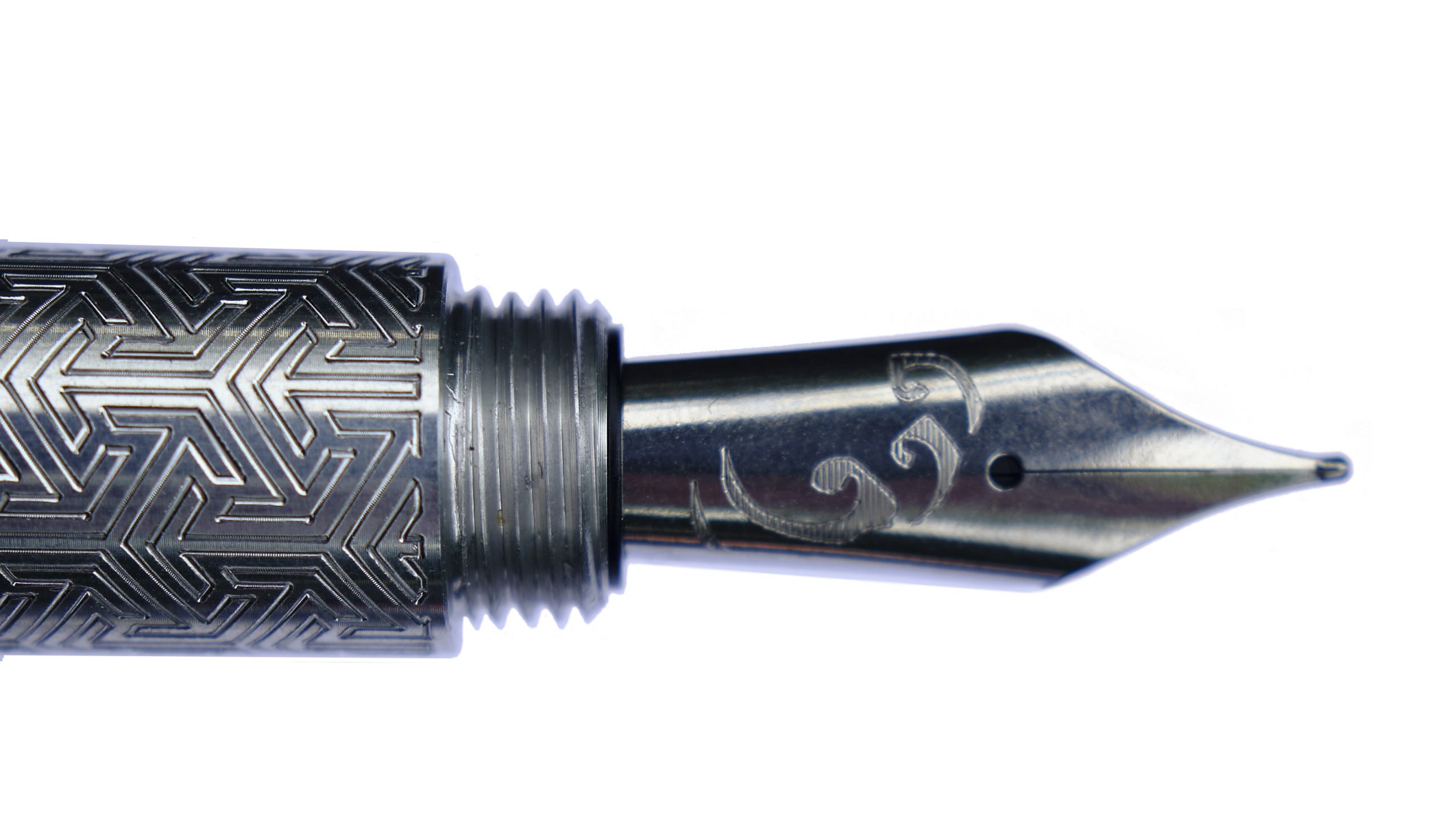
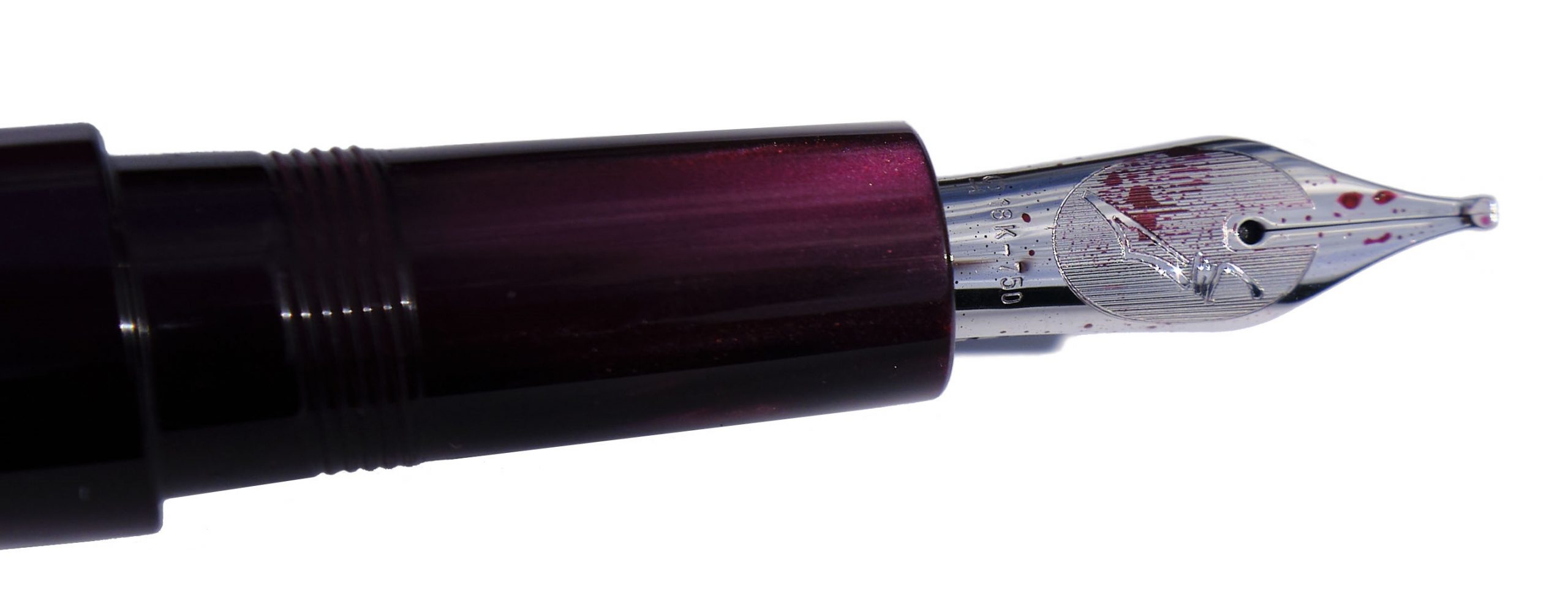
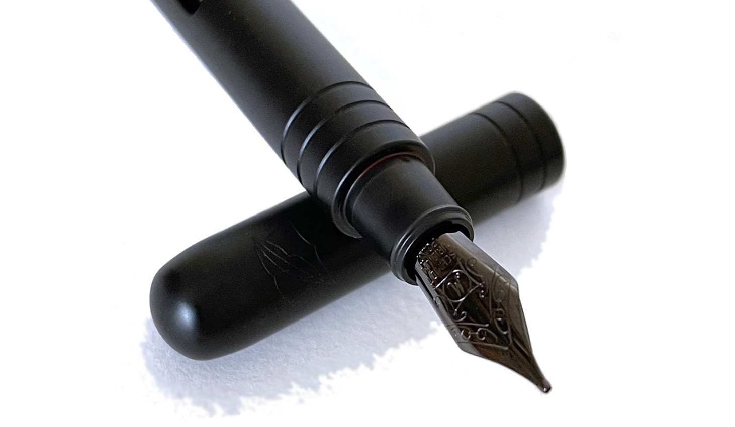
Ben Walsh’s father is a graphic designer and friend of Ireland’s foremost Celtic artist: Jim Fitzpatrick who is renowned for a series of Celtic mythology artworks and this prompted Ben to make a pen sporting Celtic knotwork decoration for his father. From these prototypes Gravitas offered the model to the fountain pen public. Celtic knotwork is famous in designs in Ireland and an echo of the traditions that monks scribed in the 8th century Book of Kells. In Celtic iconography the starting point is the square King Solomon (the reference of ‘Divine Inscrutability’ and wisdom) and foundation knots which are then extended to a plait structure of the Josephine knot. This is perfectly executed on the pen, showing as a silver laser-etched pattern on the anodised black aluminium or on 304 stainless steel precision machine finish and bead-blasted with a black PVD coating. Our reviewer with the steel version partnered the pen with a gold Jowo nib, a near perfect match of a stiff body with a more flexible and versatile nib.
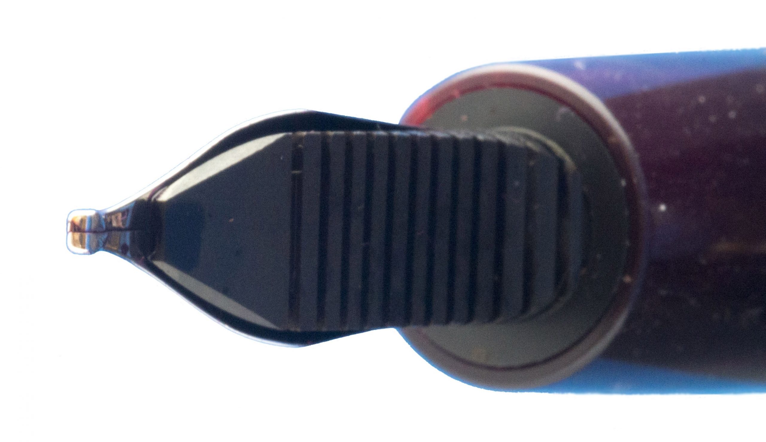
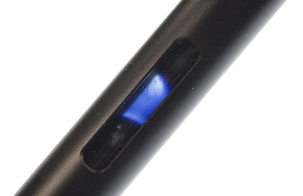
How they feel These are wonderfully tactile, beautiful and stylish pens that are a genuine pleasure to hold and use, not least because of the balance. All the models had the same triple-start square threads that meant the cap came off in one turn to reveal a generous some 30mm length section. The threads feel unobtrusive and comfy on the fingers. There is a 60-degree bevelled drop from the 15mm diameter body to 12mm of the section at the top, which then gently tapers down to 11.5mm at the bottom of the section.
Universally the reviewers felt the pens were well-balanced; their heft snug and comfortable, with even the weightier models not too tiring for normal use. The bronze beast at 70.7g uncapped still felt ergonomic and stable in the hand. The bronze body has a very fine micro-texture to it that makes the surface easier to hold, while the stainless-steel model has a textured pattern which extends to the section which allows for a firm grip too. The steel-based Skittles model looks stunning in the hand and feels balanced and firm for writing. The weight is mainly in the barrel and thus is supported in the crook of your hand rather than by your fingers. Consequently, it doesn’t strain your finger joints in the same way that some heavier pens do. There’s no clip to get in the way, and this model doesn’t post either; it has been kept simple.
How they fill Gravitas’ models are all cartridge/converter types, coming with a packet of small international cartridges in blue or black as well as the robust Schmidt K5 converter.
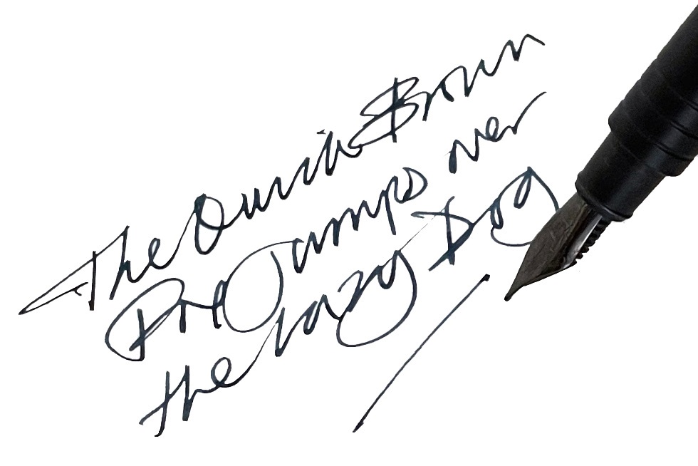
Crucially, how they write… There was universal consensus on the comfort of the balance and feel of the different pens in the hand and how the #6 Jowo nibs performed. One reviewer wrote several long letters and others tested their pens at length with notes, letters and EDC tasks. One even attempted to copy some Uncial script and Celtic knot-work. With a variety of different steel nibs tested and one experimental gold nib fitted too, these pens all wrote faultlessly.
Pens! What are they good for? These pens are a pleasure to use and the overall look and feel incite you to pick them up. For one reviewer, simply picking up the psychedelic Skittles model and turning it in the light was pleasure enough. They are versatile, easy to use, and the aesthetics of the different models makes this a ‘go to’ pen for many owners.
VFM The Gravitas fountain pens are good value for money and compare favourably against other metal-bodied fountain pens. Depending on the finish and patterning the standard Gravitas pen ranges from €70 to €105 (£60-£90, or $85-$125). Postage to the UK is about €10-€15.
The only way is ethics The pens are designed, prototyped, finished and packaged in Ireland by a micro-business (less than 10 employees). You can talk directly and easily with the owner Ben Walsh, which as many remarked makes the experience it all the more attractive.
If this isn’t quite your cup of tea, but almost… Metal pens often divide opinion, especially where they include metal sections whose lack of easy tactile connection can let the whole package slip. However, all reviewers noted how easy to use these pens felt. If the main Gravitas design is nevertheless a bit too big for your hands, the more recent ‘entry-level’ design may be more to your taste.
Our overall recommendation Even reviewers with long-standing aversions to metal found Ben Walsh’s fountain pens striking a welcome chord. For a pen with such precise and determined design they represent great value for money. Buy one and watch the brand grow!
Where to get hold of one Gravitas is purely an on-line operation, but our view is that you can buy with confidence. Bag yours at: www.gravitaspens.com
This meta-review references:
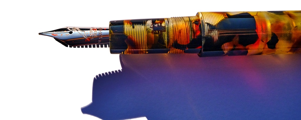
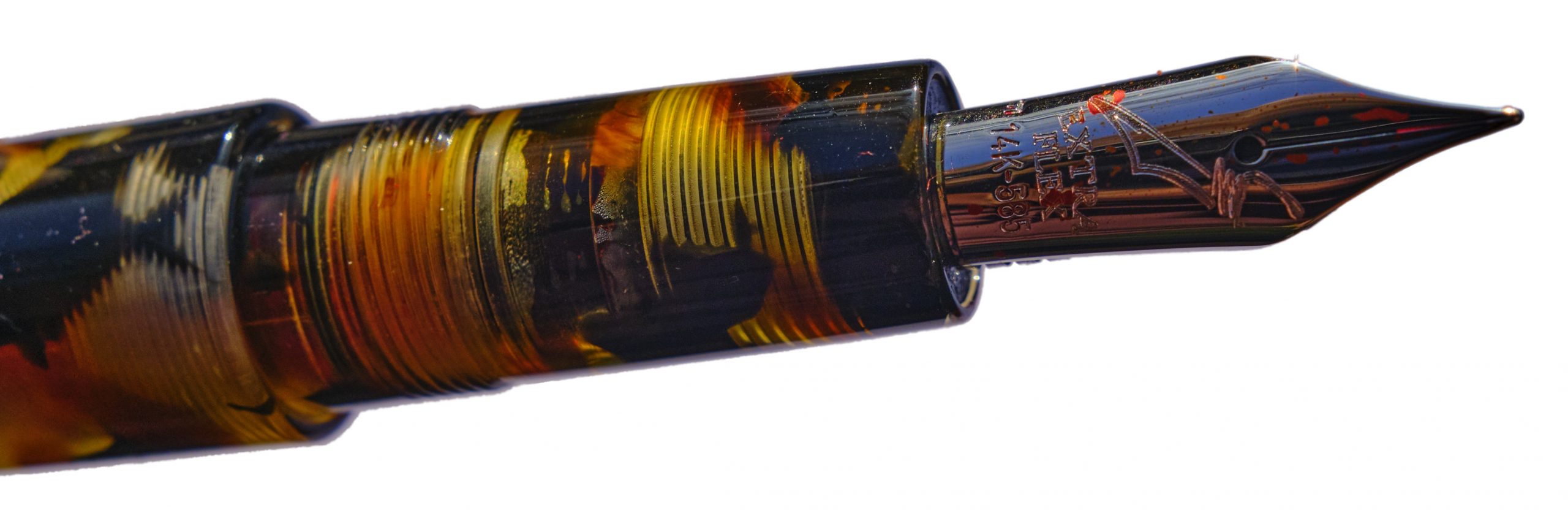
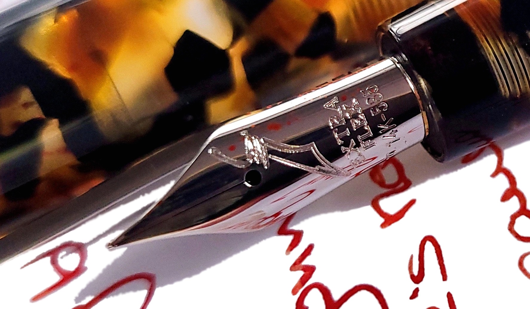
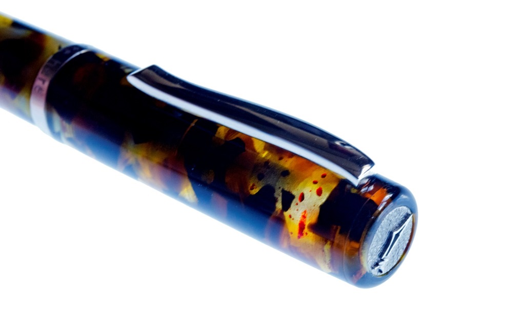
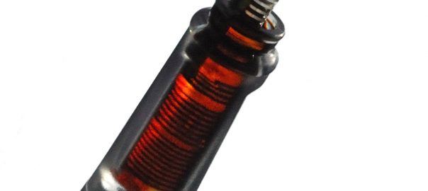
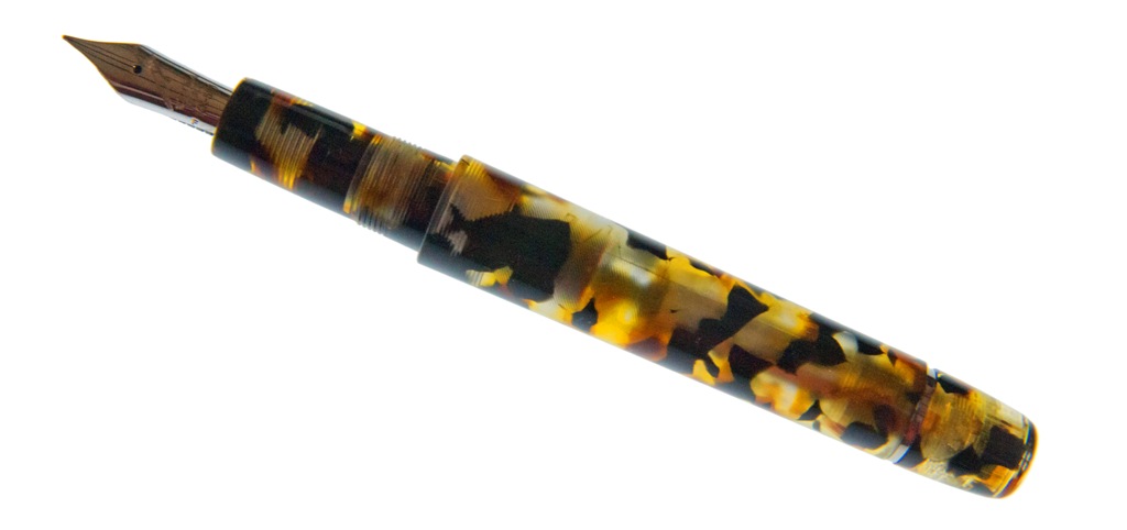 How it fills This is a piston-filer, as is the norm with most Scribo models (apart from the Piuma), and it fills fairly easily with a decent quantity of ink which, unusually, is visible within the workings. The temptation to fill it with a complementary shade has proved very strong; even Mr Teal didn’t put turquoise in this one, and another contributor bucked the trend with a disturbing absence of purple. If you like orange ink, though, this is the bee’s knees – and looks like them, too.
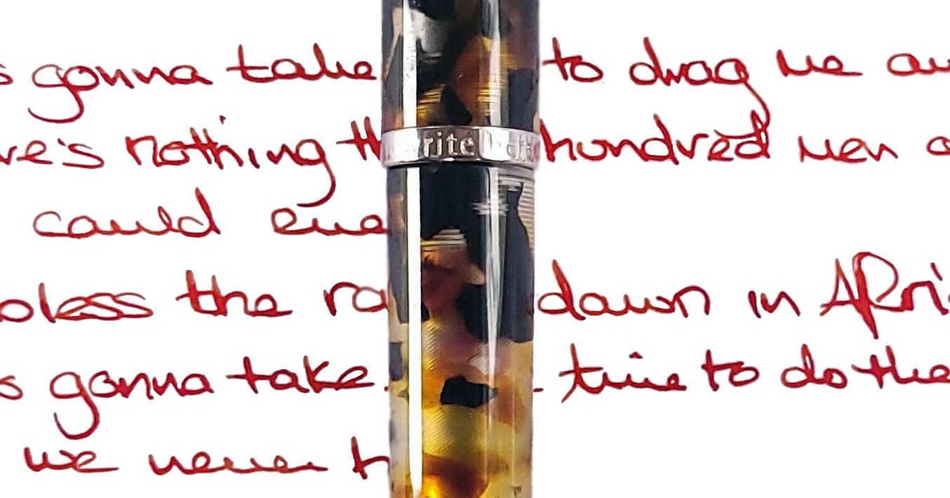
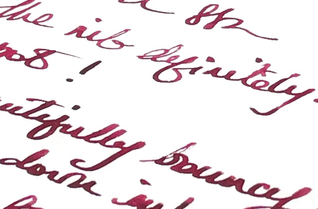
 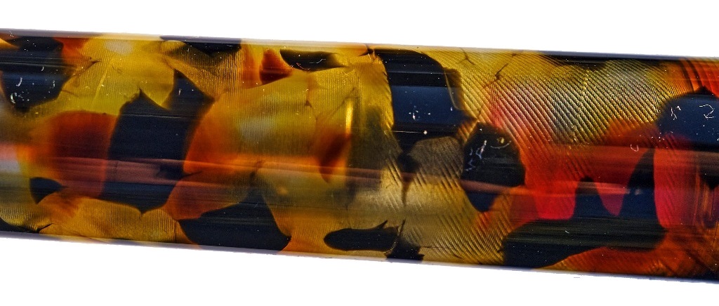 Crucially, how it writes… The Fine Flex nib is a joy, and by general consensus the nearest thing to a vintage wet noodle on the market today – even to the point, shockingly, that some of our reviewers prefer it to the Pilot FA nib. So how it writes is curvaceously, and wet. This is not a pen which scratches and blots on the page so much as one which aesthetically drools all over it.
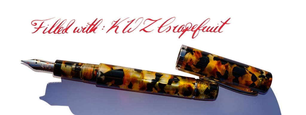
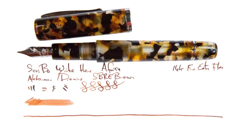
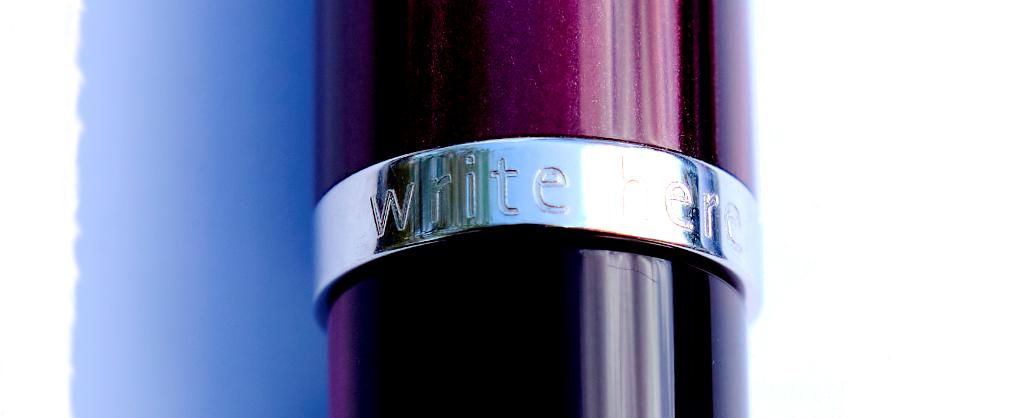
 Where to get hold of one Write Here is the only place you’ll find this, but if you can’t get to Shrewsbury it’s also available online.
 This meta-review references:
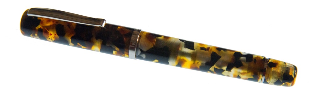
 How it feels Solid, grippy and, thanks to aluminium construction, fairly light. That said, balance is a personal thing and this seems to suit those who particularly like medium-length pens best. Fans of small pocket pens may find it a touch over-long for perfect balance and, conversely, full-size pen afficionados may feel it’s a bit on the short side. Much comes down to personal preference, with this one.
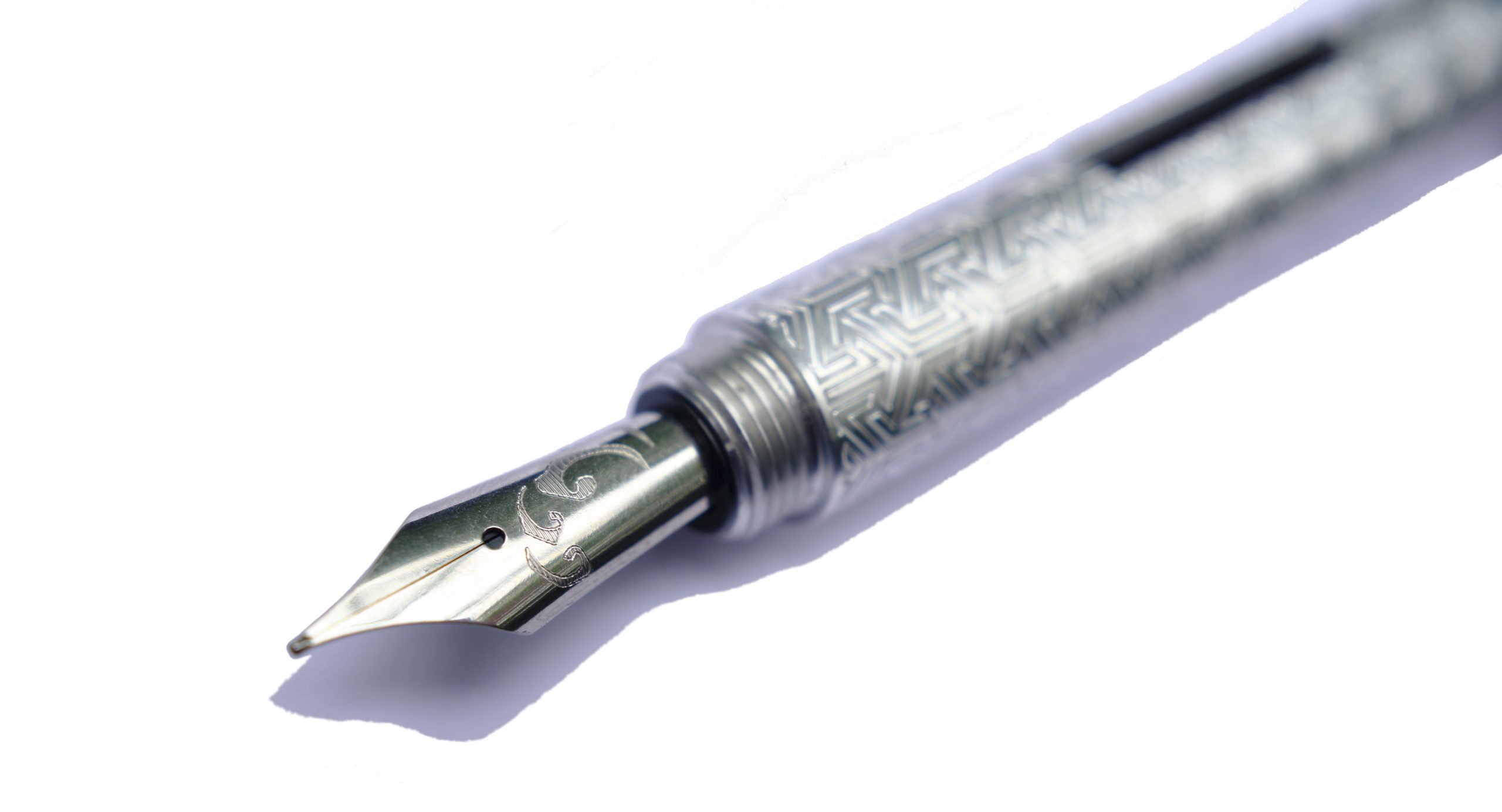 How it fills This is the converter version of the Kitsune, which tells you most of what you need to know. There’s space for a full size converter, and a blind cap which twists off at the back end to make refilling a touch simpler. The resulting ink capacity is a bit of a step up from the tiny converters which fit small pocket pens, too.
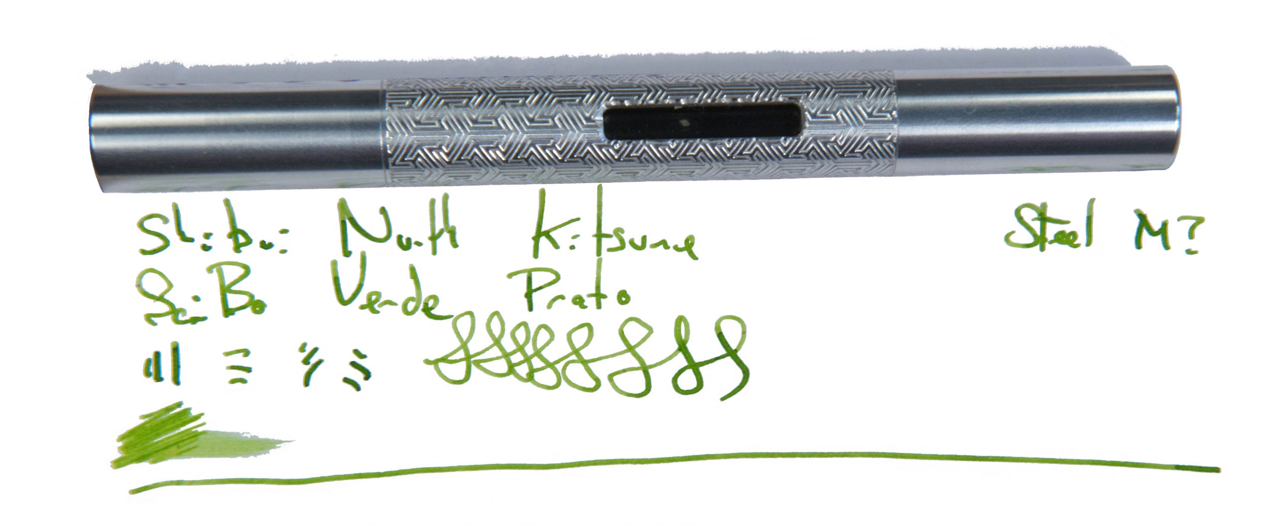
 VFM It took us a little while to test this design, and the exact model is no longer on sale. But the Pocket Fox is similar, with a shorter international cartridge, for around £100 to £110 usually – not bad for a hand-made pen with an interesting finish and Geordie bragging rights.
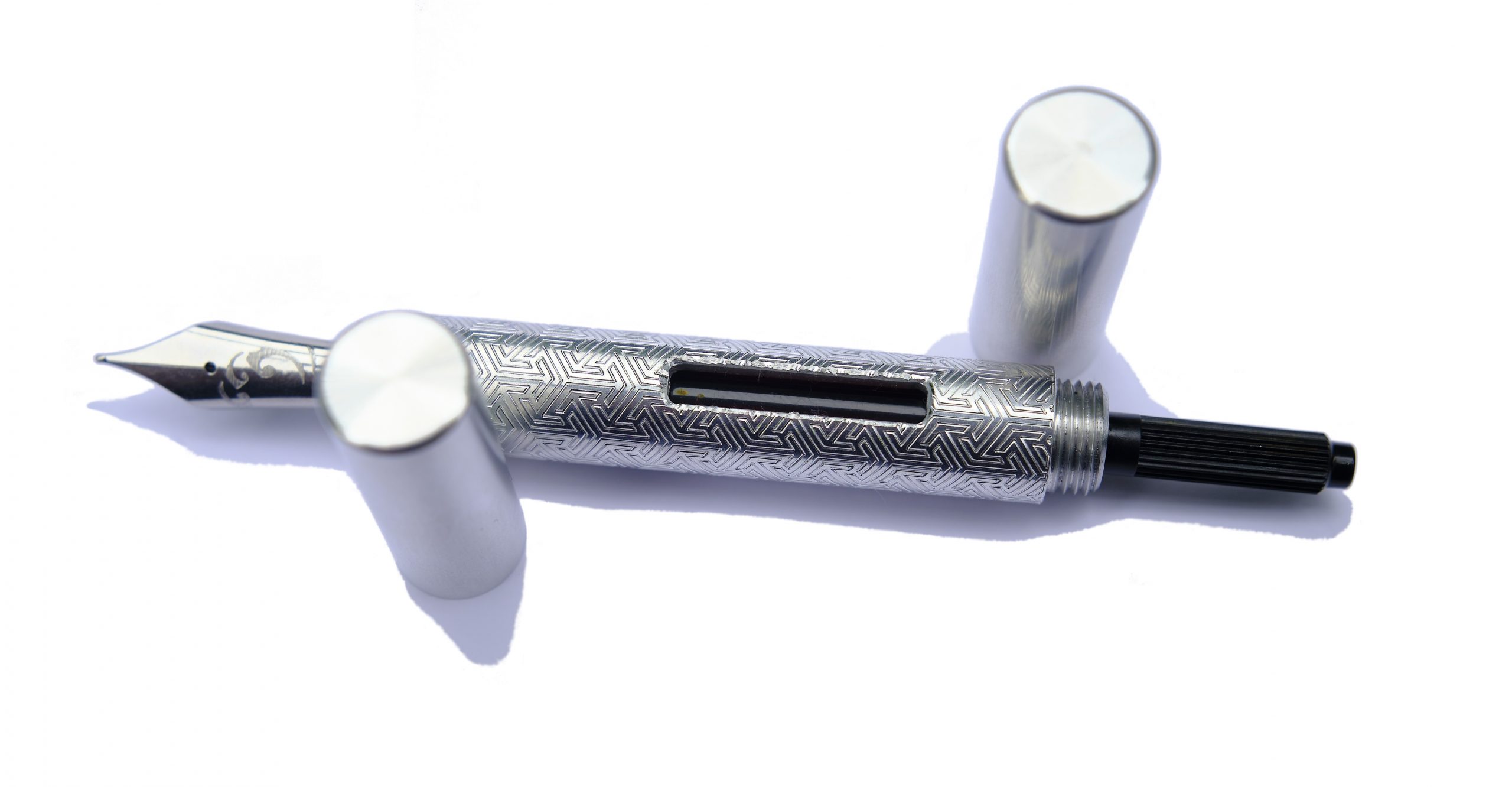 The only way is ethics It’s made by a human being who you can contact and have a chat with first, right here in Blighty, and packaged responsibly. What’s not to like?
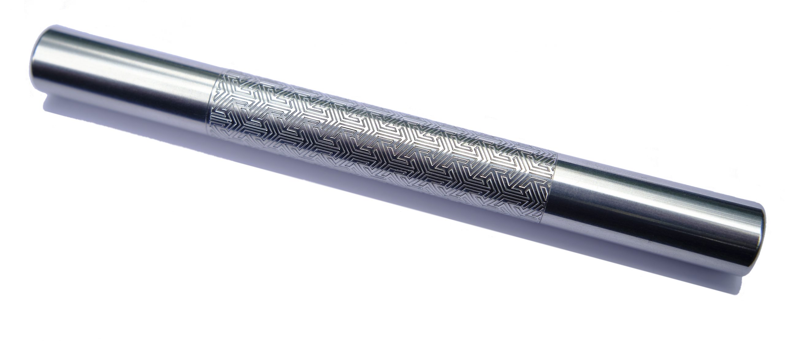 If this isn’t quite your cup of tea, but almost… Go shorter or go longer, in, err, short. The cut-down version is now known as the ‘Pocket Fox’ and looks the business in all sorts of finishes. Fans of longer pens may prefer the gracefully curved Tombo, meanwhile.
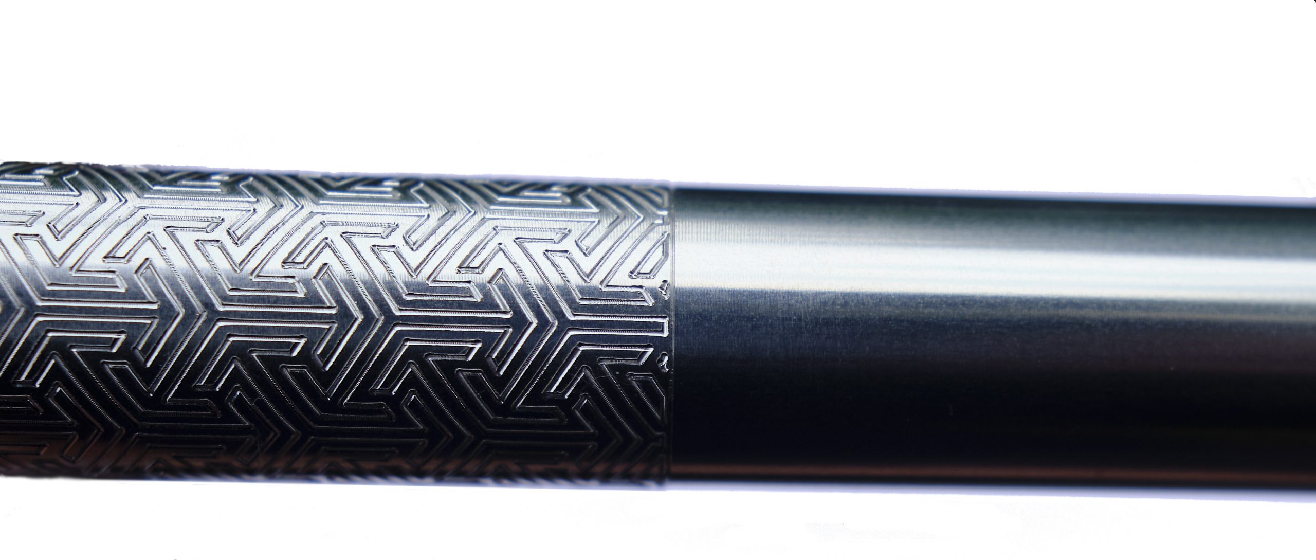 Our overall recommendation Find the right balance for you, then take the plunge.
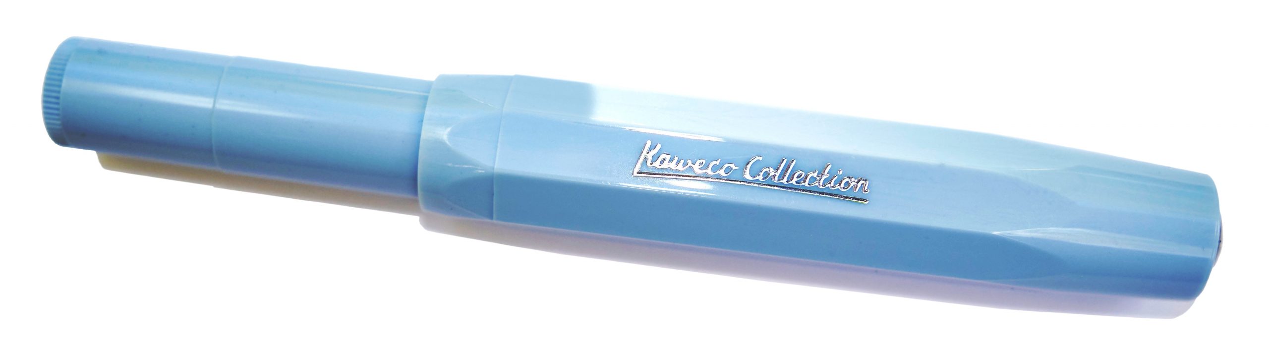
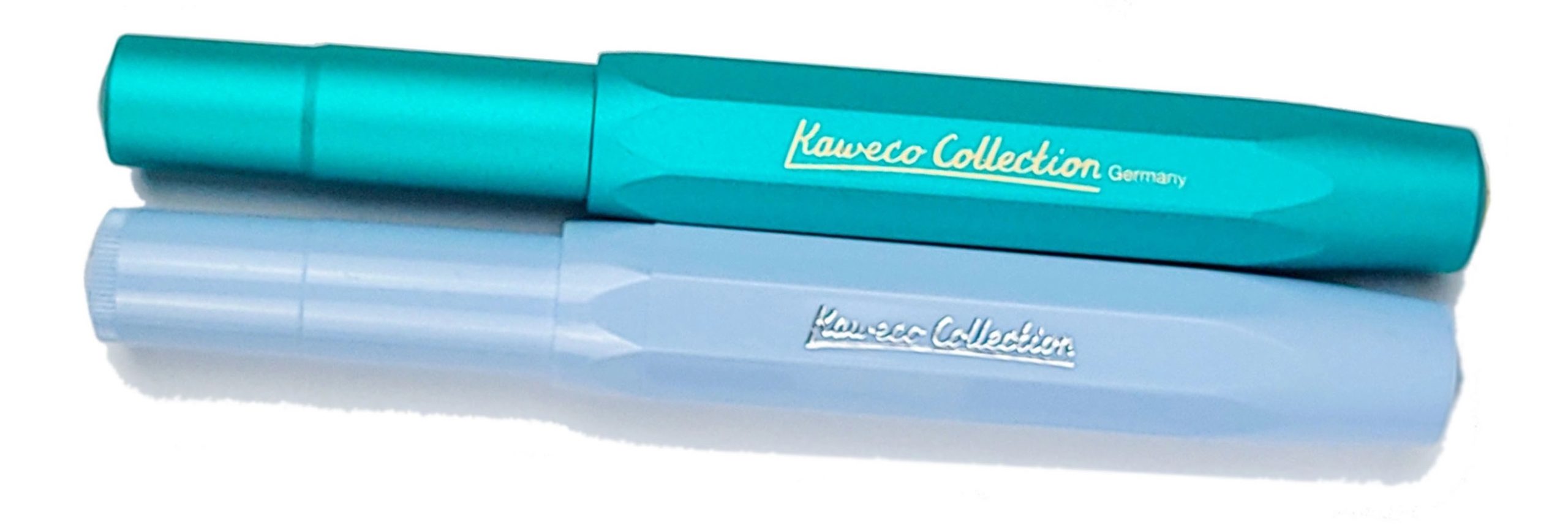 How it looks It looks much like any other Sport but in a pair of rather sophisticated colours, and with ‘Kaweco Collection’ proudly displayed on the side of the barrel. No complaints there; if you’re a Sport fan, you probably want already simply after looking at these pictures – and that’s rather the brand’s plan.
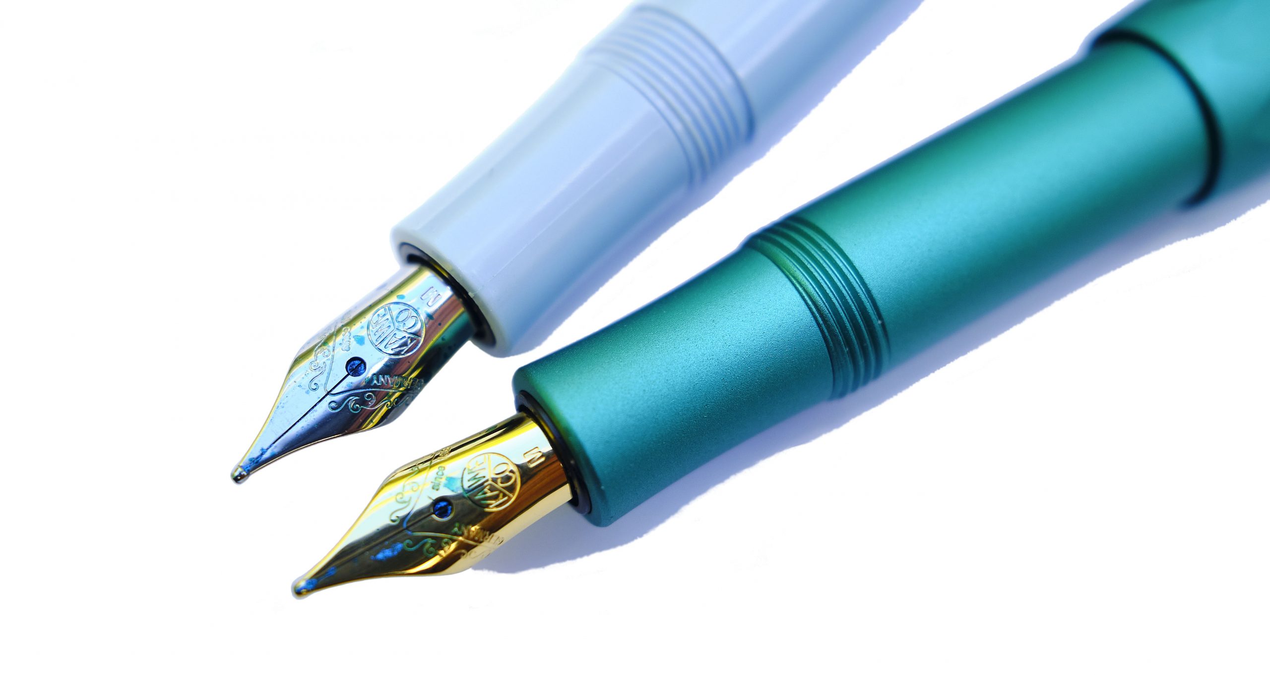 How it feels Small, and light. As usual, the aluminium version feels a touch more robust, but far from heavy. Like you’d expect a Sport to feel, really; the difference is all visual.
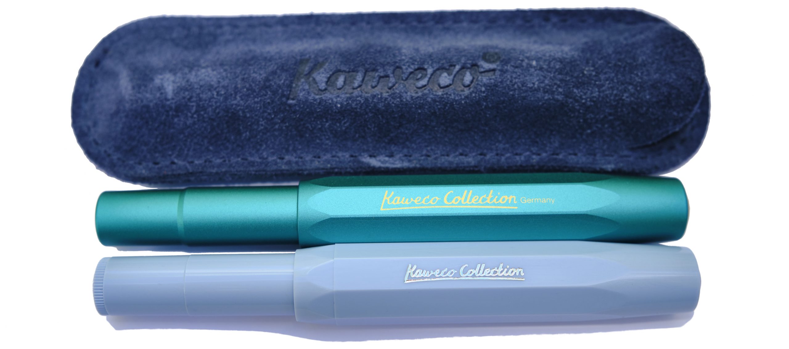 How it fills As ever, syringe-filling a small international cartridge would be our tip. There is a tiny push-rod converter, but the ink runs out so quickly that scope for frustration is considerable.
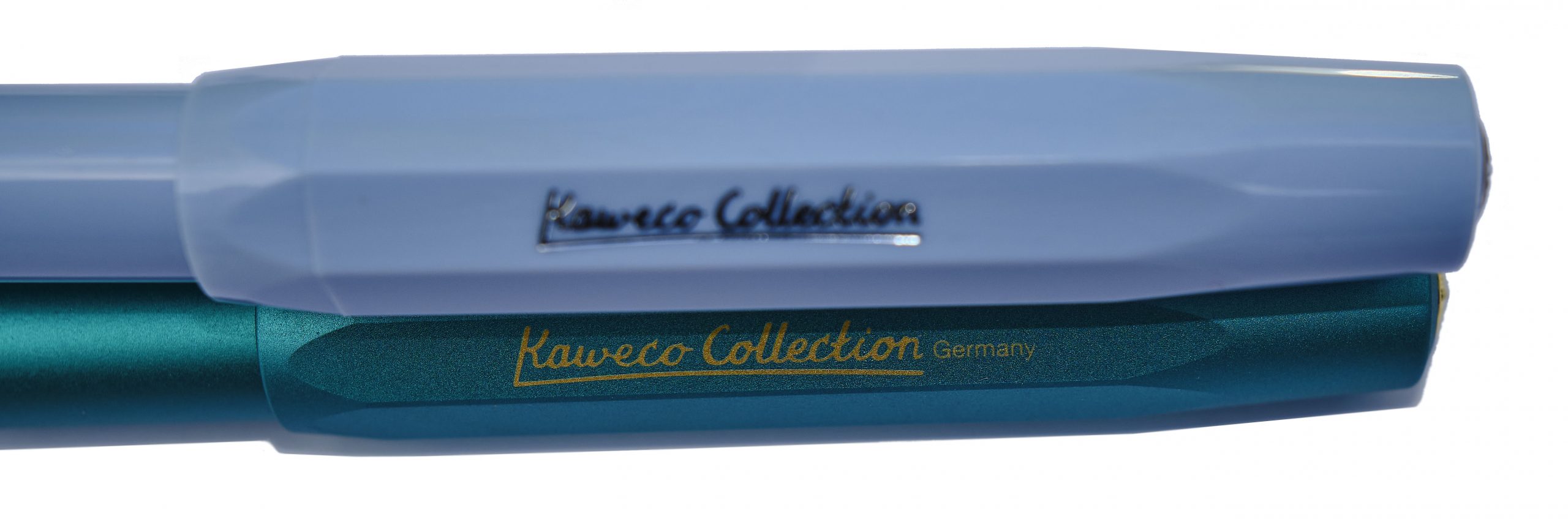 Crucially, how it writes… Generally, pretty well. The quality control on the steel nibs has improved in recent years, and for the pricier aluminium version any Bock 060 nib can be screwed in if you fancy a change. There’s even a gold option, should pushing the boat out that far be on the agenda. We stuck with the standard steel M, probably the most popular option, for this test and the results were encouraging.
 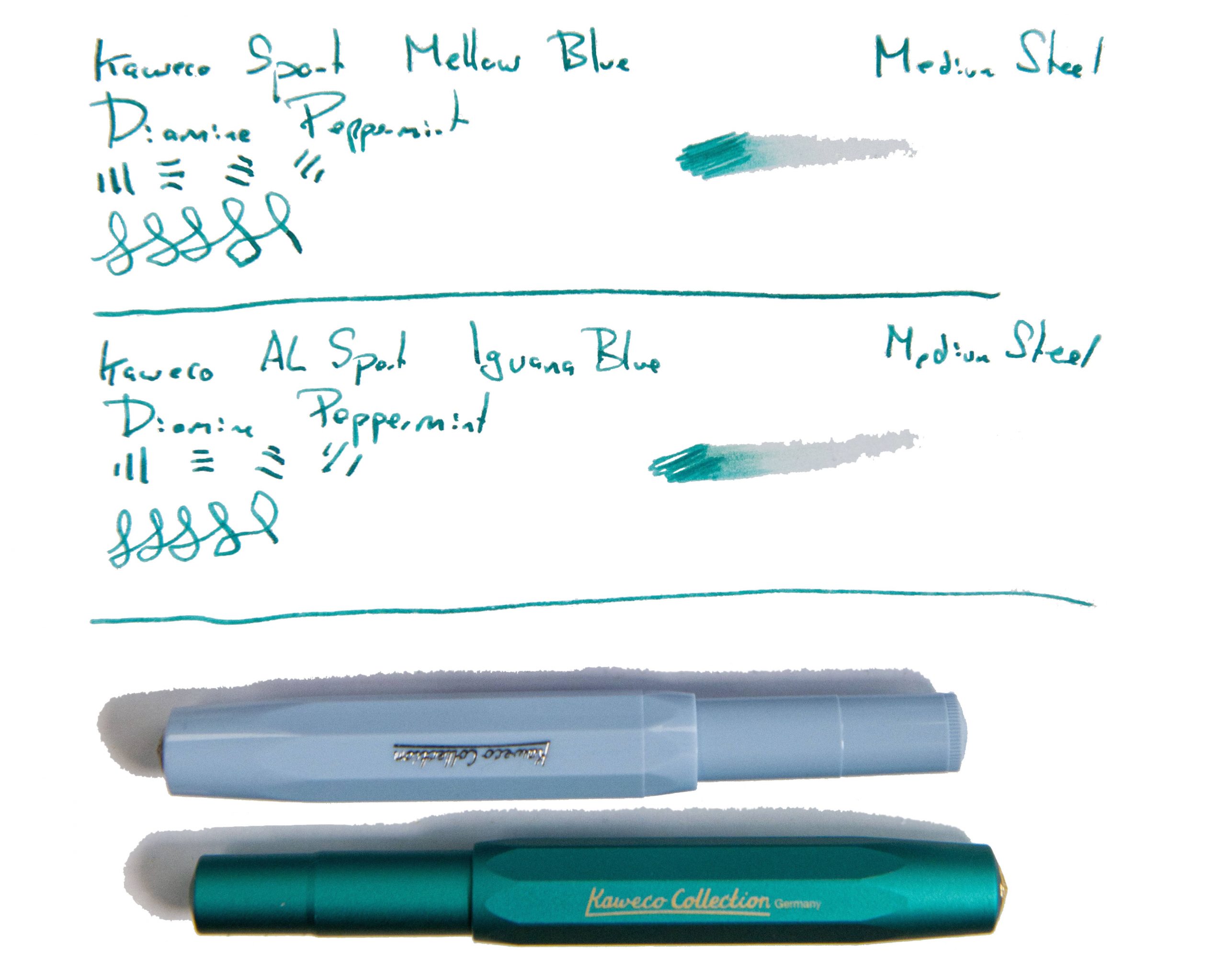 Pen! What is it good for? The Sport’s natural home is in your pocket, of course, but these two specials were also made for showing off, so it’s up to you. Generally we’d suggest these are for leisure use rather than business, but who are we to dictate?
 VFM The plastic Mellow Blue will set you back about £25, which is quite fair value, and the swisher aluminium Iguana Blue more like £70 – not crazy money at all, but it makes sense to try an ‘entry level’ Sport to check out whether the format works for you first.
 The only way is ethics These are made in Germany with decent labour conditions, and Kaweco haven’t gone crazy with the packaging, so things look healthy on the ethical front.
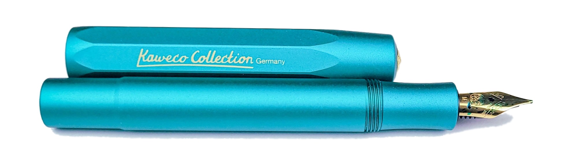
 Our overall recommendation These will sell like the proverbial hot cakes; if either takes your fancy, get it quickly!
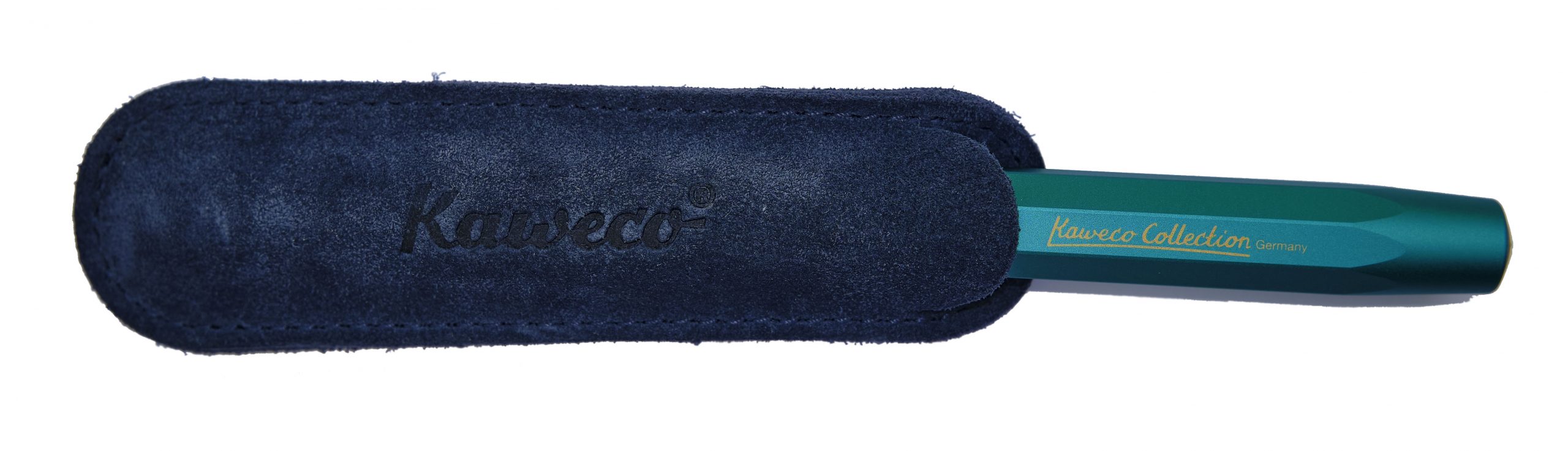 Where to get hold of one All your favourite fountain pen specialists are likely to have these in stock – as long as they last.
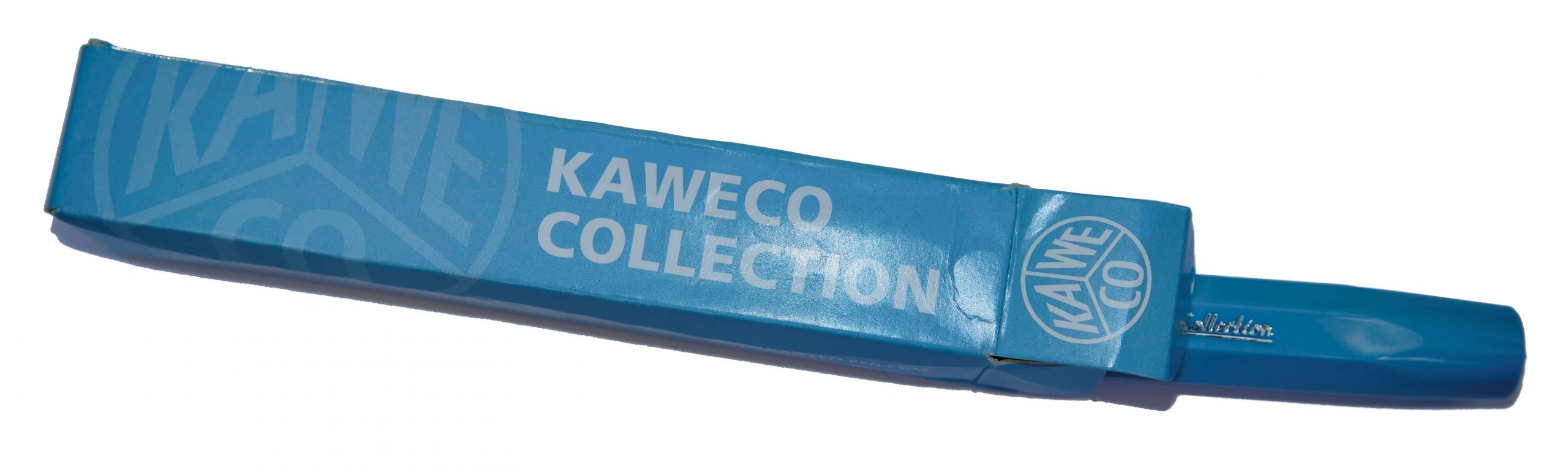 This meta-review references:
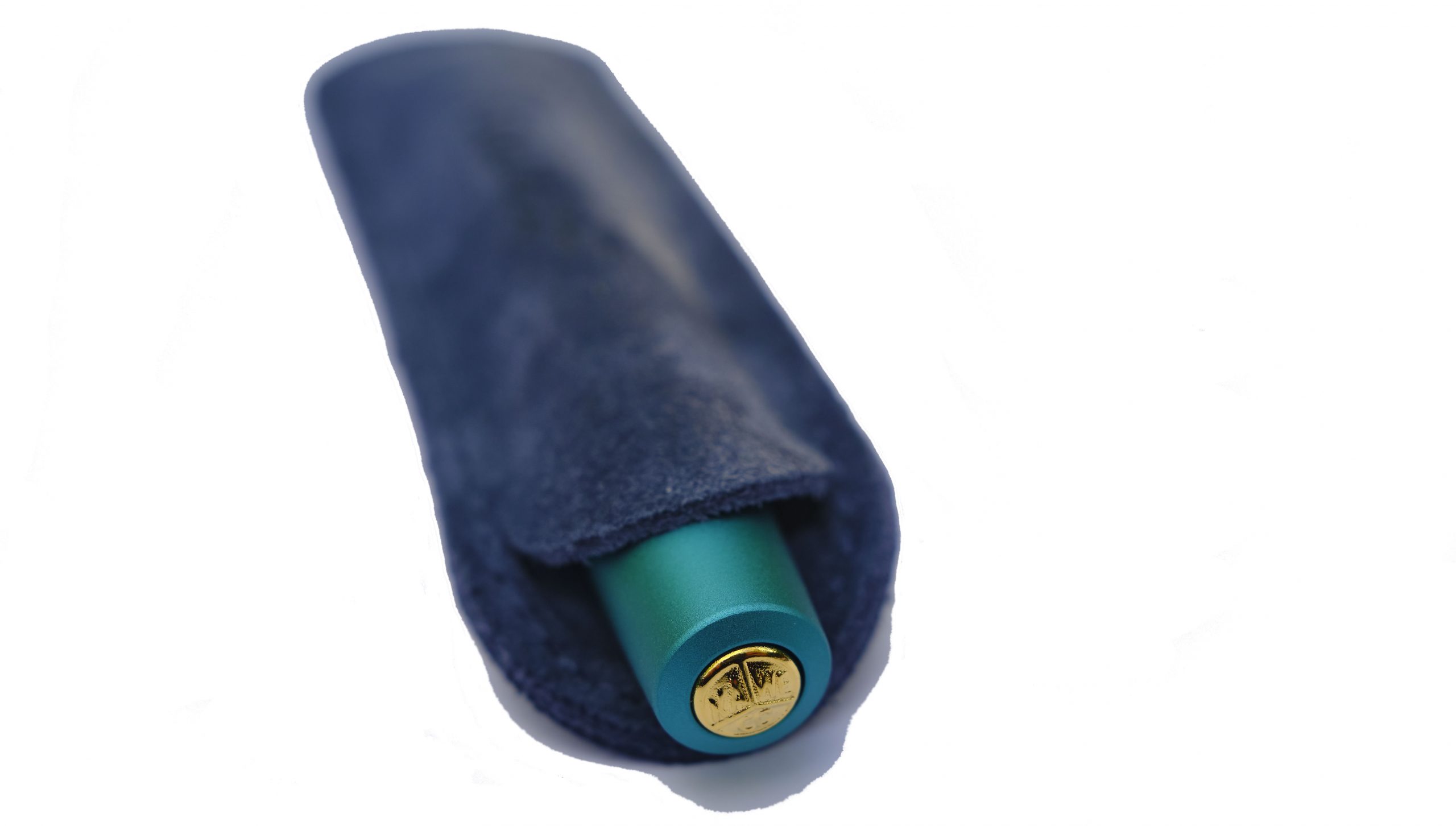
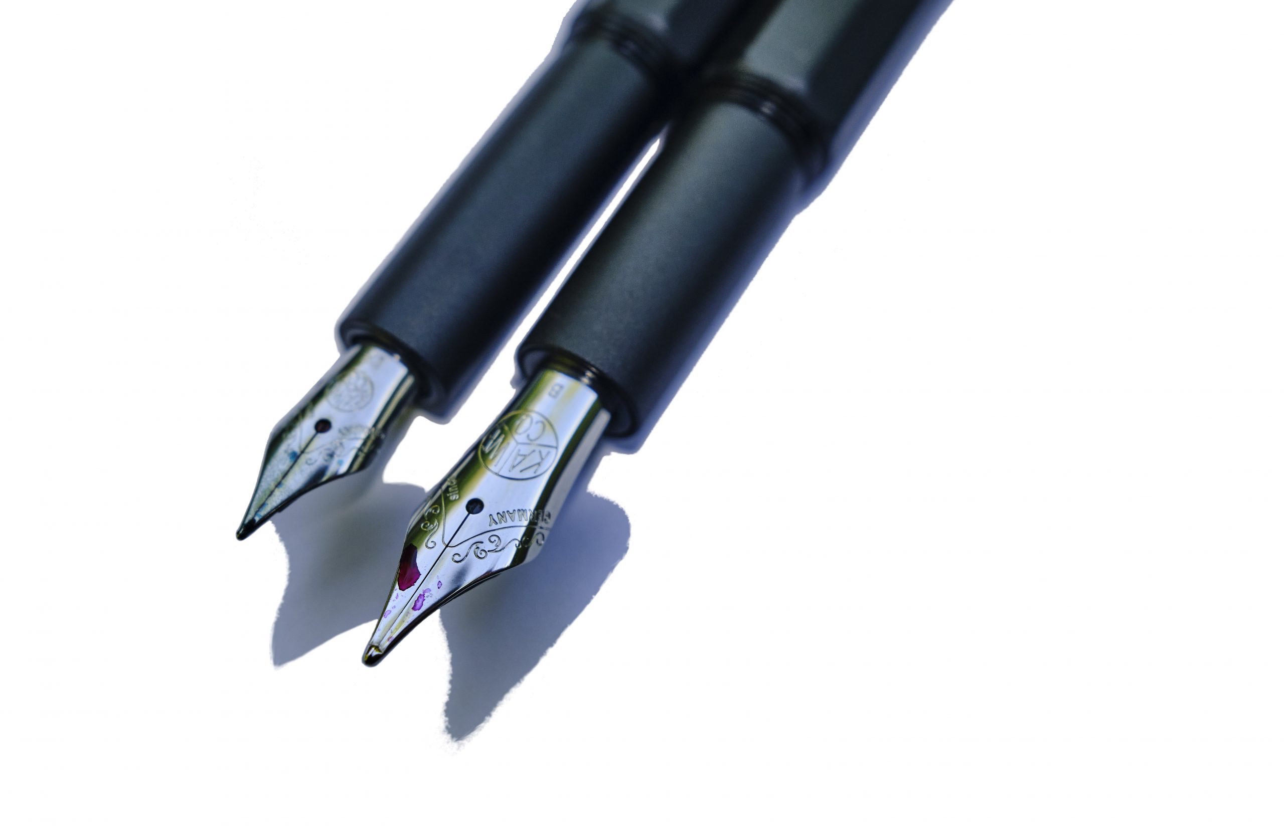
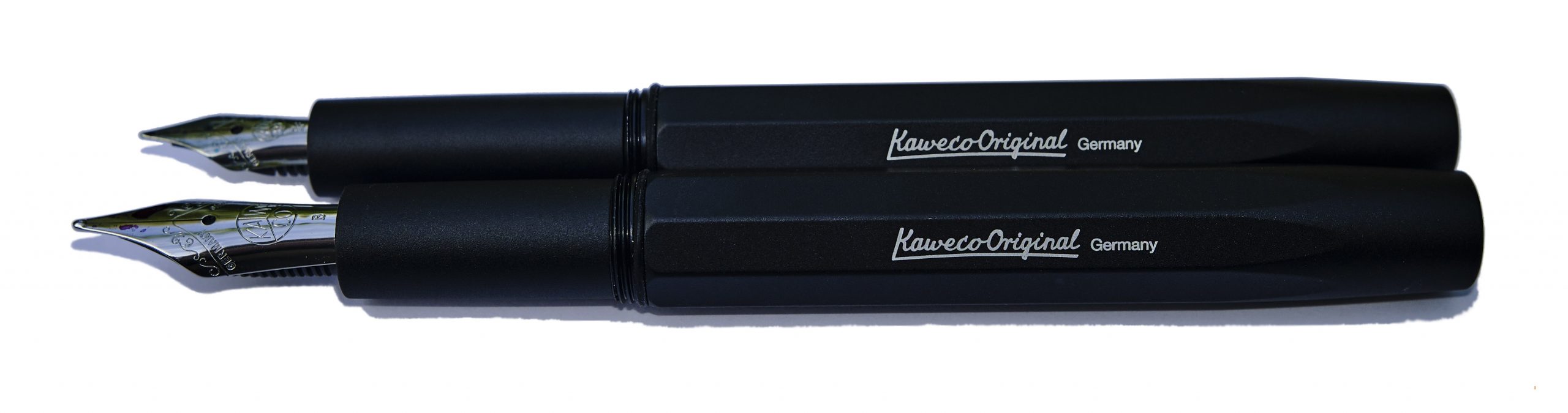 How it looks Actually, they came up with two Originals, with very different nib sizes. The smaller version uses the diminutive short #5 060 Bock nib familiar from the Sport and Lilliput models, which unfortunately looks a little stunted in a long pen like this. The larger Original, though, uses a nice big #6 250 nib which looks in proper proportion – a bit like a scaled-up Sport, keeping the distinctive octagonal profile which is something of a Kaweco calling card.
 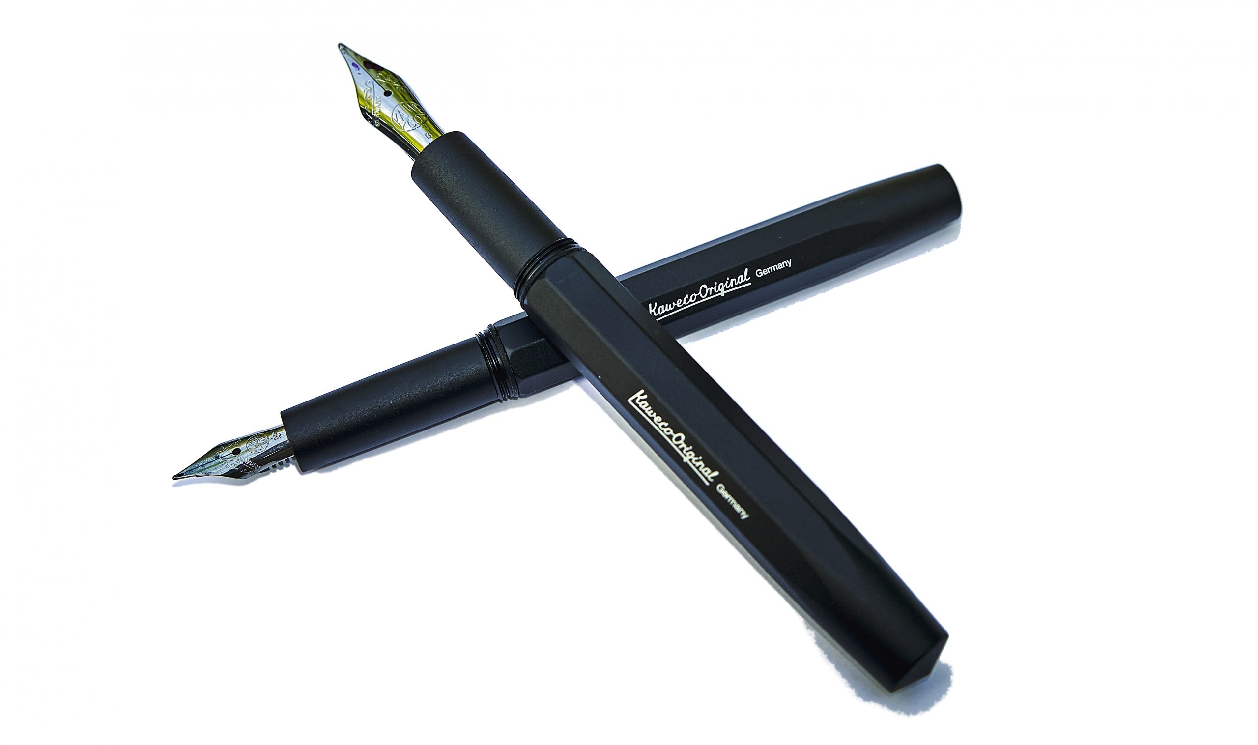 How it feels Both Originals feel solid yet, thanks to aluminium construction, not terribly heavy. On the whole, robust but usable.
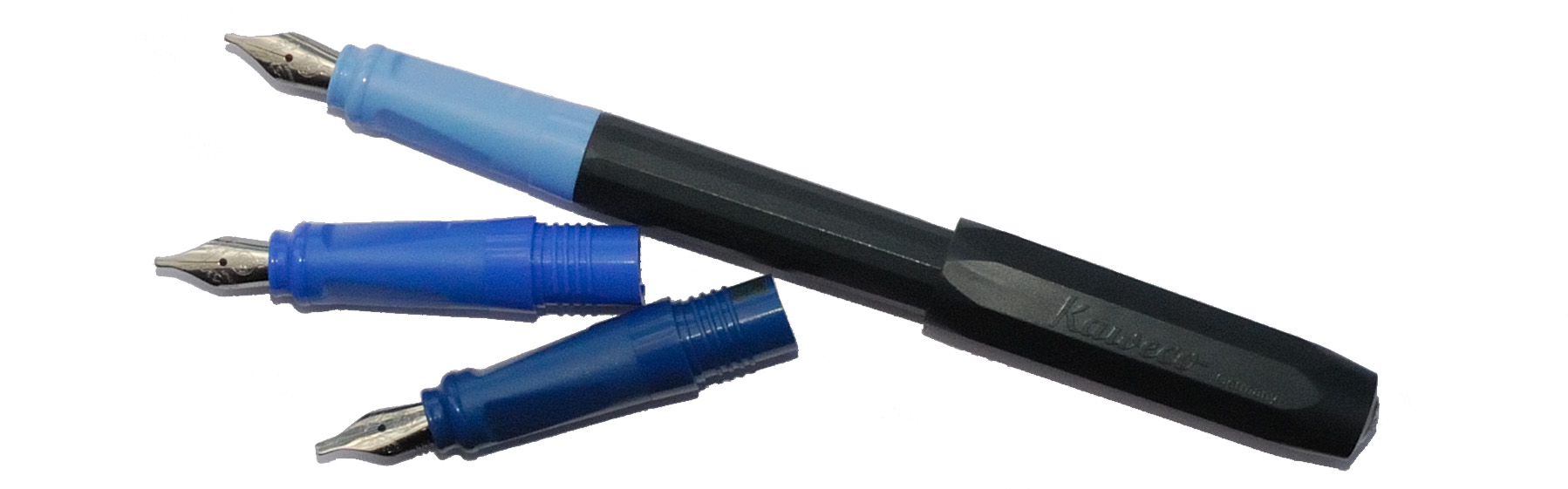
  How it fills An obvious advantage over the Sport is that the Originals have room for a full-size converter, and Kaweco have maximised that gain by threading the inside collar of the section to allow for a screw-in converter, helpfully also available from Kaweco in a range of colours. For reasons which remain a mystery, we chose purple for our test units, but retailers might be well advised to provide a converter as standard; it’s a much more ‘premium’ experience filling up with ink from a proper bottle, and being able to prime a feed with a quick twist of the converter can help when inks prove to be a little on the dry side.
 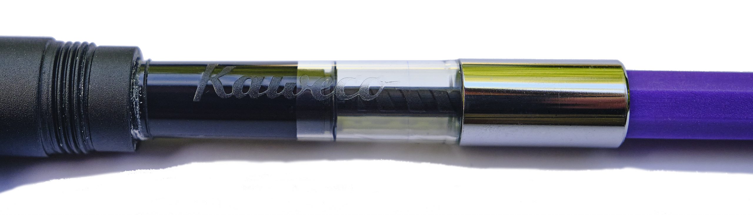 Crucially, how it writes… As ever that depends upon the nib fitted and the ink too, but we had a varied experience with our test units. The tiny 060 had an EF nib which struggled to lay enough ink down really, but as we’d probably elect to upgrade to a more fitting Bock 076 (sadly not yet available in Kaweco branding) anyway, perhaps that’s not the end of the world. The larger 250 had a B tip which surprised several of our reviewers with how well it performed as a ‘daily driver’, so that looks like the winner.
 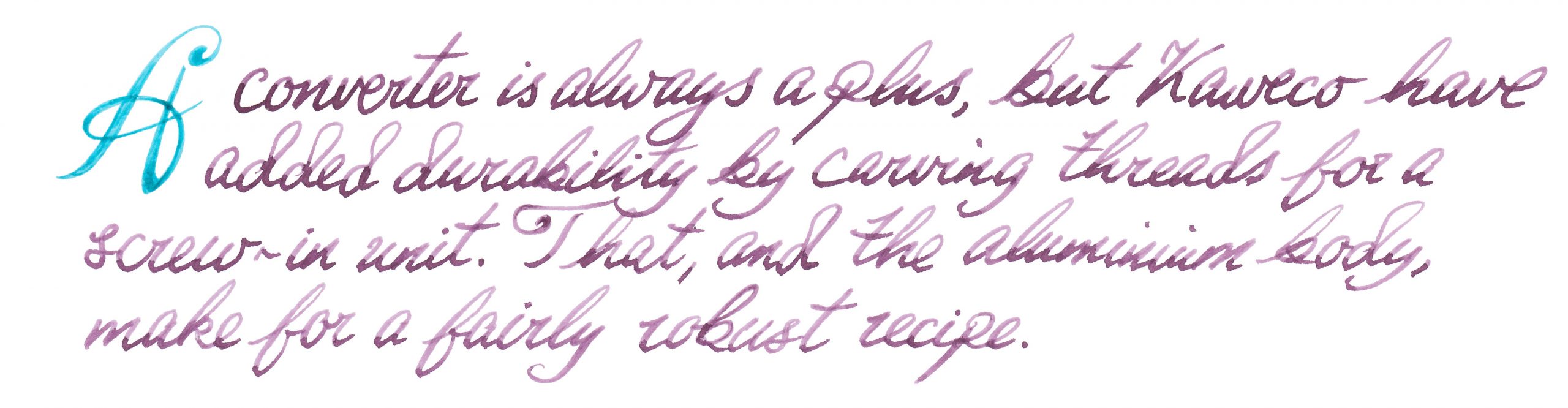 Pen! What is it good for? These might be a bit pricy for a school pen, but they are robust enough to serve as a daily driver for a more grown-up writer.
 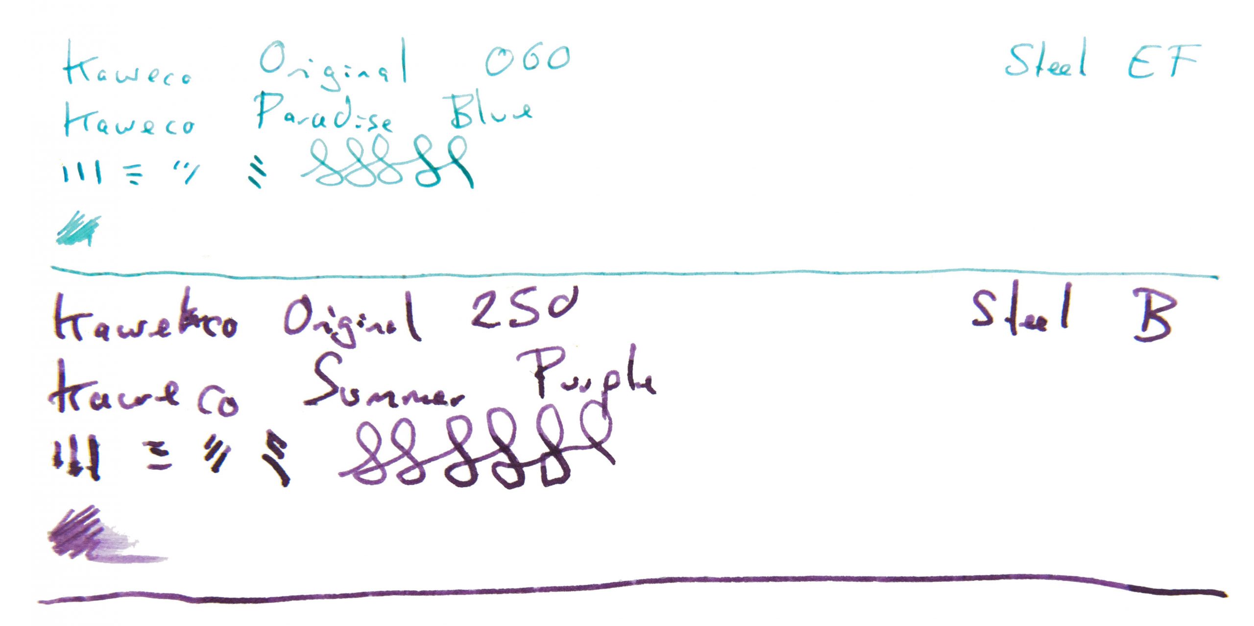 VFM At a ‘street price’ close to £100 for the #6 version these are not cheap, to be honest, so our tip would be to buy from a bricks-and-mortar shop where you can try a number of nibs and get the one which really works for you. It needs to be usable to be worth the money, at this price point.
 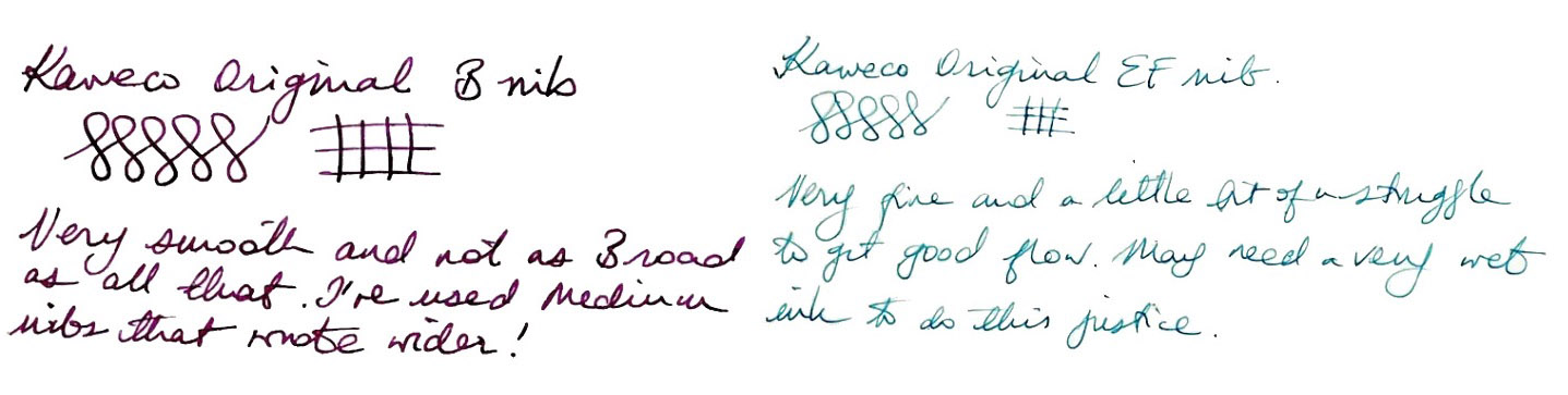 The only way is ethics Made in the EU, and packaged sensibly, there’s little to worry about on this front.
 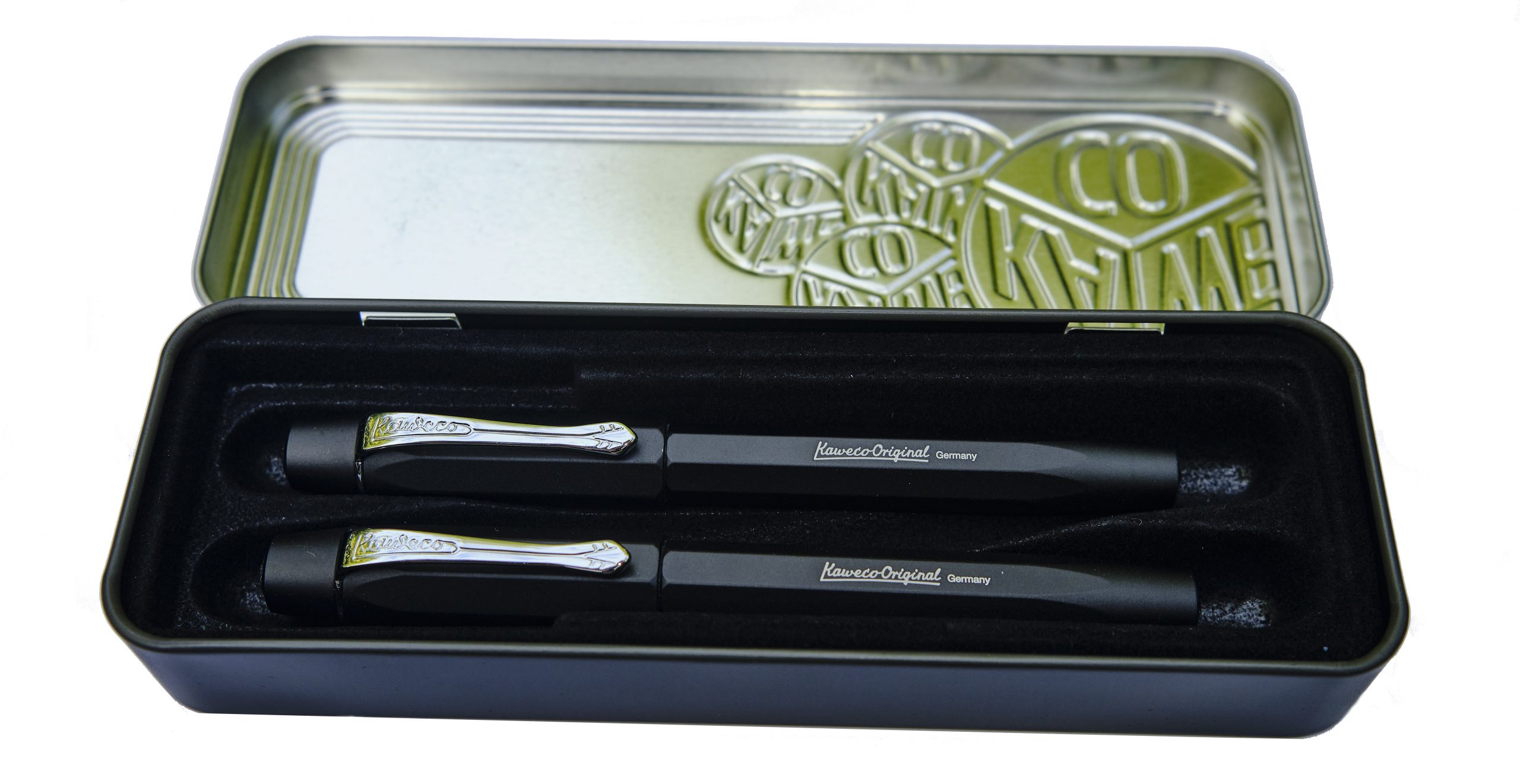 If this isn’t quite your cup of tea, but almost… If the 060 nib just looks a bit short, fitting an after-market 076 will probably help. If you like the 250 version but for some reason just don’t dig a polygonal cross-section, Kaweco’s smoothly cylindrical Supra may be more your thing.
 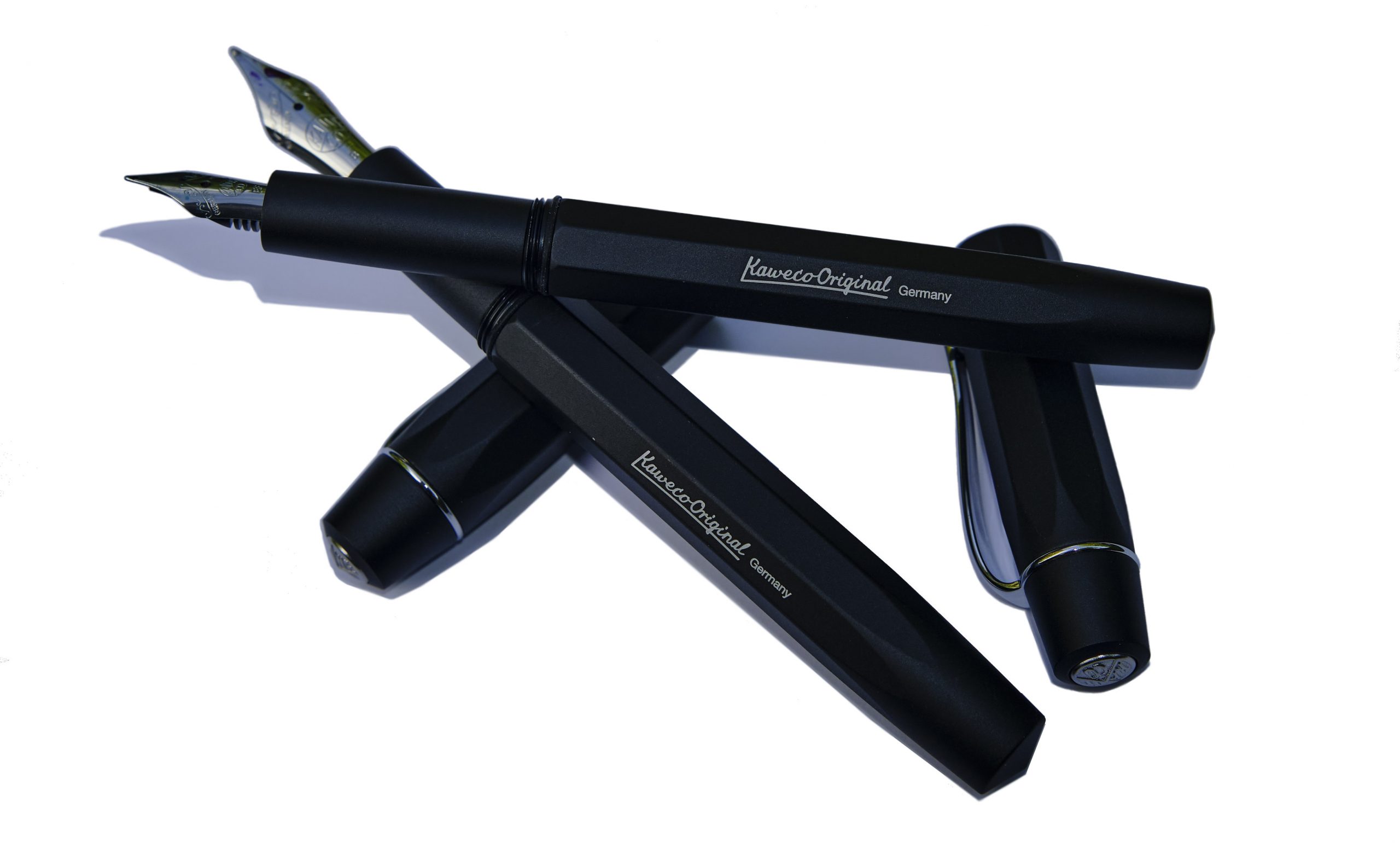 Our overall recommendation For people who enjoy brief scribbles with a Sport but want something similar but a bit larger for extended writing sessions – and that might be rather a lot of us – one of the Originals could well be the answer. But given that the right nib makes a big difference, we’d recommend trying them out in the flesh first.
 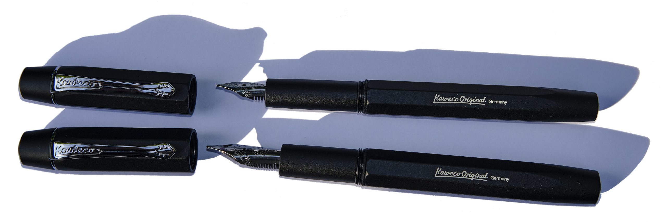 Where to get hold of one It’s a fairly new model at present but most fountain pen shops are likely to consider this soon. Buying in person looks less hassle than online purchasing given the possibility of a bit of nibular trial-and-error.
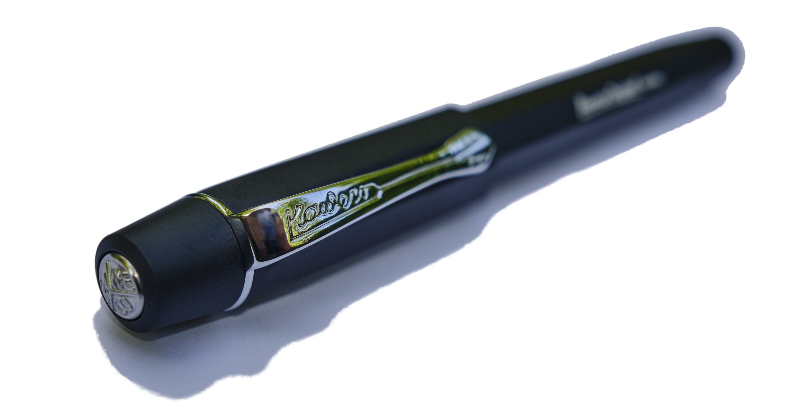
 Thanks to Kaweco for the review samples.
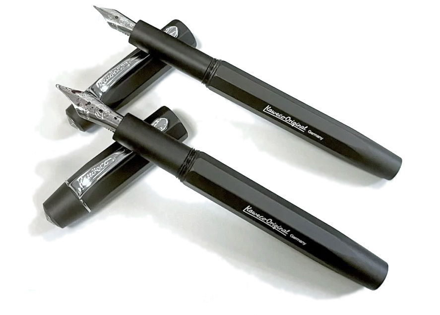
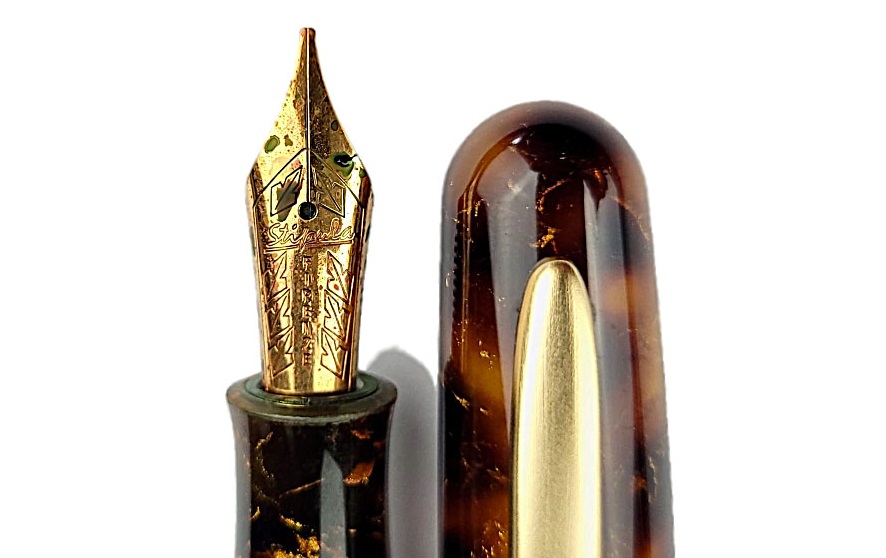
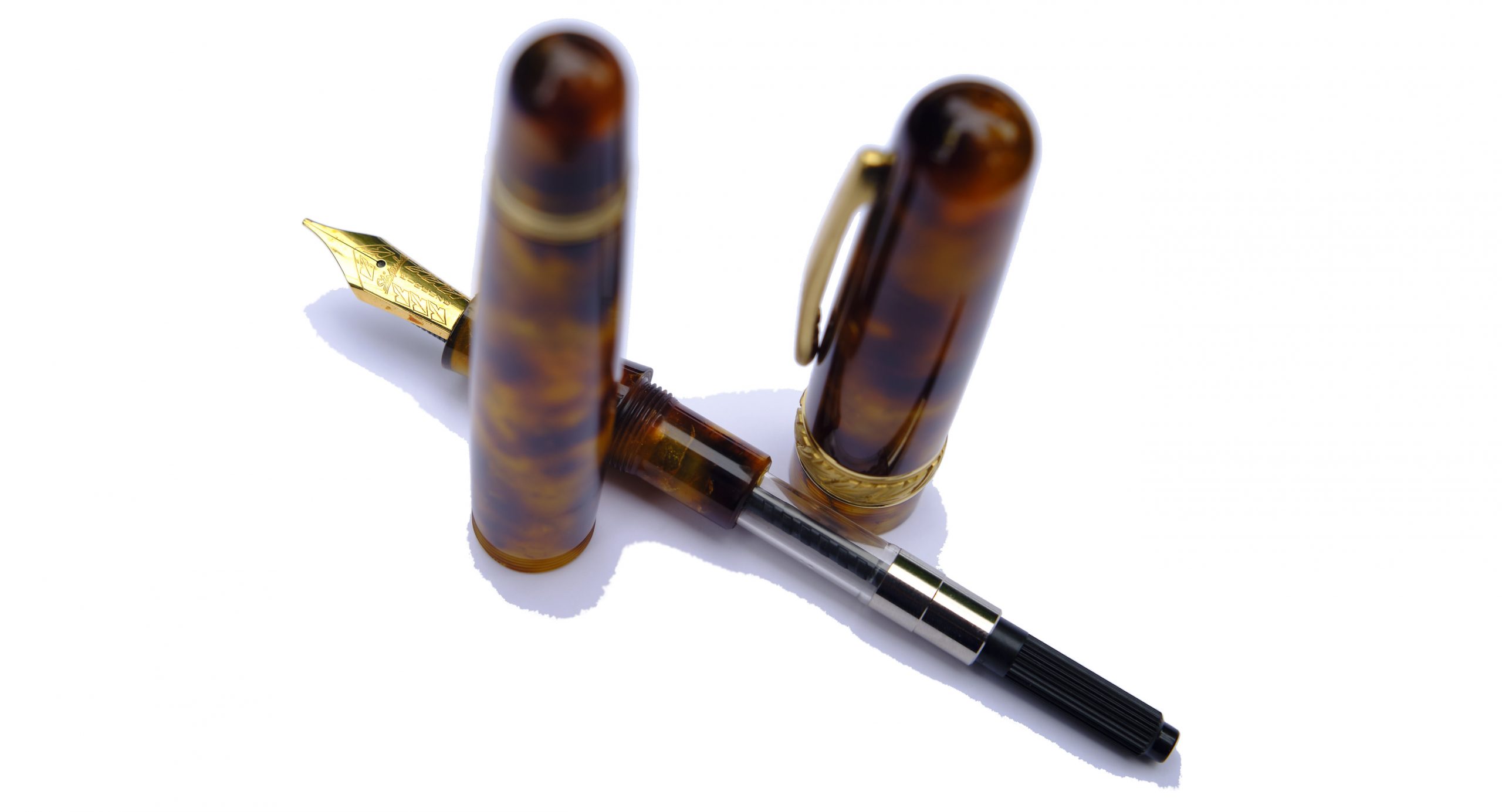
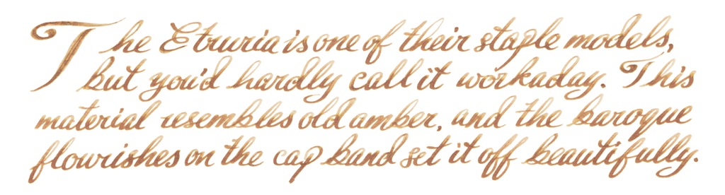
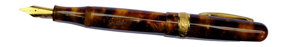
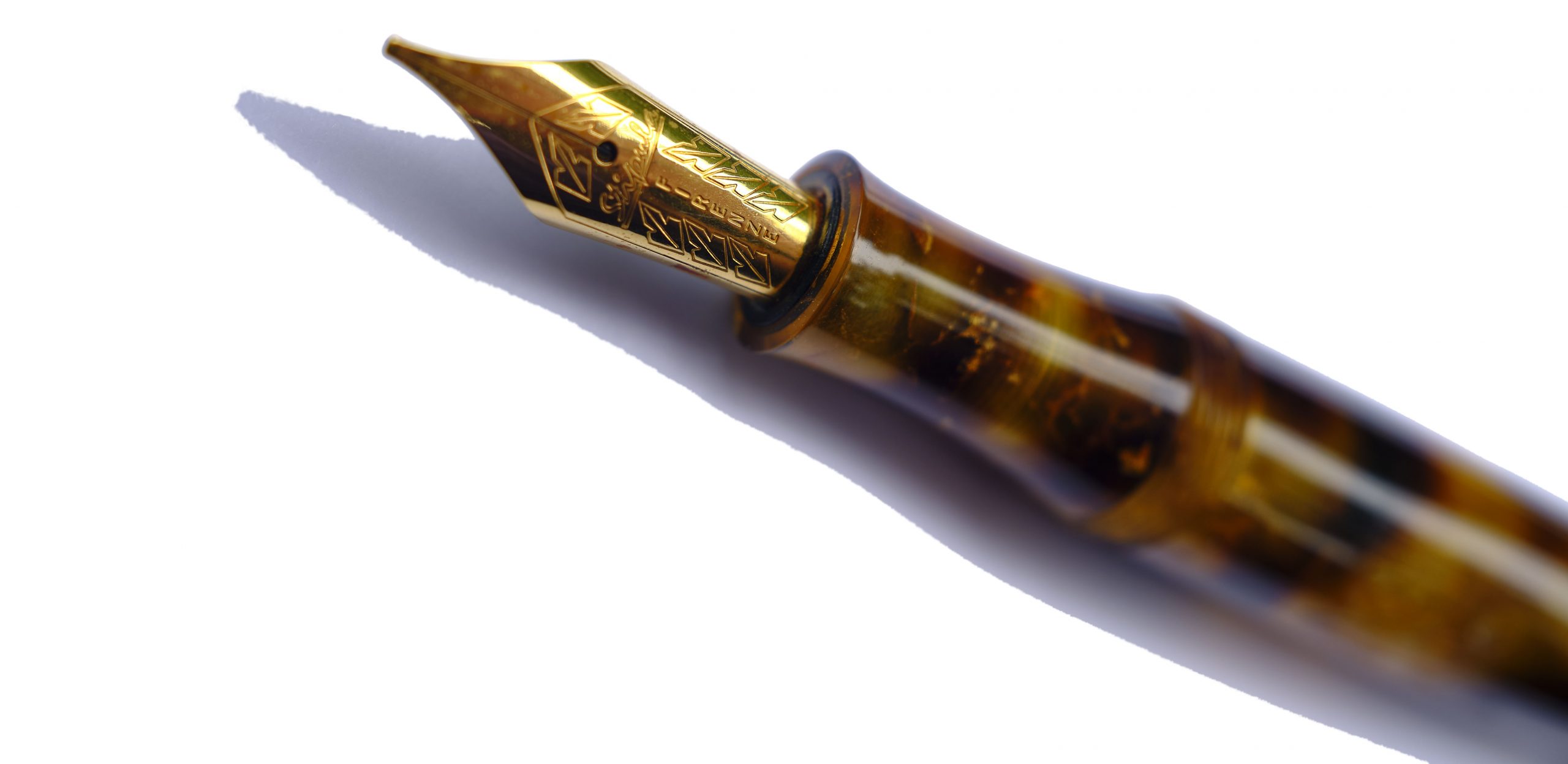
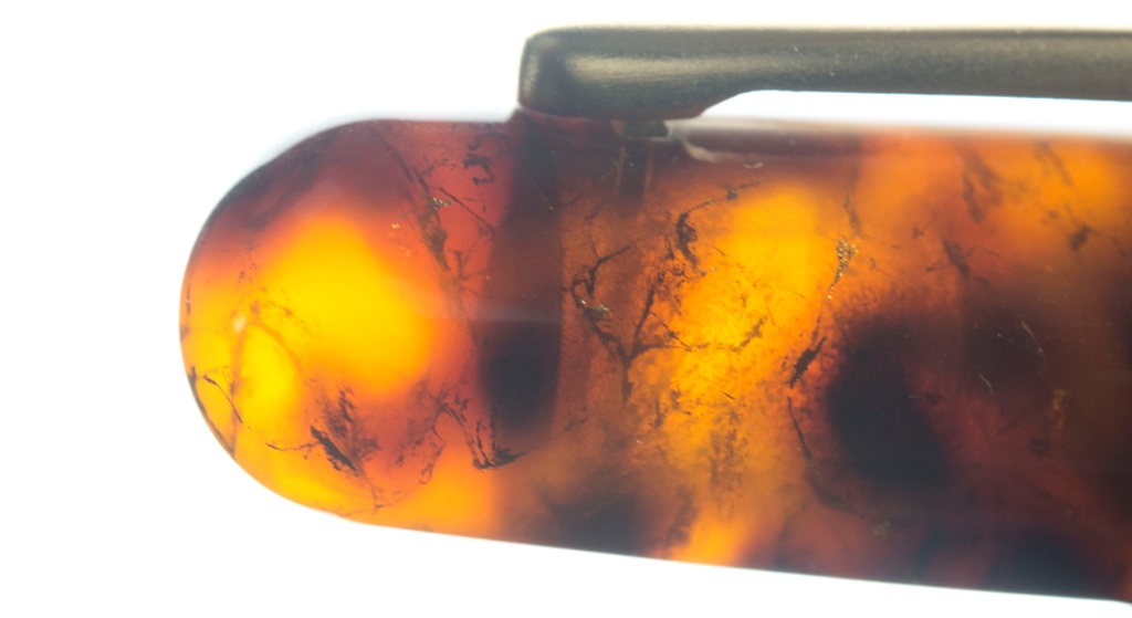
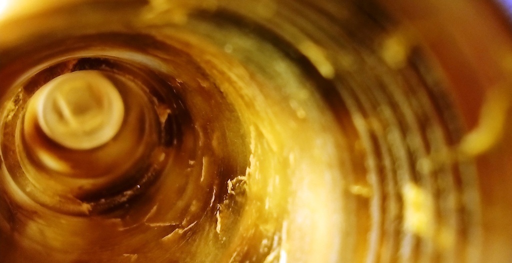
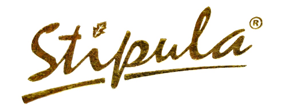
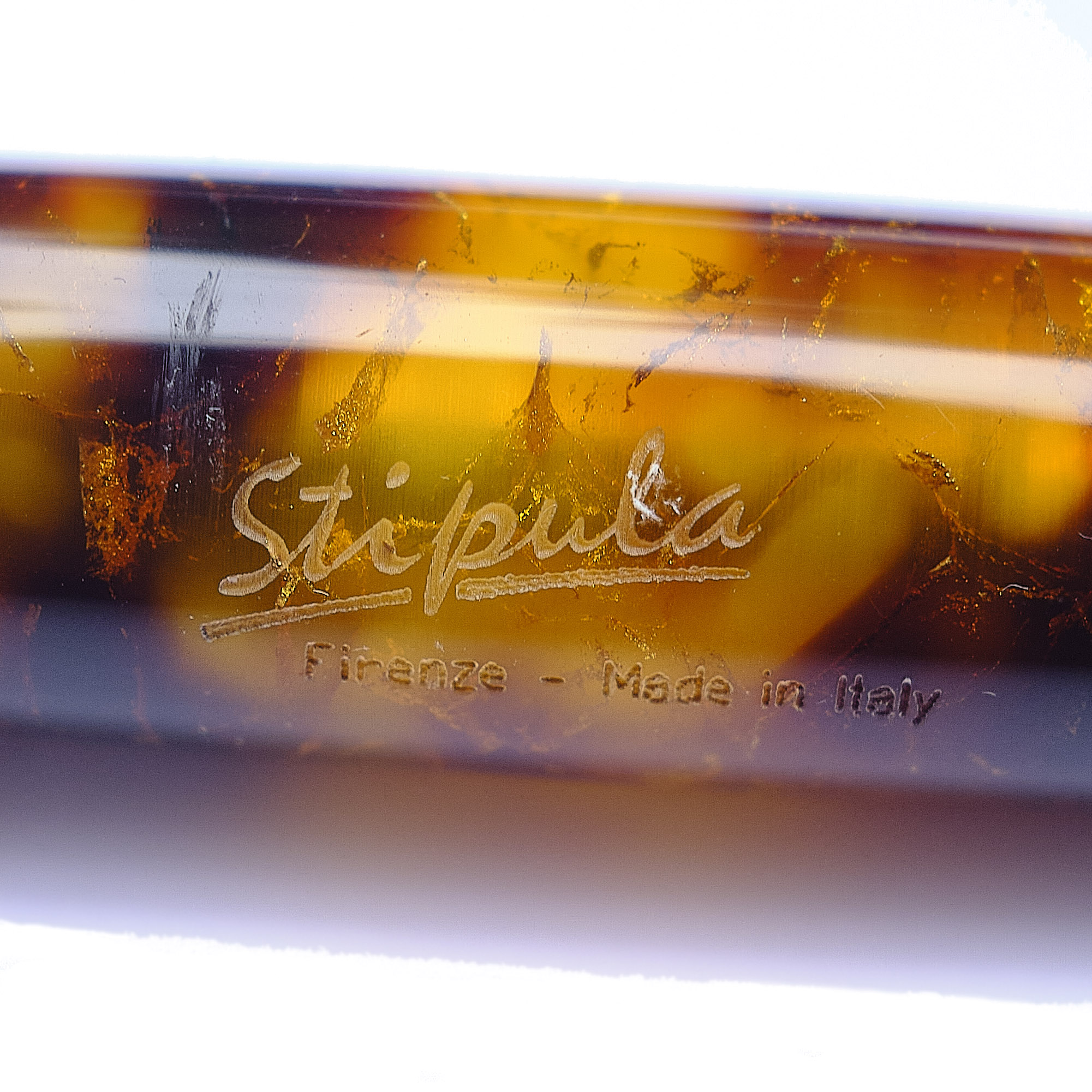 A little bit of history Classics fans know that Latin pops up everywhere, and perhaps even more appropriately so when the brand in question is Italian. Stipulae originally sprung from the same root as ‘stubble’, perhaps denoting thin reeds for writing or perhaps, as Mick suggests, the custom of breaking a twig to indicate consent to all the terms of a contract – the stipulations. The third Renaissance was in love with all those retro references, and nowhere more so than Florence, home to this day to a fountain pen brand called Stipula. But its output is hardly ever seen in Blighty; so we wanted to find what such a pen was like in the flesh.
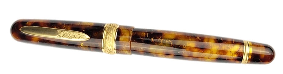
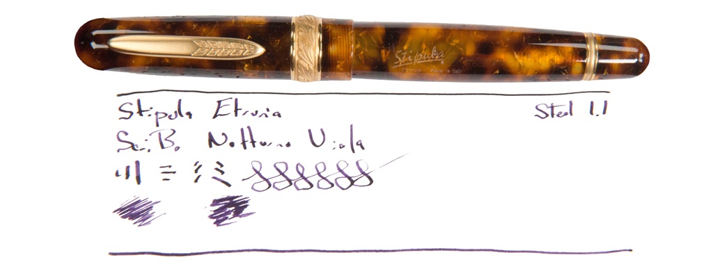
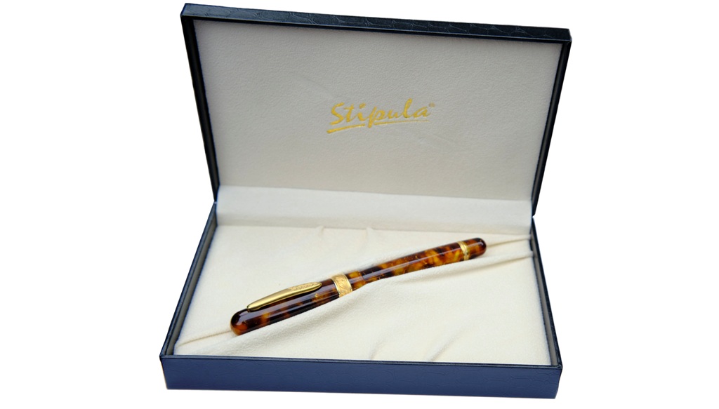
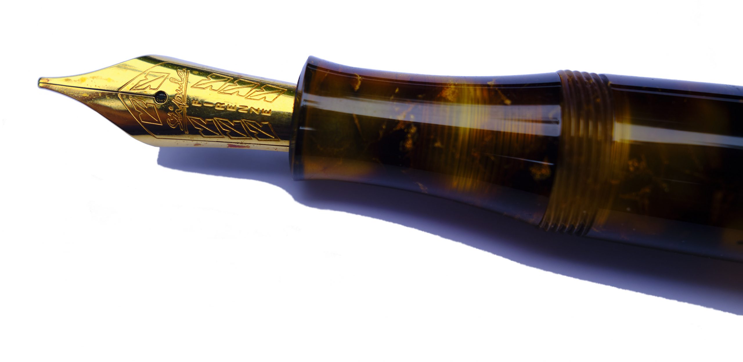 How it feels Girthy but nicely balanced; unless you have a very strong preference for slender pens, this should do you just fine.
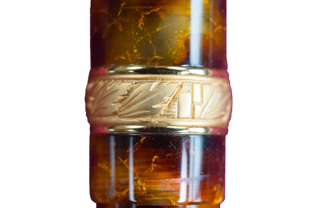
 This meta-review references:
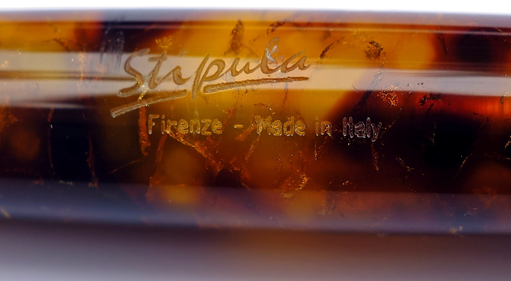
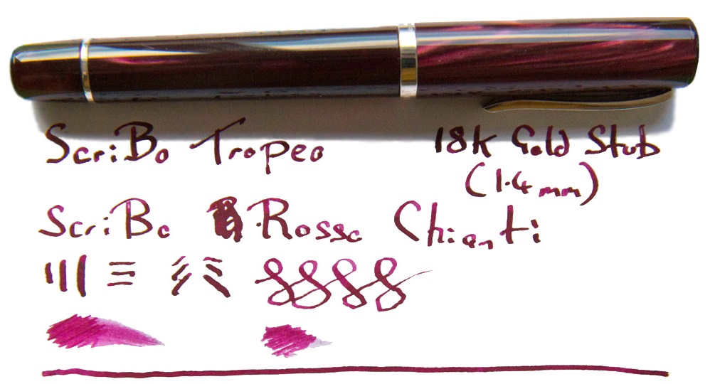
 Thanks to Write Here for sending the Tropea our way.
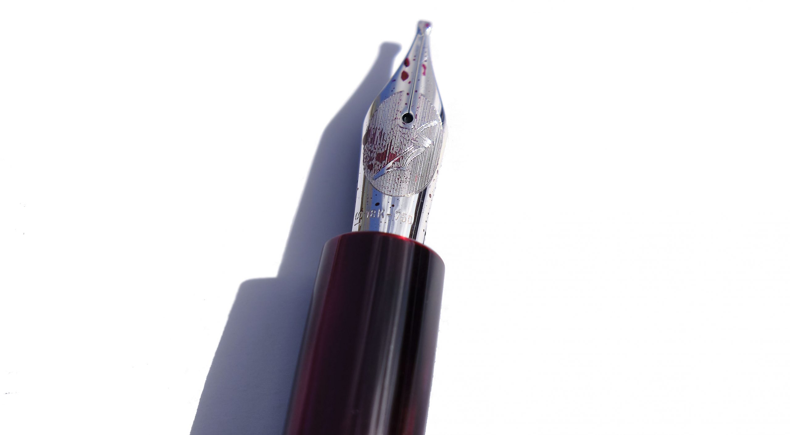
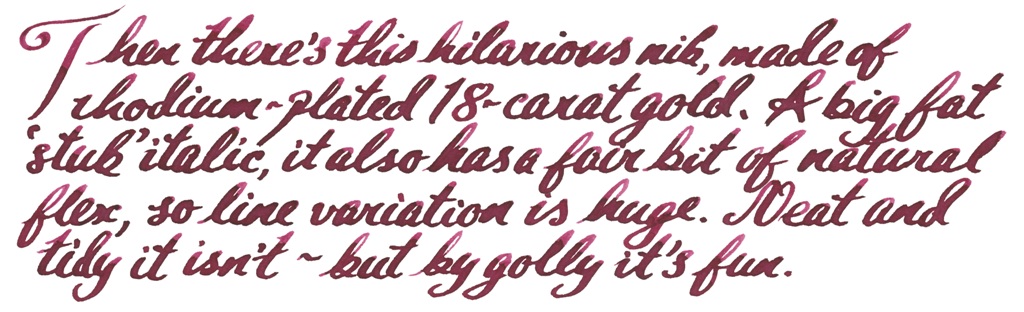
 Quite a mountain of history, actually Back in the 1970s, steady-state Luddites fought against two intellectual movements and lost twice, first to the constant expansion of the universe and then, down here on Earth, to plate tectonics. But our story starts about half a million years ago when the slow-motion collision of the African and Eurasian plates caused the growth and repeated eruptions of a stratovolcano known to successive civilisations as Etna. It’s held a place in myth and legend ever since, including as the prison of the monstrous Typhon, and as the source of much of Sicily’s soil has been ruled over by Greeks, Carthaginians, Romans, the offspring of King Rollo (no, really) and, for a brief but toothsome interval, a revolutionary squashed-fly biscuit. Etna also chucks out plenty of lava, of course, and Visconti gamely set out to make something of it.
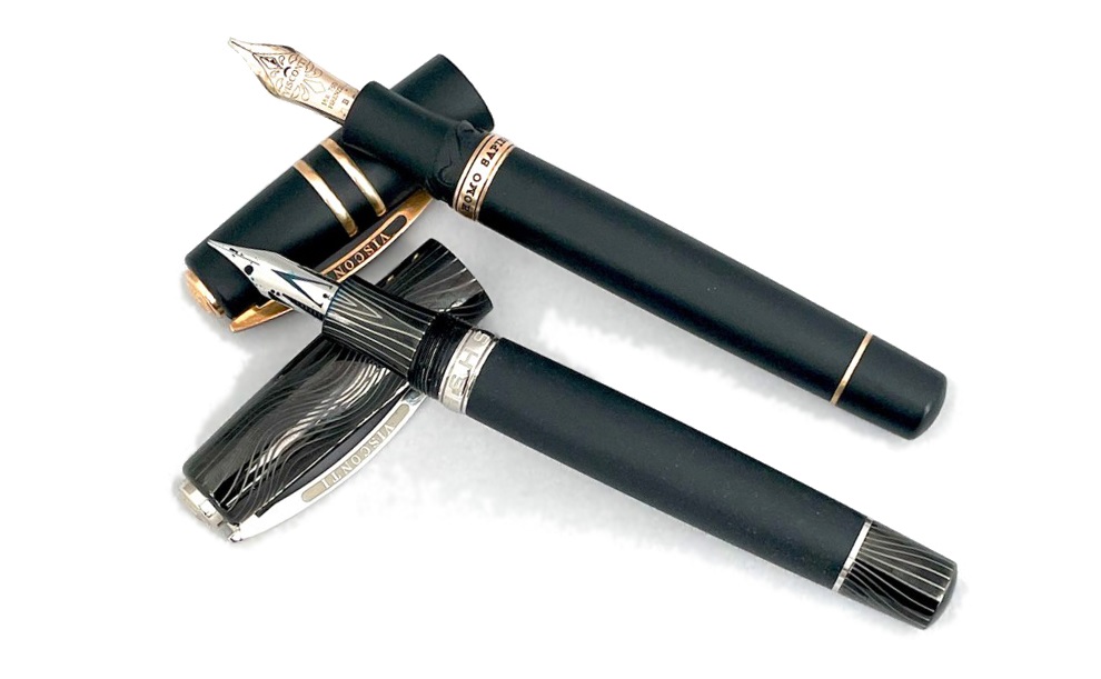
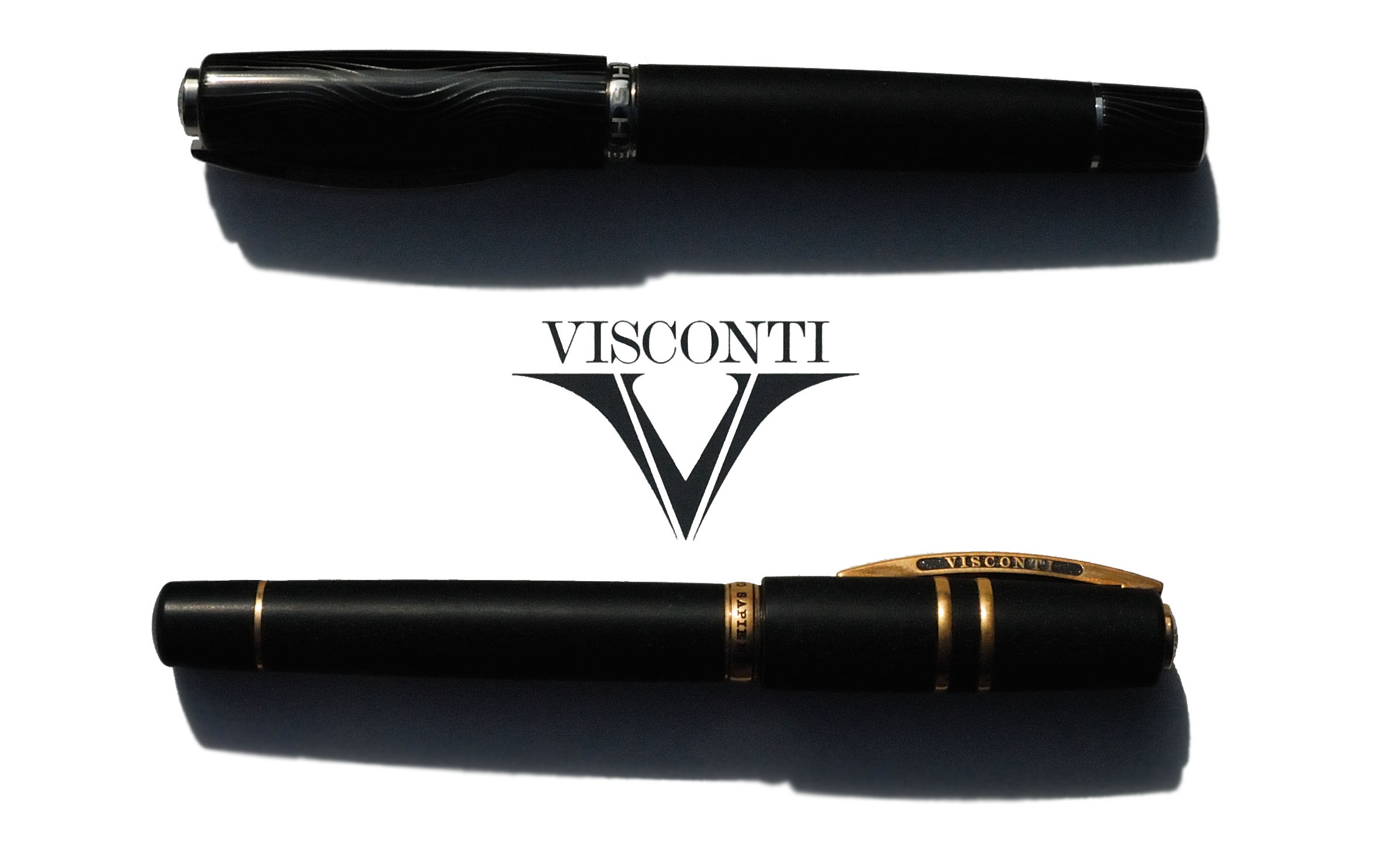
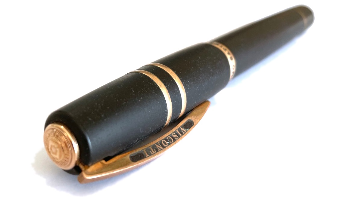
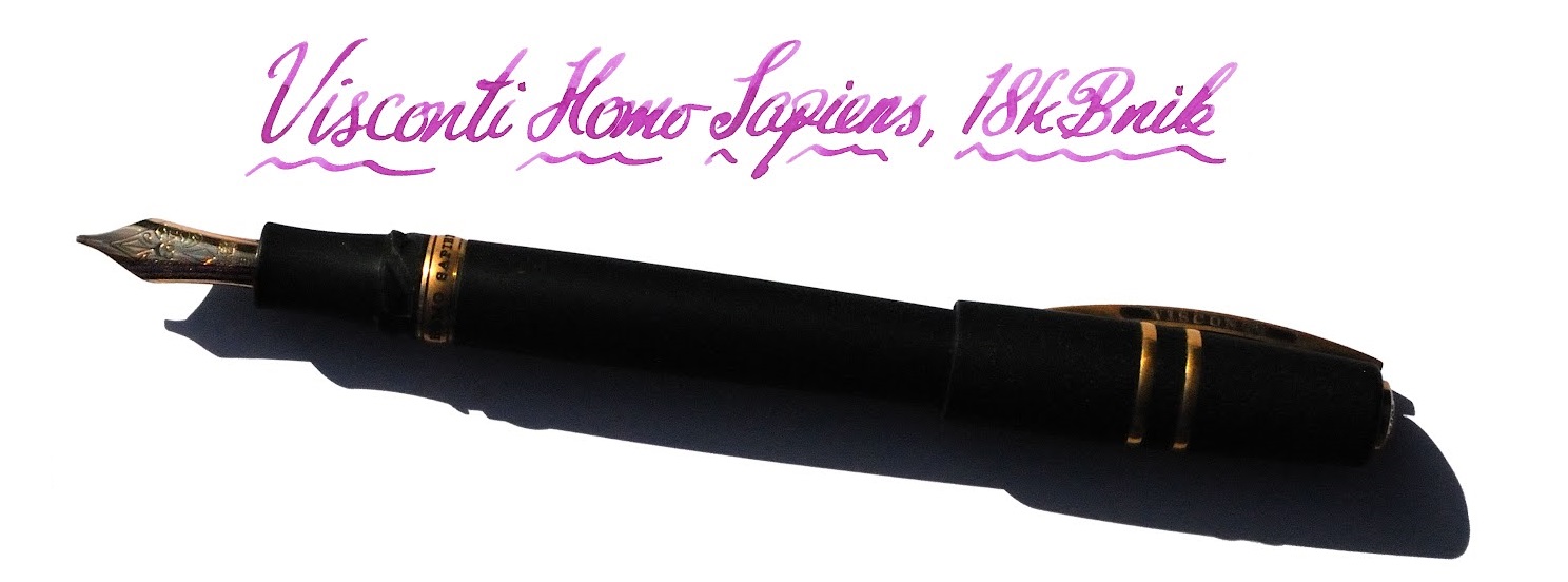
 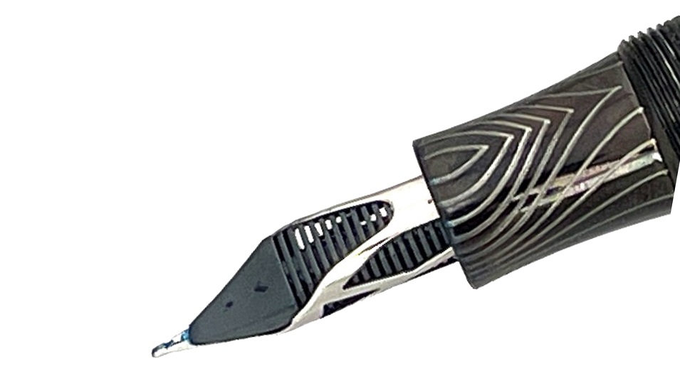 How it looks The classic Homo Sapiens look is a black basaltic tube with a few metal rings and the signature Visconti bowed clip. If it’s under-stated in its usual dress it can be a lot more exotic as a special edition, and we were lucky enough to get our hands on a curious ‘special’ indeed, the Evolution – which looks like a Klingon tool for signing instantly broken peace treaties.
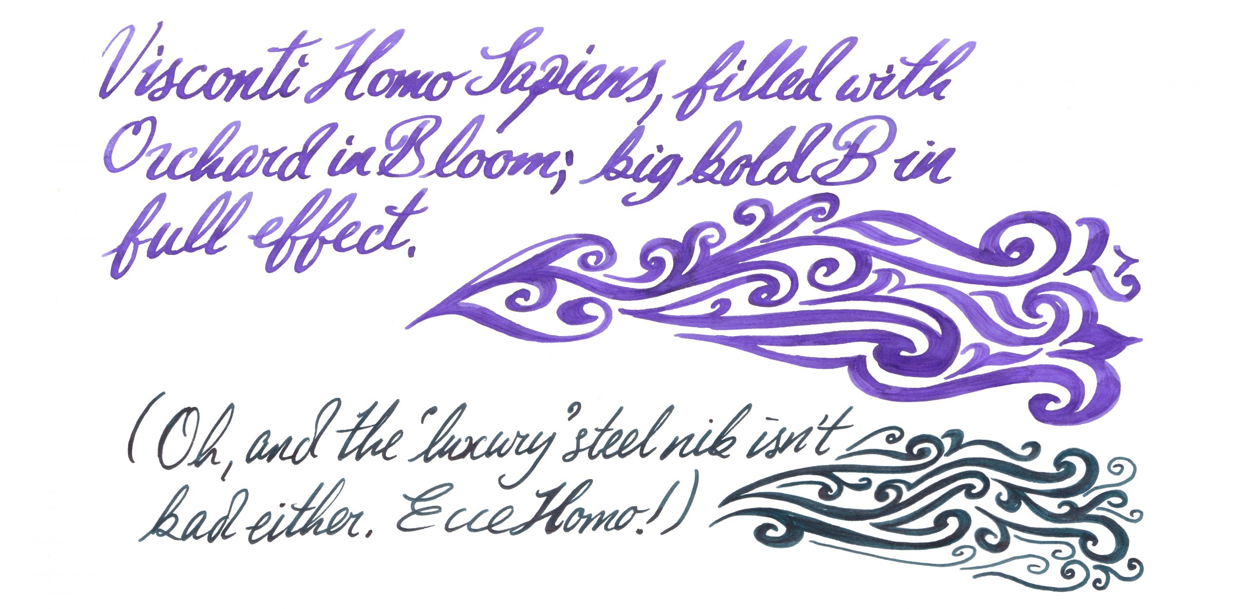
 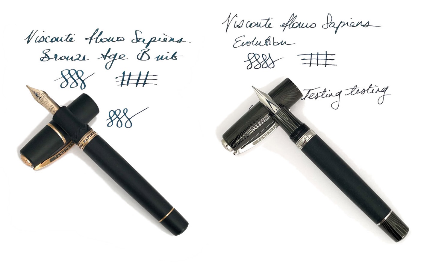 How it feels Sizeable, fairly hefty but not ridiculously heavy, for most of our reviewers. Most is not all, mind; at least one of our panel put the pen on the scales and declared it too weighty to live with. The clever bayonet closure (NB, not present on the Evolution) makes for a comfortable grip, though, and the weight is well-distributed. Visconti makes bold claims about the barrel material being hydroscopic, so that it still has a grip in sweaty hands, and although this is perhaps better tested in the summer it does seem to work quite well in practice.
  How it fills This is a vacuum-filler, and it sucks in a voluminous gulp of scribbling juice without much effort on the user’s part. There’s no way to use cartridges, of course, but if you’re in the market for a pen this pricey a bottle of decent ink is unlikely to exceed the budget.
 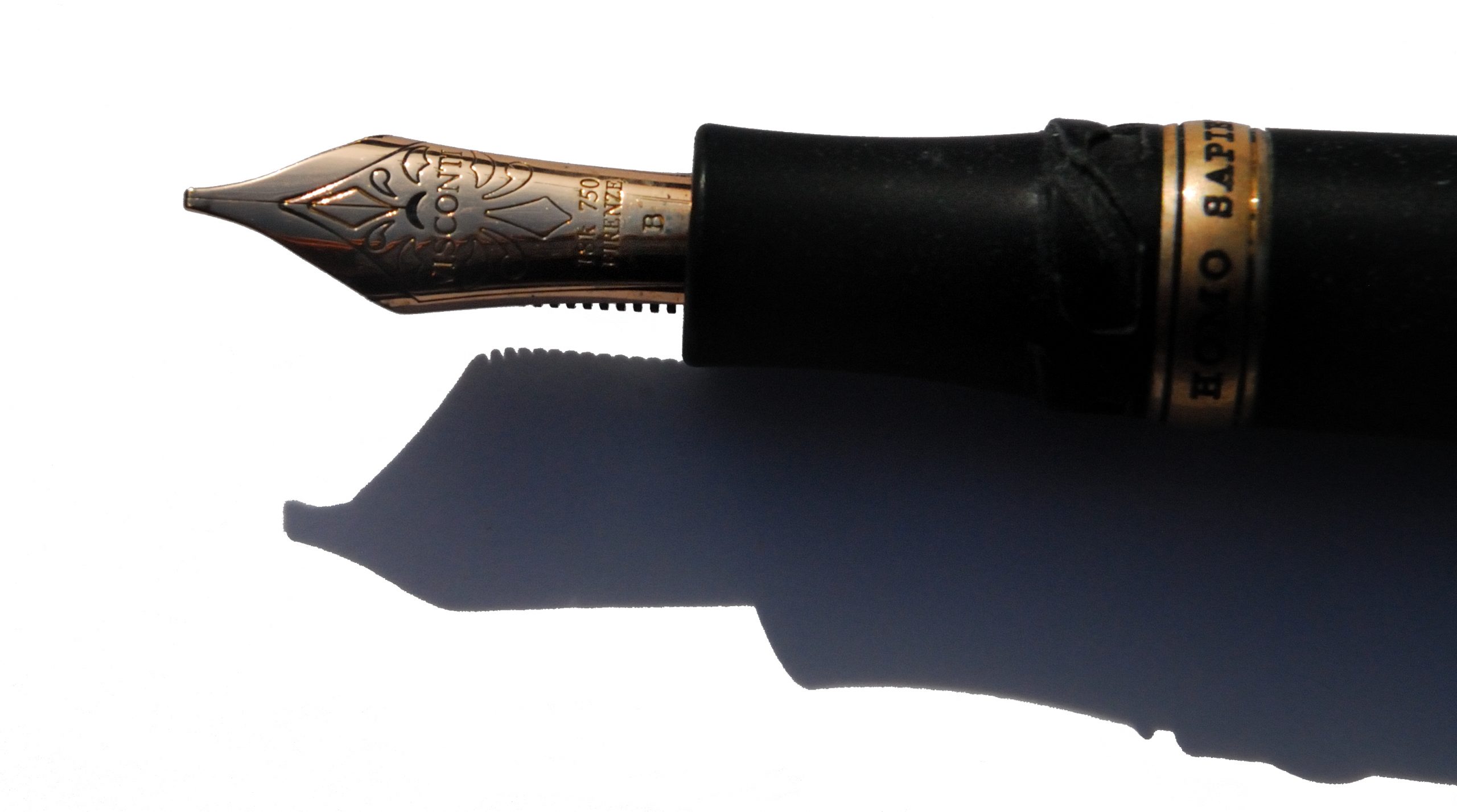 Crucially, how it writes… Now here hangs a tale. Originally, the Homo Sapiens employed palladium nibs which proved notoriously difficult to tune (and harder still to keep in trim). Our duo exemplifies recent alternatives; a usually well-behaved and slightly bouncy gold nib or, for the Evolution, a tubular steel nib which is firm but smooth. A pleasure on either count, although they are very different beasts. The gold nib on our test pen afforded some hard starts to a couple of reviewers, but not to the degree that made writing impossible – and as it flowed adequately for others ink choice may be a critical factor there. Another vital Homo Sapiens tip, which we wish Visconti would tell people directly, is to undo the blind cap a couple of turns before staring to write; this seems to reduce the risk of drying-up considerably.
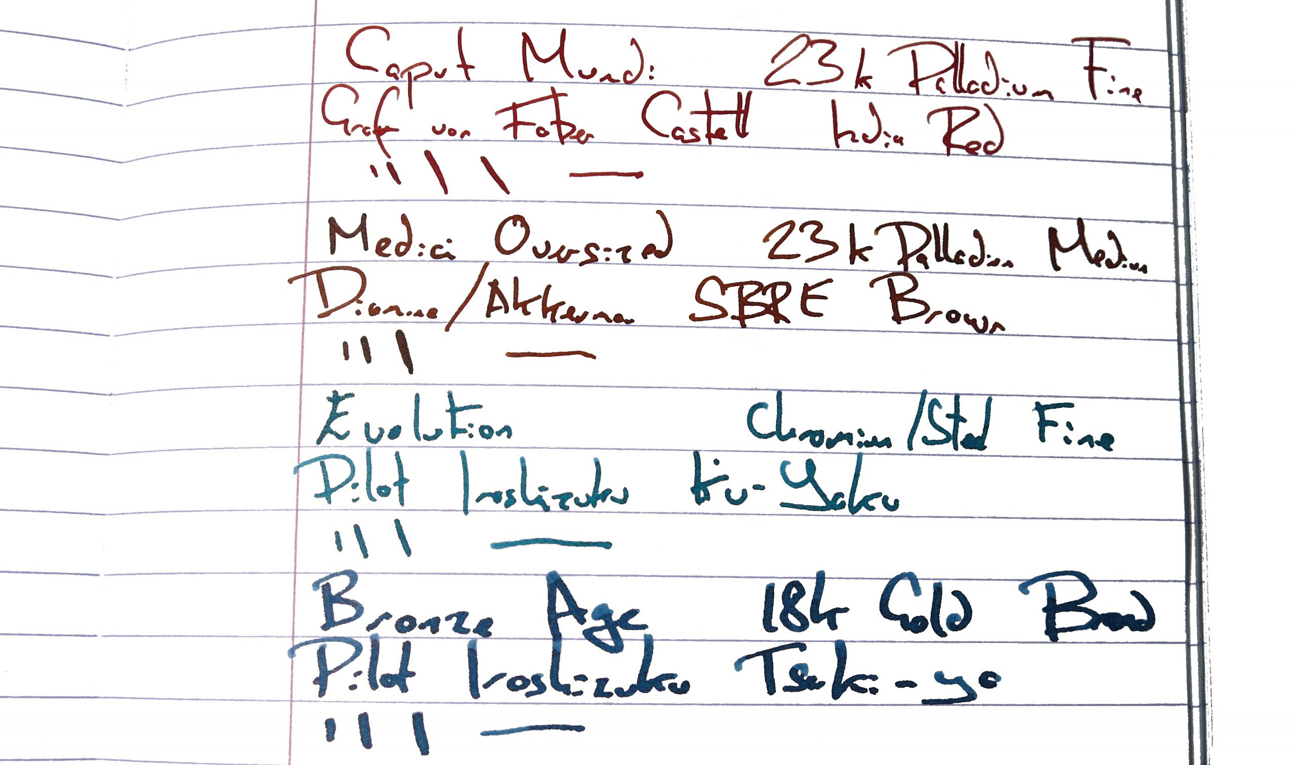
 VFM These are very good pens, no doubt, but compared to other premium Italian offerings the value proposition is sometimes perhaps a little dicey. The Evolution tipped over into four figures, and that’s hard to justify for a steel-nibbed pen, however artistically assembled. Choose with care.
 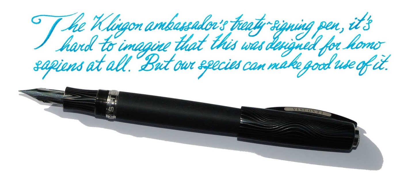 The only way is ethics These are made in Italy and (unless someone gets a really harsh cut of the fee) no-one’s being under-remunerated at this price. If you can afford one, enjoy it with a clear conscience!
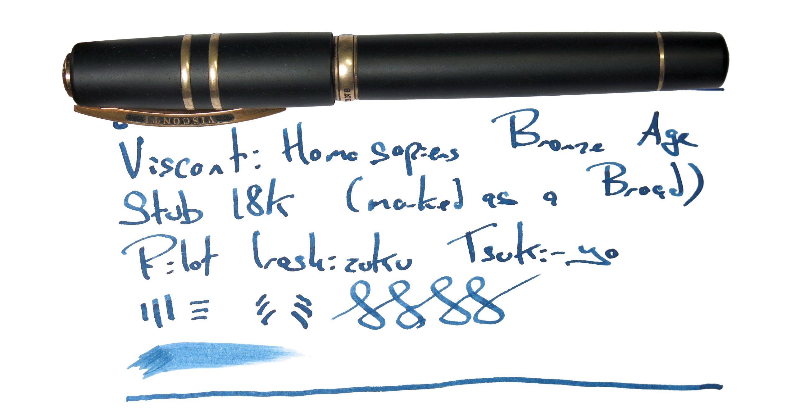 If this isn’t quite your cup of tea, but almost… There are new special editions of the Homo Sapiens out most years. Bide your time, save up, and pounce as soon as you see one you like. Or, if you want a posh pen from a different part of Italy, Scribo and Pineider may have a competing claim upon your attention.
 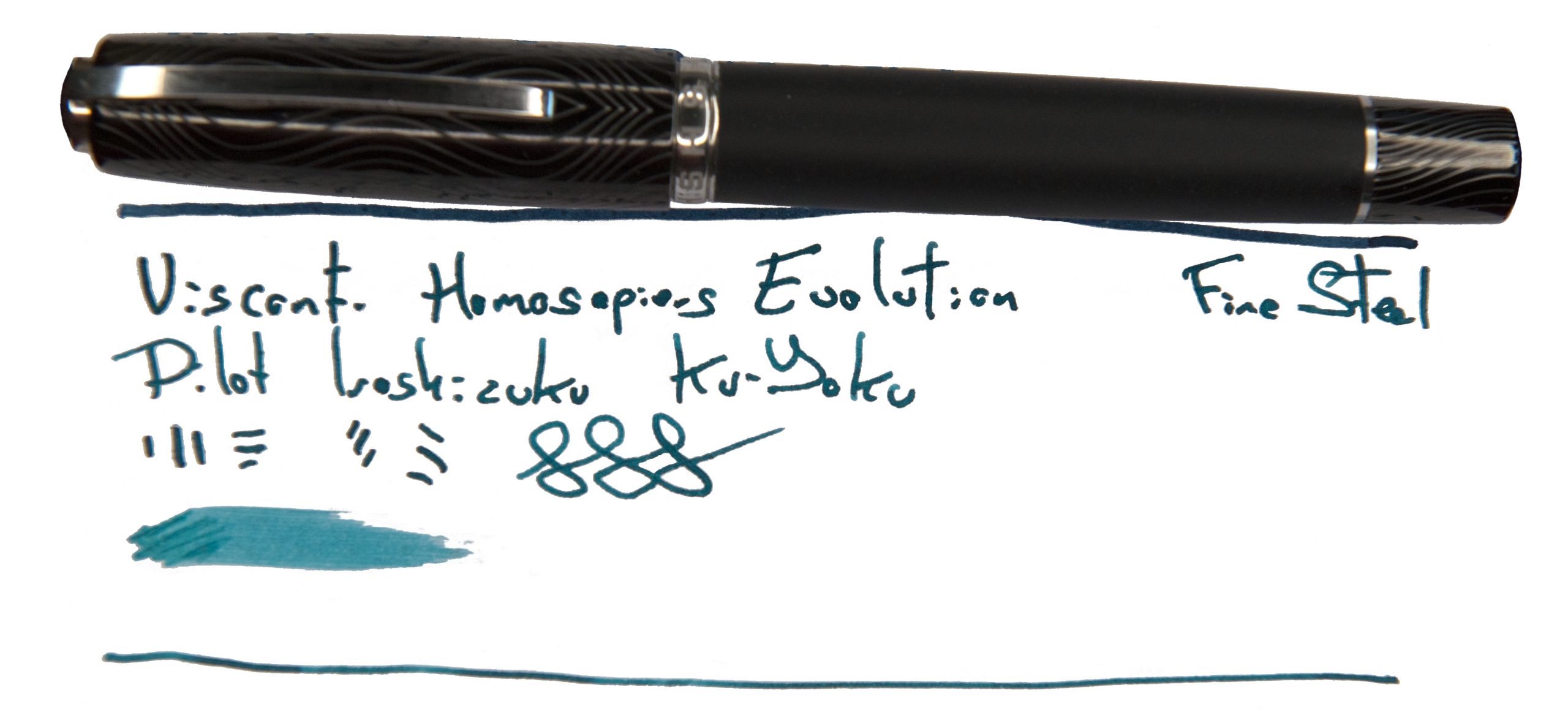 Our overall recommendation Try one in the hand, if you can – but if you love it, that’s your pocket money spent for a while!
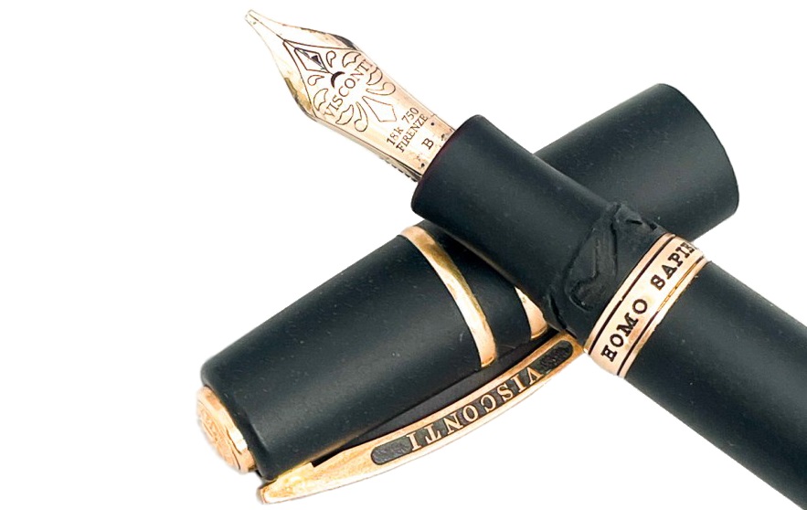
 This meta-review references:
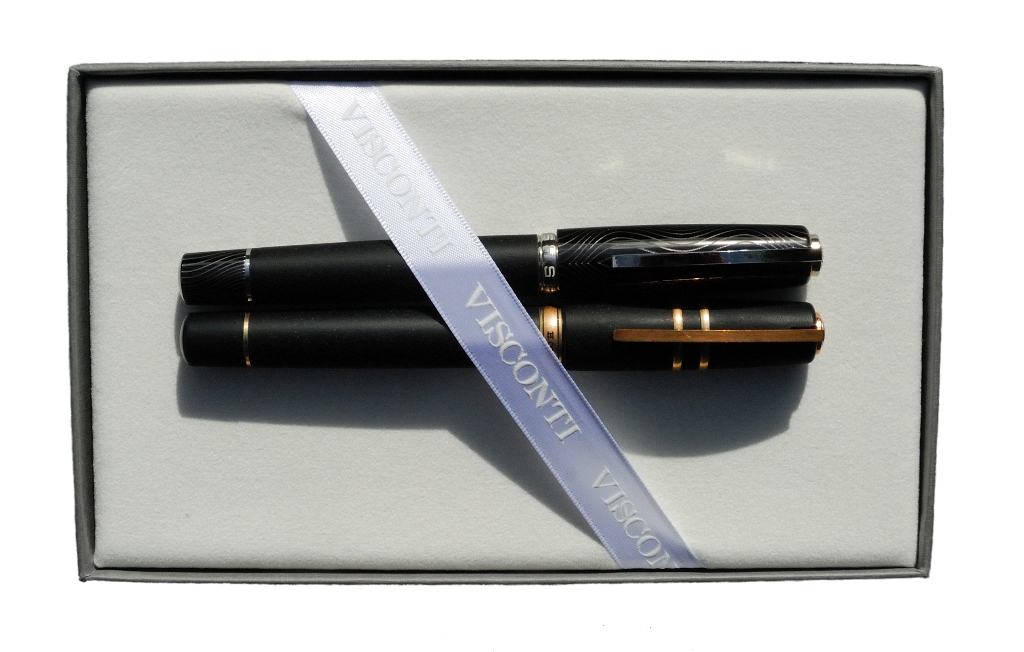

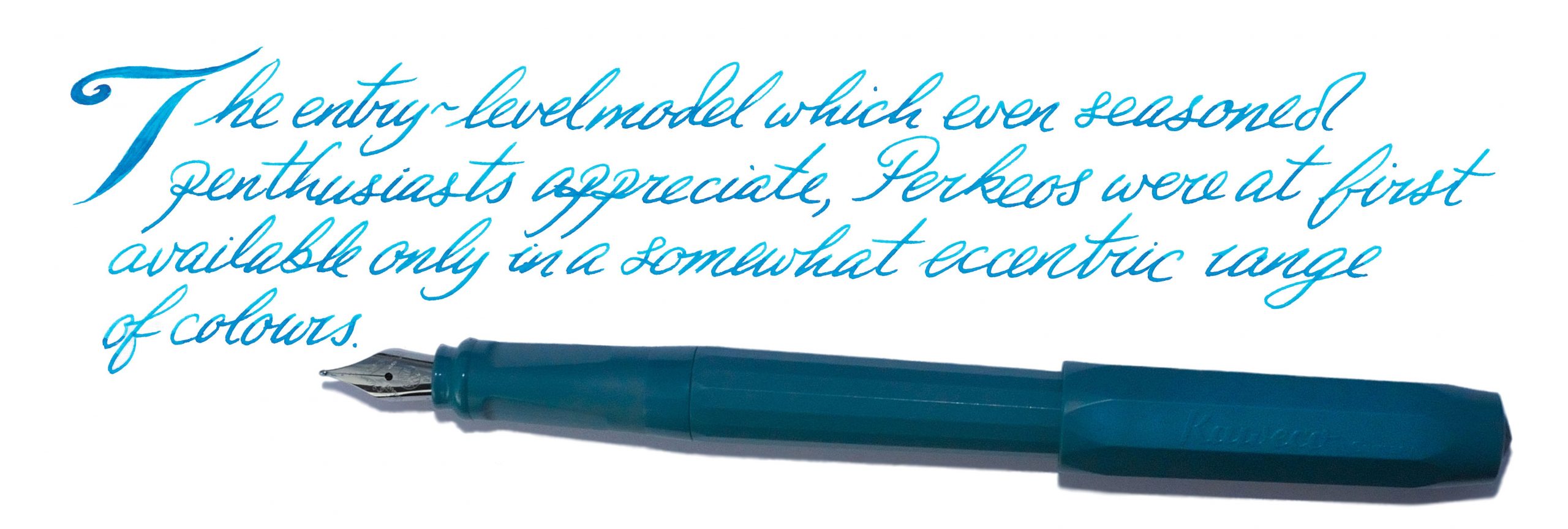
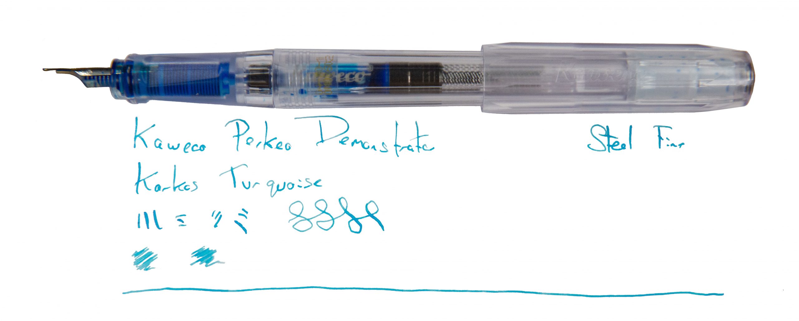
 A little bit of history We’ve reviewed the Perkeo before, so
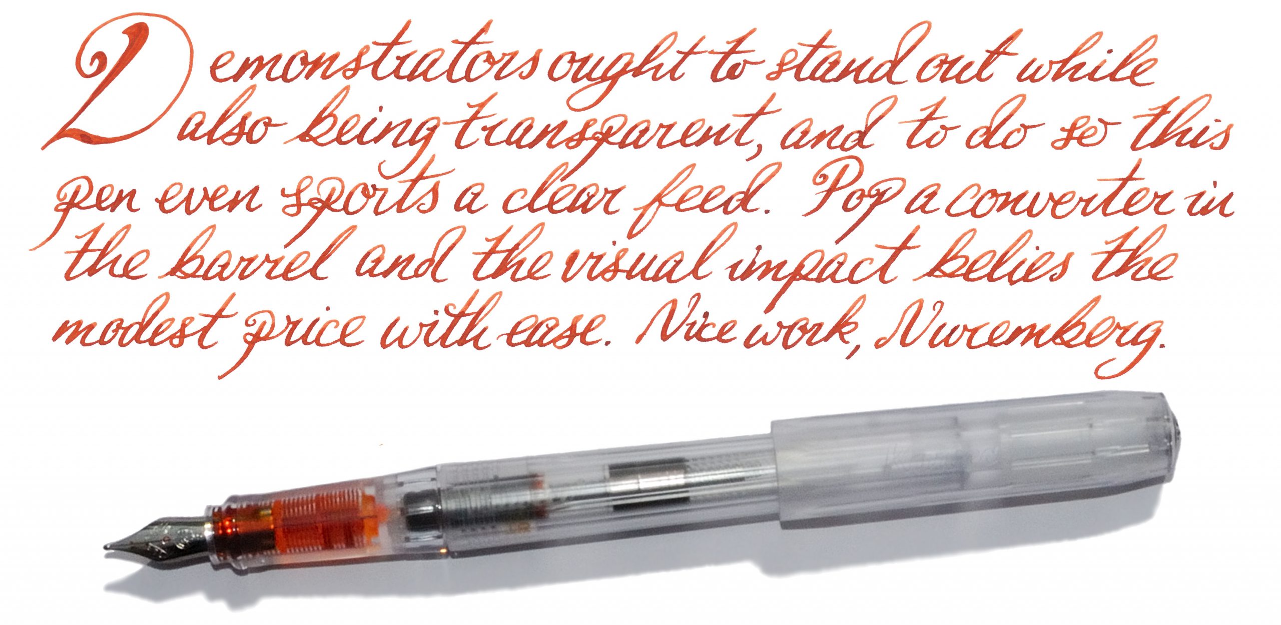
 How it fills There’s space for a brace of small international cartridges in the barrel, or a full-sized converter, which really looks the business in the demonstrator version.