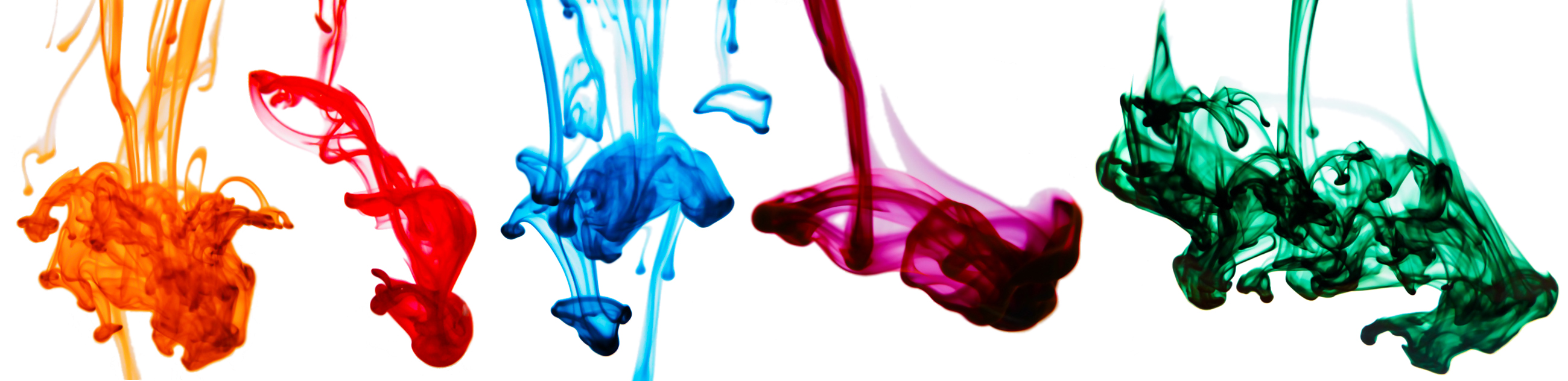
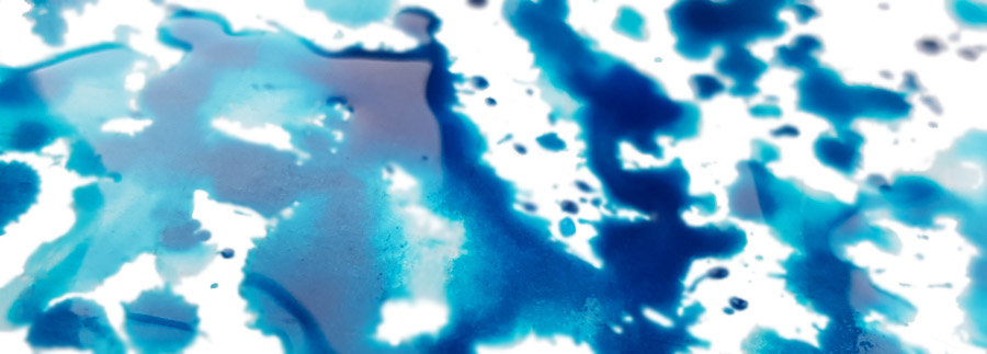
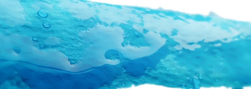
We’re joined by the Clumsy Penman himself for this week’s review, so what better way to start than with a collection of his underwater ink pics?
It’s off to Nuremberg we must go next, though, for this is where the marvellous Kaweco are based. A small name which packs a big punch in the fountain pen world, we all have a Sport or two from Kaweco tucked-away in a pocket somewhere. They actually have their own range of inks made in Austria (as does Montblanc, curiously enough), but wherever they hail from it was high time that we put their own range of inks to the test too! An adventurous band of United Inkdom reviewers new and old (hey, less of the old) broke out the nibs and got busy.
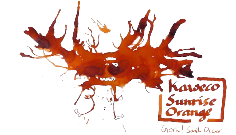
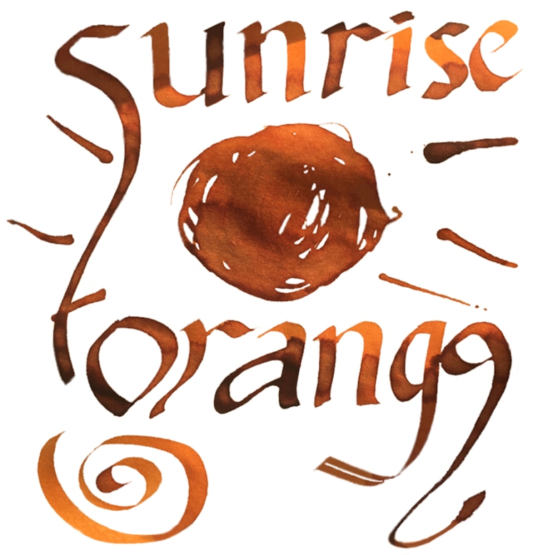
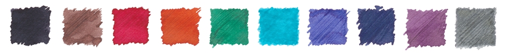
Sunrise Orange is one of the newer additions to the range, and reactions from our testers suggest that it was a very welcome one. Mateusz found this not only a worthy rival to the well-know Apache Sunset, but in many respects rather better, and Scribble liked the orange-tinged sunrise so much that a bottle of tequila is back on the shopping list, while Ian was soon lusting for a spot of caramel. Either way, it’s tasty – and just look at that shading.

Paradise Blue has quite a fan base, as a good sturdy (or ‘solid’ as James says) turquoise/teal. Scribble likes it a lot, and Ian can live with the modest shading too. The flow is good but, as Mateusz points out, there is a price to pay in this particular ink’s tendency to sink rapidly into paper, which is only really useful if you want to read your genius-like thoughts back-to-front from the reverse page.
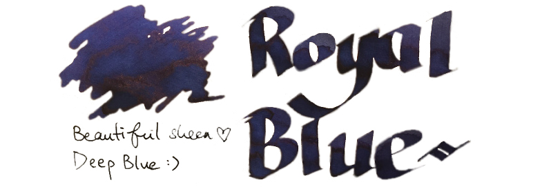
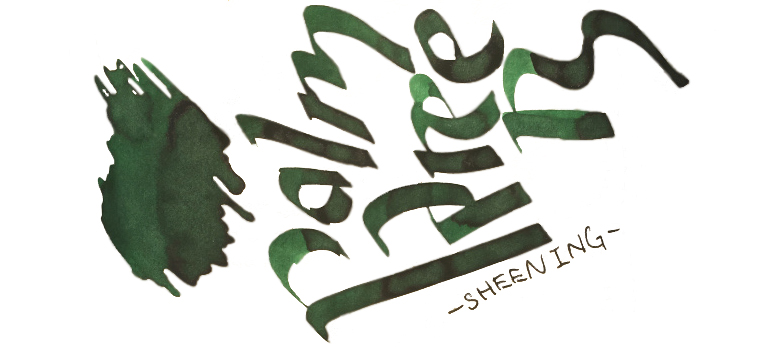
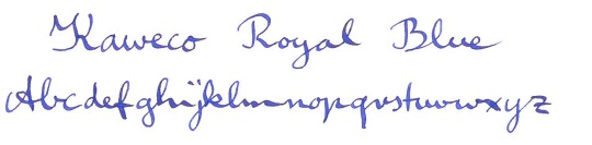 Royal Blue is perhaps not the most original colour, and Ian and Scribble were both reminded of school-room days. Matthias set out to find what mystical qualities might have put this in the same class as the now-deceased Rotring ink, without definite result – although he did like it. James, though, found something others hadn’t spotted; a sheen. Now you’ve done it, James – that’ll open the floodgates.
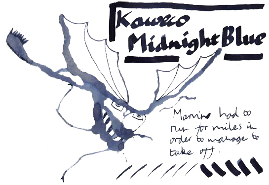
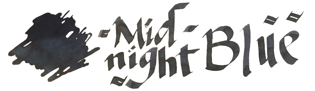
Midnight Blue is a fairly standard dark blue or blue-black. Honestly, there’s not a lot to say about this as a colour, although as Ian points out it does still have reliably good flow.
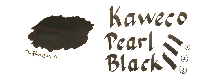
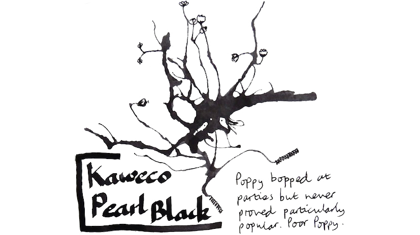
Pearl Black, similarly, is a rather everyday black. Any self-respecting ink range does have to have a black, and there is a limit to what anyone can do to make it interesting, although Ian thought this one was on a par with Aurora black, which sounds like a compliment at least.
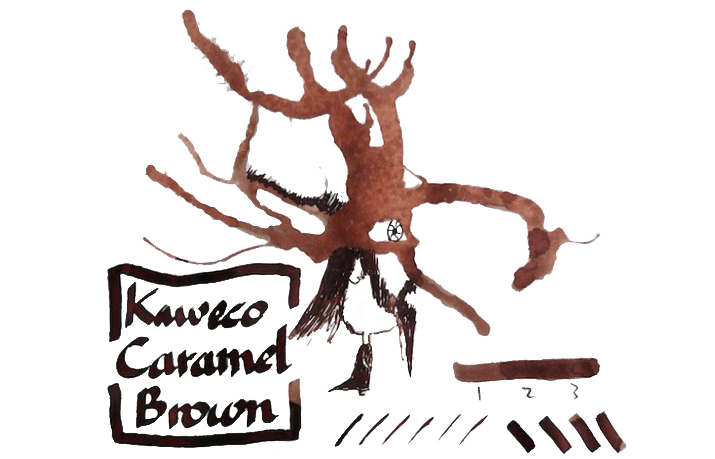
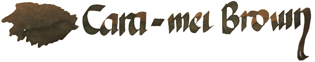 Caramel Brown seems to be one of the least popular colours. There’s nothing especially wrong with it as an ink, if you like browns – but if you’re not a fan of brown inks in the first place, then this may not tempt you to the earthy side. Ian even found it ‘sludgy‘ (in colour rather than consistency), and it’s hard to hear that as a good thing.
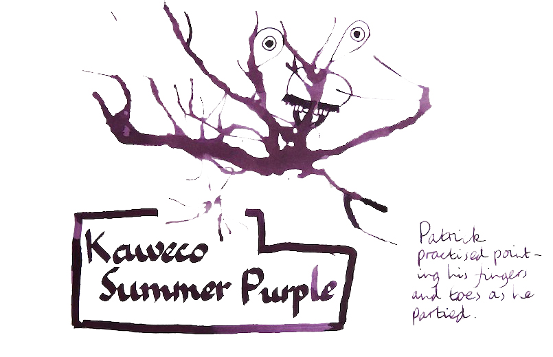
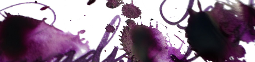
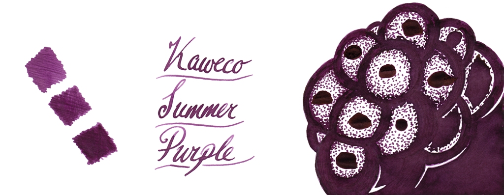 Summer Purple returns the Kaweco ink range to popularity, with a juicy flow and a juicy colour to boot. Mateusz found it a good performer, James enjoyed the subtle sheen, Scribble added it to the never-ending collection of Too Many Purples. Even Ian, who is not the world’s biggest fan of purples, thought this a good one.
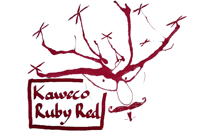
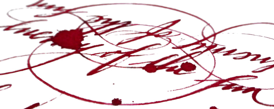
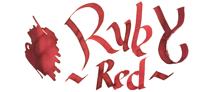 Ruby Red seems to have impressed people just as much as Montblanc’s Corn-poppy Red did (we’re back to wondering about that Austrian factory again). Ian felt it had a good bit of character, while both James and Mateusz noted more than a hint of rosy magenta in the mix.
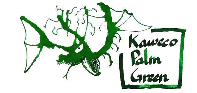
Palm Green looks like a forest green to James or a ‘textbook’ green to Mateusz, which just goes to show the benefit of taking more than one opinion. Ian spotted potential for quite pronounced shading, too.
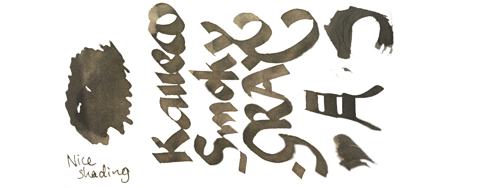
Smoky Grey is last, and probably on this occasion least, given that only two reviewers have put it to the test. Grey is not everyone’s cup of tea, to be fair, but this one does seem to behave quite well and offer more shading interest than the average.
 VFM Can be something of a challenge with this collection, to be honest. The bottles contain only 30ml, and are sold at ‘premium’ prices in the UK – although this is at least in part a self-inflicted exchange rate problem for us Brits to deal with. Price competition looks particularly tough when compared with our home-grown Diamine, who provide 80ml bottles of ink for little more than half the price. Few retailers stock both brands at present, but to cite the example of one with the lowest prices for both, at the time of publication The Writing Desk were charging a little over 7 pence per millilitre for Diamine, and 35p/ml for Kaweco ink. That effectively knocks Kaweco inks out of consideration for everyday colours like Royal Blue, which both brands provide; even if you like the look of that sheen, it’s unlikely that many fountain pen users would consider the Kaweco version five times better than the Diamine. But some of the highly distinctive shades such as Sunrise Orange, Paradise Blue and Smoky Grey have qualities which really make them worth seeking out, in our opinion – and they’re hardly going to break the bank!
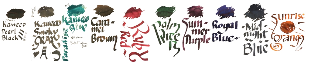 Our overall recommendation is to choose carefully and invest in one or two of these which particularly take your fancy. If you like purple, Summer Purple is warm and user-friendly. If you’re a turquoise fan and can stand the ink sinking-in to the paper rather enthusiastically, Paradise Blue is a lovely colour. Ruby Red and Palm Green beat any teacher’s homework-marking ballpoint any day… and Sunrise Orange eats Apache Sunset for breakfast. If you just want a well-behaved Austrian everyday black or royal blue, you don’t really need to spend so much; even Montblanc will provide you with twice as much ink for the same money. But we like this collection; suffice it to say that there are several Sports, Lilliputs and at least one Supra which will now be filled with ink from the same stable for quite some time.
Thanks to Kaweco for kindly providing generous samples for this meta-review exercise.
For more reviews of the whole range see:
- James Lake’s text-and-photos review
- Scribble Monboddo’s hand-written review
I recently used the Pearl Black ink cartridge and it keeps drying it up. It doesn’t flow as much and is quite rough to write with. In one pen it is unusable. Just dries up and the pen starts scratching the paper. It feels as though there is chalk in the ink.
That does sound unusual. ‘May be worth trying a different cartridge? These tests were all from bottled ink, by the way.