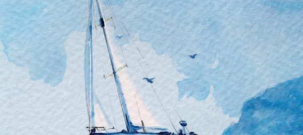
A little bit of history Randall Reeves, who generally doesn’t bother much with his last name, is a buccaneering fellow who likes a nautical challenge and half, and not content with mere global circumnavigation has created a new problem to solve; getting around the Americas, and then around Antarctica, in a figure of eight pattern. North-west passage, roaring forties, Bermuda Triangle and all. It’s a lot of effort just to see both polar bears and penguins on the same voyage, but it’s hard not admire the chutzpah. As it happens, our friend Nick Stewart, calligrapher extraordinaire, is distantly related and decided to dedicate to Randall the best sort of tribute he could imagine – an ink, of course!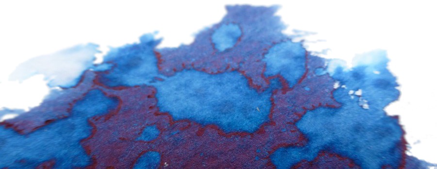
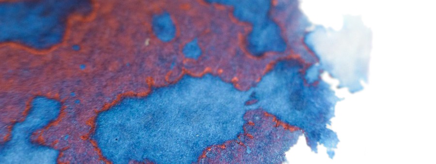
How it looks Diamine are capable of making really interesting inks when asked nicely, and Nick clearly knew what he wanted to achieve in collaborating with them to mix up something a bit special. The result is as changeable as the sea itself; lots of blues of varying depth, with a red sheen at sunset and/or shiny paper – which is where the maritime analogies break down a bit, but you get the gist. We were favourably impressed, to say the least!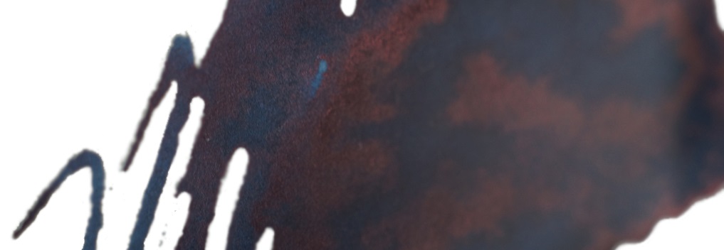
How it writes This is quite saturated stuff and may present one or two challenges when it comes to rinsing out demonstrators after use, but the flow is much like any other Diamine – which is to say not the absolute wettest one can get (that’s KWZ), but fine for almost all fountain pens.

Ink! What is it good for? You could probably take it to work if you wanted, or save it for your private journal. But this is made for art, calligraphy and big messy doodles. Have fun with it – it’s what it’s for.

VFM Pretty good considering that it’s a limited edition, and early buyers get a piece of art created with the ink itself as a sweetener.

If this isn’t quite your cup of tea, but almost… There, are, to be fair, new blue-with-red-sheen inks coming on to the market all the time. It’s a tintenzeitgeist sort of thing. But few of the alternatives come with the imprimatur of an actual proper calligrapher and a link to round-several-continents yachtsman, if that’s what really, erm, floats your boat.
Our overall recommendation Some bias has to be admitted here. Nick is a regular contributor to United Inkdom and, naturally, we like what he does. But this honestly looks like a limited edition worth grabbing while it lasts, if multi-tonal marine inks are your bag.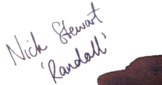
Where to get hold of some The only way is to ask Nick Stewart nicely, right here. You might even get one of these nice artworks to boot – all created with the same ink, of course.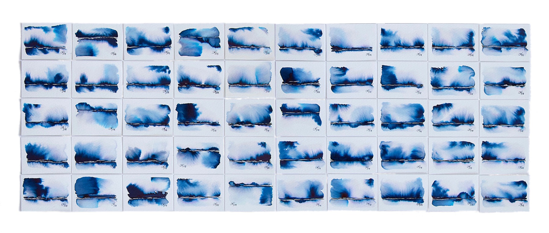
This meta-review references:
 Thanks to Nick for the samples, and of course Randall for the inspiration
Many thanks for the review. I’m both flattered and honoured. Just to say, that due to popular demand, I have produced more bottles of Randall and swatch cards.
It’s a beautiful ink and, in Nick’s hands, it’s a stunning creative tool!