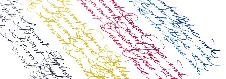
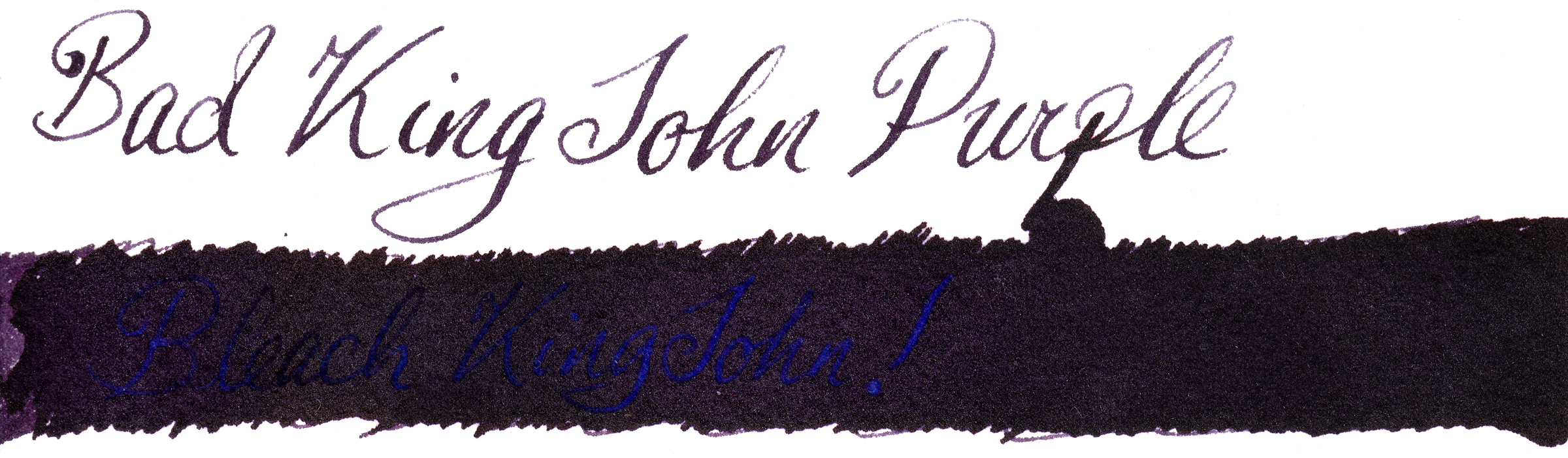
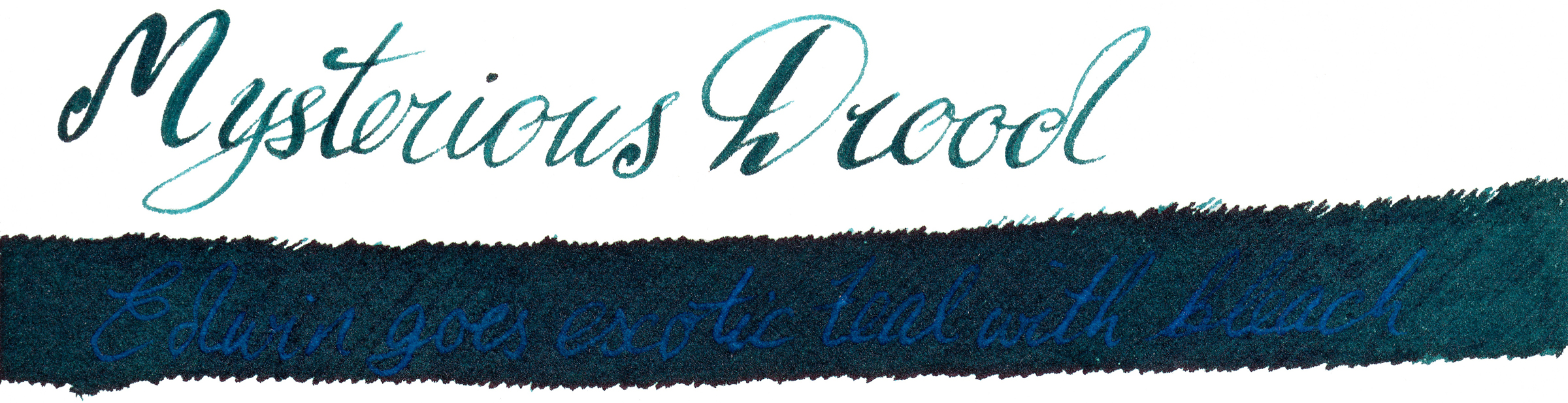
 A little bit of history Nick Stewart is a creative designer, artist, calligrapher and educator from historic Rochester, on the Thames estuary in Kent. Nick also actively contributes to United Inkdom. As an artist he is very passionate about inks, especially their chromatic properties, breaking down all possible hues and tonal ranges present in any ink he works with. He has tested hundreds and hundreds of inks which allowed him to understand how they are made and what factors are affecting specific properties. There is a hint of alchemy in his work, especially when Nick experiments with bleach to test how the destructive process which results can create something new and exciting.
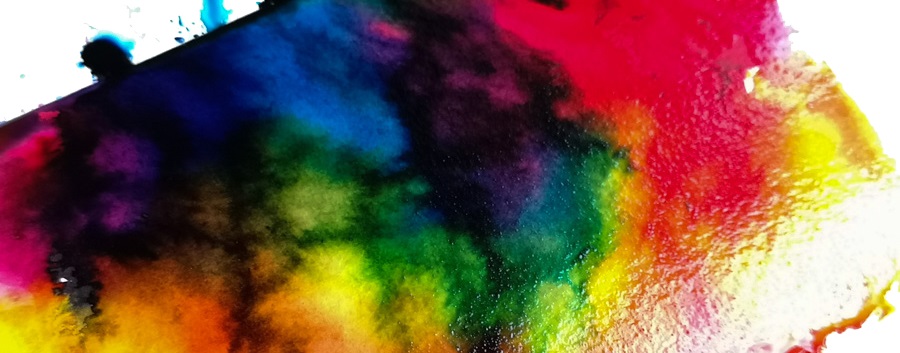
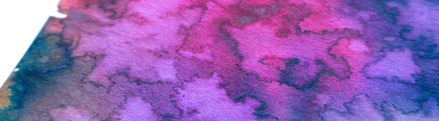
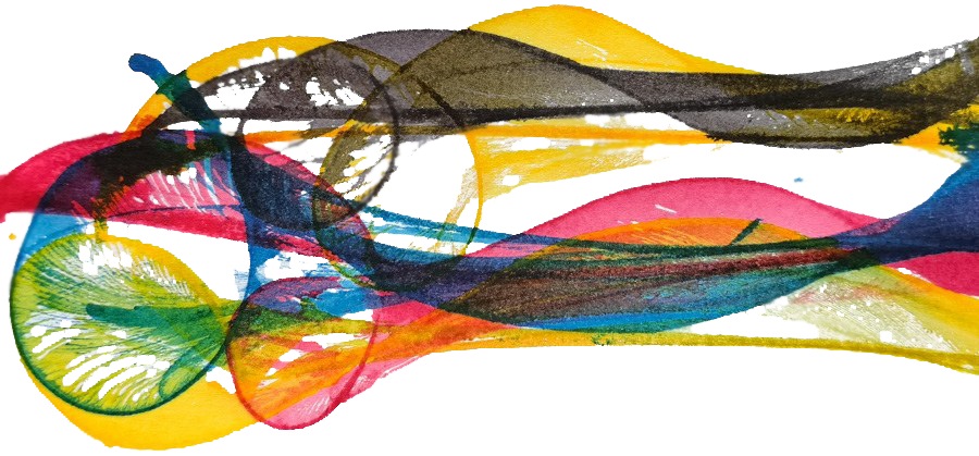
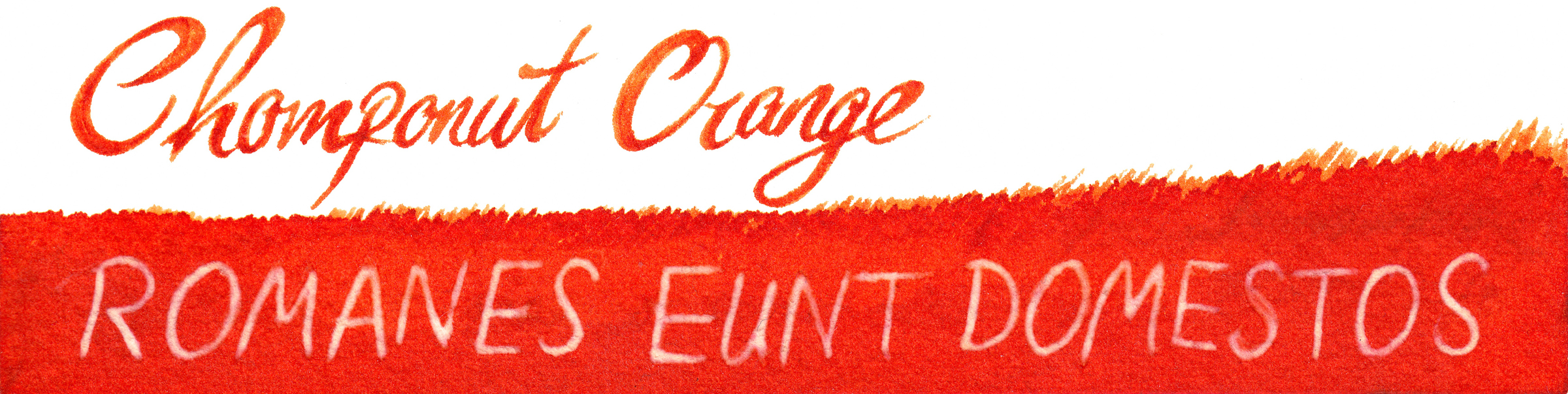
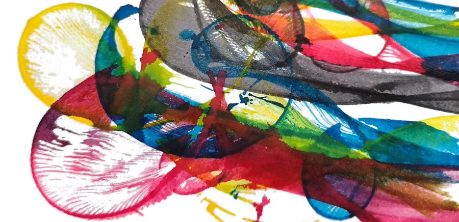
Nick has been working closely with Britain’s best-known fountain pen ink manufacturer to design his own custom-made inks, and we have already reviewed the first result, the beautiful Randall Blue-Black ink. Recently, he also came up with set of four mixable inks which mimic the CMYK colour model which many of us know better from printers. By blending them together, with specific ratios, the whole range of secondary and tertiary colours can be obtained. The idea was to create inks which generate a wide enough palette of colours that anyone can simply take them for a journey in a rucksack along with an art journal or watercolour paper pad. In principle it works in the same way as the simple watercolour sets you can find in any art shop and blend together using water. Because the majority of inks are made using dyes, the properties and final effects are different from those which pigment-based paints generate and are an interesting alternative to them.
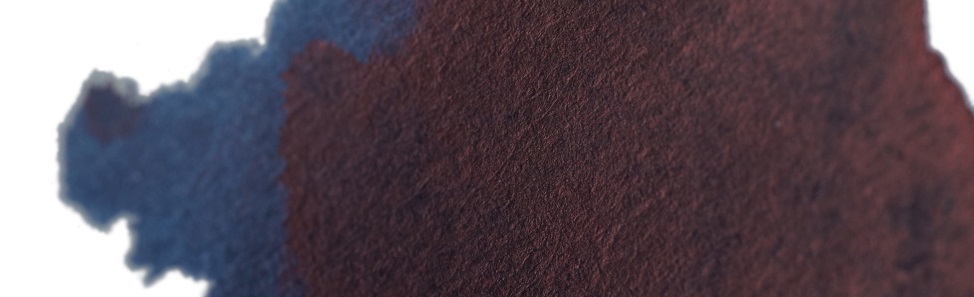
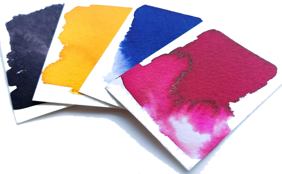
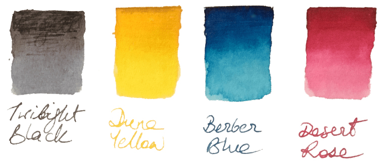 How it looks Nick’s set contains four independent 30ml inks. The intended purpose is to blend them together to obtain new colours, but each ink can be used separately as a stand-alone fountain pen ink. The colours available in the set are: Berber Blue (C), Desert Rose (M), Yellow Dune (Y) and Twilight Black (K). These are not ‘pure’ CMYK colours, and each ink has its own unique characteristics. However, when mixed together they still create a full range of secondary and tertiary colours.
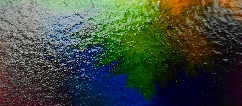
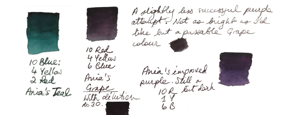
How it mixes For drawing, probably the best way to mix and blend inks together would be to use small portable paint trays, as employed by artists for watercolour or acrylic paints. The only problem is to figure out the best way of taking small amounts (or even drops) of each ink from the set bottles and transferring these to the mixing tray. With watercolour and acrylic paints it’s easy enough, since these are often available in small tubes or as solid blocks. Picking the ink directly from the bottle using a brush might not be the best idea; it would be very easy to cross-contaminate (unless you use several brushes). Pouring inks directly from the bottle may be risky, and cause splattery surprises. Plastic pipettes (or little eyedroppers) seem to be ideal for this, although you’ll need to carry a few of them. In future, we think it might be a good idea to make the set available with small eyedroppers mounted directly on the cap.
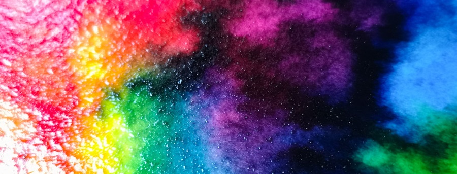
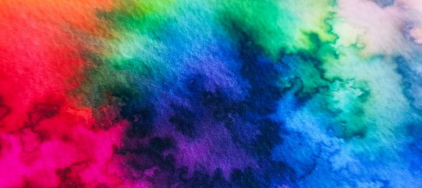
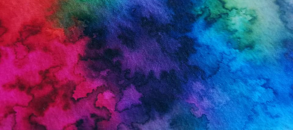
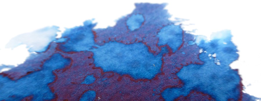
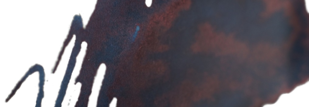
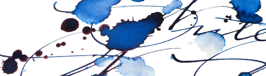
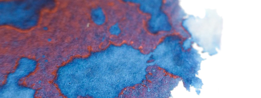
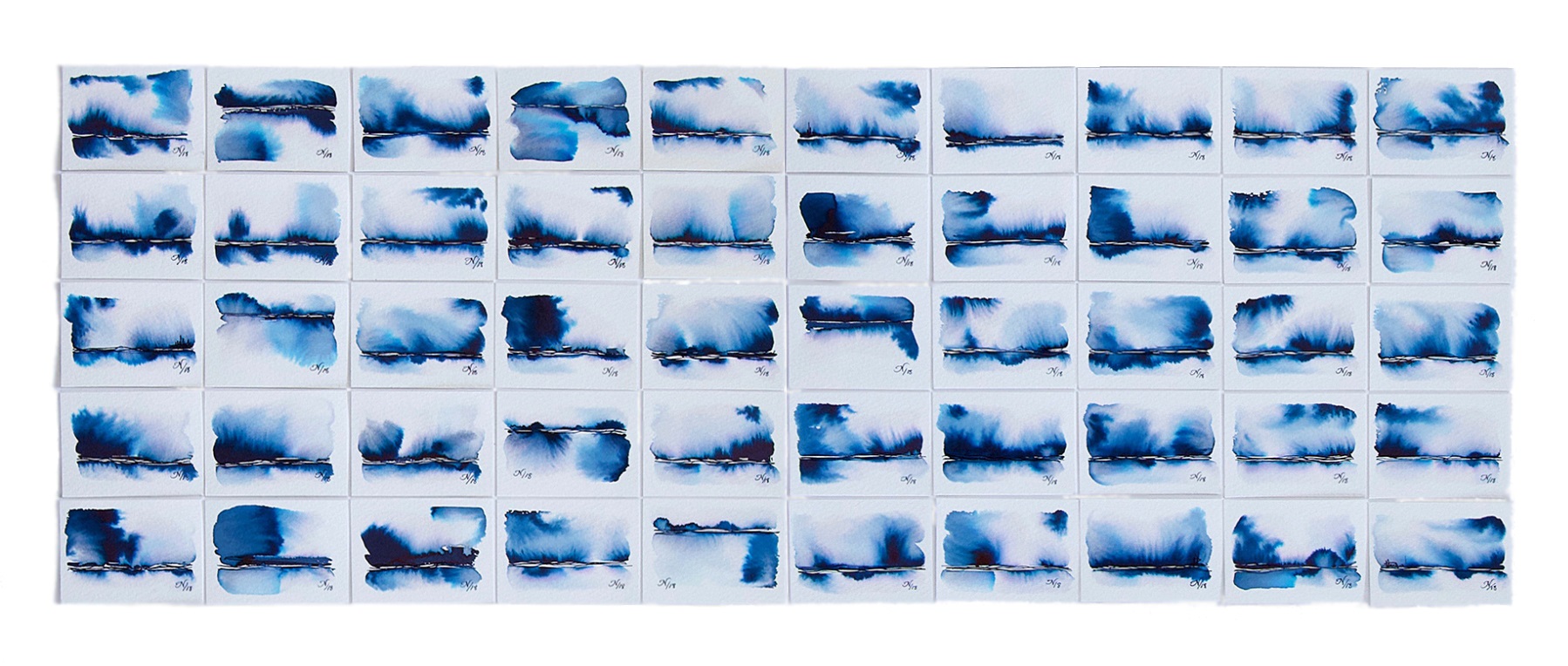
All four inks mix nicely together, and if necessary they can be easily diluted with water. For watercolour paper it’s helpful to apply thin layer of water as a medium, so the inks will flow better on the paper. Water brushes are also good for blending and washes.
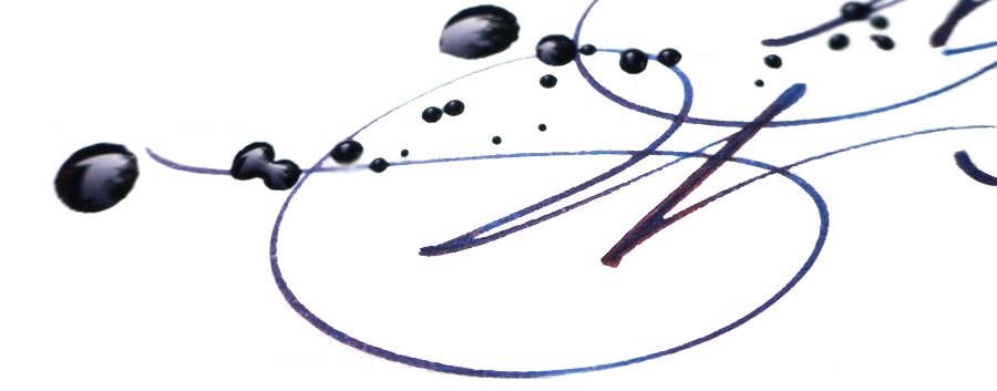
Crucially, how it writes… All four inks are very good quality. They flow well in fountain pens and the overall writing experience is pleasant. We have not noticed any unnecessary bleeding through, ghosting or feathering. As expected, the same observations apply for custom-mixed inks made with this set.
Ink! What is it good for? These are multi-purpose inks. The primary purpose of any fountain pen ink is writing, of course; all four base colours are nice on their own, but why not to create your unique combination of colours simply by experimenting and mixing base inks together as you like? However, the secret trick this set has appears as soon as they are diverted to use in painting and illustration – they blend well and the resulting colours are well-saturated and vivid. These inks are also water-soluble, so can be used for washes too.
VFM The set is available for £20, which looks like decent value to us. You get four 30ml inks which are high quality in their own right and work very well with fountain pens, brushes and almost any other media you can find. Once you figure out how to mix them to obtain your preferred custom colours, this much ink should last quite a while.
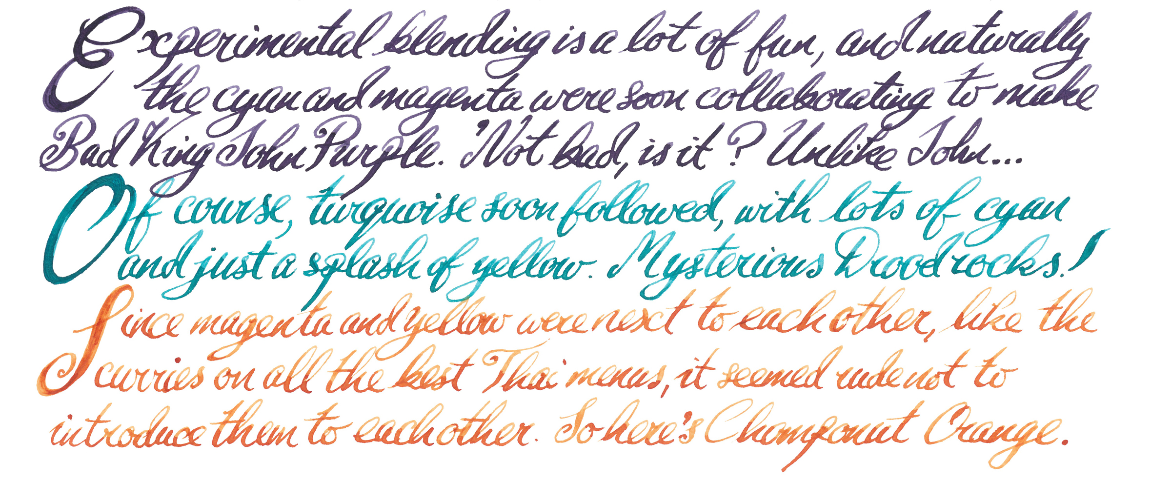
If this isn’t quite your cup of tea, but almost… Blending colours is great fun and even if you don’t feel you have bags of artistic skill or unsure about the theory of colour mixing, you should definitely give it a go. Experimenting with colours is fascinating and maybe accidentally (magically) you will create the favourite ink colour you have always been searching for. Who knows? Try it and let the magic happen!
Our overall recommendation If you are illustrating, journalling or drawing when travelling and if you like different mixed-media to create art, then Nick’s ‘CMYK’ set is designed for you. If mixing colours doesn’t immediately sound like your cup of tea, we’d say you’re missing out. Take a leap and try it!
Where to get hold of some The set of CMYK inks is available directly from Nick Stewart’s website where you can find all the details. 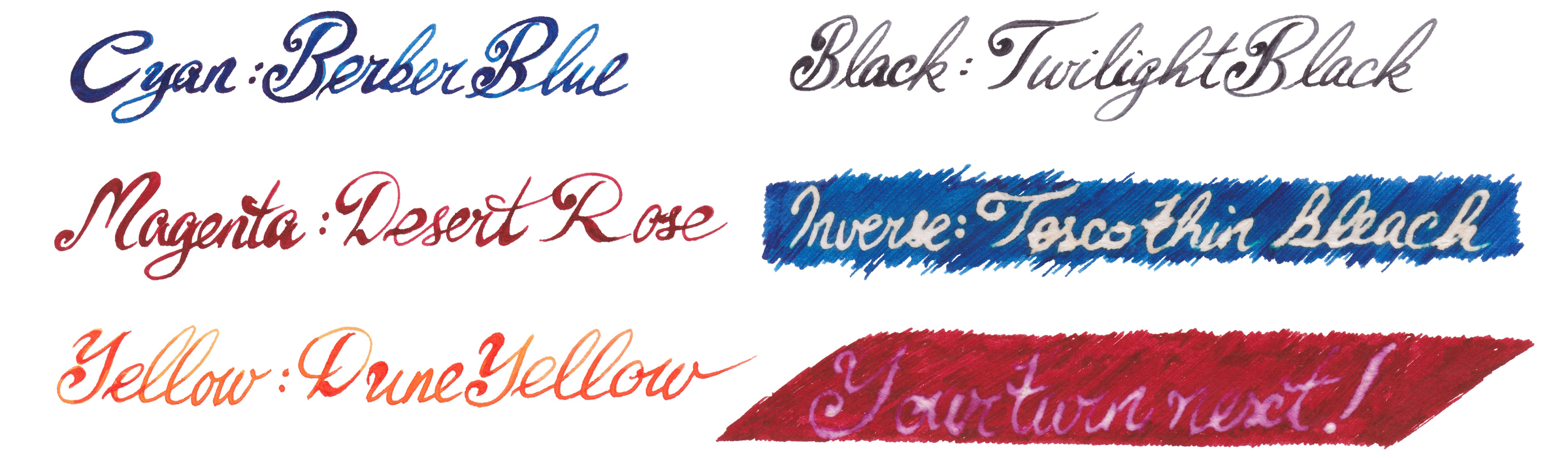
This meta-review references:
Thanks to Nick himself for getting some samples out to us.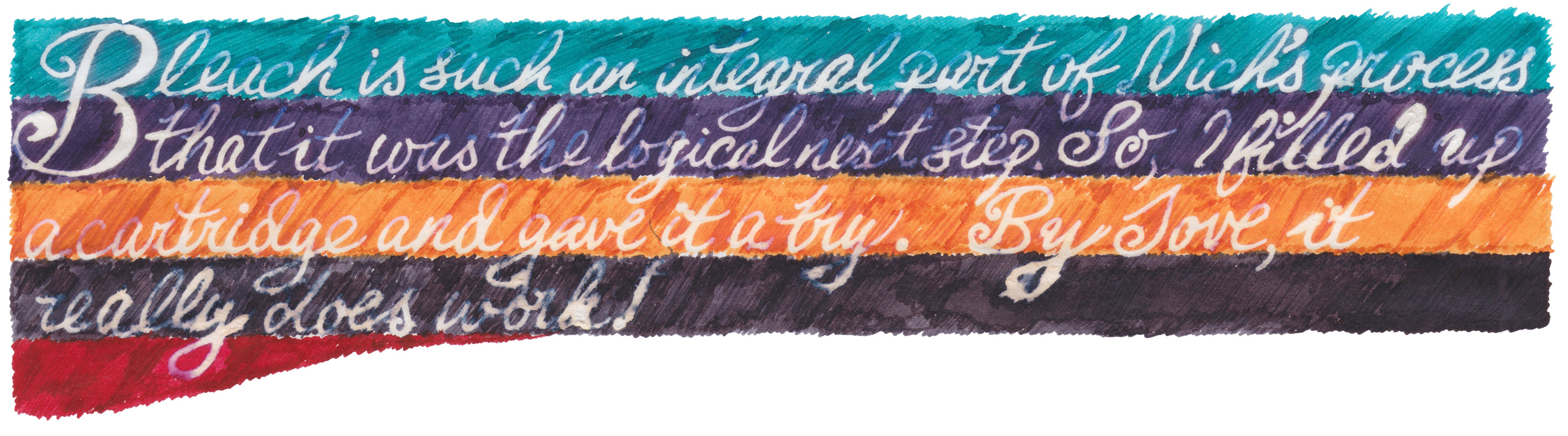


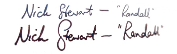
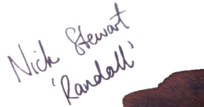
 Thanks to Nick for the samples, and of course Randall for the inspiration