 This week, we profile a brand new name in the fountain pen retail firmament – the exotically-monikered Izods, of exotic (OK, we’re stretching a point here) Ipswich. Izods has come to many readers’ attention as a result of the growing interest in Robert Oster inks, which we’ll come on to below. But we start by catching up with Roy, the founder of the company.
So, where does that curious name come from? Well, I wanted a name which was short and snappy, and my grandfather had a yard in Birmingham called Izods – somehow it just seemed to fit! I got into selling vintage pens the way many people do in this world; I like fixing things, and after preparing a few fountain pens for my own use found I had rather more on my hands than I’d planned, then one thing led to another.
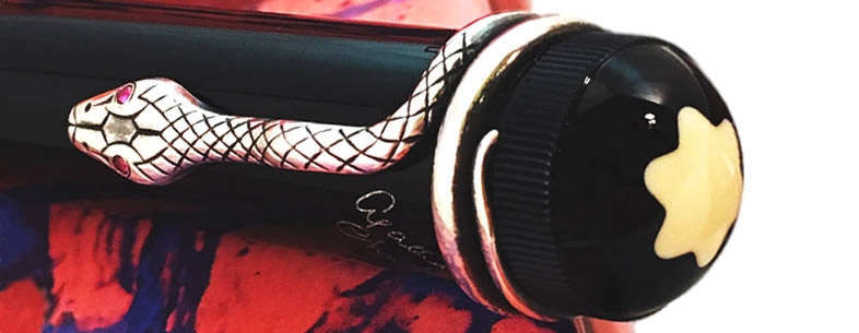
You’re obviously fond of Montblanc, a brand which not everyone in the fountain pen world has kind words for – so what does it for you? MB is a big conglomerate selling all sorts of things these days, and that’s perhaps not everyone’s cup of tea of course. But many of the vintage pens were made of really good-quality materials which hold their value and usability for a long time, and even people who aren’t fountain pen fans say they have something of an ‘aura’ about them. The trouble is, buying vintage Montblancs on the internet can be a fraught business, with some in variable condition and even counterfeits to trap the unwary. That’s where I come in; I check everything properly, including the provenance, and carry out any cleaning, minor repairs etc. if needed so that I can be sure that anything I put on sale is in top-notch condition. My favourites are the special editions like the Agatha Christie pen (pictured above), but they all seem to have their fans.
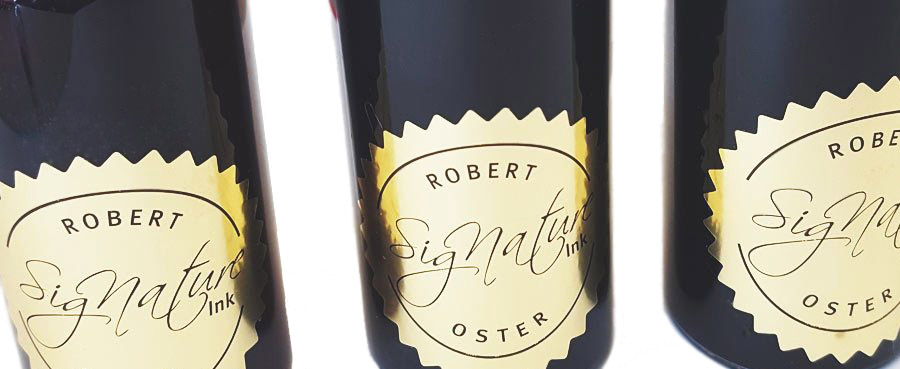
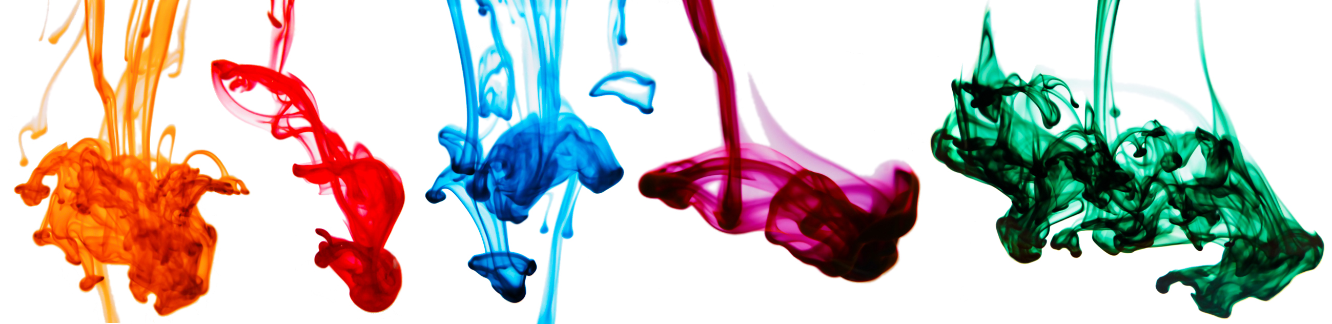
How did Australia’s Robert Oster inks come your way? After selling pens for a while, ink seemed the logical next step – but I wanted to offer something a little different. There was already quite a bit of interest in Robert’s range of inks on this side of the planet, and few outlets, so that seemed a niche which needed filling. Robert was great to talk to and we got on immediately – he even found himself buying a couple of pens from me! We’ve just picked nine inks so far – there are plenty more colours where they came from – but they do seem to be selling like hot cakes already.
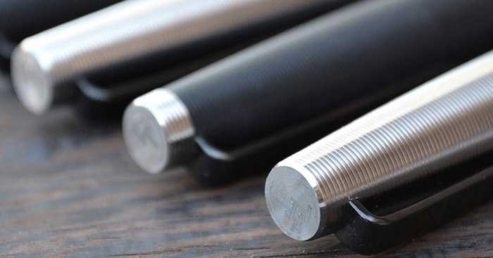
How did Tactile Turn join the collection? Again, like Robert this was a personal connection as much as anything; Will from Tactile Turn is a real enthusiast who takes such a pride in being hands-on, and the Gist is a lovely pen – it looks and feels different, in a good way! We’re stocking most of the materials Will makes the Gist in at present and may well broaden out to a wider selection of nib options, and perhaps even some of Will’s other models, if demand is as strong as we expect it to be.
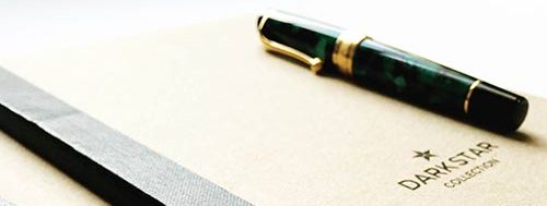
United Inkdom will be reviewing the Tactile Turn Gist and a selection of Robert Oster inks soon. Meanwhile, you can see all of Roy’s wares, including the Darkstar notebooks above, at the Izods website.
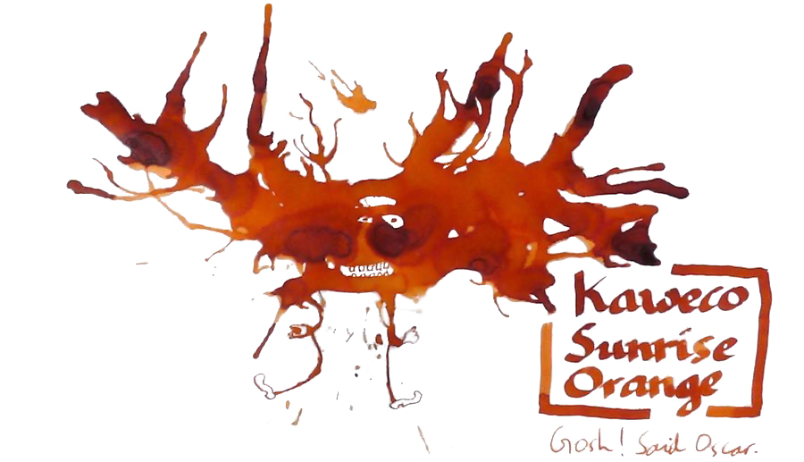
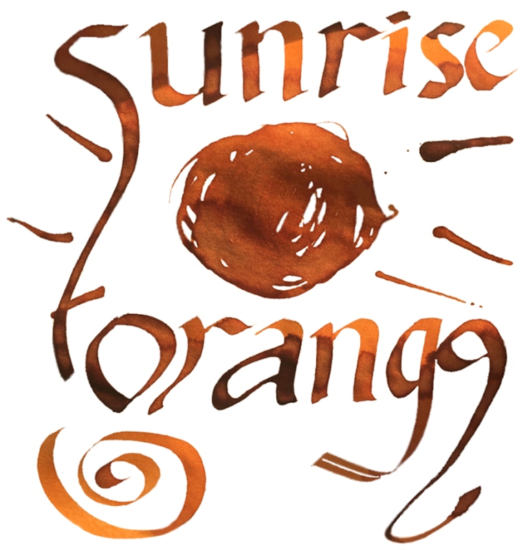
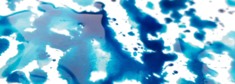
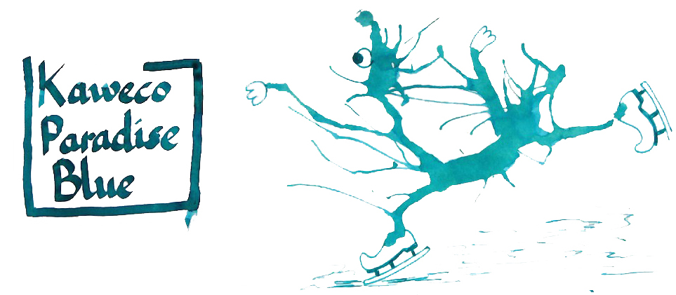
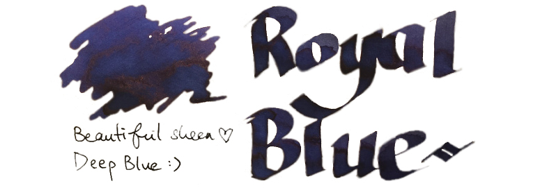
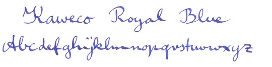
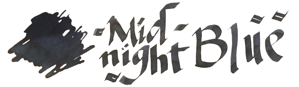
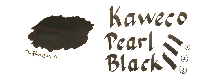
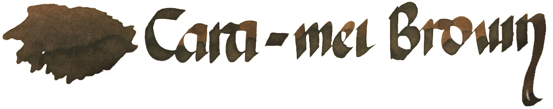
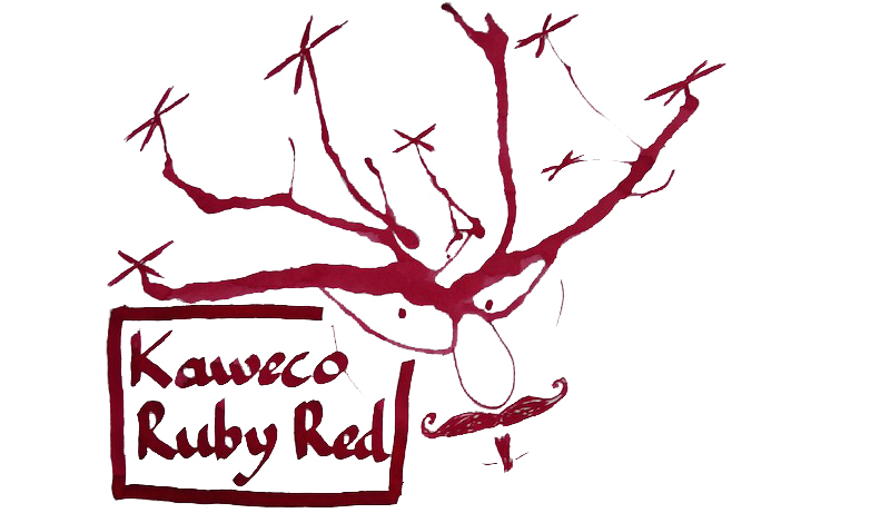
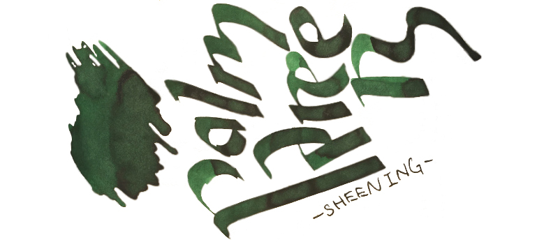
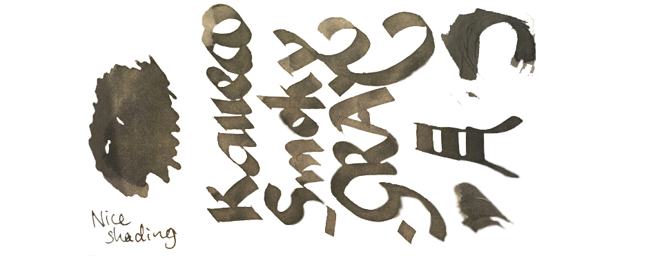
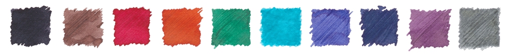 VFM Can be something of a challenge with this collection, to be honest. The bottles contain only 30ml, and are sold at ‘premium’ prices in the UK – although this is at least in part a self-inflicted exchange rate problem for us Brits to deal with. Price competition looks particularly tough when compared with our home-grown Diamine, who provide 80ml bottles of ink for little more than half the price. Few retailers stock both brands at present, but to cite the example of one with the lowest prices for both, at the time of publication The Writing Desk were charging a little over 7 pence per millilitre for Diamine, and 35p/ml for Kaweco ink. That effectively knocks Kaweco inks out of consideration for everyday colours like Royal Blue, which both brands provide; even if you like the look of that sheen, it’s unlikely that many fountain pen users would consider the Kaweco version five times better than the Diamine. But some of the highly distinctive shades such as Sunrise Orange, Paradise Blue and Smoky Grey have qualities which really make them worth seeking out, in our opinion – and they’re hardly going to break the bank!
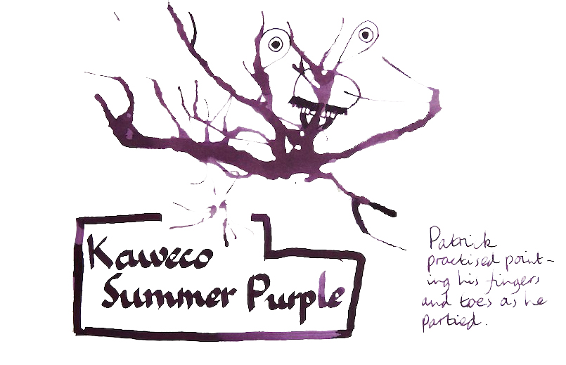
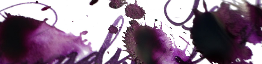
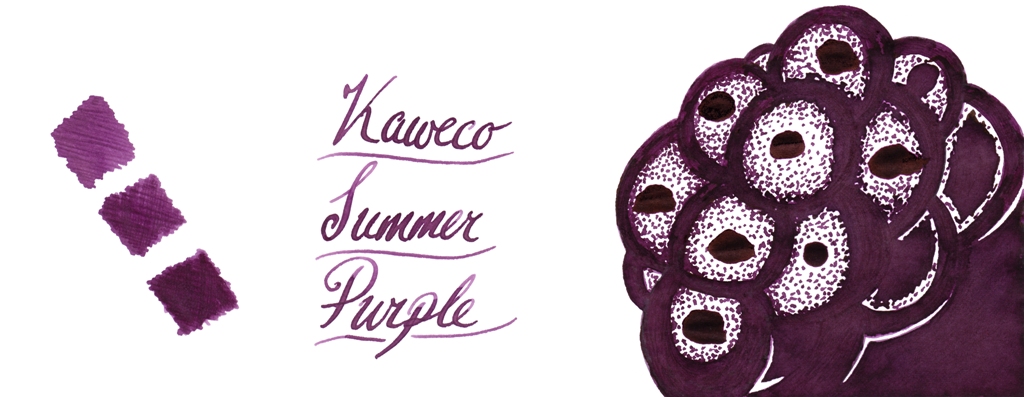
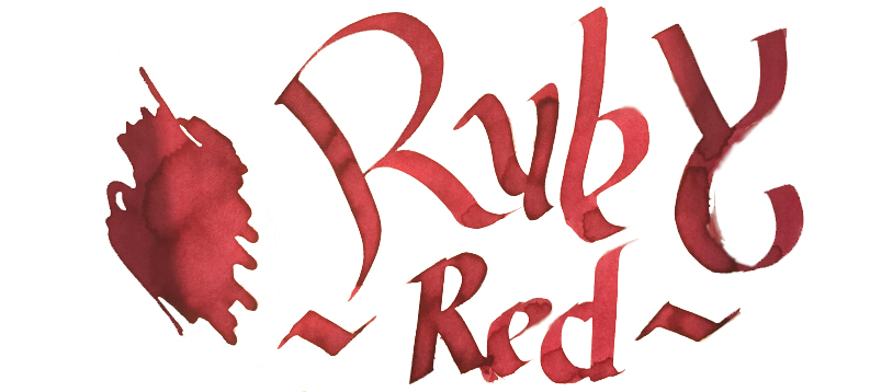
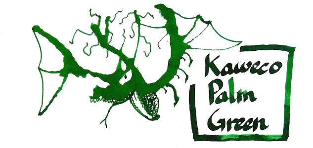
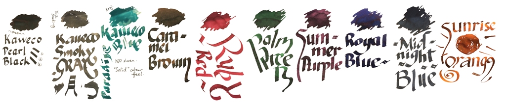 Our overall recommendation is to choose carefully and invest in one or two of these which particularly take your fancy. If you like purple, Summer Purple is warm and user-friendly. If you’re a turquoise fan and can stand the ink sinking-in to the paper rather enthusiastically, Paradise Blue is a lovely colour. Ruby Red and Palm Green beat any teacher’s homework-marking ballpoint any day… and Sunrise Orange eats Apache Sunset for breakfast. If you just want a well-behaved Austrian everyday black or royal blue, you don’t really need to spend so much; even Montblanc will provide you with twice as much ink for the same money. But we like this collection; suffice it to say that there are several Sports, Lilliputs and at least one Supra which will now be filled with ink from the same stable for quite some time.
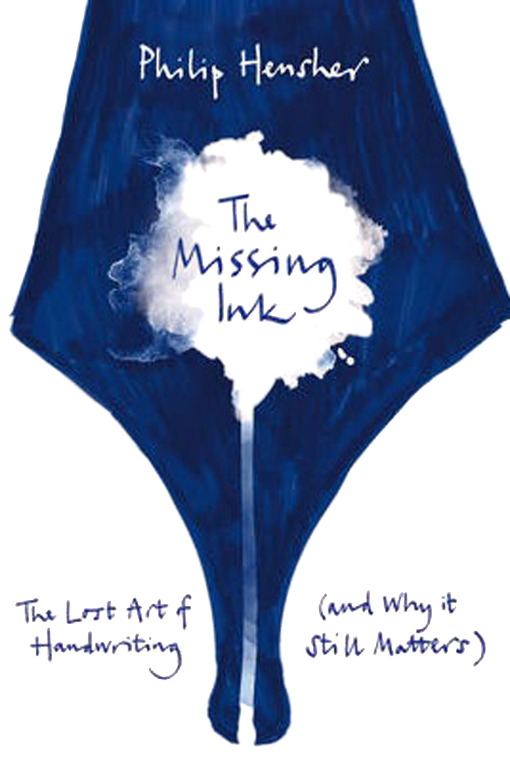
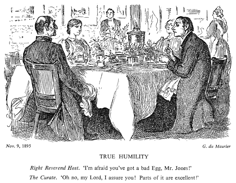 Punch cartoons pop up in many a history textbook, but the sketch above is probably the one that got most into everyday language. Our readings of The Missing Ink suggest a similarly ‘balanced’ view; Daniel enjoyed it, John found it not much to his taste, and Scribble found it, well, a bit of a curate’s egg.
 So where did it go wrong? Well, the author is a professor of creative writing, and goodness do readers get to see all his craft in action. The endless whimsical footnotes, and diversions into irrelevances like Hitler’s handwriting and the Bic ballpoint, will either be very much your cup of tea, or very much not. In short, he goes on a bit – and not about pens and handwriting, much of the time.