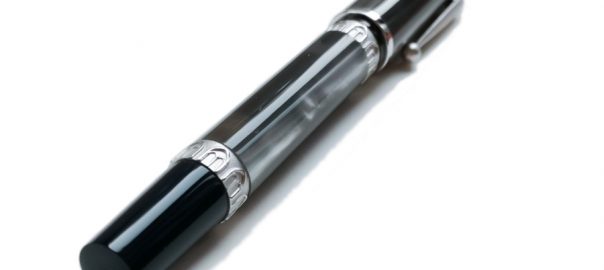
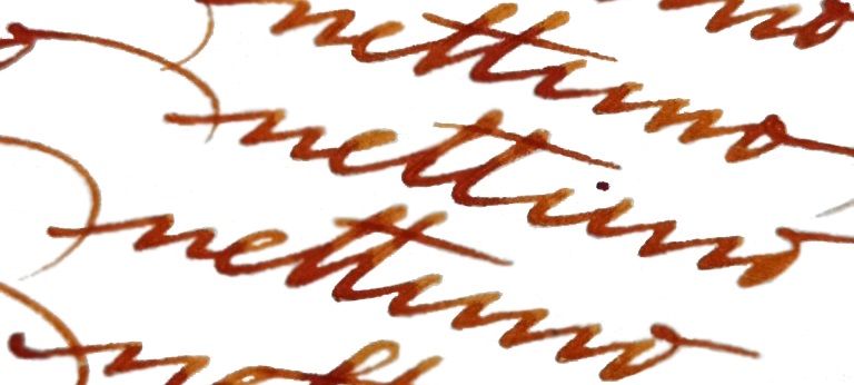
A little bit ofhistoryNettuno 1911 (named after Neptune – a God of the Sea) are beautifully hand-crafted Itanian fountain pens, made in Bologna under the supervision of Nino Marino – a former president of the famous Delta Pen Company. Nettuno pens have a very long history originating in the last century and perhaps Nettuno as a brand was one of the first (if not the first) fountain pen companies established in Italy. One of their advertisements from 1911 showed Neptune holding the fountain pens as if they were his iconic trident; the model for the company’s logo was based on a famous statue of Neptune in Bologna. The 1911 series celebrates the Italian heritage of the reborn Nettuno brand.
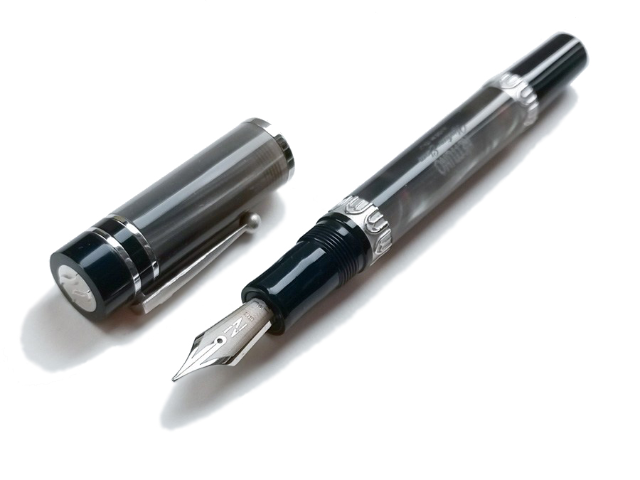
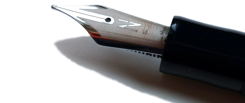
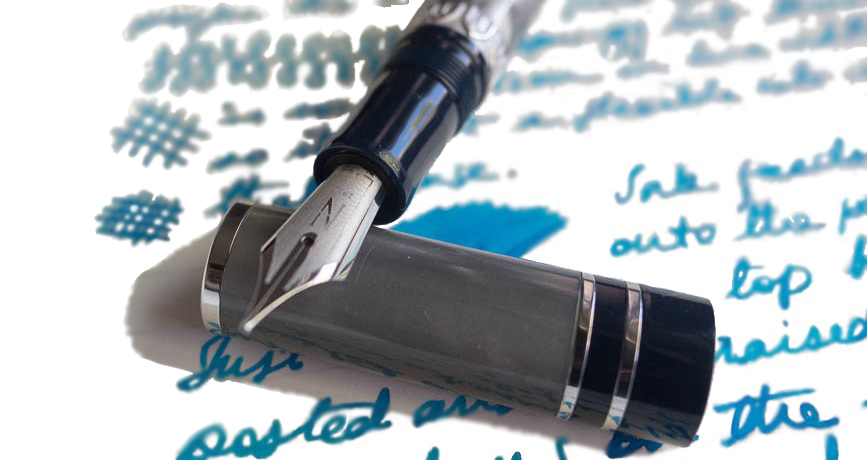
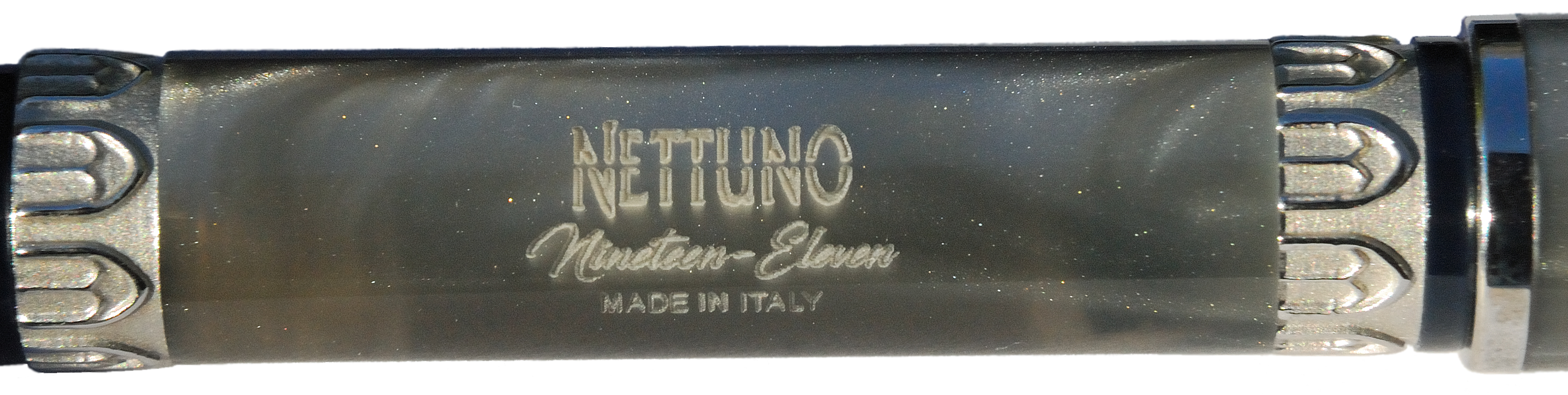
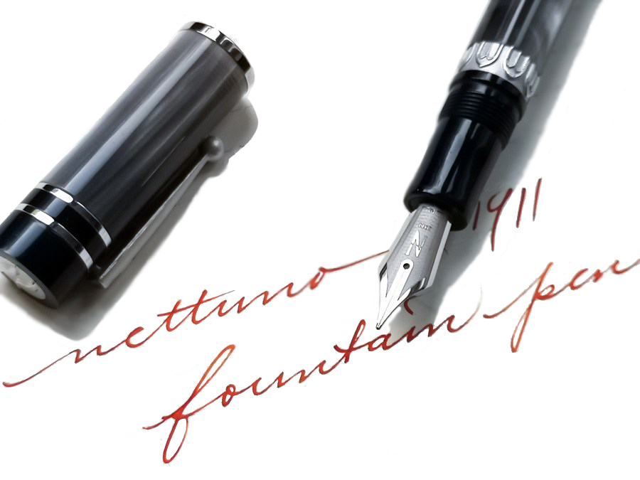
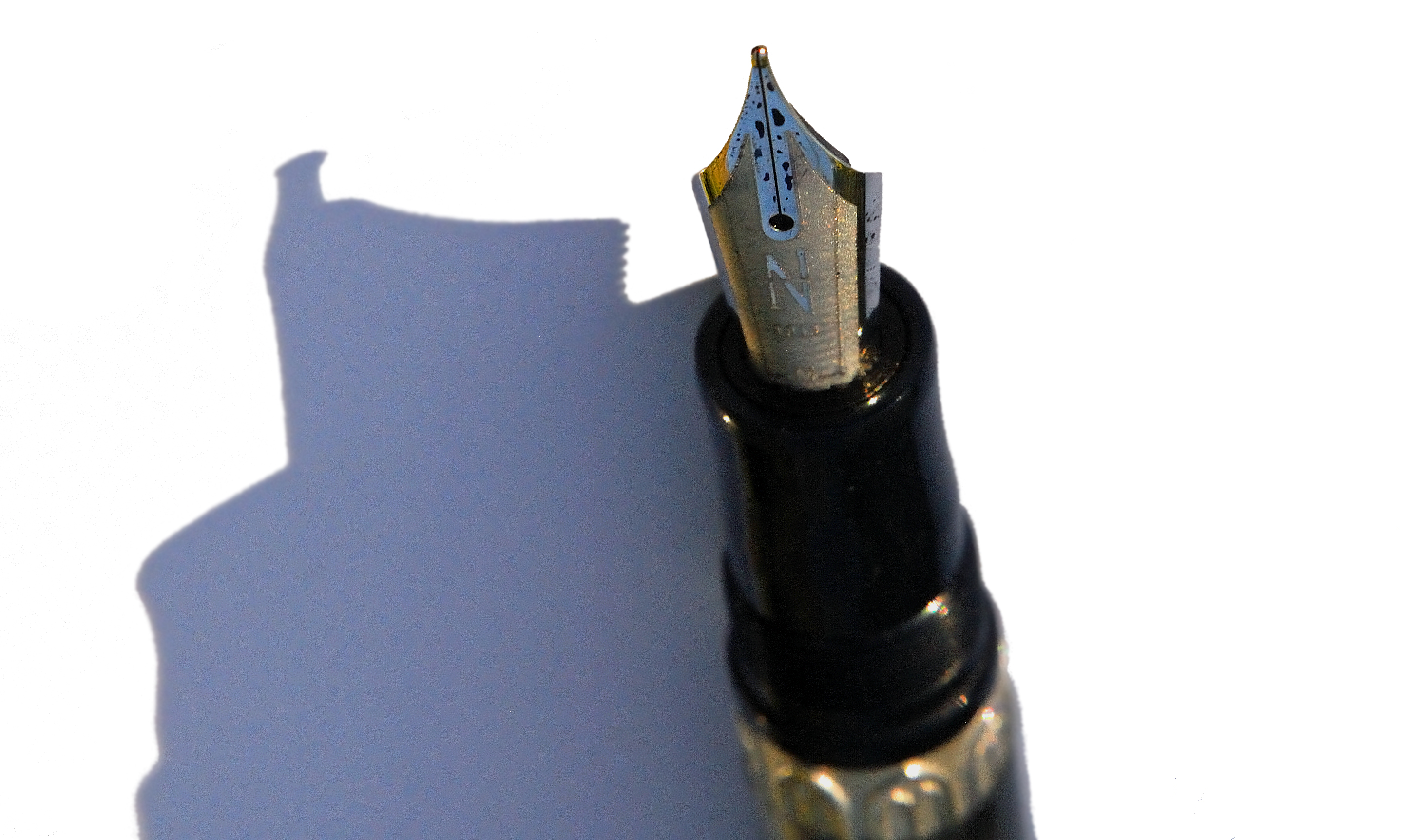
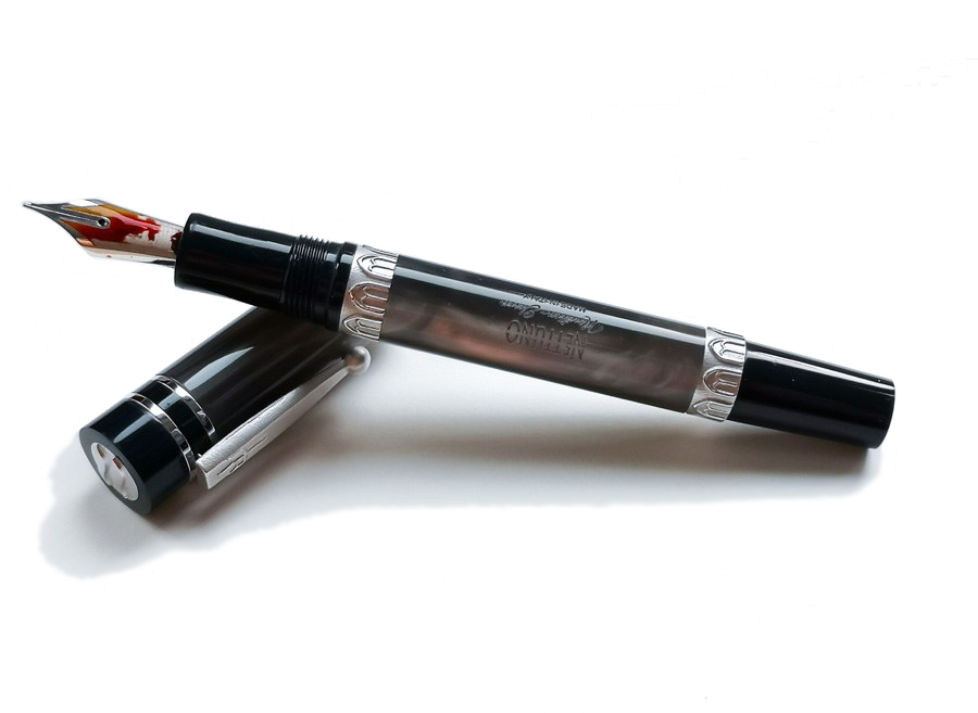
How it looksThe finish of the Nettuno 1911 models we tested is called Tritone. It features a pearlescent shimmering silvery grey resin body with grip section and finials made from dark blue resin. These are complemented with rhodium accents. On the cap there are three polished bands whereas the barrel contains two wider rings, with the relief patterns of arched windows referring to ancient Roman architecture. These bands are made from the same metal as the clip and have a matte texture. The finial on the cap has a metal ring with a wave pattern. The pen is equipped with a rhodium-plated steel nib.
The ornaments on the nib are rather minimalist, but effective. There is a large stylised capital ‘N’ from the Nettuno logo left on the etched, matte-textured surface, which matches nicely with the other trims present on the barrel. All parts are very well-made, with real attention to detail; the resin elements, for instance, are nicely smooth with a glossy finish. The Nettuno 1911 Tritone is a very elegant fountain pen indeed.
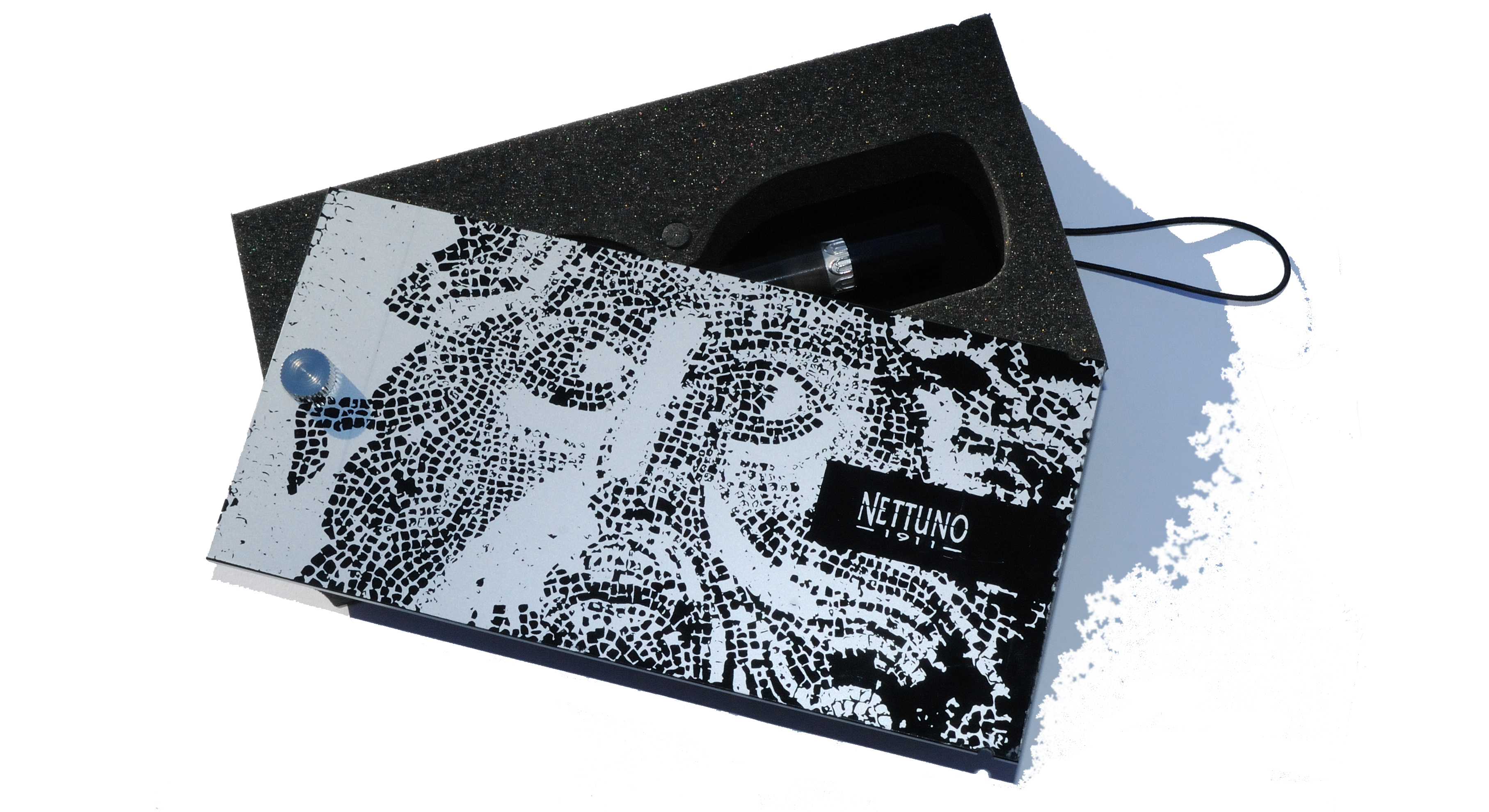
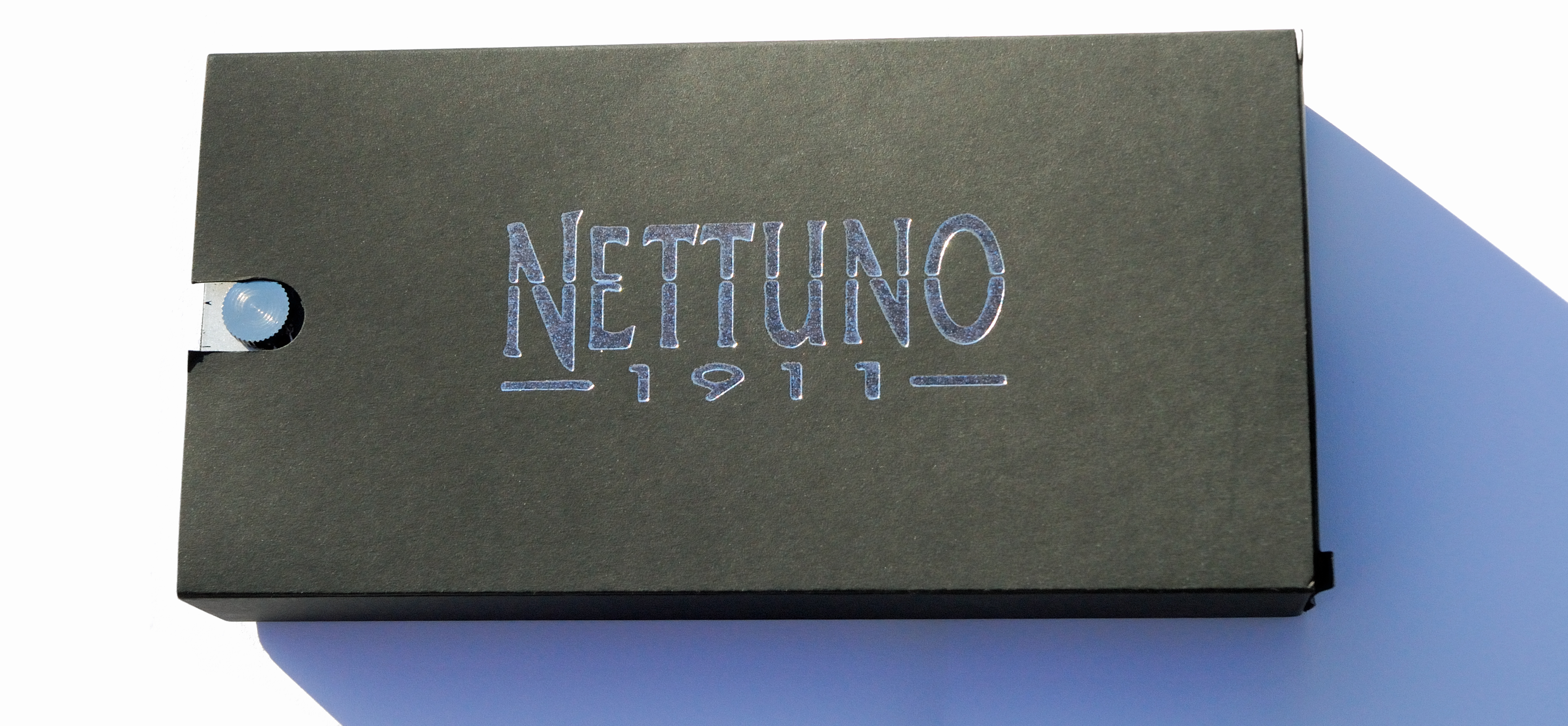
The Nettuno 1911 comes in a black cardboard sleeve and aesthetically pleasing presentation box. The box is rather unusual; a beautifully printed cover lid has to be rotated around a pin to open it, while an elastic band keeps lid and the box tightly closed . Each pen is numbered but not limited. The Netunno 1911 collection consista of ten different models currently available . The type of resin, finish and trim colour and nib coating vary from one model to another.
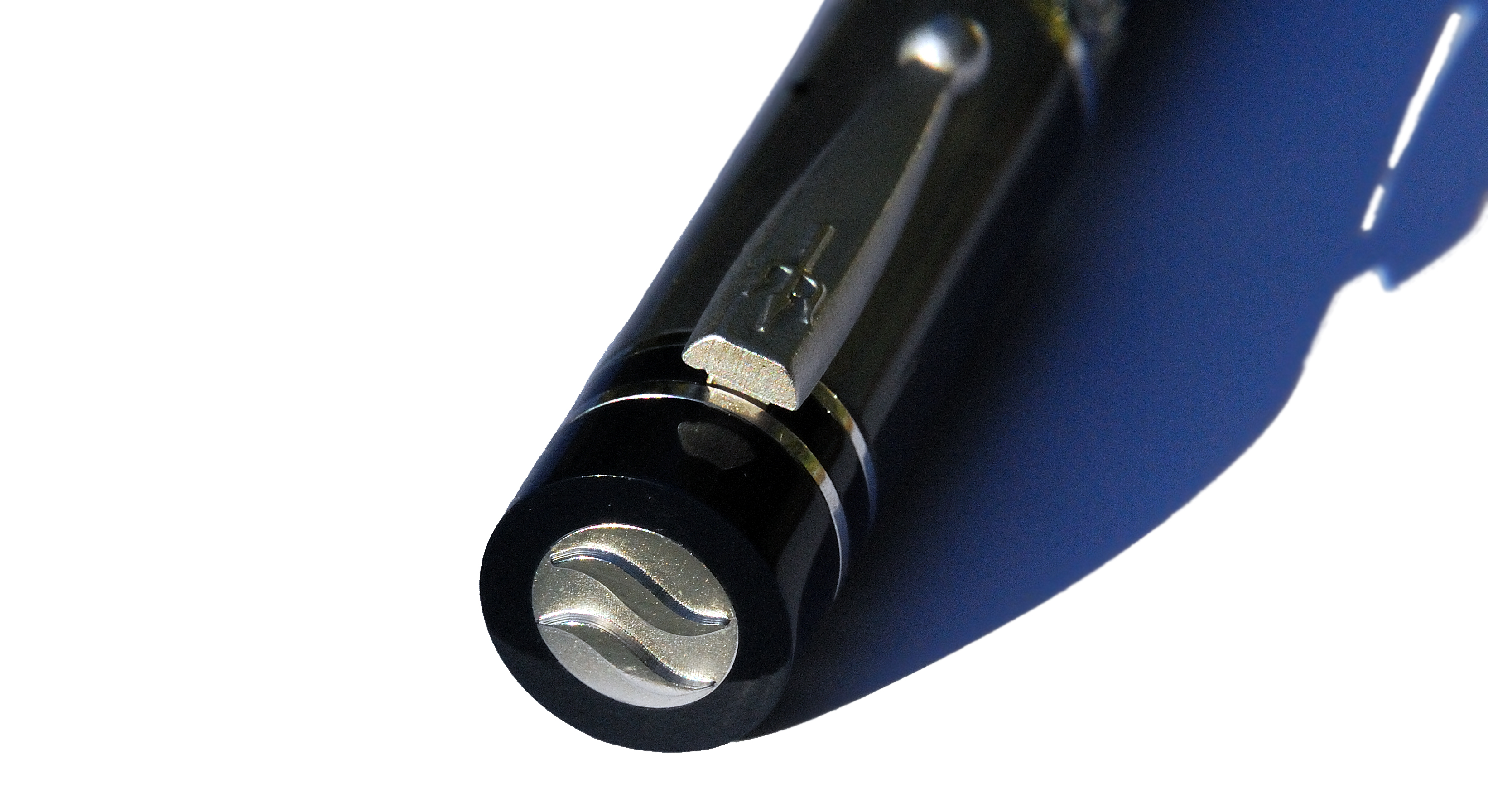
How it fills The Nettuno 1911 uses a threaded converter, which can be accessed via the ‘blind cap’ on the barrel (which gives access to the converter knob). Because the cartridge converter is screwed into the section, it stays in place during refilling. This is a simple but quite effective solution which effectively produces a captured converter filling solution – much like a piston mechanism, in use.
How it feels Despite its fair weight (36g capped), the Netunno 1911 feels comfortable in the hand. We found its weight to be balanced, but if you lean more towards light-weight Japanese pens (e.g. Sailor or Pilot) then the Nettuno 1911 may feel a little on the heavy side. The step on the barrel/section as well as the threads are rather smooth, but the deeply-etched trim may became noticeable during longer writing sessions, especially to those who tend to hold pens on the upper part of the grip section. Theoretically the pen can be used with the cap posted, although this makes it too heavy and unbalanced in our view.
Crucially, how it writes…The fitted steel nib writes well, and the writing experience we all had was positive. This nib is not quite as rigid as might often be expected from steel. There is a decent amount of springiness which enhances the overall writing experience. The model we tested was equipped withe a medium nib. If pressed gently, some line variation may be achieved but with regular pressure the line width is rather consistent. Interestingly, we have noticed some small problems with the ink flow which manifested as occasional ‘skipping’, which may be attributable to many things including ink properties, paper quality, etc. It may be just this unit, too. Overall, the Nettuno 1911 writes well, but on the other hand there is nothing really special and exciting about this nib either.
Pen! What is it good for?The Netunno 1911 is definitely a pen to have on the table during important business meetings. It looks elegant and shows its class. It is definitely a good ‘general use’ fountain pen, including for note taking, but perhaps not ideal as a daily, ‘all task work-horse’ pen. For those purposes it should have exceptionally good ink flow, be very ergonomic and perhaps lightweight too – and here the emphasis is a bit more upon show. There is, however, plenty that owners will want to show.
VFM £219.00 feels quite expensive for a pen with a humble steel nib; for this price many customers would expect either a full piston-filling mechanism and/or a gold nib. The nib size is unfortunately limited to western medium (M) and fine (F) only. However, the Nettuno 1911 Tritone is very well-built and the materials used are great quality too. The overall design is quite distinctive with great attention to detail, especially as regards trims.
If this isn’t quite your cup of tea, but almost…If this particular design is not not to your taste but you still fancy a beautiful Italian pen which performs well albeit for significantly less money, then the Leonardo Officina Italiana Momento Zero or Furore may be worth a look.
Our overall recommendationIf you are looking for an interesting well-made pen with a characteristic themed design then the Nettuno 1911 could be a good choice. The craftsmanship and choice of materials are excellent, giving this pen a premium feel. Beautiful and somehow unique presentation enhances its ‘high street’ appearance. However, if writing experience is more important to you than the aesthetics then there are many significantly less expensive pens equipped with good quality steel nibs out there.
Where to get hold of one Nettuno 1911 is available in the UK from iZods Ink who are the official Nettuno 1911 official retailer. The price tag on this pen and other models in the series is £219.99.
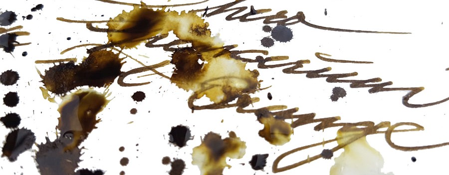
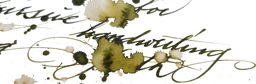
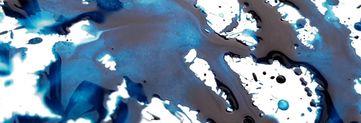
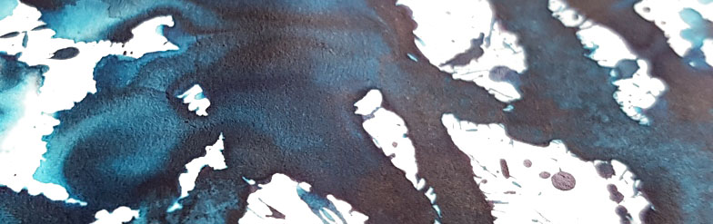
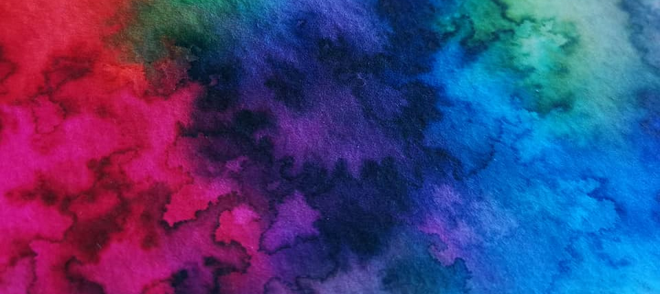
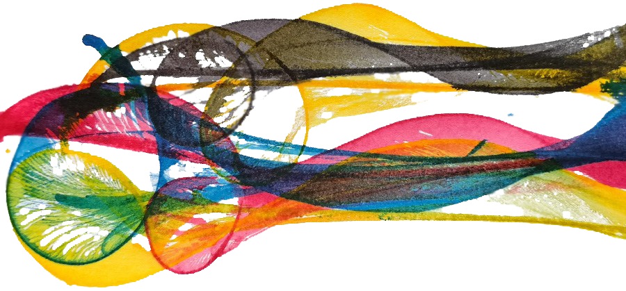
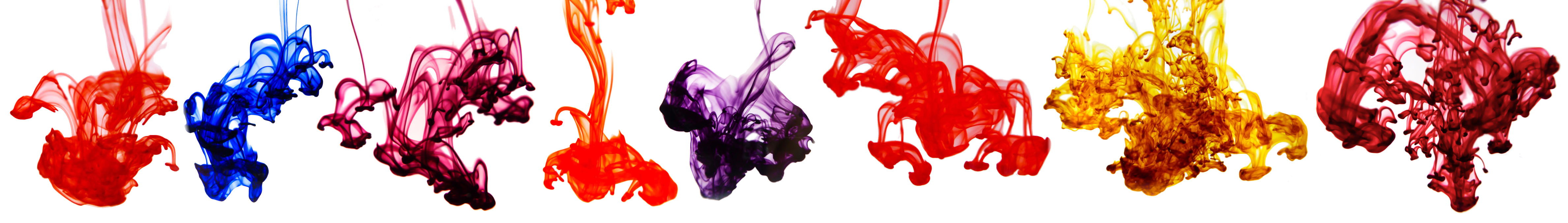
A little bit ofhistory This is a festive tradition now, so the British ink legends Diamine strike the market again with another of eight Shimmering inks, which complement the 32 inks in the series already released over last three years (we reviewed them here and here). This makes an impressive family of 40 shimmering inks in total, covering a wide palette of base colours combined with either gold or silver flecks suspended in their depths.
How it looks
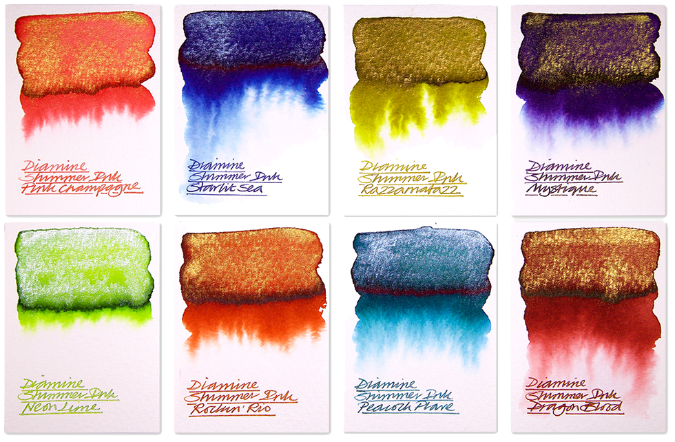
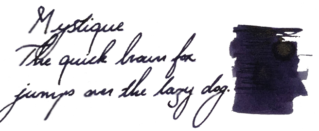
Mystique
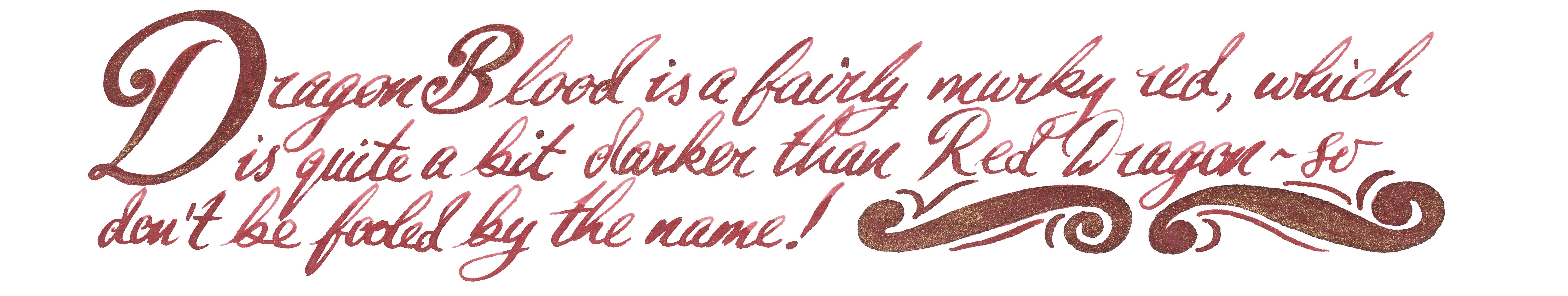
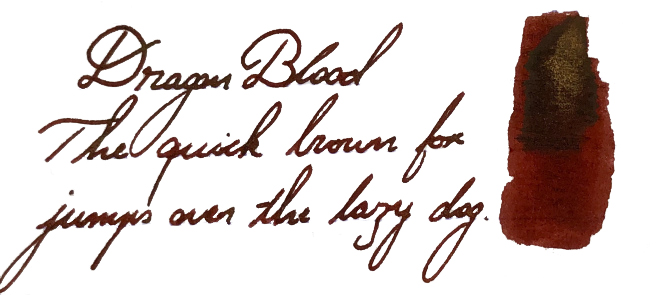
Dragon Blood
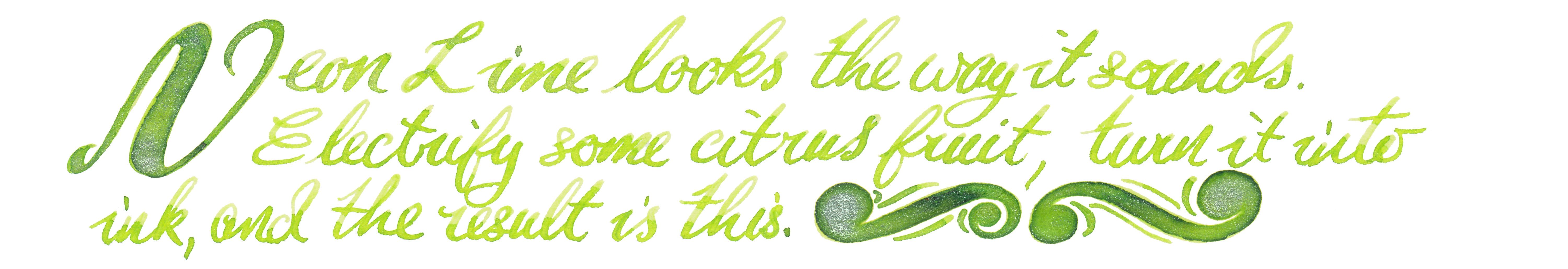
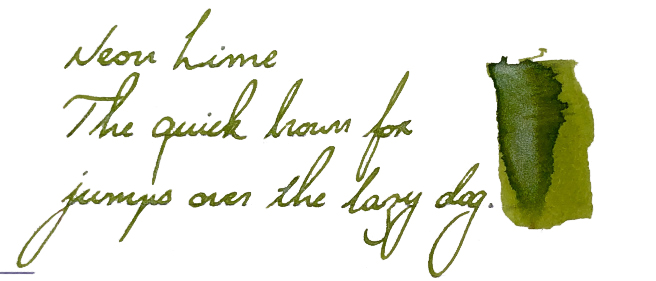
Neon Lime
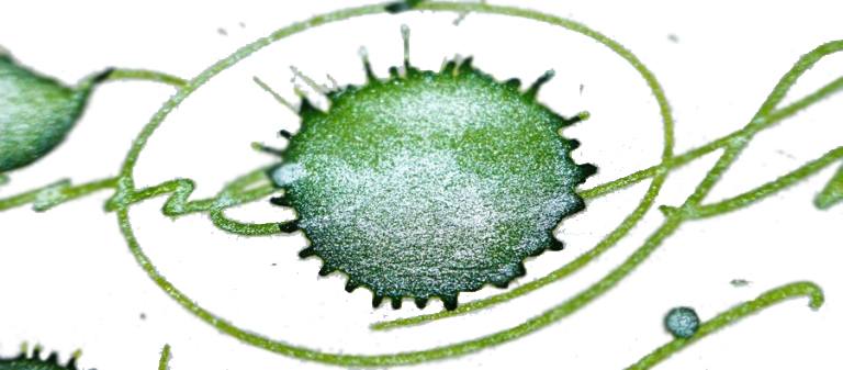
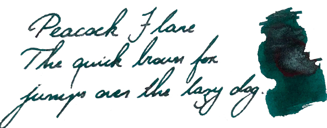
Peacock Flare
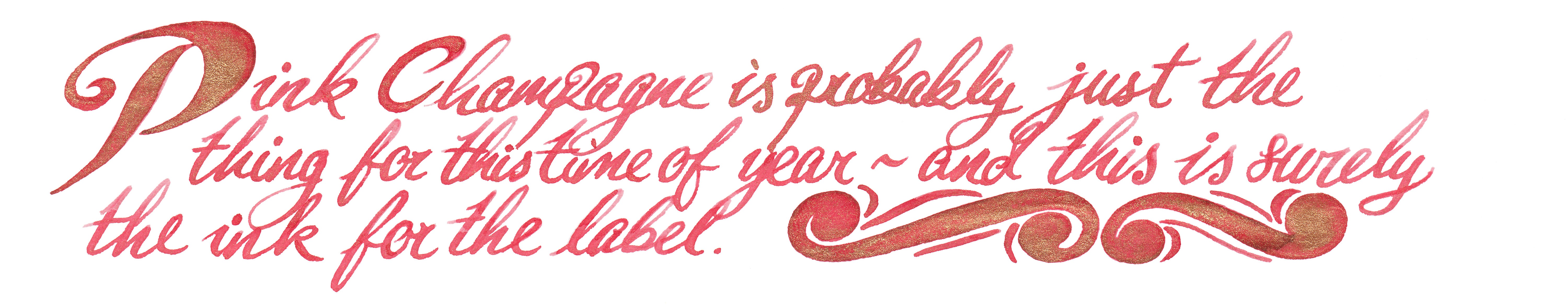
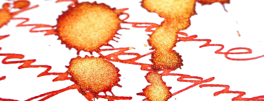
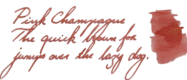
Pink Champagne
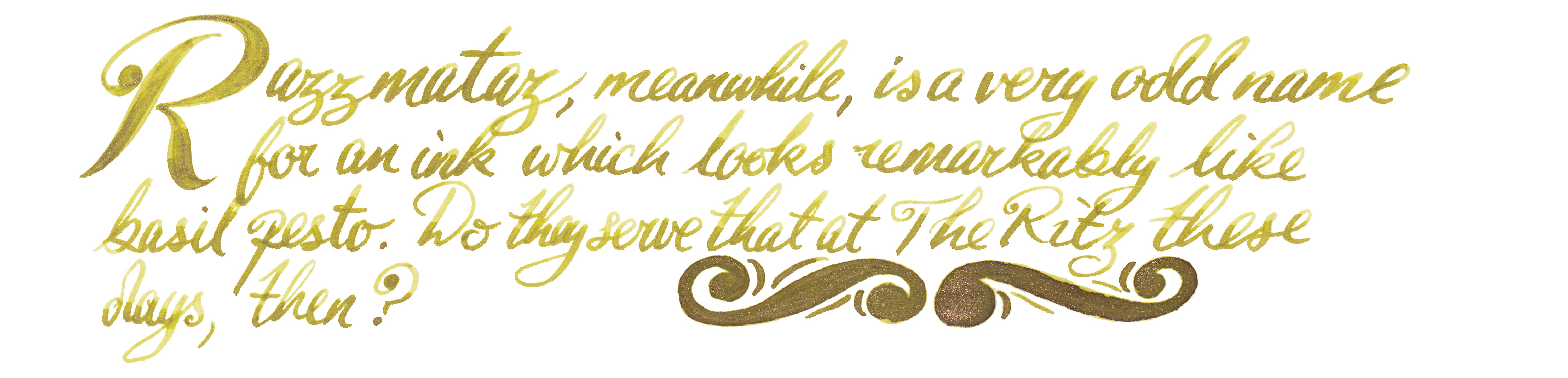
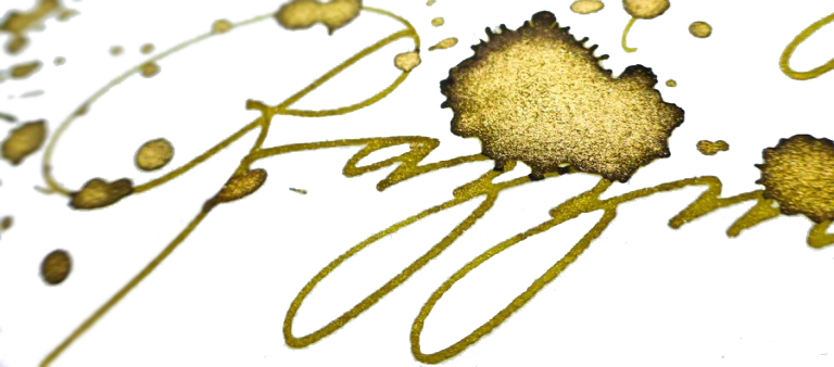
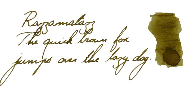
Razzmatazz
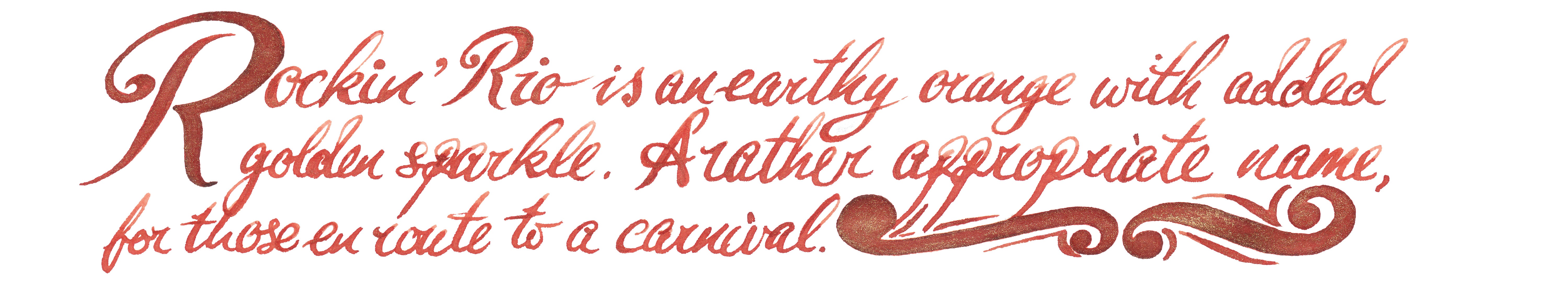
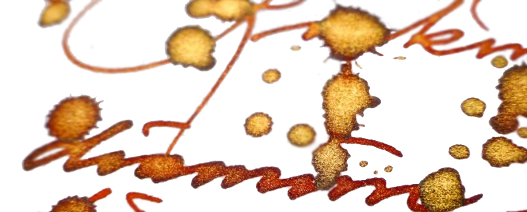
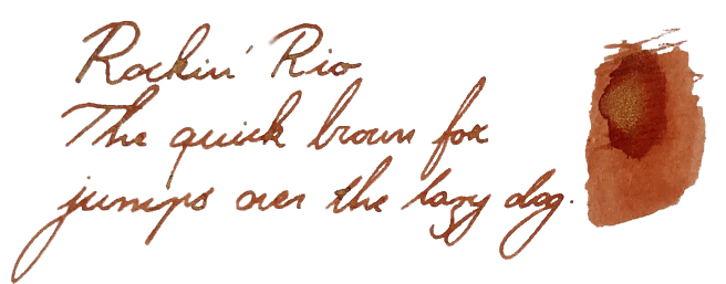
Rockin’ Rio
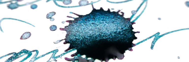
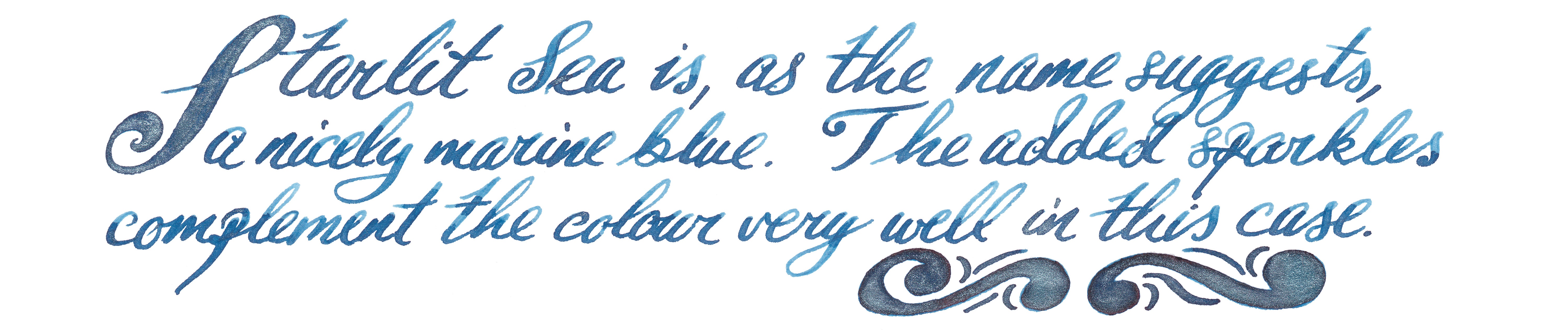
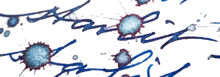
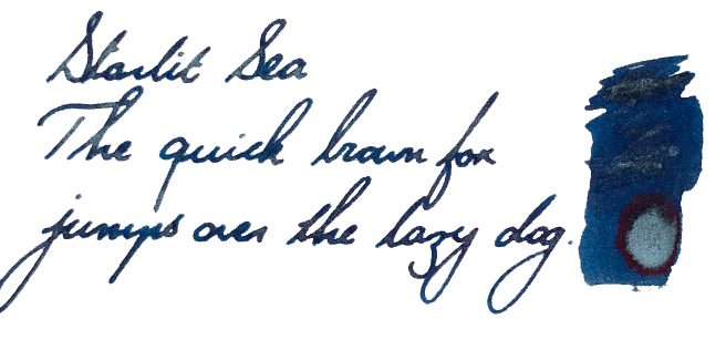
Starlit Sea
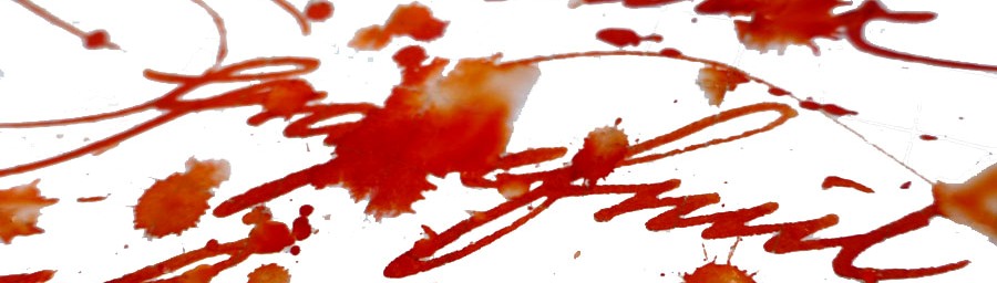
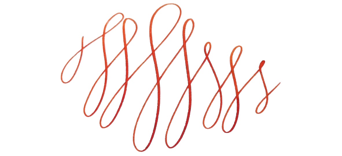
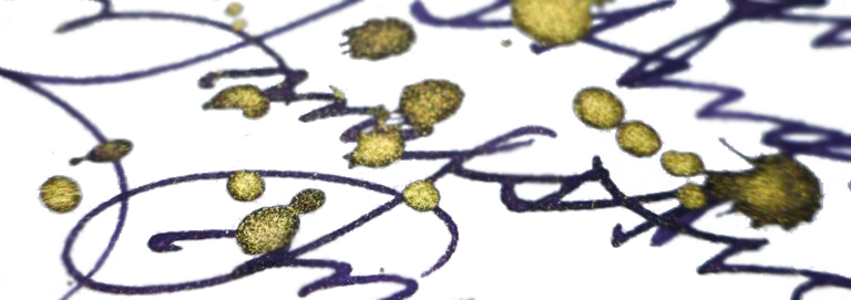
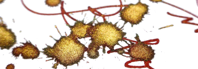
Crucially, how it writes… Diamine inks are very good indeed. This company has a long tradition (over 150 years!) and knows clearly how to make good-quality and well-saturated ink which flows. Shimmering inks are no exception here, however due to their specific nature some precautions have to be taken. Because shimmering inks are in fact suspensions, before filling the bottle should be shaken so the glittery particles will be evenly distributed. The same rule applies once your fountain pen is filled; gently agitate the pen before you use it (read it the economic news, or twiddle it between your fingers, whichever you prefer). It may not be a bad idea to prime the feed before writing. To get the full effect, a broad and ‘juicy’ nib is often a good choice, although the shimmering effect can be achieved using finer nibs as well. To get the best results then good, smooth and fountain-pen-friendly paper is a must!
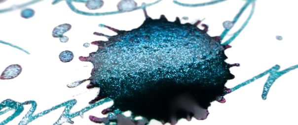
Ink! What is it good for? These are not ‘standard’ inks by any means, but Shimmering inks are in fact suitable for use in almost any modern fountain pen. However, suspended particles can potentially clog your precious feed, so our recommendation is to use inexpensive fountain pens which are easy to dismantle and clean. Glass pens or dip pens may be a good alternative here. We also do not recommend leaving pens filled with this type of ink for a prolonged period of time since it may leave deposits and dry out between the fins of the feeder – and it can then take some hard work to clean it up properly. Diamine Shimmer ink can be used on daily basis, but it may look a little unusual on business or legal documents (unless you work for Santa), so we would not recommend use for these purposes. Diamine Shimmering inks are, however, absolutely ideal for all festive occasions including wedding invitations or Christmas cards (yes, be quick Christmas is coming very soon!). If you wish to practice fancy Copperplate or Spencerian calligraphy, these inks are perfect for it. They will definitely add a ‘shiny’ dimension to your hand-writing and lift it up to higher level. We have also seen shimmering inks regularly used in personal diaries or journals. The possibilities may be endless, depending upon how creative or adventurous you are.
VFMConsidering the fact that Diamine inks are well made and the writing experience is generally very positive, a 50ml bottle filled with beautiful glittery ink for less than £10 is very good value for money (the official price is £9.95 at Diamine’s own web shop). Some UK retailers are selling it for even less (£ 8.95). ‘Sounds good… and it is!
If this isn’t quite your cup of tea, but almost…If you feel uncomfortable using this type of inks with your fountain pen, you can always try them out with glass pens. It is definitely a safe alternative and the effects are still very good. If you’d prefer to try pearlescent inks from a different manufacturer, then J. Herbin, De Atramentis and more recently Robert Oster all have alternatives worth considering – albeit at significantly higher prices.
Our overall recommendation These inks are really fun to use and the shimmering effects are extremely pleasing. Diamine have proved again that they can deliver affordable, great-quality products, and with a broad selection of 40 colours there is plenty to play with. An unqualified thumbs-up from us!
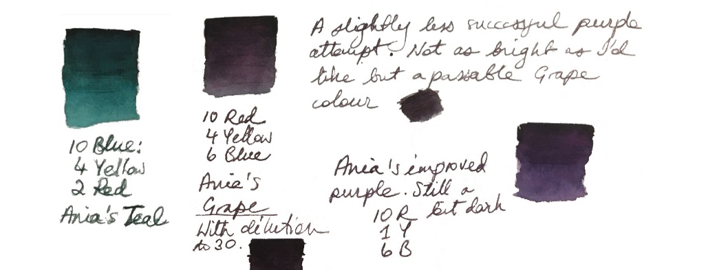
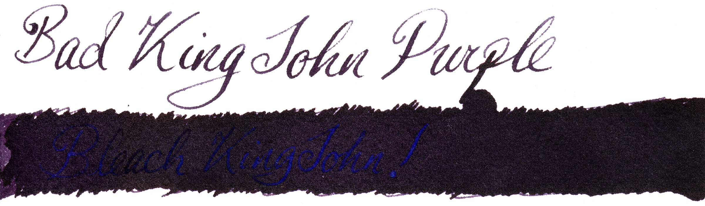
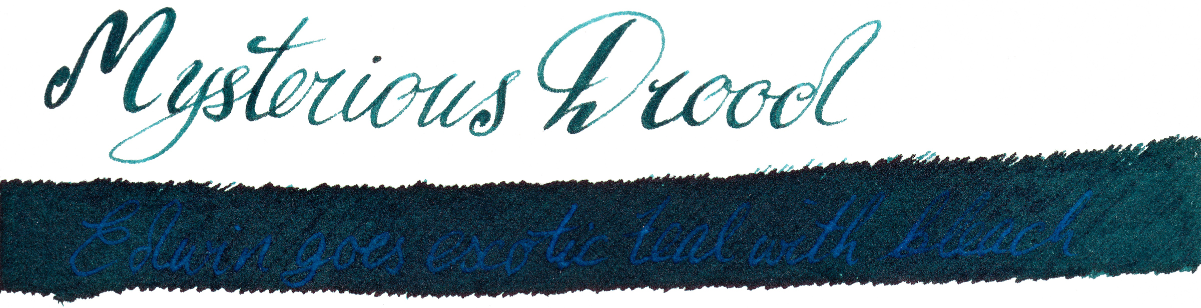
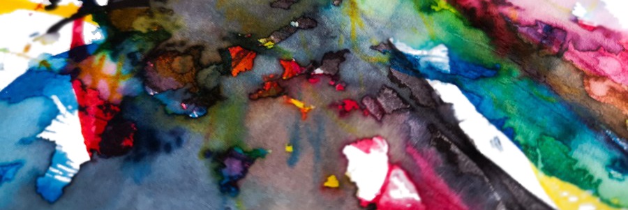
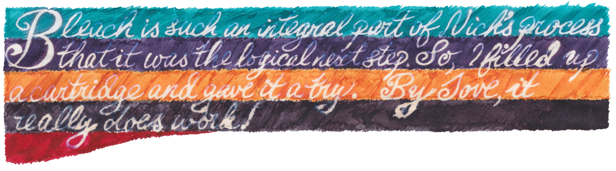
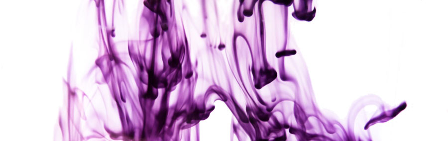
A little bit ofhistoryNick Stewart is a creative designer, artist, calligrapher and educator from historic Rochester, on the Thames estuary in Kent. Nick also actively contributes to United Inkdom. As an artist he is very passionate about inks, especially their chromatic properties, breaking down all possible hues and tonal ranges present in any ink he works with. He has tested hundreds and hundreds of inks which allowed him to understand how they are made and what factors are affecting specific properties. There is a hint of alchemy in his work, especially when Nick experiments with bleach to test how the destructive process which results can create something new and exciting.
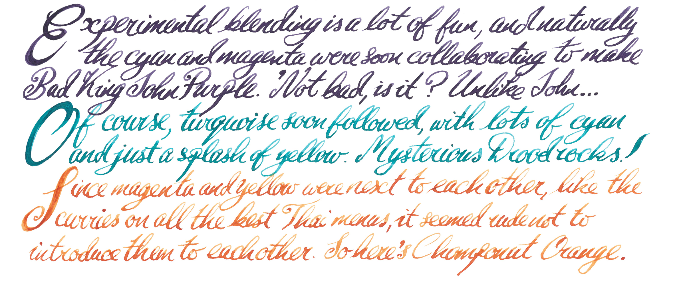
Nick has been working closely with Britain’s best-known fountain pen ink manufacturer to design his own custom-made inks, and we have already reviewed the first result, the beautiful Randall Blue-Black ink. Recently, he also came up with set of four mixable inks which mimic the CMYK colour model which many of us know better from printers. By blending them together, with specific ratios, the whole range of secondary and tertiary colours can be obtained. The idea was to create inks which generate a wide enough palette of colours that anyone can simply take them for a journey in a rucksack along with an art journal or watercolour paper pad. In principle it works in the same way as the simple watercolour sets you can find in any art shop and blend together using water. Because the majority of inks are made using dyes, the properties and final effects are different from those which pigment-based paints generate and are an interesting alternative to them.
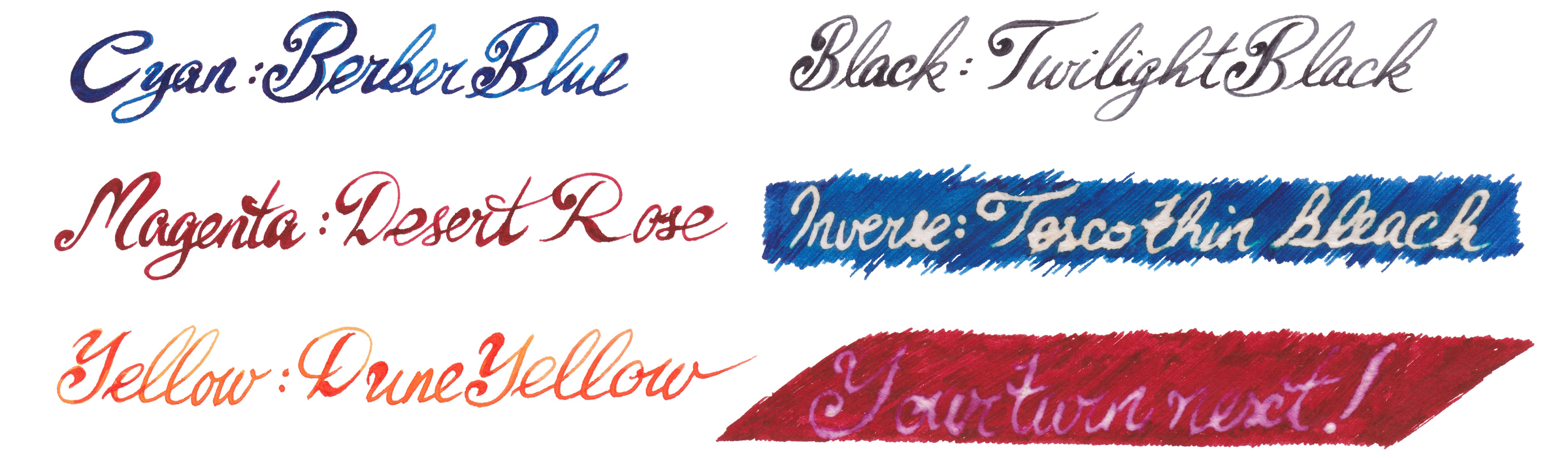
How it looksNick’s set contains four independent 30ml inks. The intended purpose is to blend them together to obtain new colours, but each ink can be used separately as a stand-alone fountain pen ink. The colours available in the set are: Berber Blue (C), Desert Rose (M), Yellow Dune (Y) and Twilight Black (K). These are not ‘pure’ CMYK colours, and each ink has its own unique characteristics. However, when mixed together they still create a full range of secondary and tertiary colours.
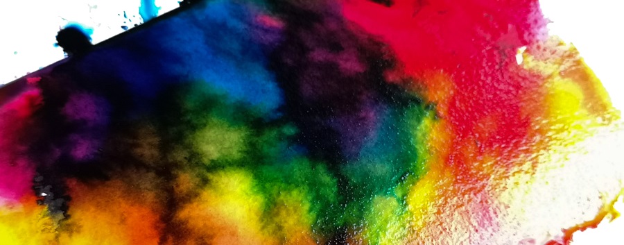
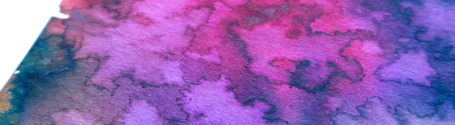
How it mixes For drawing, probably the best way to mix and blend inks together would be to use small portable paint trays, as employed by artists for watercolour or acrylic paints. The only problem is to figure out the best way of taking small amounts (or even drops) of each ink from the set bottles and transferring these to the mixing tray. With watercolour and acrylic paints it’s easy enough, since these are often available in small tubes or as solid blocks. Picking the ink directly from the bottle using a brush might not be the best idea; it would be very easy to cross-contaminate (unless you use several brushes). Pouring inks directly from the bottle may be risky, and cause splattery surprises. Plastic pipettes (or little eyedroppers) seem to be ideal for this, although you’ll need to carry a few of them. In future, we think it might be a good idea to make the set available with small eyedroppers mounted directly on the cap.
All four inks mix nicely together, and if necessary they can be easily diluted with water. For watercolour paper it’s helpful to apply thin layer of water as a medium, so the inks will flow better on the paper. Water brushes are also good for blending and washes.
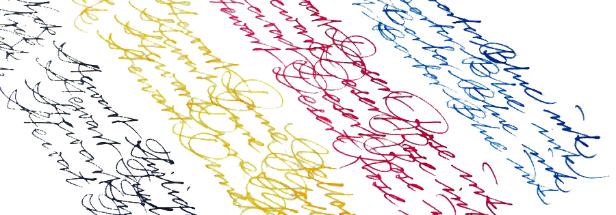
Crucially, how it writes…All four inks are very good quality. They flow well in fountain pens and the overall writing experience is pleasant. We have not noticed any unnecessary bleeding through, ghosting or feathering. As expected, the same observations apply for custom-mixed inks made with this set.
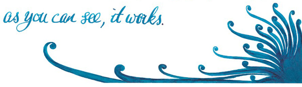
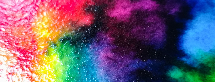
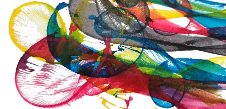
Ink! What is it good for?These are multi-purpose inks. The primary purpose of any fountain pen ink is writing, of course; all four base colours are nice on their own, but why not to create your unique combination of colours simply by experimenting and mixing base inks together as you like? However, the secret trick this set has appears as soon as they are diverted to use in painting and illustration – they blend well and the resulting colours are well-saturated and vivid. These inks are also water-soluble, so can be used for washes too.
VFMThe set is available for £20, which looks like decent value to us. You get four 30ml inks which are high quality in their own right and work very well with fountain pens, brushes and almost any other media you can find. Once you figure out how to mix them to obtain your preferred custom colours, this much ink should last quite a while.
If this isn’t quite your cup of tea, but almost…Blending colours is great fun and even if you don’t feel you have bags of artistic skill or unsure about the theory of colour mixing, you should definitely give it a go. Experimenting with colours is fascinating and maybe accidentally (magically) you will create the favourite ink colour you have always been searching for. Who knows? Try it and let the magic happen!
Our overall recommendation If you are illustrating, journalling or drawing when travelling and if you like different mixed-media to create art, then Nick’s ‘CMYK’ set is designed for you. If mixing colours doesn’t immediately sound like your cup of tea, we’d say you’re missing out. Take a leap and try it!
Where to get hold of someThe set of CMYK inks is available directly from Nick Stewart’s website where you can find all the details.
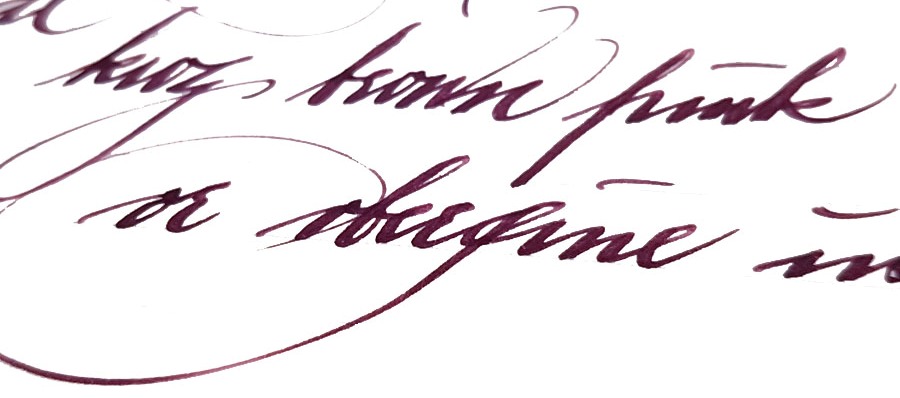
A little bit ofhistoryAs a still fairly new ink brand, KWZ has received a lot of attention in the last two years as it took the fountain pen world by storm. KWZ is operated by a lovely couple of professionally-trained chemists from Poland, Konrad Żurawski and his wife Agnieszka. That enigmatic name, KWZ, is simply Konrad’s initials. Konrad’s journey with ink manufacturing started as a hobby few years ago and quickly became his and his wife’s passion. Being a synthetic chemist specialising in polymers and organic chemistry, Konrad decided to experiment (which is not unusual for chemists) with formulae and reactions to create his own unique inks from scratch. Initially, he was mainly interested in making permanent iron gall (‘IG’) inks, which due to specific chemical reactions occurring over time have fascinating properties and behaviour, but he soon extended his laboratory’s range to ‘standard’ dye-based inks too. After many trials and tests Konrad came up with several inks which he and his wife decided to take to the Polish market first, then further afield. Agnieszka tells us that on the first outing to the Polish Pen Show, they were literally cutting-out KWZ Ink bottle labels while they were still on the train. During next few months KWZ inks started to get rave reviews on various fountain pen websites, blogs and social media channels, and with anticipation and demand growing quickly, the KWZ brand was formally registered in 2015. The range grew fast, even as Konrad and Agnieszka continued their scientific careers, and at the time of writing they have created an impressive range of 62 unique colours including 41 standard dye-based inks and 21 iron gall inks.
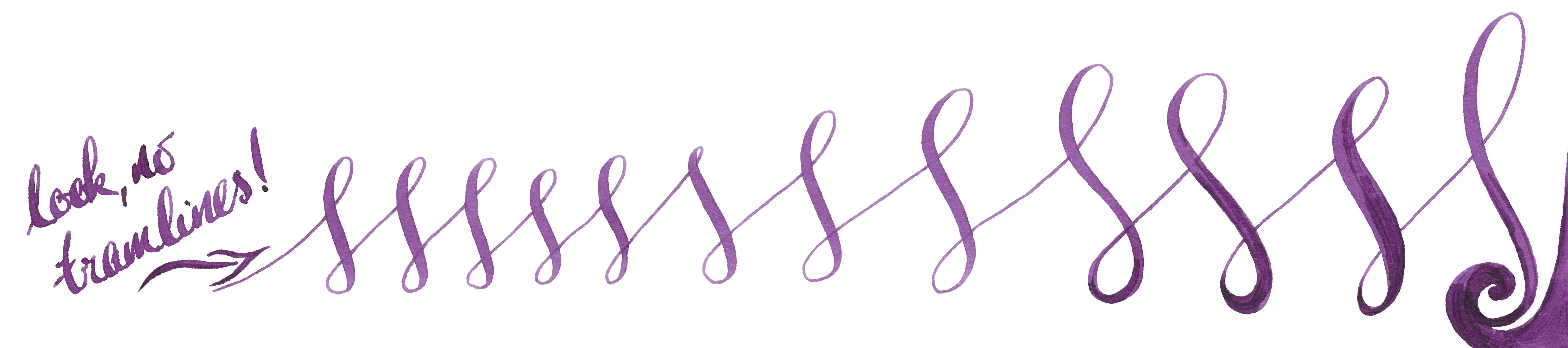
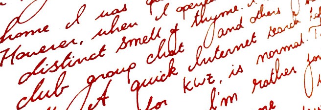
How it looksand How it writesKonrad is a fountain pen user as a well as a chemist, so understands how physical properties like surface tension, appropriate viscosity, flow, etc. are important for a satisfying writing experience. There is nothing worse than beautiful ink which is completely unusable, and when the flow or capillary action is limited one can struggle to write even on the best-quality paper. Konrad goes to great lengths in selecting, testing and applying ingredients and in this respect the KWZ brand has raised the bar for ink manufacturing more widely. The United Inkdom reviewers all found that aside from the impressively broad colour palette the crucial difference for KWZ ink is its flow properties. Of course writing experience depends on many things like paper, pen, nib, how the feed keeps up with the ink and also one’s writing style itself. People who have very a light touch need ink which flows well to keep up, otherwise pen will skip – but interestingly, heavy-handed writers also require a ‘wet’ ink in order to produce thicker and uniform line. This is especially true for those who use semi-flexible or flexible nibs, which can tend to tramline/railroad if a dry ink is selected. In this respect we found that KWZ inks are some of the best available; the flow is excellent, and in even the most gushing of flex-nib feeds it can keep up. We found the writing experience very pleasant with all types of pens all we tried the ink in, including those with particularly fine nibs as well as broad and flexible ones. On good-quality paper KWZ inks behave very well, tending not to feather and bleed through. This may not be the case with cheap absorbent alternatives such as photocopy/printer paper, but of course all fountain pen inks struggle on those surfaces. Because KWZ inks are highly saturated some ‘ghosting’ may occur especially on very thin paper, such as that made by Tomoe River. We found that many inks from KWZ we tested gave a decent amount gradual shading, but in some cases shading is very impressive, although in general KWZ inks do not exhibit a sheen. They are fairly wet inks, so drying time is not the strongest feature, but once they do dry completely there is not smudging.
Let’s have a look at some of the particular colours we tested. Obviously we have not tried all the inks KWZ offers, but we picked a few which are good representatives of this broad and diverse palette.
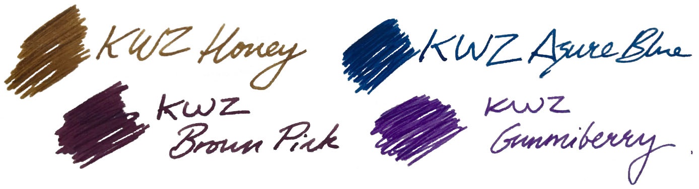
Brown Pink
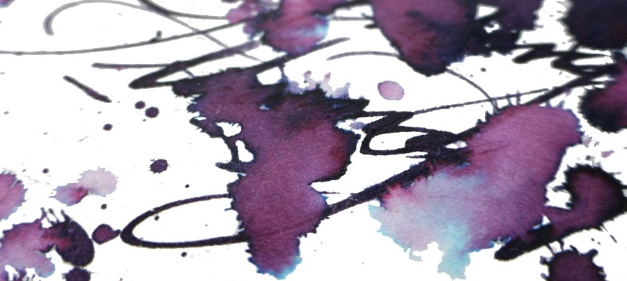
This is one of the KWZ inks that Mateusz and Laura enjoyed the most. A beautiful combination of red-purple with hint of bright light blue makes this ink quite unique. If you like aubergine, plum or beetroot like colours, this KWZ ink will please you. When it dries on the paper it looks less vibrant and flattened, but with this subtle gradual shading Brown Pink is a ‘must have’ in any ink collection – and its popularity already reflects this.
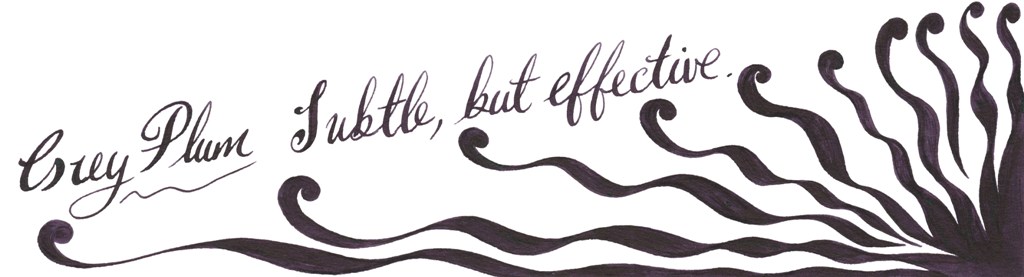
Grey Plum
Compared to Brown Pink, Grey Plum is darker and more purple. The blend of purple, dark grey and bright blue gives a very interesting and pleasing result. With wet juicy nibs it looks almost black.
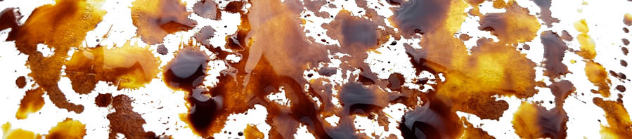
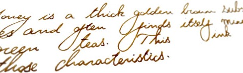
Honey
Honey is probably one of the most popular KWZ inks and for a while it was not easy to obtain it, because it kept selling out. Honey is a warm looking golden-brown ink, which gained its popularity because of the lovely shading it produces. This is particularly pronounced on smooth, good-quality paper, where the greatest colour gradation happens.
Cappuccino
This is a warm-looking brown which also gives nice shading.
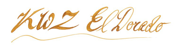
El Dorado
El Dorado is an another example of a great shading ink. The colour varies between darker yellow and orange, or a nice blend of caramel and honey, if you prefer.
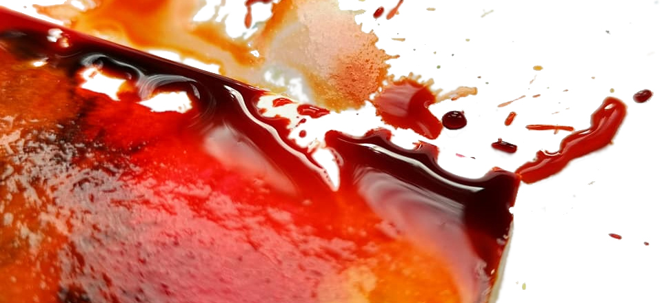
Orange (IG)
This is very interesting ink. Out of the bottle it looks like a warm orange, but being an iron gall ink it undergoes drastic metamorphosis and quickly becomes a darker brown…pure magic.
Green Gold
If you like military, camouflage colours similar to Diamine Safari, than Green Gold may be for you. This is a wonderful blend of earthy, almost olive green with yellow.
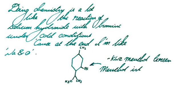
Menthol Green
This is a blue/green or green/blue ink which verges upon teal – mixed with a little absinthe, perhaps.
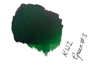
Green #3 and Foggy Green
Green#3 may be easily classified as a ‘standard’ green which according to Gillian give some nice shading too.
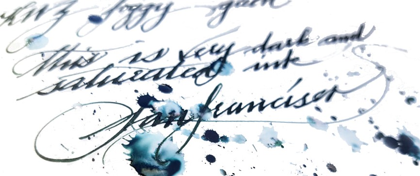
Foggy Green is rather difficult to describe; a murky, faded dark green with a significant amount of grey. It could be best to use this only in drier pens as it otherwise comes out very dark. This may be an interesting option for those who do not like flashy inks which stand out from the paper.
Azure #3
If you like deep cerulean blue/turquoise inks which remind one of blue lagoons, Azure#3 is absolutely a must. Ruth loves slightly darker brother Azure #4 too.
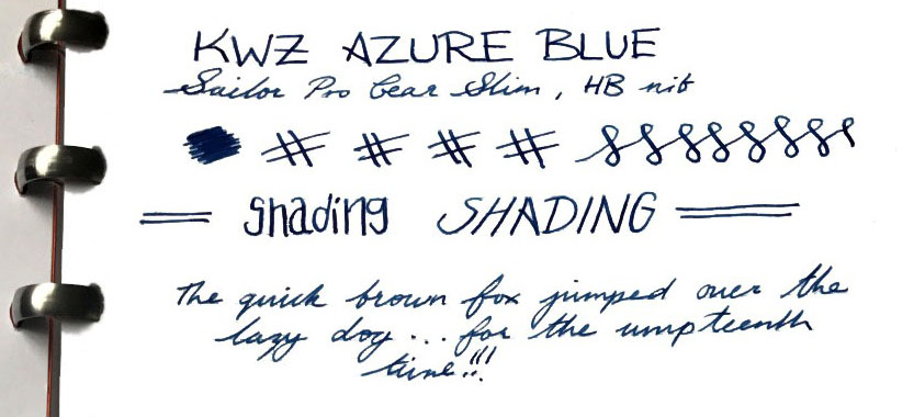
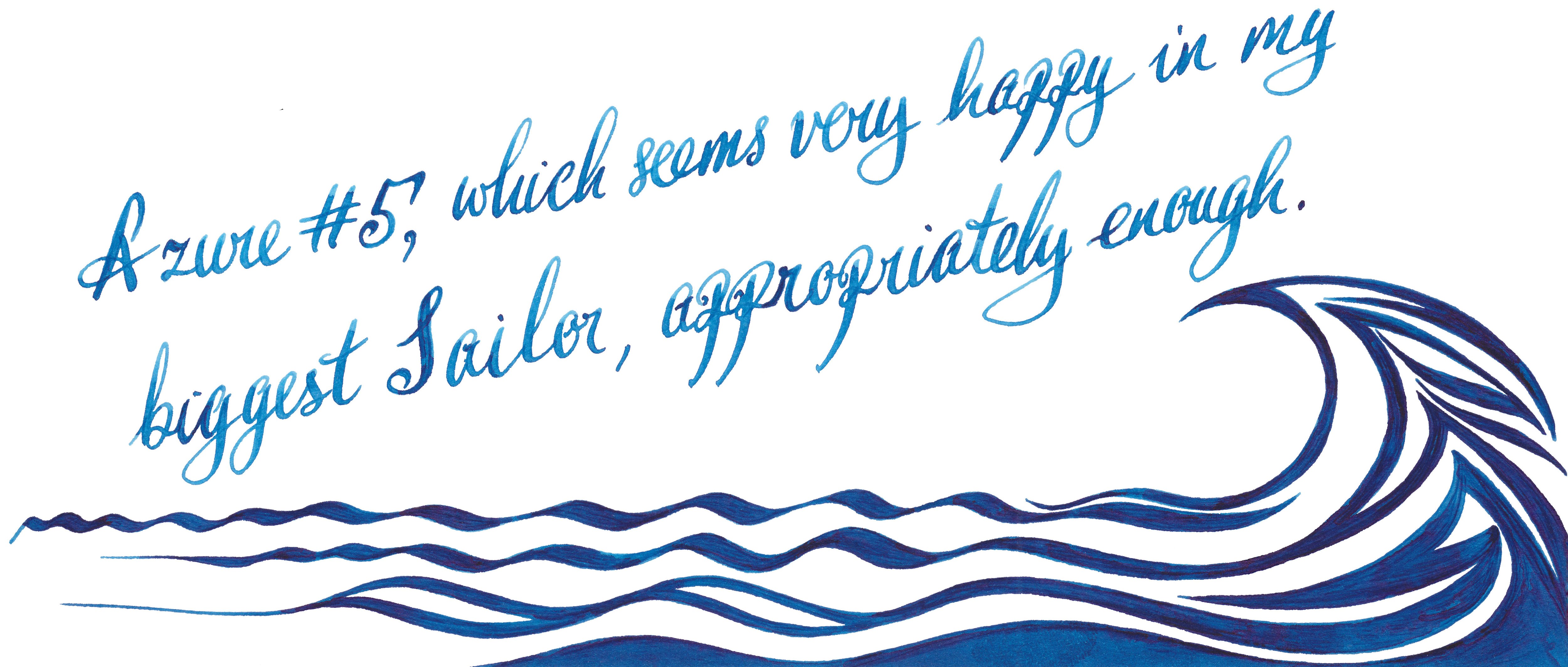
Azure #5
This is a gorgeous deep blue which offers some pretty shading. This may be a perfect day-to-day ink. Both Laura and Scribble were delighted how this well-lubricated ink performs with picky Sailor pens.
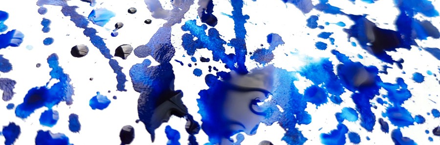
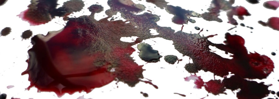
Turquoise (standard and IG)
Love magic? Iron Gall Turquoise will help you to trick people. This fresh deep turquoise blue ink dries to a wonderfully dark teal.
before……and after
However, if you are not so adventurous then the beautiful standard turquoise is a safer option. Moreover, it has been proven that it is happy in flexible nibs, and
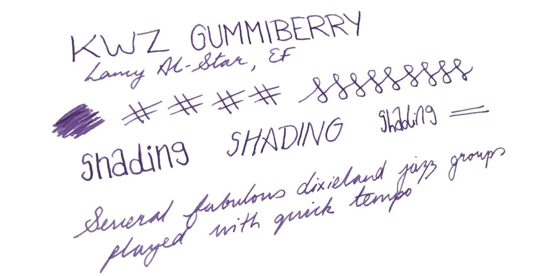
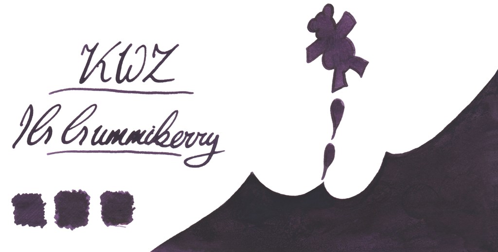
Gummiberry
Gummiberry juice gives the ability to bounce at unusual heights. Like the idea? Us too! This is wild and crazy name for such a pretty purple ink. Ruth definitely loves it – no surprises there. John loves it too. The big surprise is that Laura, who is generally is that not much into ‘girly’ colours enjoyed it too. It works very well with Scribble’s Pilot Custom 742 FA. John was also very pleased by flawless performance of his Sailor EF pen.
There’s an iron gall version of this in development, too:
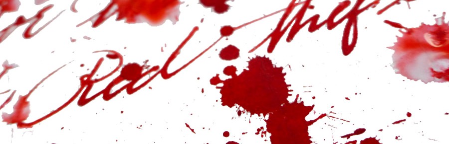
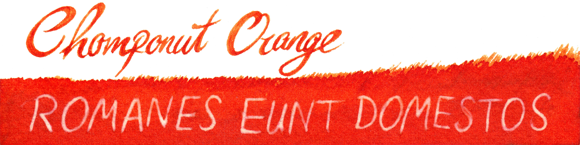
Thief’s Red and Flame Red
Many of us love red and red orange inks – the more disturbing the better! Be careful if you decide to work in the office or anywhere public these two. Thief’s Red is more red-towards-pink:
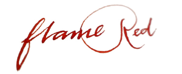
…while Flame Red is definitely red/orange:
Grapefruit
KWZ Grapefruit is a bold and vibrant orange with light touch of pink – we thought it a very appropriate name.
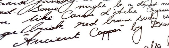
Maroon
Last but not least is the rich and saturated Maroon, which even gives a hint of sheen, uncommon among KWZ inks. This is a very pretty colour indeed.
How it smells Well, in general KWZ inks have very a distinctive and recognisable scent which for some is reminiscent of vanilla, whereas for other it reminds them of thyme. The smell will eventually disappear (at least form the paper). The characteristic aroma of a KWZ ink comes from the antifungal/anti-mould agent which KWZ uses in the formulation. In contrast to the phenols used as a preservative by some manufacturers, the anti-fungal chemical used in KWZ inks is not toxic. This is great news, but not all of us have been enamoured of the pungent smell, especially during longer writing sessions. Despite some reported problems with staining TWSBI pens (especially the ECO model), it is generally relatively easy to clean pens from KWZ inks, but at the same time is also very difficult to eliminate the smell. Agnieszka and Konrad are certainly aware of this issue and they are continuously working on better, more satisfying formulation. We have been told that since September 2016 all KWZ inks have different component which gives rather sweet and less irritating ‘chemical’ scent compared to how it was before.
Our observation regarding the KWZ ‘perfume’ is in line what we have seen reported and discussed by other users elsewhere; responses are sharply divided between those actually quite like this this smell and those who can barely stand it all. It is worth mentioning that the KWZ inks we were testing came from both ‘old’ and ‘new’ batches respectively, so it is not surprising that our experiences are different. Interestingly, within our team of reviewers Ruth found this smell pleasant, whereas Laura and Gillian have completely opposite experiences, and while Scribble can handle it, his other half will only let him use it outdoors. Our assessment is that as soon as Konrad and Agnieszka standardise the new ‘neutral’ formula, KWZ will become a solid brand for the wider market – but until then, writers may be well-advised to try a sample before committing to a full bottle.
Regarding problems related to the TWSBI ECO line, where several issues with permanent staining were reported, we have been told that the KWZ team has investigated this and have already switched an ingredient which was unfortunately reacting with the polymer used in these pens.
Ink! What is it good for? This really is a very subjective matter. Because the colour range KWZ offers is so broad, picking the right colour for your needs should not be too difficult. All those who likes classic colours for office/businesses will be satisfied as well as those who are adventurous enough to use more exotic colours. Again, the only concern is that characteristic smell, which is not to everyone’s taste and may not be appreciated by all around you. Apart from that, this is ink fit for just about any every-day fountain pen purpose.
VFMKWZ inks are not the cheapest. In the UK you may get a 60ml bottle of KWZ Ink for around £12-13, depending which retailer you pick. This is almost double what you will spent on 80 ml bottle of standard Diamine ink, so it is not easy to justify on colour grounds alone, but for users of flex nibs or drier feeds the flow properties may make the investment worth it.
Our overall recommendation Our reviewers all agreed that KWZ Inks are very interesting and even have potential to be market leaders in the future. KWZ inks are generally wet and well lubricating. All the inks we tested flow nicely and gave us a good writing experience, even with pens which normally tend to run dry – and that viscosity helps to maintain a fast flow which is particularly noticeable with more demanding flexible or semi-flexible nibs. Colours are saturated and many exhibit great shading (e.g. Honey). However, if you are sensitive to the rather powerful pong of the current KWZ ink formula, getting cheaper Diamine ink or investing slightly more for Robert Oster’s Signature inks may be a wise alternative.
Where to get hold of someKWZ inks are not yet as widely available as some other popular brands. However, several specialist online retailers do stock them, and in the UK a wide selection of colours (including Iron Gall inks) is available exclusively from Pure Pens and Bureau Direct.
Thanks to Pure Pens, Bureau Direct and KWZ Ink themselves for providing inks to several of our bloggers previously – and big thanks to Pure Pens for furnishing even more of us with samples specifically for this meta-review exercise.
 How it looks The finish of the Nettuno 1911 models we tested is called Tritone. It features a pearlescent shimmering silvery grey resin body with grip section and finials made from dark blue resin. These are complemented with rhodium accents. On the cap there are three polished bands whereas the barrel contains two wider rings, with the relief patterns of arched windows referring to ancient Roman architecture. These bands are made from the same metal as the clip and have a matte texture. The finial on the cap has a metal ring with a wave pattern. The pen is equipped with a rhodium-plated steel nib.
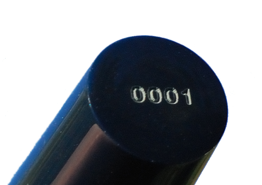
 A little bit of history This is a festive tradition now, so the British ink legends
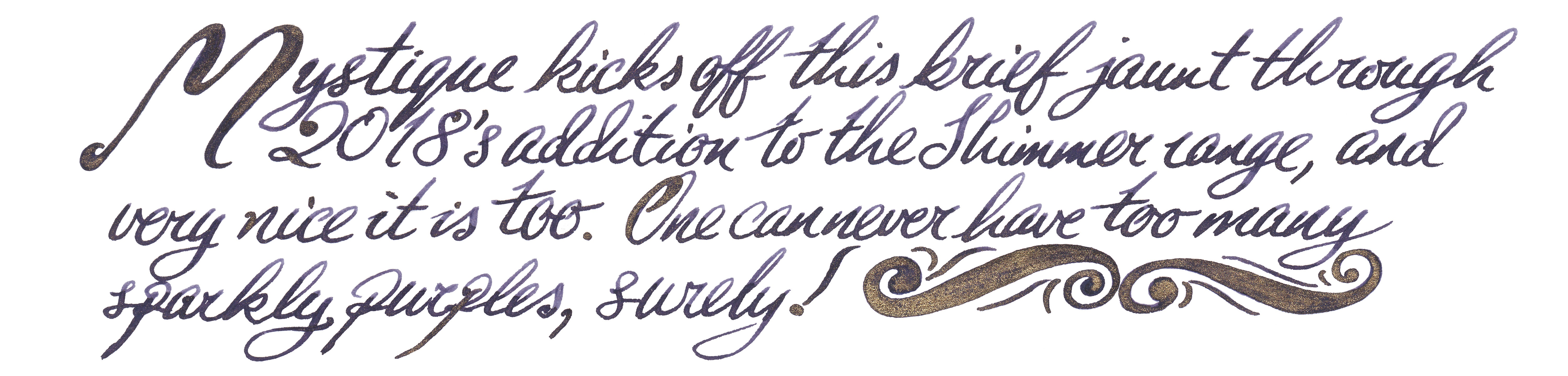

 If this isn’t quite your cup of tea, but almost… If you feel uncomfortable using this type of inks with your fountain pen, you can always try them out with glass pens. It is definitely a safe alternative and the effects are still very good. If you’d prefer to try pearlescent inks from a different manufacturer, then J. Herbin, De Atramentis and more recently Robert Oster all have alternatives worth considering – albeit at significantly higher prices.
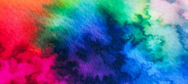
 A little bit of history Nick Stewart is a creative designer, artist, calligrapher and educator from historic Rochester, on the Thames estuary in Kent. Nick also actively contributes to United Inkdom. As an artist he is very passionate about inks, especially their chromatic properties, breaking down all possible hues and tonal ranges present in any ink he works with. He has tested hundreds and hundreds of inks which allowed him to understand how they are made and what factors are affecting specific properties. There is a hint of alchemy in his work, especially when Nick experiments with bleach to test how the destructive process which results can create something new and exciting.
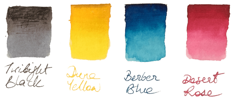 How it looks Nick’s set contains four independent 30ml inks. The intended purpose is to blend them together to obtain new colours, but each ink can be used separately as a stand-alone fountain pen ink. The colours available in the set are: Berber Blue (C), Desert Rose (M), Yellow Dune (Y) and Twilight Black (K). These are not ‘pure’ CMYK colours, and each ink has its own unique characteristics. However, when mixed together they still create a full range of secondary and tertiary colours.
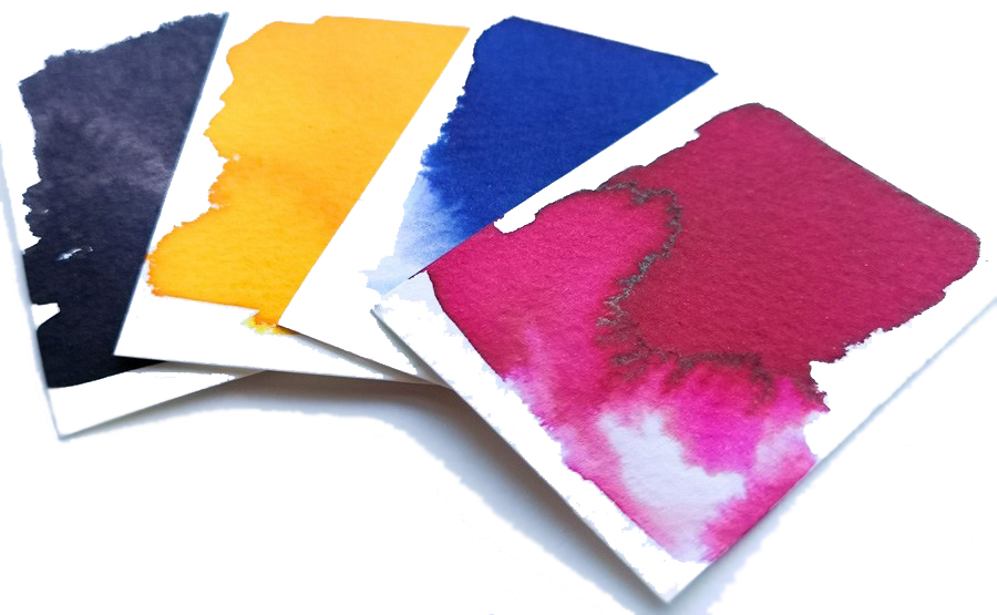
 The United Inkdom reviewers all found that aside from the impressively broad colour palette the crucial difference for KWZ ink is its flow properties. Of course writing experience depends on many things like paper, pen, nib, how the feed keeps up with the ink and also one’s writing style itself. People who have very a light touch need ink which flows well to keep up, otherwise pen will skip – but interestingly, heavy-handed writers also require a ‘wet’ ink in order to produce thicker and uniform line. This is especially true for those who use semi-flexible or flexible nibs, which can tend to tramline/railroad if a dry ink is selected. In this respect we found that KWZ inks are some of the best available; the flow is excellent, and in even the most gushing of flex-nib feeds it can keep up. We found the writing experience very pleasant with all types of pens all we tried the ink in, including those with particularly fine nibs as well as broad and flexible ones. On good-quality paper KWZ inks behave very well, tending not to feather and bleed through. This may not be the case with cheap absorbent alternatives such as photocopy/printer paper, but of course all fountain pen inks struggle on those surfaces. Because KWZ inks are highly saturated some ‘ghosting’ may occur especially on very thin paper, such as that made by Tomoe River. We found that many inks from KWZ we tested gave a decent amount gradual shading, but in some cases shading is very impressive, although in general KWZ inks do not exhibit a sheen. They are fairly wet inks, so drying time is not the strongest feature, but once they do dry completely there is not smudging.