Tag Archives: Diamine

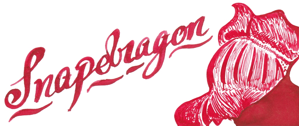
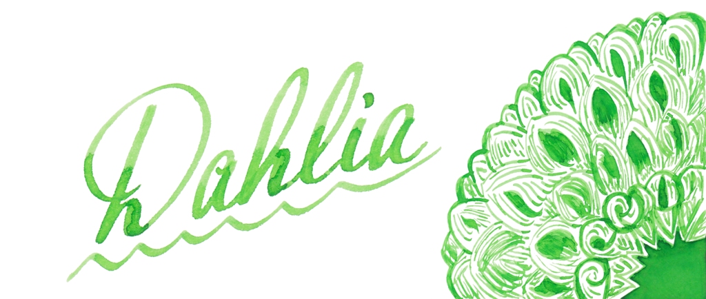
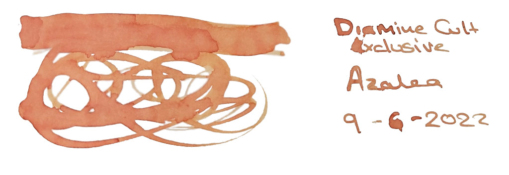
Diamine new Flowers box set

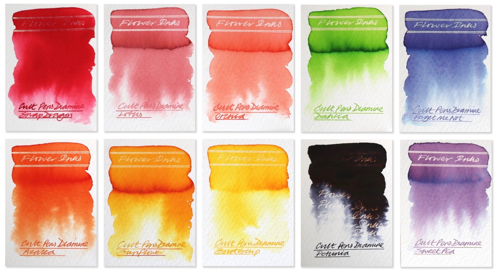
A little bit of history  OK, relax, we’re not going to relate the whole natural history of flora. Let’s stick to the inks. Diamine released a box set of inks inspired by flowers a few years back, and it was a hit, with shades like Pansy and Cornflower continuing to find new fans even now. So, quite reasonably, Cult Pens thought it would be a good idea to commission a sequel.

How it looks  These are packaged in ten square-ish bottles.

How it arrives  In a box, naturally enough. This is perhaps a bit predictable, but it’s easier to manage than a flower-pot.

Crucially, how it writes…  Not too wet, not too dry – but some of this set are a bit low on saturation, so be warned.

Ink! What is it good for?  Drawing, we think; given the pallor of several of these inks they look better suited to illustration than correspondence.

VFM  £60 for ten small pots of ink is a fair bit, so the full set is probably one for hard-core floristry fans. Others may prefer to await individual refill pots and pick just the colours which really do it for them.

The only way is ethics  Made near Liverpool by a firm we can trust to behave, and packaged in old-school materials, this scores highly.

If this isn’t quite your cup of tea, but almost…  Go for the original Flowers box set, which has a rather more robust range of colours.

Our overall recommendation  If you find yourself lusting after the pale and mysterious inks which many Japanese brands indulge in, without the instant penury a large collection of those might inflict, you could do a lot worse than try a few horticultural doodles with this box set.

Where to get hold of some  Only from Cult Pens

This meta-review references:

Thanks to  Diamine for the samples

It’s the most colourful time of the year

A little bit of history  Advent calendars started in Germany, or possibly Austria, but at any rate fairly close to one of the great homes of nibmeisters then and now. Beloved of Lutherans in particular, the versions with pretty pictures cheered up the home in winter, and the versions with sweets made up for that monotonous Diet of Worms. But it took Scousers to come up with a version of the advent calendar which would brighten your life for the rest of the year without threatening one’s waistline, and thus in 2019 the Inkvent calendar was born. Twenty-five little bottles of ink, all of them new, behind cardboard doors. Some of us gave in immediately. Some of us waited until we could buy full bottles individually. But all of us wanted to share the results.

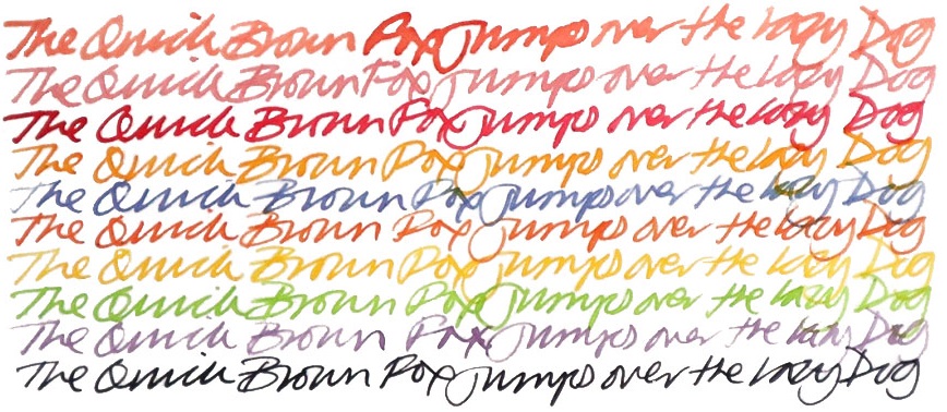
How it looks  It looks much like an ordinary advent calendar with something boring like chocolate inside, but that’s just a cunning disguise. There’s a jolly snowman design printed in blue, which might be why the inks are now labelled as ‘Blue Edition’… but that’s probably not what you wanted to know about. The new bottles are amazing four-legged contraptions which look like they could canter away at any moment if you don’t put down that wretched ballpoint and play with a real pen. But perhaps that’s not what you’re after either? Oh – the inks!! Well they look amazing as a range, don’t they? We were a little surprised to find quite so many browns and dark greens, but the whole palette of midwinter hues is here. There are also plenty of traditionally festive reds, some very groovy blues, a gold, a silver, two cracking purples and a terrific turquoise. Unusually for a set released together, some are ‘solid colours’ but many feature sheen, shimmer or both, which is showing off really, but if you can’t do that on special days when can you?

Crucially, how it writes…  These all seemed to be fairly well-behaved inks for our expanded testing team (these are very popular inks), although the usual caveat about shimmering inks applies; i.e. use these only in pens which can be readily dismantled for full cleaning (and, preferably, reassembled without consulting a Haynes manual).

Ink! What is it good for?  These aren’t inks for taking to the office, to be honest, but as those are all closed at the time of writing perhaps that’s no bad thing. They’re inks for having fun with – and they’re just right for it!

VFM  These are not the cheapest inks Diamine has ever produced, but they’re nevertheless admirably affordable by international standards. The prices are variable depending upon complexity, too, so the standard inks are about £8 , and the shimmery sheen monsters about £11, depending as ever upon where you shop. For 50ml that’s not bad value, especially when the results look this snazzy.

If this isn’t quite your cup of tea, but almost…  Seriously? Come on, there a lot of really interesting inks here. If there isn’t a single thing which takes your fancy, we’re probably not going to be friends. But if you want a second chance, there’s a fair bet that another one is on the cards for this Yule, when we’ll all need some more cheering-up after all.

Our overall recommendation  Have a meander around the detailed reviews which this article draws upon – links below – and see what grabs you. Something will! Top tips from our gang include sheeny blue Polar Glow, teal/red sheen monster Season’s Greetings, robust red Fire Embers, tinsel-turquoise Blue Peppermint and shiny dark Winter Miracle, which looks like Scribble Purple with bright blue glitter and is none the worse for it.

Where to get hold of some  These are new, but they’re not limited editions; available then, at any good stationery shop – and until those are open, on all decent fountain pen retail websites.

This meta-review references:

Thanks to  Diamine for inundating us with a postcard from quite near North Wales, actually, and an awful lot of sample pots.

FPUK special inks

A little bit of history When the jurist Lord Monboddo – who we perhaps have to admit was a bit of an eccentric – was in London for one of his yearly visits in 1787, he attended a hearing of the Court of King’s Bench which he, trained in Roman-based law, had relatively little to contribute to. According to legend, the structure started to collapse, plaster rained from the ceiling and everyone rushed from the building, wigs flying, only to realise their esteemed guest had been left behind. Monboddo was entreated to stir himself and asked why he had not already done so; his response was simply that he had assumed this was “an annual ceremony, with which, as an alien, he had nothing to do”.
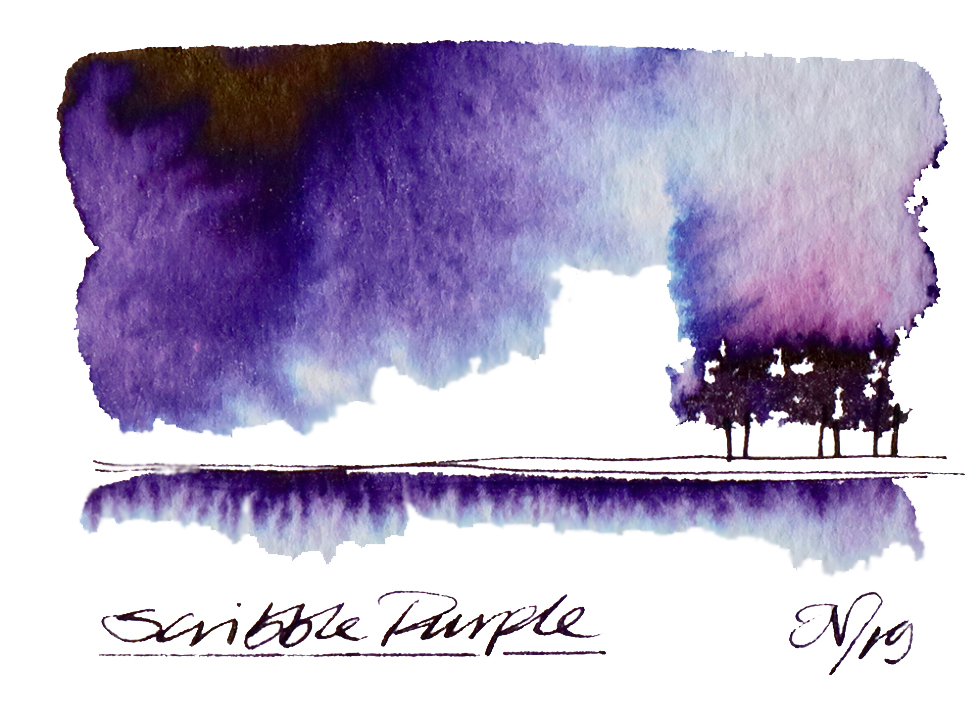
Perhaps he may have had a point; bubbles come, and bubbles go.  When the investment bubble of the Darien Gap scheme bankrupted Scotland in the late seventeenth century, it either sought aid from, or was forced to go cap-in-hand to (depending upon your interpretation) England, and the 1707 Act of Union followed. That Union soon fell prey to its own difficulties with the South Sea Bubble, generating debts so massive that they were only finally paid off in 2015, just in time for a new have-cake-and-eat-it bubble to arise in its place the next year. The latter looks likely to put paid to the local market for luxury writing equipment, and indeed those united kingdoms that this site was named in tribute to. But, thanks to a similarly endangered enterprise entitled ‘Fountain Pens UK’ on social media, we can perhaps at least have one last inky hurrah.
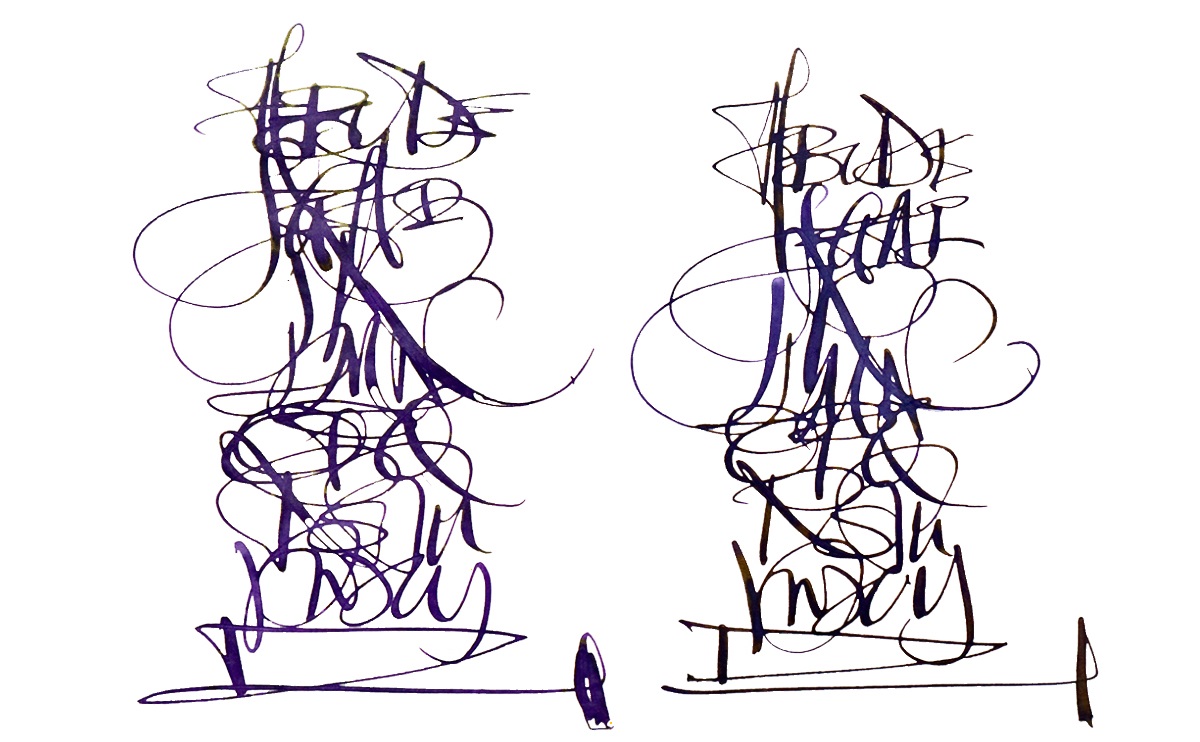
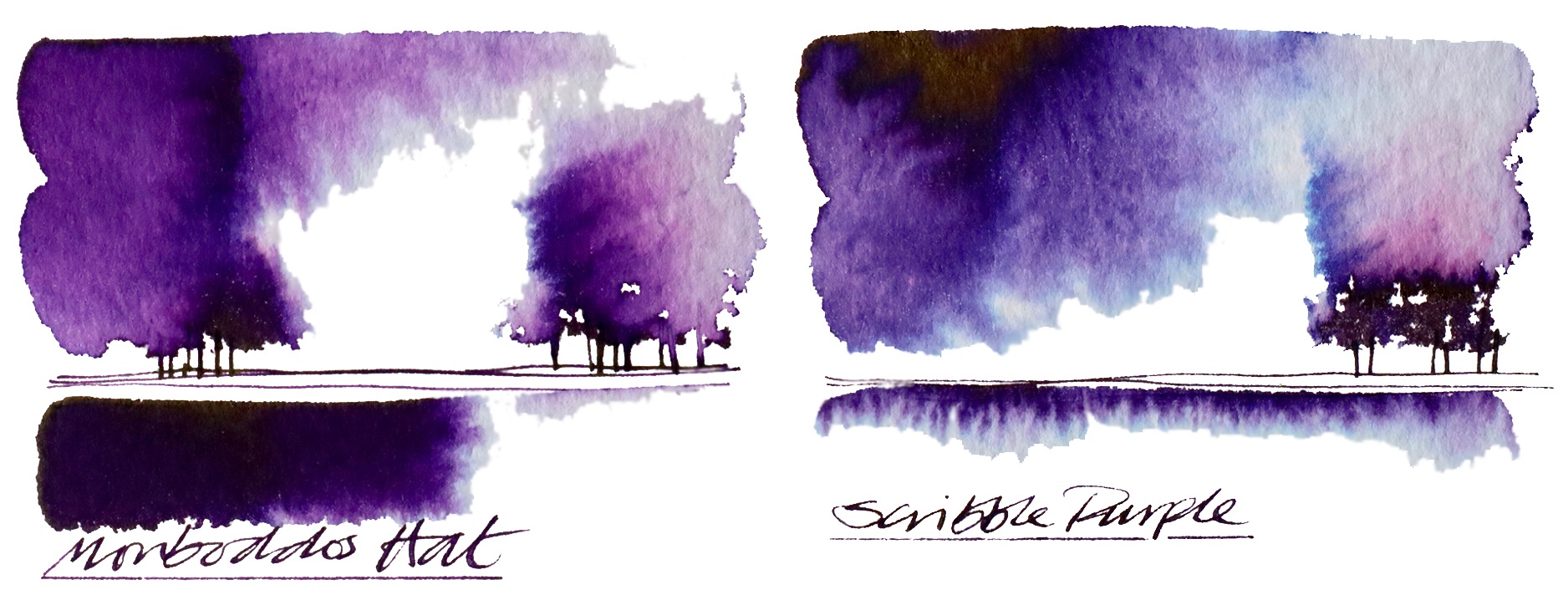
Earlier in 2019, the members of FPUK starting collaborating with Diamine, a brand which has itself been around long enough to have been formally set in a few different countries without actually relocating. The collaboration was fulsome and detailed, with Nick Stewart testing no less than ten prototypes and Scribble then trying the three which made the shortlist. The FPUK group voted on the final formula for production and, in an example of what can happen in properly regulated democracy (perhaps we’d best steer clear of that one here), decided that two should share the winner’s podium. The administrators insisted that one should be named in honour of a certain purple ink enthusiast, and the other as a tribute to his hat, which is somewhat embarrassing for the author of this piece but we’ve got this far using first person plural and it’s too late to come over all gushing now. Lord Monboddo didn’t have a purple hat, because both the millinery style in question and synthesised aniline purple dye came about in the mid nineteenth century, a good fifty years or more after his demise, but the extremely distantly related (probably) Scribble Monboddo does – and is wearing it whilst writing this piece. Pictures or it didn’t happen, eh? 
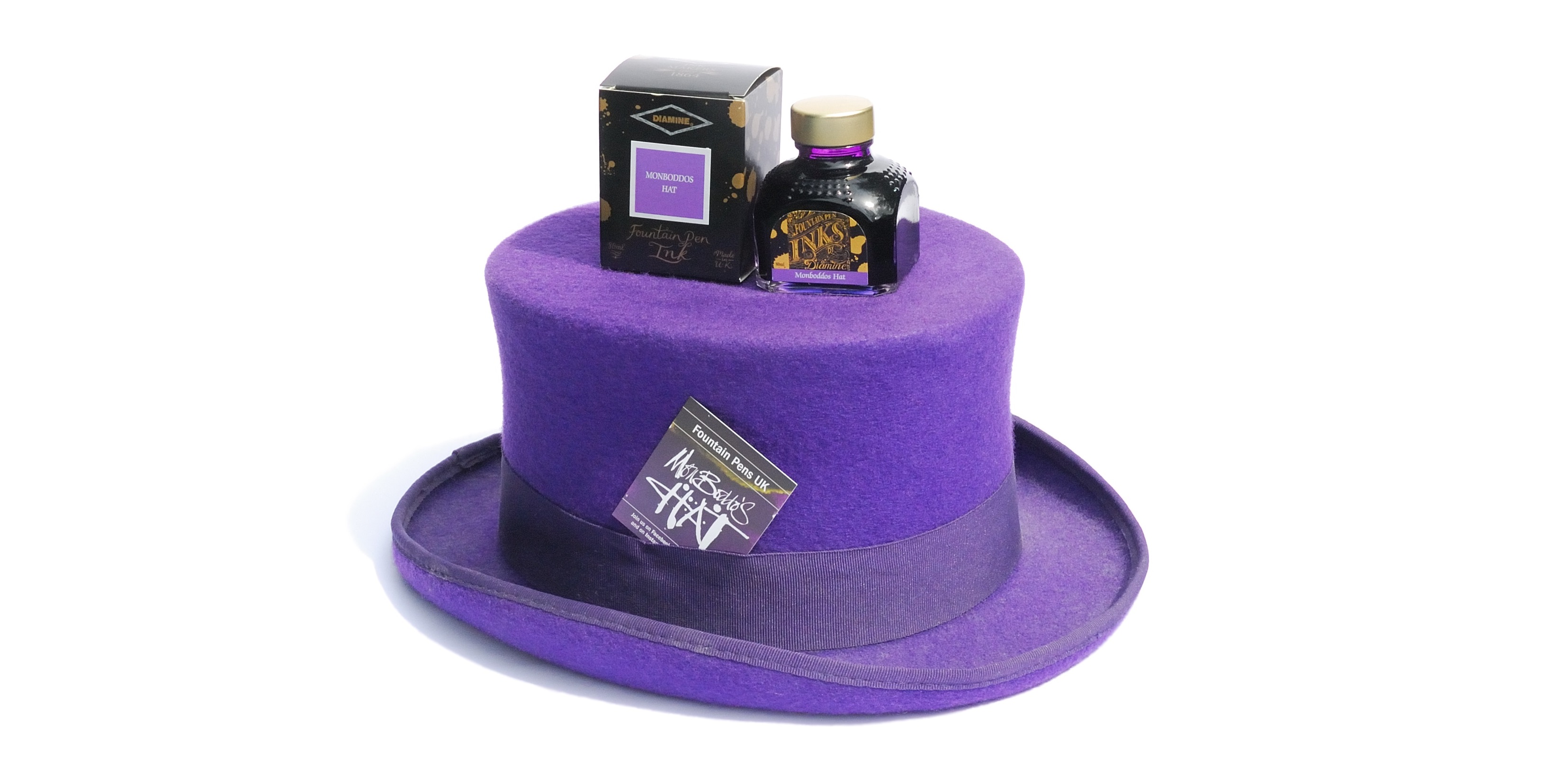
Bubbles come, and bubbles go. Let’s waft this one around for a bit before it pops…

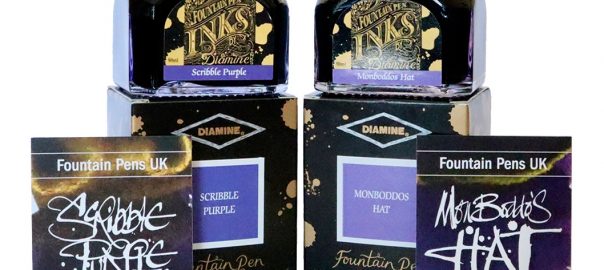
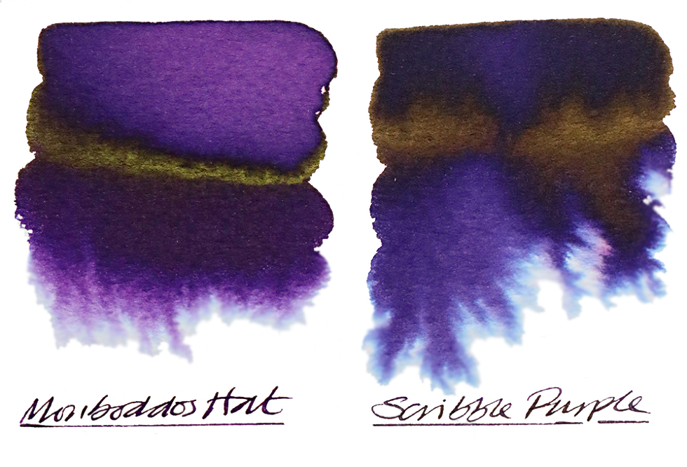
How it looks  Purple, astonishingly enough! Scribble Purple, which started life as prototype #765, is a rich, dark purple with, rather unusually, a golden sheen when it is laid on especially thickly. Prototype #768x became Monboddo’s Hat, a brighter pinkish-red (but not wishy-washy) purple with more of a green sheen. 
How it smells  Nothing to sniff here – move along benodorously now.
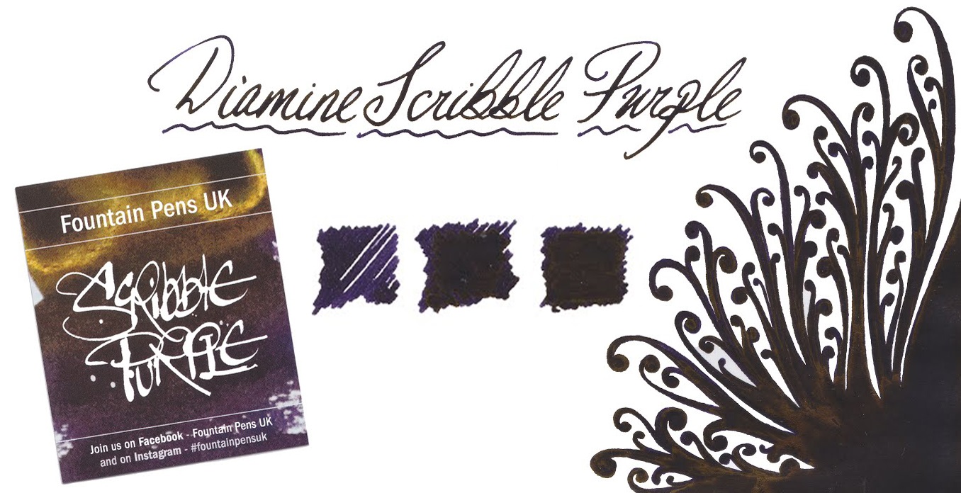
How it travels  These inks are available in both of Diamine’s standard carriers, the 30ml plastic Bradgate bottle (incidentally named after the birthplace of Lady Jane Grey, if you fancy another little bit of history) and the 80ml ‘chicken pox’ glass flask. Both are practical conveyances for the ink, and the larger 80ml size also come with collectable cards designed by Nick Stewart himself.
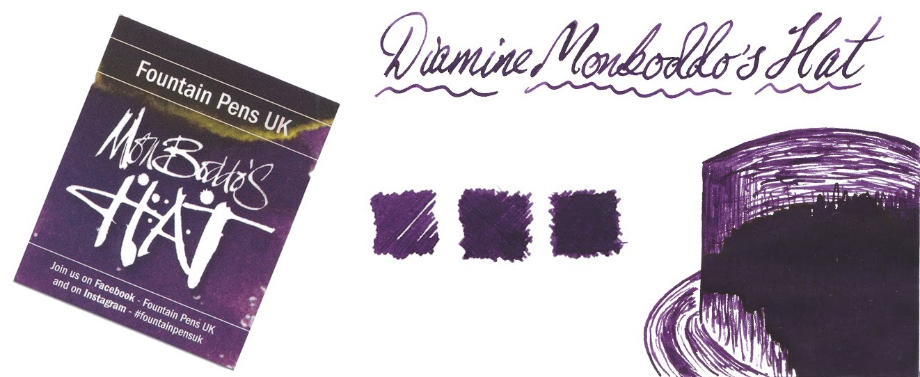
Crucially, how it writes…  Now, there are some differences here, which may helpfully justify buying both.  Scribble Purple is saturated but nevertheless flows as well as standard fountain pen ink usually does, with no sin to report. Monboddo’s Hat is noticeably drier, so perhaps not so ideal for everyday purposes – but excellent if you have an overly-wet feed to tame, or if you are working on slowly-written calligraphic masterpieces.
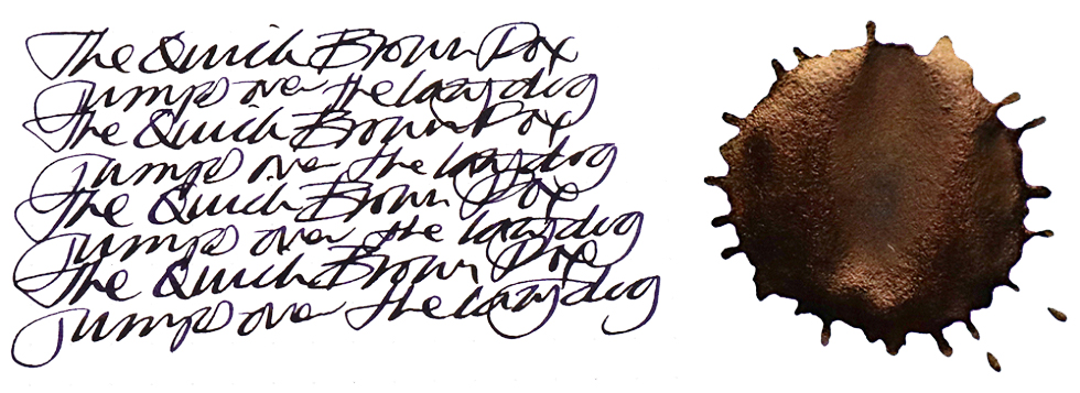
Ink! What is it good for?  If you’re lucky enough to find work in the lean years ahead, Scribble Purple is probably an ink which you can take with you; it’s so dark that the uninitiated probably won’t distinguish the difference from boring blue-black from a distance, while cognoscenti will be quietly impressed. Monboddo’s Hat is an ink for creative purposes, as writers of doodle-laden journals and the like are already discovering.
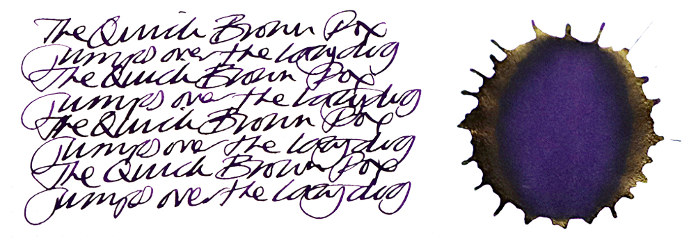
VFM  Diamine have a reputation as one of best-value manufacturers of ink anywhere, and these two special editions are no exception. Writers in what is left of Britain once Scotland departs and the borders go up should be able to enjoy access as long as funds allow. Moderate stockpiling may be wise elsewhere, but don’t go overboard – it may look delicious, but you really shouldn’t drink it.
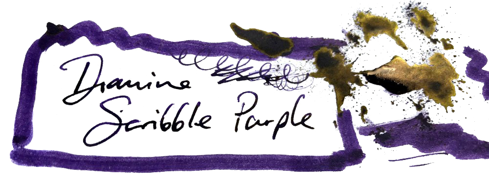
If this isn’t quite your cup of tea, but almost…  Then buy the other one!

Our overall recommendation  If you want a purple ink which you can use for writing with any fountain pen, without interruptions other than refilling, bag some Scribble Purple. If you enjoy experimenting with calligraphy or have an absolute fire-hose of a vintage pen and wish to, erm, take back control (oh dear) then Monboddo’s Hat is a great choice too.
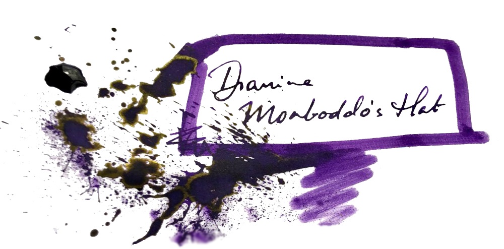
Where to get hold of some  All of your favourite fountain pen retailers and etailers sell these inks, which have now made it to the standard Diamine range internationally. It’s also possible to buy from Diamine directly.

This meta-review references:

Thanks to  Bernardo and all the members of the FPUK group for the initiative, Diamine for the enthusiastic collaboration – and all our readers and contributors for making the Inkdom, while it lasted, a kinder, gentler and more creative place.
Diamine Shimmers – new colours for 2018

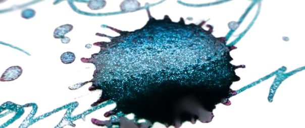
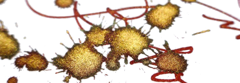
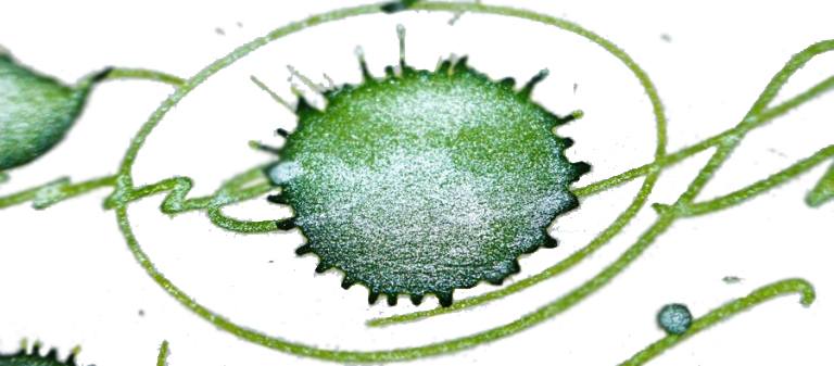
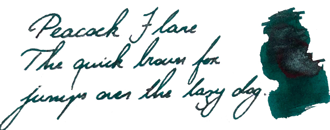
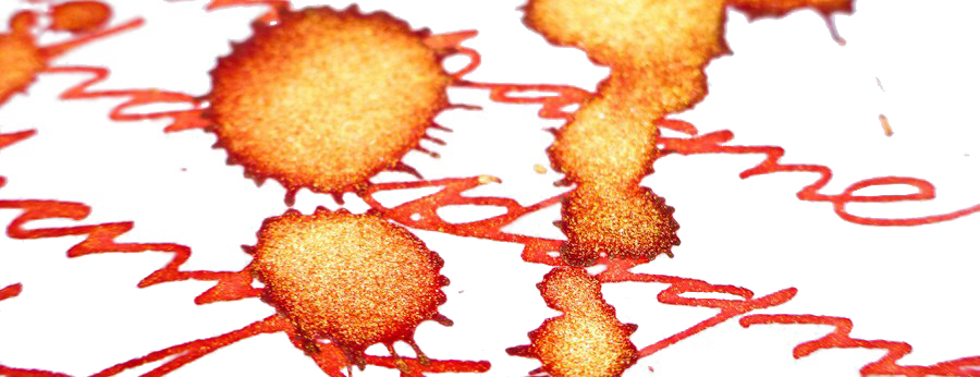
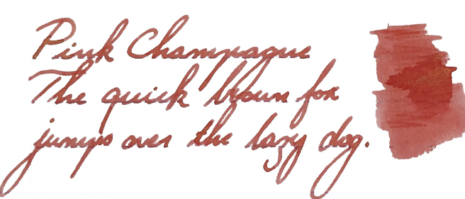
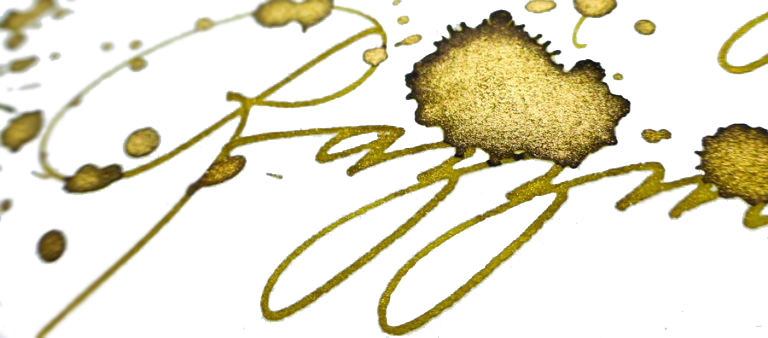
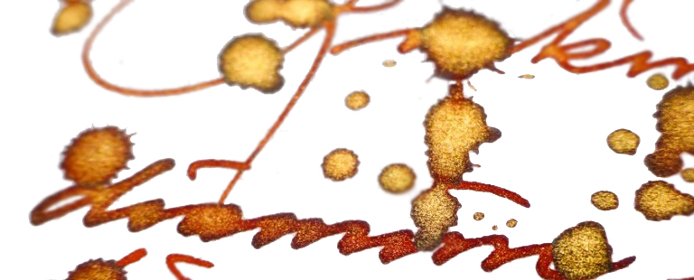
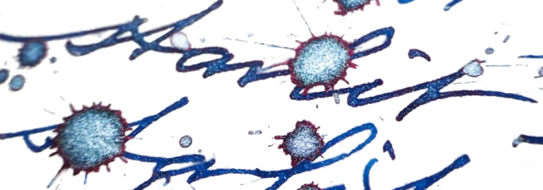
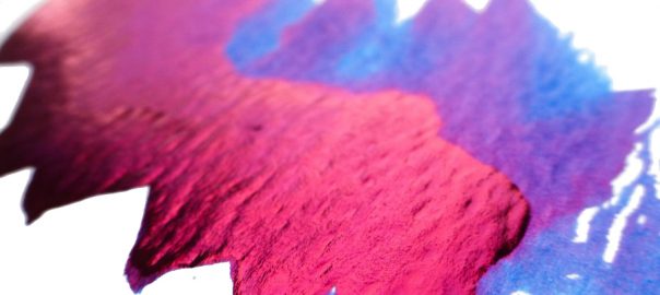
A little bit of history This is a festive tradition now, so the British ink legends Diamine  strike the market again with another of eight Shimmering inks, which complement the 32 inks in the series already released over last three years (we reviewed them here and here). This makes an impressive family of 40 shimmering inks in total, covering a wide palette of base colours combined with either gold or silver flecks suspended in their depths.

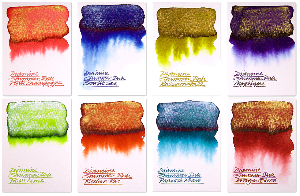
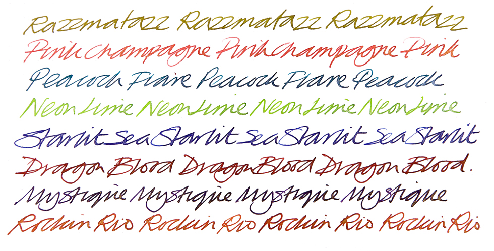
How it looks  

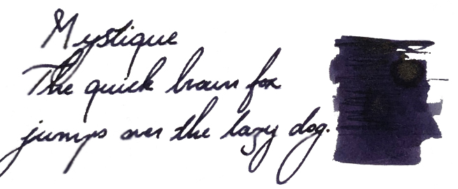
Mystique

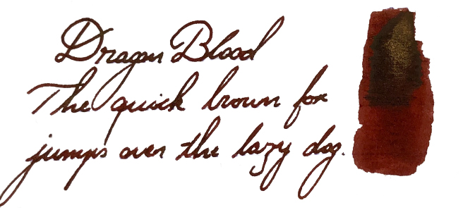
Dragon Blood

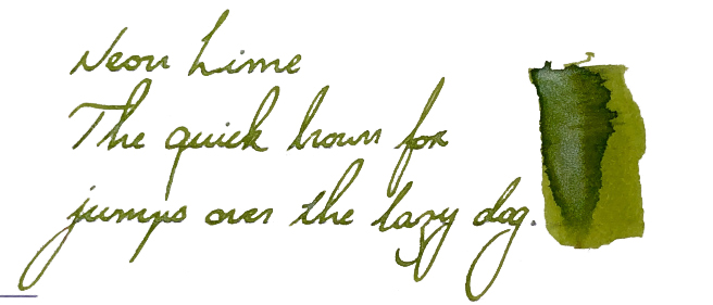
Neon Lime

Peacock Flare

Pink Champagne

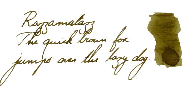
Razzmatazz

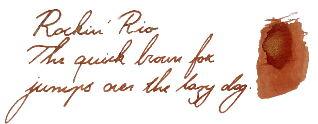
Rockin’ Rio

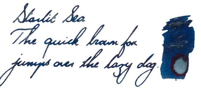
Starlit Sea

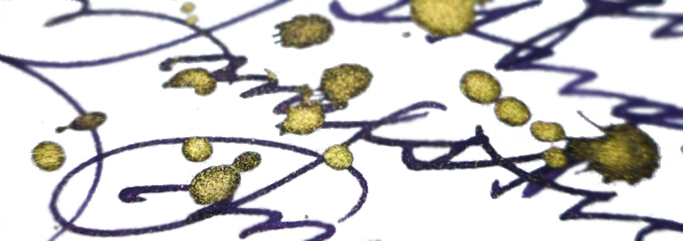
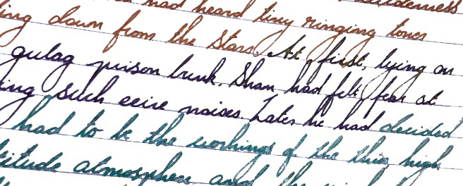
Crucially, how it writes… Diamine inks are very good indeed. This company has a long tradition (over 150 years!) and knows clearly  how to make good-quality and well-saturated ink which flows. Shimmering inks are no exception here, however due to their specific nature some precautions have to be taken. Because shimmering inks are in fact suspensions, before filling the bottle should be shaken so the glittery particles will be evenly distributed. The same rule applies once your fountain pen is filled; gently agitate the pen before you use it (read it the economic news, or twiddle it between your fingers, whichever you prefer). It may not be a bad idea to prime the feed before writing. To get the full effect, a broad and ‘juicy’ nib is often a good choice, although the shimmering effect can be achieved using finer nibs as well.  To get the best results then good, smooth and fountain-pen-friendly paper is a must!

Ink! What is it good for? These are not ‘standard’ inks by any means, but Shimmering inks are in fact suitable for use in almost any modern fountain pen. However, suspended particles can potentially clog your precious feed, so our recommendation is to use inexpensive fountain pens which are easy to dismantle and clean. Glass pens or dip pens may be a good alternative here. We also do not recommend leaving pens filled with this type of ink for a prolonged period of time since it may leave deposits and dry out between the fins of the feeder – and it can then take some hard work to clean it up properly.   Diamine Shimmer ink can be used on daily basis, but it may look a little unusual on business or legal documents (unless you work for Santa), so we would not recommend use for these purposes.  Diamine Shimmering inks are, however, absolutely ideal for all festive occasions including wedding invitations or Christmas cards (yes, be quick Christmas is coming very soon!).  If you wish to practice fancy Copperplate or Spencerian calligraphy,  these inks are perfect for it. They will definitely add a ‘shiny’ dimension to your hand-writing and lift it up to higher level.  We have also seen shimmering inks regularly used in personal diaries or journals. The possibilities may be endless, depending upon how creative or adventurous you are.

VFM  Considering the fact that Diamine inks are well made and the writing experience is generally very positive, a 50ml bottle filled with beautiful glittery ink for less than £10 is very good value for money (the official price is £9.95 at Diamine’s own web shop). Some UK retailers are selling it for even less (£ 8.95). ‘Sounds good… and it is!

If this isn’t quite your cup of tea, but almost…  If you feel uncomfortable using this type of inks with your fountain pen, you can always try them out with glass pens. It is definitely a safe alternative and the effects are still very good. If you’d prefer to try pearlescent inks from a different manufacturer, then J. Herbin, De Atramentis and more recently Robert Oster all have alternatives worth considering – albeit at significantly higher prices.
Our overall recommendation These inks are really fun to use and the shimmering effects are extremely pleasing. Diamine have proved again that they can deliver affordable, great-quality products, and with a broad selection of 40 colours there is plenty to play with. An unqualified thumbs-up from us!

Where to get hold of some  Diamine Shimmering inks are available directly from the Diamine web-shop, or all the usual retailers including Cult Pens, Pure Pens, The Writing Desk or Bureau Direct.

This meta-review references:

Thanks to Diamine for the samples.

Sheeny blue inks shoot-out

A little bit of history  Once upon a time in the west, or the western hemisphere at least, there were fine upstanding fountain pen makers like Parker, whose Penmanship Blue had a nice, subtle, red sheen on it, which made handwriting shimmer gently in the right light and, thirty years later, made otherwise sensible shoppers absolutely do a nut-job and blow staggering piles of cash on half-empty bottles just to dip their nibs in this apparently magical writing elixir. It got a bit silly, frankly. Then ink specialists here in this century started making their own, and things became calm and sensible once more. Well, mostly. Here are three of the new contenders, from Amurrka, Oz and Blighty, slugging it out head-to-head – as if civilised ink would stoop to anything of the sort! Tsk.

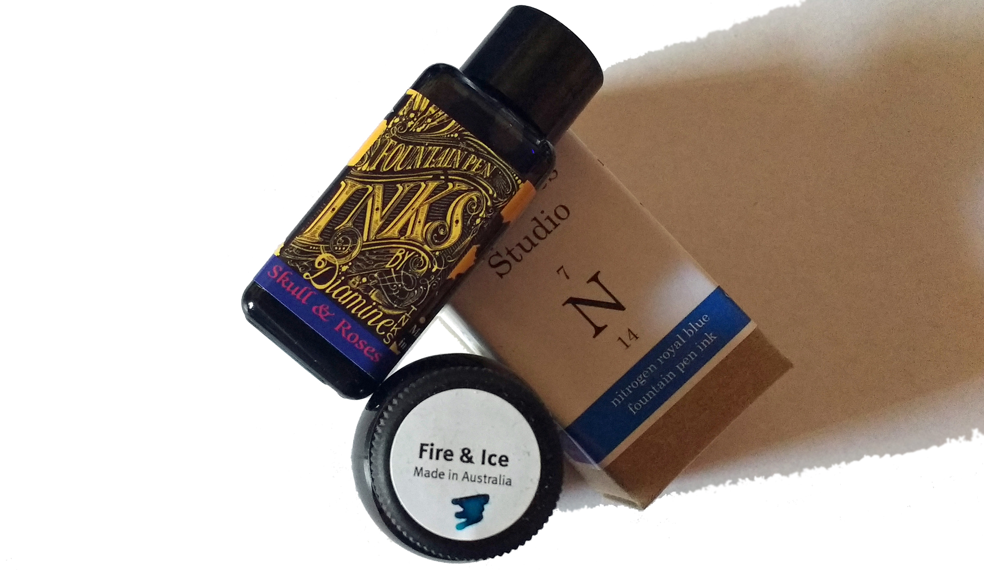
How it looks  Our three selected inks all look like high-quality, but ordinary, blue inks as they go on to the page. Robert Oster’s Fire & Ice is a light blue verging on turquoise, Diamine’s Germany-only Skull & Roses is a richer ‘royal’ blue, and Organics Studio’s Nitrogen Blue is somewhere in between. Then, once dried, they exhibit a red sheen when you twist them in oblique light. It’s a neat trick.

How it behaves on the paper Perfectly well; these all come from serious ink manufacturers with reputations to protect, so there are no major problems. Drying times can occasionally be longer than expected, however, particularity for Nitrogen.How it behaves in the pen  Again, pretty much as standard fountain pen ink does, although sheen inks can lead to a build-up of sediment eventually – and several of us have found ebonite feeds turning a fetching shade of red! Fortunately, it’s nothing that a good rinse won’t fix.
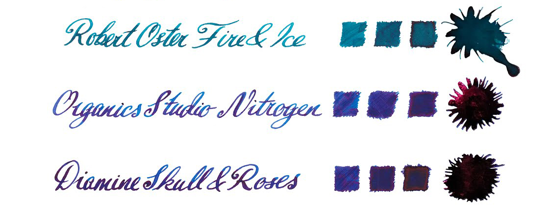
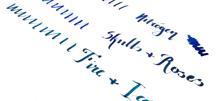
Ink! What is it good for?  The art of correspondence may be dying fast, but if anything’s going to bring it back it must surely be the excuse to use inks as alluring as these. It makes boring blue interesting again, after all.
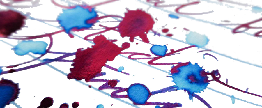
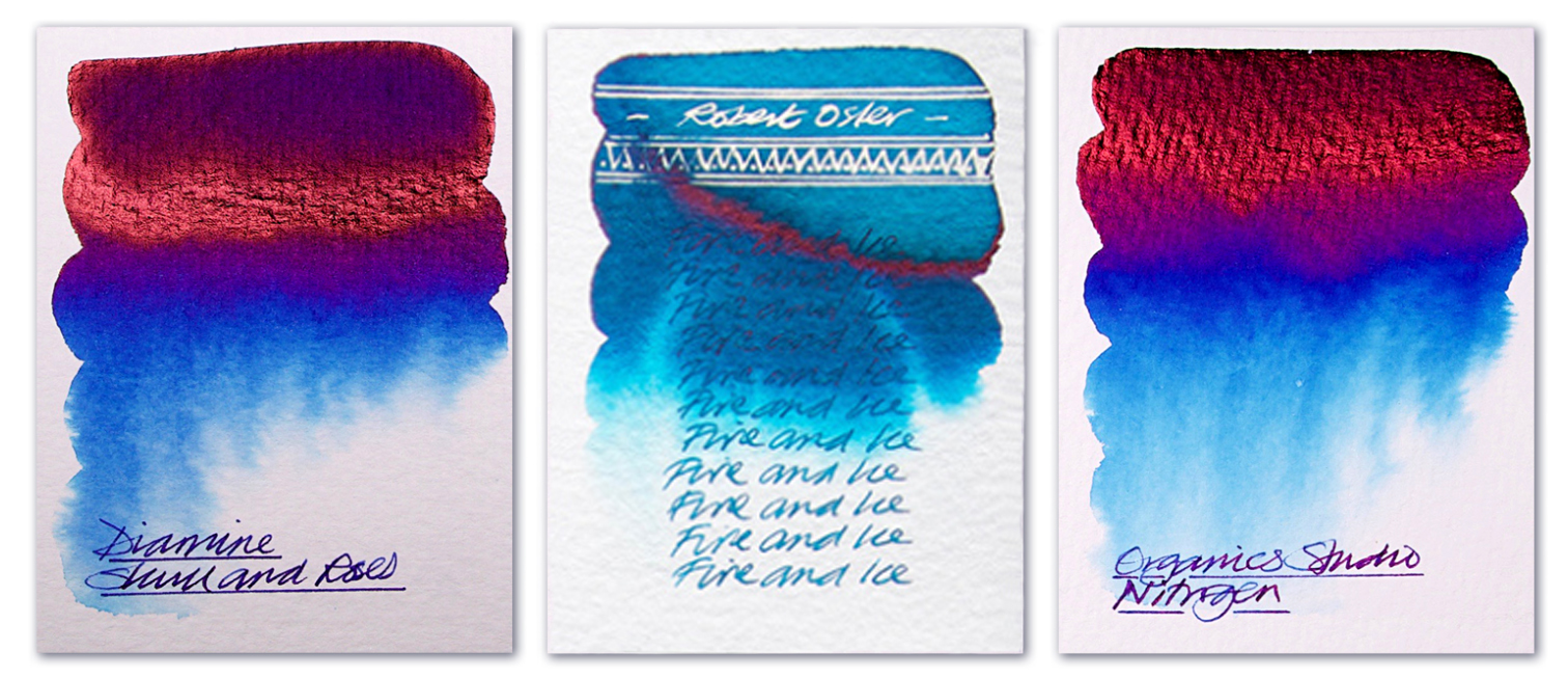
VFM  Good quality sheening ink is generally a ‘premium’ product at present so you may have to pay a little more – but if you enjoy the effect, you’re unlikely to find the modest uplift a major penalty.

If this isn’t quite your cup of tea, but almost…  There are more ink makers jumping on this band-wagon all the time – for instance, we’re hearing good things about Krishna Moonview. Or you could mortgage your home, sell a couple of major organs and buy some Parker Penmanship, of course…
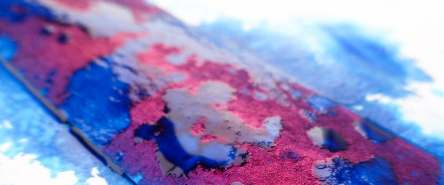
Our overall recommendation  Give it a go. The effect is very pleasing and the ink is easy to live with, even in fussy thoroughbred pens. Skull & Roses is the trickiest to get hold of despite being made here in the UK, but that’s just the result of an exclusive deal – and Diamine could undoubtedly come up with something even better for full global distribution in due course. In the meantime, Fire &Ice if you like Turquoise, or Nitrogen if you like full-on royal blue with all the trimmings, are well worth a try.
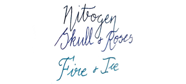
Where to get hold of some  For Skull & Roses, you have to buy from Germany – but there are numerous tintenshoppingspecialisten (Nein, das ist kein Neologismus!) on the web, or even Amazon if you really get stuck. Executive Pens Direct stocks Fire & Ice, while The Writing Desk carries Nitrogen amongst a a fairly wide range of Organics inks. A bit of internet research will produce the goods without too much heavy trawling.

This shoot-out meta-review references:

Thanks to  Diamine for the rare sample of Skull & Roses, Executive Pens Direct for the sample of Robert Oster’s Fire & Ice, and The Writing Desk for shipping some Nitrogen this side of the pond.

Diamine Shimmertastic new colours

A little bit of history  Diamine were the first manufacturer to produce a range of affordable shimmering inks following J. Herbin’s innovation of introducing tiny sparkling particles to their inks. They launched with a range of 10 different colours, added another 12 later (reviewed here), and the new ones take that up to an impressive 32 colours.

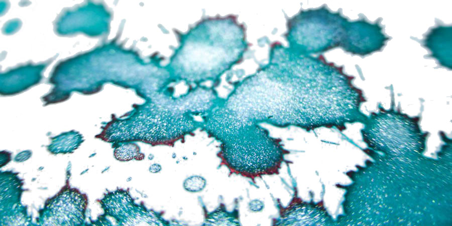
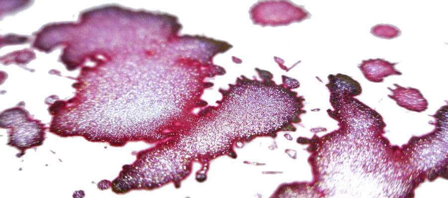
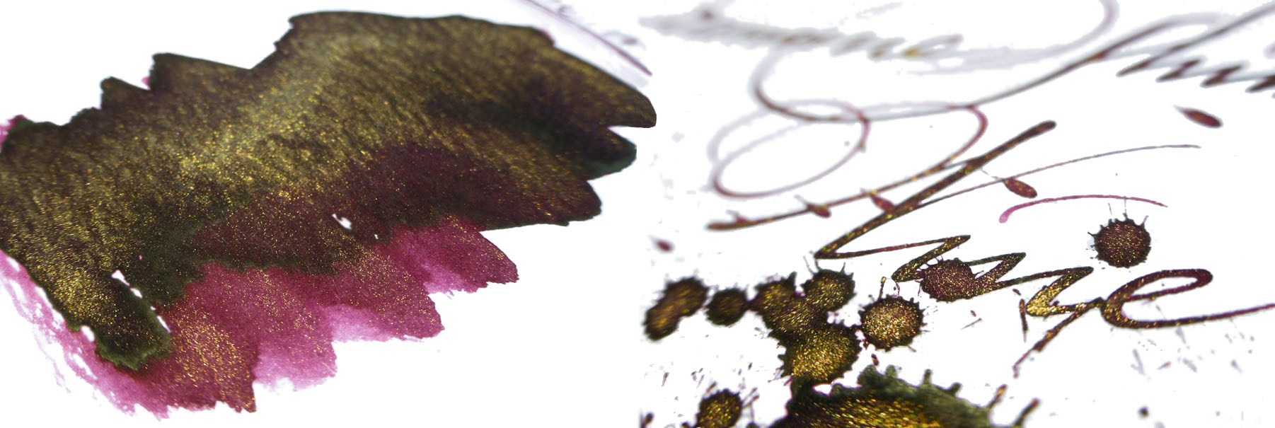
How it looks  Diamine are well-versed in shimmering inks by now. They could do this in their sleep. However, they’ve not rested on their laurels here. Rather than just adding more sparkle to more ink, they’ve upped their game. What makes these new inks stand out is not only their strong, saturated colours, but the sheen many of them display. This adds a new dimension to the inks. The sparkle itself is subtle yet visible.

The blues and greens  The new range features four blue and green inks.

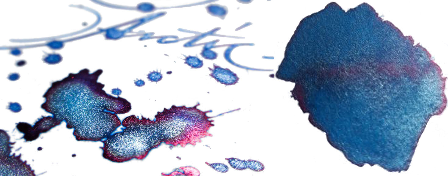
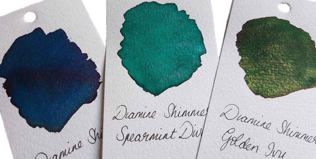
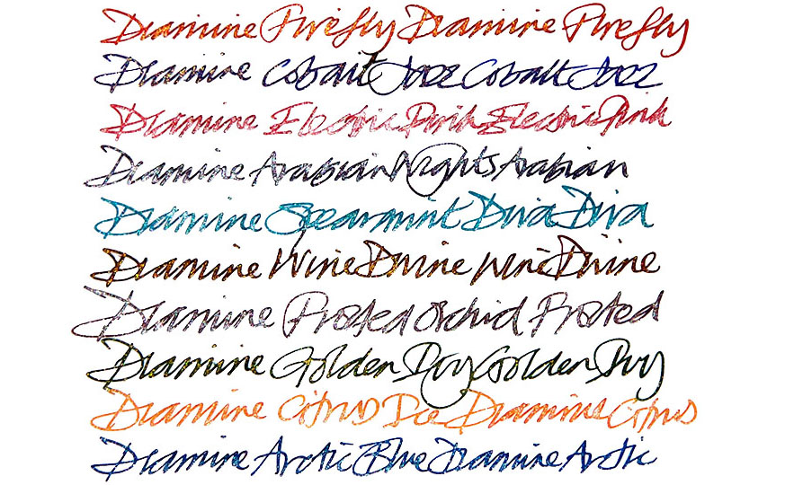
Arctic Blue is a bright, cool blue with a frosty silver shimmer. It also has a pinkish-red sheen.

Spearmint Diva is a bluish-green with silver shimmer. It’s similar to Tropical Glow from the same range, though the latter is more of a greenish-blue. It’s good to see that Diamine have those of us who love a good teal covered! However, Spearmint Diva also has a bit of a red sheen on some papers.

Golden Ivy is a traditional deep green with, again, a reddish sheen, set off with gold shimmer. This would make a lovely Christmas ink.

Cobalt Jazz is a saturated cobalt blue with a red sheen and gold shimmer. This is a gorgeous colour that looks pretty spectacular.

The reds  There are three new red inks in the range.

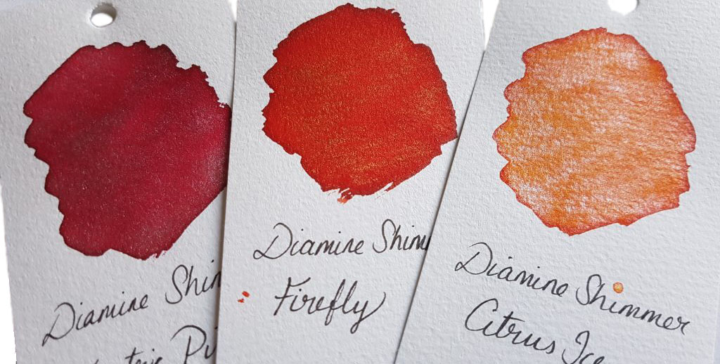
First off, there’s Electric Pink. This is no cute Barbie pink. This is take-no-prisoners pink: it’s rich and saturated, with silver sparkle.

Citrus Ice is a warm, saturated orange with a contrasting cool silver sparkle.

Firefly is an orange-toned red with gold sparkle. Another festive ink.

The purples  The three new additions at the purple end of the spectrum are a real treat.

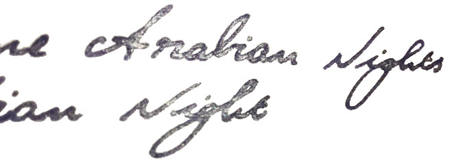
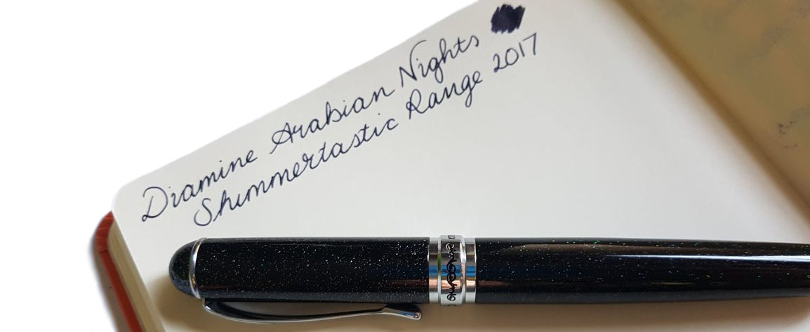
Arabian Nights is a deep purple-black with silver shimmer. It’s probably the most usable of the inks for everyday writing. The shimmer is subtle and the dark ink is readable and utilitarian while retaining a lot of character.

Frosted Orchid is a slightly lighter purple ink with red tones and silver sparkle. This will be popular.

The last of the new inks is Wine Divine. This is a lovely addition to Diamine’s already well-stocked wine cellar (with Merlot, Syrah, and Claret). The ink is a rich burgundy with gold shimmer.


Crucially, how it writes…  Diamine have been on the go for over 150 years. The quality of their ink is sound, and these are no exceptions. They flow well and benefit from a wider nib to show off both sheen and shimmer. 

Ink! What is it good for?  These are unusual inks, and the sparkle makes it unlikely you’ll want to use these for business documents. They’re great for cards and letters, especially with Christmas fast approaching. As usual with shimmering inks, be sure to give the bottle a gentle shake before filling a pen. Similarly, gently agitate a pen that’s had the ink in it a while to mix up the settled shimmer particles. There’s also a caveat: any ink with particles like this has the potential to clog up a pen, so use this ink in pens that you can disassemble relatively easily to clean out properly.

VFM  Although more expensive than Diamine’s standard inks, the Shimmertastic range is an affordable way to get some seriously interesting inks. In the UK, a 50ml bottle retails for around £9-10.If this isn’t quite your cup of tea, but almost…  J. Herbin make a variety of premium shimmering inks. De Atramentis also offer a new line of shimmering inks, with each ink available with gold, silver, or copper shimmer. Robert Oster are soon to launch their own sparkles, too.
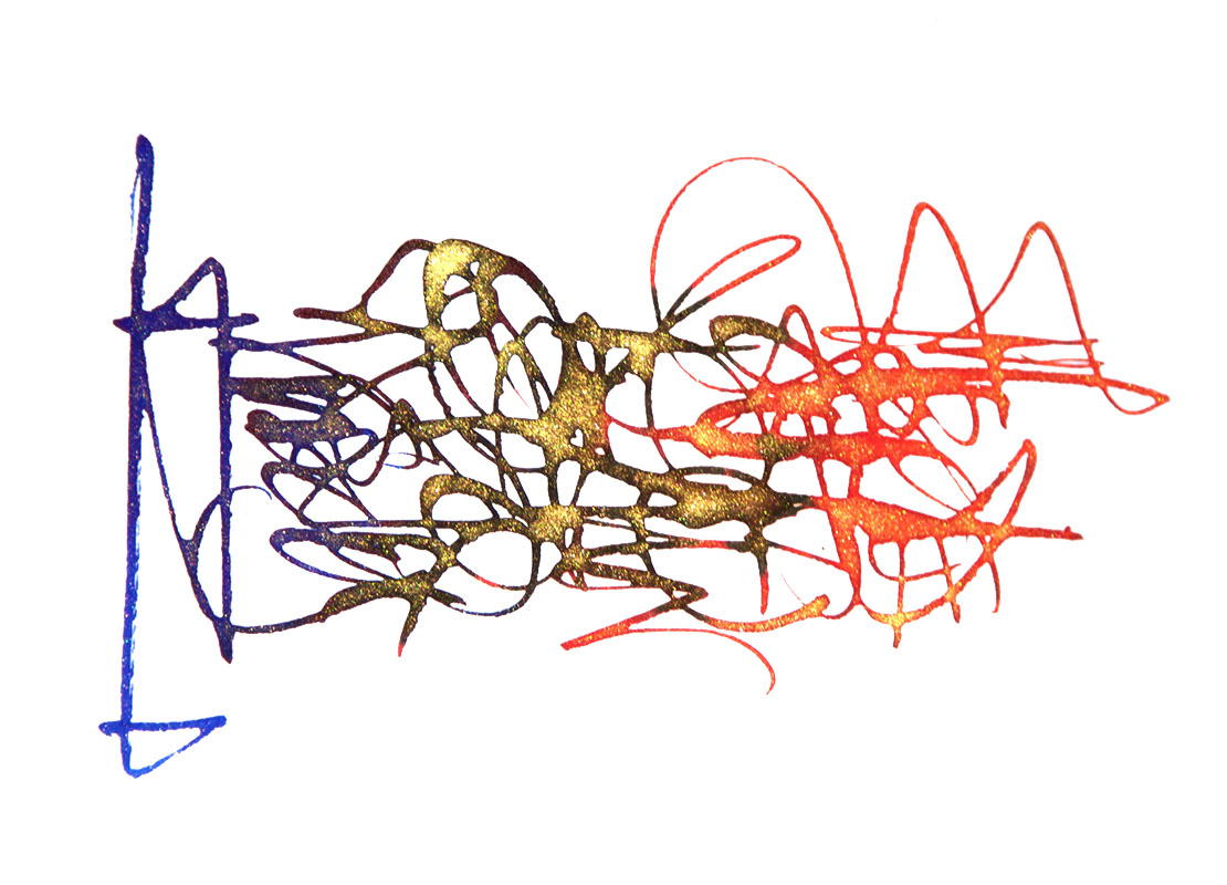
Our overall recommendation  These are great, fun inks with some unusual and interesting properties, available at a good price. Where to get hold of some  The usual suspects have these inks in stock (or soon will!). You can also purchase from Diamine directly.

This meta-review references:

Thanks to  Diamine for kindly providing samples as the newly expanded range was launched.

Diamine Shimmertastic inks review

shimmerdrops2A little bit of history

A couple of years ago there was a lot of buzz about another brand (you all know which one) putting shiny sparkles into a handful of their inks. It looked fun, but it was expensive, and Diamine don’t do things by halves.  They brought out a whole set of ten, then followed it up this year with twelve more shimmering inks, each sporting a healthy dose of gold or silver coloured glitter.  What could be more fitting for our Christmas meta-review?

Ink! What is it good for?

Well let’s be honest, this isn’t one you’re likely to take to work, unless your job involves writing Christmas cards (it’s absolutely brilliant for that).  This is ink for having fun with!  If you treat it wisely, it will work in ordinary fountain pens and there are only two modest caveats.  Firstly, always give the bottle a very thorough shake before filling the pen, and ideally use a pen which can stand a gentle perturbation before writing too; the glitter is in suspension, not in solution, and will laze on the bottom unless stirred into life.  Secondly, any particulate matter can gum-up pen parts in time, so pick a pen which you can thoroughly dismantle for the occasional clean, including the converter or piston (TWSBIs and most Platinums are therefore a good choice).  Other than that, you can sparkly-scribble to your heart’s content.

VFM

The going rate is about £9 for 50ml, which makes this noticeably more expensive than the standard fountain pen inks from Diamine, but still very good value compared to some of the more ‘exotic’ inks around.  The base colours are for the most part very nice inks in their own right, and other than occasionally bleeding-through with very wet nibs, or feathering on cheap paper, they’re pretty well-behaved too.  You really can’t go too far wrong.

 OK now, that’s enough chat – show me the shiny!

The bright blueslight-blues

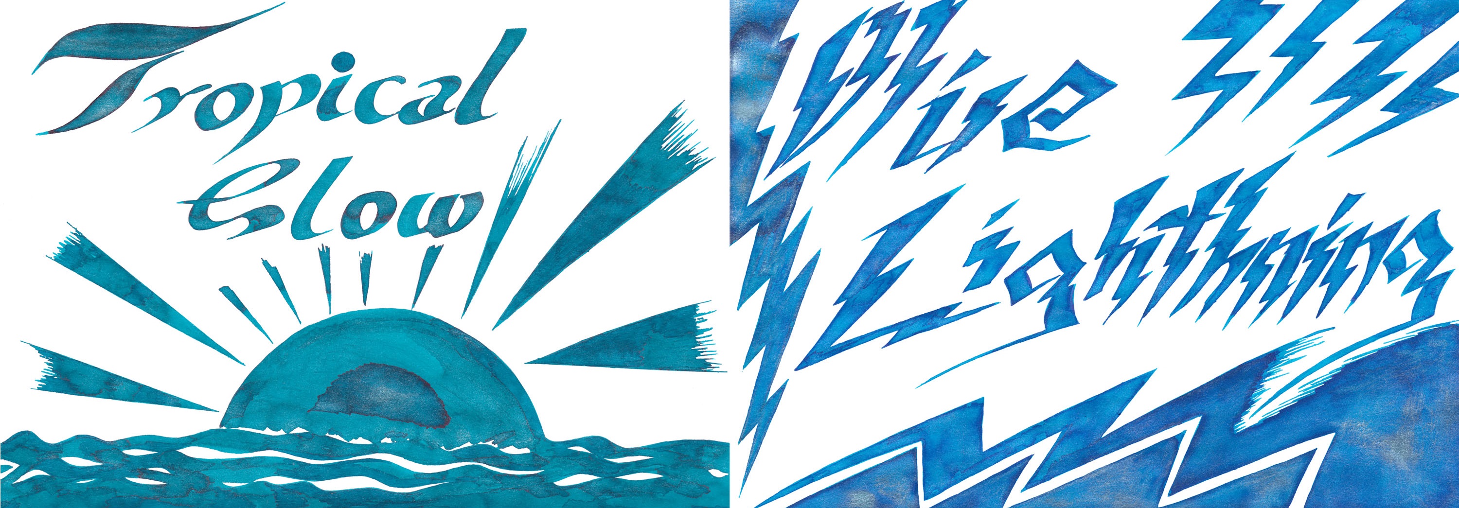
We start with a couple of absolute crackers.  Blue Lightning, a very bright blue with silver sparkles, has a loyal following from the original collection, while Tropical Glow has become an immediate favourite with almost everyone who’s tried it, even making the ‘Too Many Peacocks‘ Christmas Day hit list.  ‘Not a bad way to start, eh?tropicalglow2

lightning2

The dark bluesrich-blues

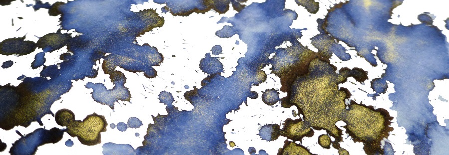
Blue Flame and Blue Pearl are fairly traditional royal blues, with gold or silver sparkles respectively; the effect is predictable but pleasing.blueflame2bluepearl2Enchanted Ocean and Shimmering Seas are a little harder to categorise – like the sea, they keep changing colour as the light shifts. But both are broadly blue-black with either green or purple hints, with a spot of iridescence from bioluminescent plankton at the surface.
shimmeringsea2

The reds

reds

Pink Glitz is, unusually for a pink, so riotously butch that you could put it in a PFM and get away with it, while Red Lustre could safely be spilled all over the Christmas tablecloth without anyone noticing.  Firestorm Red and Inferno Orange look a lot like the open fire you’re meant to be roasting some chestnuts on right now (but thanks for taking a break to read this instead).pink1 redlustre3 firestorm1infernoorange2

The browns

browns

This civilised set of browns goes all the way from molten chocolate to wet beach, and the sparkles really add something to what can otherwise be a somewhat drab colour for inks. They really do work surprisingly well on the page.brandydazzle2 caramel3

The greens

greens2

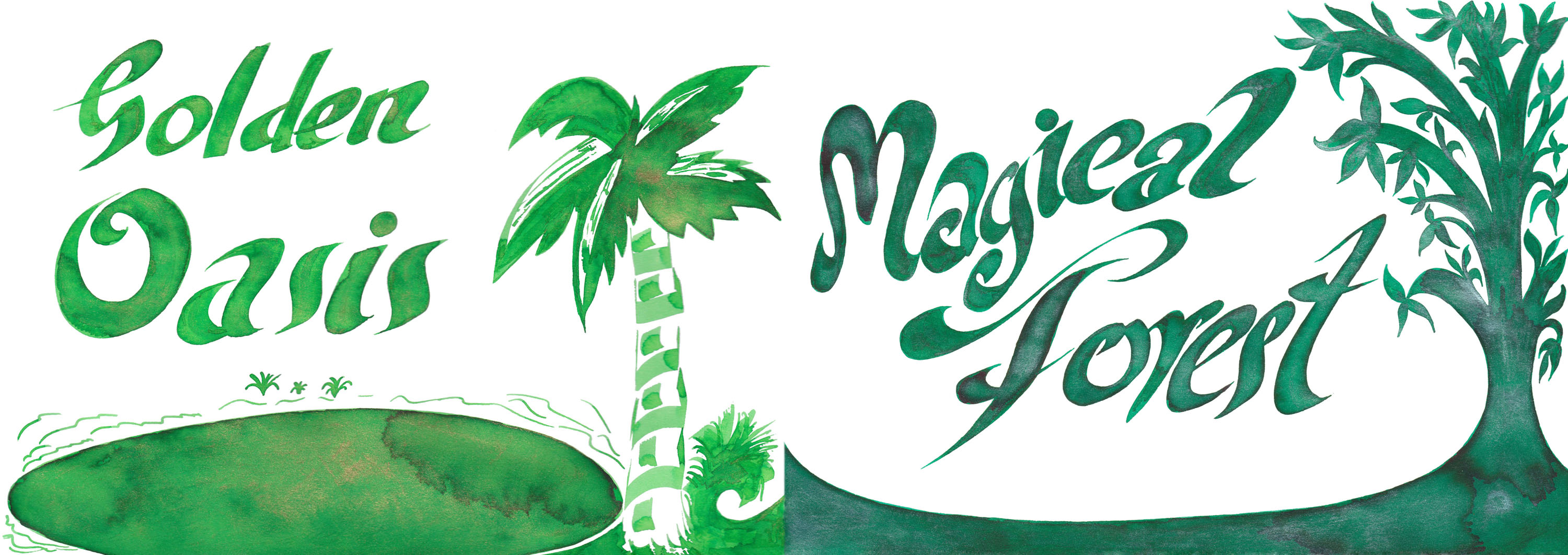
Green ink has its devoted fans, and here are a couple of splendid stocking fillers for any you encounter.  Magical Forest is almost perfect for writing the price list in  your neighbourhood crystal healing emporium, while the lime green with golden sparkles of Golden Oasis looks for all the world like a gecko flitting by.golden-oasis2

magicalforest3 magicalforest2

The greys

greys2

moondust2

While not everyone feels that grey is quite the colour for the festive season, re-brand it as silver and everything’s fine.  So here we have dark silver with bright silver sparkles (hmm, subtle) darker silver with golden sparkles (less subtle), and silver with the lights off (OK, OK, it’s black).  The dark base ink does show the sparkles up quite effectively.nightsky2

The purples

purples

Of course we’ve saved the best for last – for those into a spot of purple action at least!  Two of these have already featured on Too Many Purples and the third will follow soon.  Purple Pazzazz is a warm purple which is quite reminiscent of Lamy’s much-trumpeted dark lilac, but easier to get hold of and with golden sparkles to boot; what’s not to like?  Lilac Satin is not unlike Diamine’s earlier Iris from the flowers box set, with added silvery shine, and that’s a rather splendid finish too. Finally, Magenta Flash is a very purpley sort of magenta for a change (no pinks in disguise here), and looks rather spectacular in a wet-nibbed pen of your choice.

magenta3

pazzazz2

Come and get it!

You can get hold of your own Shimmertastic supplies in all of the usual favourite online sources, or direct from Diamine themselves.  Easy peasy.

This meta-review draws upon:

Thanks to:

Pure Pens for samples of the original ten flavours, Diamine themselves for samples of the new twelve colours, and Cult Pens for sponsorship-in-kind to get big bottles of some of the best for sharing-around.


Deep Dark Inks collection

A bit of history  Diamine have been making a splendid range of inks in Liverpool since 1864, and as well as their own extensive branded range of fountain pen refuelling solutions, they occasionally make an ink or two specially for another company, pen manufacturer, or indeed anyone who asks nicely and stumps up the cash.  Fine examples include the series they used to make for Conway Stewart, the handsome collection cooked-up for PW Akkerman, and indeed the eponymous SBRE Brown.  You can hardly blame the mighty Cult Pens team for getting in on the act – and so, starting with a nice rich blue, they have gradually developed a striking collection of inks which do just what they say on the bottle; they’re deep, they’re dark, and, well, inky.

Deep Dark Blue kicked-off the collection, with the aim of getting a blue similar that in the Cult Pens logo.  It looks a bit darker than that when it first goes on to the paper, but dries to a dark blue that is just on the blue side of blue-black.  ‘Probably an ideal choice for writing with at work if you want something suitably sober but still more interesting than standard ‘school’ blue.  It’s good stuff, which Stuart declares his favourite deep blue ever, and you can watch Ian put it through its paces here too.

blueDeep Dark Brown is as far as dark as brown can go without becoming black really, but Diamine have pulled it off.  If you ever need to dash off a quick facsimile of the Magna Carta, then this is probably the ink for you – although if you can also write more legibly than those thirteenth-century scribes that would be greatly appreciated by constitutional law experts the world over.brownDeep Dark Red is almost a must-have ink, especially if you want a red ink which you can legitimately use at work without being mistaken for a very unimpressed teacher.  It manages to stay red without fading into brownish hues, as Oxblood tends to, and rather surprisingly it’s Scribble’s favourite (purple fans may now need a little sit-down to recover). Ian loves this one too.redDeep Dark Green provides seems a logical addition to the mix, although we’re struggling to think of many occasions when it would be the ideal choice.  In the dusty corridors of Whitehall, writers of incendiary letters of complaint to ministers are traditionally known as missives from the ‘green ink brigade’, and rare as it is for governmental correspondence to be issued in any sort of fountain pen ink at all, this seems right for the job.  Green ink is also still used by the chief of MI6, but it’s going to take C quite a while to get through the whole production run of this ink without some assistance…greenDeep Dark Purple has been one of the star turns in Scribble’s over-the-top Too Many Purples mega-review, and for good reason; purple ink obsessives need something which they can get away with using at work!  This one has a special trick up its sleeve, too – if you really pour it onto the page you’ll notice a striking green sheen floating to the top, and it’s quite a sight.purpleDeep Dark Orange seems like a tall order, and the risk of smudging into a light brown must have been a seat-of-the-pants ink-blending challenge, but they made it (in both senses).  Somewhere between Pumpkin and Ancient Copper, if you know your Diamines, this ink has impressive shading in the right nib.  A bit of a connoisseur of all things orange, even Ian was impressed.orangeWhat next?  Cult Pens are working on the understanding that this collection is now complete, and with six stonking inks who can blame them?  But then again, if Deep Dark Orange is possible, surely Deep Dark Turquoise should be!  Here’s a mock-up of how that could look, mixed from Havasu Turquoise and 1864 Blue-Black, but the boffins at Diamine could do it so much better.  What do you think?turquoiseGetting hold of a refill is a simple enough job since all three of the standard Diamine packages are available; pre-filled international cartridges, 30ml sample bottles or the classic 80ml glass flagons.  Better still, until the end of March 2016 you can get a 10% discount by going to the website and using this code: CULT10 (remember to enter it in capitals).

If you want to see even more you can Scribble’s hand-written review and Ruth’s video review too!