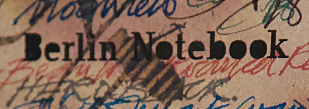
A little bit of history Rob de la Porte at Made for Ink very kindly sent the United Inkdom review team samples of these notebooks just in time for Hallowe’en. Rob is a real craftsman with a well-deserved reputation for producing limited print runs of affordable, good quality, fun-themed, hand-made notebooks that are ideal for journal keepers of all persuasions. These notebooks are no exception – and they include more than a little bit of history themselves.
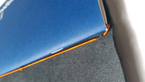
How they look The notebooks came beautifully packaged, raising expectations that something good and of quality would be within. We weren’t disappointed.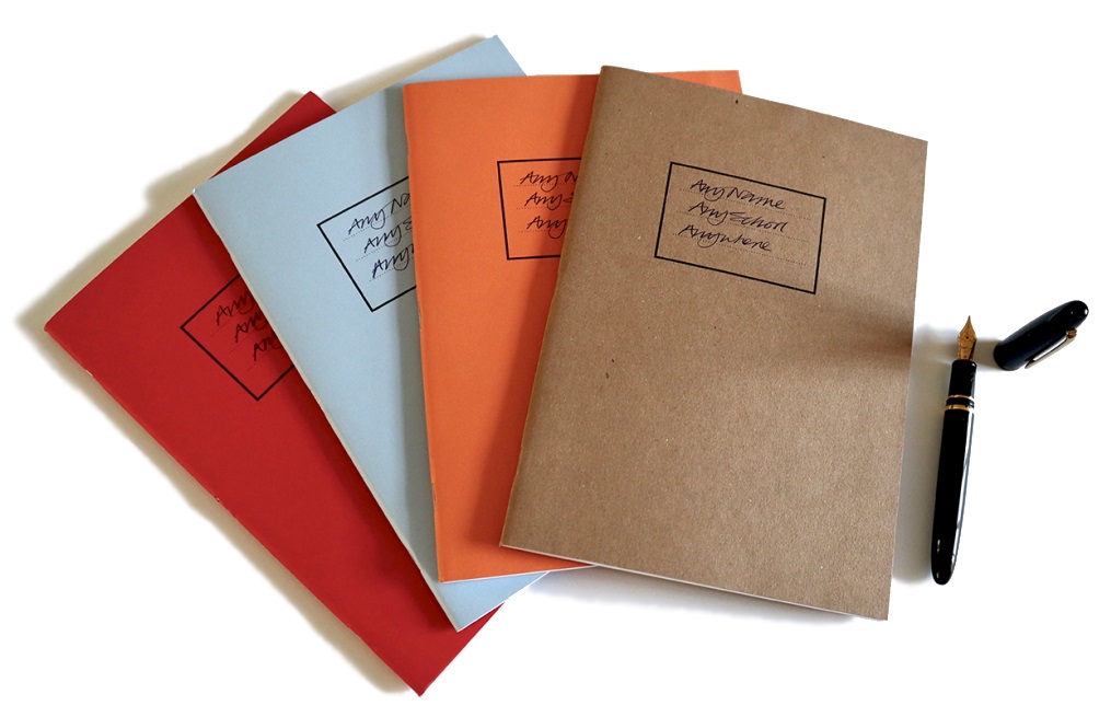
The Exorcise Books initially look quite unprepossessing, like something that you would have used in school, but they are very definitely a league or two up from that and reveal attention to detail and quality that sets them apart. The B5 paper is 100 gsm uncoated extra white in a smooth finish and hails from Scotland, but no mention of that play please, despite the subject matter. The four designs come in red, pale blue, orange and buff covers. 
The inside covers back and front distinguish the notebooks, which have a theme which suits the title. The research for the woodcut images (on the flyleaf) and text (on the back cover) was carried out by our very own Scribble Monboddo, who is also a historian on the quiet; they really add to the notebooks.
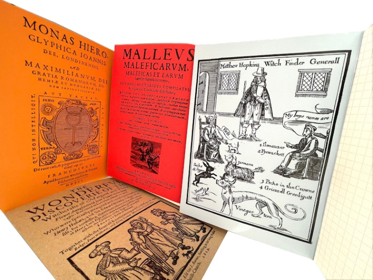
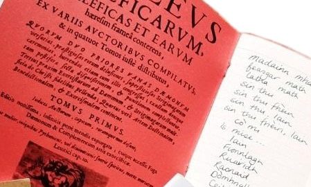
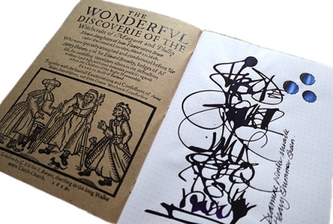
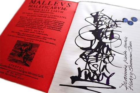
The light blue one we saw featured reproductions of woodcuts of the infamous torturer and murderer of unusual and wise women, Matthew Hopkins. In the red Exorcise Book lurked the 15th century’s malodorous Malleus Maleficarum, a manual for interrogating witches. The orange book featured the strange Elizabethan Doctor Dee, and eruditely swept through the even stranger HP Lovecraft, the mad bad Aleister Crowley, and Joseph Smith of Mormon fame too.
Finally, the inside buff-coloured front cover had a reproduction of a book made by the 11th Duke of Rutland in 1619 recording the lamentable putting to death of two women for witchcraft on 11th March 1618. In the fraught times of the war between the new religion (Protestantism) and the old religions (Catholicism and even older folk beliefs) women were the constant losers and victims. The victimisation of the so-called Belvoir witches is recounted briefly in Scribble’s text, noting that there is a unique ecclesiastical monument to the supposed victims of witchcraft in a local church, but no marker to, or even records of the trial of the poor women themselves. The pithy motto of the final sentence is a worthy axiom for these times and for filling these notebooks; “Remember to write what you see and what you hope for, not what you fear.”
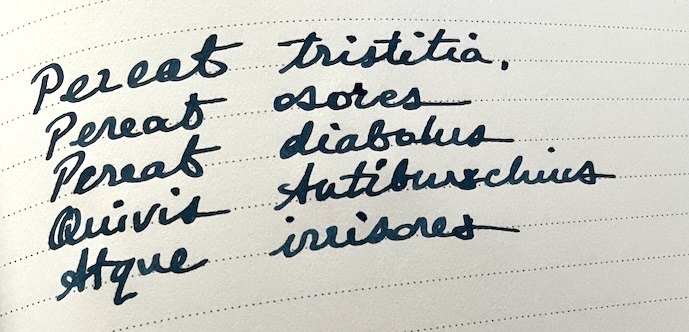
One of our number risked a Latin inscription in her notebook but no incubi seemed to appear; so, no Inkdom reviewers were harmed or alarmed in this meta-review.
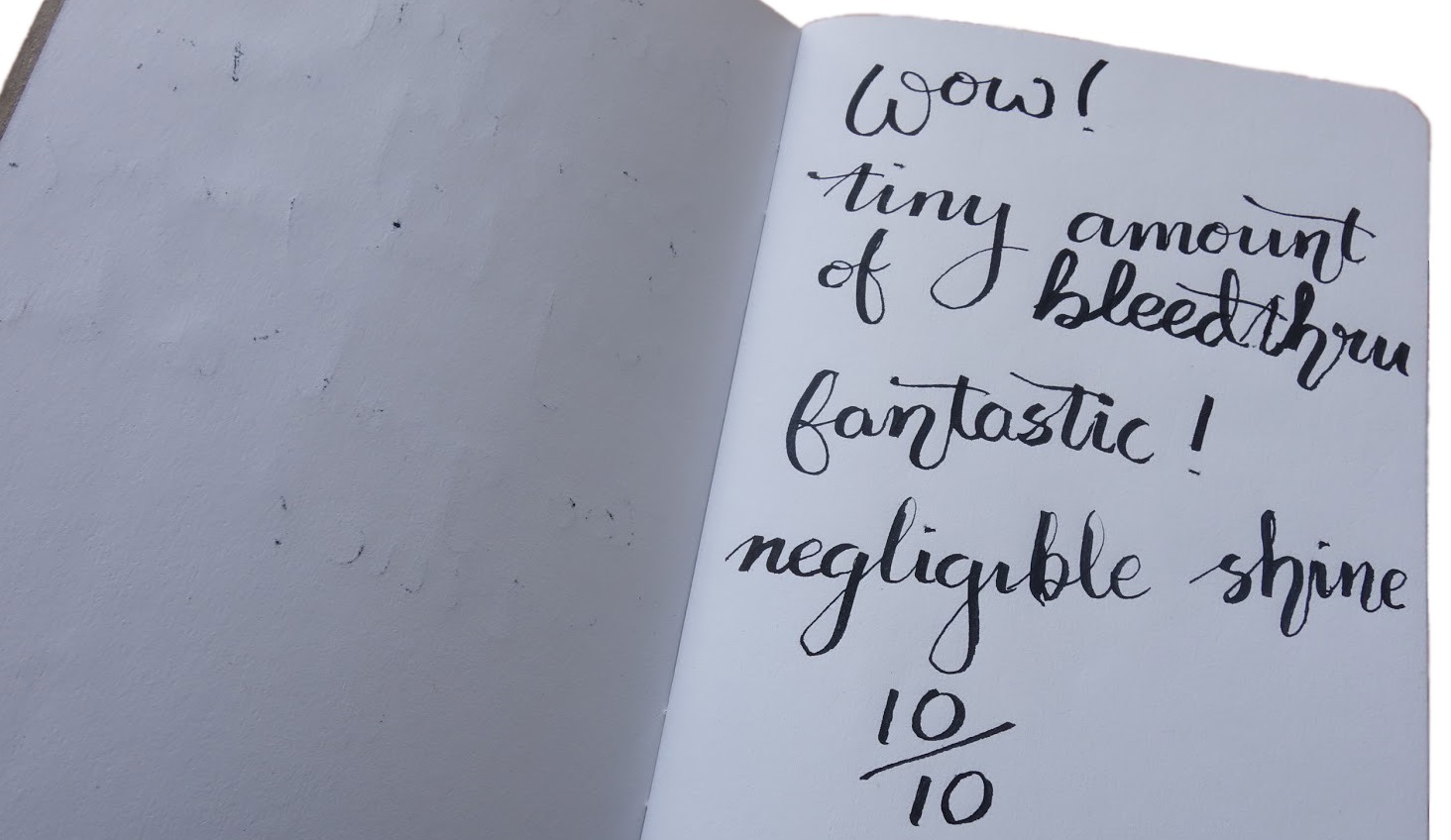
How it feels The Exorcise Books consist of 60 pages of beautiful, high-quality 100gsm paper which absorbs fountain pen ink like a strolling minstrel wandering over the page. So nice is the paper that you might be tempted to try water colour on the plain paper, but that won’t end well – charcoal, graphite, or coloured pencils work just fine, though.
One of our number did push the wetness of ink considerably and went full on with Diamine Winter Miracle, a very heavy sheening purple ink with a shimmer, and applied with an automatic pen. It showed through on the 100gsm where the ink puddled, and there was some bleed through but that is to be expected with such a payload of ink. The shimmer and sheen both worked but if it’s just for handwriting then this paper will work very well with a fountain pen.
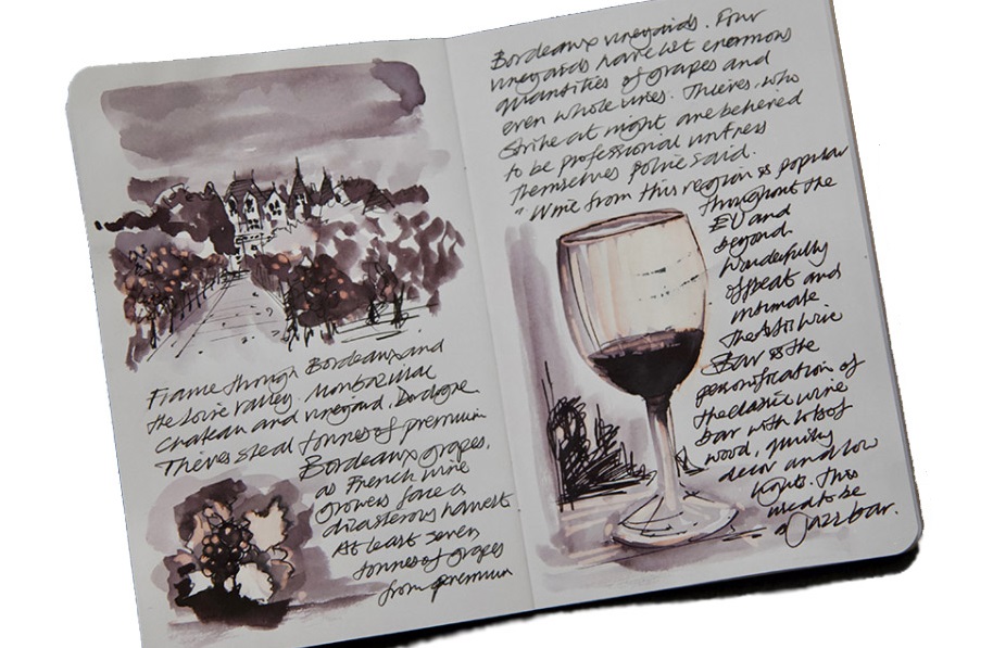
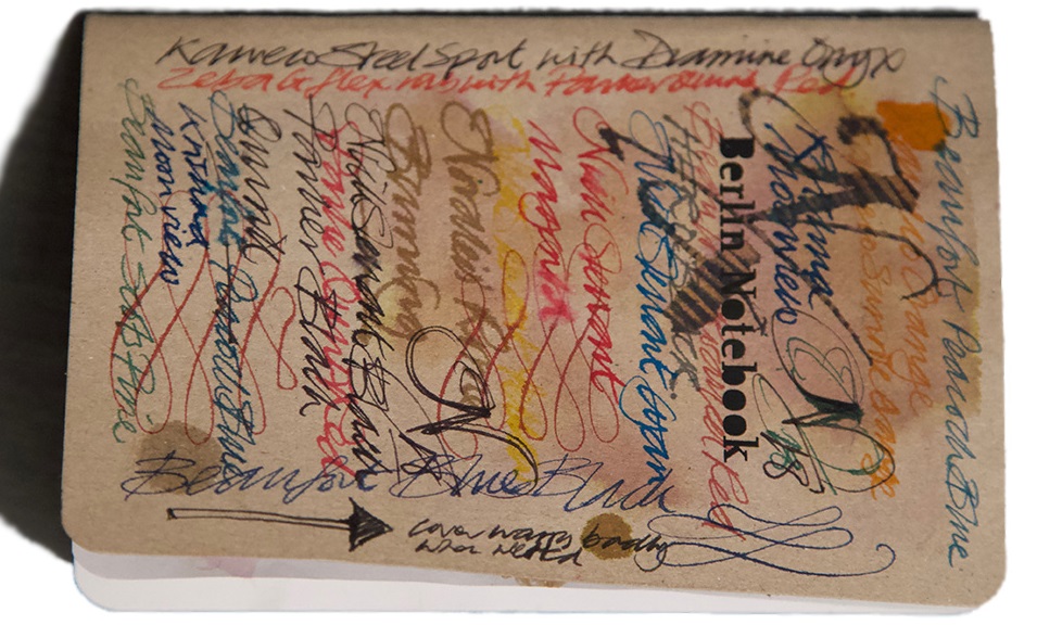
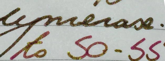
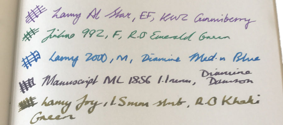
Another reviewer tried a range of different pen-ink combinations including a Sailor Naginata Togi equipped with Robert Oster Opal Mauve, a Waterman Carene 18k gold Fine nib filled with Rohrer and Klinger Verdegris, a John Garnham JG6 with a titanium fine nib and powered by Diamine Inkvent Midnight Hour. All of these, including the very wet JG6 permutation, were quickly absorbed by the paper. Only a very wet ink showed a bit of, err, ghosting.
How it fills Starting to fill a notebook is often one of those rituals of delay and procrastination for fountain pen users and the quality of the paper in these may compound such deferment misery. But the messages and pithy adages on the inside back covers should surely make you want to fearlessly learn more, read more and reflect and wonder on the power of scribing information on paper. Exorcise any fear and record your thoughts and considerations of what you have read, found out, and want to be known. 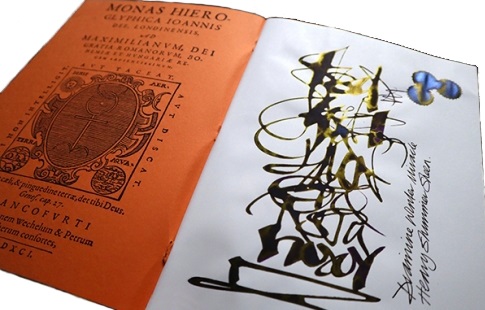
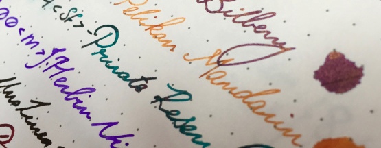
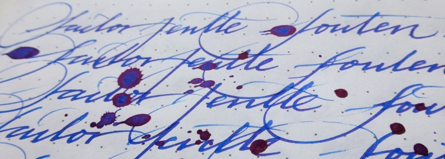
Crucially, how it handles ink… These notebooks cope beautifully with fountain pen writing. One reviewer blitzed them with super-saturated pen and ink combinations and did a little bleed-through. Another reviewer reported some ghosting. A third found the Exorcise paper behaved perfectly; no feathering, no bleed and only slight show-through with very wet ink, and inks seemed to show very true to their colours and characteristics with the super-saturated combo of double broad nib and purple blue of the Troublemaker Lam-ang and the subtle shading of the Robert Oster Opal Mauve. Neither the blitz of the former, nor the subtly of the latter were missed out on this paper.
The quality of the paper shows through on every level. We were aided by award-winning microscopist Mike Smith, the secretary of the Leeds Microscopical Society, to examine the paper closer. Mike’s equipment yielded a series of images that he said clearly showed the superior quality of the paper compared to 100gsm standard print paper, a 90 gsm French brushed vellum and a ‘certain’ 68gsm Japanese paper.

In brief, the heavier paper from Made for Ink seems to absorb more of the ink in the fibres, and their interstices, across the path it was scribed on the paper and in a more consistent manner.
Pulp! What is it good for? Notebooks and scrapbooks have been the go-to tools for collating and organising information for many hundreds of years. Medieval and Renaissance scribes were typically systematic indexers and bullet-pointers of their commonplace books. These are just as versatile; write Latin, Gaelic or sketch in them and they can cope.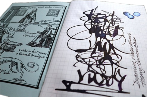
VFM These are high-quality, hand-made products selling at very reasonable prices – no malice there!
The only way is ethics The Exorcise Books are handmade in Rutland from materials made in the UK. Enough said?
If this isn’t quite your cup of tea, but almost… The reviewers unanimously loved these notebooks. They look good, feel of quality and work consistently with a range of ink and nibs. The chances are that you will like them too – but if you really need something in a different size, Made for Ink also stock very good A5 alternatives.
Our overall recommendation The Exorcise Books are made with paper you can trust to handle any pen and ink combination consistently, and they tell a story. They are handmade by an ethical UK-based penthusiast, and they are good value for money too. They get an unequivocal thumbs-up from us.
Where to get hold of one The Exorcise Books retail for £6.95, and can be ordered direct from: https://madefor.ink/
This meta-review references:
- Nick Stewart’s calligraphic review
- Mick’s scholarly survey
- Ania’s spell binding
- Alison’s toil and trouble
- Scribble’s, err, scribbles
Thanks to Rob de la Porte for the notebooks – and Joan, Margaret and Philippa Flowers for what they taught us.
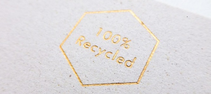
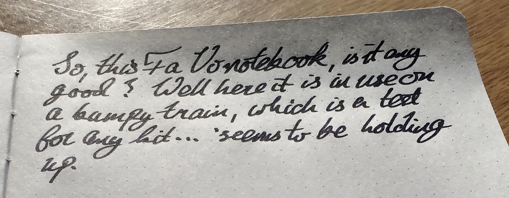
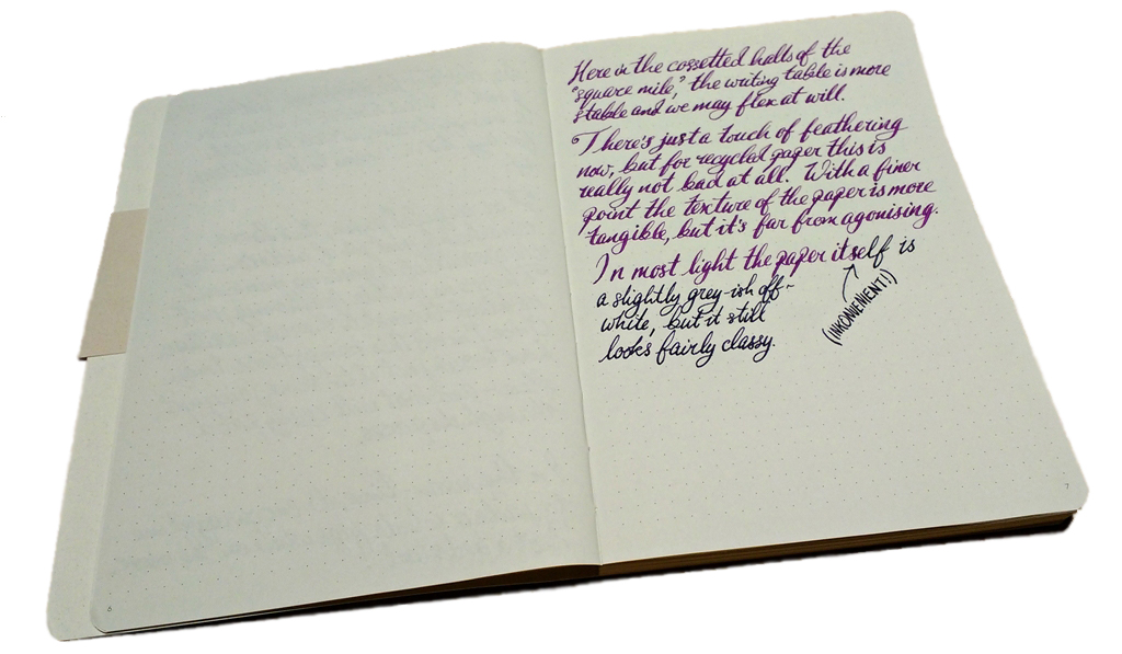
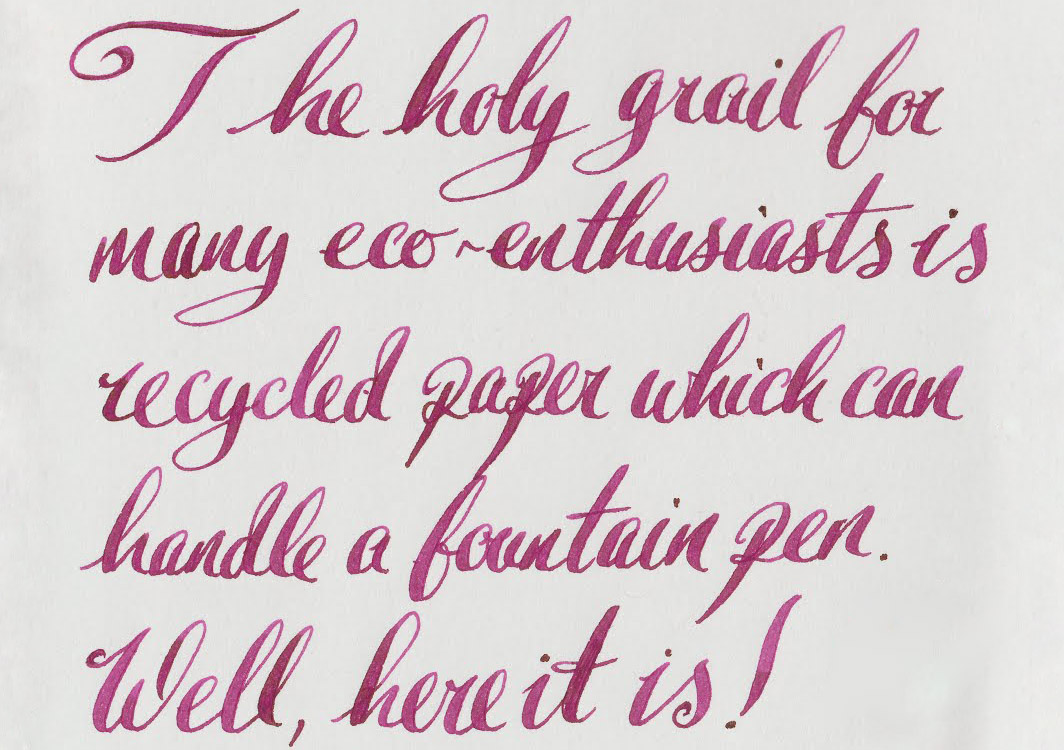
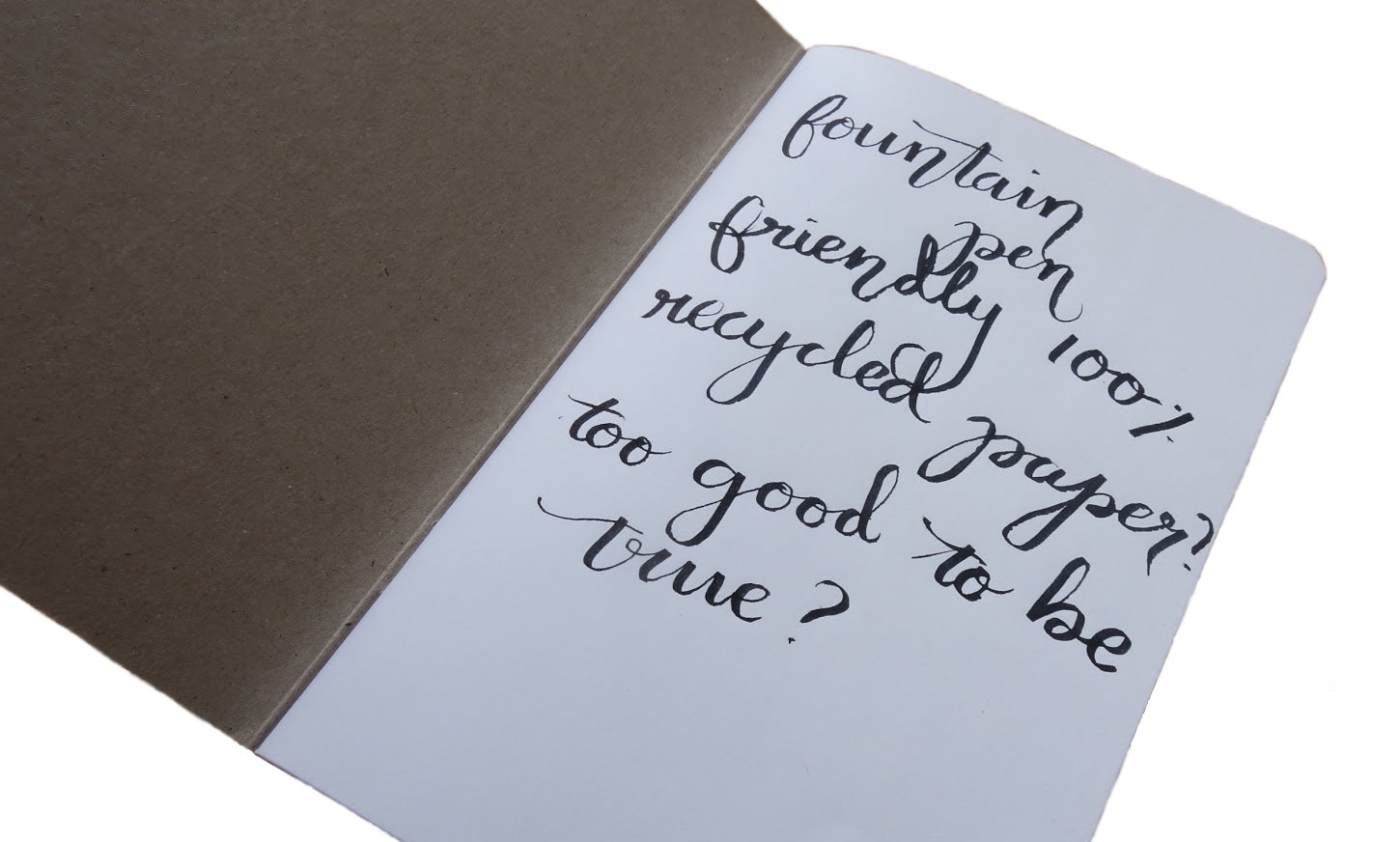
 Crucially, how it handles a fountain pen… As previously mentioned, the notebook uses recycled paper – so what you’re getting isn’t going to be akin to the great writing experience of, say, Clairefontaine. However, it was pleasantly surprising, because for recycled paper this did quite well. We noticed some bleed and minor show-through, but we could also see some shading and a slight amount of sheen on certain tests. So it’s reassuring that the writing won’t look ‘flat’ and without dimension on the page.
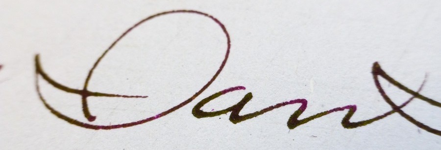
 VFM
VFM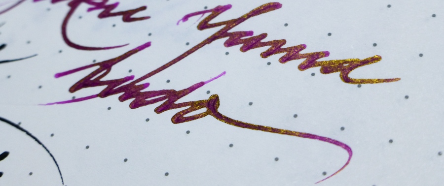
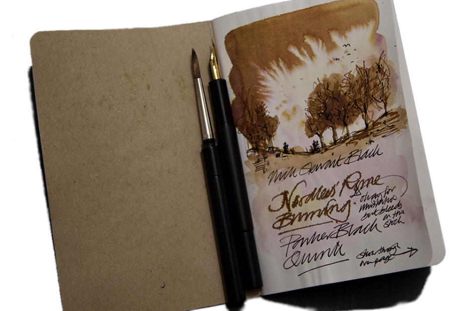
 Crucially, how it handles fountain pens… Quite well, fortunately! The manufacturer’s claim to use the best paper in the world was a bit of an exaggeration – we have certainly all used better – but that’s not say it’s bad at all. It was quite pleasant to write on and coped with every nib we threw at it with aplomb.
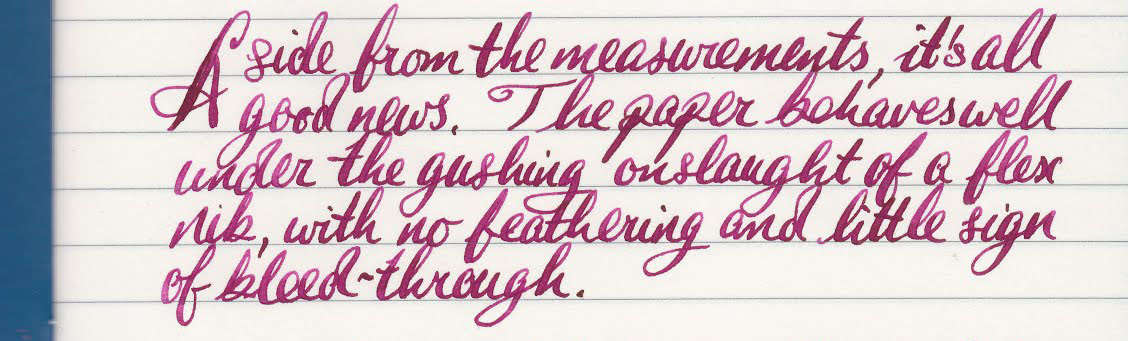


 Thanks to Paper Republic for donating no less then three notebooks in return for honest reviews.
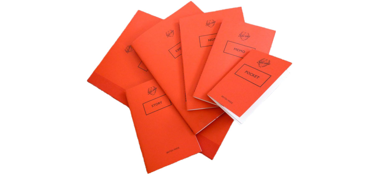 How it feels Everyone within the Inkdom commented on how textured the paper is. The paper is 90gsm Natural White Wave paper and you can definitely feel it on your pen. We actually rather liked this; it’s certainly not as smooth as Clairefontaine, but you can feel what you;’re doing as you move the nib across the paper. What’s more, this paper handles anything thrown at it. Gillian even mentioned that the paper might be able to hold up to watercolours! Dabiel and Scribble found that it was able to handle all the nibs that they threw at it and The Clumsy Penman also commented on how well the paper copes with inks.
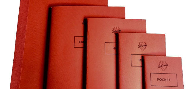
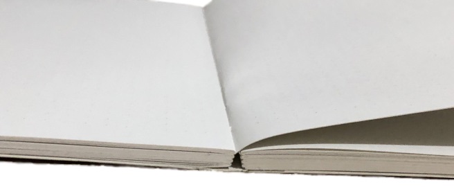
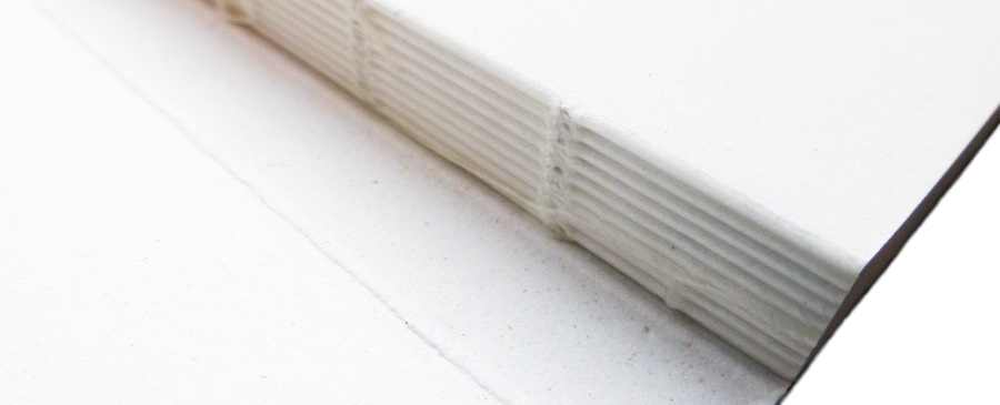
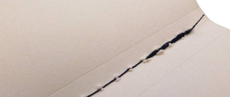 Crucially, how it handles… Pages in the Silvine notebooks are hand-stitched, which gives the notebooks a very personal feel and also means that they lay flat which makes the writing experience even more pleasurable. Some of us weren’t too keen on how the stitching looked, however, as it wasn’t always clean and could look a tad messy. The exception to this is the Project notebook, which has a little bit of extra protection because of how big and heavy it is (speaking in relative terms to the other sizes, such as the itty-bitty Pocket). All the notebooks have perforated pages and they work very well as you can easily tear out the pages if you need to, but you needn’t worry about the perforations becoming weak when flipping pages in the notebook – the pages will only come out if you want them to come out.
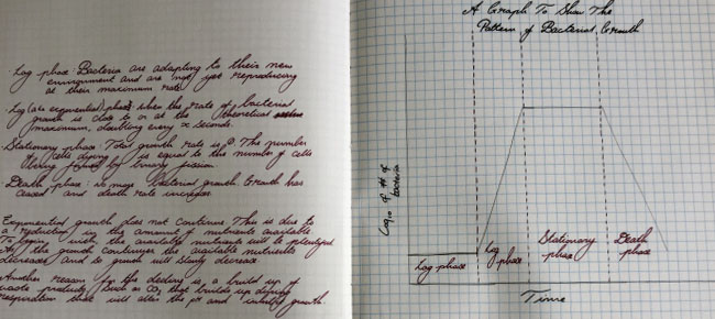
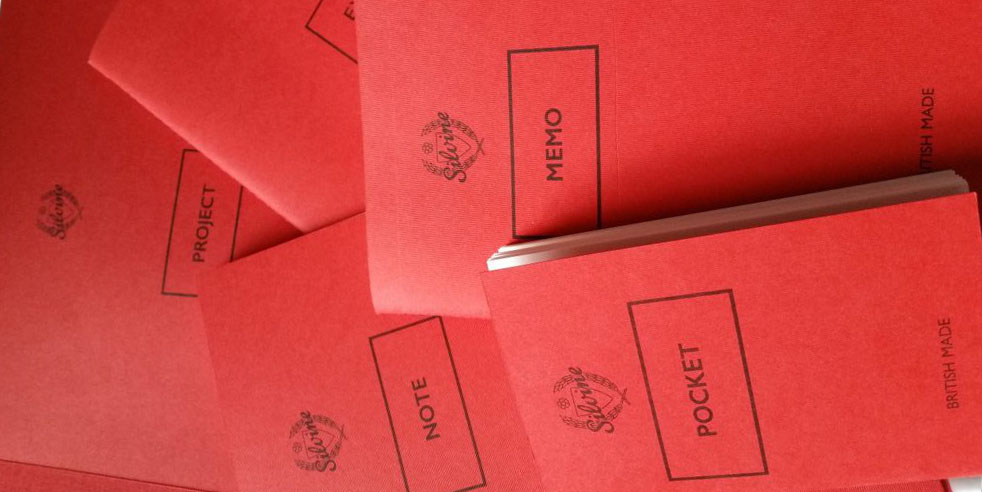
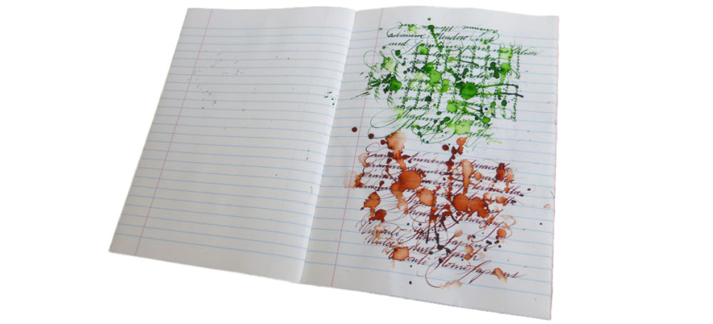 Pulp! What is it good for? As mentioned above, each notebook fills its own little niche. You can read our individual reviews to get a better sense for what you could use them for. Daniel was was able to use the Project notebook for drawing graphs for biology illustrations, but Gillian pointed out that it doesn’t have to just be for applications like drawing out scientific apparatus. You’re bound to find the right notebook for you amongst this selection; John has even made the Pocket part of his every day carry. Some of us did identify other limitations; there is no grid option and the notebooks are all a non-standard size.
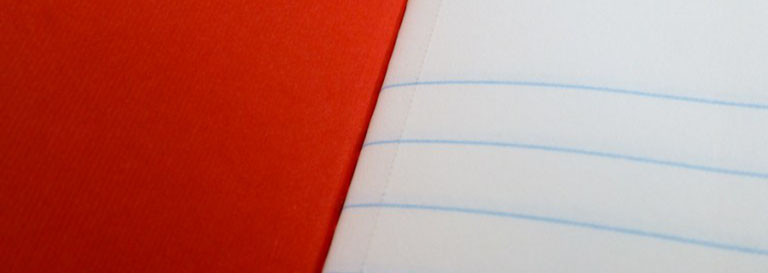 VFM Typically, the cheapest of these notebooks is the Memo, at around £4.50, with the most expensive around £14.00. However, if you consider the Pocket notebooks, which come in packs of three, the cost of each individual notebook is £2.17. John says that the notebooks are “expensive but worth it,” and that sums up the consensus view – you do pay a of a premium, but it’s worth it.