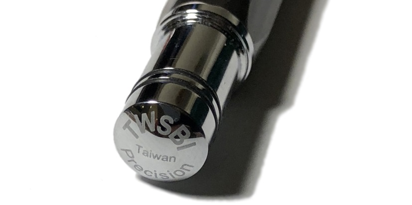
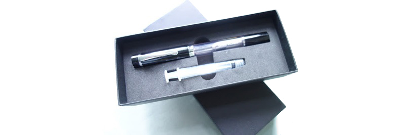
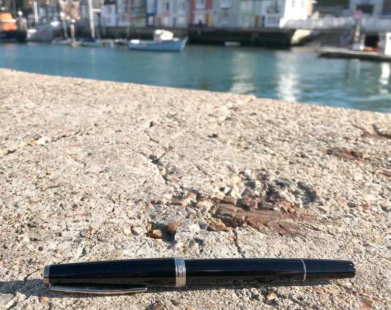
A little bit of history It’s probably safe to say that TWSBI is a Marmite brand; you either love ’em or you hate ’em. However, the Precision line is one that those who love TWSBI will warm to, but also something that those who currently don’t indulge in TWSBIfication (mainly due to their reported quality control issues) may want to give a chance, as this pen and pencil set are rather robust in their build and look likely to be reliable. We quite enjoyed them!
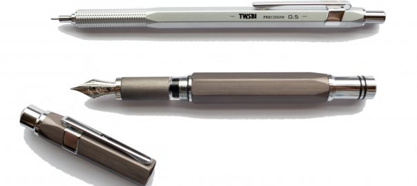
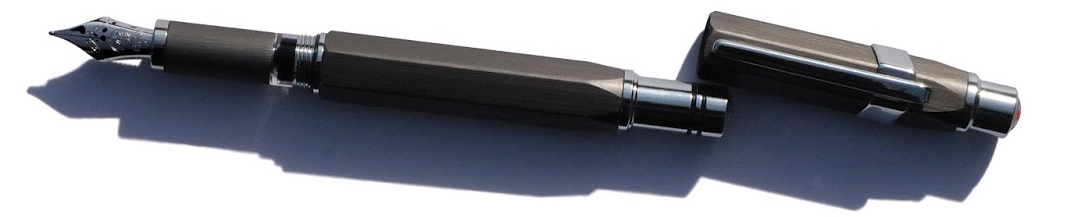
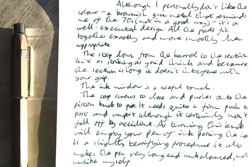
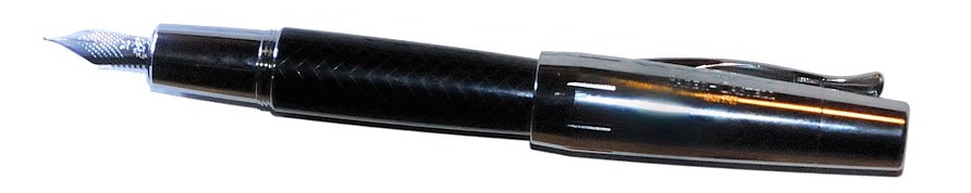
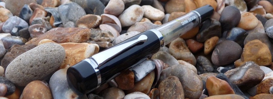
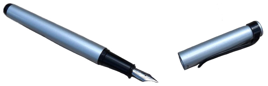
How it looks Some of us had our initial reservations about the fountain pen design, but it grows on you. The shape could be described as an “inverse hourglass” with a chunky middle section and thinner grip section and piston knob which almost gives it a “kit pen” aesthetic. The pencil design has more than a hint of Rotring about it, but this is in no sense a bad thing.
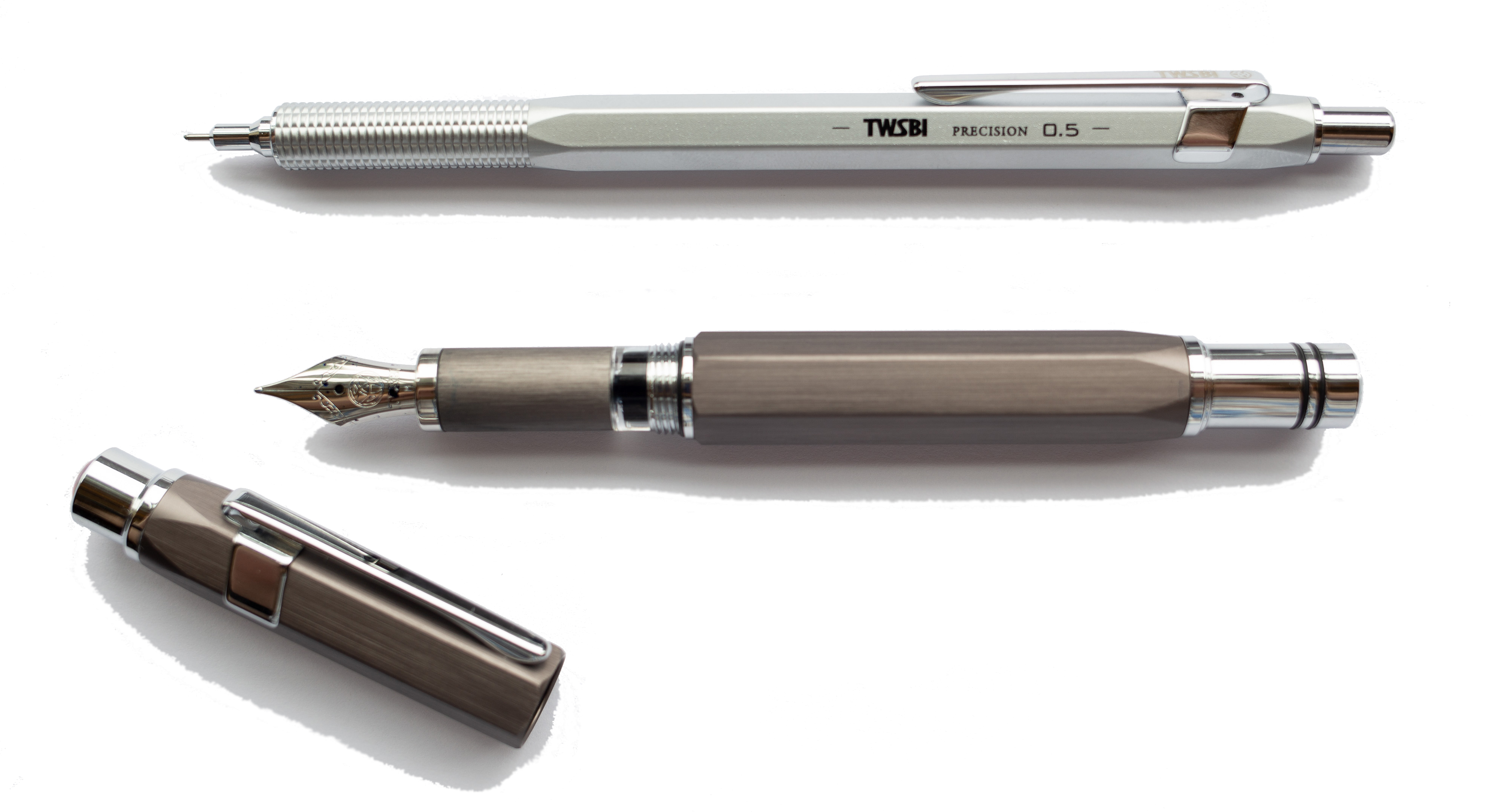
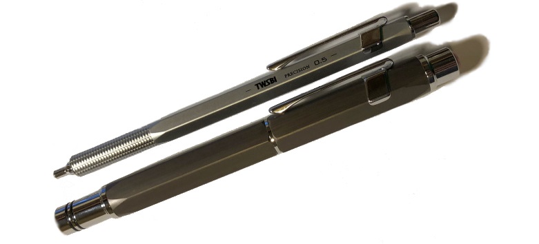
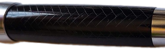
Currently the pen is only available in one finish, which is a matte grey brushed look. It is very smooth to the touch, however. The pencil is available in both silver and black but has a more metallic finish than its fountain pen counterpart, and also comes with a rather nice knurled grip. Those who really insist can also obtain a ballpoint in a similar body to that of the pencil, although we can’t imagine why you’d want to. The barrel on both the pen and pencil are faceted, which is a distinct design feature. Here it is compared to Daniel’s Montegrappa NeroUno Linea to show the facets:
How it feels Because of the materials used to make these instruments, they can feel reassuringly heavy in the hand once wielded. Both the pen and the pencil are nicely balanced, however, and this gives for a nice writing experience. The fountain pen cap does post, with a firm push, but this may not be the wisest move, partly for the obvious reason of making the pen top-heavy, but also because an accidental pumping of the piston may occur – and that can get very messy (Scribble’s carpet is reportedly still recovering). It’s quite easy to write with both the pen and pencil for a long time without any sort of fatigue. This is especially pleasing considering that fountain pen is a piston filler, which leads nicely on to…
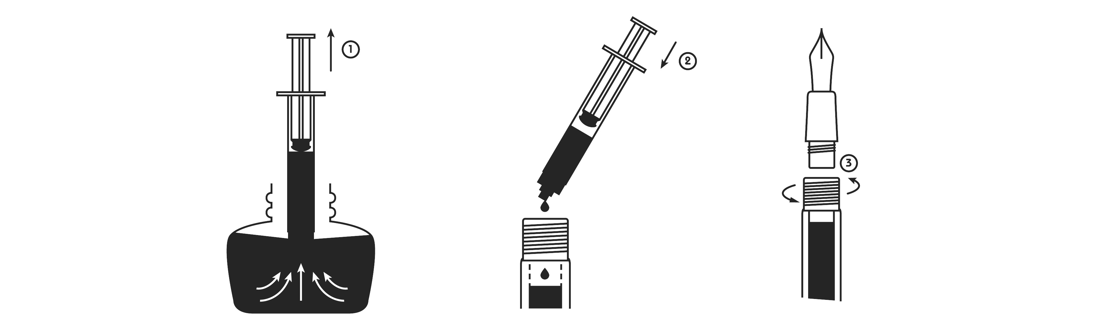
How it fills Segues! The fountain pen is, in typical TWSBI fashion, a piston filler. This gives you plenty of ink and allows you to write for quite a while. Some people do have their reservations about piston fillers as they can require a bit more maintenance when cleaning, though it isn’t too much hassle truth be told – and as is the case for all TWSBI pens, the tools required are all in the box.
The pencil refills are standard leads that you can buy from your favourite stationer – be it online or on the high street.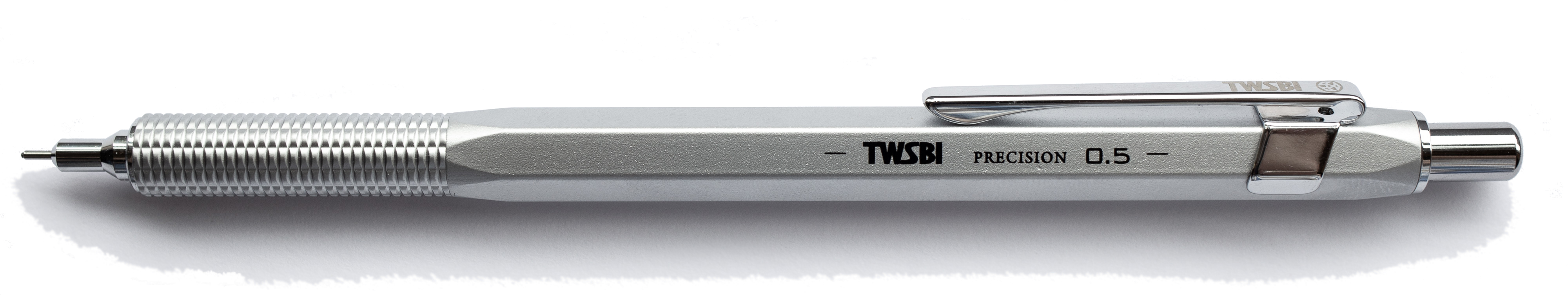
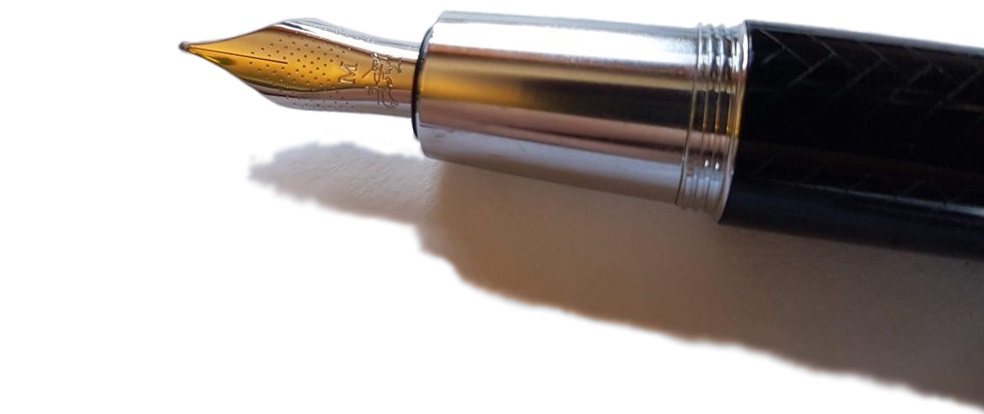
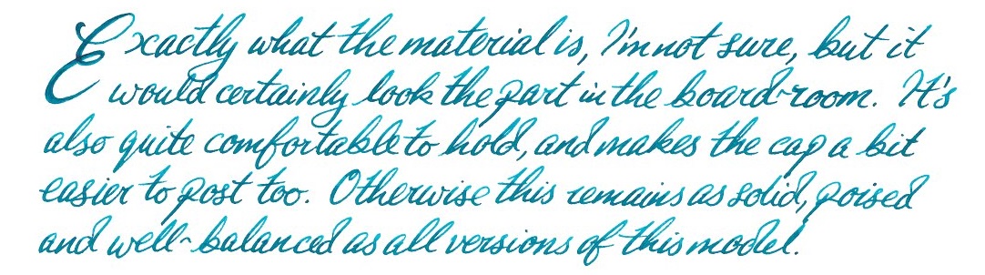
Crucially, how it writes Both the fountain pen and the pencil both write very well. In part, the pencil performance is dependent upon what lead you have in it (partly the case with inks in the pen, though not to such an extent). Because both are well balanced, you do get a nice writing experience coupled with the nib/lead. The pen is available in all the normal TWSBI steel offerings, including stub nibs. We found no problems in terms of hard starts or skips with the pen. Our bleistift expert did notice, however, that the test pencil pushed-through rather more lead than is normal beyond the sleeve, which can increase the risk of snapping.
Pen(cil)! What is it good for? This set would find itself fitting-in nicely in a business context, as well at one’s own table for personal use. The pen design aesthetic is somewhat similar to that of the famed Lamy 2000, but without the price tag (and gold nib, of course). The pencil’s echoing of (and in some senses improvement upon) the Rotring tradition would fit it for a design studio – if you can find one which still uses pencils.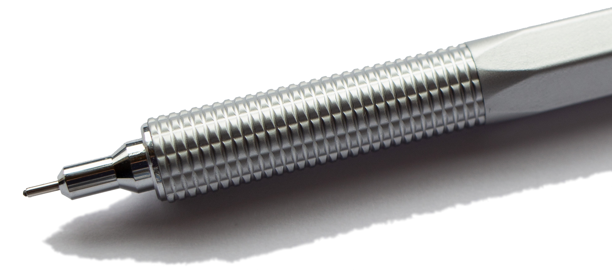
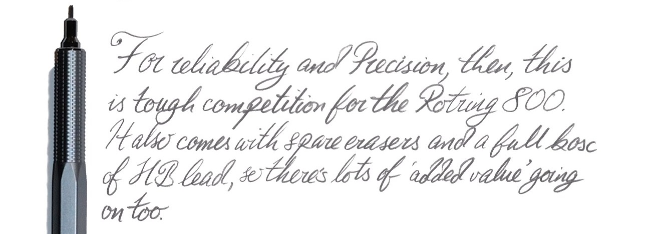
Value For Money Coming in at around £70-80 for the pen and mid £20s for the pencil, this may be an investment for some. But it’s a reliable pen, and a piston filler too, so it has the makings of a ‘workhorse’ pen which could end up paying for itself if used enough; no overpriced cartridges here, and less plastic waste too. The pencil is decent value, especially compared to the Rotring models it is apparently pitched against.
If this isn’t quite your cup of tea There’s a lot going for this pen. If you’re looking for recommendations for something similar to this, first you’d have to consider which aspect(s) you’re most put off by. If it’s the piston fill, then look for a cartridge/converter pen (this could possibly push you into gold nib territory if you’re willing to spend a little bit extra – Platinum #3776 comes to mind, which is a fantastic pen). If you enjoy the design, the Lamy 2000, as mentioned above, may be worth looking into; this would set you back an extra ~£50 (almost twice the price of the Precision), though as is the case with the Precision, you’re looking at a reliable workhorse that is worth (to most) the investment and so you can find comfort in that fact – it also comes with a gold nib and is more streamlined if you enjoy the matte grey brushed look on the Precision that you also get on the 2000 but not the “inverse hourglass” shape. If the pencil doesn’t quite float your boat, Rotring really is the obvious place to look.
There are, of course, other pen models within the TWSBI line-up that may tickle your fancy… Our overall recommendation The Precision FP is a good, reliable pen, which has the potential to become a trusty workhorse without breaking the bank. None of us had any problems in terms of the writing experience, and the only cause for concern were our own personal preferences when it comes to design. All in all, a thumbs up! The pencil is a slightly more mixed offering given the issue Matthias identified with excessive lead protrusion, but still great value for the price demanded.
Where to get one TWSBI have plenty of retailers in the UK now, and they are not difficult to find on the whole, although new models can sell out quickly. Our test pen was contributed by the marvellous Write Here of Shrewsbury (who, at time of writing, have this pen on special offer!) while the pencil was procured in this case from the equally splendid Writing Desk of Bury St. Edmunds.
This meta review references:
- Ian’s reviews of the fountain pen and mechanical pencil
- Scribble’s reviews of the fountain pen and mechanical pencil
- Matthias’s review of the mechanical pencil (with a brief look at the pen too)
Thanks to Write Here for sending a pen our way before their initial stock sold out!
 How it feels Unposted, it’s a fairly big pen, but not oversized – so comfortable for most hands. That cap does post, but this makes it a bit top-heavy in our opinion(s).
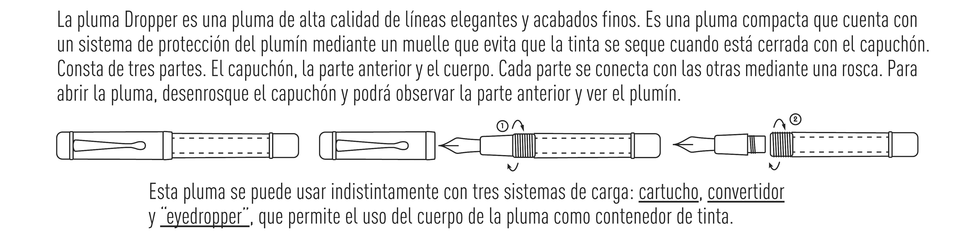
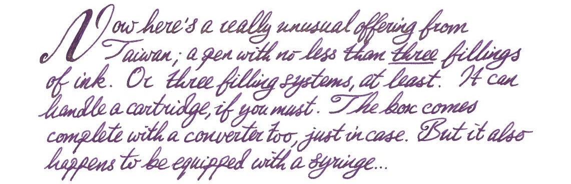
 If this isn’t quite your cup of tea, but almost… Have a shop-around for eye-droppers. They are making a gradual comeback – take the Opus 88, for instance.
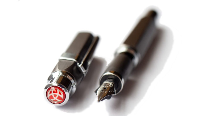
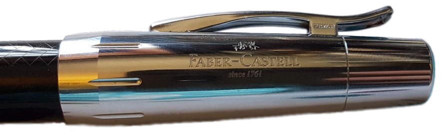
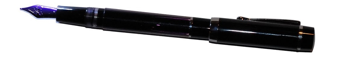
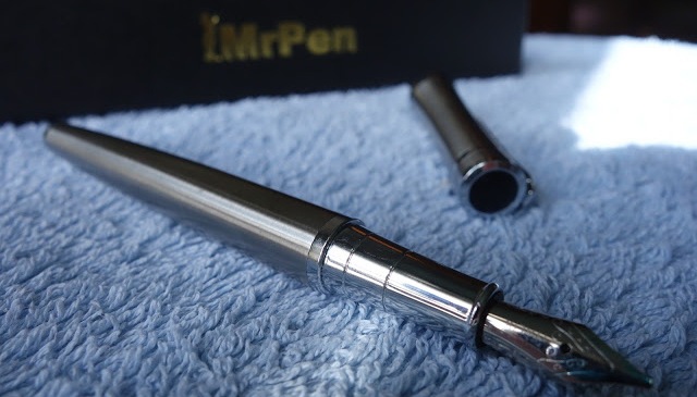
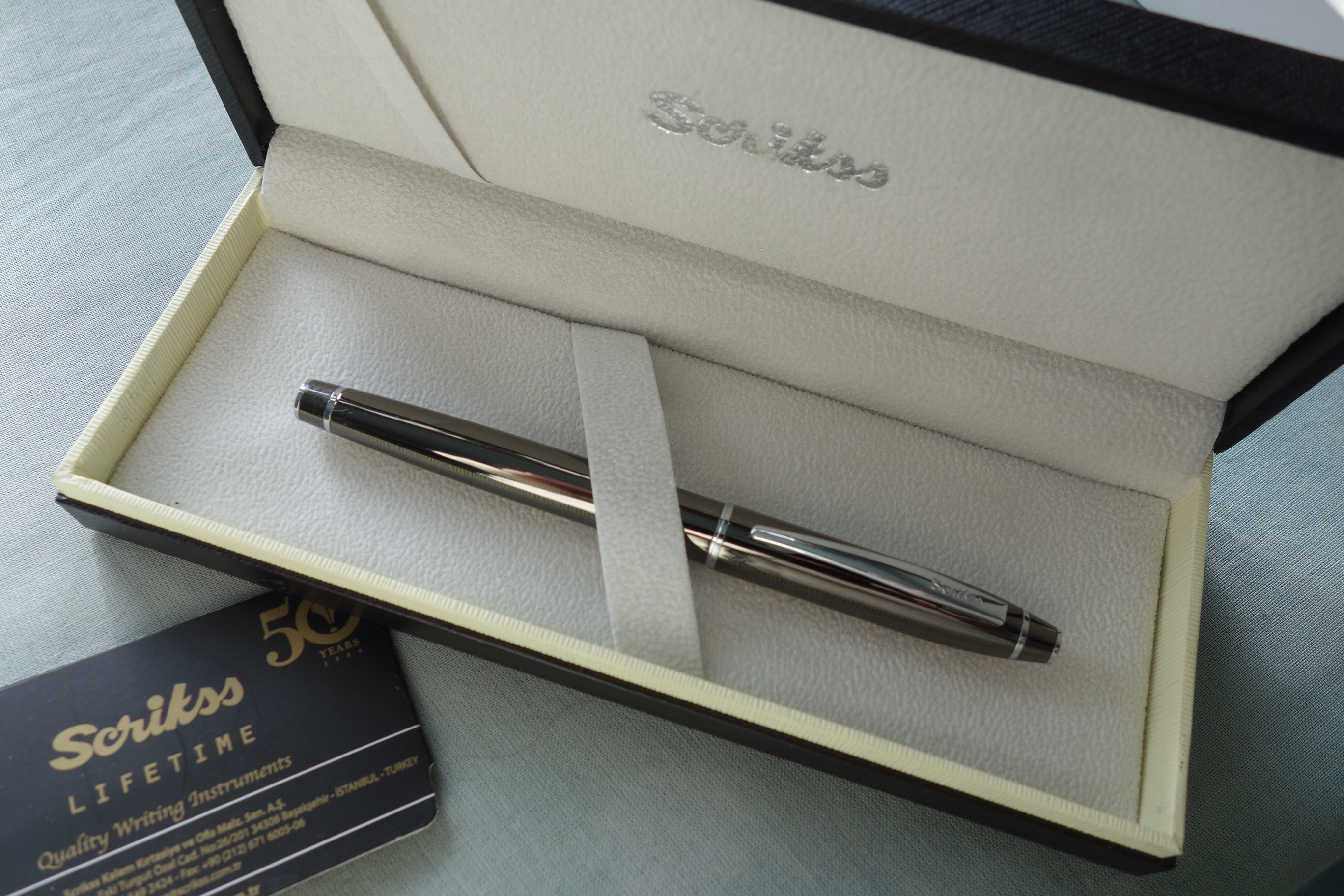
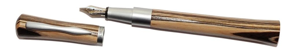
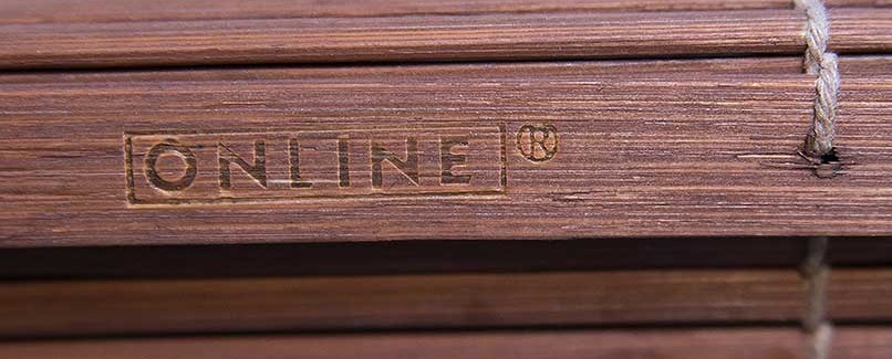
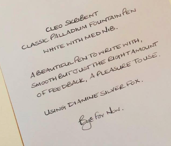
 A little bit of history Cleo Skribent is the company which kept fountain pen manufacturing going behind the iron curtain, and now make affordable daily drivers like the
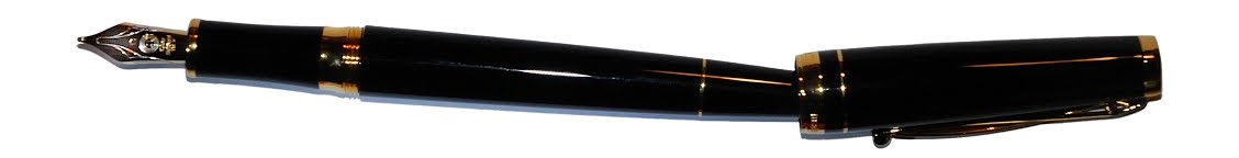
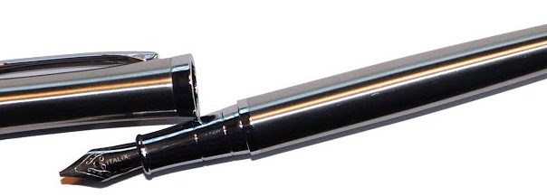
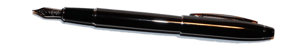
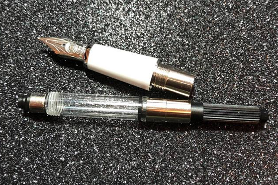
  How it looks Quite distinctive, with a tapered barrel which is reminiscent of a desk pen, and that impressively over-engineered clip. The gold finish wasn’t to everyone’s taste, but a chrome trim alternative and a nicely blue version are also available.
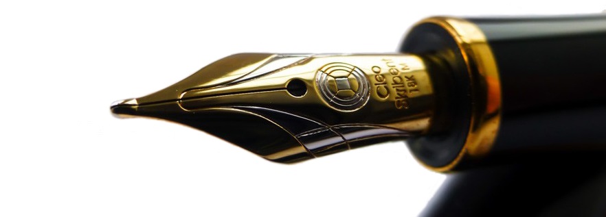 How it feels Light but well-poised and ready to write. It’s hard to resist the urge to try a few squiggles when you pick this up, even if you have nothing in particular to write – but as Skribent roughly translates as ‘scribble’ that’s perhaps appropriate.
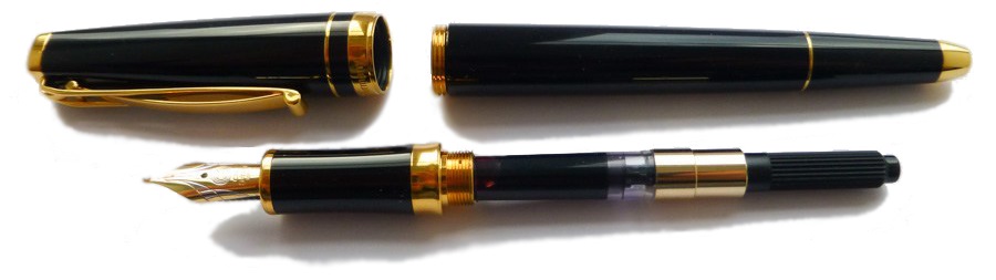 How it fills Somewhat disappointingly, given the piston option of the reasonably priced Classic, the Skribent is a cartridge/converter number. However, the converter does screw in for greater security, which is a smart move.
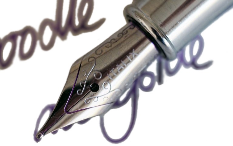
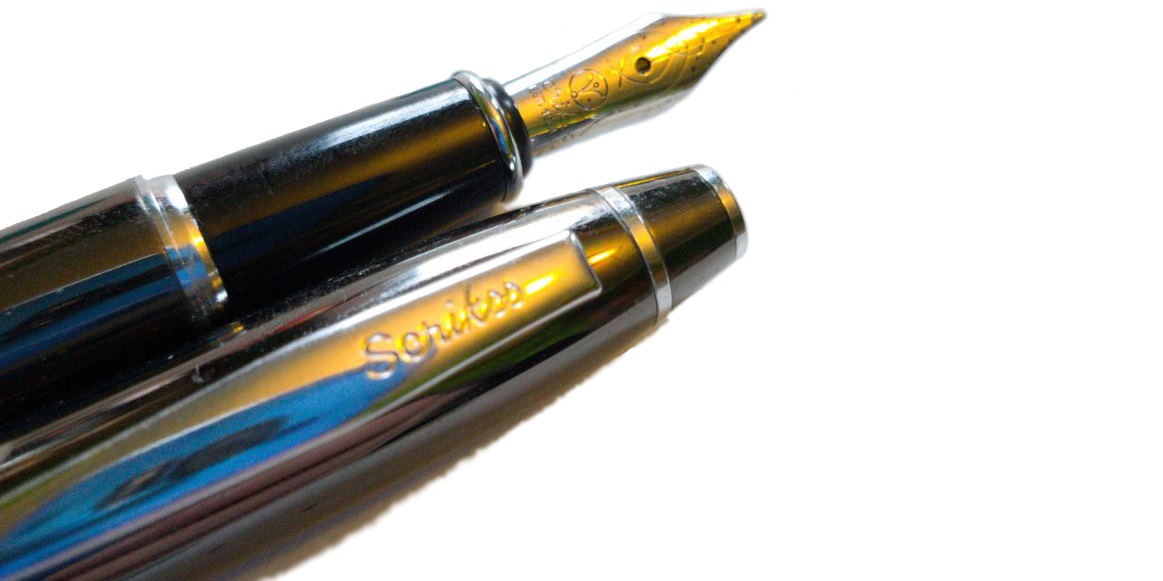
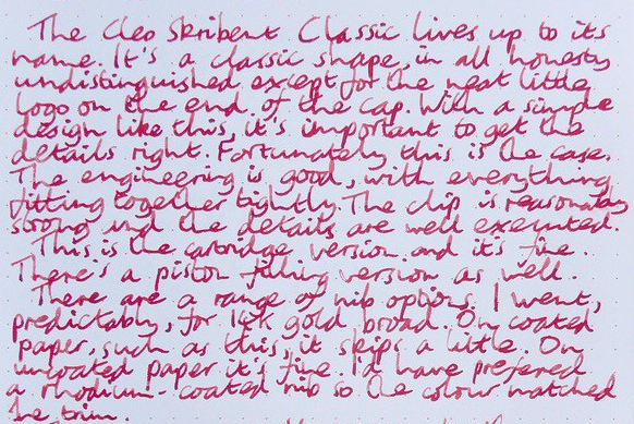
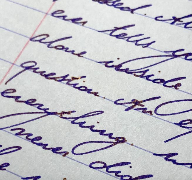
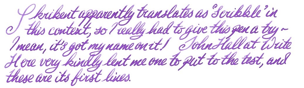 Crucially, how it writes… Ah, here is where the Skribent changes opinions quite quickly. The looks might not win everyone over, but that nib does! It’s small but perfectly formed, with a gentle bounce usually only encountered on a Japanese ‘soft’ nib, and although it offers only modest line variation it is a real joy to write with.
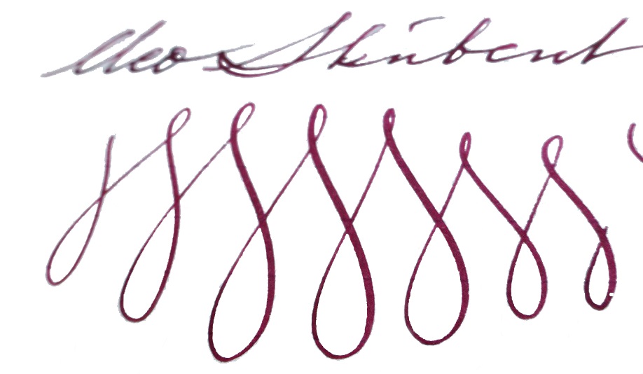 Pen! What is it good for? This is a proper ‘writer’s pen’, this one; it is well-built and could cope with whole reams of text. ‘Just the thing for writing that novel you’ve been meaning to get around to…
 If this isn’t quite your cup of tea, but almost… Cleo makes a wide range of fountain pens, and we do aim to review more of them over the next couple of years. But probably the nearest writing experience to that available from the Skribent would be a Platinum #3776 with an SM nib – if you can find one.
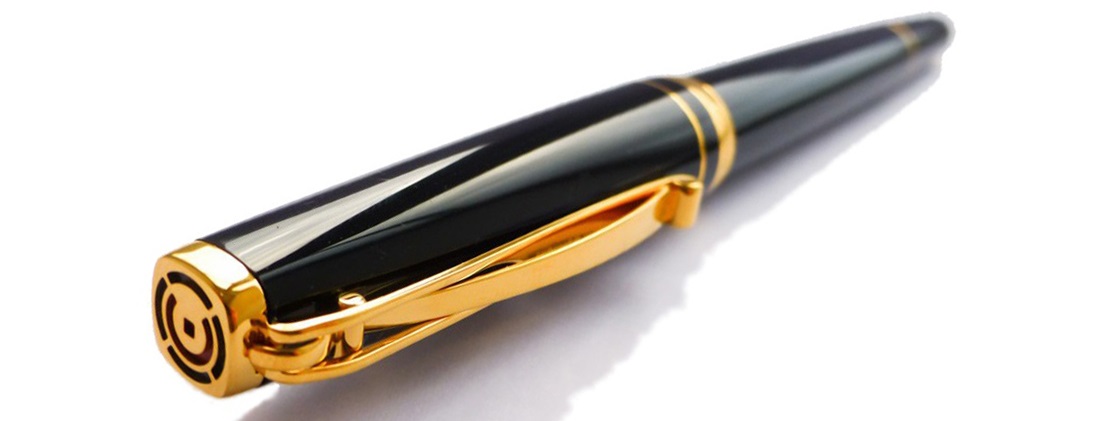 Our overall recommendation If you do have a yearning to write a book long-hand, and you can afford a luxury ‘daily driver’, you could do a lot worse than the Skribent – and you’re sure to fall in love with the nib. We think that Cleo would be wise to reconsider the price positioning, however.
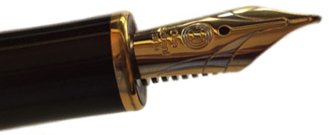 Where to get hold of one There are few Cleo stockists in the UK so, review samples not withstanding, it does make sense to
 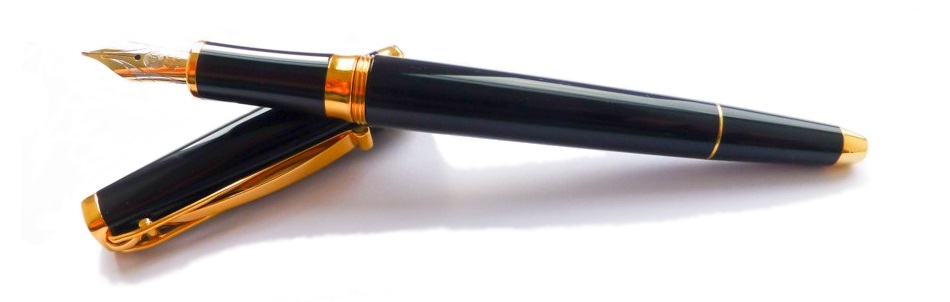 This meta-review references:
 Thanks to Write Here for lending us the Skribent to play with!
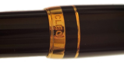
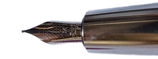
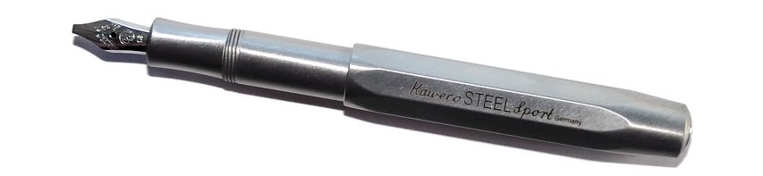 A little bit of history Every serious fountain pen fan has a Kaweco Sport somewhere; small, pocketable – and in their simple plastic form eminently affordable – they are often starter pens, and frequently stay in use as emergency back-up pens even when owners have developed more exotic tastes. For quite a while, though Kaweco has been developing a ‘premium’ line of robust, refined, reassuringly expensive Sports in interesting materials ranging from carbon fibre to industrial metals. The very first United Inkdom meta-review tested the
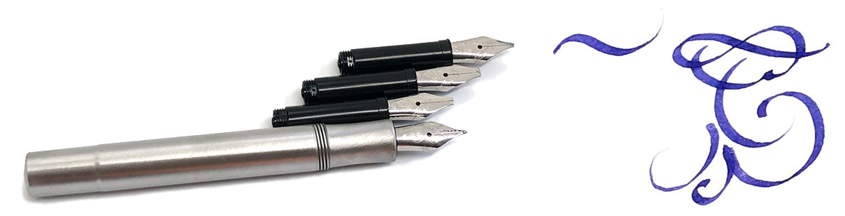

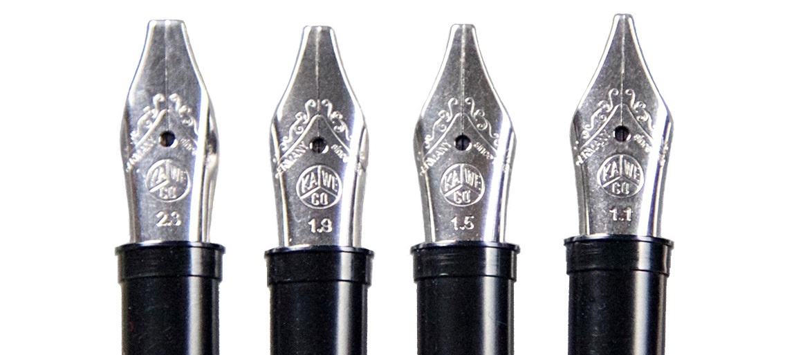
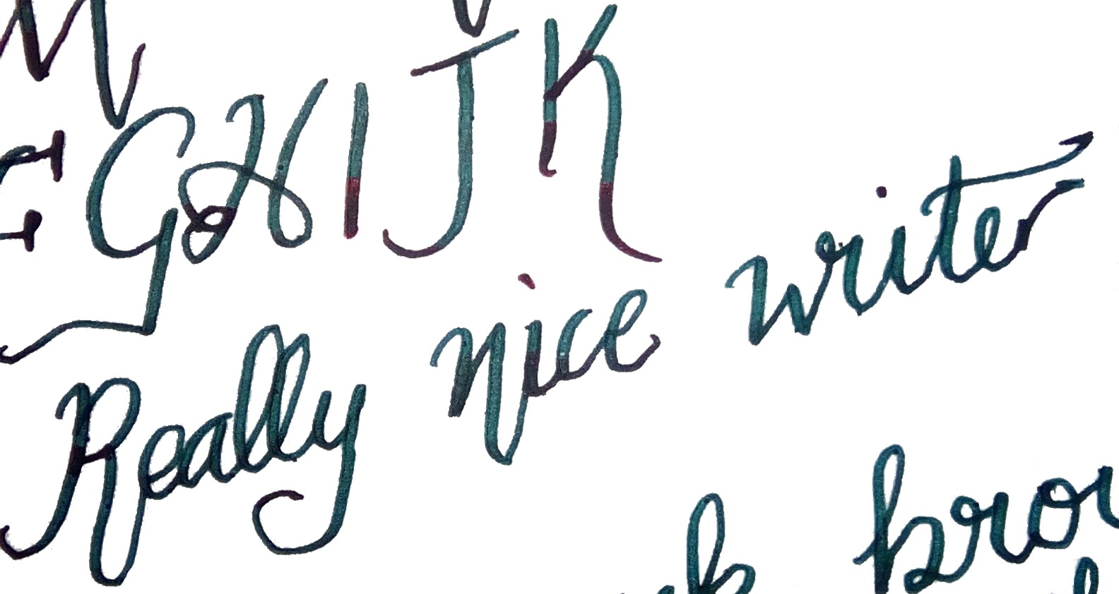
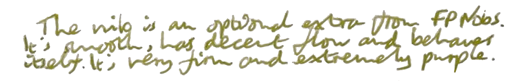
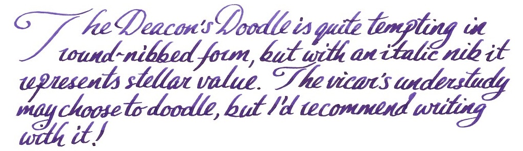
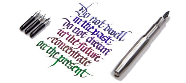
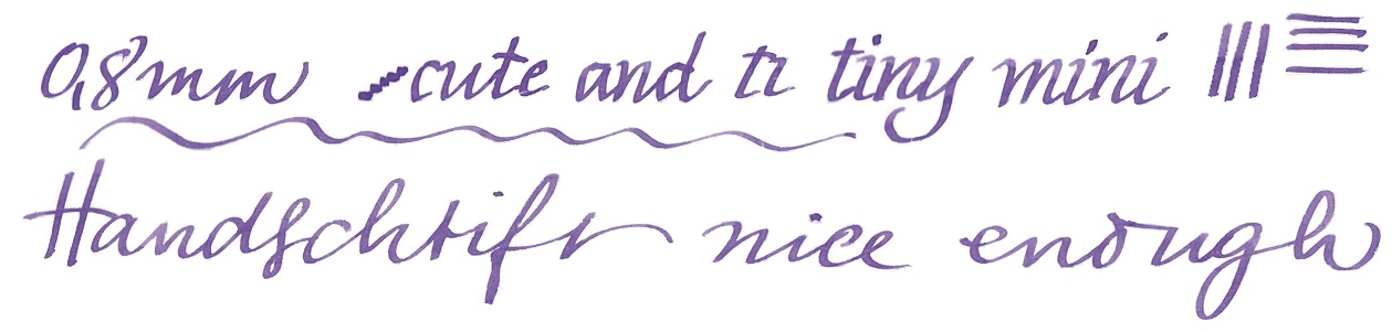
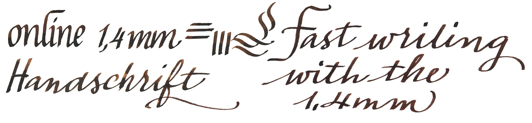
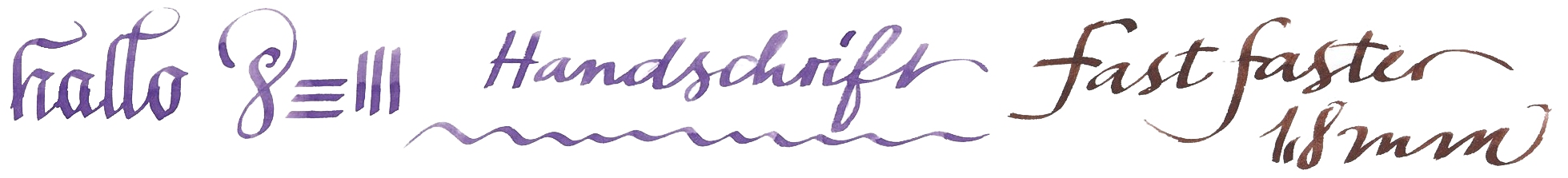
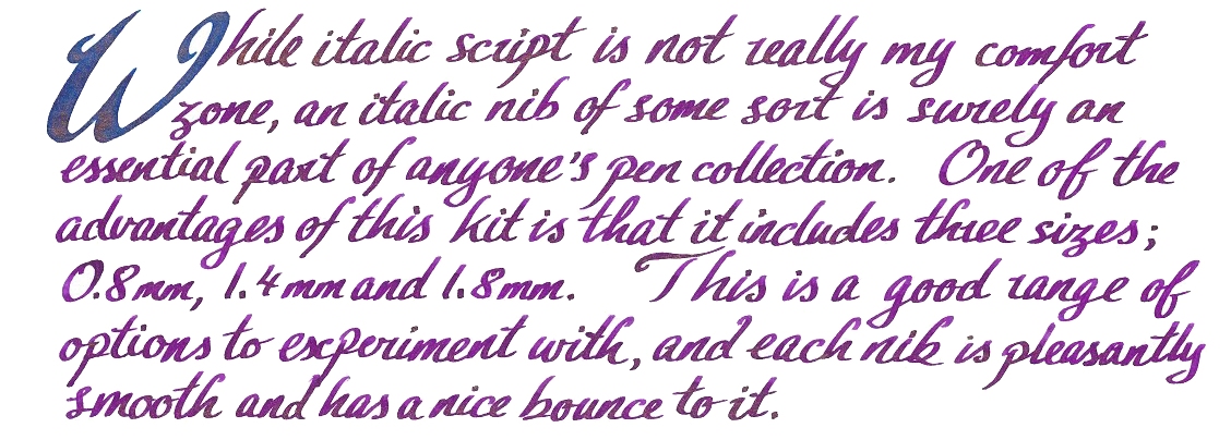
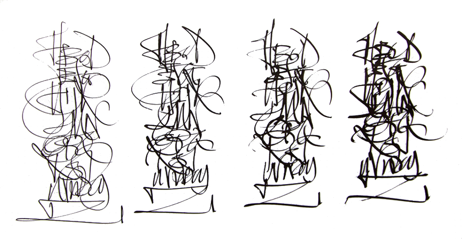 Crucially, how it writes… As always, that depends on what nib you choose. Like all the more expensive Sport bodies (and indeed most of the Kaweco fountain pen range) this version uses screw-in small#5 Bock assemblies, which are available in a wide range of both round and italic tips. For the round tipped-nibs, many of us find that EF, F and M tend to be safest of the steel options, although any flow or smoothness issues, which can be variable in steel, vanish if you upgrade to gold. For this meta-review, though, we put the Steel Sport in the hands of two professional calligraphers (in Kent and Austria, respectively) who put the italic options through their paces – and found the narrower 1.1mm and 1.5mm nibs worked well even for fast writing, while a little more care was required for the wider tips where the same flow of ink has to stretch further. But as long as you choose the right nib for you and your own writing style, this is a reliable performer.
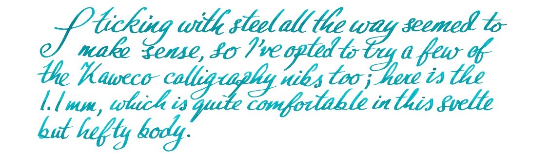 Pen! What is it good for? With a round-tipped nib this is probably the pocket pen par excellence; it looks the business, works well and will probably outlast most owners. Our calligraphers thought it was good for having some fun with italic lettering too, even if not quite the thing for fee-earning studio work (which is not what it is really designed for, to be fair).
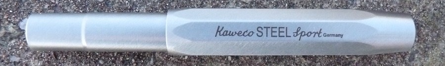
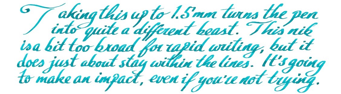 VFM This is not a cheap pen – indeed, apart from the carbon-fibre version this is the most expensive Sport so far. Retailing for either €85 or £84.99 (which says something interesting about current exchange rates), it’s a significant purchase, but still not in luxury price-tag territory in our view. It looks a lot more expensive, though, and it’s tough enough that you would have to try very hard before you damaged it – nothing short of a diamond-tipped angle grinder is going to break this!
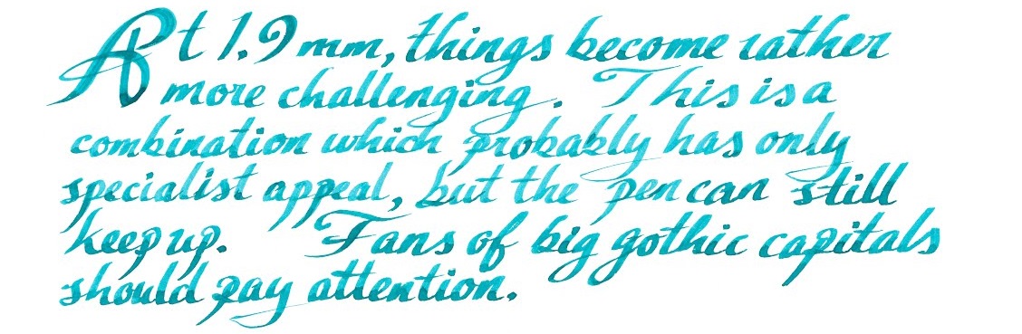 If this isn’t quite your cup of tea, but almost… Then there’s the shinier, lighter and more affordable aluminium version, or the steampunk splendour of the Brass Sport, either of which are sound choices. We have also seen the prototype of the solid silver version – but expect that one to break the £100 barrier, as the materials alone are likely to add around £15 to production costs at current prices.
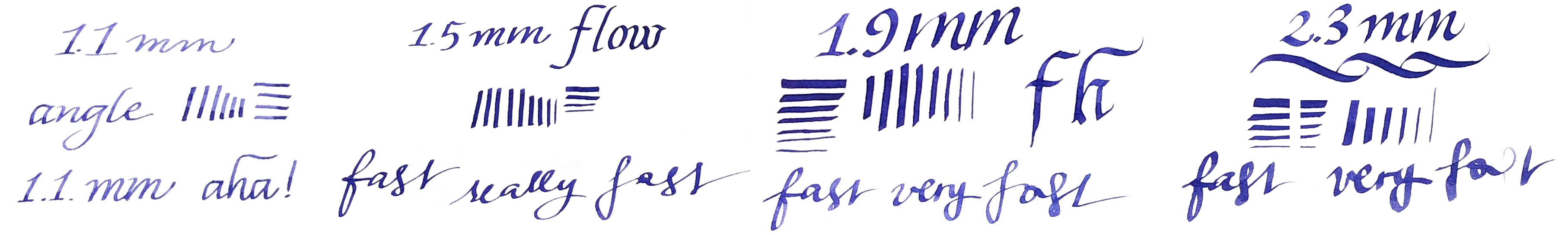
 Where to get hold of one From all the usual sources. Some pens take lots of research to track down, but this shouldn’t be one of them, and it’s currently available from almost all the places you’d expect to look. At the time of publication, The Writing Desk were selling these for £5 less than most other UK retailers, but we don’t expect their stock to last too long!
 This meta-review references:
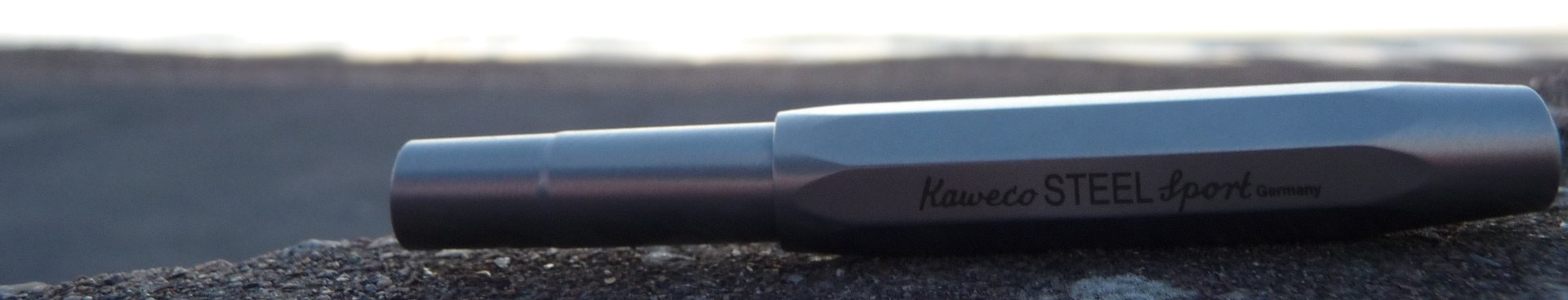

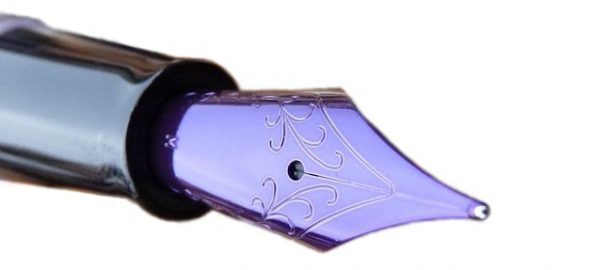
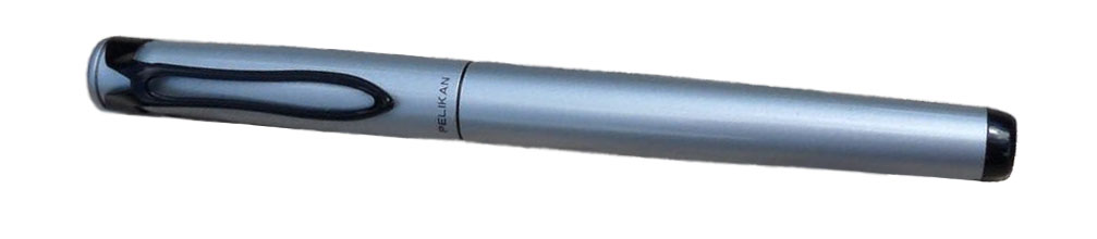 How it looks Pelikan is a company famous for making lots of very similar (and beautiful) looking pens but the Stola III is a little different. The clip maintains the pelican-beak motif but is a simple wire loop. The cap and barrel are finished in a silver-grey enamel which is modern looking but rather plain. The section is black plastic. It’s unlikely to set any hearts racing, but Pelikan have done a good job for a low price-point.
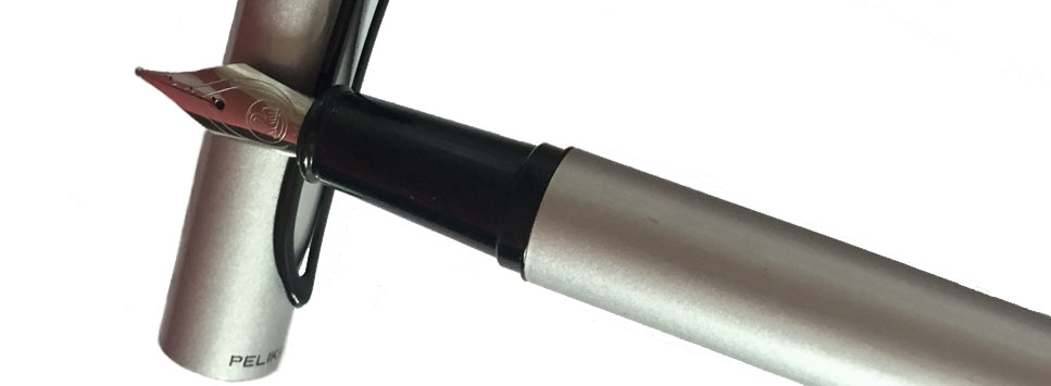
 Crucially, how it writes… The stainless steel nib is very good for a pen that costs £20. It’s smooth and has a good flow. It’s great… as long as you want a medium nib. Unfortunately, Pelikan have only released the Stola III with one size of nib, which is silly when so many other pens at similar prices are available with a full range of widths. It’s doubly silly when the nib itself writes so well.
 Pen! What is it good for? The Stola III is a lovely pen for extended writing, if it isn’t too short for you. You can pick a colour to get your thoughts flowing and journal or plan away to your heart’s content.
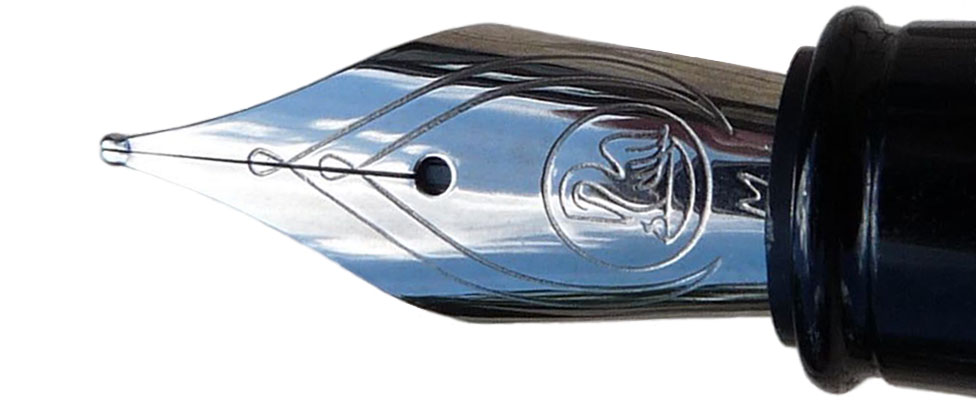 If this isn’t quite your cup of tea, but almost… then you have a huge number of options. If you want a small, pocketable pen then the Kaweco Classic Sport is a little cheaper and has lots of nib sizes. The Lamy Safari is easily obtainable, a fantastic pen and also a little cheaper. If you’d prefer a more classic looking pen then the Pilot MR (also known as the Metropolitan) is worth a look, as is the Faber-Castell Basic. Then for funky looking pens you could look at the Pilot Kakuno or the Faber-Castell Loom. Finally, if you’d like an enamelled metal-barrelled pen with a cap that’ll post, the excellent but often overlooked Sheaffer VFM is a good choice. We could go on but you get the idea… this is a crowded price point, which can only be a good thing.
 This meta-review references reviews by: