A little bit of history Are you sitting comfortably? The history here is a quite a long one. When Padraig was kidnapped by pirates and taken to slavery in Ireland – prior to his subsequent visit which, in the long run, elevated him as Saint Patrick – some accounts record that his sister Lupita was carried away with him. Her life story is obscure indeed, but somehow legends ascribed to or connected with her found their home at the edge of Lough Ennell. What may have been an isolated area of the now-drained bog at the edge could conceivably been named in shaky Norman French as L’Isle de Lupita, but this too is conjecture; somehow, nevertheless, the name was corrupted to Lilliput. Many centuries later the Dean of a cathedral – St.Patrick’s Cathedral, as it happens, for in our world all things are connected – was staying by the lake when he looked across and saw tiny figures, diminished by perspective, on the far side of the shore. According to literary legend, there an idea was born; for that Dean was none other than Jonathan Swift.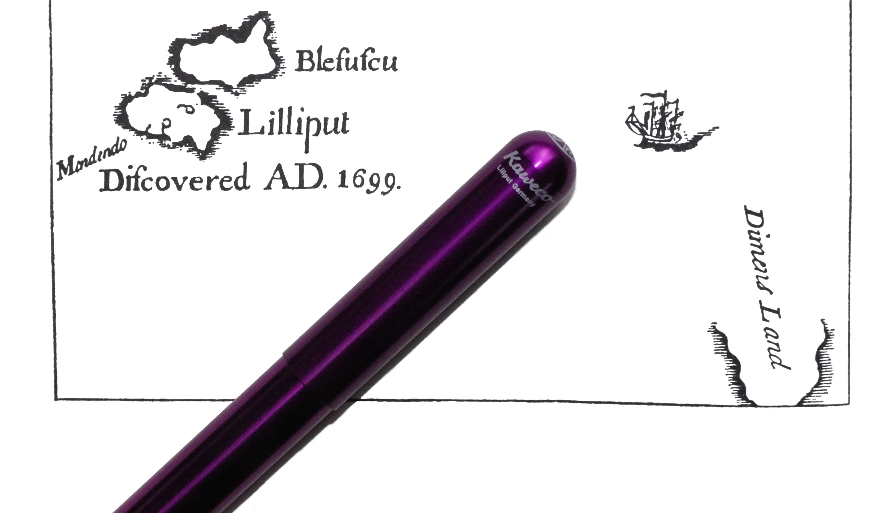 A little bit more history Jonathan Swift was a rapier-sharp satirist in his time (see ‘A Modest Proposal‘ for his critique of the way some governments behave towards the poor), but his best-known work these days is a rather subtler satire on tribal folly, Gulliver’s Travels. Lemuel Gulliver’s first port of call, of course, is Lilliput, where the people are astonishingly diminutive – around six inches in height, typically. If the fountain pen had been available at this point, a good century and a half before its invention, the proportionate writing implement for a true Lilliputian would have been about 1cm in length. In setting out to make an exceptionally minuscule fountain pen it is greatly to the relief of all diligent scribes that Messrs Koch, Weber and Company of Nuremberg, late of Heidelberg, aspired to virtues beyond mere portability…
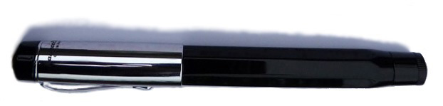
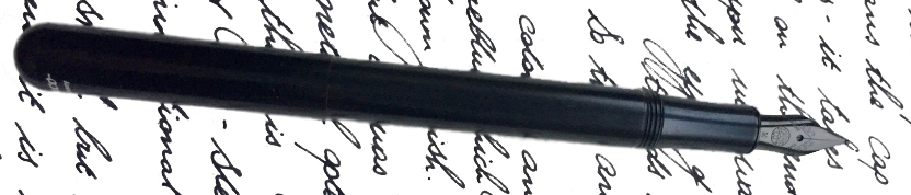
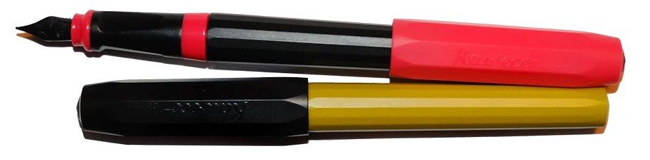
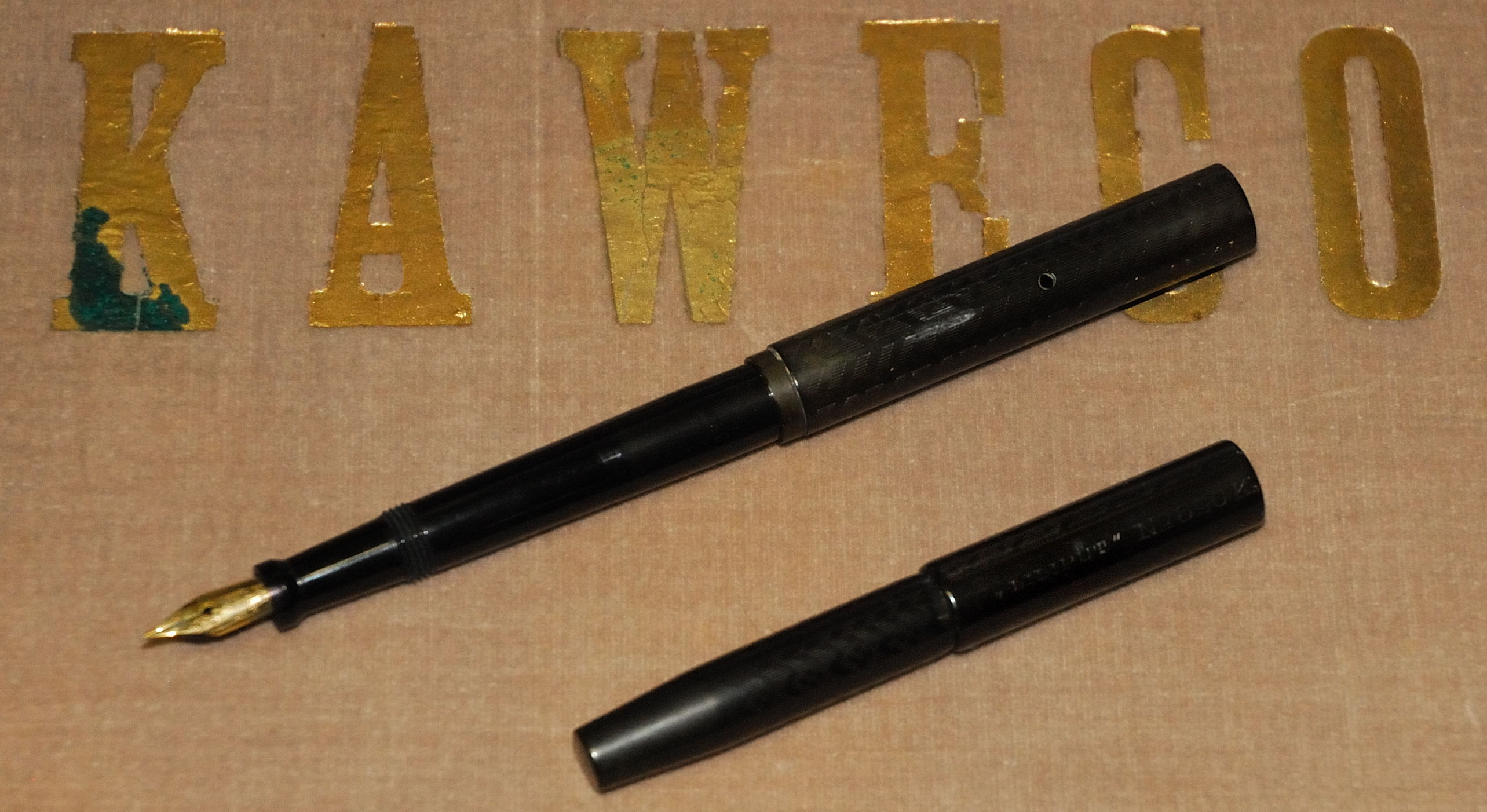
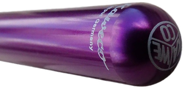 How it looks Oh alright, it’s still tiny – just not quite as tiny as that! This simple metal tube (well, simple in most versions, at least) is the smallest serious fountain pen currently in production. It looks small and, at least in basic black, inconspicuous. Unscrew the cap, screw it onto the back to extend to the pen’s full length, and it looks a bit more like the pen concept we’re all familiar with. Then different finishes separate the subtle from the unsubtle; the plain black aluminium gives way to flashy pink and purple versions, encounters with flame-throwers turn the stainless steel version into ‘fireblue’, and the rippled finish of the ‘brass wave’ turns a basic pipe into something which looks like it just fell out of a grandfather clock. There’s a lot of visual variety for such a small pen. Oddly, a typographical error misses the third ‘L’ in Lilliput from the barrel imprint, but Swift’s own spelling was so haphazard that he probably wouldn’t mind too much.
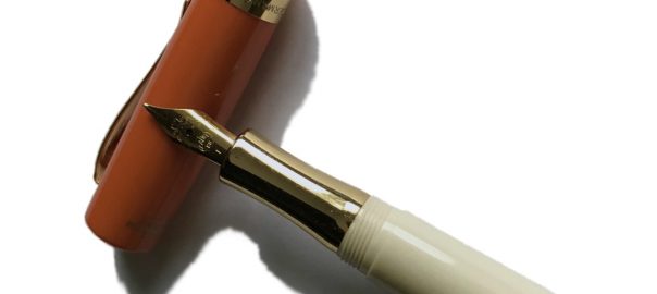
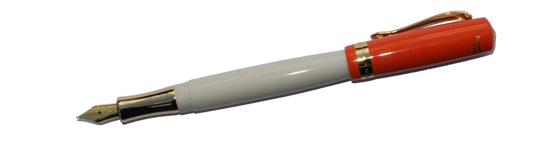
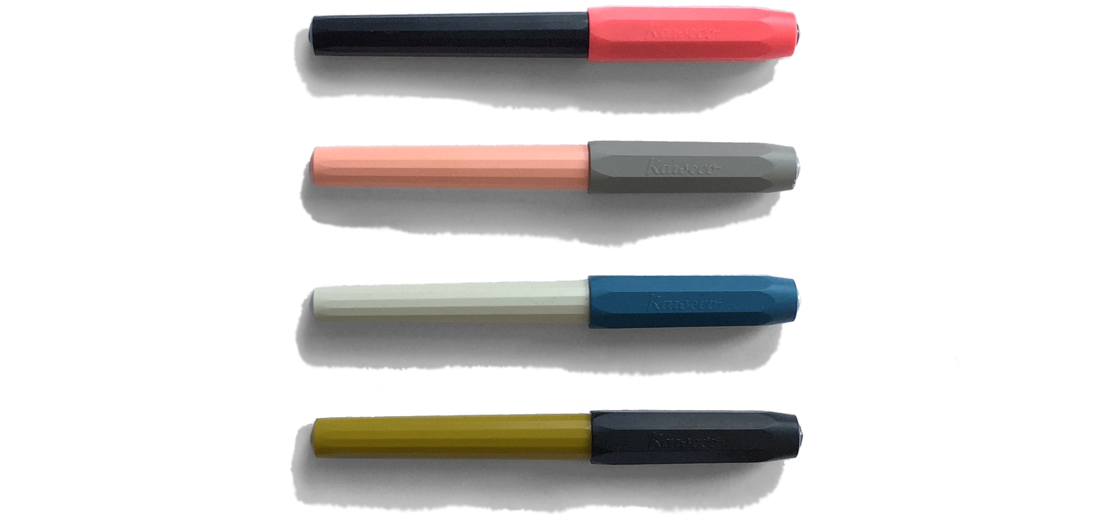
How it feels Did we mention this thing is small? It really feels it! For most of our reviewers, the Lilliput is ideal for a light, unobtrusive pocket pen which does a good job of taking quick notes. One of our reviewers found it too small to do anything much with, while another actually wrote an entire examination paper with one. This is certainly a size and shape which divides opinion quite sharply.
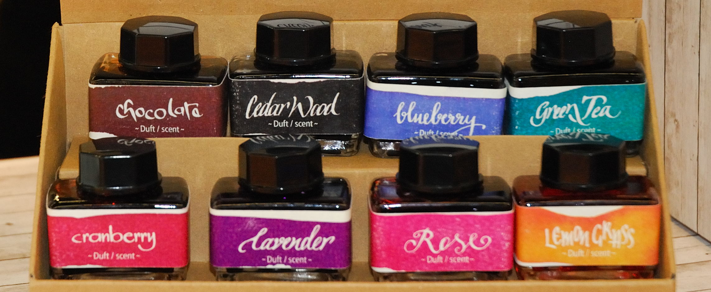
How it fills There is room for a small international cartridge in the barrel, and that’s all. Kaweco’s new small converter does fit into the section, but with little free space in the barrel the piston cannot be safely pulled far enough to get more than about 0.1ml drawn up, so that’s unlikely to be helpful. Thankfully, a wide range of decent tints are available in cartridge form these days, including all ten of Kaweco’s own inks, and refilling an empty cartridge from a bottle with a syringe is fairly straightforward.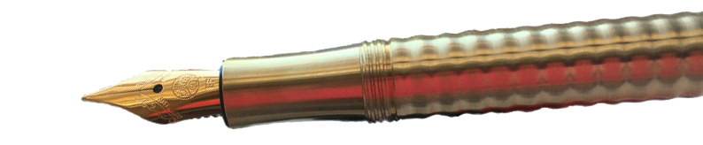
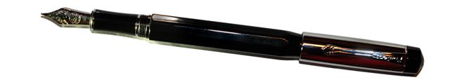
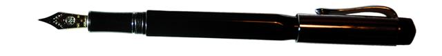
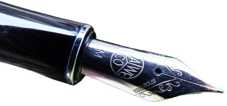
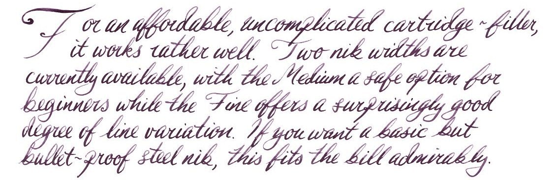
Crucially, how it writes… As ever, that depends upon the nib you choose. The Lilliput uses the same nib as most other small-ish Kaweco fountain pens including the Sport, Student, Special and Dia, and the whole nib, feed and collar assembly is a simple screw-fit so you can swap and change to your heart’s content. The standard steel units are usually pretty good, and if the quality consistency is perhaps not quite as stellar as that achieved by Diplomat and Faber-Castell, the enthusiastic and friendly customer service more than makes up for it; no Kaweco pen owner is left for long without a pen they can use, in our experience. The gold-coloured nibs work similarly well, while the black-painted nibs tend to run a little drier but can be coaxed back into life by refilling with a very wet ink, such as KWZ. If you really want to go crazy and spend more on a nib than you did on the pen, you can even fit one of the excellent gold nibs – and those are indeed not cheap, but Bock gold is very reliable.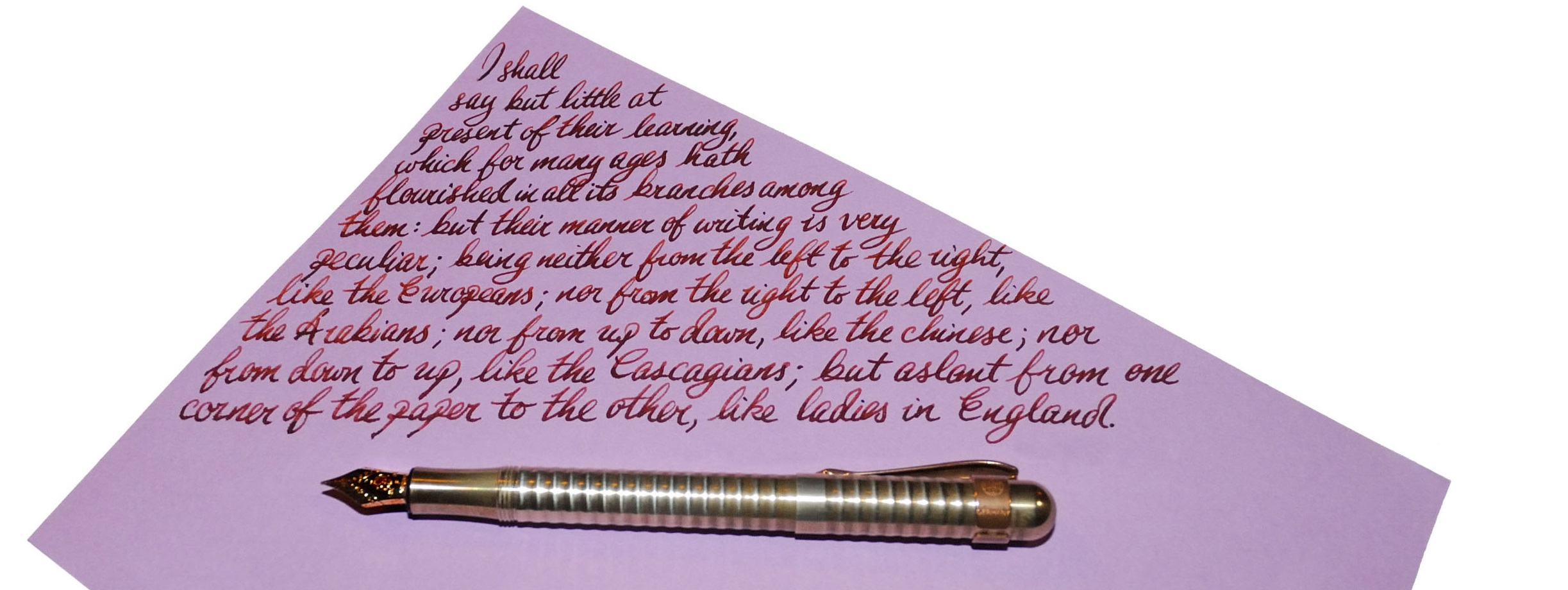
Pen! What is it good for? For most people, this is a trusty little stand-by pen to write quick notes with. True eccentrics will write reams with the thing, but it’s a free world and we love the variety!
VFM This depends upon the finish you go for, and how far it fits your writing style. The brass wave and ‘fireblue’ versions do take considerable expertise and time to make, and are priced quite reasonably for what they are – but perhaps only represent good value if you are actually going to use them. The more basic aluminium versions are incontestably good value as robust but real pocket fountain pens.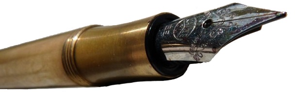
If this isn’t quite your cup of tea, but almost… Buy a bigger pen. Seriously, there is very little of comparable size and quality in the current market. There are some tiny vintage pens, which you may find if you’re lucky, and some other cheap and rather less durable pocket pens from a few other manufacturers are still around, but if you want an ultra-small pocket fountain pen which will last the distance this is probably the best option. If you like the minimalist shape of the Lilliput and just want it scaled-up for comfort in the hand, however, you might consider its larger sibling, the Brobdingnag*.
Our overall recommendation If you have a need for a pocket pen and are determined to avoid the wretched Ballpoints of Blefuscu, Lilliput is the destination for you. One contributor to this meta-review’s team is returning their sample as too small for their needs, but probably a good half of our bloggers have a Lilliput tucked into a pocket somewhere. Pick up a friend’s before you buy, test-drive one at a shop, or purchase one from a dealer you can trust to take it back if it’s just too, errm, Lilliputian for you.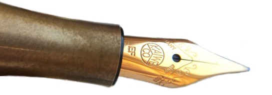
Where to get hold of one Any number of fountain pen specialist sellers – in fact, nearly all of them – carry the Lilliput. However, the purple, pink and champagne versions are only available from Mostwanted Pens.
This meta-review references:
Thanks to Kaweco for helping with access to several of the Lilliputs we reviewed – some of which we couldn’t let go of.
*The Brobdingnag is now marketed as the Supra, the original Swiftian soubriquet having proved a little long even for this barrel. ‘Cracking pen, though.
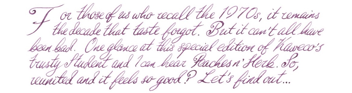
 If this isn’t quite your cup of tea, but almost… Then you have most individual tastes! For a colour scheme along these lines, the vintage market is probably the best place to look. But if you like the shape and just don’t consider the 1970s the decade of peak elegance, the main Student range is worth a look – our tip is the demonstrator version.
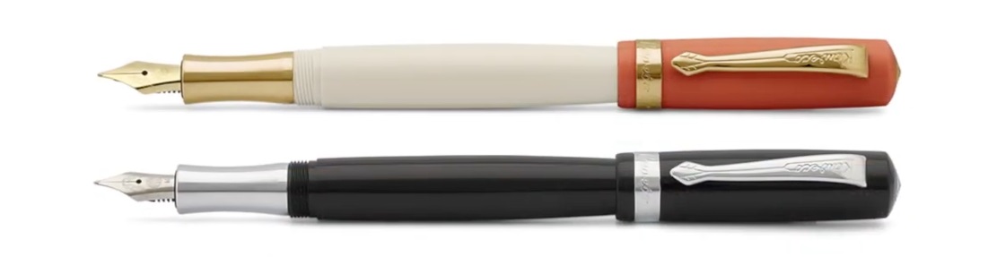
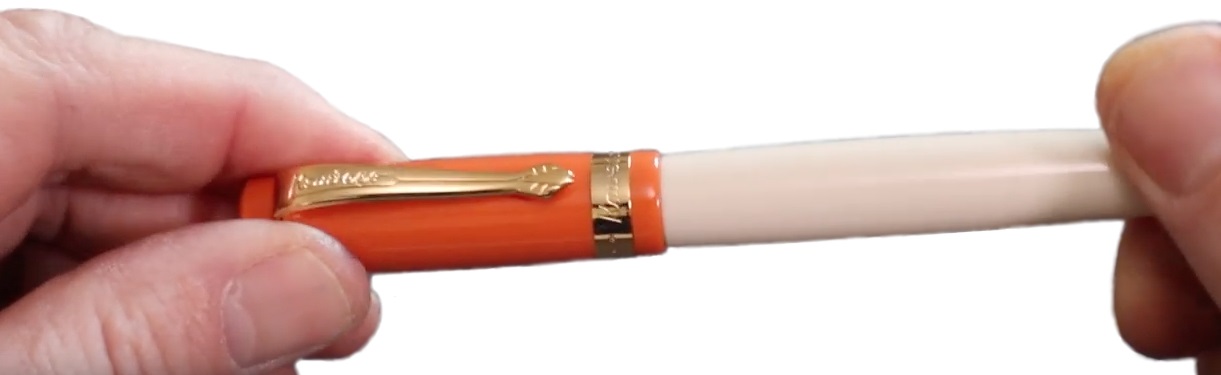
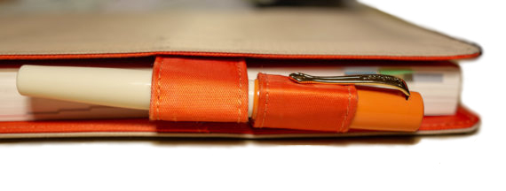
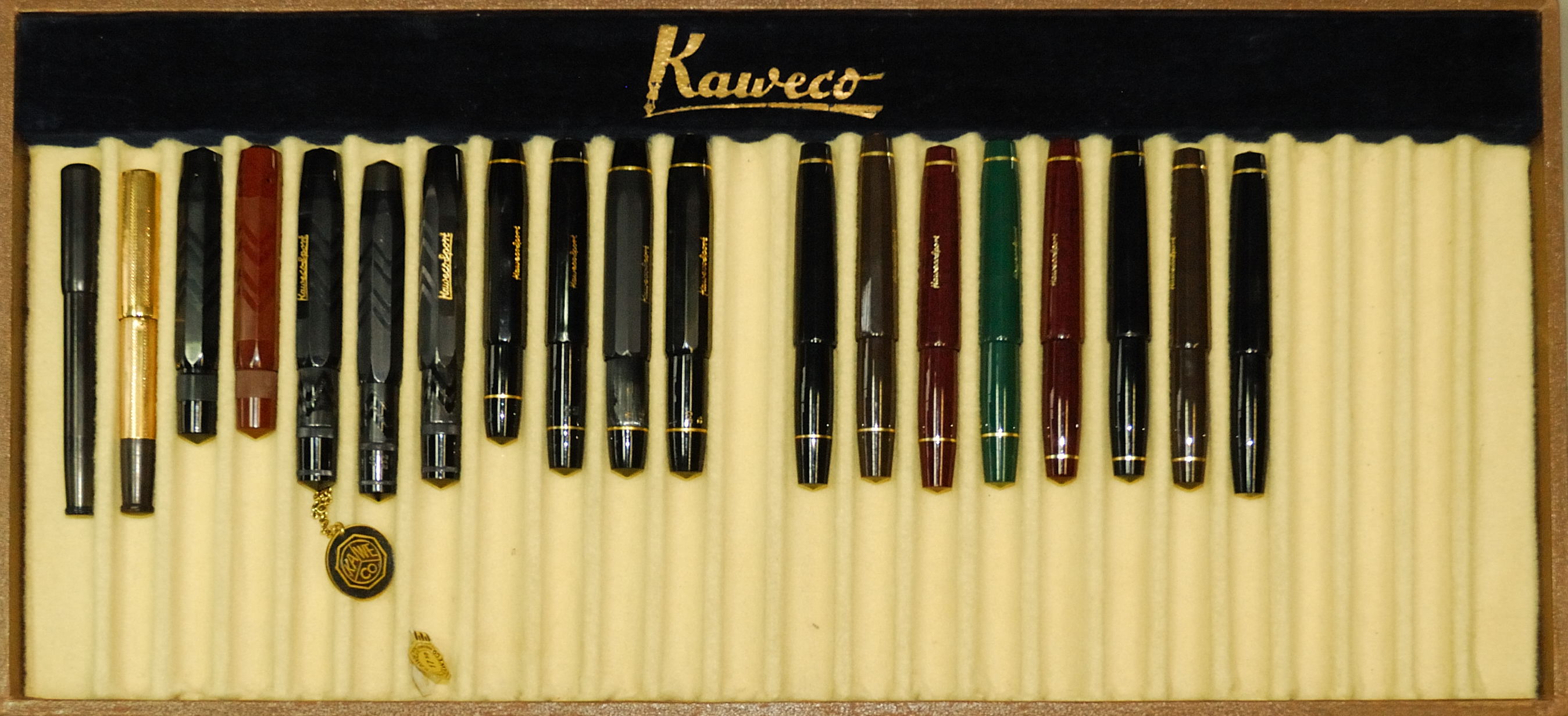
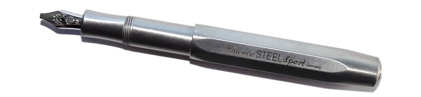 A little bit of history Every serious fountain pen fan has a Kaweco Sport somewhere; small, pocketable – and in their simple plastic form eminently affordable – they are often starter pens, and frequently stay in use as emergency back-up pens even when owners have developed more exotic tastes. For quite a while, though Kaweco has been developing a ‘premium’ line of robust, refined, reassuringly expensive Sports in interesting materials ranging from carbon fibre to industrial metals. The very first United Inkdom meta-review tested the
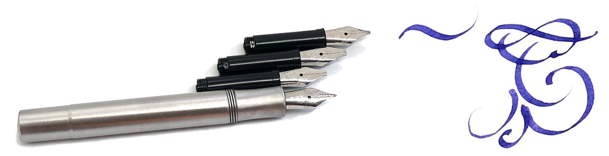

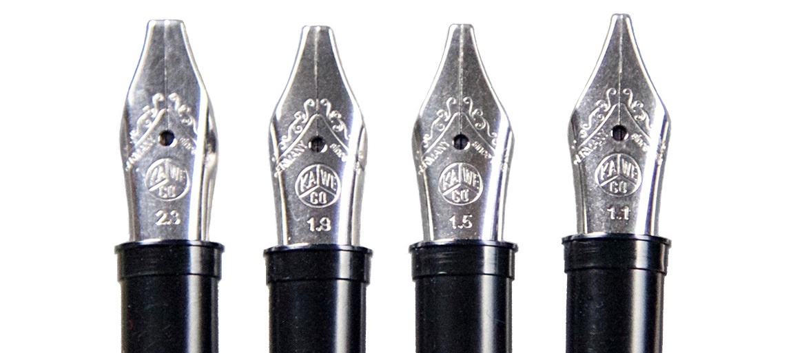
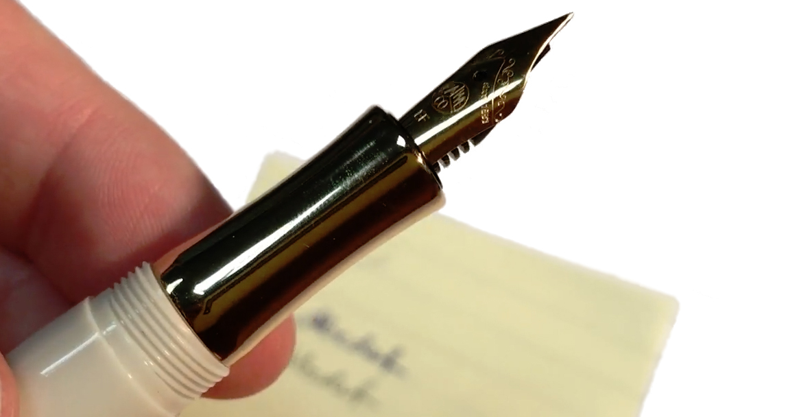
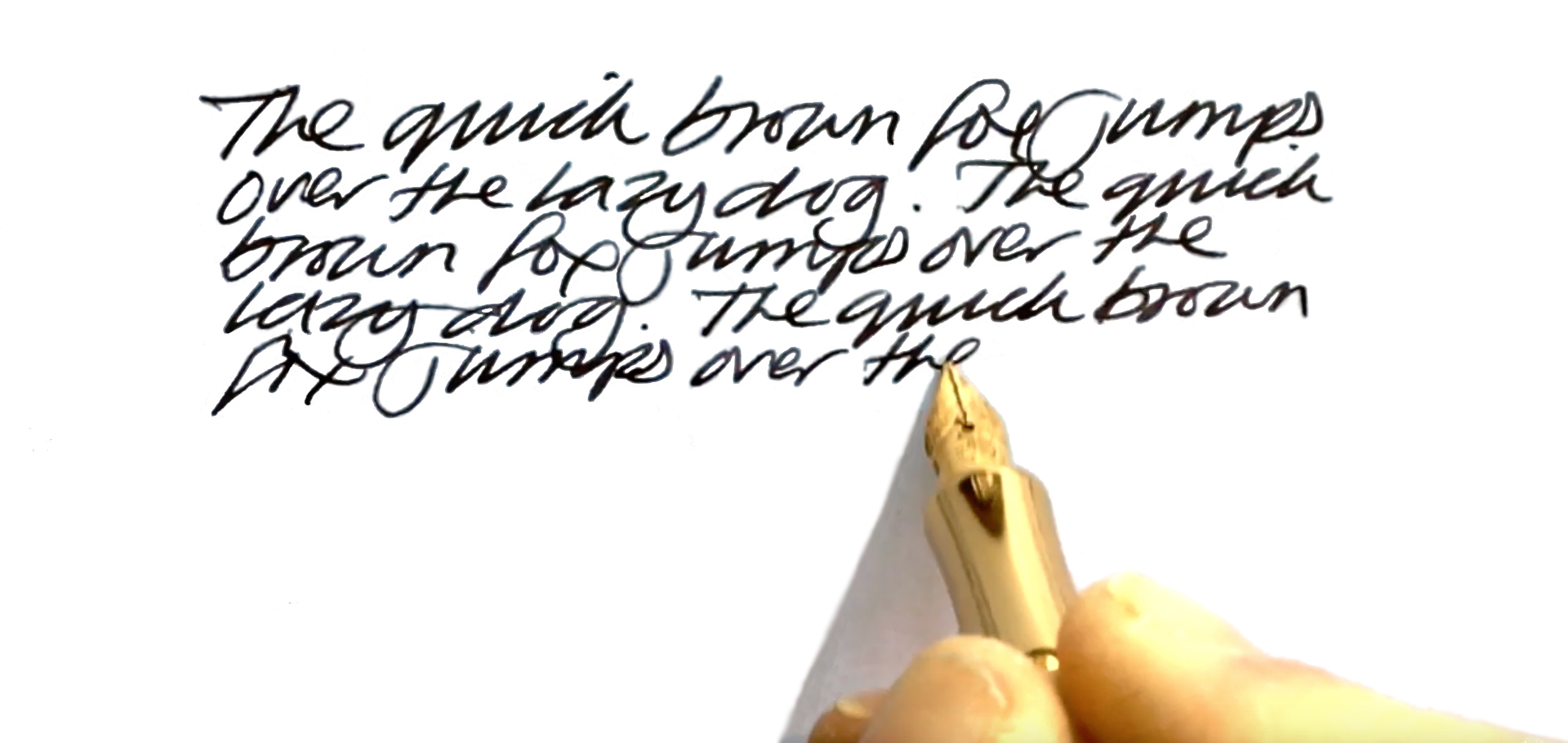
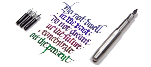
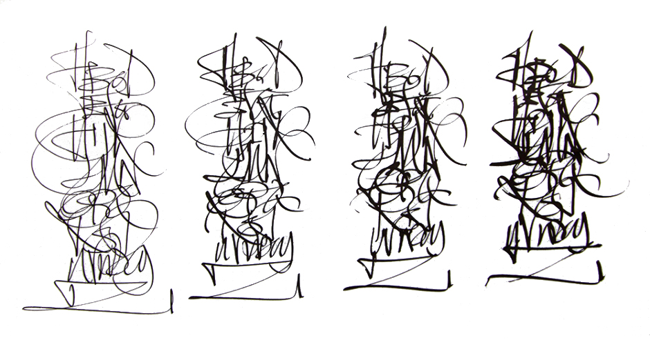 Crucially, how it writes… As always, that depends on what nib you choose. Like all the more expensive Sport bodies (and indeed most of the Kaweco fountain pen range) this version uses screw-in small#5 Bock assemblies, which are available in a wide range of both round and italic tips. For the round tipped-nibs, many of us find that EF, F and M tend to be safest of the steel options, although any flow or smoothness issues, which can be variable in steel, vanish if you upgrade to gold. For this meta-review, though, we put the Steel Sport in the hands of two professional calligraphers (in Kent and Austria, respectively) who put the italic options through their paces – and found the narrower 1.1mm and 1.5mm nibs worked well even for fast writing, while a little more care was required for the wider tips where the same flow of ink has to stretch further. But as long as you choose the right nib for you and your own writing style, this is a reliable performer.
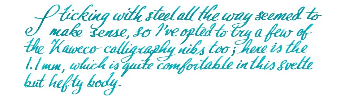 Pen! What is it good for? With a round-tipped nib this is probably the pocket pen par excellence; it looks the business, works well and will probably outlast most owners. Our calligraphers thought it was good for having some fun with italic lettering too, even if not quite the thing for fee-earning studio work (which is not what it is really designed for, to be fair).
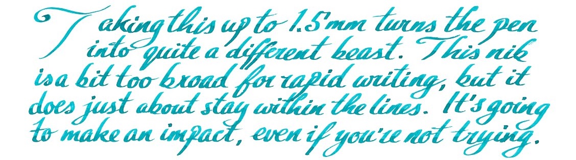 VFM This is not a cheap pen – indeed, apart from the carbon-fibre version this is the most expensive Sport so far. Retailing for either €85 or £84.99 (which says something interesting about current exchange rates), it’s a significant purchase, but still not in luxury price-tag territory in our view. It looks a lot more expensive, though, and it’s tough enough that you would have to try very hard before you damaged it – nothing short of a diamond-tipped angle grinder is going to break this!
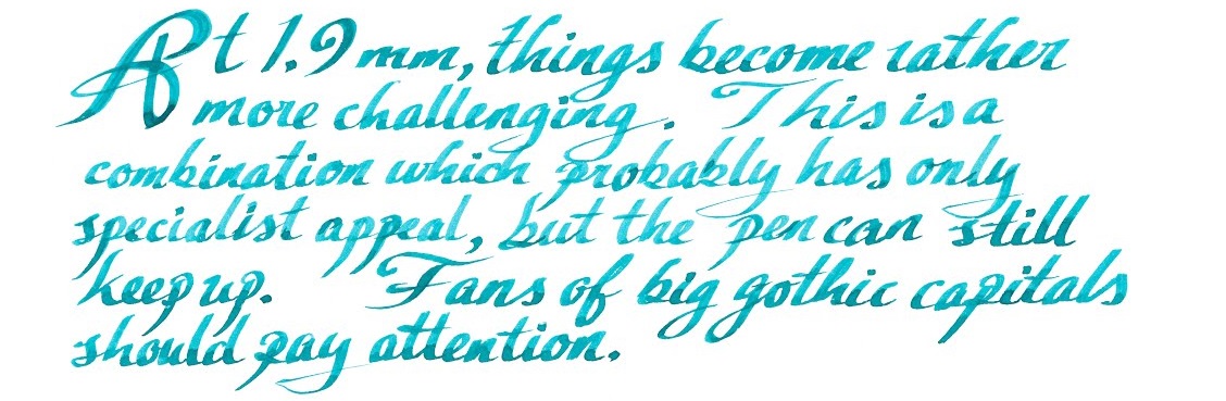 If this isn’t quite your cup of tea, but almost… Then there’s the shinier, lighter and more affordable aluminium version, or the steampunk splendour of the Brass Sport, either of which are sound choices. We have also seen the prototype of the solid silver version – but expect that one to break the £100 barrier, as the materials alone are likely to add around £15 to production costs at current prices.
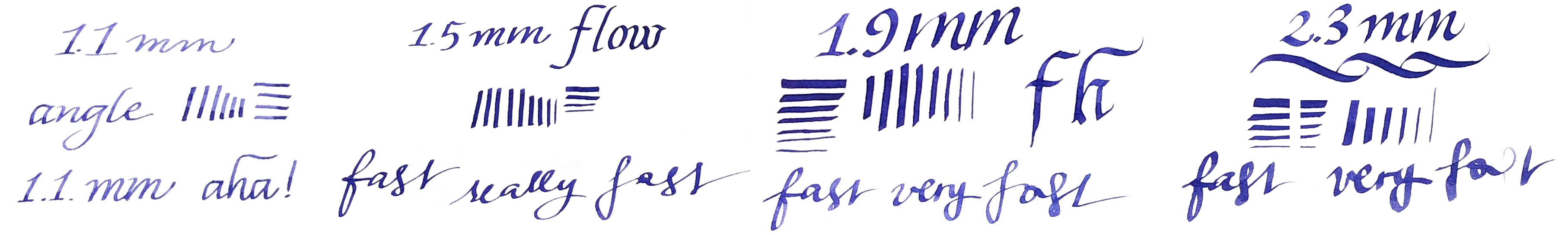
 Where to get hold of one From all the usual sources. Some pens take lots of research to track down, but this shouldn’t be one of them, and it’s currently available from almost all the places you’d expect to look. At the time of publication, The Writing Desk were selling these for £5 less than most other UK retailers, but we don’t expect their stock to last too long!
 This meta-review references:
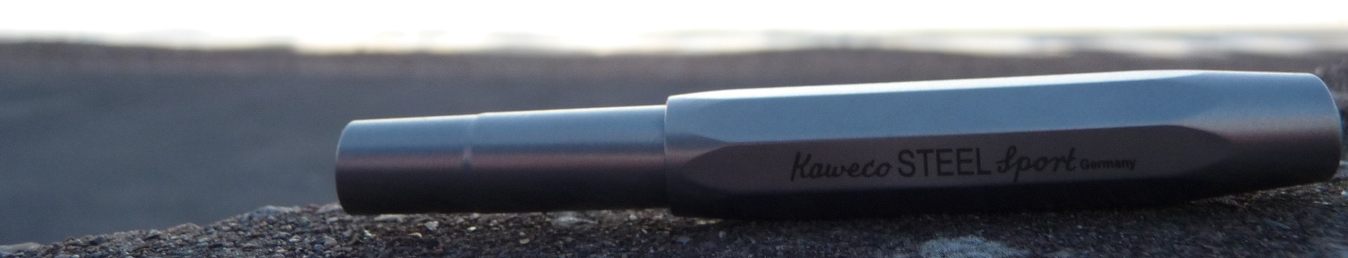

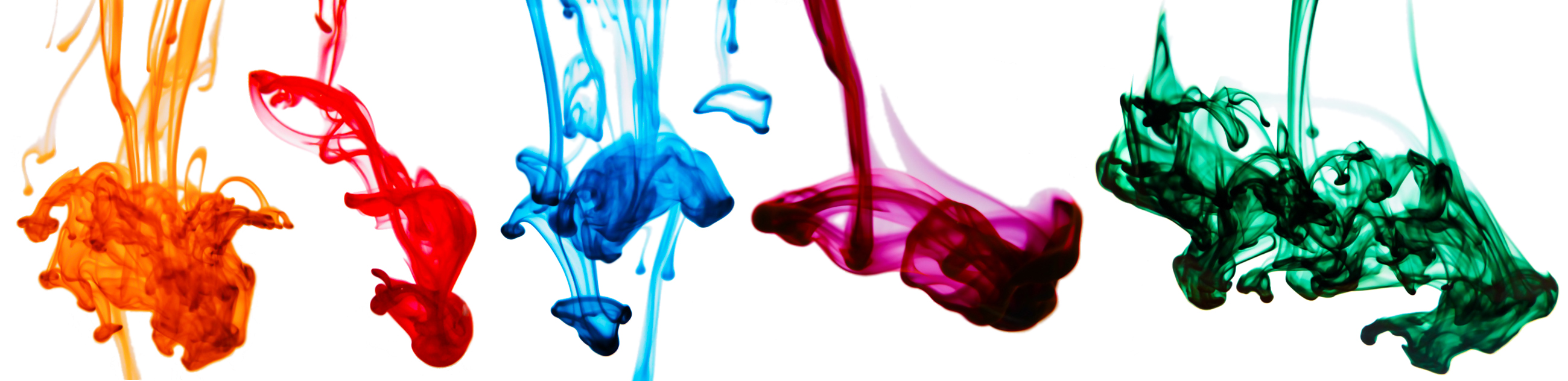

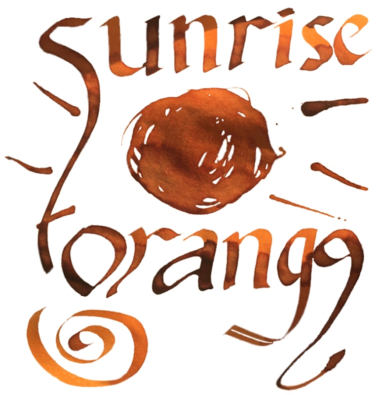


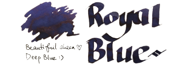
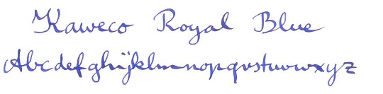
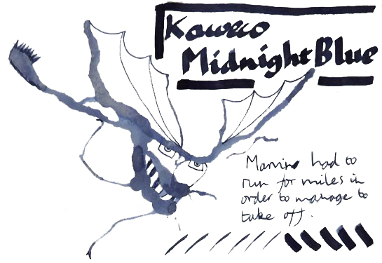
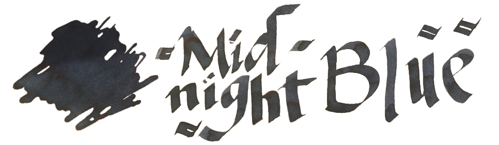
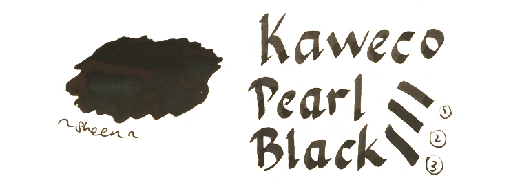

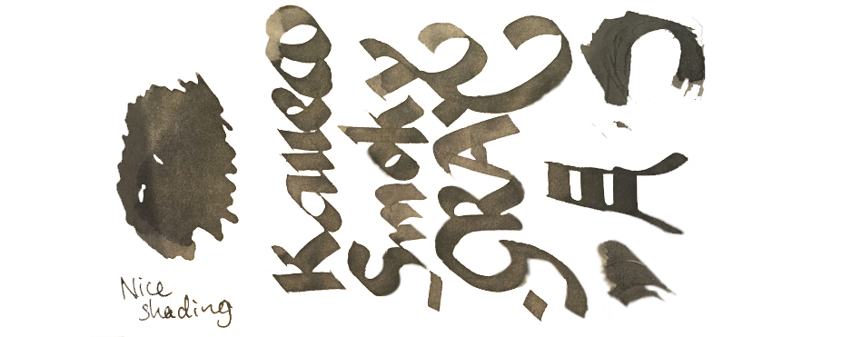
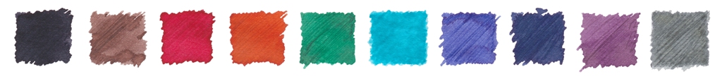 VFM Can be something of a challenge with this collection, to be honest. The bottles contain only 30ml, and are sold at ‘premium’ prices in the UK – although this is at least in part a self-inflicted exchange rate problem for us Brits to deal with. Price competition looks particularly tough when compared with our home-grown Diamine, who provide 80ml bottles of ink for little more than half the price. Few retailers stock both brands at present, but to cite the example of one with the lowest prices for both, at the time of publication The Writing Desk were charging a little over 7 pence per millilitre for Diamine, and 35p/ml for Kaweco ink. That effectively knocks Kaweco inks out of consideration for everyday colours like Royal Blue, which both brands provide; even if you like the look of that sheen, it’s unlikely that many fountain pen users would consider the Kaweco version five times better than the Diamine. But some of the highly distinctive shades such as Sunrise Orange, Paradise Blue and Smoky Grey have qualities which really make them worth seeking out, in our opinion – and they’re hardly going to break the bank!
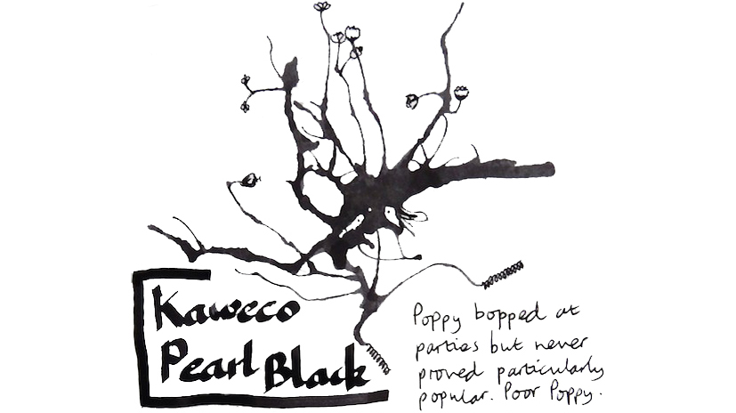
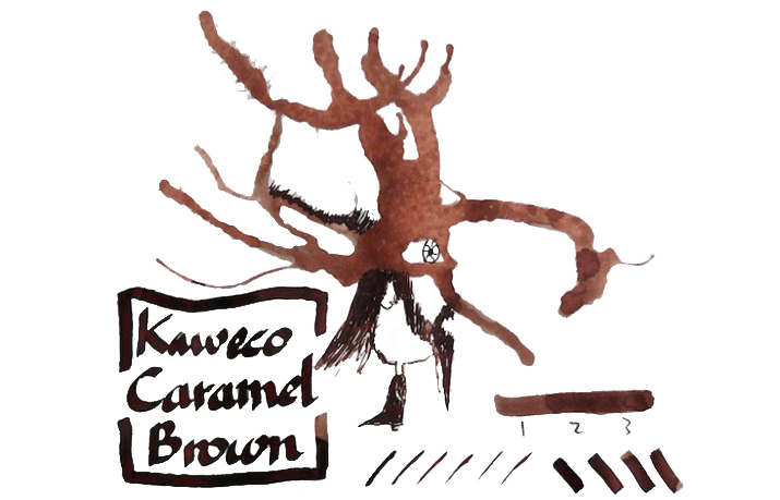
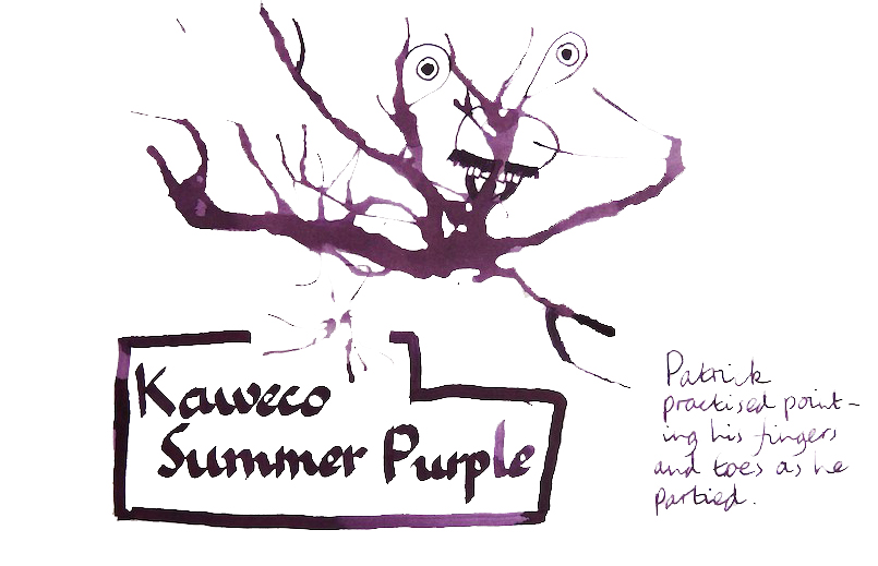
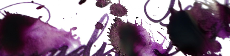
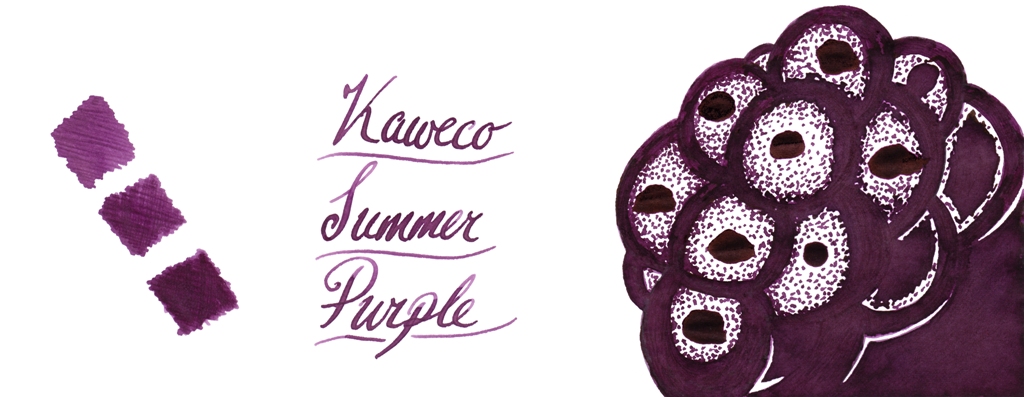
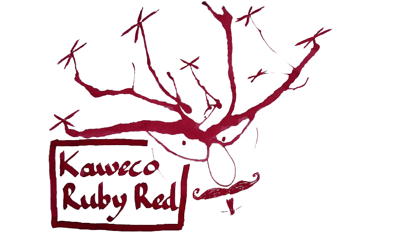
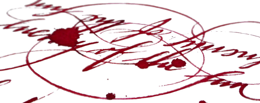
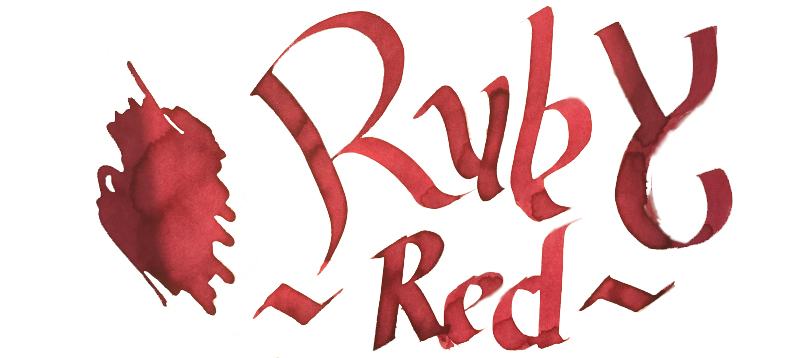
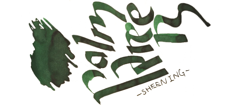
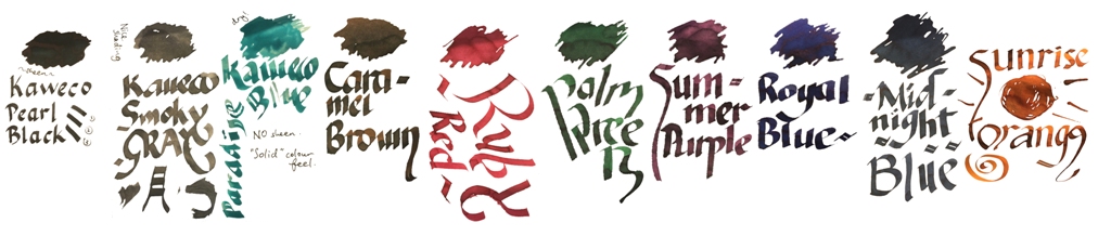 Our overall recommendation is to choose carefully and invest in one or two of these which particularly take your fancy. If you like purple, Summer Purple is warm and user-friendly. If you’re a turquoise fan and can stand the ink sinking-in to the paper rather enthusiastically, Paradise Blue is a lovely colour. Ruby Red and Palm Green beat any teacher’s homework-marking ballpoint any day… and Sunrise Orange eats Apache Sunset for breakfast. If you just want a well-behaved Austrian everyday black or royal blue, you don’t really need to spend so much; even Montblanc will provide you with twice as much ink for the same money. But we like this collection; suffice it to say that there are several Sports, Lilliputs and at least one Supra which will now be filled with ink from the same stable for quite some time.