A little bit of history: While other German manufacturers such as Pelikan and Kaweco have been around since the 19th century, Cleo Skribent is a company that found itself established in the 20th century, shortly after the Second World War. The pens were made in Germany, initially in the founder’s garage “behind the iron curtain”. Once the curtain had been lifted, Cleo Skribent saw a booming business and the company continues to manufacture pens to this day. The name Cleo refers to the Egyptian pharaoh, Cleopatra, with whom the company identifies with due to the innovation and design of the Egyptian pyramids (though Daniel does point out Cleopatra lived closer to the launch of the iPhone than she did the pyramids).
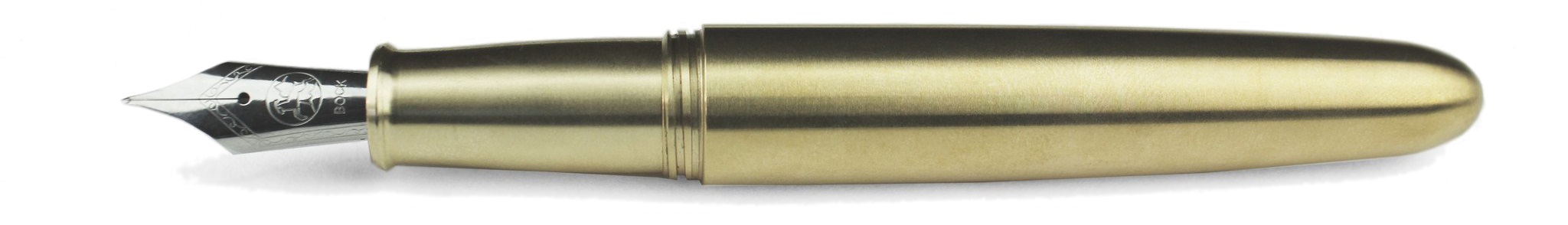
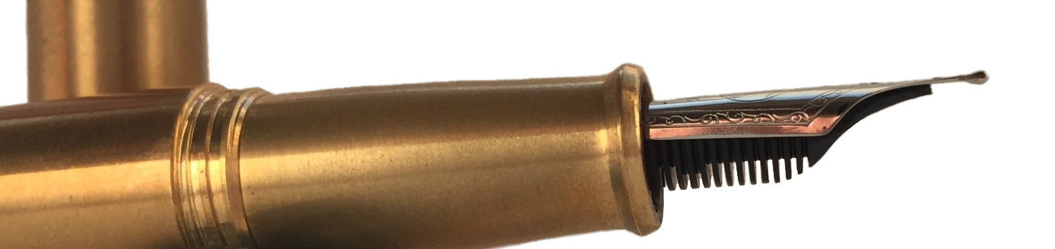
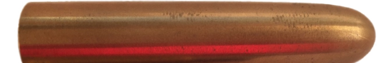
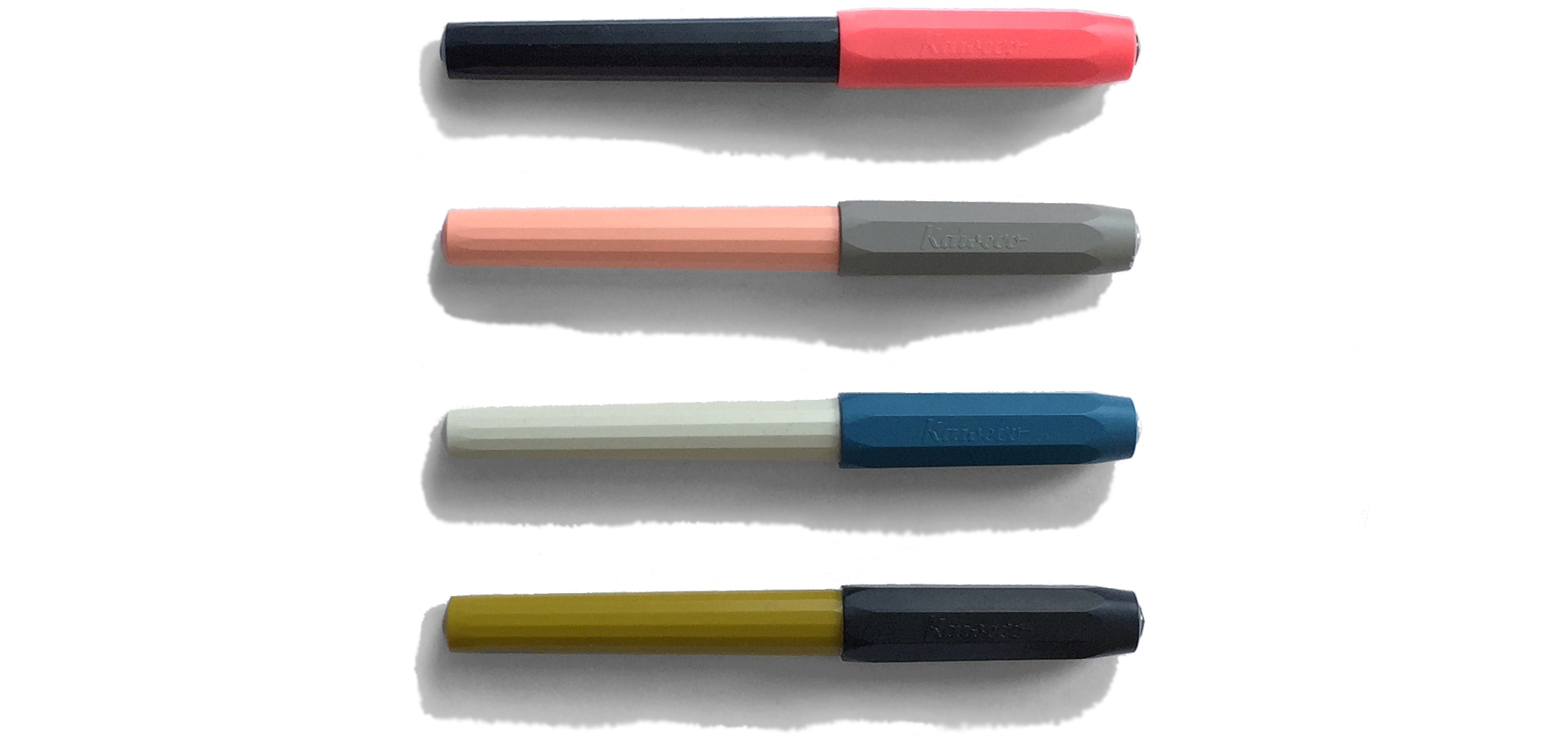
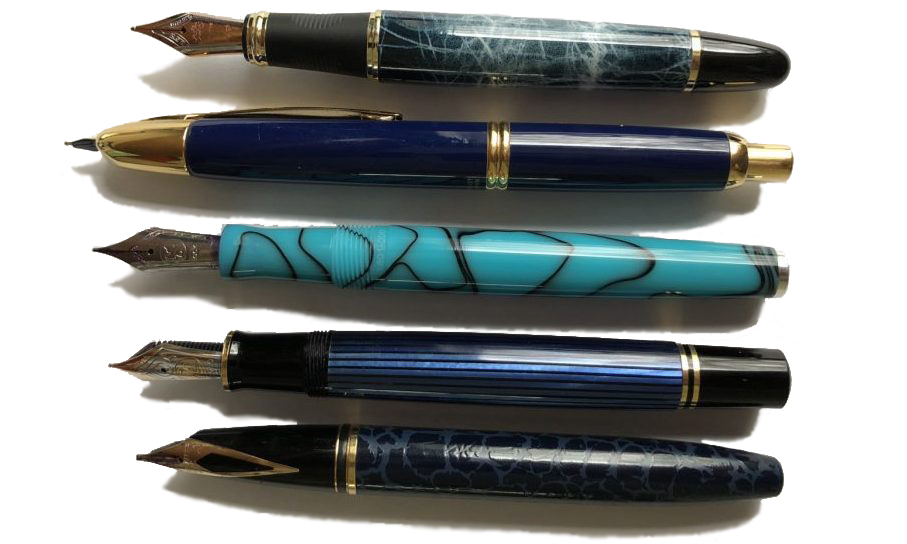
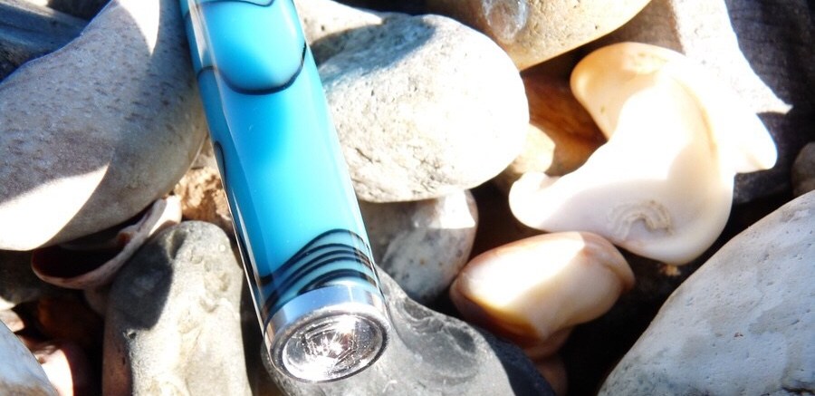
How it looks: The Classic measures 134mm uncapped and 163mm posted. Some of us found the pen to be large, while others considered it small. The pen is also slim, which gives it a refined and sleek look, though this may not be to everyone’s tastes. The pens come in a range of colours of white, black or red and each come with their own option of gold or chrome furniture which means there’s something for everyone. The design, depending on who it is you’re asking, could be described as “understated”, or just simply “boring”. Though, the white and gold option does offer something “the same but different” as it’s still a conservative looking design but going about it in a different way. If you want something a bit more “out there” and unconventional, perhaps the red would tickle your fancy. The various options that you get are a fantastic selling point. For example, Daniel enjoyed the white and gold aesthetic, while Sarah thought the gold and silver looked better. There’s choice for everyone (that is, so long as you like white, black or red pens).
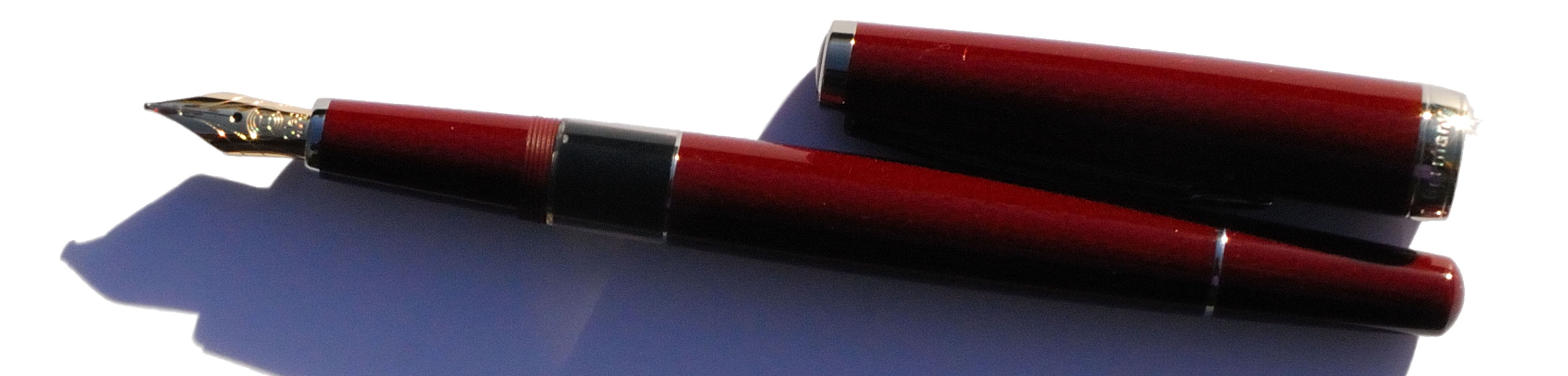
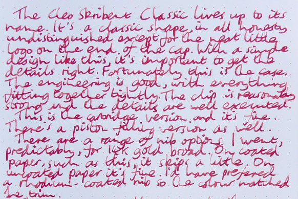
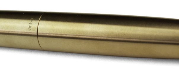
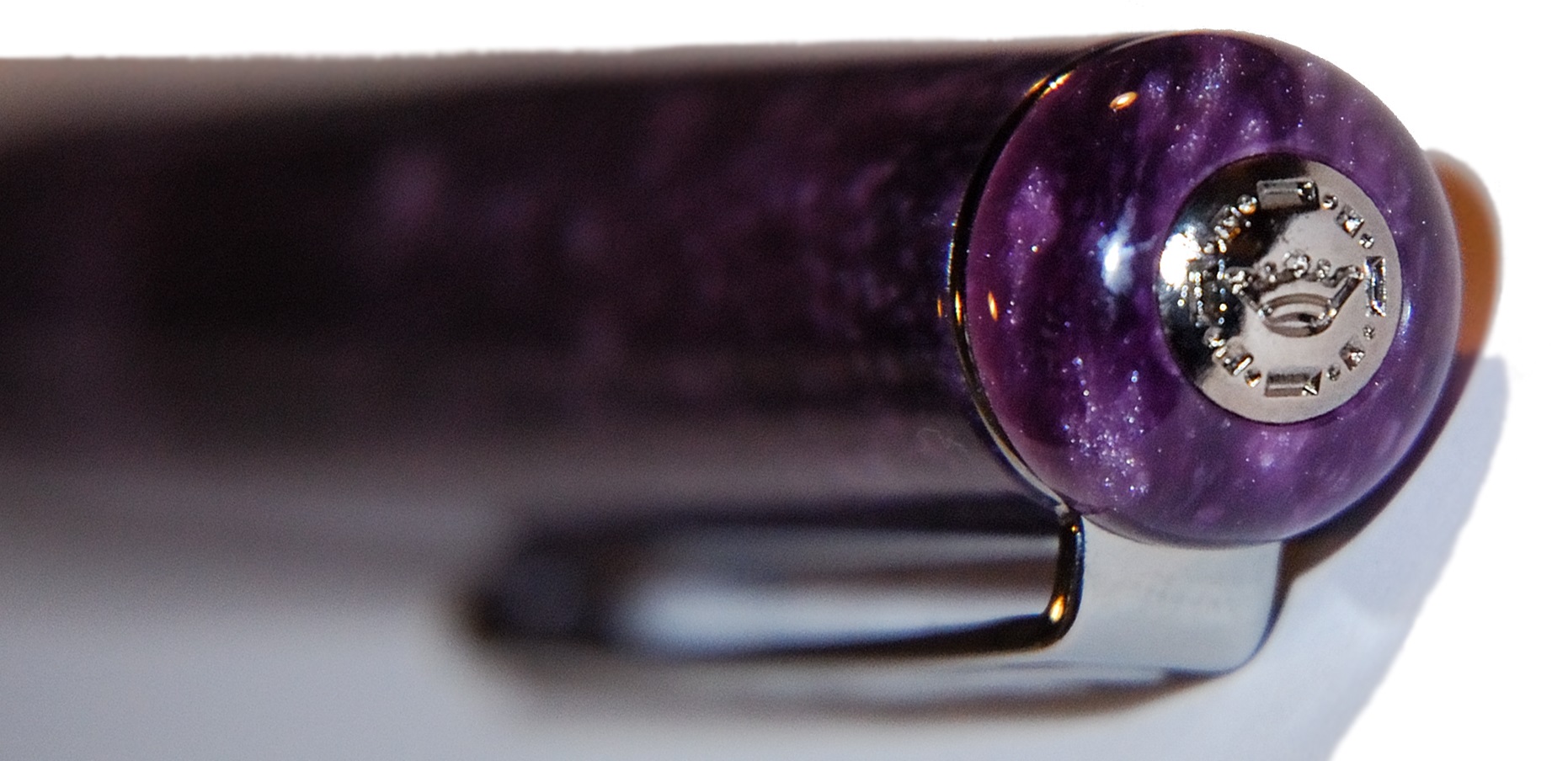
On the top of the cap is the Cleo Skribent logo.
The piston filler versions of the pen come with an ink window, which is very handy.

How it feels: The Classic weighs 18g capped, so this is an extremely lightweight pen. For some of us, that put us off a little bit. However, it is certainly well balanced and if you wish to post the pen, it does so very well. The cap screws off, but the step up to the section is minimal and due to the long section, you can bet on having a very nice grip on the pen.
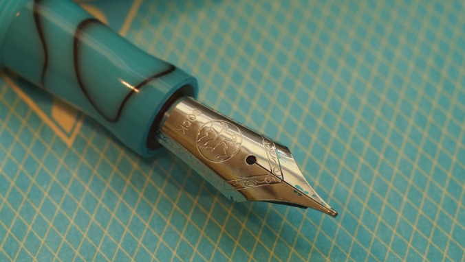
How it fills: You have the option of a cartridge/converter pen or a ‘piston’ filling pen. The cartridge/converter is compatible with standard international fittings.
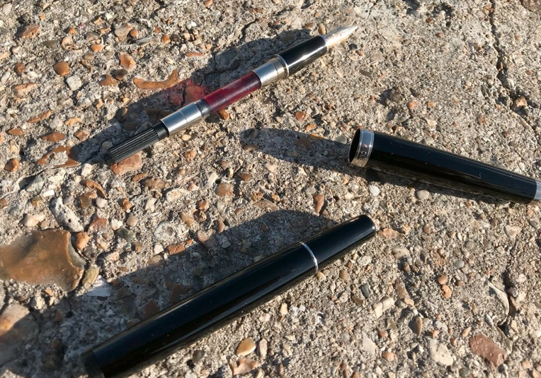
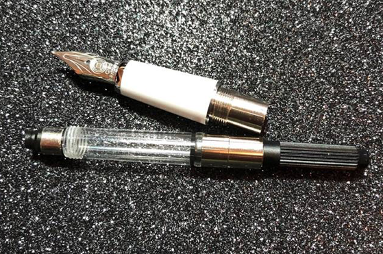
The piston is essentially a captured converter. You unscrew the blind cap at the end of the pen to get to the converter inside and you then twist it like a normal converter. However, the piston filler does hold more ink than the standard international converter (which screws in, by the way, so you avoid any ink spillages by the converter coming loose!). By using the piston filler, it does make it harder to clean out (though not impossible or by any means tedious).
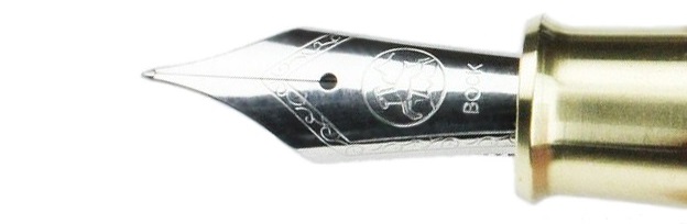
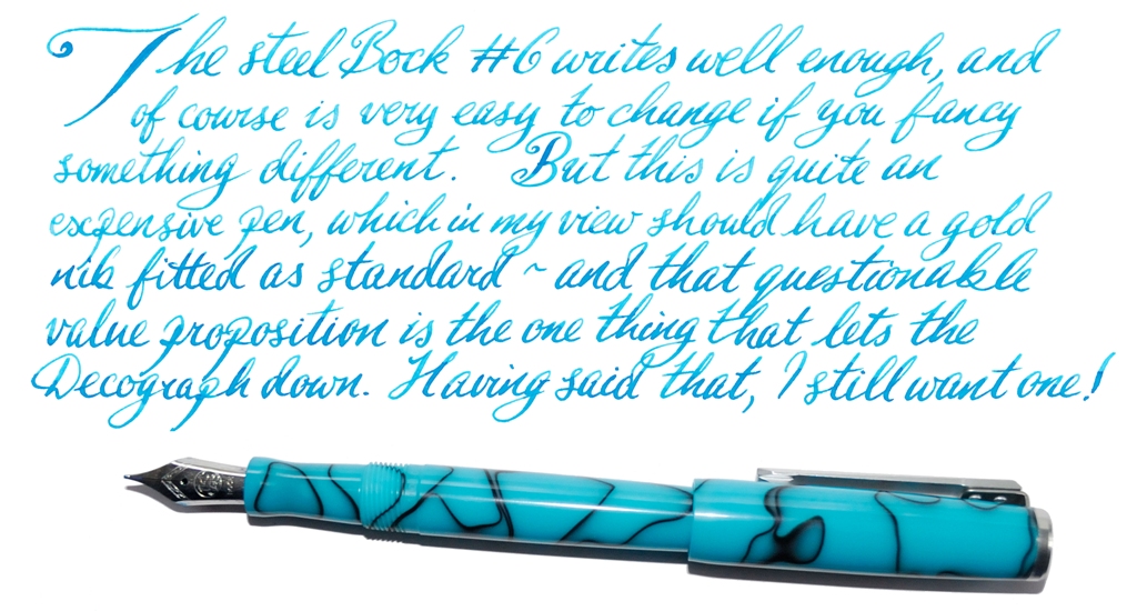
Crucially, how it writes: Not all of us got on with the nib initially. Several of us noticed hard starts and skips at first, which perhaps isn’t something you would expect from a pen in this price range. The nib is also on the dry side when first ‘out of the box’ – but Scribble reports much wetter, softer action after the 14k nib has written a few thousand words.
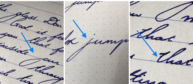
Because we were testing the gold nib options, we did find a bit of spring and bounce which is characteristic of gold nibs, however this fell short in early use when we found the feed didn’t keep up with the flow. However, a super-wet ink helped a little – and in at least one case prolonged use fixed it completely.
Pen! What is it good for? The Classic is, simply put, a classic design. It’s slightly more streamlined than other pens, so you get a slightly different aesthetic to the typical cigar shaped pen. This is certainly something you could take into a business or more professional setting. Because of the wide number of choices that you can have, you can choose the exact specifications that suit your needs and would also make it a very good journalling pen or something that you carry around with you due to the lightweight characteristic (also makes it good for extended writing sessions).
If this isn’t quite your cup of tea, but almost: The price of this range goes from £75 with a steel nib and cartridge converter filling system to £155 with a 14k gold nib and a piston filler, so it occupies a range in the market. For a gold nib, you can’t go too far wrong with the Platinum #3776, which you can pick up for £99 if you look in the right places (even cheaper, if you’re on the grey market) which comes with a gold nib and is a pen known for fantastic quality. This is, however, a cartridge converter. The TWSBI Vac 700R is also an option, which has a larger ink capacity, though with a steel nib. If a good, reliable gold nib pen is something you’re after then the #3776 is a very good pen to consider. If the ink capacity is more your concern and you’re looking around this price point, you can’t really beat the Vac 700R at this level. Of course, Cleo make all sorts of other interesting models too, like the Ebonite.
Our overall recommendation: This is a pen which wants to work for its living, and a potentially promising choice if you’re looking for a work-horse; it responds best after a good wearing-in. That can be an unusual experience if you’re used to pens working perfectly right away, though, so this probably won’t be a pen to everyone’s tastes. If you want to use and abuse an old-fashioned pen which will probably last for life, this is the Trabant of the fountain pen world. If you know you don’t have the patience to tinker under the bonnet, though, this might not be the perfect vehicle for your pearls of wisdom.
Where to get hold of one: You can view the Classic line Write Here (see what we did there?), which is also where these pens were kindly donated to the United Inkdom reviewers for review purposes. There are also other pens offered by Cleo Skribent that may tickle your fancy, such as the ebonite version which you can also find a review of below.
This meta review references:
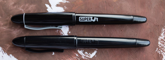
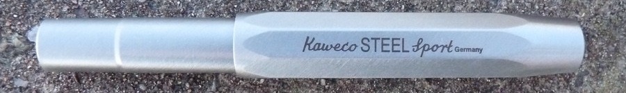
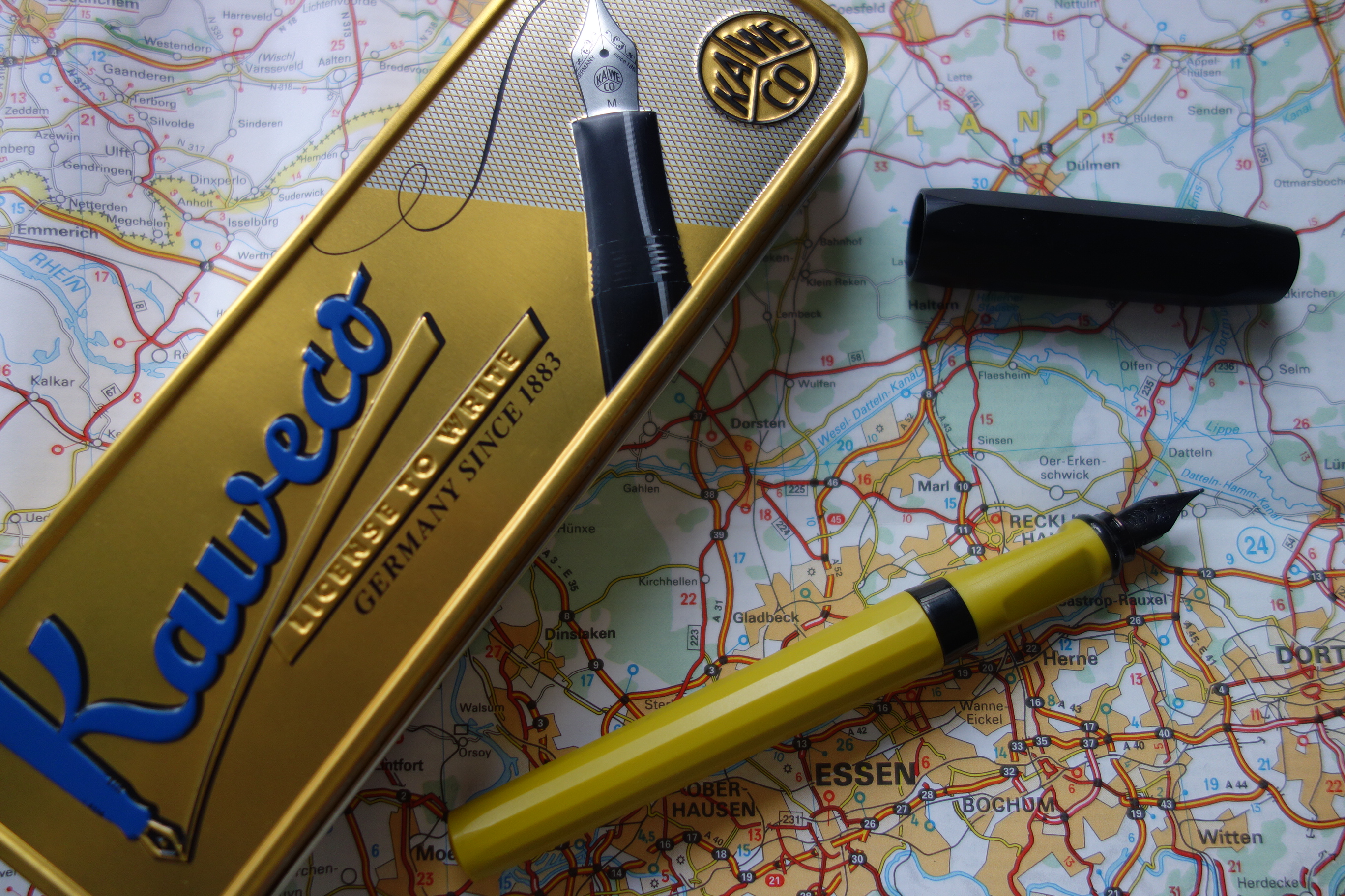
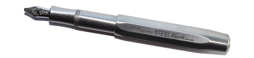 A little bit of history Every serious fountain pen fan has a Kaweco Sport somewhere; small, pocketable – and in their simple plastic form eminently affordable – they are often starter pens, and frequently stay in use as emergency back-up pens even when owners have developed more exotic tastes. For quite a while, though Kaweco has been developing a ‘premium’ line of robust, refined, reassuringly expensive Sports in interesting materials ranging from carbon fibre to industrial metals. The very first United Inkdom meta-review tested the
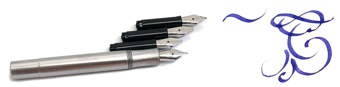

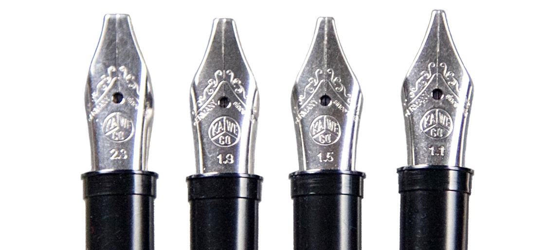
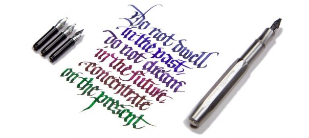
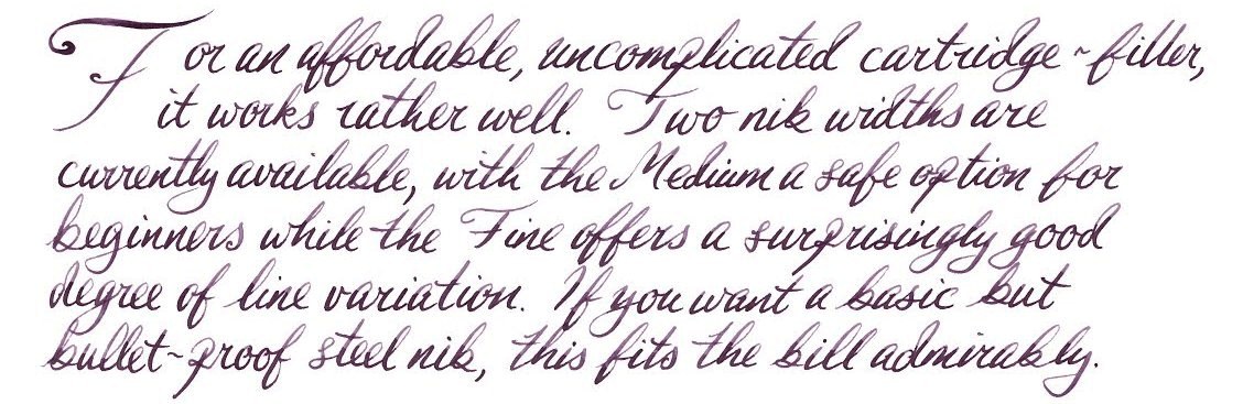
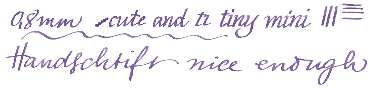
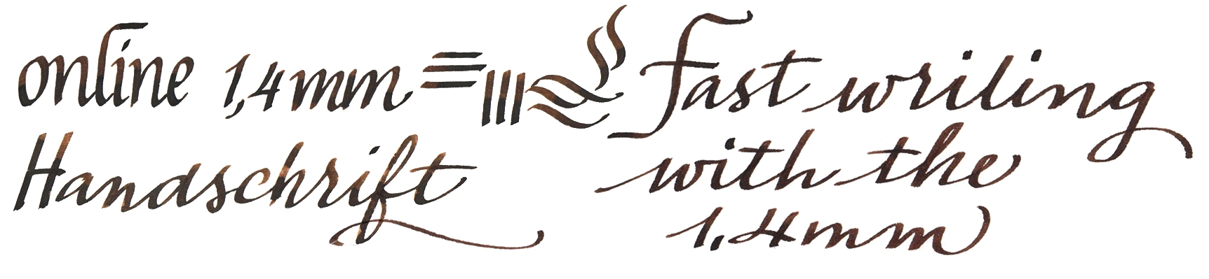
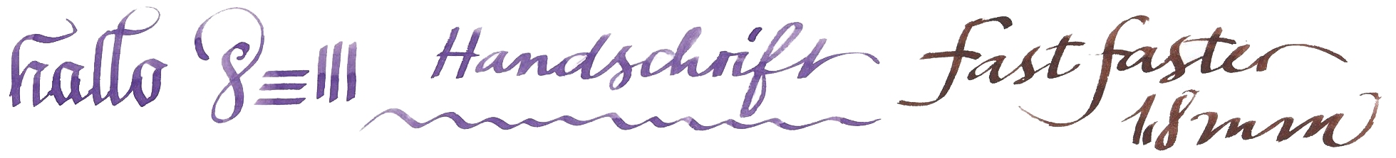
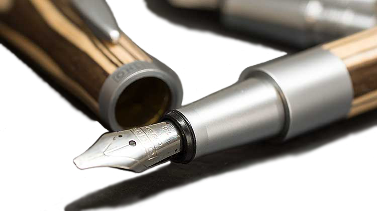
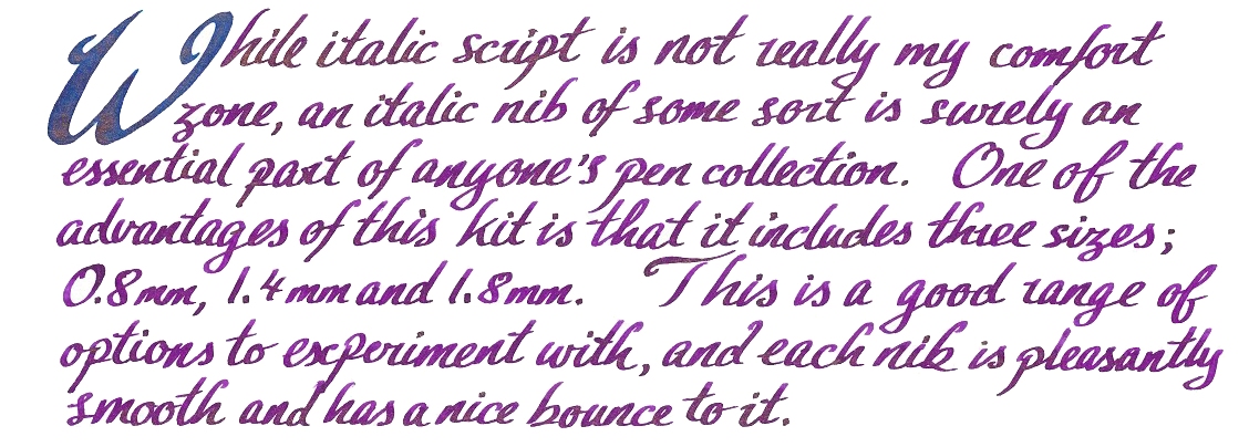
 Crucially, how it writes… As always, that depends on what nib you choose. Like all the more expensive Sport bodies (and indeed most of the Kaweco fountain pen range) this version uses screw-in small#5 Bock assemblies, which are available in a wide range of both round and italic tips. For the round tipped-nibs, many of us find that EF, F and M tend to be safest of the steel options, although any flow or smoothness issues, which can be variable in steel, vanish if you upgrade to gold. For this meta-review, though, we put the Steel Sport in the hands of two professional calligraphers (in Kent and Austria, respectively) who put the italic options through their paces – and found the narrower 1.1mm and 1.5mm nibs worked well even for fast writing, while a little more care was required for the wider tips where the same flow of ink has to stretch further. But as long as you choose the right nib for you and your own writing style, this is a reliable performer.
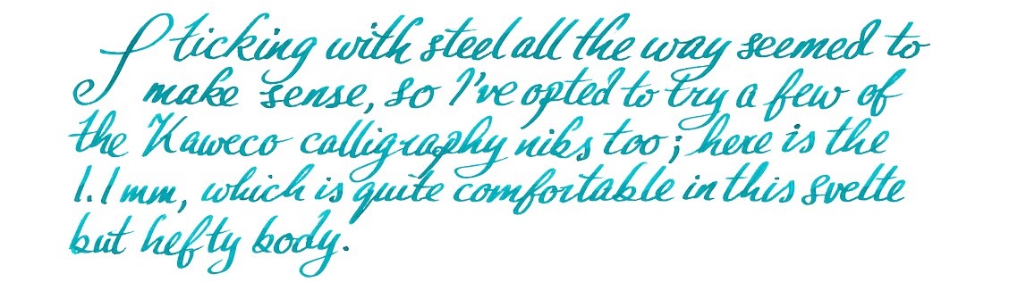 Pen! What is it good for? With a round-tipped nib this is probably the pocket pen par excellence; it looks the business, works well and will probably outlast most owners. Our calligraphers thought it was good for having some fun with italic lettering too, even if not quite the thing for fee-earning studio work (which is not what it is really designed for, to be fair).
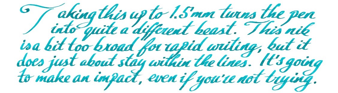 VFM This is not a cheap pen – indeed, apart from the carbon-fibre version this is the most expensive Sport so far. Retailing for either €85 or £84.99 (which says something interesting about current exchange rates), it’s a significant purchase, but still not in luxury price-tag territory in our view. It looks a lot more expensive, though, and it’s tough enough that you would have to try very hard before you damaged it – nothing short of a diamond-tipped angle grinder is going to break this!
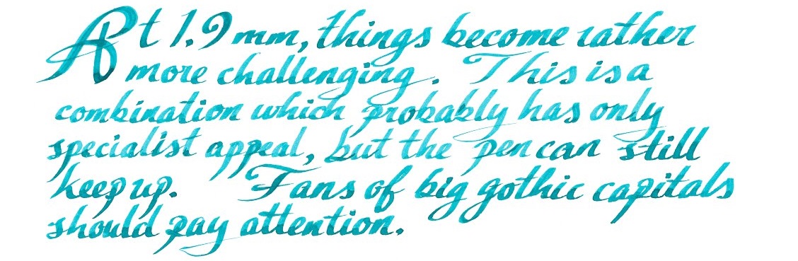 If this isn’t quite your cup of tea, but almost… Then there’s the shinier, lighter and more affordable aluminium version, or the steampunk splendour of the Brass Sport, either of which are sound choices. We have also seen the prototype of the solid silver version – but expect that one to break the £100 barrier, as the materials alone are likely to add around £15 to production costs at current prices.
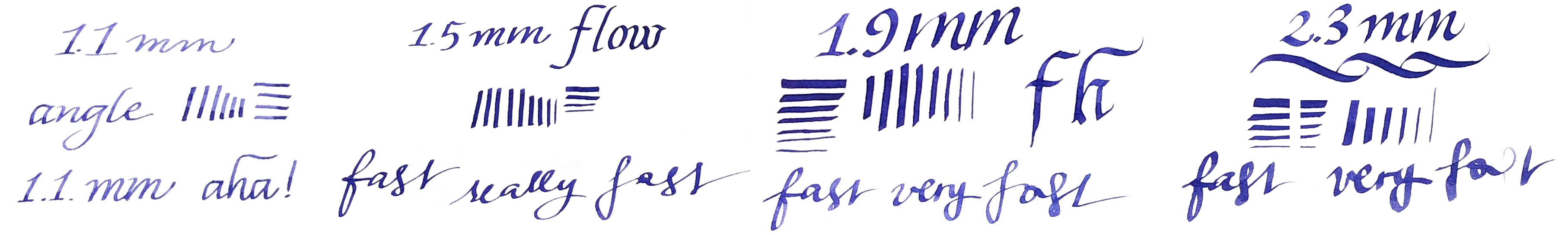
 Where to get hold of one From all the usual sources. Some pens take lots of research to track down, but this shouldn’t be one of them, and it’s currently available from almost all the places you’d expect to look. At the time of publication, The Writing Desk were selling these for £5 less than most other UK retailers, but we don’t expect their stock to last too long!
 This meta-review references:
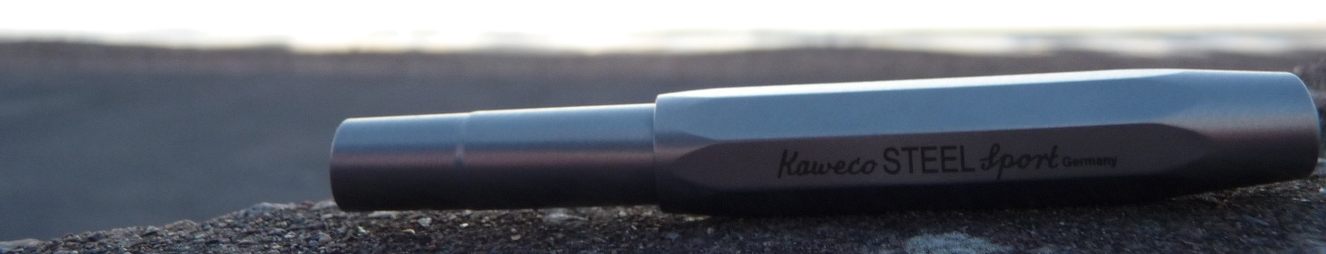
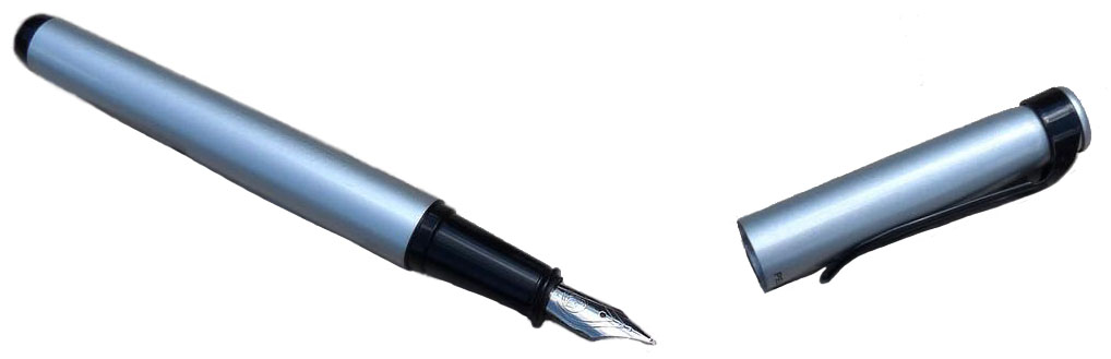
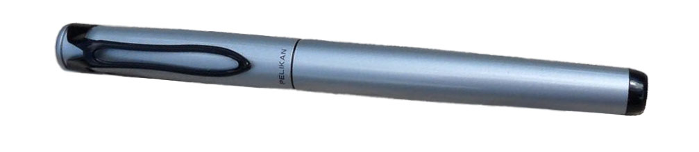 How it looks Pelikan is a company famous for making lots of very similar (and beautiful) looking pens but the Stola III is a little different. The clip maintains the pelican-beak motif but is a simple wire loop. The cap and barrel are finished in a silver-grey enamel which is modern looking but rather plain. The section is black plastic. It’s unlikely to set any hearts racing, but Pelikan have done a good job for a low price-point.
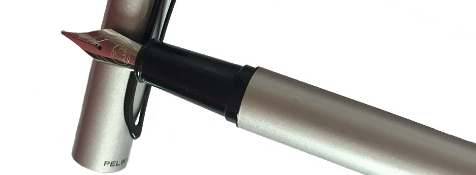
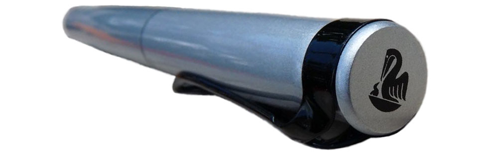 Crucially, how it writes… The stainless steel nib is very good for a pen that costs £20. It’s smooth and has a good flow. It’s great… as long as you want a medium nib. Unfortunately, Pelikan have only released the Stola III with one size of nib, which is silly when so many other pens at similar prices are available with a full range of widths. It’s doubly silly when the nib itself writes so well.
 Pen! What is it good for? The Stola III is a lovely pen for extended writing, if it isn’t too short for you. You can pick a colour to get your thoughts flowing and journal or plan away to your heart’s content.
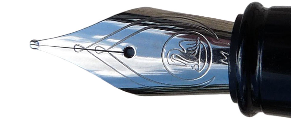 If this isn’t quite your cup of tea, but almost… then you have a huge number of options. If you want a small, pocketable pen then the Kaweco Classic Sport is a little cheaper and has lots of nib sizes. The Lamy Safari is easily obtainable, a fantastic pen and also a little cheaper. If you’d prefer a more classic looking pen then the Pilot MR (also known as the Metropolitan) is worth a look, as is the Faber-Castell Basic. Then for funky looking pens you could look at the Pilot Kakuno or the Faber-Castell Loom. Finally, if you’d like an enamelled metal-barrelled pen with a cap that’ll post, the excellent but often overlooked Sheaffer VFM is a good choice. We could go on but you get the idea… this is a crowded price point, which can only be a good thing.
 This meta-review references reviews by:
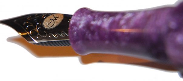
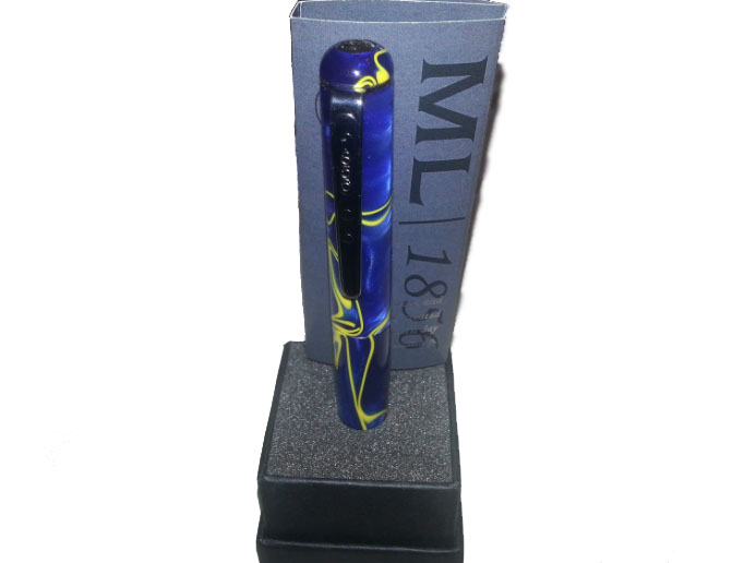
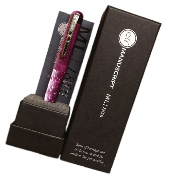
 However, not every aspect of the aesthetic was loved by everyone. The clip has two circles, echoing the dual crown of the cap’s top (which is a reminder that Manuscript has been going so long that they used to supply the kings of both Spain and Portugal), but the shape of the clip itself seemed a little gimmicky. As Laura put it, “don’t dress a model in Primark clothes.”
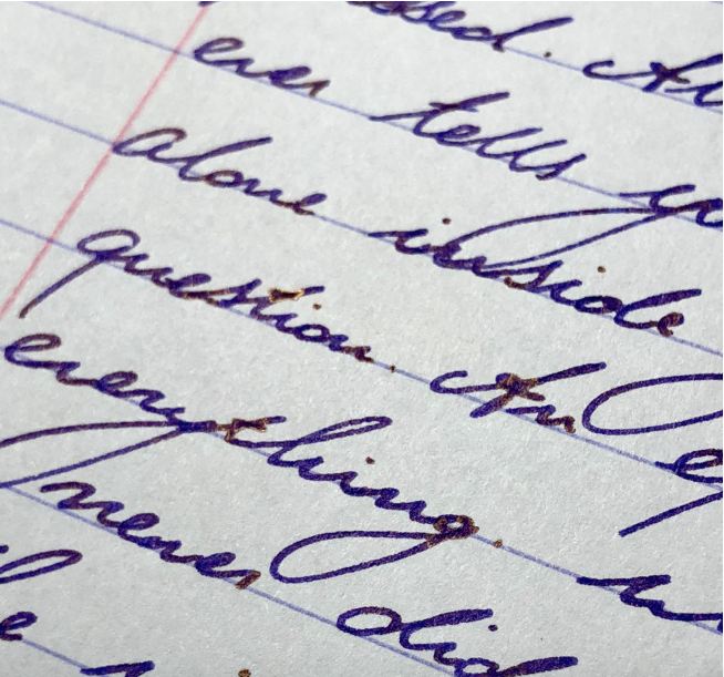
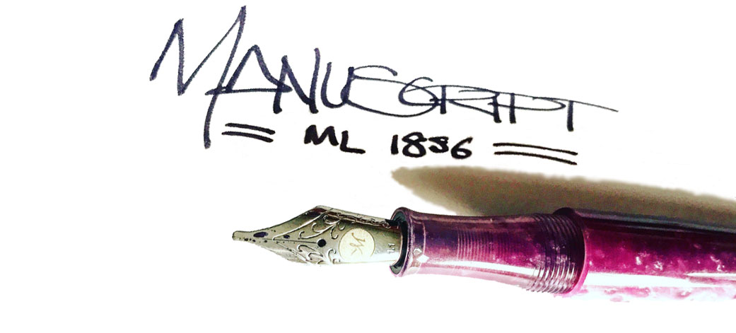 Most of our reviewers found the steel nibs satisfactory, albeit a little bit dry at first in one case. Overall, the writing experience was rated as pleasant by the reviewing team. The only thing that the italic nibs aren’t great for are reverse writing, as Daniel discovered. The #6 JoWo nibs write a fairly wet line and the feeds keep up well.
  Pen! What is it good for? Manuscript seems to be, as a brand, synonymous with calligraphy, certainly for beginners here in the UK anyway. The 1.1mm and 1.5mm italic nibs means that you can get a little stylistic with your writing, particularly when considering scripts such as gothic.
 Our overall recommendation While we loved using the pen, the price point just didn’t justify it until that was reviewed; there were too many alternatives which were similar to the ML1856 but better quality/feel for the same price or others that might sacrifice ever so slightly on the feel but were much more affordable. We like the direction Manuscript is heading in, but our recommendation was to wait until the value issue had been rectified before pulling the trigger.
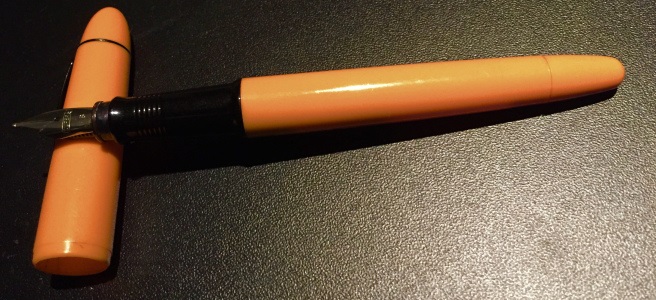
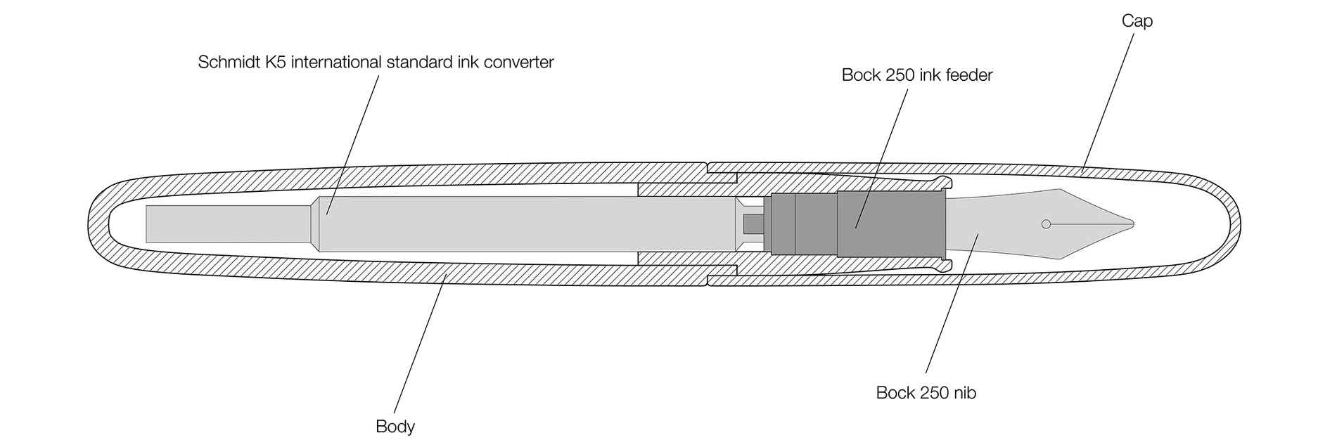
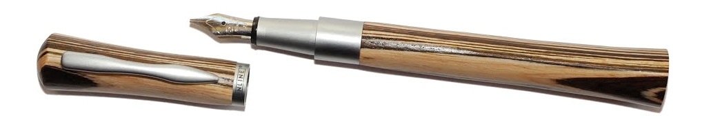
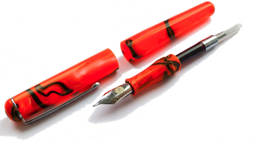
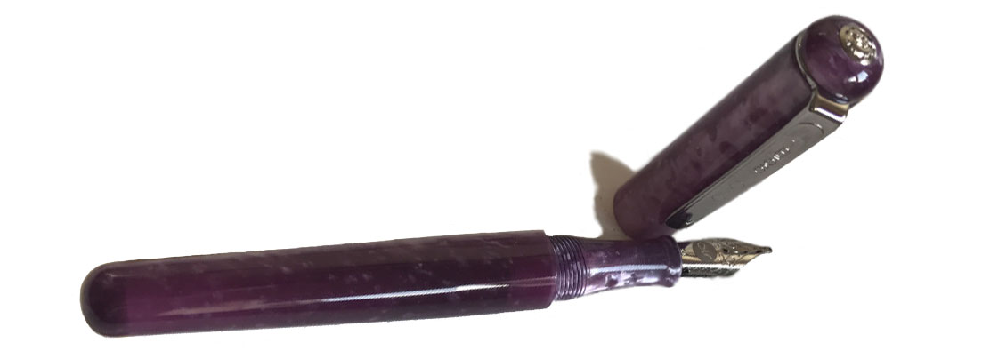
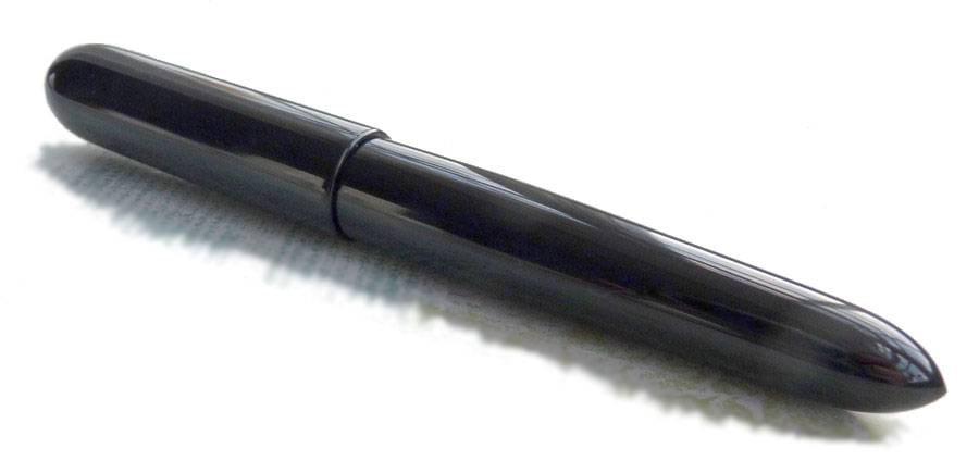 How it looks Like a pocket version of the
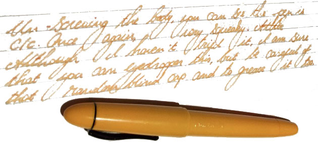
 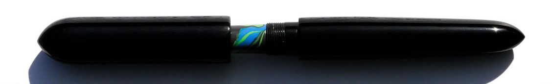 How it feels It’s big – really extraordinarily big. So much so that you might wonder if your hands are big enough. Three-quarters of our reviewing panel were, however, pleasantly surprised to find that it nevertheless felt about right in the hand, and the lightness of the materials ensures that it’s not as heavy as it looks either. The ebonite makes it warm to the touch immediately, which is also rather pleasant. But it will be just a bit too big for some.
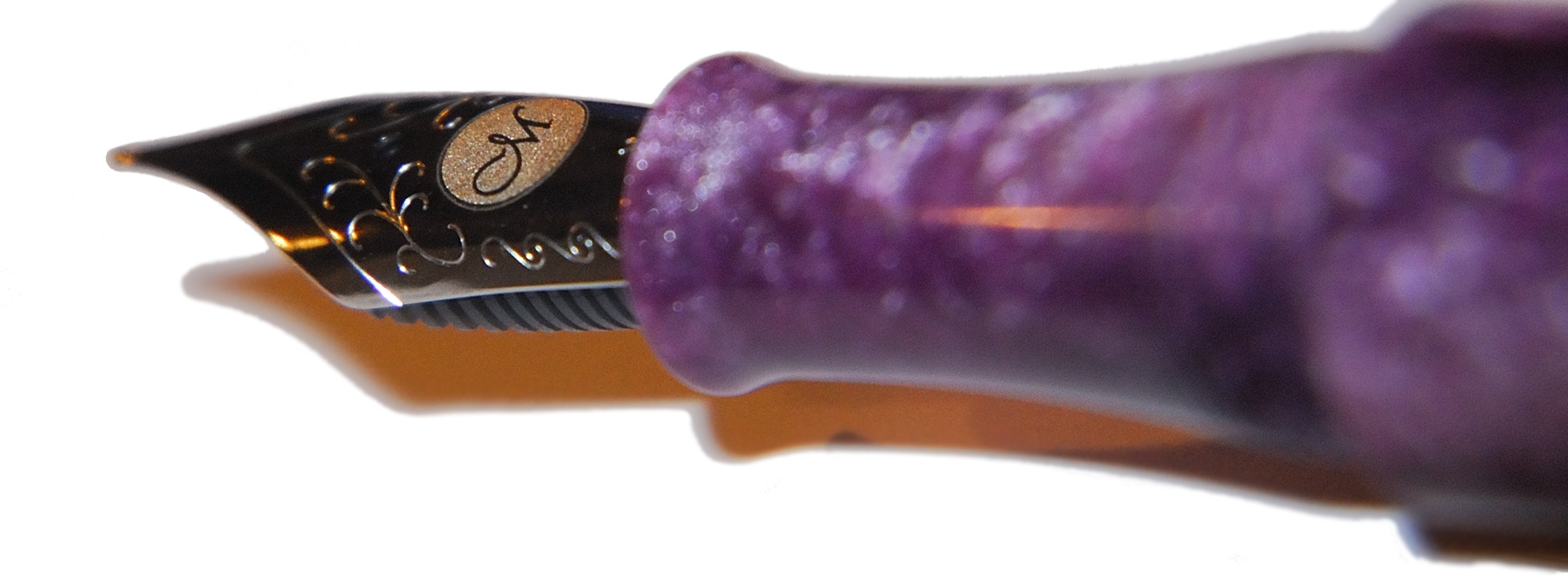
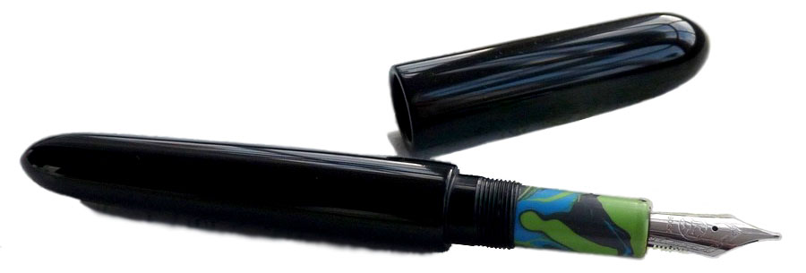 Crucially, how it writes… As ever with hand-made pens, that depends upon the nib you choose to add. Jake uses the Bock #6 steel nib as standard, and although the review unit we sampled had been bashed about a bit, to the detriment of writing performance in this case, Jake does test all nibs before dispatch to customers and will rectify any issues which arise after delivery. The writing position is comfortable and, with a #6 nib of your choice, this should be a very nice long-term scribbler.
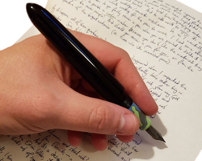 VFM Most versions of the Streamline are available at around the £150 mark, which we think is fair for a hand-made pen with unique design and plenty of customisation options. Installing a nib which is more exotic than the steel standard will naturally add to that, but it’s still a tempting proposition for most of us who reviewed it.
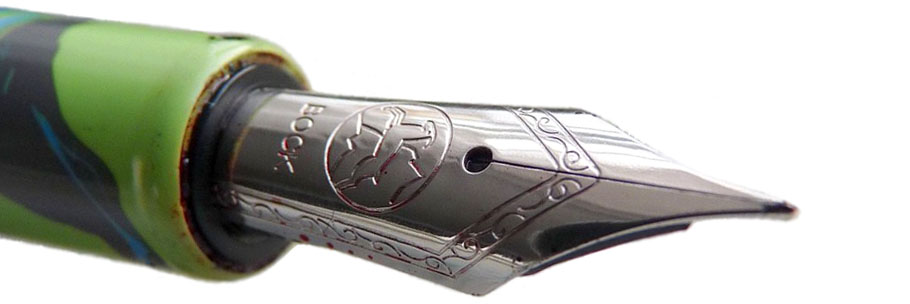 Our overall recommendation If you like big pens and you cannot lie, then make like Sir Inkalot to the website and order one; we were mightily impressed and several of us have started to muse about our own choice of materials one day. We’d like to see a version with a bigger #8 nib in the future too, but this is a pretty special pen which looks out of this world but is also very nice to wield.
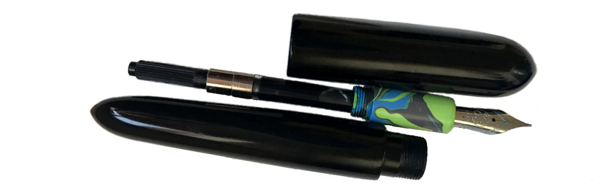 Where to get hold of one From Jake’s
 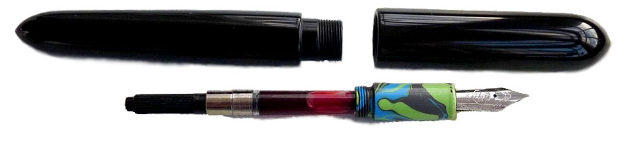 Thanks to Jake for supplying this extraordinary test sample, and offering one lucky reader the chance to take it home! The competition entailed ideas for favourite Welsh designers, with a very broad brief as to what ‘designer’ means. There were some wonderfully creative responses but the most surprising had to be the humble equals= sign. The prize is winging its way by flying saucer…