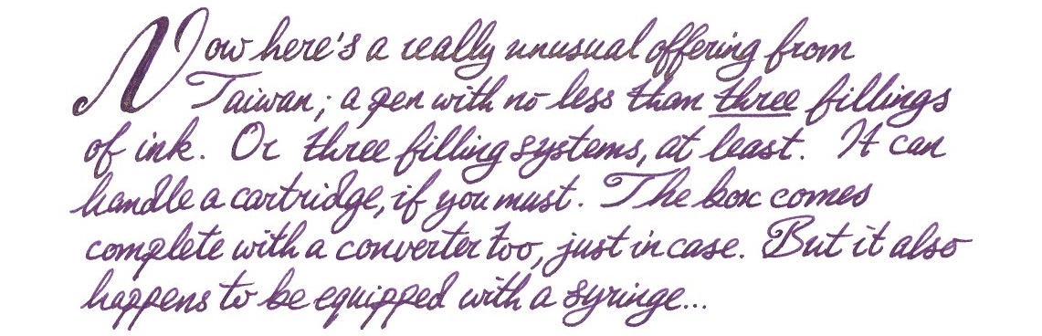
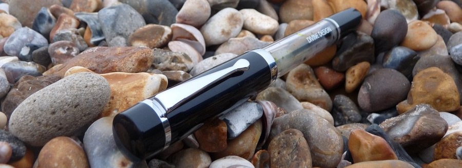
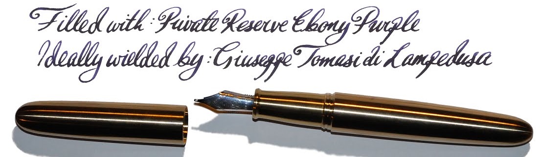
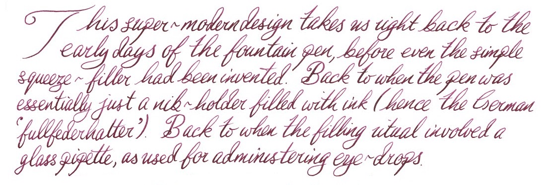
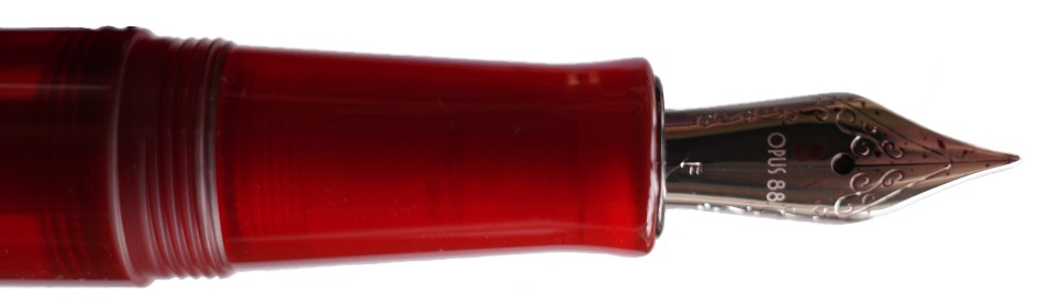
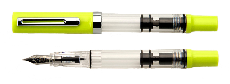
A little bit of history Before there were pistons, vacuums, pneumatic blast-poppers or funky crescent levers, there was but one filling system – the humble eye-dropper. Like its fellow Taiwanese offering from Opus 88, the Divine Design Eyedropper goes back to the roots, albeit with a syringe rather than a pipette in the box.
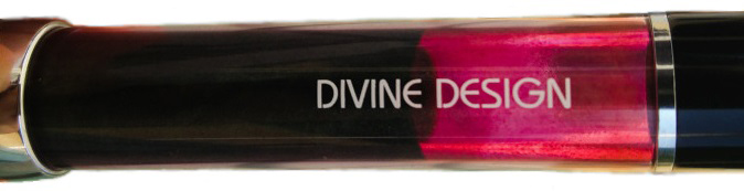
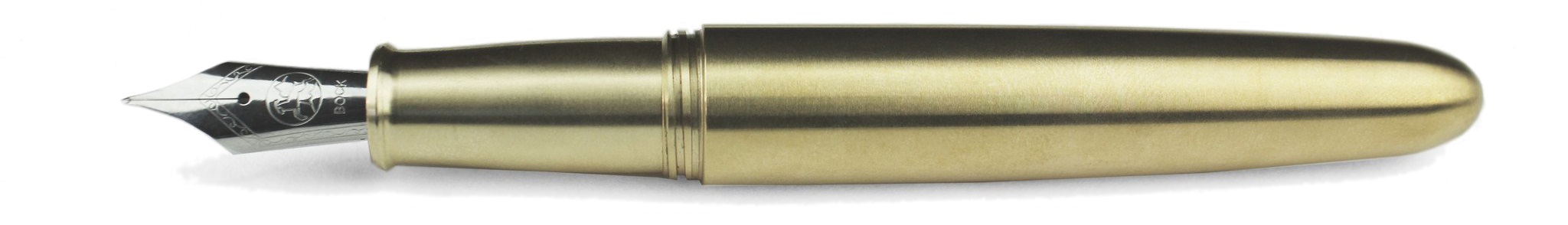
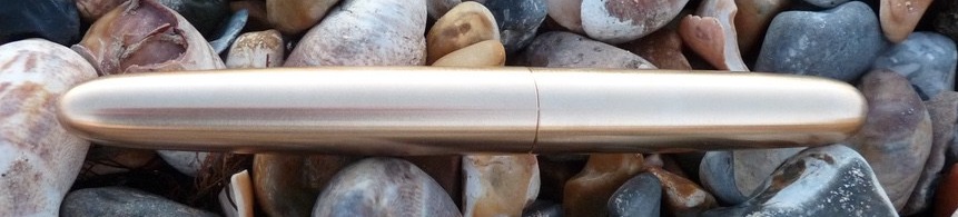
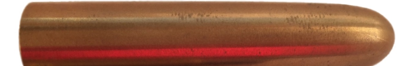
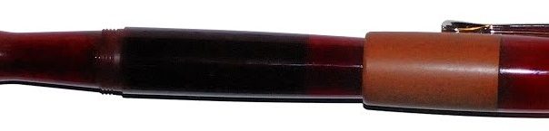
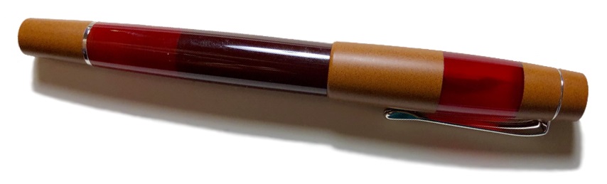
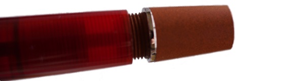
How it looks Very plain and straightforward: black cap and ends, transparent barrel, undistinguished clip. This is either helpfully minimalist, or a bit boring, according to taste – but we all agreed that this much ink sloshing around inside was a pleasant view.
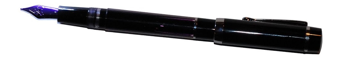 How it feels Unposted, it’s a fairly big pen, but not oversized – so comfortable for most hands. That cap does post, but this makes it a bit top-heavy in our opinion(s).
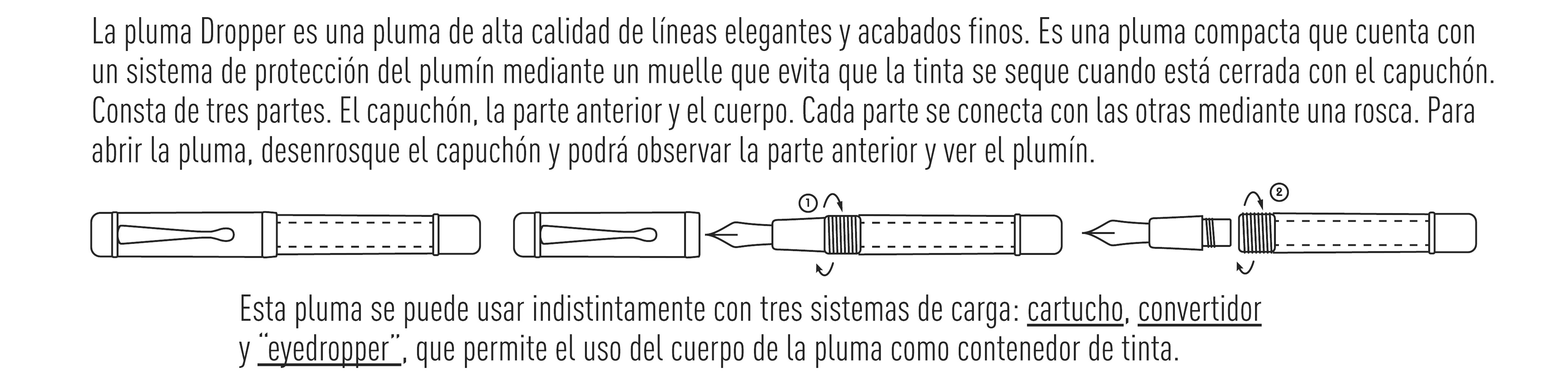
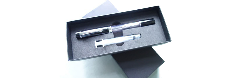
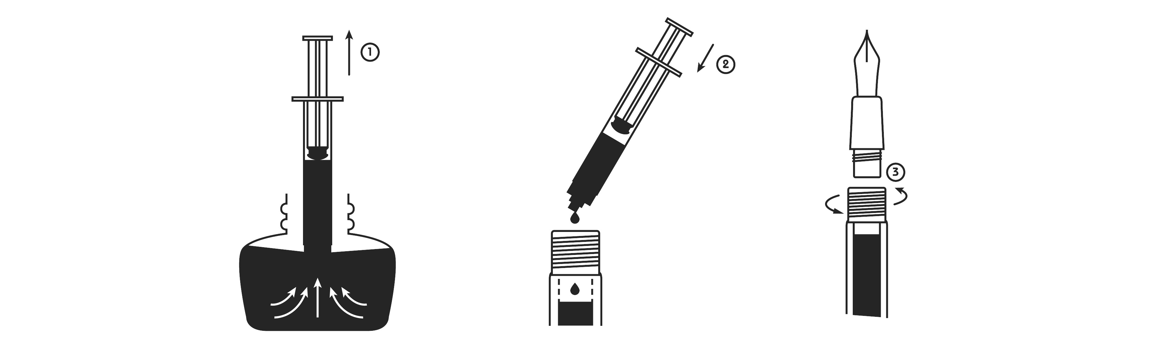
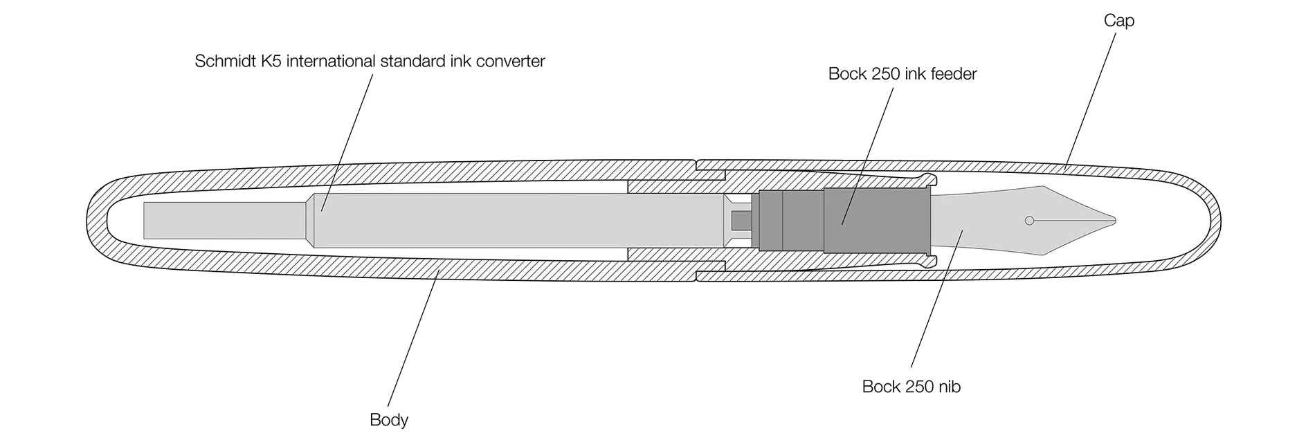
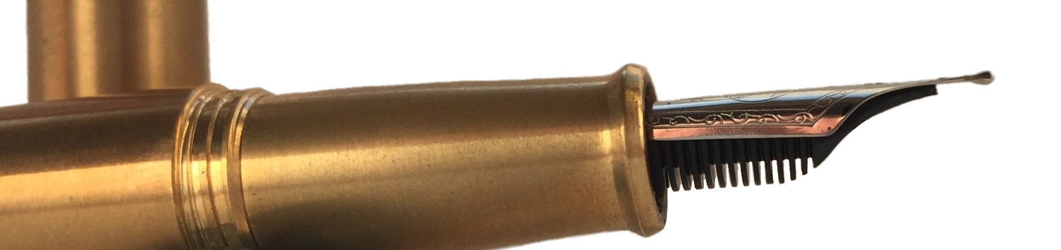
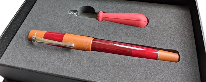
How it fills Here is this pen’s first party trick – no less than three filling options. Why you’d put a puny cartridge in a beast like this is hard to imagine, but it’s nice to know that the capability is there for real emergencies. The box comes with a decent converter, which is considerate, but also somewhat redundant – because this thing is made to be filled to the brim. Open the barrel, which has nice long threads and an o-ring already fitted – and you can get a whopping 4ml of ink in there, which is enough to write for days.
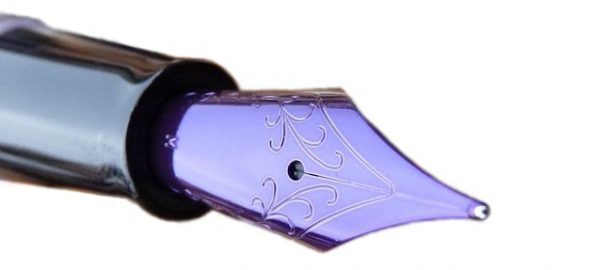
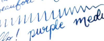
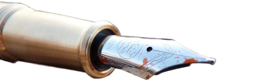
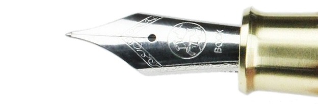
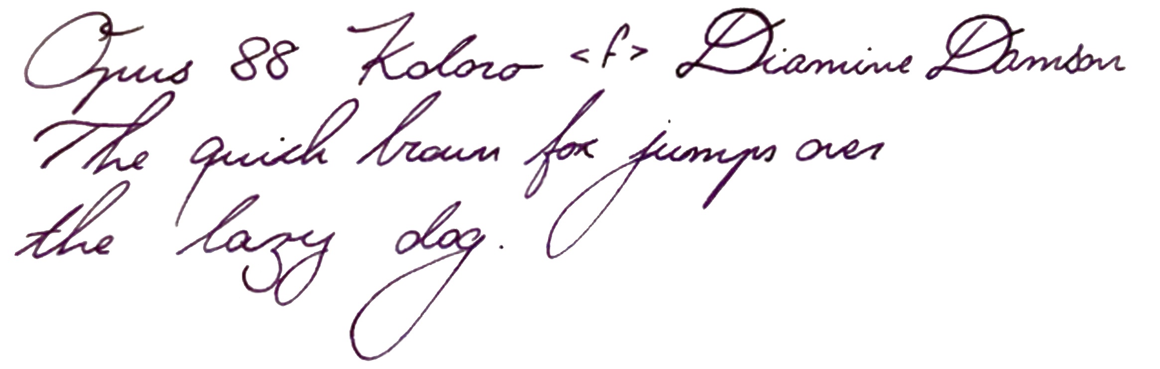
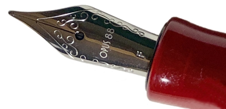
Crucially, how it writes… Here is the pen’s second party trick; it takes a JoWo #6, and those are swappable. For fun, and to make interesting photographs, we went for one of their colour-lacquered offerings, but any of their steel options would do – or you could even push the boat out and choose a gold upgrade. The purple lacquer did start to wear off once it reached its fourth reviewer, but the tip carried on writing just as well.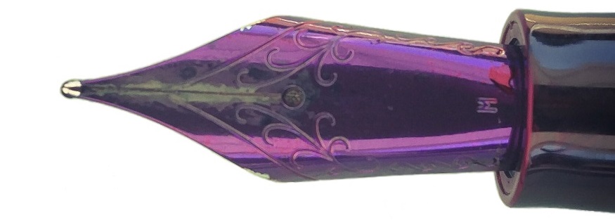
Pen! What is it good for? It’s probably just the thing for when you don’t need to show off, but do need to write for a long stint without refilling. There are other ways to achieve that aim, but let’s face it – this solution is a tenth of the price of a Conid.
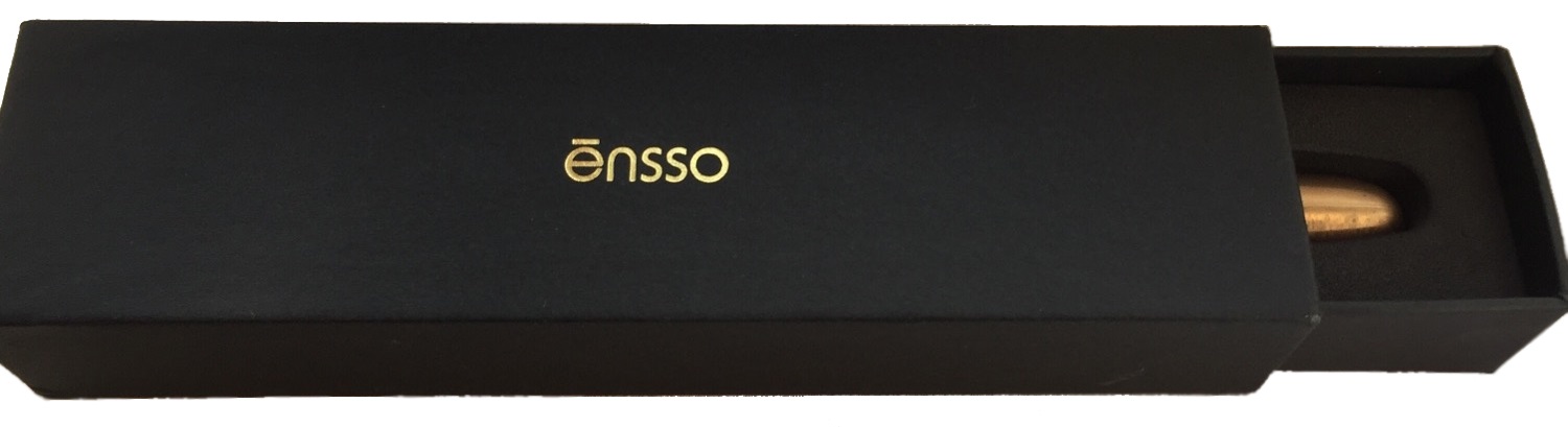
VFM With the nib and a bit of VAT inside the EU (for the time being, at least) this comes to about £45. Not dirt cheap, but pretty fair value for a useful pen, if not the glitziest. The box includes a syringe, converter, and instrucciones (in Español), so it covers all the bases and even provides a diverting translation challenge if, for some inexplicable reason, you’re the sort of fountain pen enthusiast who knows everything apart from where the ink goes.
 If this isn’t quite your cup of tea, but almost… Have a shop-around for eye-droppers. They are making a gradual comeback – take the Opus 88, for instance.
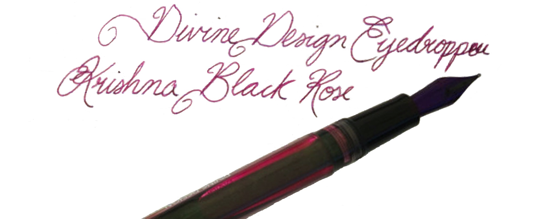
Our overall recommendation We like the way it works, for the most part, even if we’re not all blown-away by its plain looks. A safe choice as long as you don’t insist upon posting all your caps.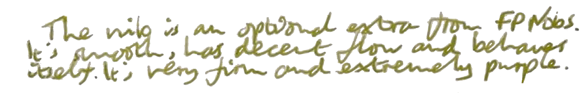
Where to get hold of one Shop around!
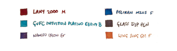
This meta-review references:
- Scribble’s purple postcard
- Ian’s postcard from the beach
- Ali’s full-on David Bailey scenic postcard
- Cantatrice’s indundation by a postcard from Mrs Trellis of North Wales
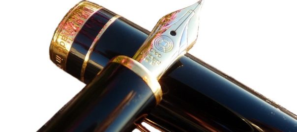
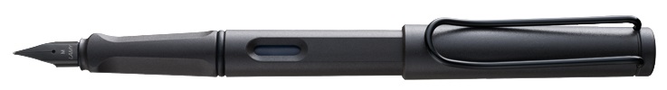
 A little bit of history Cleo Skribent is the company which kept fountain pen manufacturing going behind the iron curtain, and now make affordable daily drivers like the
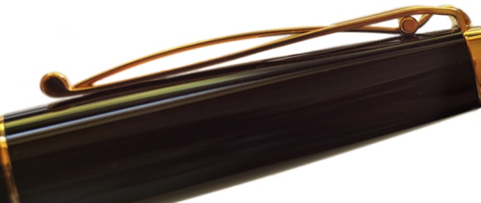
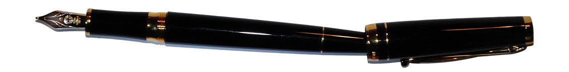
 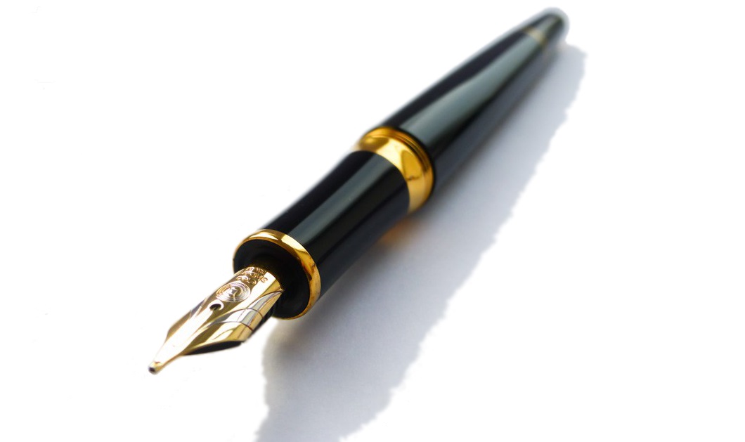 How it looks Quite distinctive, with a tapered barrel which is reminiscent of a desk pen, and that impressively over-engineered clip. The gold finish wasn’t to everyone’s taste, but a chrome trim alternative and a nicely blue version are also available.
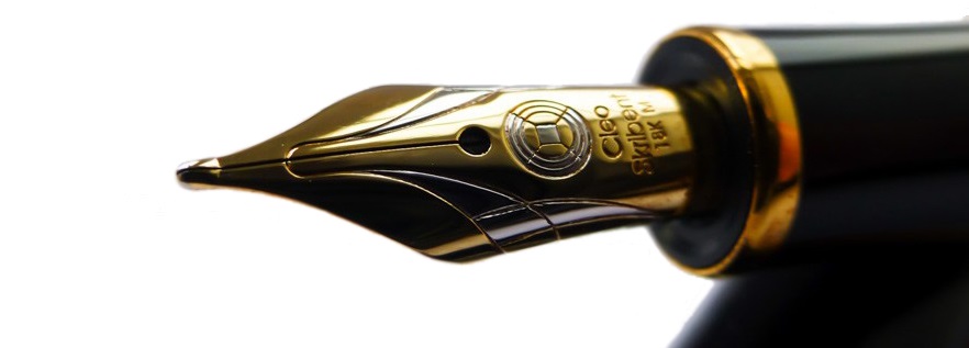 How it feels Light but well-poised and ready to write. It’s hard to resist the urge to try a few squiggles when you pick this up, even if you have nothing in particular to write – but as Skribent roughly translates as ‘scribble’ that’s perhaps appropriate.
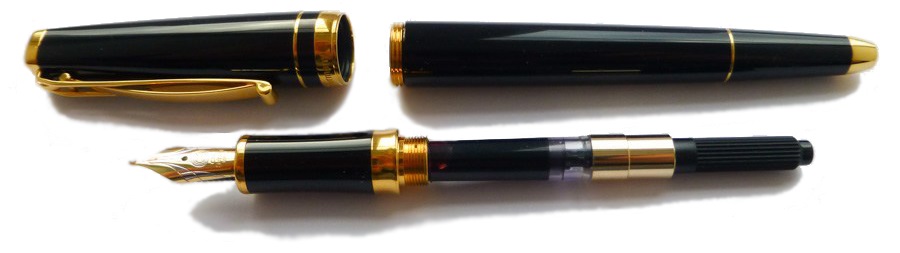 How it fills Somewhat disappointingly, given the piston option of the reasonably priced Classic, the Skribent is a cartridge/converter number. However, the converter does screw in for greater security, which is a smart move.
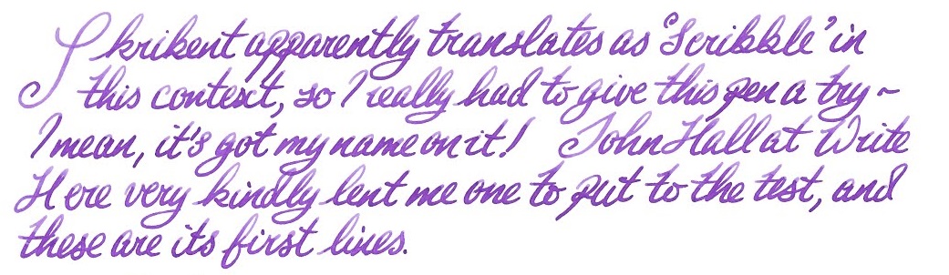 Crucially, how it writes… Ah, here is where the Skribent changes opinions quite quickly. The looks might not win everyone over, but that nib does! It’s small but perfectly formed, with a gentle bounce usually only encountered on a Japanese ‘soft’ nib, and although it offers only modest line variation it is a real joy to write with.
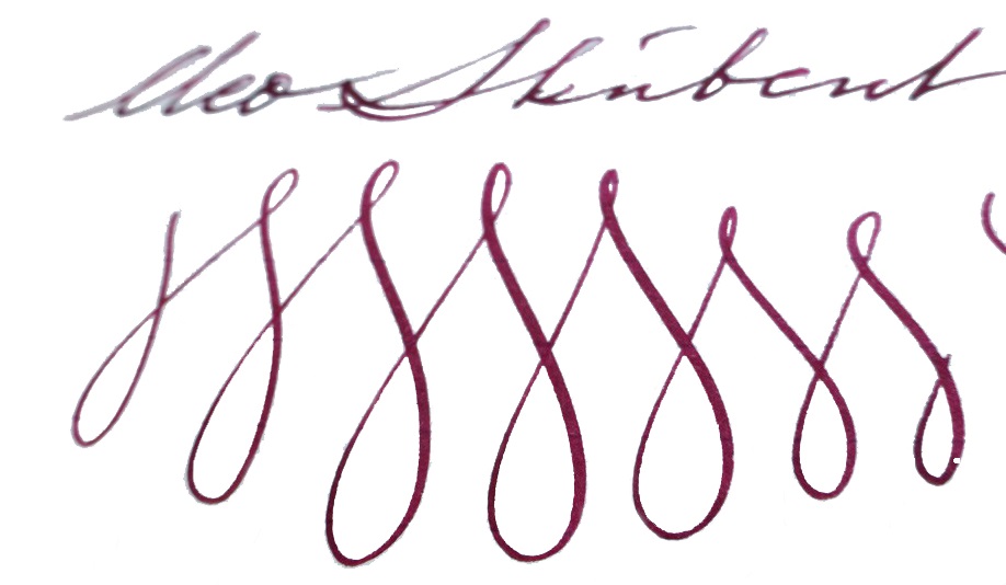 Pen! What is it good for? This is a proper ‘writer’s pen’, this one; it is well-built and could cope with whole reams of text. ‘Just the thing for writing that novel you’ve been meaning to get around to…
 If this isn’t quite your cup of tea, but almost… Cleo makes a wide range of fountain pens, and we do aim to review more of them over the next couple of years. But probably the nearest writing experience to that available from the Skribent would be a Platinum #3776 with an SM nib – if you can find one.
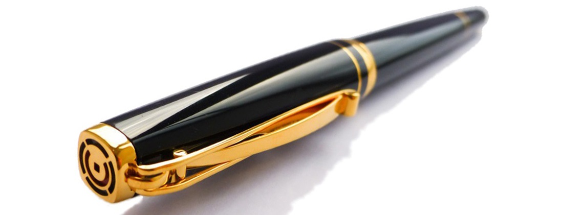 Our overall recommendation If you do have a yearning to write a book long-hand, and you can afford a luxury ‘daily driver’, you could do a lot worse than the Skribent – and you’re sure to fall in love with the nib. We think that Cleo would be wise to reconsider the price positioning, however.
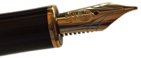 Where to get hold of one There are few Cleo stockists in the UK so, review samples not withstanding, it does make sense to
 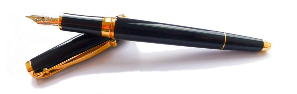 This meta-review references:
 Thanks to Write Here for lending us the Skribent to play with!
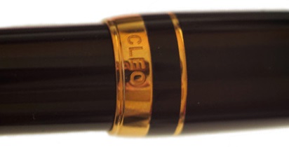

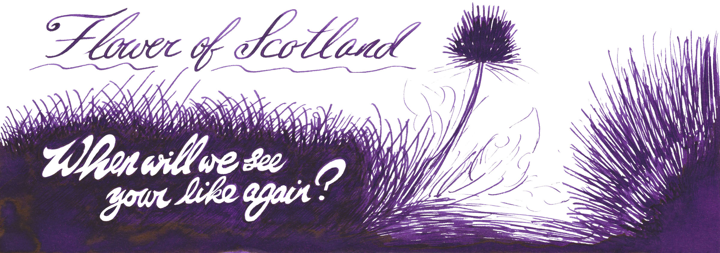
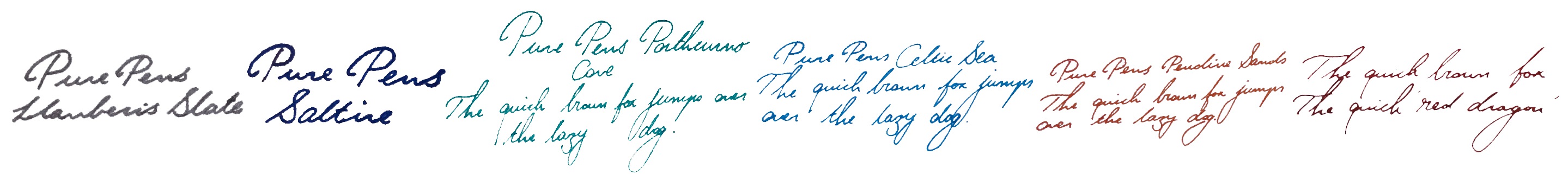
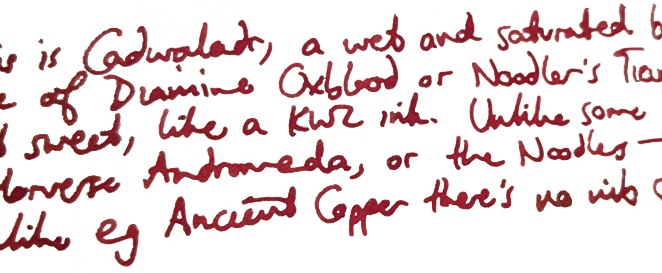
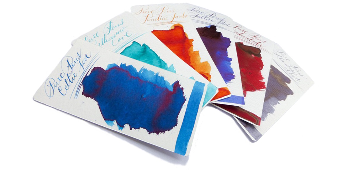
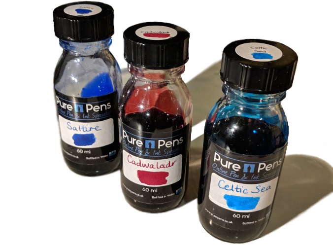
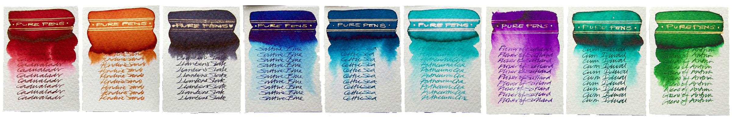
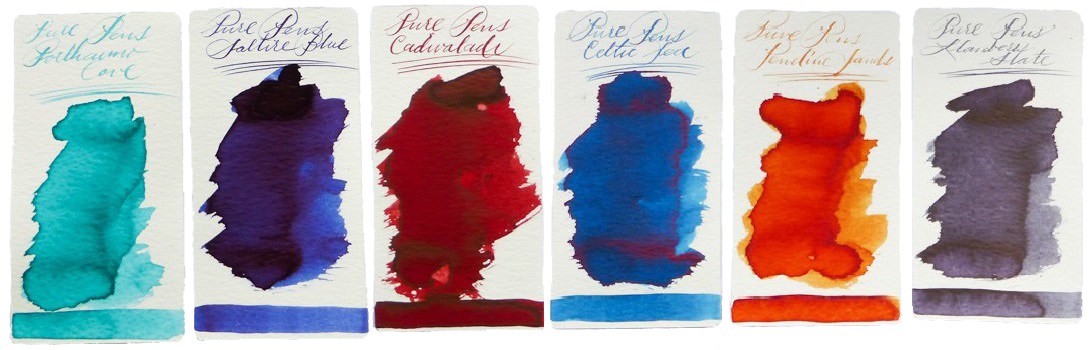
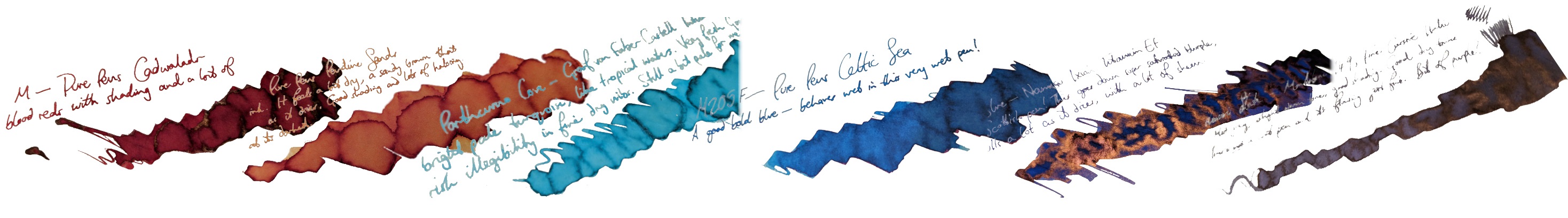
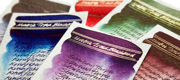
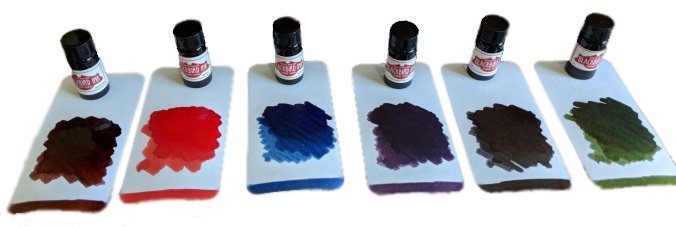
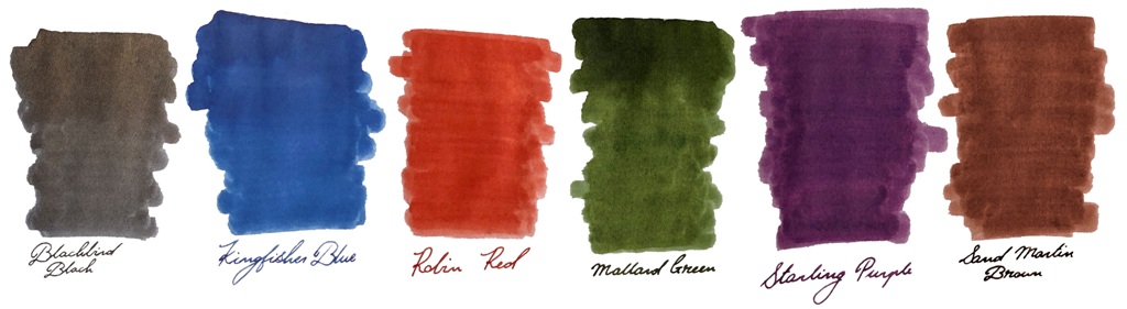
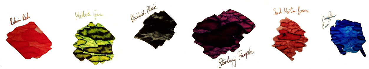
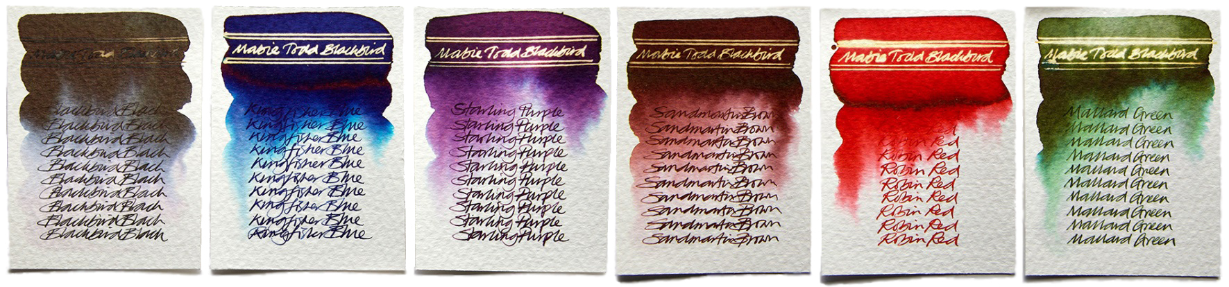
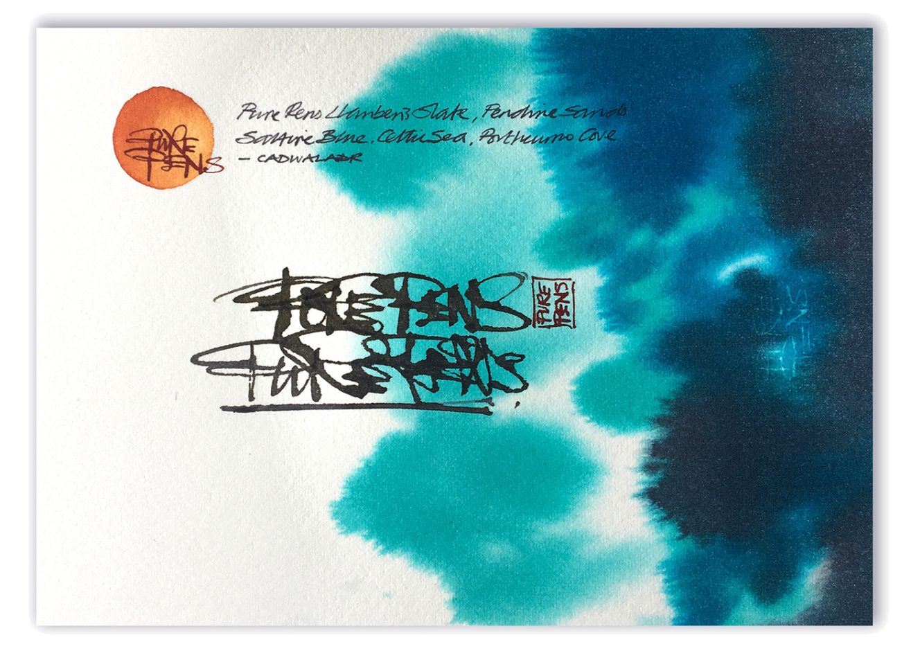 How it looks Cadwaladr is a rich red, with plenty of character.
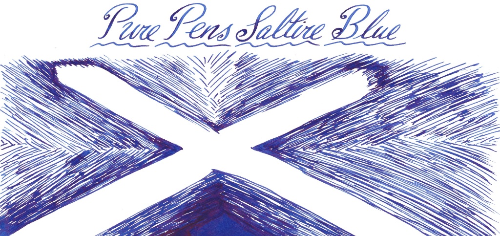
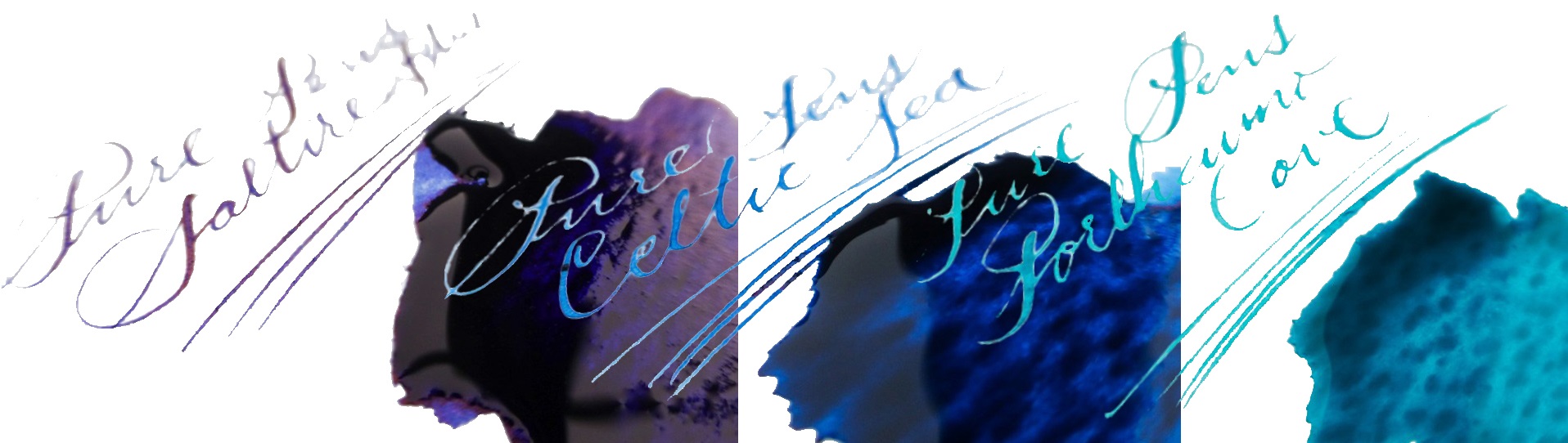
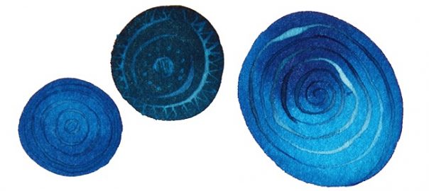
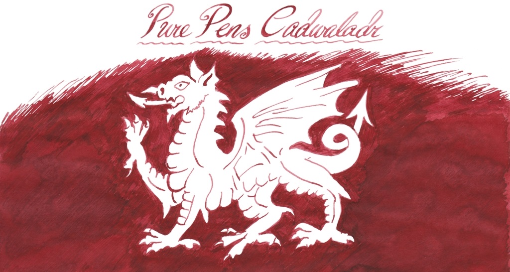 Celtic Sea is a pleasing blue, with lots of maritime presence.
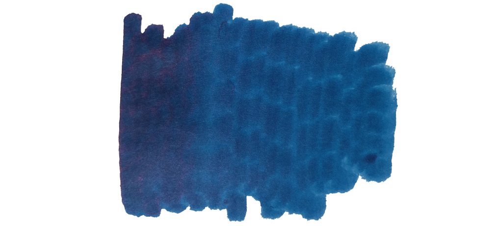
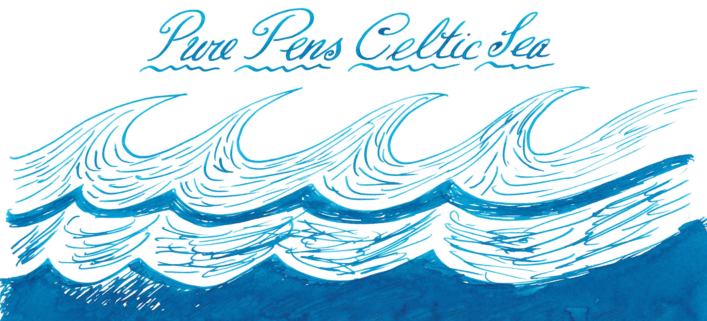


 This meta-review references:
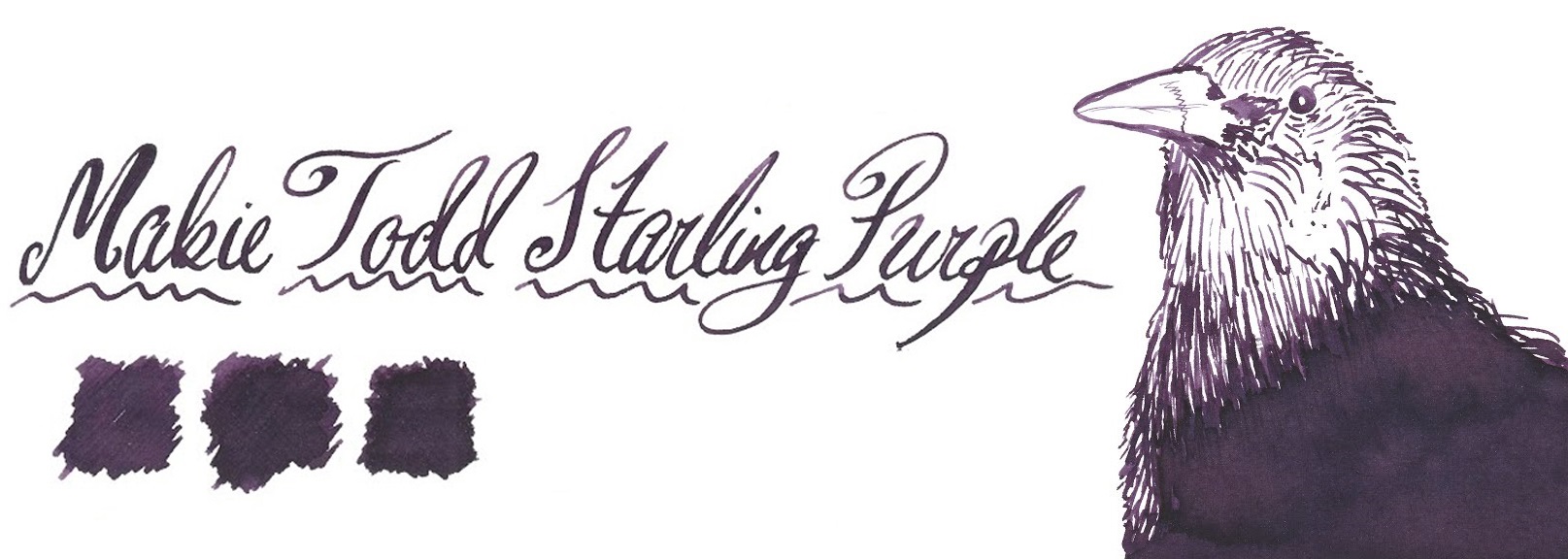
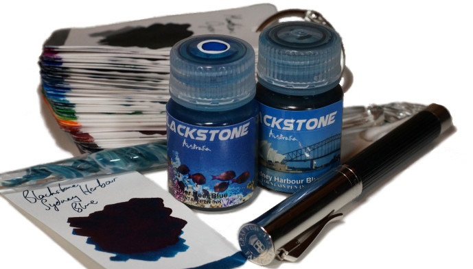
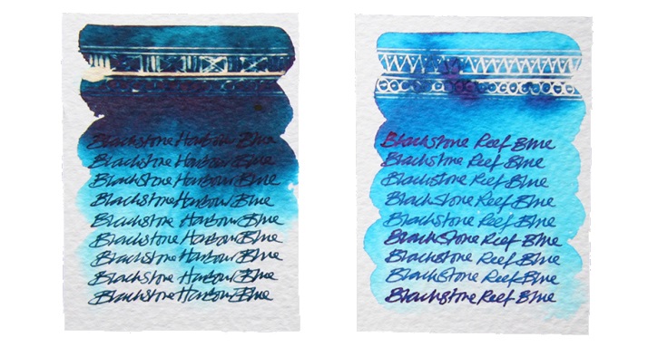
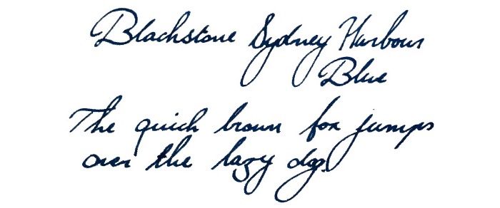 Ink! What is it good for? It’s multi-purpose ink, this; it would be perfectly nice for writing a diary with, but you could probably get away with taking it to the office too. The plastic bottle is also hardy enough for travelling with, if you want to avoid glassware on the move.