A little bit of history The original nineteenth-century Kaweco sold its wares from a shop adjacent to the University of Heidelberg, whose students had an unfortunate habit of slicing wedges out of each others’ cheeks to prove their prowess (or, presumably, lack of it) at fencing. The pen, as we all know, is mightier than the sword, and the Student is on sale still. QED.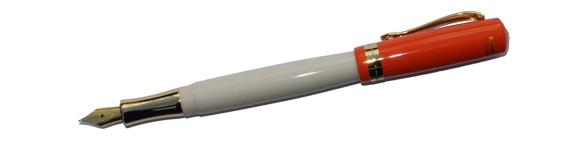
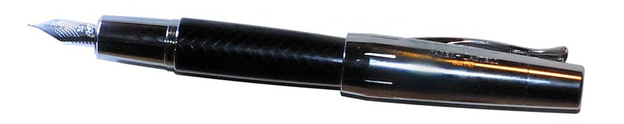
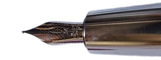
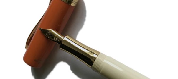
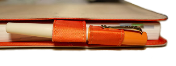
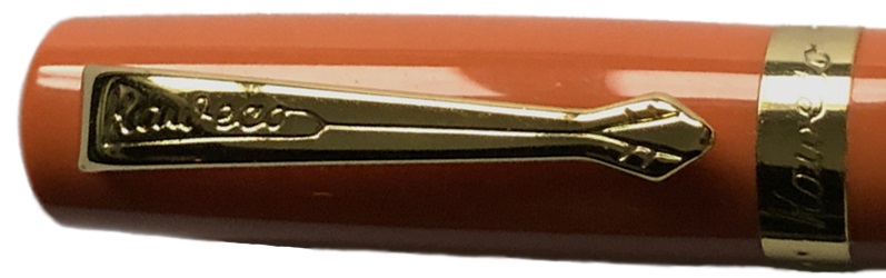
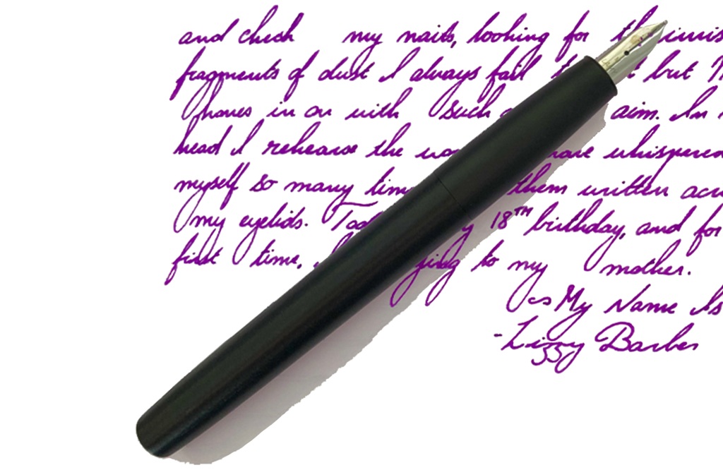
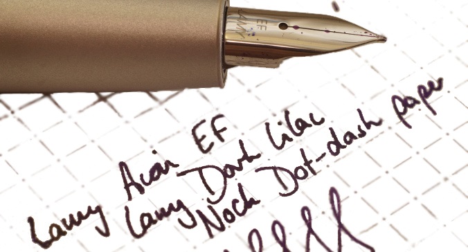
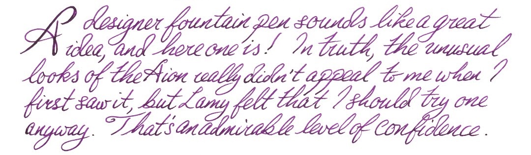
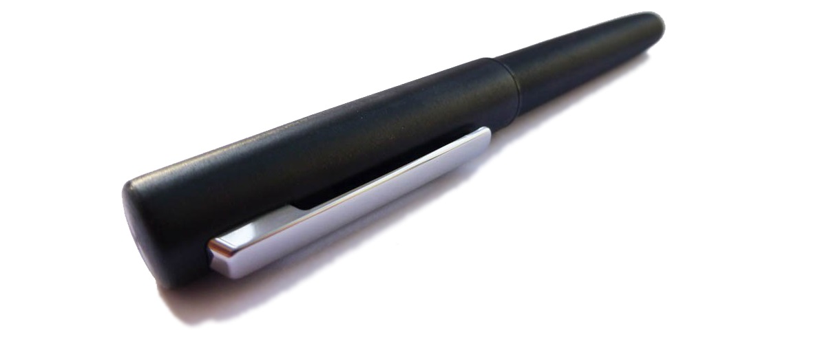
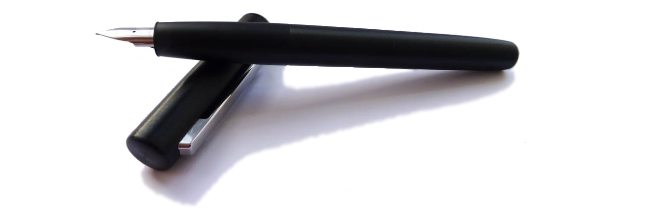
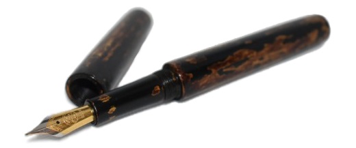
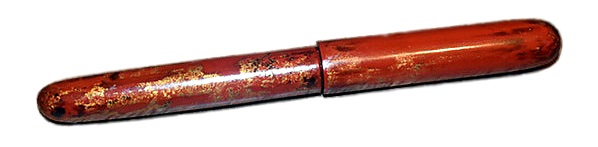
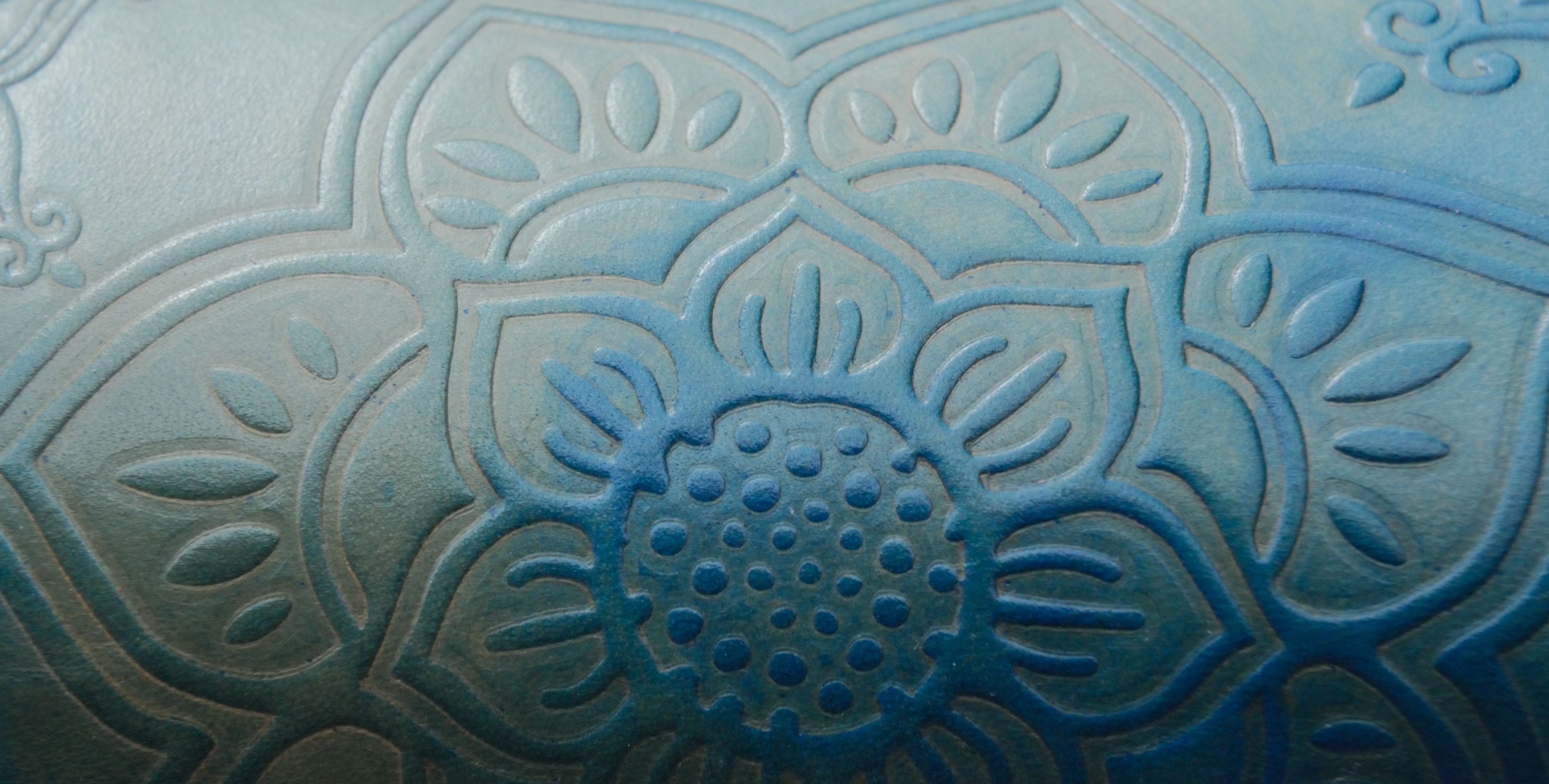
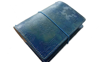
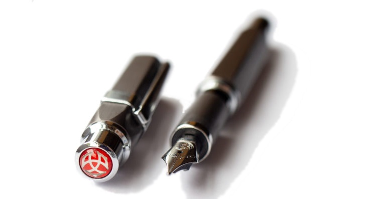
How it looks As regards the shape, the pen looks much like any other Kaweco Student; a traditional form in good quality plastics, with the 060 (small #5) Bock nib already known to many writers from the Sport and Lilliput pens. But things go a little zany when it comes to the colour scheme, which in this case appears to have been inspired by the furnishings of a hotel lobby, circa 1976. It walked into the party, like it was walking onto a yacht, its hat strategically dipped below one eye, its scarf, it was apricot. You get the picture.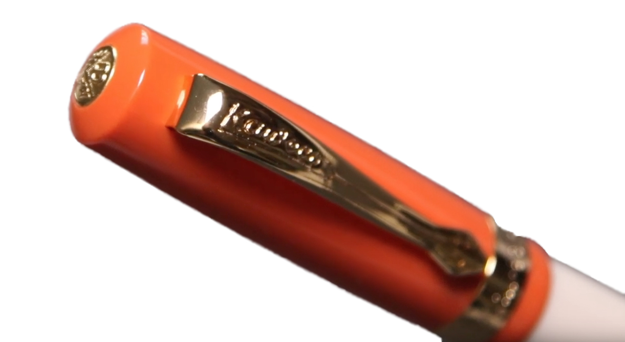
How it feels This is a comfortable pen to hold, and the slightly concave grip section helps with that. The cap is light enough to post when writing, although unlike the Sport the Student doesn’t require this for the pen to be usable. 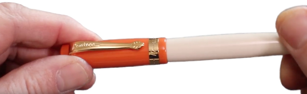
How it fills This is a straightforward cartridge filler, but there is space enough in the barrel for a standard push-fit converter if you prefer.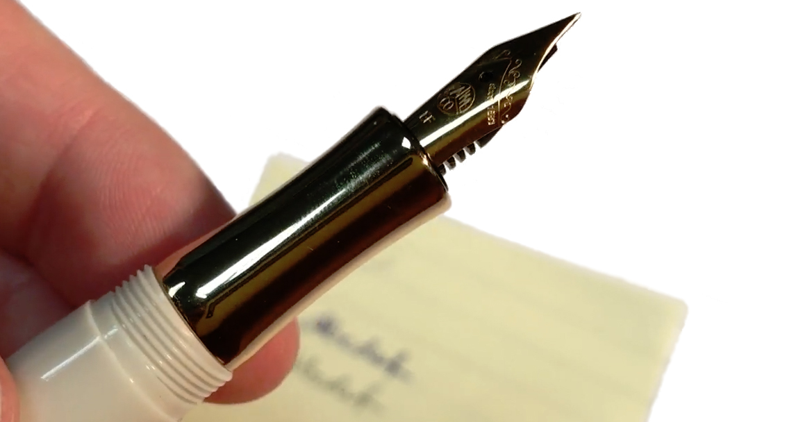
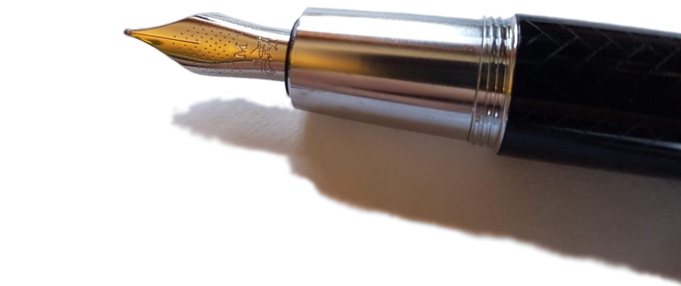
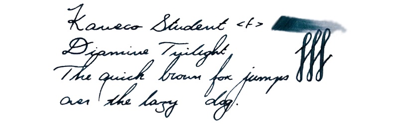
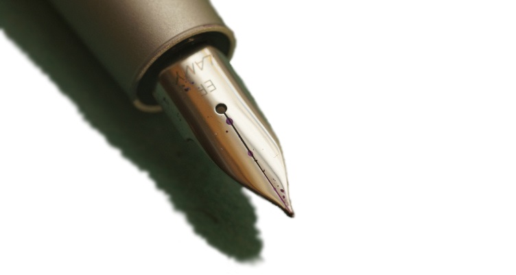
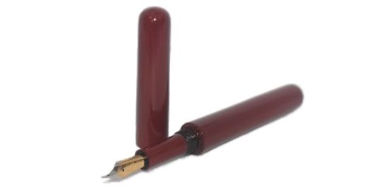
Crucially, how it writes…The ’70s Soul’ edition comes with a gold-plated steel nib which writes very nicely – indeed, the units we tested had one of the best small steel nibs that we’d encountered in a Kaweco.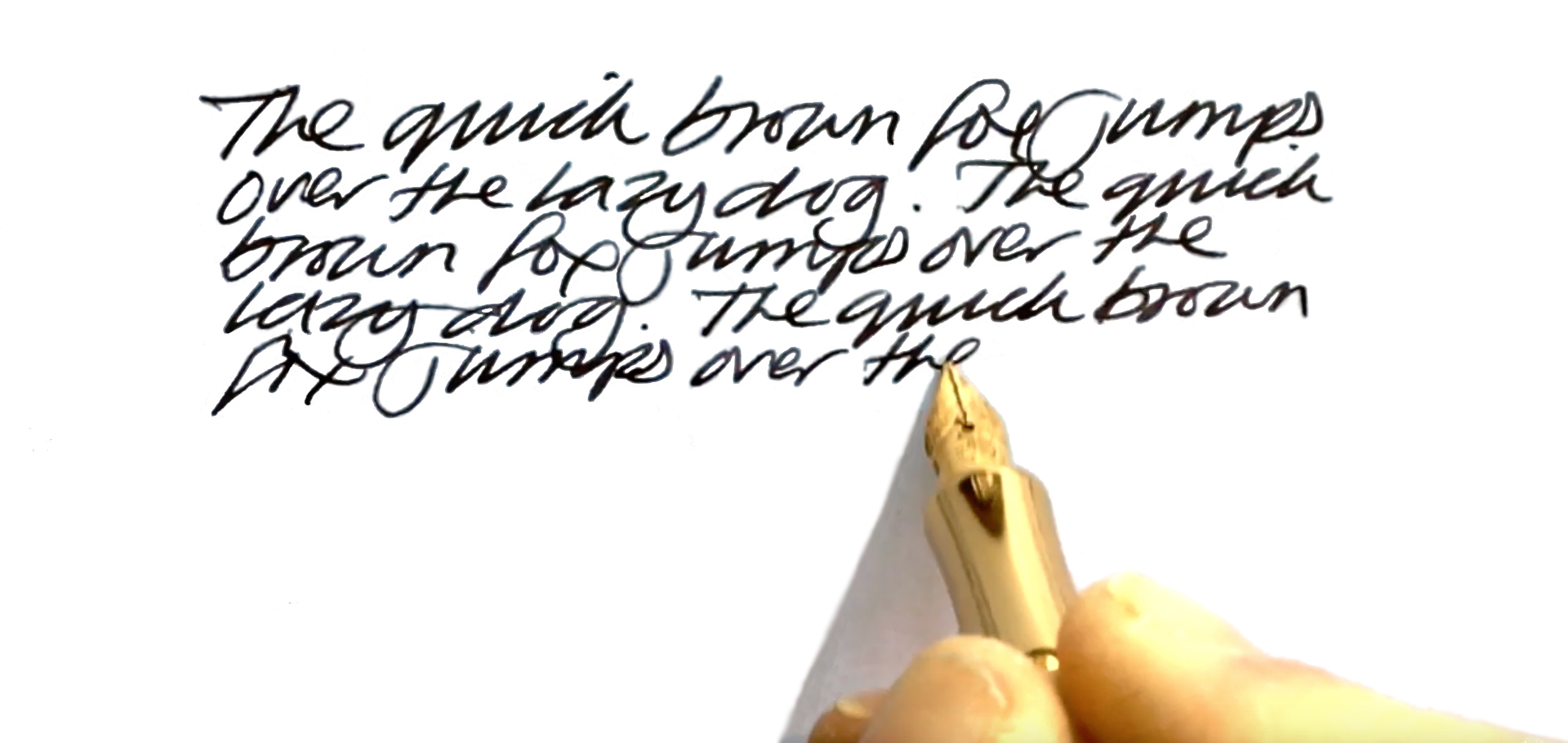
Pen! What is it good for? Obviously it’s great for swanning onto a yacht with a floppy beret and an apricot scarf, but apart from that it seems just the thing for the more flamboyant sort of workplace, or possibly even the side of the catwalk. Perhaps not one to take to a duel, though…
VFM So-so. The usual Student is pretty sound value, usually at around £40 on the UK market. The 70s Soul adds a 50% up-lift to that, and £60 is a bit harder to justify unless this nostalgic costume strongly appeals; for that sort of money, you can obtain the aluminium or brass versions of the Sport, which use the same nib but are made from essentially indestructible materials.
 If this isn’t quite your cup of tea, but almost… Then you have most individual tastes! For a colour scheme along these lines, the vintage market is probably the best place to look. But if you like the shape and just don’t consider the 1970s the decade of peak elegance, the main Student range is worth a look – our tip is the demonstrator version.
Our overall recommendation If you’re buying a present for someone who still owns some Fleetwood Mac on vinyl, or a hipster who is under the impression that a classic MGB is a viable means of transport, this is a winner. Unlike the old turntables and wheezing sports cars, it actually works rather well, too!
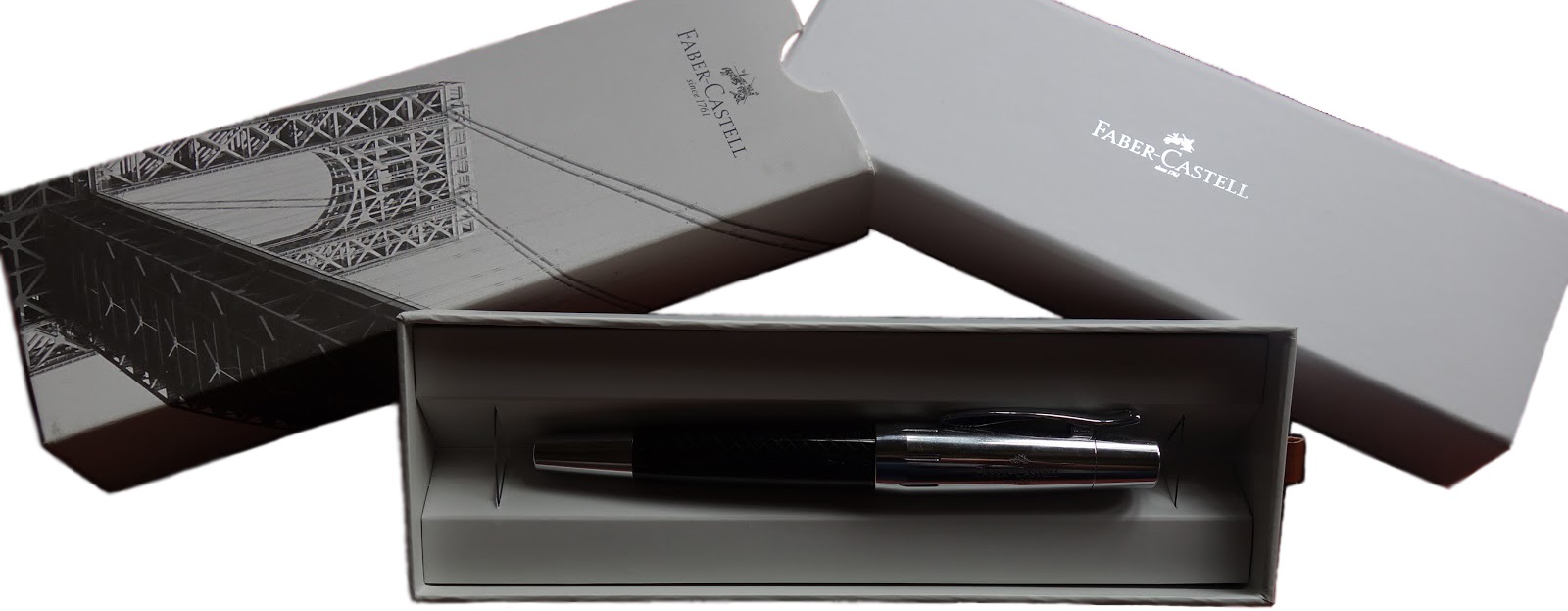
Where to get hold of one Kaweco has a good network of stockists throughout Europe, including the UK, and you’re unlikely to have any difficulty finding a retailer who can sell you a Student. If you particularly want this colour scheme, though, you may need to act sooner rather than later.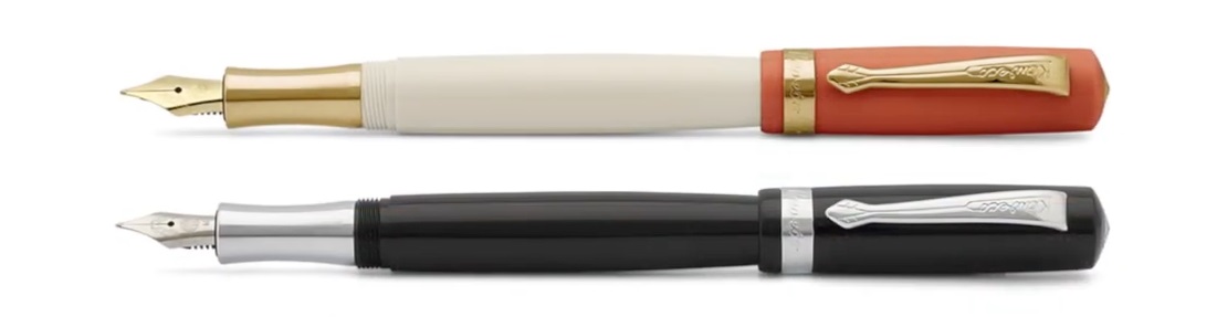
This meta-review references:
Thanks to Kaweco for sending us this interesting retro curiosity to try.

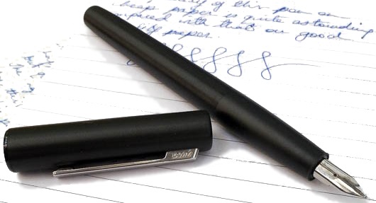


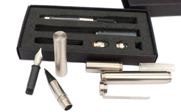
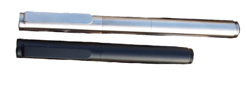 How it fills The ‘pocket’ configuration will fit only a small international cartridge, but the extended version has space for a proper twist converter.
 Pen! What is it good for? It’s good for, depending upon your point of view, customisers who like to regularly reconfigure and re-invent their pocket pen, or for terminally indecisive fidgets!
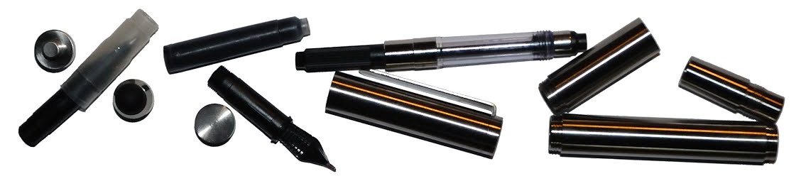
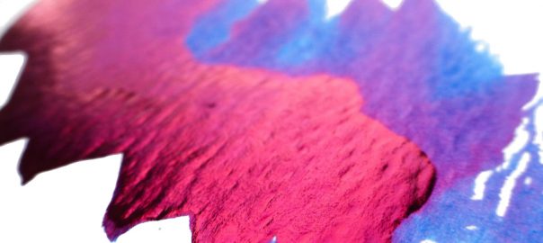
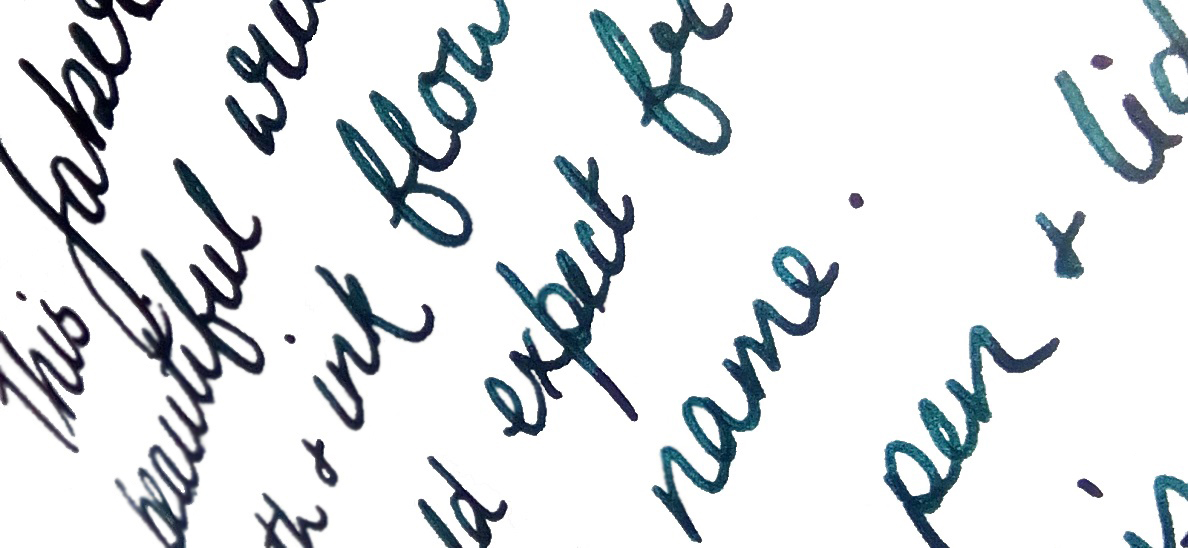
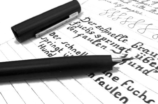
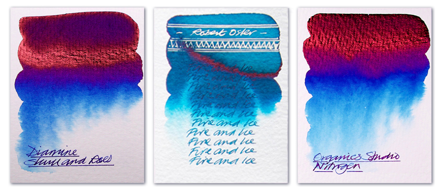
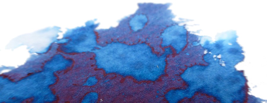
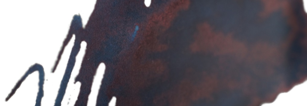
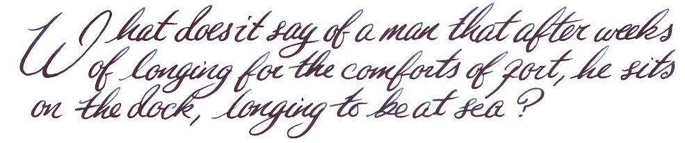
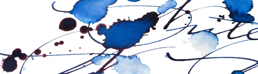
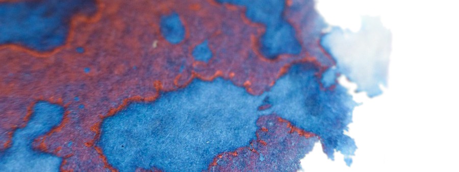
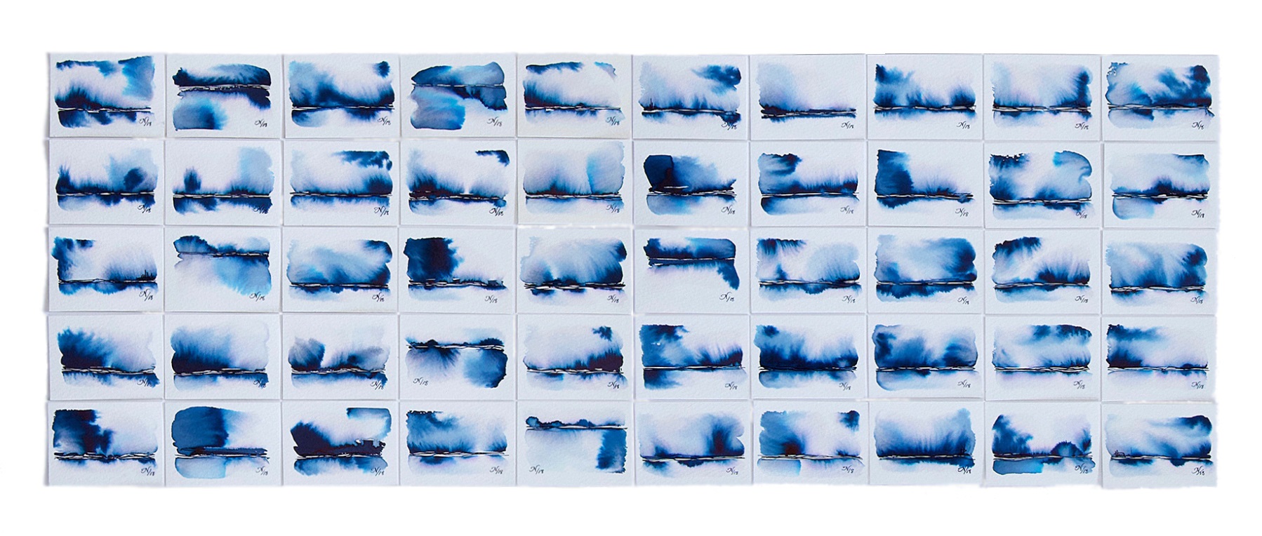
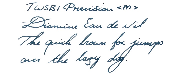
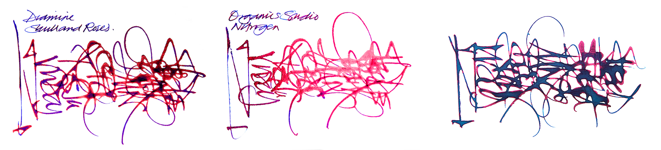 How it behaves on the paper Perfectly well; these all come from serious ink manufacturers with reputations to protect, so there are no major problems. Drying times can occasionally be longer than expected, however, particularity for Nitrogen.
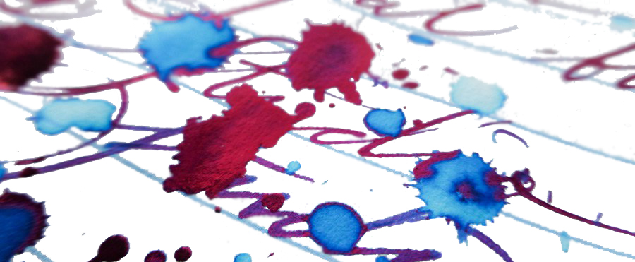
 If this isn’t quite your cup of tea, but almost… There are more ink makers jumping on this band-wagon all the time – for instance, we’re hearing good things about Krishna Moonview. Or you could mortgage your home, sell a couple of major organs and buy some Parker Penmanship, of course…
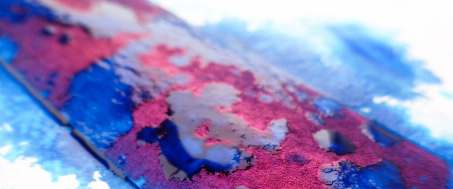 Our overall recommendation Give it a go. The effect is very pleasing and the ink is easy to live with, even in fussy thoroughbred pens. Skull & Roses is the trickiest to get hold of despite being made here in the UK, but that’s just the result of an exclusive deal – and Diamine could undoubtedly come up with something even better for full global distribution in due course. In the meantime, Fire &Ice if you like Turquoise, or Nitrogen if you like full-on royal blue with all the trimmings, are well worth a try.
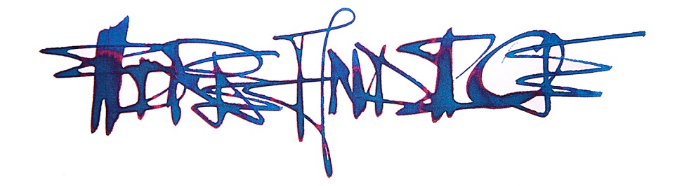 This shoot-out meta-review references:
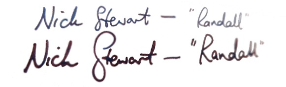
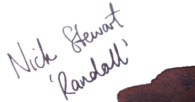
 Thanks to Nick for the samples, and of course Randall for the inspiration
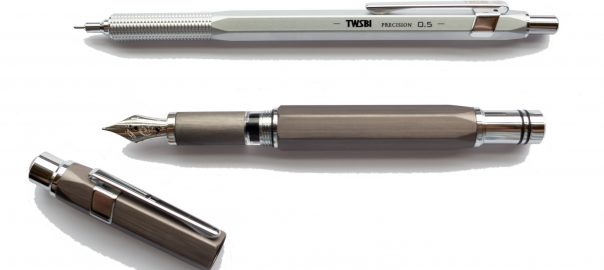
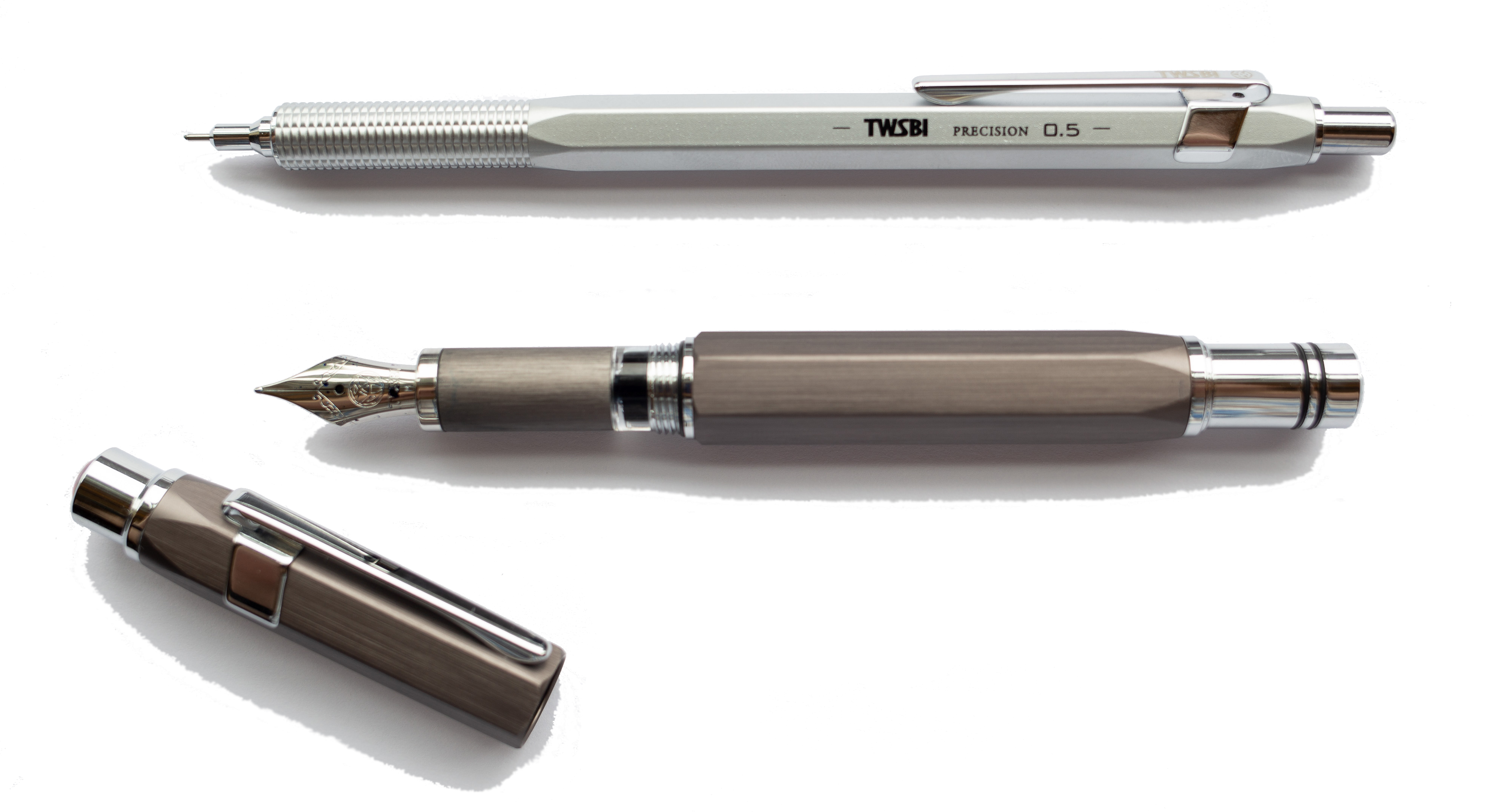
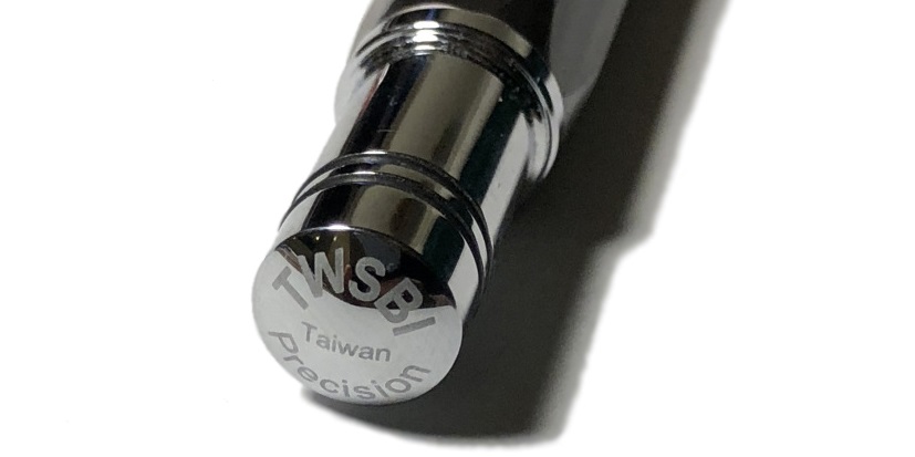
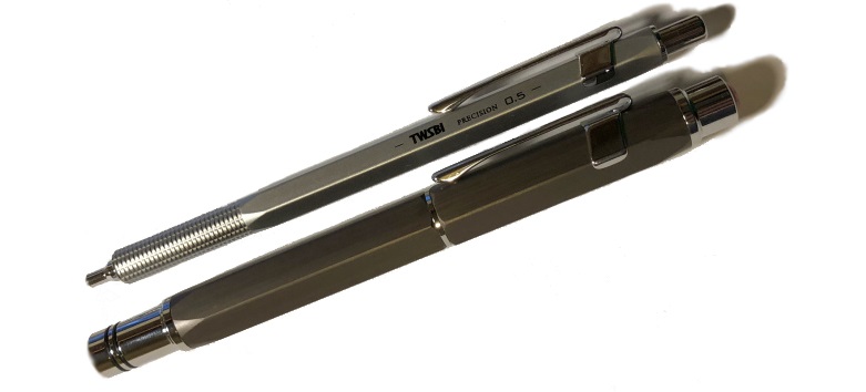
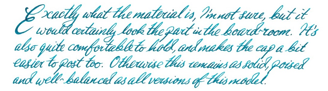
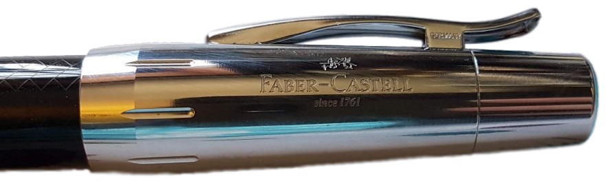
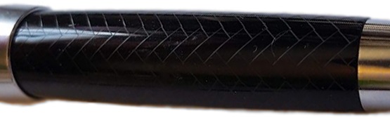
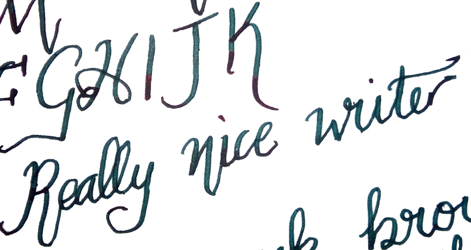
 It’s quite easy to write with both the pen and pencil for a long time without any sort of fatigue. This is especially pleasing considering that fountain pen is a piston filler, which leads nicely on to…
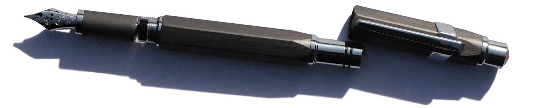
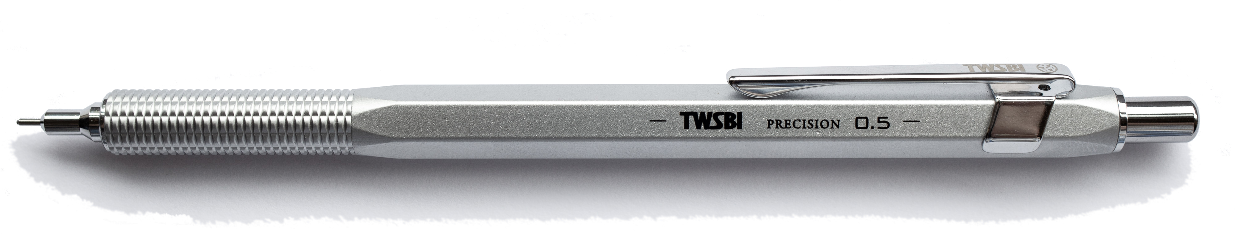
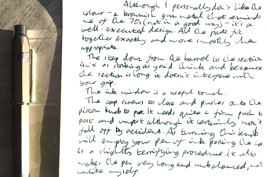
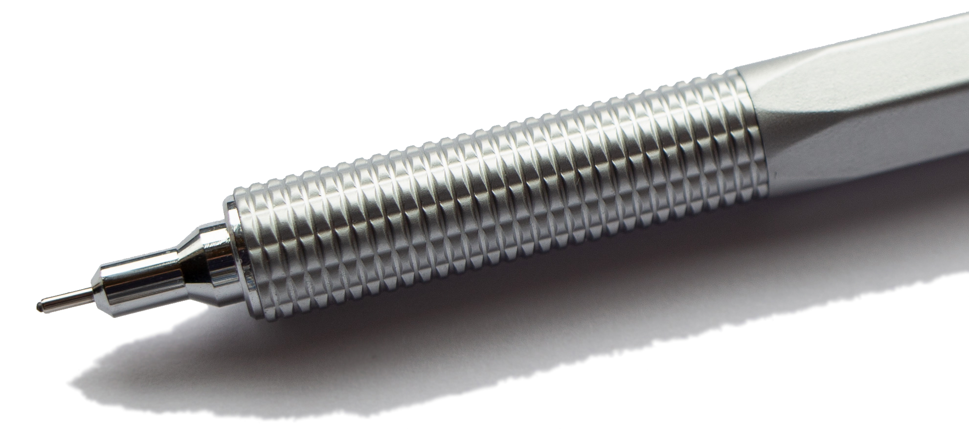
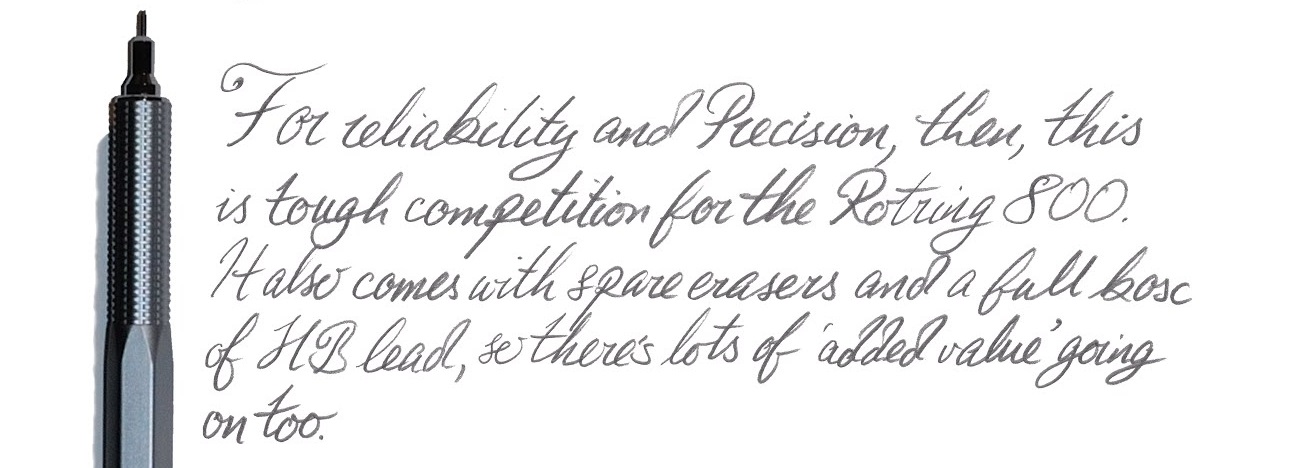
 Our overall recommendation The Precision FP is a good, reliable pen, which has the potential to become a trusty workhorse without breaking the bank. None of us had any problems in terms of the writing experience, and the only cause for concern were our own personal preferences when it comes to design. All in all, a thumbs up! The pencil is a slightly more mixed offering given the issue Matthias identified with excessive lead protrusion, but still great value for the price demanded.