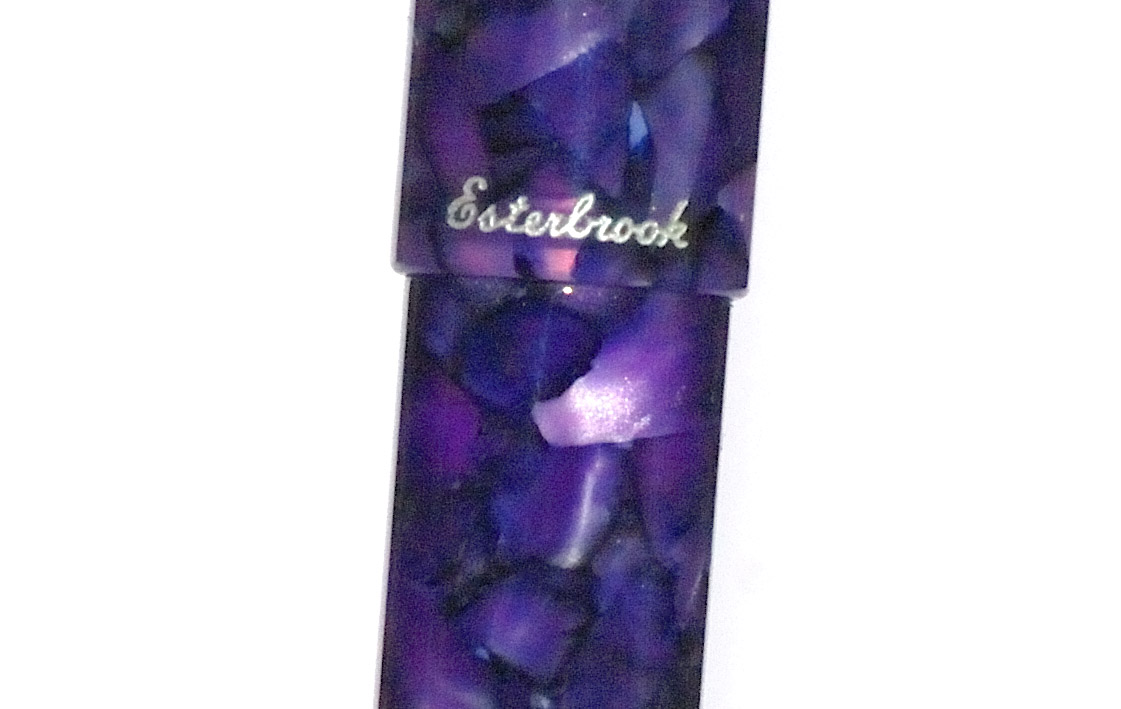
A little bit of history One of the most frequent questions we get asked here at the Inkdom’s secret bunker is what can be sensibly procured for careless beginners with small-ish hands. We don’t want to put them off with a lousy writing experience, but then again we’d rather it didn’t cost a fortune when the pen is sat on, melted over a Bunsen burner or lost on the school bus. Venerable British firm Manuscript, which has been supplying study desks since the days when that ink-well hole was in every-day use, turns out to be still in the business of providing a solution. Of course we had to give it a try!
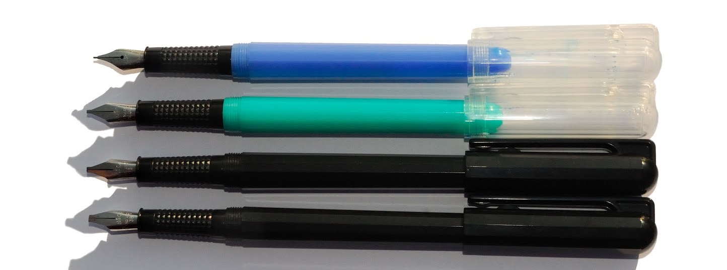
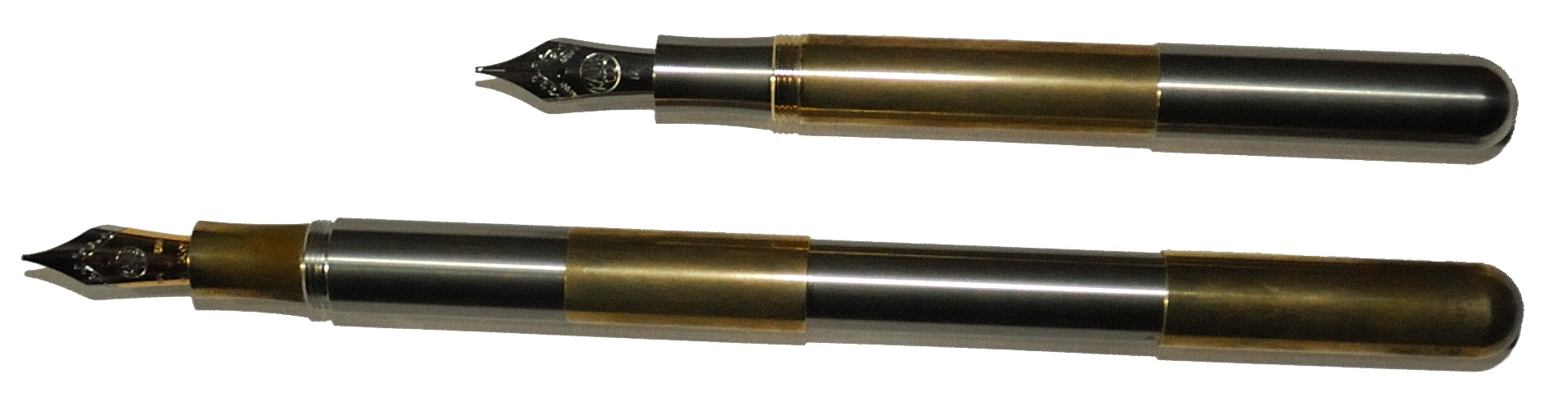
How it looks The Dodec has a slim barrel with, as the name suggests, twelve sides. The plastics in use range over sky blue turquoise, magenta, black and transparent finishes. With knurled grip sections the overall look is economical and functional, which is pretty much the Dodec proposition in a nutshell. There’s no mistaking it for a boring old ballpoint, though.
How it feels Light and easy to handle – as long as you don’t grip that non-slip section too tightly. The nibs feel positively laser-guided on the page, though; there’s no tactile clue as to how astonishingly inexpensive the Dodec is.
How it fills This is a straightforward cartridge filler, for most purposes. The dimensions are built to a budget and the barrel is actually too tight a fit for a standard Schmidt converter. However, the long ‘international’ cartridges sold by Waterman and Pelikan fit perfectly and allow for a useful squeeze when the nib has run dry – which can happen occasionally.
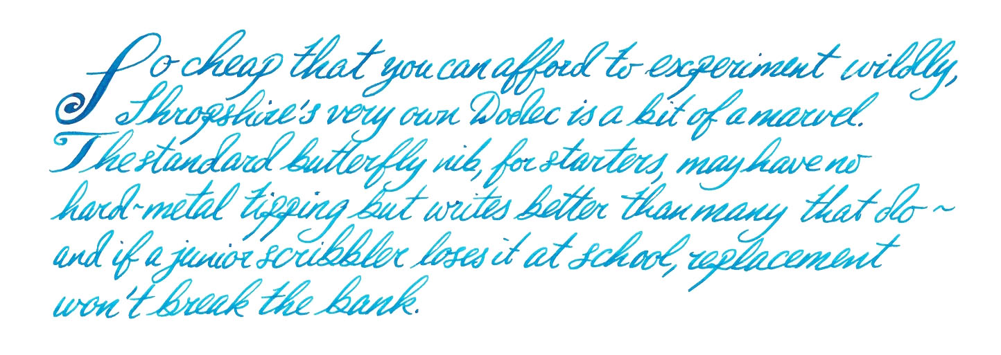
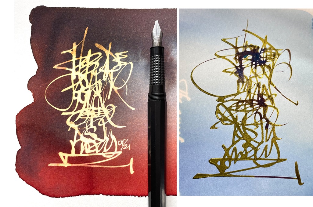
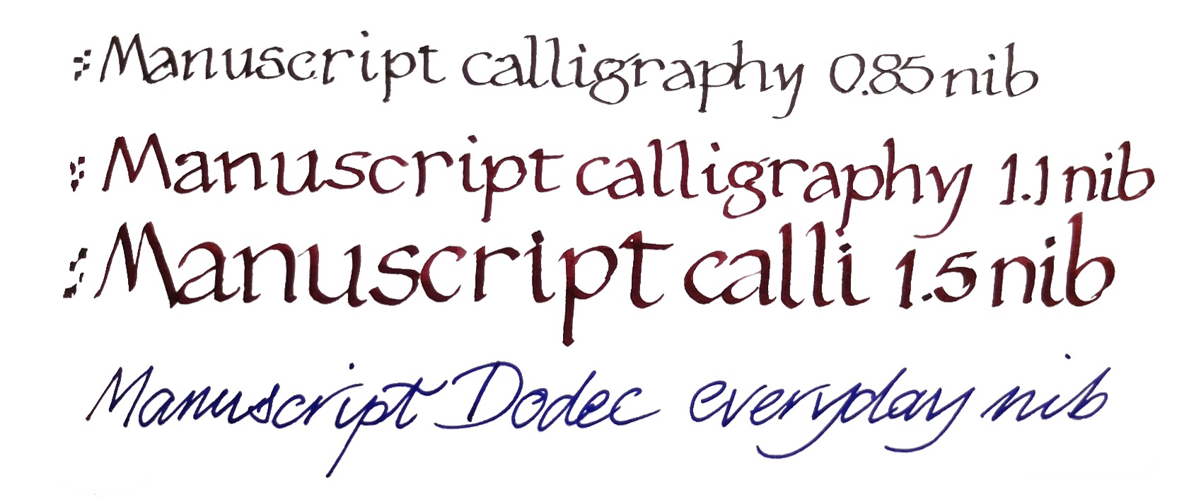
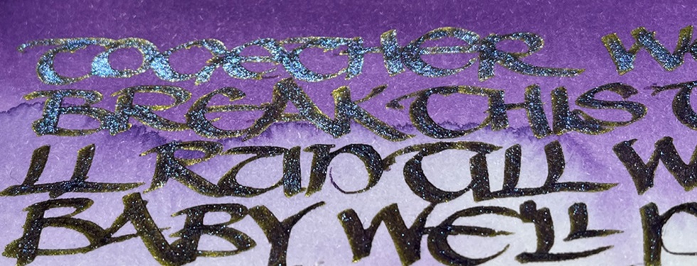
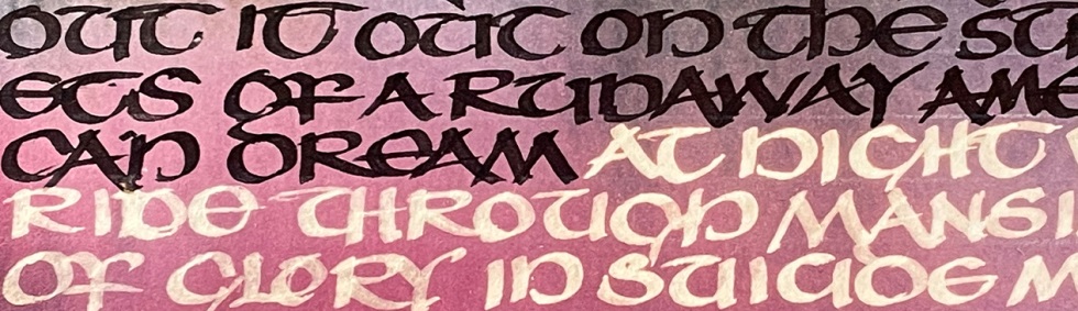
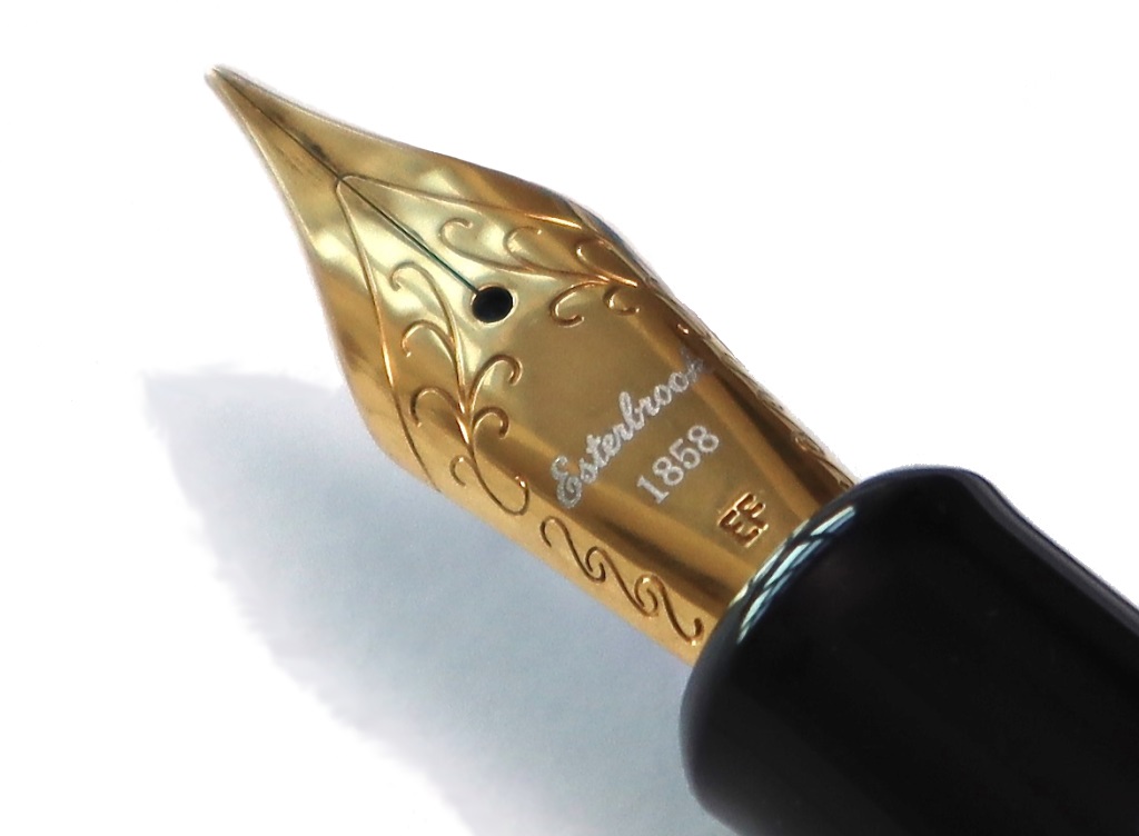
Crucially, how it writes… Now here is where it gets more complicated than might have been expected from the tiny price tag. For Dodecs sport two completely different types of nib! The ‘handwriting’ nib is essentially a folded or butterfly design, which writes amazingly smoothly without employing a harder metal on the tip. It’s a great introduction to what a proper fountain pen feels like, and in the unlikely event of wearing it out a replacement is very, very affordable. The italics, meanwhile, are of the classic ‘crisp’ variety and come in a dizzying range of sizes which encourages experimentation – they’re fun to use but can also produce seriously impressive results too.
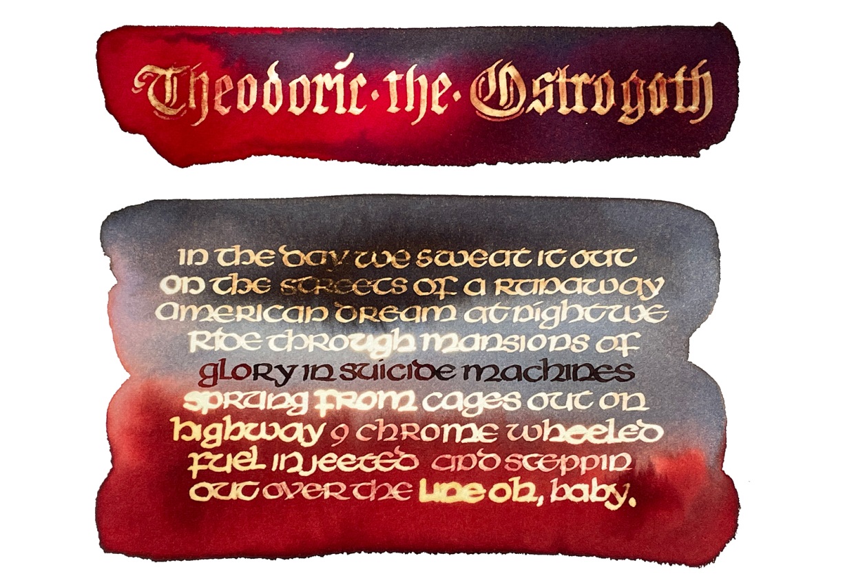
Pen! What is it good for? The handwriting pen is obviously great for beginners but often impresses even grizzled gold nib fanatics, so it serves as everything from first fountain to everyday shopping-list-compiler. The italic nibs are made for having fun with, but even proper calligraphers approve. The Dodec is built down to a budget and this occasionally shows up as inconsistent ink flow, but reseating the friction-fit nib and feed when required is a very simple job. In return, you can afford to abuse them a bit and innovate. 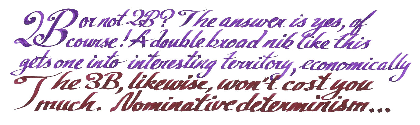
VFM Shop around and you can often pick these up about £1.50 a go. You’d be hard-pressed to find a decent ballpoint at that sort of price – if such a thing even existed, of course. That’s hard to argue with, really.
The only way is ethics Made right here in Blighty and using fairly minimal packaging, there’s not much to worry over and a fair bit to feel good about.
If this isn’t quite your cup of tea, but almost… The rest of the Manuscript range is probably worth a look instead. Some people do prefer the rounder, less nobbly ‘Classic’ from the same stable, which is similarly stonking value.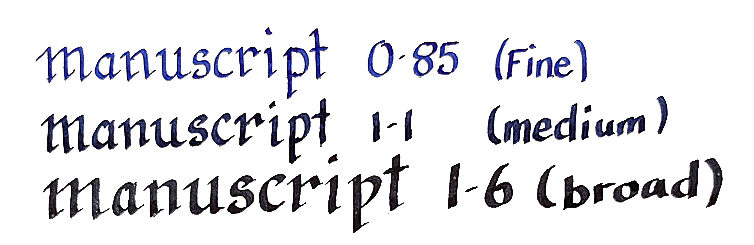
Our overall recommendation A Dodec costs less than a something a barista could make for you once upon a time, and you’ve had a year off from that so, seriously, what are you waiting for?
Where to get hold of one The handwriting and italic versions of the Dodec can often be found in ‘thrift’ outlets like Boyes and The Range, as well as from educational stationers in bulk. If that doesn’t appeal, plenty of online retailers and art supply shops stock a full range and you can even buy them from Manuscript direct. Try an online search for ‘Manuscript Dodec’ and you may be pleasantly surprised.
This meta-review references:
- Scribble’s, err, scribbles
- Nick’s calligraphic odyssey
- Jo’s spring budget special
- Joe’s nostalgic noodlings
- Ania’s budget breakdown
- Mick’s exhaustive investigation
Thanks to Manuscript for kindly furnishing us with samples to show what the Dodec can do.
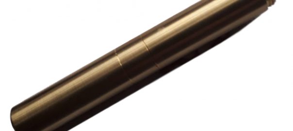
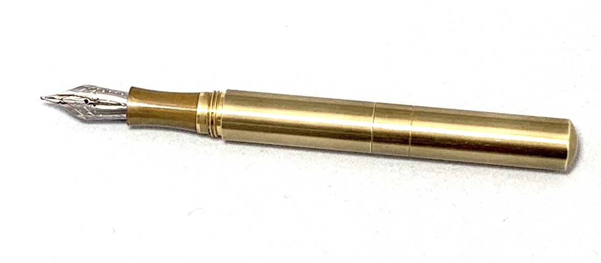 How it looks It’s a short featureless tube, basically. If you’re still stuck in gender discrimination mode, it could conceivably be mistaken for a portable mascara applicator, or an emergency Spitfire cockpit canopy removal tool. Obviously these are both foolish misperceptions, but such is the fate of the common-or-garden dinosaur. The rest of us can either polish the brass or let it elegantly corrode (‘patina’ is a lovely euphemism for brass rust, isn’t it?), while wondering what lurks within.
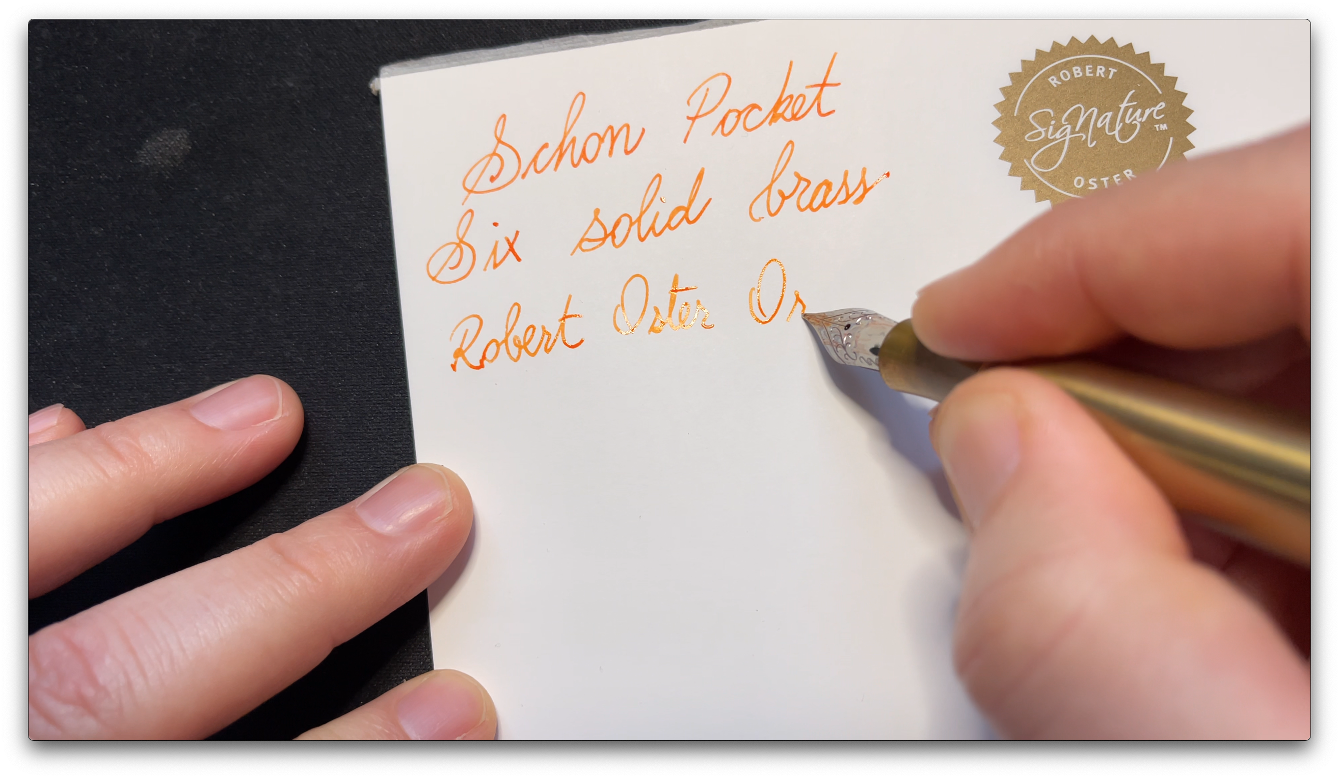
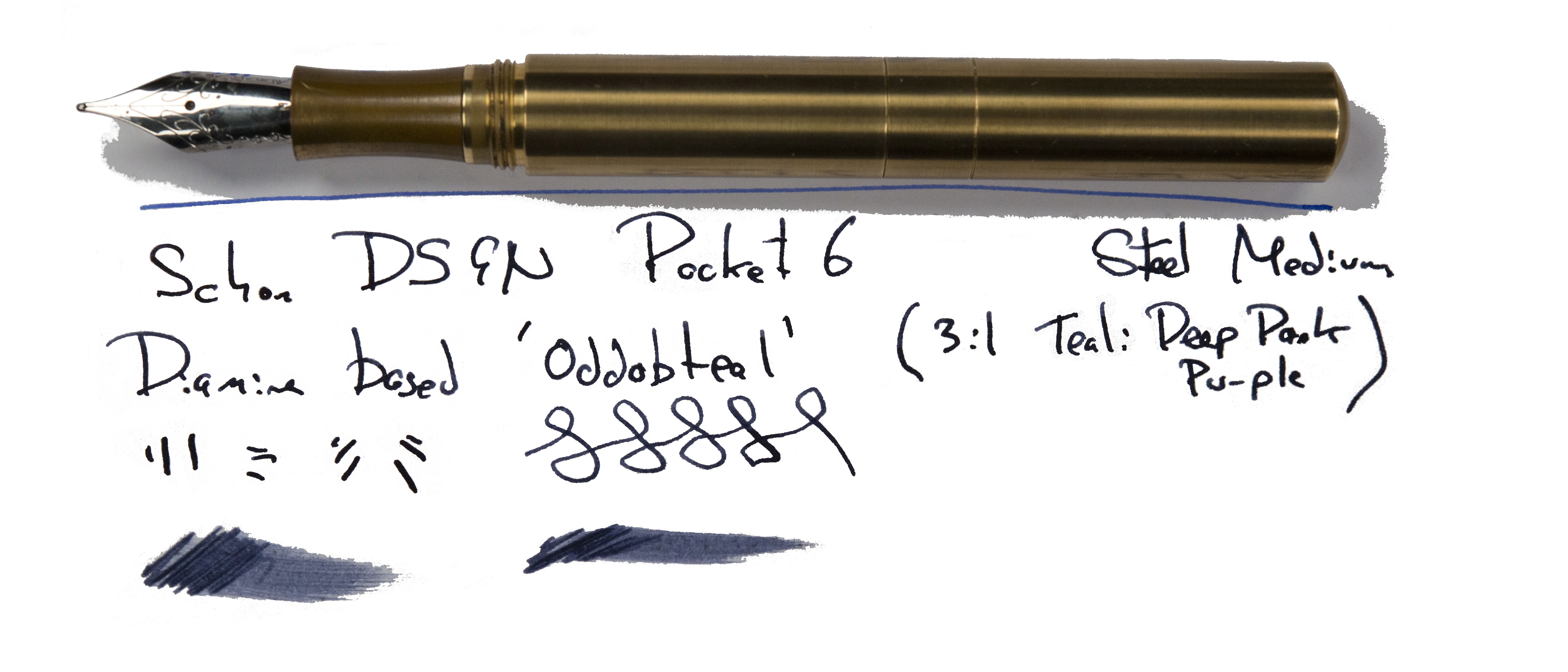
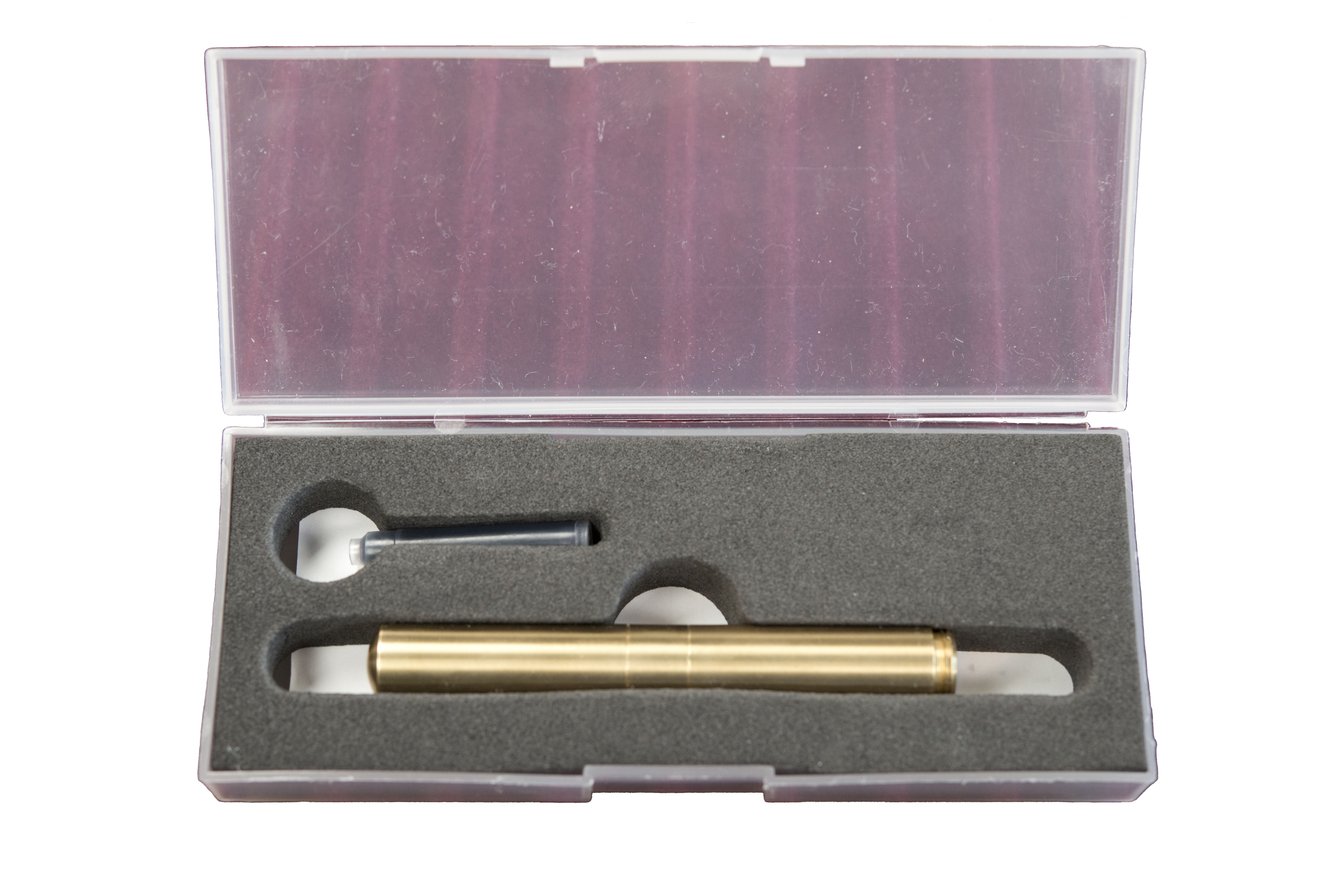 How it feels Heavy, obviously – it’s made of brass. No messing (k-bmm, tssk!). But when the Pocket 6 is fully assembled, which is easy enough with the screw-in cap posting arrangement, it both looks and feels like a fairly full-sized pen. If the weight is a bother, which it seemed to be for some of our reviewers, then lighter aluminium versions are also available – with some eye-popping paint jobs.
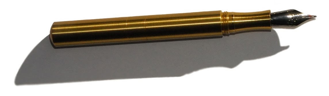
 Pen! What is it good for? Errm, putting in your pocket, maybe? It will take some bashing-about and still write well when you need it to – although the time involved in reassembling the pen before writing might not make this the ideal jotter for very quick notes.
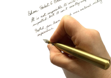
 Our overall recommendation If you want a pocket pen which last for a century and has a ‘proper’ nib on the front, this does the job in style. Just beware that the brass version is hefty, and the aluminium version seems to be very popular too, quite possibly for that reason.
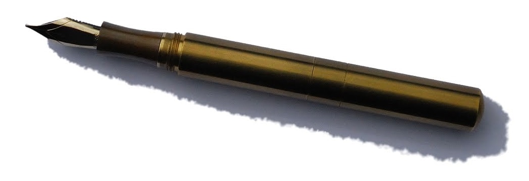
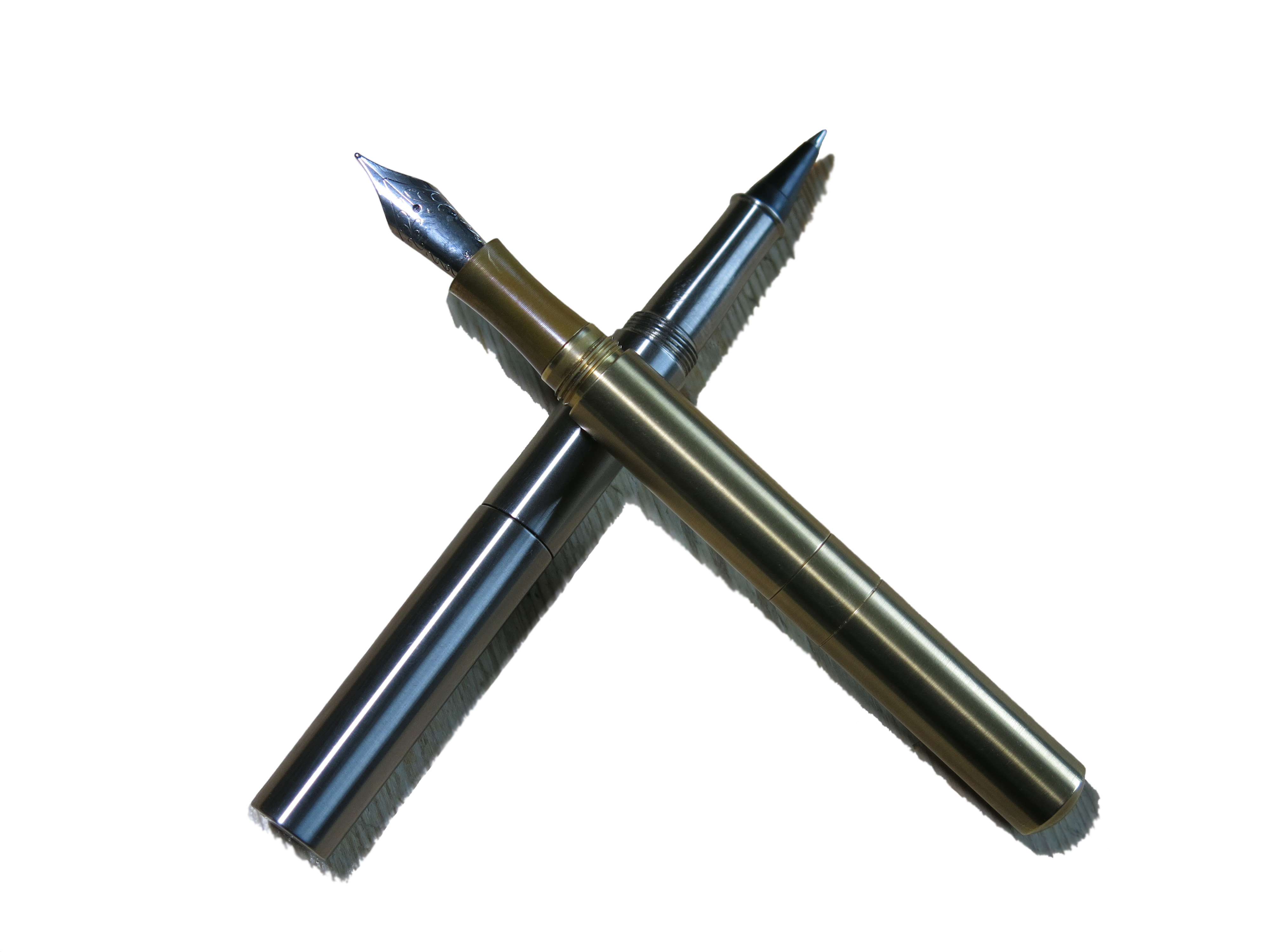
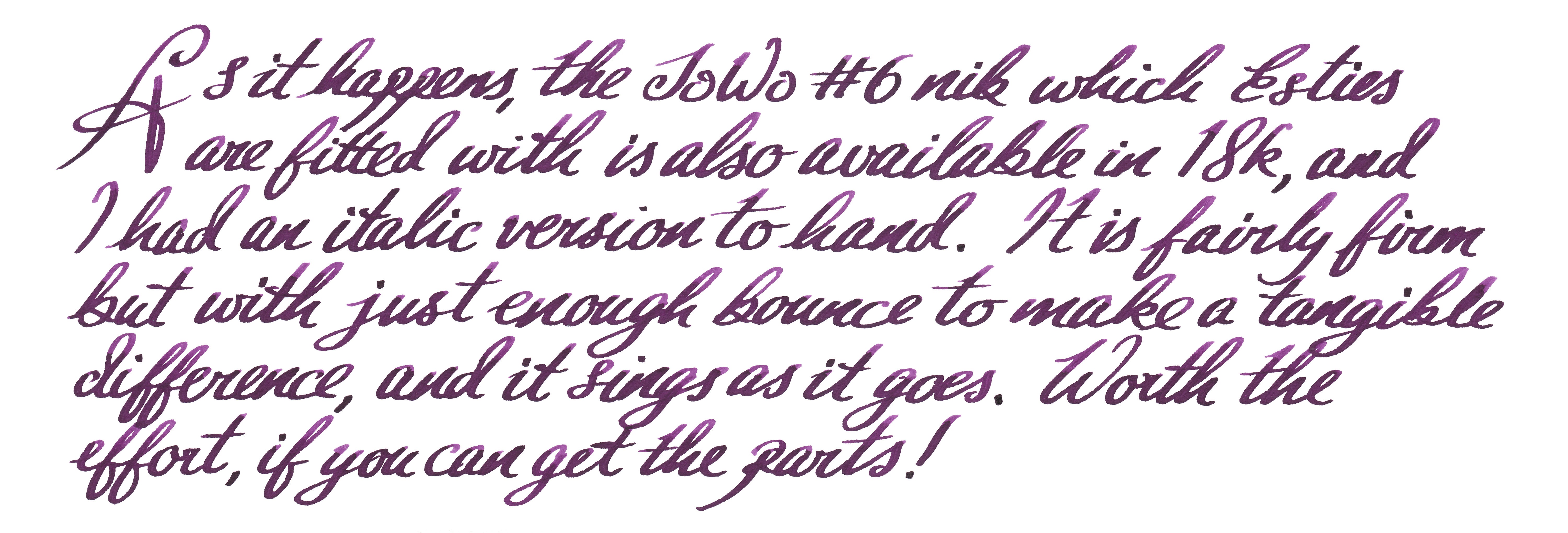
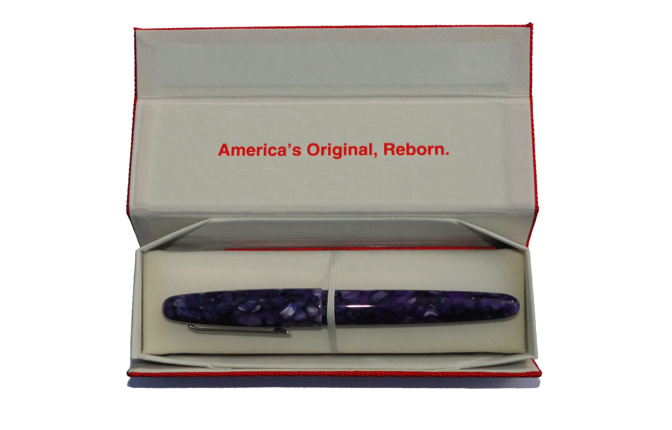
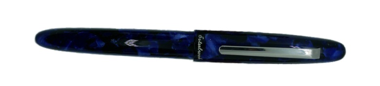
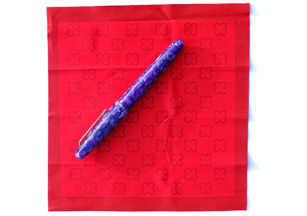
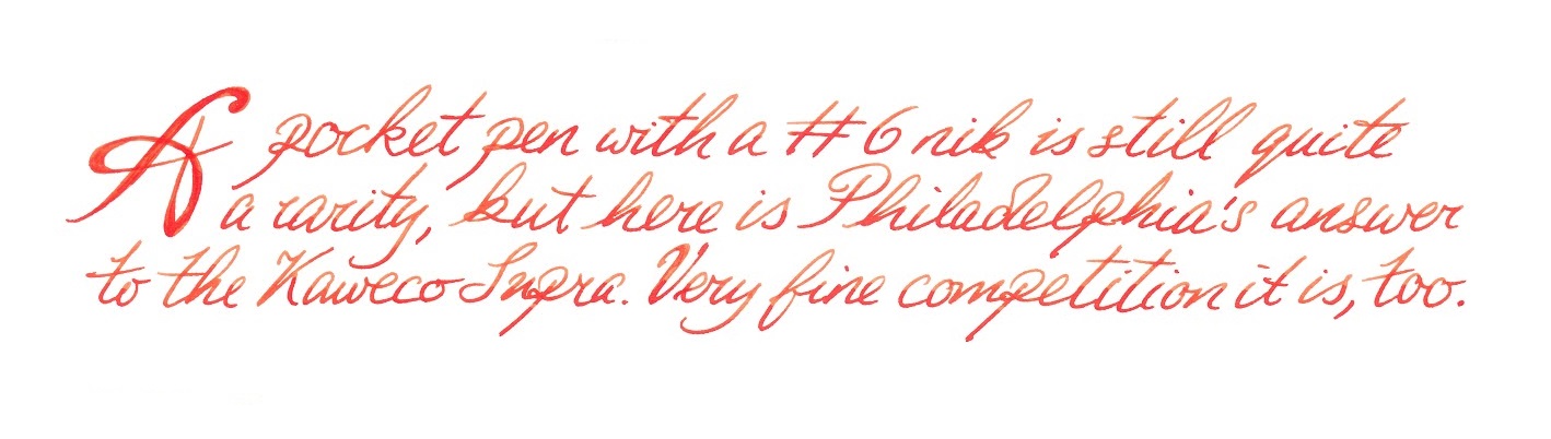
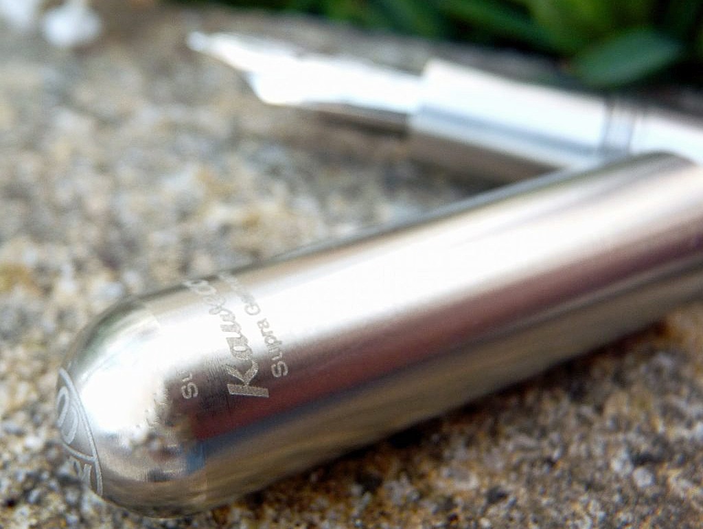
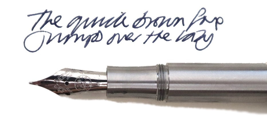
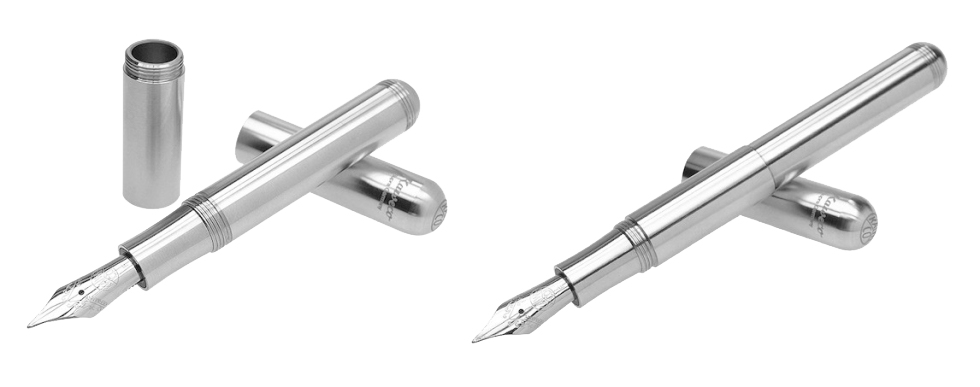
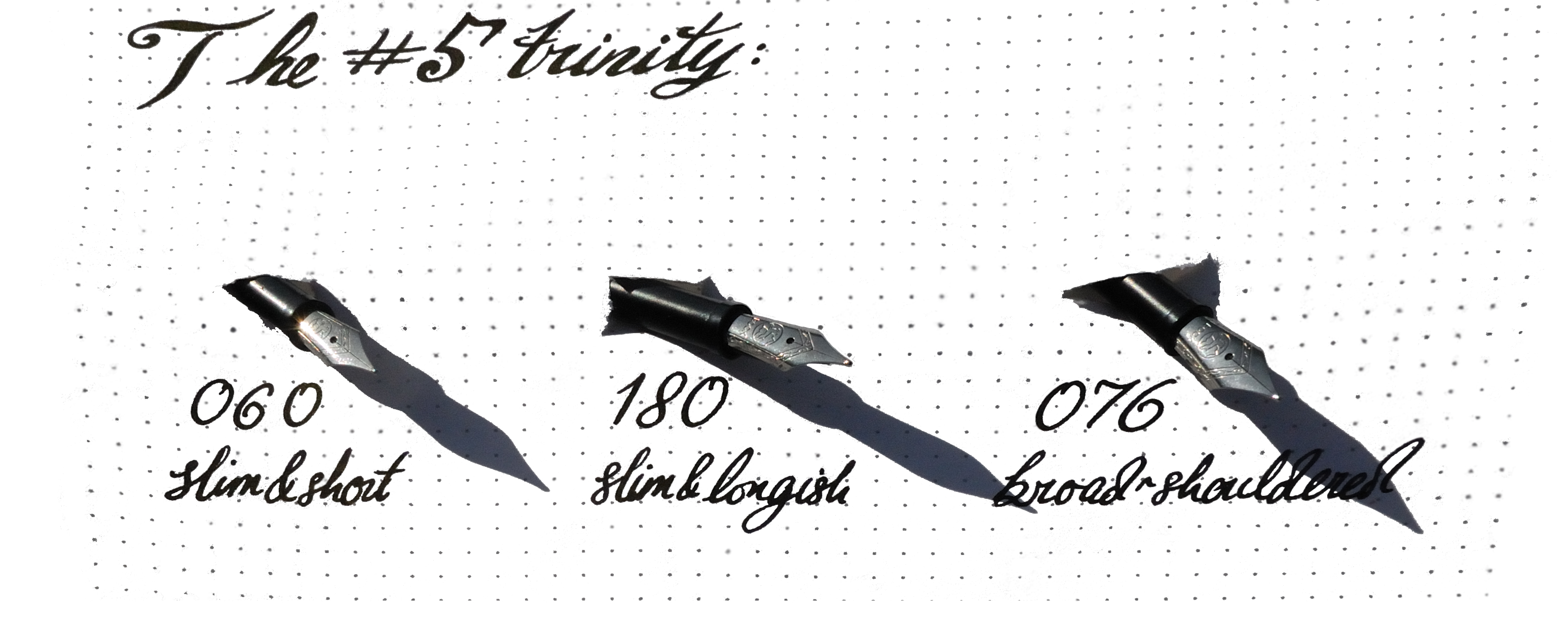
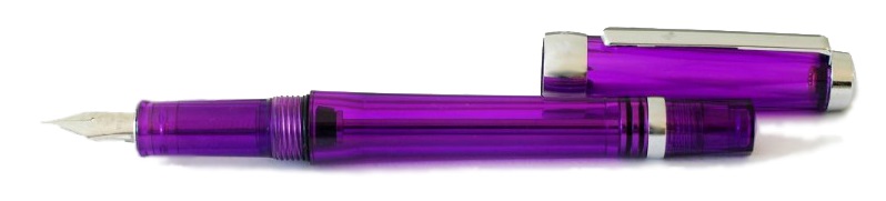
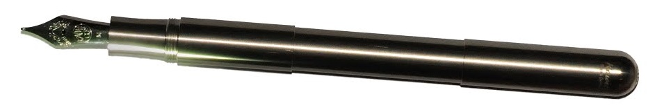 How it looks The Supra appears, from a distance, to be a Lilliput with a cinched waist. Up close, it’s evident that, if anything, it’s a Lilliput which has been to sumo training camp and bulked-up mightily; this thing has a nice big #6 nib, for starters! Then, if you remove the extension tube, it suddenly looks like a tiddler again. Hmm.
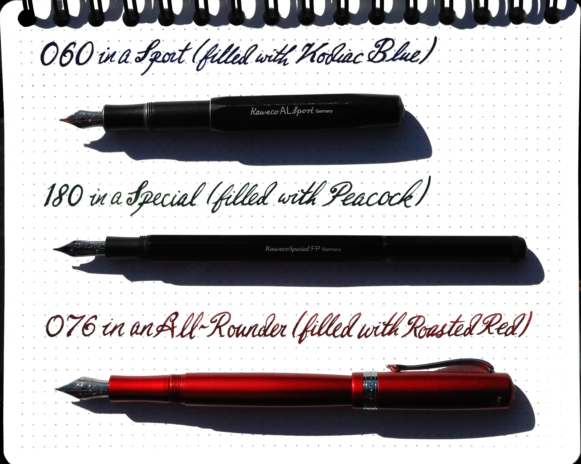
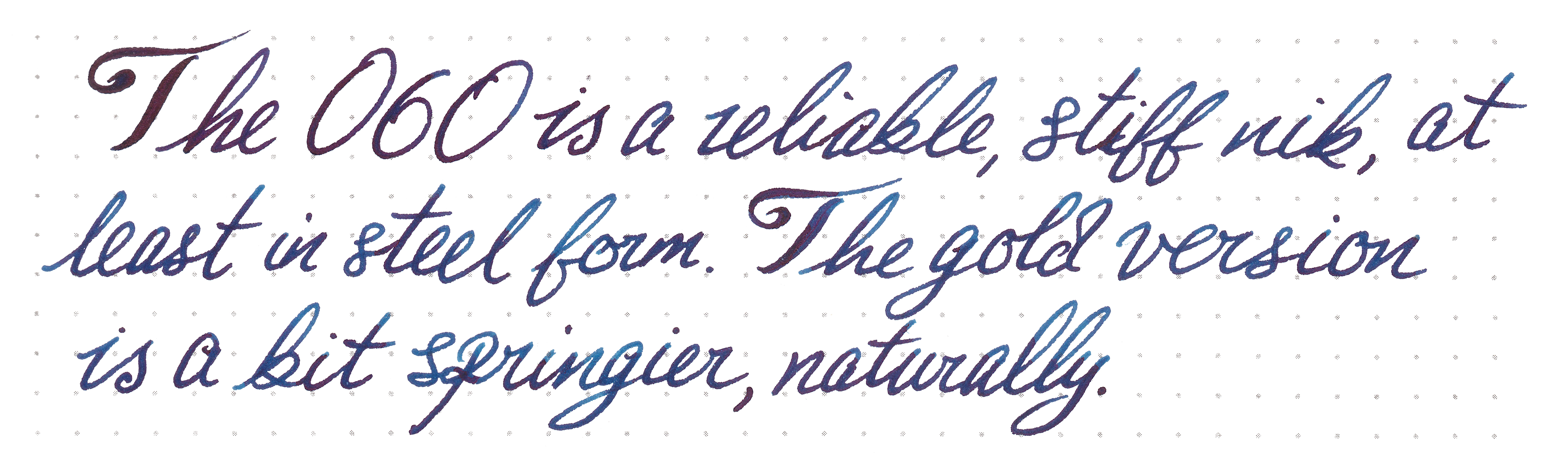
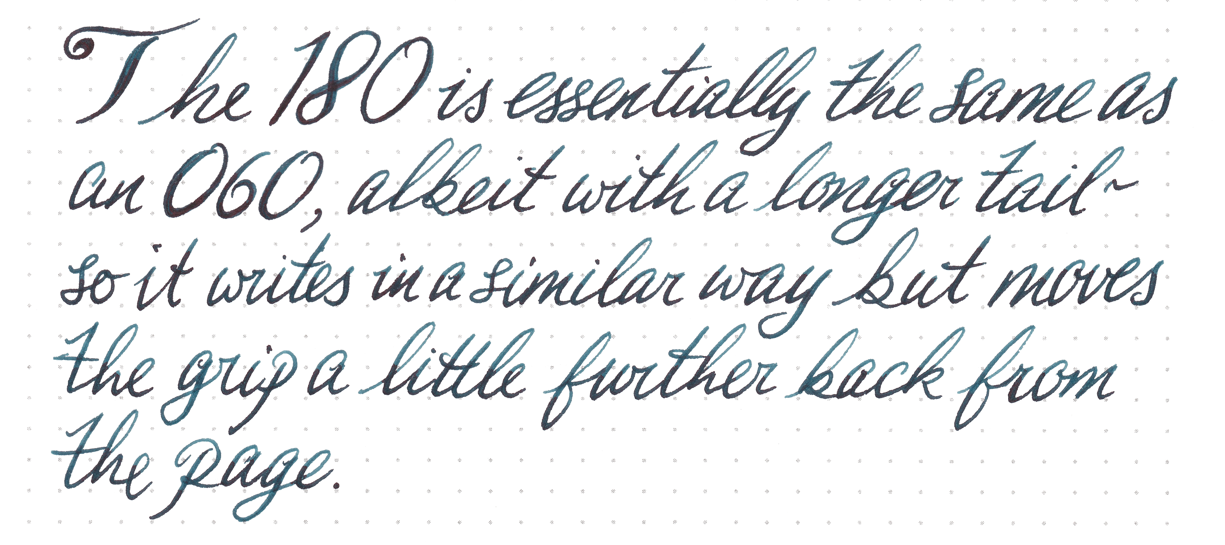
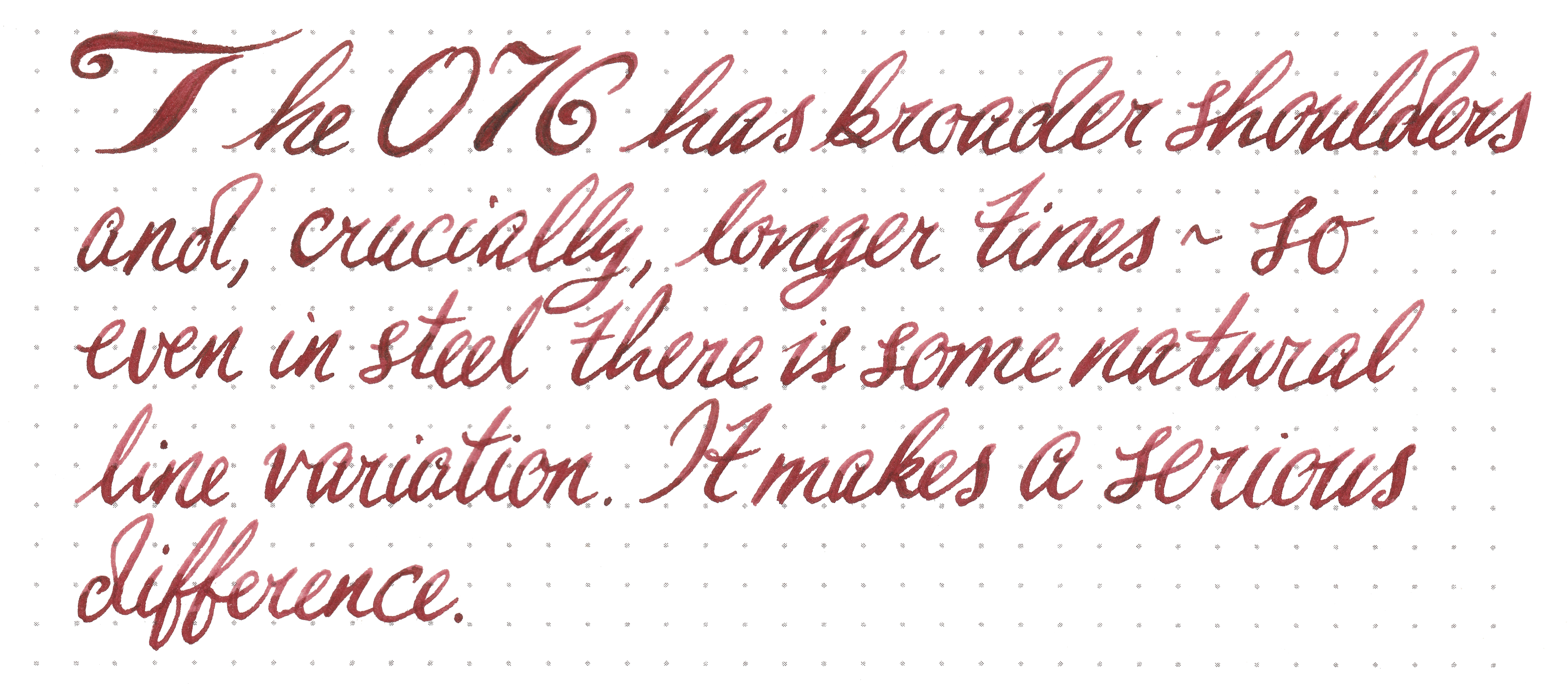
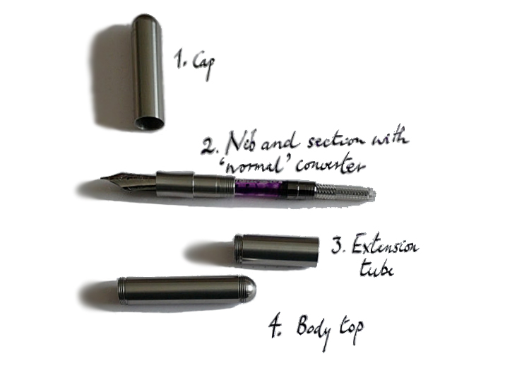 How it feels That extension is the Supra MacGuffin. Fit it between barrel and section, and the result is a standard-length pen which feels about right in the hand, albeit a little long with the cap posted. Omit the extension tube, and the Supra is a pocket pen which feels about right with the cap posted, even if the large #6 nib can be a bit of a surprise to anyone more used to the dainty 060 (small #5) of the Lilliput and Sport models. Once you’ve worked out which length works for you, this feels solid and well-balanced, although the somewhat short grip section might not suit everyone.
 VFM This isn’t cheap, with current retail prices getting dangerously near three figures. It’s a good, solid, reliable fountain pen which will probably outlast most purchasers, but that’s still quite a lot of money for a moderately stylised length of plumbing. Whether the value proposition adds up largely depends upon whether the feel of the pen works for you so well that you want to pick it up again and again. We’d really like to see Kaweco sell the unadorned short-form Supra for those who just want this, with the extension tube available as an optional secondary purchase, both to reduce waste and get that price down a little. In the mean-time, while half of our testers found the pen a bit too heavy and ‘industrial’ for their tastes, the other half loved it and two are now proud owners.
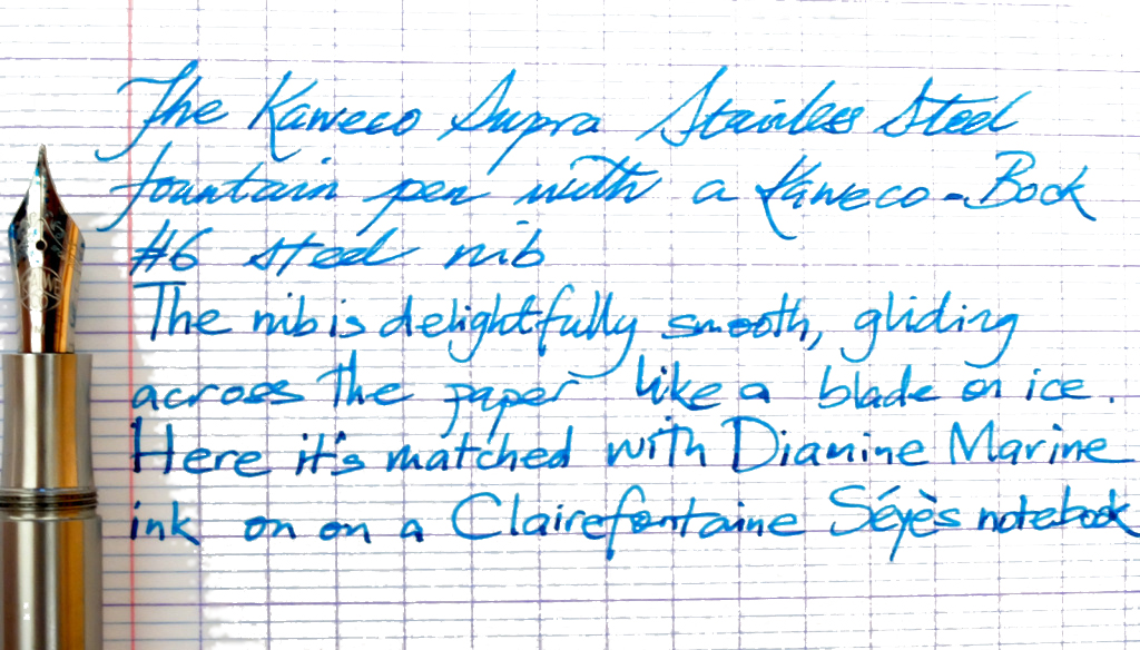
 Our overall recommendation As is so often the case, try before you by. As a heavy, uncompromising and essentially indestructible pen it won’t be everyone’s cup of tea. But if you’re the sort of rugged EDC fan who likes to be able to smash your way out of a burning car using the same pen that you deploy to write a note to the insurers immediately afterwards, a Bauhaus-toting art-school grad with strong hands, or just a sniper with literary aspirations, this is absolutely the pen for you.
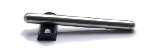
 This meta-review references:
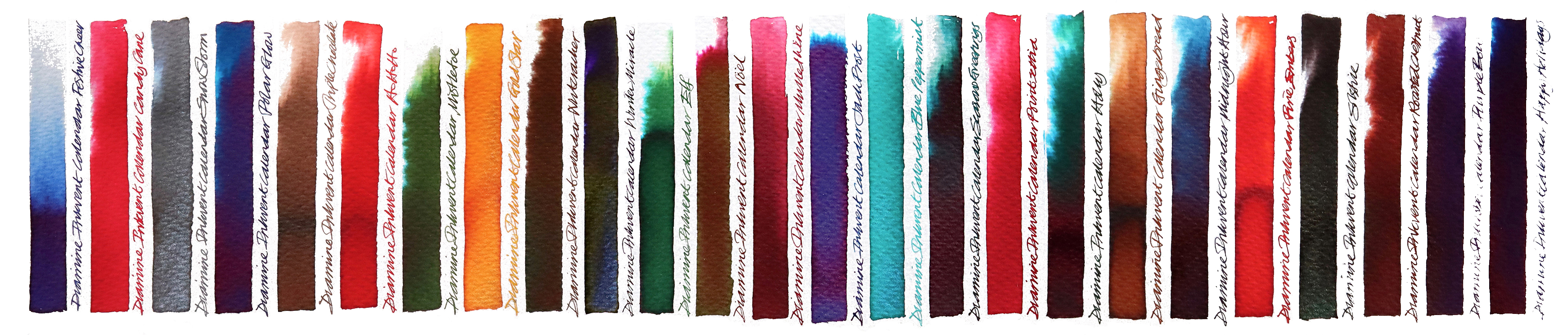
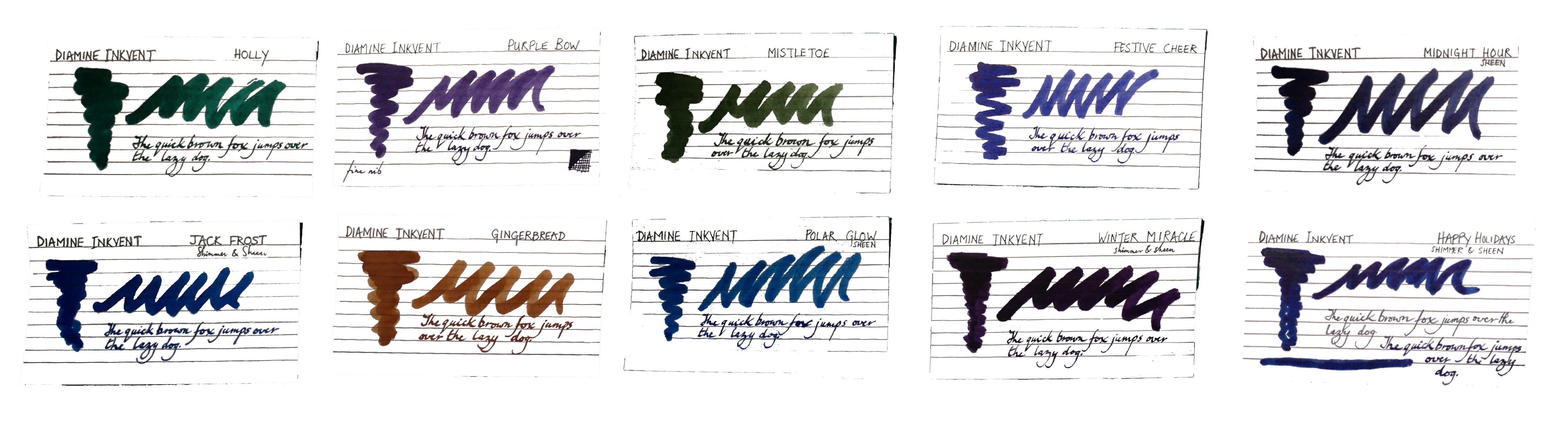
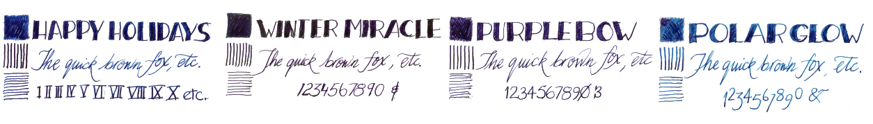
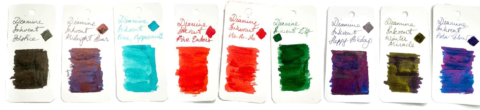
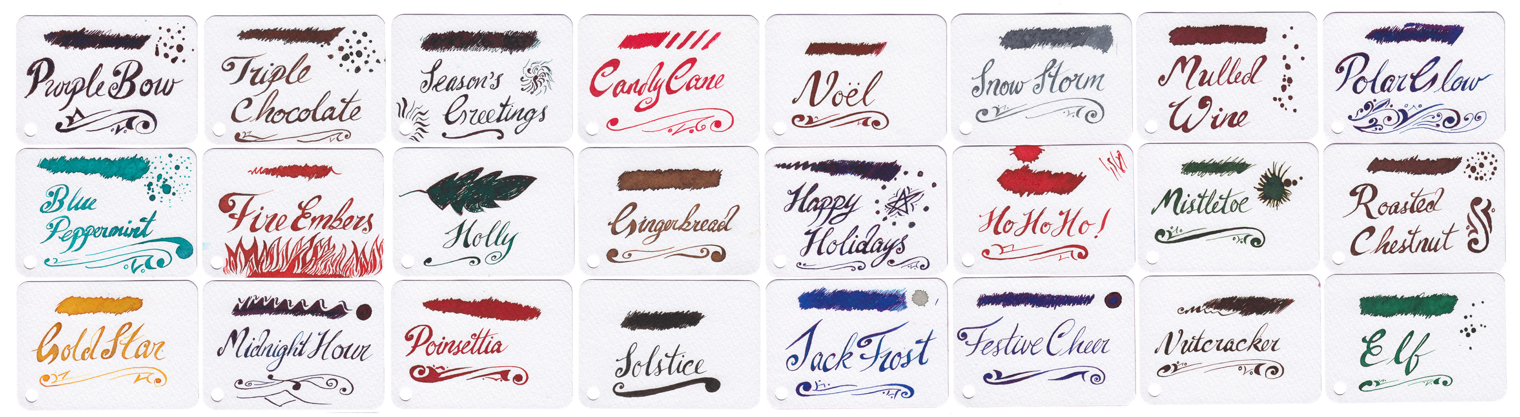
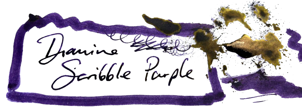
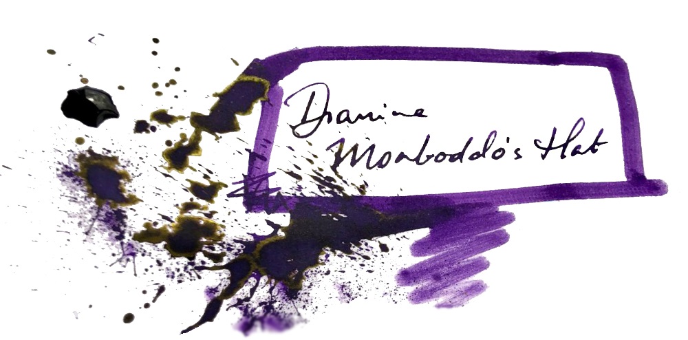
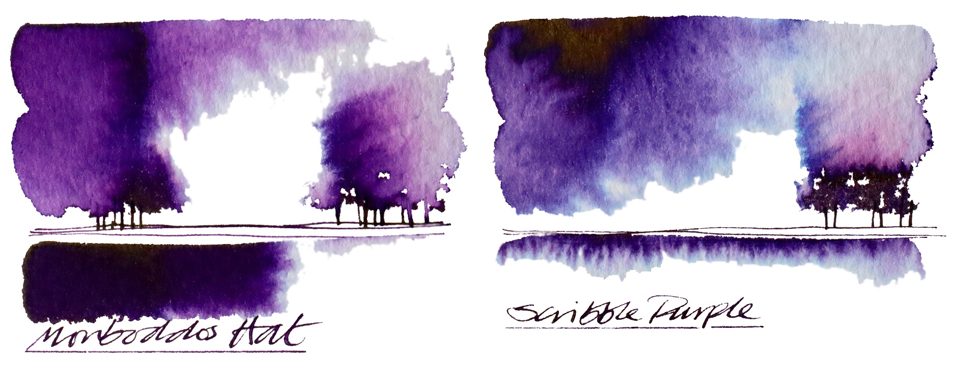
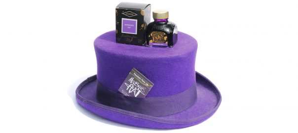
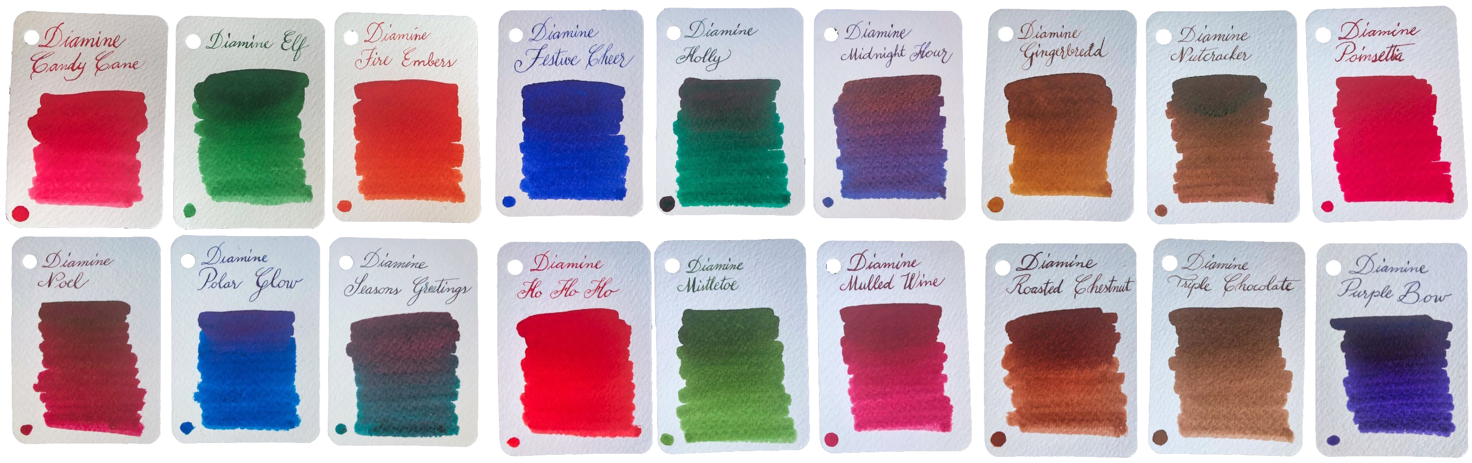 How it looks It looks much like an ordinary advent calendar with something boring like chocolate inside, but that’s just a cunning disguise. There’s a jolly snowman design printed in blue, which might be why the inks are now labelled as ‘Blue Edition’… but that’s probably not what you wanted to know about. The new bottles are amazing four-legged contraptions which look like they could canter away at any moment if you don’t put down that wretched ballpoint and play with a real pen. But perhaps that’s not what you’re after either? Oh – the inks!! Well they look amazing as a range, don’t they? We were a little surprised to find quite so many browns and dark greens, but the whole palette of midwinter hues is here. There are also plenty of traditionally festive reds, some very groovy blues, a gold, a silver, two cracking purples and a terrific turquoise. Unusually for a set released together, some are ‘solid colours’ but many feature sheen, shimmer or both, which is showing off really, but if you can’t do that on special days when can you?
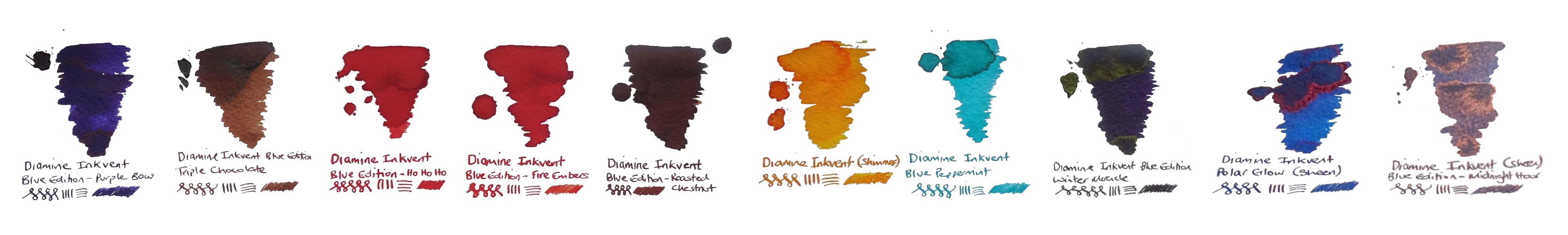
 This meta-review references:
 Thanks to Diamine for inundating us with a postcard from quite near North Wales, actually, and an awful lot of sample pots.

 We start with a hat-tip to fellow stationery bloggers who run a news and update service of their own – but we don’t see them as competitors, because it’s a small world out there – positively a nanosphere, in fact. A subscription to the
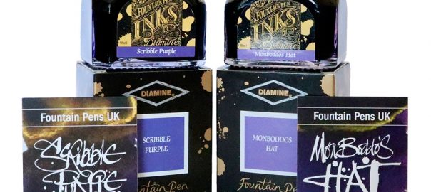
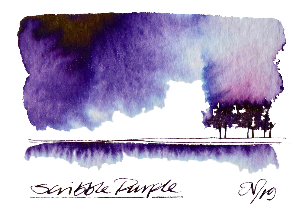
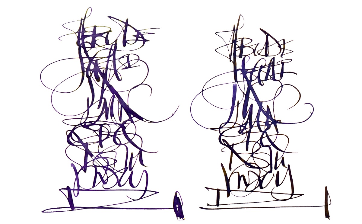
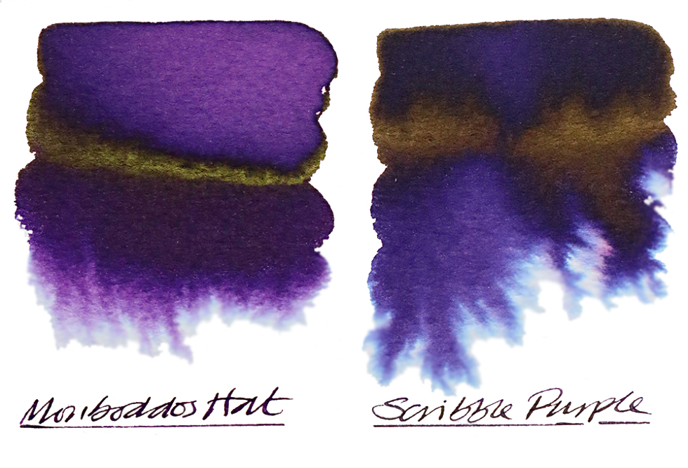
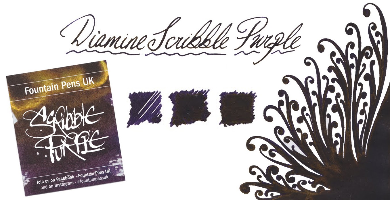
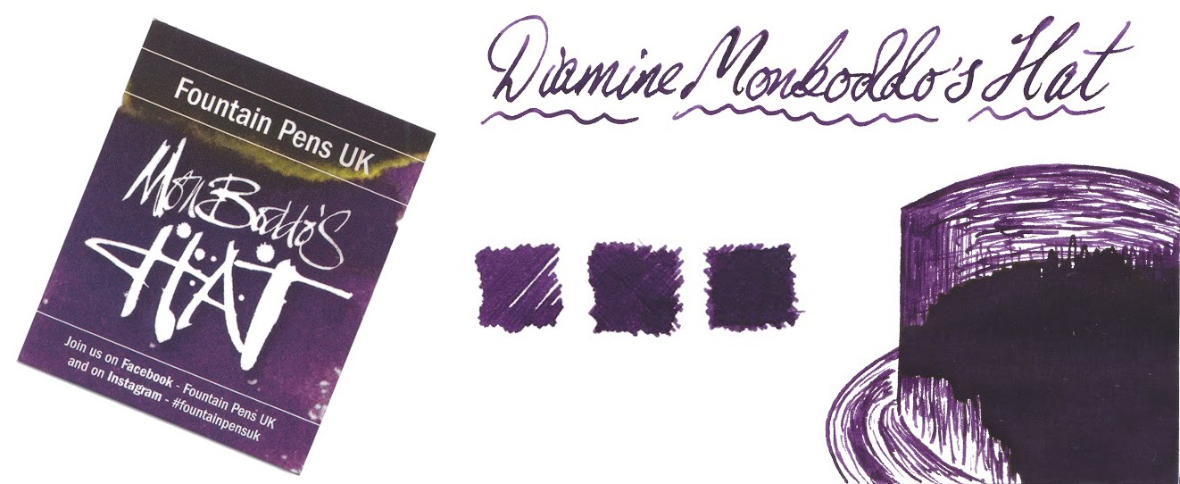
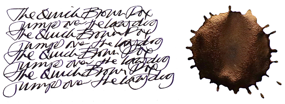
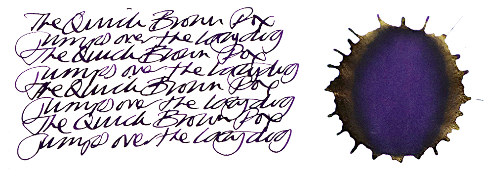
 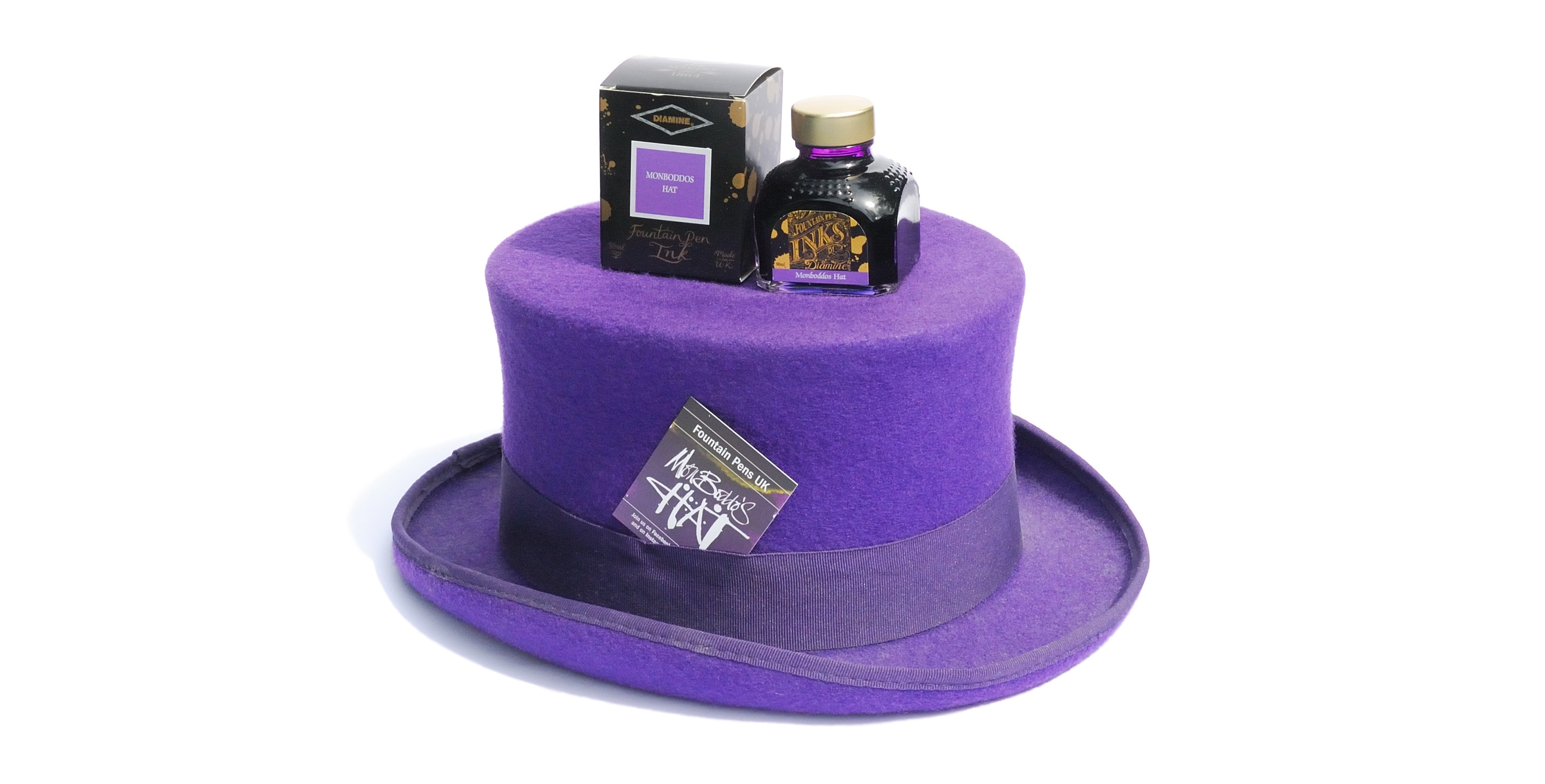 Talking of hat-tips, the Fountain Pens UK group on Farcebook have collaborated with Diamine to produce two terrific inks,
 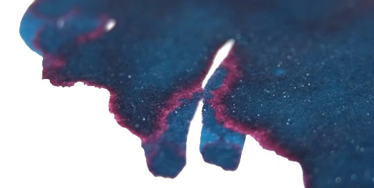 Diamine are all over the electric high street at the moment, with a new ink to celebrate fifteen years of Cymru’s finest nibtacular retail establishment, Pure Pens. Their
 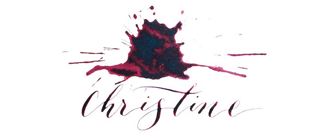 Not be outdone, Cult Pens have exercised Diamine’s finest minds and then named inks after them – and thus Chris and Phil can now now fill your converters as well as answering your emails. Philip, in particular, is a
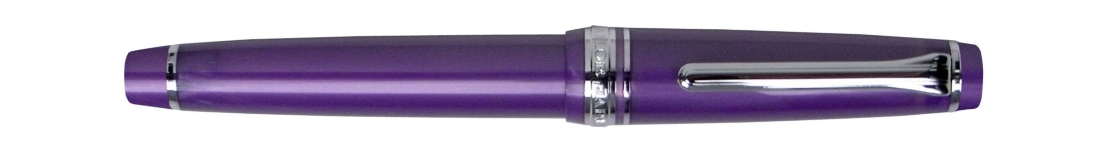
 …while Andy’s Pens now include a cheeky Vac700 impersonator, the
  Write Here’s ex-OMAS friends at ScriBo are sticking with greens and blues so far, but the latest incarnation is looking
 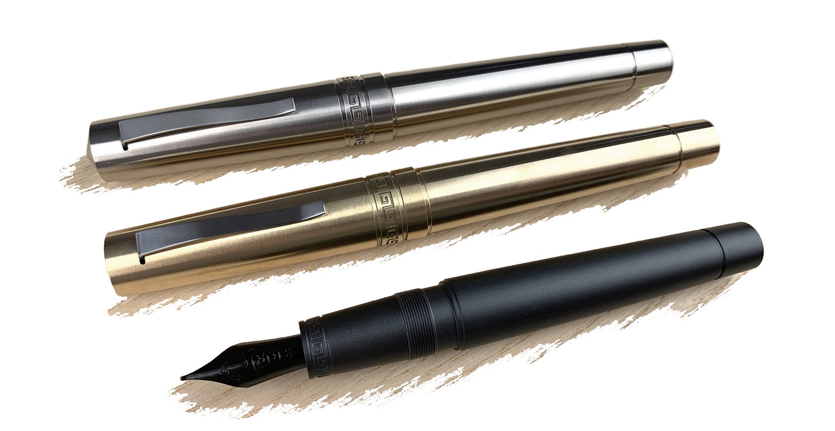 Beyond these shores, Californian firm Ensso are back on Kickstarter with a very tempting metal offering, the
  Finally, something to look forward to if we survive Hallowe’en after all. Roy from the mighty Izods is organising a new pen show just south of Marylebone on the 13th June 2020, and there are even rumours of Robert Oster flying in himself! Watch this space…
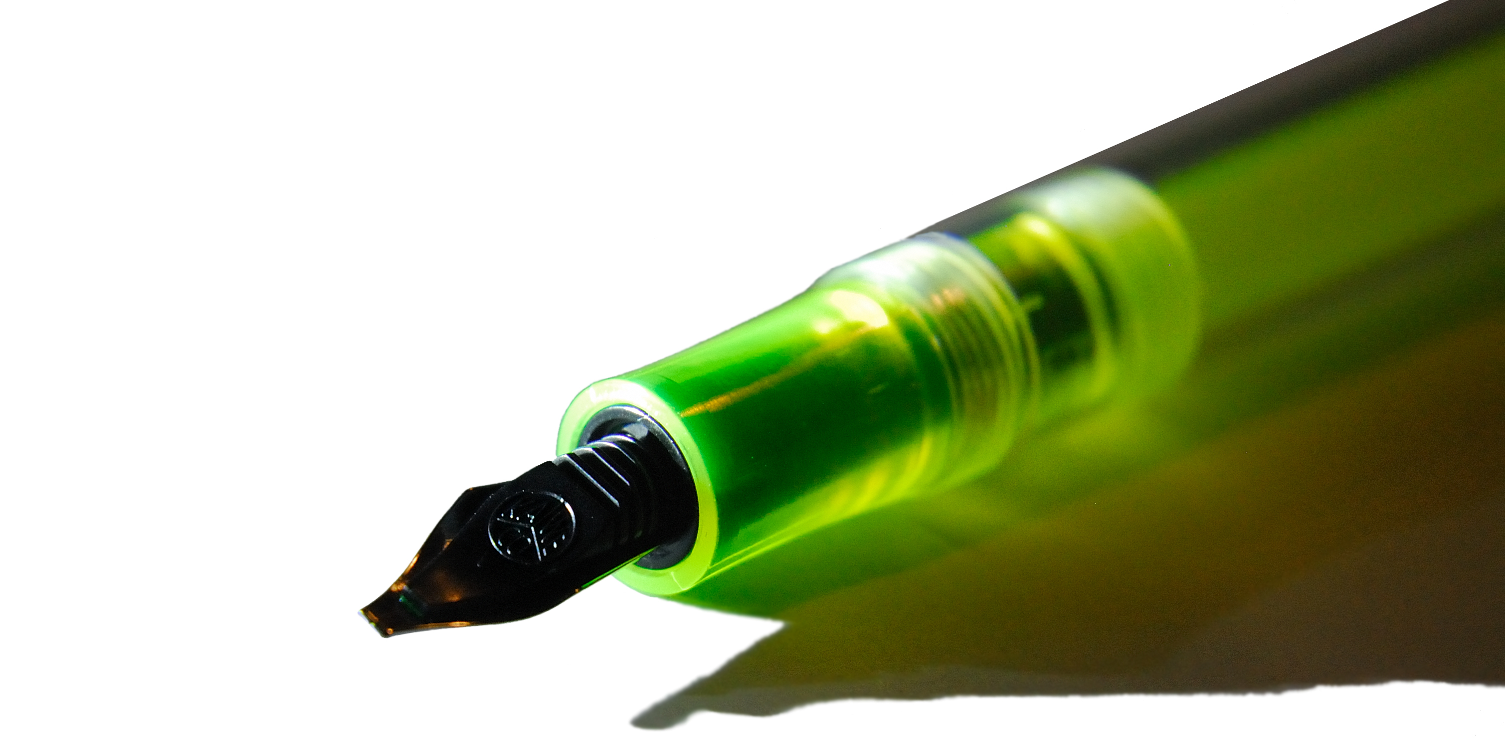

 A little bit of history On the other side of the Atlantic, different religious sects still have their own universities; you can, if you so wish, attend seats of learning gathered under the sway of belief systems not even recognised by the rest of the world, but we shall name no names. A Jesuit university is a relatively mainstream concept compared with some of the more outré outliers, albeit perhaps a surprising place to train as an industrial chemist – but Frank Honn graduated from one such, and went on to discover a novel use for the fluorescent dye pyranine as the first highlighting ink. It was a success, by any standards, and generations of pupils have grown up with felt-tip pens full of the stuff ever since. But felt-tips are horrible, and fountain pens are not, so Kaweco set out to make a highlighter that persons of taste might actually be able to contemplate using.
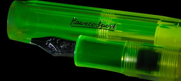
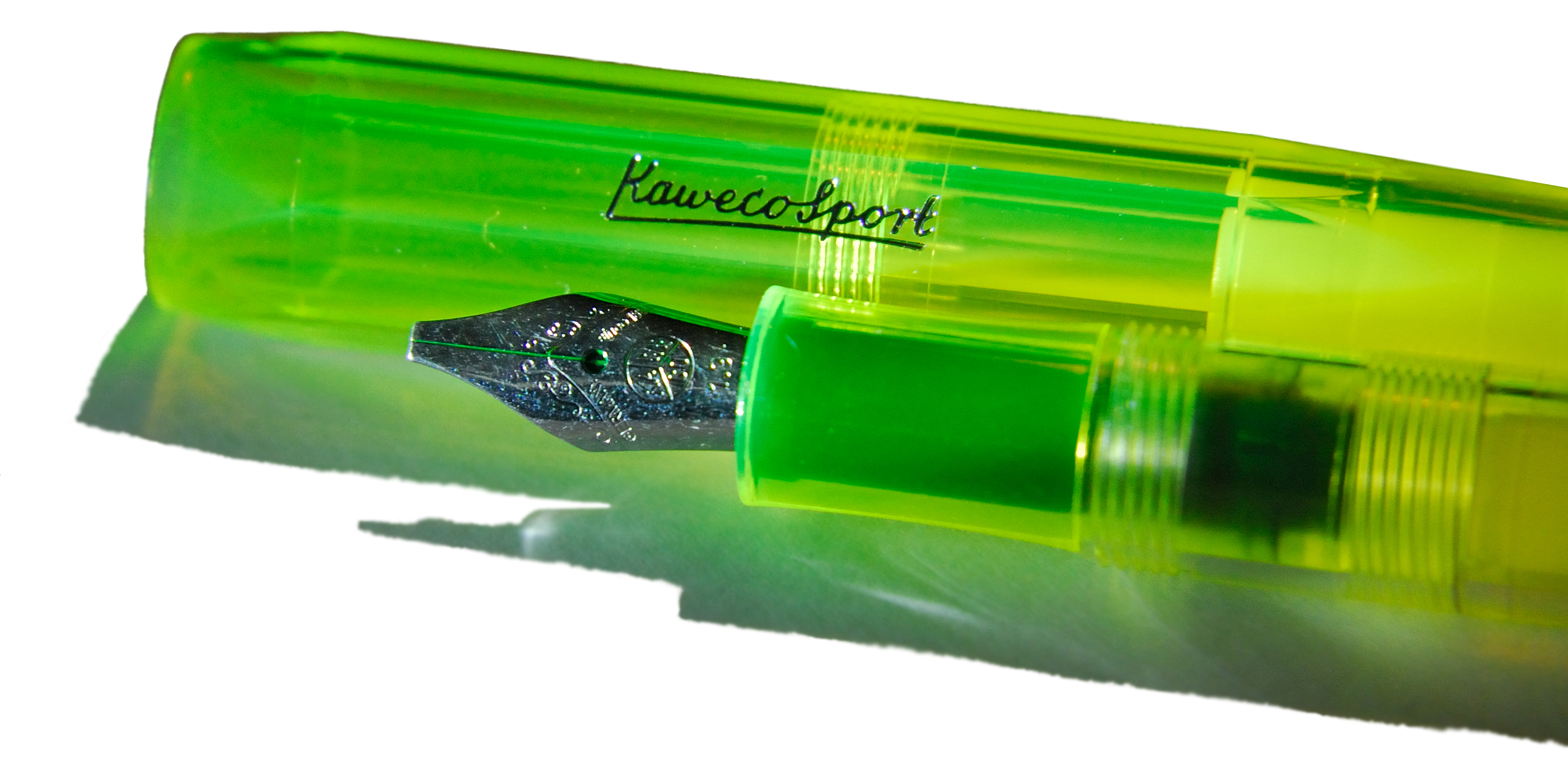
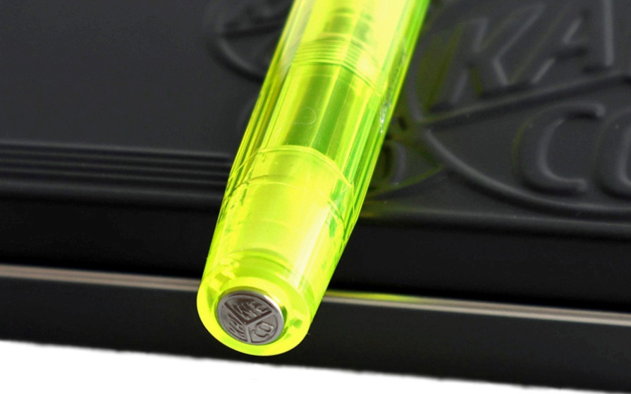
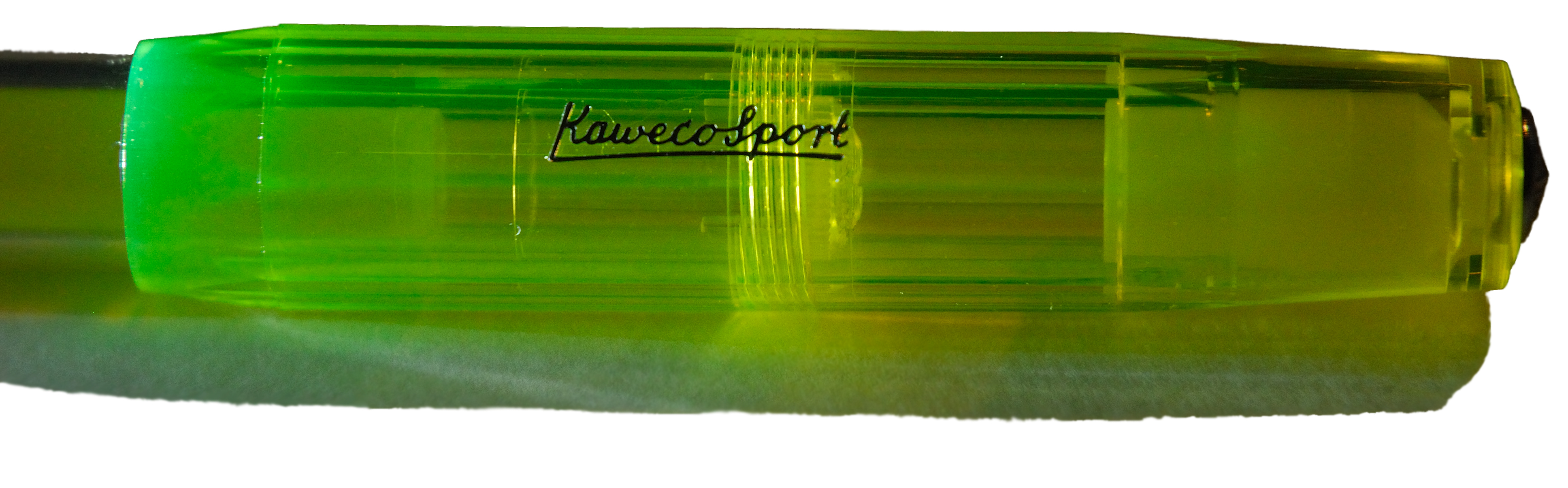
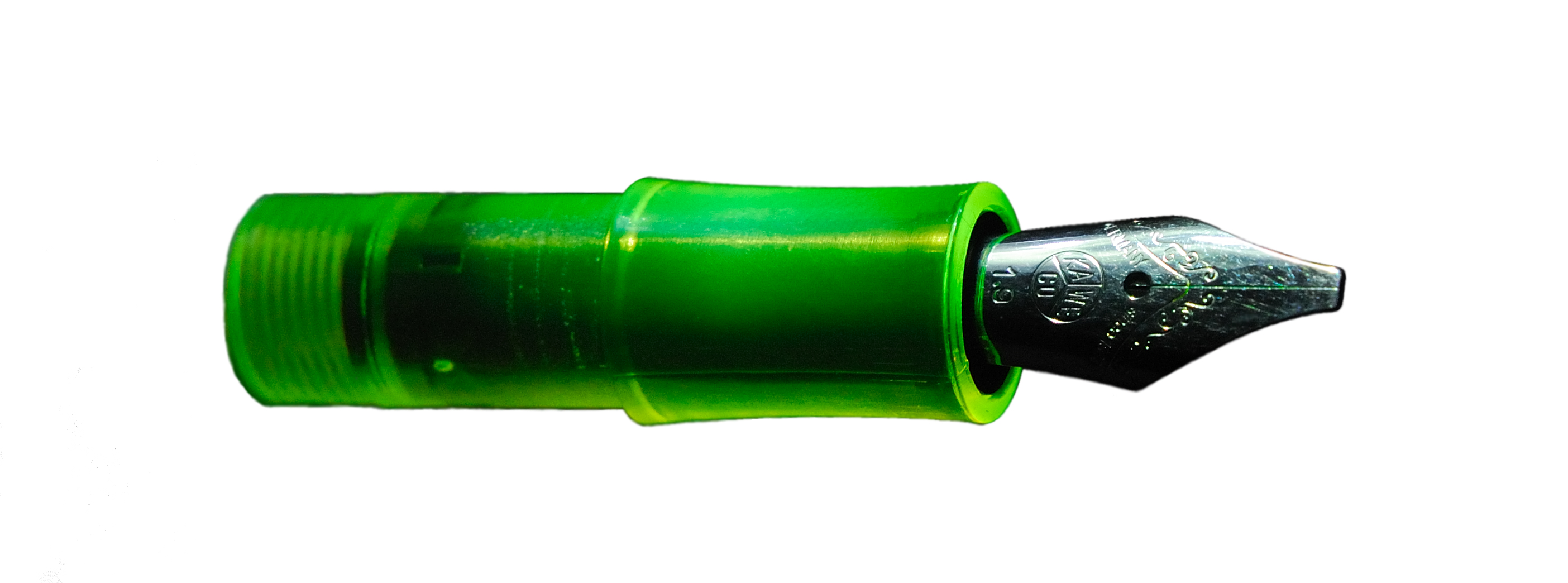
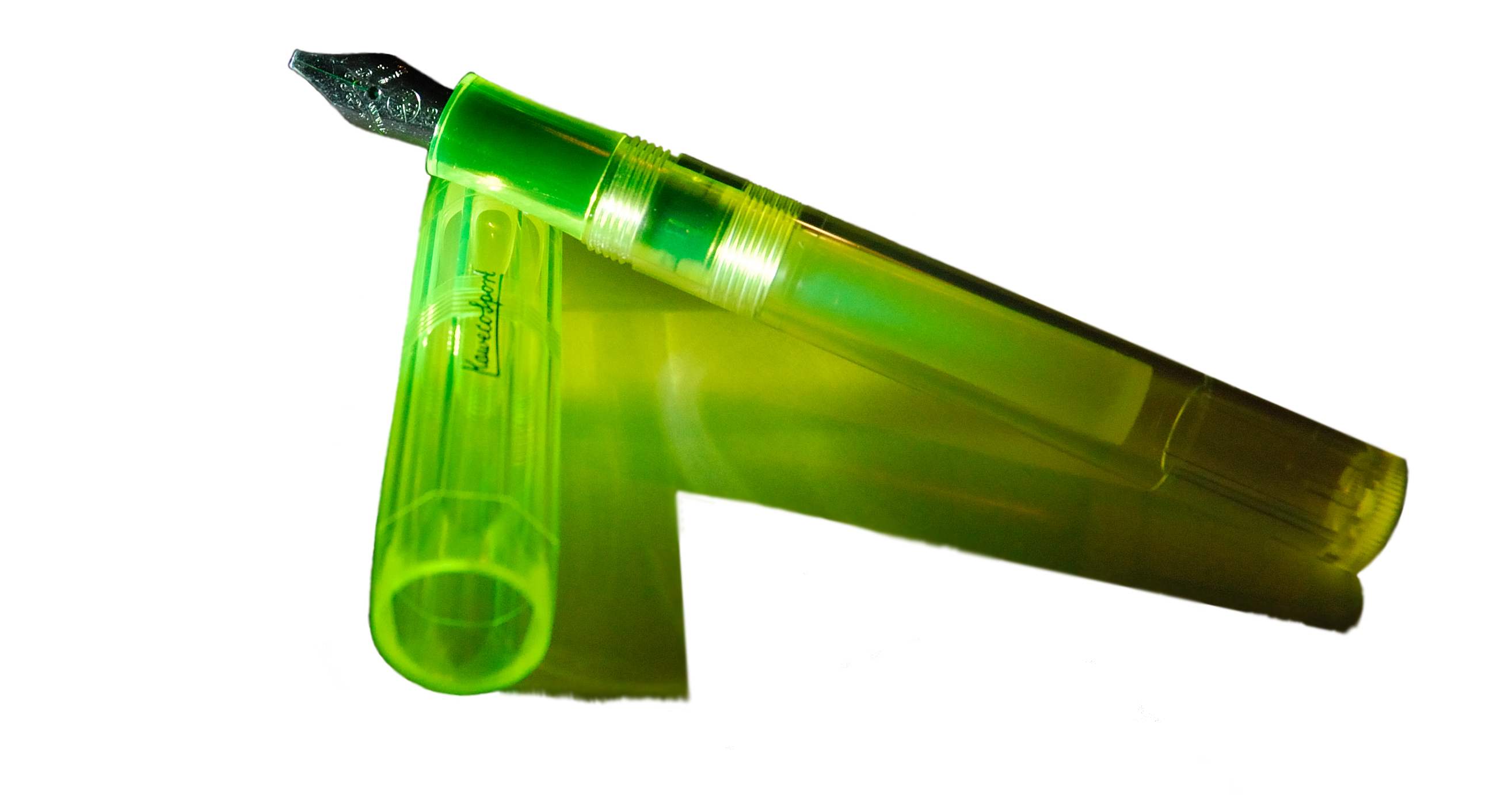 How it looks Did we say this was tasteful? Well, maybe it depends upon your own taste! It’s certainly rather loud – but there’s no mistaking what it’s for.
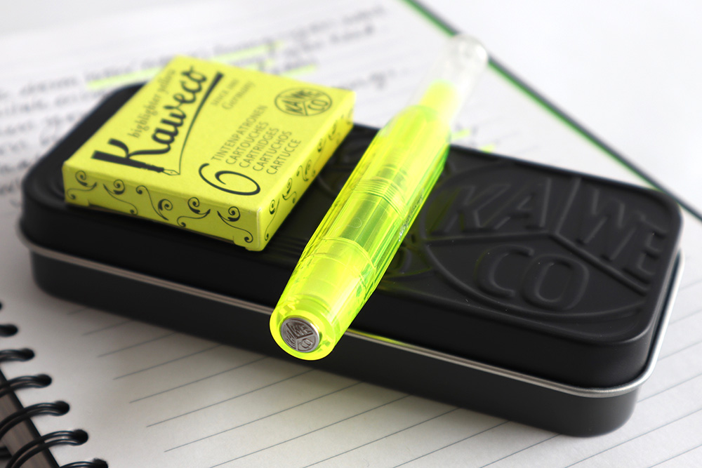
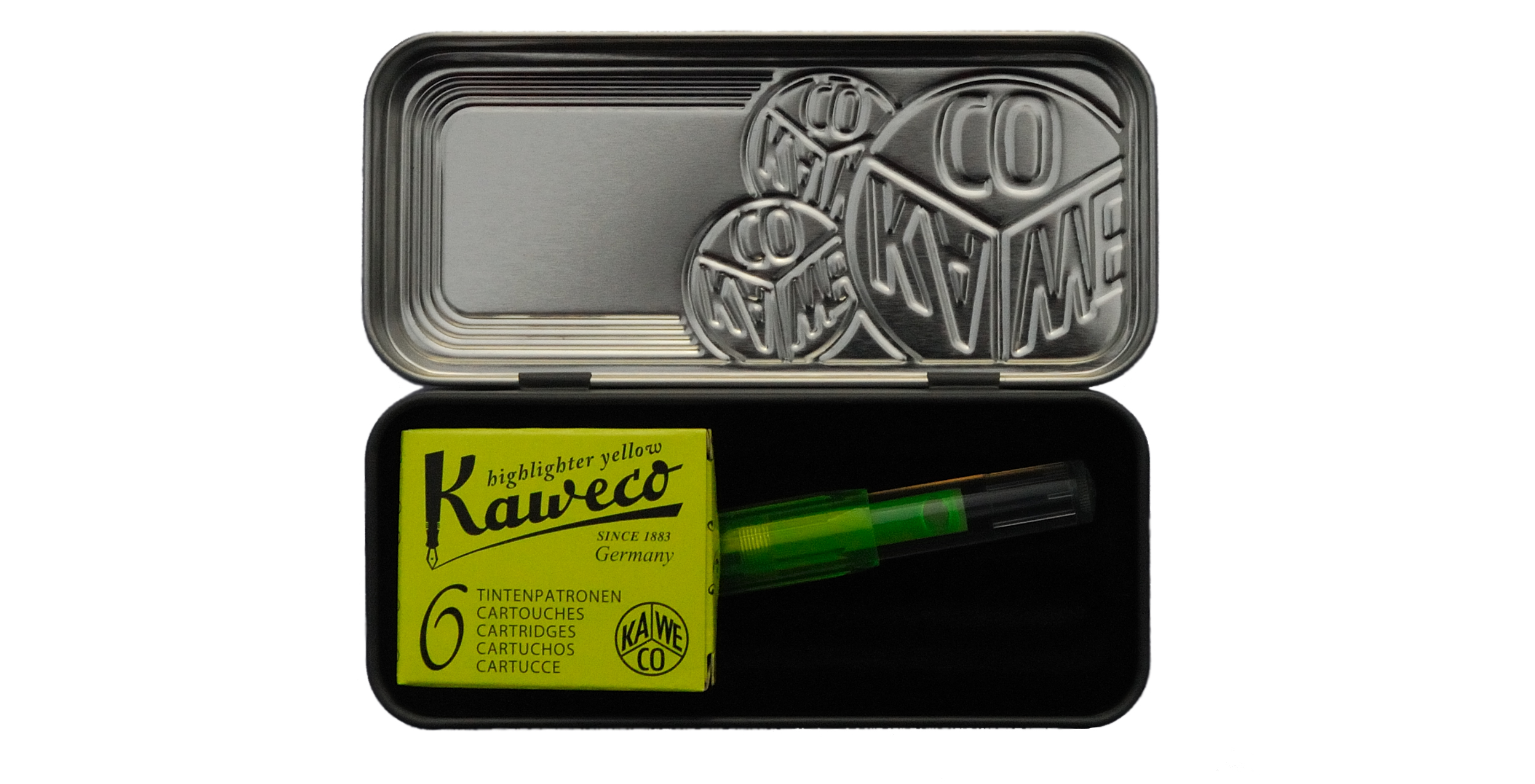 How it fills Via cartridges specially filled with unworldly glowing fluids.
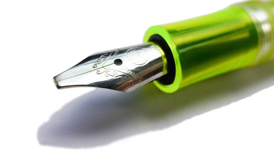
 Our overall recommendation Think about whether you really do all that much highlighting, and perhaps invest in a pack of the highlighter ink cartridges first to see if you take to using an italic fountain pen for this purpose – but if the answer to both is yes then this is, like pyranine, a ready solution.
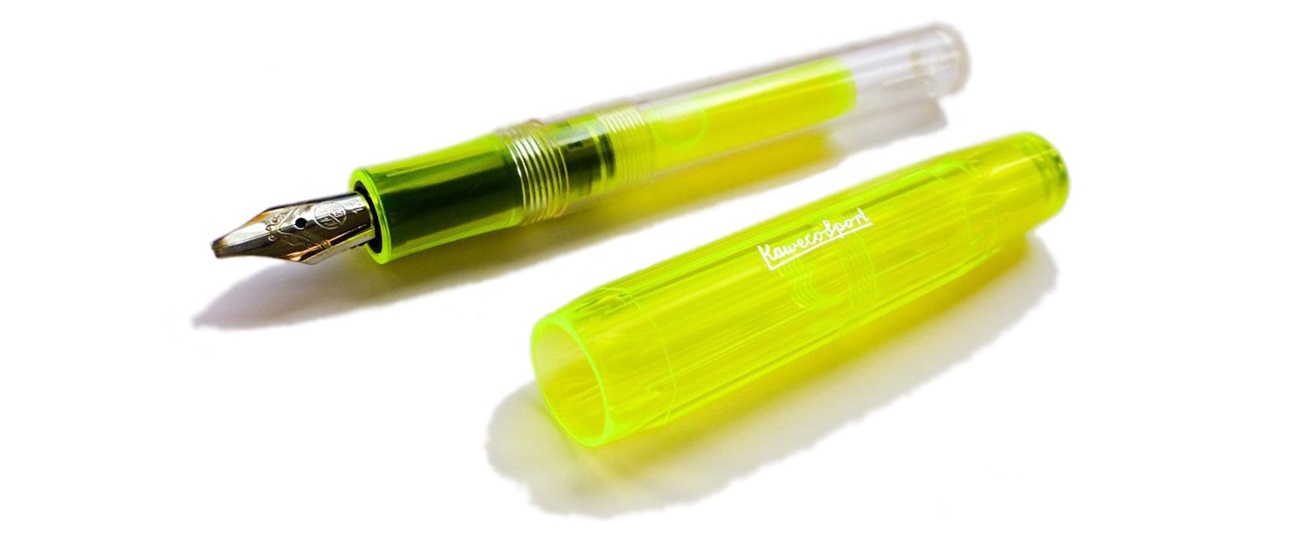
 This meta-review references:
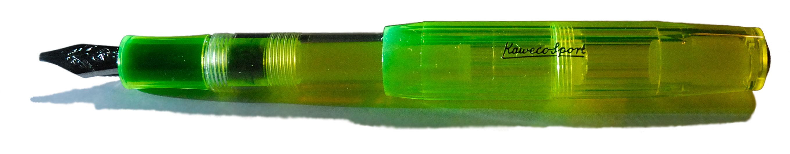 Thanks to Kaweco for the review sample.