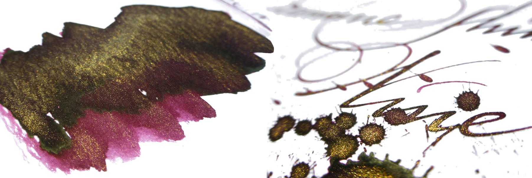
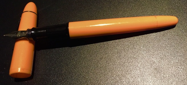
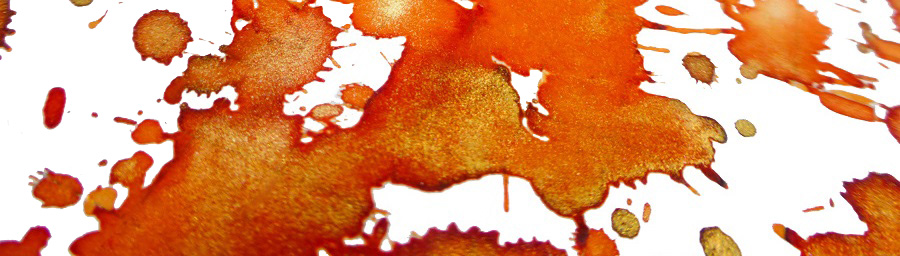
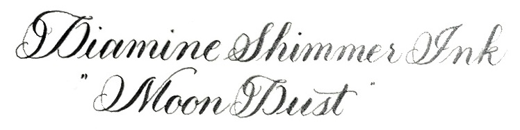
A little bit of history Some time during the Caledonian Orogeny, around 490–390 million years ago, the Great Glen Fault formed. Wind forward a few aeons and the trench this left cuts a swathe across Scotland, including the very well-known Loch Ness and, just to the south, the rather tautologous Loch Lochy, near which is the home of Beaufort Ink. Despite the name, Beaufort Ink have made their way in the world selling nibs and pen-turning parts rather than ink – until now. Now they’re making up for lost time, and then some!
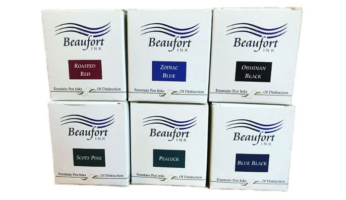
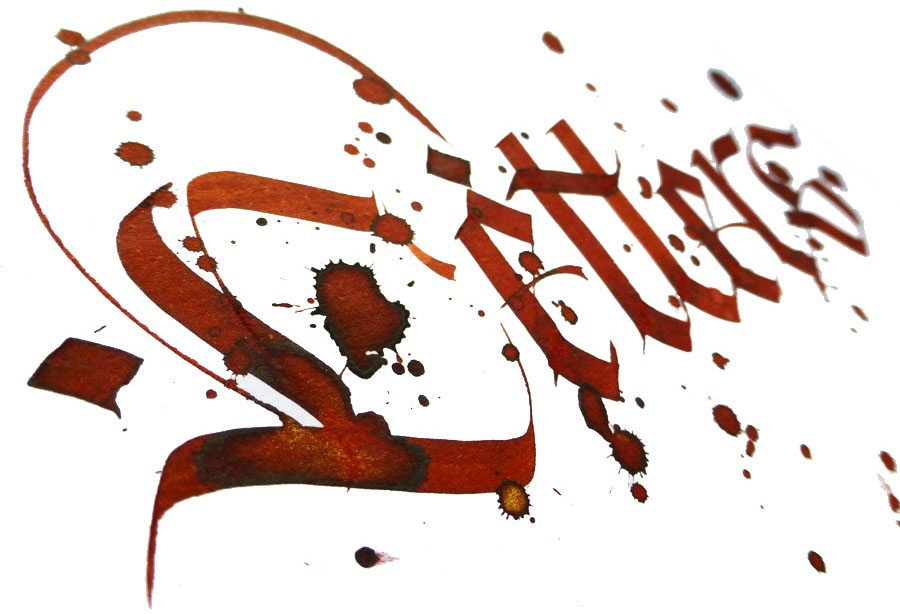
How it looks As an ensemble, this is a set of inks which immediately conjure up visual memories of the Highlands – which the creator insists is entirely accidental, but we’re not complaining! They deserve a brief review one by one, and they shall jolly well have it too.
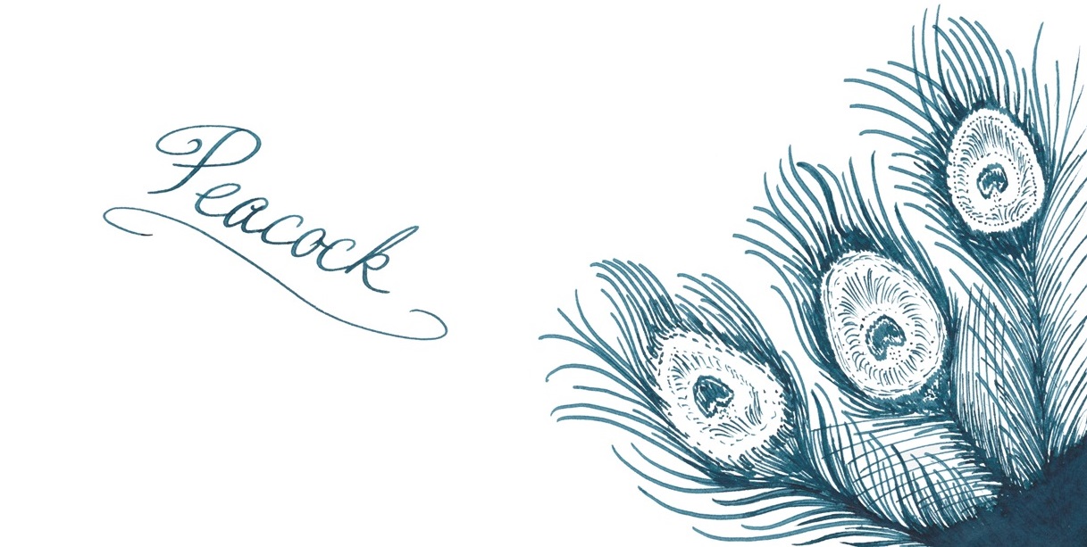
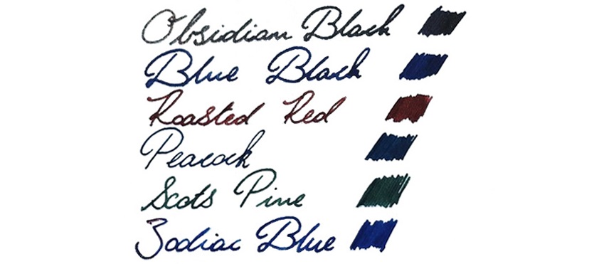
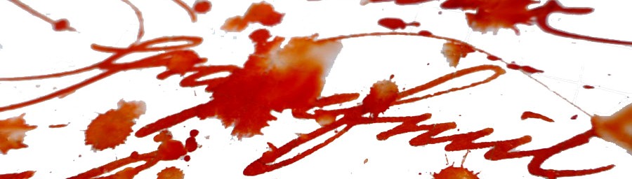
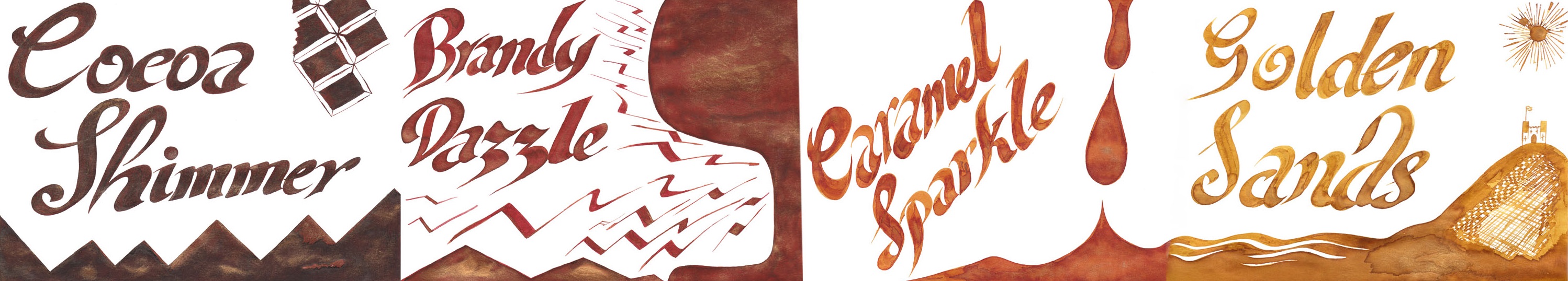
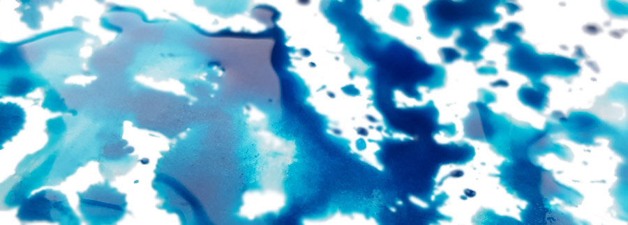
Peacock This is where the whole range started, as the Beaufort supremo is a confirmed teal-head. A deep, rich and very dark turquoise, this is somewhat reminiscent of Sheaffer’s long-lamented Peacock Blue – and has won plenty of fans in the United Inkdom ranks.
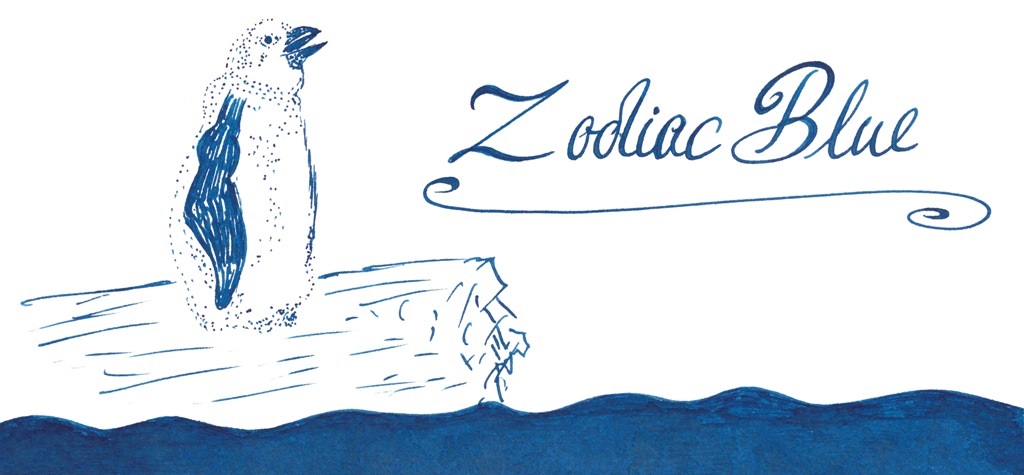
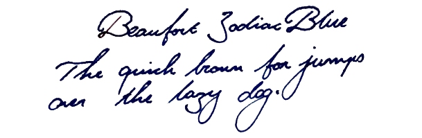
Zodiac Blue nicely echoes the blue of Arctic waters, as viewed from a Zodiac boat. It’s a long way from boring old ‘school’ blue, that’s for sure.
Blue Black is not often a label which gets people excited; usually, that’s the ink you use at work and then set aside in favour of something more exciting as soon as you get home. Somehow, though, this recipe manages to capture the dark blue of a loch without being dull.
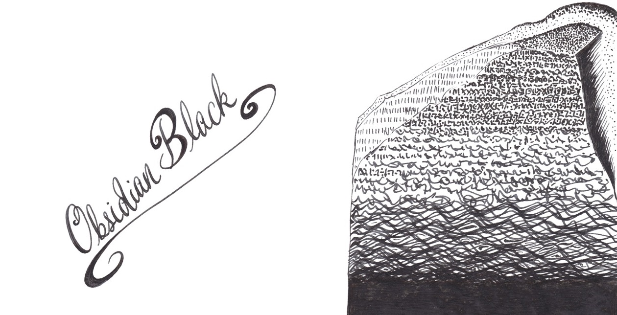
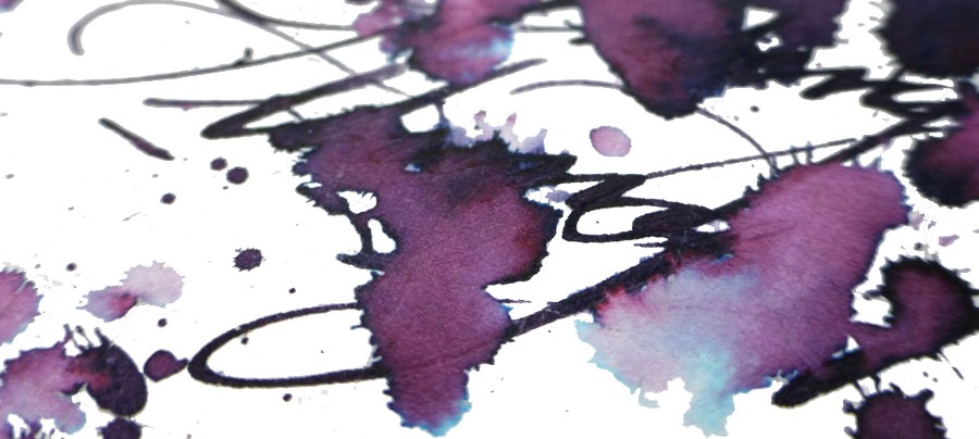
Obsidian is a refined grey-black with a spot of sheen too – not a jet-black ink, but a nicely saturated sort of black nevertheless.
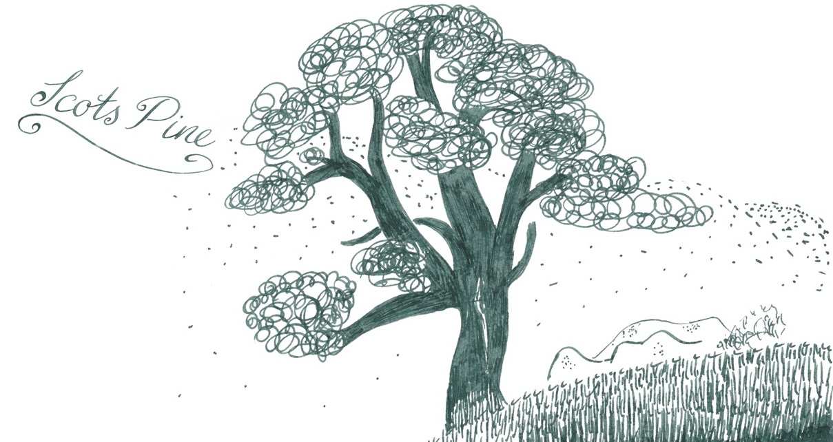
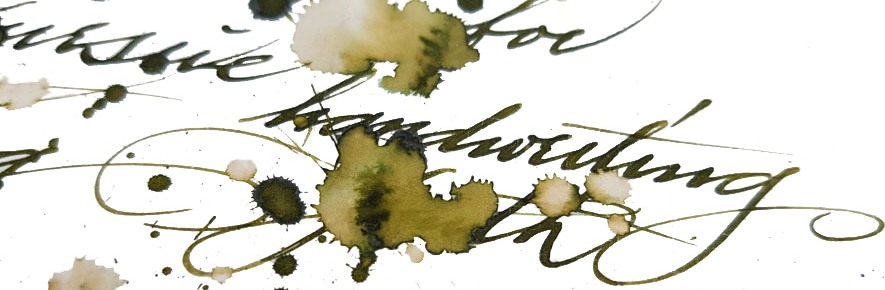
Scots Pine is an earthy, dark green which could be as valuable to artists as to writers. Not so many testers found this one their favourite, but it’s certainly distinctive.
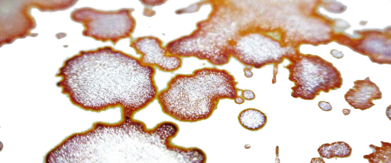
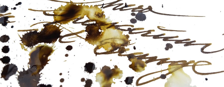
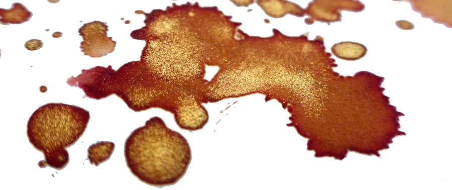
Roasted Red convincingly summons-up the hue of roasted red peppers with a sprinkling of paprika. A sophisticated shade to complete the collection.
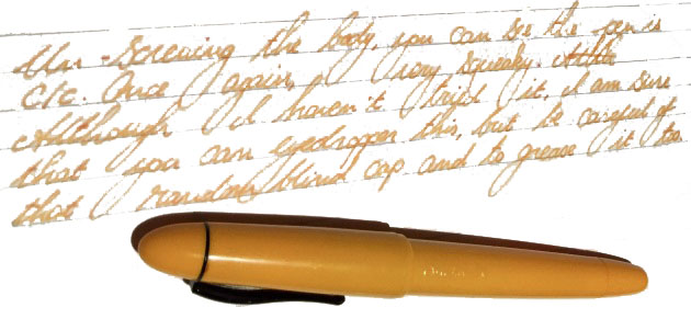
Crucially, how it writes…Smoothly! The formulation was selected for good flow as well as reliable saturation, and it shows.
Ink! What is it good for?Most of these inks could actually be sneaked into the office without too much risk, but they also look just the thing for getting a vintage pen back into action.
VFM At £8.35 for 45ml, this is twice the farthings-per-millilitres that standard Diamine would cost, but that’s still not stratospherically expensive – and arguably good value because it works well and you’ll actually want to write with it enough to get to the end of the bottle.If this isn’t quite your cup of tea, but almost…Beaufort have indicated that other colours may join the collection if there’s sufficient demand. Unsubtle hints about the urgent need for Purple Heather have already been lodged. The case for Made In Scotland From Girders Orange, meanwhile, awaits a longer label as well as copyright permission!
Where to get hold of some Straight from Beaufort Ink.This meta-review references:
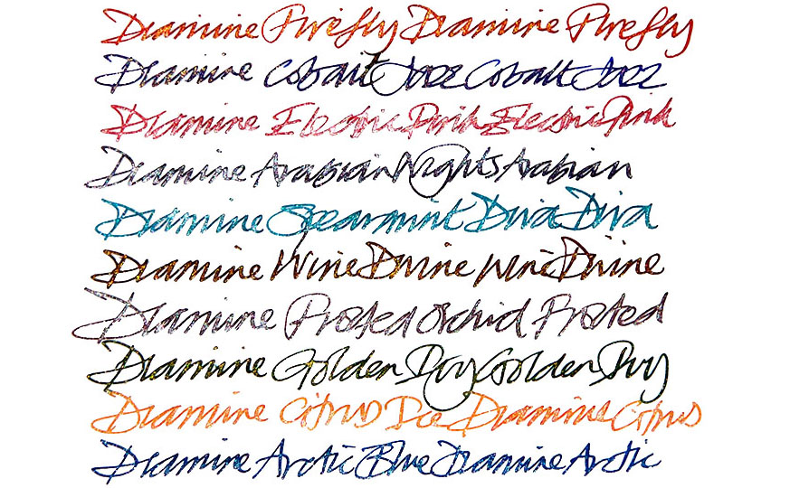
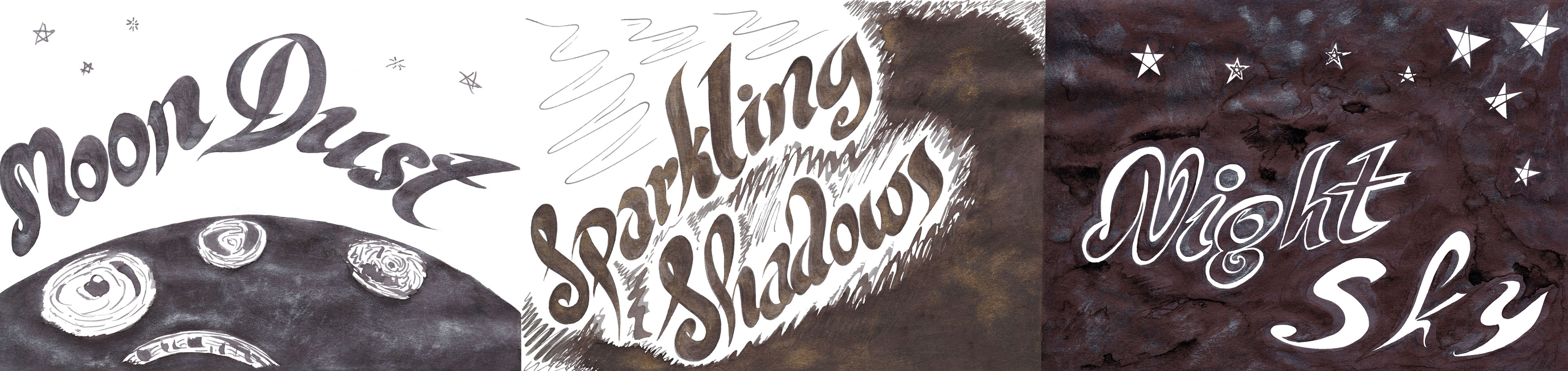
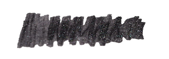
A little bit ofhistoryDiamine were the first manufacturer to produce a range of affordable shimmering inks following J. Herbin’s innovation of introducing tiny sparkling particles to their inks. They launched with a range of 10 different colours, added another 12 later (reviewed here), and the new ones take that up to an impressive 32 colours.
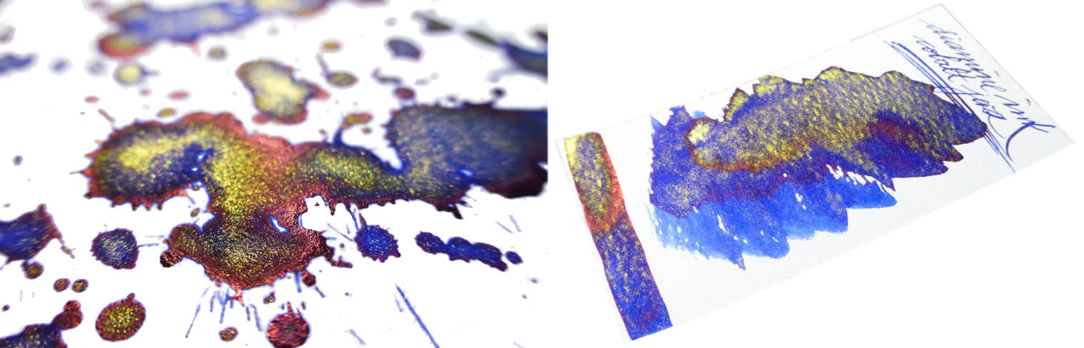
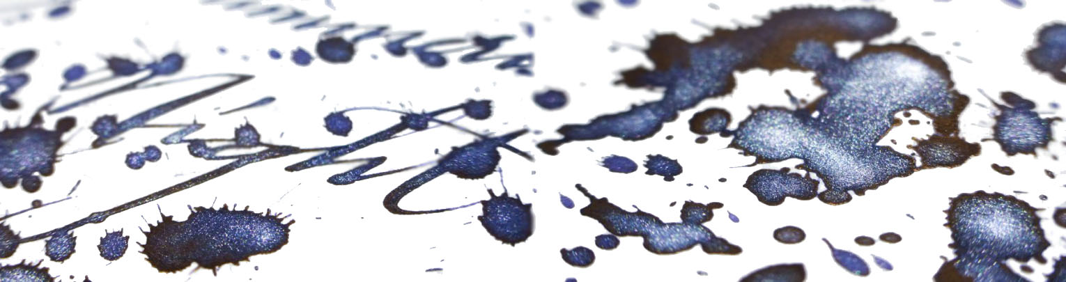
How it looksDiamine are well-versed in shimmering inks by now. They could do this in their sleep. However, they’ve not rested on their laurels here. Rather than just adding more sparkle to more ink, they’ve upped their game. What makes these new inks stand out is not only their strong, saturated colours, but the sheen many of them display. This adds a new dimension to the inks. The sparkle itself is subtle yet visible.
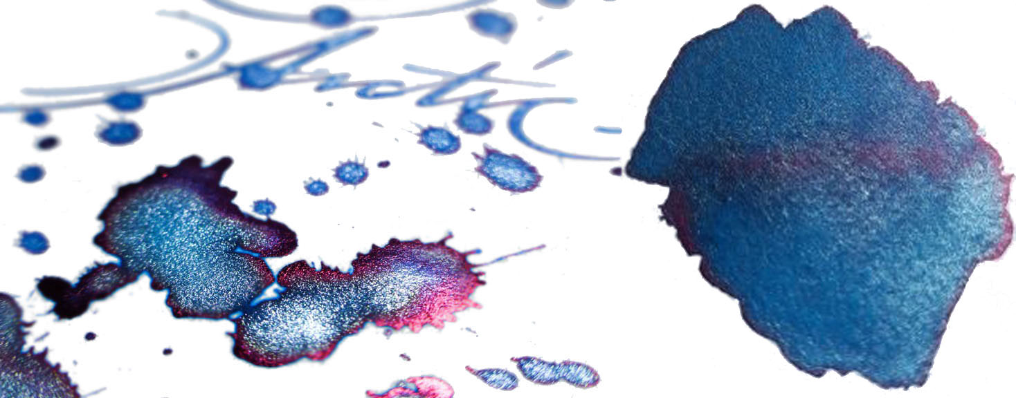
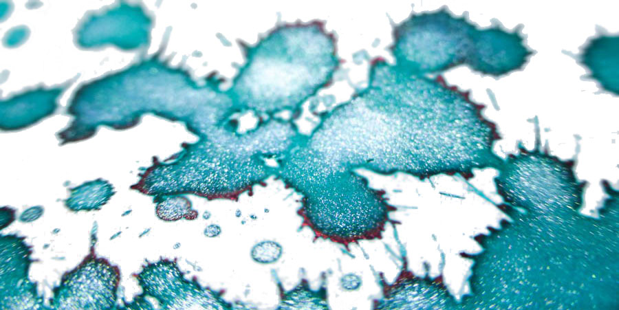
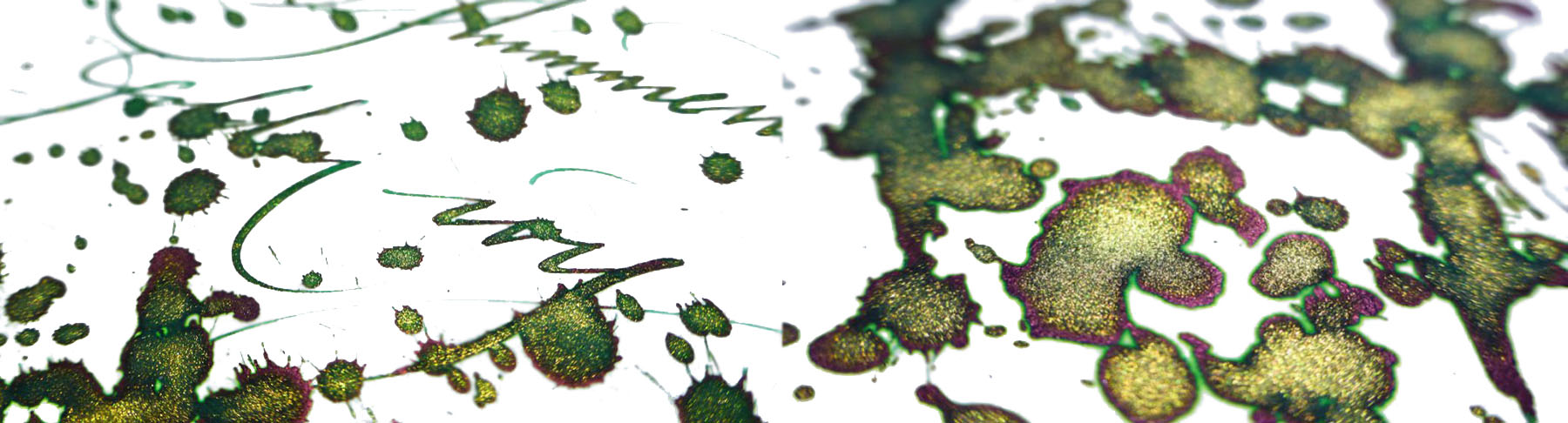
The blues and greens The new range features four blue and green inks.
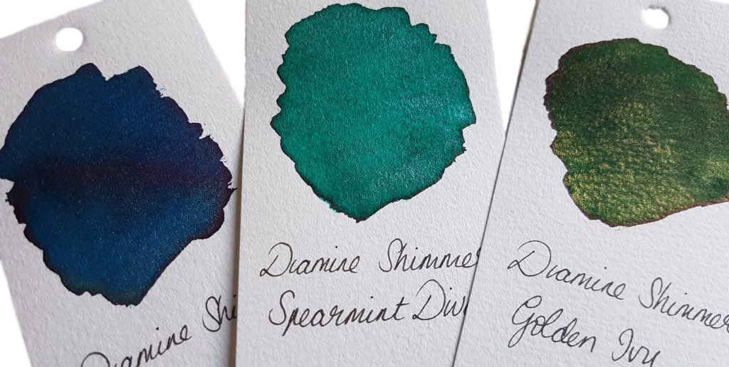
Arctic Blue is a bright, cool blue with a frosty silver shimmer. It also has a pinkish-red sheen.
Spearmint Diva is a bluish-green with silver shimmer. It’s similar to Tropical Glow from the same range, though the latter is more of a greenish-blue. It’s good to see that Diamine have those of us who love a good teal covered! However, Spearmint Diva also has a bit of a red sheen on some papers.
Golden Ivy is a traditional deep green with, again, a reddish sheen, set off with gold shimmer. This would make a lovely Christmas ink.
Cobalt Jazz is a saturated cobalt blue with a red sheen and gold shimmer. This is a gorgeous colour that looks pretty spectacular.
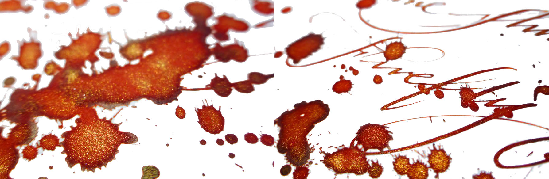
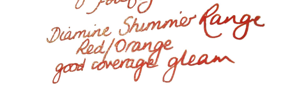
The reds There are three new red inks in the range.
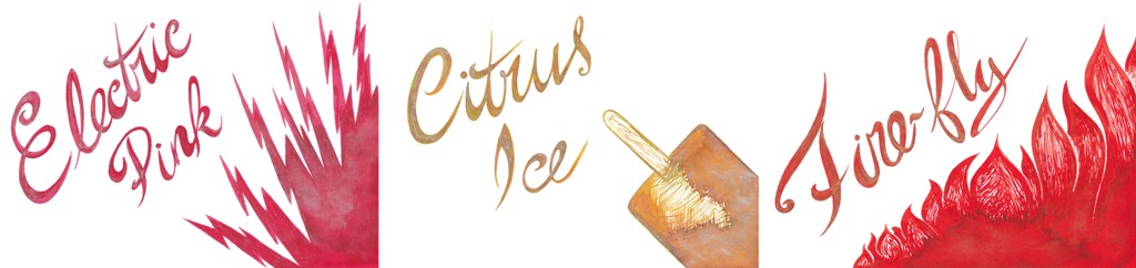
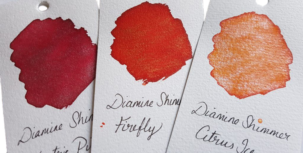
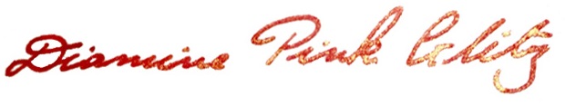
First off, there’s Electric Pink. This is no cute Barbie pink. This is take-no-prisoners pink: it’s rich and saturated, with silver sparkle.
Citrus Iceis a warm, saturated orange with a contrasting cool silver sparkle.
Firefly is an orange-toned red with gold sparkle. Another festive ink.
The purples The three new additions at the purple end of the spectrum are a real treat.
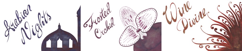
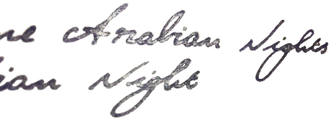
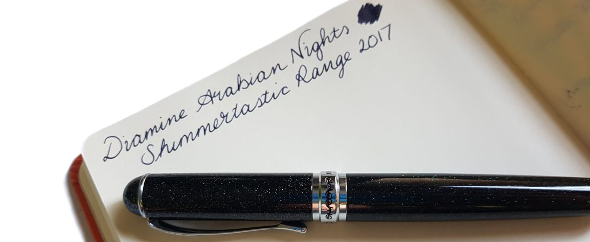
Arabian Nights is a deep purple-black with silver shimmer. It’s probably the most usable of the inks for everyday writing. The shimmer is subtle and the dark ink is readable and utilitarian while retaining a lot of character.
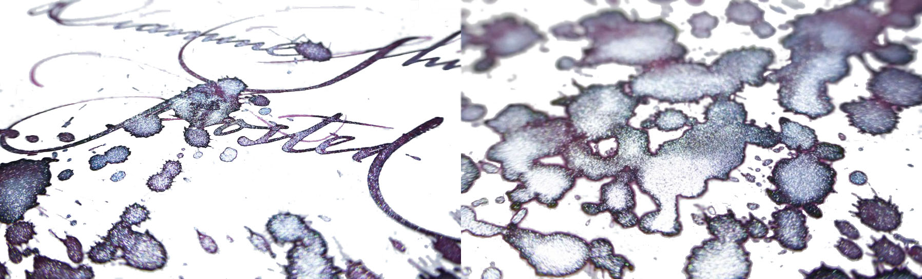
Frosted Orchid is a slightly lighter purple ink with red tones and silver sparkle. This will be popular.
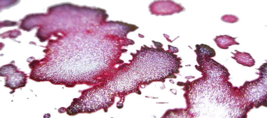
The last of the new inks is Wine Divine. This is a lovely addition to Diamine’s already well-stocked wine cellar (with Merlot, Syrah, and Claret). The ink is a rich burgundy with gold shimmer.
Crucially, how it writes…Diamine have been on the go for over 150 years. The quality of their ink is sound, and these are no exceptions. They flow well and benefit from a wider nib to show off both sheen and shimmer.
Ink! What is it good for?These are unusual inks, and the sparkle makes it unlikely you’ll want to use these for business documents. They’re great for cards and letters, especially with Christmas fast approaching. As usual with shimmering inks, be sure to give the bottle a gentle shake before filling a pen. Similarly, gently agitate a pen that’s had the ink in it a while to mix up the settled shimmer particles. There’s also a caveat: any ink with particles like this has the potential to clog up a pen, so use this ink in pens that you can disassemble relatively easily to clean out properly.
VFMAlthough more expensive than Diamine’s standard inks, the Shimmertastic range is an affordable way to get some seriously interesting inks. In the UK, a 50ml bottle retails for around £9-10.If this isn’t quite your cup of tea, but almost…J. Herbin make a variety of premium shimmering inks. De Atramentis also offer a new line of shimmering inks, with each ink available with gold, silver, or copper shimmer. Robert Oster are soon to launch their own sparkles, too.
Our overall recommendationThese are great, fun inks with some unusual and interesting properties, available at a good price. Where to get hold of someThe usual suspectshave these inks in stock (or soon will!). You can also purchase from Diamine directly.
A little bit ofhistoryThe ancient Romans did all sorts of rum things in barrels; polluting wine with lead to sweeten it, fermenting the pungent rotted-fish sauce garum, and brewing-up the hard-wearing ink atramentum. German ink-makers De Atramentis continue this tradition in their name and some of their production methods (albeit hopefully without the aroma of decomposing marine life), and recently they have got on the sparkly ink bandwagon. Everybody’s doing it these days, it seems – J.Herbin, Diamine and Robert Oster too. So we set out to find out what De Atramentis is bringing to the party…
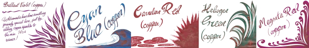
How it looksThe base inks are seven colours, plus black. What makes the collection stand out is the availability of these inks in three different pearlescent finishes; gold, silver and, uniquely, copper. There’s a higher volume of sparkly particles than are typically found in pearlescent inks so how it looks is shiny – very, very, shiny!Crucially, how it writes…Much like standard fountain open ink, and De Atramentis certainly make plenty of that. There can be the occasional hold-up due to the high proportion of particulates (the sparkly bits), which eventually silt-up the feed and stem the flow, but this is easily rectified with a thorough clean. With this in mind it’s advisable to stick to fountain pens which can be completely dismantled for a quick scrub, but these inks are otherwise suitable for use with most of the nibbage you own.
Ink! What is it good for?It’s very shiny indeed, but those sparkicles can brush off once the ink is dry – so it’s probably not one for the office, but anything from journalling to labelling presents would be good ways to put it to work.
VFMNot bad at all; Pure Pens sell some of these at £10.50 a bottle, which is only a little more than comparable inks from Diamine, and about half the price that J.Herbin charge for a sparkly.
If this isn’t quite your cup of tea, but almost…Then De Atramentis do face some pretty stiff competition from Diamine. No-one else has quite the range of shimmer choices that De Atramentis does, though, and their copper option appears to be otherwise unheard of in the pearlescent market.
Our overall recommendationIf masses of glitter appeals, or the unusual copper finish does it for you, give this a go. If you prefer a slightly more nuanced range of base colours beneath your glitter, check out the newly-expanded Diamine Shimmer range (which we’ll also cover again here soon).
Where to get hold of somePure Pens sell a partial range of these, or you can buy the full collection direct from source if you don’t mind covering a bit more postage.
This meta-review references:
Scribble Monboddo’s reviews of the copper, silver and gold ranges
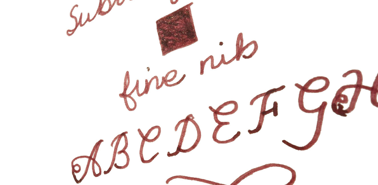
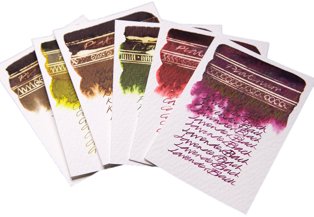
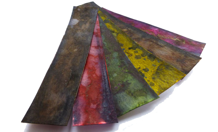
A little bit ofhistoryFor anyone who’s just survived the British summer, it can be hard to believe that wasps do anything useful at all; the big ones ruin picnics and the tiny ones kill bees. But as it happens, some of those very small wasps inadvertently serve a human purpose by making nests on the surface of the sturdy oak tree – because those ‘iron galls’ in turn provide the source material for a permanent ink formula recipe used since Pliny the Elder. Pliny Senior unfortunately failed to describe the formula in sufficient detail before the eruption of Vesuvius did for him, but patient scribes have been perfecting it ever since. When it works well, it can preserve documents for millennia. When it goes wrong and the ink gets too acidic, it can eat the writing surface – and it has form for eating fountain pens too, so it’s a brave manufacturer who ventures into this market. But Diamine, KWZ and Rohrer and Klingner have found ways to make the recipe safe, and now Platinum have come along with no less than six shades of iron gall ink to get creative with. The United Inkdom team set out to put it to the test – said team including a chemist, a calligrapher and two historians, so there was no fear of punches being pulled.
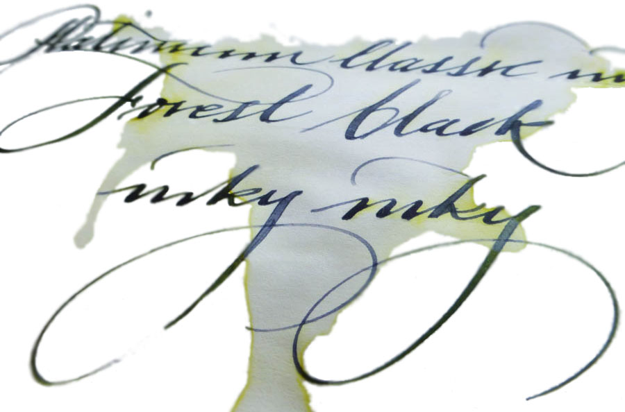
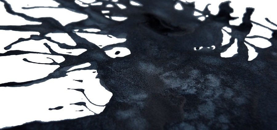
How it looksThis changes in the first minute that it spends on the paper – it goes on quite bright, especially the Citrus and Cassis varieties, then quickly darkens as it oxidises. None of the shades darken all the way to black, so the naming convention (Lavender Black, Forest Black, etc.) is a little misleading, but the transformation from light to dark is impressive – and rather fascinating to watch.
How it smellsNow let’s be honest, not all specialist inks are terribly pleasant to the nose . This one requires a chemical reaction to work, which you can actually see in front of your eyes, as the video below demonstrates – and as this ink is not pigment-based, it’s not technically watching paint dry. But despite all that exciting stuff going on, there’s nothing malodorous to report. Phew.
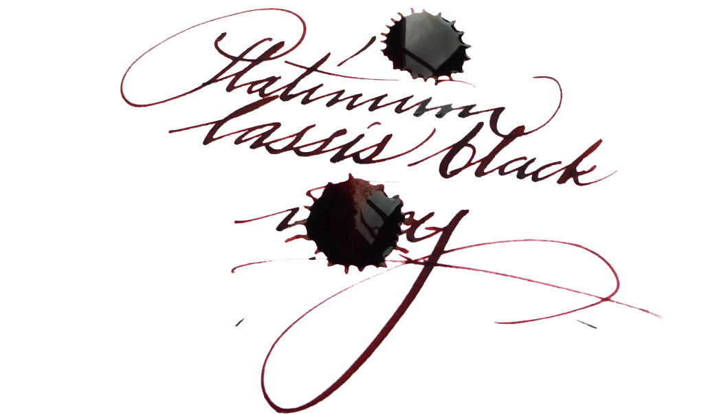
Crucially, how it writes…Perfectly well! It’s perhaps just a touch drier than some ‘standard’ fountain pen inks, but a decent fountain pen can handle it with ease. Given that this is still a permanent ink and even the new, gentler, formula has some acidity to it, a fountain pen which doesn’t dry out too easily is a wise choice (one of Platinum’s own #3776 models is a good place to start), and of course it’s worth giving it a good flush out after a few days with iron gall ink in there. But you can pop it into the barrel of your ‘serious nibbage’ without too much fear of damage.
Ink! What is it good for?As Nick capably demonstrates, it’s great for calligraphy. Since it’s an iron gall ink it should be acceptable if you’re signing a marriage register, and as it’s permanent it should do for addressing the wedding invitations too (the ink is partially washable, but even if it gets rained on the text will still be legible). Lavender Black, which seems to be the consensus pick of the bunch, could be good for one’s secret diary (you have one of those, right?). Or you could just have fun with them, like we did!VFMThese are not cheap inks, it has to be admitted; £22 will buy you a fairly respectable fountain pen these days, after all. But some of Platinum’s ‘Classic’ colours are really easy on the eye – and if you are using this for a special event, it’s not going to be that big a dent in the stationery budget.
The ink is partially washable, but the text remains legible
If this isn’t quite your cup of tea, but almost…If you just need an iron gall ink and aren’t too concerned by the traditional blue-grey shade, then standard registrar’s ink will inevitably be quite a bit less expensive, and there’s plenty of that about (try Diamine). There are also other coloured iron gall inks available, usually at a lower price, from KWZ and Rohrer & Klingner. Alternatively, if you’re a Platinum fan and just need something permanent, some of their pigment-based inks aren’t bad and their carbon ink is amongst the blackest of the black.Our overall recommendationWe think these are pretty impressive inks, and conjure up a wider and more interesting palette than iron gall formulae can usually manage. If you have a sensible use for a permanent ink and fancy something a bit different, a 60ml bottle will do the job well. Given the significant cost our tip is to pick one or two which really take your fancy rather than going straight for the whole set.Where to get hold of someWe got ours direct from Cult Pens, and that’s a good place to start – they are the official Platinum dealers for the UK, and as it happens it’s where many of us have acquired our #3776s from too.
A little bit ofhistoryAs a still fairly new ink brand, KWZ has received a lot of attention in the last two years as it took the fountain pen world by storm. KWZ is operated by a lovely couple of professionally-trained chemists from Poland, Konrad Żurawski and his wife Agnieszka. That enigmatic name, KWZ, is simply Konrad’s initials. Konrad’s journey with ink manufacturing started as a hobby few years ago and quickly became his and his wife’s passion. Being a synthetic chemist specialising in polymers and organic chemistry, Konrad decided to experiment (which is not unusual for chemists) with formulae and reactions to create his own unique inks from scratch. Initially, he was mainly interested in making permanent iron gall (‘IG’) inks, which due to specific chemical reactions occurring over time have fascinating properties and behaviour, but he soon extended his laboratory’s range to ‘standard’ dye-based inks too. After many trials and tests Konrad came up with several inks which he and his wife decided to take to the Polish market first, then further afield. Agnieszka tells us that on the first outing to the Polish Pen Show, they were literally cutting-out KWZ Ink bottle labels while they were still on the train. During next few months KWZ inks started to get rave reviews on various fountain pen websites, blogs and social media channels, and with anticipation and demand growing quickly, the KWZ brand was formally registered in 2015. The range grew fast, even as Konrad and Agnieszka continued their scientific careers, and at the time of writing they have created an impressive range of 62 unique colours including 41 standard dye-based inks and 21 iron gall inks.
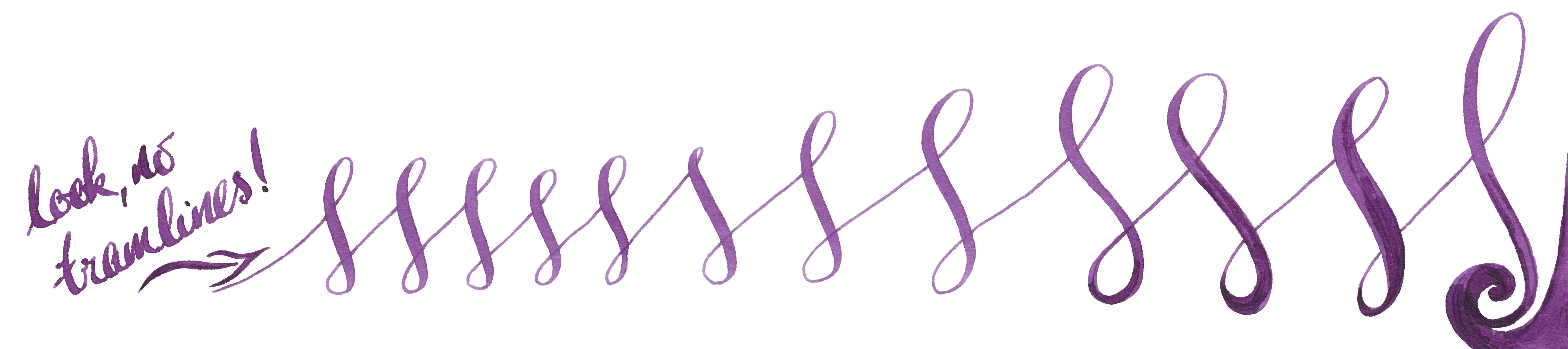
How it looksand How it writesKonrad is a fountain pen user as a well as a chemist, so understands how physical properties like surface tension, appropriate viscosity, flow, etc. are important for a satisfying writing experience. There is nothing worse than beautiful ink which is completely unusable, and when the flow or capillary action is limited one can struggle to write even on the best-quality paper. Konrad goes to great lengths in selecting, testing and applying ingredients and in this respect the KWZ brand has raised the bar for ink manufacturing more widely. The United Inkdom reviewers all found that aside from the impressively broad colour palette the crucial difference for KWZ ink is its flow properties. Of course writing experience depends on many things like paper, pen, nib, how the feed keeps up with the ink and also one’s writing style itself. People who have very a light touch need ink which flows well to keep up, otherwise pen will skip – but interestingly, heavy-handed writers also require a ‘wet’ ink in order to produce thicker and uniform line. This is especially true for those who use semi-flexible or flexible nibs, which can tend to tramline/railroad if a dry ink is selected. In this respect we found that KWZ inks are some of the best available; the flow is excellent, and in even the most gushing of flex-nib feeds it can keep up. We found the writing experience very pleasant with all types of pens all we tried the ink in, including those with particularly fine nibs as well as broad and flexible ones. On good-quality paper KWZ inks behave very well, tending not to feather and bleed through. This may not be the case with cheap absorbent alternatives such as photocopy/printer paper, but of course all fountain pen inks struggle on those surfaces. Because KWZ inks are highly saturated some ‘ghosting’ may occur especially on very thin paper, such as that made by Tomoe River. We found that many inks from KWZ we tested gave a decent amount gradual shading, but in some cases shading is very impressive, although in general KWZ inks do not exhibit a sheen. They are fairly wet inks, so drying time is not the strongest feature, but once they do dry completely there is not smudging.
Let’s have a look at some of the particular colours we tested. Obviously we have not tried all the inks KWZ offers, but we picked a few which are good representatives of this broad and diverse palette.
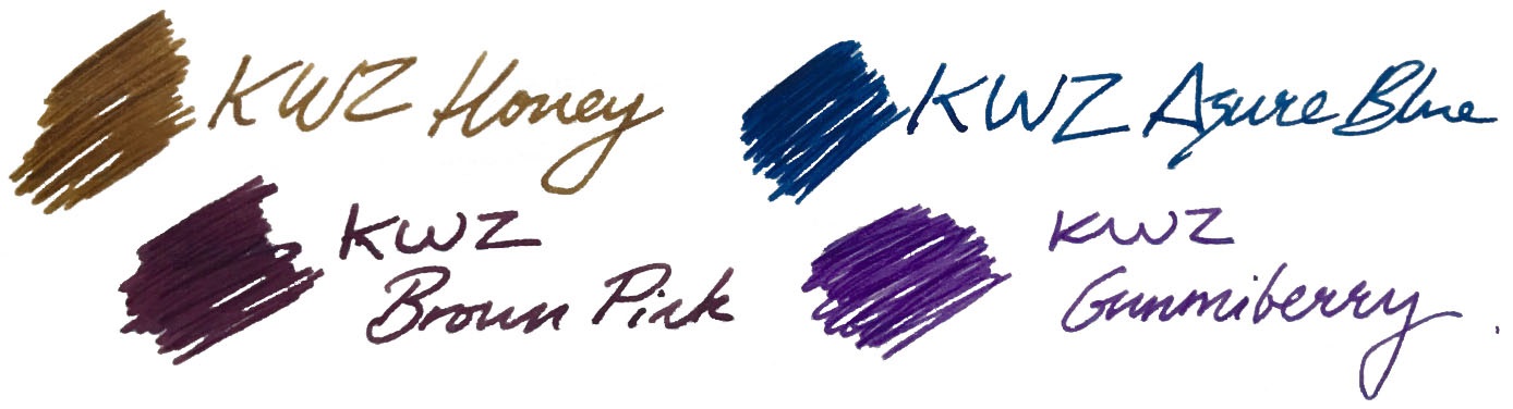
Brown Pink
This is one of the KWZ inks that Mateusz and Laura enjoyed the most. A beautiful combination of red-purple with hint of bright light blue makes this ink quite unique. If you like aubergine, plum or beetroot like colours, this KWZ ink will please you. When it dries on the paper it looks less vibrant and flattened, but with this subtle gradual shading Brown Pink is a ‘must have’ in any ink collection – and its popularity already reflects this.
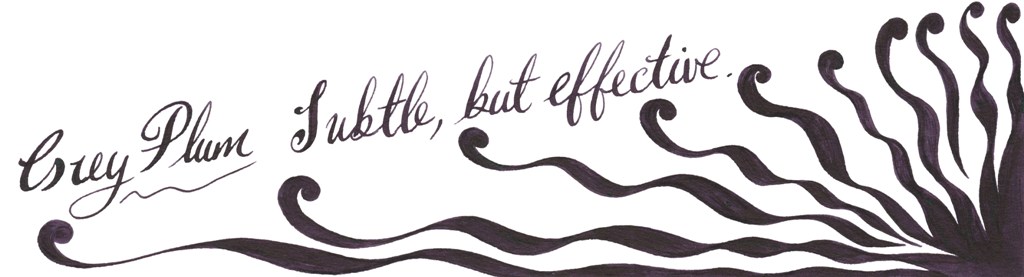
Grey Plum
Compared to Brown Pink, Grey Plum is darker and more purple. The blend of purple, dark grey and bright blue gives a very interesting and pleasing result. With wet juicy nibs it looks almost black.
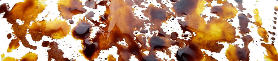
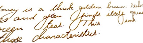
Honey
Honey is probably one of the most popular KWZ inks and for a while it was not easy to obtain it, because it kept selling out. Honey is a warm looking golden-brown ink, which gained its popularity because of the lovely shading it produces. This is particularly pronounced on smooth, good-quality paper, where the greatest colour gradation happens.
Cappuccino
This is a warm-looking brown which also gives nice shading.
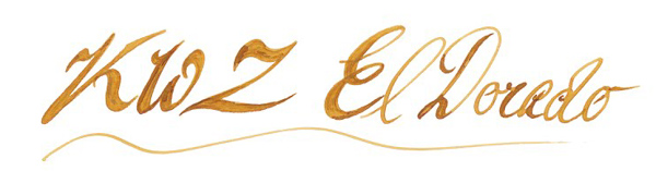
El Dorado
El Dorado is an another example of a great shading ink. The colour varies between darker yellow and orange, or a nice blend of caramel and honey, if you prefer.
Orange (IG)
This is very interesting ink. Out of the bottle it looks like a warm orange, but being an iron gall ink it undergoes drastic metamorphosis and quickly becomes a darker brown…pure magic.
Green Gold
If you like military, camouflage colours similar to Diamine Safari, than Green Gold may be for you. This is a wonderful blend of earthy, almost olive green with yellow.
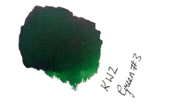
Menthol Green
This is a blue/green or green/blue ink which verges upon teal – mixed with a little absinthe, perhaps.
Green #3 and Foggy Green
Green#3 may be easily classified as a ‘standard’ green which according to Gillian give some nice shading too.
Foggy Green is rather difficult to describe; a murky, faded dark green with a significant amount of grey. It could be best to use this only in drier pens as it otherwise comes out very dark. This may be an interesting option for those who do not like flashy inks which stand out from the paper.
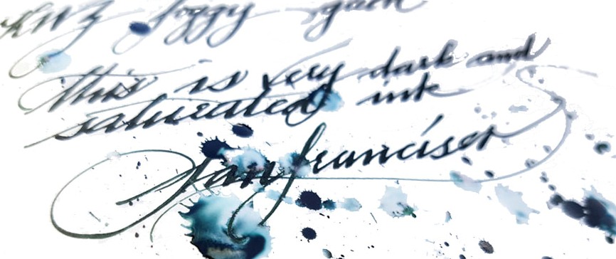
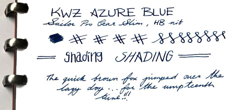
Azure #3
If you like deep cerulean blue/turquoise inks which remind one of blue lagoons, Azure#3 is absolutely a must. Ruth loves slightly darker brother Azure #4 too.
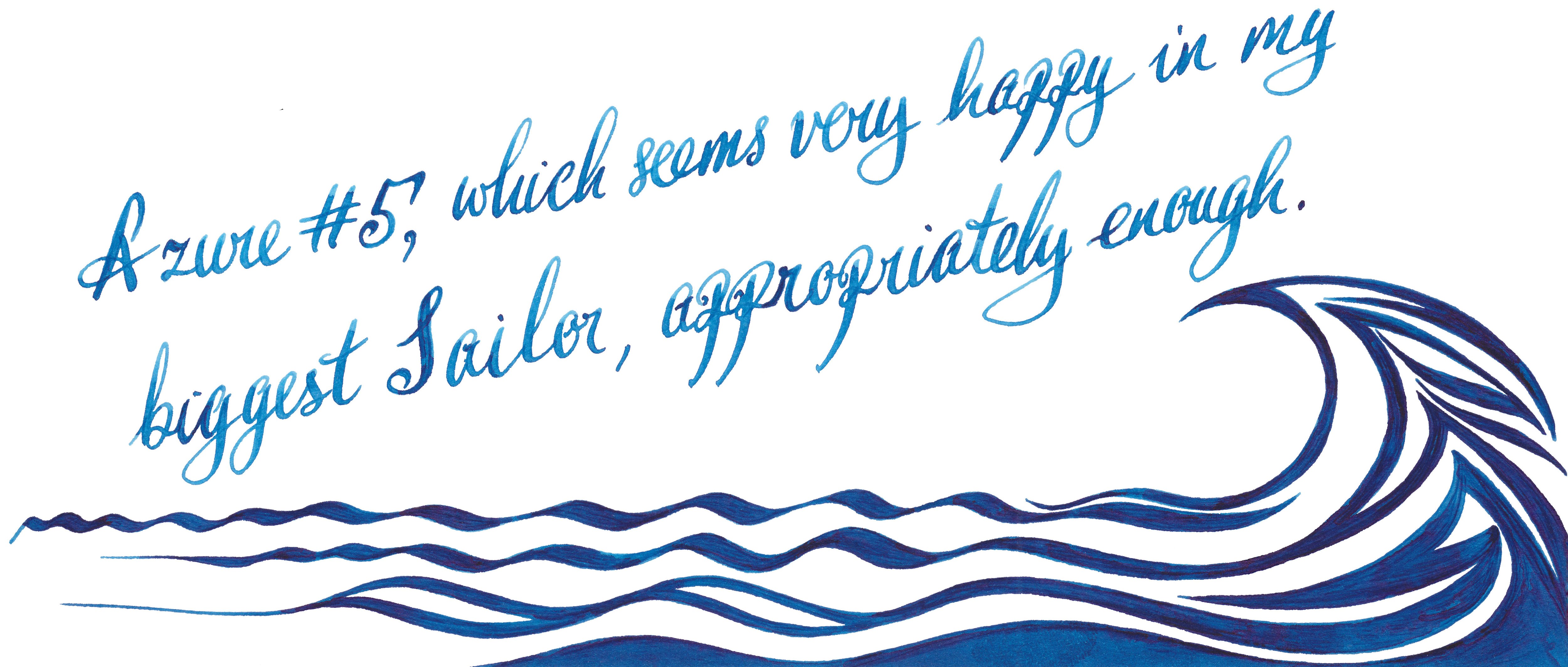
Azure #5
This is a gorgeous deep blue which offers some pretty shading. This may be a perfect day-to-day ink. Both Laura and Scribble were delighted how this well-lubricated ink performs with picky Sailor pens.
Turquoise (standard and IG)
Love magic? Iron Gall Turquoise will help you to trick people. This fresh deep turquoise blue ink dries to a wonderfully dark teal.
before……and after
However, if you are not so adventurous then the beautiful standard turquoise is a safer option. Moreover, it has been proven that it is happy in flexible nibs, and
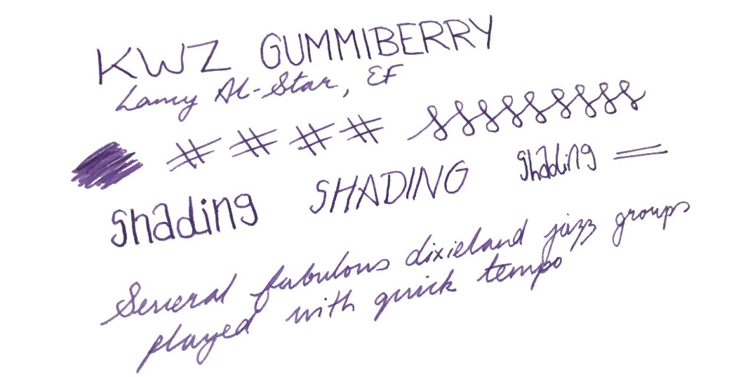
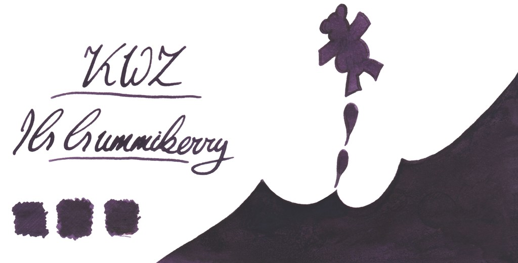
Gummiberry
Gummiberry juice gives the ability to bounce at unusual heights. Like the idea? Us too! This is wild and crazy name for such a pretty purple ink. Ruth definitely loves it – no surprises there. John loves it too. The big surprise is that Laura, who is generally is that not much into ‘girly’ colours enjoyed it too. It works very well with Scribble’s Pilot Custom 742 FA. John was also very pleased by flawless performance of his Sailor EF pen.
There’s an iron gall version of this in development, too:
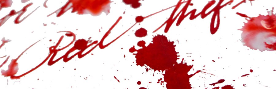
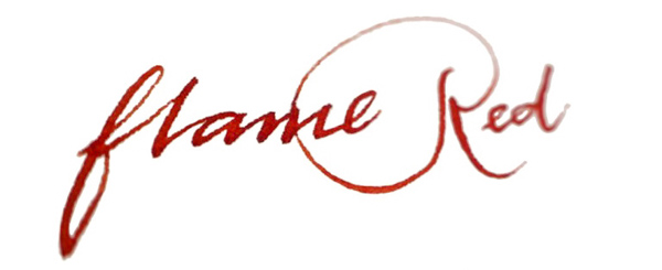
Thief’s Red and Flame Red
Many of us love red and red orange inks – the more disturbing the better! Be careful if you decide to work in the office or anywhere public these two. Thief’s Red is more red-towards-pink:
…while Flame Red is definitely red/orange:
Grapefruit
KWZ Grapefruit is a bold and vibrant orange with light touch of pink – we thought it a very appropriate name.
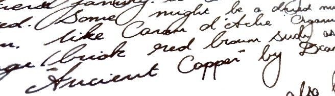
Maroon
Last but not least is the rich and saturated Maroon, which even gives a hint of sheen, uncommon among KWZ inks. This is a very pretty colour indeed.
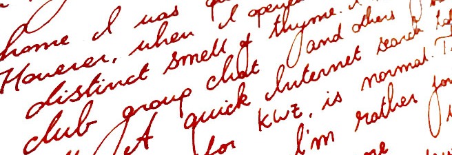
How it smells Well, in general KWZ inks have very a distinctive and recognisable scent which for some is reminiscent of vanilla, whereas for other it reminds them of thyme. The smell will eventually disappear (at least form the paper). The characteristic aroma of a KWZ ink comes from the antifungal/anti-mould agent which KWZ uses in the formulation. In contrast to the phenols used as a preservative by some manufacturers, the anti-fungal chemical used in KWZ inks is not toxic. This is great news, but not all of us have been enamoured of the pungent smell, especially during longer writing sessions. Despite some reported problems with staining TWSBI pens (especially the ECO model), it is generally relatively easy to clean pens from KWZ inks, but at the same time is also very difficult to eliminate the smell. Agnieszka and Konrad are certainly aware of this issue and they are continuously working on better, more satisfying formulation. We have been told that since September 2016 all KWZ inks have different component which gives rather sweet and less irritating ‘chemical’ scent compared to how it was before.
Our observation regarding the KWZ ‘perfume’ is in line what we have seen reported and discussed by other users elsewhere; responses are sharply divided between those actually quite like this this smell and those who can barely stand it all. It is worth mentioning that the KWZ inks we were testing came from both ‘old’ and ‘new’ batches respectively, so it is not surprising that our experiences are different. Interestingly, within our team of reviewers Ruth found this smell pleasant, whereas Laura and Gillian have completely opposite experiences, and while Scribble can handle it, his other half will only let him use it outdoors. Our assessment is that as soon as Konrad and Agnieszka standardise the new ‘neutral’ formula, KWZ will become a solid brand for the wider market – but until then, writers may be well-advised to try a sample before committing to a full bottle.
Regarding problems related to the TWSBI ECO line, where several issues with permanent staining were reported, we have been told that the KWZ team has investigated this and have already switched an ingredient which was unfortunately reacting with the polymer used in these pens.
Ink! What is it good for? This really is a very subjective matter. Because the colour range KWZ offers is so broad, picking the right colour for your needs should not be too difficult. All those who likes classic colours for office/businesses will be satisfied as well as those who are adventurous enough to use more exotic colours. Again, the only concern is that characteristic smell, which is not to everyone’s taste and may not be appreciated by all around you. Apart from that, this is ink fit for just about any every-day fountain pen purpose.
VFMKWZ inks are not the cheapest. In the UK you may get a 60ml bottle of KWZ Ink for around £12-13, depending which retailer you pick. This is almost double what you will spent on 80 ml bottle of standard Diamine ink, so it is not easy to justify on colour grounds alone, but for users of flex nibs or drier feeds the flow properties may make the investment worth it.
Our overall recommendation Our reviewers all agreed that KWZ Inks are very interesting and even have potential to be market leaders in the future. KWZ inks are generally wet and well lubricating. All the inks we tested flow nicely and gave us a good writing experience, even with pens which normally tend to run dry – and that viscosity helps to maintain a fast flow which is particularly noticeable with more demanding flexible or semi-flexible nibs. Colours are saturated and many exhibit great shading (e.g. Honey). However, if you are sensitive to the rather powerful pong of the current KWZ ink formula, getting cheaper Diamine ink or investing slightly more for Robert Oster’s Signature inks may be a wise alternative.
Where to get hold of someKWZ inks are not yet as widely available as some other popular brands. However, several specialist online retailers do stock them, and in the UK a wide selection of colours (including Iron Gall inks) is available exclusively from Pure Pens and Bureau Direct.
Thanks to Pure Pens, Bureau Direct and KWZ Ink themselves for providing inks to several of our bloggers previously – and big thanks to Pure Pens for furnishing even more of us with samples specifically for this meta-review exercise.
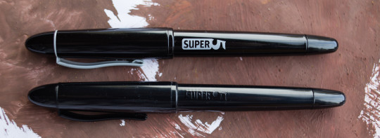
A little bit ofhistoryLast year we made contact (via Matthias) with the remarkable Super5 in Germany, and a select band of bloggers got to grips with their novel range of pens and inks. It’s such a distinctive collection that just this once we’re reviewing a whole brand, rather than just one product. The range includes fountain pens, rollerballs, and FP-friendly permanent inks – you can see why we couldn’t resist!
How it looksThe Super5 pen, in all its variants, looks a lot like the Kingsley Dex and the Manuscript Master, which is hardly surprising as it shares its basic Helit body with both. Like the Master, it has a nice metal sections too, and the useless but fun screw-off blind cap which could, just about, allow access to the turning knob of a converter if you wanted it to (but you won’t want it to, honestly). This is a comfortable, appealing shape and there’s a decent range of colour schemes too. The inks looks like they come in Rohrer&Klingner bottles, because that’s precisely what they are.
How it feelsThe pen’s body is a combination of warm plastic and firm but comfortable metal (in the section). ‘Nothing to complain about there.
How it fillsPop in a cartridge, or if you want to make the most of the Super5 ink range, a normal ‘international’ converter. It’s all very straightforward.
Crucially, how it writes…Very well, and quite differently from many other affordable fountain pens. The round nib has iridium tipping but the italic versions have none – just polished steel. Of course, that’s just fine if calligraphy is your style. If you really can’t handle fountain pens, which seems unlikely if you’re reading this but let’s roll with it anyway, there’s also a rollerball version which accepts the same cartridges or converters so you can use fountain pen ink.
Pen! What is it good for?The italic nibs (0.5mm and 0.7mm respectively) are particularly good for fast semi-calligraphic writing. They work with the Super5 permanent inks, too, so they’re pretty handy.
Ink! What is it good for?While the names of some of the inks baffled us a bit, we all thought they worked very well in the Super5 pens, flowing impressively well for such a thick ink. So, it’s good stuff for calligraphy – as long as you give your pen an occasional flush-through afterwards.
VFMThese have to be imported, and they are only procured in relatively small batches, so the pens are inevitably not going to be quite as affordable as the humble Dex – indeed, they’re about twice the price. That’s still not ridiculous money for pens which work well and can handle some punishment, though. The ink is a little steeper, but still fair value if a coloured permanent ink is just what you need.
If this isn’t quite your cup of tea, but almost…The Dex and Manuscript Master are pens worth a look instead. KWZ are working on some permanent inks which could prove competition in the refill department.
Our overall recommendationIt’s all worth a look – and if you want something no-one else in the office is likely to have, this is a sure-fire bet.
Where to get hold of oneDirect from ‘Papierlabor‘ is the only way.
This meta-review references:
Matthias’s text-and-photos review of the fountain pen
Here in the United Inkdom, us poms and near neighbours are sometimes lucky enough to receive some bonzer gear to play with – sometimes pens, sometimes paper, and sometimes… sometimes ink!
And here’s the thing about that; a pen will convey the message, the paper will carry the message, but it’s the ink that brings the message to life. So when we get inks to play with, all of us tend to get a bit over-excited.
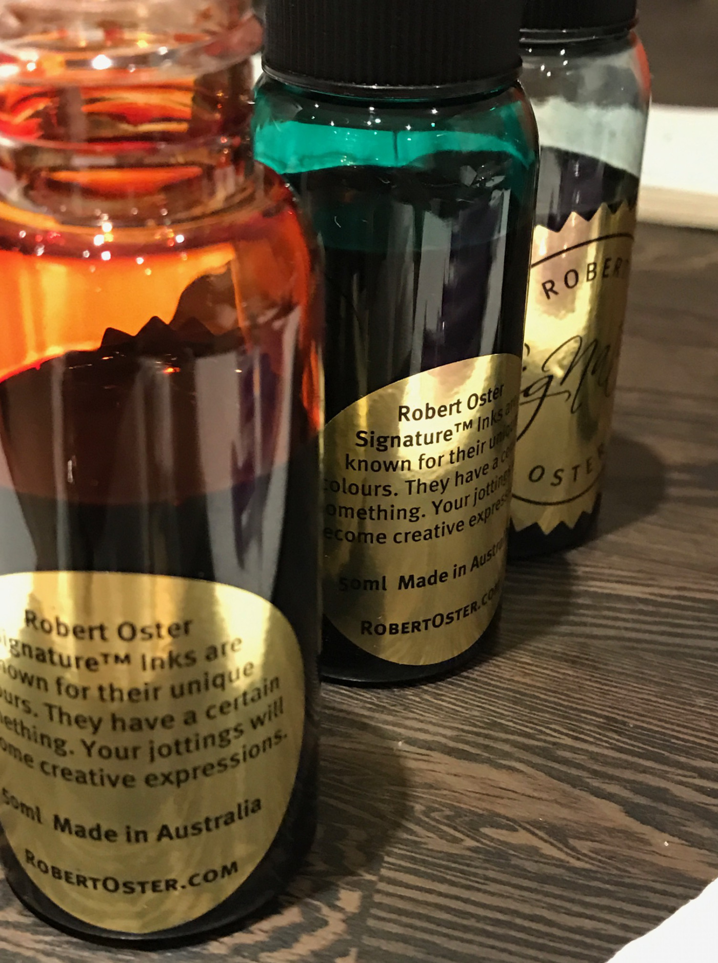
Robert Oster Signature inks are fairly new to Blighty, but an Australian brand that’s quickly developing a strong following over here, and it’s easy to see why.
They’re not the fastest drying of inks, averaging between ten and fifteen seconds for full dryness on good paper. As you might expect from an ink that wet the flow on them is superb, coverage on the page is complete, there’s no stutter, even from very fine nibs, but when you have an ink as rich and fulsome as these, you want something a little thicker to enjoy the tones upon the paper.
It’s also rare that all of us agree on the nature and quality of an ink – we’re an eclectic bunch with a wide variety of tastes – but universally, these colours have us inspired. The inks have interesting names which give a nod to the inspiration of the creator, and as you’ll see in the many individual reviews linked below, they don’t disappoint.
But as a little teaser…
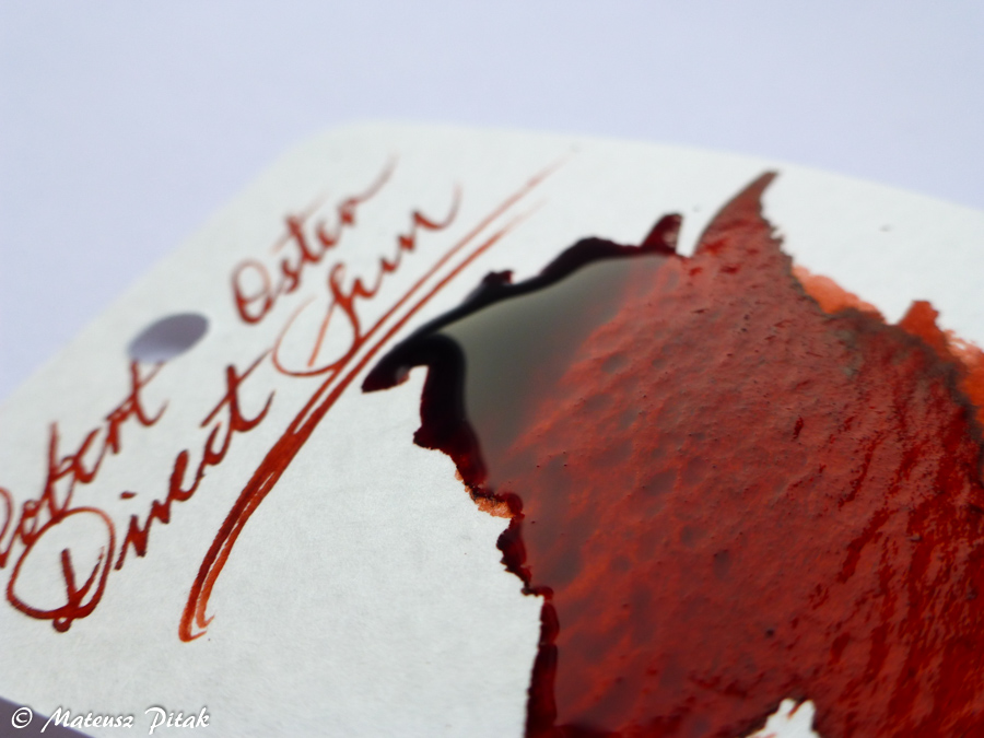
Direct Sun
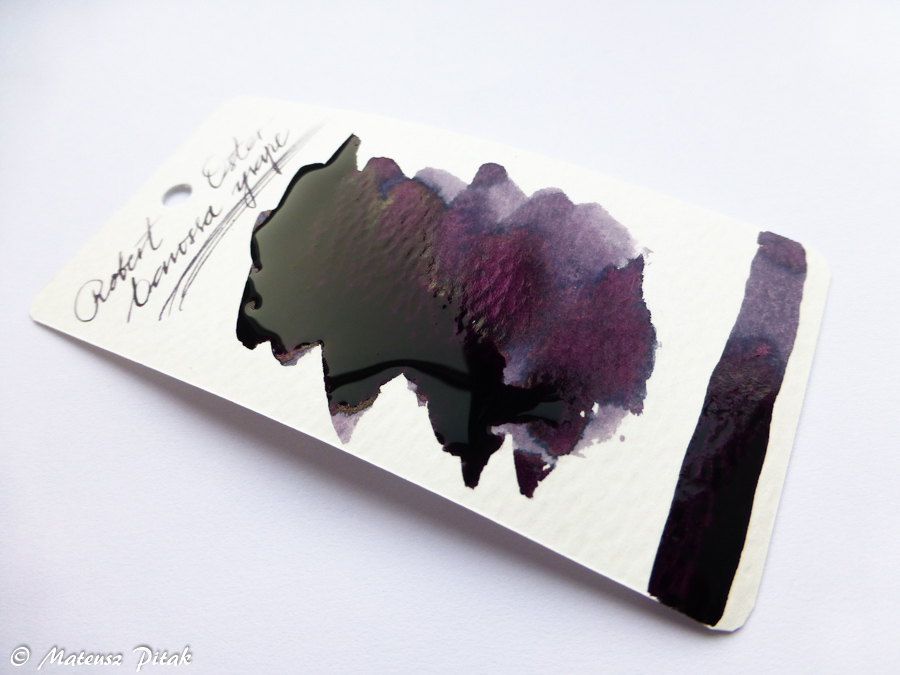
Barossa Grape
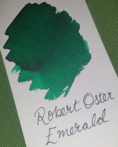
Emerald
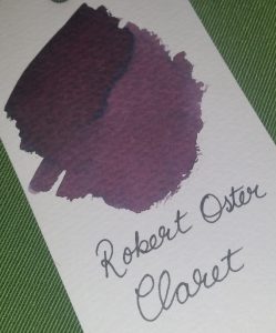
Claret
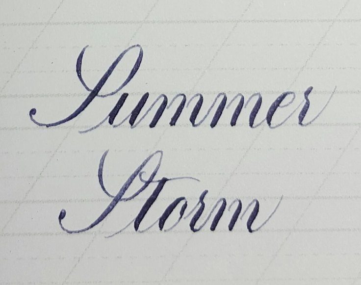
Summer Storm
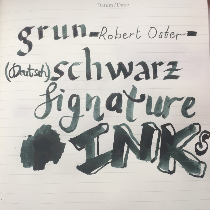
Grün Schwarz
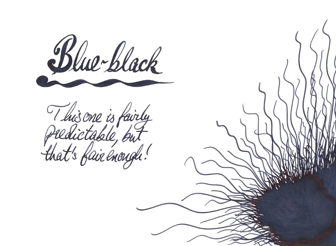
Blue-black
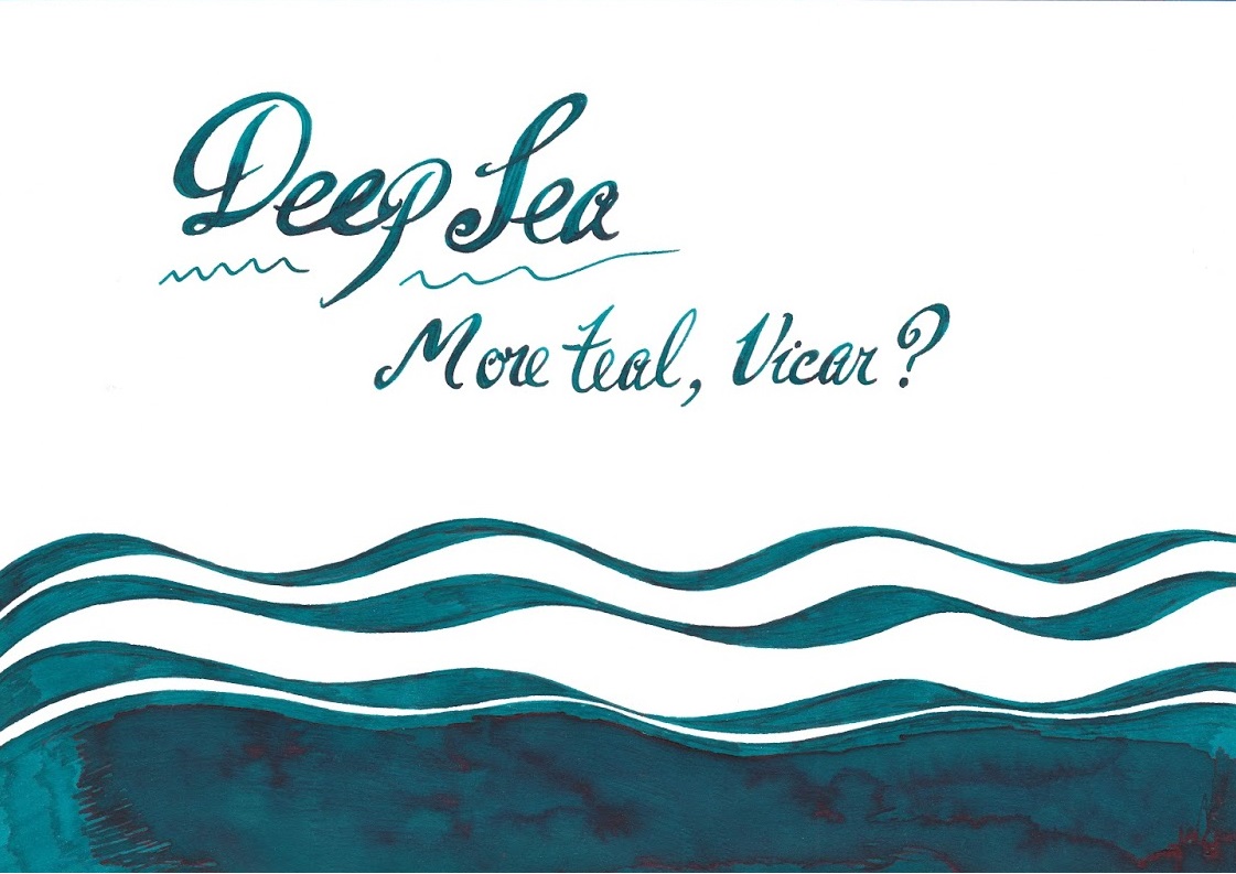
Deep Sea
Blue Sea
The full range isn’t available in the UK yet, but it will be soon, and we’re both anticipating that (because these really are to die for), and dreading it (because we all have to eat sometime…) in equal measure. They’re not the cheapest of inks, retailing at £14.50 for a single bottle, but with the viscosity of the ink in question, that bottle will last some time. They can be found at iZods, who kindly donated some samples for this review exercise (thanks again Roy), and we gather other suppliers are also coming on-stream as we speak.
So without further ado, we present the combined reviews of United Inkdom for the Robert Oster Signature inks…
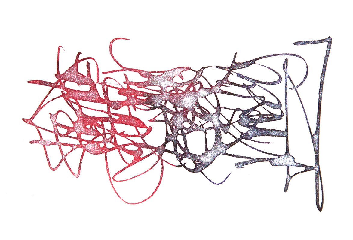
A couple of years ago there was a lot of buzz about another brand (you all know which one) putting shiny sparkles into a handful of their inks. It looked fun, but it was expensive, and Diamine don’t do things by halves. They brought out a whole set of ten, then followed it up this year with twelve more shimmering inks, each sporting a healthy dose of gold or silver coloured glitter. What could be more fitting for our Christmas meta-review?
Ink! What is it good for?
Well let’s be honest, this isn’t one you’re likely to take to work, unless your job involves writing Christmas cards (it’s absolutely brilliant for that). This is ink for having fun with! If you treat it wisely, it will work in ordinary fountain pens and there are only two modest caveats. Firstly, always give the bottle a very thorough shake before filling the pen, and ideally use a pen which can stand a gentle perturbation before writing too; the glitter is in suspension, not in solution, and will laze on the bottom unless stirred into life. Secondly, any particulate matter can gum-up pen parts in time, so pick a pen which you can thoroughly dismantle for the occasional clean, including the converter or piston (TWSBIs and most Platinums are therefore a good choice). Other than that, you can sparkly-scribble to your heart’s content.
VFM
The going rate is about £9 for 50ml, which makes this noticeably more expensive than the standard fountain pen inks from Diamine, but still very good value compared to some of the more ‘exotic’ inks around. The base colours are for the most part very nice inks in their own right, and other than occasionally bleeding-through with very wet nibs, or feathering on cheap paper, they’re pretty well-behaved too. You really can’t go too far wrong.
OK now, that’s enough chat – show me the shiny!
The bright blues
We start with a couple of absolute crackers. Blue Lightning, a very bright blue with silver sparkles, has a loyal following from the original collection, while Tropical Glow has become an immediate favourite with almost everyone who’s tried it, even making the ‘Too Many Peacocks‘ Christmas Day hit list. ‘Not a bad way to start, eh?
The dark blues
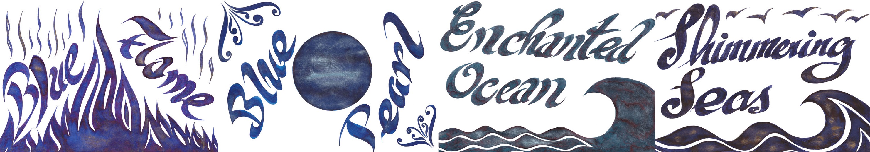
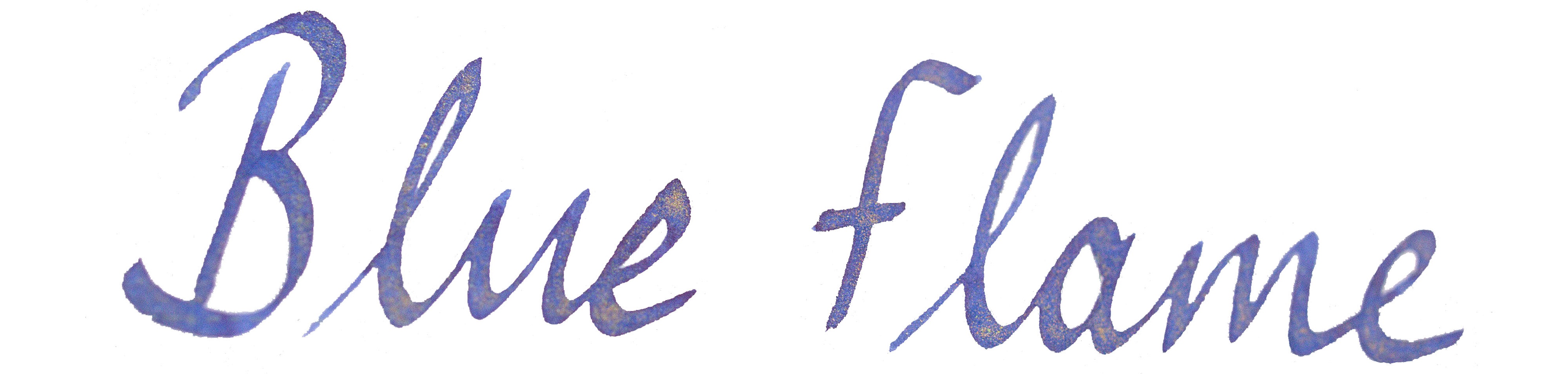
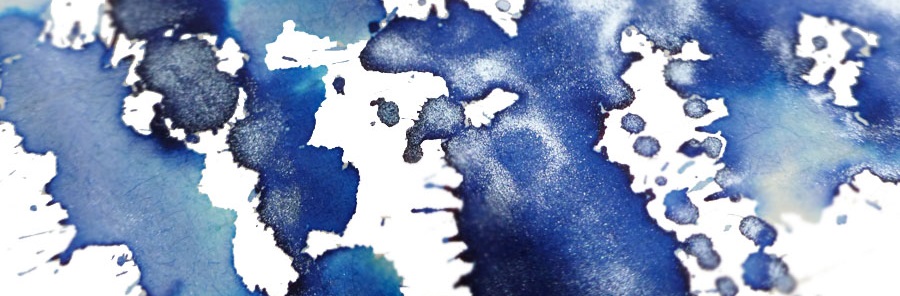
Blue Flame and Blue Pearl are fairly traditional royal blues, with gold or silver sparkles respectively; the effect is predictable but pleasing.Enchanted Ocean and Shimmering Seas are a little harder to categorise – like the sea, they keep changing colour as the light shifts. But both are broadly blue-black with either green or purple hints, with a spot of iridescence from bioluminescent plankton at the surface.
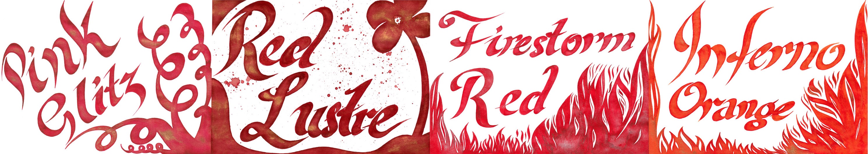
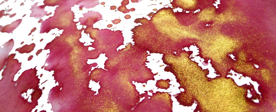
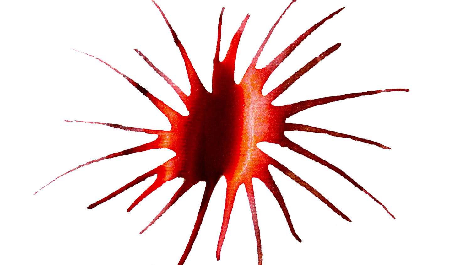
The reds
Pink Glitz is, unusually for a pink, so riotously butch that you could put it in a PFM and get away with it, while Red Lustre could safely be spilled all over the Christmas tablecloth without anyone noticing. Firestorm Red and Inferno Orange look a lot like the open fire you’re meant to be roasting some chestnuts on right now (but thanks for taking a break to read this instead).
The browns
This civilised set of browns goes all the way from molten chocolate to wet beach, and the sparkles really add something to what can otherwise be a somewhat drab colour for inks. They really do work surprisingly well on the page.
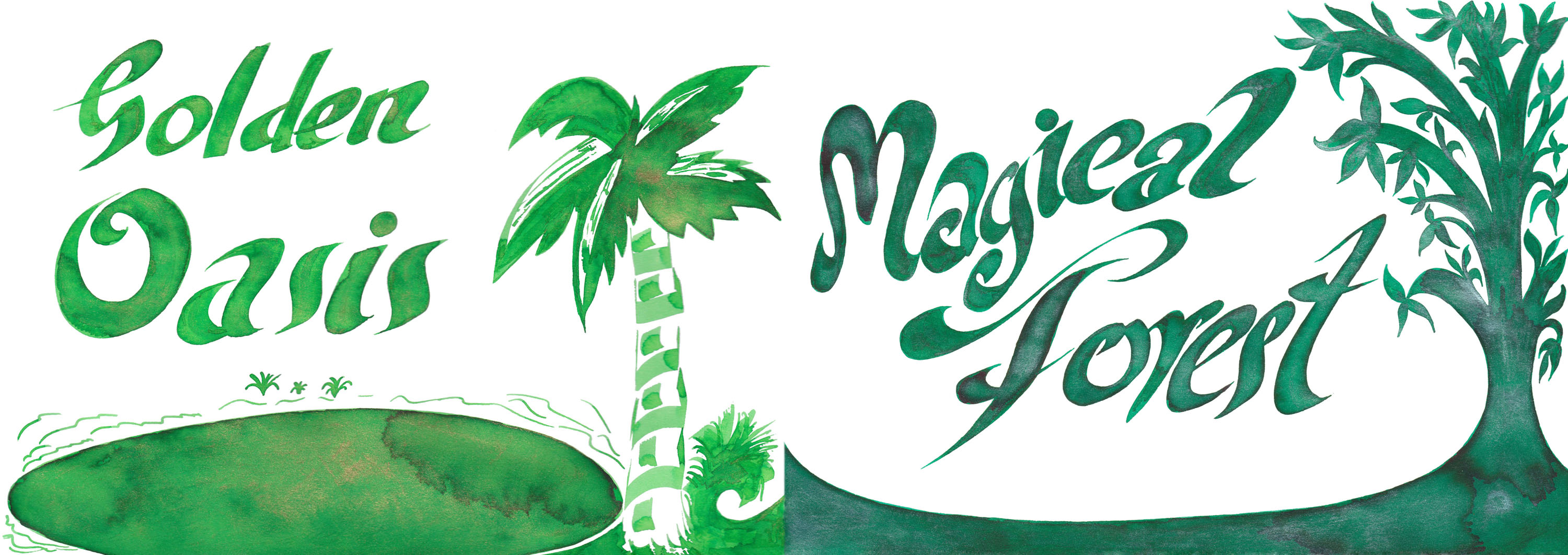
The greens
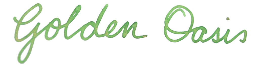
Green ink has its devoted fans, and here are a couple of splendid stocking fillers for any you encounter. Magical Forest is almost perfect for writing the price list in your neighbourhood crystal healing emporium, while the lime green with golden sparkles of Golden Oasis looks for all the world like a gecko flitting by.
The greys
While not everyone feels that grey is quite the colour for the festive season, re-brand it as silver and everything’s fine. So here we have dark silver with bright silver sparkles (hmm, subtle) darker silver with golden sparkles (less subtle), and silver with the lights off (OK, OK, it’s black). The dark base ink does show the sparkles up quite effectively.
The purples
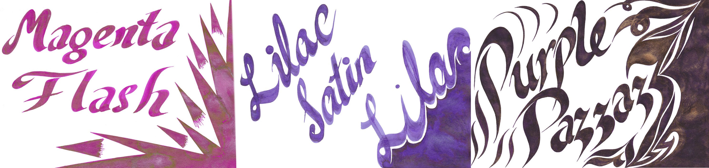
Of course we’ve saved the best for last – for those into a spot of purple action at least! Two of these have already featured on Too Many Purples and the third will follow soon. Purple Pazzazz is a warm purple which is quite reminiscent of Lamy’s much-trumpeted dark lilac, but easier to get hold of and with golden sparkles to boot; what’s not to like? Lilac Satin is not unlike Diamine’s earlier Iris from the flowers box set, with added silvery shine, and that’s a rather splendid finish too. Finally, Magenta Flash is a very purpley sort of magenta for a change (no pinks in disguise here), and looks rather spectacular in a wet-nibbed pen of your choice.
Come and get it!
You can get hold of your own Shimmertastic supplies in all of the usualfavouriteonlinesources, or direct from Diamine themselves. Easy peasy.
Pure Pens for samples of the original ten flavours, Diamine themselves for samples of the new twelve colours, and Cult Pens for sponsorship-in-kind to get big bottles of some of the best for sharing-around.
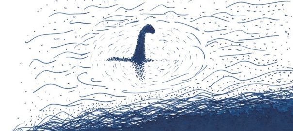
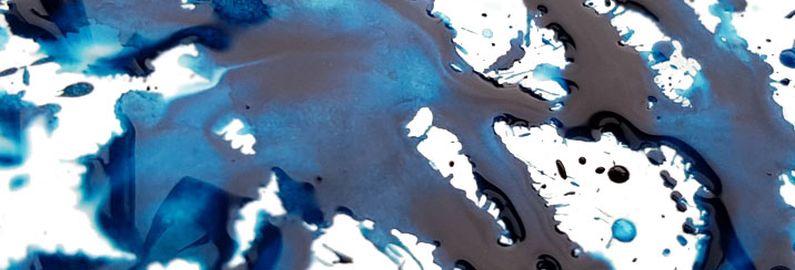
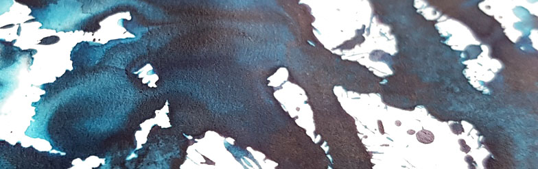
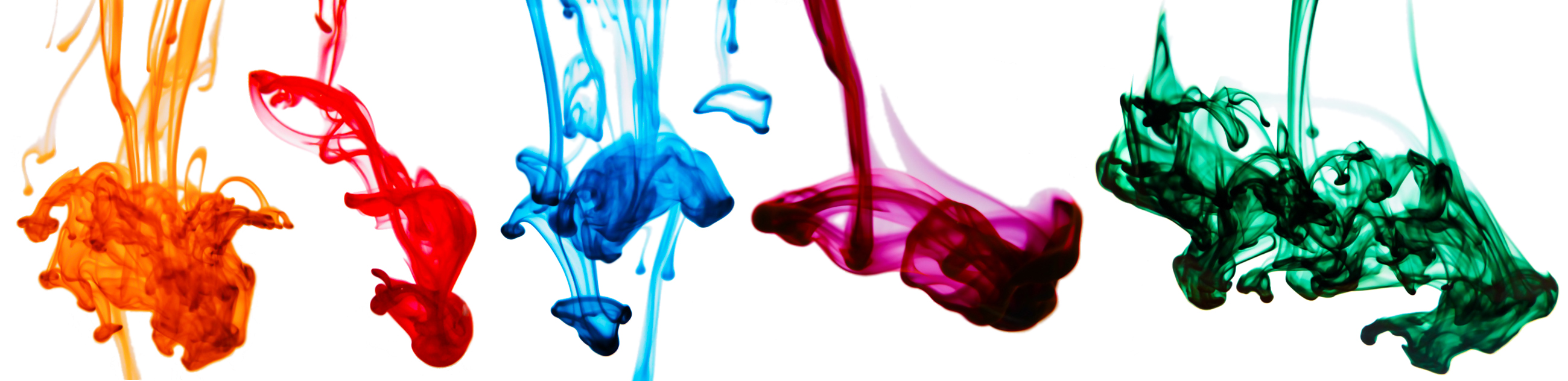
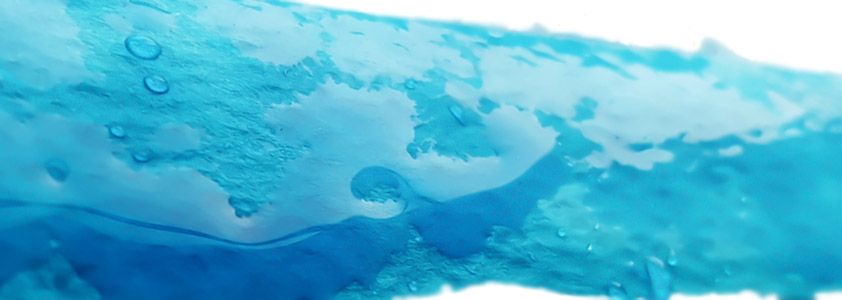
We’re joined by the Clumsy Penman himself for this week’s review, so what better way to start than with a collection of his underwater ink pics?
It’s off to Nuremberg we must go next, though, for this is where the marvellous Kaweco are based. A small name which packs a big punch in the fountain pen world, we all have a Sport or two from Kaweco tucked-away in a pocket somewhere. They actually have their own range of inks made in Austria (as does Montblanc, curiously enough), but wherever they hail from it was high time that we put their own range of inks to the test too! An adventurous band of United Inkdom reviewers new and old (hey, less of the old) broke out the nibs and got busy.
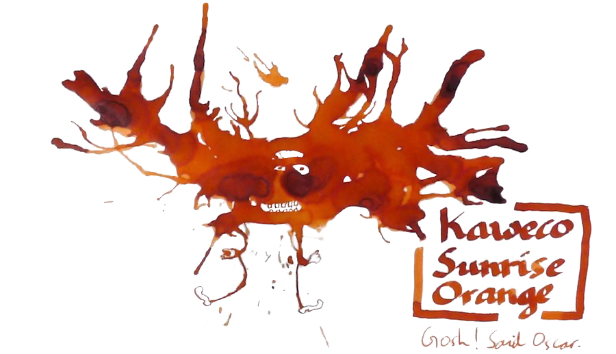
Sunrise Orange is one of the newer additions to the range, and reactions from our testers suggest that it was a very welcome one. Mateusz found this not only a worthy rival to the well-know Apache Sunset, but in many respects rather better, and Scribble liked the orange-tinged sunrise so much that a bottle of tequila is back on the shopping list, while Ian was soon lusting for a spot of caramel. Either way, it’s tasty – and just look at that shading.
Paradise Blue has quite a fan base, as a good sturdy (or ‘solid’ as James says) turquoise/teal. Scribble likes it a lot, and Ian can live with the modest shading too. The flow is good but, as Mateusz points out, there is a price to pay in this particular ink’s tendency to sink rapidly into paper, which is only really useful if you want to read your genius-like thoughts back-to-front from the reverse page.
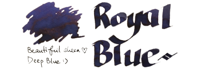
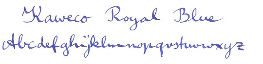
Royal Blue is perhaps not the most original colour, and Ian and Scribble were both reminded of school-room days. Matthias set out to find what mystical qualities might have put this in the same class as the now-deceased Rotring ink, without definite result – although he did like it. James, though, found something others hadn’t spotted; a sheen. Now you’ve done it, James – that’ll open the floodgates.
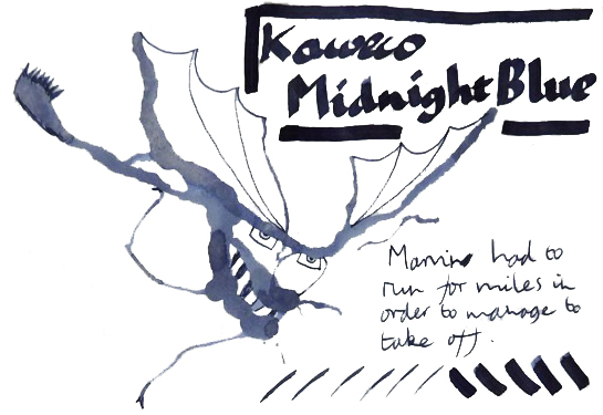
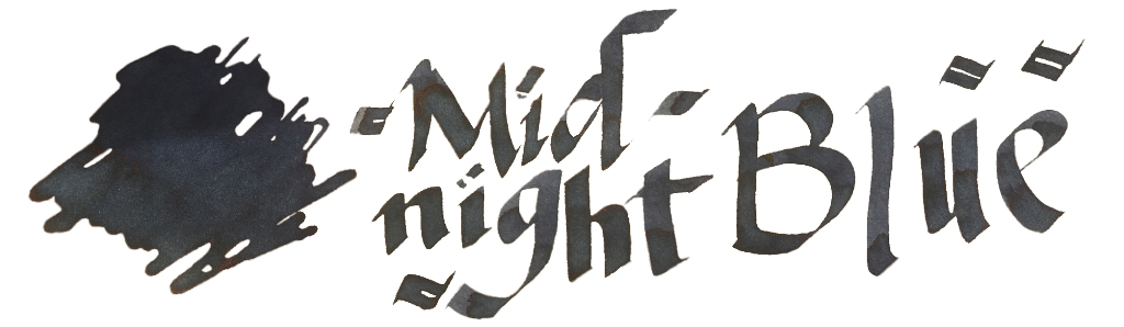
Midnight Blue is a fairly standard dark blue or blue-black. Honestly, there’s not a lot to say about this as a colour, although as Ian points out it does still have reliably good flow.
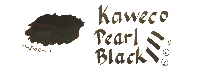
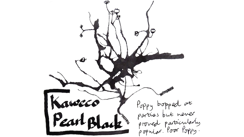
Pearl Black, similarly, is a rather everyday black. Any self-respecting ink range does have to have a black, and there is a limit to what anyone can do to make it interesting, although Ian thought this one was on a par with Aurora black, which sounds like a compliment at least.
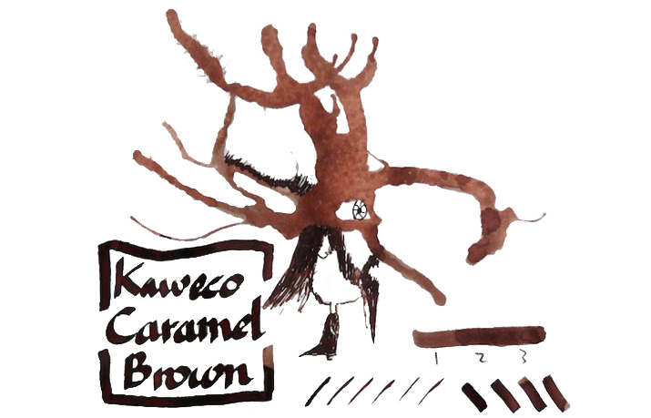
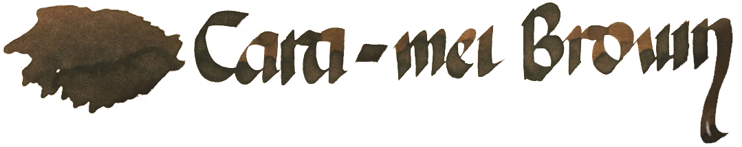
Caramel Brown seems to be one of the least popular colours. There’s nothing especially wrong with it as an ink, if you like browns – but if you’re not a fan of brown inks in the first place, then this may not tempt you to the earthy side. Ian even found it ‘sludgy‘ (in colour rather than consistency), and it’s hard to hear that as a good thing.
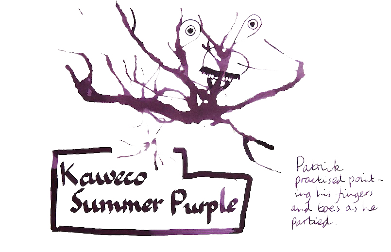
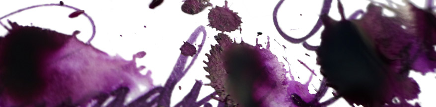
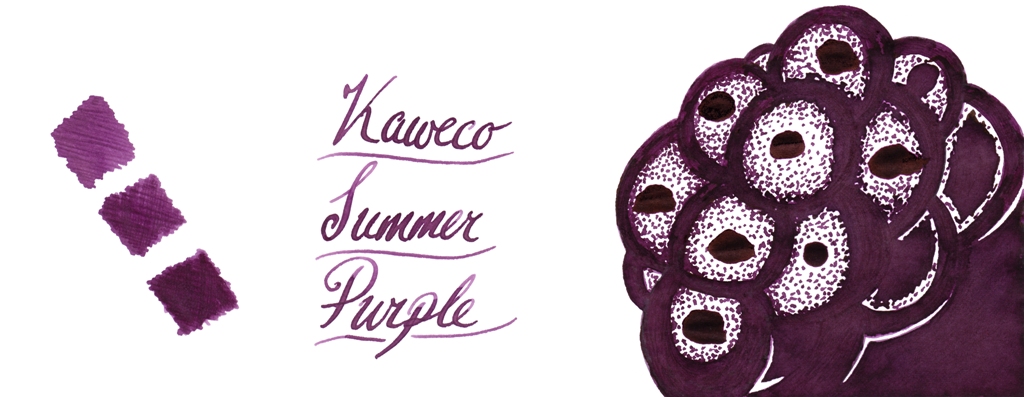
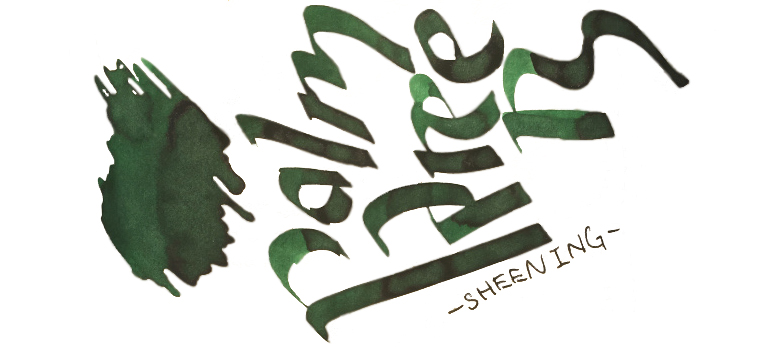
Summer Purple returns the Kaweco ink range to popularity, with a juicy flow and a juicy colour to boot. Mateusz found it a good performer, James enjoyed the subtle sheen, Scribble added it to the never-ending collection of Too Many Purples. Even Ian, who is not the world’s biggest fan of purples, thought this a good one.
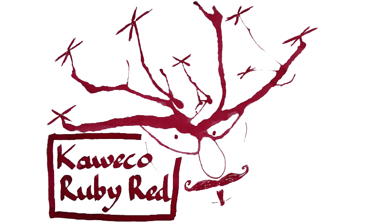
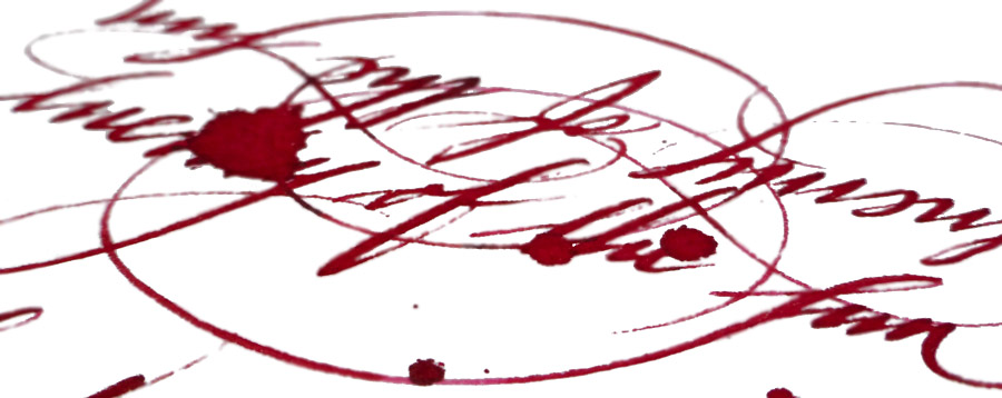
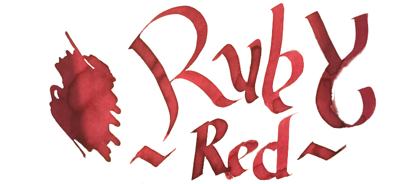
Ruby Red seems to have impressed people just as much as Montblanc’s Corn-poppy Red did (we’re back to wondering about that Austrian factory again). Ian felt it had a good bit of character, while both James and Mateusz noted more than a hint of rosy magenta in the mix.
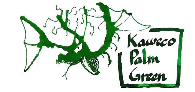
Palm Green looks like a forest green to James or a ‘textbook’ green to Mateusz, which just goes to show the benefit of taking more than one opinion. Ian spotted potential for quite pronounced shading, too.
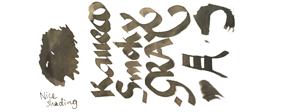
Smoky Grey is last, and probably on this occasion least, given that only two reviewers have put it to the test. Grey is not everyone’s cup of tea, to be fair, but this one does seem to behave quite well and offer more shading interest than the average.
VFM Can be something of a challenge with this collection, to be honest. The bottles contain only 30ml, and are sold at ‘premium’ prices in the UK – although this is at least in part a self-inflicted exchange rate problem for us Brits to deal with. Price competition looks particularly tough when compared with our home-grown Diamine, who provide 80ml bottles of ink for little more than half the price. Few retailers stock both brands at present, but to cite the example of one with the lowest prices for both, at the time of publication The Writing Desk were charging a little over 7 pence per millilitre for Diamine, and 35p/ml for Kaweco ink. That effectively knocks Kaweco inks out of consideration for everyday colours like Royal Blue, which both brands provide; even if you like the look of that sheen, it’s unlikely that many fountain pen users would consider the Kaweco version five times better than the Diamine. But some of the highly distinctive shades such as Sunrise Orange, Paradise Blue and Smoky Grey have qualities which really make them worth seeking out, in our opinion – and they’re hardly going to break the bank!Our overall recommendation is to choose carefully and invest in one or two of these which particularly take your fancy. If you like purple, Summer Purple is warm and user-friendly. If you’re a turquoise fan and can stand the ink sinking-in to the paper rather enthusiastically, Paradise Blue is a lovely colour. Ruby Red and Palm Green beat any teacher’s homework-marking ballpoint any day… and Sunrise Orange eats Apache Sunset for breakfast. If you just want a well-behaved Austrian everyday black or royal blue, you don’t really need to spend so much; even Montblanc will provide you with twice as much ink for the same money. But we like this collection; suffice it to say that there are several Sports, Lilliputs and at least one Supra which will now be filled with ink from the same stable for quite some time.
Thanks to Kaweco for kindly providing generous samples for this meta-review exercise.
A bit of history Private Reserve suggests a fine wine, rather than an ink, but it’s a brand that has had a loyal following in its native North America for many years. Here in Blighty, it’s a little harder to find, but several of our reviewers were kindly provided with samples by The Writing Desk following our recent couple of articles about their ways. The three reviewers all got different samples, so a meta-review has been a bit more challenging than usual – but Ian had reviewed many Private Reserve inks in the past and Scribble had tested all the purples, so we have quite a range covered! Between us, there are five Private Reserve inks that at least two of us have tried, comprising two greens, a greenish blue and a pair of purples. Are you inking comfortably? Then I’ll begin…
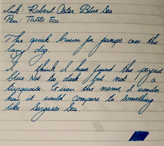
Don’t step on my blue suede shoes Blue Suede is a good place to start because it’s a tricky colour to pin down. It IS blue, but then again it’s really rather green. Our newest reviewer, Daniel, points out that this is actually a teal, if anything – and a jolly decent one too. It’s so saturated that there is no shading to speak of, but it’s not going to look insipid either. Ian was a big fan too, adding that drying times may not be the fastest but they were also far from terrible.
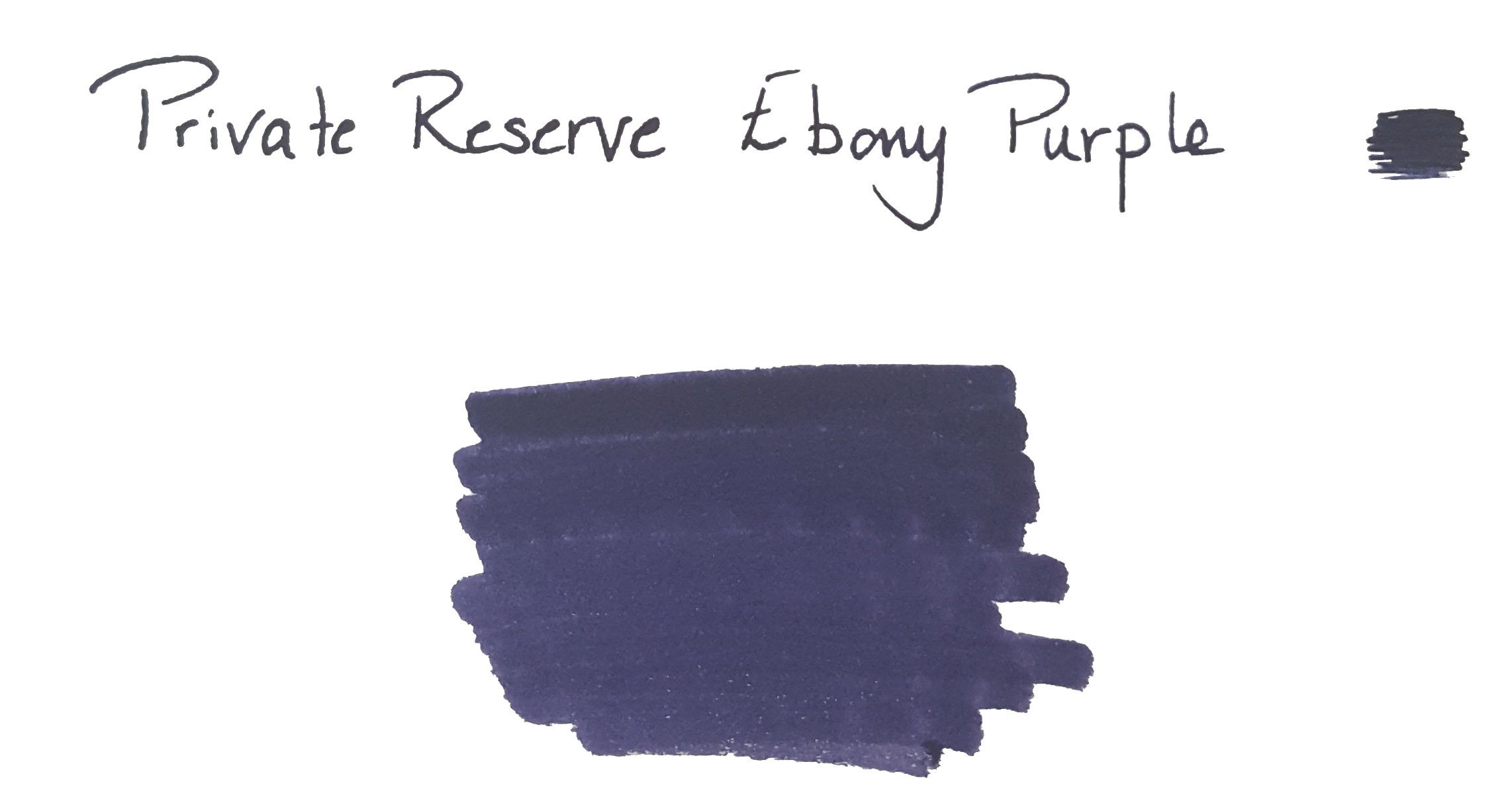
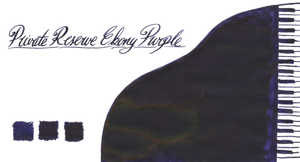
Ebony and burgundy go together in perfect harmony Those of us who like to sneak a purple to work are often in search of a purple-black ink, and this certainly fits the bill – plus, it has quite a noticeable sheen if you lay it on thick. Ruth got a sample of this as part of her trial assortment and was suitably impressed.
Scribble has been busy trying to review every purple there is, and still liked Ebony Purple so much that he’s got on to The Writing Desk and bought a big bottle of the stuff.
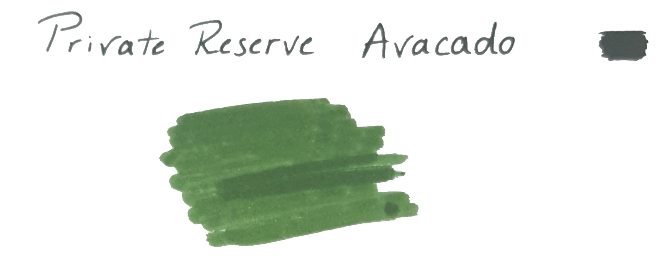
You say avacado, I say avocoda, oh let’s call the whole thing off Now, the good people at Private Reserve may not be able to spell avocado, but they certainly know how to make an ink that looks like the flesh of said fruit. Ian found the colour impressively rich, and Ruth was quite taken with it too.
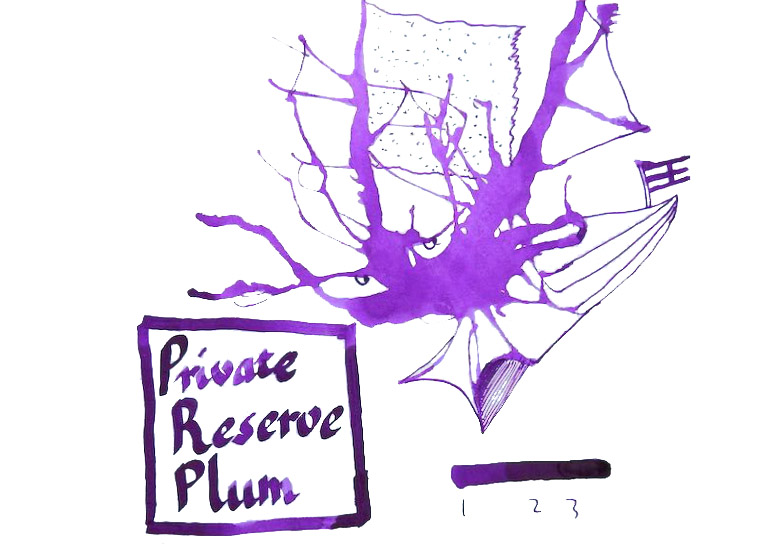
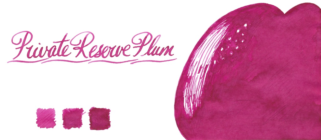
Down-there-in-the-ink, sha-la-la-la-laa, it looks like the inkling of a plum Plum is a fruity shade which seems to do different things in different pens, unless of course we got some labels mixed-up!
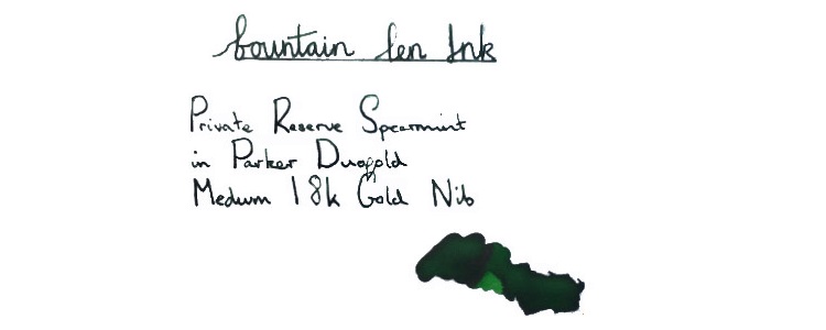
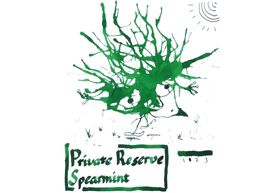
Yes, we have no rhinoceros Spearmint was quite a bit darker than the mention of mint appeared to suggest.
Rob found that there was more shading with this colour, but that the saturated nature of the ink could pose clogging challenges with some pens – albeit nothing that good rinse of the feed wouldn’t sort out. Ian enjoyed the shading that showed-up in his ‘inkling’ illustration too.
Somewhere over the rainbow Private Reserve has its origins in Indiana, which is quite a way from Kansas, but Dorothy probably wouldn’t be disappointed – plenty of other colours are available too! Thanks to The Writing Desk, Daniel enjoyed another two greens; Ebony Green and the possibly mislabelled Ebony Blue, while Rob sampled Electric DC Blue and the nicely dark Chocolat, and Ruth enjoyed a sip of Orange Crush. Private Reserve sent Scribble a set of samples directly to support his search for the perfect purple, so he’s also had fun with Purple Mojo, Purple Haze and Super Violet. Ian gets the prize for the broadest reach with reviews of Tanzanite, Buttercup, Ebony Brown, Black Cherry, and Shoreline Gold.
It’s the End of The World As We Know It But you’ll at least feel fine in the ink department with some of these – ‘well worth checking-out, in our assessment, and the simplest way of getting hold of them in the UK is to head to The Writing Desk. Let us know about the colours we missed!
 A little bit of history Some time during the Caledonian Orogeny, around 490–390 million years ago, the Great Glen Fault formed. Wind forward a few aeons and the trench this left cuts a swathe across Scotland, including the very well-known Loch Ness and, just to the south, the rather tautologous Loch Lochy, near which is the home of Beaufort Ink. Despite the name, Beaufort Ink have made their way in the world selling nibs and pen-turning parts rather than ink – until now. Now they’re making up for lost time, and then some!

 If this isn’t quite your cup of tea, but almost… Beaufort have indicated that other colours may join the collection if there’s sufficient demand. Unsubtle hints about the urgent need for Purple Heather have already been lodged. The case for Made In Scotland From Girders Orange, meanwhile, awaits a longer label as well as copyright permission!
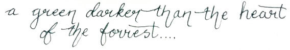
 This meta-review references:
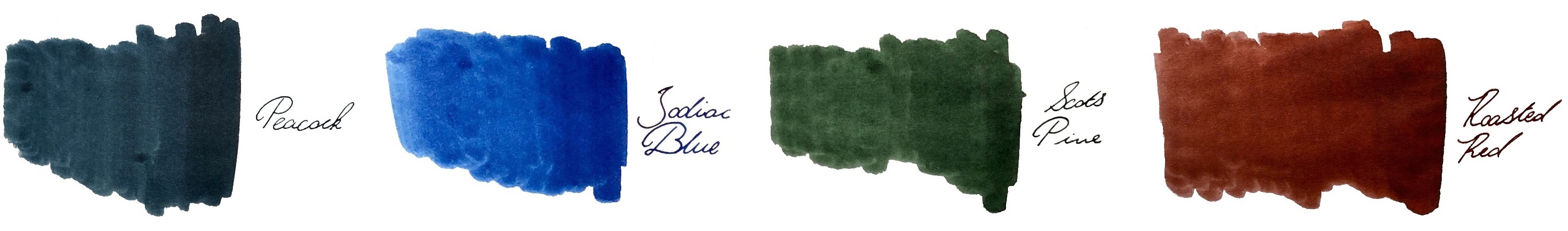 Thanks to Beaufort Ink for kindly providing samples of the whole range.
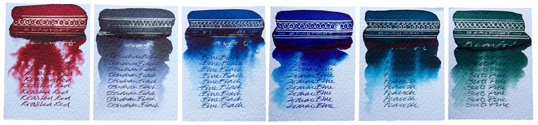
 A little bit of history Diamine were the first manufacturer to produce a range of affordable shimmering inks following J. Herbin’s innovation of introducing tiny sparkling particles to their inks. They launched with a range of 10 different colours, added another 12 later (reviewed
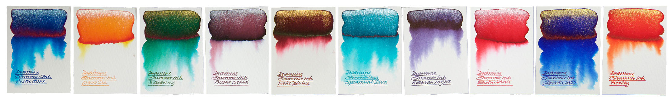
 If this isn’t quite your cup of tea, but almost… J. Herbin make a variety of premium shimmering inks.
 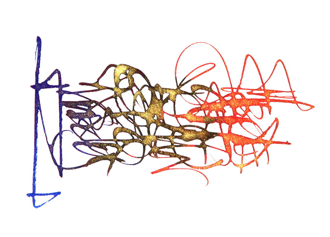 Where to get hold of some The
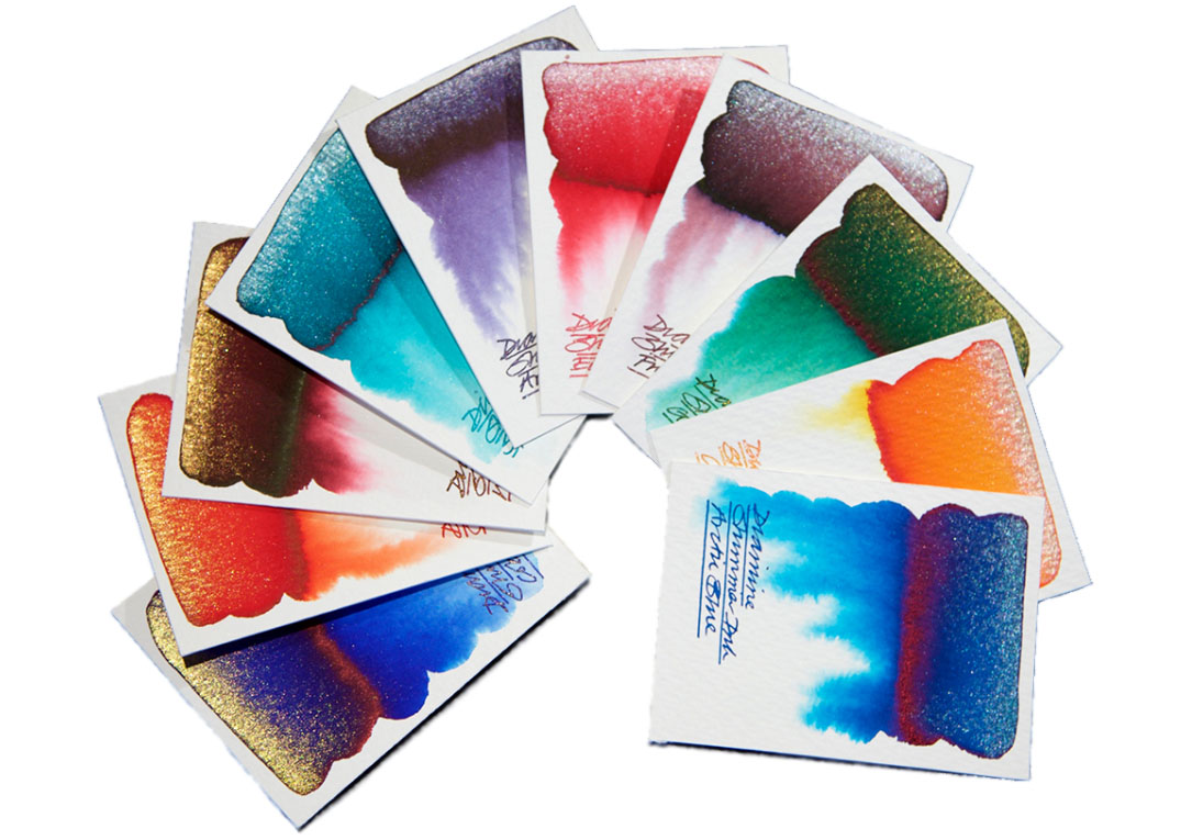
 A little bit of history The ancient Romans did all sorts of rum things in barrels; polluting wine with lead to sweeten it, fermenting the pungent rotted-fish sauce garum, and brewing-up the hard-wearing ink atramentum. German ink-makers De Atramentis continue this tradition in their name and some of their production methods (albeit hopefully without the aroma of decomposing marine life), and recently they have got on the sparkly ink bandwagon. Everybody’s doing it these days, it seems – J.Herbin, Diamine and Robert Oster too. So we set out to find out what De Atramentis is bringing to the party…
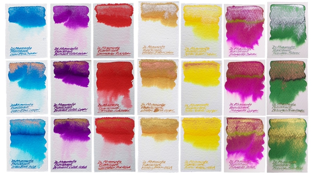 Crucially, how it writes… Much like standard fountain open ink, and De Atramentis certainly make plenty of that. There can be the occasional hold-up due to the high proportion of particulates (the sparkly bits), which eventually silt-up the feed and stem the flow, but this is easily rectified with a thorough clean. With this in mind it’s advisable to stick to fountain pens which can be completely dismantled for a quick scrub, but these inks are otherwise suitable for use with most of the nibbage you own.
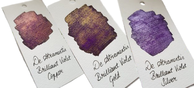
 Thanks to De Atramentis themselves for generously sending us a sparkling set of these inks for testing.
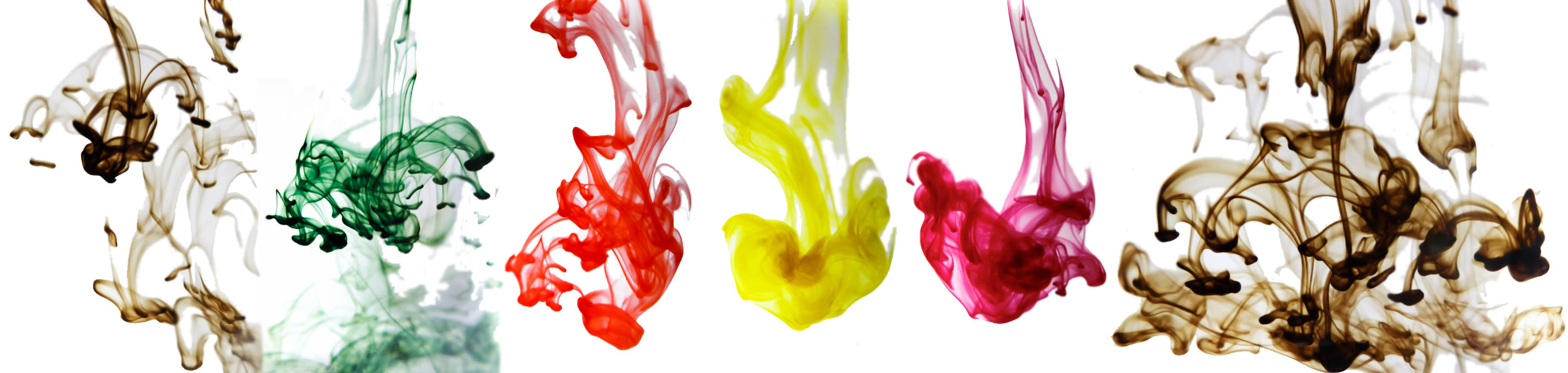
 Ink! What is it good for? As Nick capably demonstrates, it’s great for calligraphy. Since it’s an iron gall ink it should be acceptable if you’re signing a marriage register, and as it’s permanent it should do for addressing the wedding invitations too (the ink is partially washable, but even if it gets rained on the text will still be legible). Lavender Black, which seems to be the consensus pick of the bunch, could be good for one’s secret diary (you have one of those, right?). Or you could just have fun with them, like we did!
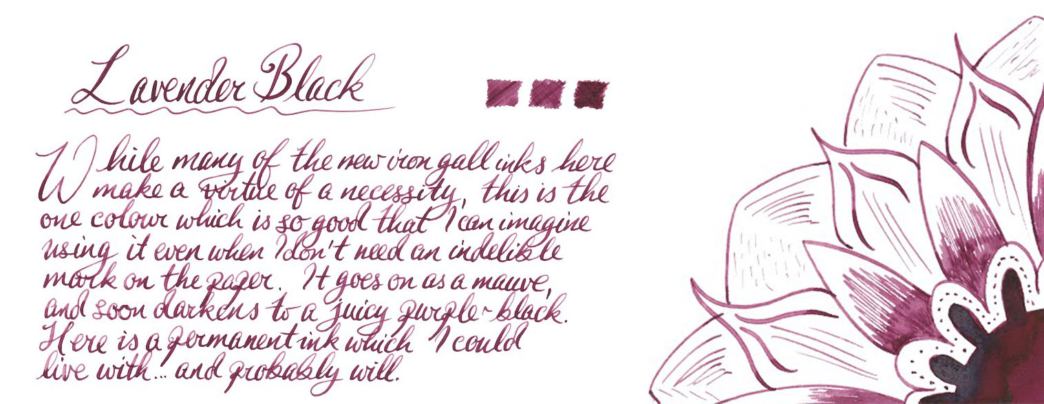 VFM These are not cheap inks, it has to be admitted; £22 will buy you a fairly respectable fountain pen these days, after all. But some of Platinum’s ‘Classic’ colours are really easy on the eye – and if you are using this for a special event, it’s not going to be that big a dent in the stationery budget.
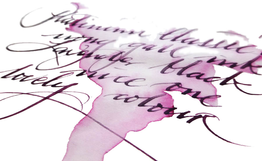
 Our overall recommendation We think these are pretty impressive inks, and conjure up a wider and more interesting palette than iron gall formulae can usually manage. If you have a sensible use for a permanent ink and fancy something a bit different, a 60ml bottle will do the job well. Given the significant cost our tip is to pick one or two which really take your fancy rather than going straight for the whole set.
 Where to get hold of some We got ours direct from
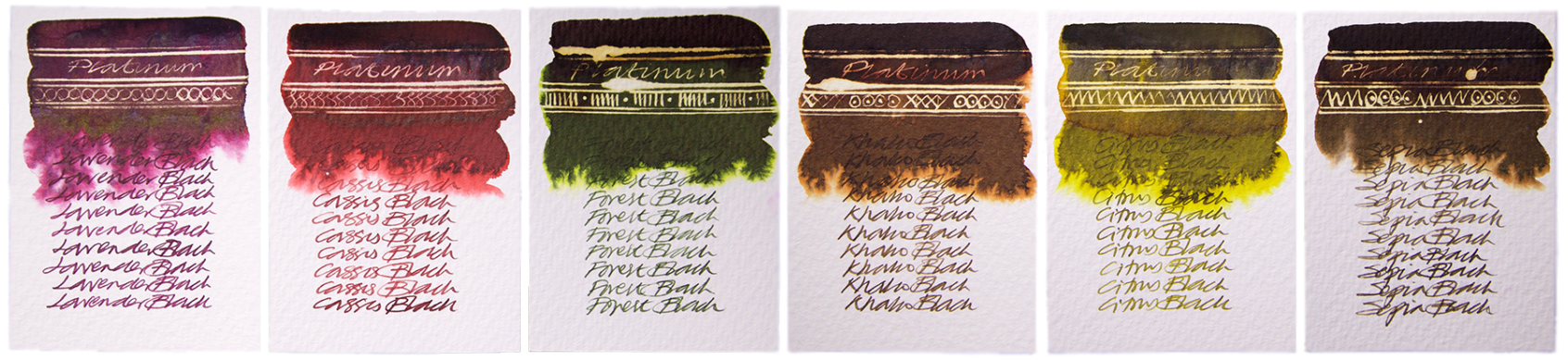
 The United Inkdom reviewers all found that aside from the impressively broad colour palette the crucial difference for KWZ ink is its flow properties. Of course writing experience depends on many things like paper, pen, nib, how the feed keeps up with the ink and also one’s writing style itself. People who have very a light touch need ink which flows well to keep up, otherwise pen will skip – but interestingly, heavy-handed writers also require a ‘wet’ ink in order to produce thicker and uniform line. This is especially true for those who use semi-flexible or flexible nibs, which can tend to tramline/railroad if a dry ink is selected. In this respect we found that KWZ inks are some of the best available; the flow is excellent, and in even the most gushing of flex-nib feeds it can keep up. We found the writing experience very pleasant with all types of pens all we tried the ink in, including those with particularly fine nibs as well as broad and flexible ones. On good-quality paper KWZ inks behave very well, tending not to feather and bleed through. This may not be the case with cheap absorbent alternatives such as photocopy/printer paper, but of course all fountain pen inks struggle on those surfaces. Because KWZ inks are highly saturated some ‘ghosting’ may occur especially on very thin paper, such as that made by Tomoe River. We found that many inks from KWZ we tested gave a decent amount gradual shading, but in some cases shading is very impressive, although in general KWZ inks do not exhibit a sheen. They are fairly wet inks, so drying time is not the strongest feature, but once they do dry completely there is not smudging.
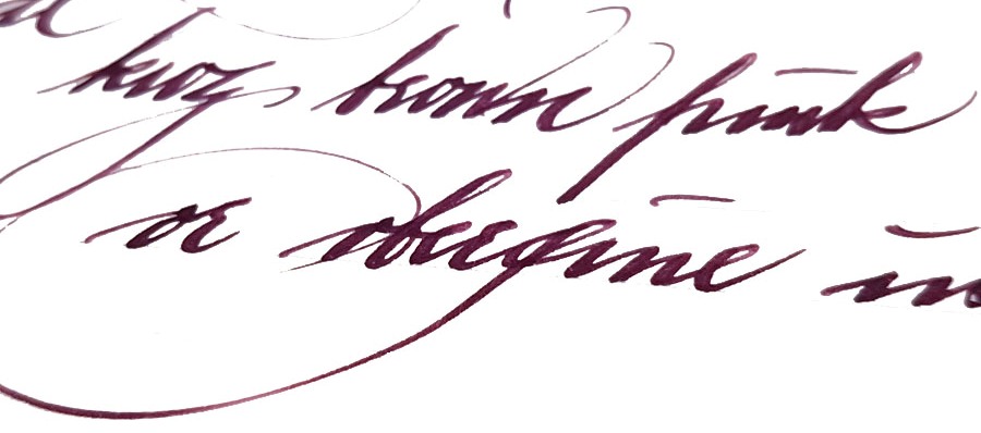


 A little bit of history
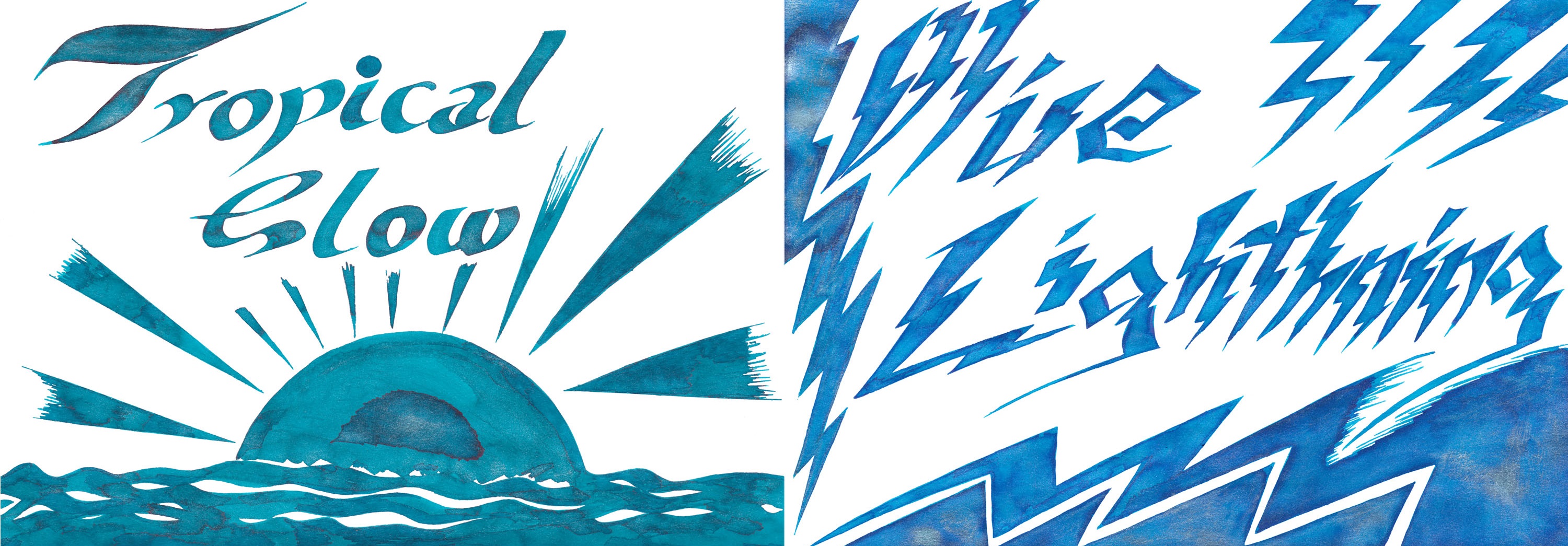


 Enchanted Ocean and Shimmering Seas are a little harder to categorise – like the sea, they keep changing colour as the light shifts. But both are broadly blue-black with either green or purple hints, with a spot of iridescence from
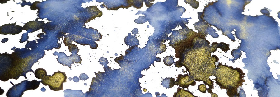

 VFM Can be something of a challenge with this collection, to be honest. The bottles contain only 30ml, and are sold at ‘premium’ prices in the UK – although this is at least in part a self-inflicted exchange rate problem for us Brits to deal with. Price competition looks particularly tough when compared with our home-grown Diamine, who provide 80ml bottles of ink for little more than half the price. Few retailers stock both brands at present, but to cite the example of one with the lowest prices for both, at the time of publication The Writing Desk were charging a little over 7 pence per millilitre for Diamine, and 35p/ml for Kaweco ink. That effectively knocks Kaweco inks out of consideration for everyday colours like Royal Blue, which both brands provide; even if you like the look of that sheen, it’s unlikely that many fountain pen users would consider the Kaweco version five times better than the Diamine. But some of the highly distinctive shades such as Sunrise Orange, Paradise Blue and Smoky Grey have qualities which really make them worth seeking out, in our opinion – and they’re hardly going to break the bank!
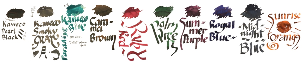 Our overall recommendation is to choose carefully and invest in one or two of these which particularly take your fancy. If you like purple, Summer Purple is warm and user-friendly. If you’re a turquoise fan and can stand the ink sinking-in to the paper rather enthusiastically, Paradise Blue is a lovely colour. Ruby Red and Palm Green beat any teacher’s homework-marking ballpoint any day… and Sunrise Orange eats Apache Sunset for breakfast. If you just want a well-behaved Austrian everyday black or royal blue, you don’t really need to spend so much; even Montblanc will provide you with twice as much ink for the same money. But we like this collection; suffice it to say that there are several Sports, Lilliputs and at least one Supra which will now be filled with ink from the same stable for quite some time.
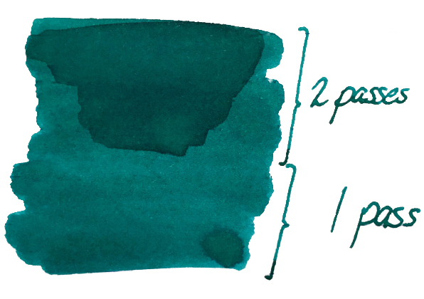 It’s so saturated that there is no shading to speak of, but it’s not going to look insipid either. Ian was
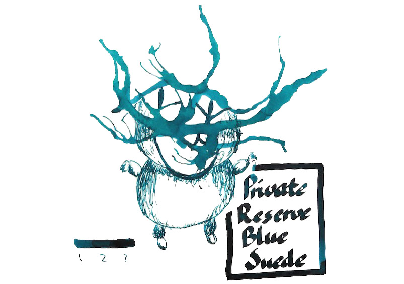
 Ian found the colour