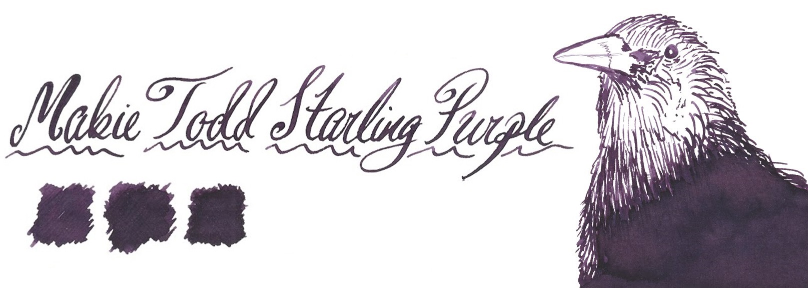
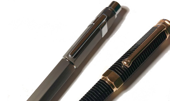
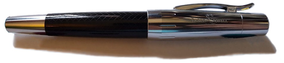
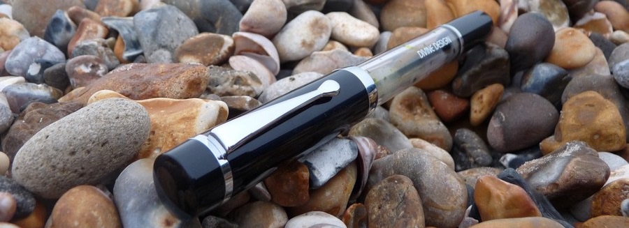
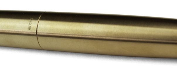
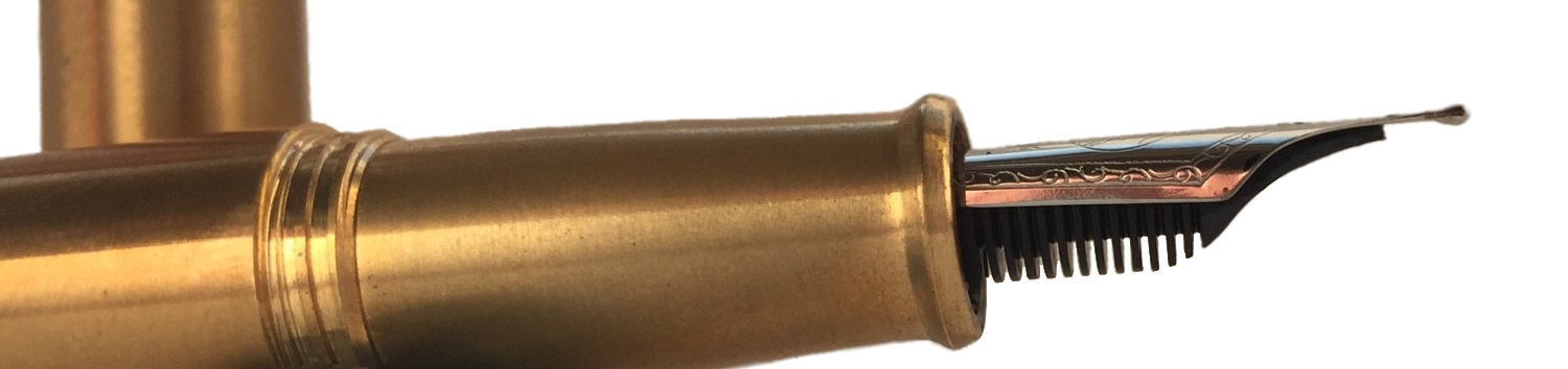
A little bit of history Karas Kustoms have been making pens, mostly from metal, since 2011. Their first pens used gel ink but they soon began manufacturing fountain pens and have been going from strength to strength. Although they’ve made some plastic pens they continue to be best known for metal pens with a slightly industrial aesthetic. How it looks This industrial metal design is strong with the Starliner. It’s named after a Ford car and there are suggestions of a tail-light in the cap. It’s quite fifties-looking and, in fact, the Reaktor range, of which the Starliner is a part, is meant as a homage to 1950s America.
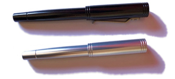
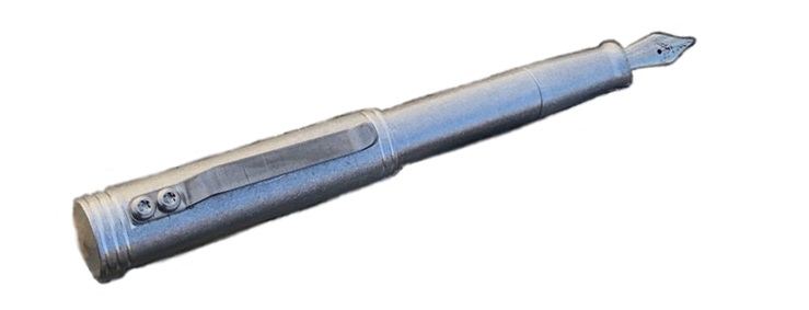
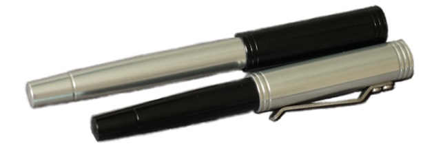
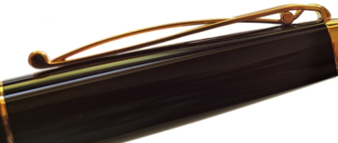
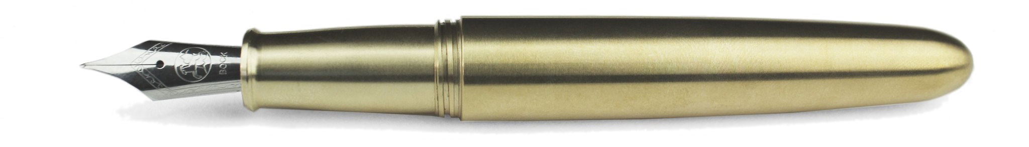
The slightly larger ‘XL’ pen has a clip of folded metal, fixed in place with Karas Kustoms’ distinctive two bolts.
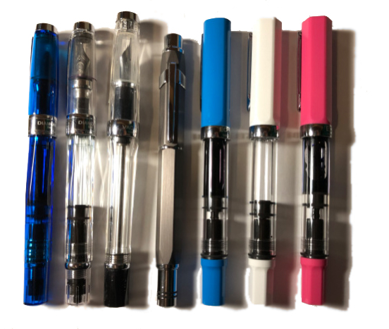
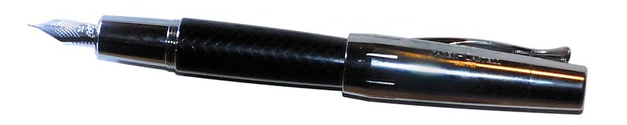
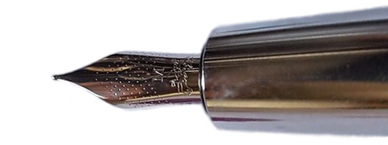
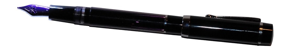
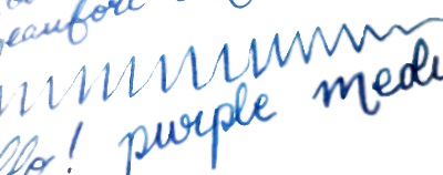
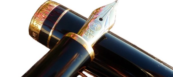
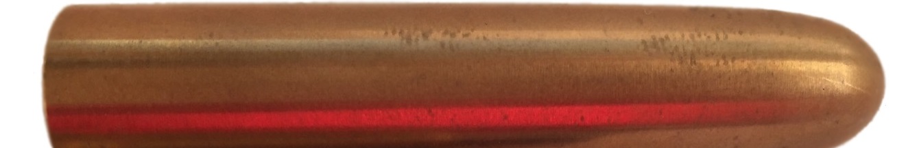
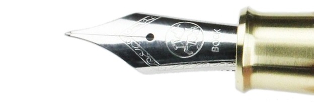
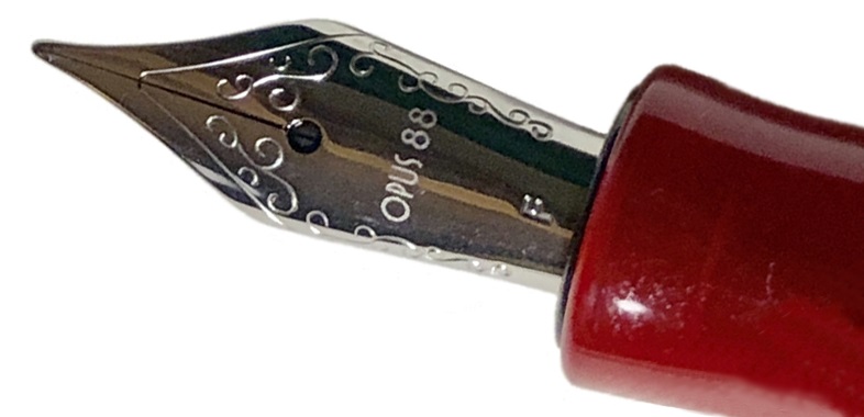
There are four options: black, raw aluminium, silver with a red section, and silver with a blue section. Two of our pens came with smaller nibs but all the production pens will come with a larger #6 sized nib (although using a #5 sized feed).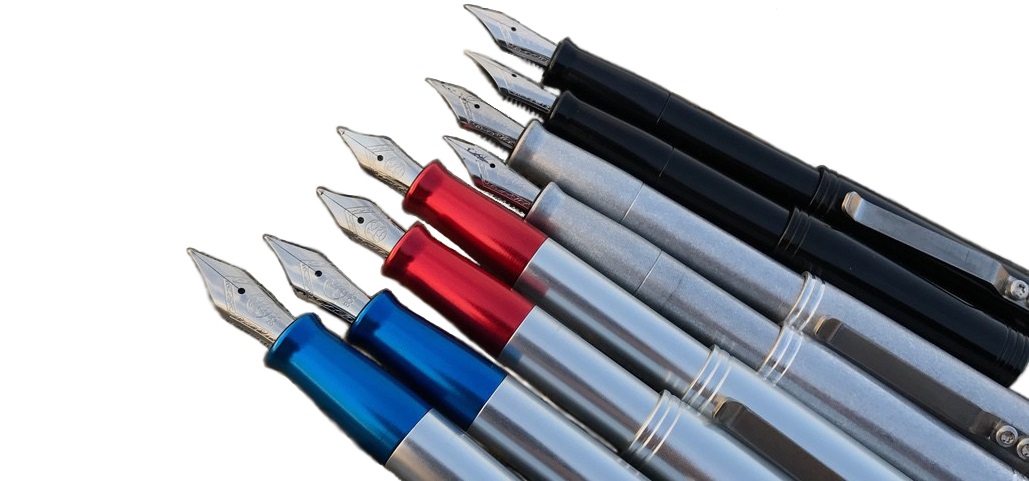
How it feels Both pens are made from aluminium and are light in the hand. The cap being a push-on pull-off affair, there are no threads and so the gently shaped section is easy on the fingers. Neither pen is particularly long and the shorter version is certainly too short to comfortably hold for any length of time. Both versions would benefit from the cap being posted but as the cap posts quite deeply this doesn’t add a significant amount to the length (although one reviewer felt it added just enough). Three of our four reviewers felt the pens were too top-heavy when posted.
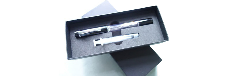
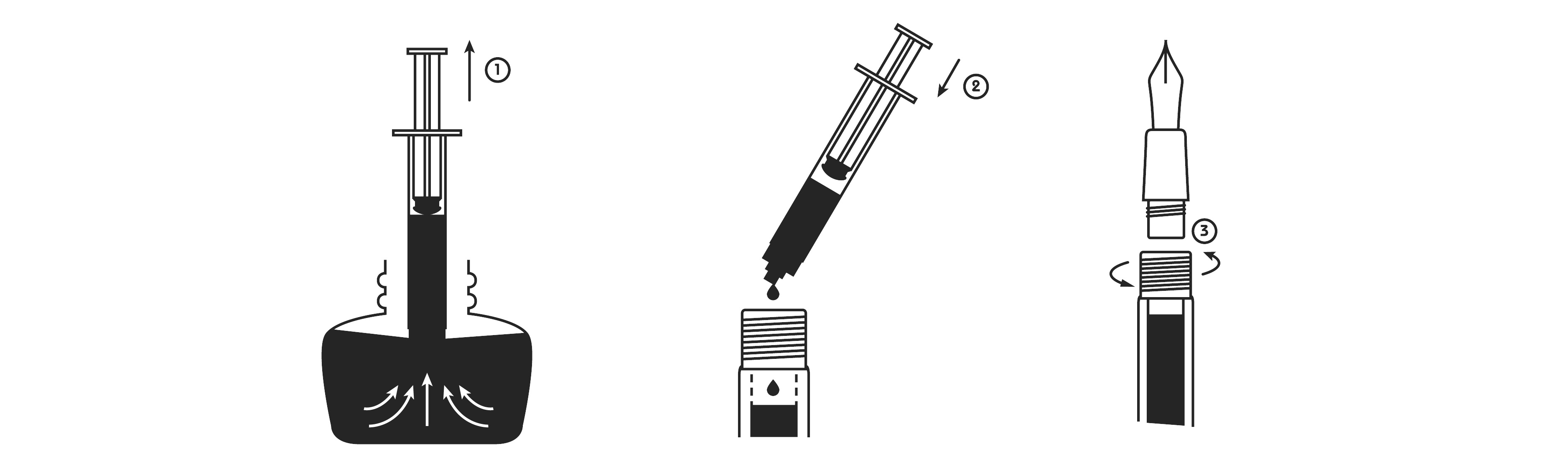
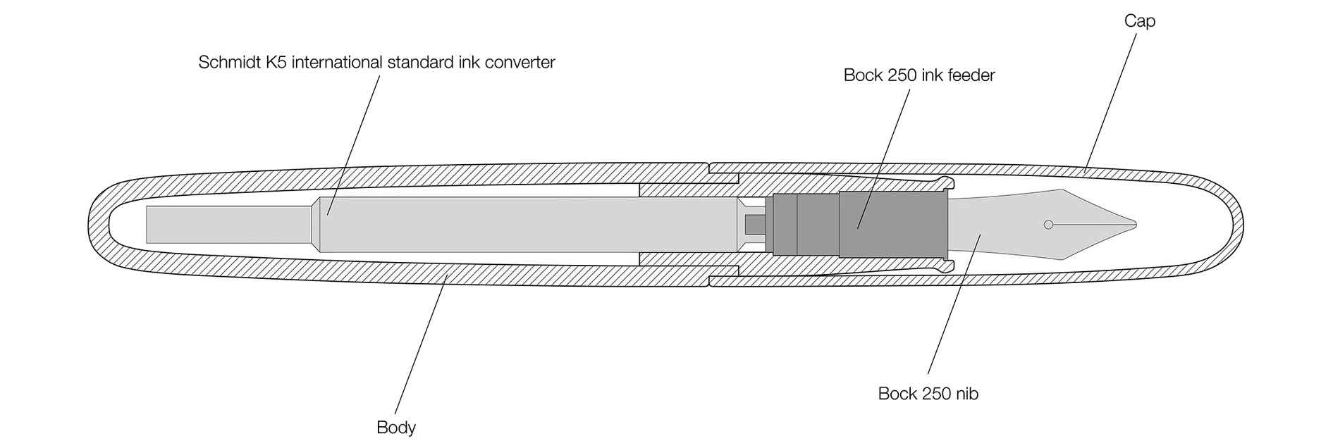
How it fills The XL comes with a converter and can also use international standard cartridges. The smaller pen will only accept short international standard cartridges.
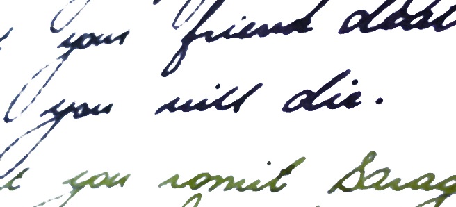
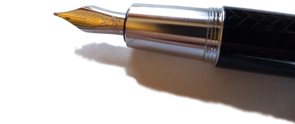
Crucially, how it writes… Karas Kustoms use Bock nibs and, unfortunately, the samples we received were very inconsistent. Some wrote well but some suffered from hard starts and skipping.
Pen! What is it good for? Both pens are solidly constructed and will take a bit of a battering. They’re good if you want a pen that you don’t need to worry about protecting or keeping safe from knocks. The push-on cap (held in place with o-rings) means the cap is unlikely to accidentally come off (although one of the prototypes we had did seem to have a problem with coming loose, and most of the pens we were sent suffered from rattles).
VFM The Starliner pens are meant to fill a gap in Karas Kustom’s line-up, at $50 for the smaller pen and $55 for the larger pen. Of course by the time they’ve made their way to the UK, shipping and customs charges increase this price significantly. It’s hard to find small-batch metal pens in this price range but… opinion about this pen was sharply divided amongst our reviewers and so it’s hard to state categorically whether this pen provides good value for money or not.

If this isn’t quite your cup of tea, but almost… If you’re after a good pocket pen then the evergreen Kaweco Sport is available in plastic for less money or metal for more. If you’re after a metal pen in Britain then Namisu or Mr.Pen’s offerings are both worth looking at. If you like the design but aren’t keen on the compromises Karas made to keep the price down on the Starliner, then it might be worth considering some of their other pens.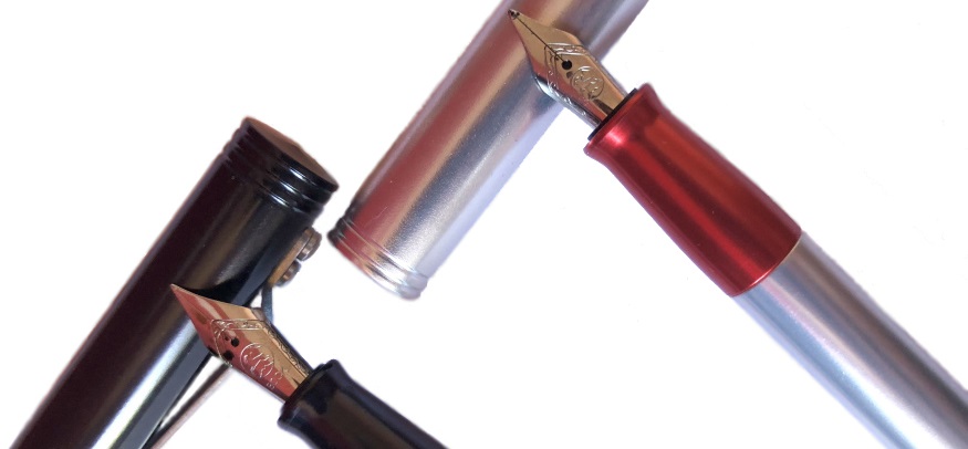
Our overall recommendation Four reviewers looked at both the Starliner pens. Two loved them and two hated them with a passion. If you don’t like how it looks then stop reading now! But if you like the looks, and don’t mind a rattly cap (something that may well be less of an issue on the production pens rather than our prototypes), and find short pens comfortable to use, then the Starliner pens are like nothing else at this price point.
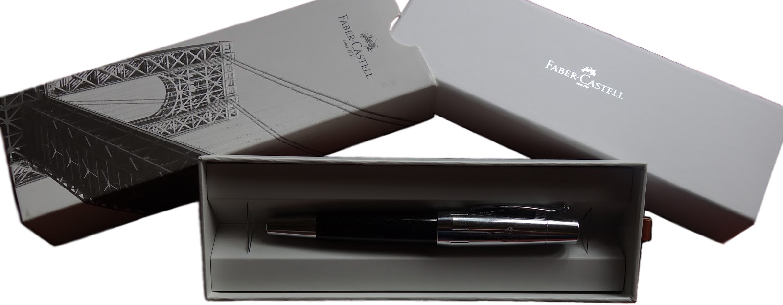
Where to get hold of one Currently only from Karas Kustoms direct.
This meta-review references:
Thanks to Karas Kustoms for sending us the full Starliner range to review.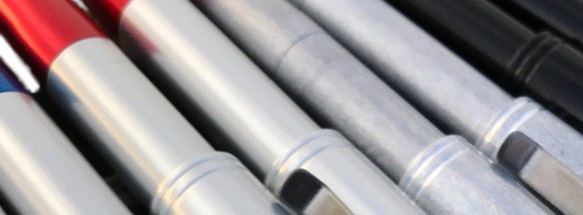

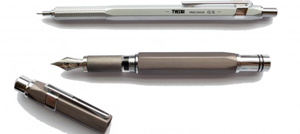
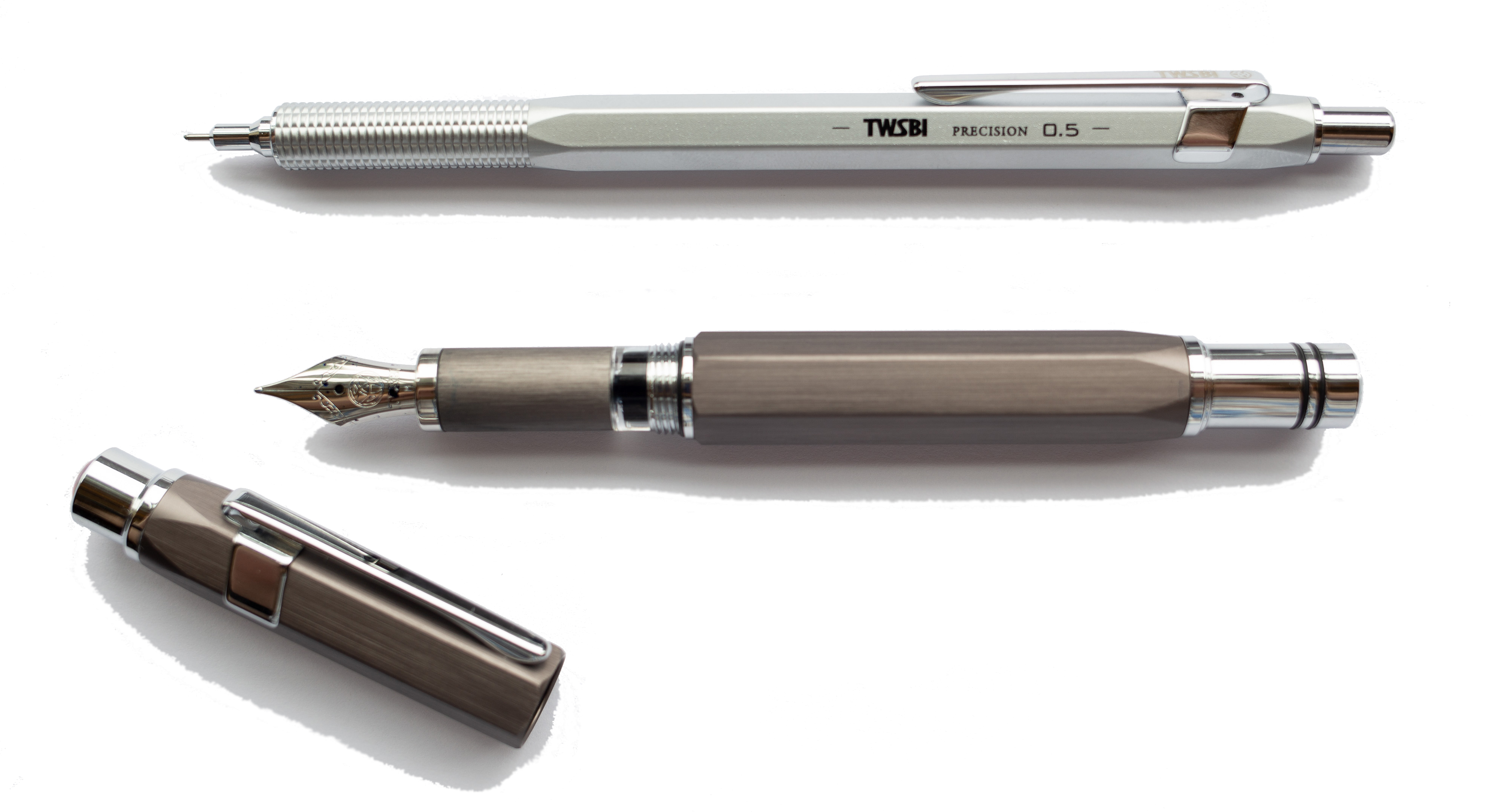
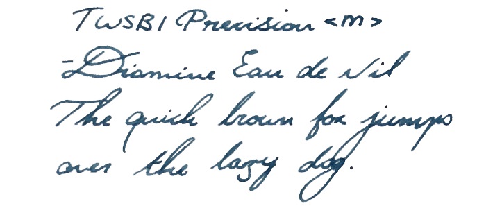
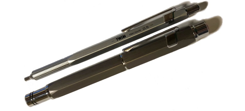
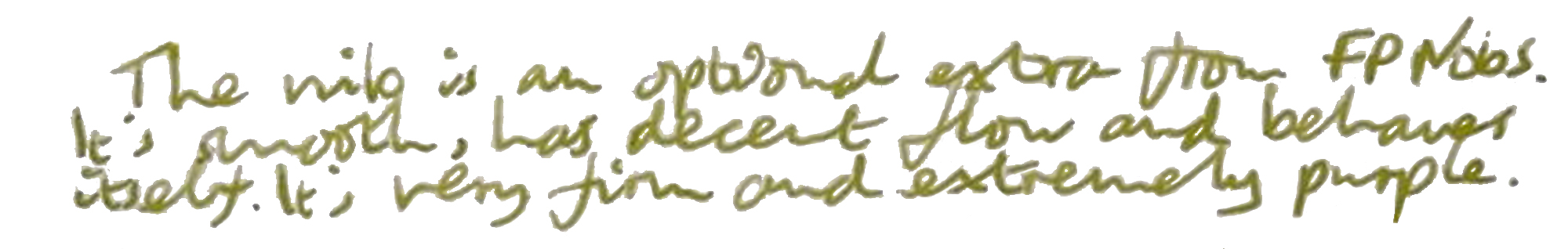
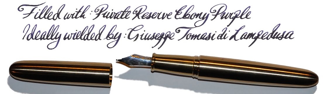
 It’s quite easy to write with both the pen and pencil for a long time without any sort of fatigue. This is especially pleasing considering that fountain pen is a piston filler, which leads nicely on to…
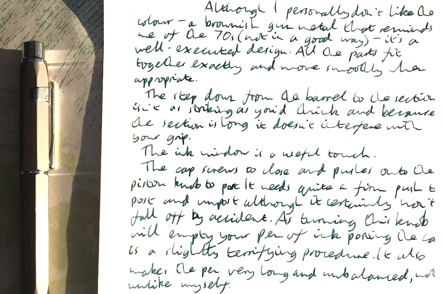
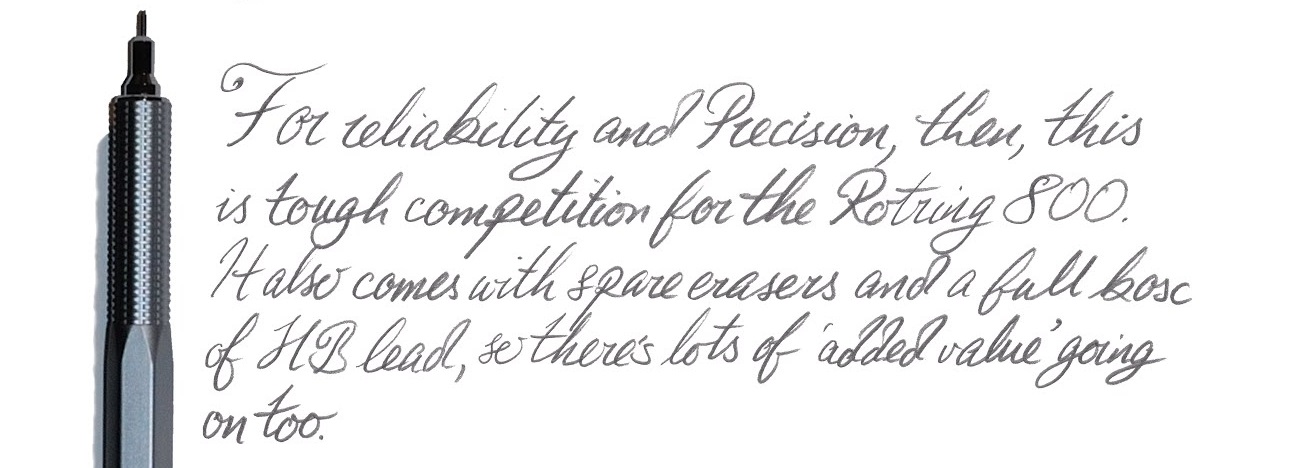
 Our overall recommendation The Precision FP is a good, reliable pen, which has the potential to become a trusty workhorse without breaking the bank. None of us had any problems in terms of the writing experience, and the only cause for concern were our own personal preferences when it comes to design. All in all, a thumbs up! The pencil is a slightly more mixed offering given the issue Matthias identified with excessive lead protrusion, but still great value for the price demanded.
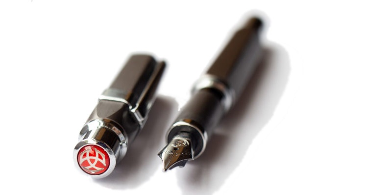
 How it feels Unposted, it’s a fairly big pen, but not oversized – so comfortable for most hands. That cap does post, but this makes it a bit top-heavy in our opinion(s).
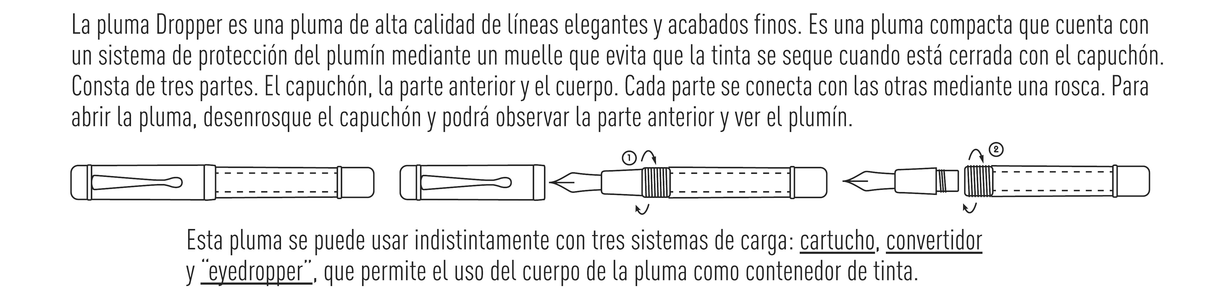
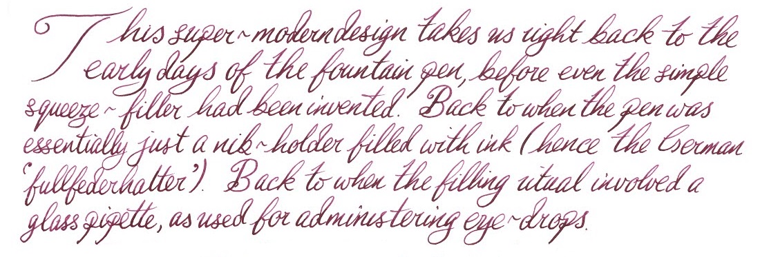
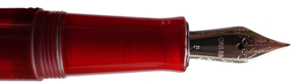
 If this isn’t quite your cup of tea, but almost… Have a shop-around for eye-droppers. They are making a gradual comeback – take the Opus 88, for instance.
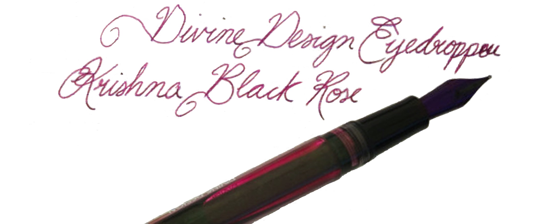
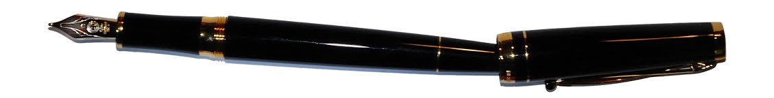
 A little bit of history Cleo Skribent is the company which kept fountain pen manufacturing going behind the iron curtain, and now make affordable daily drivers like the
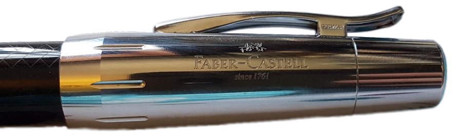
 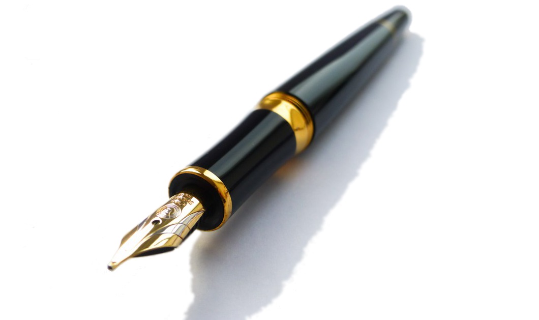 How it looks Quite distinctive, with a tapered barrel which is reminiscent of a desk pen, and that impressively over-engineered clip. The gold finish wasn’t to everyone’s taste, but a chrome trim alternative and a nicely blue version are also available.
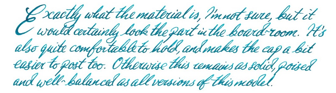
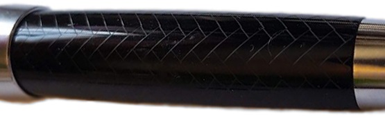
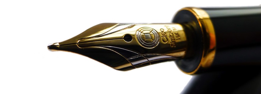 How it feels Light but well-poised and ready to write. It’s hard to resist the urge to try a few squiggles when you pick this up, even if you have nothing in particular to write – but as Skribent roughly translates as ‘scribble’ that’s perhaps appropriate.
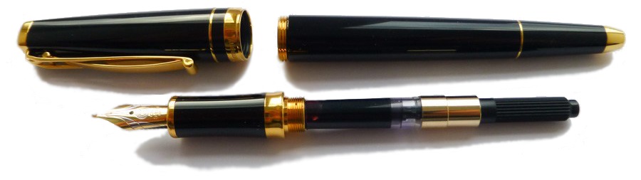 How it fills Somewhat disappointingly, given the piston option of the reasonably priced Classic, the Skribent is a cartridge/converter number. However, the converter does screw in for greater security, which is a smart move.
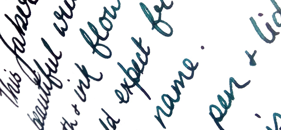
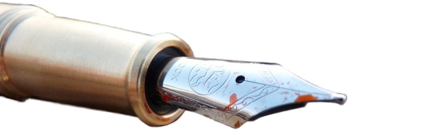
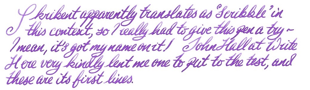 Crucially, how it writes… Ah, here is where the Skribent changes opinions quite quickly. The looks might not win everyone over, but that nib does! It’s small but perfectly formed, with a gentle bounce usually only encountered on a Japanese ‘soft’ nib, and although it offers only modest line variation it is a real joy to write with.
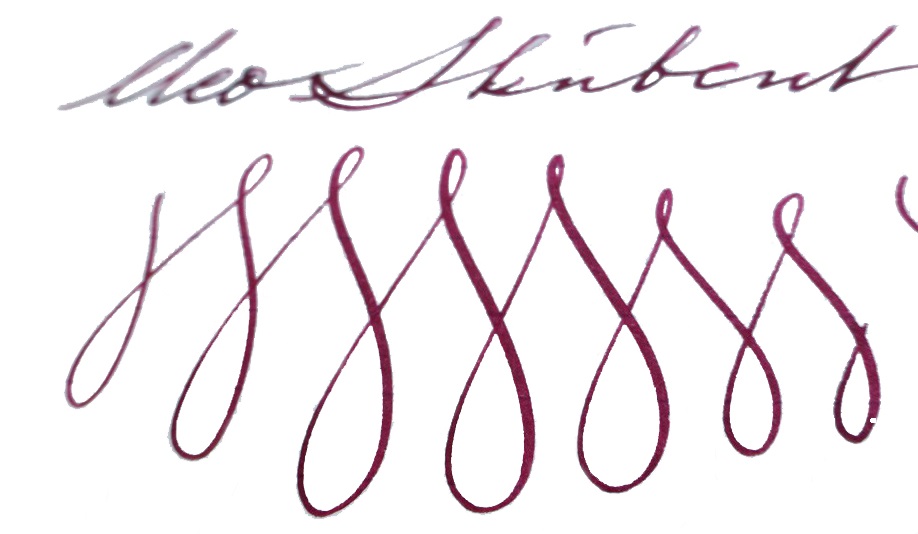 Pen! What is it good for? This is a proper ‘writer’s pen’, this one; it is well-built and could cope with whole reams of text. ‘Just the thing for writing that novel you’ve been meaning to get around to…
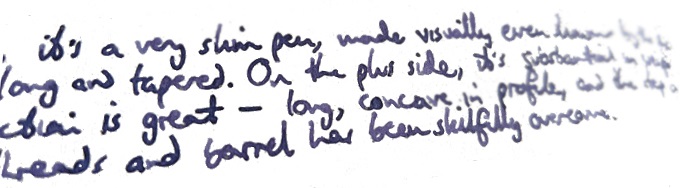
 If this isn’t quite your cup of tea, but almost… Cleo makes a wide range of fountain pens, and we do aim to review more of them over the next couple of years. But probably the nearest writing experience to that available from the Skribent would be a Platinum #3776 with an SM nib – if you can find one.
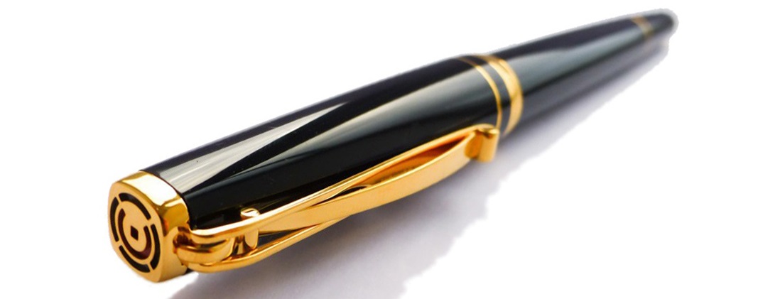 Our overall recommendation If you do have a yearning to write a book long-hand, and you can afford a luxury ‘daily driver’, you could do a lot worse than the Skribent – and you’re sure to fall in love with the nib. We think that Cleo would be wise to reconsider the price positioning, however.
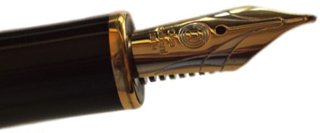 Where to get hold of one There are few Cleo stockists in the UK so, review samples not withstanding, it does make sense to
 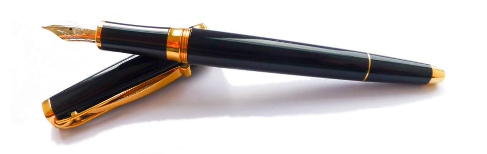 This meta-review references:
 Thanks to Write Here for lending us the Skribent to play with!

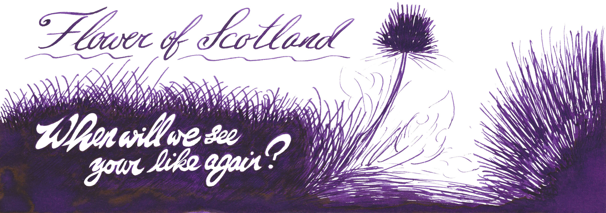
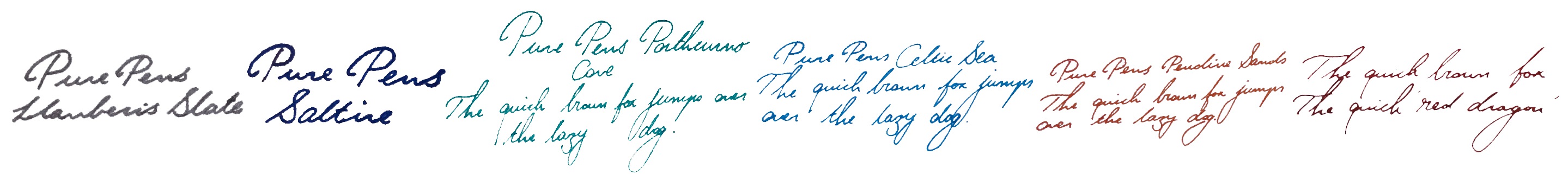
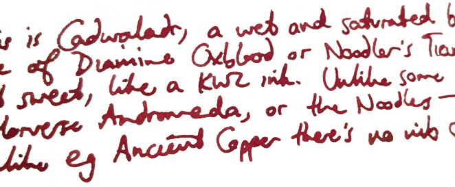
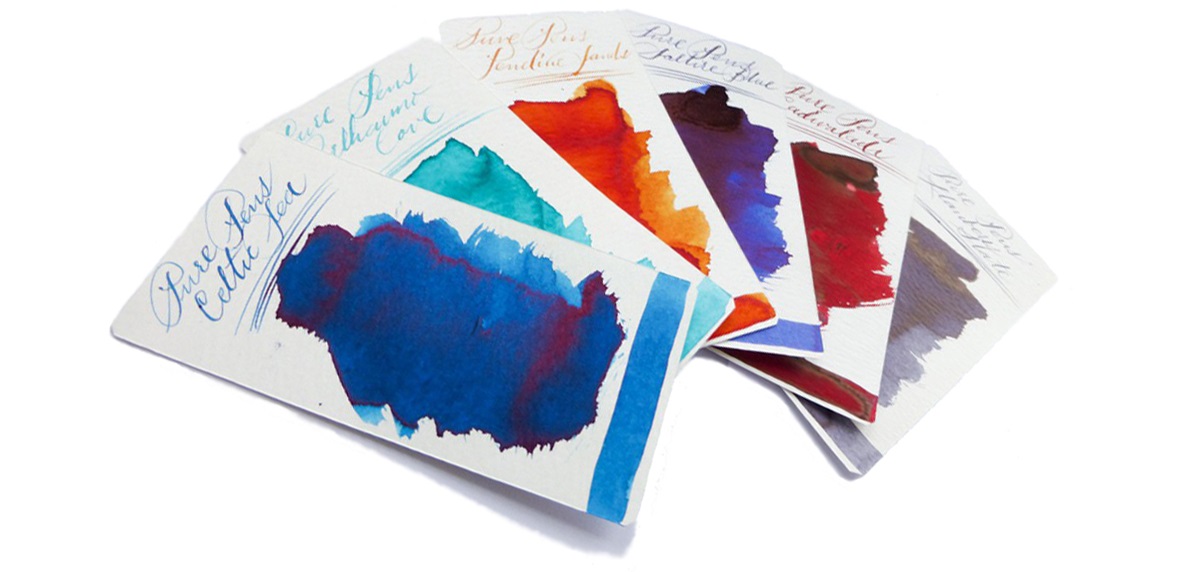
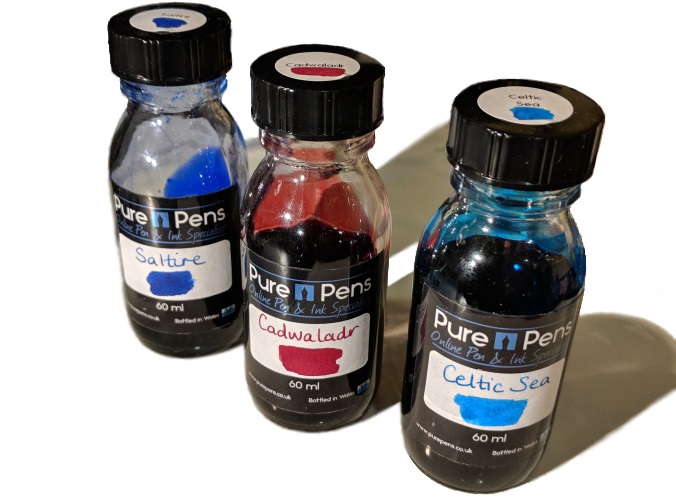
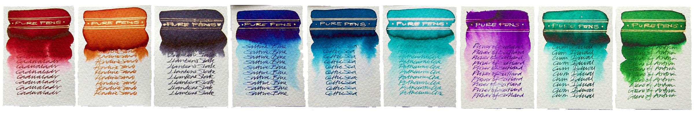
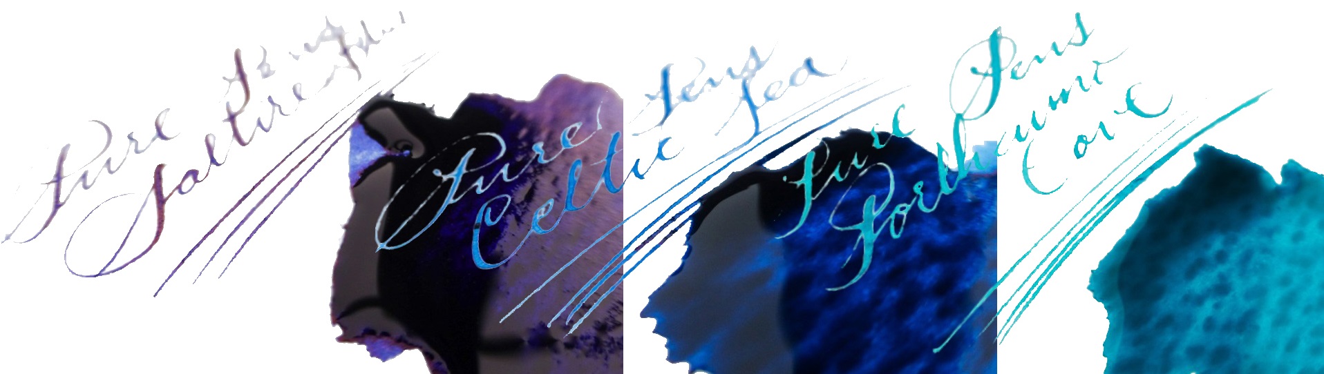
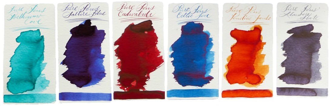
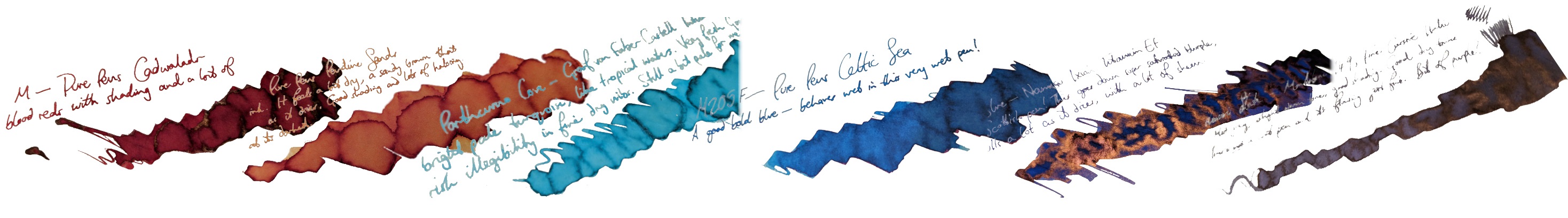
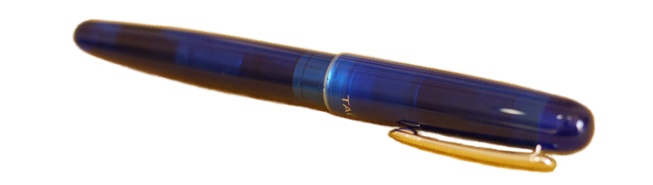
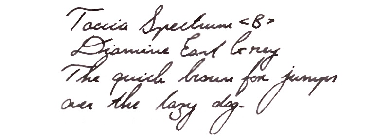
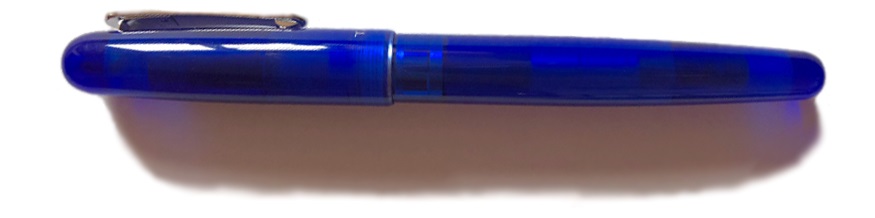
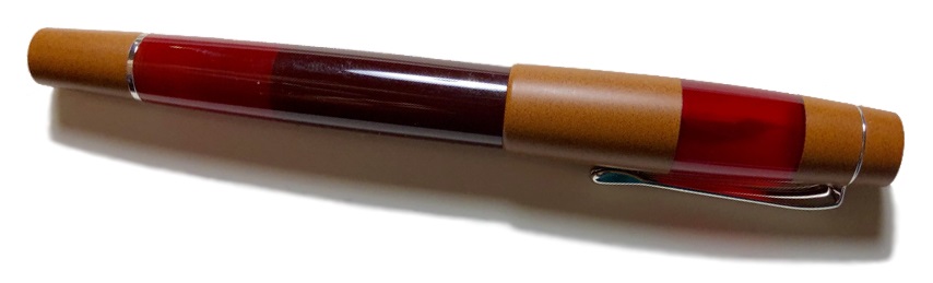
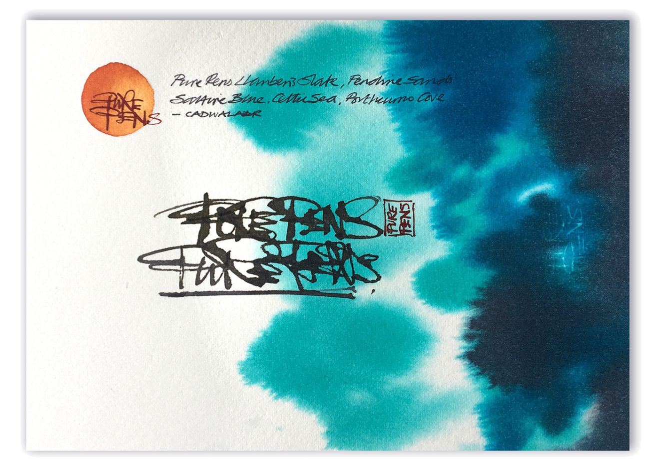 How it looks Cadwaladr is a rich red, with plenty of character.
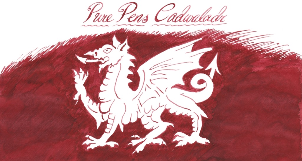 Celtic Sea is a pleasing blue, with lots of maritime presence.
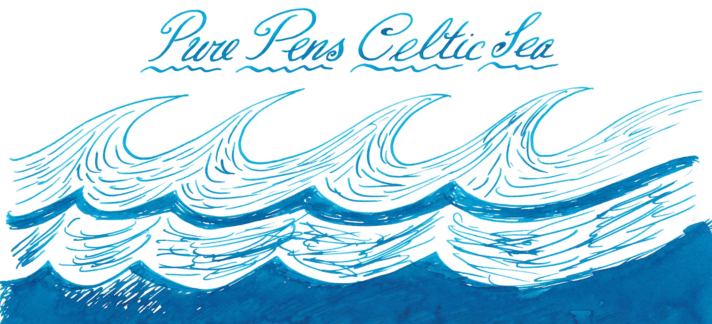

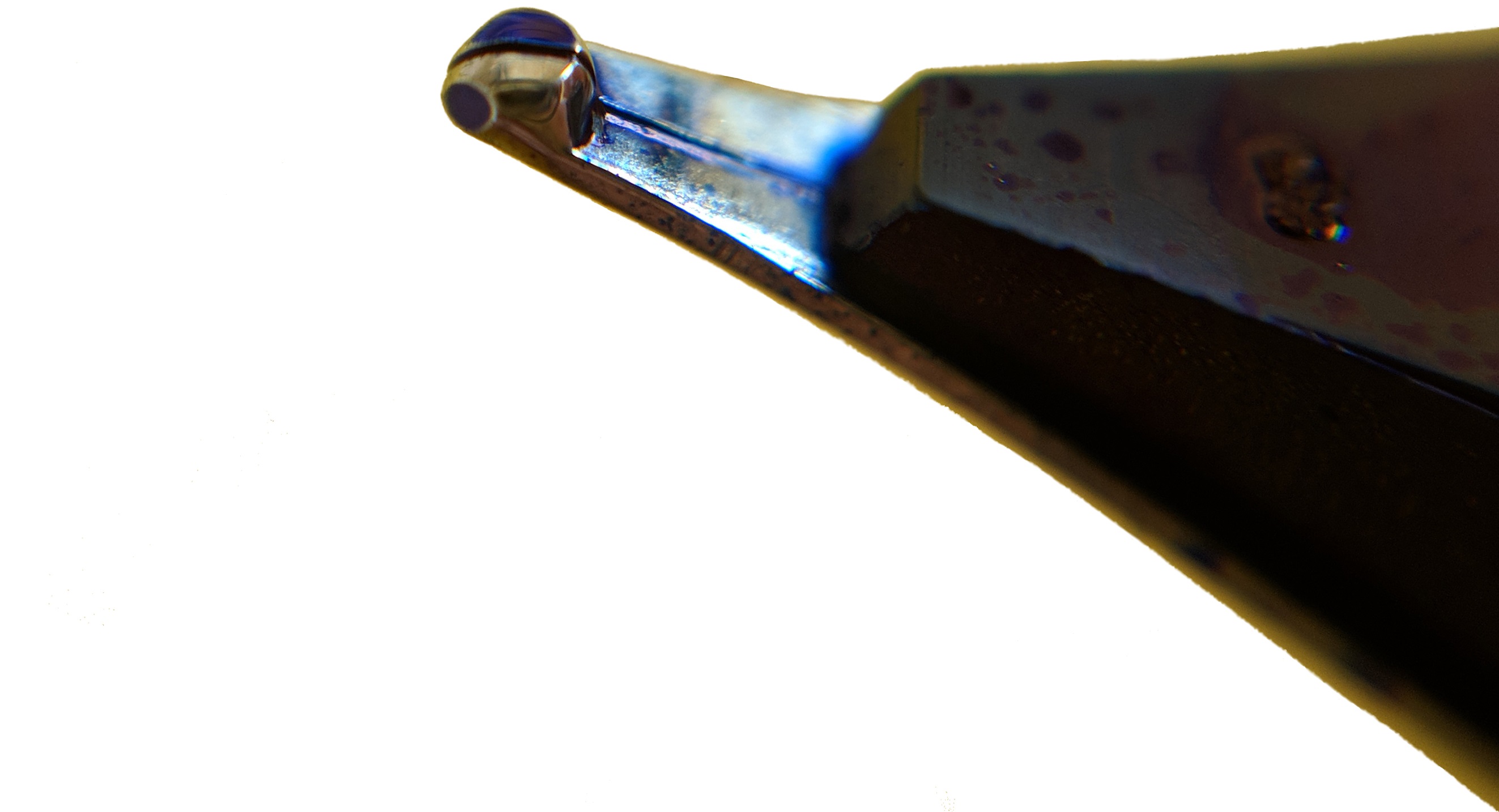
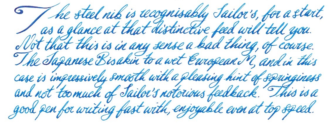
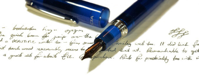 How it fills Our reviewers agreed that the filling mechanism is the Spectrum’s Achilles’ heel. It uses a proprietary Sailor converter, which simultaneously held very little ink and leaked like a sieve. Luckily the worst of the leaks are contained by an o-ring between barrel and section, but one reviewer still ended up with inky fingers.
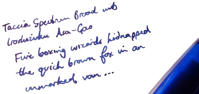
 This meta-review references: