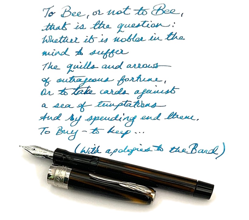
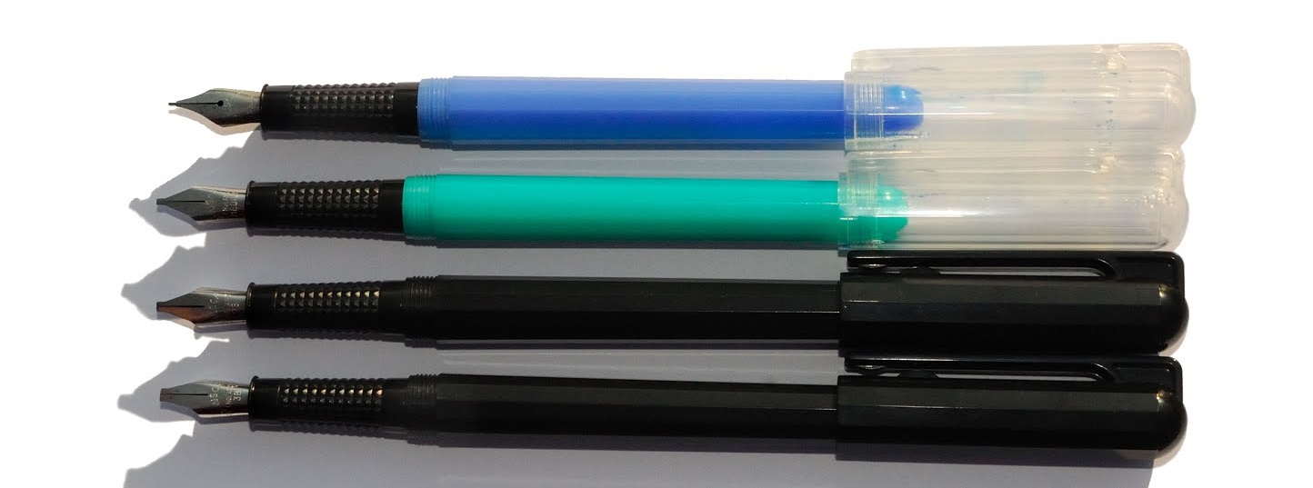
 A little bit of history Much as we all mourn OMAS, ink wasn’t their strong point. Their spiritual heirs, Scribo, have apparently set out to correct that. We put the whole range to the test.
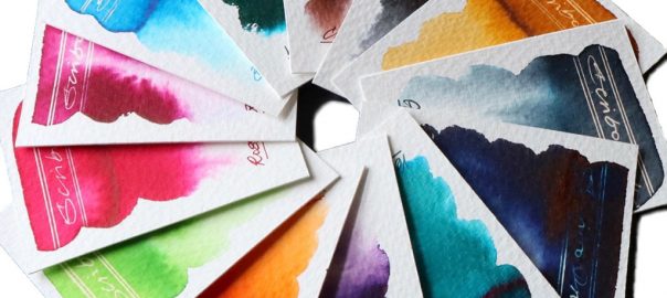
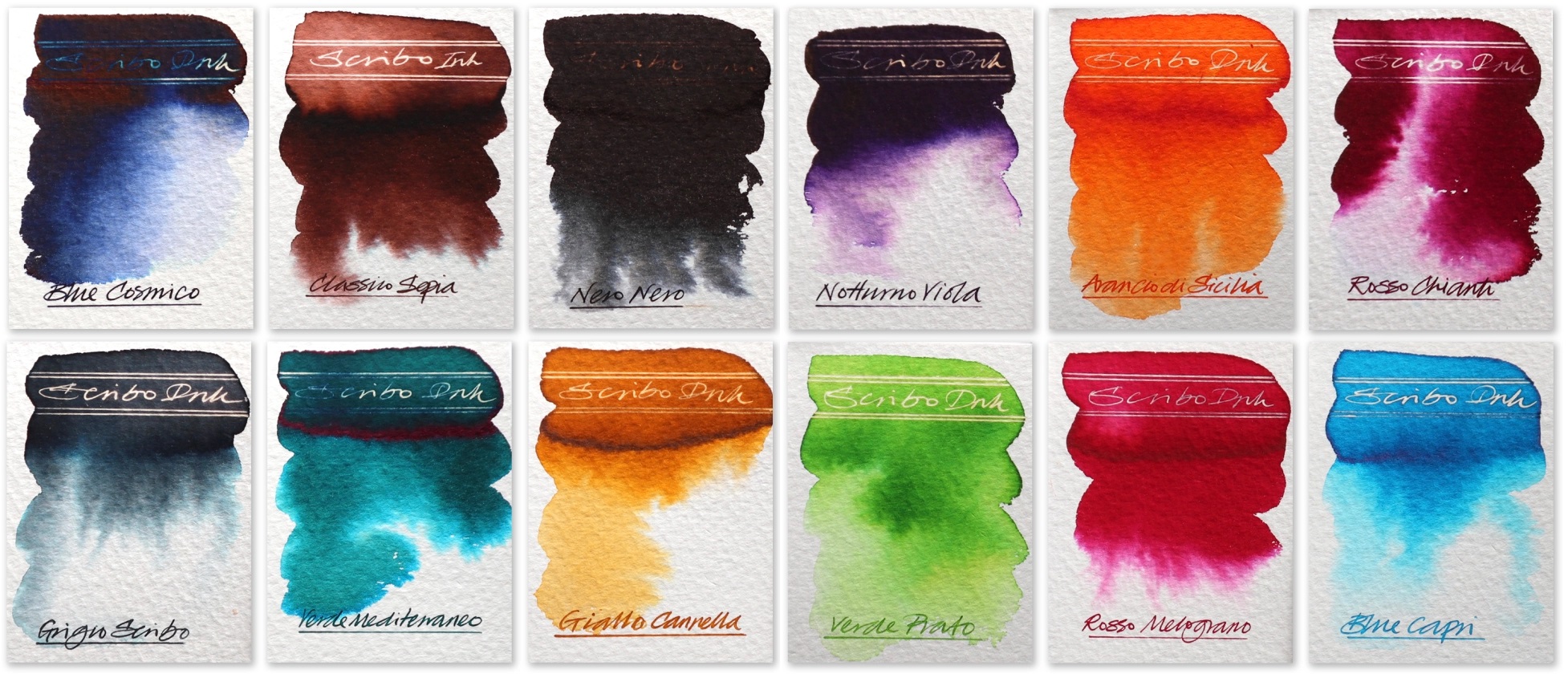
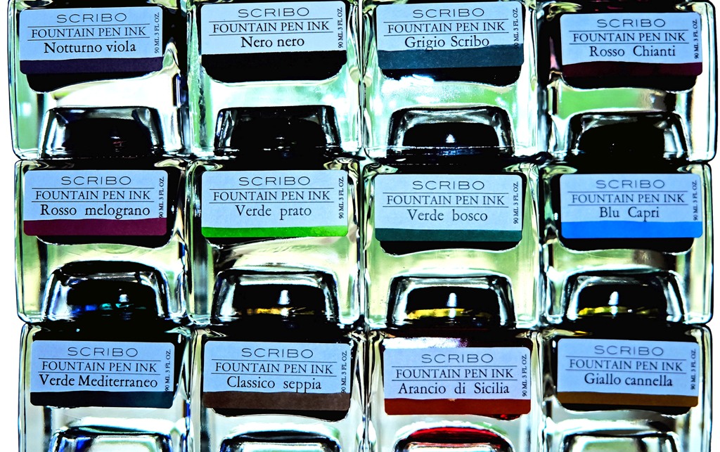
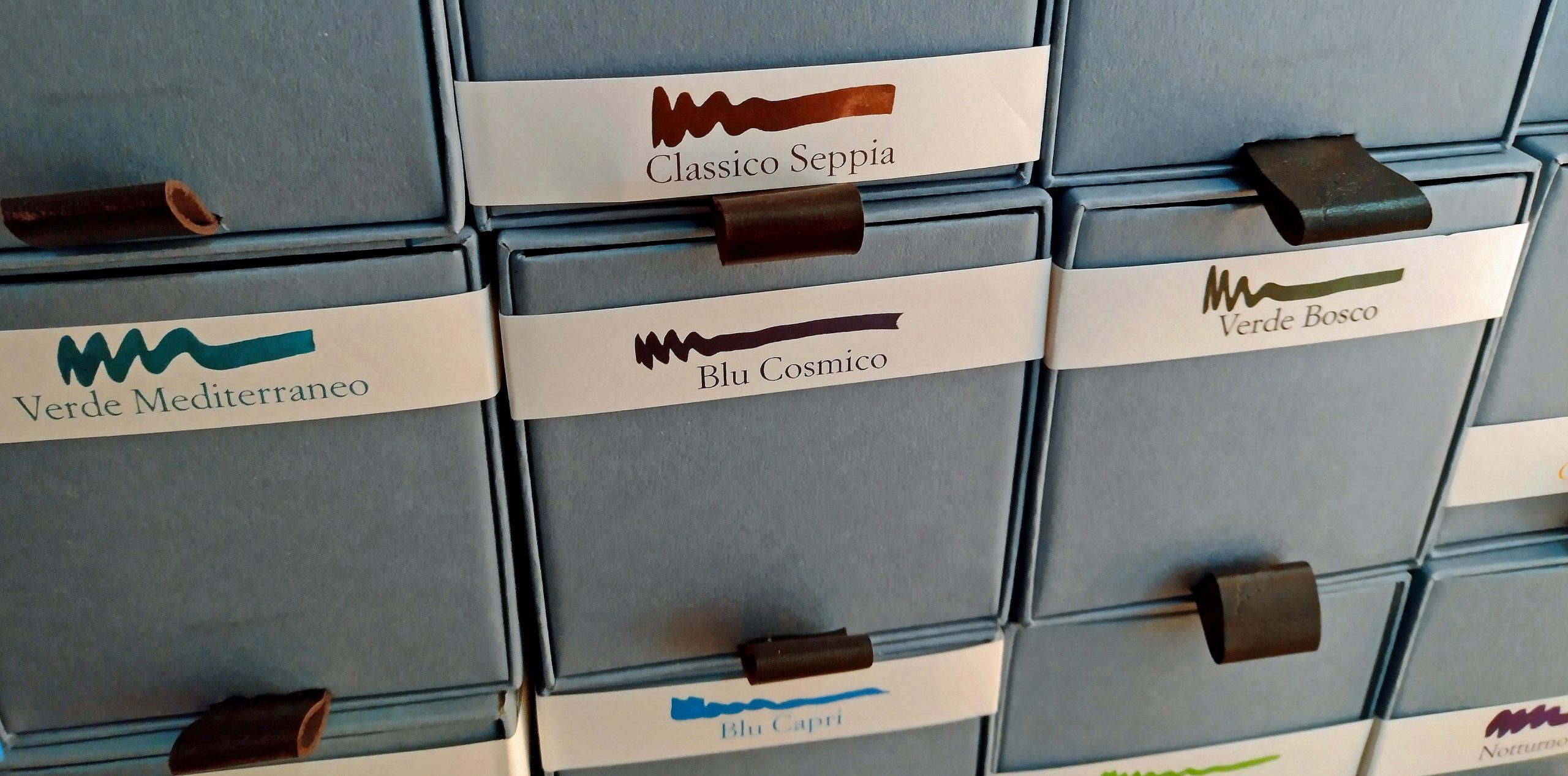
How it arrives Packaging isn’t everything, but my goodness do Scribo make an event of it. The cubic cardboard boxes slide out like drawers to reveal stackable square-based bottles which positively shout “we’re special!” – and so they are.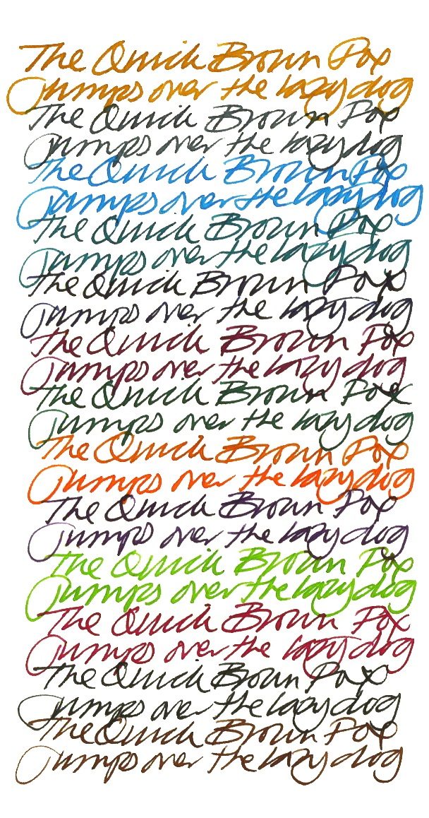 How it looks This is a big range, and the different components deserve detailed attention:
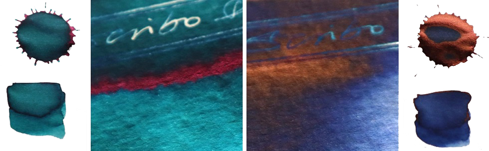
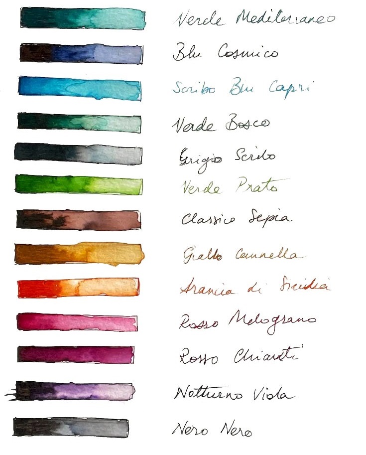
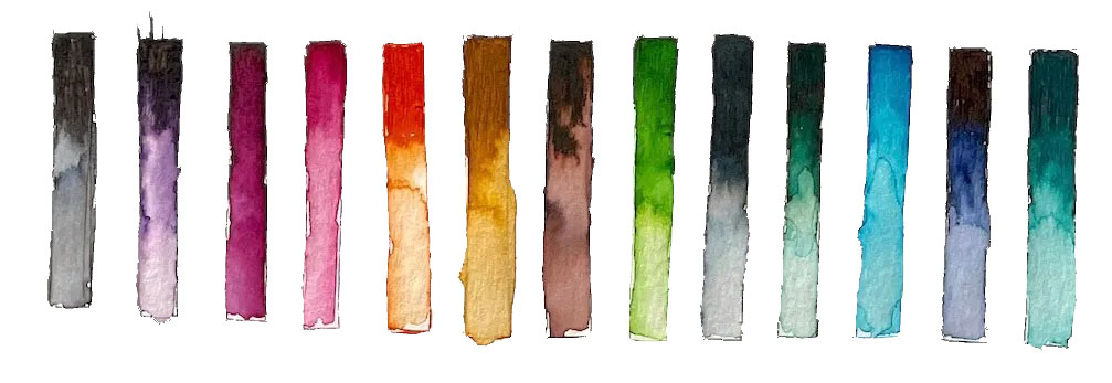
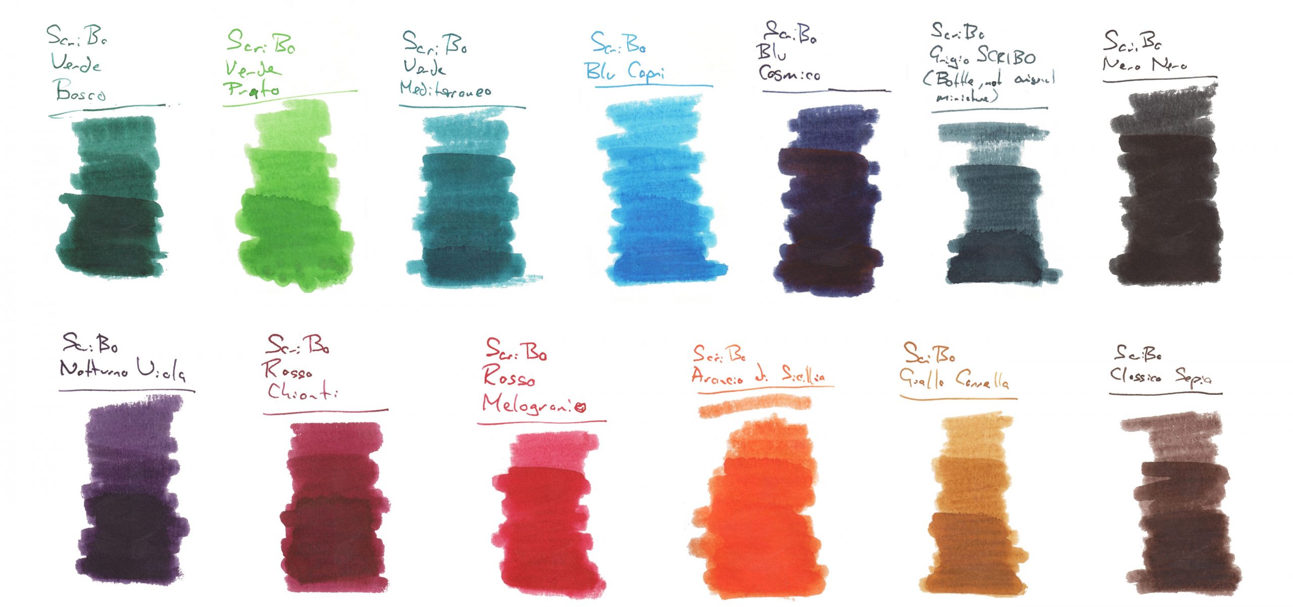
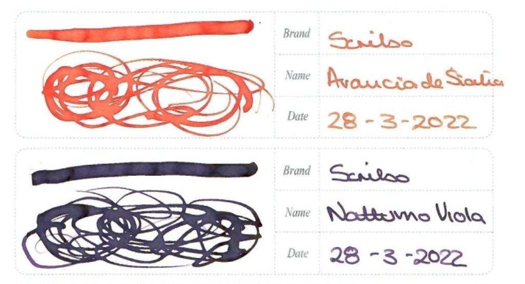
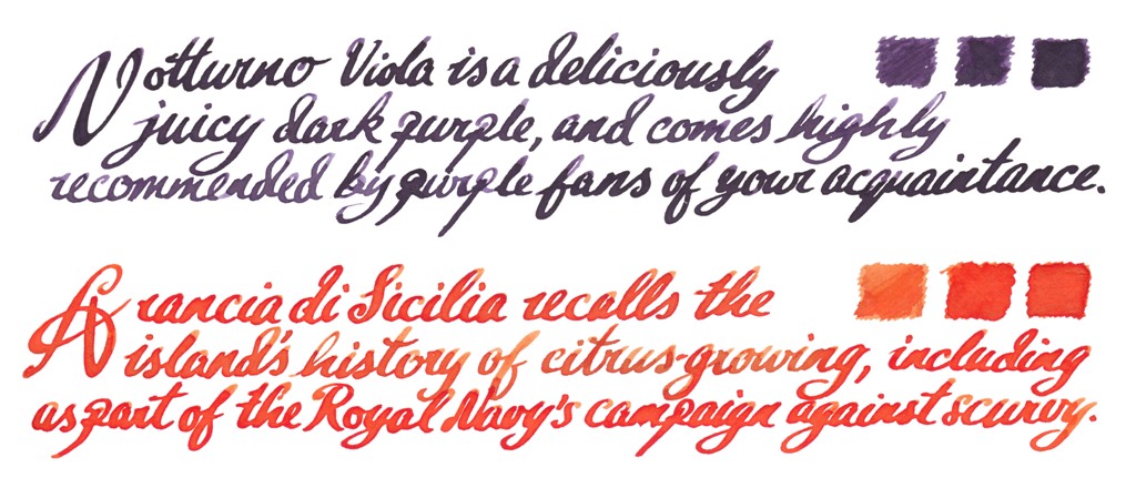
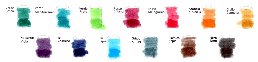
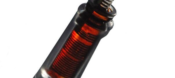
The inktelligentsia The orange and purple offerings immediately won many fans, the purple dark enough to take to work and the orange stiff competition for any similar shade. If you have only the pocket money for the one bottle, either would be a good place to start.
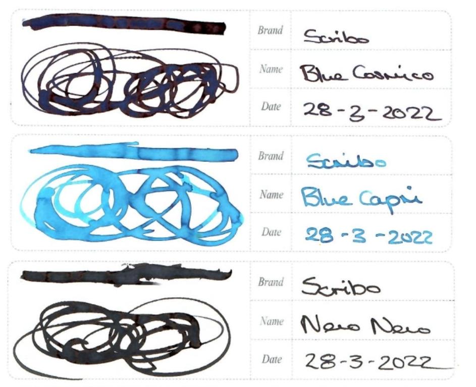
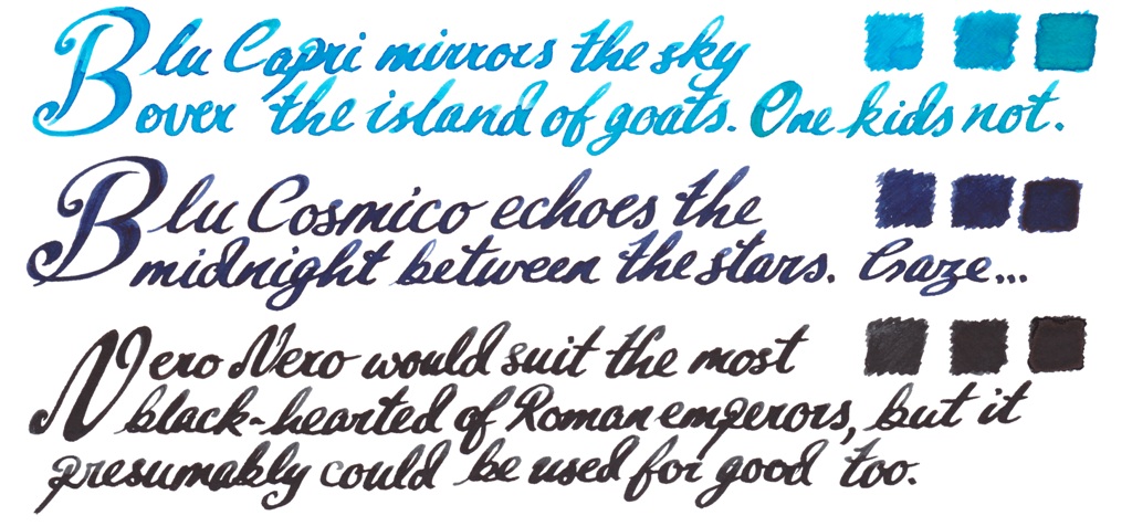
The patricians Some sturdy blues and very black black here, with an empirical link; Capri was the childhood home of Caligula, uncle of Nero.
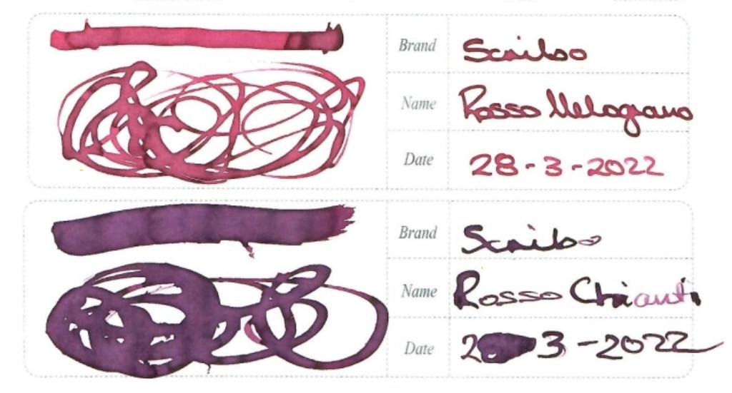
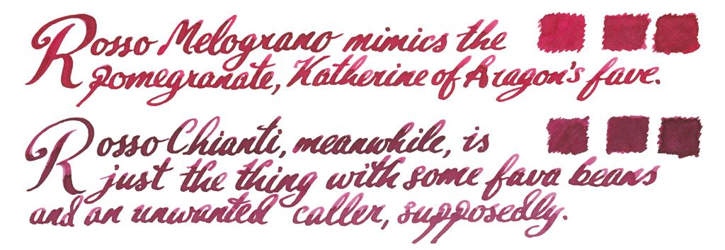
The communards Should you wish to raise the red flag, you can do so with a juicy pomegranate, or, err, with a nice Chianti.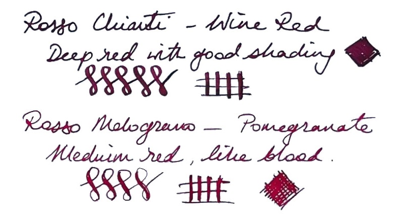
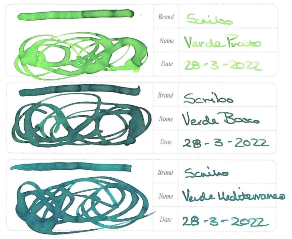
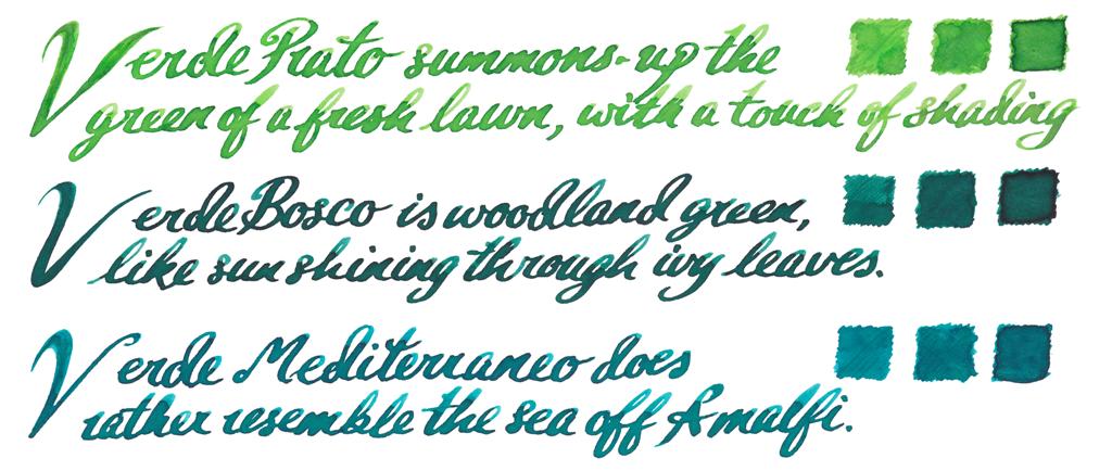
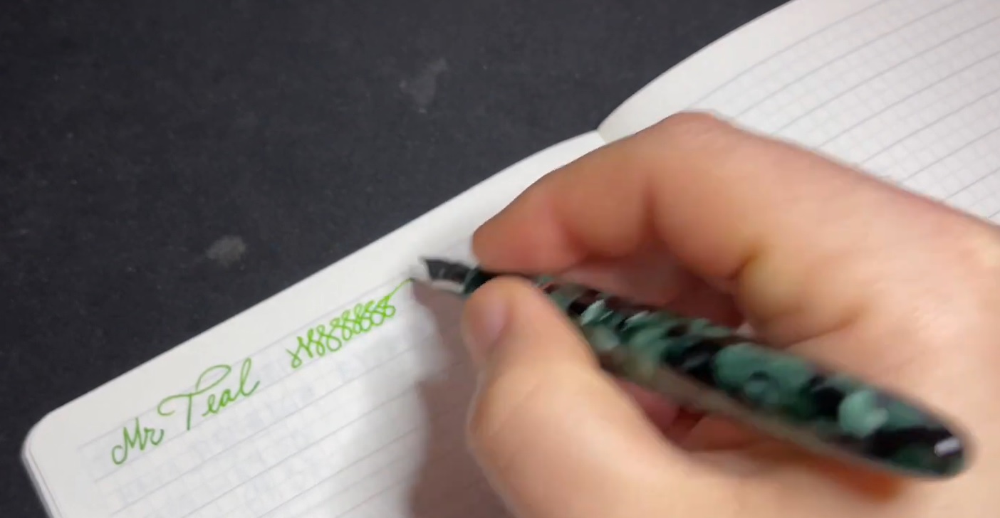
The ecologists That’s a lot of green for a modest range, but there’s a shade here for everyone – with a civilised teal probably taking the prize.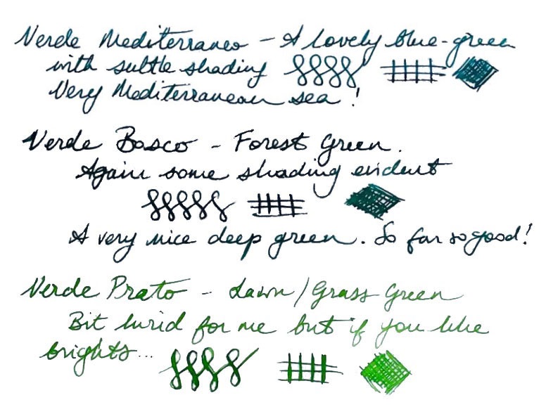
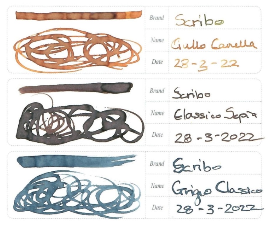
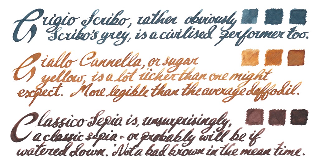
The dullards It’s a little harder to get excited about browns and greys, but they do have an audience – and these at least do it with a bit of class.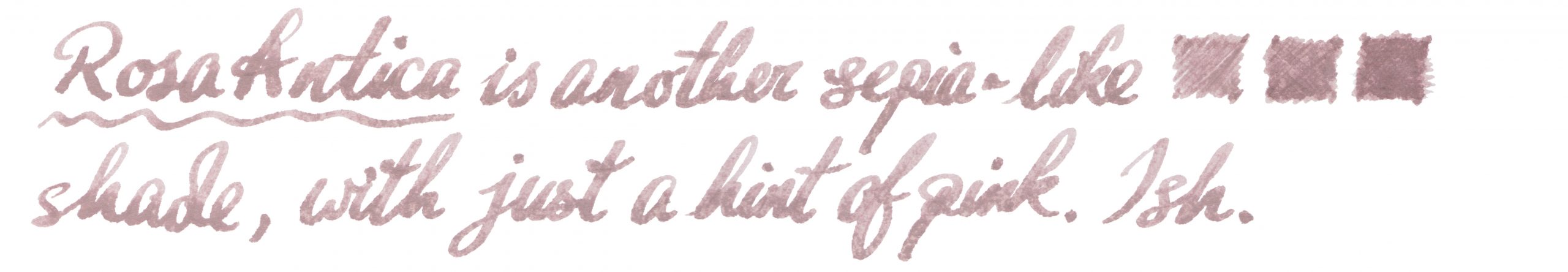
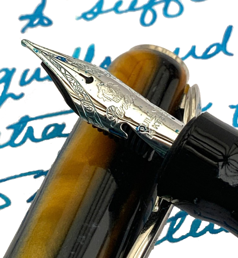
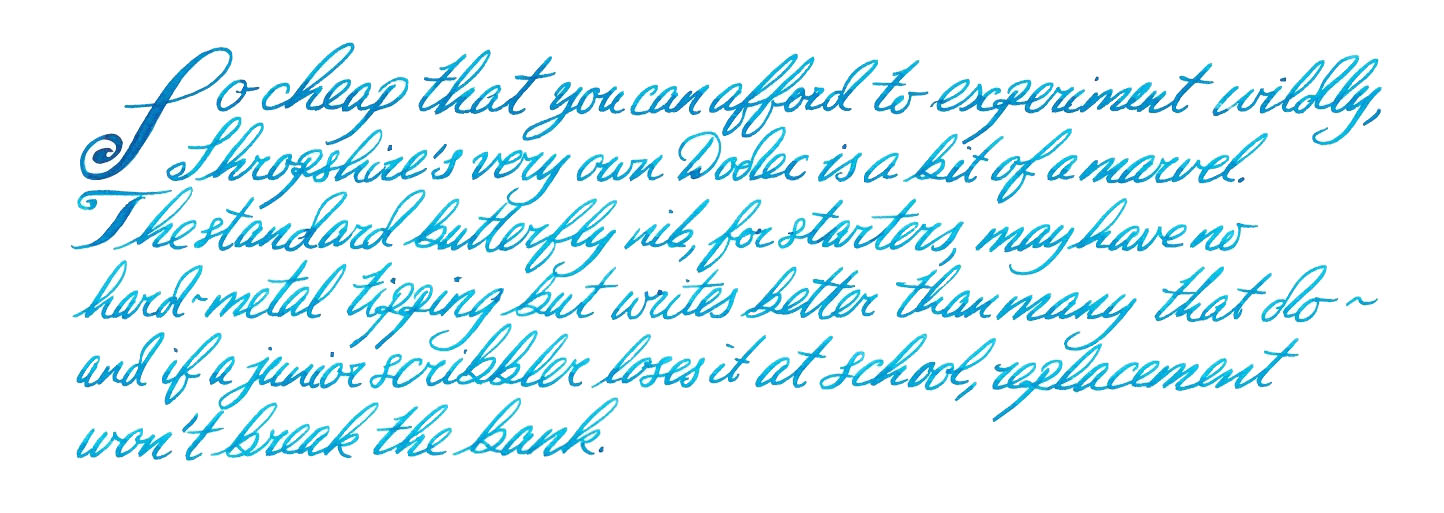
Crucially, how it writes… Actually, that varies: some were found to be a touch dry for our testing panel. However, as Scribo pens themselves tend to run very wet, it’s a good match for the right nibbage.
Ink! What is it good for? If you work in design or fashion, perhaps you can take one of these inks to the office. For the rest of us, this is probably best for writing a diary, making private notes or correspondence with friends – and none the worse for that, of course.
VFM These aren’t cheap, by any stretch of the imagination, and are priced comparably with Iroshizuku inks. As a result we would hesitate to advise rushing out and buying the whole range, as the outlay would be equivalent to the price of a very good pen. But if you have treated yourself to a nice Scribo pen and want something which complements it, a bottle of your favourite shade might not be too crazy an indulgence.
The only way is ethics The inks are made in the EU (we think) and the packaging is eminently re-usable, so it scores fairly highly on this front.
If this isn’t quite your cup of tea, but almost… You could try some KWZ – although be prepared that a Scribo pen thus equipped may double as a small fire-extinguisher in emergencies. In terms of the colour palette, Italy may have little to compete with this but over in Japan Sailor and Pilot both have ink ranges which cover similar ground, at similarly ‘premium’ prices.
Our overall recommendation Scribo have done their pens justice with some grown-up inks in really impressive packaging, but they do cost accordingly. Our tip would be to choose just the one which which matches your pen.
Where to get hold of some Our samples were donated by Write Here, the only UK stockist we’re aware of thus far. If you happen to be in Bologna, Scribo may also sell direct.
This meta-review references:
 Thanks to Write Here for the samples
 Quite a mountain of history, actually Back in the 1970s, steady-state Luddites fought against two intellectual movements and lost twice, first to the constant expansion of the universe and then, down here on Earth, to plate tectonics. But our story starts about half a million years ago when the slow-motion collision of the African and Eurasian plates caused the growth and repeated eruptions of a stratovolcano known to successive civilisations as Etna. It’s held a place in myth and legend ever since, including as the prison of the monstrous Typhon, and as the source of much of Sicily’s soil has been ruled over by Greeks, Carthaginians, Romans, the offspring of King Rollo (no, really) and, for a brief but toothsome interval, a revolutionary squashed-fly biscuit. Etna also chucks out plenty of lava, of course, and Visconti gamely set out to make something of it.
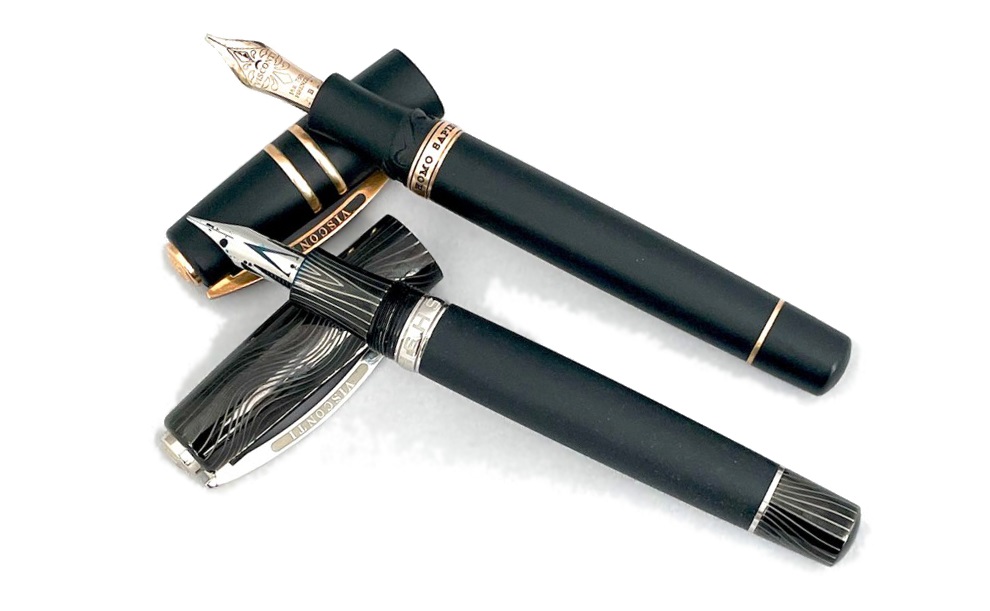
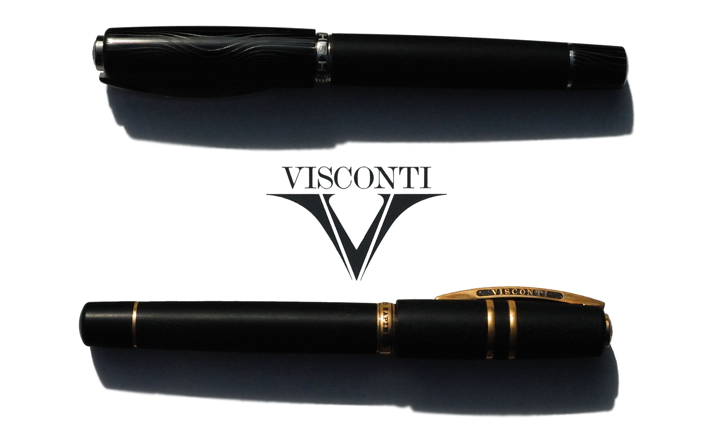
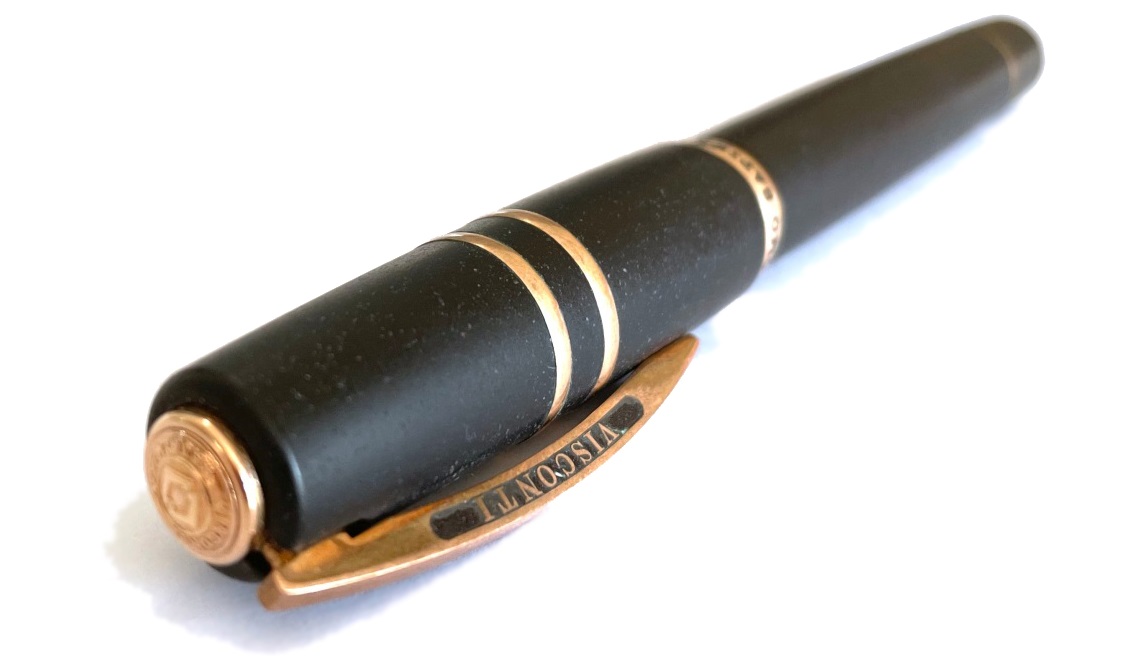
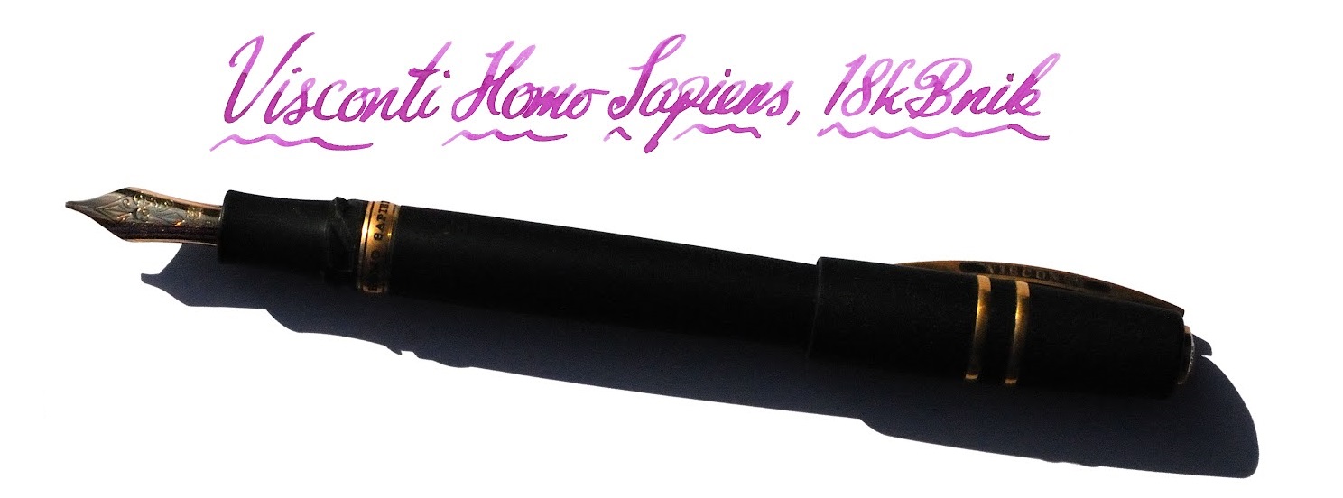
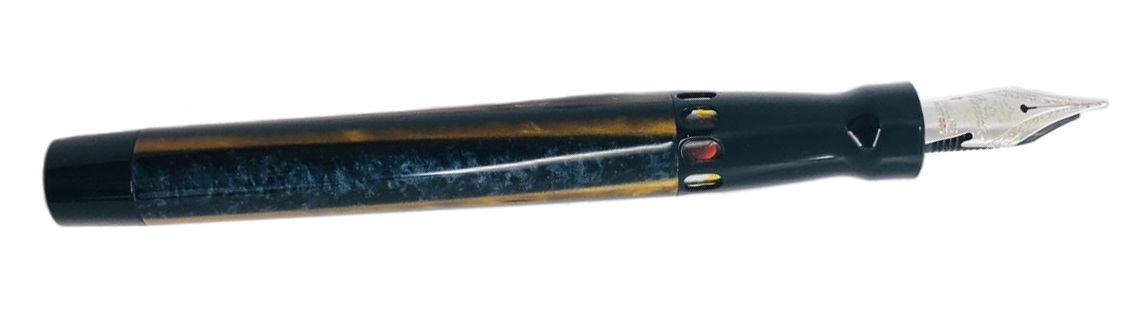
 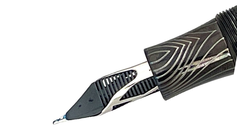 How it looks The classic Homo Sapiens look is a black basaltic tube with a few metal rings and the signature Visconti bowed clip. If it’s under-stated in its usual dress it can be a lot more exotic as a special edition, and we were lucky enough to get our hands on a curious ‘special’ indeed, the Evolution – which looks like a Klingon tool for signing instantly broken peace treaties.
 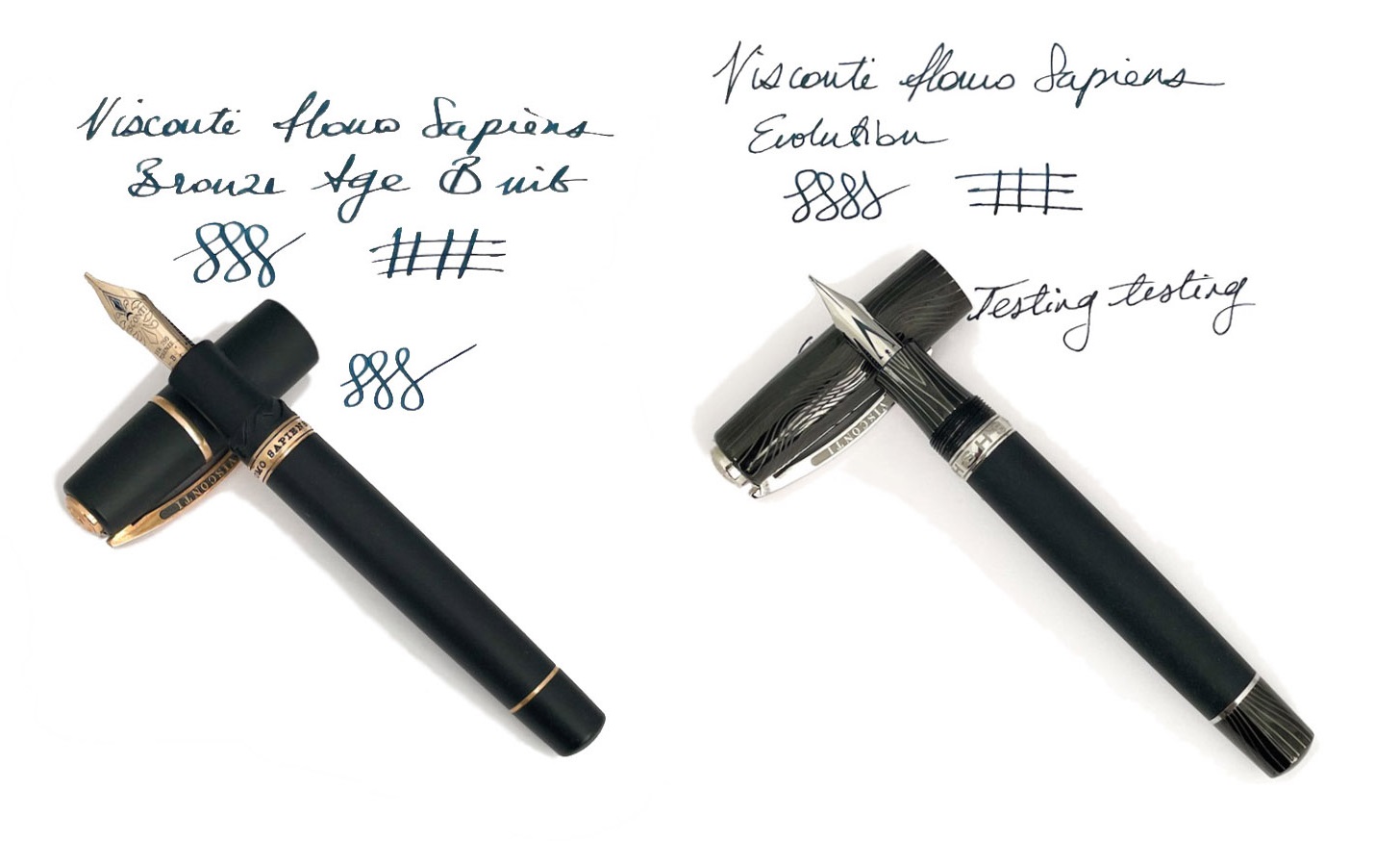 How it feels Sizeable, fairly hefty but not ridiculously heavy, for most of our reviewers. Most is not all, mind; at least one of our panel put the pen on the scales and declared it too weighty to live with. The clever bayonet closure (NB, not present on the Evolution) makes for a comfortable grip, though, and the weight is well-distributed. Visconti makes bold claims about the barrel material being hydroscopic, so that it still has a grip in sweaty hands, and although this is perhaps better tested in the summer it does seem to work quite well in practice.
  How it fills This is a vacuum-filler, and it sucks in a voluminous gulp of scribbling juice without much effort on the user’s part. There’s no way to use cartridges, of course, but if you’re in the market for a pen this pricey a bottle of decent ink is unlikely to exceed the budget.
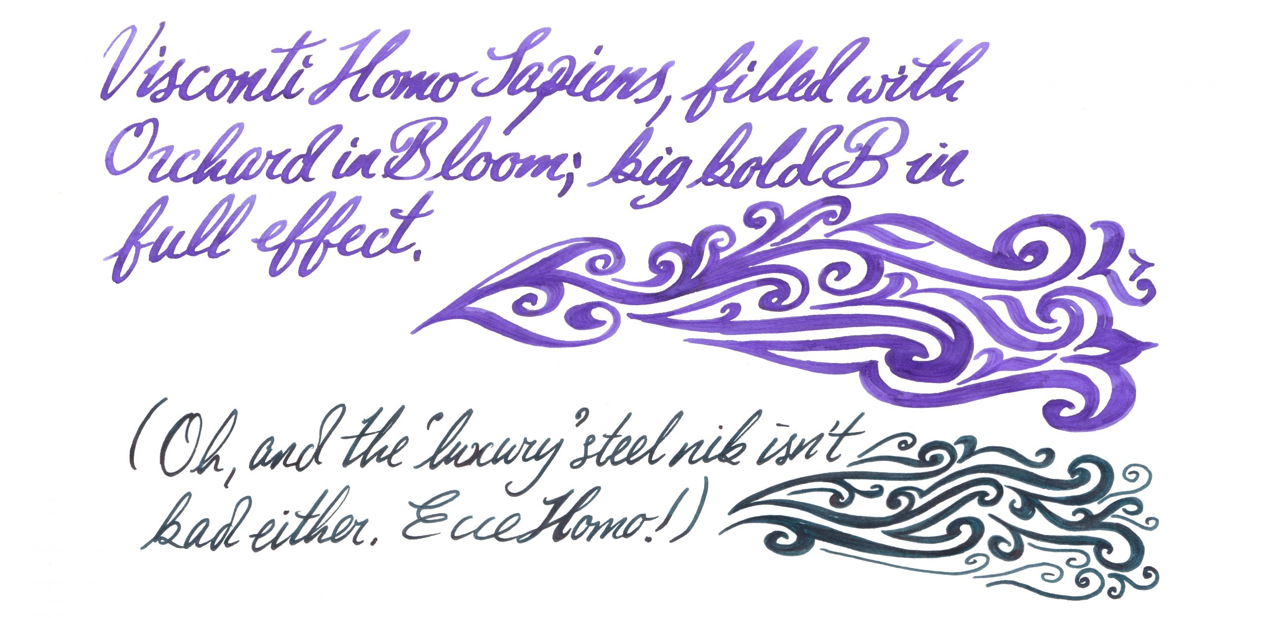
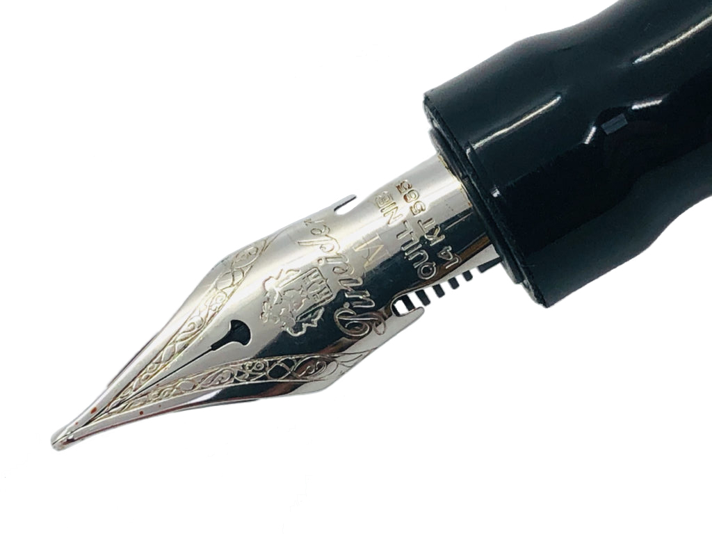
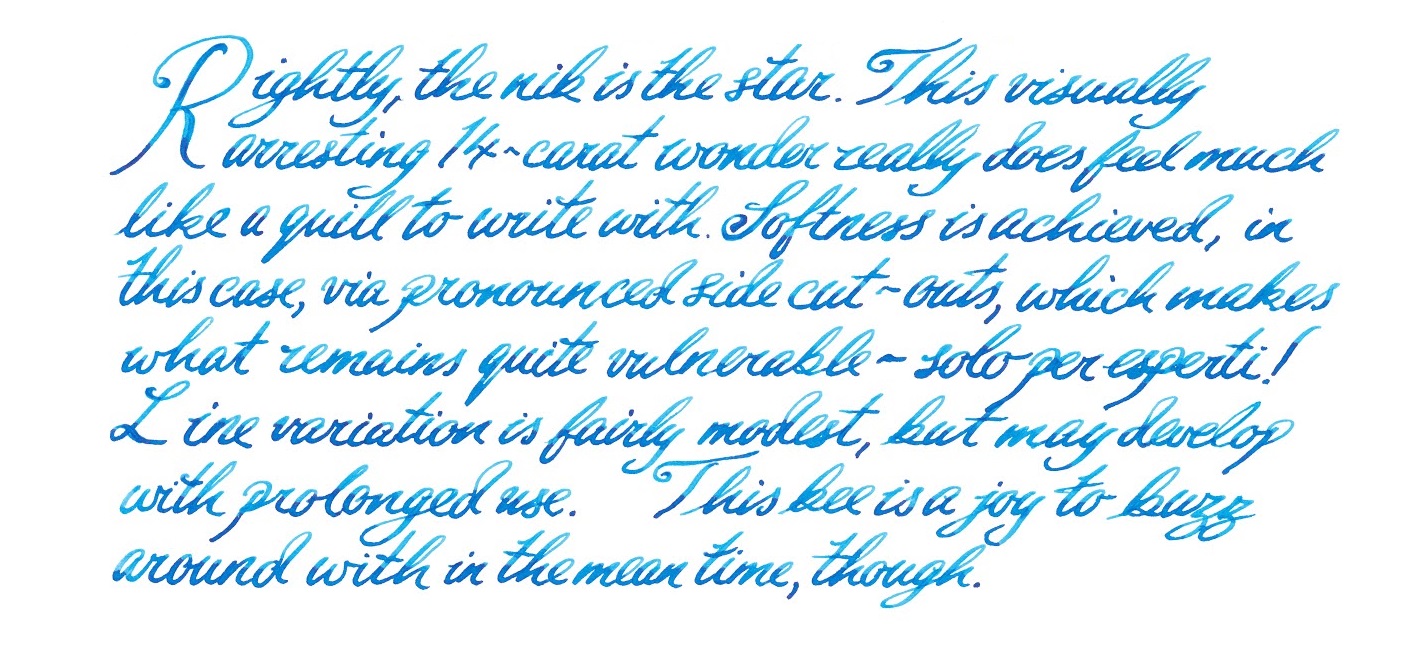
 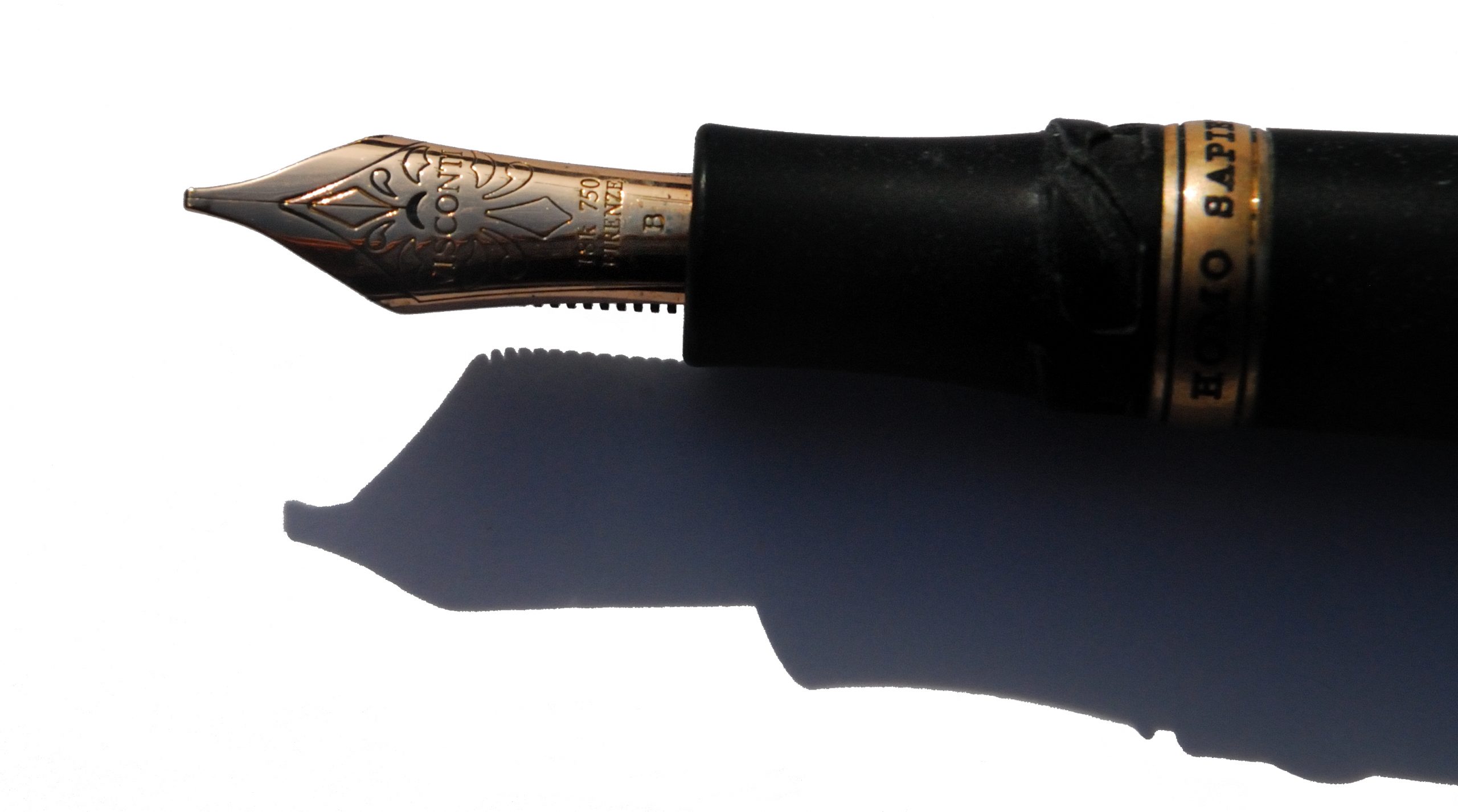 Crucially, how it writes… Now here hangs a tale. Originally, the Homo Sapiens employed palladium nibs which proved notoriously difficult to tune (and harder still to keep in trim). Our duo exemplifies recent alternatives; a usually well-behaved and slightly bouncy gold nib or, for the Evolution, a tubular steel nib which is firm but smooth. A pleasure on either count, although they are very different beasts. The gold nib on our test pen afforded some hard starts to a couple of reviewers, but not to the degree that made writing impossible – and as it flowed adequately for others ink choice may be a critical factor there. Another vital Homo Sapiens tip, which we wish Visconti would tell people directly, is to undo the blind cap a couple of turns before staring to write; this seems to reduce the risk of drying-up considerably.
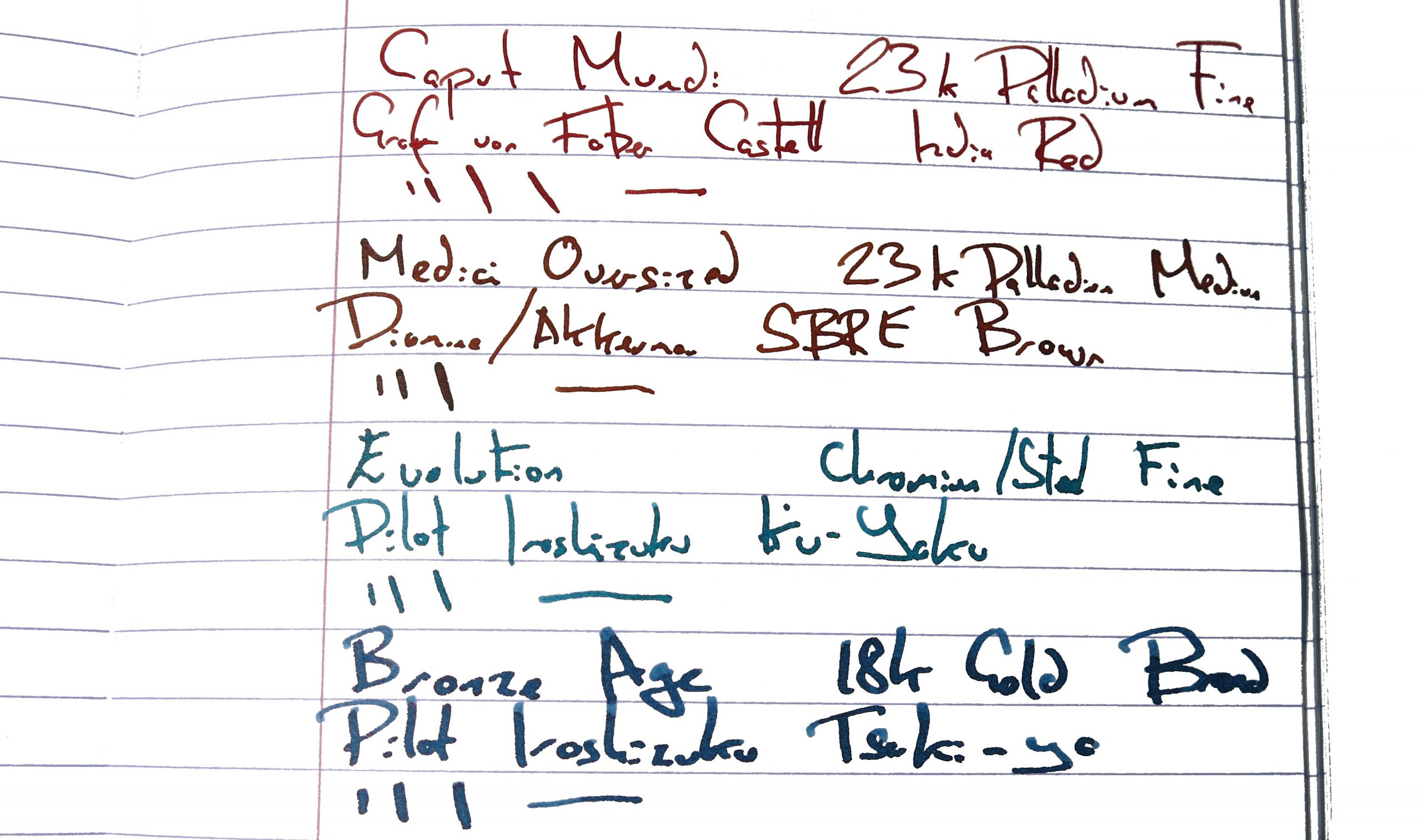
 VFM These are very good pens, no doubt, but compared to other premium Italian offerings the value proposition is sometimes perhaps a little dicey. The Evolution tipped over into four figures, and that’s hard to justify for a steel-nibbed pen, however artistically assembled. Choose with care.
 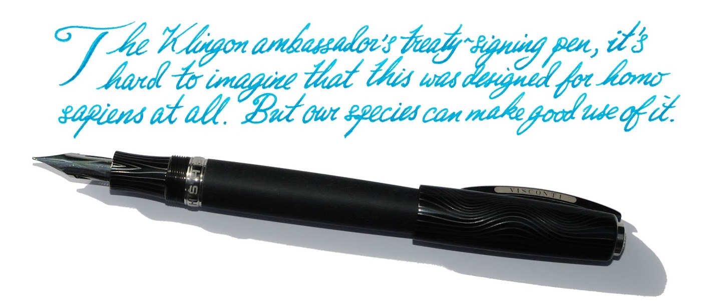 The only way is ethics These are made in Italy and (unless someone gets a really harsh cut of the fee) no-one’s being under-remunerated at this price. If you can afford one, enjoy it with a clear conscience!
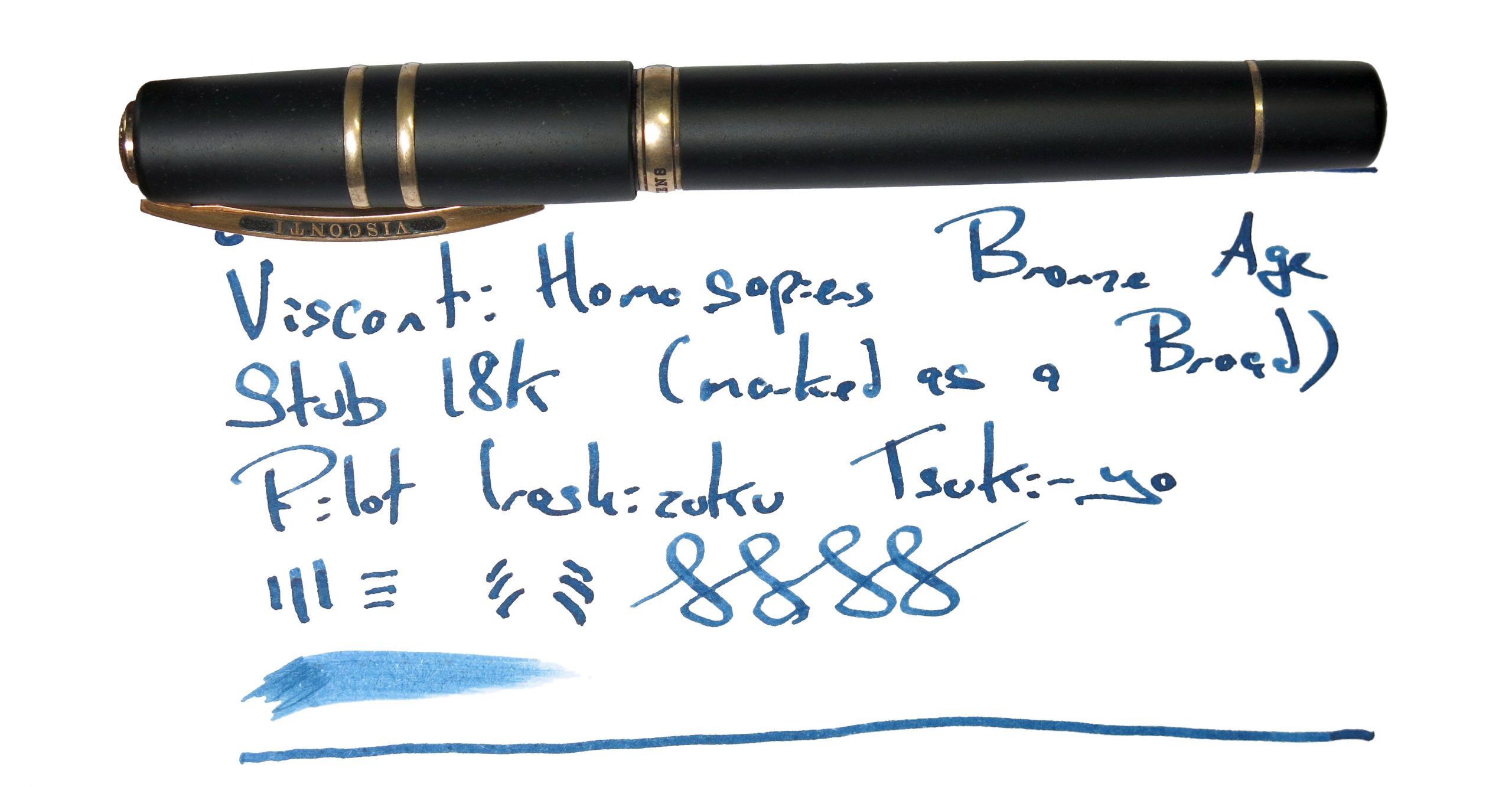 If this isn’t quite your cup of tea, but almost… There are new special editions of the Homo Sapiens out most years. Bide your time, save up, and pounce as soon as you see one you like. Or, if you want a posh pen from a different part of Italy, Scribo and Pineider may have a competing claim upon your attention.
 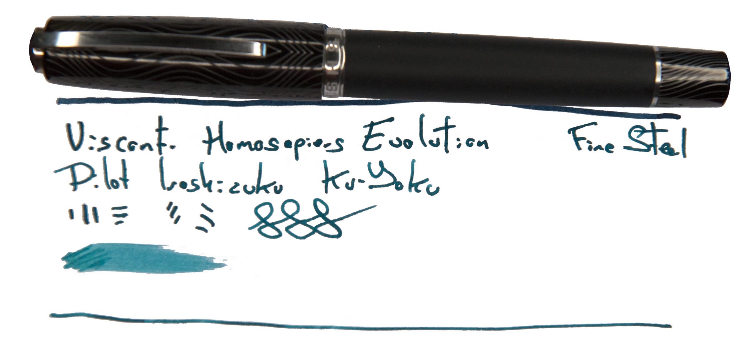 Our overall recommendation Try one in the hand, if you can – but if you love it, that’s your pocket money spent for a while!
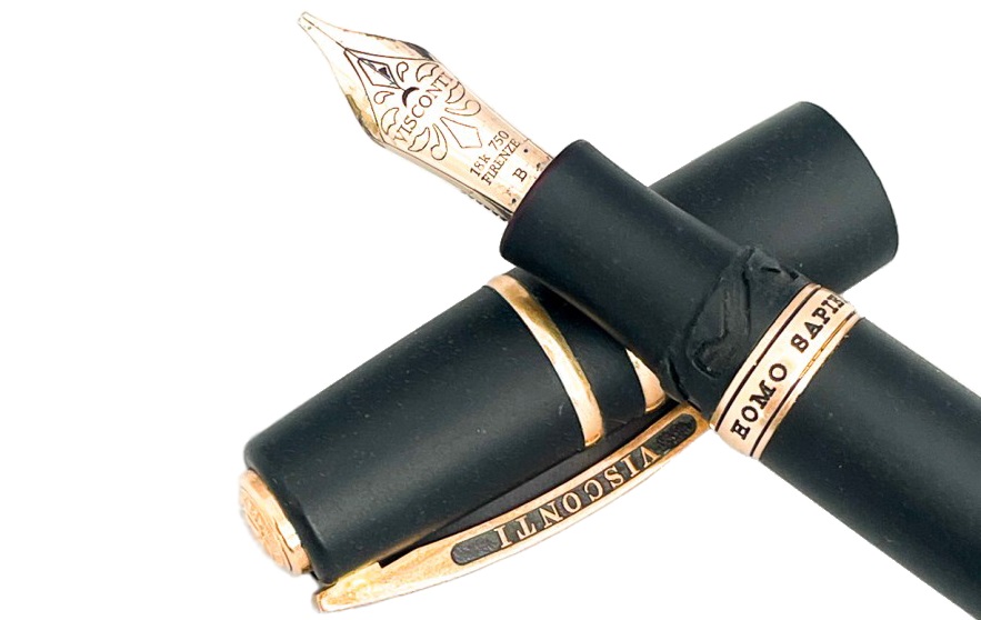
 This meta-review references:
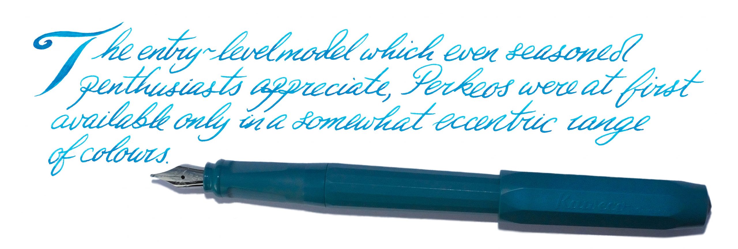
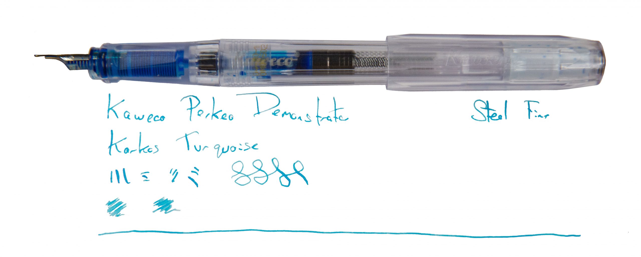
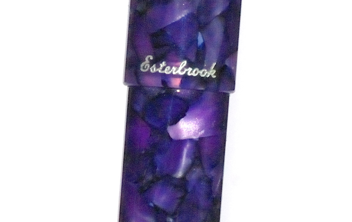
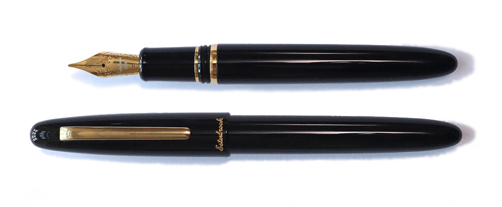
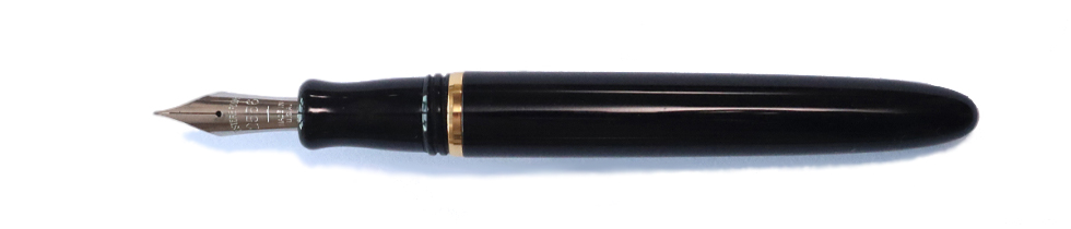
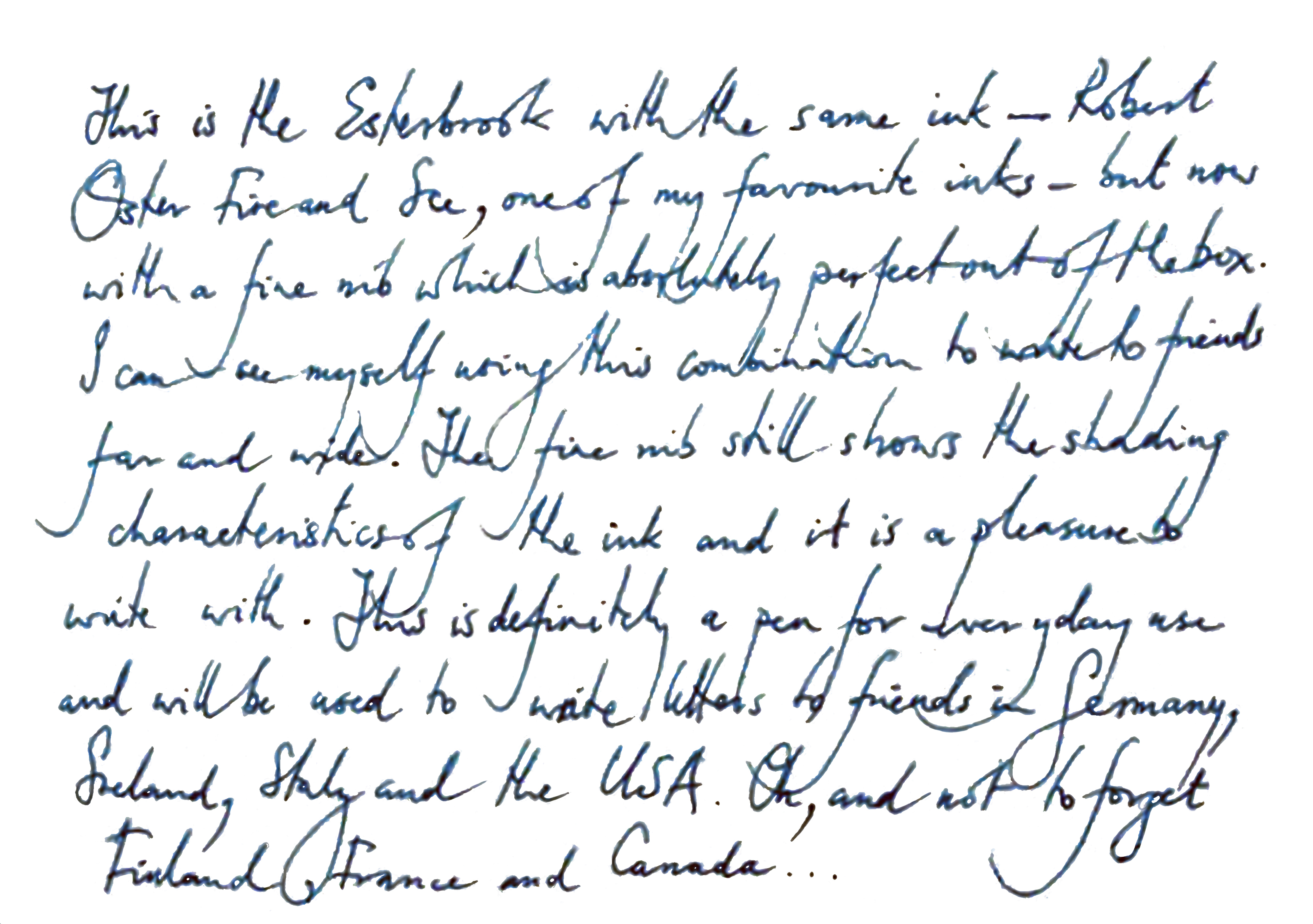
 A little bit of history We’ve reviewed the Perkeo before, so
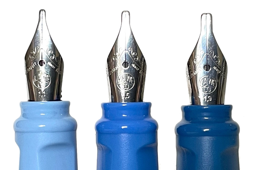
 How it fills There’s space for a brace of small international cartridges in the barrel, or a full-sized converter, which really looks the business in the demonstrator version.
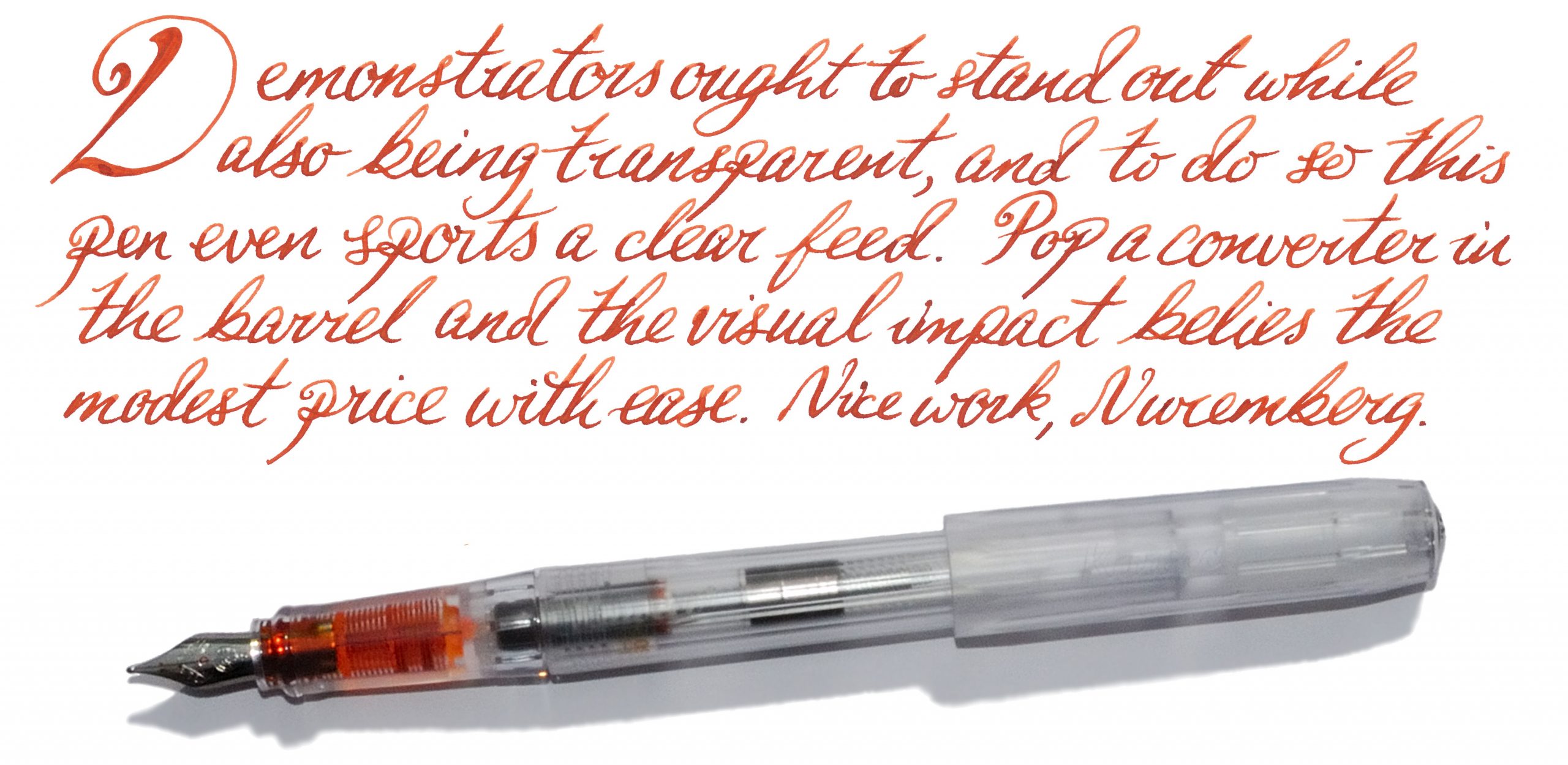

 Pen! What is it good for? It would just be cruel to inflict an office environment on this fontoplumistic starlet. Take it your boudoir, your scriptorium in a secluded castle, to the best al fresco ristorante table you can find – but not, purlease, to work. *Shudders*
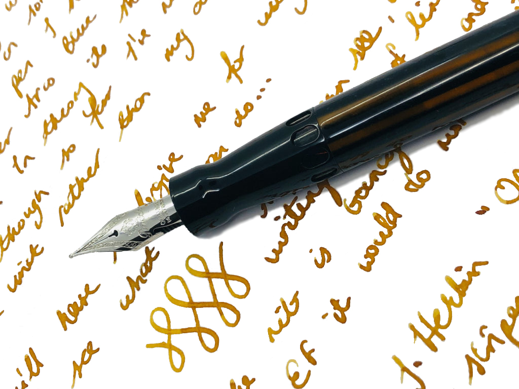
 If this isn’t quite your cup of tea, but almost… The Full Metal Jacket, one of Pineider’s slightly more affordable pens, is based upon essentially the same design – albeit with less gaudy materials.


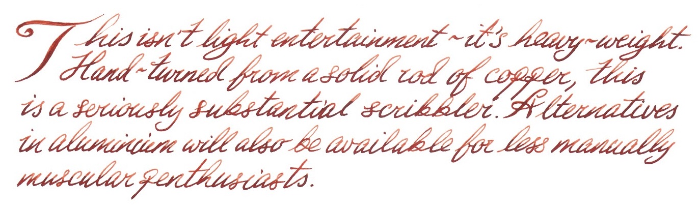
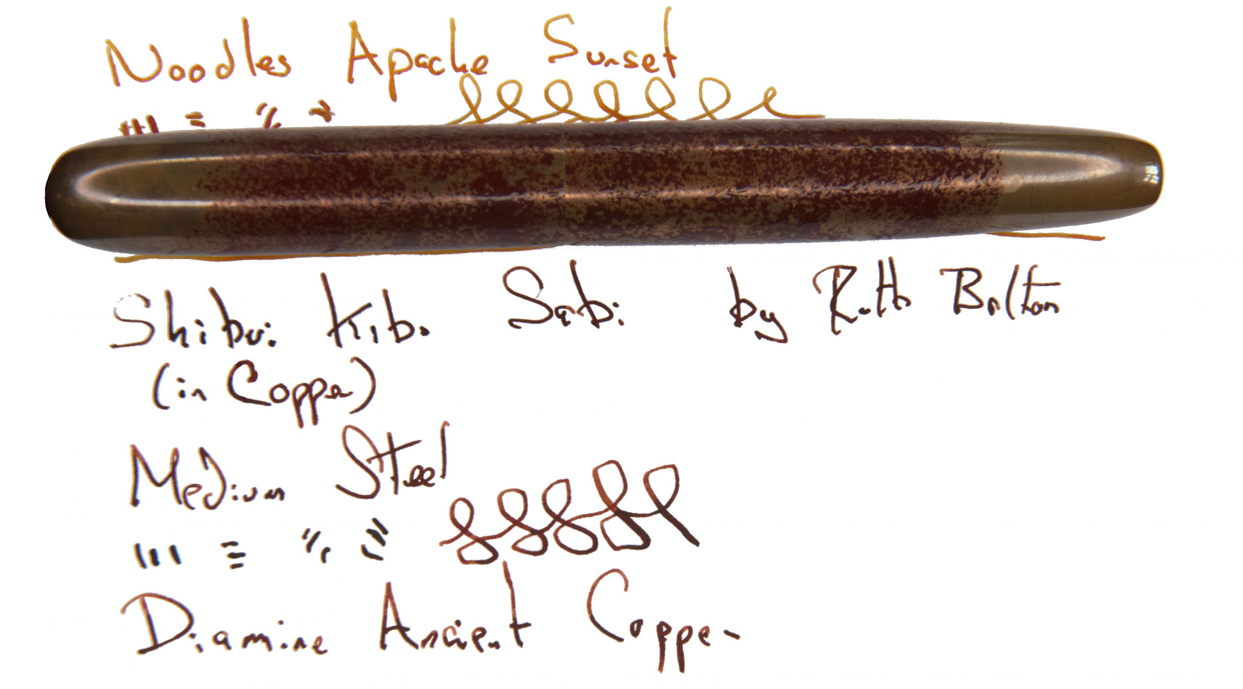
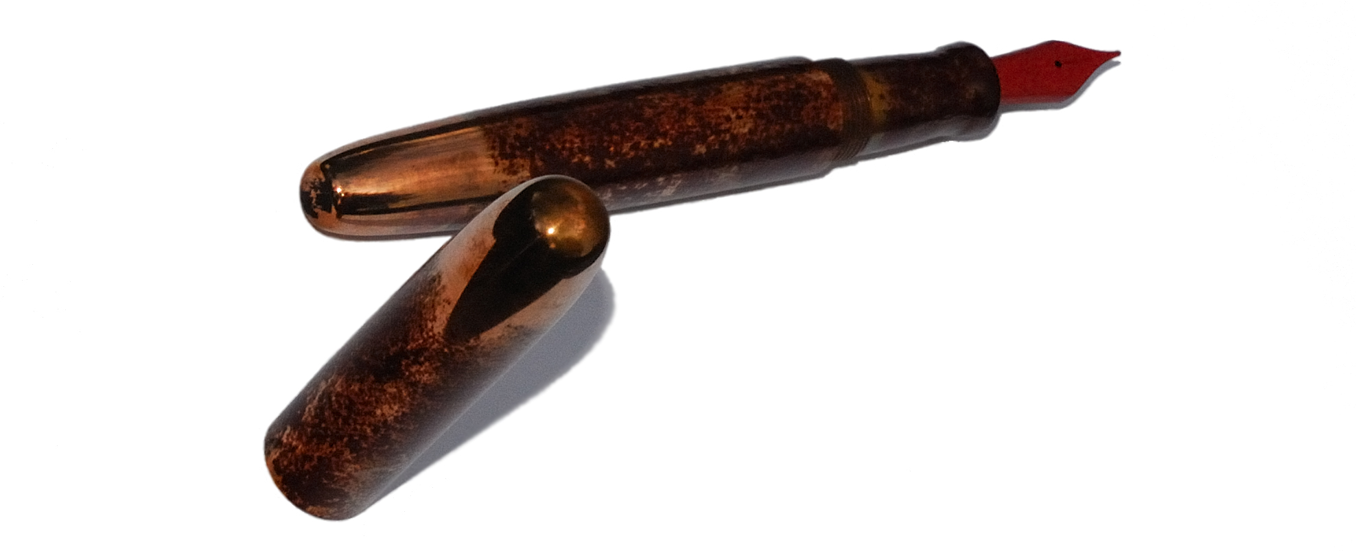
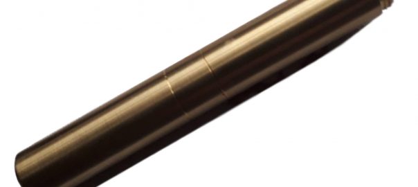
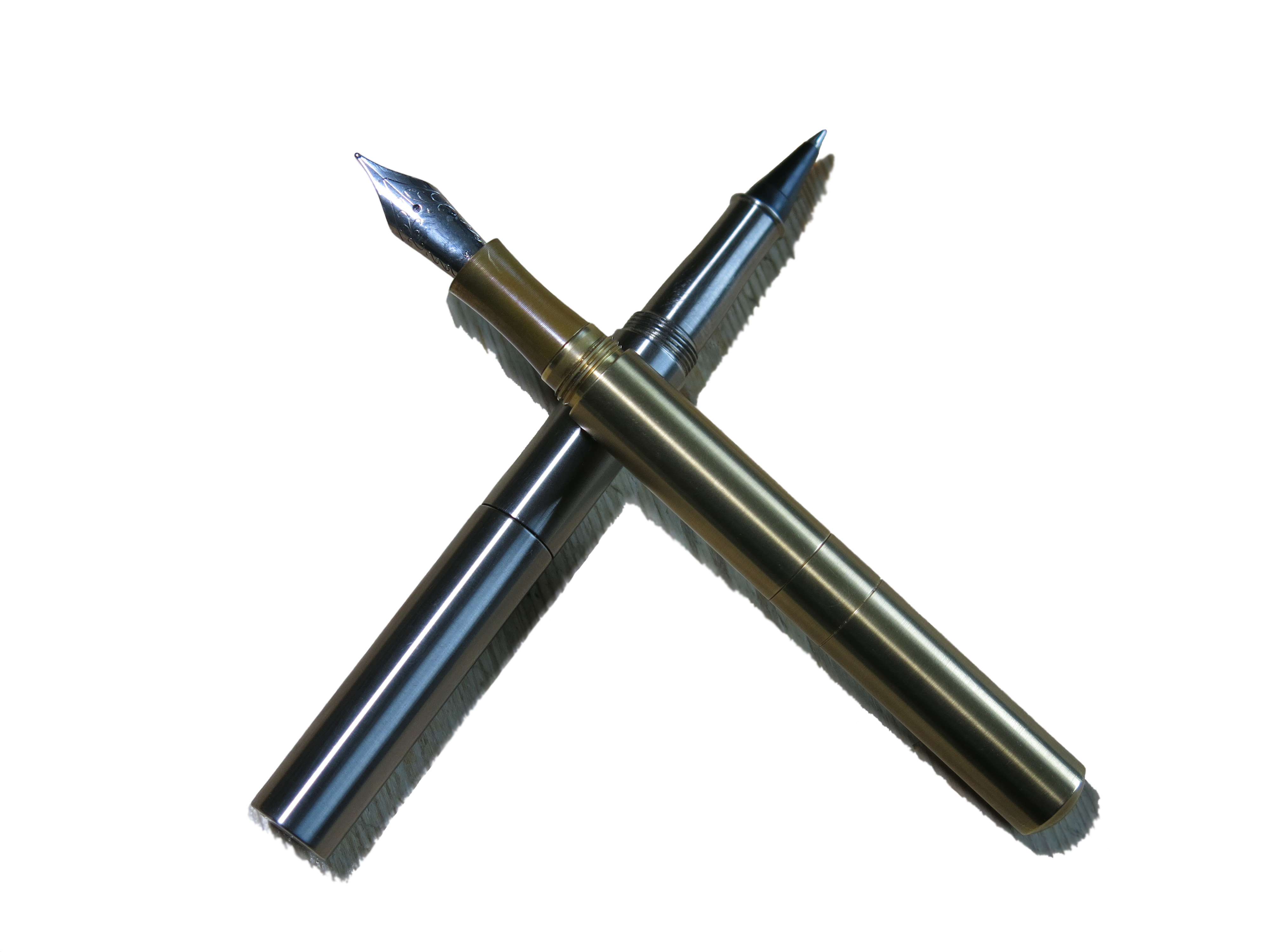
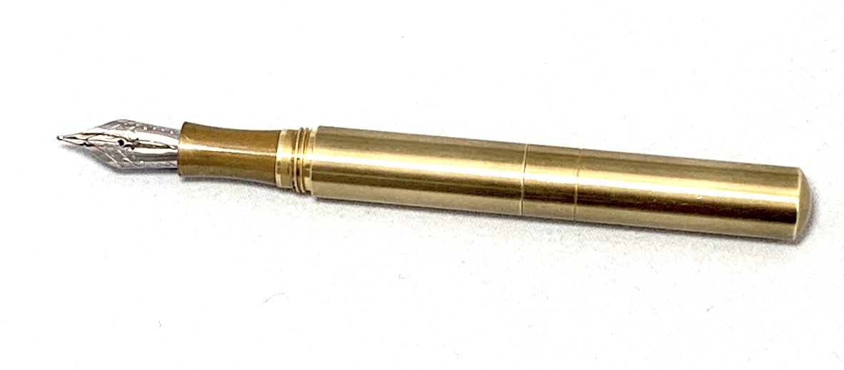 How it looks It’s a short featureless tube, basically. If you’re still stuck in gender discrimination mode, it could conceivably be mistaken for a portable mascara applicator, or an emergency Spitfire cockpit canopy removal tool. Obviously these are both foolish misperceptions, but such is the fate of the common-or-garden dinosaur. The rest of us can either polish the brass or let it elegantly corrode (‘patina’ is a lovely euphemism for brass rust, isn’t it?), while wondering what lurks within.
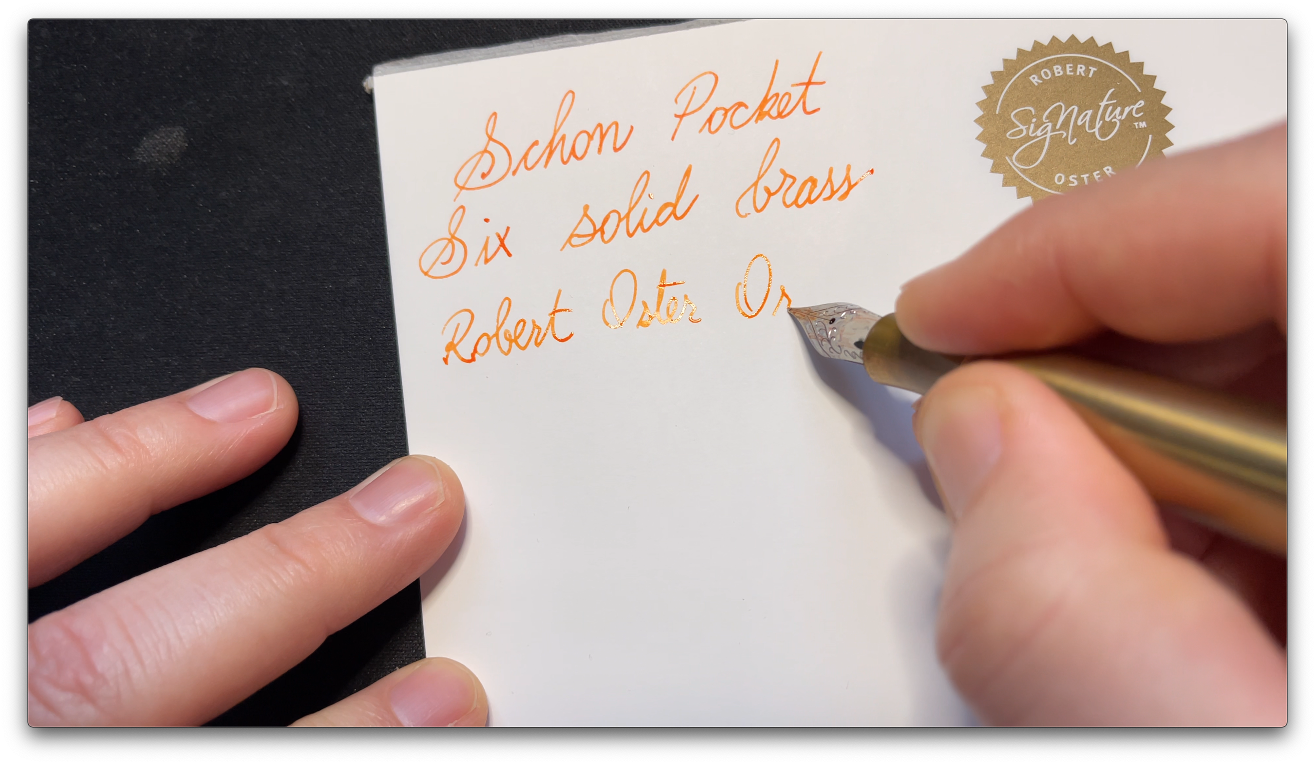
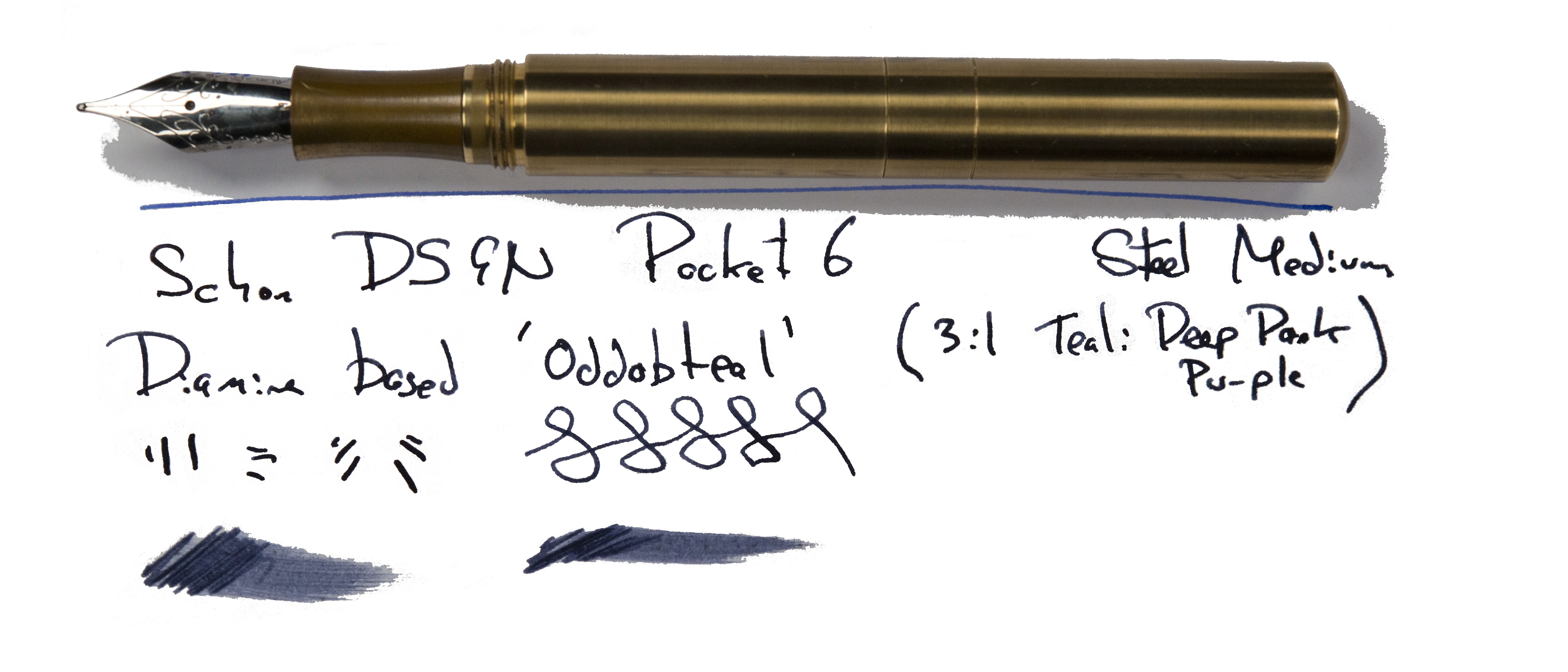
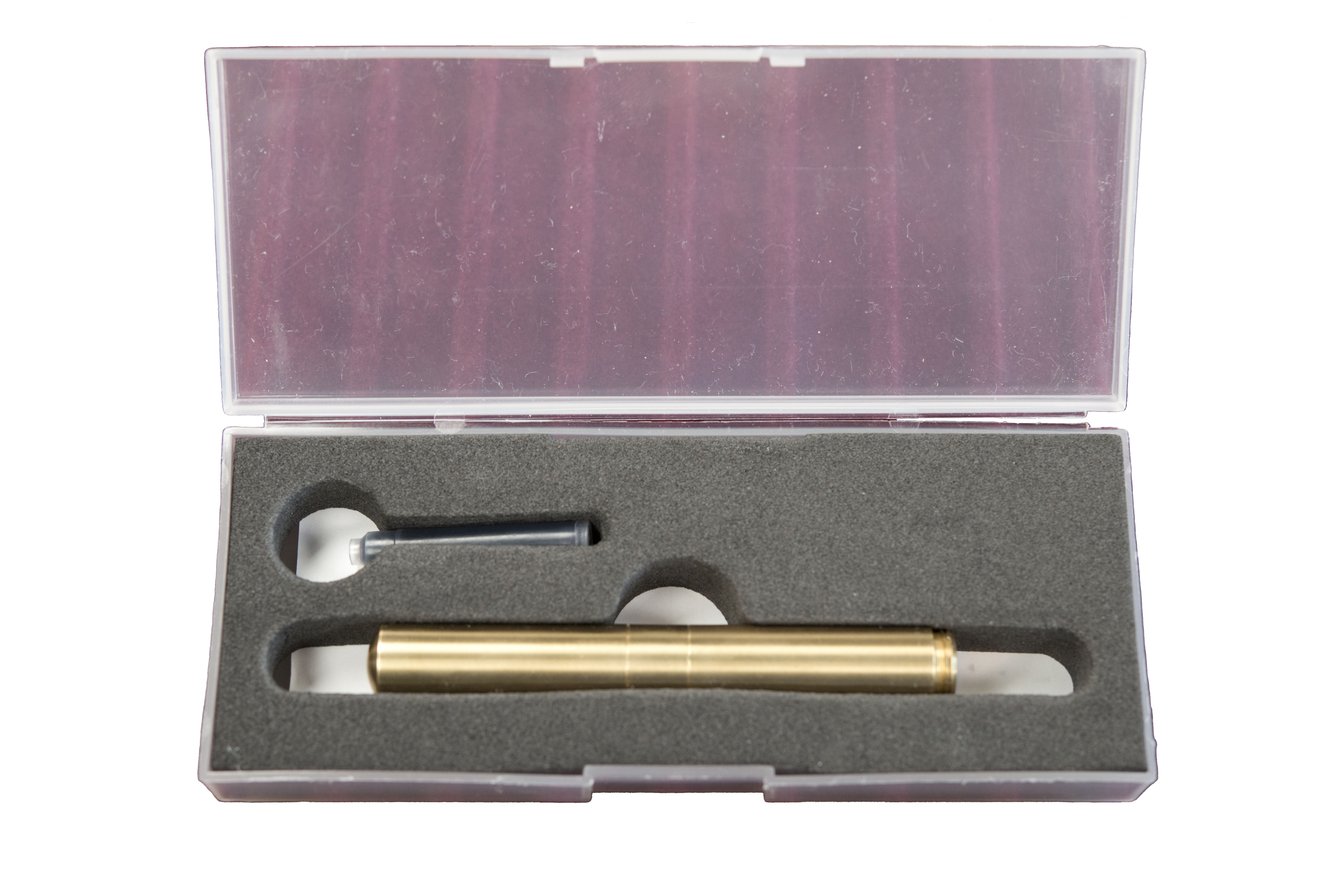 How it feels Heavy, obviously – it’s made of brass. No messing (k-bmm, tssk!). But when the Pocket 6 is fully assembled, which is easy enough with the screw-in cap posting arrangement, it both looks and feels like a fairly full-sized pen. If the weight is a bother, which it seemed to be for some of our reviewers, then lighter aluminium versions are also available – with some eye-popping paint jobs.
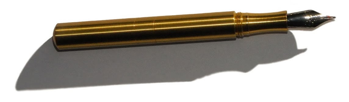
 Pen! What is it good for? Errm, putting in your pocket, maybe? It will take some bashing-about and still write well when you need it to – although the time involved in reassembling the pen before writing might not make this the ideal jotter for very quick notes.
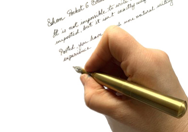
 Our overall recommendation If you want a pocket pen which last for a century and has a ‘proper’ nib on the front, this does the job in style. Just beware that the brass version is hefty, and the aluminium version seems to be very popular too, quite possibly for that reason.
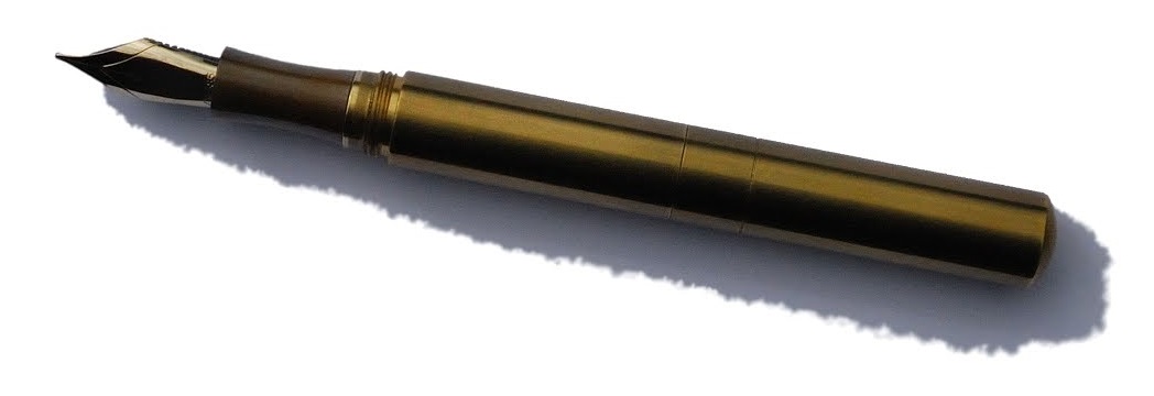
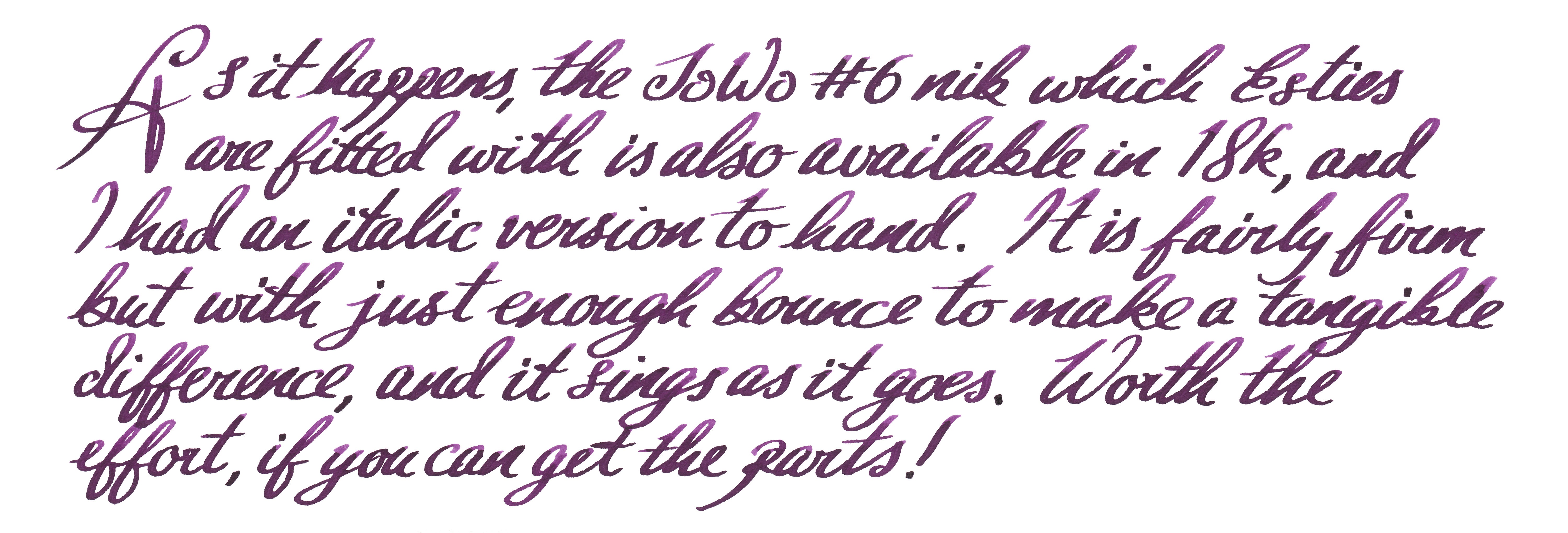
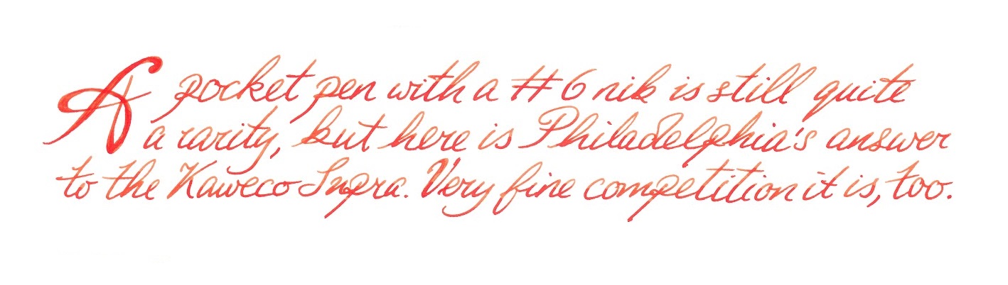
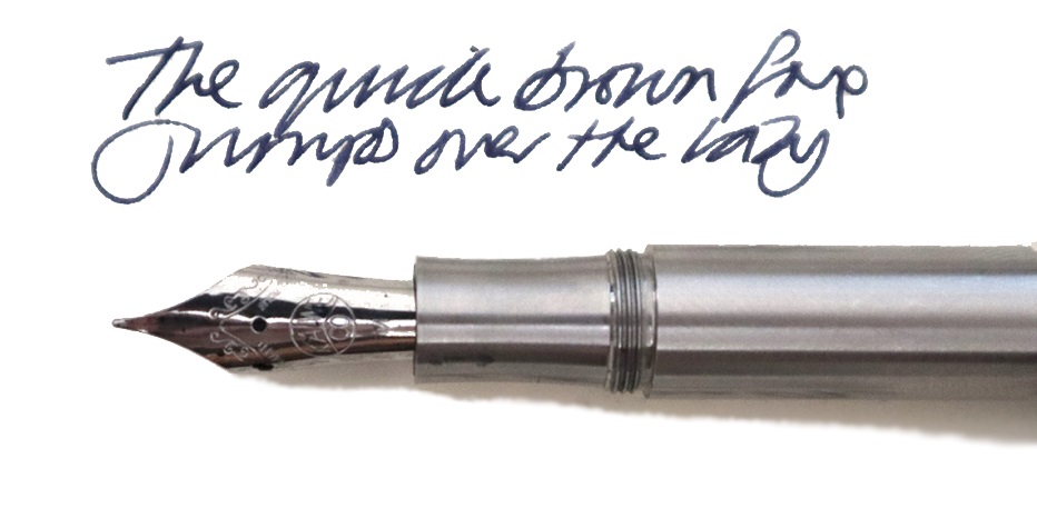
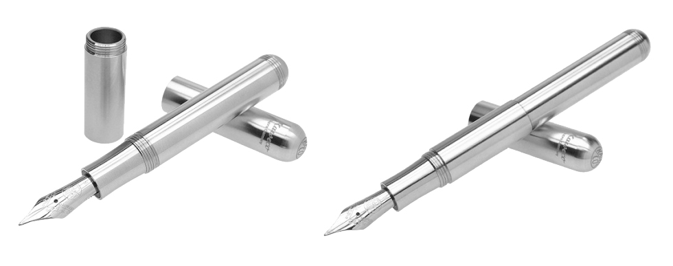
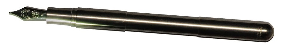 How it looks The Supra appears, from a distance, to be a Lilliput with a cinched waist. Up close, it’s evident that, if anything, it’s a Lilliput which has been to sumo training camp and bulked-up mightily; this thing has a nice big #6 nib, for starters! Then, if you remove the extension tube, it suddenly looks like a tiddler again. Hmm.
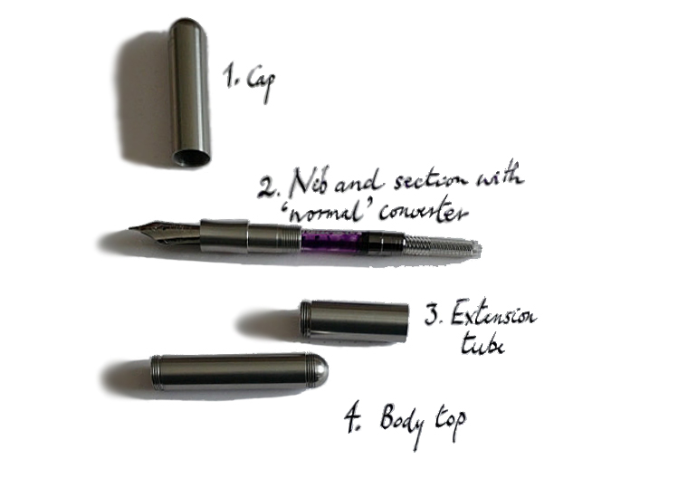 How it feels That extension is the Supra MacGuffin. Fit it between barrel and section, and the result is a standard-length pen which feels about right in the hand, albeit a little long with the cap posted. Omit the extension tube, and the Supra is a pocket pen which feels about right with the cap posted, even if the large #6 nib can be a bit of a surprise to anyone more used to the dainty 060 (small #5) of the Lilliput and Sport models. Once you’ve worked out which length works for you, this feels solid and well-balanced, although the somewhat short grip section might not suit everyone.
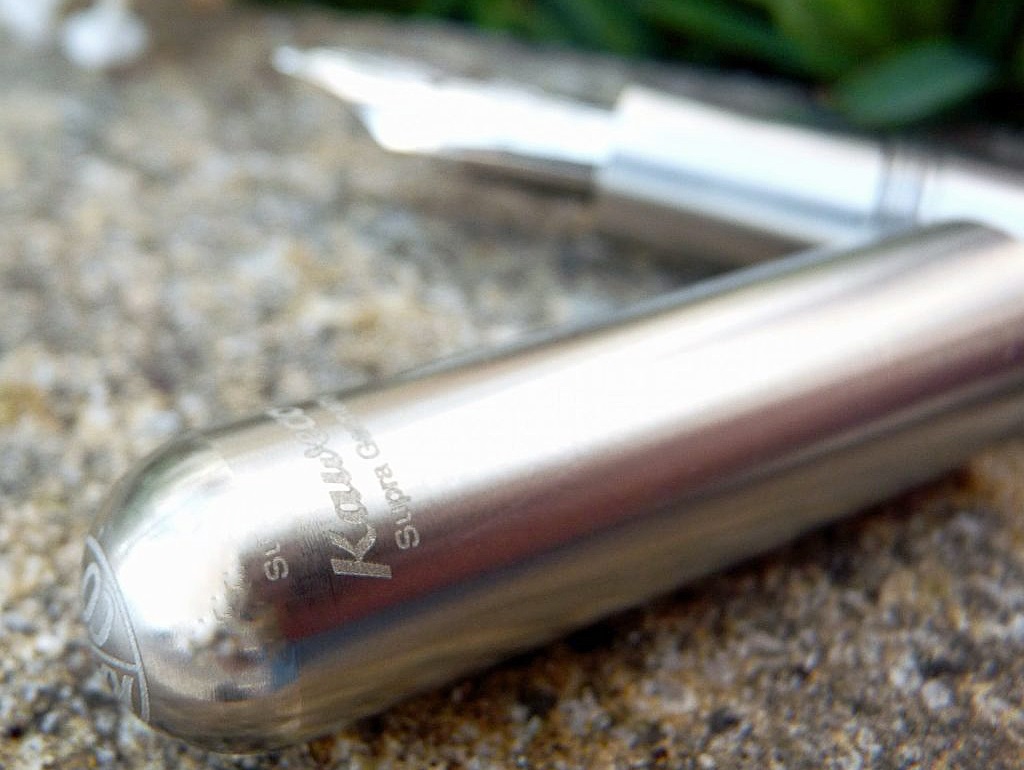
 VFM This isn’t cheap, with current retail prices getting dangerously near three figures. It’s a good, solid, reliable fountain pen which will probably outlast most purchasers, but that’s still quite a lot of money for a moderately stylised length of plumbing. Whether the value proposition adds up largely depends upon whether the feel of the pen works for you so well that you want to pick it up again and again. We’d really like to see Kaweco sell the unadorned short-form Supra for those who just want this, with the extension tube available as an optional secondary purchase, both to reduce waste and get that price down a little. In the mean-time, while half of our testers found the pen a bit too heavy and ‘industrial’ for their tastes, the other half loved it and two are now proud owners.
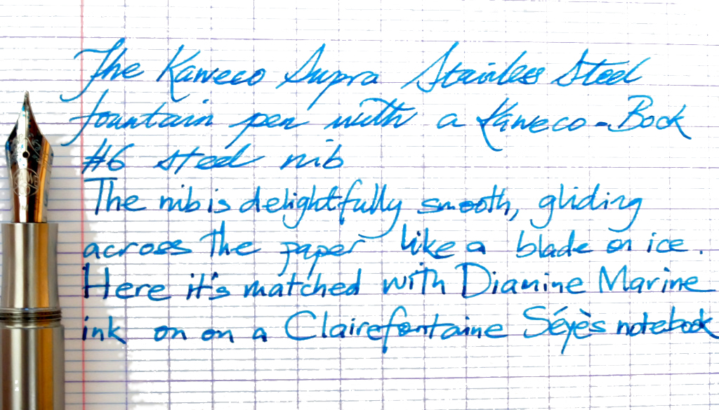
 Our overall recommendation As is so often the case, try before you by. As a heavy, uncompromising and essentially indestructible pen it won’t be everyone’s cup of tea. But if you’re the sort of rugged EDC fan who likes to be able to smash your way out of a burning car using the same pen that you deploy to write a note to the insurers immediately afterwards, a Bauhaus-toting art-school grad with strong hands, or just a sniper with literary aspirations, this is absolutely the pen for you.
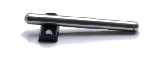
 This meta-review references:
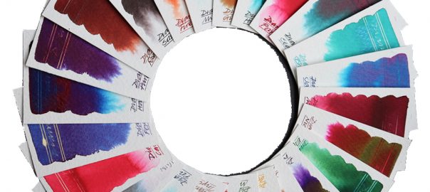
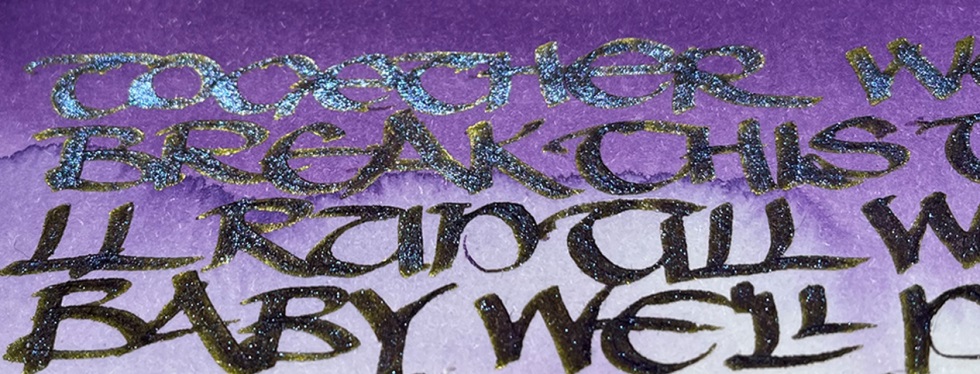
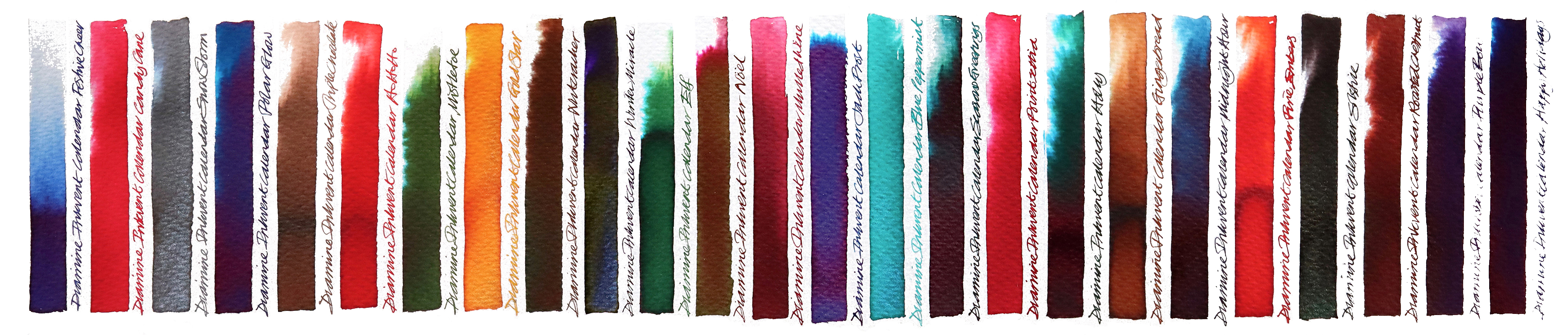
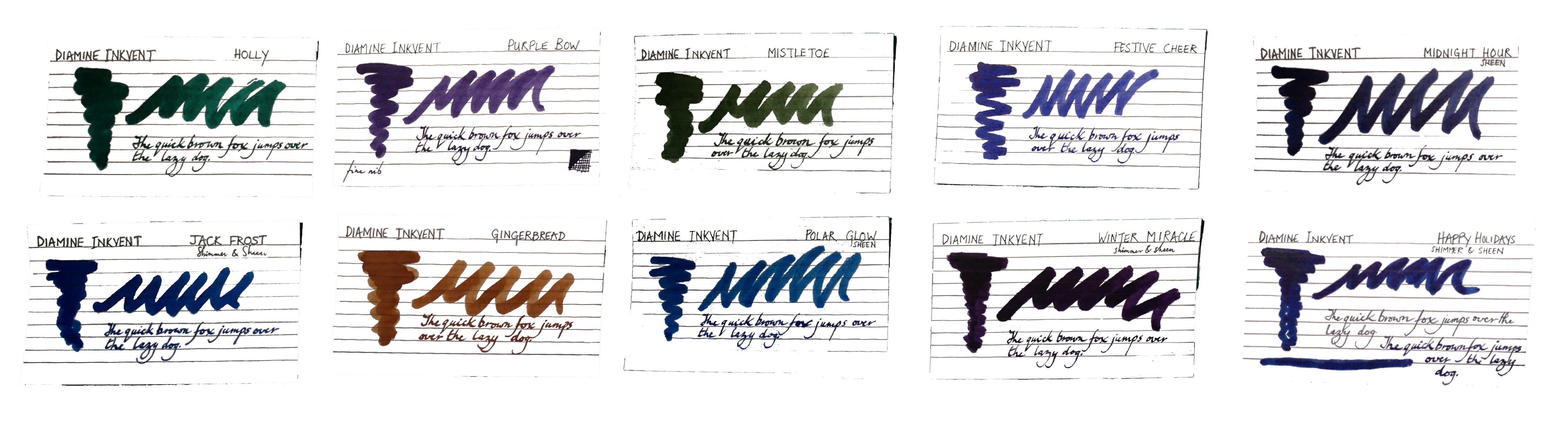
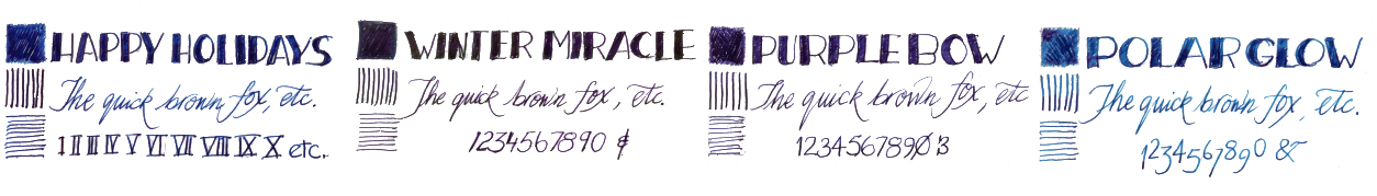
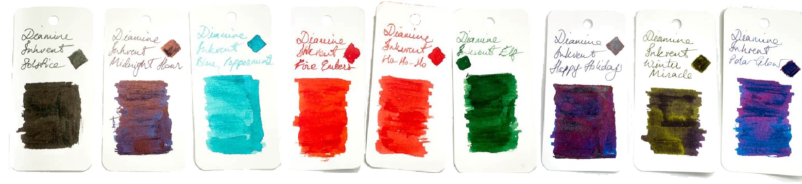
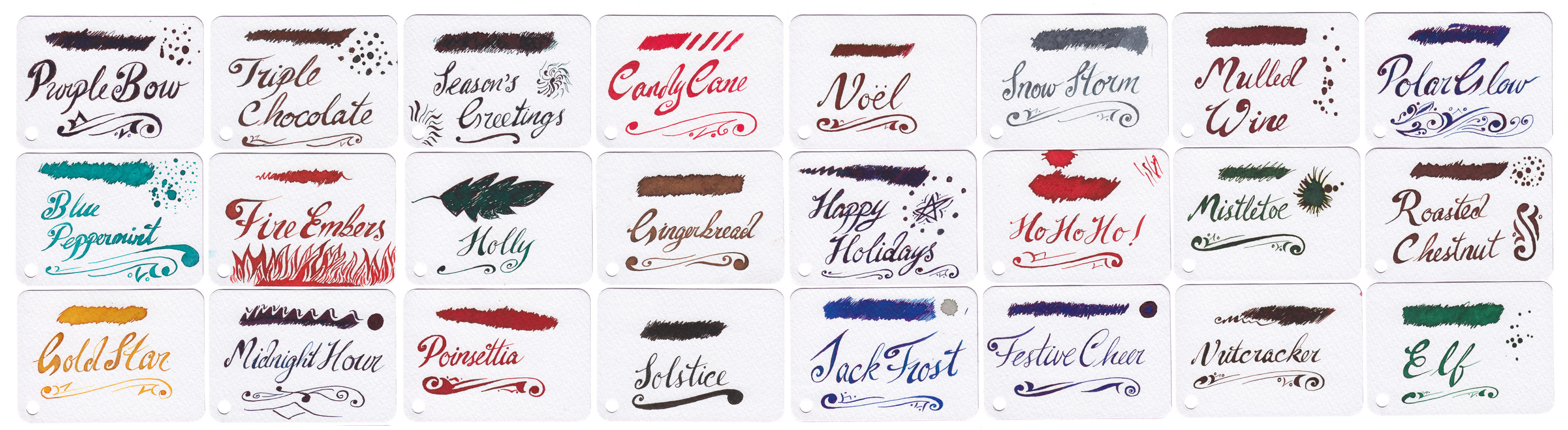
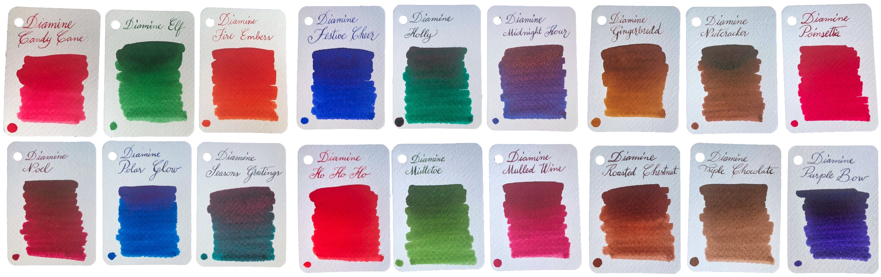 How it looks It looks much like an ordinary advent calendar with something boring like chocolate inside, but that’s just a cunning disguise. There’s a jolly snowman design printed in blue, which might be why the inks are now labelled as ‘Blue Edition’… but that’s probably not what you wanted to know about. The new bottles are amazing four-legged contraptions which look like they could canter away at any moment if you don’t put down that wretched ballpoint and play with a real pen. But perhaps that’s not what you’re after either? Oh – the inks!! Well they look amazing as a range, don’t they? We were a little surprised to find quite so many browns and dark greens, but the whole palette of midwinter hues is here. There are also plenty of traditionally festive reds, some very groovy blues, a gold, a silver, two cracking purples and a terrific turquoise. Unusually for a set released together, some are ‘solid colours’ but many feature sheen, shimmer or both, which is showing off really, but if you can’t do that on special days when can you?
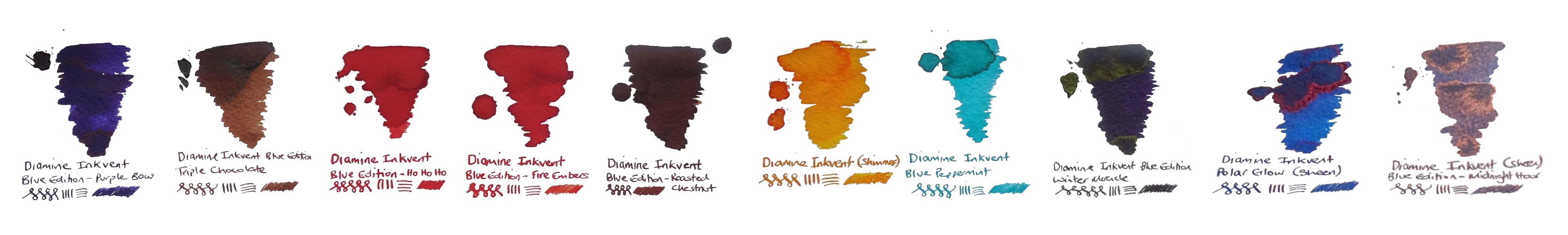
 This meta-review references:
 Thanks to Diamine for inundating us with a postcard from quite near North Wales, actually, and an awful lot of sample pots.