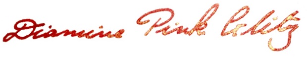
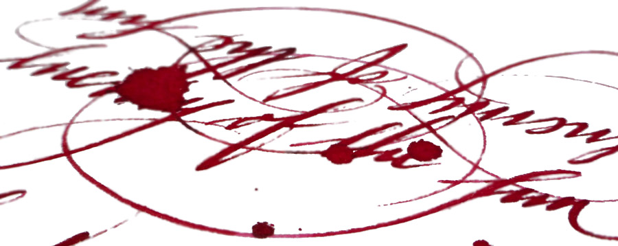
A little bit of history As a still fairly new ink brand, KWZ has received a lot of attention in the last two years as it took the fountain pen world by storm. KWZ is operated by a lovely couple of professionally-trained chemists from Poland, Konrad Żurawski and his wife Agnieszka. That enigmatic name, KWZ, is simply Konrad’s initials. Konrad’s journey with ink manufacturing started as a hobby few years ago and quickly became his and his wife’s passion. Being a synthetic chemist specialising in polymers and organic chemistry, Konrad decided to experiment (which is not unusual for chemists) with formulae and reactions to create his own unique inks from scratch. Initially, he was mainly interested in making permanent iron gall (‘IG’) inks, which due to specific chemical reactions occurring over time have fascinating properties and behaviour, but he soon extended his laboratory’s range to ‘standard’ dye-based inks too. After many trials and tests Konrad came up with several inks which he and his wife decided to take to the Polish market first, then further afield. Agnieszka tells us that on the first outing to the Polish Pen Show, they were literally cutting-out KWZ Ink bottle labels while they were still on the train. During next few months KWZ inks started to get rave reviews on various fountain pen websites, blogs and social media channels, and with anticipation and demand growing quickly, the KWZ brand was formally registered in 2015. The range grew fast, even as Konrad and Agnieszka continued their scientific careers, and at the time of writing they have created an impressive range of 62 unique colours including 41 standard dye-based inks and 21 iron gall inks.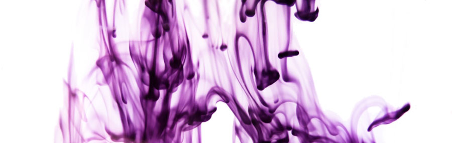
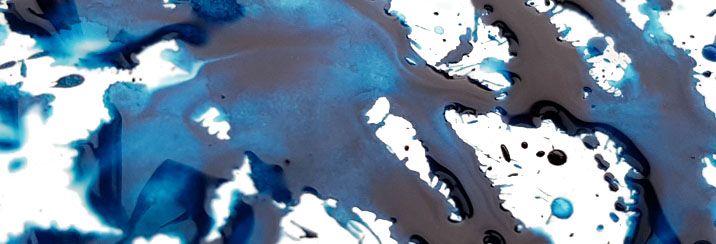
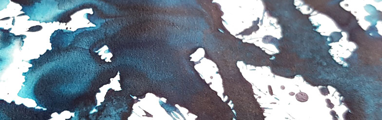
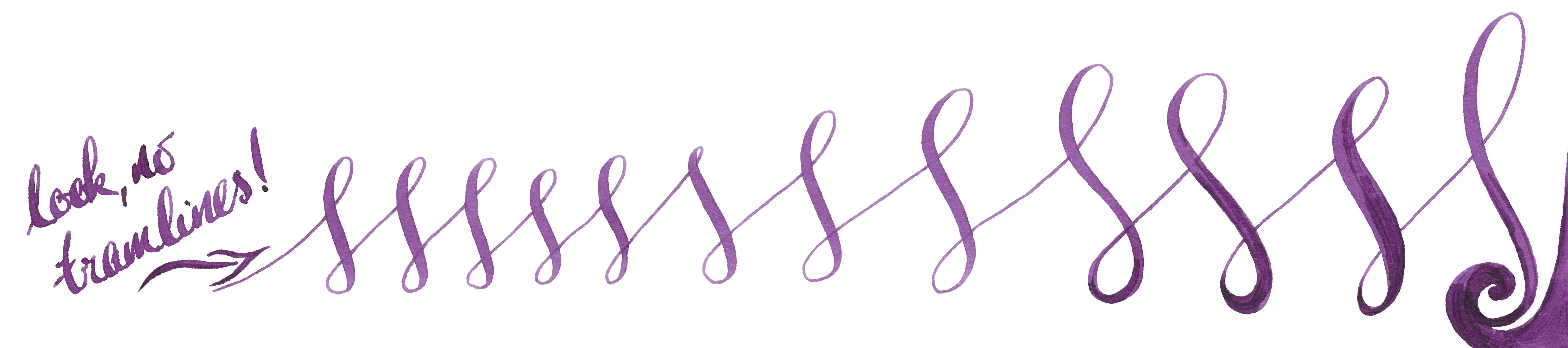
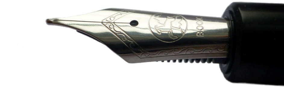
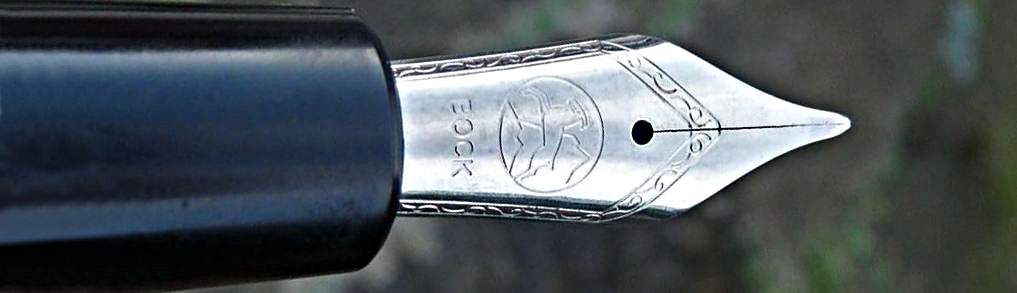
How it looks and How it writes Konrad is a fountain pen user as a well as a chemist, so understands how physical properties like surface tension, appropriate viscosity, flow, etc. are important for a satisfying writing experience. There is nothing worse than beautiful ink which is completely unusable, and when the flow or capillary action is limited one can struggle to write even on the best-quality paper. Konrad goes to great lengths in selecting, testing and applying ingredients and in this respect the KWZ brand has raised the bar for ink manufacturing more widely. 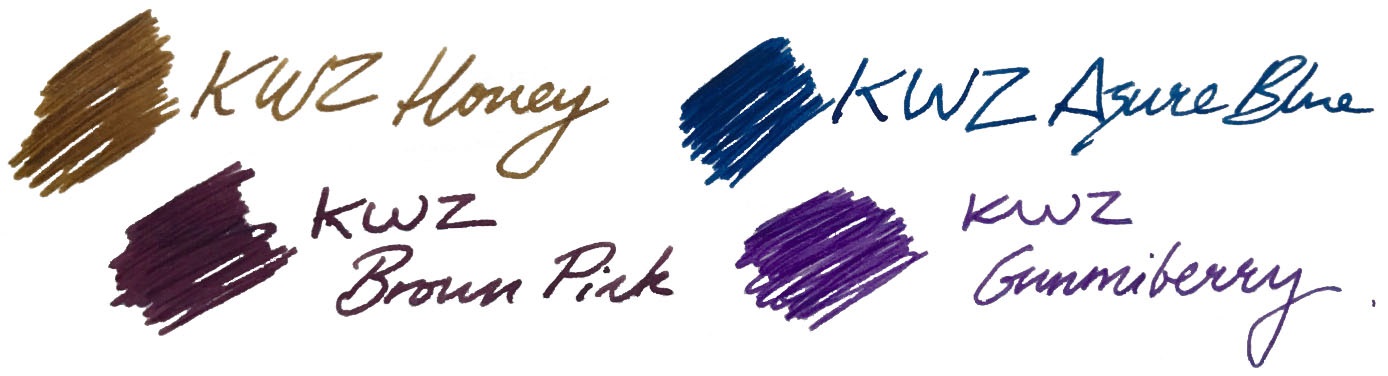 The United Inkdom reviewers all found that aside from the impressively broad colour palette the crucial difference for KWZ ink is its flow properties. Of course writing experience depends on many things like paper, pen, nib, how the feed keeps up with the ink and also one’s writing style itself. People who have very a light touch need ink which flows well to keep up, otherwise pen will skip – but interestingly, heavy-handed writers also require a ‘wet’ ink in order to produce thicker and uniform line. This is especially true for those who use semi-flexible or flexible nibs, which can tend to tramline/railroad if a dry ink is selected. In this respect we found that KWZ inks are some of the best available; the flow is excellent, and in even the most gushing of flex-nib feeds it can keep up. We found the writing experience very pleasant with all types of pens all we tried the ink in, including those with particularly fine nibs as well as broad and flexible ones. On good-quality paper KWZ inks behave very well, tending not to feather and bleed through. This may not be the case with cheap absorbent alternatives such as photocopy/printer paper, but of course all fountain pen inks struggle on those surfaces. Because KWZ inks are highly saturated some ‘ghosting’ may occur especially on very thin paper, such as that made by Tomoe River. We found that many inks from KWZ we tested gave a decent amount gradual shading, but in some cases shading is very impressive, although in general KWZ inks do not exhibit a sheen. They are fairly wet inks, so drying time is not the strongest feature, but once they do dry completely there is not smudging.
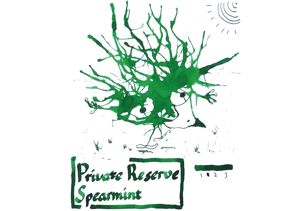
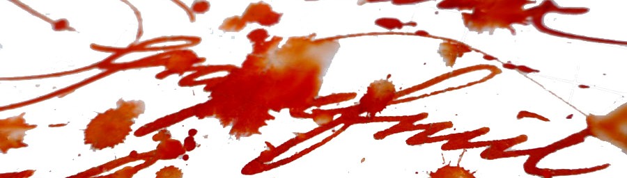
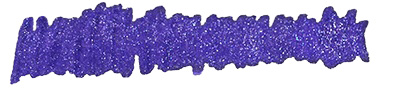
Let’s have a look at some of the particular colours we tested. Obviously we have not tried all the inks KWZ offers, but we picked a few which are good representatives of this broad and diverse palette.
Brown Pink
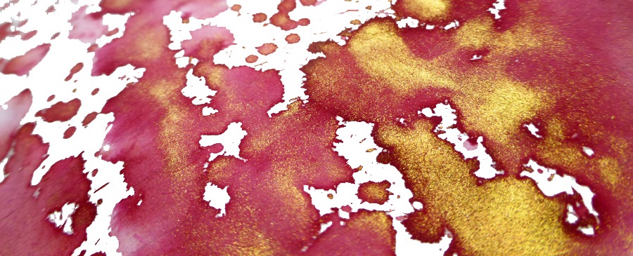
This is one of the KWZ inks that Mateusz and Laura enjoyed the most. A beautiful combination of red-purple with hint of bright light blue makes this ink quite unique. If you like aubergine, plum or beetroot like colours, this KWZ ink will please you. When it dries on the paper it looks less vibrant and flattened, but with this subtle gradual shading Brown Pink is a ‘must have’ in any ink collection – and its popularity already reflects this. 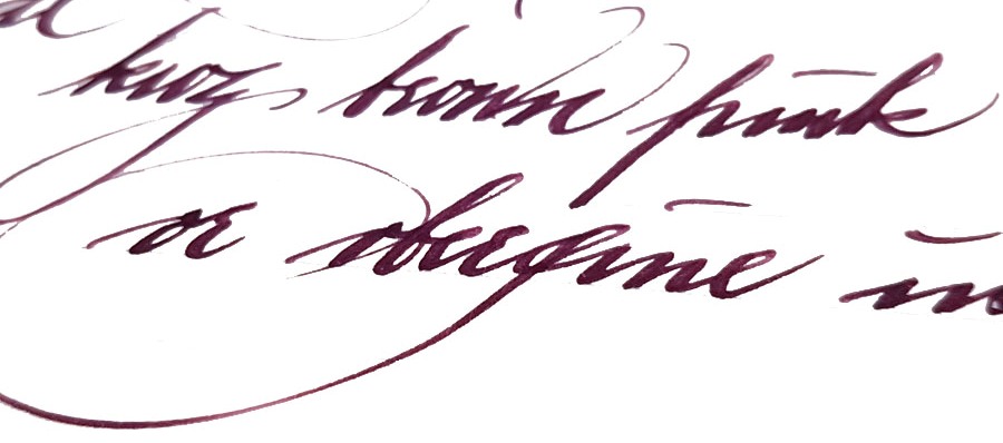
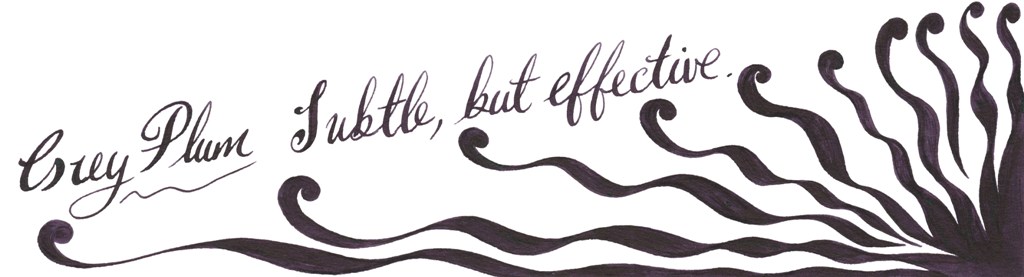
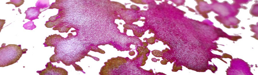
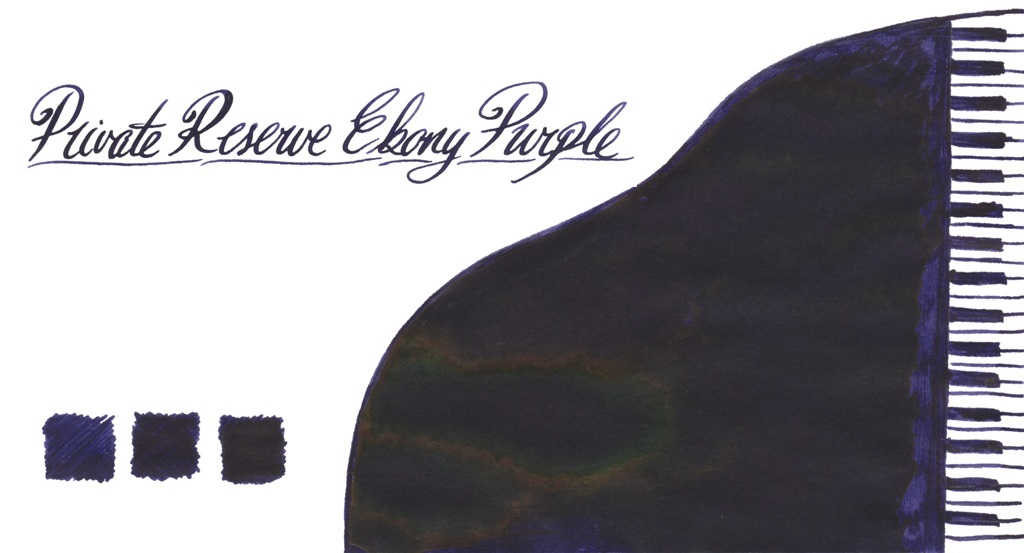
Grey Plum
Compared to Brown Pink, Grey Plum is darker and more purple. The blend of purple, dark grey and bright blue gives a very interesting and pleasing result. With wet juicy nibs it looks almost black.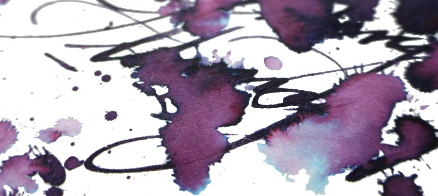
Honey
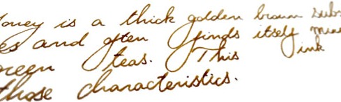
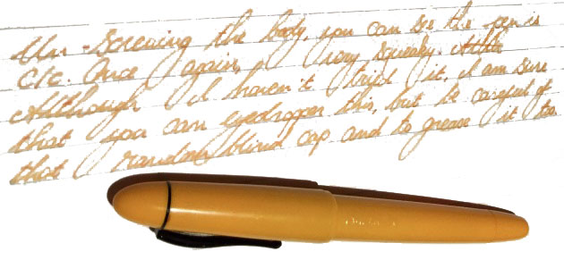
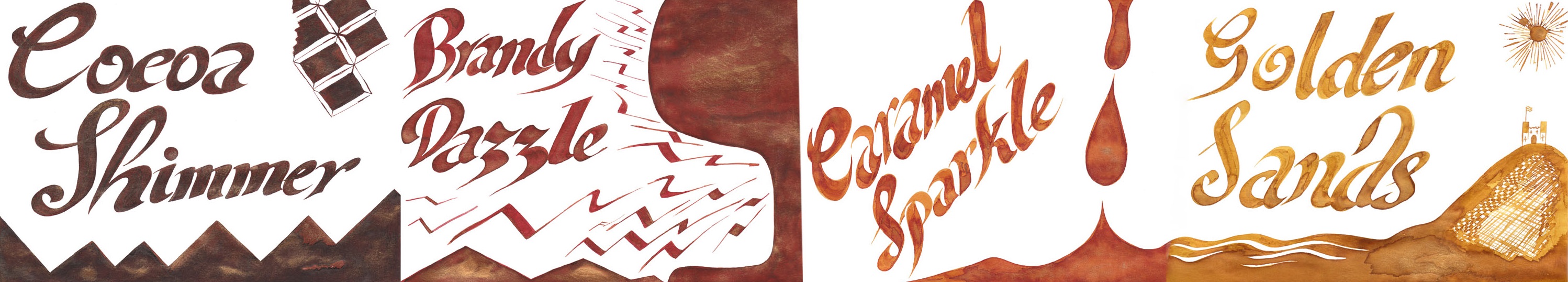
Honey is probably one of the most popular KWZ inks and for a while it was not easy to obtain it, because it kept selling out. Honey is a warm looking golden-brown ink, which gained its popularity because of the lovely shading it produces. This is particularly pronounced on smooth, good-quality paper, where the greatest colour gradation happens.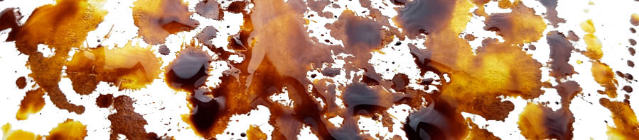
Cappuccino
This is a warm-looking brown which also gives nice shading.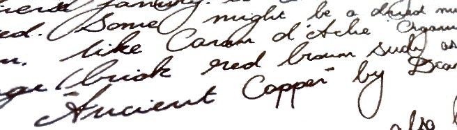
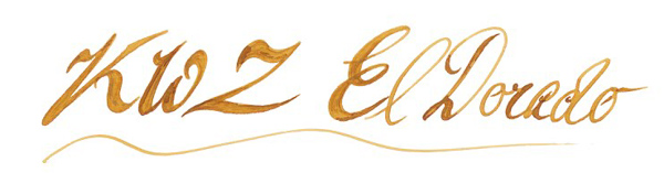
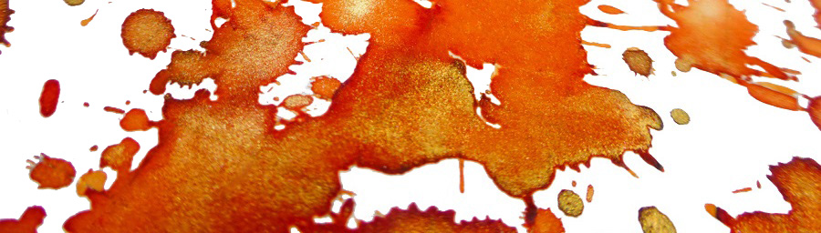
El Dorado
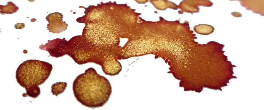
El Dorado is an another example of a great shading ink. The colour varies between darker yellow and orange, or a nice blend of caramel and honey, if you prefer.
Orange (IG)
This is very interesting ink. Out of the bottle it looks like a warm orange, but being an iron gall ink it undergoes drastic metamorphosis and quickly becomes a darker brown…pure magic.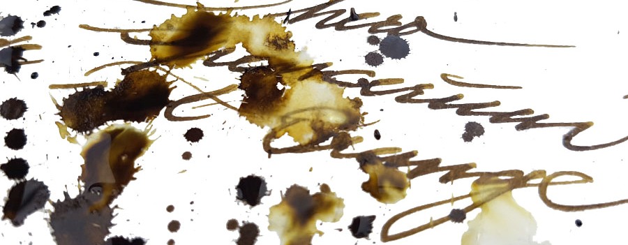
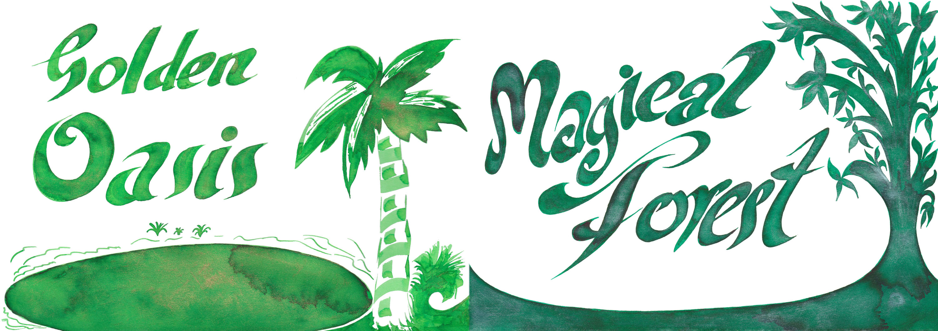
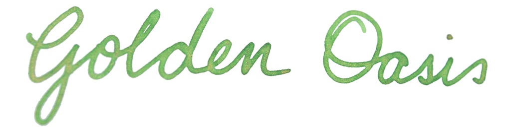
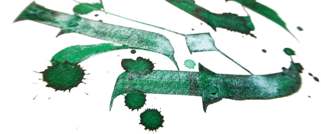
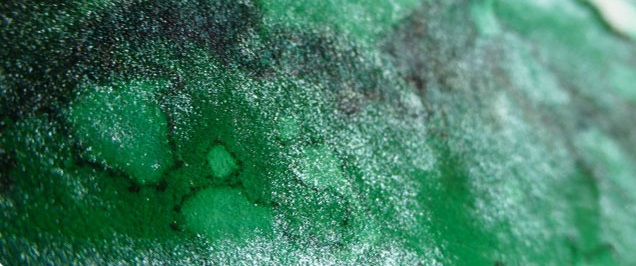
Green Gold
If you like military, camouflage colours similar to Diamine Safari, than Green Gold may be for you. This is a wonderful blend of earthy, almost olive green with yellow.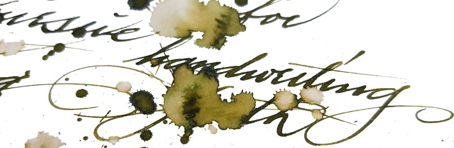
Menthol Green
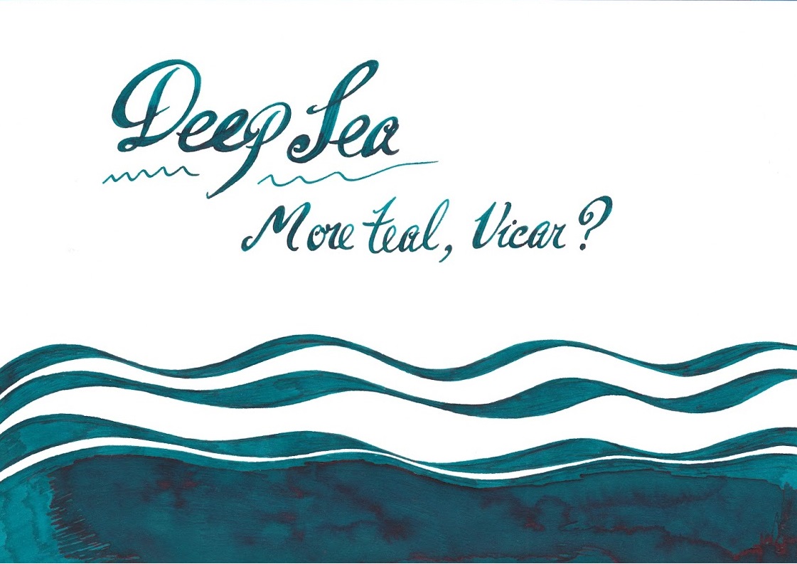
This is a blue/green or green/blue ink which verges upon teal – mixed with a little absinthe, perhaps.
Green #3 and Foggy Green
Green#3 may be easily classified as a ‘standard’ green which according to Gillian give some nice shading too.
Foggy Green is rather difficult to describe; a murky, faded dark green with a significant amount of grey. It could be best to use this only in drier pens as it otherwise comes out very dark. This may be an interesting option for those who do not like flashy inks which stand out from the paper.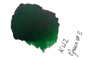
Azure #3
If you like deep cerulean blue/turquoise inks which remind one of blue lagoons, Azure#3 is absolutely a must. Ruth loves slightly darker brother Azure #4 too.
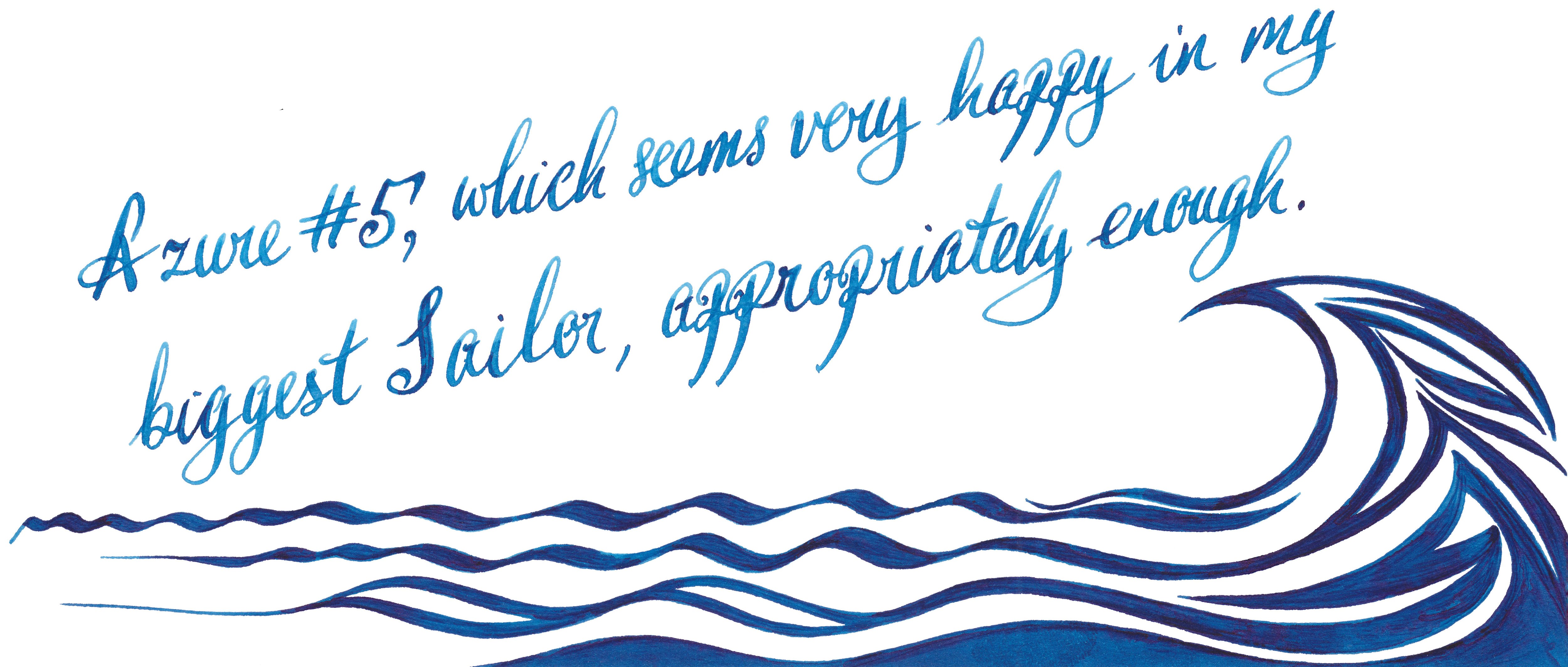
Azure #5
This is a gorgeous deep blue which offers some pretty shading. This may be a perfect day-to-day ink. Both Laura and Scribble were delighted how this well-lubricated ink performs with picky Sailor pens. 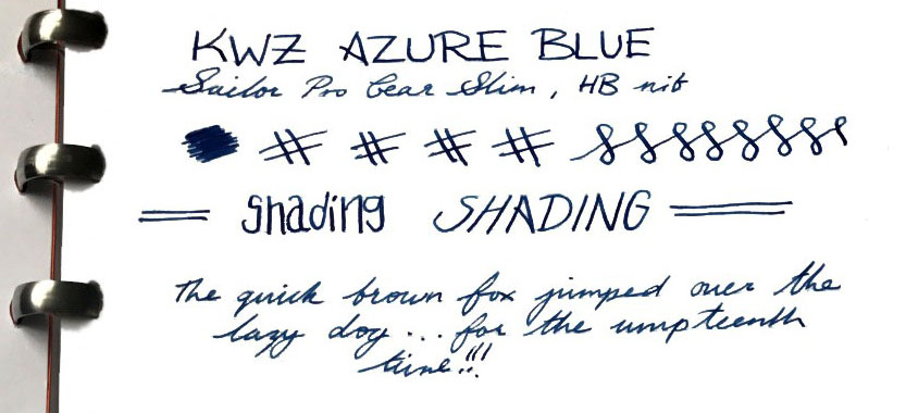
Turquoise (standard and IG)
Love magic? Iron Gall Turquoise will help you to trick people. This fresh deep turquoise blue ink dries to a wonderfully dark teal.
However, if you are not so adventurous then the beautiful standard turquoise is a safer option. Moreover, it has been proven that it is happy in flexible nibs, and
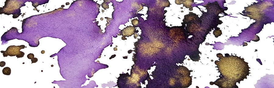
Gummiberry
Gummiberry juice gives the ability to bounce at unusual heights. Like the idea? Us too! This is wild and crazy name for such a pretty purple ink. Ruth definitely loves it – no surprises there. John loves it too. The big surprise is that Laura, who is generally is that not much into ‘girly’ colours enjoyed it too. It works very well with Scribble’s Pilot Custom 742 FA. John was also very pleased by flawless performance of his Sailor EF pen. 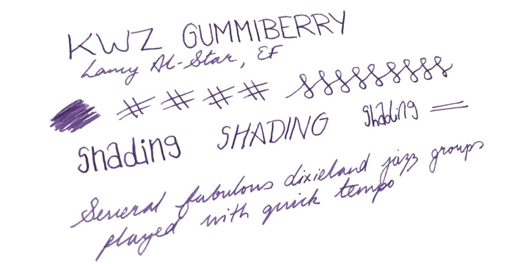
There’s an iron gall version of this in development, too: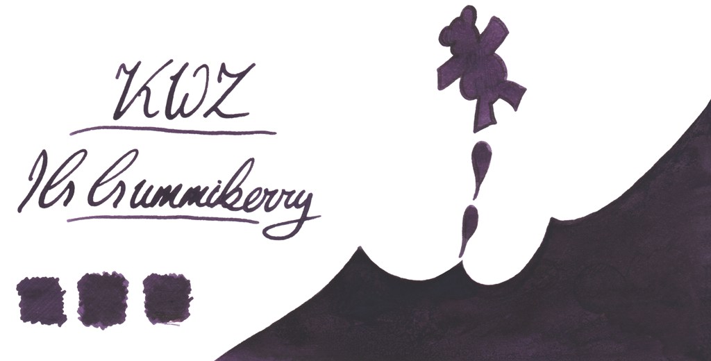
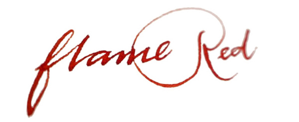
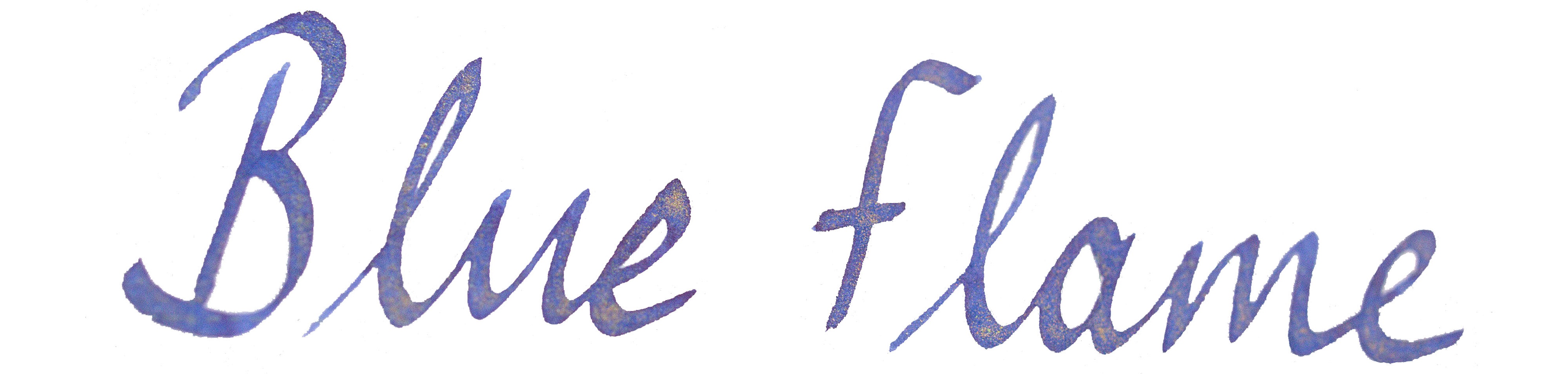
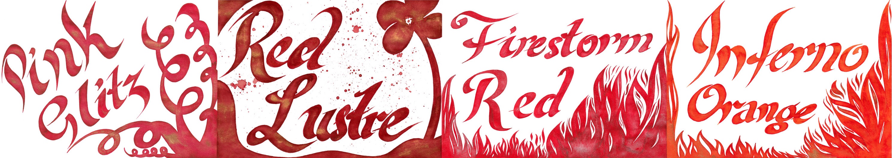
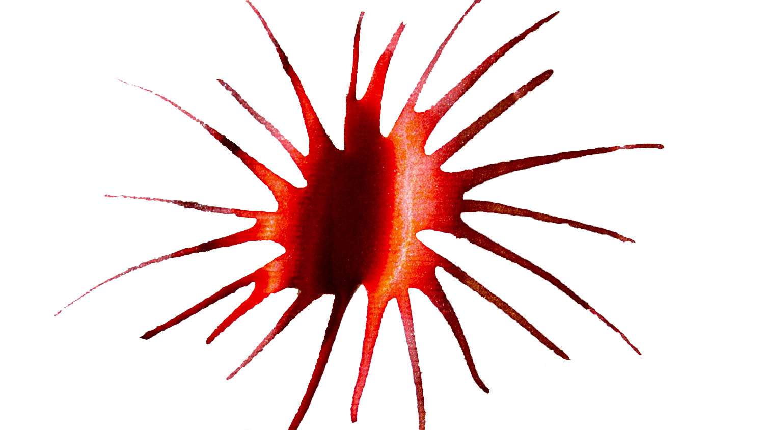
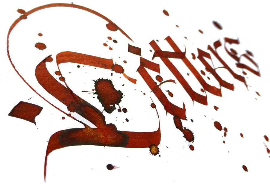
Thief’s Red and Flame Red
Many of us love red and red orange inks – the more disturbing the better! Be careful if you decide to work in the office or anywhere public these two. Thief’s Red is more red-towards-pink: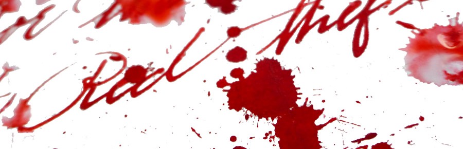
…while Flame Red is definitely red/orange:
Grapefruit
KWZ Grapefruit is a bold and vibrant orange with light touch of pink – we thought it a very appropriate name.
Maroon
Last but not least is the rich and saturated Maroon, which even gives a hint of sheen, uncommon among KWZ inks. This is a very pretty colour indeed.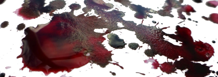
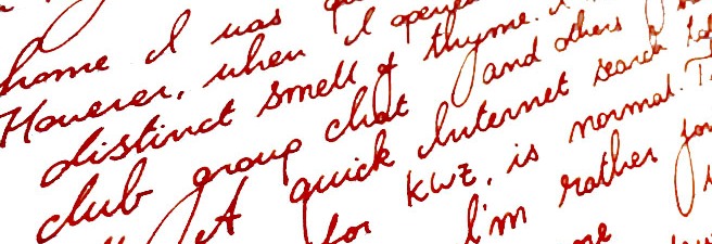
How it smells Well, in general KWZ inks have very a distinctive and recognisable scent which for some is reminiscent of vanilla, whereas for other it reminds them of thyme. The smell will eventually disappear (at least form the paper). The characteristic aroma of a KWZ ink comes from the antifungal/anti-mould agent which KWZ uses in the formulation. In contrast to the phenols used as a preservative by some manufacturers, the anti-fungal chemical used in KWZ inks is not toxic. This is great news, but not all of us have been enamoured of the pungent smell, especially during longer writing sessions. Despite some reported problems with staining TWSBI pens (especially the ECO model), it is generally relatively easy to clean pens from KWZ inks, but at the same time is also very difficult to eliminate the smell. Agnieszka and Konrad are certainly aware of this issue and they are continuously working on better, more satisfying formulation. We have been told that since September 2016 all KWZ inks have different component which gives rather sweet and less irritating ‘chemical’ scent compared to how it was before.
Our observation regarding the KWZ ‘perfume’ is in line what we have seen reported and discussed by other users elsewhere; responses are sharply divided between those actually quite like this this smell and those who can barely stand it all. It is worth mentioning that the KWZ inks we were testing came from both ‘old’ and ‘new’ batches respectively, so it is not surprising that our experiences are different. Interestingly, within our team of reviewers Ruth found this smell pleasant, whereas Laura and Gillian have completely opposite experiences, and while Scribble can handle it, his other half will only let him use it outdoors. Our assessment is that as soon as Konrad and Agnieszka standardise the new ‘neutral’ formula, KWZ will become a solid brand for the wider market – but until then, writers may be well-advised to try a sample before committing to a full bottle.
Regarding problems related to the TWSBI ECO line, where several issues with permanent staining were reported, we have been told that the KWZ team has investigated this and have already switched an ingredient which was unfortunately reacting with the polymer used in these pens.
Ink! What is it good for? This really is a very subjective matter. Because the colour range KWZ offers is so broad, picking the right colour for your needs should not be too difficult. All those who likes classic colours for office/businesses will be satisfied as well as those who are adventurous enough to use more exotic colours. Again, the only concern is that characteristic smell, which is not to everyone’s taste and may not be appreciated by all around you. Apart from that, this is ink fit for just about any every-day fountain pen purpose.
VFM KWZ inks are not the cheapest. In the UK you may get a 60ml bottle of KWZ Ink for around £12-13, depending which retailer you pick. This is almost double what you will spent on 80 ml bottle of standard Diamine ink, so it is not easy to justify on colour grounds alone, but for users of flex nibs or drier feeds the flow properties may make the investment worth it.
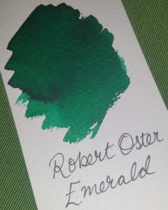
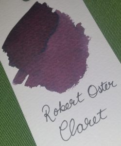
Our overall recommendation Our reviewers all agreed that KWZ Inks are very interesting and even have potential to be market leaders in the future. KWZ inks are generally wet and well lubricating. All the inks we tested flow nicely and gave us a good writing experience, even with pens which normally tend to run dry – and that viscosity helps to maintain a fast flow which is particularly noticeable with more demanding flexible or semi-flexible nibs. Colours are saturated and many exhibit great shading (e.g. Honey). However, if you are sensitive to the rather powerful pong of the current KWZ ink formula, getting cheaper Diamine ink or investing slightly more for Robert Oster’s Signature inks may be a wise alternative.
Where to get hold of some KWZ inks are not yet as widely available as some other popular brands. However, several specialist online retailers do stock them, and in the UK a wide selection of colours (including Iron Gall inks) is available exclusively from Pure Pens and Bureau Direct.
This meta-review references:
- The Clumsy Penman’s reviews of Honey, Foggy Green, Green Gold, Thief’s Red, Azure, Maroon, Brown Pink, Grapefruit, Flame Red and Grey Plum
- Scribble Monboddo’s hand-written review of a smaller selection, and all the purples
- Ruth’s video review of several colours
- Laura’s ‘tickled pink‘ test of four beauties
- John’s review of some tempting samples
- Gillian’s review of four shades
Thanks to Pure Pens, Bureau Direct and KWZ Ink themselves for providing inks to several of our bloggers previously – and big thanks to Pure Pens for furnishing even more of us with samples specifically for this meta-review exercise.


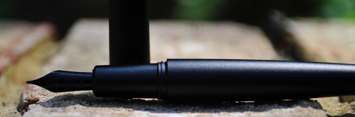
 A little bit of history Glaciers, weathering and tectonic plates were all involved to a greater or lesser extent in separating the Lothian volcanoes from the kingdom of Fife, but ever since the Forth Bridge became the world’s largest project management metaphor, both sides of the firth have been part of an on-and-off industrial heartland. That engineering heritage was recently sparked in to life in one local business unit by the Kickstarter project which brought Namisu into being, and they’re now producing a couple of models in an increasingly diverse range of materials. Some of us have been interested since those heady Kickstarter days, but the word is spreading fast…
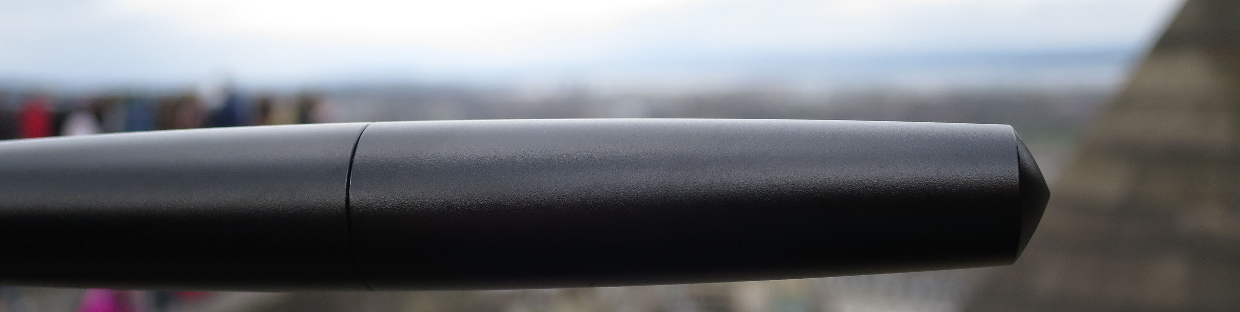

 Where to get hold of one Right now, buying from
 A little bit of history
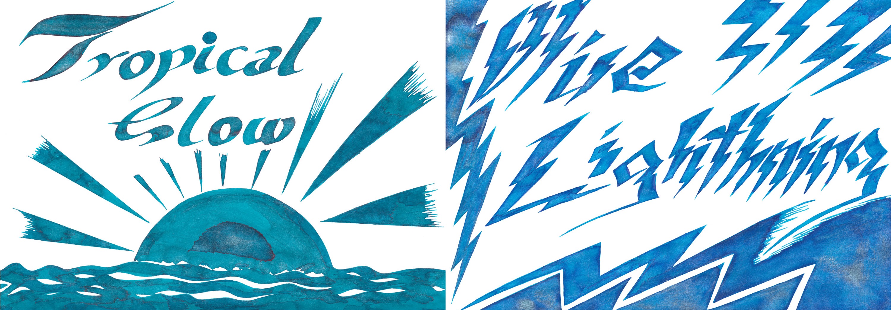


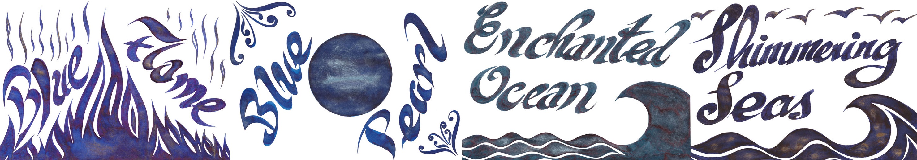
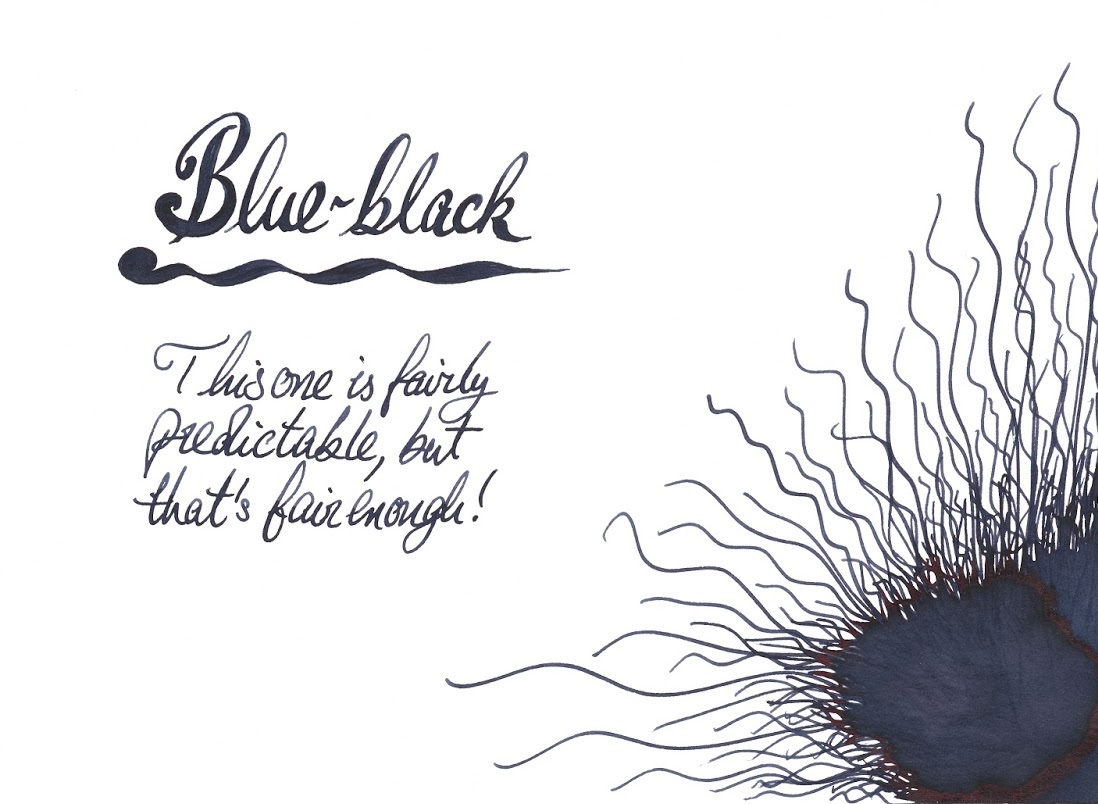
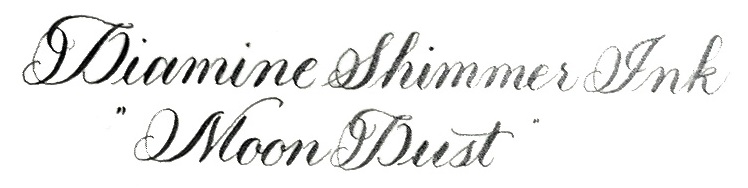
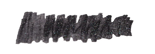
 Enchanted Ocean and Shimmering Seas are a little harder to categorise – like the sea, they keep changing colour as the light shifts. But both are broadly blue-black with either green or purple hints, with a spot of iridescence from
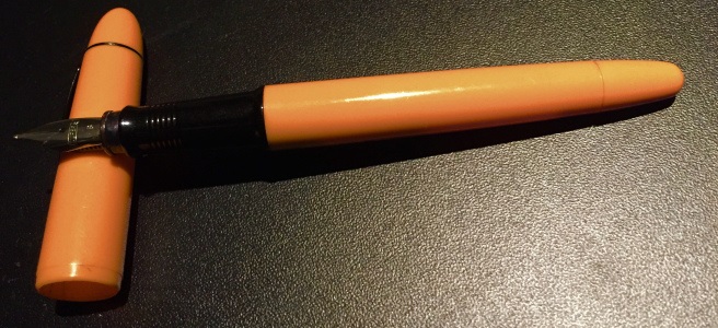
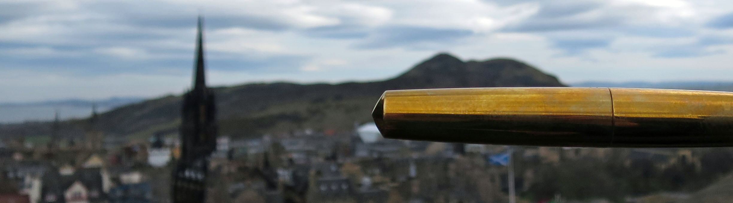
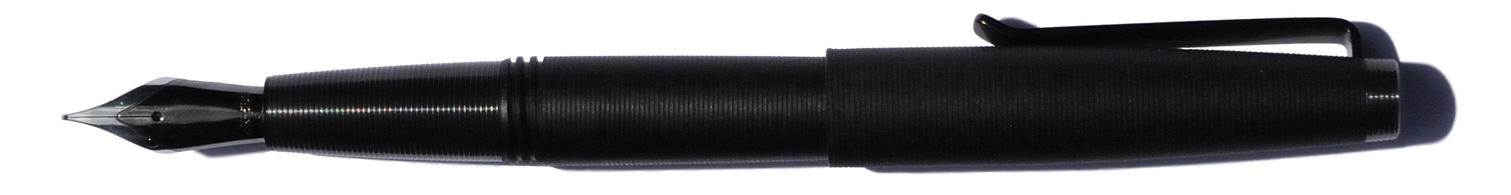
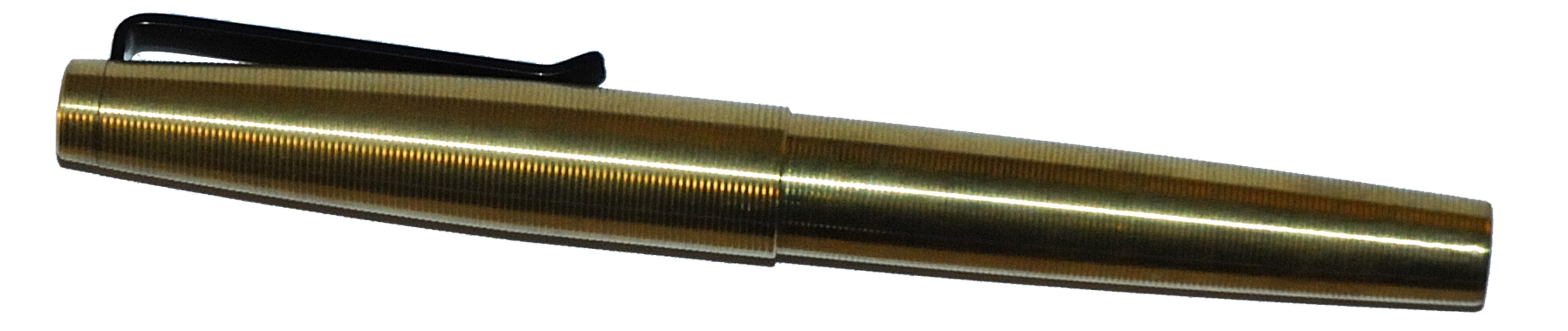
 How it looks As the brand name suggests (just for once, it’s entirely relevant and accurate) the whole pen has been precision-turned to make it a tactile pleasure to use – but we’ll come on to how it feels in a moment. How it looks is, frankly, pretty much like the stereotypical alien mind-probe; with those eerily-accurate ripples and space-age materials, it wouldn’t look out place in Captain Kirk’s hands (its uses are far less sinister, though, unless you write left-handed of course). The very sharp-eyed may be able to spot some light marks from the lathe chuck on the barrel of the polycarbonate version (as depicted below), but it doesn’t greatly detract from the overall effect.
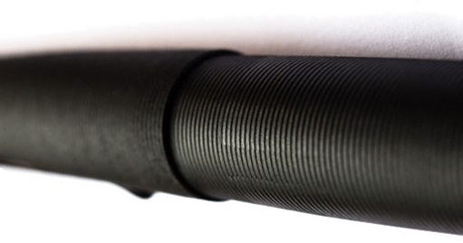 How it feels Those ripples and ridges provide a good grip without discomfort, and most users have found this a pleasure to pick up and get writing with. The weight varies considerably depending upon the materials chosen; the all-brass version is without doubt a nicely weighty pen, the all-polycarbonate version is feather-light, and the combinations of polycarbonate barrel and metal section concentrate the weight just where you most want it, near the nib. Which feels best for you depends largely upon personal taste. The only catch we detected was that the copper grip can be a little slippery on a warm day.
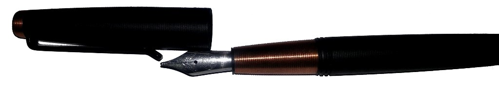
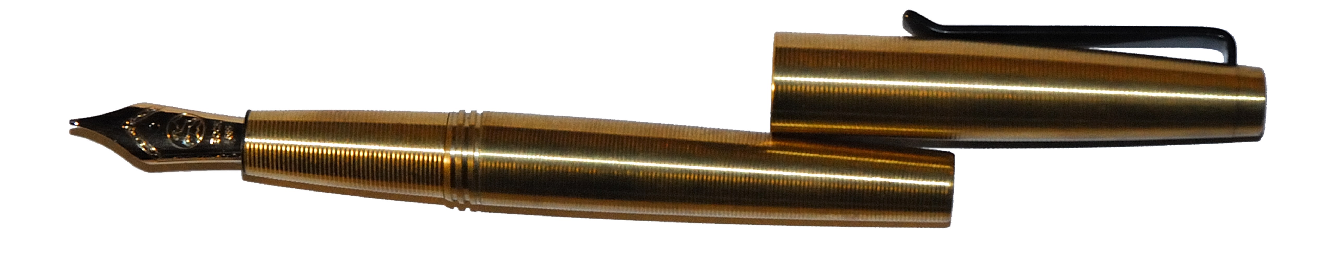 VFM The Gist has to cope with transatlantic tariffs and the buffeting of currency exchange rates, so competing on price with European offerings is not always going to be easy. With a simple steel nib, the all-polycarbonate looks to us like fair, albeit perhaps not stellar, value at £70 – whereas just £30 more will get you the all-copper version which seems an absolute steal.
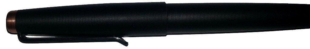
 Where to get hold of one Newcomer e-tailer iZods is stocking a broad sample of the Gist range in the UK, including the titanium and copper versions
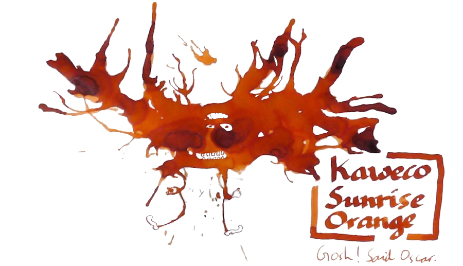
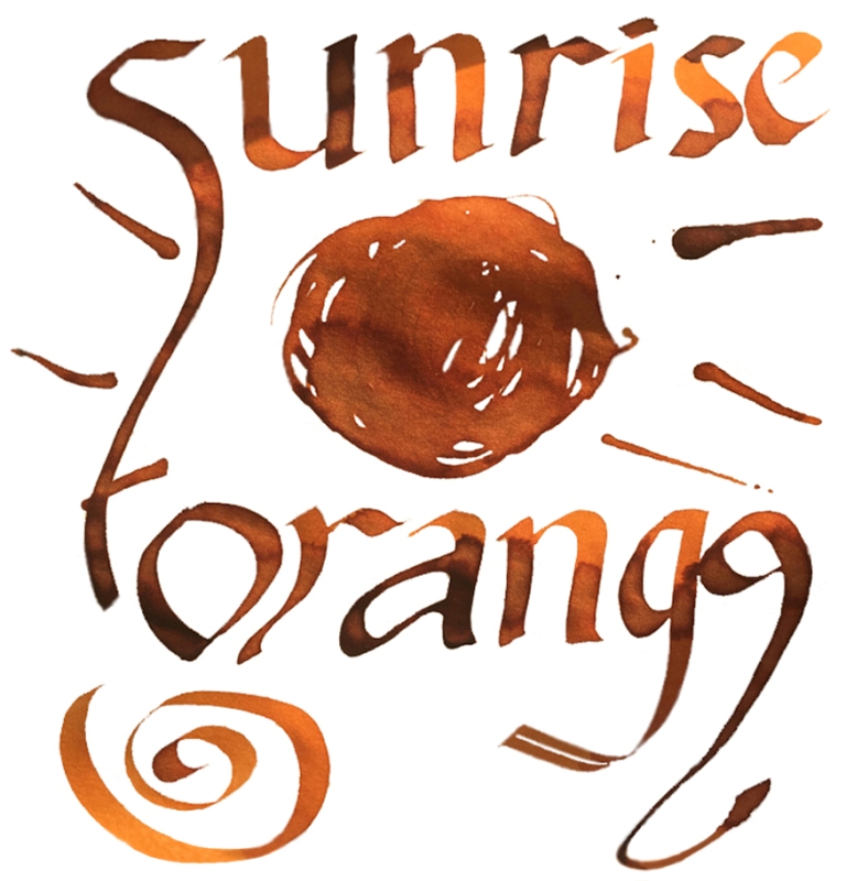

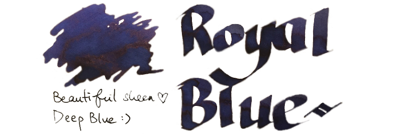
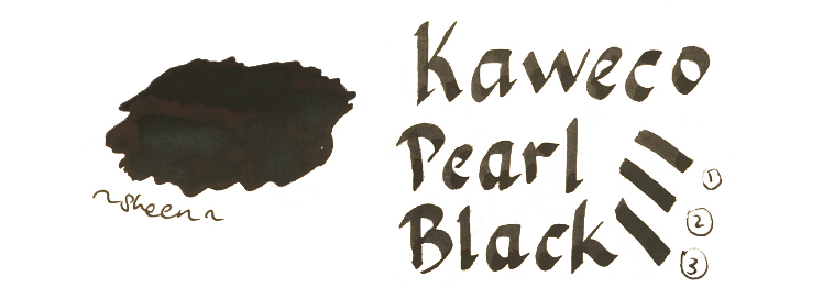

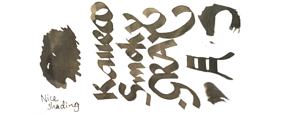
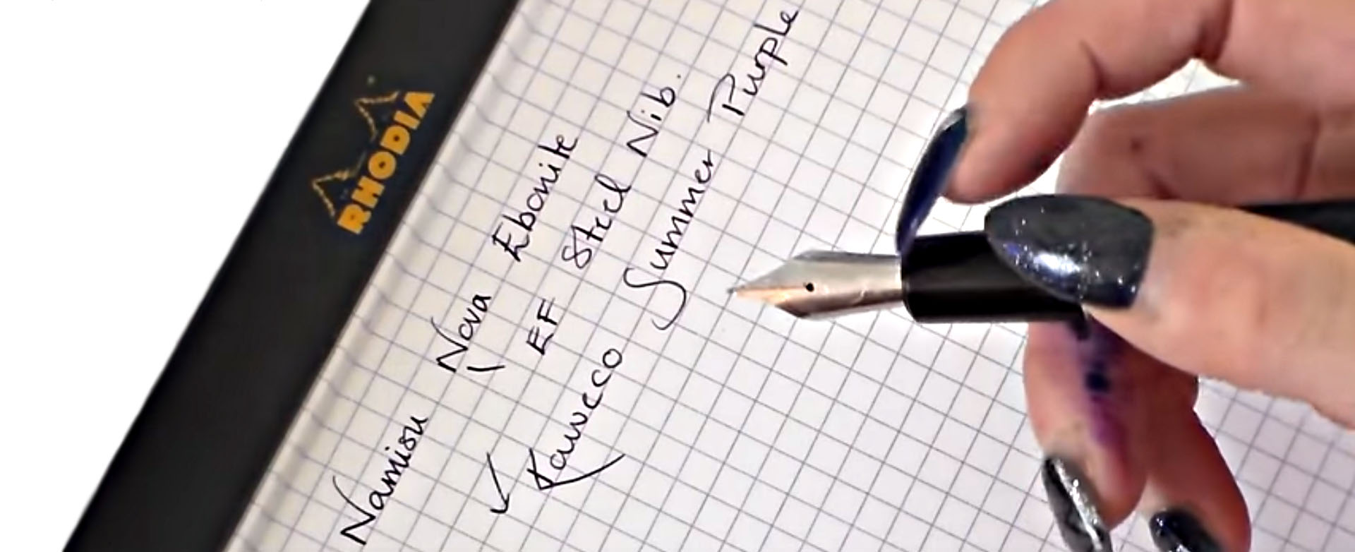
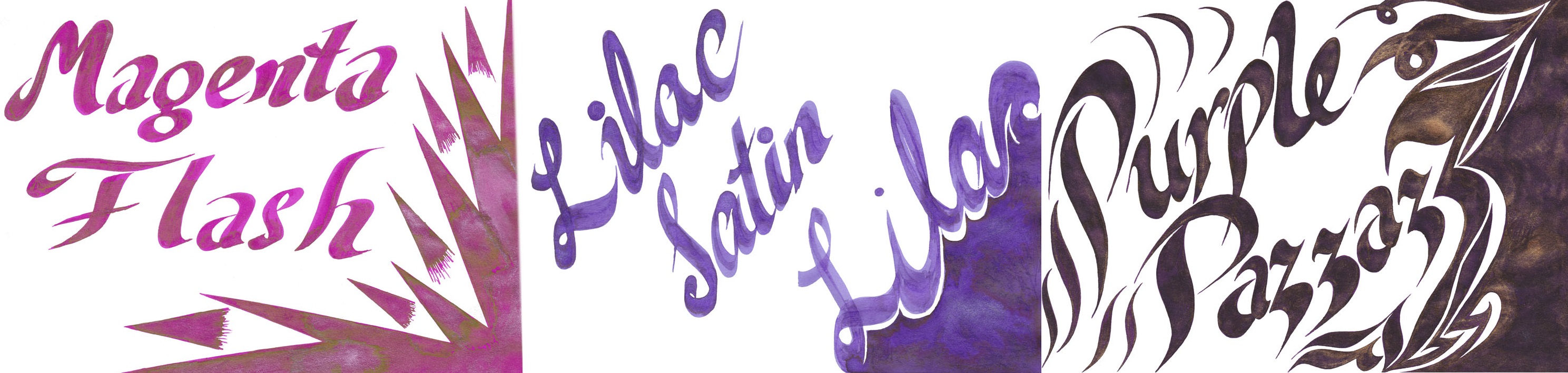
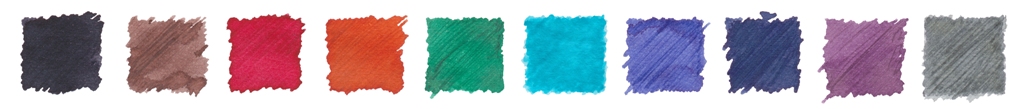 VFM Can be something of a challenge with this collection, to be honest. The bottles contain only 30ml, and are sold at ‘premium’ prices in the UK – although this is at least in part a self-inflicted exchange rate problem for us Brits to deal with. Price competition looks particularly tough when compared with our home-grown Diamine, who provide 80ml bottles of ink for little more than half the price. Few retailers stock both brands at present, but to cite the example of one with the lowest prices for both, at the time of publication The Writing Desk were charging a little over 7 pence per millilitre for Diamine, and 35p/ml for Kaweco ink. That effectively knocks Kaweco inks out of consideration for everyday colours like Royal Blue, which both brands provide; even if you like the look of that sheen, it’s unlikely that many fountain pen users would consider the Kaweco version five times better than the Diamine. But some of the highly distinctive shades such as Sunrise Orange, Paradise Blue and Smoky Grey have qualities which really make them worth seeking out, in our opinion – and they’re hardly going to break the bank!
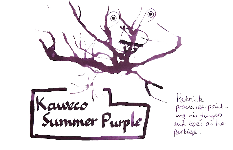
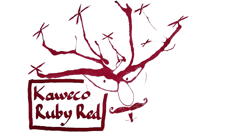
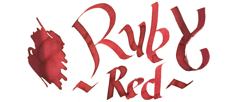
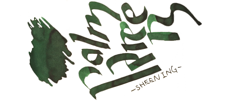
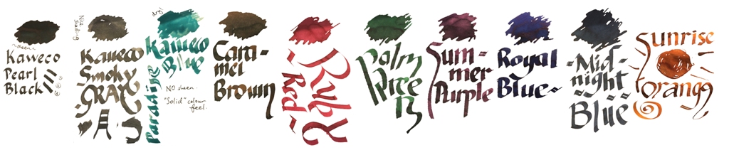 Our overall recommendation is to choose carefully and invest in one or two of these which particularly take your fancy. If you like purple, Summer Purple is warm and user-friendly. If you’re a turquoise fan and can stand the ink sinking-in to the paper rather enthusiastically, Paradise Blue is a lovely colour. Ruby Red and Palm Green beat any teacher’s homework-marking ballpoint any day… and Sunrise Orange eats Apache Sunset for breakfast. If you just want a well-behaved Austrian everyday black or royal blue, you don’t really need to spend so much; even Montblanc will provide you with twice as much ink for the same money. But we like this collection; suffice it to say that there are several Sports, Lilliputs and at least one Supra which will now be filled with ink from the same stable for quite some time.
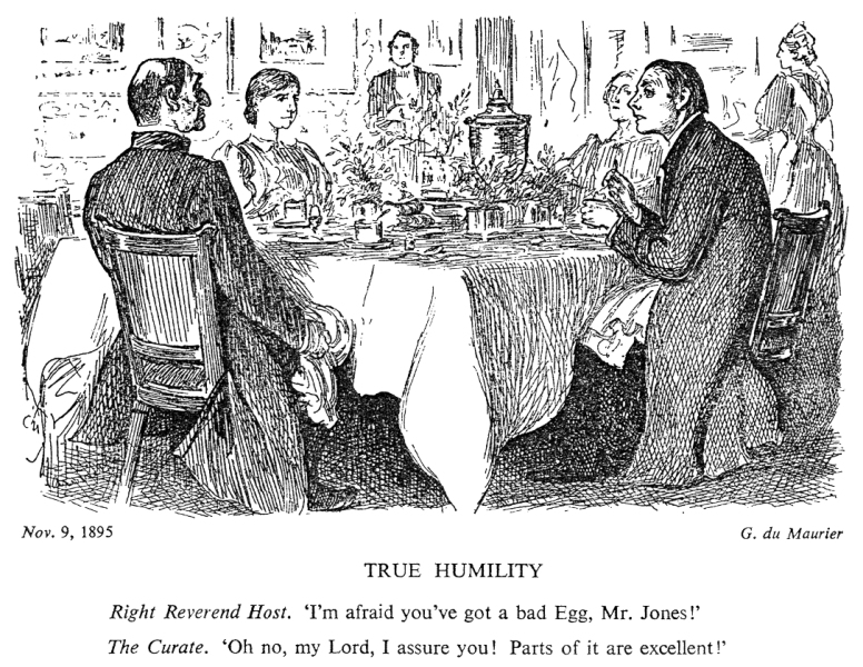 Punch cartoons pop up in many a history textbook, but the sketch above is probably the one that got most into everyday language. Our readings of The Missing Ink suggest a similarly ‘balanced’ view; Daniel enjoyed it, John found it not much to his taste, and Scribble found it, well, a bit of a curate’s egg.
 So where did it go wrong? Well, the author is a professor of creative writing, and goodness do readers get to see all his craft in action. The endless whimsical footnotes, and diversions into irrelevances like Hitler’s handwriting and the Bic ballpoint, will either be very much your cup of tea, or very much not. In short, he goes on a bit – and not about pens and handwriting, much of the time.
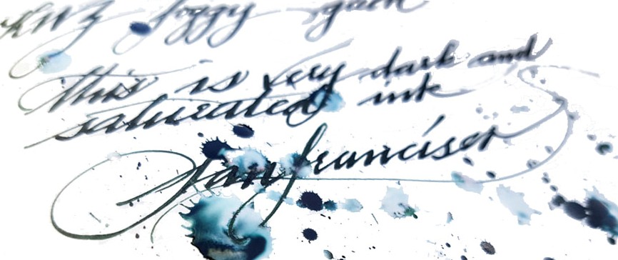
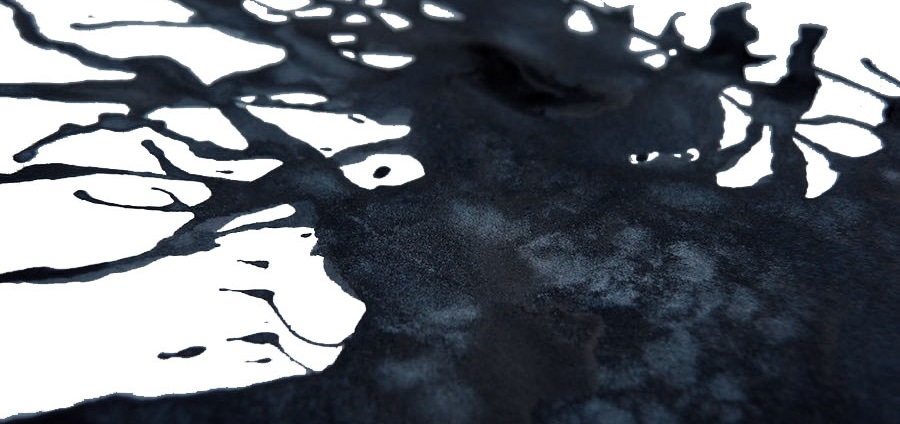
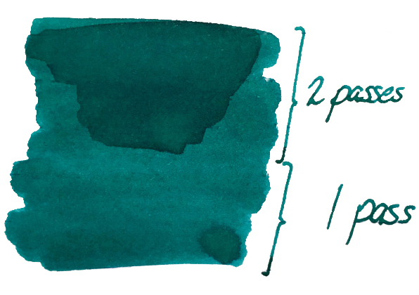 It’s so saturated that there is no shading to speak of, but it’s not going to look insipid either. Ian was
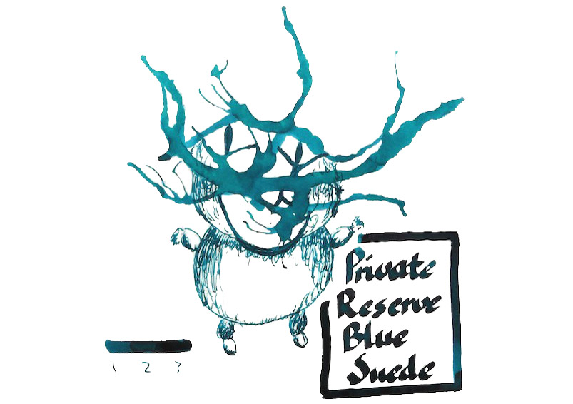
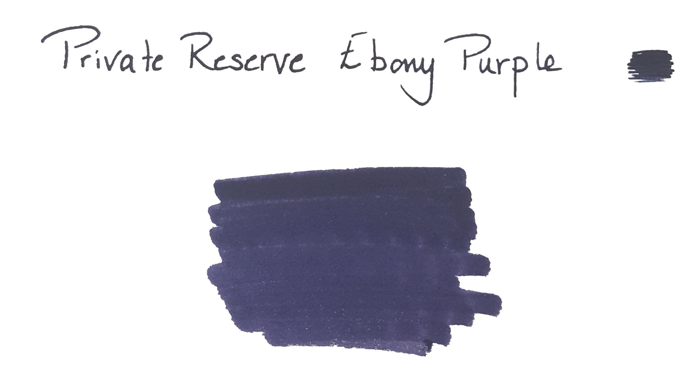
 Ian found the colour