 A little bit of history Glaciers, weathering and tectonic plates were all involved to a greater or lesser extent in separating the Lothian volcanoes from the kingdom of Fife, but ever since the Forth Bridge became the world’s largest project management metaphor, both sides of the firth have been part of an on-and-off industrial heartland. That engineering heritage was recently sparked in to life in one local business unit by the Kickstarter project which brought Namisu into being, and they’re now producing a couple of models in an increasingly diverse range of materials. Some of us have been interested since those heady Kickstarter days, but the word is spreading fast…
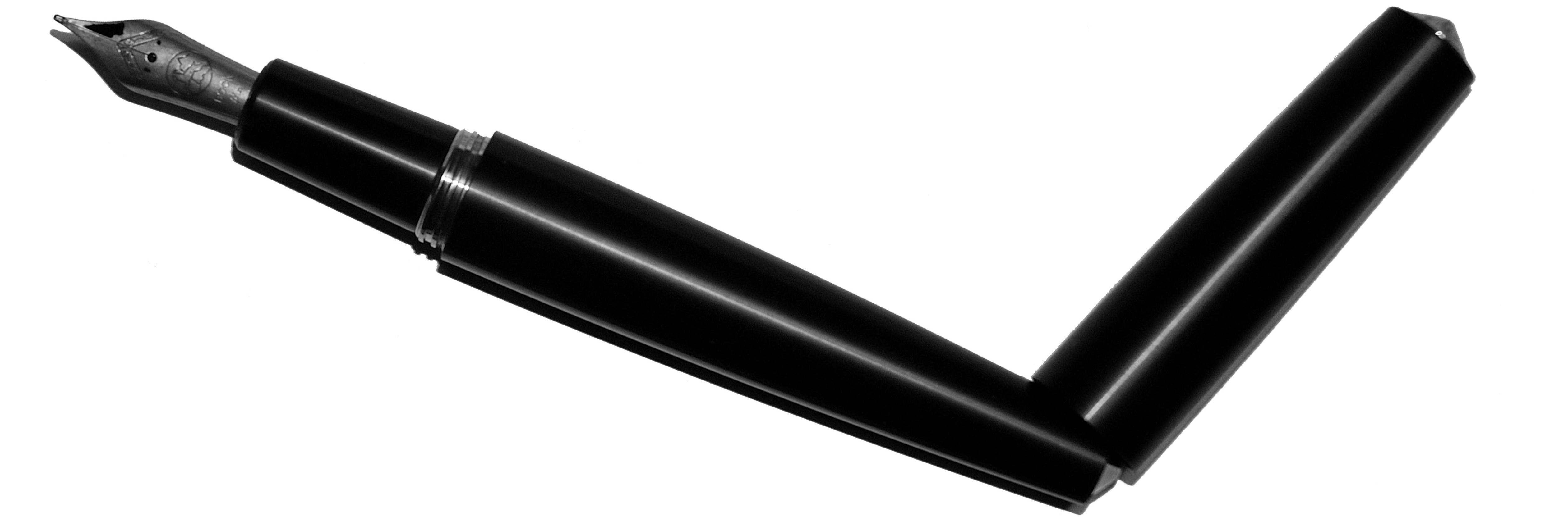
How it looks Like a streamlined version of the Nakaya-esque ‘bullet’ shape, polished-up for use as a prop in 1950s sci-fi B-movies – which is a long way round to saying that it’s minimalist, and we like that. It looks exceedingly cool, whatever the material it’s cast in. The only catch is that said minimalist tube does rather like to roll off any surface you place it on!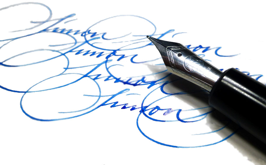
How it feels Large but really rather comfortable. Obviously, the different materials available make a quite a difference; the aluminium version is sturdy and light, the ebonite version is very warm to the touch, and the brass version is satisfyingly heavy – probably too heavy for many writers, but marvellous if you like a weightier pen.
How it smells This criterion doesn’t feature in every meta-review, but appears here thanks to the ebonite version which Namisu kindly lent several of us to test. Ebonite is a rather old-school material for a fountain pen, and it’s essentially just very hard rubber. That makes it tactile, light and warm to hold, which are all good things, but for those with sensitive noses there is also the detectable whiff of burnt tyres on a warm summer’s day. Of course, whether that’s a noxious pong or a nostalgic aroma is very much a matter of olfactory taste.
How it fills Cartridge/converter. There should be space in there for a longer international cartridge, and Namisu often provide a good Schmitt converter with the Nova too.
Crucially, how it writes… This is very much dependent upon whether you go for one of Namisu’s nibs or fit your own. Namisu stocks Bock nibs, usually either the standard steel (occasionally black-coated, as above) or titanium. The Bock #6 steel nibs are firm but quite pleasant to use, while the titanium option offers a bit of flex – although we had mixed feelings as to how smooth they were on the paper. The feed and collar unscrew, and any other Bock #6 assembly will screw back in, so if you happen to have spare nibs from the larger Kaweco or Diplomat pens, for example, they’ll be easy to swap. It’s also possible to buy unbranded Bock replacement nibs from sources such as Beaufort, although the gold option is as pricey as you might expect. Helpfully, the actual metal is a standard shape, so other #6 nibs, for instance those made by JoWo, can be transplanted into the Bock feed and collar assembly without too much difficulty.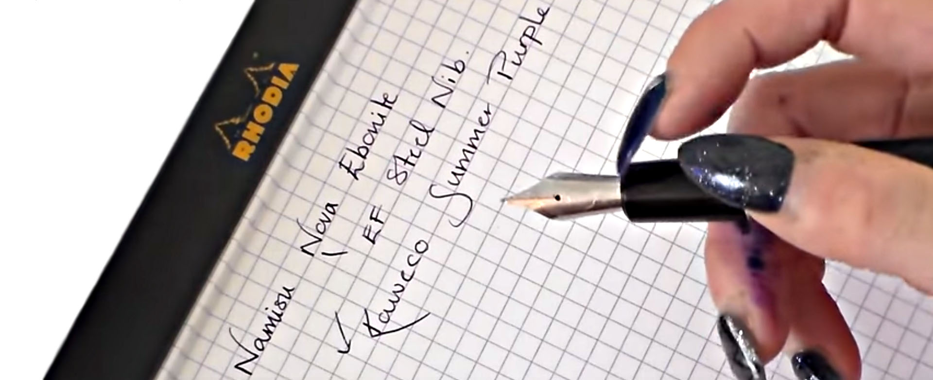
Pen! What is it good for? The aluminium and ebonite versions are both good for longer writing sessions or quick note-taking – as long as you put the cap somewhere safe! The brass version could probably double up as some form of defensive weapon, but we wouldn’t recommend doing that with it.
VFM At £45 the aluminium version is really very good value for a distinctive British-built fountain pen. The brass and titanium versions get pricier, but are both still quite competitive for enthusiasts of those metals. Ebonite nudges the ticket into three figures, which seemed a little steep to us for a pen which only has a basic steel nib, but it’s an unusual material, and while rather expensive this is hardly daylight robbery. Match a Nova with a really good nib of your choice and you get something truly splendid for the outlay.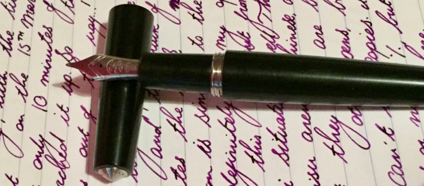
If this isn’t quite your cup of tea, but almost… Namisu also make the Orion, a fairly similar shape but one which hasn’t appealed so much to us. Or, if you like the look of the titanium Nova and want to spend ten times as much, there’s a Nakaya made from the same material. Hmm.
Our overall recommendation Go ahead and get one while you can! The aluminium version is an affordable design classic, and you can always upgrade to other materials later on. If you covet the brass version, though, move fast; Namisu took some persuading to make it at all and we understand that it is intended as a one-off at the moment (you could prove them wrong, of course).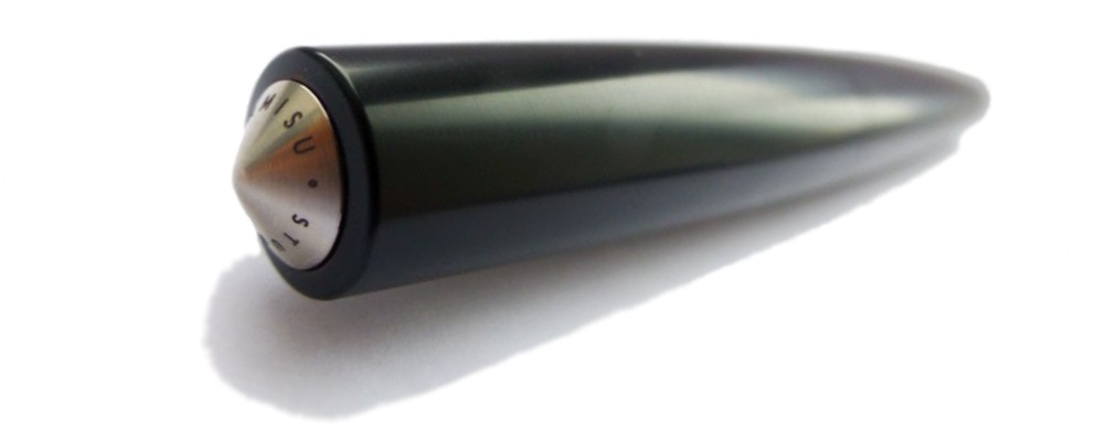 Where to get hold of one Right now, buying from Namisu directly is the only way. Some purchasers have found that customer service is not always their strong suit, so this is one where ordering carefully and waiting patiently are sensible strategies.
This meta-review references:
- Scribble’s hand-written reviews of the aluminum, ebonite and brass Novas
- Ian’s text-and-photos reviews of the aluminium and ebonite Novas
- Ruth’s video review of the ebonite Nova
- Daniel’s text-and-photos review of the ebonite and the nibs
- Laura’s metaphorical review of the aluminium Nova
- Rob’s back-to-black review of the aluminium Nova
- The Clumsy Penman’s absolutely exhaustive test of the ebonite Nova
Thanks to Namisu for lending several of us an ebonite Nova to play with. The rest we bought with our own money!


 A little bit of history
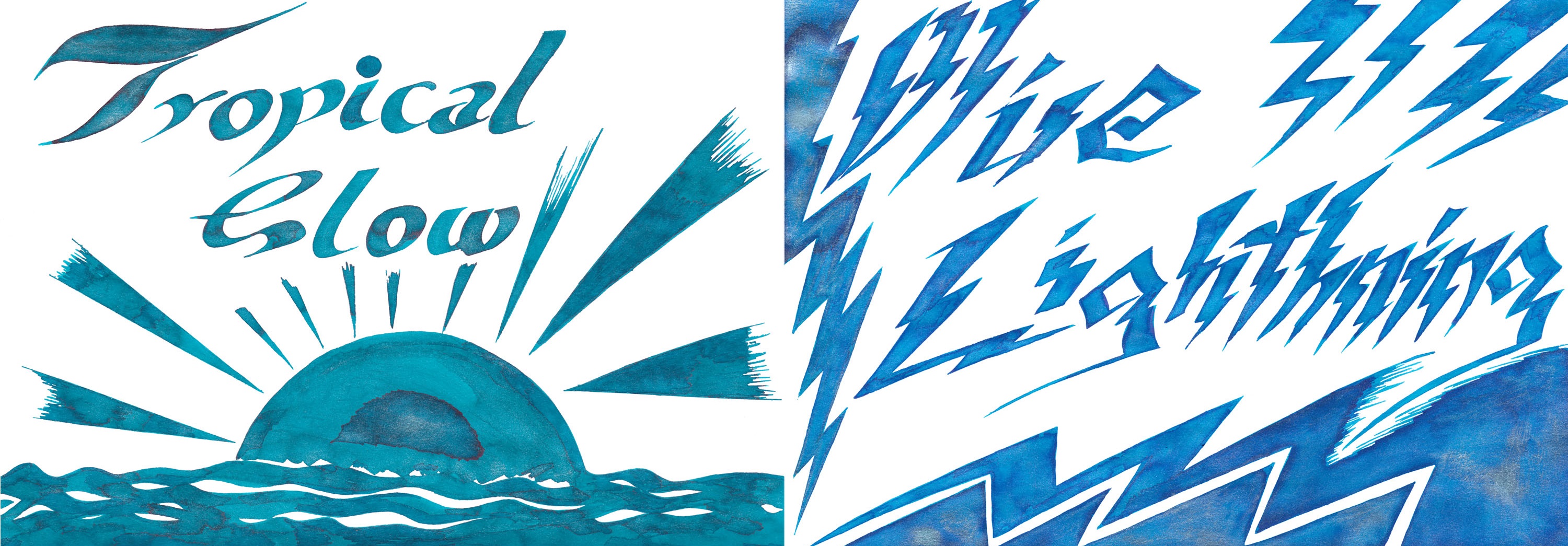


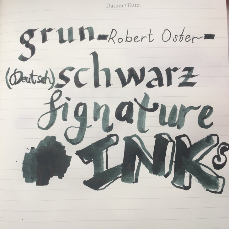
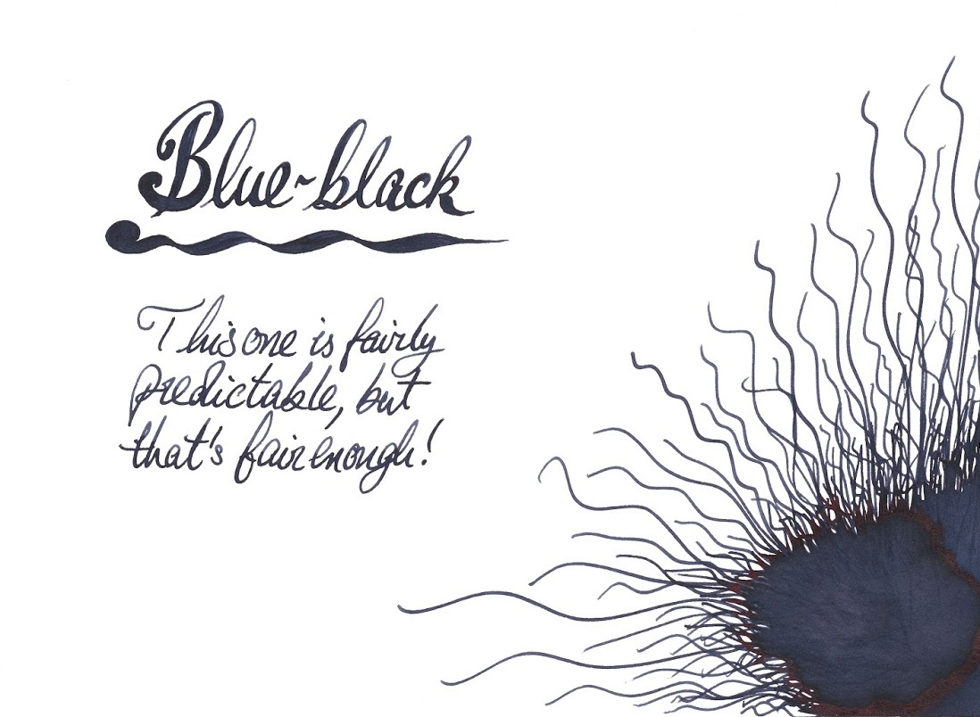
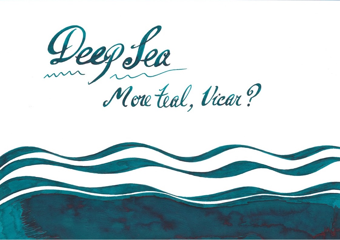
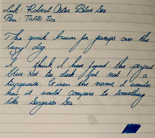
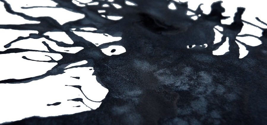
 Enchanted Ocean and Shimmering Seas are a little harder to categorise – like the sea, they keep changing colour as the light shifts. But both are broadly blue-black with either green or purple hints, with a spot of iridescence from
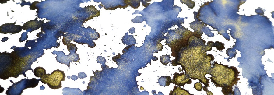


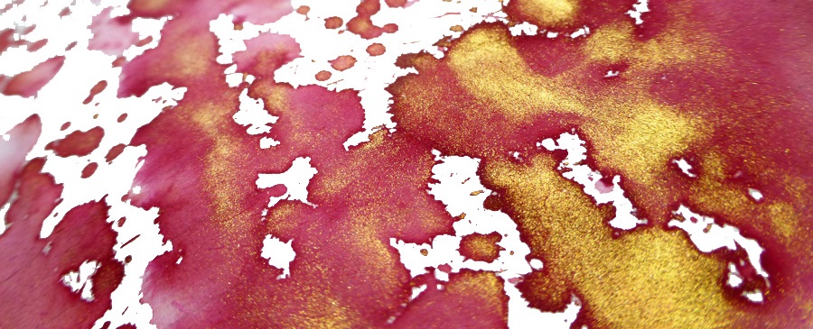
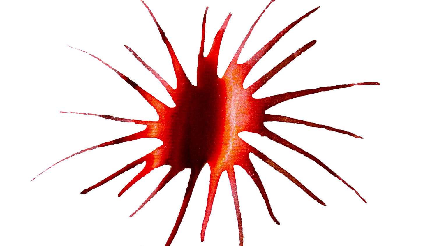







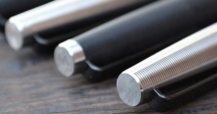
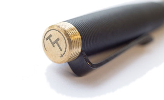 How it looks As the brand name suggests (just for once, it’s entirely relevant and accurate) the whole pen has been precision-turned to make it a tactile pleasure to use – but we’ll come on to how it feels in a moment. How it looks is, frankly, pretty much like the stereotypical alien mind-probe; with those eerily-accurate ripples and space-age materials, it wouldn’t look out place in Captain Kirk’s hands (its uses are far less sinister, though, unless you write left-handed of course). The very sharp-eyed may be able to spot some light marks from the lathe chuck on the barrel of the polycarbonate version (as depicted below), but it doesn’t greatly detract from the overall effect.
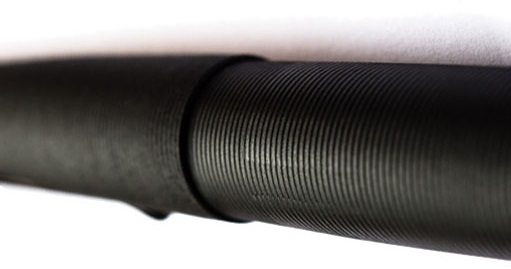 How it feels Those ripples and ridges provide a good grip without discomfort, and most users have found this a pleasure to pick up and get writing with. The weight varies considerably depending upon the materials chosen; the all-brass version is without doubt a nicely weighty pen, the all-polycarbonate version is feather-light, and the combinations of polycarbonate barrel and metal section concentrate the weight just where you most want it, near the nib. Which feels best for you depends largely upon personal taste. The only catch we detected was that the copper grip can be a little slippery on a warm day.

 VFM The Gist has to cope with transatlantic tariffs and the buffeting of currency exchange rates, so competing on price with European offerings is not always going to be easy. With a simple steel nib, the all-polycarbonate looks to us like fair, albeit perhaps not stellar, value at £70 – whereas just £30 more will get you the all-copper version which seems an absolute steal.
 Where to get hold of one Newcomer e-tailer iZods is stocking a broad sample of the Gist range in the UK, including the titanium and copper versions
  Kaweco Sport A pen which looks like no other – and which no self-respecting fountain pen fan’s collection is complete without – and all for under £20. Available very widely, including at
 Dex by Kingsley Smooth Fountain Pen An extraordinarily good fountain pen available at a bargain entry-level price in a wide range of colours – and our budget would stretch to a converter and a nice bottle of ink to go with one! A nice little introduction to the world of fountain pens. (£9.60 at
  Diamine Shimmer Inks Diamine are many people’s favourite brand when it comes to inks, being both easy on the pocket and on the eye – but their Shimmer inks are something special. These delightful inks have gold or silver coloured particles suspended in the ink, leaving a wonderful shimmer on the paper when you write. A new batch of colours have recently been released, so look out for a review on them here soon! (from £8.95 at
 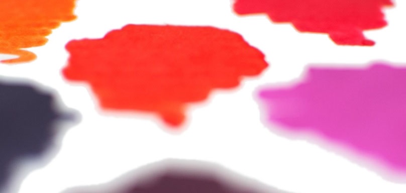 KWZ Ink Konrad Żurawski has been creating fountain pen inks since 2013. The inks are handmade in Poland, but despite being made on a small scale, there are already quite a number of colours to choose from. With excellent flow properties, they do a great job with flex nibs (and we hope to review a handful next year!), although be warned that the smell is not to absolutely everyone’s taste. (From £12.95 at
 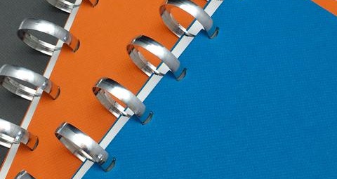 William Hannah binder + refills William Hannah paper seems to be universally admired by fountain pen users and is available in plain, lined, grid, dotted, to-do list, planner and weekly diary format – plus our budget will just about stretch to an A5 ‘archive set’ so there’s something to put it in! Available direct from
 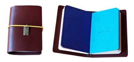 The Start Bay Compass A7 Notebook – a handmade leather notebook cover with two A7 notebook inserts (Rhodiarama A7 lined notebooks) and including an option free charm (all packages in an unbleached cotton bag). A great introduction to the world of traveller’s notebooks (
 The LAMY 2000 is widely heralded as a design classic, and WHSmith have become wildly popular for offering these for £100 recently. Inevitably, they’ve just sold out at this time of year (although
  The Diplomat Aero is, of course, the fountain pen that looks like a Zeppelin, and very nice it is too. Official UK prices exceed our limit, but Amazon has a
  Platinum’s 3776 is rightly famed as a brilliant gold-nibbed everyday writer, and although the more exotic tips like the ‘Music’ variant exceed our limit, the Bourgogne or Chartres finishes with the excellent Soft Fine nib are certainly accessible within our budget. Quality control can be a little variable, so this is one worth buying from a reputable dealer rather than talking your chances on Amazon – we’d recommend trying
  The Tactile Turn Gist will be a subject of a meta-review here soon, but the signs so far are that it’s a future classic in the making, and a Kickstarter project that has gone mainstream for all the right reasons. Some of the finishes inevitably go well over our budget, but if you’re happy with a steel nib then both the poly-carbonate and, amazingly, all-copper versions are available within our price range from UK distributor
  William Hannah notebooks are a properly British contribution to this collection, and absolutely the
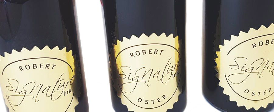
  This week, we profile a brand new name in the fountain pen retail firmament – the exotically-monikered Izods, of exotic (OK, we’re stretching a point here) Ipswich. Izods has come to many readers’ attention as a result of the growing interest in Robert Oster inks, which we’ll come on to below. But we start by catching up with Roy, the founder of the company.

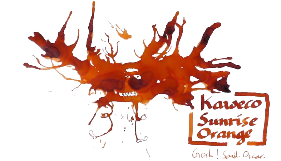
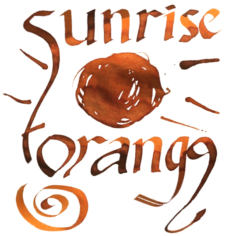
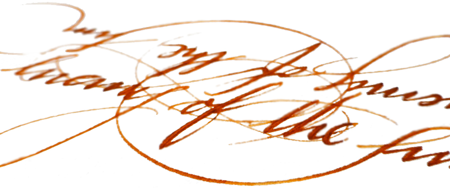
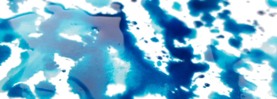
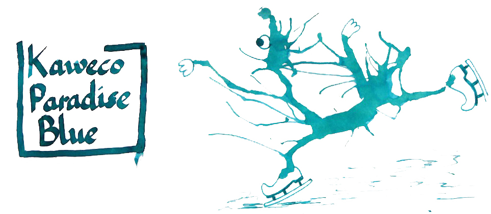
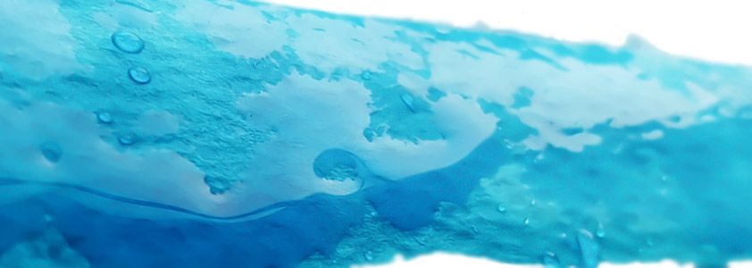
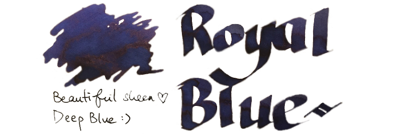

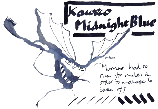

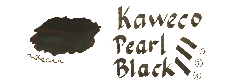
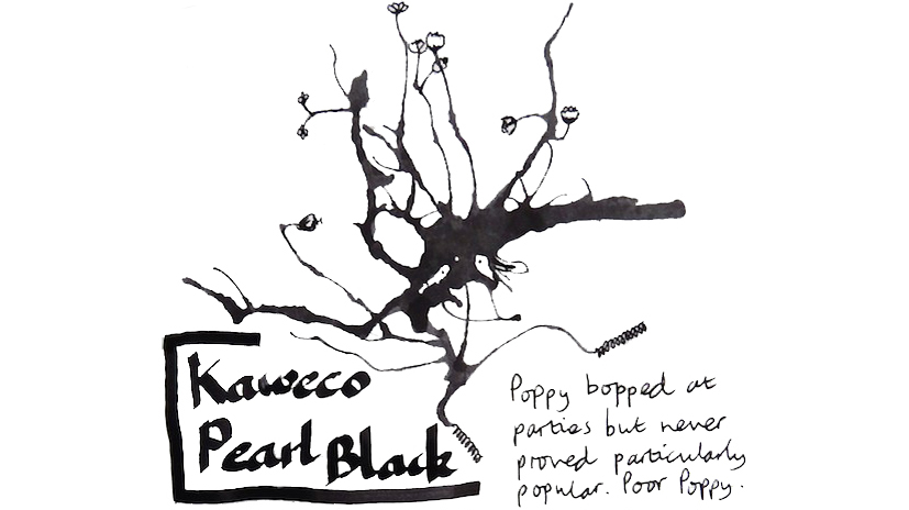
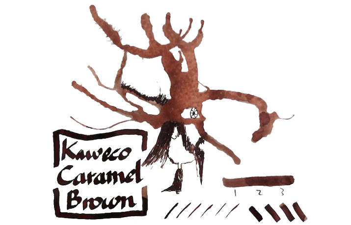

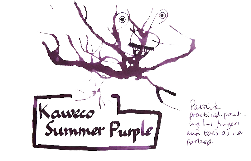

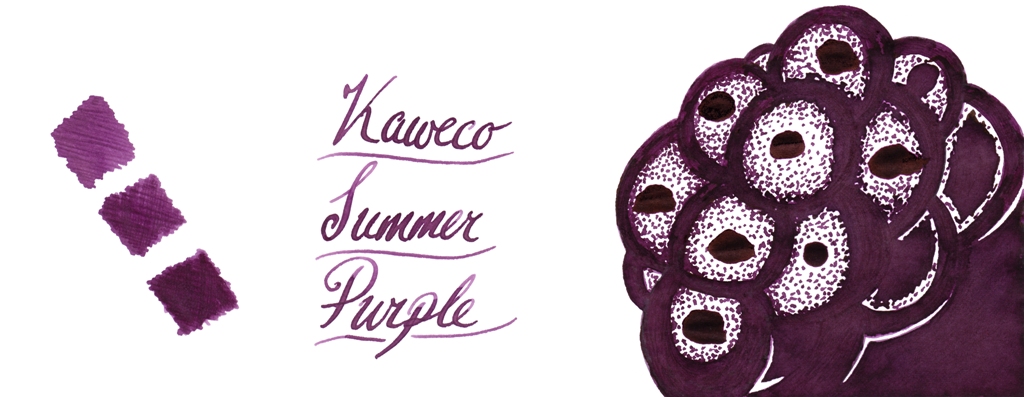
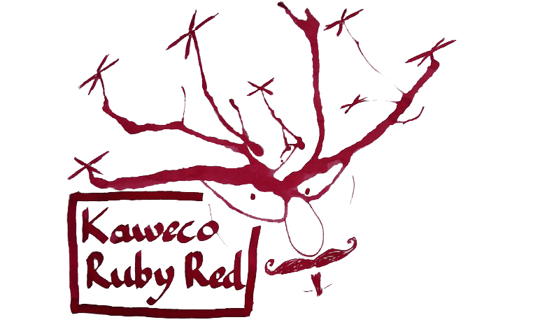
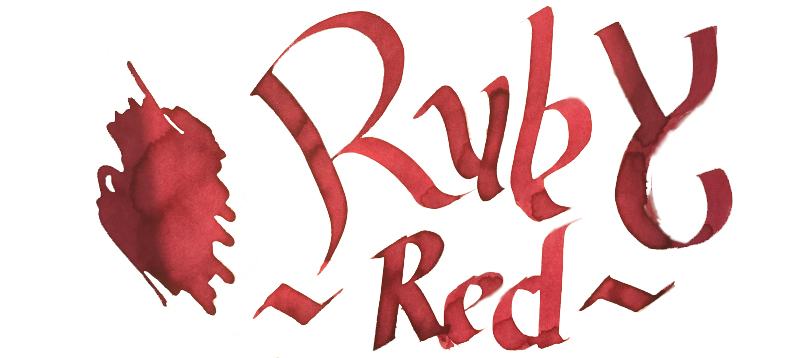
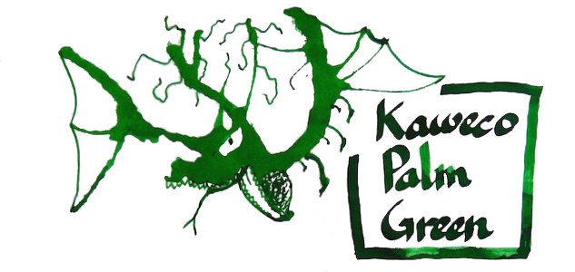
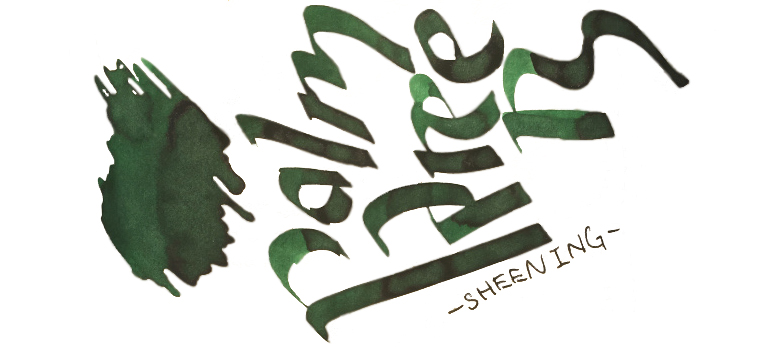
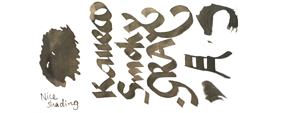
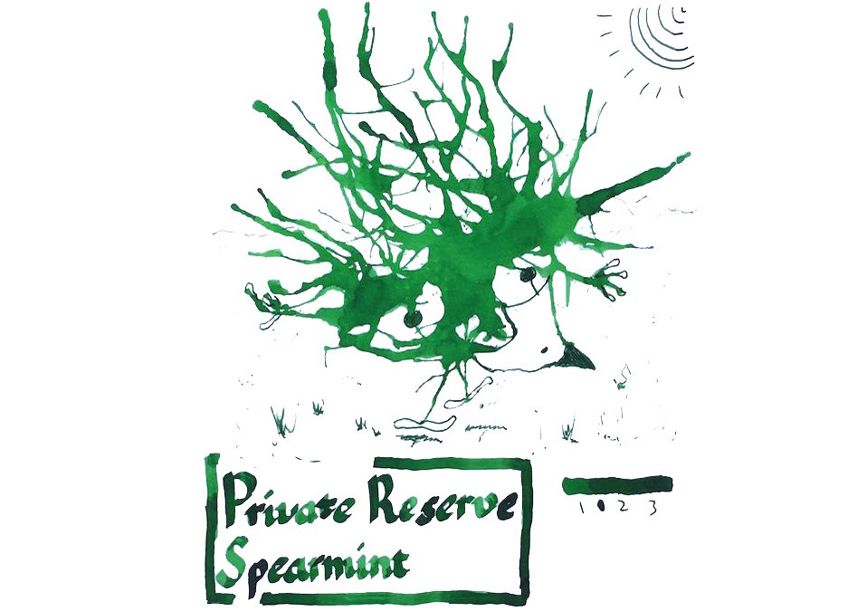
 VFM Can be something of a challenge with this collection, to be honest. The bottles contain only 30ml, and are sold at ‘premium’ prices in the UK – although this is at least in part a self-inflicted exchange rate problem for us Brits to deal with. Price competition looks particularly tough when compared with our home-grown Diamine, who provide 80ml bottles of ink for little more than half the price. Few retailers stock both brands at present, but to cite the example of one with the lowest prices for both, at the time of publication The Writing Desk were charging a little over 7 pence per millilitre for Diamine, and 35p/ml for Kaweco ink. That effectively knocks Kaweco inks out of consideration for everyday colours like Royal Blue, which both brands provide; even if you like the look of that sheen, it’s unlikely that many fountain pen users would consider the Kaweco version five times better than the Diamine. But some of the highly distinctive shades such as Sunrise Orange, Paradise Blue and Smoky Grey have qualities which really make them worth seeking out, in our opinion – and they’re hardly going to break the bank!
 Our overall recommendation is to choose carefully and invest in one or two of these which particularly take your fancy. If you like purple, Summer Purple is warm and user-friendly. If you’re a turquoise fan and can stand the ink sinking-in to the paper rather enthusiastically, Paradise Blue is a lovely colour. Ruby Red and Palm Green beat any teacher’s homework-marking ballpoint any day… and Sunrise Orange eats Apache Sunset for breakfast. If you just want a well-behaved Austrian everyday black or royal blue, you don’t really need to spend so much; even Montblanc will provide you with twice as much ink for the same money. But we like this collection; suffice it to say that there are several Sports, Lilliputs and at least one Supra which will now be filled with ink from the same stable for quite some time.
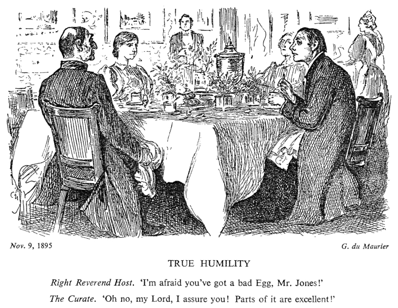 Punch cartoons pop up in many a history textbook, but the sketch above is probably the one that got most into everyday language. Our readings of The Missing Ink suggest a similarly ‘balanced’ view; Daniel enjoyed it, John found it not much to his taste, and Scribble found it, well, a bit of a curate’s egg.
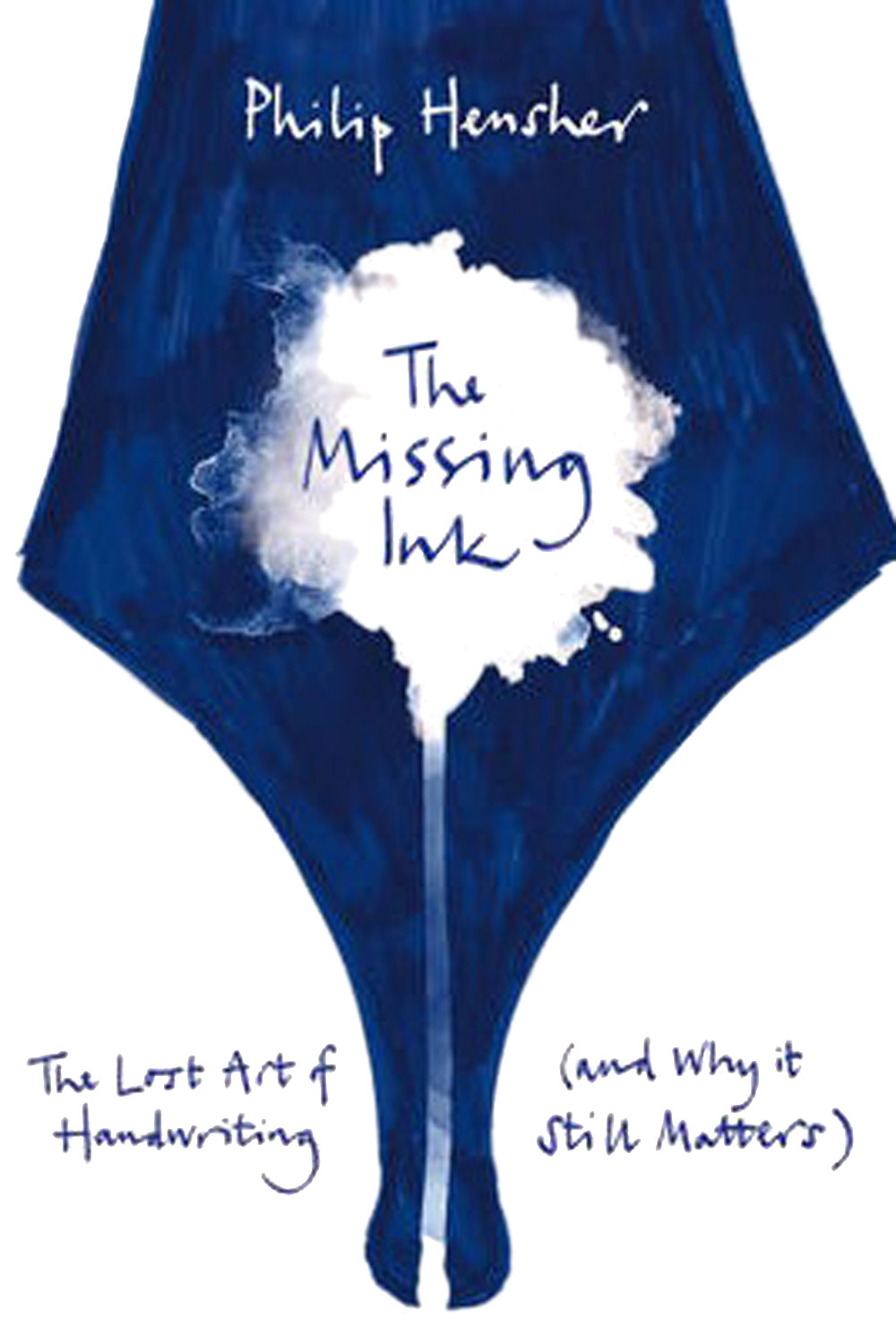
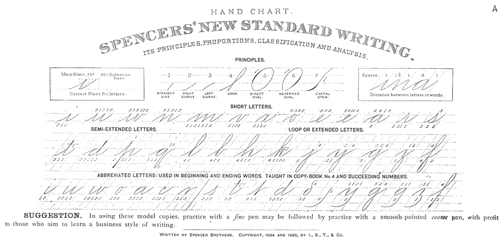 So where did it go wrong? Well, the author is a professor of creative writing, and goodness do readers get to see all his craft in action. The endless whimsical footnotes, and diversions into irrelevances like Hitler’s handwriting and the Bic ballpoint, will either be very much your cup of tea, or very much not. In short, he goes on a bit – and not about pens and handwriting, much of the time.
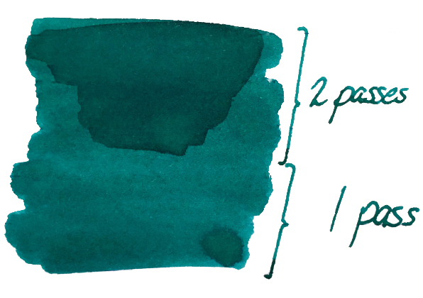 It’s so saturated that there is no shading to speak of, but it’s not going to look insipid either. Ian was
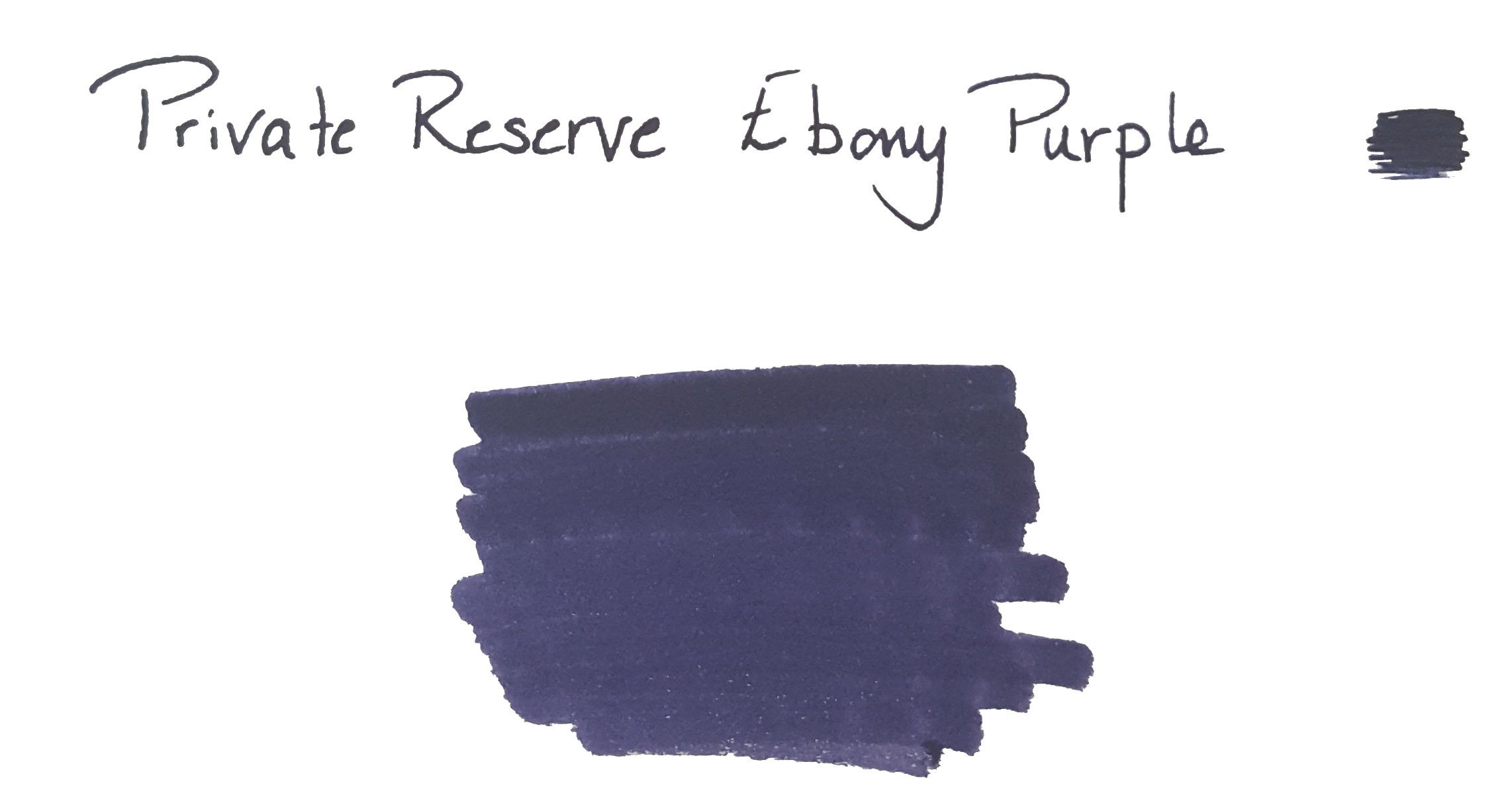
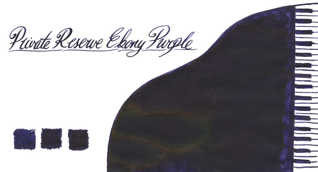
 Ian found the colour