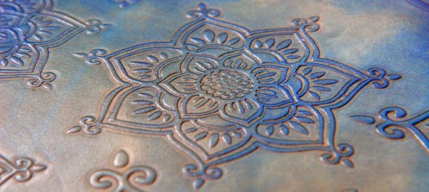
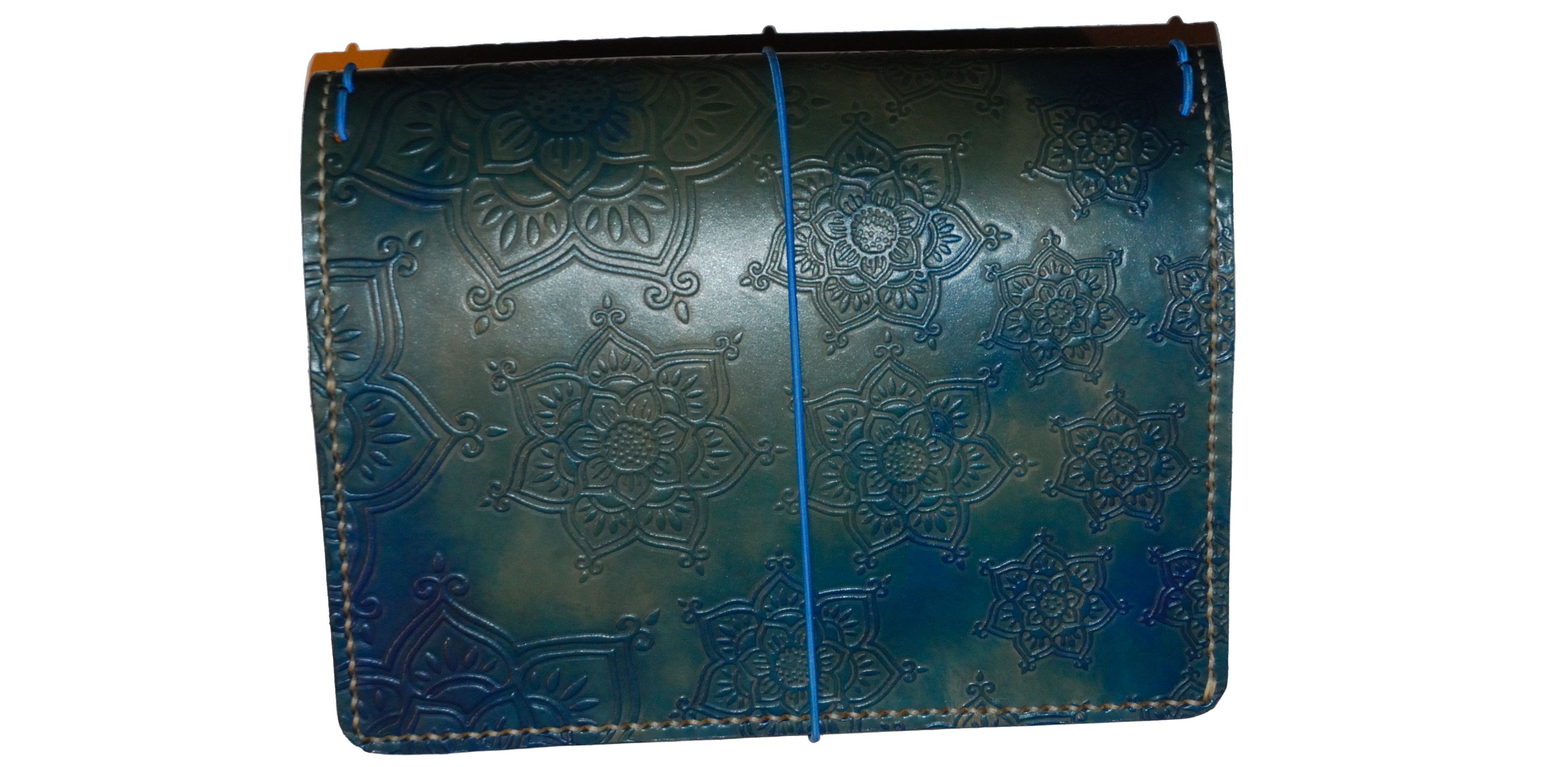
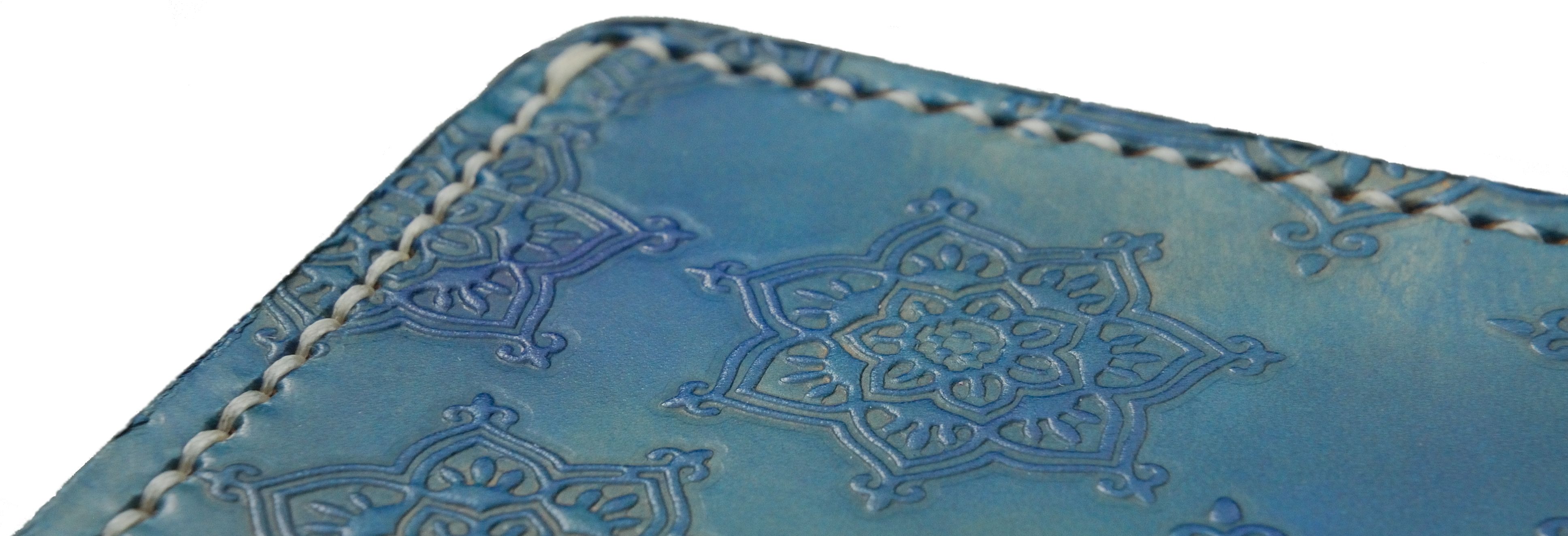
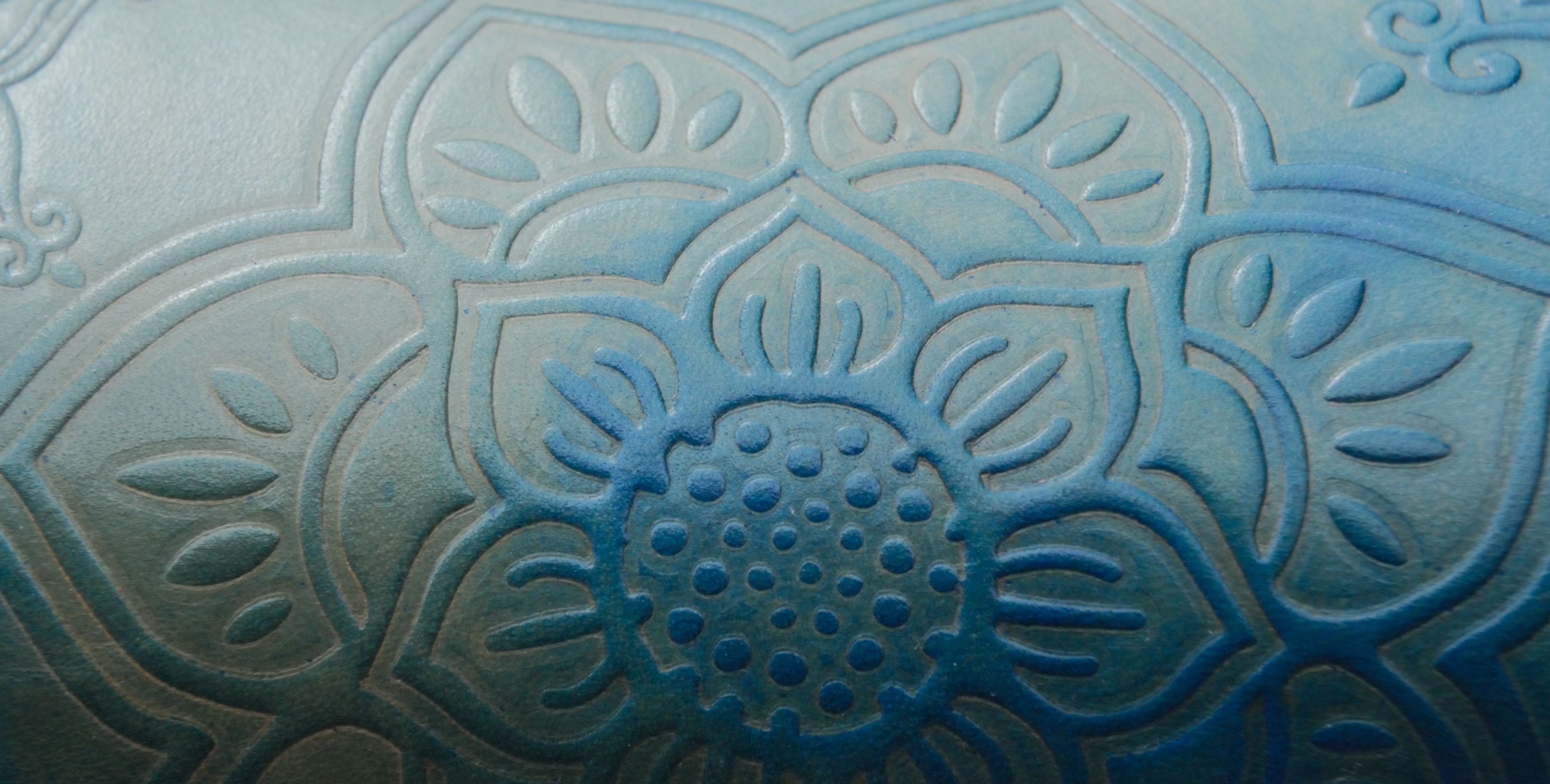
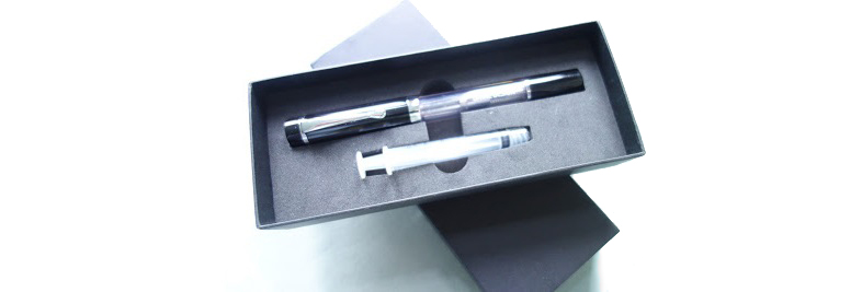
A little bit of history Tolkien left more entertainment for etymologists than anthropologists in his writings, and the latter would probably not be wildly impressed at the idea of a being who was half knight, and half elf. Such, however, was supposedly the provenance of Elrohir, and it’s a fitting name to borrow for a product made in a stable, using saddle-making techniques – although we can confirm that no elves were employed in the making of this review. The Elrohir operation is in fact run by a very nice human called Mischa, based in Wales rather than Rivendell, and we were encouraged to find out more about what she does by one of our regular readers from Middle Earth (well, Melton Mowbray, but it’s near enough). What came our way were two remarkable notebook covers; an A6 steampunk number and a blue A5 mandala affair, complete with multiple interesting refills.
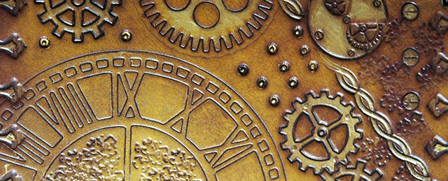
How they look Frankly astonishing. Everyone we show these to responds with some variety of ‘wow’. The designs are embossed, so they’re quite tactile too. The range is quite a challenge to describe, so a quick look at Elrohir’s Etsy page is worthwhile now. No, seriously, right now!
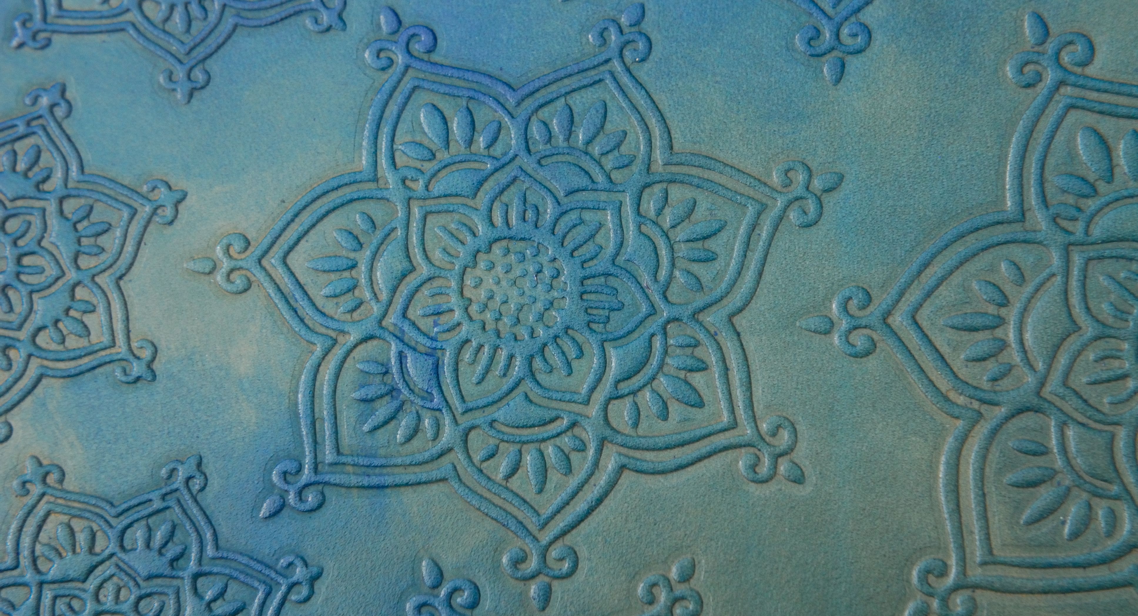
How it feels Weighty, rugged, and ready to last a life-time – and yet remarkably refined. Like the sort of saddle you’d put on a thoroughbred, probably.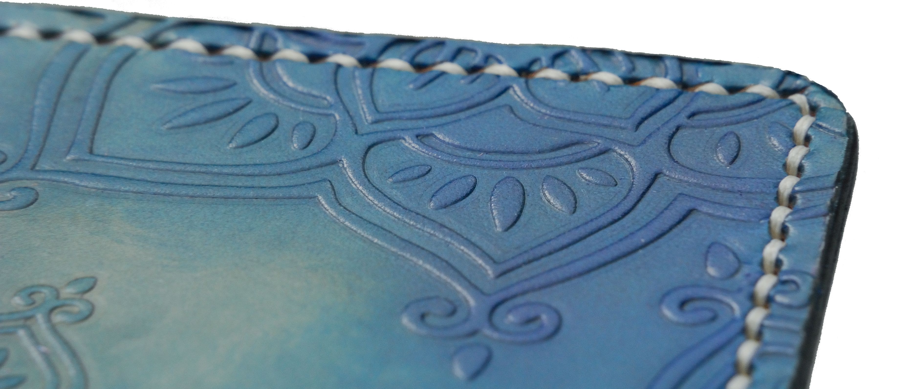
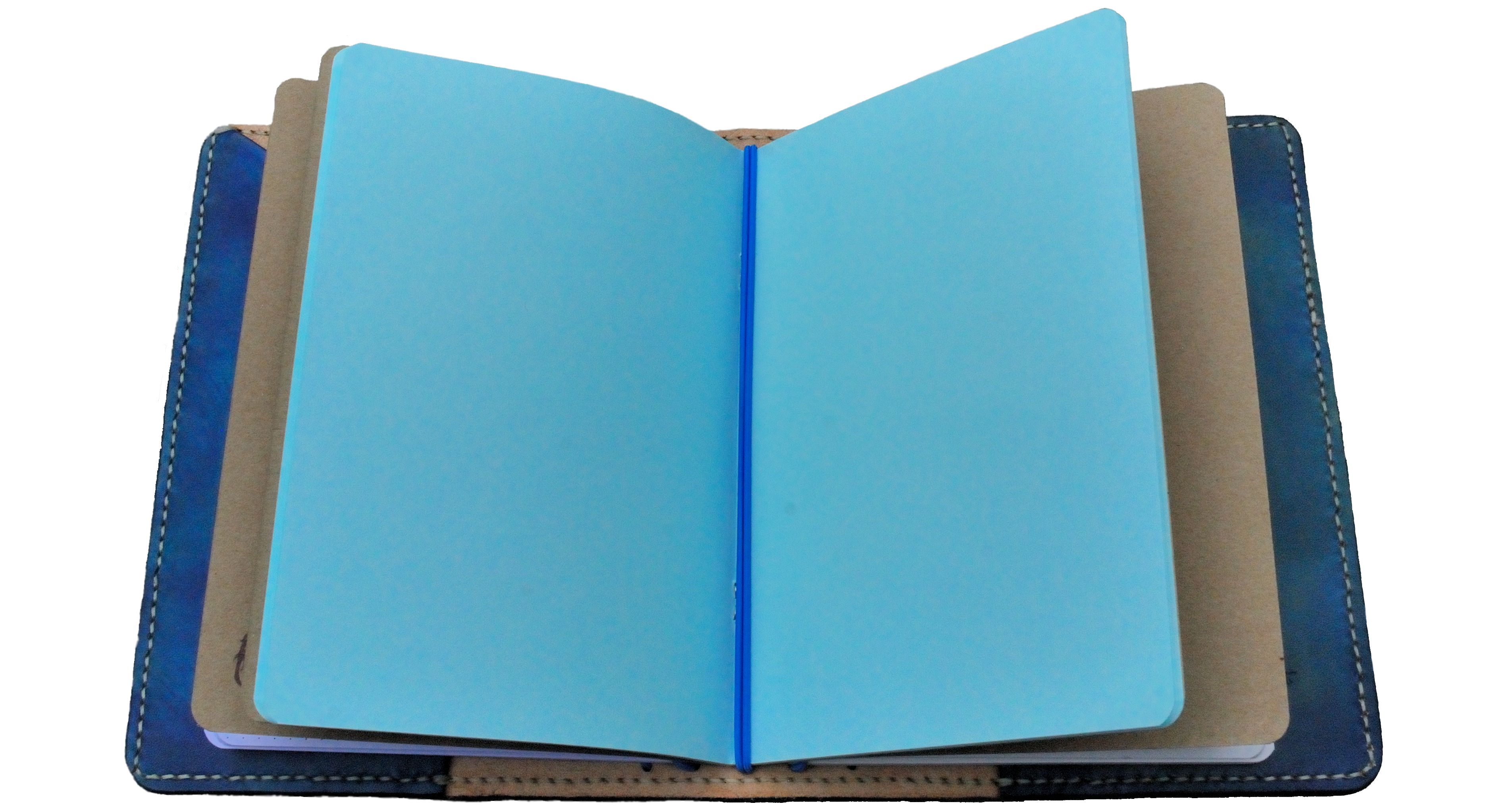
How it fills With as many simple cahier-style exercise book refills as you care to thread in. The A5 version we tested could take five or six, which did make it a bit tough to hold flat and write in – but of course thinner versions can be made available with a swift email to Mischa. Customisation is very much encouraged.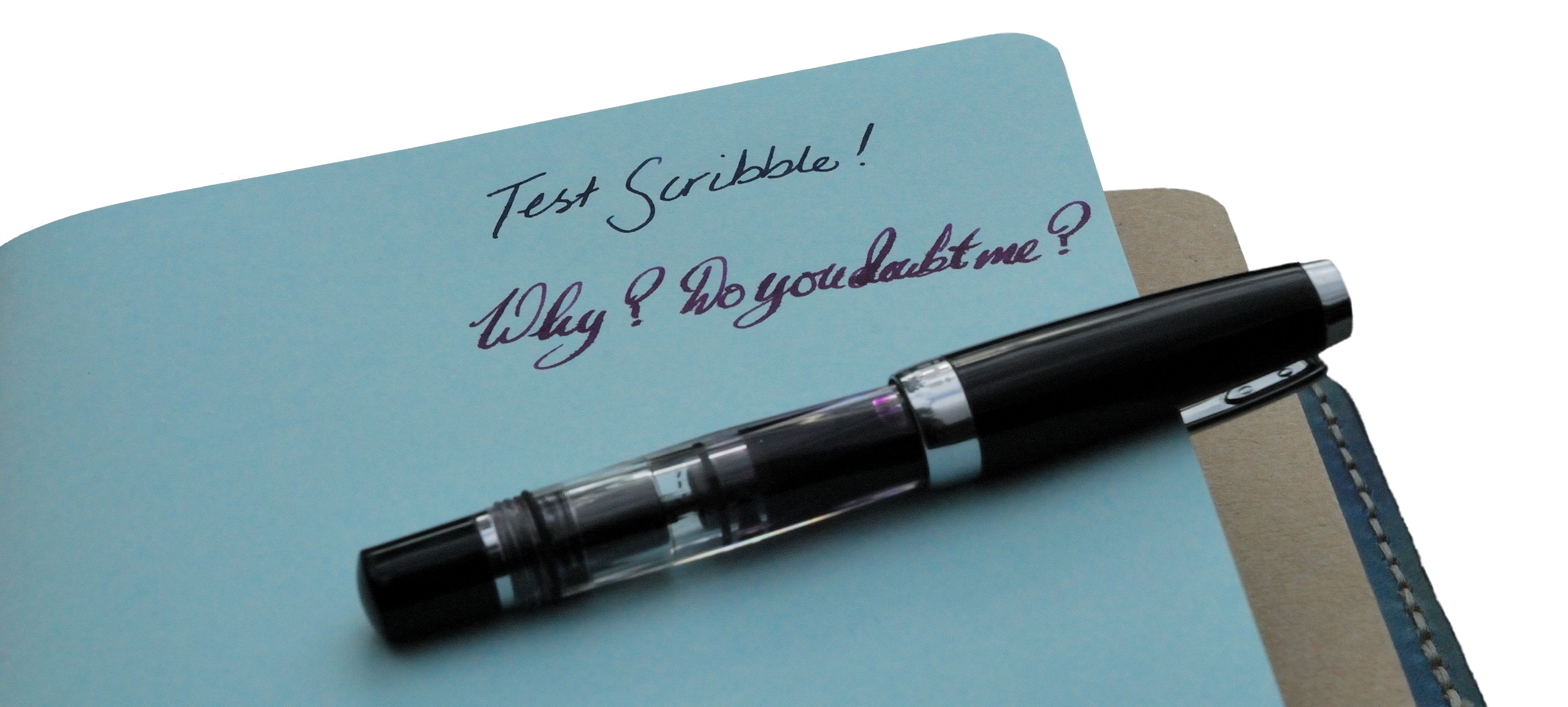
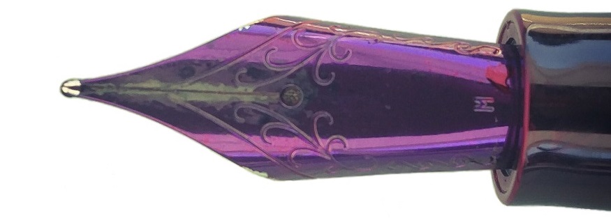
Crucially, how it copes with a fountain pen… Mischa’s own inserts come in a variety of plain and coloured papers, and all we’ve tested so far seem happy making friends with a proper nib. They look the part next to a real pen, too.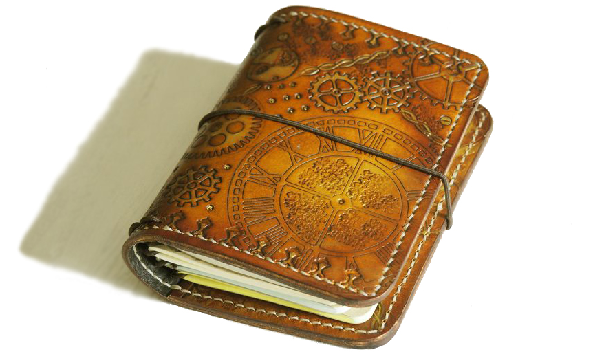
Book! What is it good for? These are built to last, but we think maybe a little too lovely to take to work (unless you work with elves, of course). For a travel journal, recipe collection or grimoire-in-development, though, it’s almost certainly exactly the thing.
VFM These cost about 30% more than the equivalent standard product from Start Bay – so not cheap, but nevertheless remarkably reasonable for such an unusual product. We certainly couldn’t complain.
If this isn’t quite your cup of tea, but almost… These are two very fine examples of Mischa’s craft, but if you prefer something a bit different – a cover depicting bats flitting through the night sky, perhaps – it’s worth having a look at the Elrohir range. We’ve yet to come across anything quite comparable from another maker.
Our overall recommendation Have a browse, save a few pennies, and get one. If you’re after a robustly decorative notebook cover, these will take some beating.
![]()
Where to get hold of one Go straight to the source and talk to Mischa! Her Etsy page is a good place to start.
This meta-review references:
- Scribble Monboddo’s brief review of the blue mandala cover
- Alison’s more detailed review of the blue mandala
- Nikki’s review of the steampunk cover
- Ania’s review of the blue mandala cover
![]() Thanks to Mischa for getting a couple of amazing samples our way. Most of us didn’t want to let them go, and that’s a recommendation!
Thanks to Mischa for getting a couple of amazing samples our way. Most of us didn’t want to let them go, and that’s a recommendation!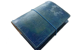
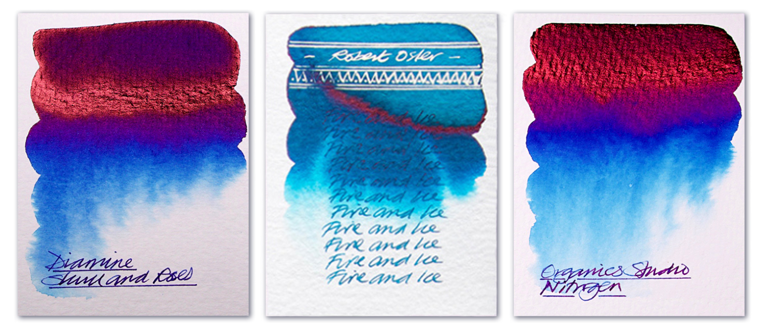
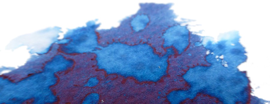
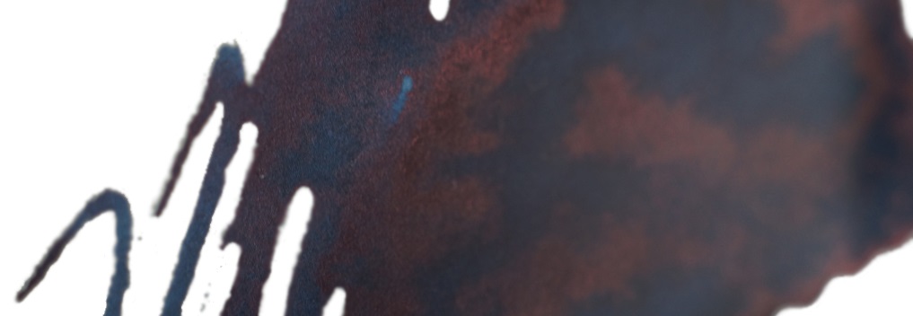
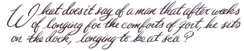
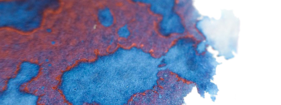
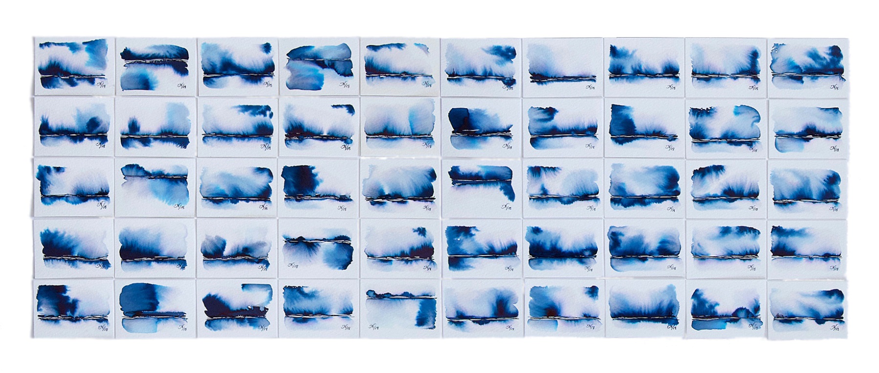
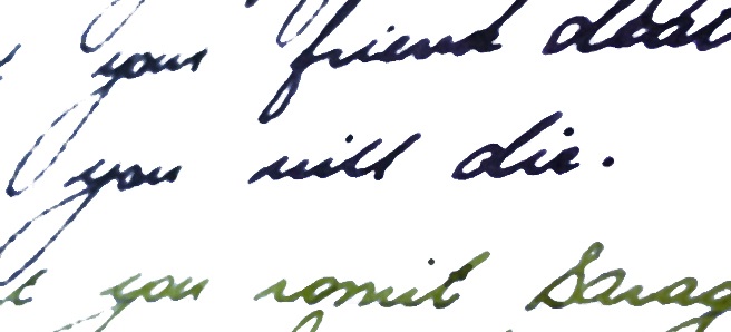
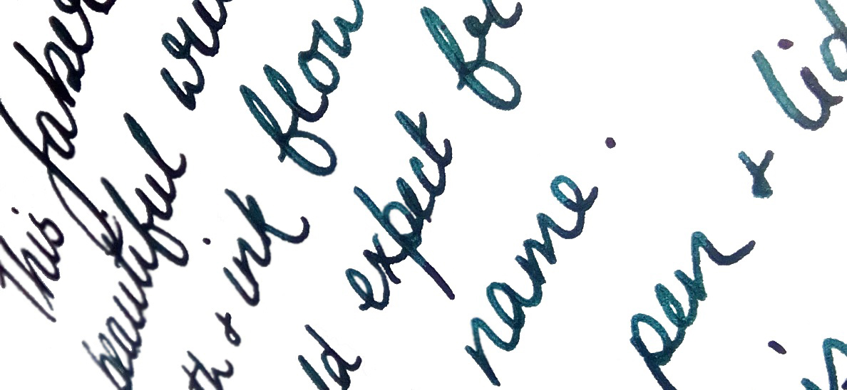
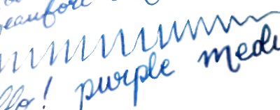
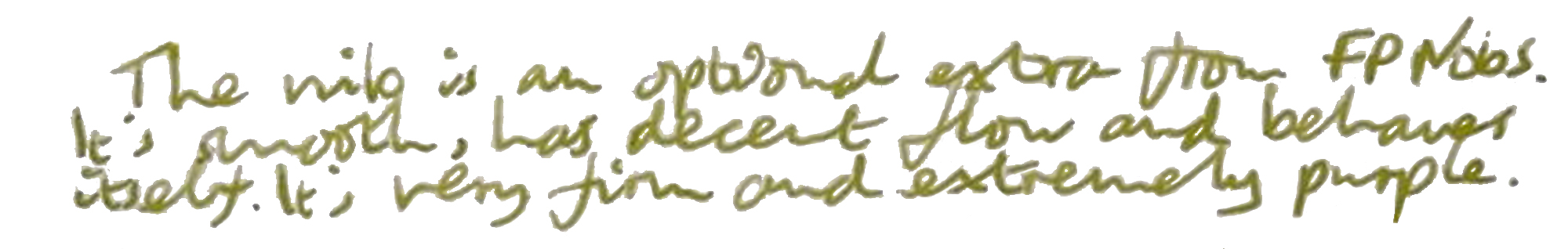
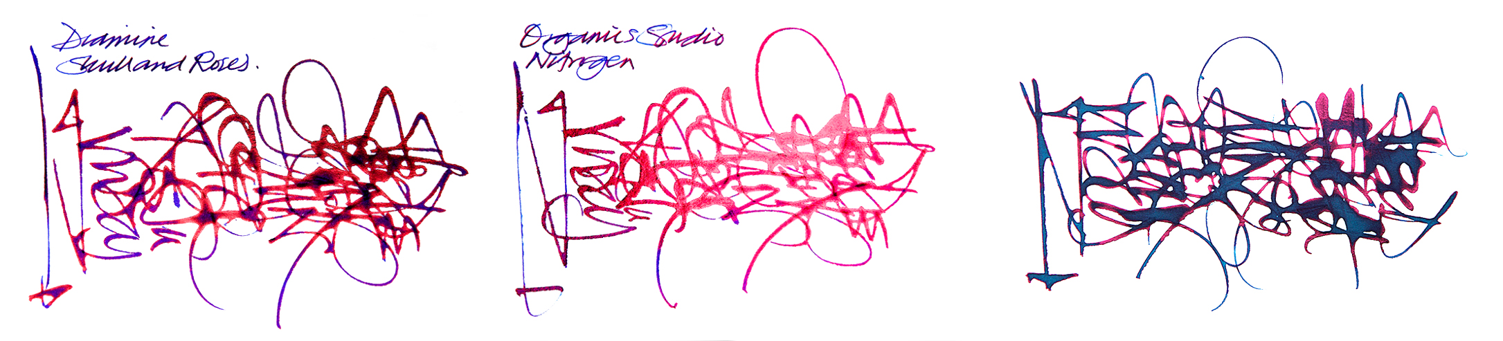 How it behaves on the paper Perfectly well; these all come from serious ink manufacturers with reputations to protect, so there are no major problems. Drying times can occasionally be longer than expected, however, particularity for Nitrogen.
 If this isn’t quite your cup of tea, but almost… There are more ink makers jumping on this band-wagon all the time – for instance, we’re hearing good things about Krishna Moonview. Or you could mortgage your home, sell a couple of major organs and buy some Parker Penmanship, of course…
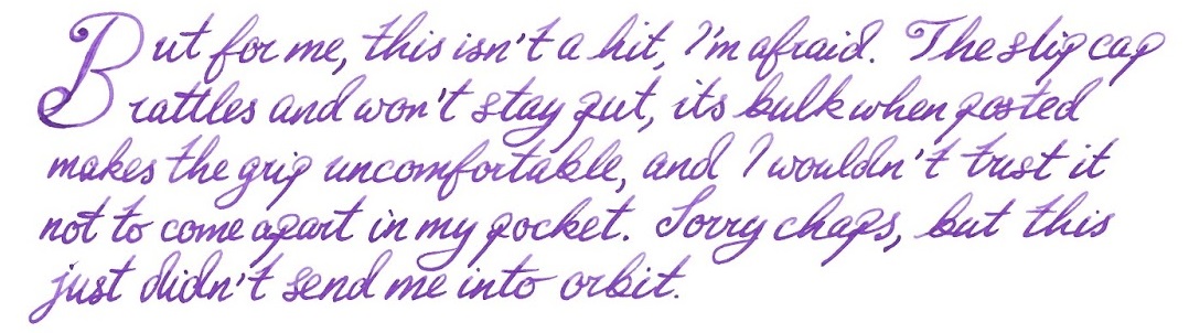
 Our overall recommendation Give it a go. The effect is very pleasing and the ink is easy to live with, even in fussy thoroughbred pens. Skull & Roses is the trickiest to get hold of despite being made here in the UK, but that’s just the result of an exclusive deal – and Diamine could undoubtedly come up with something even better for full global distribution in due course. In the meantime, Fire &Ice if you like Turquoise, or Nitrogen if you like full-on royal blue with all the trimmings, are well worth a try.
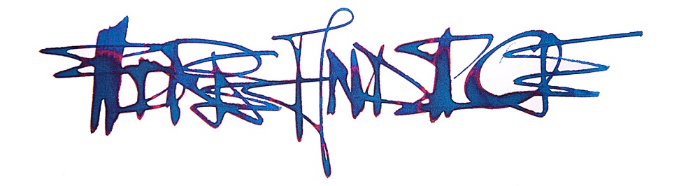 This shoot-out meta-review references:
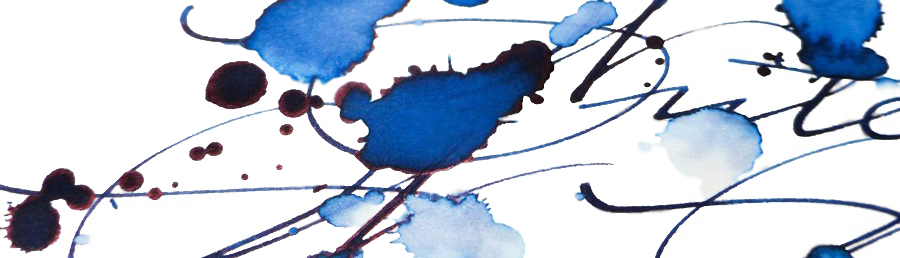
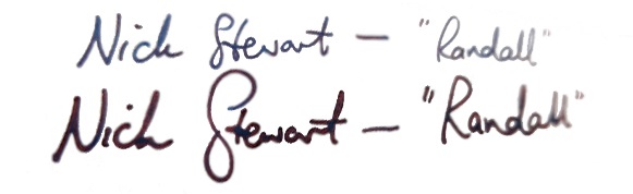
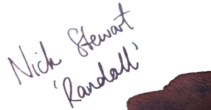
 Thanks to Nick for the samples, and of course Randall for the inspiration
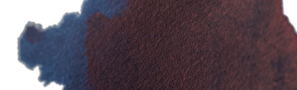
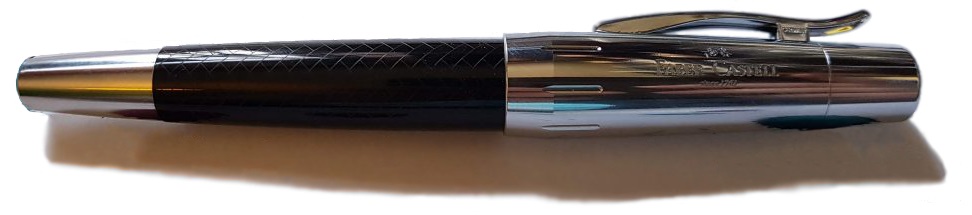
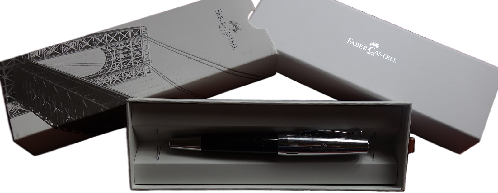
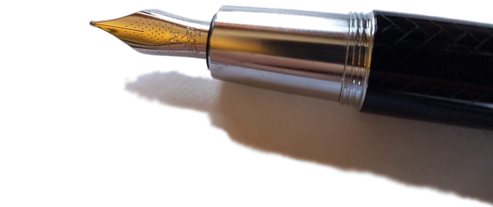
 This month it is a lovely Faber Castell E-motion fountain pen with black parquet finish that is up for grabs.
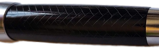
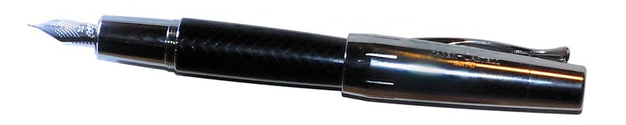
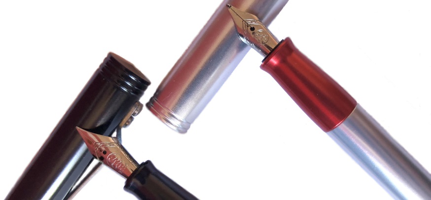
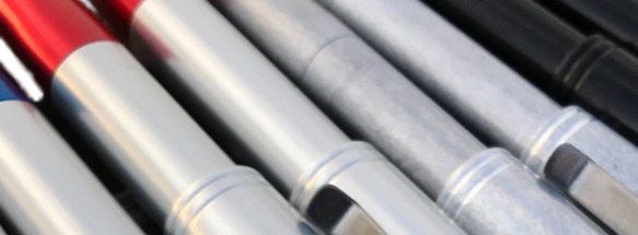
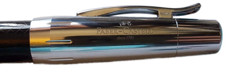
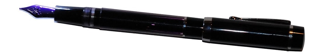
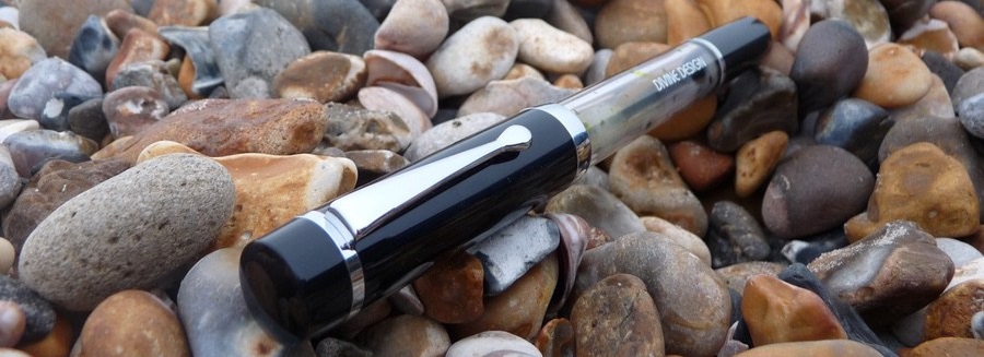
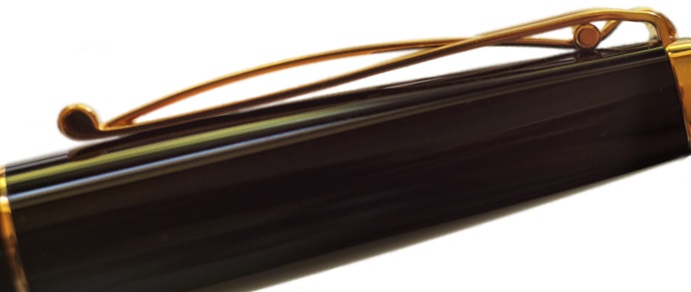
 How it looks This industrial metal design is strong with the Starliner. It’s named after a Ford car and there are suggestions of a tail-light in the cap. It’s quite fifties-looking and, in fact, the Reaktor range, of which the Starliner is a part, is meant as a homage to 1950s America.
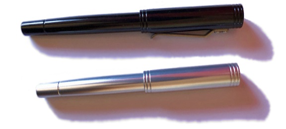


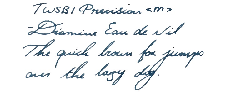
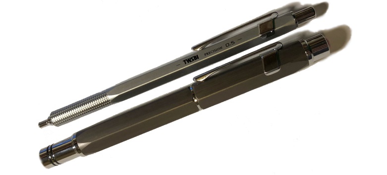
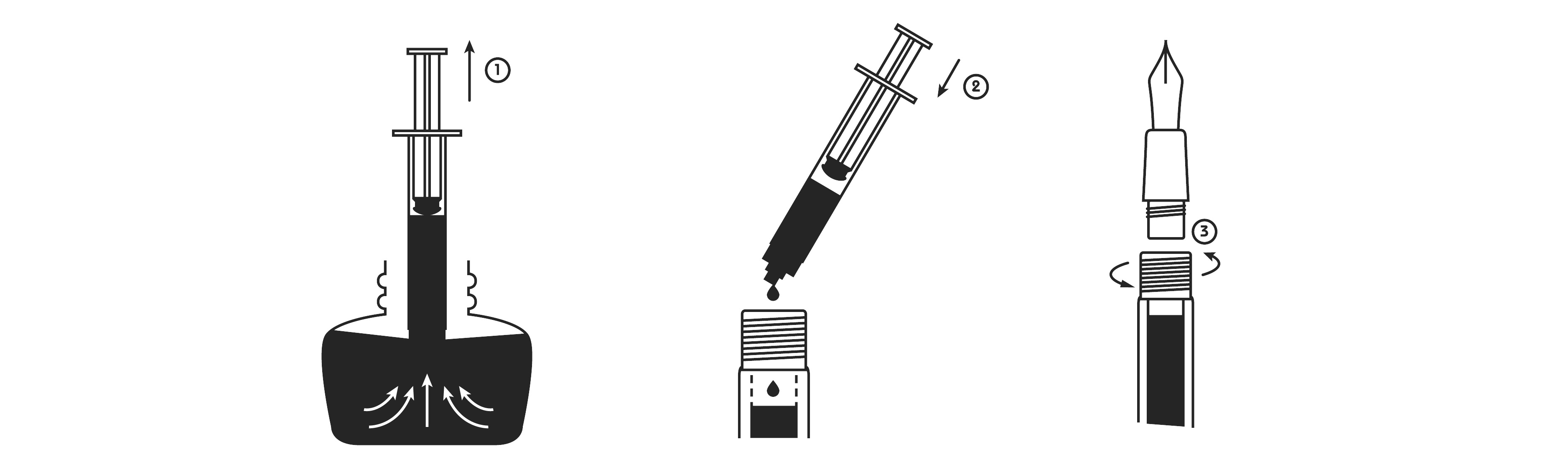
 It’s quite easy to write with both the pen and pencil for a long time without any sort of fatigue. This is especially pleasing considering that fountain pen is a piston filler, which leads nicely on to…
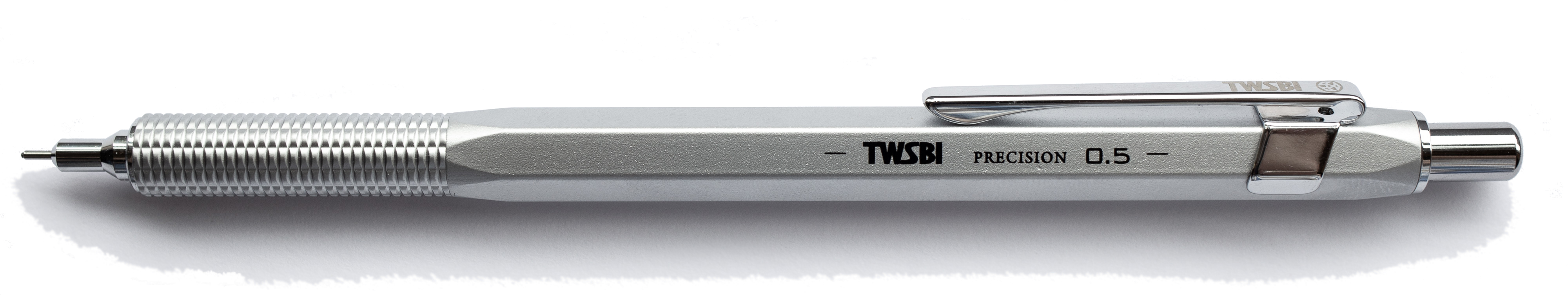
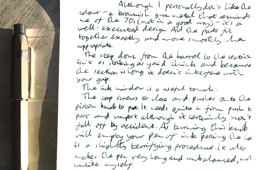
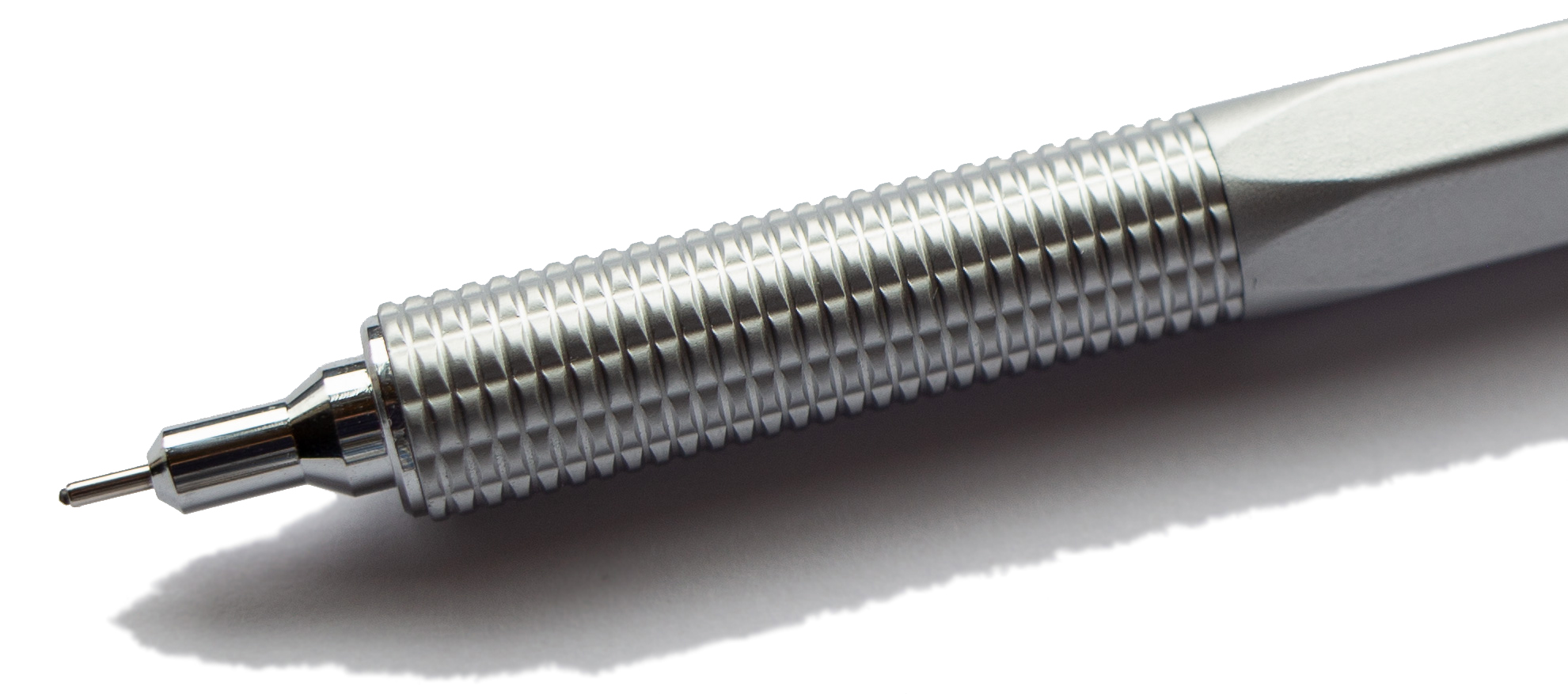
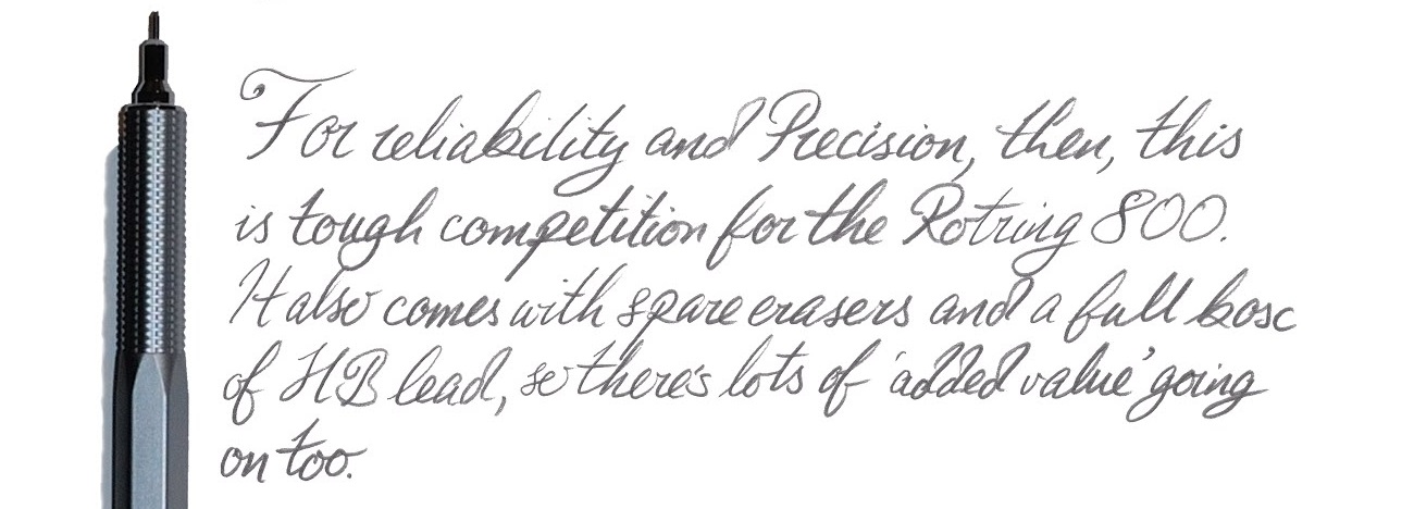
 Our overall recommendation The Precision FP is a good, reliable pen, which has the potential to become a trusty workhorse without breaking the bank. None of us had any problems in terms of the writing experience, and the only cause for concern were our own personal preferences when it comes to design. All in all, a thumbs up! The pencil is a slightly more mixed offering given the issue Matthias identified with excessive lead protrusion, but still great value for the price demanded.
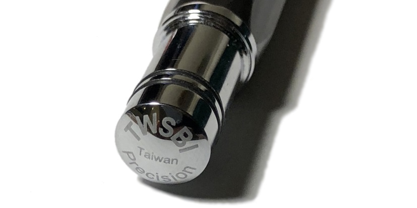
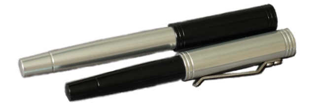
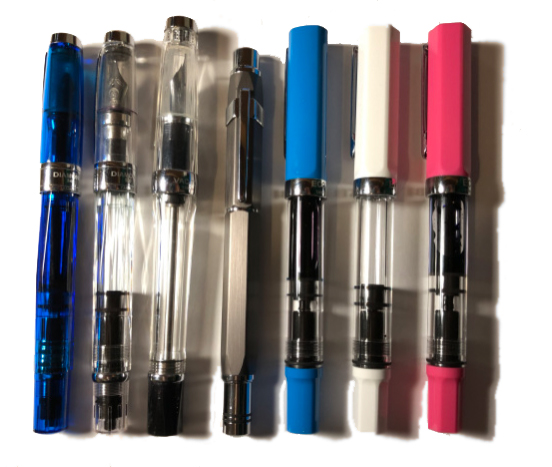
 How it feels Unposted, it’s a fairly big pen, but not oversized – so comfortable for most hands. That cap does post, but this makes it a bit top-heavy in our opinion(s).
 If this isn’t quite your cup of tea, but almost… Have a shop-around for eye-droppers. They are making a gradual comeback – take the Opus 88, for instance.
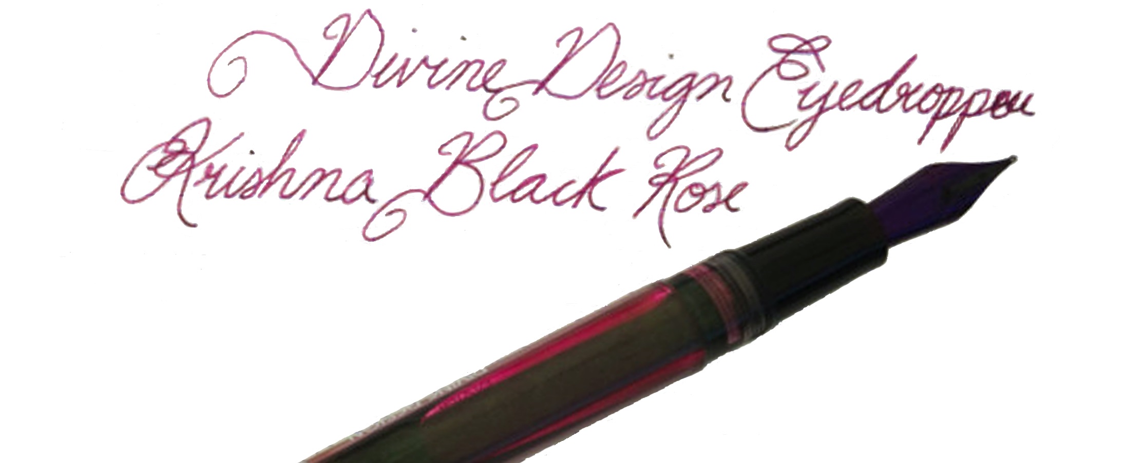
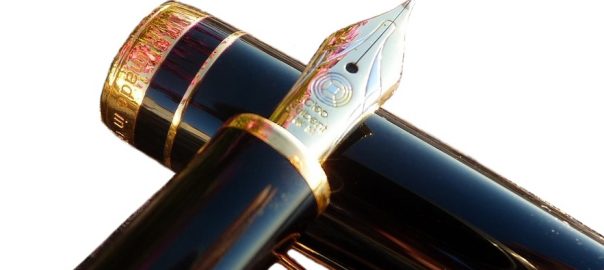
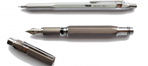
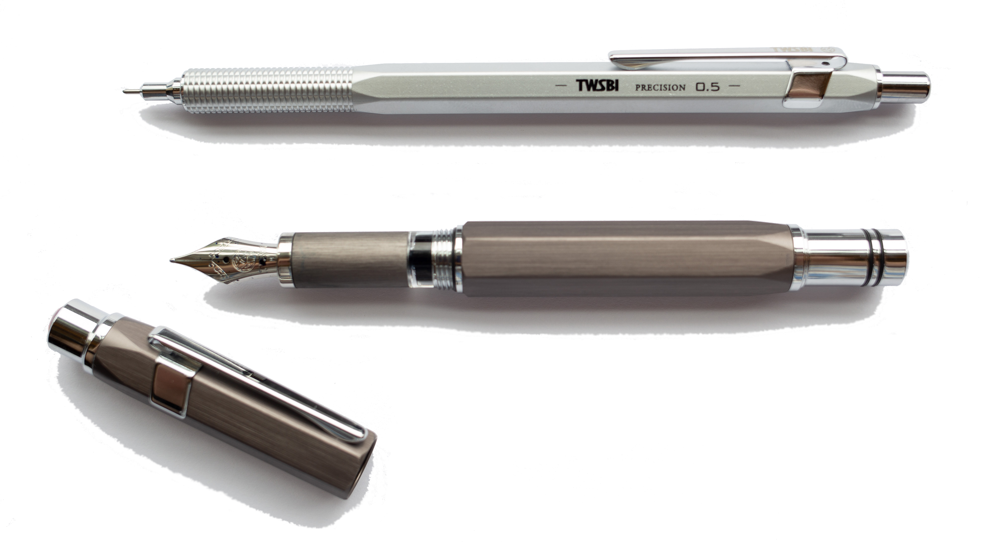
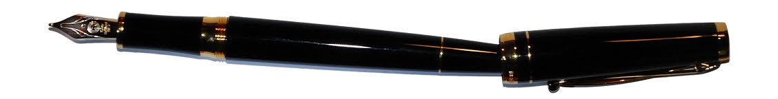
 A little bit of history Cleo Skribent is the company which kept fountain pen manufacturing going behind the iron curtain, and now make affordable daily drivers like the
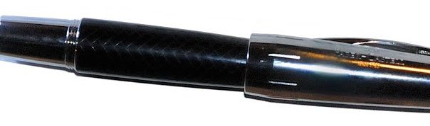
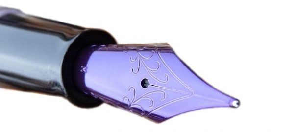
 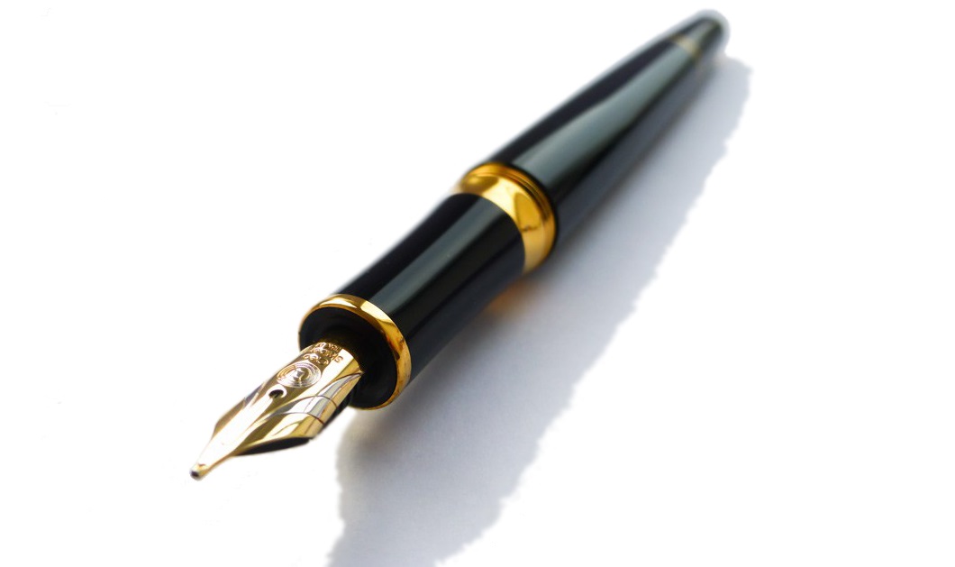 How it looks Quite distinctive, with a tapered barrel which is reminiscent of a desk pen, and that impressively over-engineered clip. The gold finish wasn’t to everyone’s taste, but a chrome trim alternative and a nicely blue version are also available.
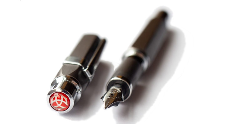
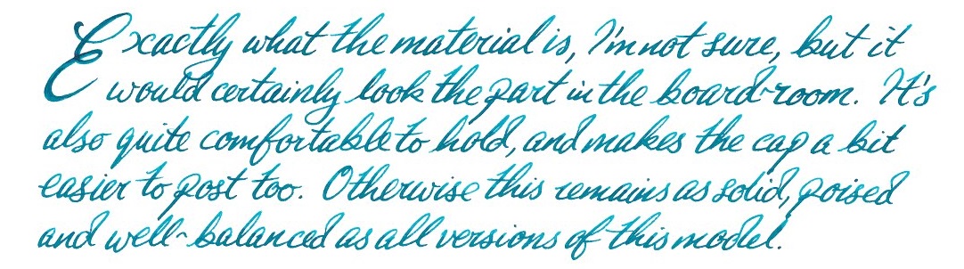
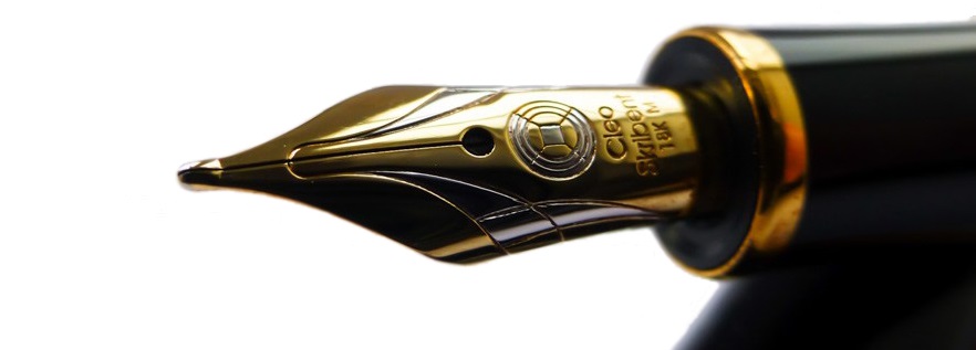 How it feels Light but well-poised and ready to write. It’s hard to resist the urge to try a few squiggles when you pick this up, even if you have nothing in particular to write – but as Skribent roughly translates as ‘scribble’ that’s perhaps appropriate.
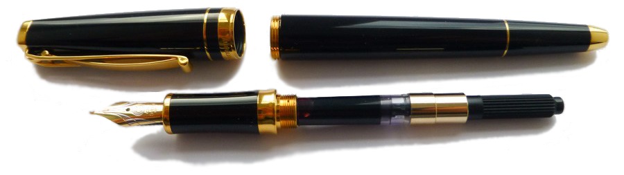 How it fills Somewhat disappointingly, given the piston option of the reasonably priced Classic, the Skribent is a cartridge/converter number. However, the converter does screw in for greater security, which is a smart move.
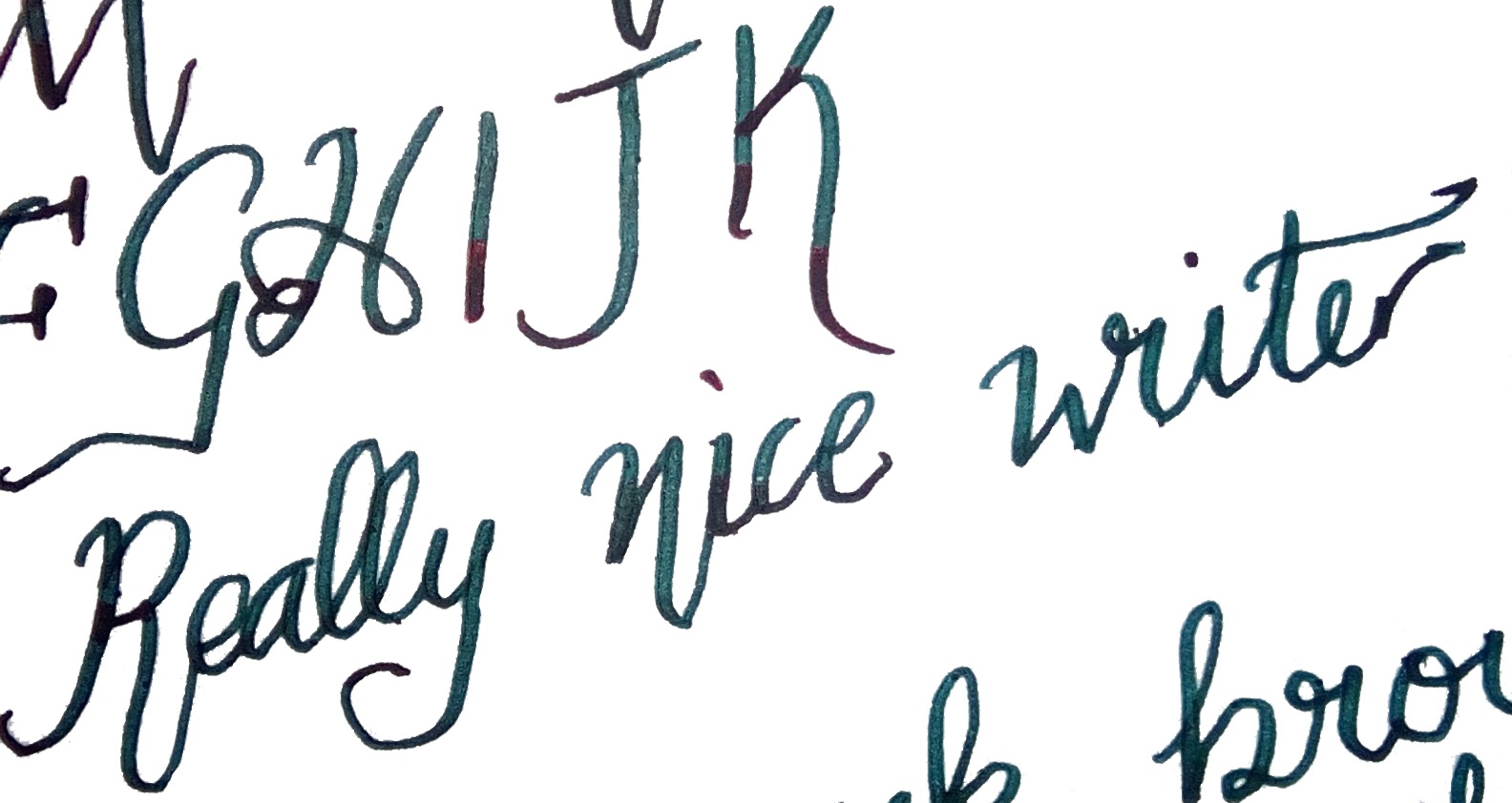
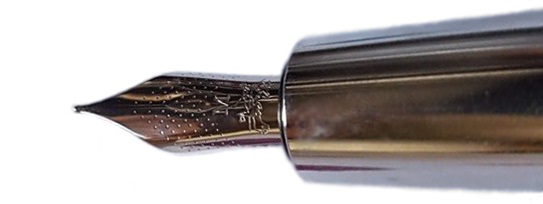
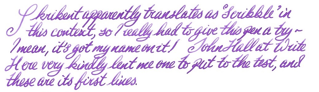 Crucially, how it writes… Ah, here is where the Skribent changes opinions quite quickly. The looks might not win everyone over, but that nib does! It’s small but perfectly formed, with a gentle bounce usually only encountered on a Japanese ‘soft’ nib, and although it offers only modest line variation it is a real joy to write with.
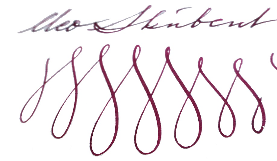 Pen! What is it good for? This is a proper ‘writer’s pen’, this one; it is well-built and could cope with whole reams of text. ‘Just the thing for writing that novel you’ve been meaning to get around to…
 If this isn’t quite your cup of tea, but almost… Cleo makes a wide range of fountain pens, and we do aim to review more of them over the next couple of years. But probably the nearest writing experience to that available from the Skribent would be a Platinum #3776 with an SM nib – if you can find one.
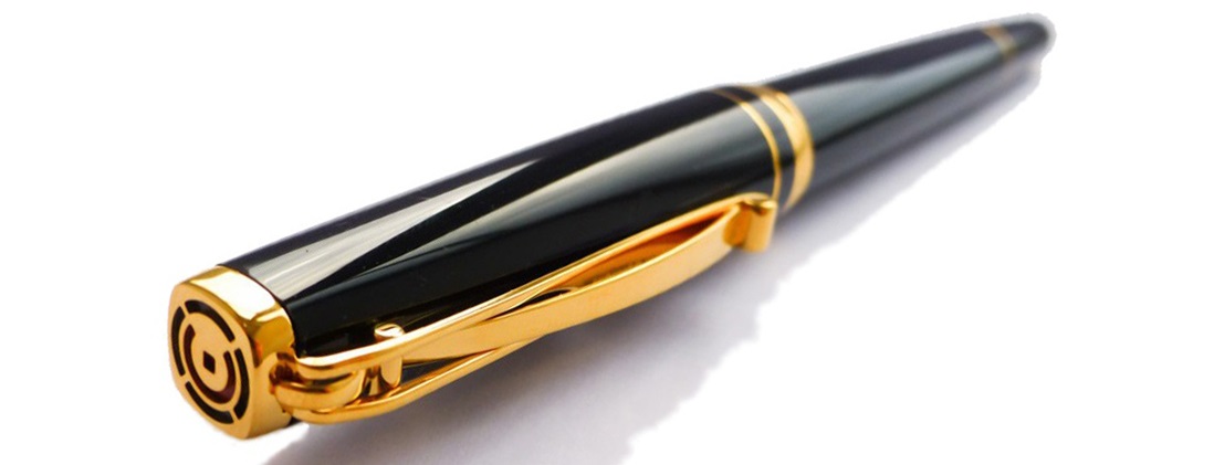 Our overall recommendation If you do have a yearning to write a book long-hand, and you can afford a luxury ‘daily driver’, you could do a lot worse than the Skribent – and you’re sure to fall in love with the nib. We think that Cleo would be wise to reconsider the price positioning, however.
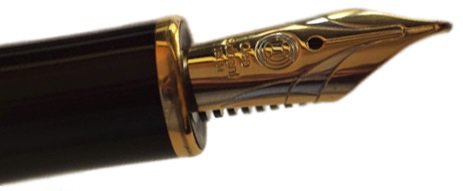 Where to get hold of one There are few Cleo stockists in the UK so, review samples not withstanding, it does make sense to
 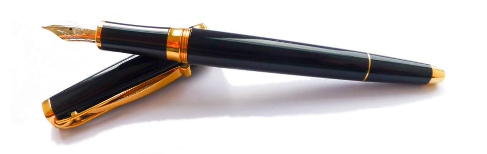 This meta-review references:
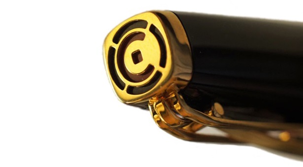 Thanks to Write Here for lending us the Skribent to play with!
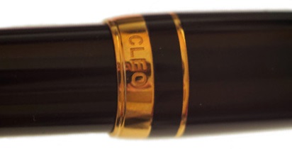
 It’s time for us to announce another give-away here at the United Inkdom Citadel!