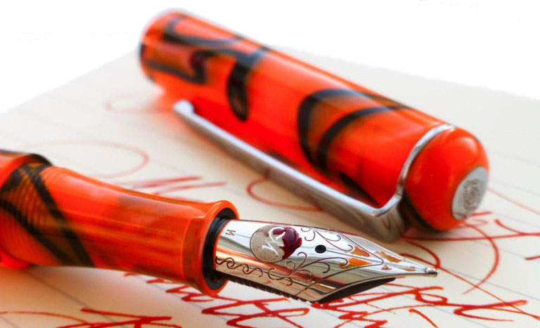
A little bit of history For anyone who’s just survived the British summer, it can be hard to believe that wasps do anything useful at all; the big ones ruin picnics and the tiny ones kill bees. But as it happens, some of those very small wasps inadvertently serve a human purpose by making nests on the surface of the sturdy oak tree – because those ‘iron galls’ in turn provide the source material for a permanent ink formula recipe used since Pliny the Elder. Pliny Senior unfortunately failed to describe the formula in sufficient detail before the eruption of Vesuvius did for him, but patient scribes have been perfecting it ever since. When it works well, it can preserve documents for millennia. When it goes wrong and the ink gets too acidic, it can eat the writing surface – and it has form for eating fountain pens too, so it’s a brave manufacturer who ventures into this market. But Diamine, KWZ and Rohrer and Klingner have found ways to make the recipe safe, and now Platinum have come along with no less than six shades of iron gall ink to get creative with. The United Inkdom team set out to put it to the test – said team including a chemist, a calligrapher and two historians, so there was no fear of punches being pulled.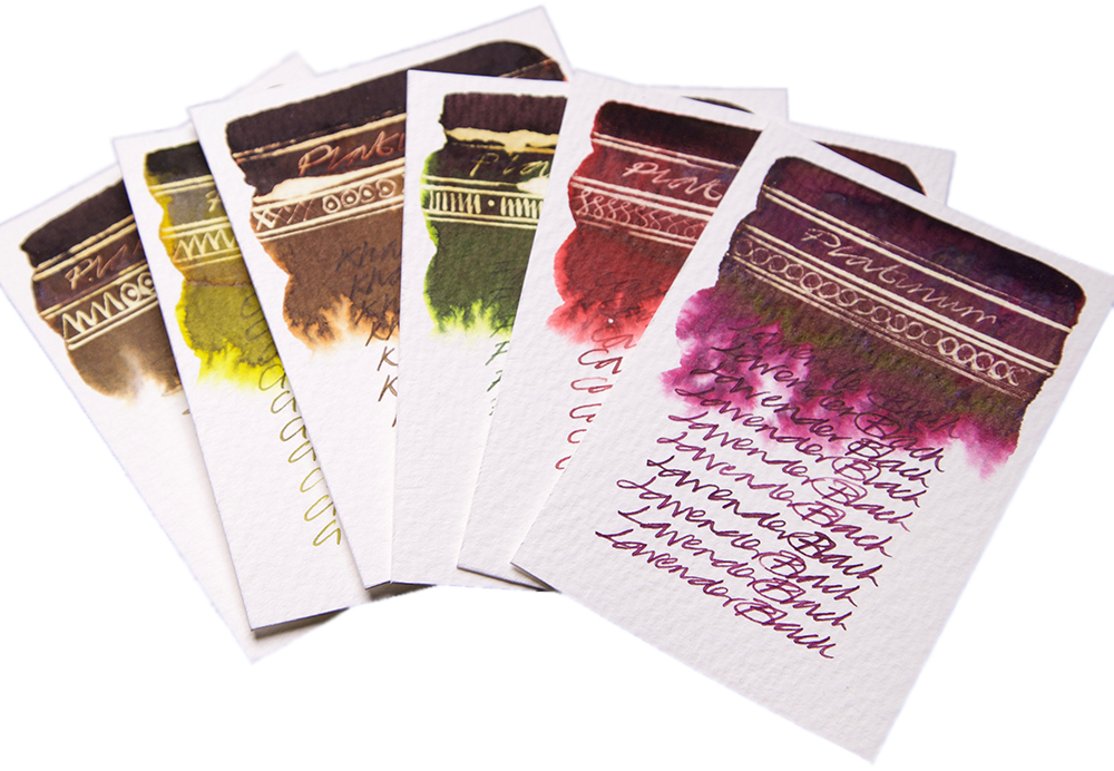
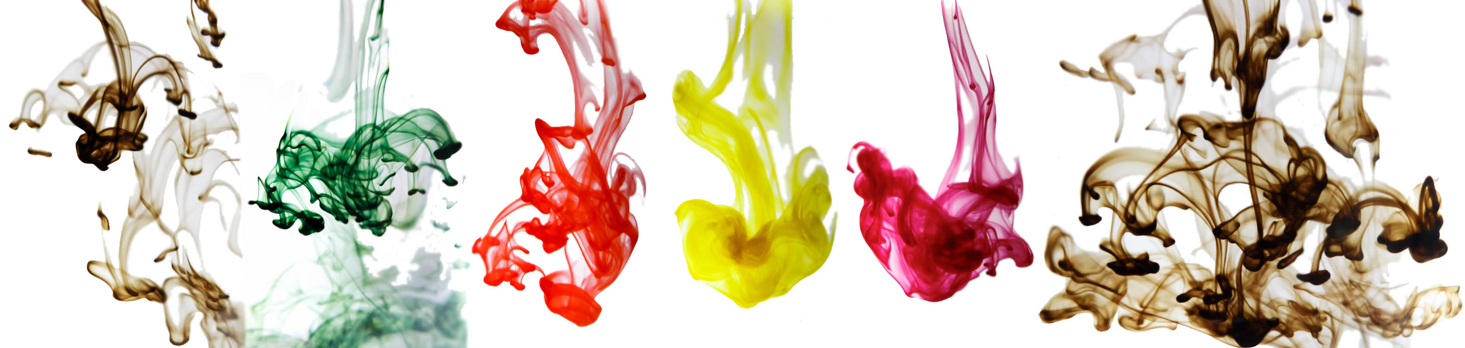
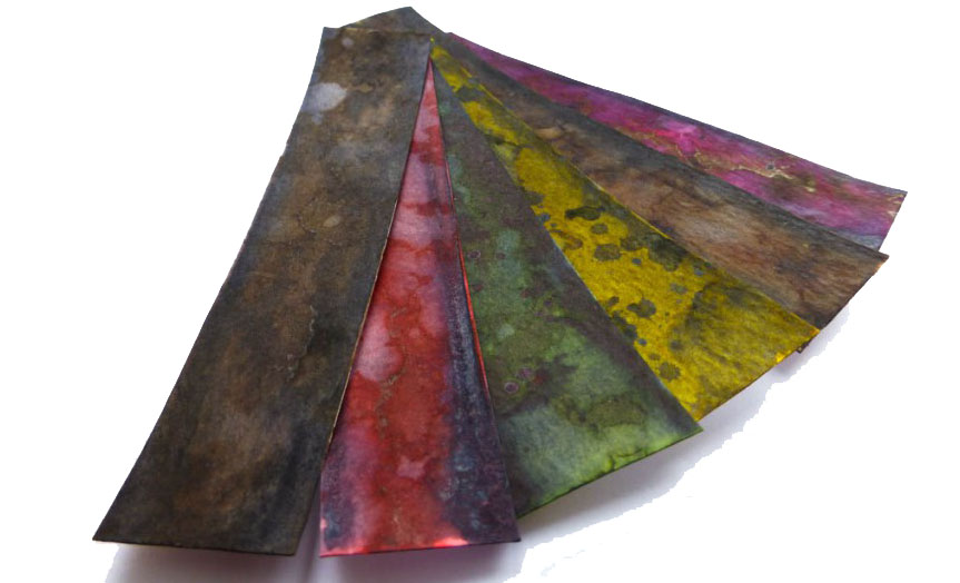
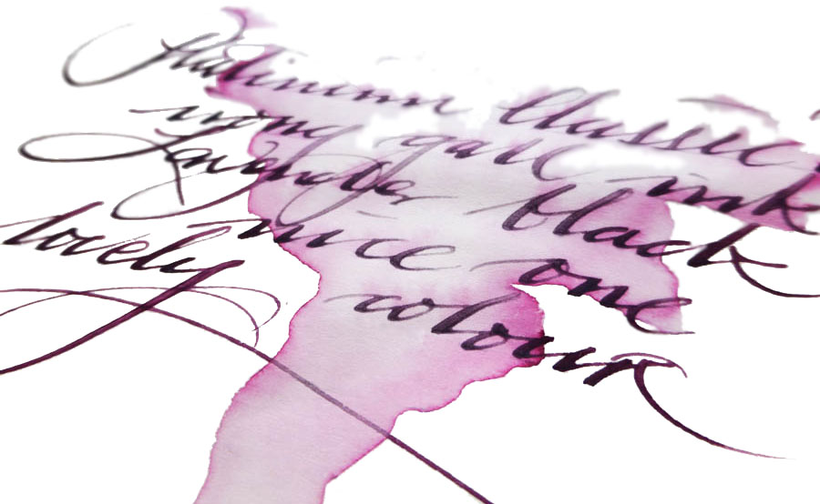
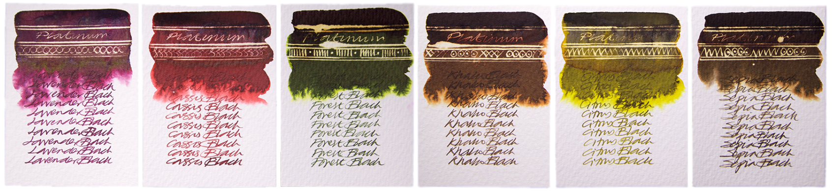
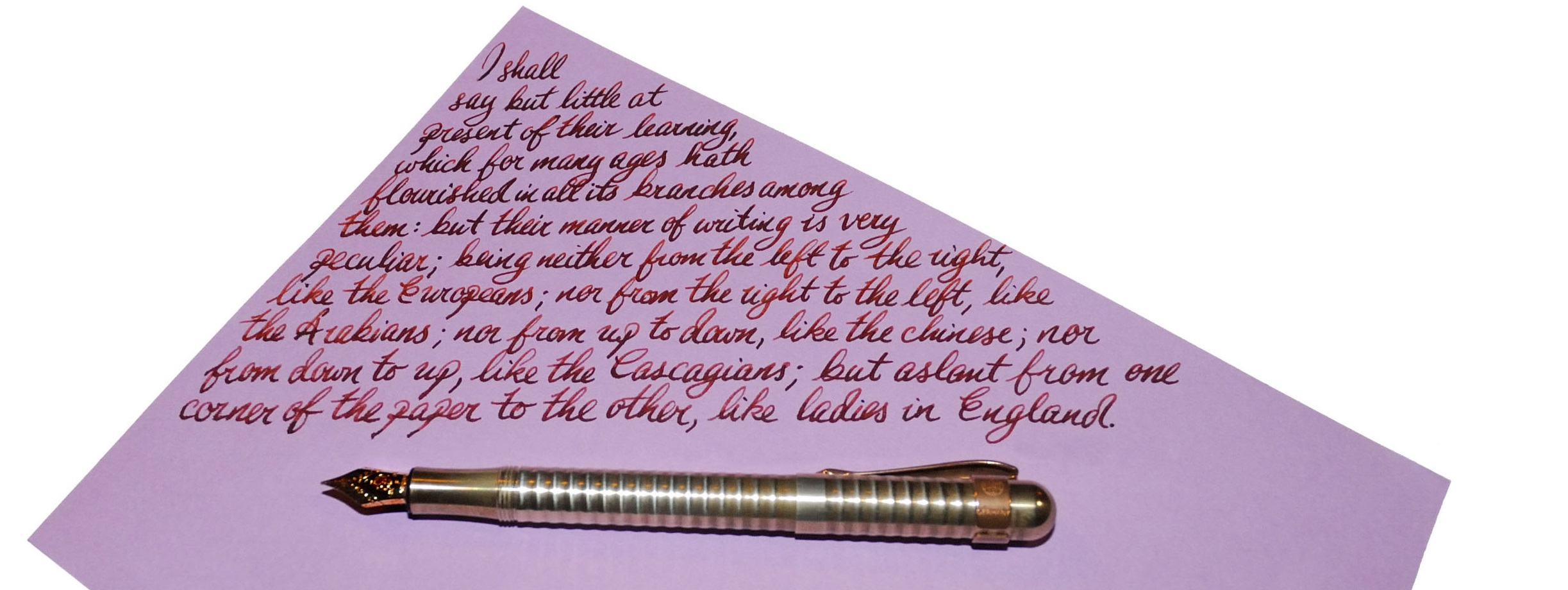
How it looks This changes in the first minute that it spends on the paper – it goes on quite bright, especially the Citrus and Cassis varieties, then quickly darkens as it oxidises. None of the shades darken all the way to black, so the naming convention (Lavender Black, Forest Black, etc.) is a little misleading, but the transformation from light to dark is impressive – and rather fascinating to watch.
How it smells Now let’s be honest, not all specialist inks are terribly pleasant to the nose . This one requires a chemical reaction to work, which you can actually see in front of your eyes, as the video below demonstrates – and as this ink is not pigment-based, it’s not technically watching paint dry. But despite all that exciting stuff going on, there’s nothing malodorous to report. Phew.
Crucially, how it writes… Perfectly well! It’s perhaps just a touch drier than some ‘standard’ fountain pen inks, but a decent fountain pen can handle it with ease. Given that this is still a permanent ink and even the new, gentler, formula has some acidity to it, a fountain pen which doesn’t dry out too easily is a wise choice (one of Platinum’s own #3776 models is a good place to start), and of course it’s worth giving it a good flush out after a few days with iron gall ink in there. But you can pop it into the barrel of your ‘serious nibbage’ without too much fear of damage.
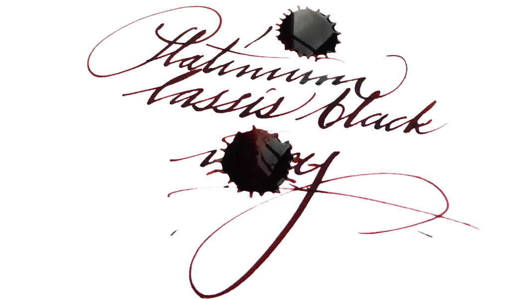 Ink! What is it good for? As Nick capably demonstrates, it’s great for calligraphy. Since it’s an iron gall ink it should be acceptable if you’re signing a marriage register, and as it’s permanent it should do for addressing the wedding invitations too (the ink is partially washable, but even if it gets rained on the text will still be legible). Lavender Black, which seems to be the consensus pick of the bunch, could be good for one’s secret diary (you have one of those, right?). Or you could just have fun with them, like we did!
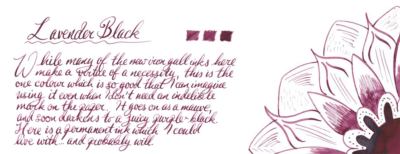 VFM These are not cheap inks, it has to be admitted; £22 will buy you a fairly respectable fountain pen these days, after all. But some of Platinum’s ‘Classic’ colours are really easy on the eye – and if you are using this for a special event, it’s not going to be that big a dent in the stationery budget.
If this isn’t quite your cup of tea, but almost… If you just need an iron gall ink and aren’t too concerned by the traditional blue-grey shade, then standard registrar’s ink will inevitably be quite a bit less expensive, and there’s plenty of that about (try Diamine). There are also other coloured iron gall inks available, usually at a lower price, from KWZ and Rohrer & Klingner. Alternatively, if you’re a Platinum fan and just need something permanent, some of their pigment-based inks aren’t bad and their carbon ink is amongst the blackest of the black. Our overall recommendation We think these are pretty impressive inks, and conjure up a wider and more interesting palette than iron gall formulae can usually manage. If you have a sensible use for a permanent ink and fancy something a bit different, a 60ml bottle will do the job well. Given the significant cost our tip is to pick one or two which really take your fancy rather than going straight for the whole set.
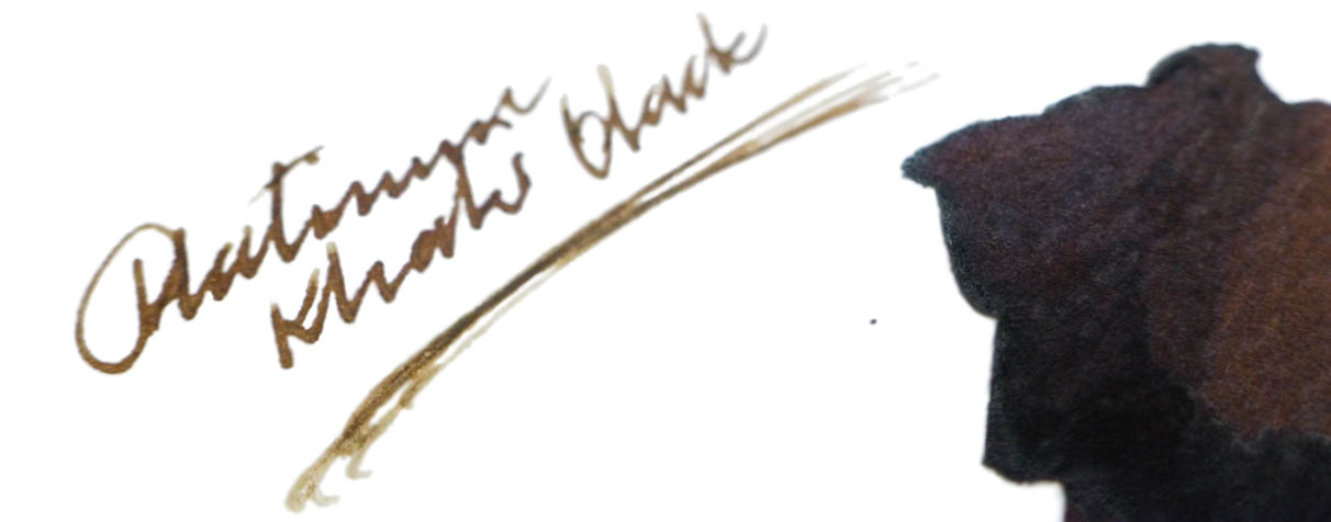 Where to get hold of some We got ours direct from Cult Pens, and that’s a good place to start – they are the official Platinum dealers for the UK, and as it happens it’s where many of us have acquired our #3776s from too.
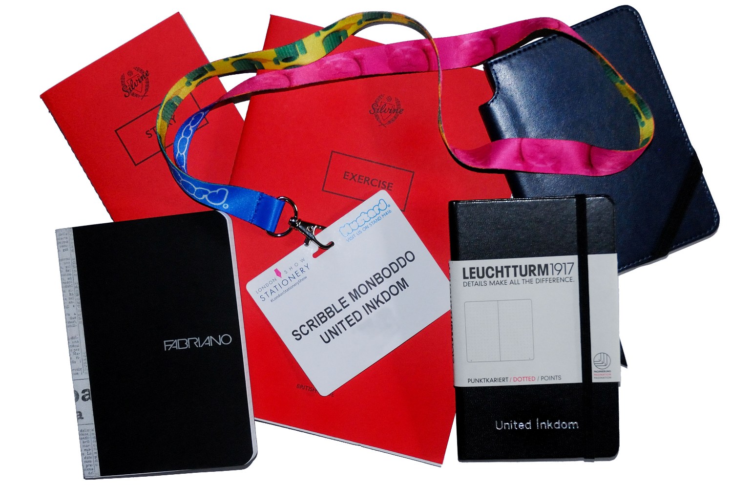
This meta-review references:
- Scribble Monboddo’s hand-written review
- Nick Stewart’s ink and bleach creativity
- The Clumsy Penman’s interesting experiments
- Gillian’s illuminated manuscript
Thanks to Cult Pens for donating the review samples.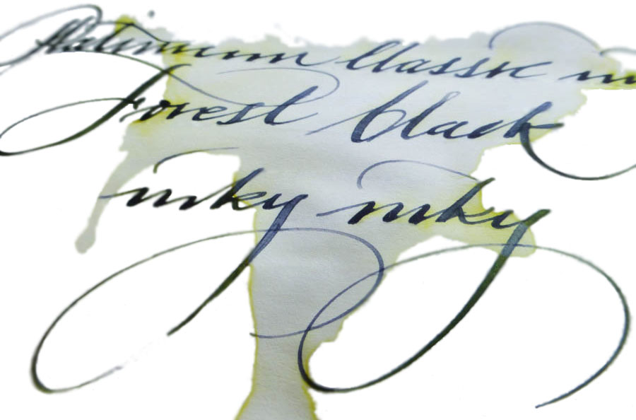
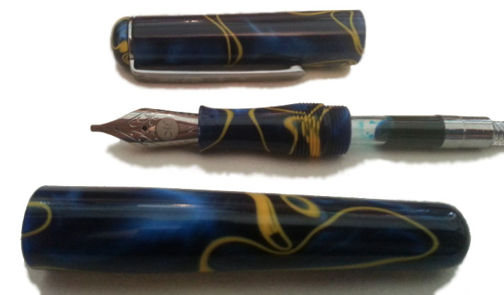
 However, not every aspect of the aesthetic was loved by everyone. The clip has two circles, echoing the dual crown of the cap’s top (which is a reminder that Manuscript has been going so long that they used to supply the kings of both Spain and Portugal), but the shape of the clip itself seemed a little gimmicky. As Laura put it, “don’t dress a model in Primark clothes.”
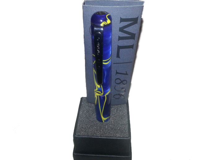
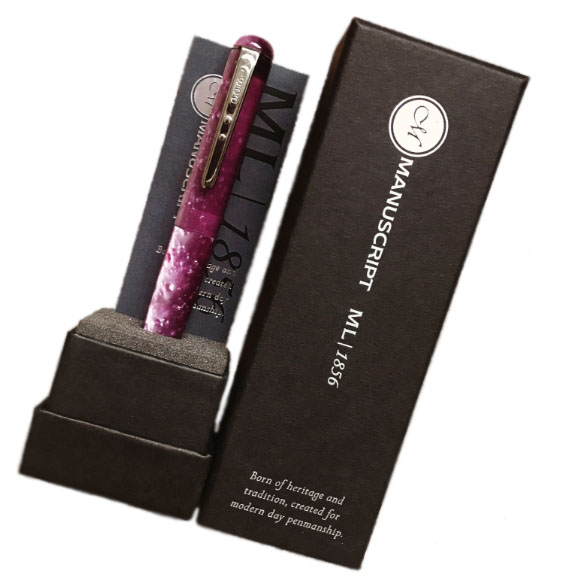
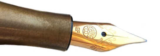
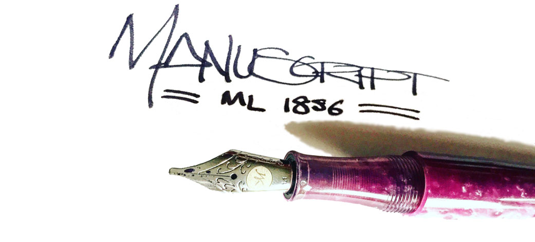 Most of our reviewers found the steel nibs satisfactory, albeit a little bit dry at first in one case. Overall, the writing experience was rated as pleasant by the reviewing team. The only thing that the italic nibs aren’t great for are reverse writing, as Daniel discovered. The #6 JoWo nibs write a fairly wet line and the feeds keep up well.
 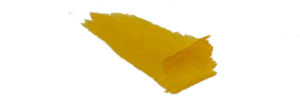 Pen! What is it good for? Manuscript seems to be, as a brand, synonymous with calligraphy, certainly for beginners here in the UK anyway. The 1.1mm and 1.5mm italic nibs means that you can get a little stylistic with your writing, particularly when considering scripts such as gothic.
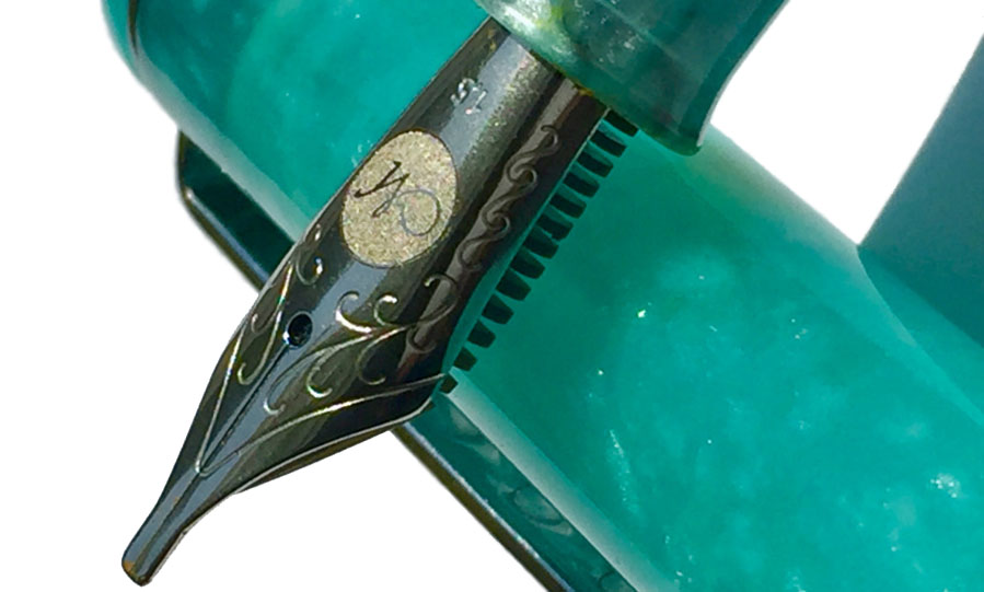
 Our overall recommendation While we loved using the pen, the price point just didn’t justify it until that was reviewed; there were too many alternatives which were similar to the ML1856 but better quality/feel for the same price or others that might sacrifice ever so slightly on the feel but were much more affordable. We like the direction Manuscript is heading in, but our recommendation was to wait until the value issue had been rectified before pulling the trigger.
 Crucially, how it handles fountain pens… Quite well, fortunately! The manufacturer’s claim to use the best paper in the world was a bit of an exaggeration – we have certainly all used better – but that’s not say it’s bad at all. It was quite pleasant to write on and coped with every nib we threw at it with aplomb.
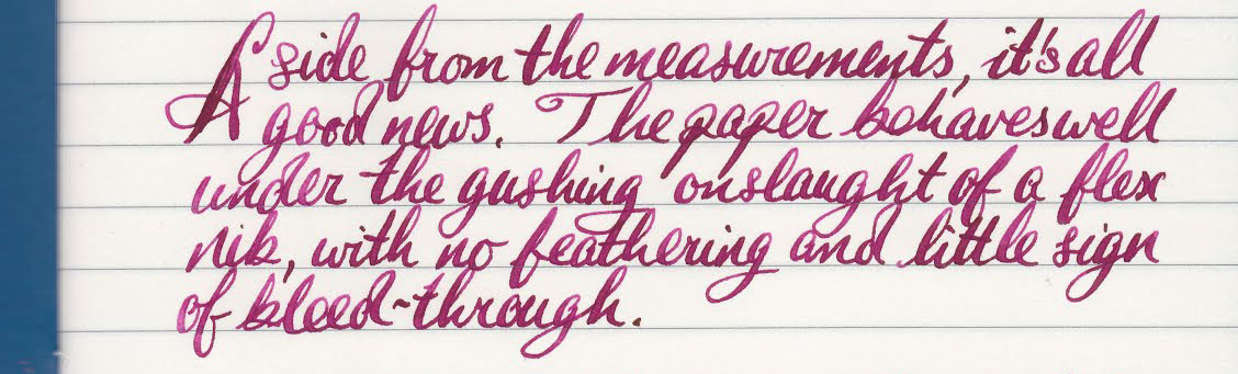

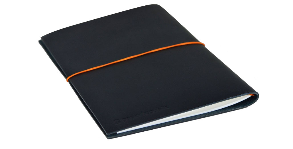

 Thanks to Paper Republic for donating no less then three notebooks in return for honest reviews.
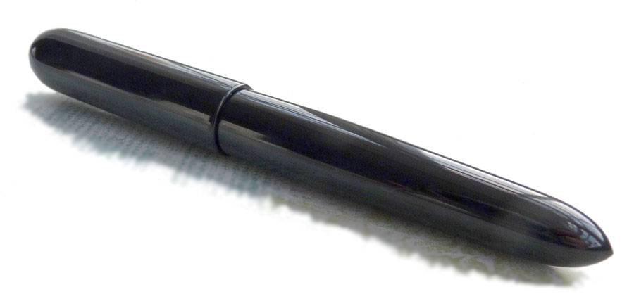 How it looks Like a pocket version of the
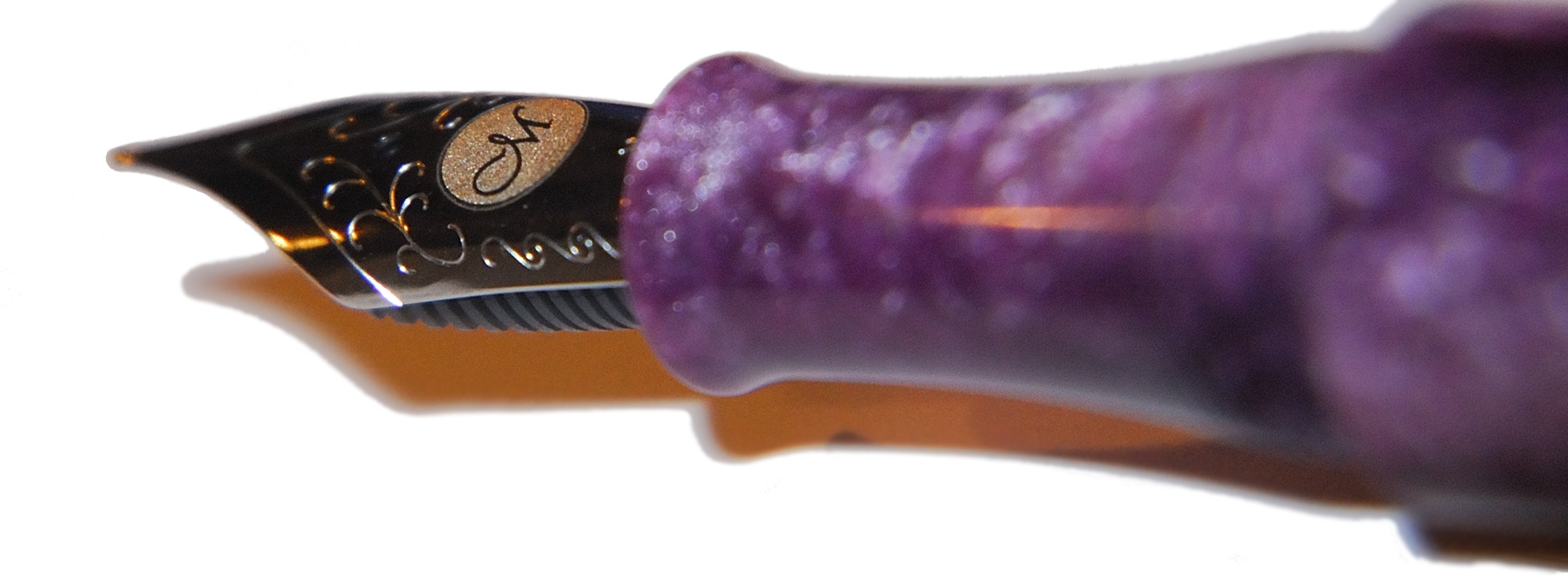
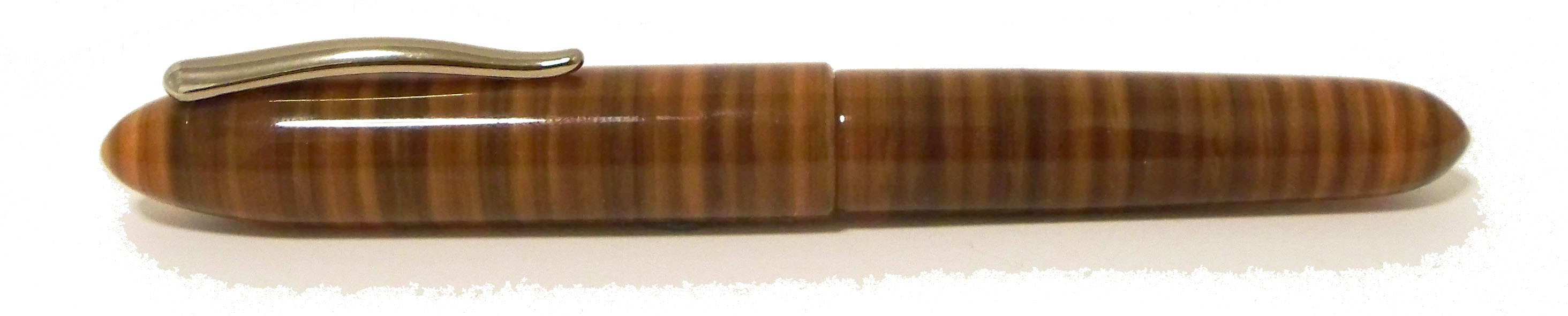
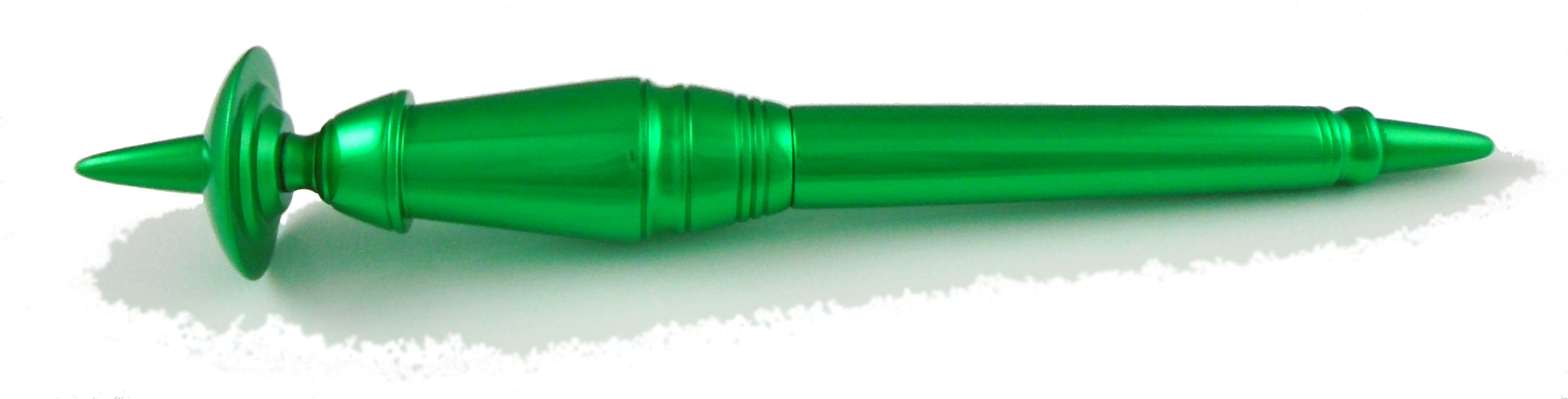
 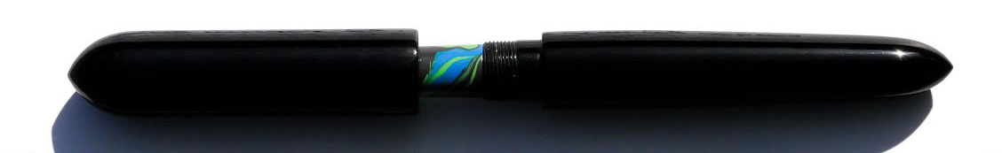 How it feels It’s big – really extraordinarily big. So much so that you might wonder if your hands are big enough. Three-quarters of our reviewing panel were, however, pleasantly surprised to find that it nevertheless felt about right in the hand, and the lightness of the materials ensures that it’s not as heavy as it looks either. The ebonite makes it warm to the touch immediately, which is also rather pleasant. But it will be just a bit too big for some.
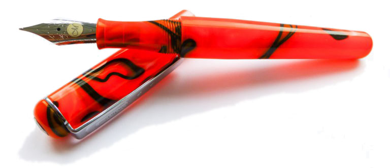
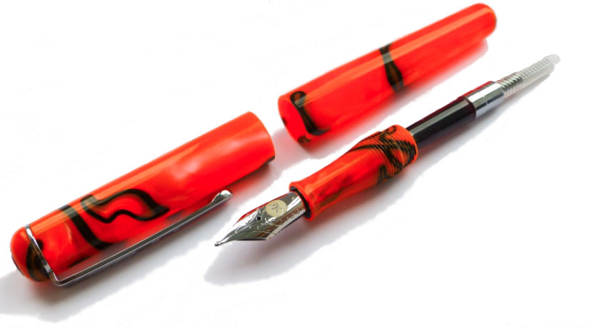
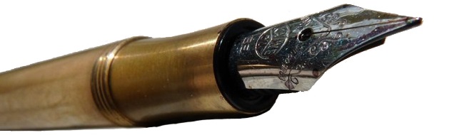
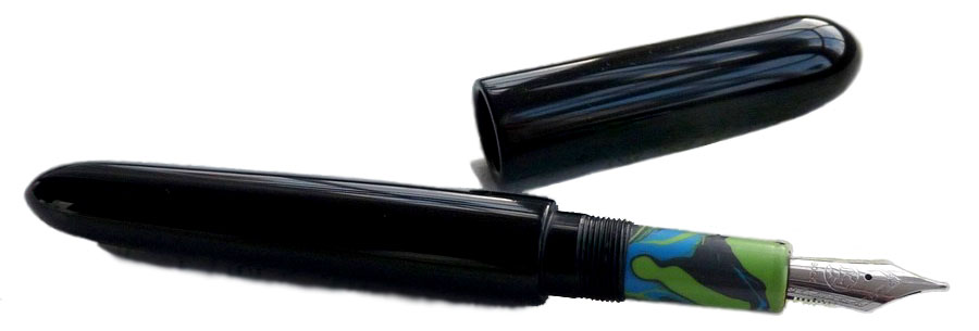 Crucially, how it writes… As ever with hand-made pens, that depends upon the nib you choose to add. Jake uses the Bock #6 steel nib as standard, and although the review unit we sampled had been bashed about a bit, to the detriment of writing performance in this case, Jake does test all nibs before dispatch to customers and will rectify any issues which arise after delivery. The writing position is comfortable and, with a #6 nib of your choice, this should be a very nice long-term scribbler.
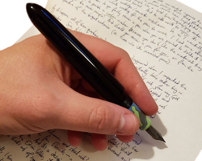 VFM Most versions of the Streamline are available at around the £150 mark, which we think is fair for a hand-made pen with unique design and plenty of customisation options. Installing a nib which is more exotic than the steel standard will naturally add to that, but it’s still a tempting proposition for most of us who reviewed it.
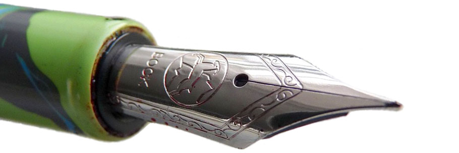 Our overall recommendation If you like big pens and you cannot lie, then make like Sir Inkalot to the website and order one; we were mightily impressed and several of us have started to muse about our own choice of materials one day. We’d like to see a version with a bigger #8 nib in the future too, but this is a pretty special pen which looks out of this world but is also very nice to wield.
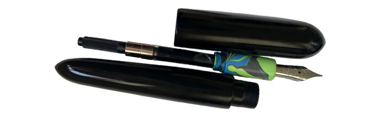 Where to get hold of one From Jake’s
 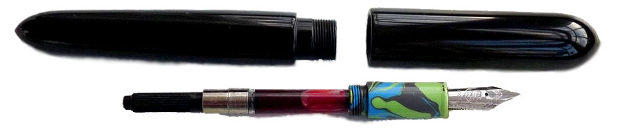 Thanks to Jake for supplying this extraordinary test sample, and offering one lucky reader the chance to take it home! The competition entailed ideas for favourite Welsh designers, with a very broad brief as to what ‘designer’ means. There were some wonderfully creative responses but the most surprising had to be the humble equals= sign. The prize is winging its way by flying saucer…
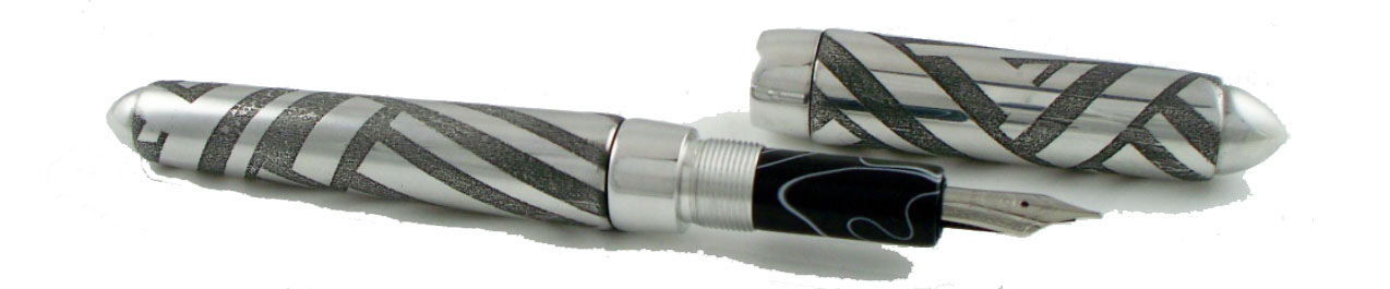
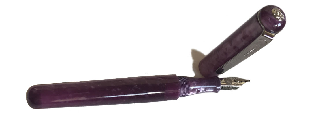
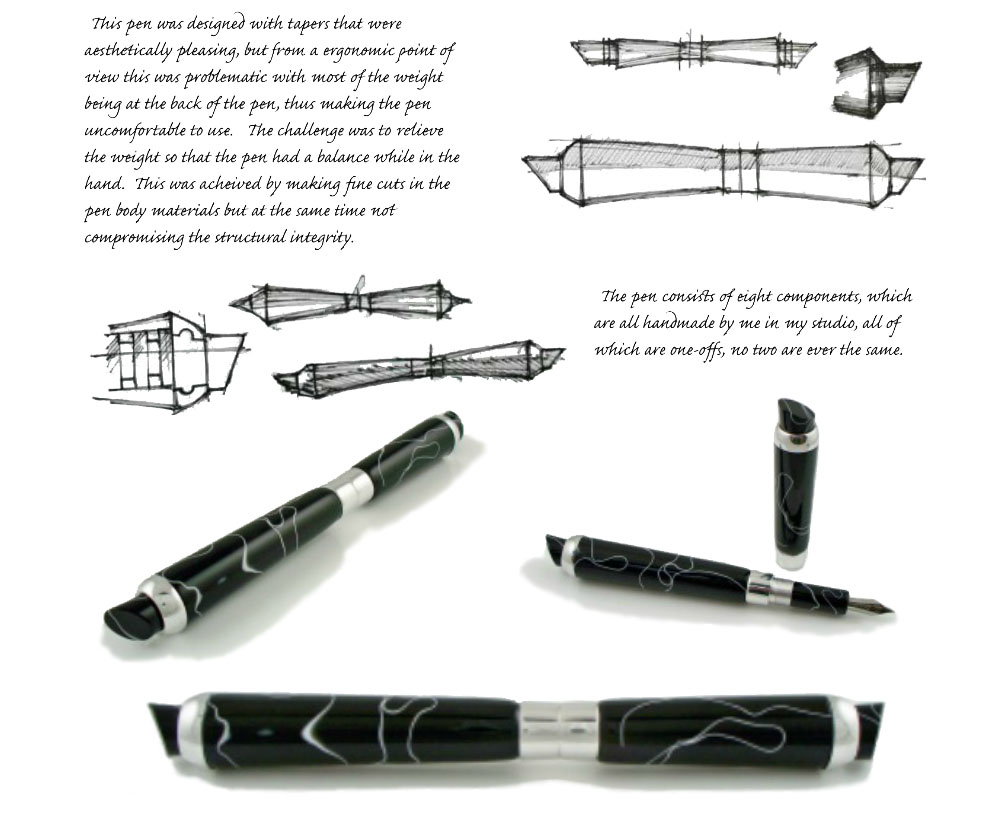
 How does a Lazzari design take shape? Here’s my little secret – I’m really a mechanical pencil fan. I’m told that’s safe enough to admit to in the stationery world, and I enjoy putting my original art skills to use. Looking at the preliminary sketches, you can see how the Streamline pen took shape. I do take commissions from customers too, but I’m always full of ideas anyway.
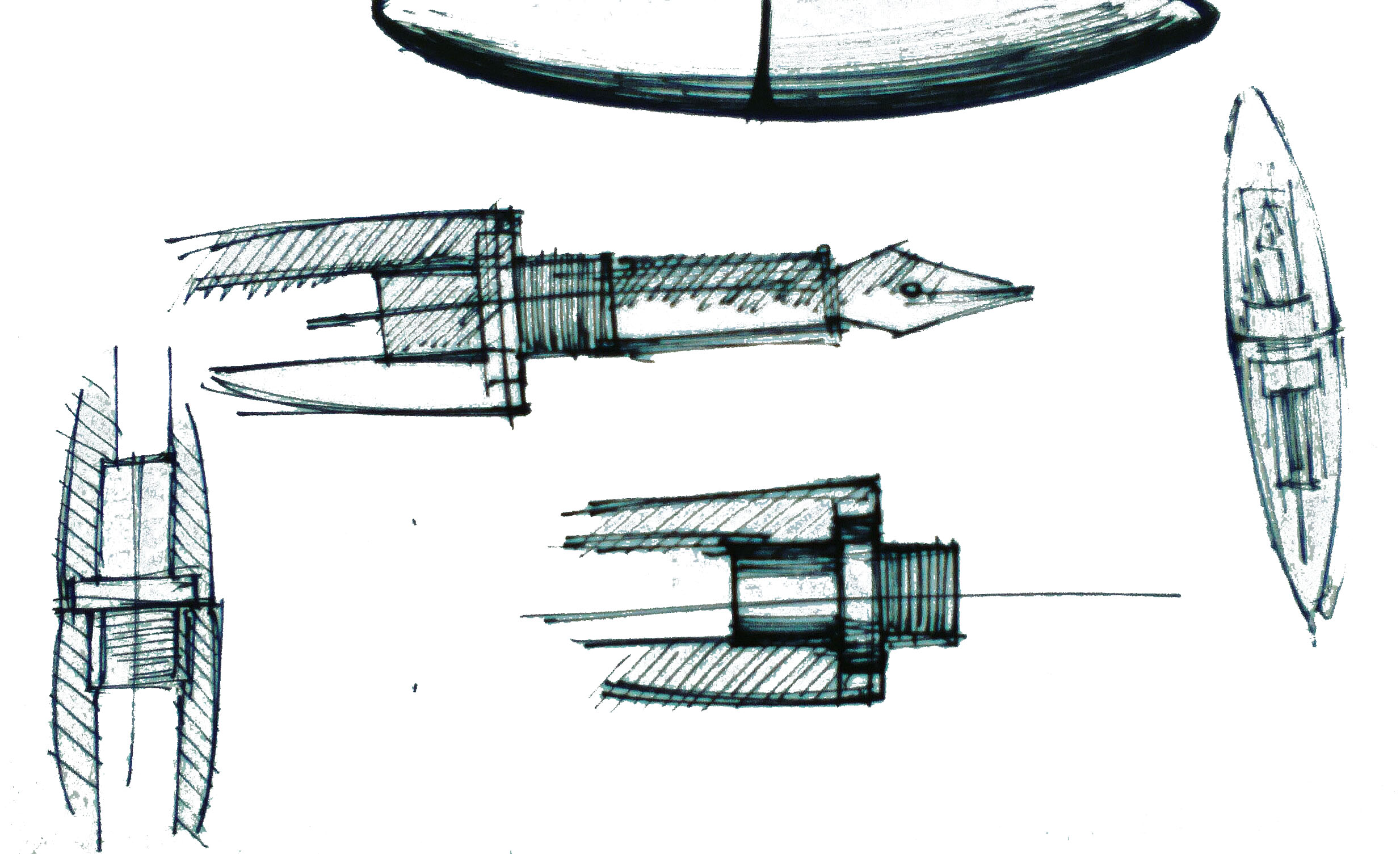
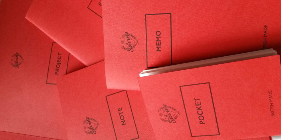
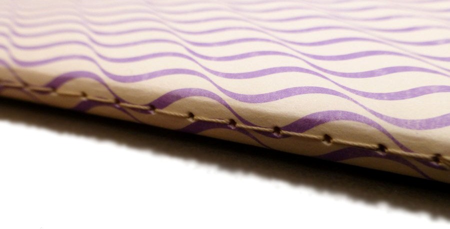
 How it feels Everyone within the Inkdom commented on how textured the paper is. The paper is 90gsm Natural White Wave paper and you can definitely feel it on your pen. We actually rather liked this; it’s certainly not as smooth as Clairefontaine, but you can feel what you;’re doing as you move the nib across the paper. What’s more, this paper handles anything thrown at it. Gillian even mentioned that the paper might be able to hold up to watercolours! Dabiel and Scribble found that it was able to handle all the nibs that they threw at it and The Clumsy Penman also commented on how well the paper copes with inks.
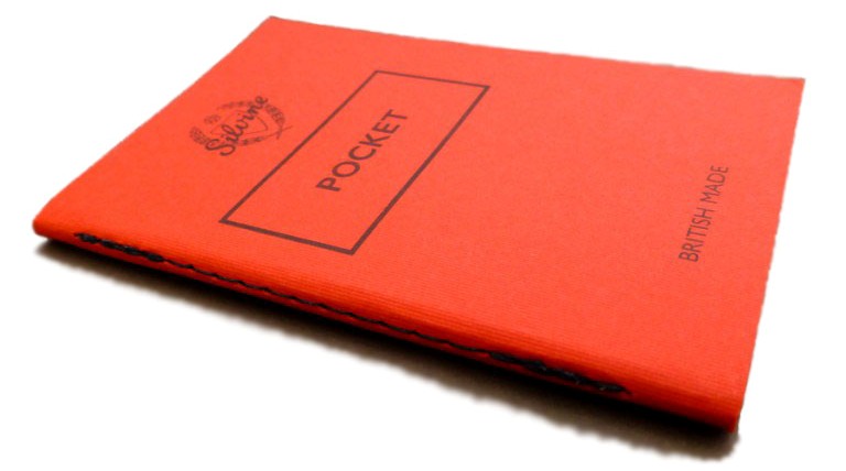
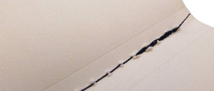 Crucially, how it handles… Pages in the Silvine notebooks are hand-stitched, which gives the notebooks a very personal feel and also means that they lay flat which makes the writing experience even more pleasurable. Some of us weren’t too keen on how the stitching looked, however, as it wasn’t always clean and could look a tad messy. The exception to this is the Project notebook, which has a little bit of extra protection because of how big and heavy it is (speaking in relative terms to the other sizes, such as the itty-bitty Pocket). All the notebooks have perforated pages and they work very well as you can easily tear out the pages if you need to, but you needn’t worry about the perforations becoming weak when flipping pages in the notebook – the pages will only come out if you want them to come out.
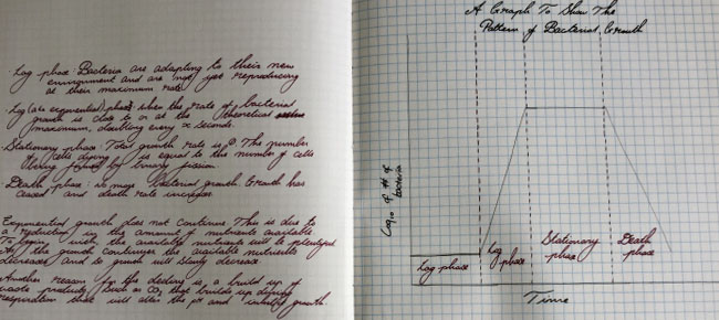
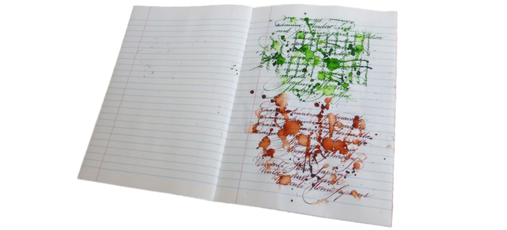 Pulp! What is it good for? As mentioned above, each notebook fills its own little niche. You can read our individual reviews to get a better sense for what you could use them for. Daniel was was able to use the Project notebook for drawing graphs for biology illustrations, but Gillian pointed out that it doesn’t have to just be for applications like drawing out scientific apparatus. You’re bound to find the right notebook for you amongst this selection; John has even made the Pocket part of his every day carry. Some of us did identify other limitations; there is no grid option and the notebooks are all a non-standard size.
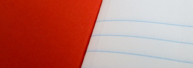 VFM Typically, the cheapest of these notebooks is the Memo, at around £4.50, with the most expensive around £14.00. However, if you consider the Pocket notebooks, which come in packs of three, the cost of each individual notebook is £2.17. John says that the notebooks are “expensive but worth it,” and that sums up the consensus view – you do pay a of a premium, but it’s worth it.
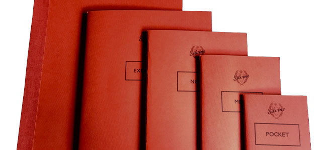
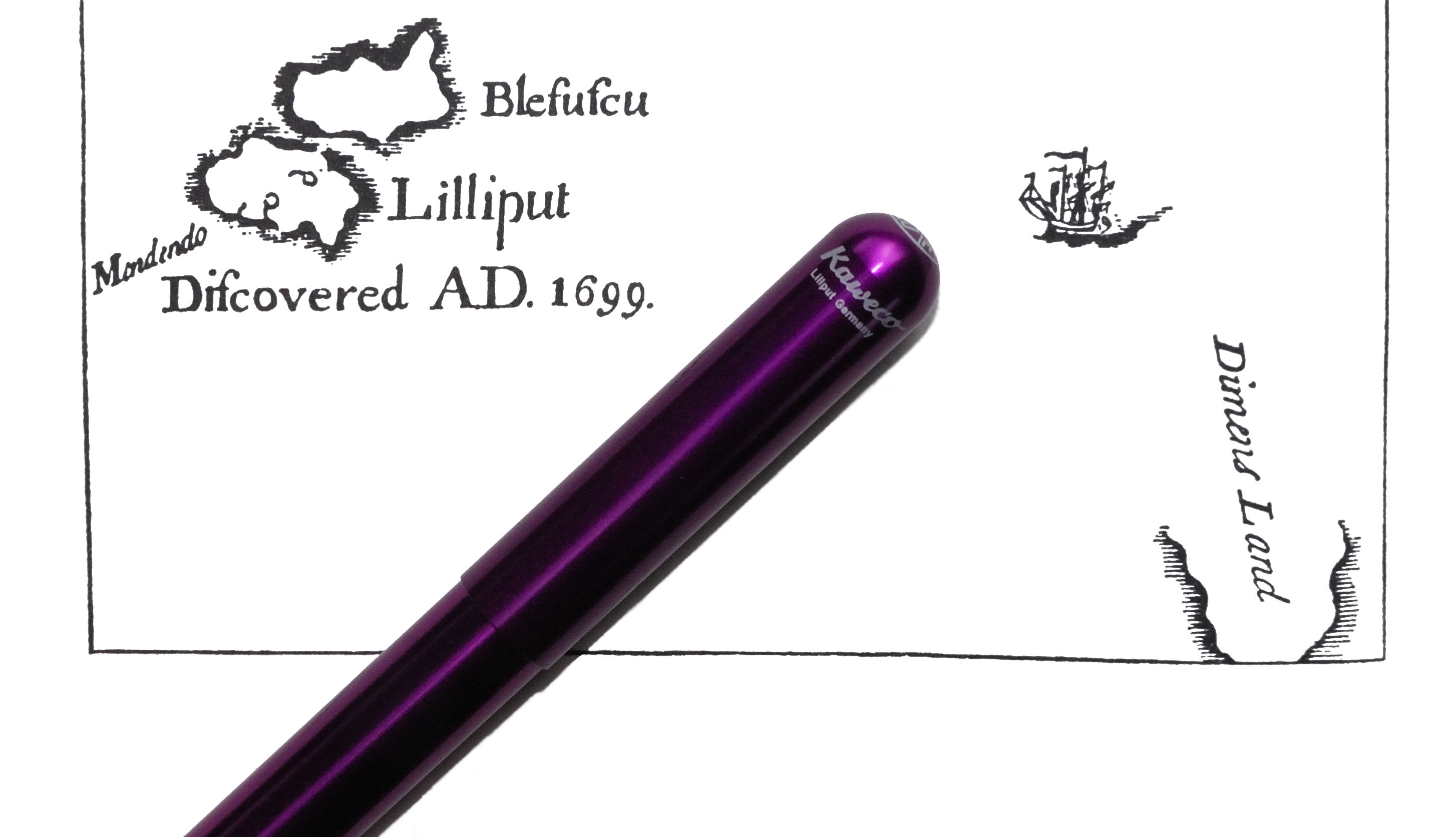 A little bit more history Jonathan Swift was a rapier-sharp satirist in his time (see ‘
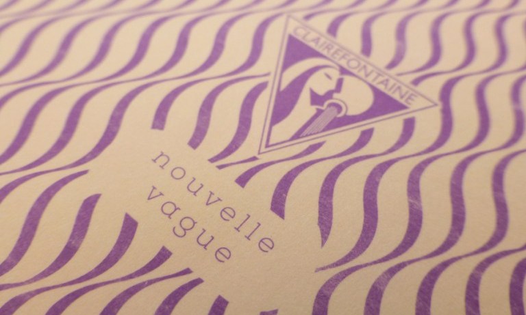
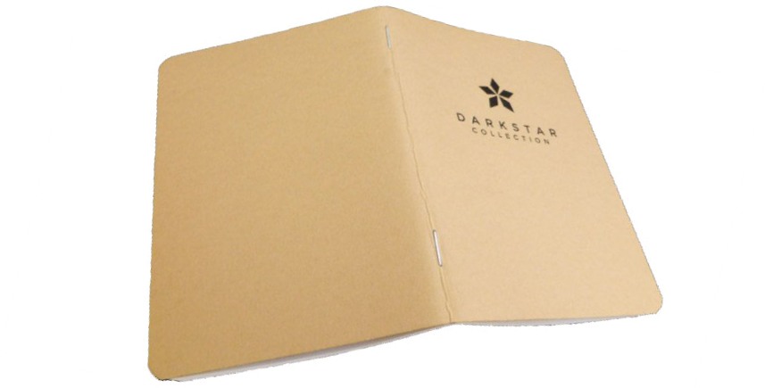
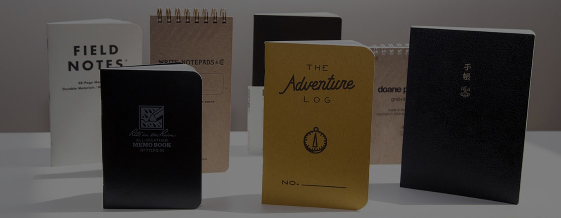
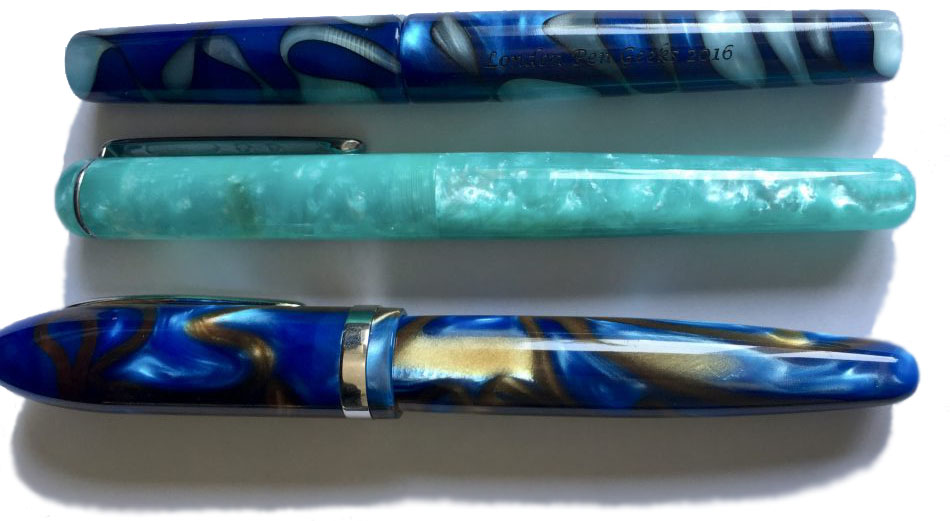
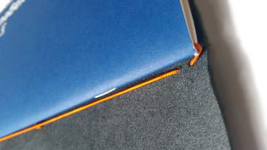
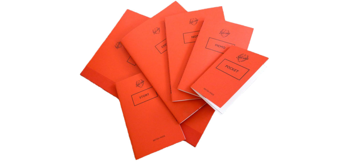
 How they look Apart from the slight variations in size, they do range from the wild to the very subtle in cover artwork. Clairefontaine have gone to town with retro geometry, while right at the other end of the scale Darkstar are understated to the point of nearly anonymous – but not quite! Of course this isn’t so important if you’re planning to put the notebook into a cover for added durability, but it does add to the visual experience of that ‘unboxing’ moment.
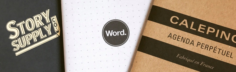
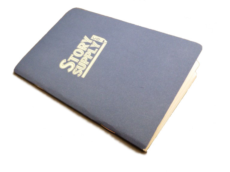
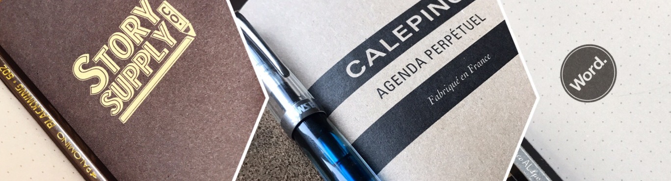
 Story Supply notebook An interesting one this, with the attention to detail that many notebooks just don’t concern themselves with, such as a section in the front for all your details, resilient paper, and a hard wearing cover. Laura, Mateusz and John all received these to work with, and it has to be said that all were pleased with this Journal, so much so in Laura’s case that marriage may be on the cards… You saw it here first.So what’s so good about it? It’s got fine lines, which is a must when you write small, but even in broader hands, proves to be a good choice for those who enjoy writing copiously. It wouldn’t be so good for those who write with stub nibs or italics, but for everyone who uses it as an everyday note book, the lines (0.5 from 0.7 standard) were very popular. It’s a thirsty notebook (by which we mean that if you leave your pen on it, it may take a drink…), but the paper is excellent quality and writes well, just so long as you remember to keep going rather than taking a break.