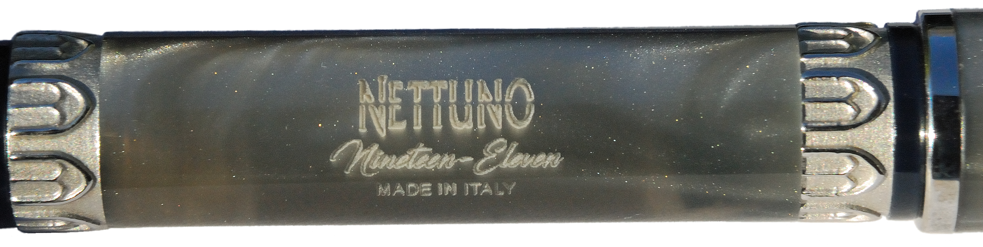
A little bit of history Nettuno 1911 (named after Neptune – a God of the Sea) are beautifully hand-crafted Itanian fountain pens, made in Bologna under the supervision of Nino Marino – a former president of the famous Delta Pen Company. Nettuno pens have a very long history originating in the last century and perhaps Nettuno as a brand was one of the first (if not the first) fountain pen companies established in Italy. One of their advertisements from 1911 showed Neptune holding the fountain pens as if they were his iconic trident; the model for the company’s logo was based on a famous statue of Neptune in Bologna. The 1911 series celebrates the Italian heritage of the reborn Nettuno brand.
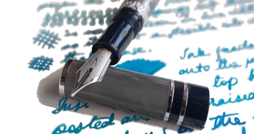
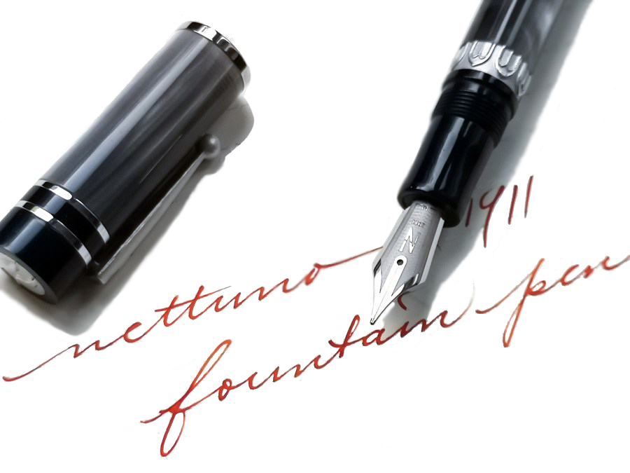
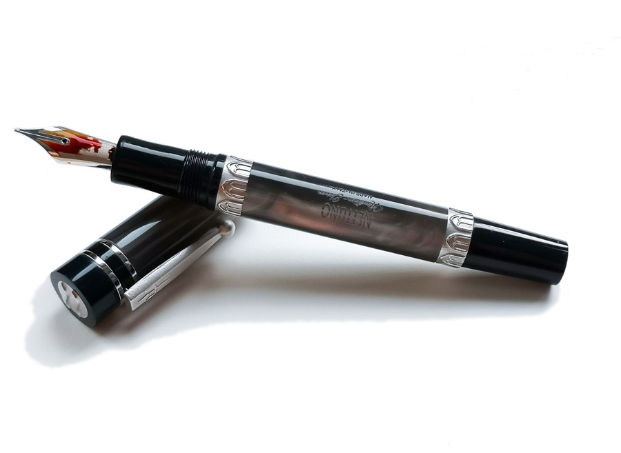
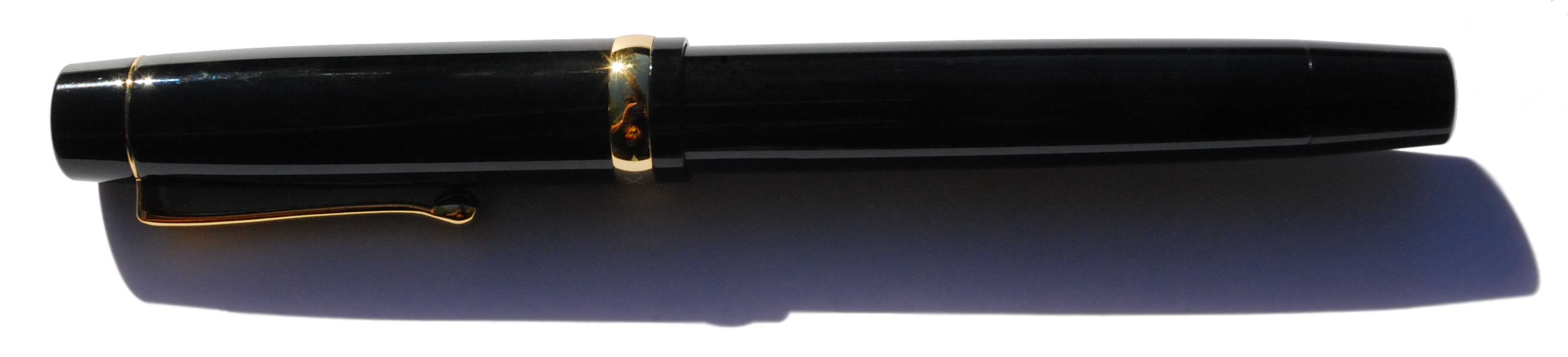
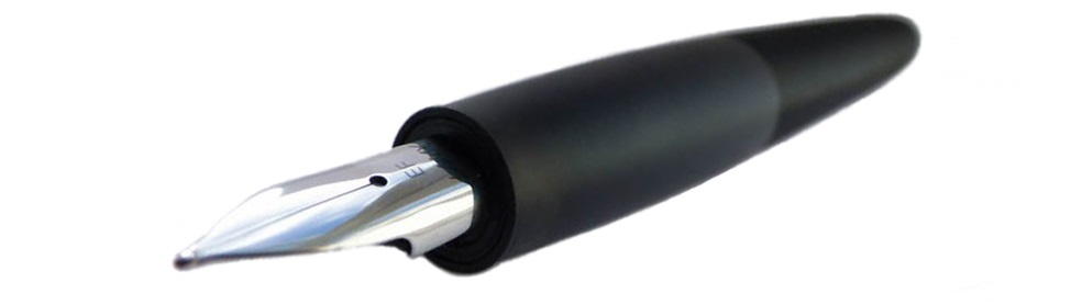
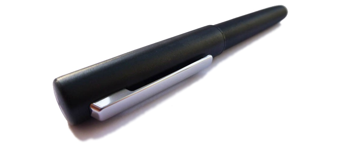
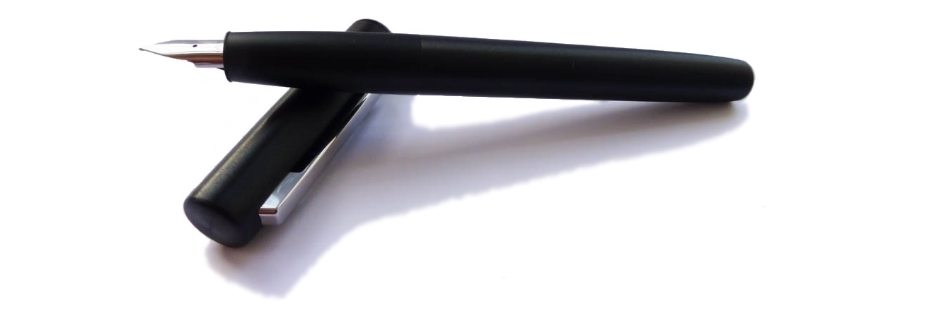
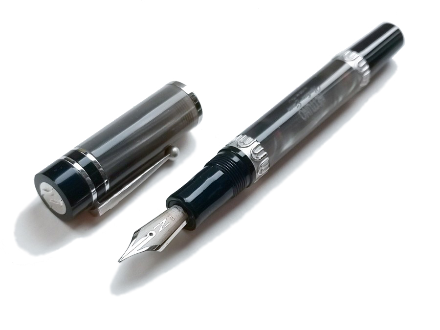 How it looks The finish of the Nettuno 1911 models we tested is called Tritone. It features a pearlescent shimmering silvery grey resin body with grip section and finials made from dark blue resin. These are complemented with rhodium accents. On the cap there are three polished bands whereas the barrel contains two wider rings, with the relief patterns of arched windows referring to ancient Roman architecture. These bands are made from the same metal as the clip and have a matte texture. The finial on the cap has a metal ring with a wave pattern. The pen is equipped with a rhodium-plated steel nib.
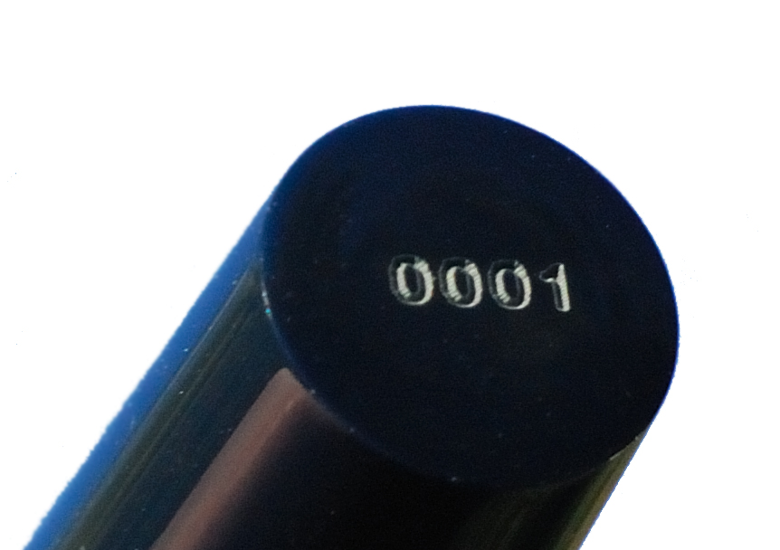
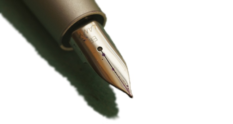
The ornaments on the nib are rather minimalist, but effective. There is a large stylised capital ‘N’ from the Nettuno logo left on the etched, matte-textured surface, which matches nicely with the other trims present on the barrel. All parts are very well-made, with real attention to detail; the resin elements, for instance, are nicely smooth with a glossy finish. The Nettuno 1911 Tritone is a very elegant fountain pen indeed. 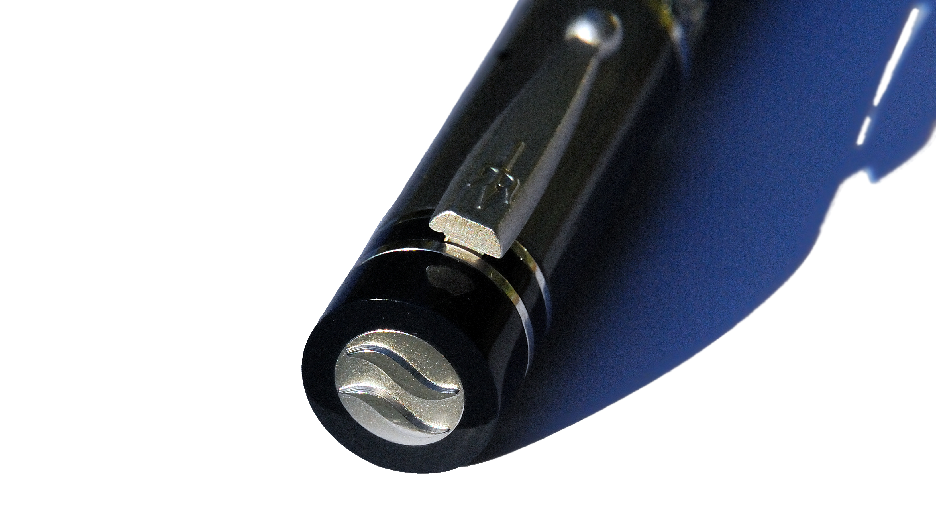
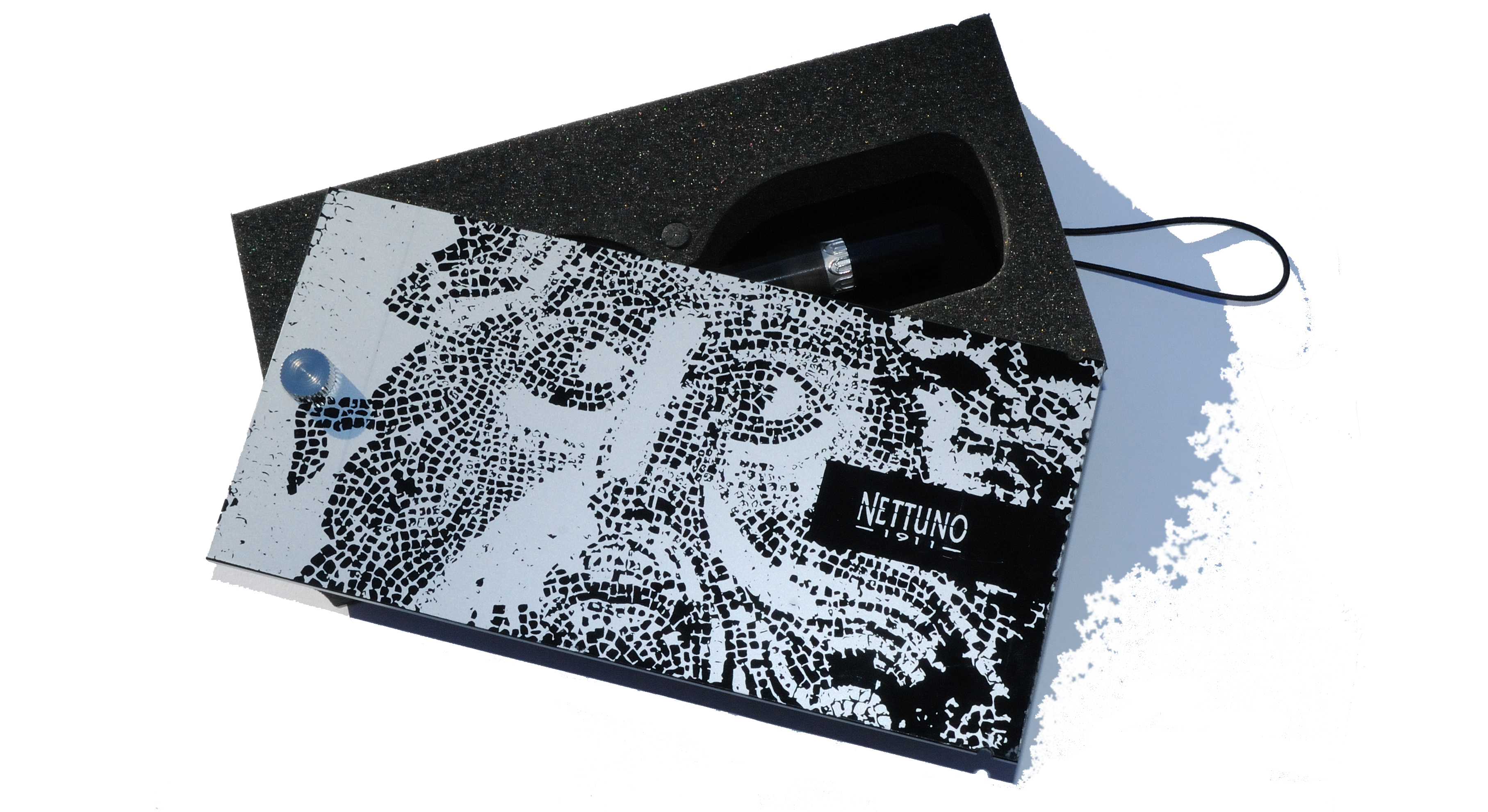
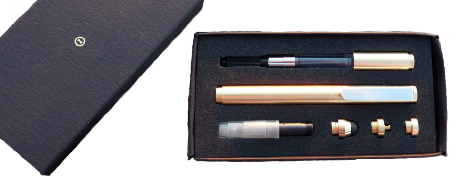
The Nettuno 1911 comes in a black cardboard sleeve and aesthetically pleasing presentation box. The box is rather unusual; a beautifully printed cover lid has to be rotated around a pin to open it, while an elastic band keeps lid and the box tightly closed . Each pen is numbered but not limited. The Netunno 1911 collection consista of ten different models currently available . The type of resin, finish and trim colour and nib coating vary from one model to another.
How it fills The Nettuno 1911 uses a threaded converter, which can be accessed via the ‘blind cap’ on the barrel (which gives access to the converter knob). Because the cartridge converter is screwed into the section, it stays in place during refilling. This is a simple but quite effective solution which effectively produces a captured converter filling solution – much like a piston mechanism, in use.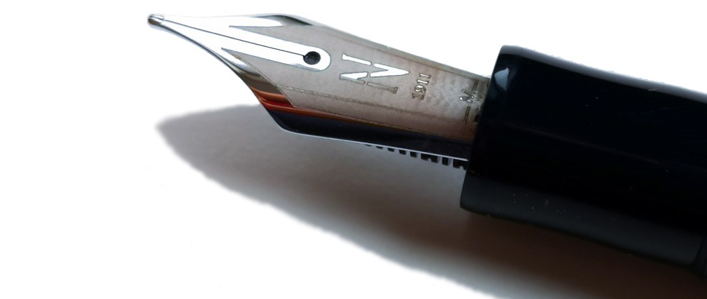
How it feels Despite its fair weight (36g capped), the Netunno 1911 feels comfortable in the hand. We found its weight to be balanced, but if you lean more towards light-weight Japanese pens (e.g. Sailor or Pilot) then the Nettuno 1911 may feel a little on the heavy side. The step on the barrel/section as well as the threads are rather smooth, but the deeply-etched trim may became noticeable during longer writing sessions, especially to those who tend to hold pens on the upper part of the grip section. Theoretically the pen can be used with the cap posted, although this makes it too heavy and unbalanced in our view.
Crucially, how it writes… The fitted steel nib writes well, and the writing experience we all had was positive. This nib is not quite as rigid as might often be expected from steel. There is a decent amount of springiness which enhances the overall writing experience. The model we tested was equipped withe a medium nib. If pressed gently, some line variation may be achieved but with regular pressure the line width is rather consistent. Interestingly, we have noticed some small problems with the ink flow which manifested as occasional ‘skipping’, which may be attributable to many things including ink properties, paper quality, etc. It may be just this unit, too. Overall, the Nettuno 1911 writes well, but on the other hand there is nothing really special and exciting about this nib either.
Pen! What is it good for?The Netunno 1911 is definitely a pen to have on the table during important business meetings. It looks elegant and shows its class. It is definitely a good ‘general use’ fountain pen, including for note taking, but perhaps not ideal as a daily, ‘all task work-horse’ pen. For those purposes it should have exceptionally good ink flow, be very ergonomic and perhaps lightweight too – and here the emphasis is a bit more upon show. There is, however, plenty that owners will want to show.
VFM £219.00 feels quite expensive for a pen with a humble steel nib; for this price many customers would expect either a full piston-filling mechanism and/or a gold nib. The nib size is unfortunately limited to western medium (M) and fine (F) only. However, the Nettuno 1911 Tritone is very well-built and the materials used are great quality too. The overall design is quite distinctive with great attention to detail, especially as regards trims.
If this isn’t quite your cup of tea, but almost… If this particular design is not not to your taste but you still fancy a beautiful Italian pen which performs well albeit for significantly less money, then the Leonardo Officina Italiana Momento Zero or Furore may be worth a look.
Our overall recommendation If you are looking for an interesting well-made pen with a characteristic themed design then the Nettuno 1911 could be a good choice. The craftsmanship and choice of materials are excellent, giving this pen a premium feel. Beautiful and somehow unique presentation enhances its ‘high street’ appearance. However, if writing experience is more important to you than the aesthetics then there are many significantly less expensive pens equipped with good quality steel nibs out there. 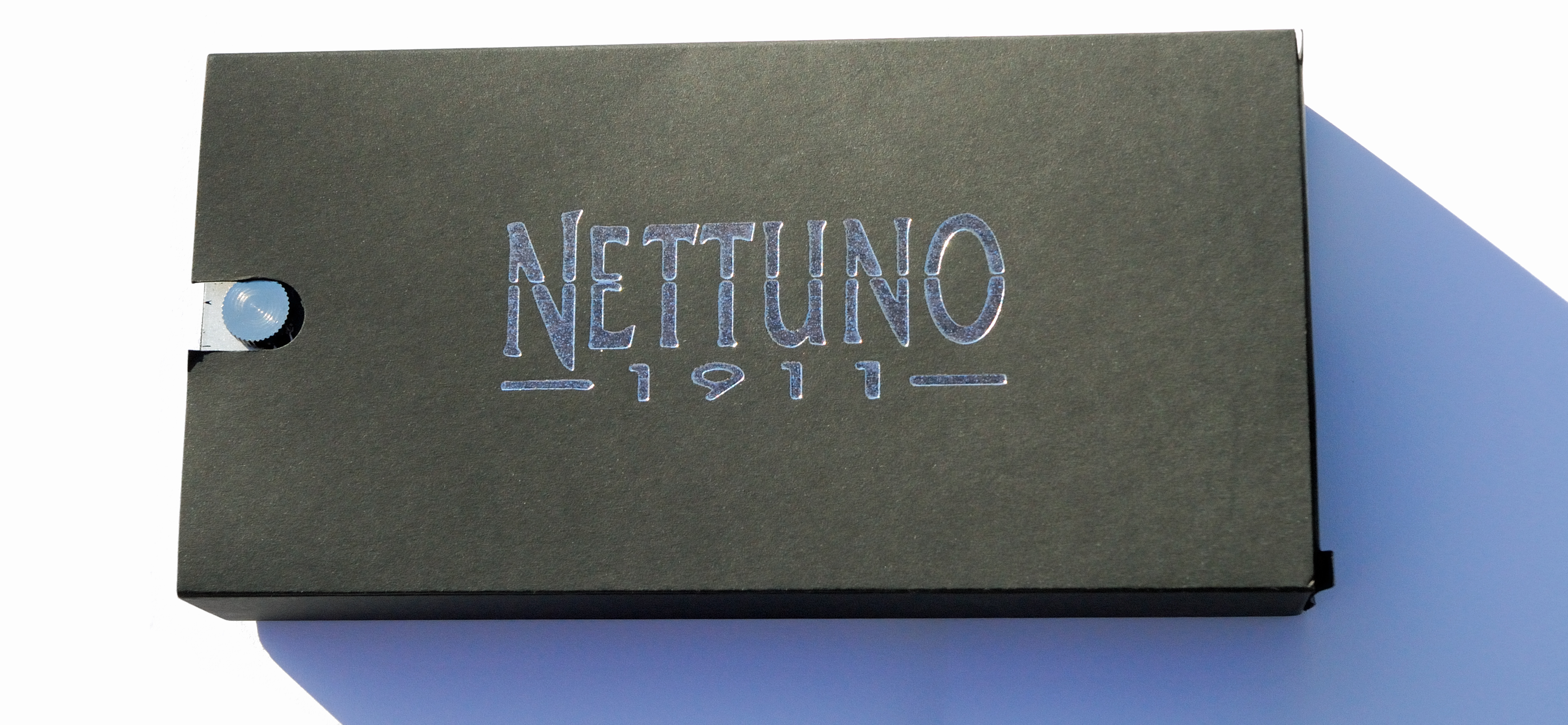
Where to get hold of one Nettuno 1911 is available in the UK from iZods Ink who are the official Nettuno 1911 official retailer. The price tag on this pen and other models in the series is £219.99. 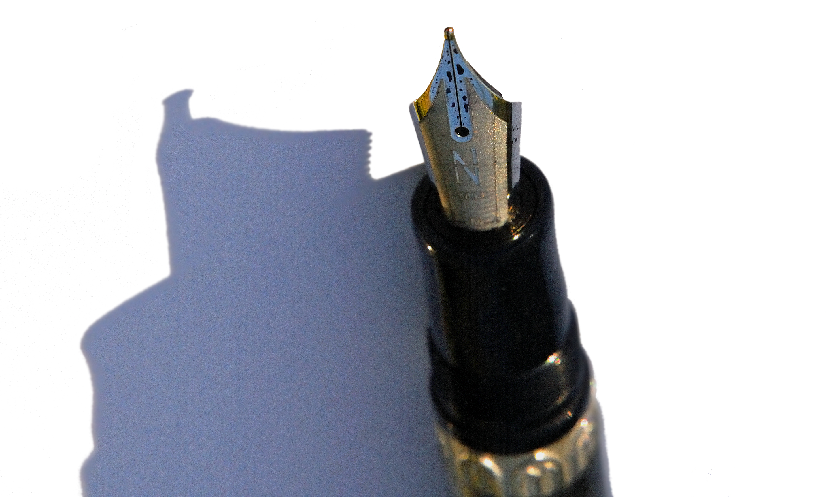
This meta-review references:
Thanks to Roy at Izods for sending us this pen to play with.
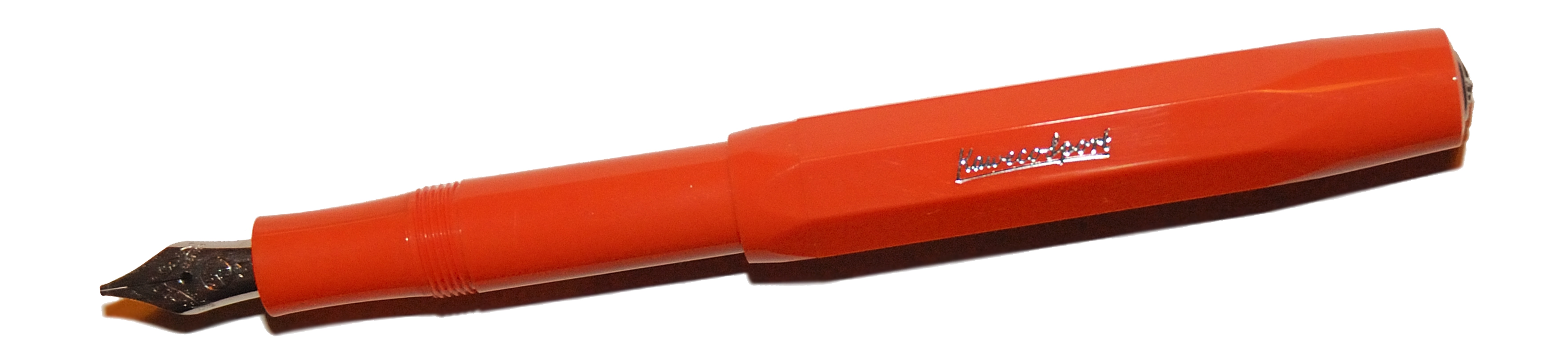
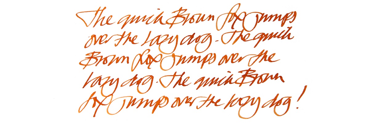
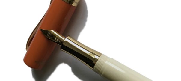
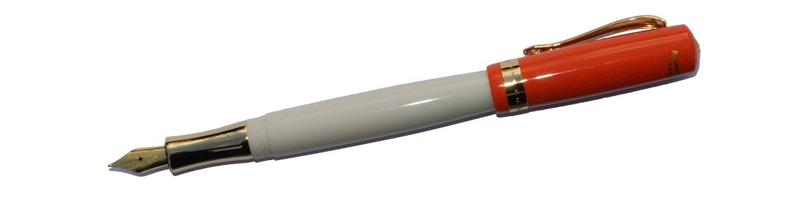
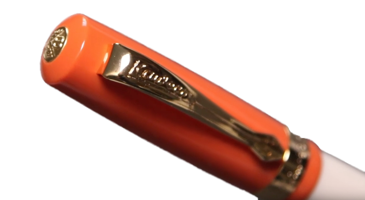
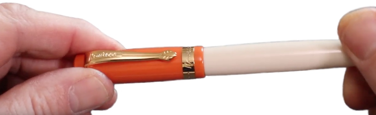
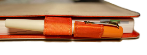
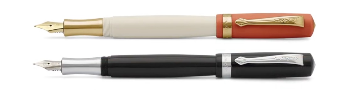
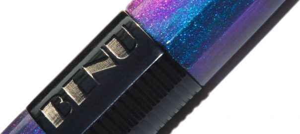
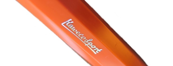 How it looks The shape is, of course, the same as for all Sports. The colour is a reliably foxy dark orange (don’t show it a beagle), with a few silvery highlights. It’s a classy presentation.
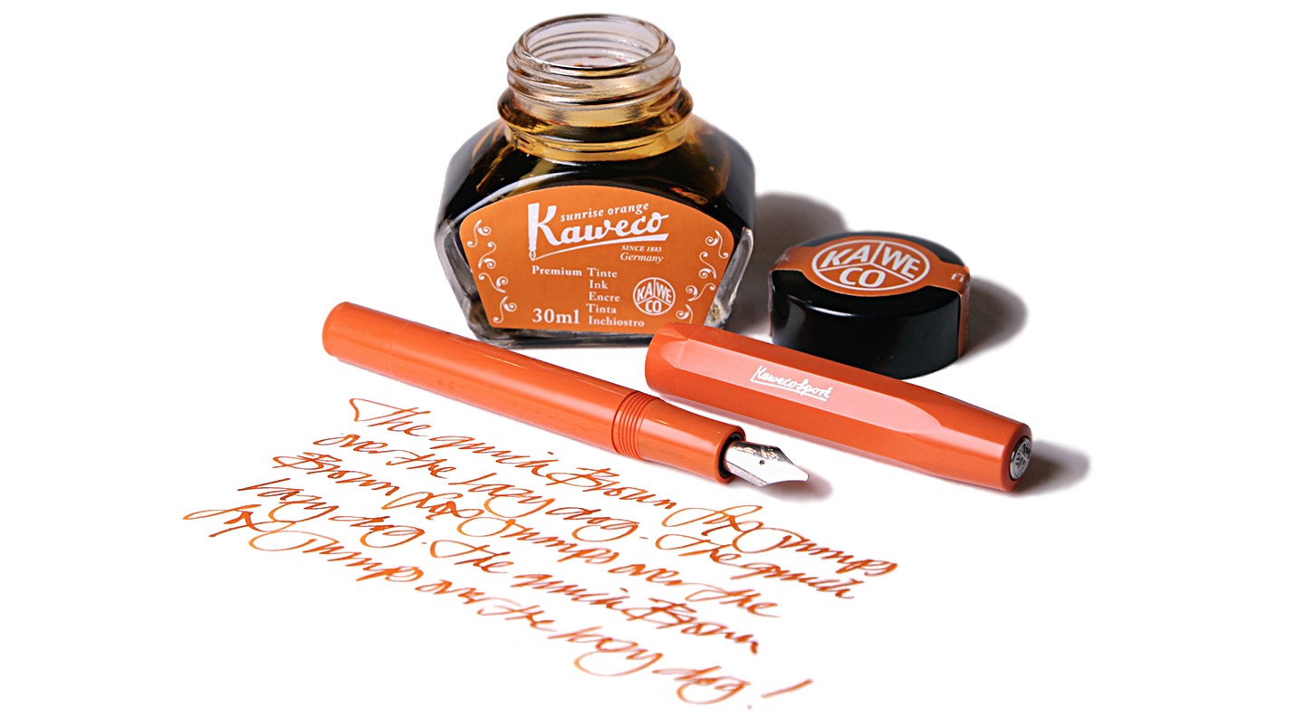
 How it fills The Sport has a legion of fans who also own a syringe, and refilling a cartridge is probably the best way to get a decent supply of ink. There is also a tiny push-rod converter, and it actually does work, but the ink capacity is very modest.
 VFM At under £20, this is decent value – no complaints there.
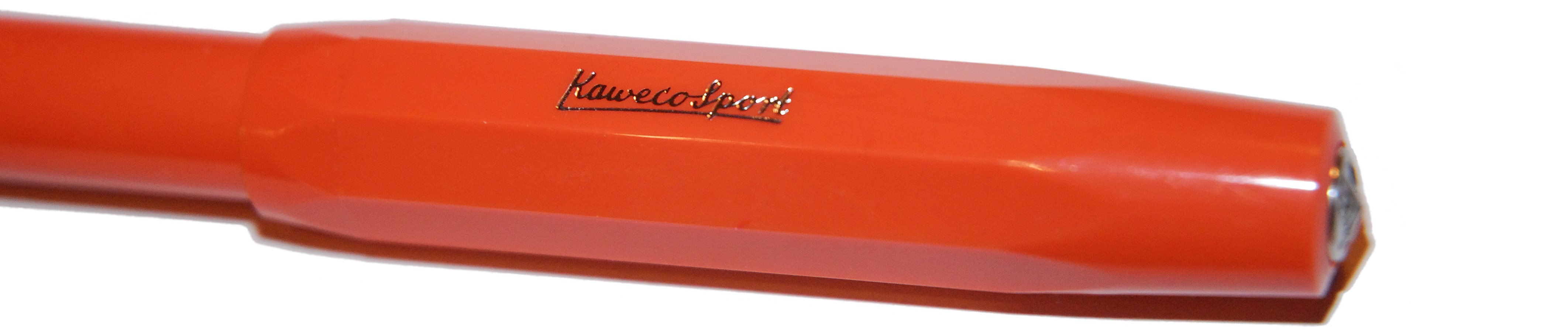 If this isn’t quite your cup of tea, but almost… Pick a different Sport; there are dozens to choose from!
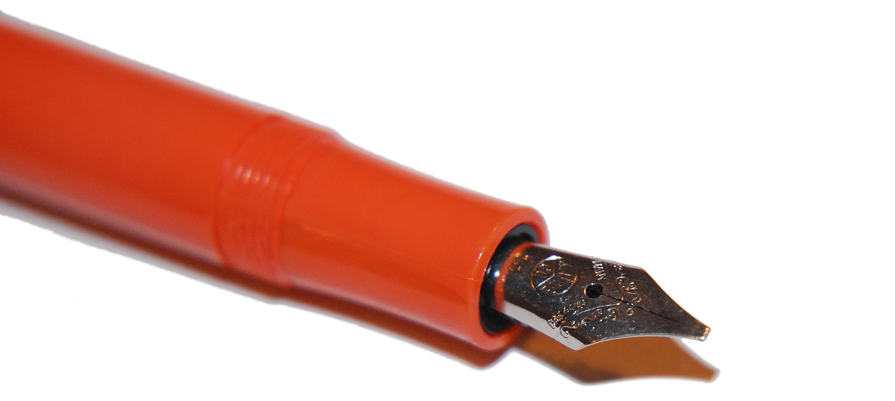 Our overall recommendation If you like the colour, and you’re already a happy owner of a Sport or two, get one before it bounds over the hedge.
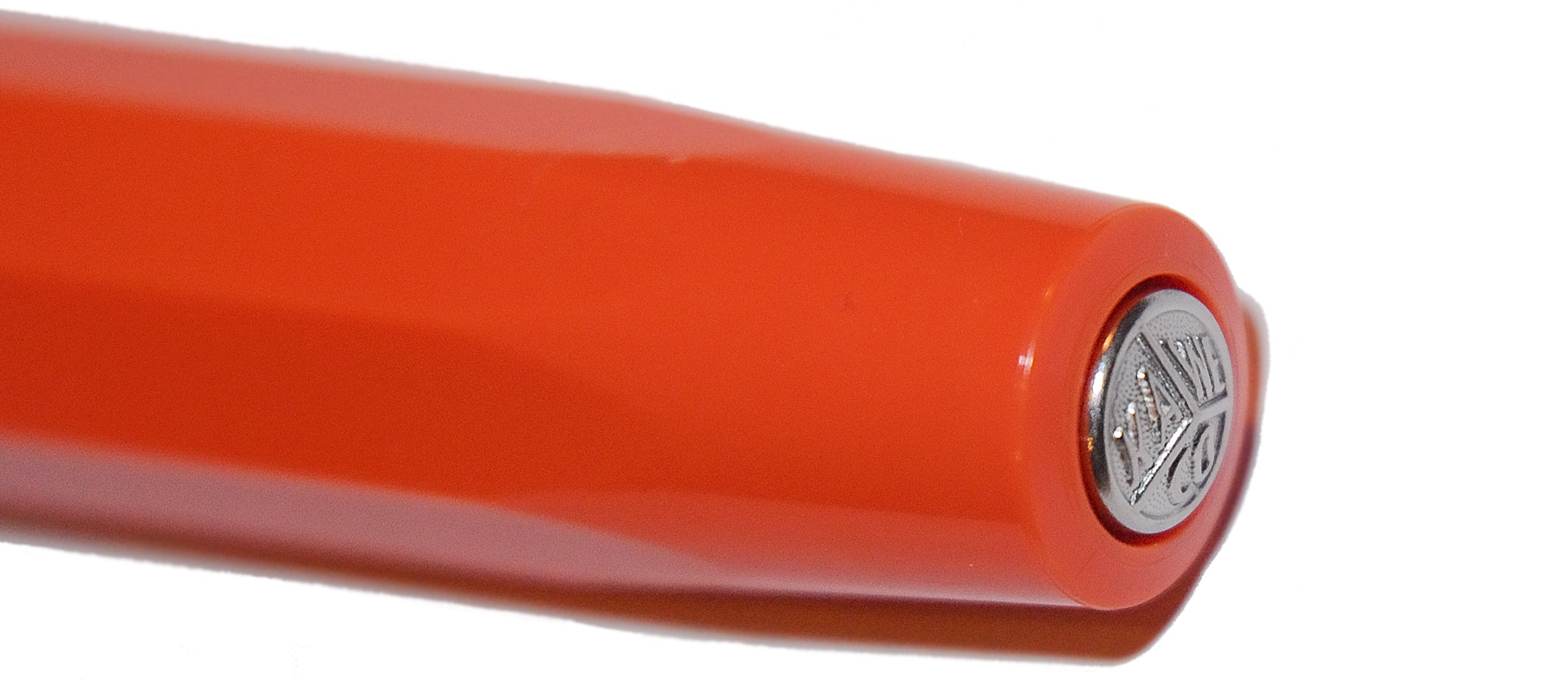 This meta-review references:
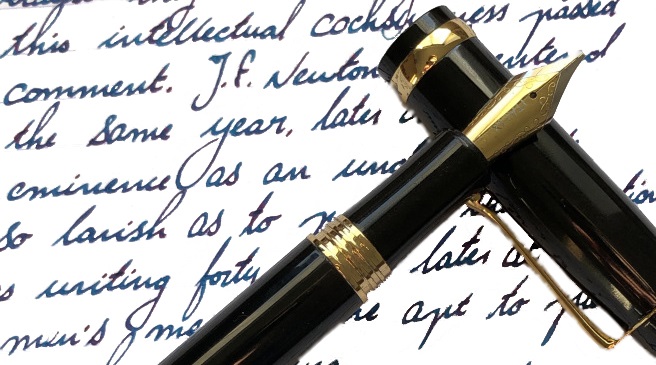
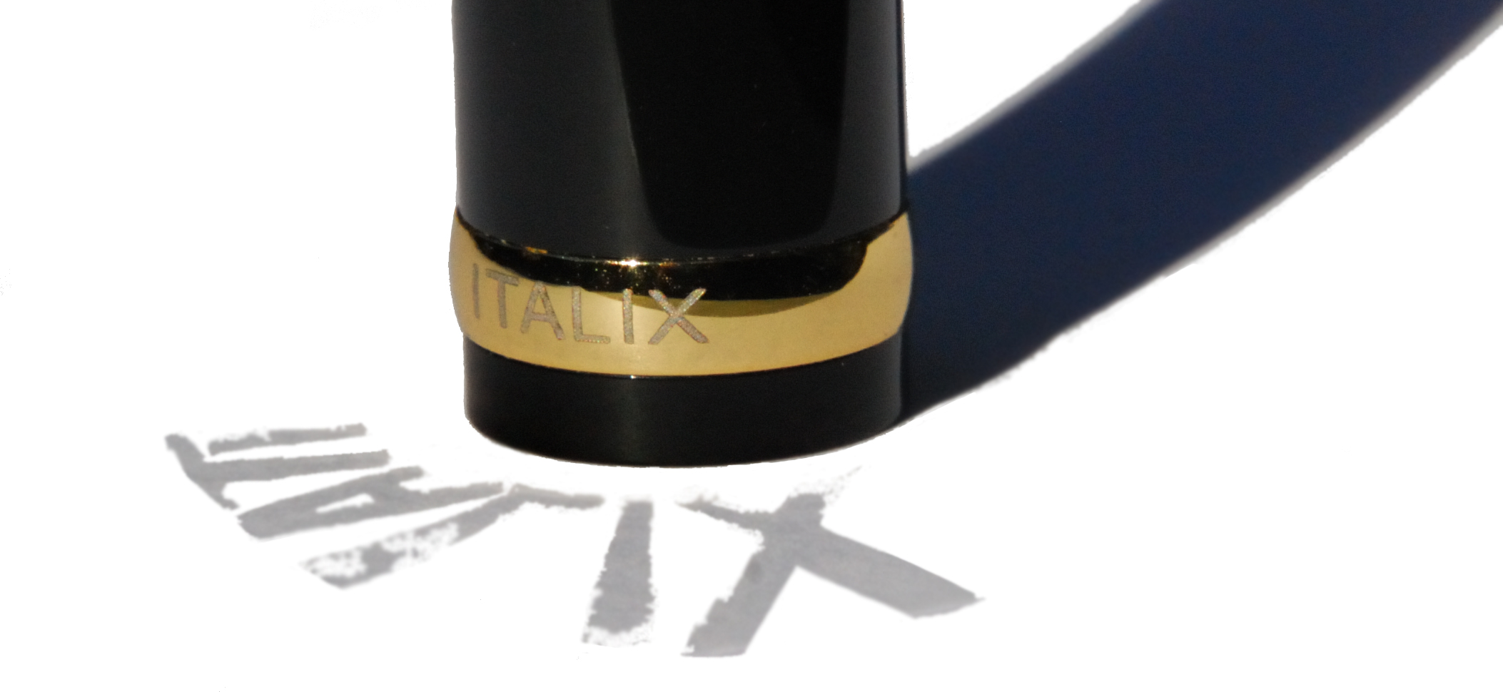
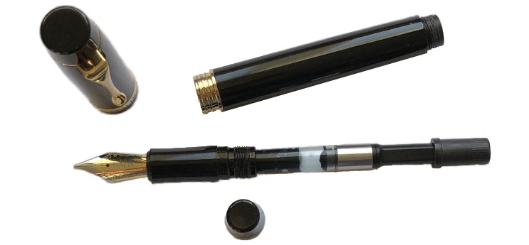
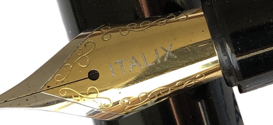
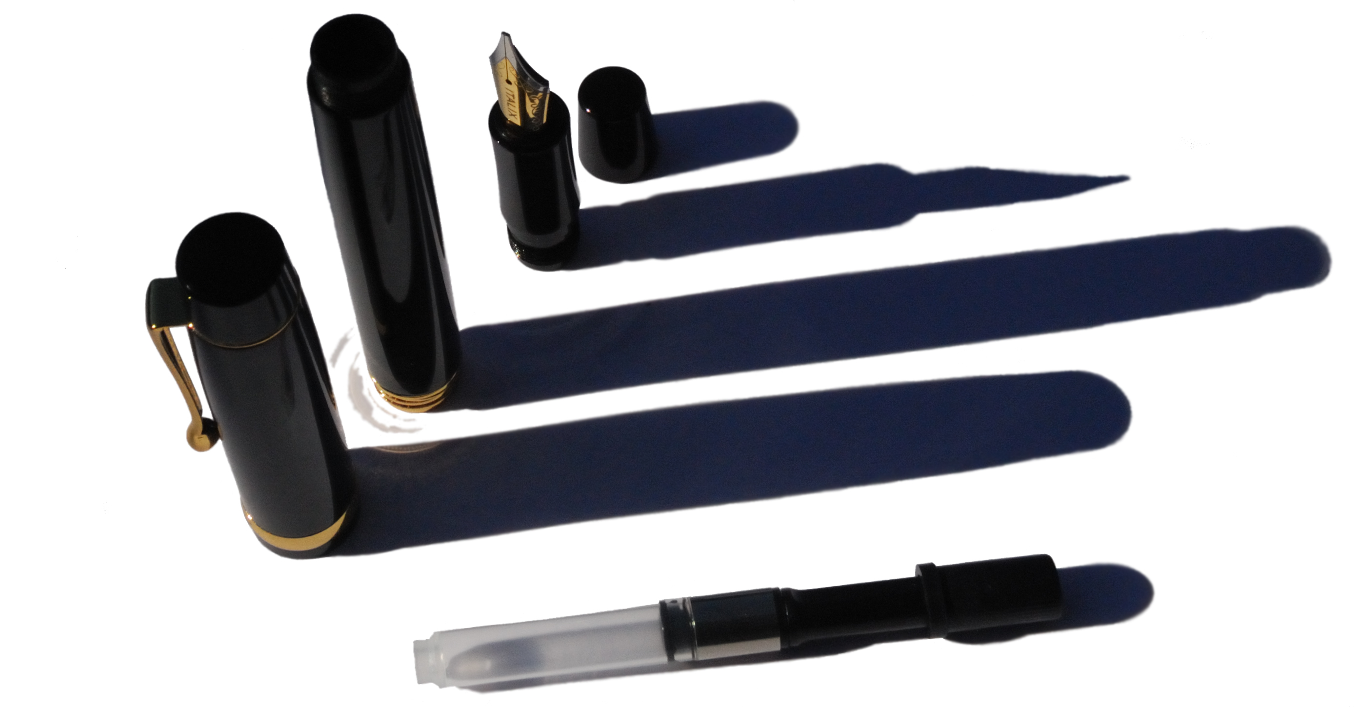
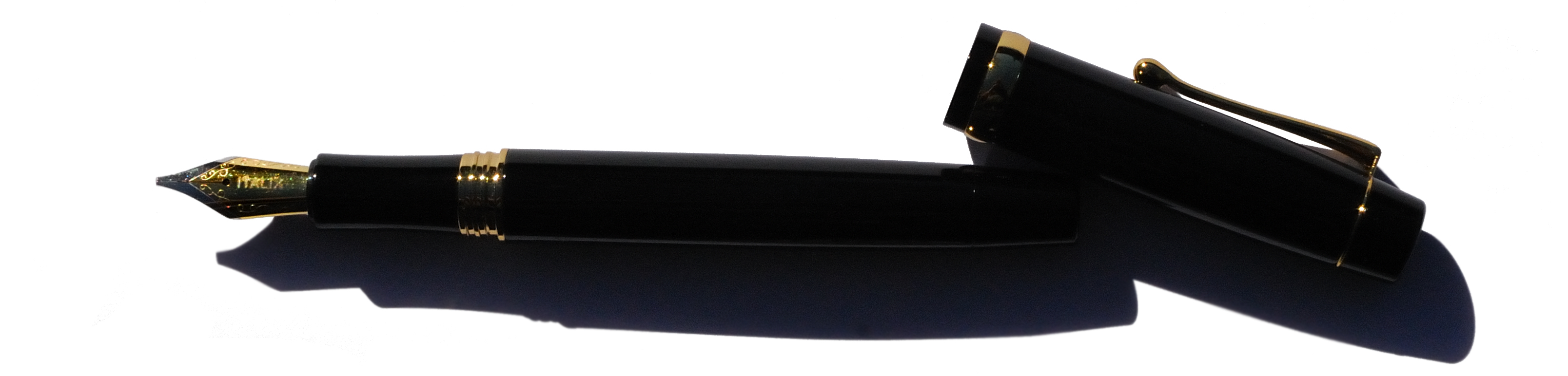
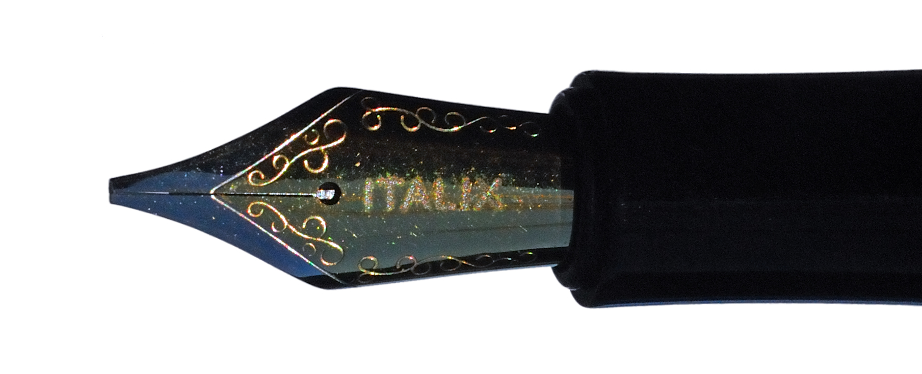
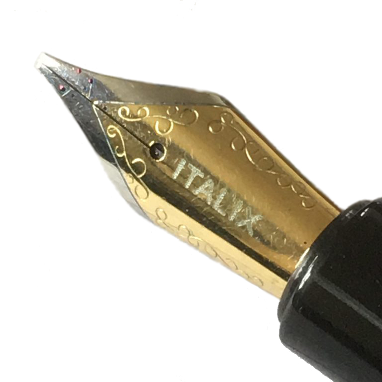 A little bit of history Italix is an increasingly legendary name in fountain pen circles, having been made famous by the Parson’s Essential model in particular, and we’ve reviewed a couple of their models very positively before. The usual modus operandi is to commission an inexpensively-manufactured body from China and fit it with a high-quality German (generally JoWo) nib which has been ground, fettled and finished by the proprietor – Mr.Pen himself. It’s been a winning formula previously, so we were keen to get our hands on the latest offering…
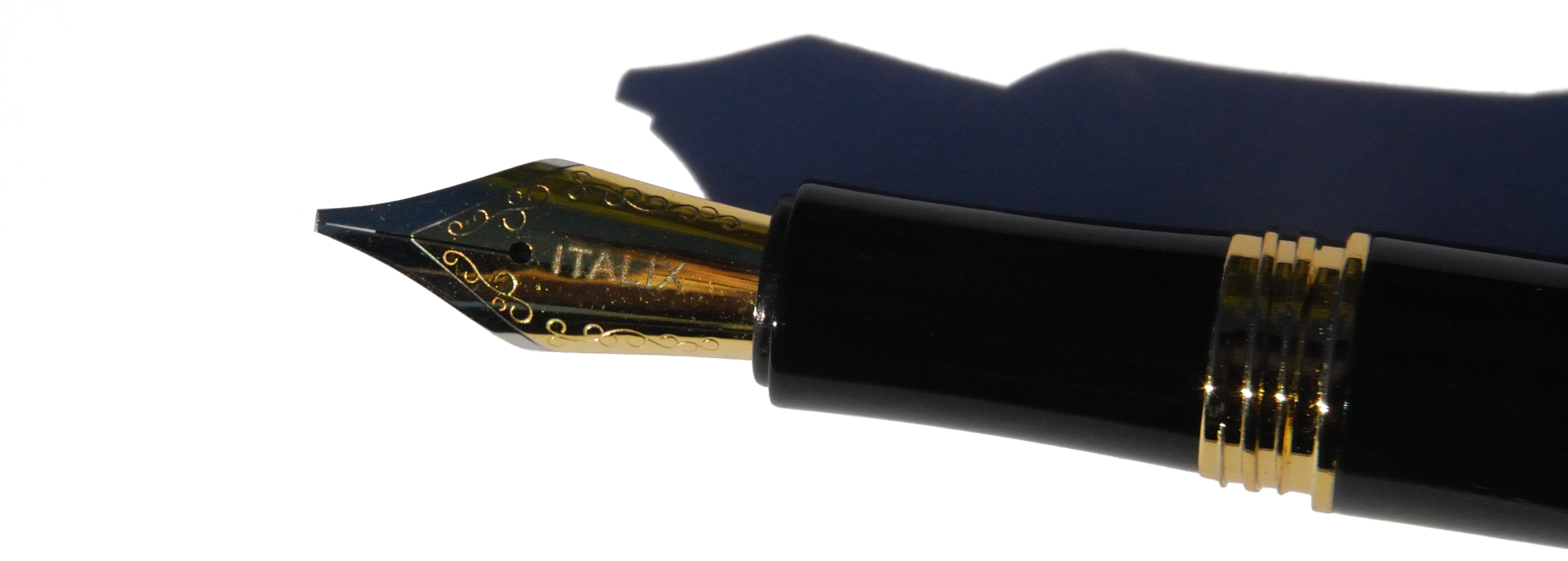
 Thanks to Mr. Pen for kindly providing this review sample.
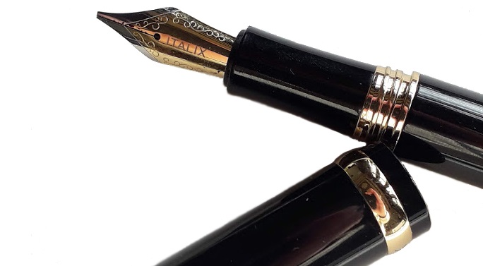
 If this isn’t quite your cup of tea, but almost… Then you have most individual tastes! For a colour scheme along these lines, the vintage market is probably the best place to look. But if you like the shape and just don’t consider the 1970s the decade of peak elegance, the main Student range is worth a look – our tip is the demonstrator version.
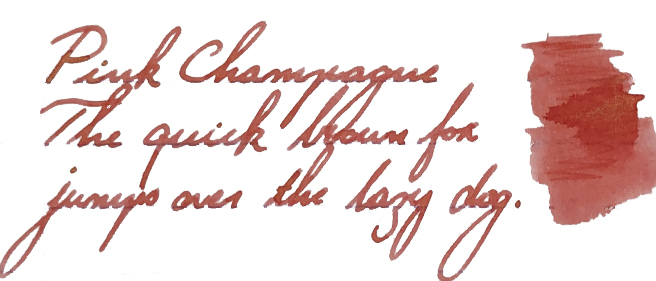
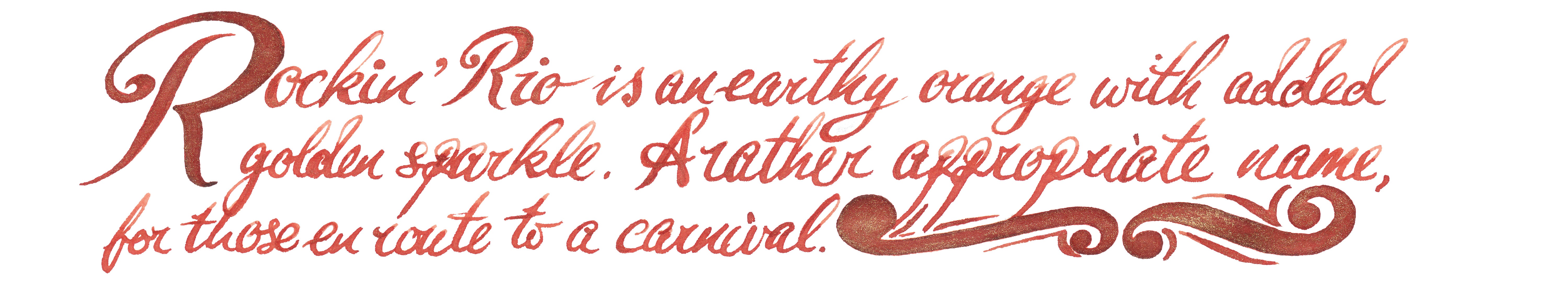
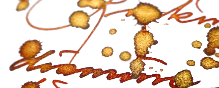
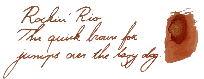
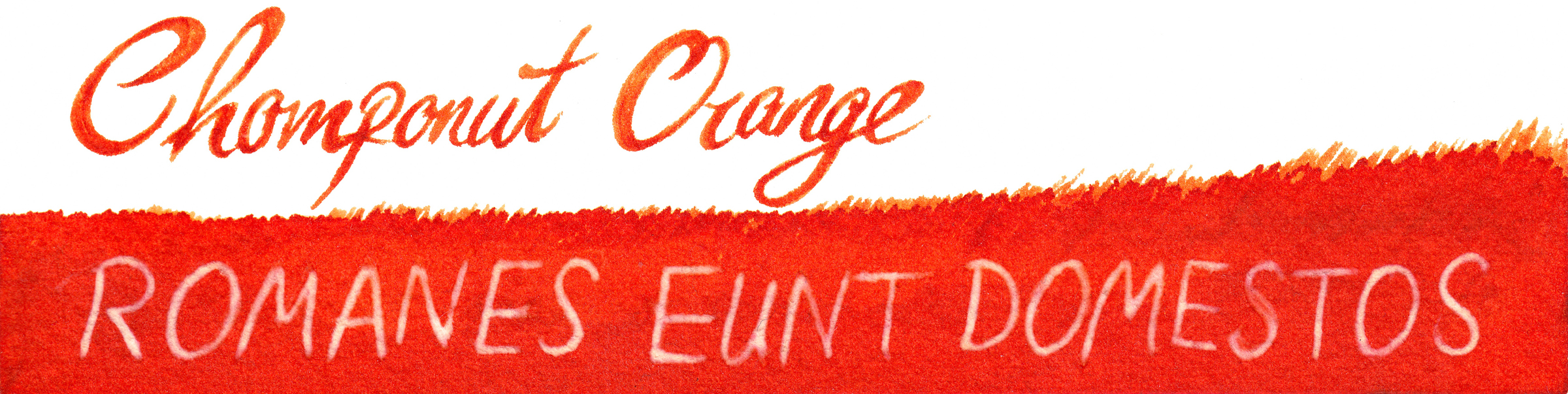
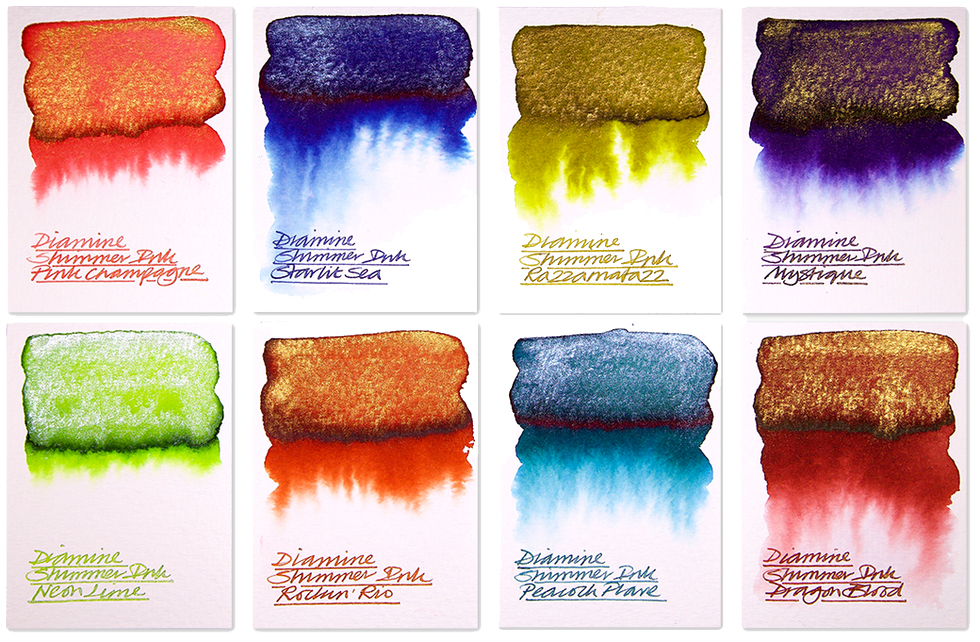 A little bit of history This is a festive tradition now, so the British ink legends
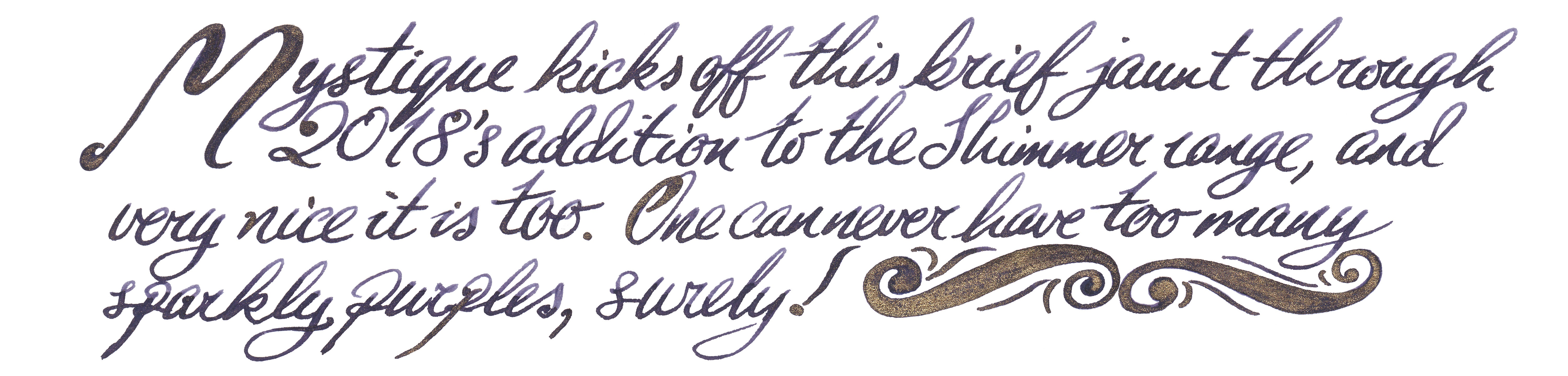
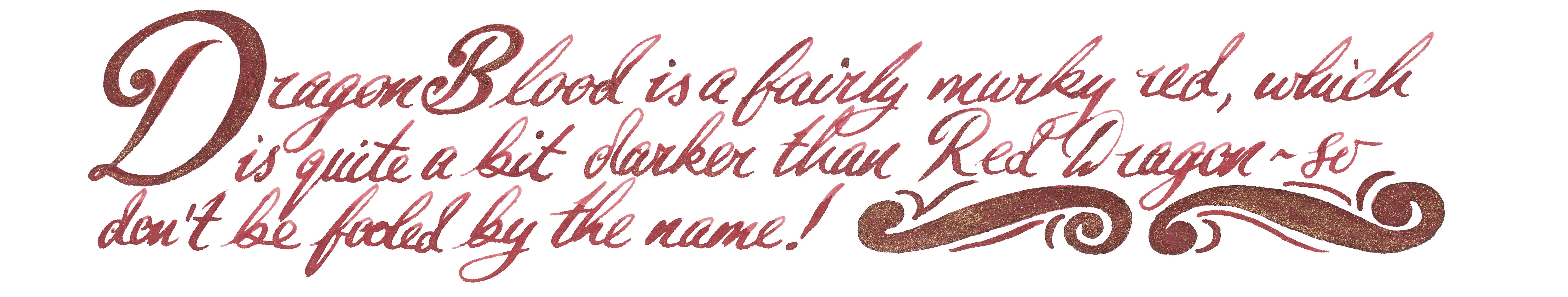

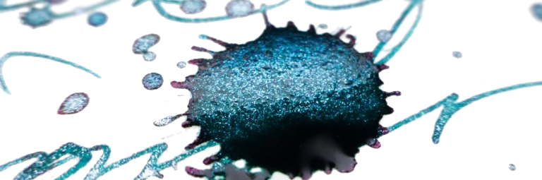
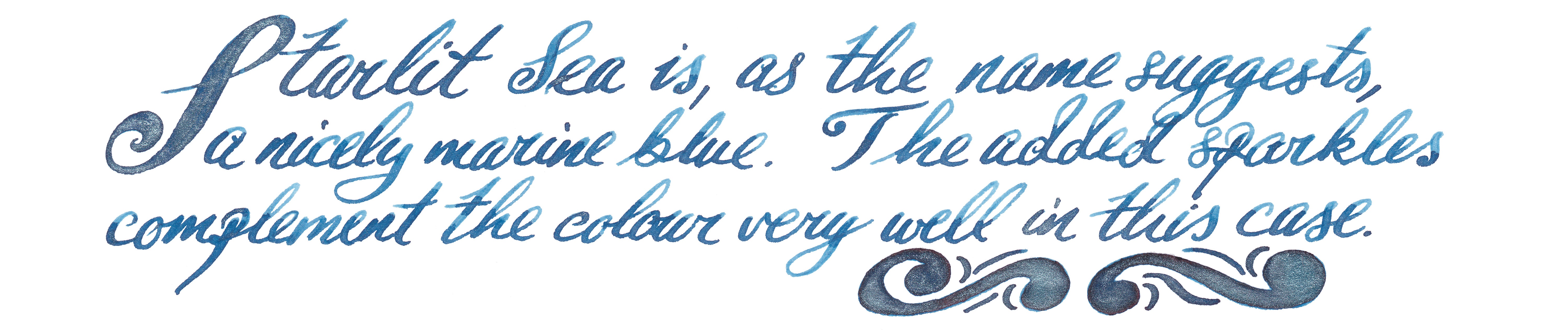
 If this isn’t quite your cup of tea, but almost… If you feel uncomfortable using this type of inks with your fountain pen, you can always try them out with glass pens. It is definitely a safe alternative and the effects are still very good. If you’d prefer to try pearlescent inks from a different manufacturer, then J. Herbin, De Atramentis and more recently Robert Oster all have alternatives worth considering – albeit at significantly higher prices.
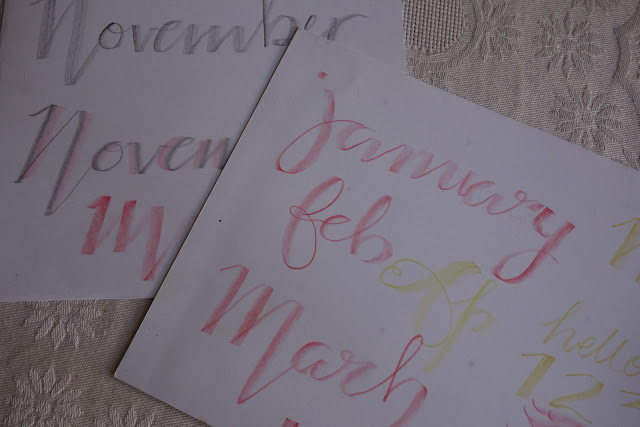
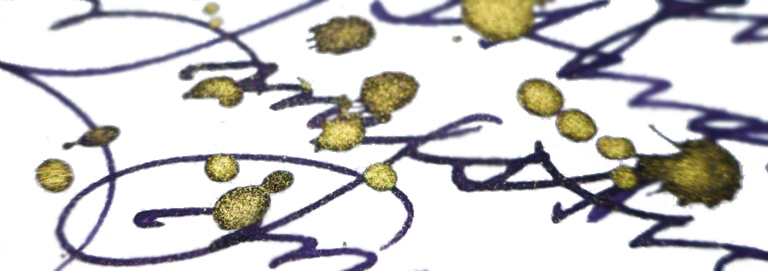
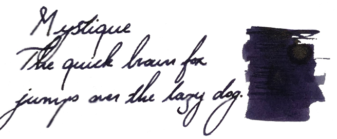
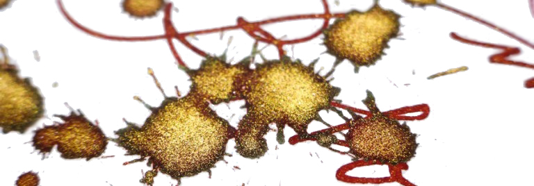
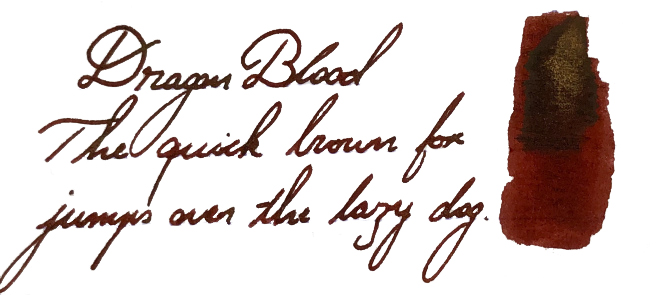
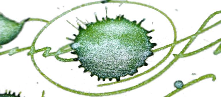
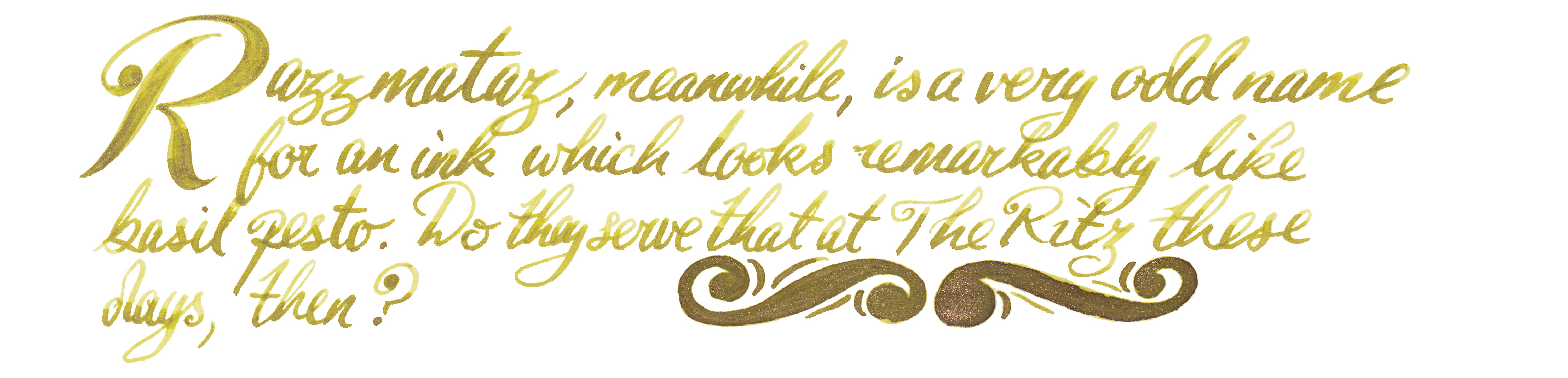
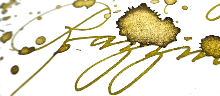
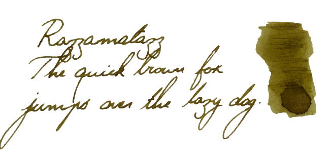
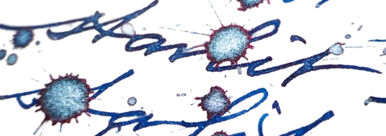
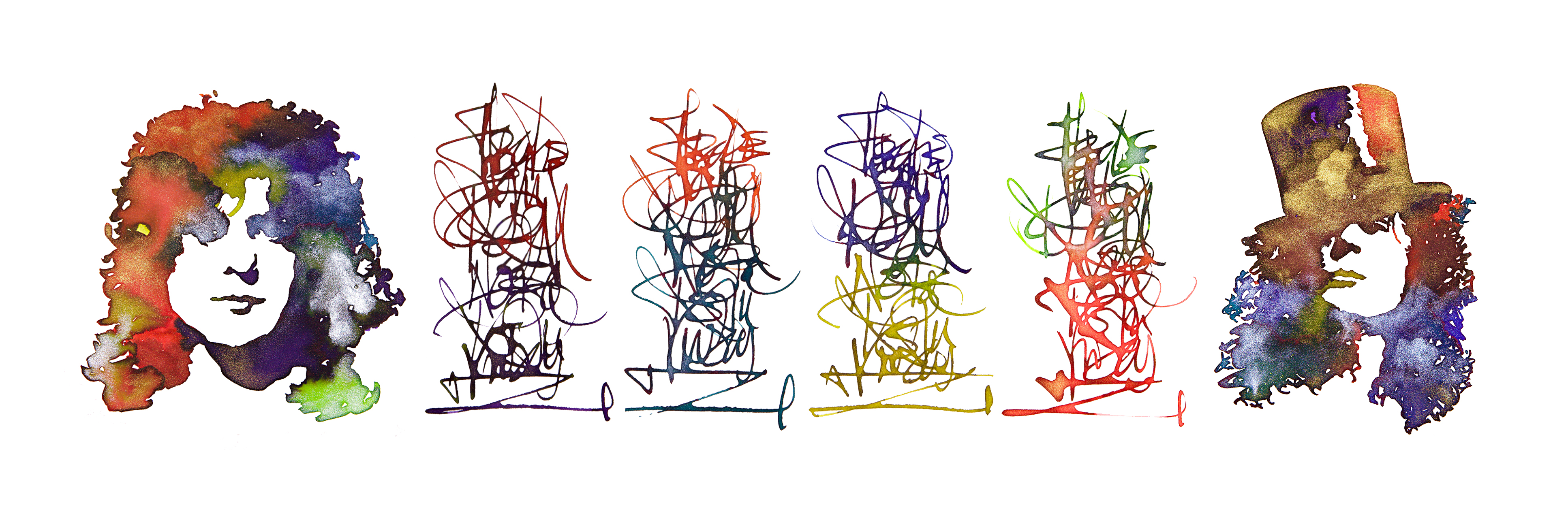
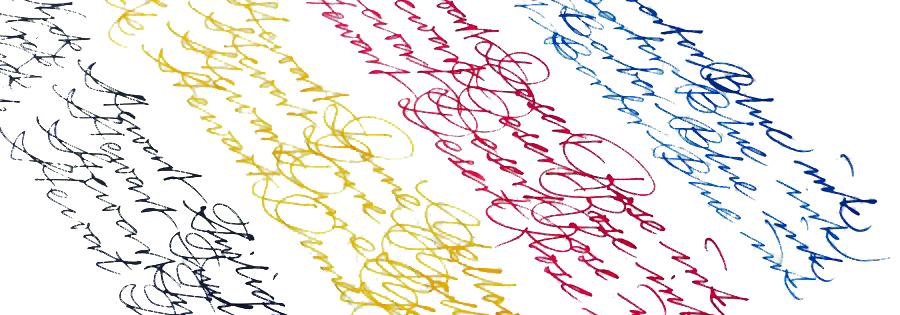
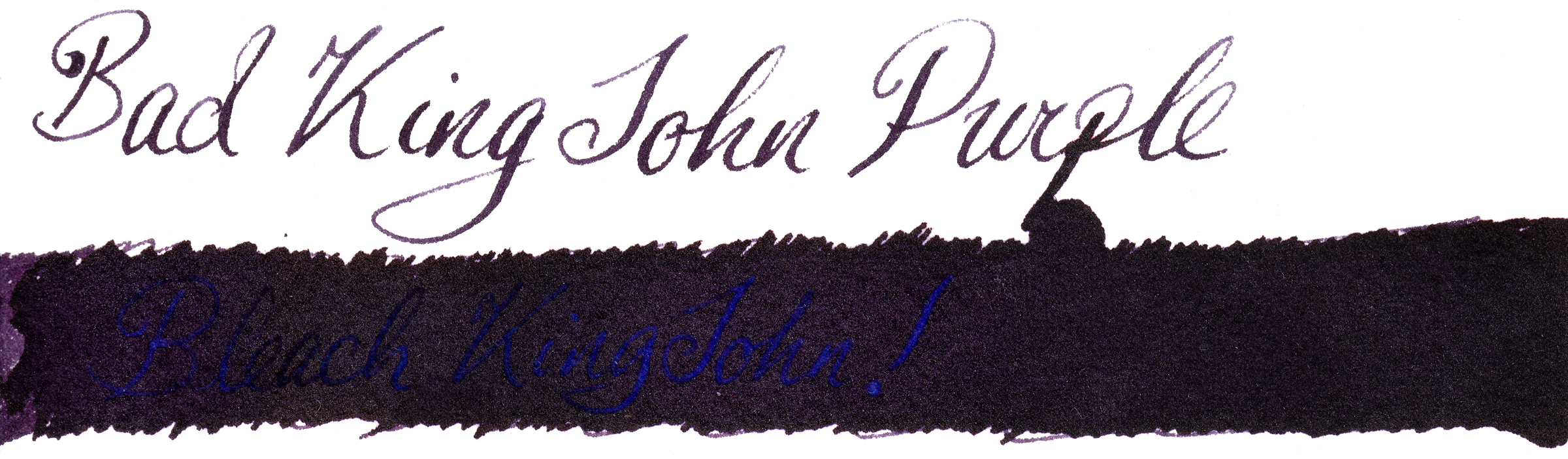
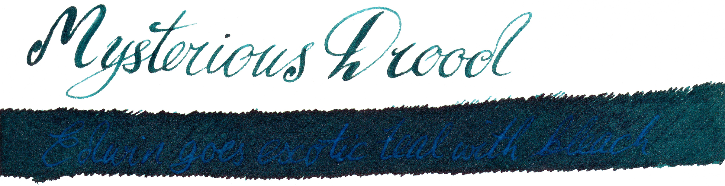
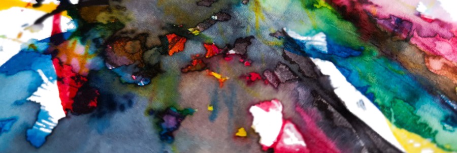
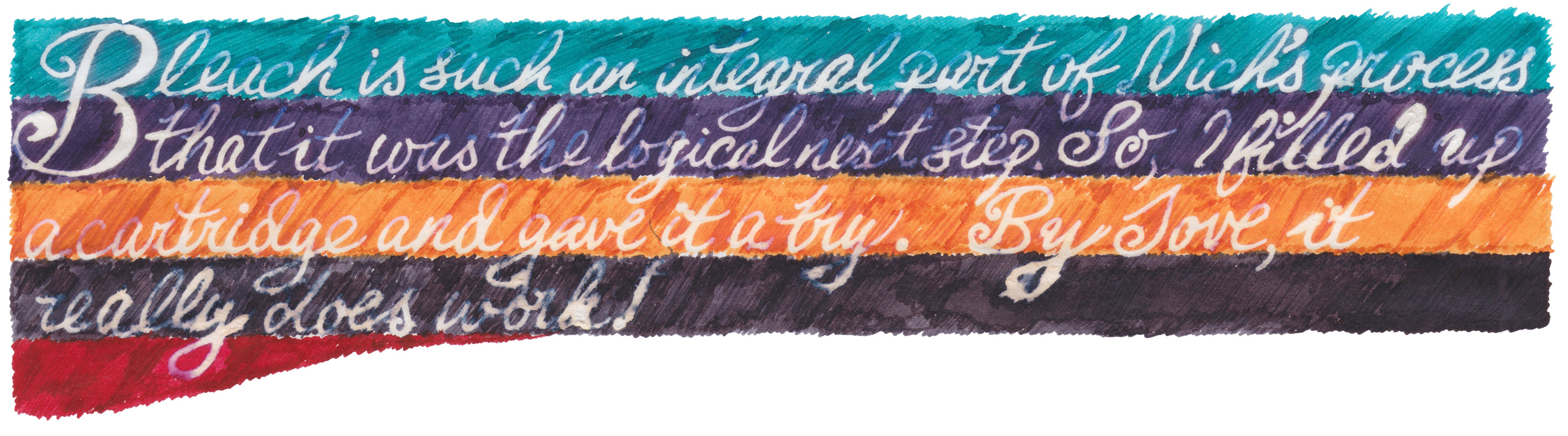
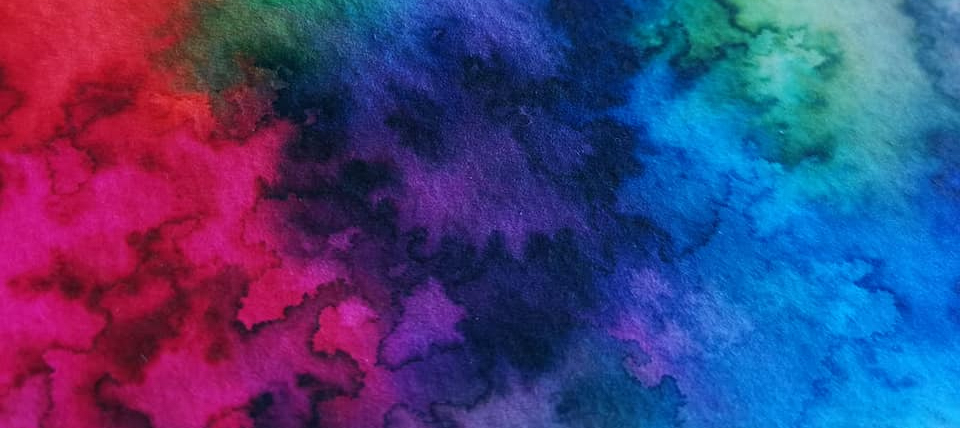 A little bit of history Nick Stewart is a creative designer, artist, calligrapher and educator from historic Rochester, on the Thames estuary in Kent. Nick also actively contributes to United Inkdom. As an artist he is very passionate about inks, especially their chromatic properties, breaking down all possible hues and tonal ranges present in any ink he works with. He has tested hundreds and hundreds of inks which allowed him to understand how they are made and what factors are affecting specific properties. There is a hint of alchemy in his work, especially when Nick experiments with bleach to test how the destructive process which results can create something new and exciting.
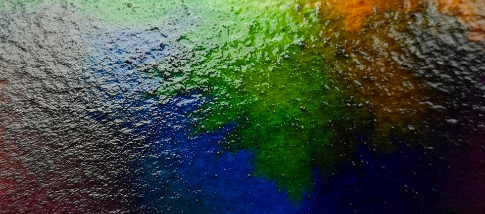
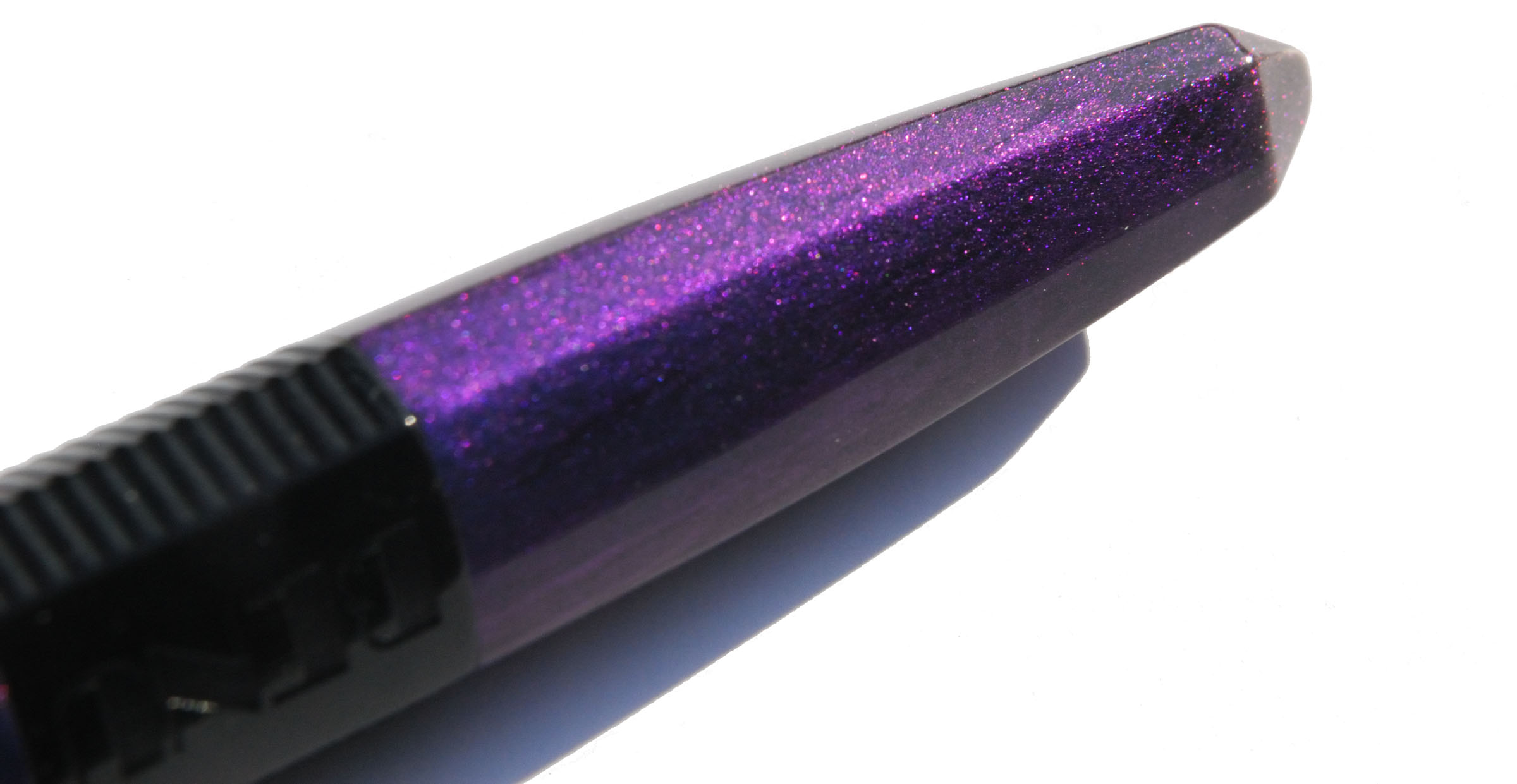
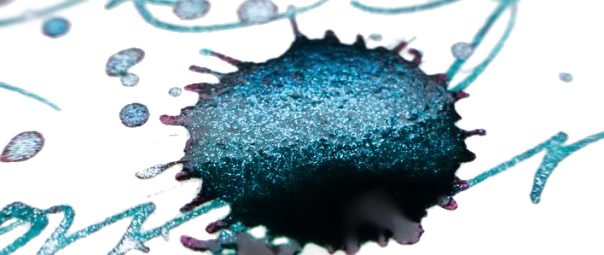
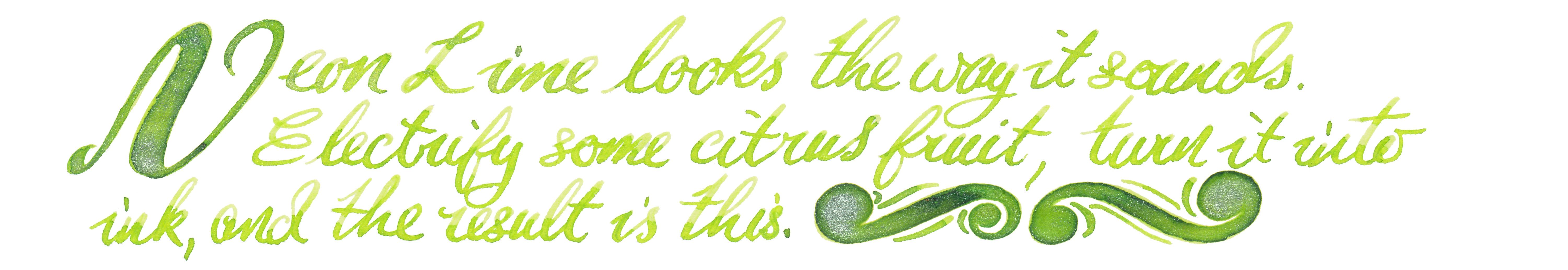
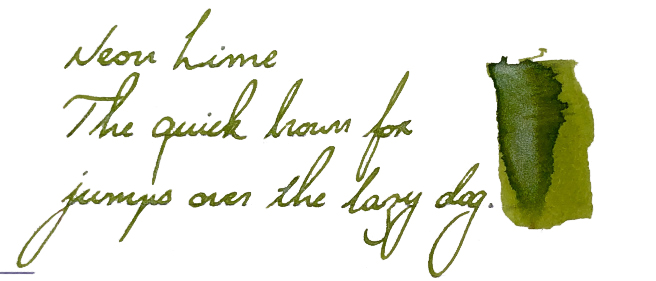
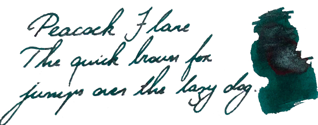
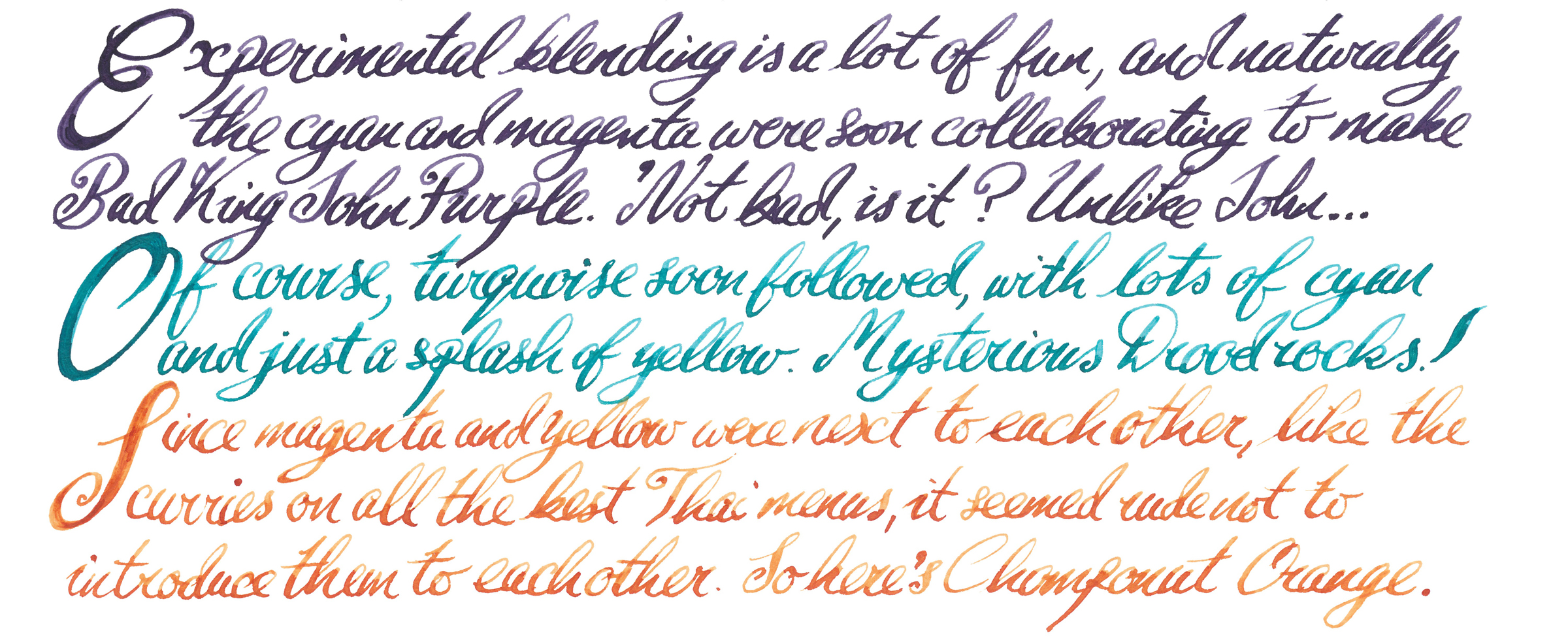
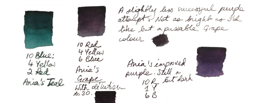
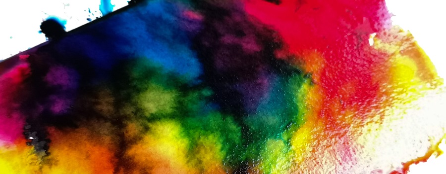
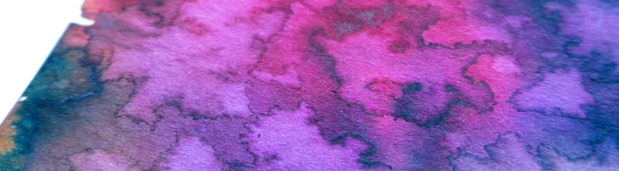
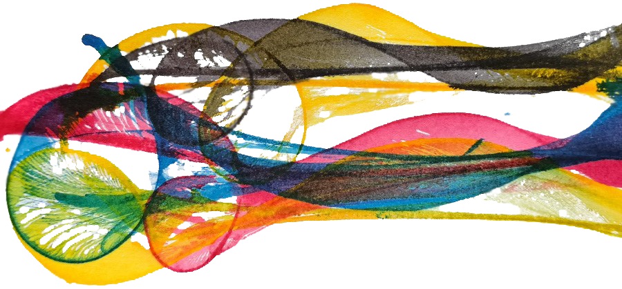
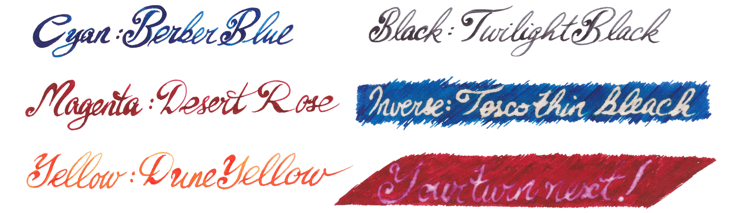
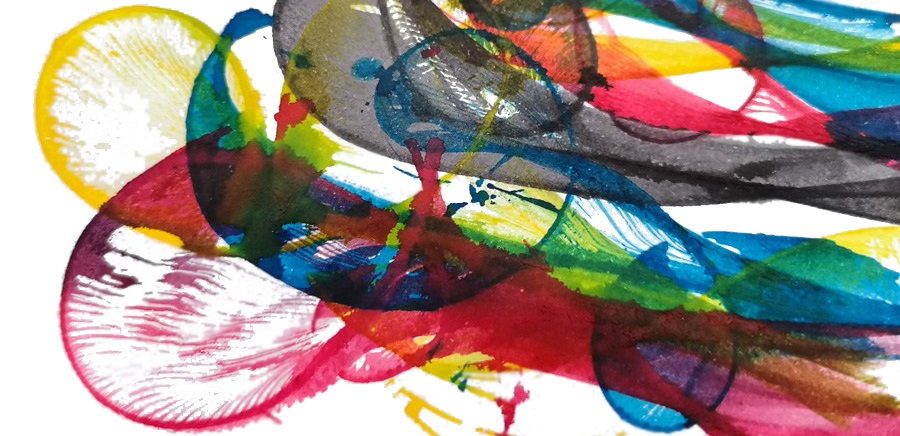
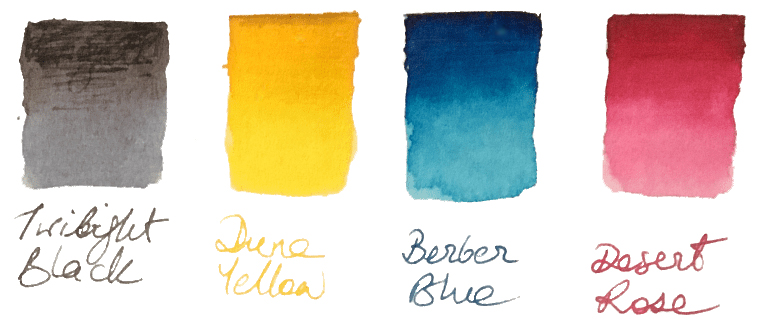 How it looks Nick’s set contains four independent 30ml inks. The intended purpose is to blend them together to obtain new colours, but each ink can be used separately as a stand-alone fountain pen ink. The colours available in the set are: Berber Blue (C), Desert Rose (M), Yellow Dune (Y) and Twilight Black (K). These are not ‘pure’ CMYK colours, and each ink has its own unique characteristics. However, when mixed together they still create a full range of secondary and tertiary colours.
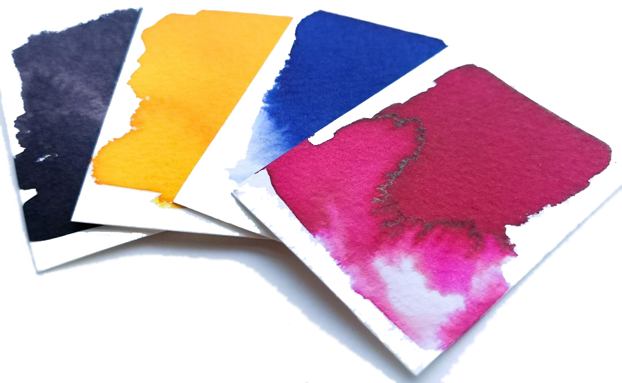

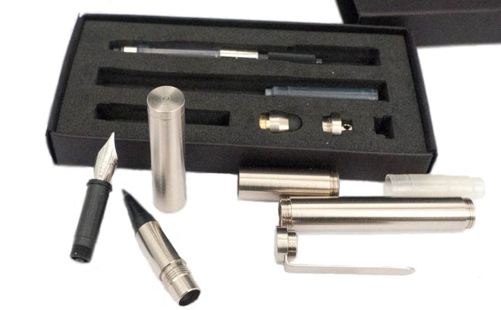
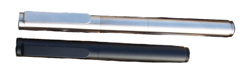 How it fills The ‘pocket’ configuration will fit only a small international cartridge, but the extended version has space for a proper twist converter.
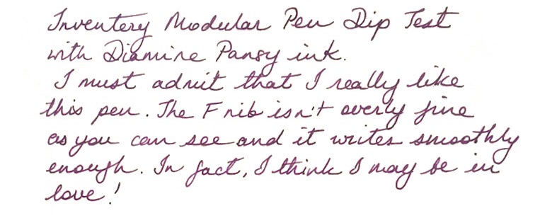 Pen! What is it good for? It’s good for, depending upon your point of view, customisers who like to regularly reconfigure and re-invent their pocket pen, or for terminally indecisive fidgets!
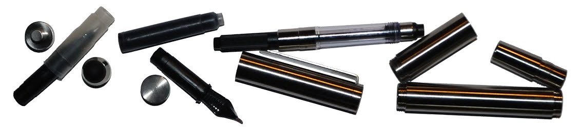
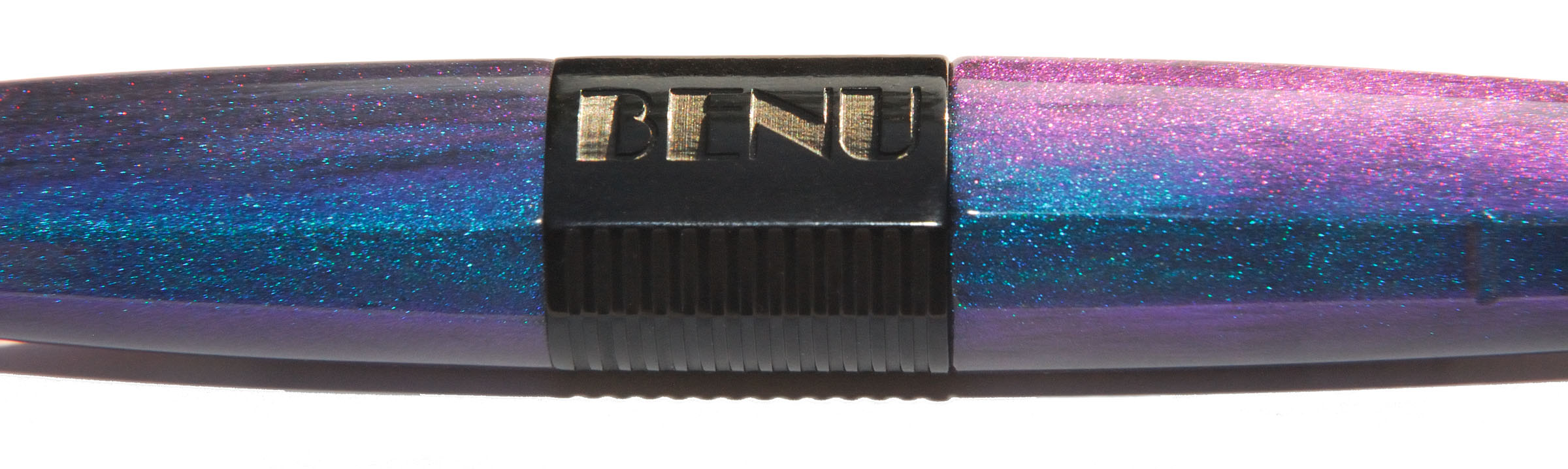
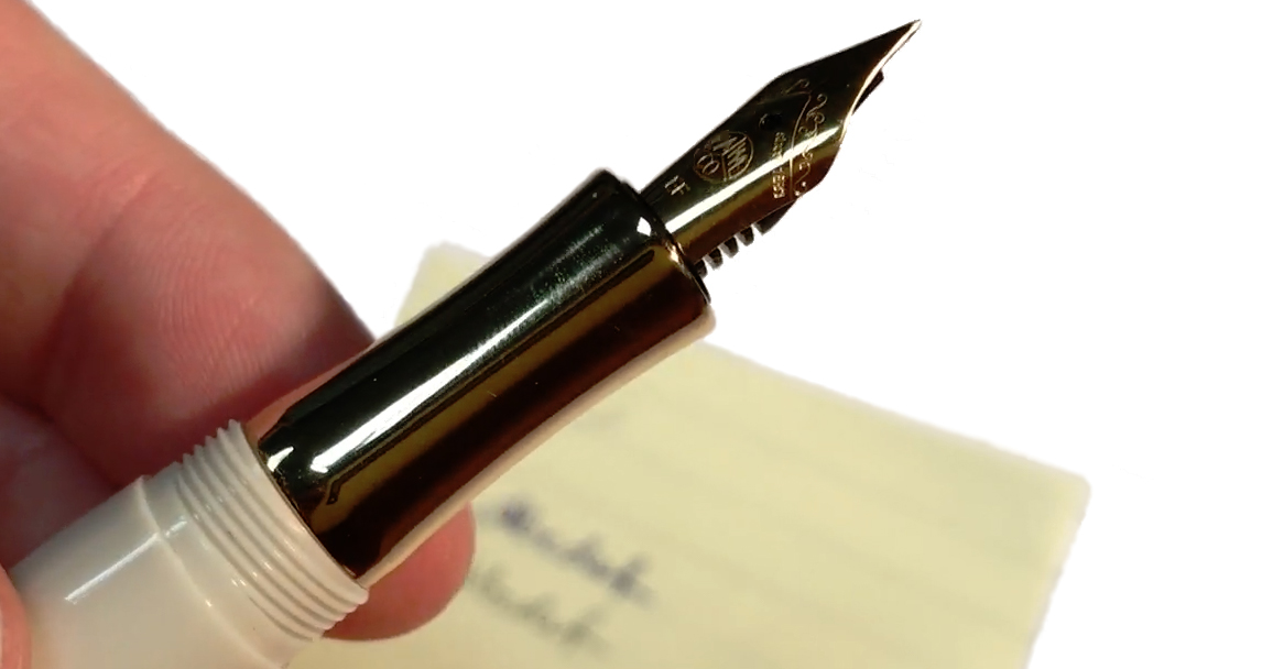
 How it fills Benu very sensibly use an international standard cartridge or converter.
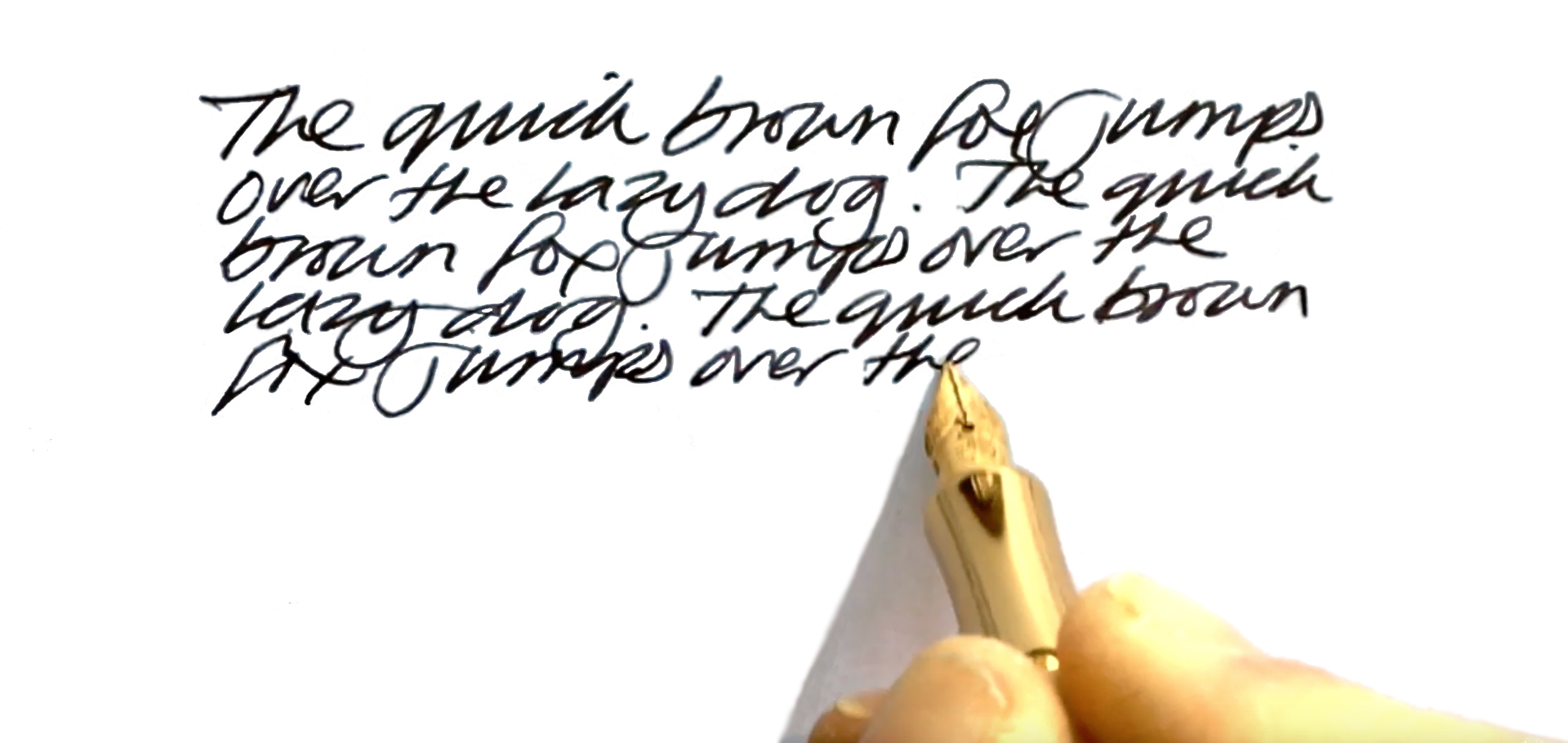
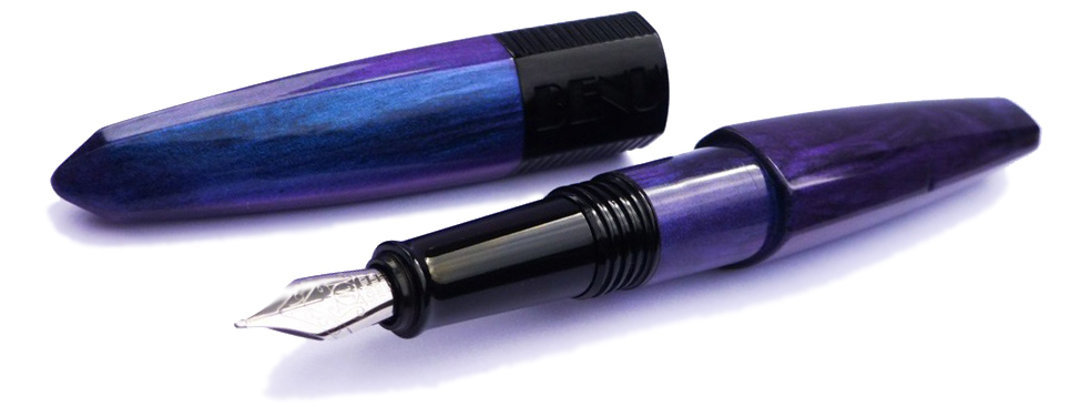 Crucially, how it writes… The nib is a generic steel Schmidt #5. The one on our review unit had good flow and behaved itself very well with no skipping or hard starts. It had some feedback which we felt was just the right side of acceptable but might not be for everyone. It isn’t the greatest nib but it works well and is easily replaced.
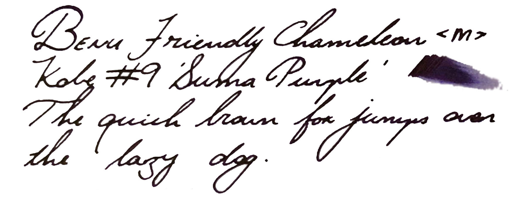
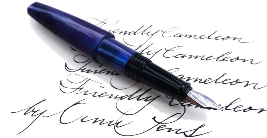
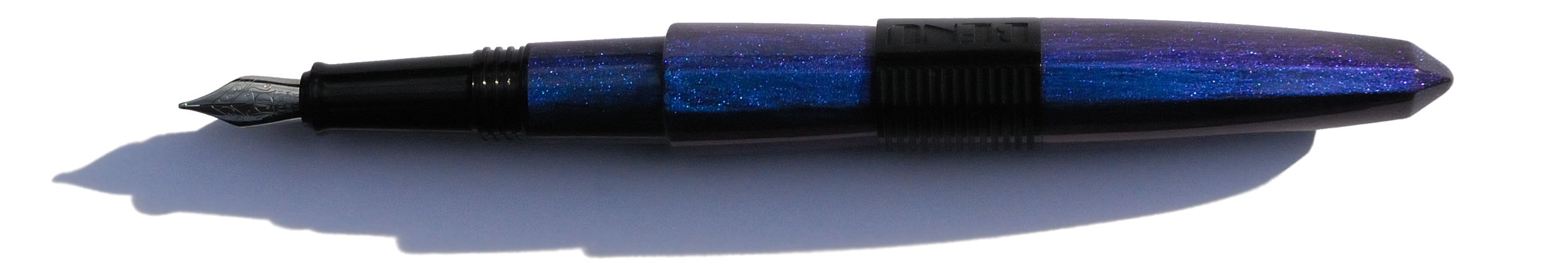
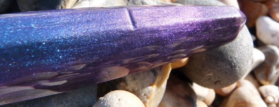
 Pen! What is it good for? The Friendly Chameleon writes well and is comfortable in the hand and so, fortunately, is an excellent pen for doing lots of writing! It’s also good for just gazing into, while waiting for inspiration to strike.
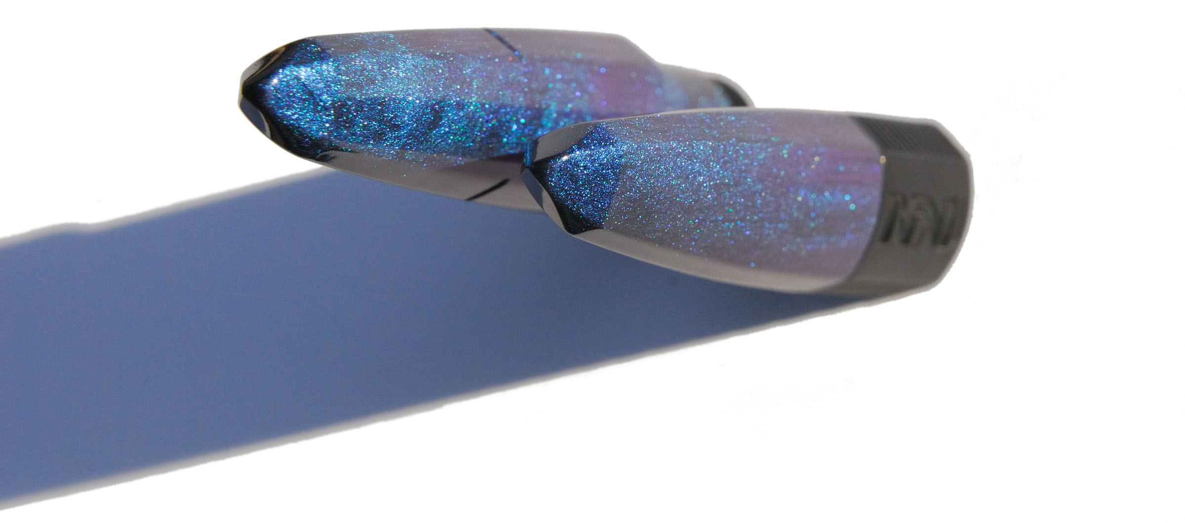 VFM At $90 (plus another $5 for a converter) this isn’t a cheap pen but it’s unique in shape and colour. It would be good to see a higher quality nib but if you like the design (and, let’s be honest, you’re going to either love it or hate it!) then a pen that works well and is this unusual is good value at this price.
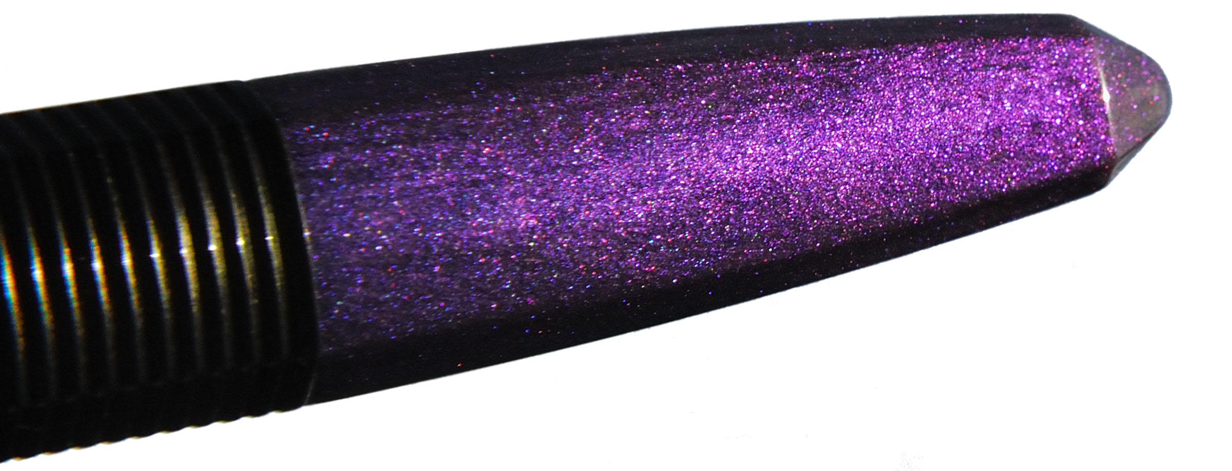 If this isn’t quite your cup of tea, but almost… It’s hard to find a pen with these kinds of looks at this price. You’d usually be looking at something bespoke, for a lot more money. So if you almost like this pen but aren’t quite sure then you might be best off looking at the rest of Benu’s range.
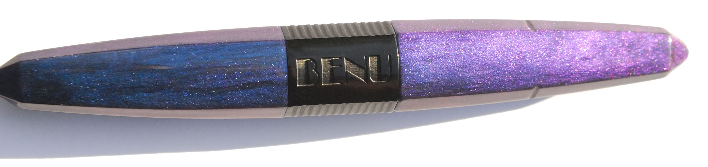 Our overall recommendation The Benu Friendly Chameleon is a good pen and all our reviewers would recommend it, if you’re seduced by its looks!
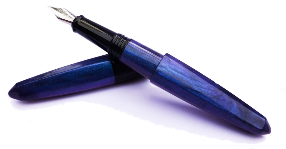 Where to get hold of one Benu sell internationally direct from their
  This meta-review references:
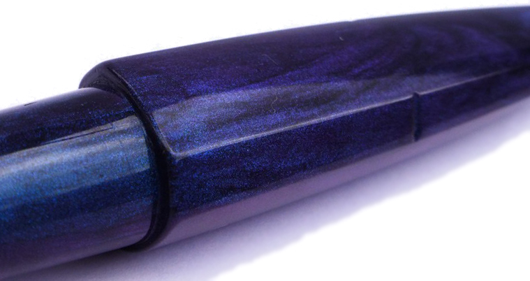 Thanks to Kate in Moscow for sending us the pen to try out.