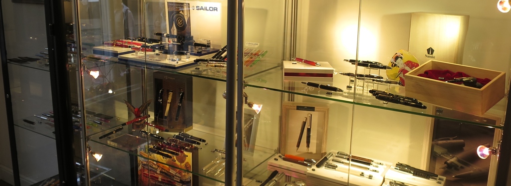
Loyal readers will already be familiar with our slow but committed campaign to profile all the boutique stationery retailers we can find, to which end we have of course interviewed The Writing Desk already. But it seemed a good time for a quick update, for the simple reason that they now have an actual stationery boutique – yes, TWD has gone bricks-and-mortar! The online operation is still going strong too, of course, but we all love a little shop, and one of the team was in Bury St. Edmunds for an afternoon, so the inevitable happened…
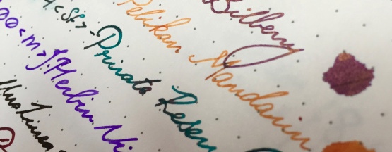
Be prepared for temptation. There is so much sought-after kit here, and combining online expertise with a physical presence on the High Street (well, Risbygate) has allowed The Writing Desk to complement their traditional offer (already distinguished by some rare brands such as Private Reserve) with a handful of rescued Conway Stewarts from Bespoke British Pens, a crop of genuine Traveller’s Notebooks, and posh Pilots actually branded as Namiki. It’s a fine mix of ancient and modern, much like the town itself; home to the fourth largest Benedectine monastery in Europe before the Dissolution, the medieval-design cathedral was only finished in 2005.
It’s well worth a visit if you’re passing through Suffolk; as well as pens that will invite rash abuses of your credit card, there are some well-chosen notebooks (with very good deals on Clairefontaine in particular), the opportunity to try pens which wouldn’t be accessible any other way, and of course Martin’s sage advice on care and repair of naughty nibs.
Having blown a bit of pocket money in the best way possible, your reporter repaired to The Nutshell, which has a justifiable claim to be England’s smallest pub – and where the customers immediately recognised the logo, acknowledged that it was a great shop and enthusiastically inhaled from the scented J.Herbin as it was passed around (it smells even better than Greene King’s finest, apparently). That’s fountain pens, you see; a hit with ink nerds, defrocked monks, beardy beer-men and purple-haired punk poets everywhere. Drop in and see for yourself!
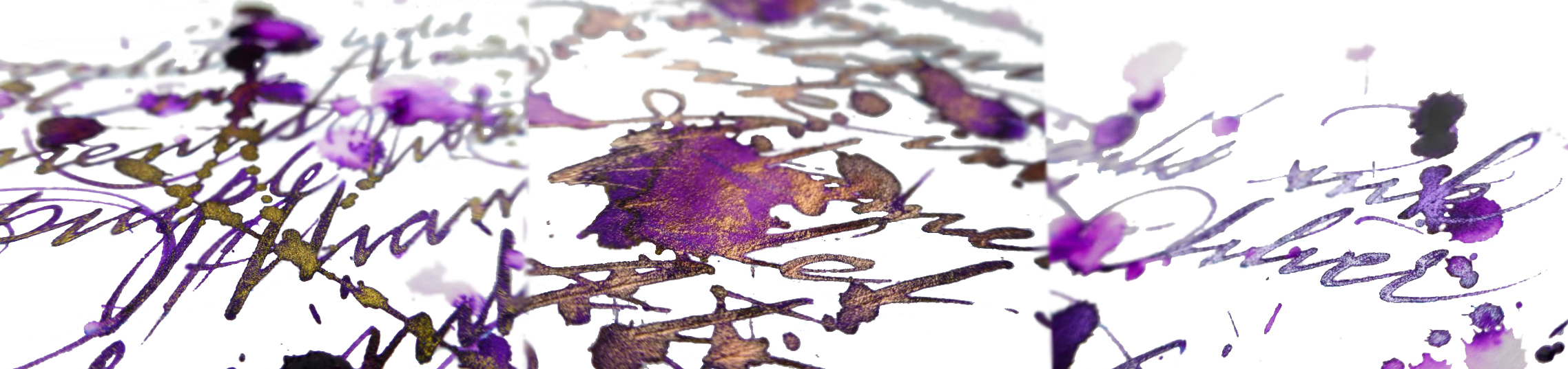
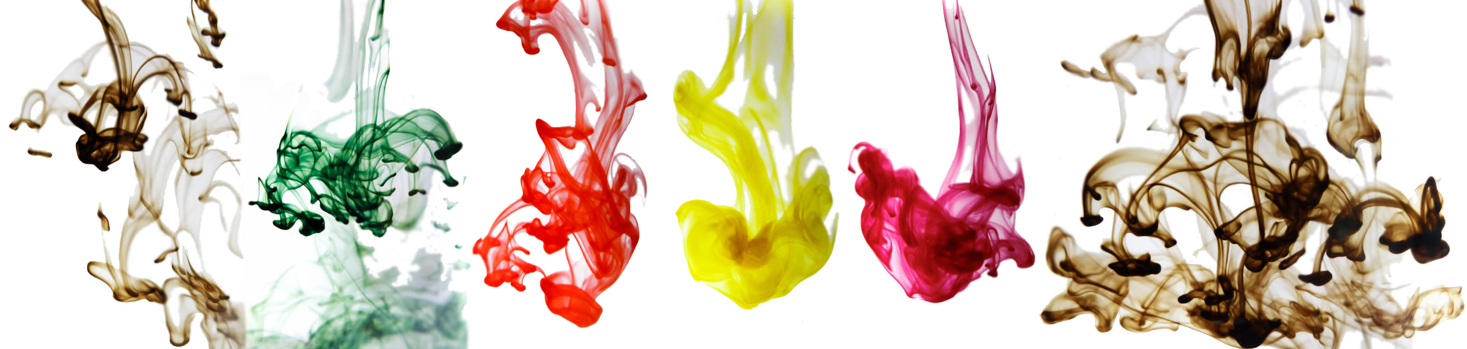
A little bit ofhistoryThe ancient Romans did all sorts of rum things in barrels; polluting wine with lead to sweeten it, fermenting the pungent rotted-fish sauce garum, and brewing-up the hard-wearing ink atramentum. German ink-makers De Atramentis continue this tradition in their name and some of their production methods (albeit hopefully without the aroma of decomposing marine life), and recently they have got on the sparkly ink bandwagon. Everybody’s doing it these days, it seems – J.Herbin, Diamine and Robert Oster too. So we set out to find out what De Atramentis is bringing to the party…
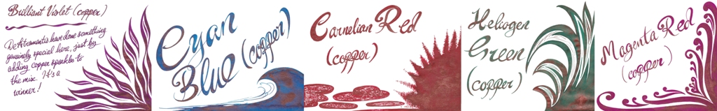
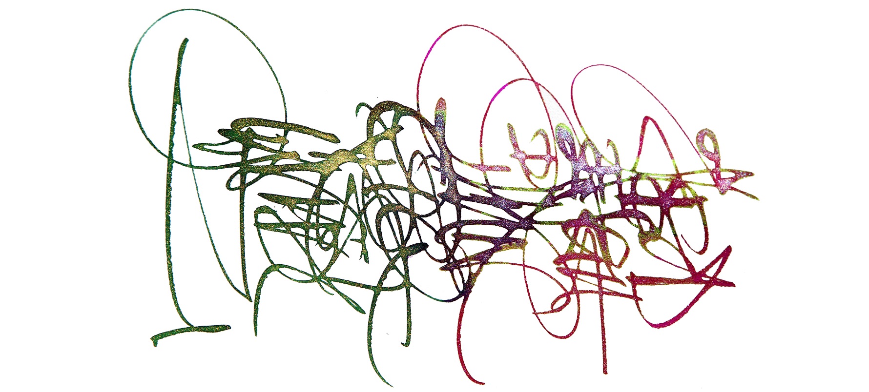
How it looksThe base inks are seven colours, plus black. What makes the collection stand out is the availability of these inks in three different pearlescent finishes; gold, silver and, uniquely, copper. There’s a higher volume of sparkly particles than are typically found in pearlescent inks so how it looks is shiny – very, very, shiny!Crucially, how it writes…Much like standard fountain open ink, and De Atramentis certainly make plenty of that. There can be the occasional hold-up due to the high proportion of particulates (the sparkly bits), which eventually silt-up the feed and stem the flow, but this is easily rectified with a thorough clean. With this in mind it’s advisable to stick to fountain pens which can be completely dismantled for a quick scrub, but these inks are otherwise suitable for use with most of the nibbage you own.
Ink! What is it good for?It’s very shiny indeed, but those sparkicles can brush off once the ink is dry – so it’s probably not one for the office, but anything from journalling to labelling presents would be good ways to put it to work.
VFMNot bad at all; Pure Pens sell some of these at £10.50 a bottle, which is only a little more than comparable inks from Diamine, and about half the price that J.Herbin charge for a sparkly.
If this isn’t quite your cup of tea, but almost…Then De Atramentis do face some pretty stiff competition from Diamine. No-one else has quite the range of shimmer choices that De Atramentis does, though, and their copper option appears to be otherwise unheard of in the pearlescent market.
Our overall recommendationIf masses of glitter appeals, or the unusual copper finish does it for you, give this a go. If you prefer a slightly more nuanced range of base colours beneath your glitter, check out the newly-expanded Diamine Shimmer range (which we’ll also cover again here soon).
Where to get hold of somePure Pens sell a partial range of these, or you can buy the full collection direct from source if you don’t mind covering a bit more postage.
This meta-review references:
Scribble Monboddo’s reviews of the copper, silver and gold ranges
It’s traditional for our meta-reviews to start with a little bit of history, and it’s just as well that this isn’t one of those, as Nuremberg is quite incapable of delivering history in little bits; it provides it in great big monumental slabs. So, let’s get the architectural introductions over with; from the Sinwell Tower, a remarkable medieval survival, you can look at pre-war and post-war photographs of the city landscape then admire the rebuilding job in front of your very own eyes. The one area which nobody was in a much of a hurry to rebuild was the parade-ground used for those 1930s rallies, but thankfully some much more positive uses have been found for that space – and last weekend your dogged United Inkdom correspondent dropped-in on two of them.
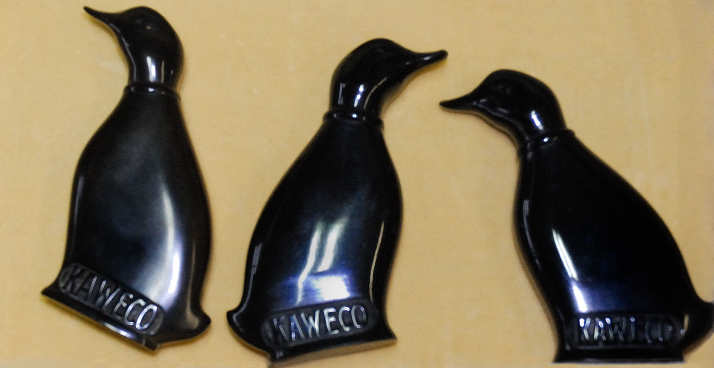
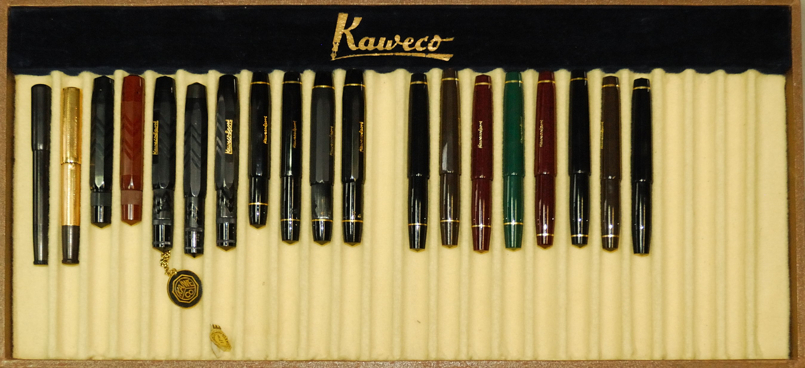
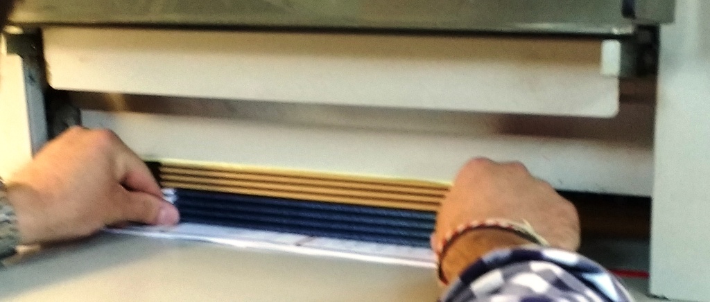
First up, of course, was a visit to Kaweco, who really have their ducks in a row – and we’re not just talking pocket ink flasks there. Michael Gutberlet, head honcho himself, gave a guided tour of facilities at Thomas Mann Strasse and Max Brod Strasse (all the roads are named after liberal German-language literary figures), and this could happily have occupied most fountain pen fans for a whole day. Seeing the assembly and dispatch operations was interesting in itself, but the highlight was inevitably Michael’s own collection of Kaweco antiques, some stretching as far back as the 1880s. The tray below, charting the morphology of the Sport model from 1911 onwards, is a good example of the ‘design DNA’ evolving over a century. The solid silver prototype of the Sport which may follow next was impressively heavy too!
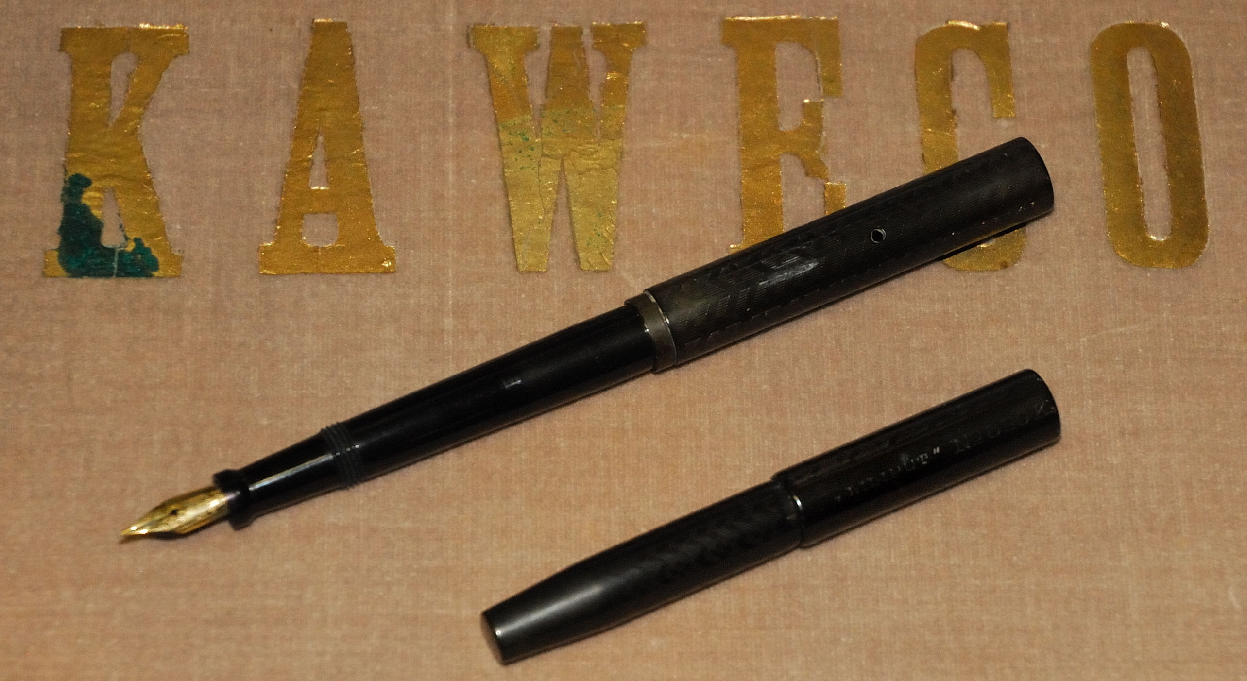
Raiding the pen archive also helped to solve another mystery which had plagued those of us more acquainted with English-language literature, viz why the Lilliput model is missing its second letter L. How the mistake happened is lost to history, but just visible on the original version of this model pictured below is the engraving which shows the spelling as LILIPUT – so retaining the error is at least staying true to tradition.
A short walk north through Hans Fallada Strasse (referring to an author who has only recently been translated into English – a tragic but riveting read) was the Exhibition Centre, our main destination. Also home to Spielwarenmesse, the annual Nuremberg toy fair, for the last few years it has hosted the marvellously-named Insights-X. This is a diverse stationery show rather than just a pen-focused event, but there was going to be plenty to see and, just as importantly, the organisers help to get a few bloggers there too.
Part of the blogger experience is a guided tour (with translator, if needed) of a number of stands for which exhibitors wanted a brief captive audience. For the German and Austrian calligraphers (and one British scribbler) present the relevance of wares varied, with slightly more which was aimed at the children-and-schools market than we quite knew what to do with. But let’s be honest, who can really object to being introduced to parrot knapsacks and flamingo pencils?
Some of the big names were there in force but with displays which left one wondering quite why they had bothered; Faber-Castell had a stand big enough to contain a working café but brought nothing from the ‘Graf’ range, and Pilot showed-up with the usual glut of VPs but no FA nibs (again). However, the guided tour included a chance to visit Online, the inconveniently-named but rather prolific German fountain pen makers. They distributed calligraphy sets to bloggers (there may be a special meta-review of those soon, if all goes according to plan) and even had another purple ink which will feature on a certain obsessive’s blog before too long…
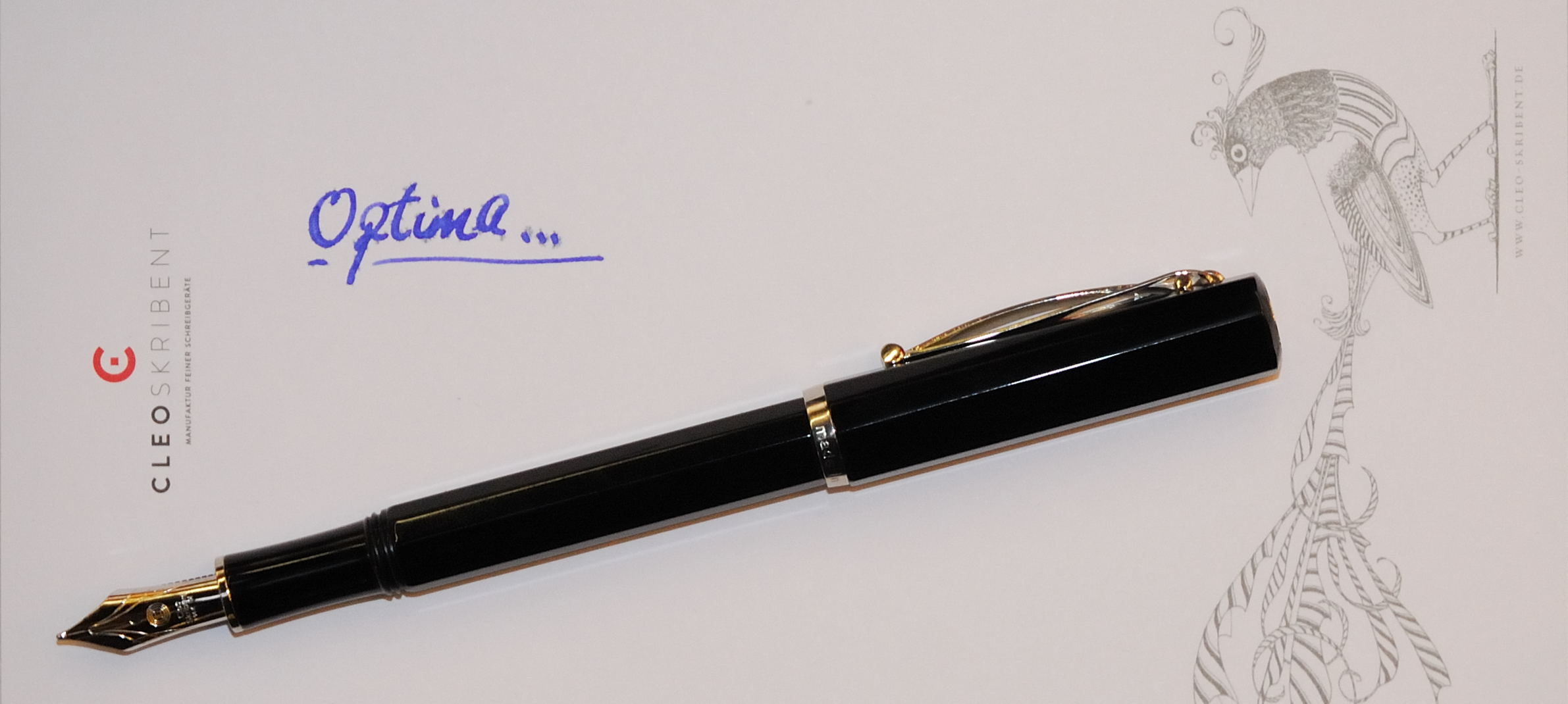
After the guided tour, there was just time to meet up with a few more firms who will interest United Inkdom readers. We made further introductions to the splendid Super 5, got in touch with Turkish pen company Scrikks for the first time (reviews to follow), and got a sneaky early view of Cleo Skribent’s forthcoming Optima model – which will replace its current ebonite piston-filler next year (we will try to cover that here too, if we can get our hands on a sample).
So, there are lots of pens and products which we’ll probably be reviewing over coming months, and you’ll be seeing plenty more blog items and articles flowing as a result of the trip. The other really good thing about this sort of experience, though, is meeting fellow enthusiasts – a real delight, even with a few language challenges to overcome. Stand by for laboured pun… Rather like Nuremberg’s castle, the pen blogging community evidently has a deep well of talent to draw from!
This is going to be a fairly short profile, for the simple reason that Personalised Stationery is such a prolific product creator that we’re highly likely to come back to them again and again. But since we’ve just meta-reviewed a couple of fine A5 notebooks from this stable, it’s time to provide a bit of background.
The stable in question is in fact a smithy, but where hammer and tongs once rung out different equipment now reigns supreme; printing rollers, staplers and guillotines. The owner, Rob, has already carved out a promising niche providing name-plated writing paper (as the company’s title suggests), and in contact with pen fans and journal-writers has started to develop a mightily impressive range of notebooks and other stationery items.
One of the reasons that the Personalised Stationery marque is proving a big hit with fountain pen fans is the quality of the paper. Now, we’re not going to give away every one of Rob’s trade secrets, but it helps to understand how this all works if you know that Lamy, Kaweco and Diamine inks are always visible on his desk – along with a few pens to put them in, of course. Testing every paper sample the hard way seems to be paying off.
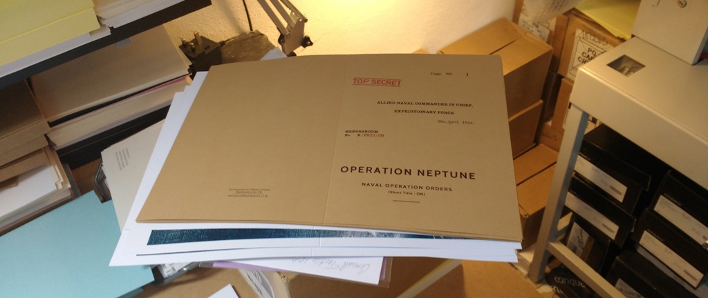
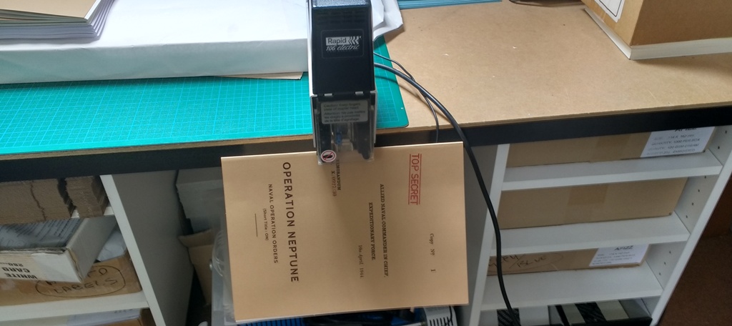
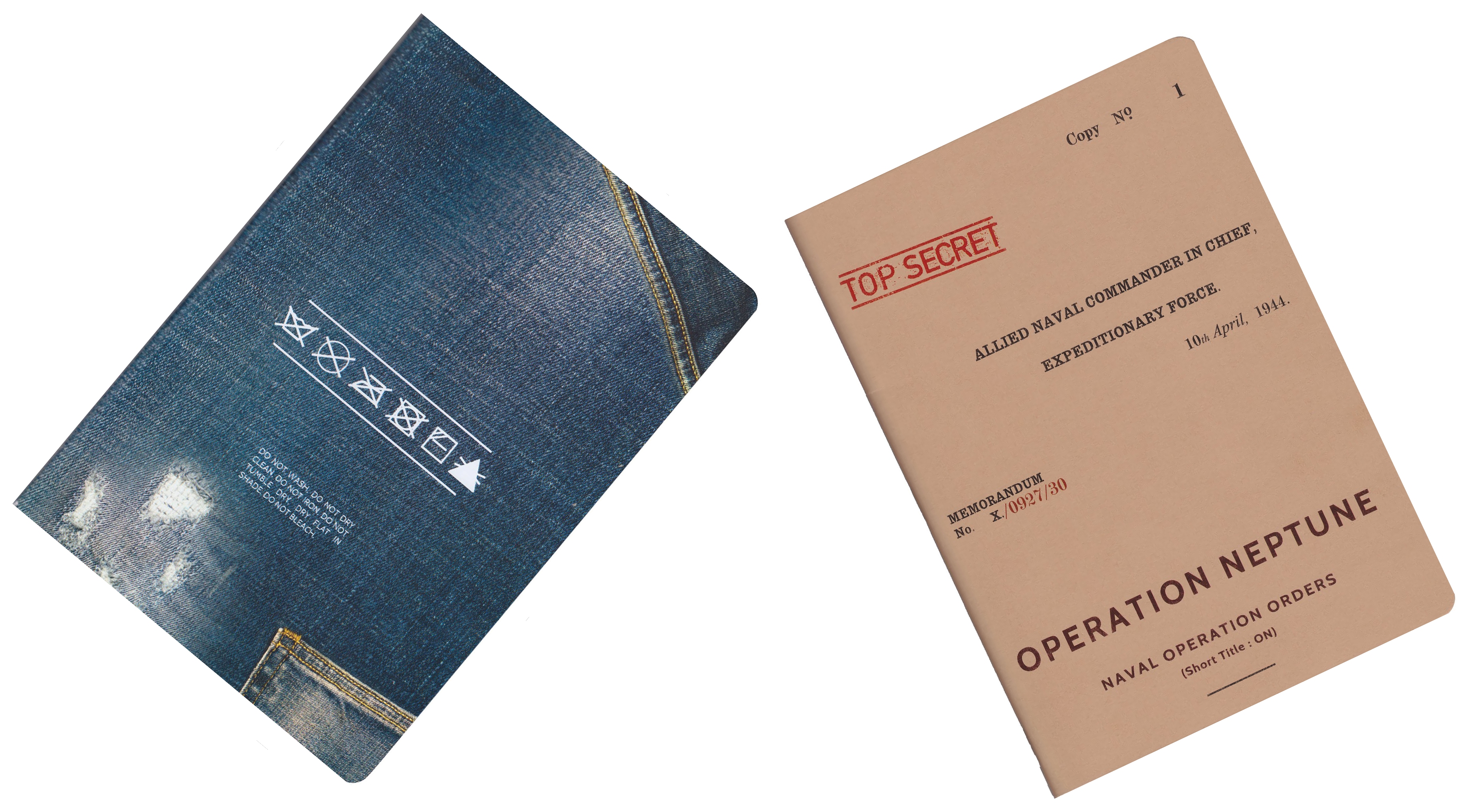
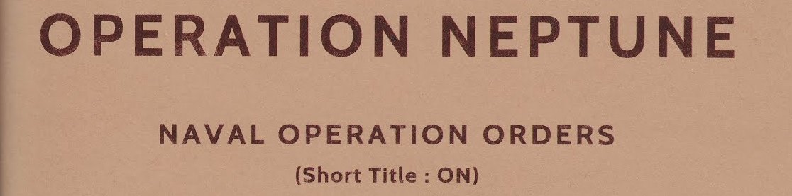
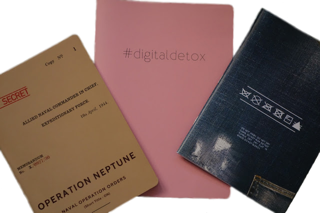
A second appeal, not unreasonably, is the visual design ideas which Rob borrows and adapts from all sorts of sources. The Operation Neptune notebook which we reviewed last week proved such a hit that a complementary range of 1940s-themed A6 pocket notebooks has become rather popular too.
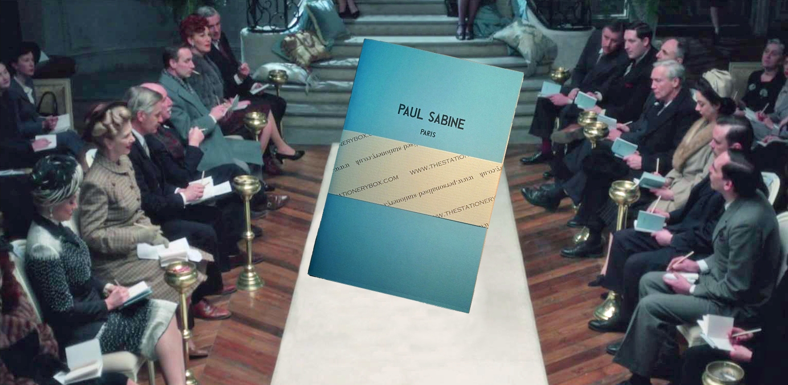
An even bigger hit was a homage to the period just after the war, as Amazon television series The Collection needed notebooks for the front row of fashion critics seated at the foot of the catwalk – and Personalised Stationery provided them, of course.
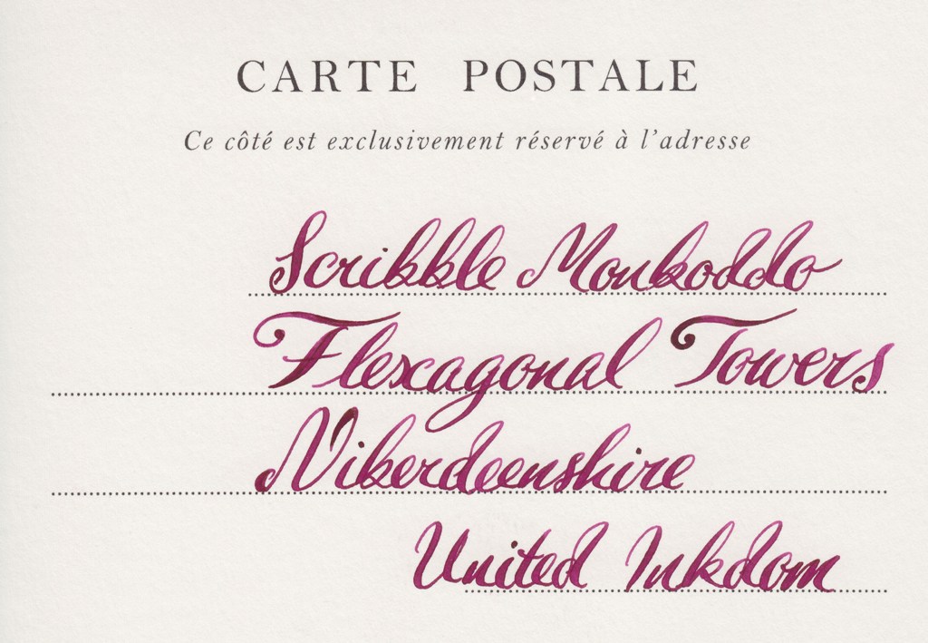
The really ‘killer’ asset is probably the genuinely personalised nature of the product collection – simply put, if no-one else is making what you want, Rob probably will. Bringing back the old double-sided postcard (remember them?) is a good example.
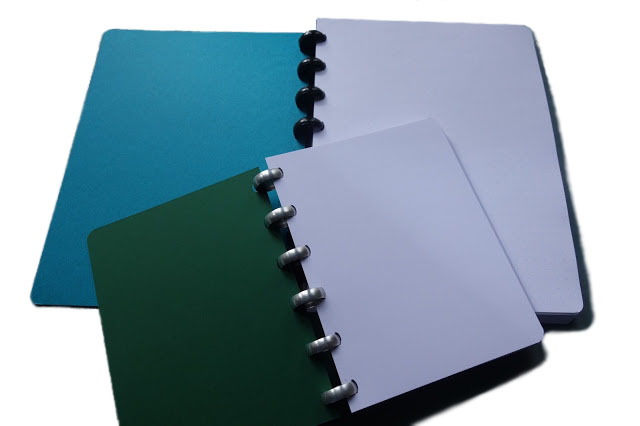
Even more gratifyingly, the increased interest in disc-bound notebooks (which we like to think we’ve played a modest part in paving the way for) has led to Rob experimenting in making his own, with line options as wide, or indeed narrow, as customers require. John was especially impressed by the one which came his way – and it could well lead to a more permanent stock line before too long, it seems. So, overused as this phrase may be, watch this space!
You may already know Rob from online conversations – he answers every query himself – but if you haven’t already seen the company site it’s certainly worth a look.
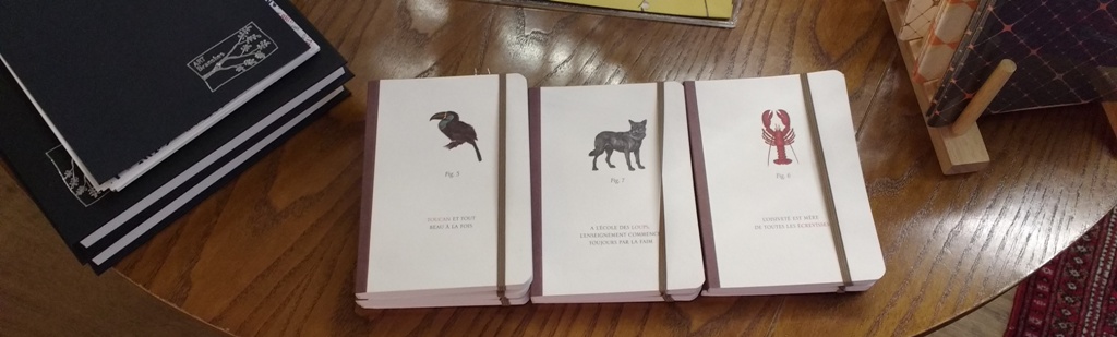
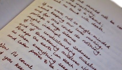
A little bit ofhistoryThe old-school (but not specifically for use in educational environments) exercise book has been making a big come-back over the last year or so, proving both a handy way to try different paper out, and a means of taking something a bit different into meetings. With the advent of full-size A5 covers like those offered by Start Bay, they’ve started attracting a following amongst people writing travel journals and the like, too. So it’s good to see a small, bespoke operation in the heart of little old Blighty making some really distinctive offerings to add to the selection out there. We could hardly wait to get started in putting them to test…
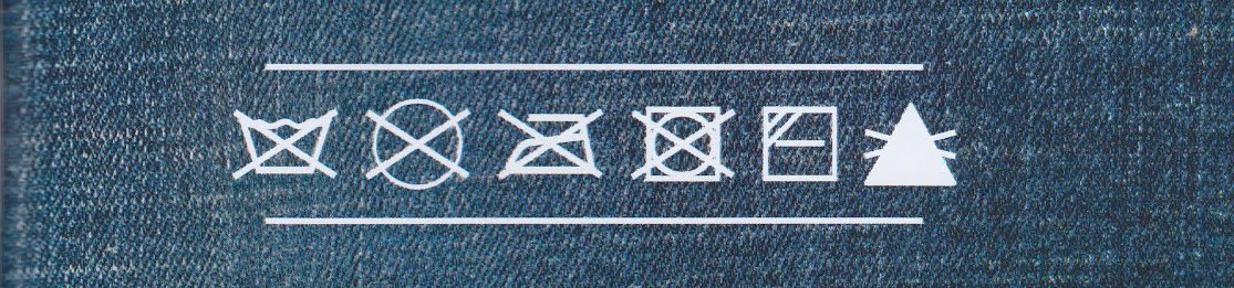
How it looks Each of the Personalised Stationery creations is a bit of portable art in its own right, so we picked two to get us started – and so that enough of us could try them to put together a meta-review, of course. The company’s main product is customised writing paper, as the name suggests, so they have come up with some creative designs one that looks remarkably like a pair of jeans, and another which resembles the secret dossier for the D-Day landings. We thought they looked very cool indeed.
How it feelsSmooth, and this is going to turn out to be important!
How it fillsThese are pre-stapled notebooks, so there’s not too much scope for alteration once delivered. However, looped staples may be in the offing sometime soon, and the books come with a decent quantity of paper for most people’s uses.
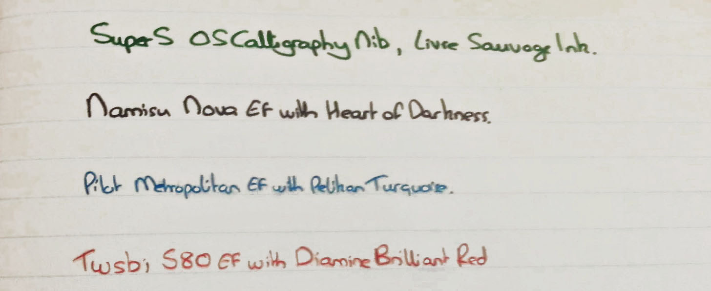
Crucially, how it handles a fountain pen…Excellently. The Fedrigoni paper selected for these notebooks is a delight to write on with a real nib, and tough enough to take a bit of abuse too. After experiencing the indifferent performance of many of the mass-market expensive alternatives, it’s something of a revelation.
Pulp! What is it good for?It’s good for taking to work, using as a planner, keeping a diary, or even writing poetry – anything which you’d only really want to do with a proper fountain pen, really. ‘Can’t think of anything you’d do without one? Don’t worry, you’re in good company on this site…
VFMThese represent pretty solid value in our view. At £5.95 they are not the cheapest A5 notebook available, but for the quality of the product they compete well with comparable offerings from Clairefontaine – which can offer nice paper for that sort of price, but not the line/dot options or the interesting cover artwork. It’s also an absolute steal for a product which is hand-made in the UK.
If this isn’t quite your cup of tea, but almost…Contact Rob at Personalised Stationery and he’ll most likely be able to knock up something exactly tailored to your needs. This is an offer we have already tested and the response was impressive.
Our overall recommendationThis is the sort of product that most fountain pen fans will love, at a price which is a bargain, from the type of specialist maker we all like to support. ‘Bit of a no-brainer, really: get one.
Where to get hold of oneDirect from the source is the simplest way. But there may also be one or two interesting collaborations in the pipeline very soon…
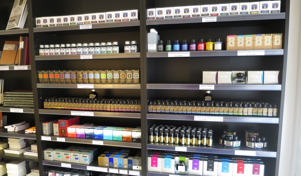
Selling fountain pens, inks and good paper is a niche business, clearly – but it’s also a fast-growing niche, inhabited by splendid people with refined tastes. So it’s always good to encounter a small firm thriving by doing the right thing, and if you’re a stationery fan then you probably already know Bureau Direct is one of those!
Still run by siblings Jo and Dominic, the team is now around nine in total (it varies at peak demand times), and thanks to Mishka there’s a good chance you’ll already have encountered them via social media. As a big deal in the online world, it’s interesting to discover that they started out with a bricks-and-mortar shop – in Covent Garden, no less. But as the internet shopping boom started, well, booming, the rents for such premises rose and the opportunities in cyber-space grew proportionately. So the team now has a spacious base to the west of London, with racks of exotic stationery aplenty.
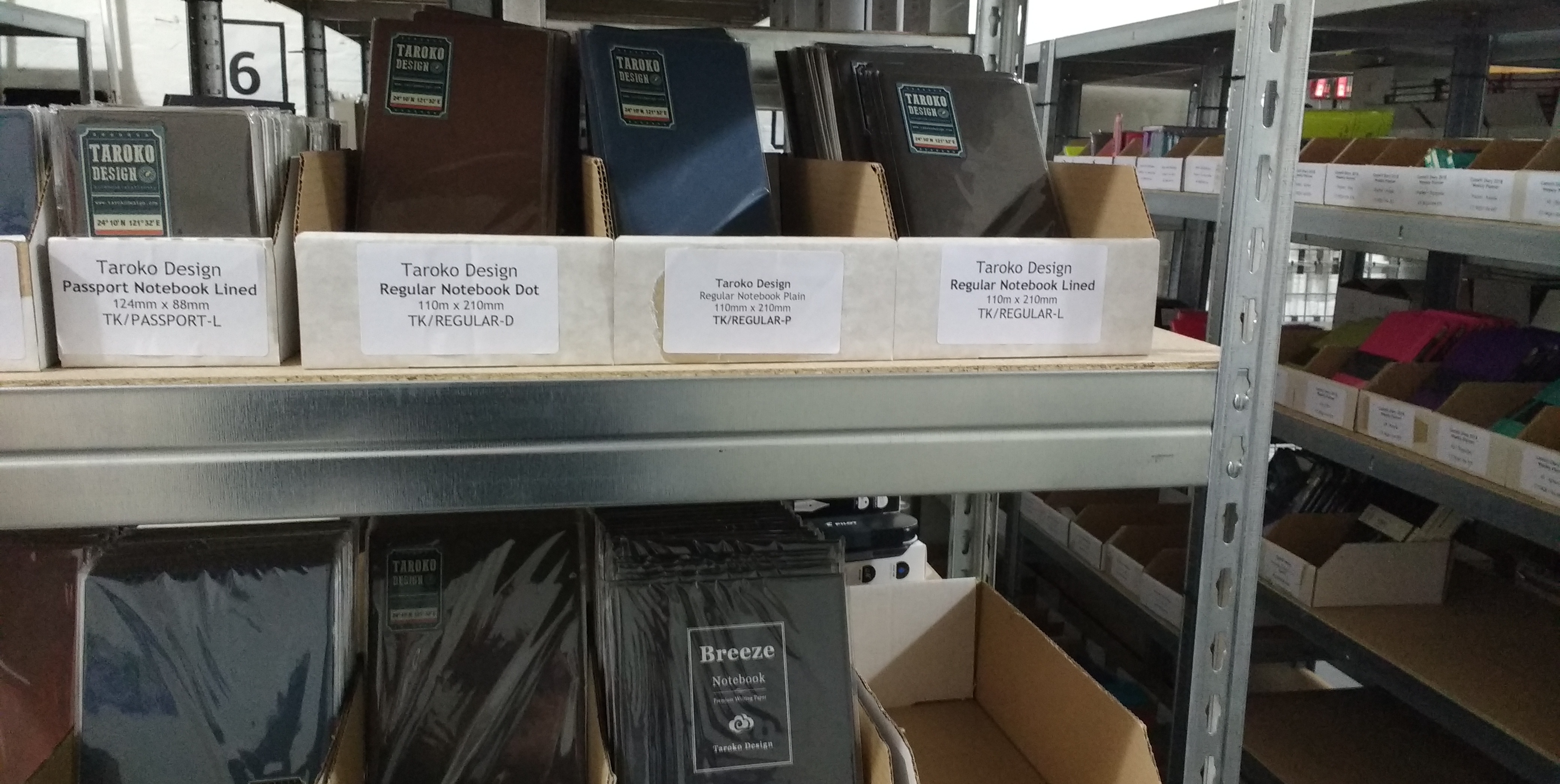
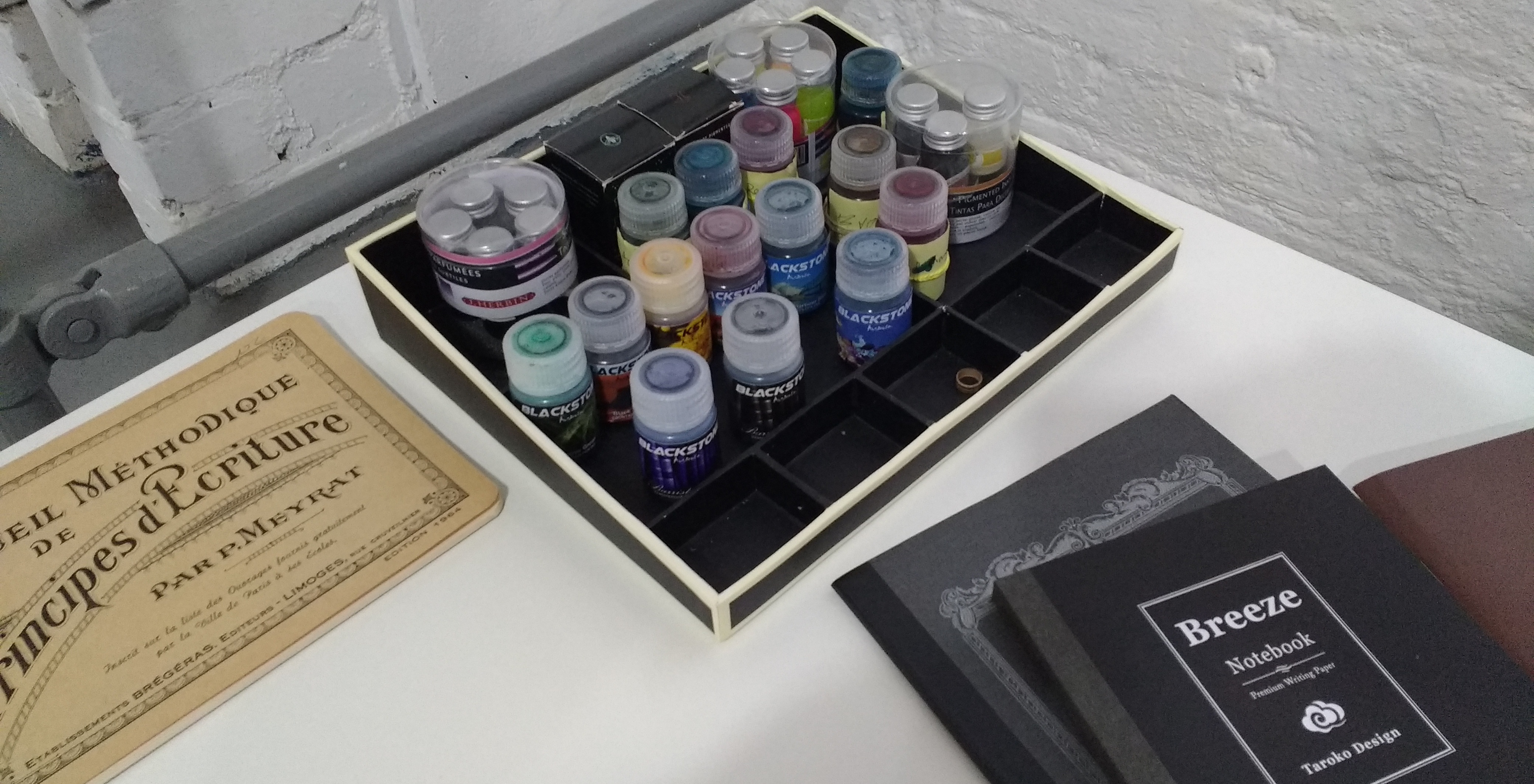
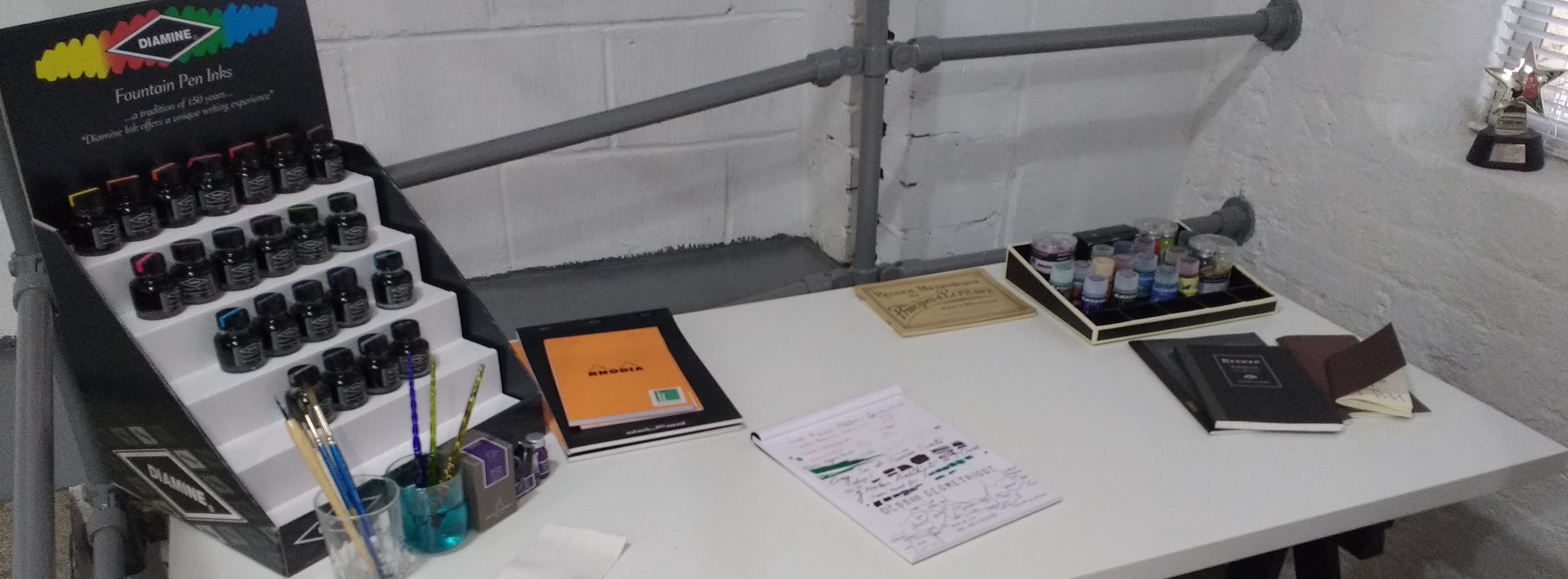
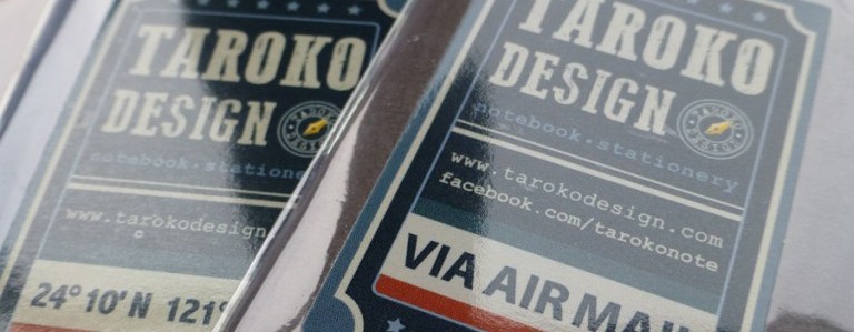
Fountain-pen friendly paper is a big deal for this company, and the array of black and red Rhodia items on the shelves of the warehouse are quite an impressive site. What will grab many fountain pen fans is that there’s enough of a customer base to engage in the occasional spot of innovation too. We ran a meta-review of one of their popular lines last week, the stapled Tomoe River notebook from Taroko Design. That’s proved so popular that Taroko have collaborated with Bureau Direct to make an even more sophisticated sewn-bound notebook, the Breeze, which we suspect is going to be a big hit too.
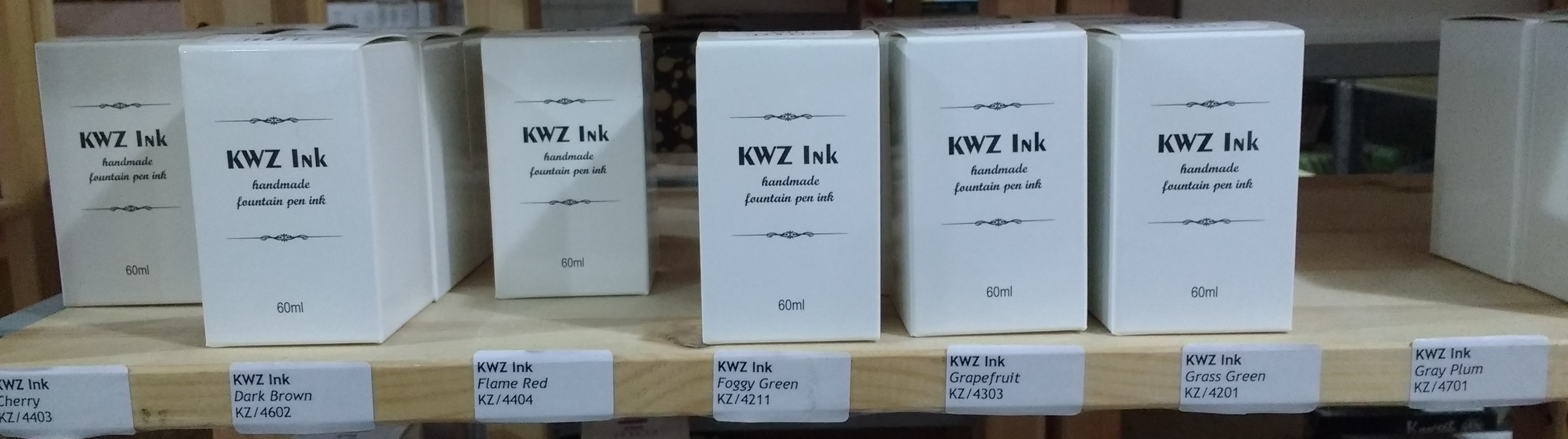
The team have been doing well bringing some interesting niche inks into the UK market, too, especially as one of the original trail-blazers for the impressive KWZ inks – and the news is that more colours, and possibly a few more iron-gall inks too, are on the way. Bureau Direct is the sole importer of Australia’s Blackstone inks on these shores, too; and hard as it may be to convince readers of this by text, our visiting reporter can vouch for their claim to be some of the most aromatically delightful inks you’re likely to come across.
Bureau Direct sell pencils and other paraphernalia too, of course, and one of the best ways to keep up to date with incoming temptations is to sign up for their email newsletters, which come with some very handy discounts too. But what you might not know unless you happen to be passing the warehouse is that they have gone back to their roots and set up an in-house testing area, so if you want to try out one of their range of fountain pens (Kaweco, TWSBI and Lamy are all on hand) or see how some of that rare ink behaves on some exotic paper, there’s a very tempting desk surrounded by very cool gear, and yes – you can just arrange to drop in! Expect to hear from this lovely bunch; we reckon we’ve clocked them as fellow enthusiasts. In the meantime, in the very unlikely event of you not having seen their website already, take a peek…
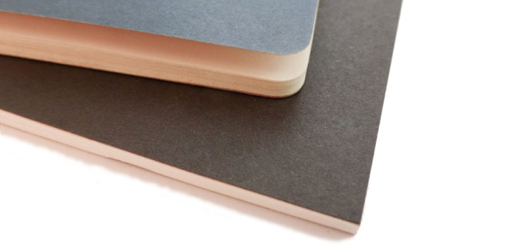
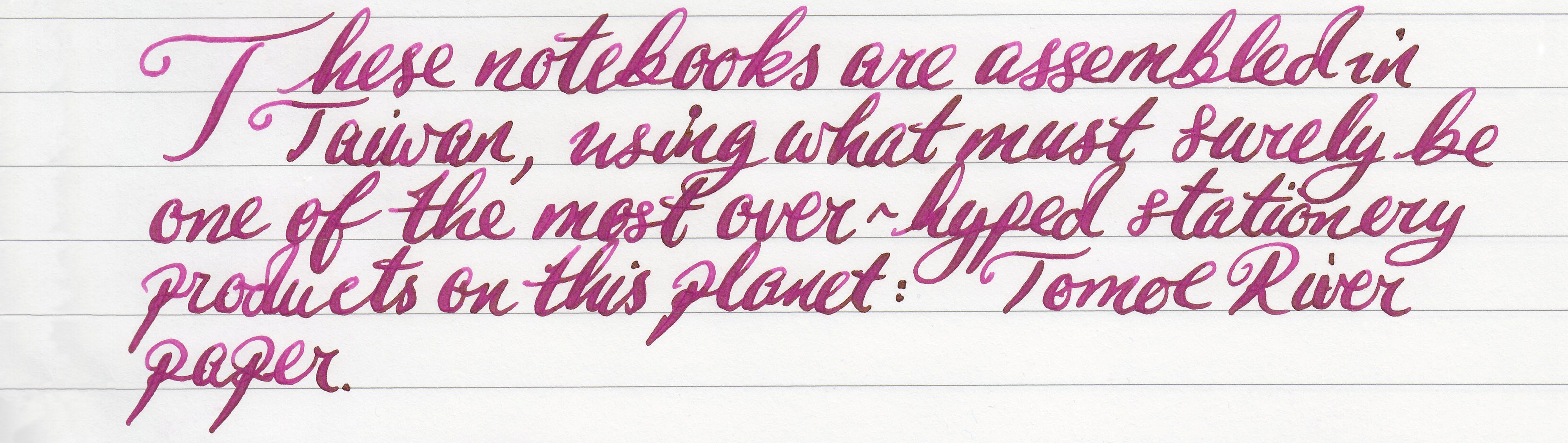
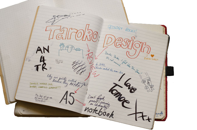
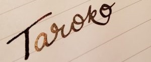
A little bit ofhistoryThere are various theories about where the Austronesian family of languages sprang from, but one of the more popular has the roots on the island of Formosa, or Taiwan as we know it today. One of these indigenous tribes, the Truku, also gave their name to an area known as Taroko, now a national park. Rather curiously, but entirely suitably for our purposes, this notebook brand therefore indirectly translates as ‘human’. So we sent samples to a few more humans to put that rather splendid heritage to the test.
How it looksIt looks like a basic school text book, and a pretty cheap one if truth be told. Appearances are deceptive on both counts; underneath those dull brown covers lies a rather sophisticated offer – at a price to match.
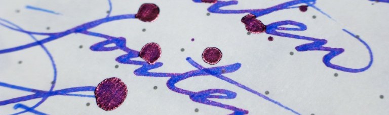
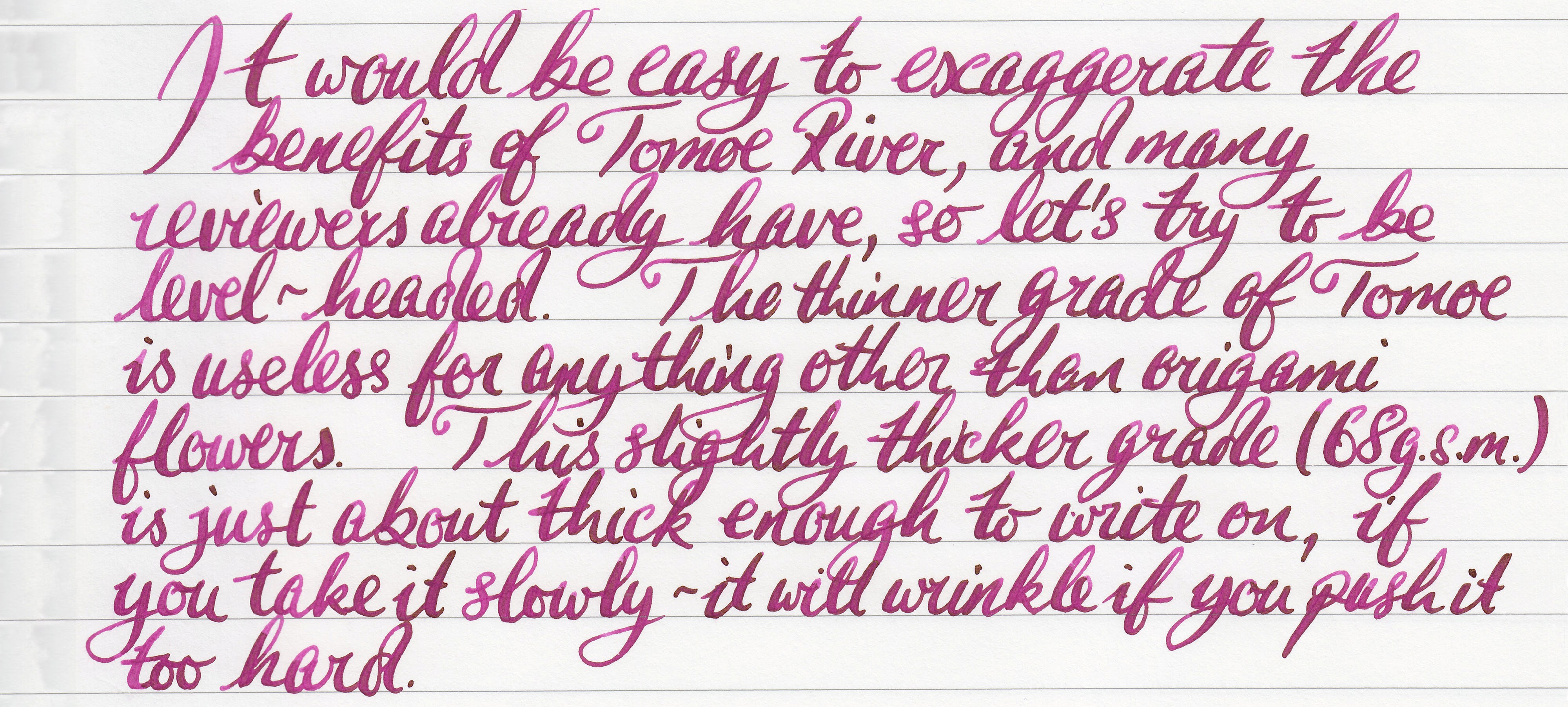
How it feelsGossamer-thin, unnervingly light and smooooooooooooth. This is all thanks to the famous/infamous Tomoe River, which like the Taroko national park was a Japanese innovation but is evidently configured a whole lot more usefully in the ROC.
How it fillsThis is a stapled notebook, so it’s pretty much pre-filled and the thin nature of the paper makes it difficult to alter that. But for most purposes there are enough sheets to make use of.
Crucially, how it handles a fountain pen…This is where the investment pays off. The Tomoe River paper is thick enough to handle a fountain pen nib without wrinkling (albeit it only just), and the smooth surface is a pleasure to write on. Like other very smooth paper surfaces (Clairefontaine Triomphe, for instance) it shows the sheen well, too. It may be flimsy, but you’re unlikely to be disappointed.
Pulp! What is it good for?It seems to be very popular for ink journals, thanks to the sheen, although it is perhaps a bit expensive just for leaking dribbly nibs on. The low profile and featherweight qualities mark it out as an ideal travel journal, however.
VFMThese are not the cheapest notebooks out there, by any stretch of the imagination. But if you are travelling and don’t want to be without some truly fountain-pen friendly paper, or if you want sneak some inconspicuous exotica which looks like a school exercise book into work, it’s not going to break the bank.
If this isn’t quite your cup of tea, but almost…There’s nothing quite as thin and light as this on the market which we could recommend, but if it’s just the smoothness and sheen-loving finish you’re after then Clairefontaine’s A5 ‘age bag’ notebook does a similar job at about half the price.
Our overall recommendationIf you’re travelling or have a need for a genuinely nib-loving exercise book which you can squeeze into even the bulgingest briefcase, give it a go.
Where to get hold of oneIt is sometimes possible to buy directly from Taroko studio in Taiwan, but it’s not especially straightforward. Several of us have bought one from Bureau Direct in the UK and had no problems doing so, and the price is no greater so that looks like the smarter option in this case.
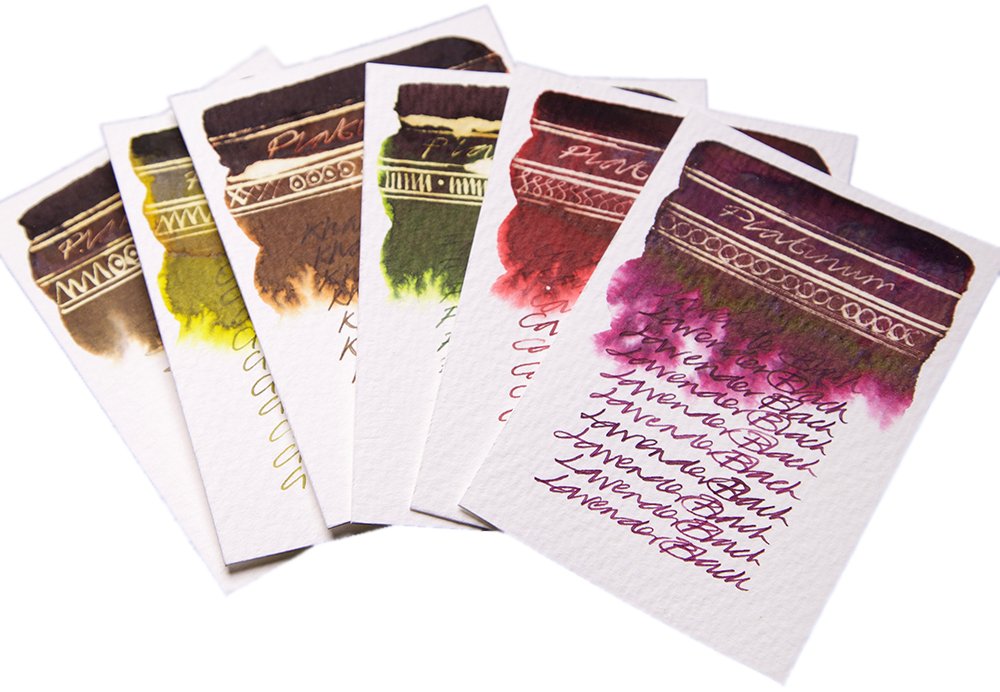
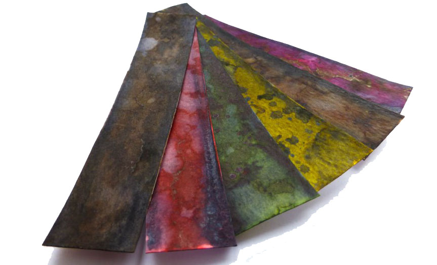
A little bit ofhistoryFor anyone who’s just survived the British summer, it can be hard to believe that wasps do anything useful at all; the big ones ruin picnics and the tiny ones kill bees. But as it happens, some of those very small wasps inadvertently serve a human purpose by making nests on the surface of the sturdy oak tree – because those ‘iron galls’ in turn provide the source material for a permanent ink formula recipe used since Pliny the Elder. Pliny Senior unfortunately failed to describe the formula in sufficient detail before the eruption of Vesuvius did for him, but patient scribes have been perfecting it ever since. When it works well, it can preserve documents for millennia. When it goes wrong and the ink gets too acidic, it can eat the writing surface – and it has form for eating fountain pens too, so it’s a brave manufacturer who ventures into this market. But Diamine, KWZ and Rohrer and Klingner have found ways to make the recipe safe, and now Platinum have come along with no less than six shades of iron gall ink to get creative with. The United Inkdom team set out to put it to the test – said team including a chemist, a calligrapher and two historians, so there was no fear of punches being pulled.
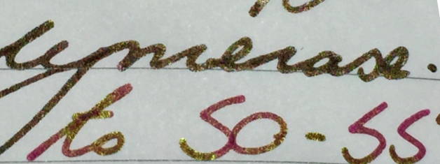
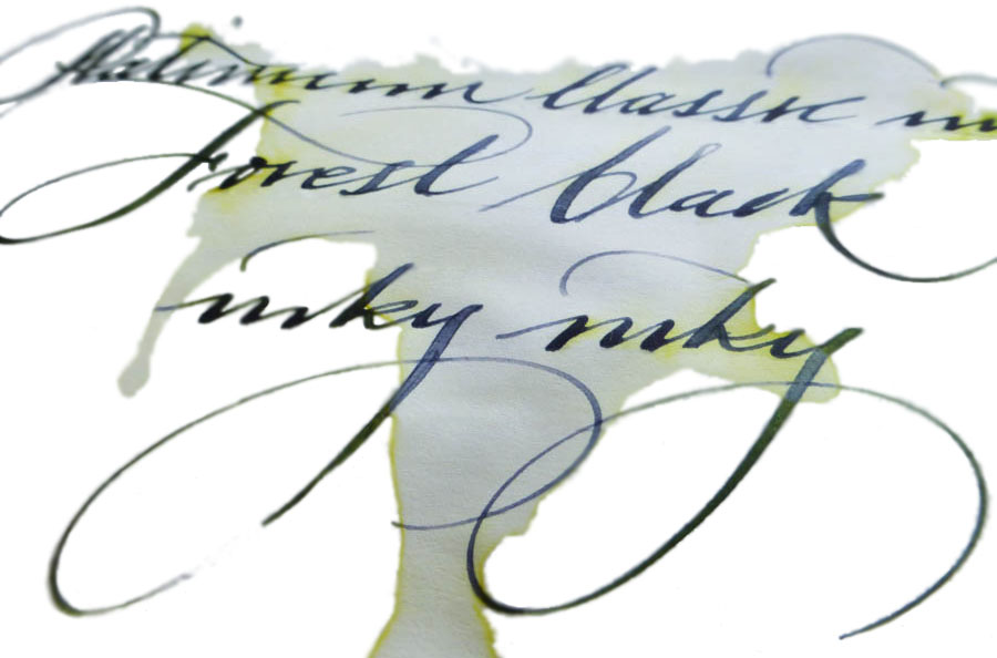
How it looksThis changes in the first minute that it spends on the paper – it goes on quite bright, especially the Citrus and Cassis varieties, then quickly darkens as it oxidises. None of the shades darken all the way to black, so the naming convention (Lavender Black, Forest Black, etc.) is a little misleading, but the transformation from light to dark is impressive – and rather fascinating to watch.
How it smellsNow let’s be honest, not all specialist inks are terribly pleasant to the nose . This one requires a chemical reaction to work, which you can actually see in front of your eyes, as the video below demonstrates – and as this ink is not pigment-based, it’s not technically watching paint dry. But despite all that exciting stuff going on, there’s nothing malodorous to report. Phew.
Crucially, how it writes…Perfectly well! It’s perhaps just a touch drier than some ‘standard’ fountain pen inks, but a decent fountain pen can handle it with ease. Given that this is still a permanent ink and even the new, gentler, formula has some acidity to it, a fountain pen which doesn’t dry out too easily is a wise choice (one of Platinum’s own #3776 models is a good place to start), and of course it’s worth giving it a good flush out after a few days with iron gall ink in there. But you can pop it into the barrel of your ‘serious nibbage’ without too much fear of damage.
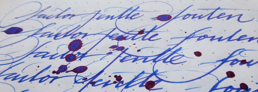
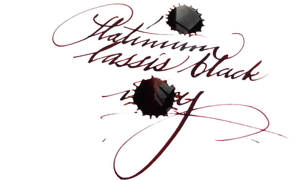
Ink! What is it good for?As Nick capably demonstrates, it’s great for calligraphy. Since it’s an iron gall ink it should be acceptable if you’re signing a marriage register, and as it’s permanent it should do for addressing the wedding invitations too (the ink is partially washable, but even if it gets rained on the text will still be legible). Lavender Black, which seems to be the consensus pick of the bunch, could be good for one’s secret diary (you have one of those, right?). Or you could just have fun with them, like we did!VFMThese are not cheap inks, it has to be admitted; £22 will buy you a fairly respectable fountain pen these days, after all. But some of Platinum’s ‘Classic’ colours are really easy on the eye – and if you are using this for a special event, it’s not going to be that big a dent in the stationery budget.
The ink is partially washable, but the text remains legible
If this isn’t quite your cup of tea, but almost…If you just need an iron gall ink and aren’t too concerned by the traditional blue-grey shade, then standard registrar’s ink will inevitably be quite a bit less expensive, and there’s plenty of that about (try Diamine). There are also other coloured iron gall inks available, usually at a lower price, from KWZ and Rohrer & Klingner. Alternatively, if you’re a Platinum fan and just need something permanent, some of their pigment-based inks aren’t bad and their carbon ink is amongst the blackest of the black.Our overall recommendationWe think these are pretty impressive inks, and conjure up a wider and more interesting palette than iron gall formulae can usually manage. If you have a sensible use for a permanent ink and fancy something a bit different, a 60ml bottle will do the job well. Given the significant cost our tip is to pick one or two which really take your fancy rather than going straight for the whole set.Where to get hold of someWe got ours direct from Cult Pens, and that’s a good place to start – they are the official Platinum dealers for the UK, and as it happens it’s where many of us have acquired our #3776s from too.
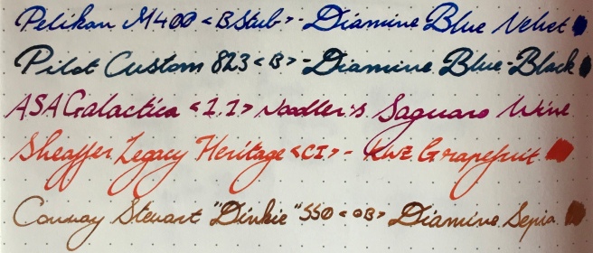
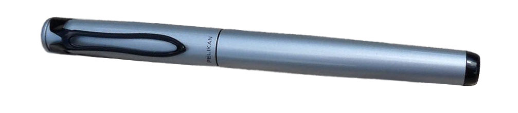
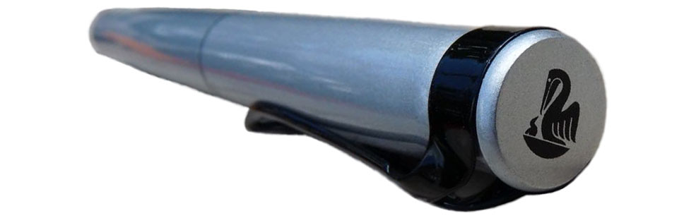
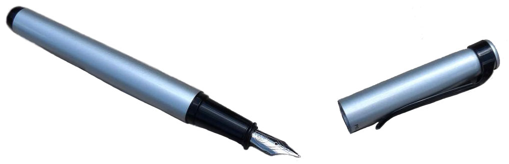
A little bit of history The first incarnation of Pelikan began in Germany in 1832, so it’s safe to say they’be been around a while. Over the course of time its gone bankrupt and restarted, and its headquarters have moved to Switzerland, but its pens haven’t changed much at all. Many of Pelikan’s designs are almost unchanged from 1929, the year the company released its first fountain pen, and they’re still made in Germany.How it looks Pelikan is a company famous for making lots of very similar (and beautiful) looking pens but the Stola III is a little different. The clip maintains the pelican-beak motif but is a simple wire loop. The cap and barrel are finished in a silver-grey enamel which is modern looking but rather plain. The section is black plastic. It’s unlikely to set any hearts racing, but Pelikan have done a good job for a low price-point.
How it feels The barrel is brass which gives the pen some heft, which went down well with some reviewers but not with others. It’s fairly well-balanced, but rather short. Some of our large-handed reviewers struggled a little with holding it comfortably and, critically, the cap doesn’t post properly (you can kind-of balance it on the end, if you don’t move it too quickly, but it’s tricky). It’s a small pen that insists on staying that way.
How it fills Standard international cartridges and some (e.g. Schmidt) converters. Not every converter will fit but this still gives you a lot of choice.Crucially, how it writes… The stainless steel nib is very good for a pen that costs £20. It’s smooth and has a good flow. It’s great… as long as you want a medium nib. Unfortunately, Pelikan have only released the Stola III with one size of nib, which is silly when so many other pens at similar prices are available with a full range of widths. It’s doubly silly when the nib itself writes so well.Pen! What is it good for? The Stola III is a lovely pen for extended writing, if it isn’t too short for you. You can pick a colour to get your thoughts flowing and journal or plan away to your heart’s content.
VFM This is very much a case of: if your requirements happen to coincide with what the Stola III offers, it’s a good value pen.If this isn’t quite your cup of tea, but almost… then you have a huge number of options. If you want a small, pocketable pen then the Kaweco Classic Sport is a little cheaper and has lots of nib sizes. The Lamy Safari is easily obtainable, a fantastic pen and also a little cheaper. If you’d prefer a more classic looking pen then the Pilot MR (also known as the Metropolitan) is worth a look, as is the Faber-Castell Basic. Then for funky looking pens you could look at the Pilot Kakuno or the Faber-Castell Loom. Finally, if you’d like an enamelled metal-barrelled pen with a cap that’ll post, the excellent but often overlooked Sheaffer VFM is a good choice. We could go on but you get the idea… this is a crowded price point, which can only be a good thing.
Our overall recommendation The Stola III is a pen that writes well, takes a wide range of cartridges, and has a certain aura of quality about it. However, it is very much a one-trick pony. If you like the metallic grey look, enjoy medium nibs, don’t like to post and find short pens comfortable, then it’s definitely worth considering the Stola III. However, with so much choice available, you can almost certainly find a different pen that’s at least as good, for a similar amount of money, that fits your tastes and needs more closely.
Where to get hold of one If you’re in the UK then Niche Pens is always a good place to start for all things Pelikan. Elsewhere, we can recommend Pen Chalet, who were kind enough to send us this sample (for which we are very grateful).This meta-review references reviews by:
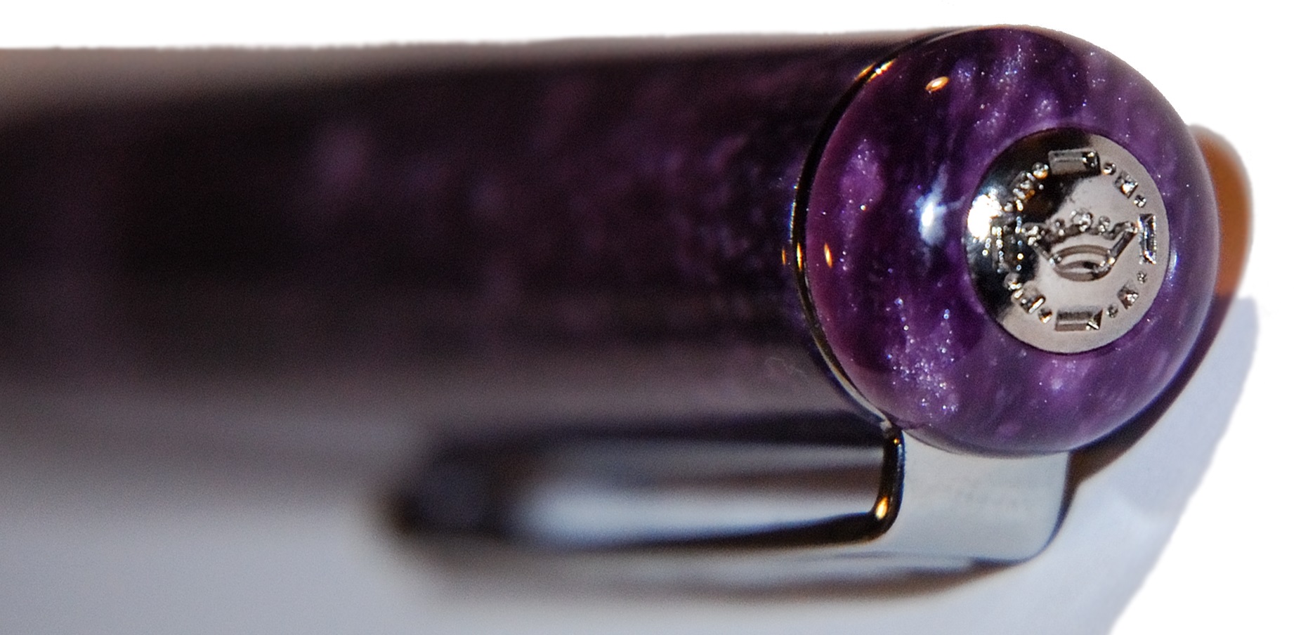
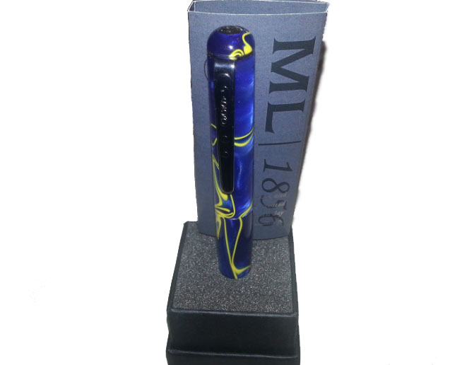
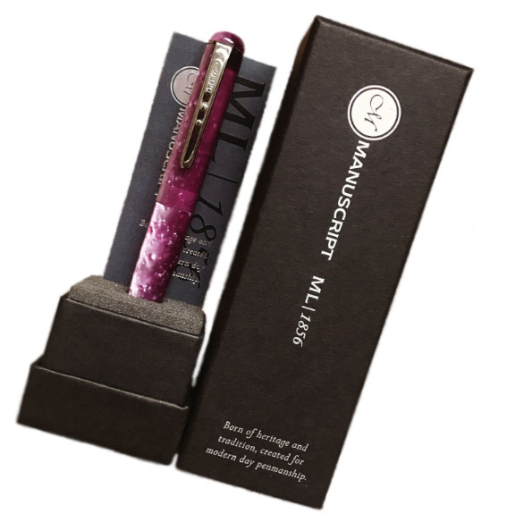
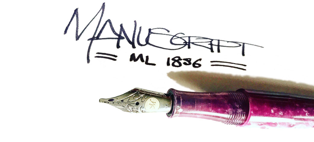
A little bit ofhistory Manuscript is a British company which has been around for over 160 years – since 1856, in fact, which is where this pen gets its name.
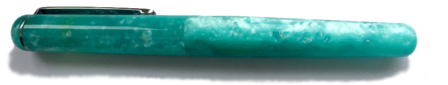
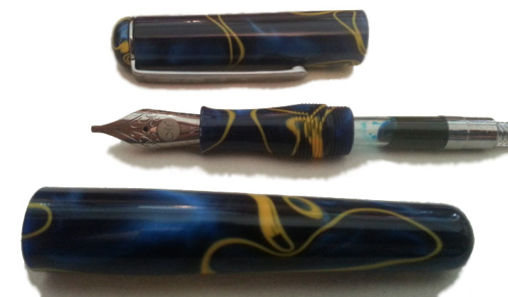
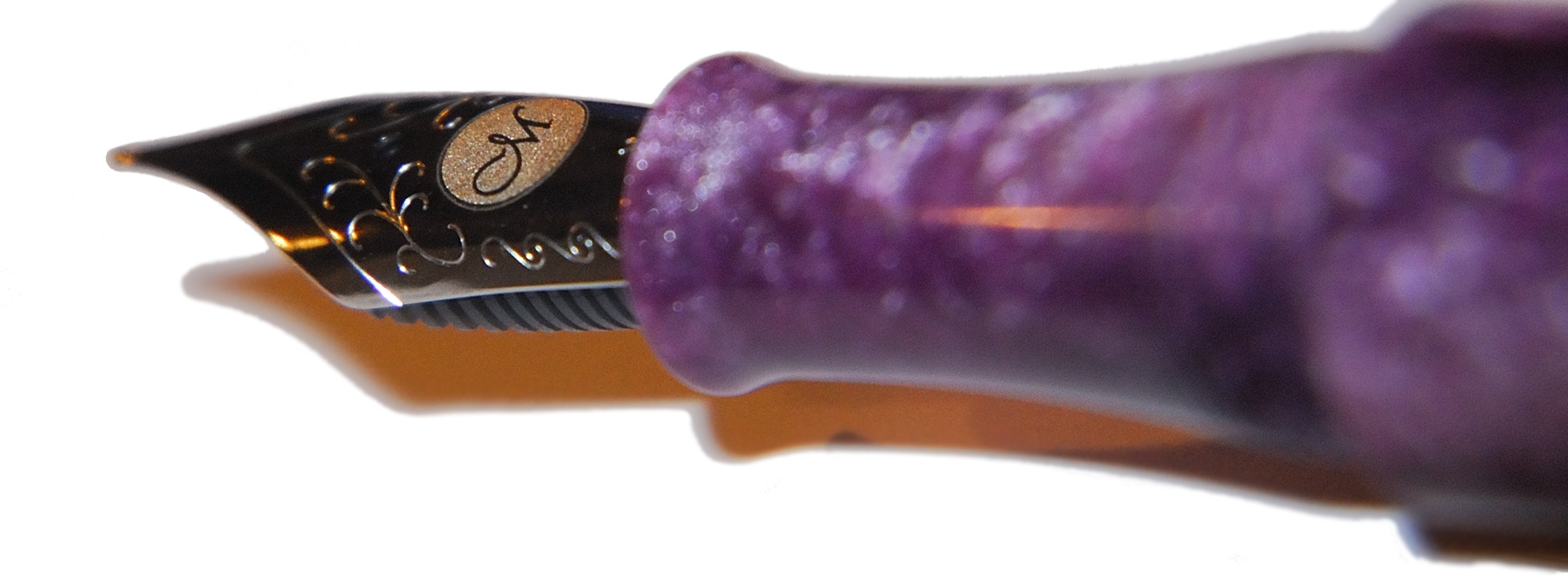
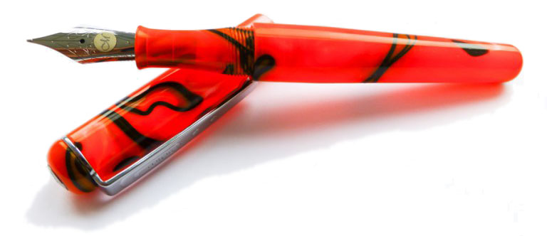
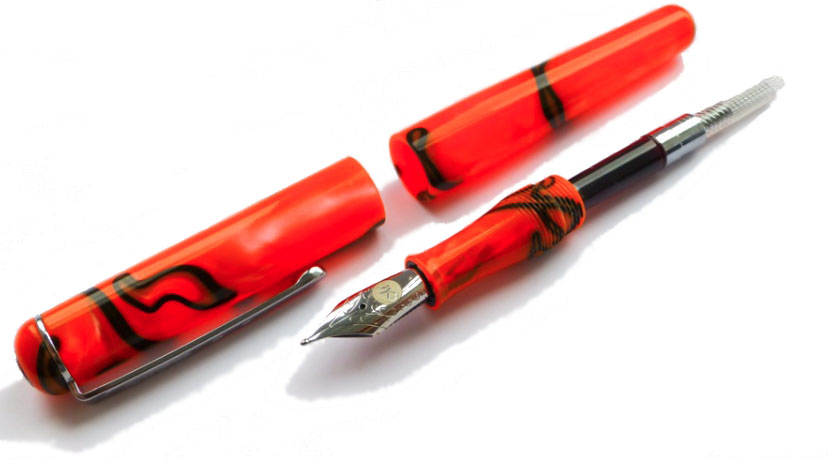
How it looks Hotttttttttttttttttttt. The Clumsy penman tested the ‘Molten Lava’, as you can see below – but we think these these pens look hotter than molten lava. Manuscript pulled the boat out when designing these. We have been fortunate enough to review the Purple Mist, Molten Lava, Turquoise Ocean & Northern Lights pens. In addition to this, there are three other colour-ways available: Red Storm, Oyster Mist and Midnight.
However, not every aspect of the aesthetic was loved by everyone. The clip has two circles, echoing the dual crown of the cap’s top (which is a reminder that Manuscript has been going so long that they used to supply the kings of both Spain and Portugal), but the shape of the clip itself seemed a little gimmicky. As Laura put it, “don’t dress a model in Primark clothes.”
How it feels Across the Inkdom we all agreed that the pen was lightweight but strong. Being made of the Italian resin, we felt confident that the pen would hold up. Daniel with his “weird grip” was still able to use the pen, despite his fingers touching the threads; thankfully they’re not sharp and are comfortable (as far as threads go). However, some concerns remained as regards the clip which seems rather stiff, albeit usable. The pen sits in the hand very well; posting is just about possible, but awkward, and doing so will make the pen too long for most tastes. The size of the pen allows Manuscript to appeal to most writers as it isn’t too large, but it isn’t a pocket pen either.
Right from the get-go with the packaging of the pen you get the impression of a ‘premium product’. It’s not a conventional pen box, with the pen standing up as opposed to laying flat, but still wonderfully presented.
How it fillsCartridge/converter. This makes it easy for the user to change inks if need be, but it’s also not difficult to refill every so often (though does make it a little bit more tedious than, say, a piston for constant ink usage, but easier for maintenance and cleaning). Daniel did question the possibility of it being converted into an eyedropper as he tested the pen with water and it seemed to be sealed, but we’re not advocating this unless Manuscript advise it!
Crucially, how it writes…There are both flat and round nib options for the Manuscript 1856: two stubs (1.1mm & 1.5mm) and a handwriting nib. All nibs are steel and are from JoWo in Germany.Most of our reviewers found the steel nibs satisfactory, albeit a little bit dry at first in one case. Overall, the writing experience was rated as pleasant by the reviewing team. The only thing that the italic nibs aren’t great for are reverse writing, as Daniel discovered. The #6 JoWo nibs write a fairly wet line and the feeds keep up well. Pen! What is it good for?Manuscript seems to be, as a brand, synonymous with calligraphy, certainly for beginners here in the UK anyway. The 1.1mm and 1.5mm italic nibs means that you can get a little stylistic with your writing, particularly when considering scripts such as gothic.
Of course, if calligraphy isn’t your thing then you can always opt for the plain round ‘handwriting’ nib, which is more conventional.
VFMWhile the majority of our findings are quite positive, we did have concerns here when the pen was first released; simply put, this is a good a pen, but it wasn’t £125 good, and there were custom-designed pens from John Twiss and Edison available at similar price points. We felt that it should have gone to market at £75 – and eventually, two years later, that’s where it ended up. At the £75 ‘street price’, it’s great value.
Bottom-top: Laban Mento, Manuscript ML1856 & John Twiss custom pen
If this isn’t quite your cup of tea, but almost…The Edison Pearlette and Collier are similar in both aesthetic and close to the original ‘official’ price. Another option might be a Laban pen; these pop up at pen shows (here in the UK at least) with a similar design but run to about £60; close to the ‘street’ price. For the original £125 you could also get a Platinum #3776, and while these lack the hand-made aesthetic the gold nib goes a long way to make up for it. Mr Pen’s English Curate, which we reviewed in 2016, is made in the same workshop (formerly of Sigma fame) but a lot more reasonably priced.Our overall recommendationWhile we loved using the pen, the price point just didn’t justify it until that was reviewed; there were too many alternatives which were similar to the ML1856 but better quality/feel for the same price or others that might sacrifice ever so slightly on the feel but were much more affordable. We like the direction Manuscript is heading in, but our recommendation was to wait until the value issue had been rectified before pulling the trigger.
Where to get hold of one There were few stockists of the pen at the original official price (La Couronne du Comte and Cult Pens being first out of the blocks), but the ML1856 is now available at a sensible price direct from the manufacturer.
Thanks to: Manuscript for providing three of these pens for review purposes. All views expressed here are our own both within the meta-review and in our own individual reviews that we have provided; the pens were sent to us in exchange for an honest review. Manuscript, to their credit, were completely fine with that, and not withstanding our reservations about some elements of the package were still keen for us to give one away; a great attitude, we think.
Give-away (Now closed!) To bag one of these, we asked readers to let us know what they thought the crowned heads of the Iberian peninsula would have used an ML1856 for, if they’d been available before the revolution – what sort of correspondence would be flying between Lisbon and Madrid with the aid of such serious nibbage? Answers in the comments box…
 A little bit of history The ancient Romans did all sorts of rum things in barrels; polluting wine with lead to sweeten it, fermenting the pungent rotted-fish sauce garum, and brewing-up the hard-wearing ink atramentum. German ink-makers De Atramentis continue this tradition in their name and some of their production methods (albeit hopefully without the aroma of decomposing marine life), and recently they have got on the sparkly ink bandwagon. Everybody’s doing it these days, it seems – J.Herbin, Diamine and Robert Oster too. So we set out to find out what De Atramentis is bringing to the party…
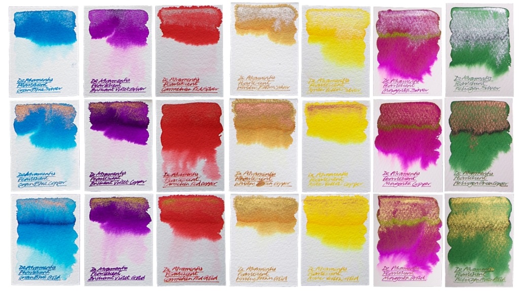 Crucially, how it writes… Much like standard fountain open ink, and De Atramentis certainly make plenty of that. There can be the occasional hold-up due to the high proportion of particulates (the sparkly bits), which eventually silt-up the feed and stem the flow, but this is easily rectified with a thorough clean. With this in mind it’s advisable to stick to fountain pens which can be completely dismantled for a quick scrub, but these inks are otherwise suitable for use with most of the nibbage you own.
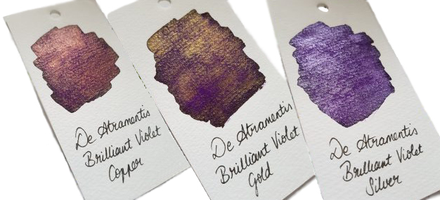
 Thanks to De Atramentis themselves for generously sending us a sparkling set of these inks for testing.
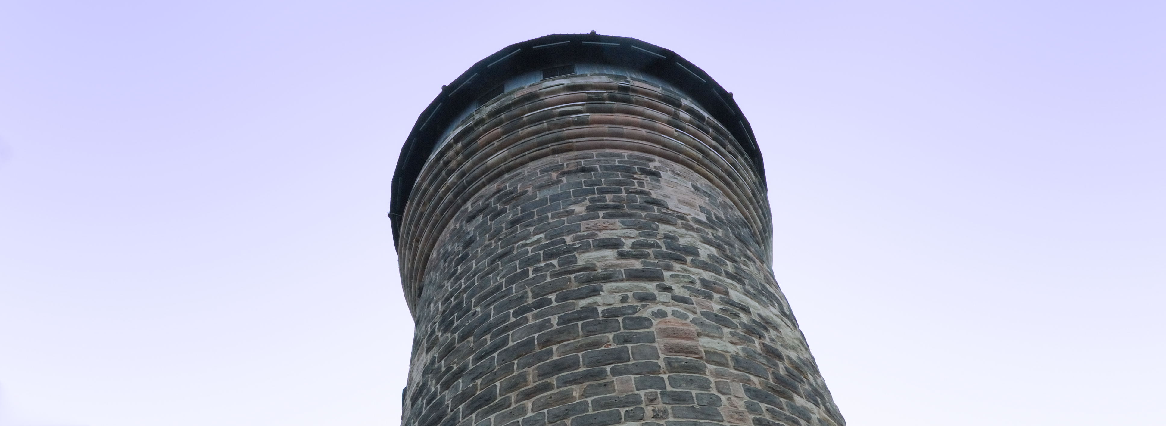


 VFM
VFM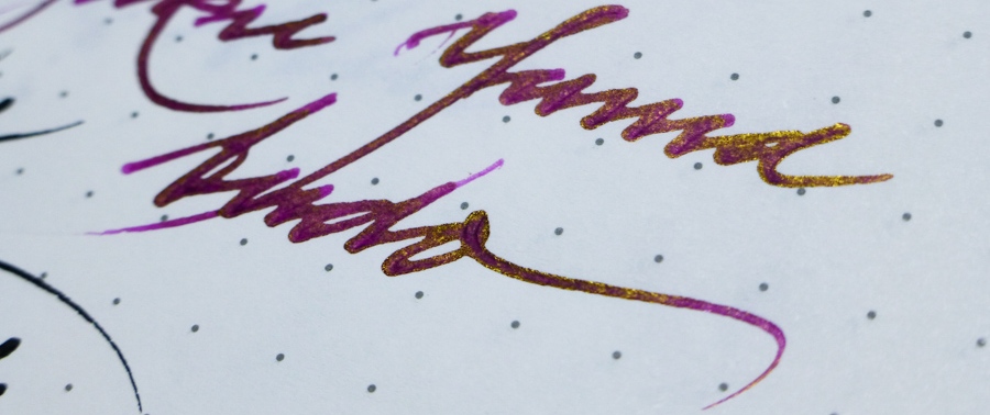
 Ink! What is it good for? As Nick capably demonstrates, it’s great for calligraphy. Since it’s an iron gall ink it should be acceptable if you’re signing a marriage register, and as it’s permanent it should do for addressing the wedding invitations too (the ink is partially washable, but even if it gets rained on the text will still be legible). Lavender Black, which seems to be the consensus pick of the bunch, could be good for one’s secret diary (you have one of those, right?). Or you could just have fun with them, like we did!
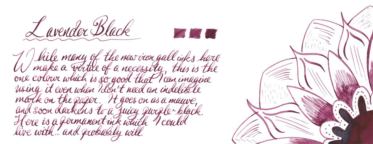 VFM These are not cheap inks, it has to be admitted; £22 will buy you a fairly respectable fountain pen these days, after all. But some of Platinum’s ‘Classic’ colours are really easy on the eye – and if you are using this for a special event, it’s not going to be that big a dent in the stationery budget.
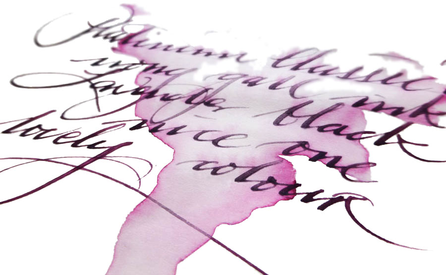
 Our overall recommendation We think these are pretty impressive inks, and conjure up a wider and more interesting palette than iron gall formulae can usually manage. If you have a sensible use for a permanent ink and fancy something a bit different, a 60ml bottle will do the job well. Given the significant cost our tip is to pick one or two which really take your fancy rather than going straight for the whole set.
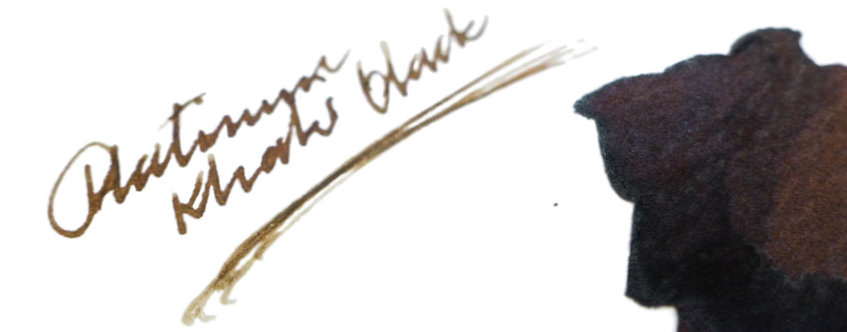 Where to get hold of some We got ours direct from
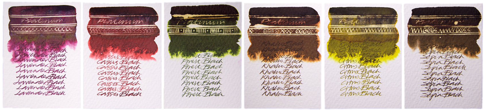
 How it looks Pelikan is a company famous for making lots of very similar (and beautiful) looking pens but the Stola III is a little different. The clip maintains the pelican-beak motif but is a simple wire loop. The cap and barrel are finished in a silver-grey enamel which is modern looking but rather plain. The section is black plastic. It’s unlikely to set any hearts racing, but Pelikan have done a good job for a low price-point.
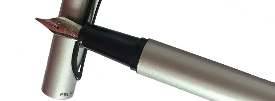
 Crucially, how it writes… The stainless steel nib is very good for a pen that costs £20. It’s smooth and has a good flow. It’s great… as long as you want a medium nib. Unfortunately, Pelikan have only released the Stola III with one size of nib, which is silly when so many other pens at similar prices are available with a full range of widths. It’s doubly silly when the nib itself writes so well.
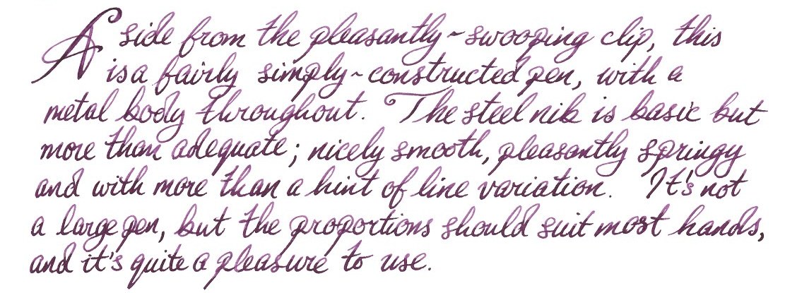 Pen! What is it good for? The Stola III is a lovely pen for extended writing, if it isn’t too short for you. You can pick a colour to get your thoughts flowing and journal or plan away to your heart’s content.
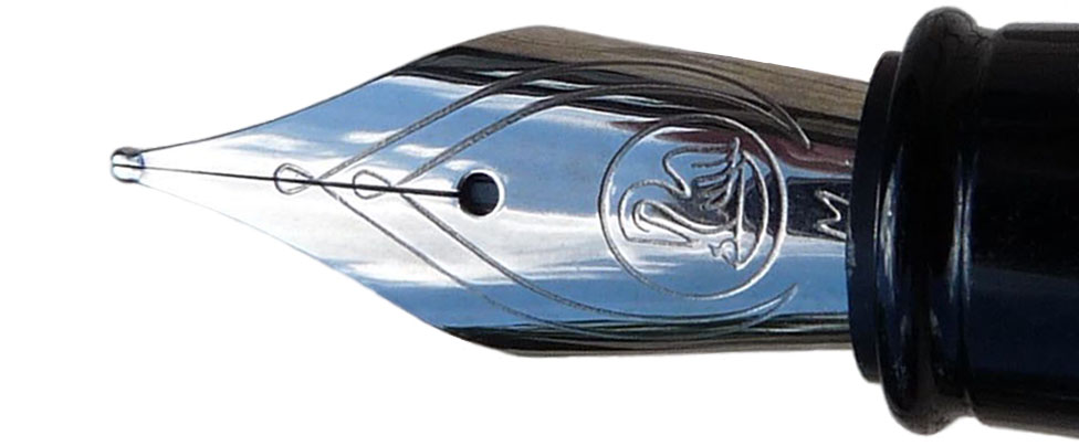 If this isn’t quite your cup of tea, but almost… then you have a huge number of options. If you want a small, pocketable pen then the Kaweco Classic Sport is a little cheaper and has lots of nib sizes. The Lamy Safari is easily obtainable, a fantastic pen and also a little cheaper. If you’d prefer a more classic looking pen then the Pilot MR (also known as the Metropolitan) is worth a look, as is the Faber-Castell Basic. Then for funky looking pens you could look at the Pilot Kakuno or the Faber-Castell Loom. Finally, if you’d like an enamelled metal-barrelled pen with a cap that’ll post, the excellent but often overlooked Sheaffer VFM is a good choice. We could go on but you get the idea… this is a crowded price point, which can only be a good thing.
 This meta-review references reviews by:
 However, not every aspect of the aesthetic was loved by everyone. The clip has two circles, echoing the dual crown of the cap’s top (which is a reminder that Manuscript has been going so long that they used to supply the kings of both Spain and Portugal), but the shape of the clip itself seemed a little gimmicky. As Laura put it, “don’t dress a model in Primark clothes.”
 Most of our reviewers found the steel nibs satisfactory, albeit a little bit dry at first in one case. Overall, the writing experience was rated as pleasant by the reviewing team. The only thing that the italic nibs aren’t great for are reverse writing, as Daniel discovered. The #6 JoWo nibs write a fairly wet line and the feeds keep up well.
  Pen! What is it good for? Manuscript seems to be, as a brand, synonymous with calligraphy, certainly for beginners here in the UK anyway. The 1.1mm and 1.5mm italic nibs means that you can get a little stylistic with your writing, particularly when considering scripts such as gothic.
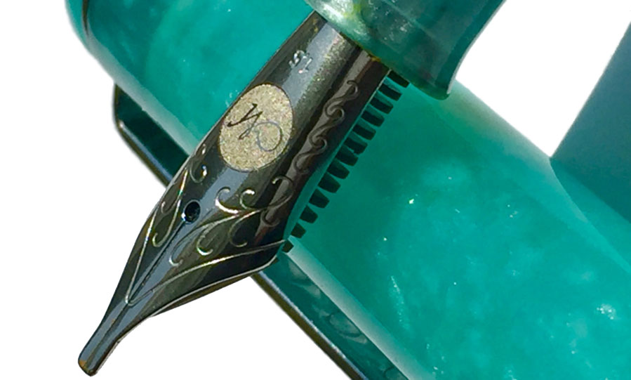
 Our overall recommendation While we loved using the pen, the price point just didn’t justify it until that was reviewed; there were too many alternatives which were similar to the ML1856 but better quality/feel for the same price or others that might sacrifice ever so slightly on the feel but were much more affordable. We like the direction Manuscript is heading in, but our recommendation was to wait until the value issue had been rectified before pulling the trigger.